Design
Our Living Room With The New Vintage Rug (I’ve Got Feelings, Per Usual)
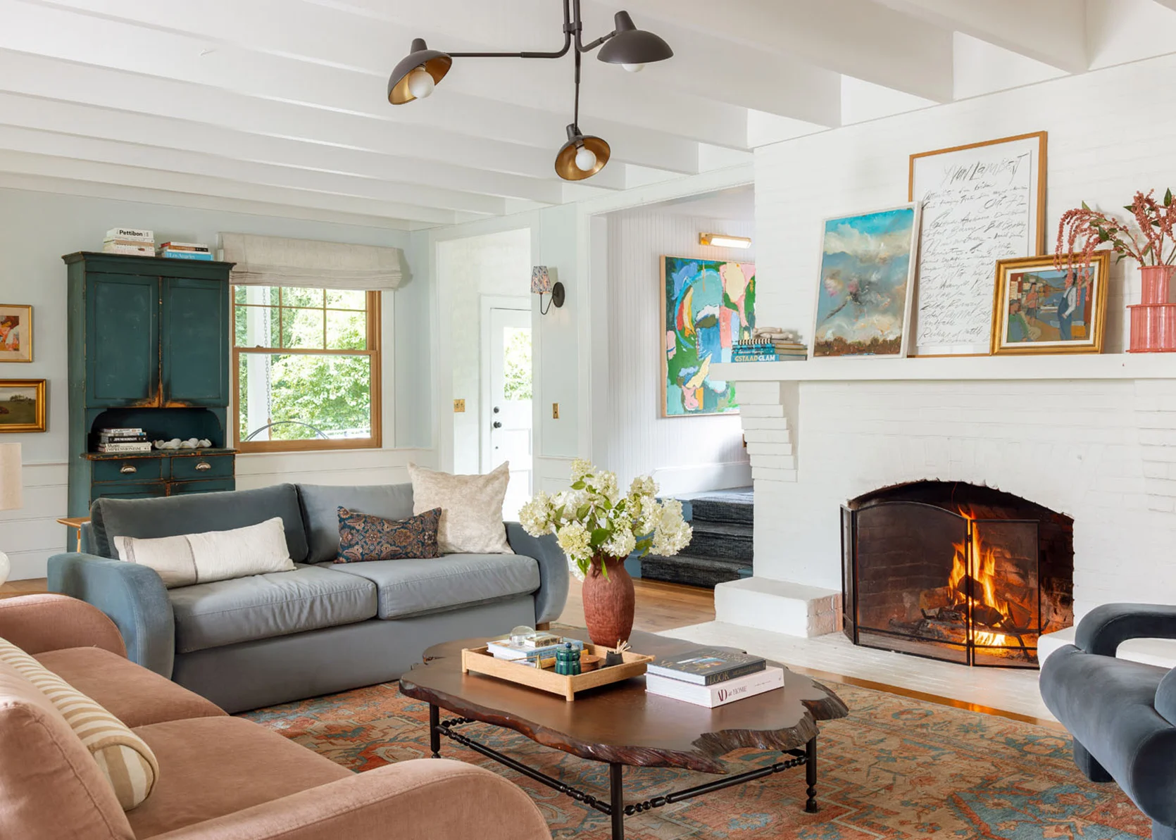
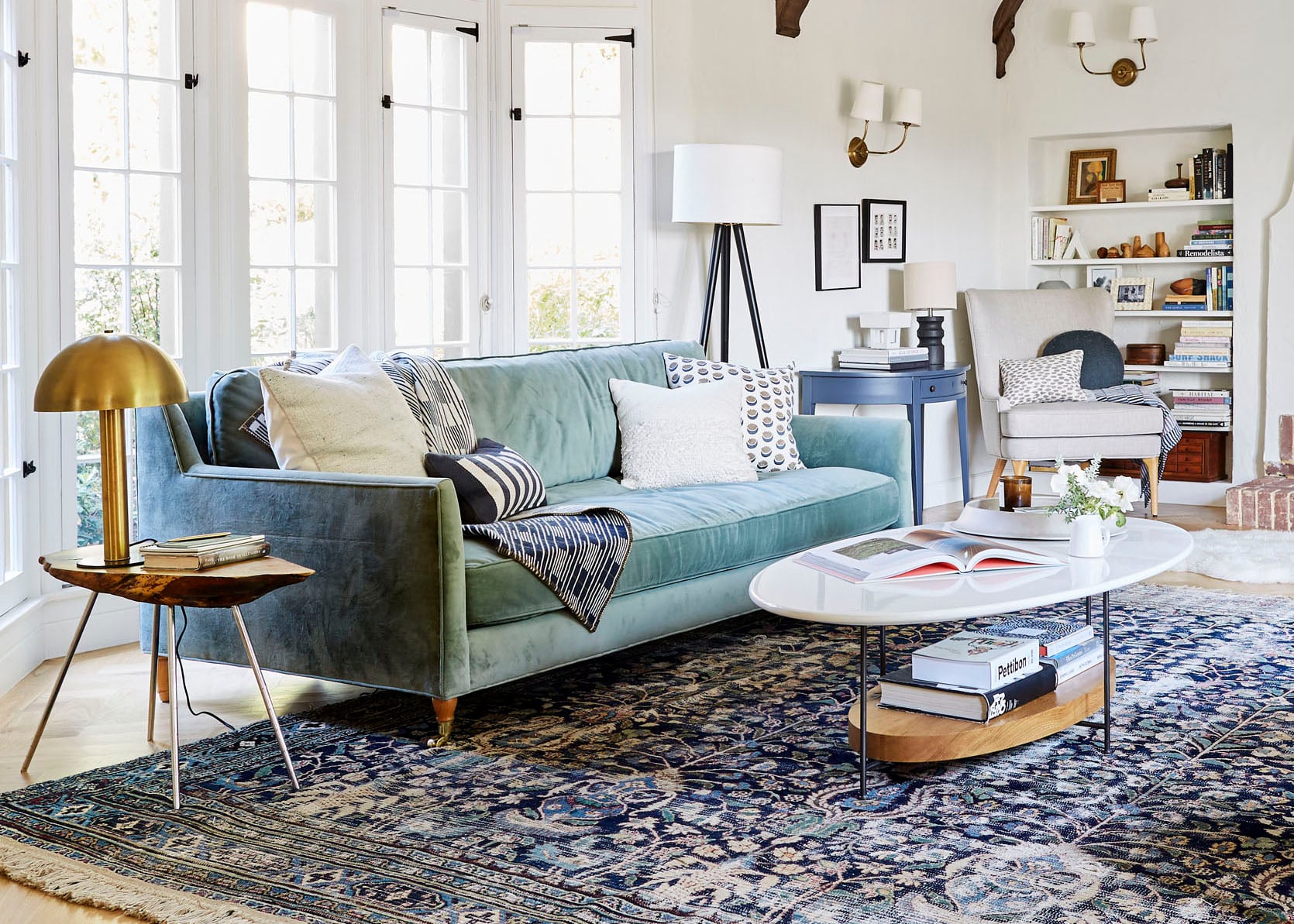
A couple of readers commented the other day that they miss the farmhouse vibe of our living room (from the first version) and it made me wonder if they/you are right …. Now, my style has never been specifically and only “farmhouse”, I’ve always been drawn to contemporary shapes and Scandinavian motifs as well. But, I kinda agree. The Barb sofas are cool and so comfortable (and I love the colors), but admittedly, they are very post-modern/contemporary and definitely not ‘farm’. And that should be fine, right? Like, your furniture doesn’t have to match the style of your house perfectly. But I would have never designed these sofas to go in this room (they are samples from our sofa line that we had in storage and shot to market them in here). I love them and they are so comfortable, but are they perfect for the style of the house? Maybe not. Could the perfect vintage rug solve the problem? Let’s explore a bit.
Version #1: Two Green Sofas Facing Each Other
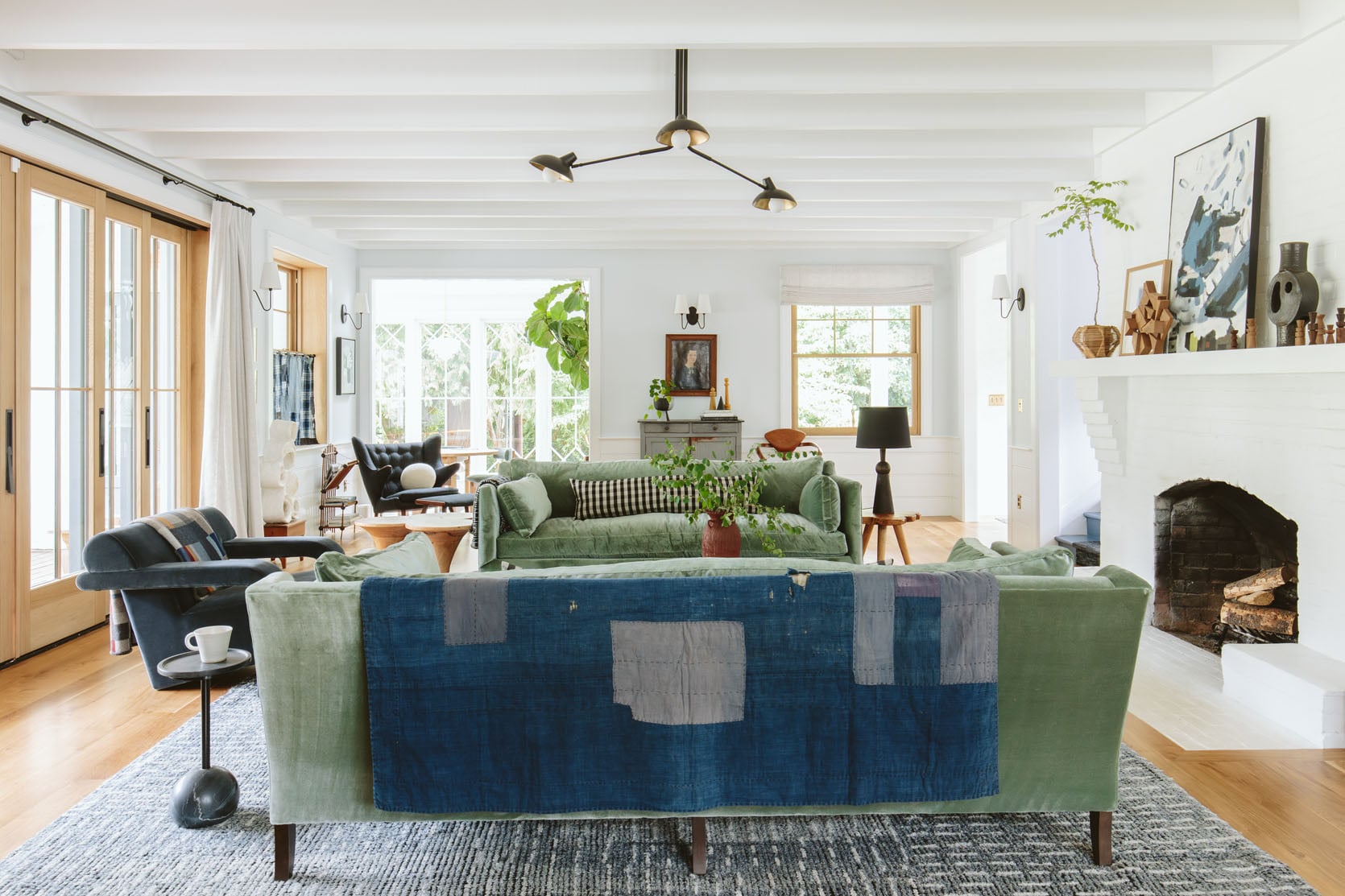
Ok this is what we originally revealed a few years ago when we shot it for Real Simple. I really, really liked this version of the room (but didn’t love – it felt like the walls and fireplace weren’t fully designed). But after months/years of searching for the right vintage sofas (and not finding one) I had to make a decision with the big Real Simple shoot impending so I bought these Fabian sofas and genuinely loved them (so comfortable)…. except that my dogs sat on the back pillows and smooshed them down every single day. It was so annoying and became a daily physical chore. Then everything changed because I launched a rug line and a sofa line, so I sold that awesome rug to my brother (I want it back!!) and sold the sofas locally knowing that I would put in sofas from my own line. But RugsUSA couldn’t make any of our rugs 12×15 and most of them didn’t even come in 10×14 (we tried) even though they said they could, so I brought in the rug I was using in my bedroom and tried it out with the green Alice sofas I designed for this room. See below:
Version #2 – Double Alice
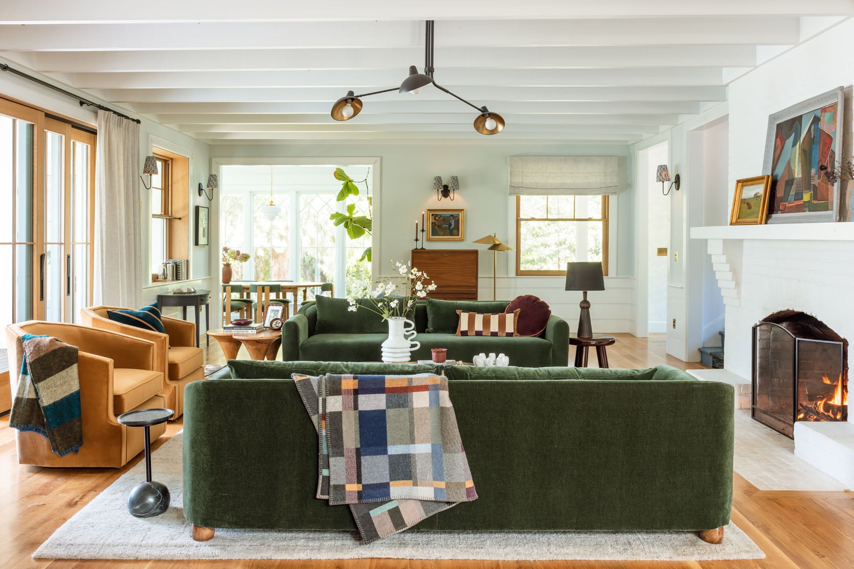
I liked this version, too. But Brian and I just loved the layout and softer color palette of the most recent double Barb layout so much more. The darker bolder green doesn’t not work, but it just felt more hotel lobby and less like an inviting home. So last winter when we had to shoot holiday two ways (one for us, one for a magazine) we brought the Barbs back in and just left them because they are so comfortable (yes we have a storage unit on our property for our furniture – not typical, I know).
Version #3 Double Barb Without The Hutch
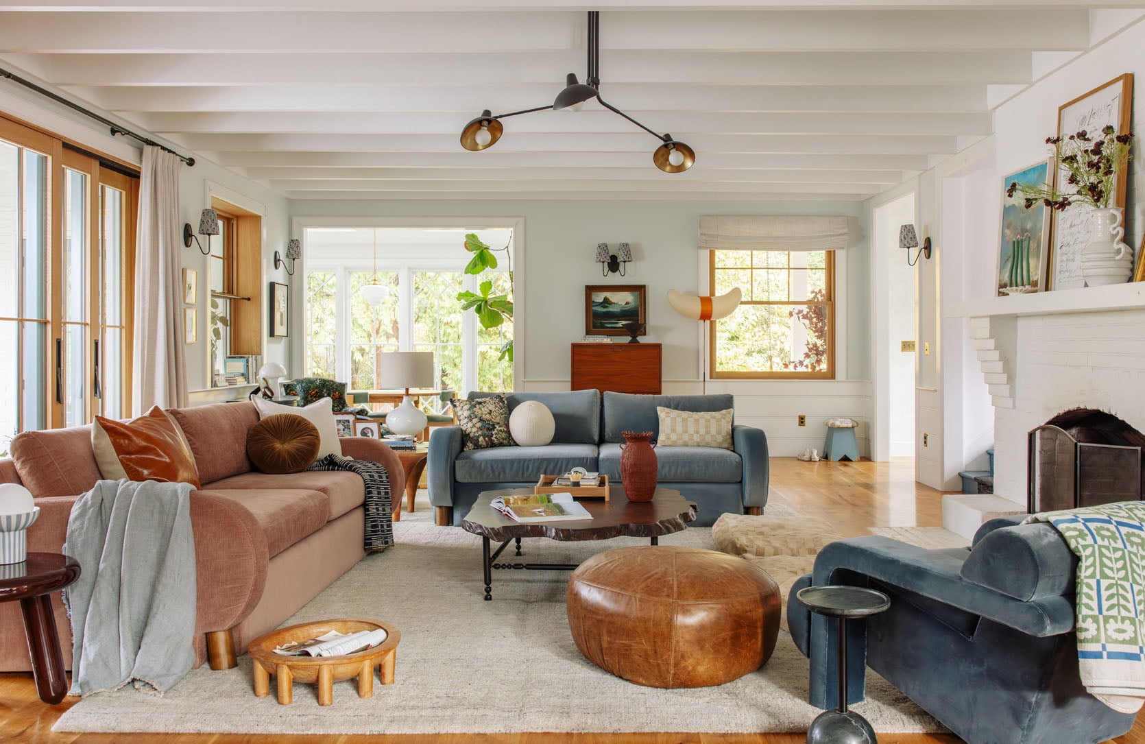
So the double Barbs came in for a shoot and never left because they are so comfortable and we like the long sofa + shorter sofa layout. The rug is one I’ve had for 8 years, and it’s admittedly pretty dang boring, but it’s the most cozy, comfortable, and forgiving rug that I can’t seem to find on the market (I got it at HD Buttercup and never knew the manufacturer). It’s more of a bedroom rug (that’s where I last had it), and it’s not big enough to be in here (this room wants a 12×15, and that rug is a 10×14) but it’s so soft, plush and hides every bit of dog and kid stuff despite being light.
Version #4: The Double Barb WITH The Hutch
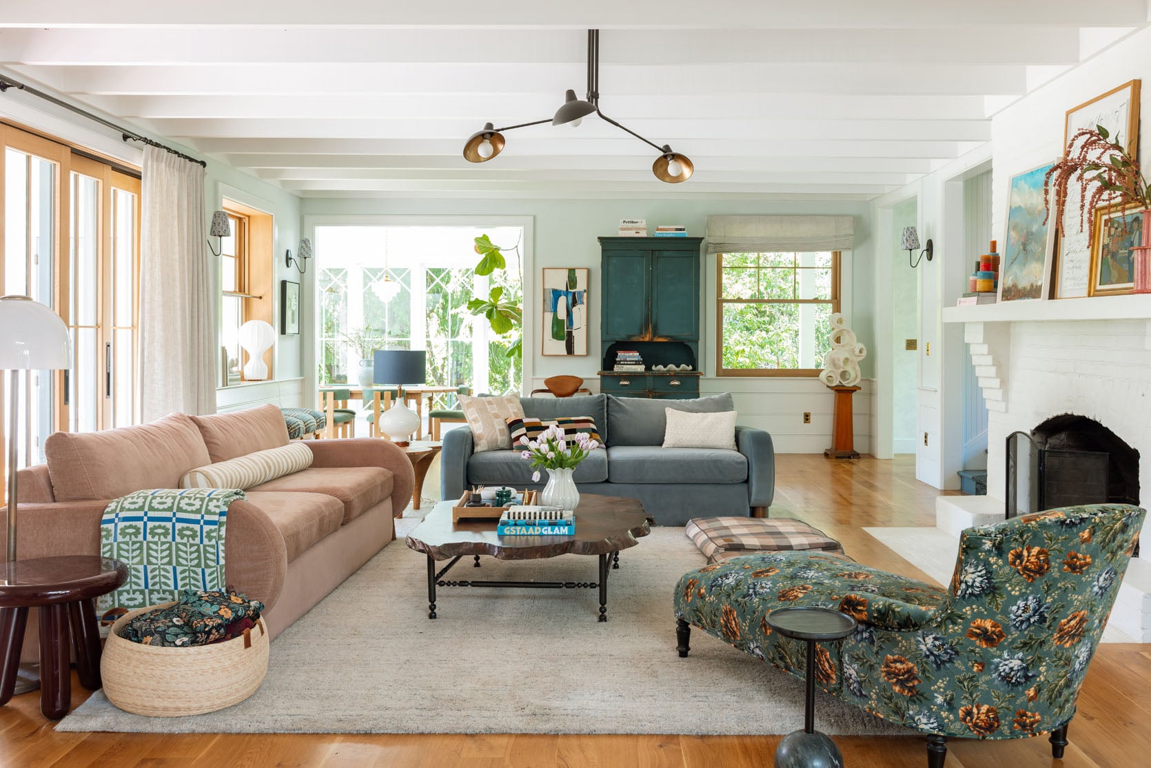
Then I wanted to finally try the antique Swedish hutch that I bought years ago for this house. It was a beast to move in here but we had movers doing other things on the property and I was like ‘now’s my chance!!’. So we shot it again to show you. And between the boring rug and the hutch something felt pretty off. I have found myself just staring at this room and wondering how to fix it since then.
But after being so incredibly frustrated with myself that I can’t nail this room I’ve decided to do an experiment where I give myself permission to take the time to actually design it for the first time, with intention, instead of making last minute choices (the Real Simple shoot) or using product that I need to sell (my sofas and rugs). It’s been really fun to fantasize about my dream floral sofa and shop for the perfect rug (while keeping most of the other elements that I love so much). I still want it to lean Scandinavian farmhouse, with color, but have it feel balanced and flow easily with the rest of the first floor and up the landing.
Meanwhile, I know for sure that I wanted a Persian-style vintage rug in the guest cottage, so I’ve been shopping and I actually found a one on Etsy with a good return policy that I’m trying out in here.
Version #5 – Double Barb + 12×15 Vintage Rug
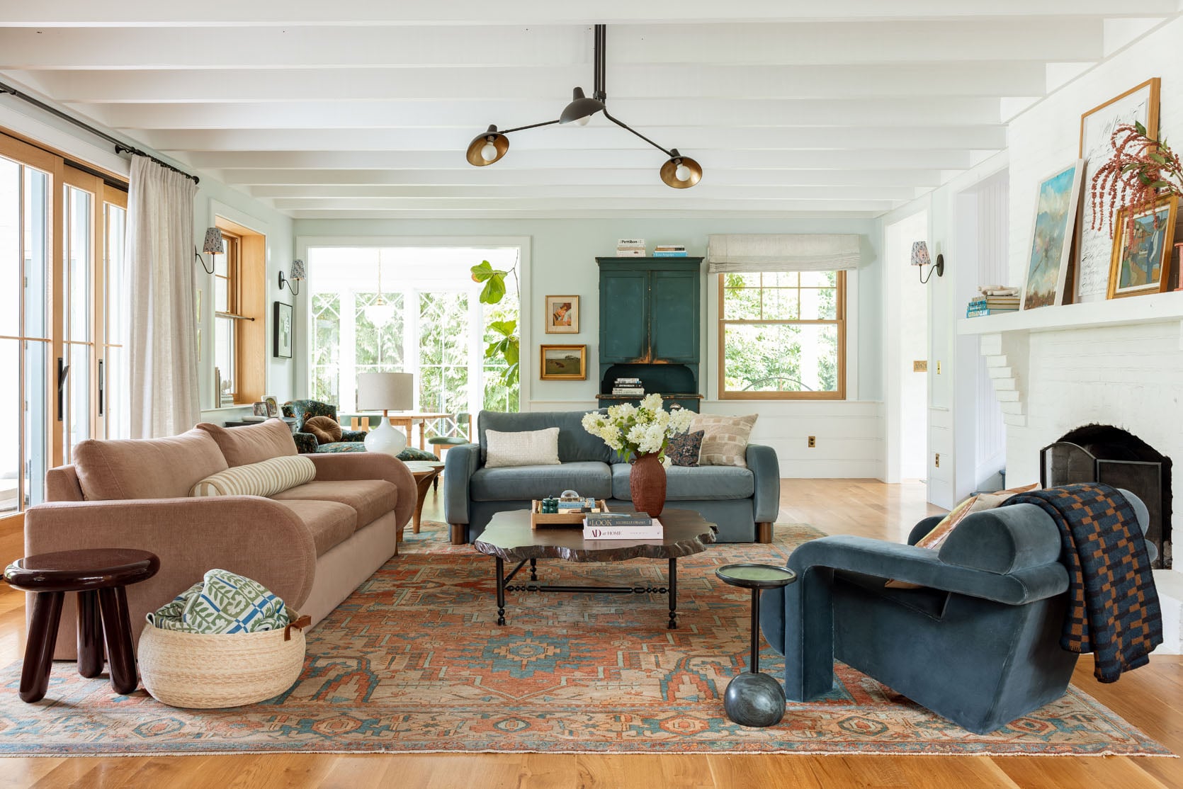
OK. Let’s. Talk. About. It. I love that it has a lot of the tones that are already happening (the blue of the hutch, the warmer tones that work so well with the coffee table and the kitchen island). It’s huge, 12×15, which is the size that this room wants and is so impossible to find vintage unless you spend like $15k, which I won’t. When it arrived it was a bit muddier than I thought it would be and yet is still really pretty. I love that it’s not super dark and busy, but it’s not quite singing with everything else, either. But whose fault is that? The rug or the Barbs?
AI Rendering Of The Rug Before Purchase
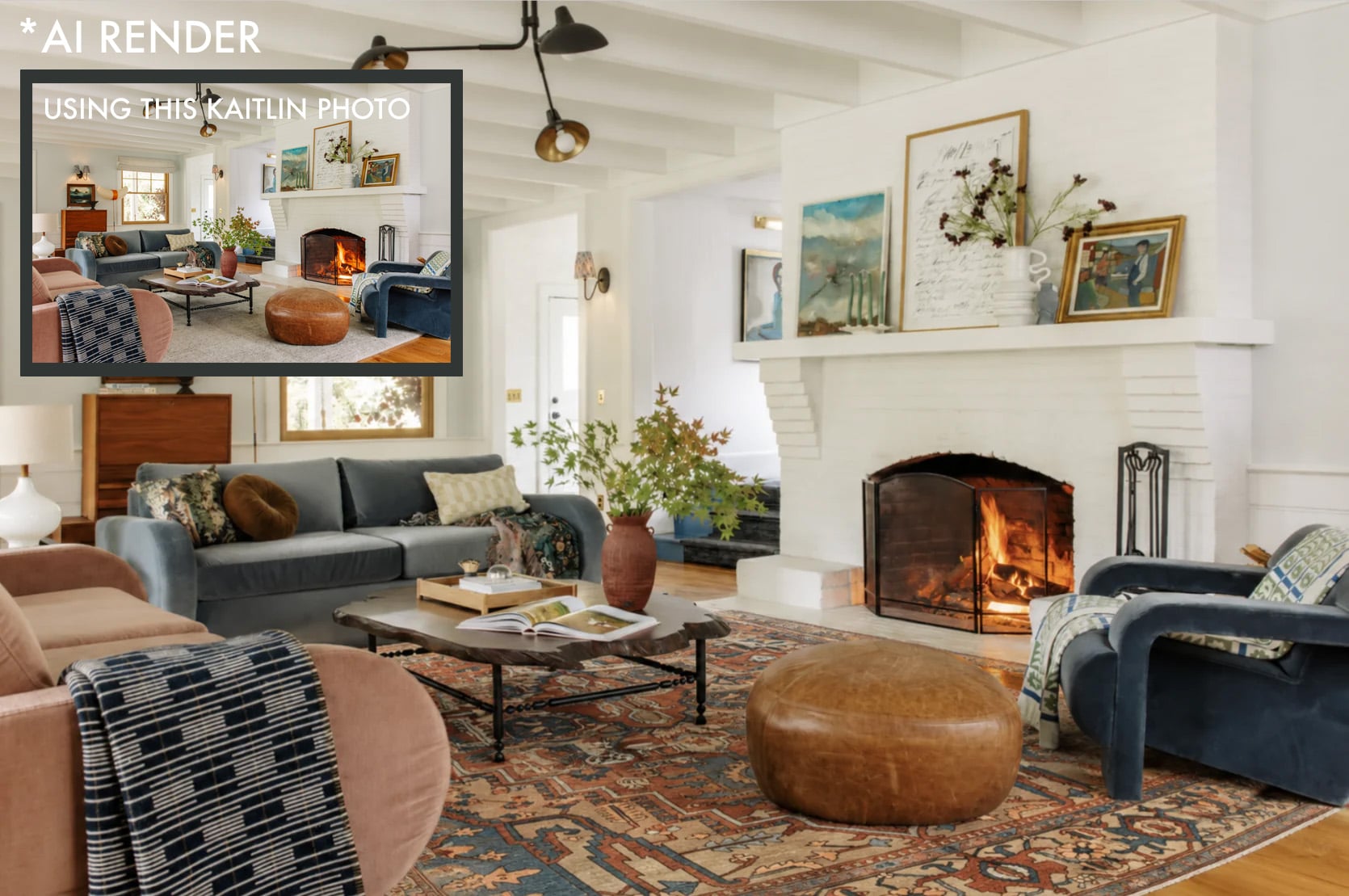
And if you are wondering if I plugged said vintage rug into AI to render it out first, I did and it looked pretty dang great. Good enough to help me order it to see it in person. But the colors ended up being off – it’s deeper and darker in the render than in real life.
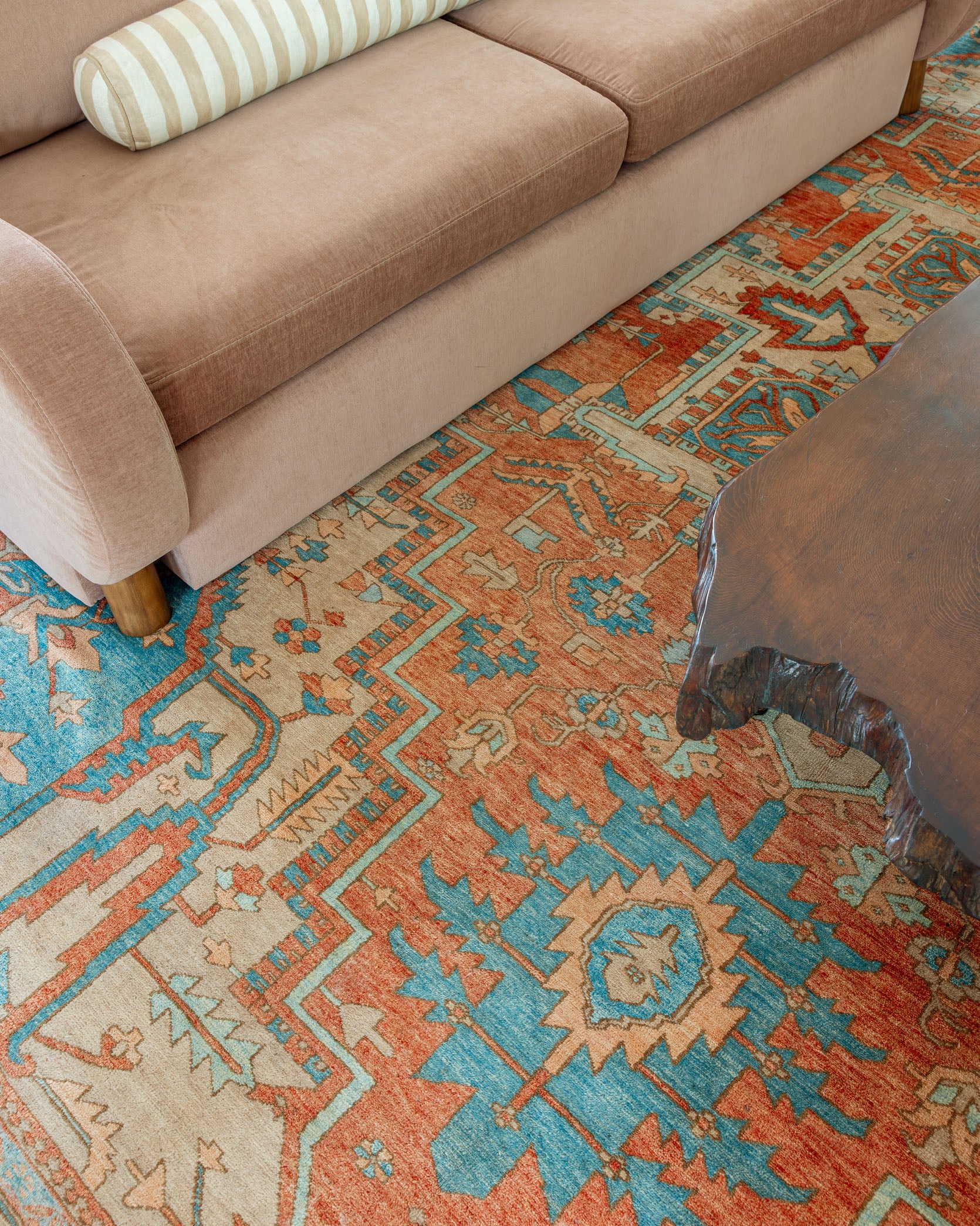
There are times when I love it and other times when I walk in and i’m like, ‘Nope. Not there yet’. It’s making me wonder if a 12×15 vintage rug exists that I will ever love (that is in a normal price range). But I wanted to shoot it and show you guys because that’s what we do – try things, show and tell, and generally obsess about whether or not they are right.
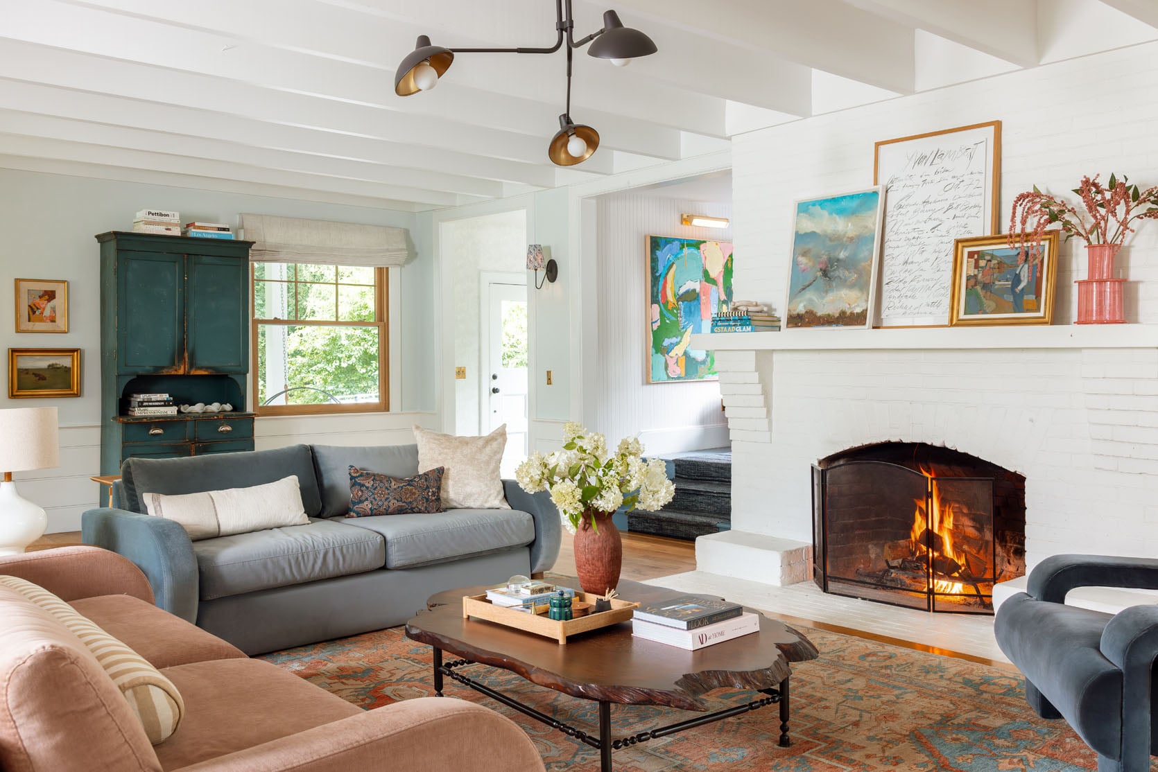
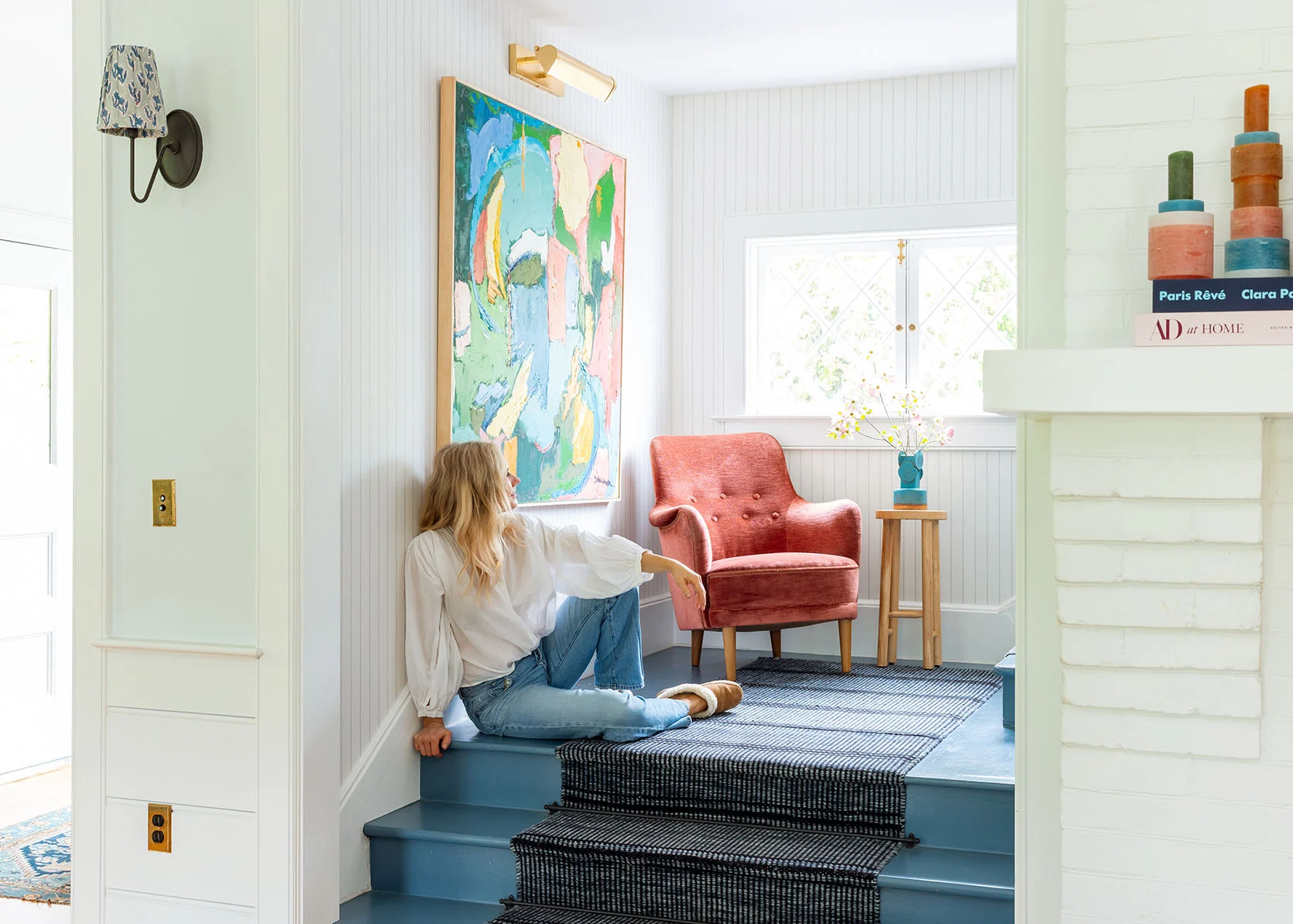
I also switched out the art next to the hutch so that it read more vintage/traditional which I think speaks to the rug and the hutch more. And then I had hoped that some of the colors in this vintage rug would speak to the painting in the landing that is so colorful, and it does and it doesn’t.
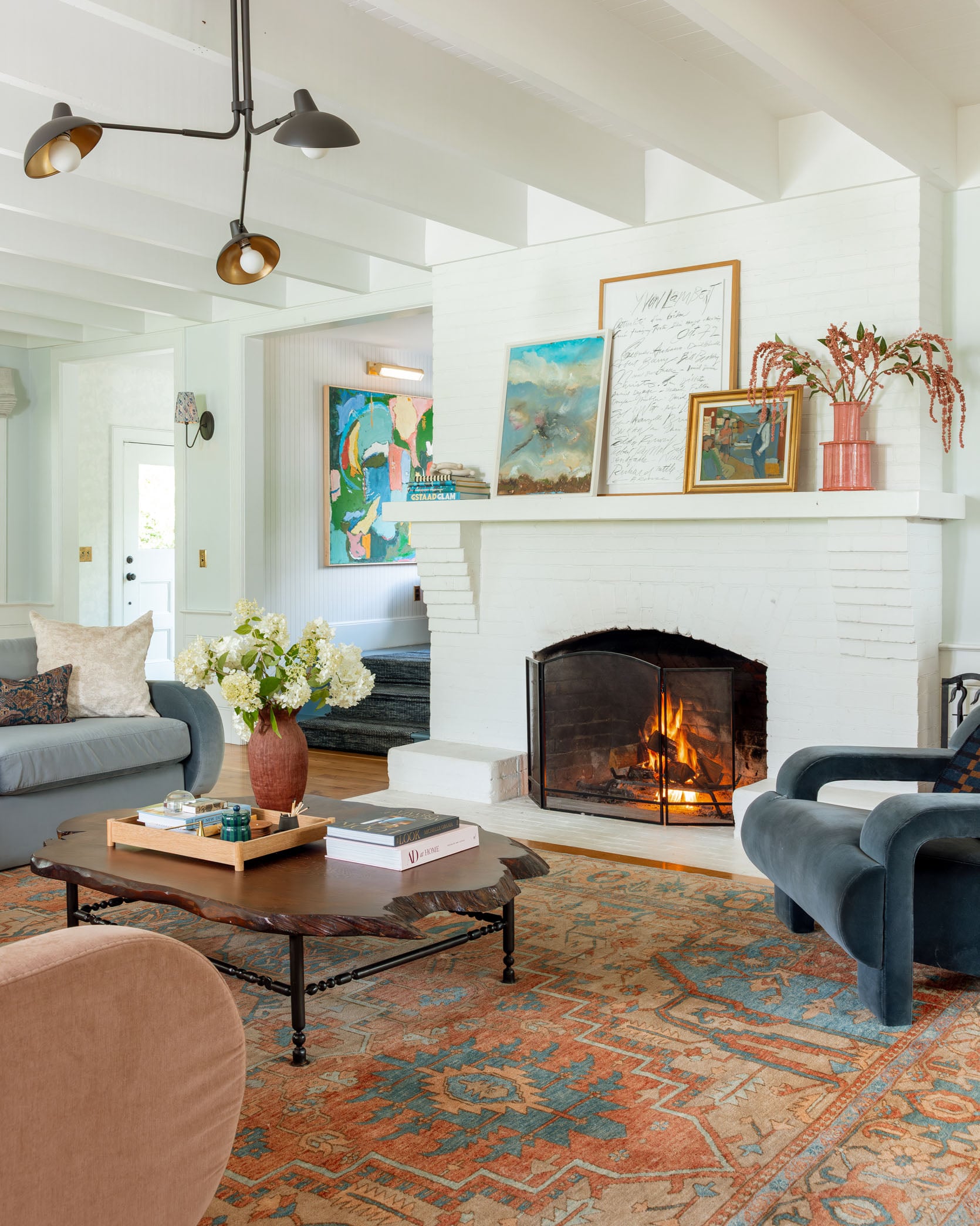
It’s pretty dang soft and obviously very forgiving and durable. It’s nothing like the boring comfy one, but even after a day or two I’ve gotten used to it in here and I love the bigger size.
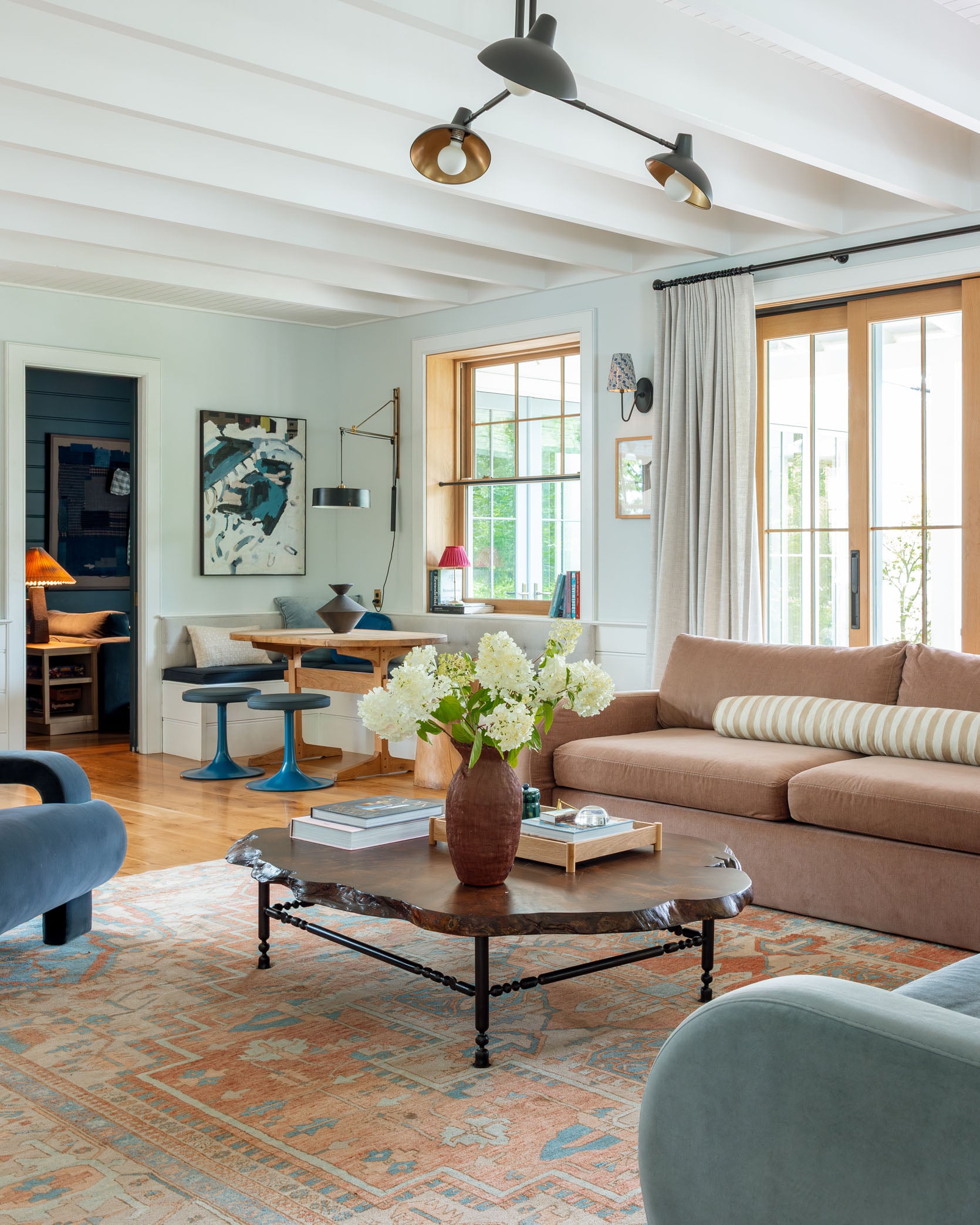
So next steps are that I’m trying to make it work with potential new sofas that are designed for this room (not just ones I rushed into that don’t work with the dogs or are part of my line that has a lot of limitations). I wish SO BAD that I could have our Oscar sofas in here – they are SO comfortable!!! But I know that our dogs will get on top of those more squishy cushions and do the same thing that thy did on the OG green sofas. And no, they only sometimes sit on the back of these cushions since they are a little firmer and higher.
If you are wondering why I don’t just design a sofa and add it to the line, join the club. I showed our manufacturer what I want and they said that it would be too expensive to be at the price point that we need to sell at scale. To sell on Wayfair, which is the only place that they are carrying them, the price point has a threshold (like $2k) so it just creates so many limitations in size, fabric and shape. But I still might try – it’s not off the table. I also might just modify the Alice design to have more colors available and perhaps change the seat so it’s not a tight seat, but a cushioned seat (the Barbs and Oscar are more comfortable because of the loose seat and back just by nature of construction).
Here’s the working moodboard that is basically my Saturday morning hobby while drinking coffee:
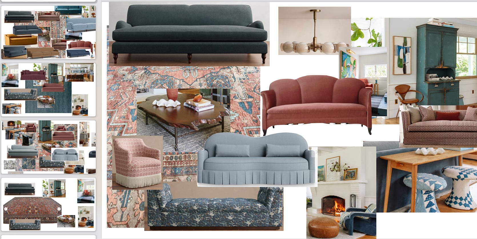
I have so many fabric swatches on the way with some ready-made sofas on the market that I love, and I’m dabbling with custom patterns and shapes. But I’m also open to this 12×15 vintage rug going out in the guest cottage if it’s not going to work with the ultimate design of this living room. This room is not a huge priority in my life and yet it’s the one that we spend the most time in and man it’s been challenging. It’s just so open to so many other rooms that it has to look good within – the kitchen, the sunroom, the entry, the landing, the family room, the dining nook and so many doorways!!! It’s a pass through room, that is really big with with a central focal point that makes it hard to create multiple zones. If you have a living room in a house that is just a room off an entry, with a single entrance/doorway, consider yourself lucky – they are so much easier to design. I don’t regret having our home be so open and I love that the living room and kitchen are so connected, but it certainly complicates the design. I just want to get to the point where I’m like ‘I LOVE THIS ROOM SO MUCH” just like I have with the family room, kitchen, sunroom, the mudroom, all the bathrooms, and even our bedroom now. This is my problem child forever 🙂 If you are like ‘hey lady, just calm down and stop tweaking your perfectly good room in your pretty house’, you are so right and join the club – I ALSO wish I could just pretend that the box is checked. But it’s not. I look at my brother’s living room, Nicole’s living room, Robyn’s living room – all so good and so well designed. So I just want mine to be part of that club, while also recognizing that this might be some sort of undiagnosed neurosis 🙂 Luckily, I’m in no real rush and can try to enjoy the process. xx
*Photos by Kaitlin Green

Designing it “from scratch” is probably the best bet in making sure it works, BUT you have so many great, loved pieces it’s hard to accept!
I actually really like the vintage rug with the Barbs – the colours work well and I like the juxtaposition of modern sofas and vintage rug. I think the issue with this room is that the fireplace and the walls are all too clean white – and I know it’s a thing to re-paint all of the woodwork in the room again, but the white just doesn’t relate to anything else in the room, which I think has always been the issue. Or did you already paint the walls above the woodwork? They are reading as very cool blue in some of those pics, not sure if it’s just a reflection of the blues/green in the room or not, but it’s too cold a colour with the warmer colours you have brought in. So either bring in more white into the room (the original blue/white rug works the best as it’s got white in it) or bite the bullet and paint at least some of the white away – even if it’s just to a warmer off-white or pale neutral, it doesn’t need to be a colour. The other whites in the room (curtains, lampshade, art, accessories) are more off-white… Read more »
I came here to say something in the same vein. The white lamp with the walls falls a little flat for me. I think changing out the white schoolhouse lamp on the side table with a terracotta based lamp would do wonders. I really love the new rug in this space.
She did repaint the top drywall of these walls to SW Mantra a few years ago.
I also like the new rug with the furnishings overall (I want to see the patterned chaise back for some pattern layering, it still needs quirk). I loved the original lighter green color of the first sofas but I like this configuration with the Barbs better.
The thing I want to change most about this room are those cool white and icy blue/green walls, which have never felt quite right. Your girlfriends living rooms have a cozier vibe with a base of warm wall colors.
A light sand color on the walls and woodwork would compliment the blue tile in the kitchen, green chairs in the dining room, and off set the teal cabinet and artwork in this room to unify the entire space making it more cohesive and homey.
I agree! That paint above the trim is casting its blue tint on everything in the room. I think blue is a color you have to go all the way with (like in Em’s pantry). It doesn’t tend to work well as a whisper. I think something warmer (a very soft oatmeal?) would do wonders.
And unfortunately I say this from experience.. I tried to paint my living room blue, but it just looked bad. Although it was so much work, when I pivoted to a light tan, I was so much happier. Yes, it’s “safer” and maybe feels too blah, but especially in a gigantic room like this, it allows the accessories to sing.
I came here to say the same! I think the rug works well in the room but perhaps the white fireplace needs a punchier color to tie it all together.
Some of you have not been on this site long enough to remember all of the discussion about painting or otherwise changing the fireplace surround! I am afraid the current color scheme reads way more 80’s than fun and unexpected. I personally love the original green matching and facing sofas, with their smaller scale. Perhaps there is something similar without the pillow issue? I do agree with many of you that a warmer off-white would make a difference. I am a big fan or Persian or otherwise patterned rugs, and you can find some great prices on non-vintage ones with many choices of colors!
I was going to suggest white sofas, but that would be crazy, and sort of what you said about white
I also came here to say the same thing. I like the vintage rug with the Barbs but the problem, to me, is the cool white/bluish walls.
My own personal opinion – the paint color for the walls falls flat. I don’t think you’ve ever liked it anyway, right? Maybe now is the time to choose a paint that makes your heart sing instead of “making it work.”
Again, my personal opinion is that the size and shape of the hutch doesn’t work in that spot. I’d put artwork on the wall and possibly a table behind the sofa, maybe with something on it? Maybe then the area between sofa and wall wouldn’t feel like you need to put something there, idk.
I like some of those deeper pink/red couch options that are patterned – very cool! I also think you may want to stay away from so much red/pink, given this is not a color you typically gravitate toward, and it may not give you that “love it” feeling you’re looking for. Plus, you already have some pinks in the guest room, I think.
It’s tough! I feel similarly about my living room.
Agreed – pink/mauve doesn’t feel Scandi to me and has always felt out of place here, I like Rug, but maybe would shift the pink, and more natural fabrics, like linens or cotton texture would bring some warmth and tie in with rug.
I think that part of the problem is that the furniture does not feel connected to the fire place (the focal point). Before you do anything, I would try to pull the rug and the furniture a bit closer to the fireplace. As is, it feels like there is a walkway to front hall between furniture and fireplace. Also the furniture feels too far form the coffee table – perhaps spend 5 min trying furniture closer to coffee table, as well as everythign closer to the fireplace?
yyyyeeeeesssssssss
The new rug is gorgeous! I think it’s the pink Barb that throws it off, it’s to light and blends with the rug to much. The blue sofa gives a little more contrast while still being cohesive. Still think a wood mantle on the fireplace would warm the space up more and make the elements blend better 🙂
I totally agree with this comment! And in general, I think another style of sofa would better suit this room. Looking forward to seeing what you come up with.
(Also, I love the big blue armoire, but wish it was centered in its space. But I guess that’s what my son would call a “me problem.”) ; )
I think the rug is beautiful! I think the hutch is beautiful! Clearly I prefer the soulful stuff to the contemporary stuff! 🙂 I think a leather sofa, like you put in Robyn’s room, with velvety chairs in more classical shapes could feel very home-y, and connect nicely with your farm’s heritage. I’m almost picturing the Frame TV/barn project from 8ish years ago, but Scandi-fied bit? The iterations are fun to watch- thank you!
I agree! I think the big pieces in the room need more warmth and character, like a leather couch or even wood on the mantle (not painted white). Some of the focal points are too sterile and don’t quite jive.
Yes, this, the modern, blocky furniture does not work with this farmhouse or scandi vibe —
I think the problem is the pink Barb. In the photos (at least on my screen), the pink isn’t quite right with the tones of the rug. I like the rug a lot and think it’s way better than the boring one. Can you AI the effect of a deeper rusty terracotta tone for the Barb?
Also, I think having two matching sofas is causing another issue – together, they look like a 3-piece suite effect, which you taught us all to avoid in favour of more eclectic furniture groupings and which looks a bit dated, especially in pale pink as it reads a bit 80s. Swap out the pink one for something else. What have you got in the storage unit? Can you try it out easily? Leather or another shade of blue would work well if you don’t have a rust-coloured one. I think when you get the sofas working, the painting on the stairs won’t be an issue at all. You’ve learned that the sofas at right-angles and one shorter works better, so you’re further forward on knowing what size you need and where they will sit!
Love the rug. And agree – that sometimes you have have to start from scratch to get it where you want!!! Plus it is fun! I agree with some of the comments below about the paint color. At least in pictures it reads really pastel. Nothing wrong with a good pastel! It just doesn’t seem to follow the vibe of the rest of your house. I feel like you are amazing at repeating the same palette throughout your house, which make it so cohesive and flow so well. But this color seems to be the Lone Ranger. Maybe a warm white or a more mid-toned blue or green would help ground everything. ALSO you are amazing for letting us all comment on your room and give our opinions. I would get too defensive :).
AI 🙂
Wow Jo this rendering!!! That wall colour is perfect (coming from someone who usually wants all white walls!)
Emily – your conundrum is SO relatable and gives us all hope. Thank you!
EHD – I’d love to see a rendering like Jo’s with these exact walls, and then with the fireplace painted a darker version of these walls. And remove the hutch (as it competes for focal point). And change pink barb to leather sofa. Ideas are so fun 🙂
OH – this is great! I love the blue/grey wall to pick up the tones of the blue Barb better.
Another thing that throws me off are the bright/vibrant colors of the art on the landing. I know Emily LOVES that piece but without bright coordinating colors elsewhere in the room, I don’t think it goes.
Ooh good call with the wall color. I was going to suggest the pink sofa was throwing it off as it looks a bit cooler than the rug. You can kind of see how it looks with a warmer tone in this rendering. I so relate to the need to fix these little (often costly) details. AI is going to turn us all into ruminating monsters!!
I think this new rug is AMAZING! Literally – when I saw the picture of it in your room – I thought ahhhhhh = that’s what this room needed all along. Like others, I truly think you’ve already identified the problem – it’s the sofas. The silhouettes and colors just feel off in this room and are giving off a 90’s matchy vibe and make me think of the “blue and mauve” trend I grew up with in the 80s. And they are the biggest elements in your room (aside from the rug). I really like the idea of focusing on getting sofas specifically for this room and your family and not using leftovers or a quick in-time-for-photoshoot purchase. Something in a pretty cognac leather …. maybe a chair if not a sofa. To me this rug is a huge step in the right direction!
I love the rug too! It looks as though it has come home – ha ha – and speaks to the fact that your home is vintage as well. I personally don’t think the coffee table relates anymore. It feels out of place to me. But please keep that rug – too good to pass up.
100% THIS. The coffee table and the hutch stand out in an unpleasing way.
The rug looks fantastic with the sofas, it just wants the midcentury secretary cabinet back instead of the hutch (too turquoise)
I love the size! Love seeing a pattern on the floor with more color! Not sure this is the best fit for this room though. Something is giving me a southwest vibe which might work better in another space.
Totally agree about the southwest vibe. It’s more a rug for an Arizona, New Mexico, or even Colorado home. I don’t see Scandinavian farmhouse in it.
Agreed! I live in AZ and I see a lot of Southwest/Navajo motifs here… the zigzag designs and the rusty coloring just all feels very Native American inspired. It’s gorgeous, but actually reminds me of some of the national park lodges that Max Humphrey featured in his book! Like this should be in a historic lodge in Grand Canyon National Park, or something.
Yes!! I came here wanting to see if anyone else saw southwest instead of Persian. It’s definitely a New Mexico vibe.
Agree 1000% on Southwest vibes
Emily – thank you for being so open and vulnerable with this post. For a seasoned professional and incredibly talented interior designer to admit that they sometimes struggle to pull a room together gives me permission to maybe have more grace with my own design woes. After moving into our first home five years ago, I’m also still struggling with getting my living room “right”. Now I’m at the point where I feel like I’ve hit a wall and have design fatigue (if that’s a real thing?). If you or any of your wonderful team members have any advice or tips on how to get past this I’m all ears!
I hope the rug stays! The colors are my favorites. 😉 I really like the hutch color with it, as it leans slightly more teal. Our own homes do seem to be the most challenging—can’t wait to see the process.
I don’t have any good suggestions, just wanted to say thanks for walking us through the thought process and helping us all realize that everyone gets stuck sometimes. The rug is very pretty, and I like the idea of bringing in some rich leather tones, but then I am wondering if the rug will start reading as more of a southwestern pattern? Maybe not if you would go with a Chesterfield style. Hmmmm…also, as you yourself noted, it seems like the rug and the stairwell painting don’t really vibe with one another either. I love them both separately but together they just aren’t talking. Maybe there is another rug that exists that is closer to what you need in here and this one is destined for the guest cottage?
Have you considered turning the rug the other way? You probably know this, but rugs look different depending on their orientation, so doing a 180-degree turn might make it look more like the shade you want.
I agree with others that the rug looks great, but the sofas never seemed like the right fit in here. Totally agree about not needing your furniture to match the age of the house, but they seem too modern for the overall vibe. And what about adding some more wood/natural elements?
the rug changes everything about the space! I really think what the room needed was this dose of vintage and color on the floor. I love the tones of this rug, especially how the pink/brown of the rug speaks to the floors and the white/light blue speaks to the walls. even though there’s no shot from the living room into the kitchen, I can imagine how the rug plays off the kitchen tile as well. I genuinely believe this is the rug for the room, and it’s the furniture that may need to shift. imho the light blue barb throws off the space from a color perspective — with the walls, rug, and now the vintage hutch I think it’s reading muddy and light gray rather than the pretty blue it is. I love the dark gray sofa you have on your mood board, I wonder if one darker sofa would ground things a bit more? maybe a burgundy color? not sure this is conducive to your lifestyle, but have you thought about leather for the living room? overall there is a lot of (gorgeous, ofc) velvet in the room. I do think it’ll help break things up (but also… Read more »
I think we are the same age and I also find myself basically apologizing for my existence a lot. You are a professional stylist, it makes sense that you are always tweaking your house.
From a nonprofessional nonstylist- it’s not the rug, it’s the sofas. I’m not sure I buy the too expensive for wayfair line that someone is giving you. Google says that the most expensive sofa sold on Wayfair is $42k. I didn’t confirm this on Wayfair because they make you sign in to search, which is one of the many reasons I don’t buy stuff on there.
anyhow, I’d love to see your real dream sofa. I have no idea how to design a sofa and would love to see your plans and ideas for this and even how a sofa goes together.
I’ve had my eye on the $3M sofa for years
lol
I’m sure it’s a typo but it’s been there a while and always cracks me up.
Hard agree with the others that the wall color and fireplace are far too white and cool and make the room as a base feel off. My main problem though in both Barb versions – there’s just so much going on. Almost like it’s a room full of all the leftovers. Like everything needs to be taken out, and then one thing at a time put back in with a heavy heavy edit. I totally get it – I’m in my bedroom currently which also has way too much going on lol!!!
“It’s a room full of all the leftovers” – this is how I would describe my house, and when I looked at Em’s living room, I thought, “this looks like my house.” So…I agree. I think if you are able, start over, and pull back a bit.
Do you know if your Bennett Sectional will ever come back in stock? I had it saved on our new house moodboard but can’t find it now.
Will the Bennett Sectional come back in stock? I had it saved on our new house moodboard but can’t find it now.
Love the rug! And agree with some readers that the walls and fireplace color might be the bigger problem? (It’s an amazing space, not really a ”problem” of course). I think this is a great opportunity to pick a color from the rug and paint the fireplace to tie them together and create a well needed focus point. You can always paint it white again if it doesn’t work?
I made a quick AI try. Not sure a pink is the best but I think adding some color to the bottom part of the fireplace is a fun idea?
This is so good! Now everything ties together with the landing picture. Maybe bring back the chaise?
The two stand-out pieces that give the room yummy joy are the hutch (want badly) and the chaise (also want badly). Together, they sing and have the Scandinavian farmhouse eclectic vibe. Slowly design around those two pieces, and it will come together. Love the clean simplicity of white walls. Nordic countries truly have a color palette; ocher, dusty blue, blue/green, dusty rose, red, clean white, glossy, and matte black. White is the unifying color. Guessing during the long dark winters, the white is soothing and hopeful.
I love seeing the process and what doesn’t work, along with what does. That’s the fun stuff! IMO, the cool blue of the walls is a tone that just doesn’t quite work with any of the iterations. Even a neutral white would feel like it was competing less with the furniture (whether the green, blue, or pink sofas). The wall color doesn’t feel like it’s serving the room. I think the hutch is gorgeous but dominates in that space. It’s so tall and a strong color, so it drives the eye straight to the hutch, and its height, instead of around the room, and it’s quite close to the window. Obviously, we work with the rooms we have, but just from a visual perspective, it leads you out of the room. Minor, minor personal opinion, but I would nix the fronds/feathery things on the fireplace. Highly subjective, but they feel a little dated and ubiquitous. Love the artwork and would love to see it paired with something earthy (chunky wood, unglazed pottery) but unique or personal. Obviously, there are so many beautiful decisions as well! But since this is a post about the evolution, it’s fun to objectively and from… Read more »
I love all of them, especially the Barbs with the chaise… but I think maybe it’s just the rug that needs to change, perhaps a warmer, neutral-ish, geometric rug? There’s a lot going on colors-wise with the Barbs, just needs a little visual rest IMO. Anyhow, you’re awesome, so it’ll be great regardless.
If it were my home, I would want the rug to pick up the colors of the tile in both the kitchen and the sunroom. Those patterns/colors are so visually strong in their areas, and having them connected with the rug would create visual continuity and, in the words of my husband, “really tie the room together.” (IYKYK!) This way, the rug will visually ground the living room/seating area, as well as tie in that beautiful hutch.
I will continue to rally for a neutral sofa (beige? cream? leather?) so that the sofas add more texture, not a competing color.
Thanks for doing the heavy lifting and letting us chime in! And yes = moodboard all the way!
I will join you on the neutral sofa team. I think an ivory sofa is the way to go. I’d add a warm wood mantel, too.
For me, the three pieces to keep and build the design around are the hutch, the chaise, and the vintage rug. All three are Wow! pieces. The pink sofa definitely has to go. In your mood board, I love that long blue sofa and the patterned backless sofa.
Yessssss!
It is fun to play around with! I’ve never felt like the blue velvet chair fits – it’s both very modern and very big and angular. It seems like it’s trying to be eclectic but just is jarring to me. I love the chaise and the hutch. The rug is nice, but pretty Southwest. I think leather for a sofa would look great with the other purses that are working. Wood clad the mantel and put those together and see what comes. And maybe see what kind of rugs are in Scandi designs? I love your entry one and a big one of it would be awesome here…
When I look at the last photo, the blue sofa, the hutch and the blue arm all combine into a big shape that is too much for the other colors. I feel like the white fireplace and the walls (are they white now?) is another large shape that fights the blue area. I agree with moving everything out and editing from there. Maybe replace the white walls with the blue from the rendering in the comments or with a warmer white with some sand or yellow tones. Thank you for showing us your thinking.
I loved the Fabian sofas, the shape was perfect for the room. The Barbs sofas rounded arms are dominating the room and along with an over sized fireplace it adds up to be too much.
The challenge for this space I feel is that having so many vignettes can often create a sense of visual clutter. Each moment itself is fine but all together…with wainscoting and paint color… the result lack of cohesiveness. Hard for the eye to land somewhere. To me, “Scandi farmhouse” in any measure assures more restraint of elements. One can breathe.
If you’re starting from scratch, I wonder how you’d pare it (all the stuff/detail) all back and perhaps create larger moments/vignettes that connect and allow the room to sing and feel grounded.
I love it.
I feel like the double barbs would look so much more like they belong in the room if they were the same color instead of 2 different colors. It would bring that slight traditional element that was present in the original farmhouse design of the living room
LOVE THE RUG!!!
The moodboard is looking cute but I noticed that the rug version on the moodboard is cooler than the actual rug as shot in your living room. In the moodboard it’s less orange and less aqua. The actual colors of the rug do not really seem like your colors. Maybe for the moodboard you’ve used a photo from the etsy listing? The moodboard rug has more variation as well. It all makes me wonder if the rug is not actually vintage but “vintage style.” Of course color is hard in images, and that’s true for etsy sellers too. But there are also a lot of scam rug sellers on etsy. I have successfully bought vintage rugs on etsy (though none that big). It’s hard! Another giveaway is the dimensions. Vintage rugs are typically not standard sizes, and rugs the length of yours are usually narrower than 12 feet. In any case, I think the aquas are what is reading Southwest. I don’t think you are ever going to love those particular blues, or the orange tones. I love vintage/antique rugs and never thought I’d have a simple modern rug in my living room. But after being stumped on why my… Read more »
To clarify, I meant that the prints in the moodboard don’t work with the color of the actual rug, even though they look great on the moodboard (cuz the rug on moodboard is cooler color-wise).
To clarify, I meant that the rug on the moodboard has cooler *colors* than the actual rug in your space.
I agree with so many of these comments – in fact, I think you may have a very rare near consensus! I too love the rug, and I think it’s because all the other patterned rugs you have used are so geometric patterned and “neat”. This feels much more relaxed and brings in a really eclectic feeling. But I agree that the pink Barb doesn’t really work with it. And I also agree that to lean in to that eclectic feeling there should not be two Barbs. A leather club sofa might work very well, particularly if you could find one that has a bit of patina. I also agree that the seating pieces are still too far from each other and from the coffee table. If you pulled them all closer to the coffee table and to the fireplace (as one commenter already mentioned), then it would be much cosier and more unified. This room has so many doorways – even if you don’t include the transition to the kitchen as a doorway – that I think the seating needs to be much more “closed circle” to feel cosy. Would you consider a small upholstered bench to fill that… Read more »
I have dogs and they are allowed on the furniture too. Bad choice as the human that paid for the house AND the furniture, but I do like sitting next to them when we watch TV, so it is what is it. lol. Anyway, have you thought about putting cardboard or something very thin but rigid in the back of the cushions on the Oscar sofas to prevent them from laying on that back cushion? Hopefully something to keep it structured and upright but hidden if it’s in the cushion. Maybe even between the cusion and the back would prevent that. Then it can be removed easily when people come over. Then when they lay on it, they will not be comfortable and learn to stay off the back cushion and just ont he seat. Just a thought. But I do like the look of the new rug!! I think that was a good buy!
Wow I have to say the new vintage rug does seem more southwestern style! It’s a bummer finding vintage rugs that large are hard to come by. Love your style anyway!
I like the rug- it brings some warmth
I like the Barbs and appreciate that their curves talk to the curve in the hutch and that their colors are friends with the rug but a contrast to the straight lines and edges of the rug design. The only thing that I wonder about is the ethereal painting on the mantel; it just doesn’t hold it’s own. I’m curious what swapping in a painting with more robust tones, like those on the landing and in the eating nook, might add to the room. A stronger painting there might also provide balance for the wonderful hutch.
KEEP the RUG. Here’s why: The colors pull in the blues from the other areas of the house that you can see while in the LR. AND because the orange looks so good on your floors! I love putting rugs that have orange/brick field (background) colors — even ones that are busy — on wood floors. Something about the field color just melts into the floor and so the room ends up looking a lot less busy. You have a lot going on in every direction of the LR — entry, sunroom, stairway, fireplace, kitchen, eating nook, family room. So a rug needs to join all the colors without adding any chaos. This one does.
That said, I do not like any of the furniture on it! The hutch or the sofa or (eegads, I’m pushing it here, I know) or the coffee table. The only thing I’d keep is the blue velvet armchair, but that’s only because of color.
I really like the new rug as an addition to the room. It tones down the effect of the hutch (which had a colour that I felt overwhelmed the room by drawing the eye to it, not the room) and it makes for a more interesting looking room with the addition of the pattern from the rug. I love the mix of styles.
I love #4 but would go back to the warm dresser, no hutch, and keep trying to find a new rug. I’m definitely in the minority about the rug but it seems as though it isn’t quite right. It seems to be causing a cascade of other changes to accommodate it when I don’t sense that you love it? It seems to swing southwestern and orange-y and seems to detract from the lovely other wood tones in the room. It’s so interesting to see what aspects of the room different readers focus on! We are an opinionated squad for sure!
Agree with most of the comments. When I first saw the new rug my mind went to the color scheme for the Guest Cottage Upstairs Office. The colors for the office are the colors in the rug. 12×15 might be too big for that office room, though. Having a pattern on the floor in the living room is needed IMO because most of the other pieces are solid colors. Like so many others have commented the BARBS don’t work, especially with the coloring in the rug. Please don’t paint the fireplace. Bringing back the original wood mantel would work wonders for realigning it as the focal point in the room. It just needs a break so as not to blend in with the walls. And as others have commented, I too, love the chaise and hutch. I also like the painting in the stairwell and wouldn’t change it out to try and match more with the rug.
It’s the pink sofa. It looks washed out with the vintage rug. When you look at the room with just the blue sofa, the rug works!
I like how the rug warms things up but I would put it in the guest cottage and keep looking, maybe for a classic oriental in warm red tones. Also I’m not the biggest fan of the Barbs…don’t really like the shapes or the murky colors. As I recall you once posted a shot of a white sectional that I thought looked great in the room! And while I love the painting on the landing, that’s a whole other color palette so perhaps it could move to the top of the stairs? I’ll see myself out now.
That white sectional shot was the best we’ve seen. That or the original green sofas.
Thank you for sharing the evolution with us -it’s been so much fun to watch! Not just this room, but all of your homes over the years.
I think the rug is absolutely a keeper. I’d keep the coffee table and the blue chair too, but consider different sofas.
I also agree with what others have mentioned: the fireplace could use a little more warmth. Maybe wood paneling in a tone similar to your doors and window frames? I also love the idea from the AI rendering of bringing in more leather, like the ottoman.
Overall, I really think you’re onto something with this rug -it feels like the piece that’s pulling everything together!
Love your style. Would you consider painting the fireplace?…
Hmmm, teach the dogs to stay OFF the light green couch cushions, they’re still the best look, bring back “my” beloved chaise, keep the hutch and vintage rug…
I too loved the original green sofas. Perhaps arranged like the Barbs are now in an L-shape. They seemed like the best color for the room rather than the too dark/intense Alices or the muted Barbs. Thanks for your openness to our thoughts and willingness to share the struggle! Your authenticity is always refreshing.
Wait! What happe ed to chaise in version #4? I love it! Would not go woth the vintage rug but it looks awesome in that version. The AI of the rug looks perfect but the real colors don’t go as well. Still beautiful though
since it’s so open I think having multiple color sofas makes it look busy and unfinished especially with the new rug so I understand and see your point that it doesn’t feel “perfect” yet.