Design
Farmhouse Landing Wallpaper And Art Update! (The New Striped Wallpaper IS So Much Better)
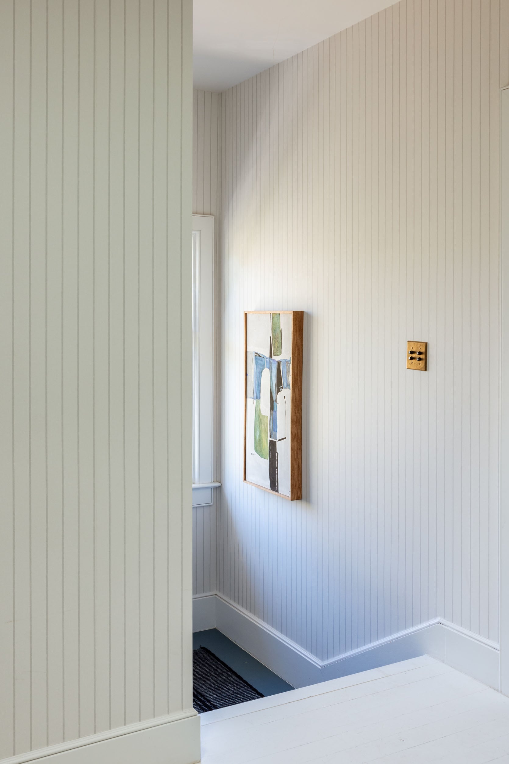
We’ve got new striped wallpaper up the stairs, and I LOVE IT. It’s not bold or exciting, but it’s perfect for this huge area (bottom stair landing and top landing) and will be the perfect backdrop for all our family photos up the stairs.
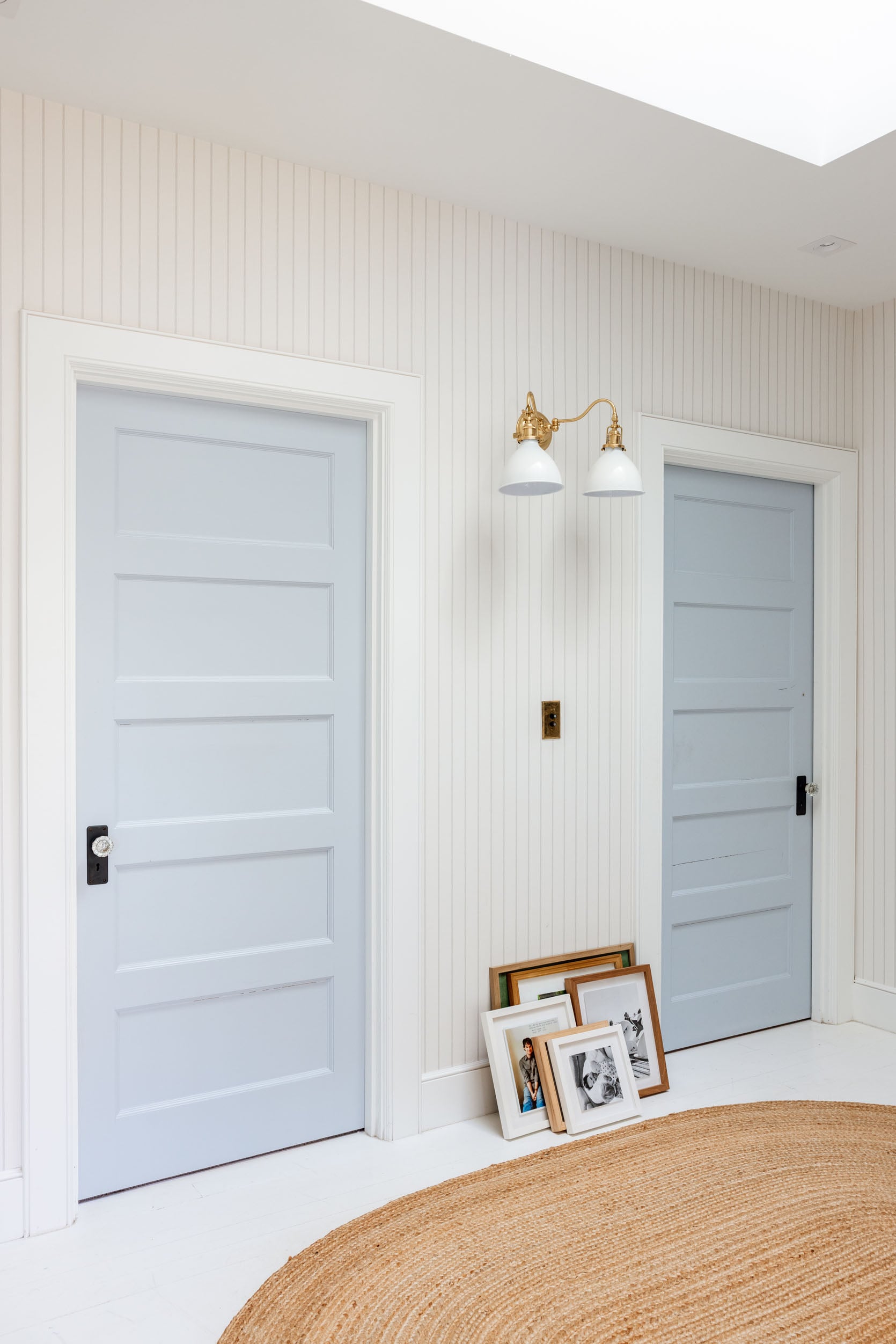
Sconce (similar) | Switchplate Cover | Wallpaper | Trim and Ceiling Color | Door Color | Skylight | Rug (similar)
In case you missed the debacle, the original wallpaper we installed (a tiny sweet ticking stripe) was so fragile that it was easily ripped or marked up. It doesn’t even exist anymore (it was a bad product, y’all). So, after it got extremely damaged from a photo shoot, I decided to just re-wallpaper the entire thing with a much more durable paper that is even better. The original stripe was so tiny you couldn’t see it on camera, whereas this is wider (but still subtle).
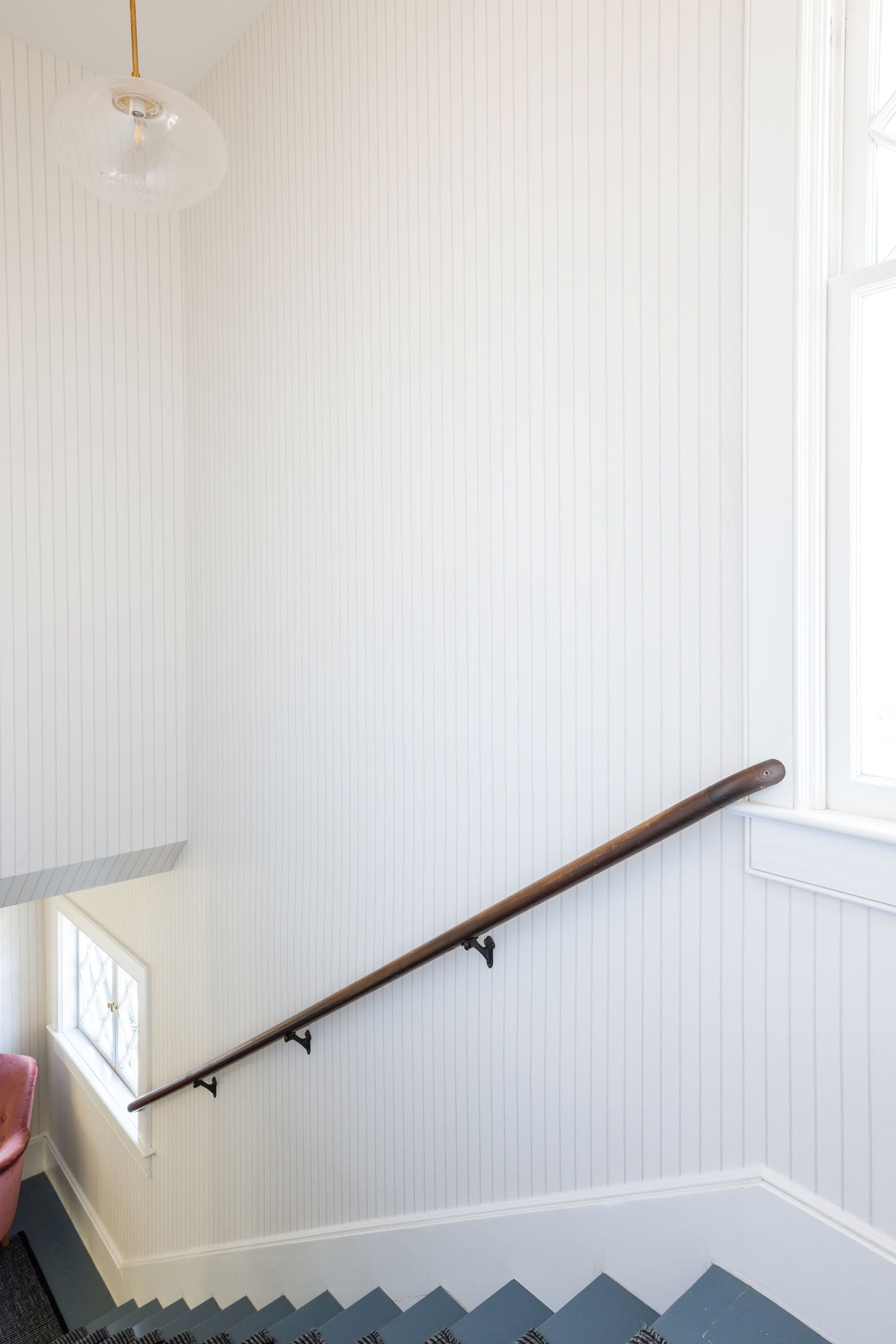
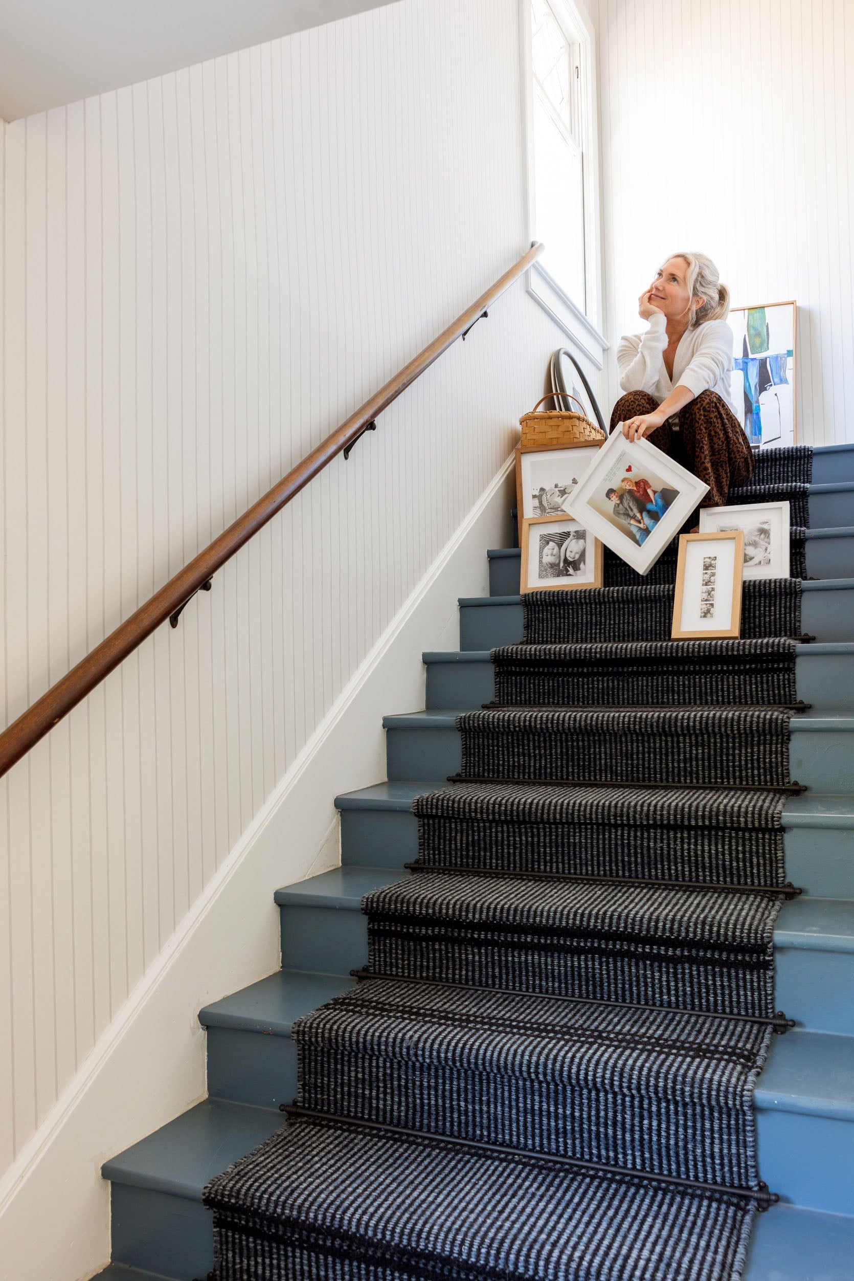
I love walking up these stairs to the pretty window on top, and I wanted to keep it light and airy. But mostly so I could plaster it with family photos.
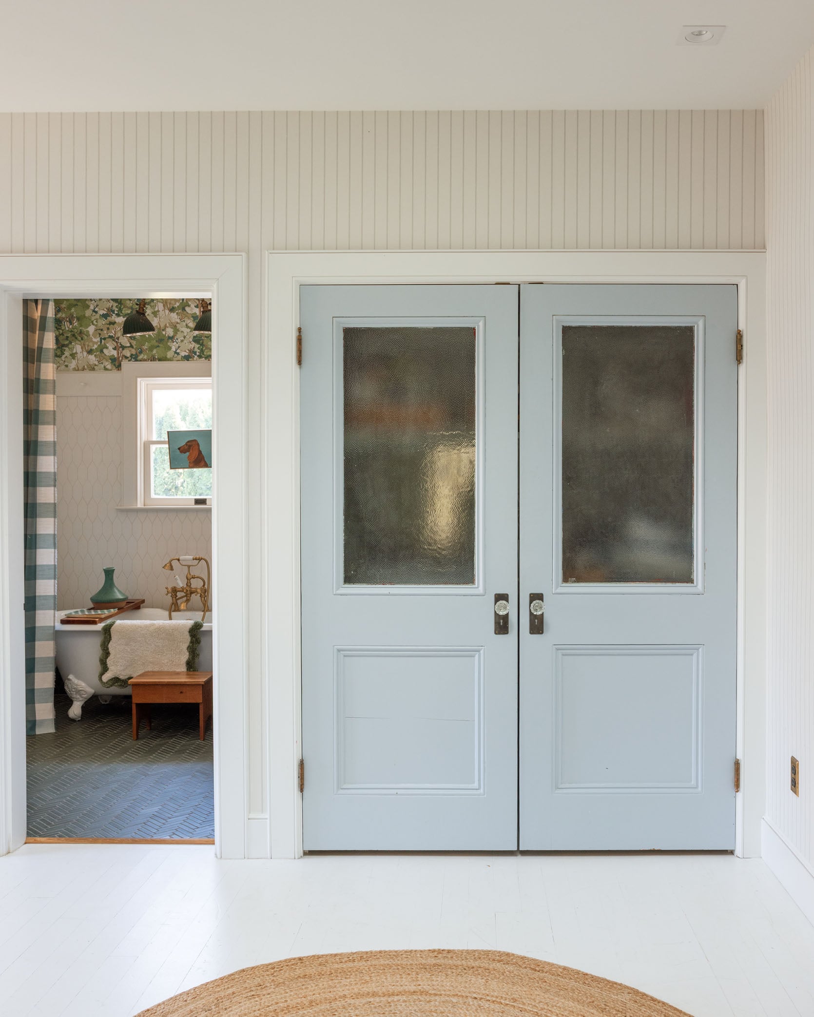
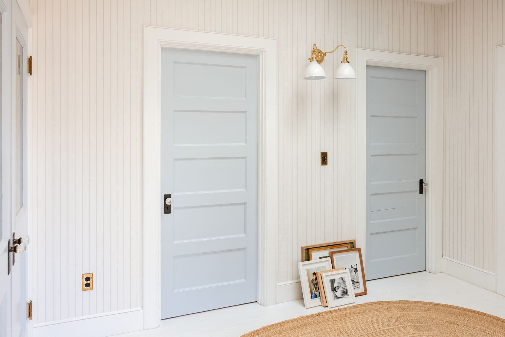
It also works so well with the existing wallpaper in the bathroom and the laundry closet. It adds so much even though it’s so subtle.
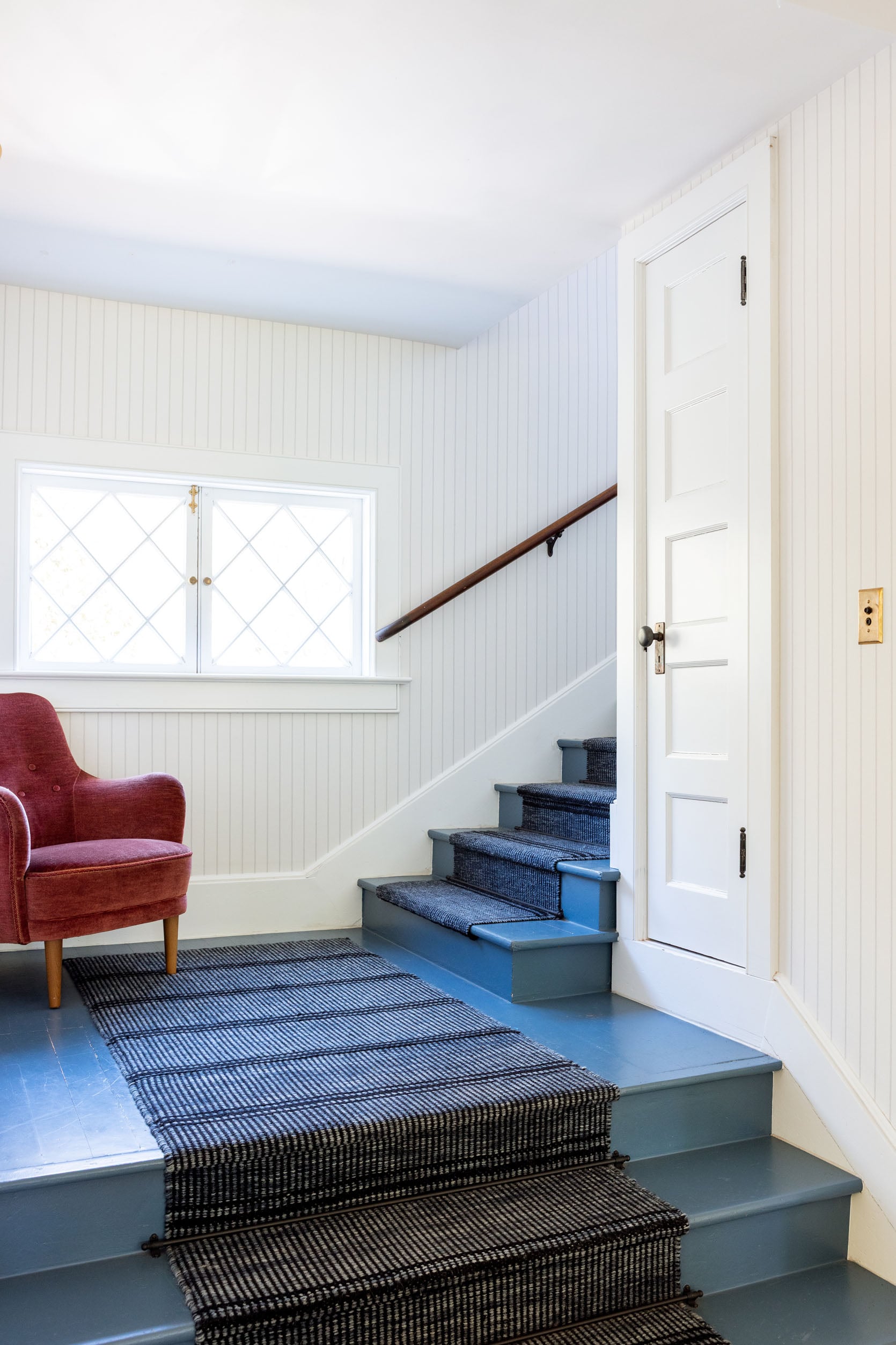
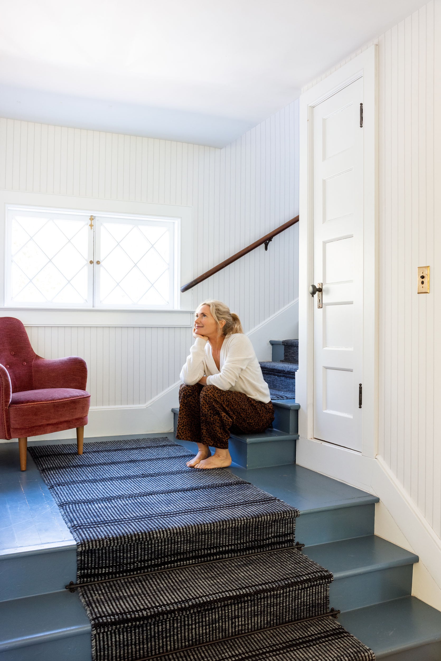
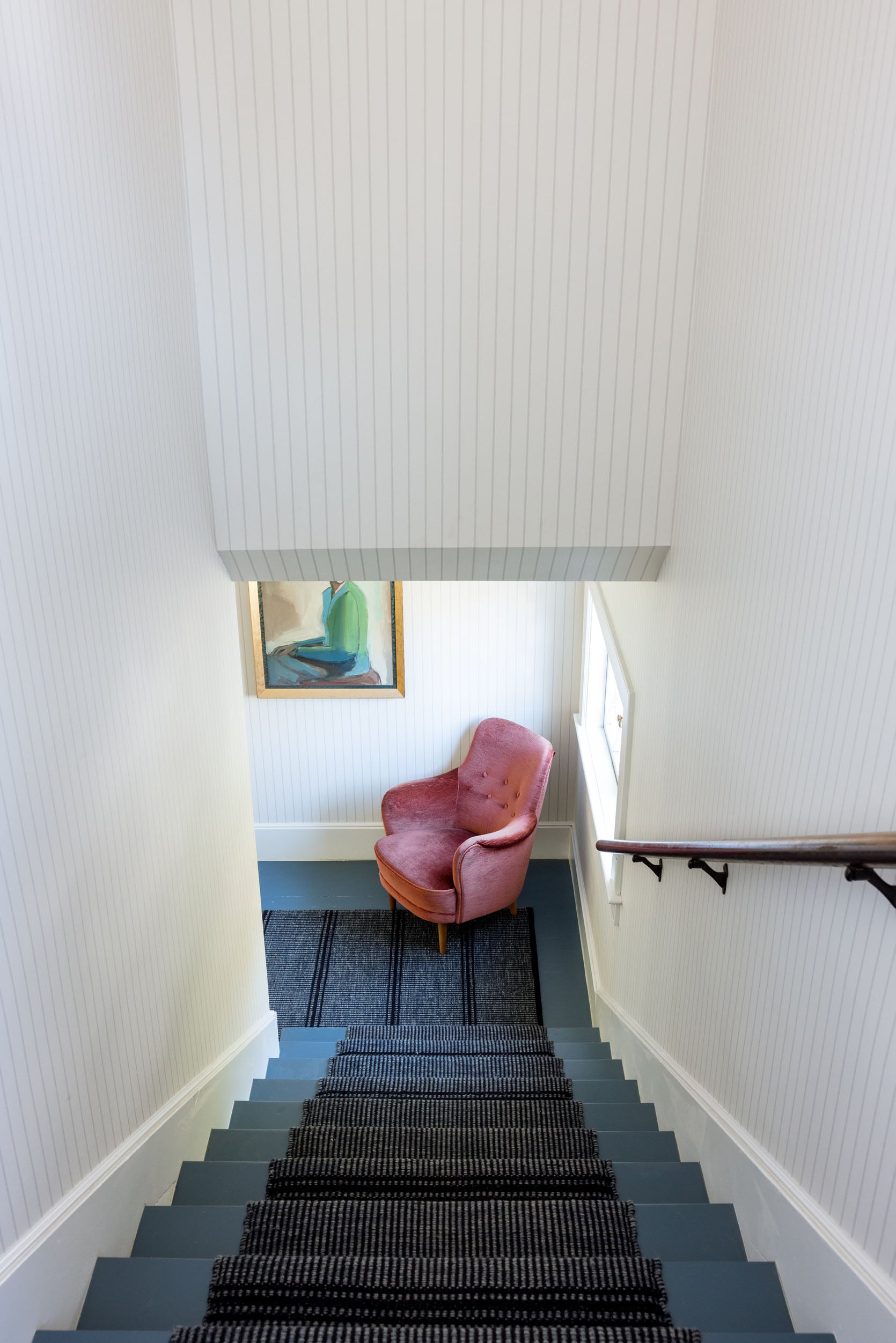
Stair Runner | Stair Paint Color | Chair (vintage)
I’ve been looking for a huge vertical piece of art (or two) for that tall wall since we moved in. It’s what is keeping me from hanging the family wall. But I should probably just go for it.
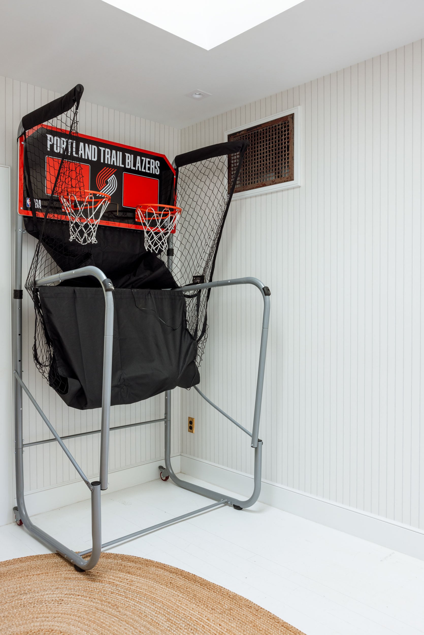
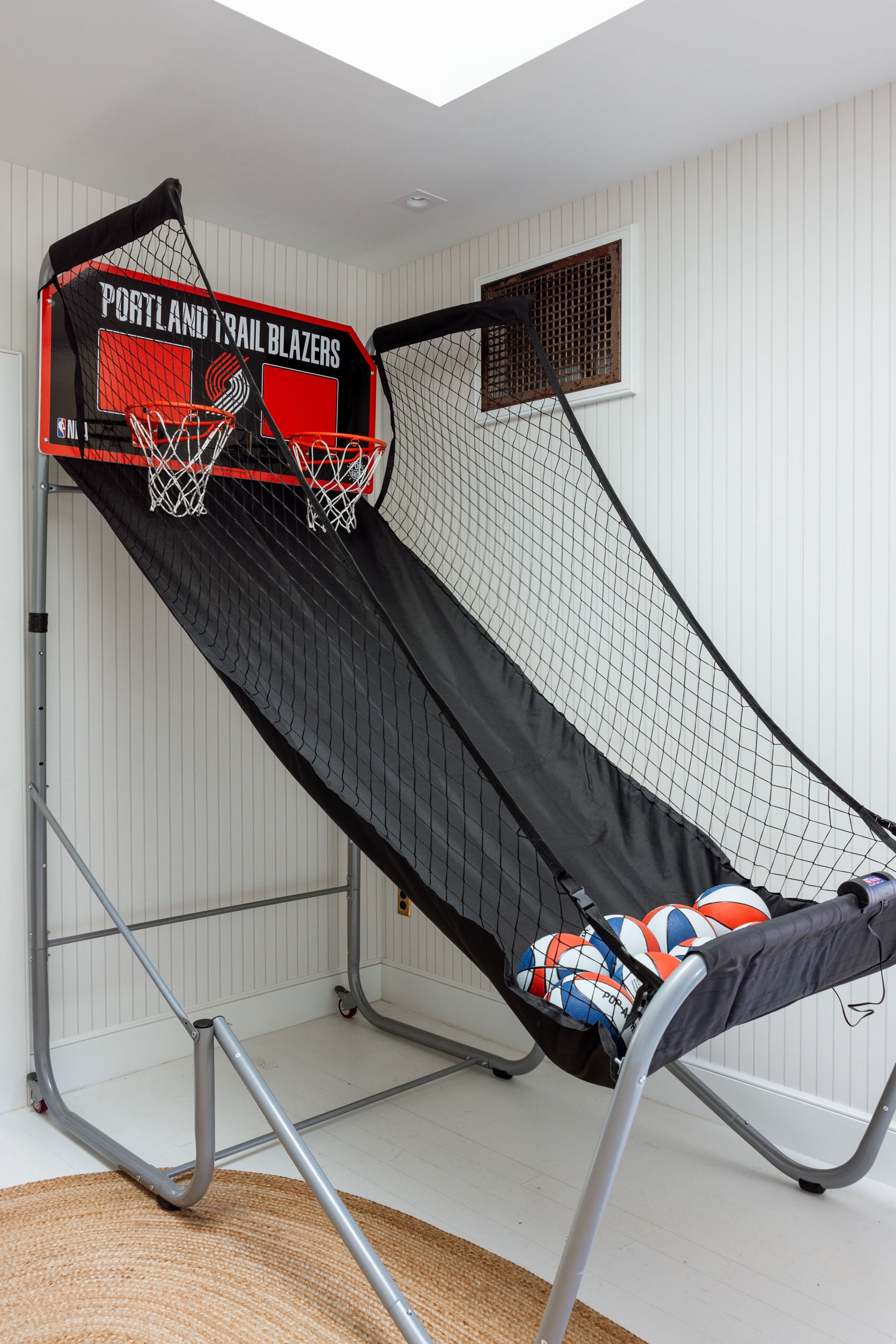
Old Wallpaper:
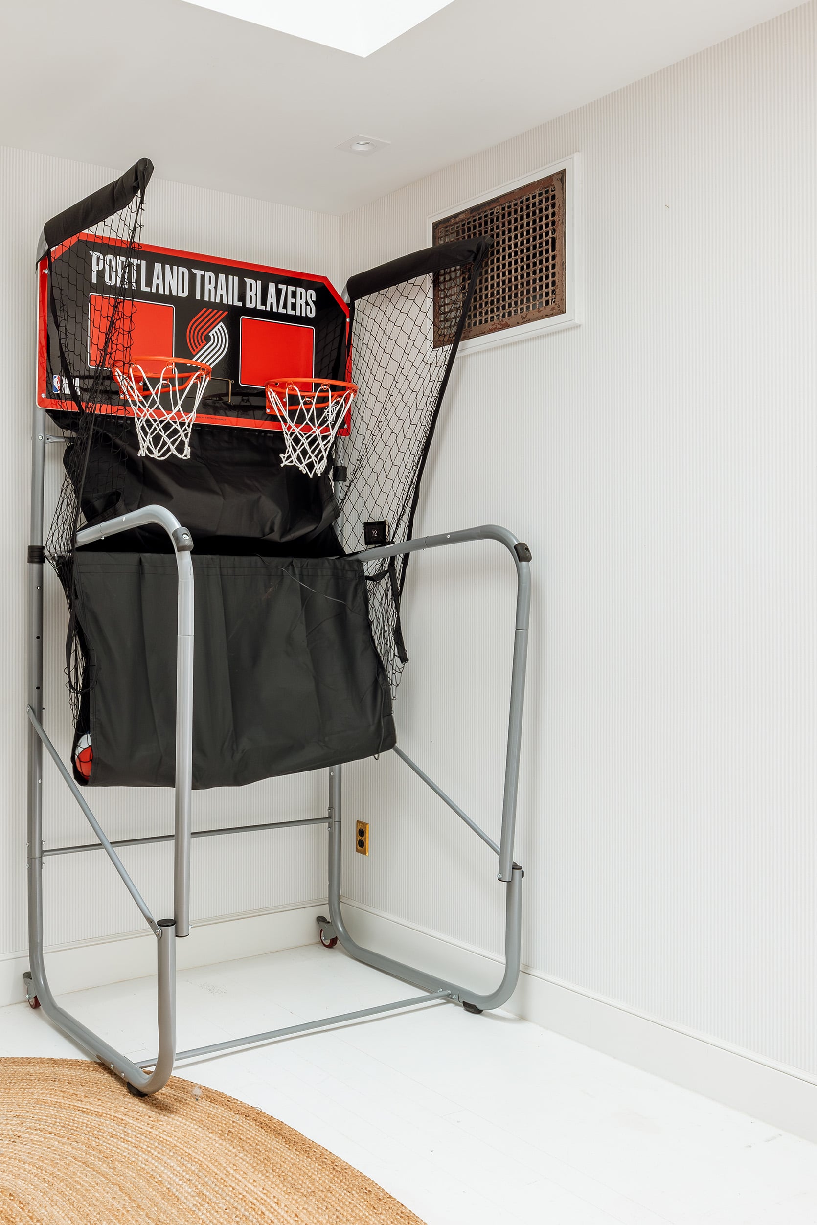
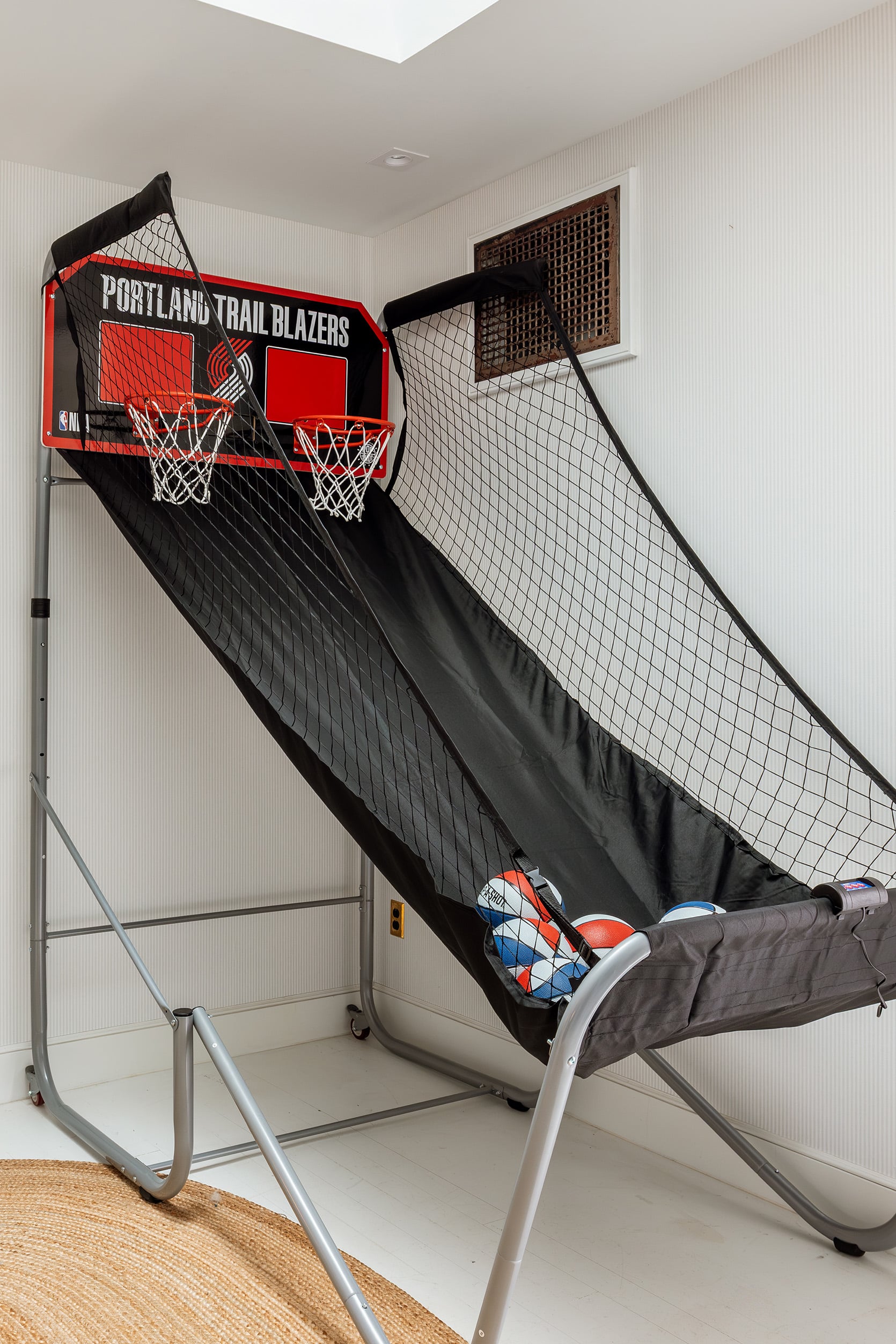
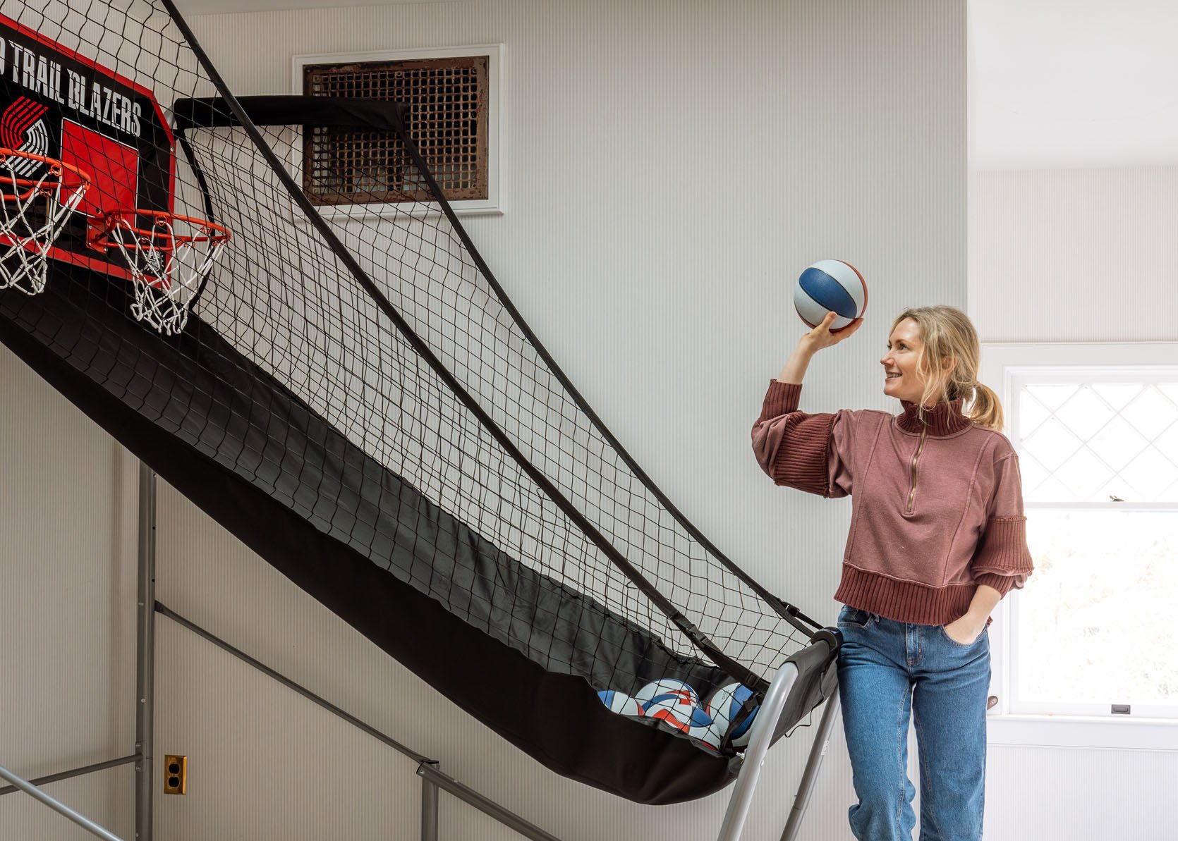
See? You can barely see the wallpaper (whoops, that was not the best choice, although it was really pretty in person). Also, I know, I know… I need to paint the vintage metal register. ARCIFORM was like “keep it original!” and at the time I totally agreed, but I wish it were brass or something prettier (or white so it would just disappear more). Because you know, I hate that it’s distracting from my beautiful Pop-a-Shot…or maybe the black ties it in and makes it cohesive (LOL).
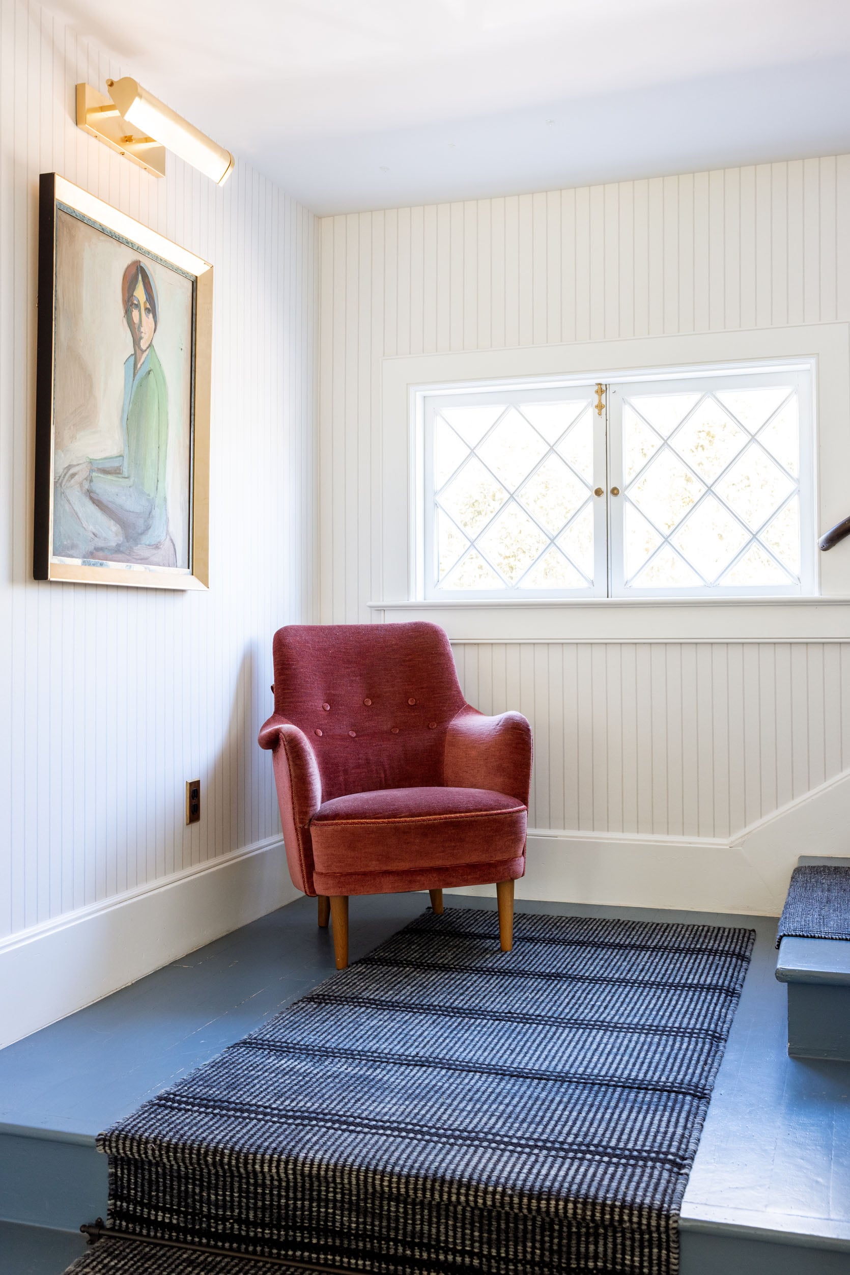
New Wallpaper:
It’s subtle, and yet this stripe has so much more impact. I LOVE IT.
Painting Swap!!
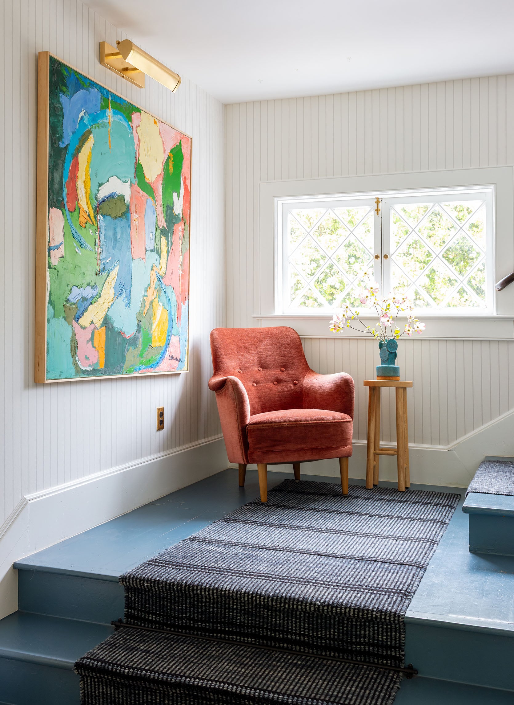
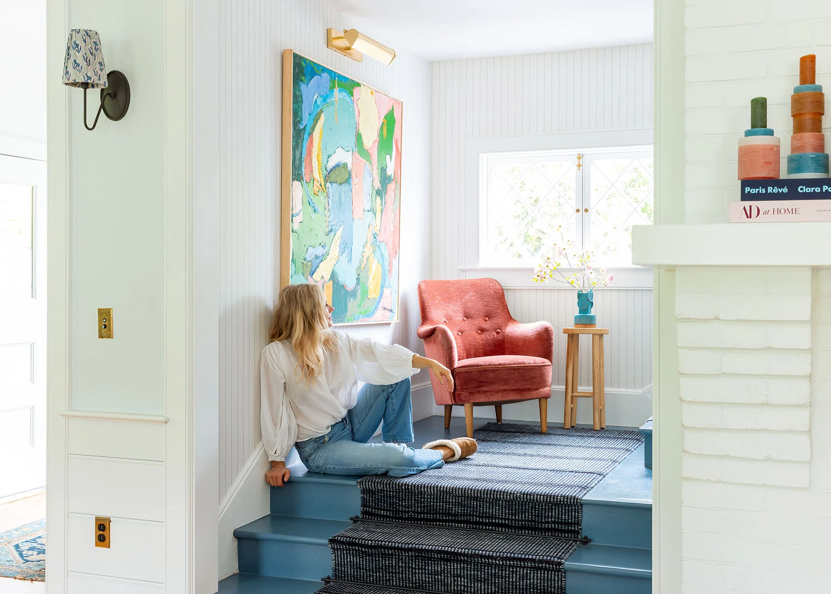
Birdie (my 10-year-old daughter) is changing her room, as you know, and no longer wanted that epic colorful painting (not in a bratty way, just in a “it’s not going to go” kinda way). FINE BY ME!! I’m obsessed with that painting, which is vintage and purchased from a local dealer, Deb Zsori (@fabiusgrange), painted by an 80s Portland artist.
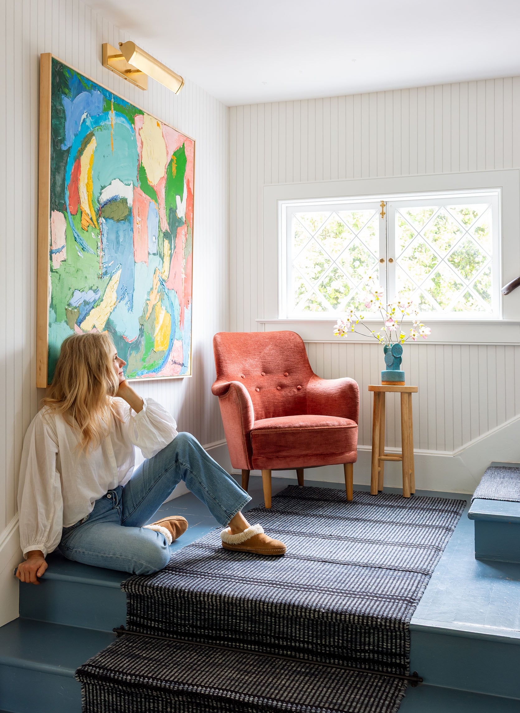
I’m rather obsessed with it here…with that chair (vintage) and that Bzippy vase. The scale of the art is huge, but perfect, and the way that the light hits it (which is soft) brings out the colors, whereas a lot of pieces we put there felt flat there. Of course, it makes me want to add a lot more color in the living room. Challenge accepted:)
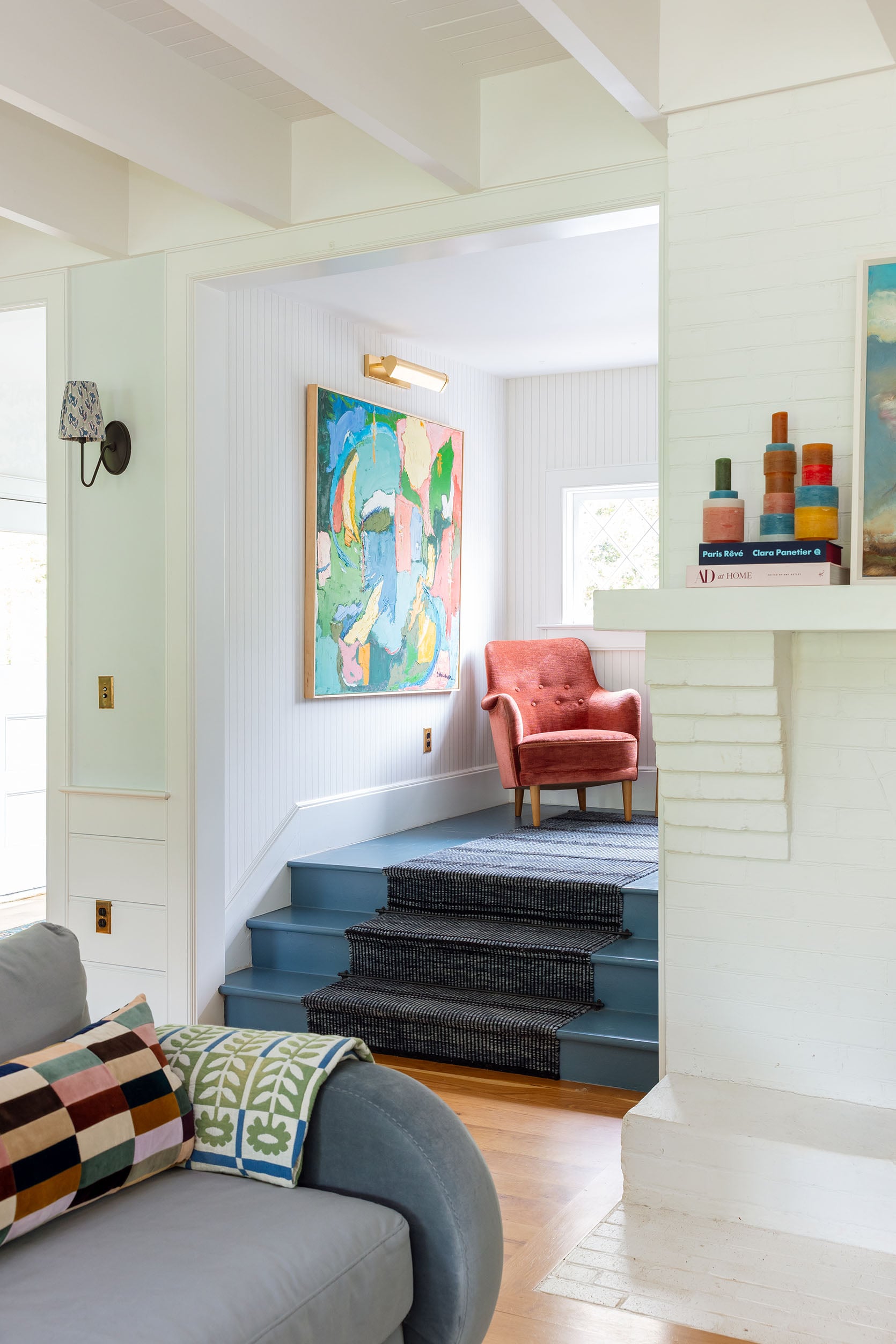
Wall Color | White Paint Color | Sofa | Pillow | Colorful Candles
God, I’m just such a stylist at heart!! Sometimes I want neutrals with hits of greens and blacks, but that’s it, and other times give me allllll the color and whimsy. I did start layering in a few more colorful pieces in here, which I’ll show you next week (some are working, some are NOT).
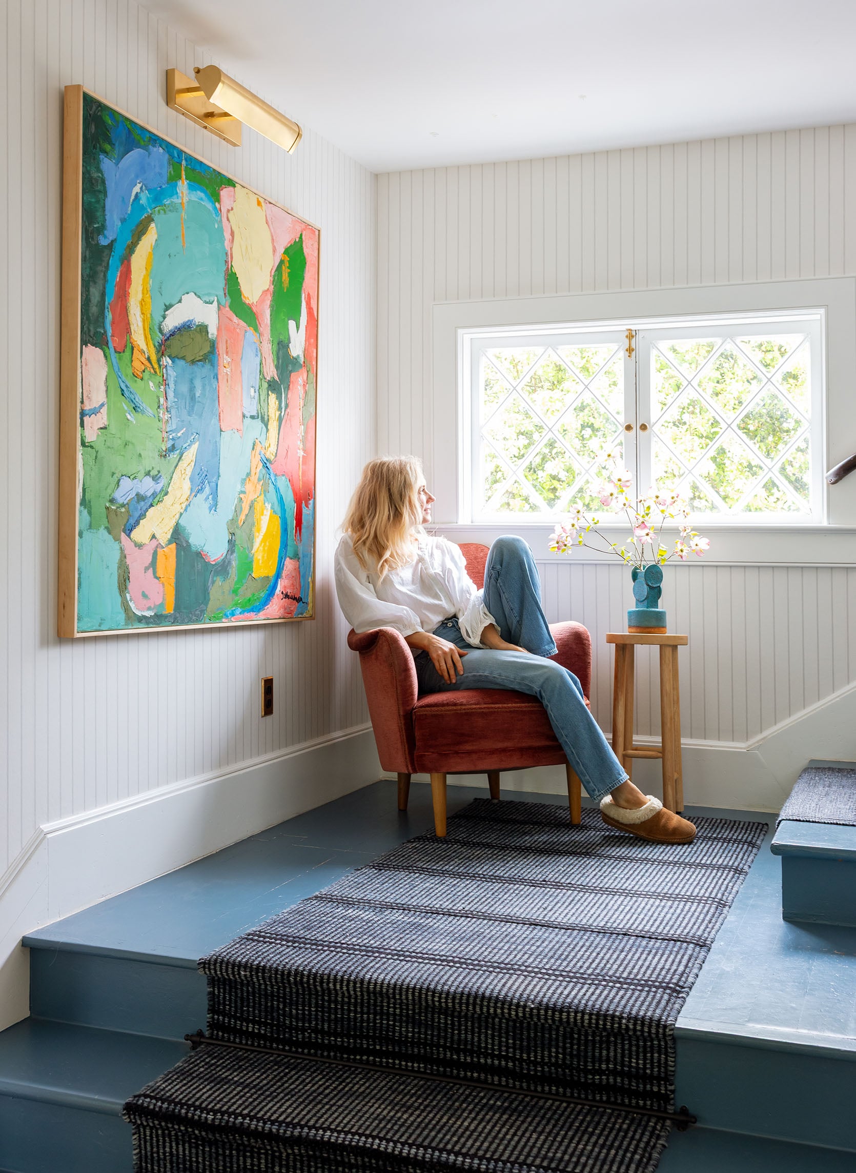
Another box checked. That busted and ripped up wallpaper was driving me nuts, and this new paper (by Schumacher) is so perfect. And with the epic painting? I’m so happy with how this looks, every single time I walk past it. Now, onto painting the upper landing floor (the same blue as the floor, then with a fun border? Stay tuned…
*Photos by Kaitlin Green


YES! That large scale painting is perfection and such a great jumping off point for accessories. I’m OBSESSED. I love how you keep experimenting and use your house as a styling playground. That is so inspiring to all of us – regardless of budget, we all can think about how to move things around that we already have to bring new energy to a space. Wow, what a great way to start the week!
This is such an uplifting comment! And true. What a great way to start the week 🙂
ah thank you. thats so so so nice to hear. It really is my favorite thing to do and i’m constantly surprised by my relationship between my mood and color. Probably the most relatable way to think about it is like fashion – sometimes I want to be comfortable, casual and blend in, and other times I want to totally stand out. Lots of psychology around both those things that is fun to explore. xx
And I love, love, love how the bold, jagged, “modern”-coded painting fights with the sweetness of the sconce shade fabric.
(And by “fights” I mean only good things—like, PLAY fights . . . a tickle fight, or a slap-fight at worst; no real punches are thrown, verve is added, expectations are gently dinged, yadda.)
Love the new wallpaper! And the color of the chair is gorgeous, with the little table/natural materials it makes a good vignette.
Any chance for less data-and-movement ads? I have to wait and let the colorful circle whirl almost EVERY time I try to scroll. Makes a long and tedious process out of reading…
LOVE the vignette on the landing with the painting, chair and vase. So lively and it really pulls your eye in. Really, really great.
LOVE the vignette on the landing with the painting, chair and vase. So lively and it really pulls your eye in. Really, really great.
thank you 🙂
10/10 on the landing. No notes. 😉
ha. thank you 🙂
Pretty, pretty! I’d love a post on hanging photos and art up a staircase, when you’ve taken the plunge.
You know, i just need to go for it. I have a few more that I want to frame but I could definitely start and just add to it. I keep thinking I need to get the art dialed in that will be on the high back wall (too far away to put photos, they’d be too small – needs to be something easy to understand while walking down the stairs) but maybe i’ll go for the family photos and then just add that later when I find the right piece (its a whole thing -ladder or scaffolding and I feel like once its up its not coming down).
I am wondering with the big piece at the bottom and a wall full of photos if you will feel like you need/want art on the high wall. Maybe it makes sense to do photos first and then see what you want to add.
Perhaps breathing room will feel good. Or if you do want something maybe it won’t be art but something more 3d or sculptural? I am picturing some vintage wooden piece like a big flat basket or antique sled or I don’t know exactly – something other than a painting.
Love the wallpaper and the colorful painting!
The art is GORGEOUS and goes perfectly in that spot. This style is what drew me to you so many years ago.
Ah thank you 😉 It did seem like such a shame it was in Elliots room where few people (over the age of 10) actually saw it.
Me too!! It’s been fun to see Emily’s style evolve over the years, but this OG vibe is what pulled me in all those years ago. The colors and the playfulness are just such a treat and get my own creative juices flowing.
I love a simple stripe, so you won’t hear any naysaying from me! The stair landing vignette is absolutely wonderful <3
thank you!!
IT LOOKS SO GOOD. No notes.
I think you almost have to leave the vent cover as is. Isn’t it the only original thing from the old farmhouse that has not been replaced or painted? I could be wrong.
Well, all the second story windows are original, the front door, the brick fireplace, the wood stair railing. There wasn’t that much ‘original’ to 1910 when we bought it, it had been redone over multiple decades. xx
This vignette has a happy energy to it. I love it!
It really does! so happy. xx
The wallpaper looks better. I find the chair funny. I don’t think it would be a nice place to sit. I think a larger round table in the corner with a nice houseplant would look best.
you are probably right 🙂 we ran out of time on our shoot day but we were going to style it a few different ways (with the demilune table). Its not a place I sit, but it sure makes me happy 🙂
I always wished I had a big landing like this to make a built-in bench with cubbies for books underneath.
The new landing is so cozy and pretty! I LOVE that painting! Do you happen to know the name of the artist??
Yes I too love the large scale painting and new wall paper. Question for you – With the dogs and kids, how is the stair runner holding up? Is it easy to vacuum? Why not just use the bare/painted stair?
I love this! It’s very inspiring. It looks happy and modern and just pretty. Thank you!
I can be such a naysayer about subtle wallpaper, but this new stripe has converted me! It just looks so incredibly pretty with the runner, and the artwork (gah!) and it has so much better visual impact when you’re sitting in the living room and looking at the landing. I can’t wait for you to paint the upstairs landing floor because it’s going to look amazing. Also, I’m with you, order the new vent cover in brass. It’ll look so delightful.
It looks awesome, the painting is perfect there. The only question I have is the sun fading the upholstered orange chair. I too have a sunny window with a red upholstered chain and the sun has really faded the fabric. Do you treat the fabric with an anti fading product?
The photos where you gaze dreamily at the new décor, paint colour, or piece of furniture, like your life is finally complete, always make me chuckle a little…!
Not sure this will get seen, but would love to know the paint color of the laundry room and upstairs bedroom doors, that blue is divine. And, the wallpaper looks great!
It’s Sherwin Williams SW 6239 Upward, their Color of the Year for 2024.
Pretty sure it is SW upwards. I’ve used it before and agree that it is divine.
I love this wallpaper, it’s subtle, but a statement. Did you hire someone to hang it? I have a floor-to-roof entryway wall(s) in my foyer. I think this would be perfect, and I am not sure this is something I could tackle . . . how do I get up to the roof height?
At first I was like, that are is too big, but then the whimsy took hold, and why not? Your space is for experimenting and I love the change ups. I read that people who change their houses around have better brain elasticity and it makes sense, change is good for the brain and soul! Also that wallpaper is scads better and love the subtle stripe, perfection!
Can you tell me the brand of the light fixture you used over your large painting on the landing.And the size of the photo lighting?
That and the picture light over the mirror in the primary bedroom were both from Rejuvenation but the style was discontinued shortly after installation.
Can you tell me the brand and size of the light fixture you used over your large painting on the landing?
LOVE this! It’s such an upgrade in so many ways. But what I love the most? It’s joyful and light and bright instead of dark and “romantic” or “moody.” Because we don’t all have to follow the same trends. And dark and dreary (errr dramatic) doesn’t go with every house.