Design
Em’s Primary Bedroom Update – New Bed Alert!
One of the least popular rooms I’ve ever finished/published was the first iteration of my primary bedroom, and I get it – I wasn’t fully happy with it either. It was more “put together” than “designed” per se, and when you have so many rooms to finish at the same time, some get neglected, which is fine. I always resist “yucking my own yum” because, honestly, having a bedroom like this in any form is so wonderful that missing a few design marks just feels petty to point out to you all.
As a reminder…
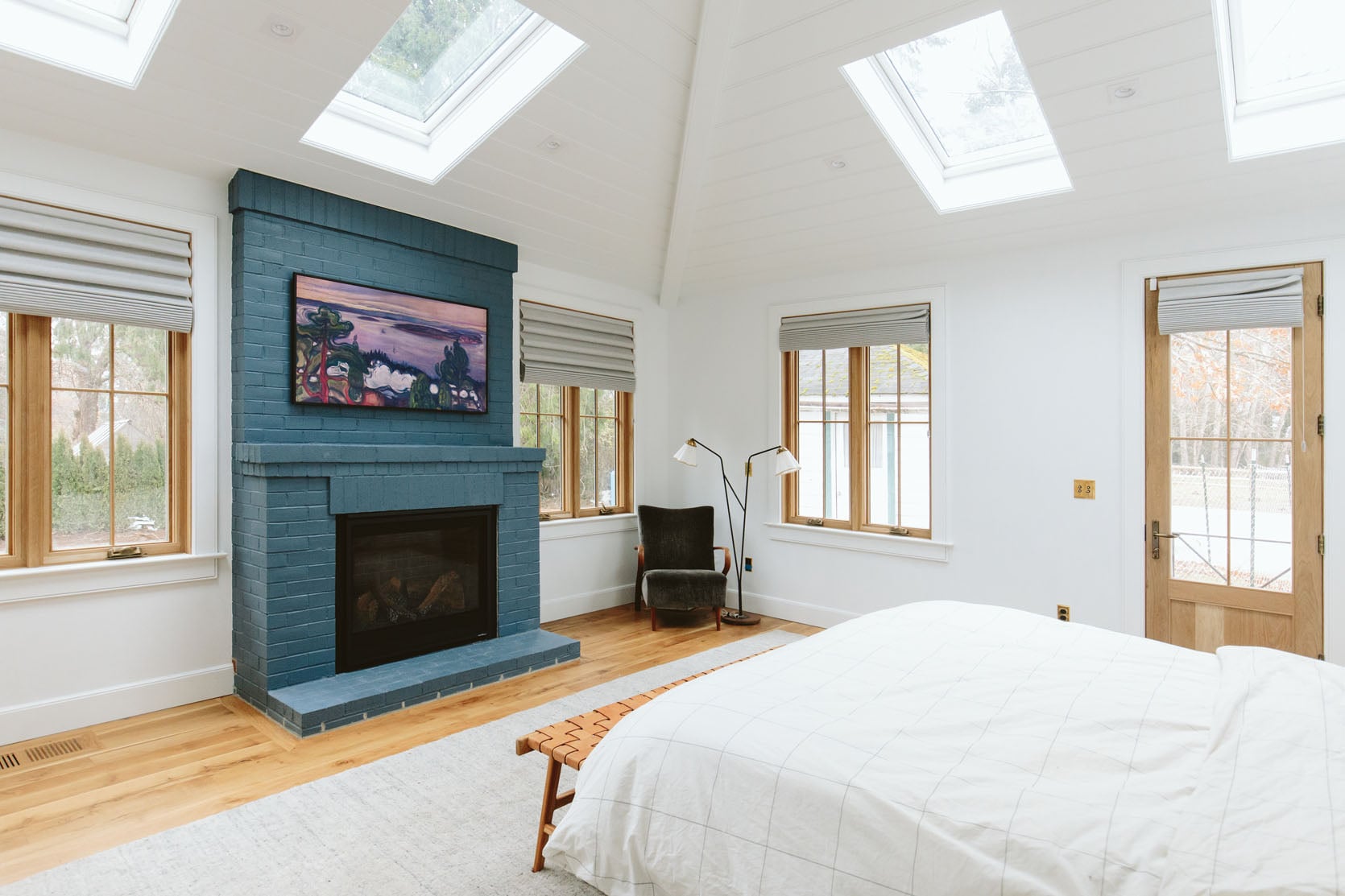
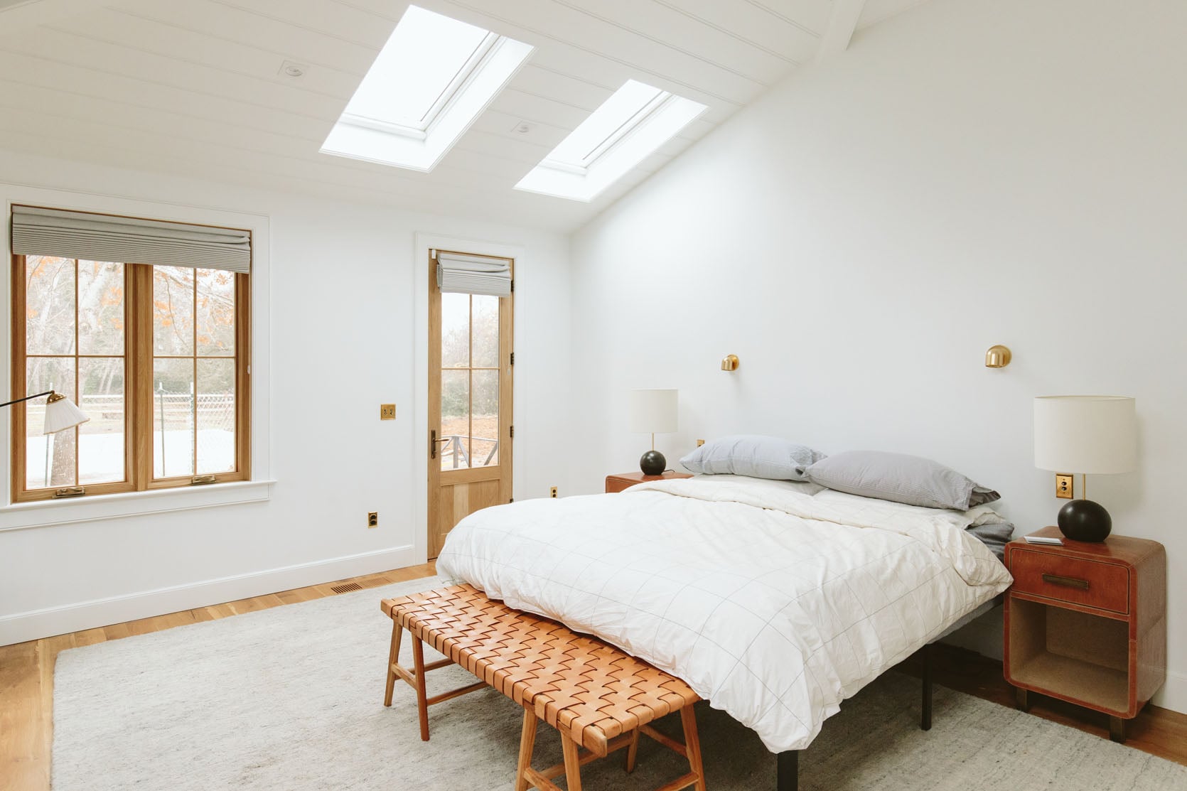
We started with a white box when we moved in. Now I like a bright white airy room (despite its current unpopularity), but admittedly, this felt like a missed opportunity. So, as the big reveal shoot of our house was impending, I made some quick decisions to see how I could create a cozy but still really simple and minimal bedroom.
What Were The Things I Didn’t Like?
I painted the room Debonaire, which is so pretty, and yet when the room is super bright in the summer, and during the day, it can be too bright for me. Brian loves it, and no one else really has a negative thing to say about it, but in the name of transparency, if I could snap my fingers, I would paint it Eventide, which is a much softer powder blue. In the morning and at night, Debonaire is just so cozy and pretty, and repainting it is so expensive and annoying (so much trim and ceiling). My first quote was $6k and would take 3 days, which I thought was a lot of time, but maybe it’s not. Regardless, I’m not motivated to do it because I like it; I just don’t love it. But this is where I had to learn the lesson (again) that I don’t like when I paint rooms with a ton of natural light, dark (you can paint light rooms light or medium but the contrast between the darkness and the bright sun picks up the pigment in the paint that can make it feel intense for me, rather than moody and cozy). Similarly, I’d suggest painting dark rooms medium or dark (not light). ANYWAY, it only barely bothers me in this situation since it’s not a dark color (it’s a medium tone) and the cost and disruption to our lives doesn’t feel worth it for a slight upgrade.
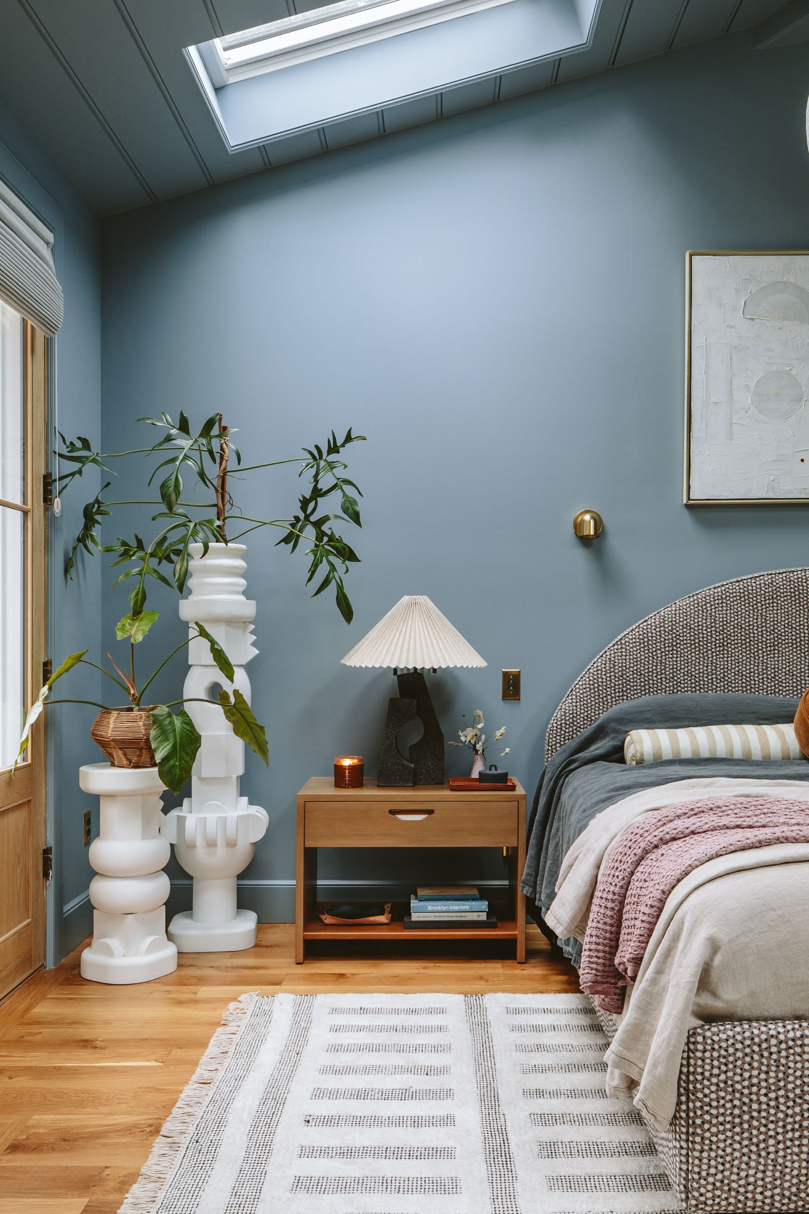
Wrong Bed
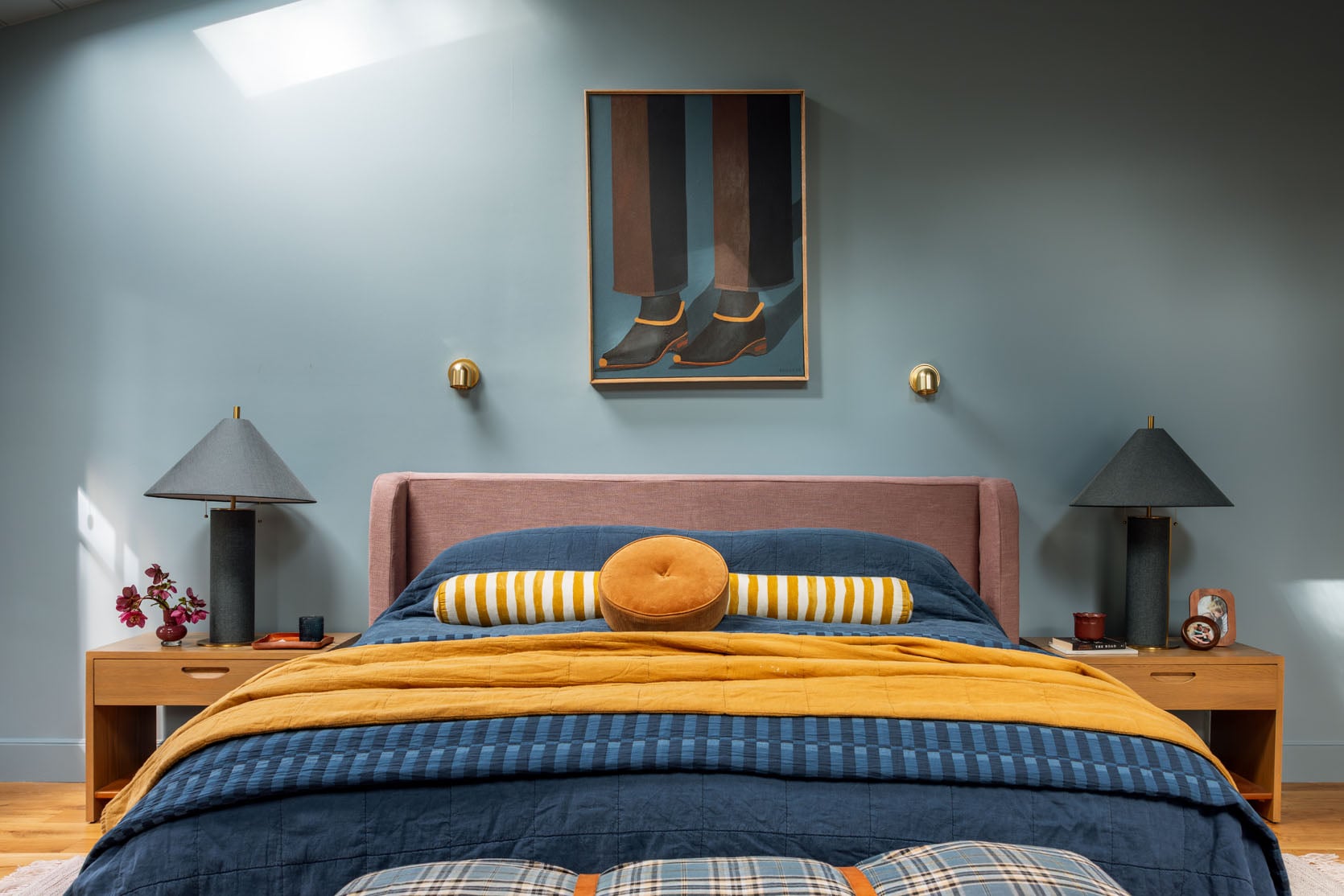
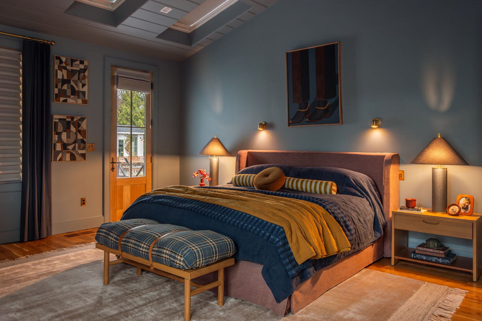
This bed was always designed for our guest room (which doesn’t 100% work there either, hilariously), but the week before the shoot, when my Jake Arnold for Crate & Barrel bed didn’t arrive (that’s the really pretty caramel velvet with a wood curved top, but apparently no longer available), we had this room assembled in here instead. And I liked it, but just didn’t love it. I really liked the scale and the shape, but the small print got lost in such a big room, and it was meant to go in the rosy room, where it would just be a quiet texture.
Leftover Rug
I can’t quit this rug because it’s the plushiest, softest, and most stain-hiding rug ever. While I’m not that motivated to do another rug line (mostly because of time/bandwidth), if someone could guarantee me that I could just make this rug in many different colors, I would do it as a public service to the world. I can’t even link it up. But it’s not my favorite color – a light gray with blue flecks in it, and it can just read a little sad in here.
Rug Change
When my rug line came out, I shot and left this Merrick rug in here, which I really loved, but it was pretty white in a room that was meant to be more tonal/soft. There was just a lot of contrast. Plus, I’ve said it before, I don’t recommend putting white rugs on your first floor, with the most foot traffic, in Oregon (better for second-floor bedrooms). It held up far better than I thought it would (we are mostly shoes off), but I used this partnership with Anthropologie to choose this super pretty taupey-pink rug.
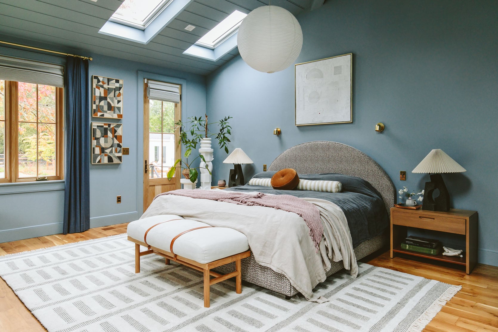
Overhead “Light” Fixture
I think Brian and I intentionally chose not to have a hanging pendant or chandelier because we didn’t want the distraction on the ceiling (something we loved in our mountain house bedroom). If I could go back in time, I would get rid of the cans (that we almost never use) and put in a J-box for a ceiling fixture. I still don’t love a chandelier in a bedroom over a bed (feels a bit fancy for me, but I have no idea why), but I liked the big Japanese lantern for its low-key simplicity. Of course, it was just a sculpture, a shape, and wasn’t wired.
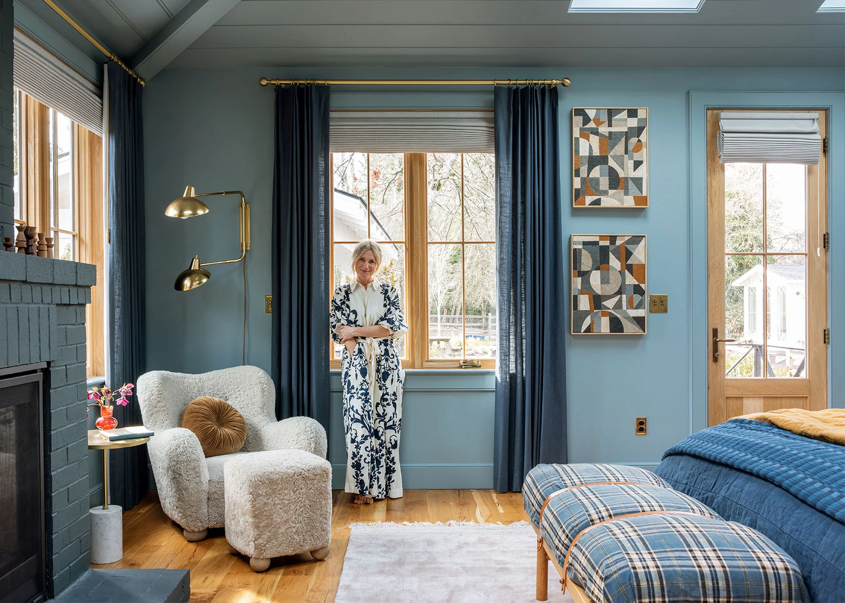
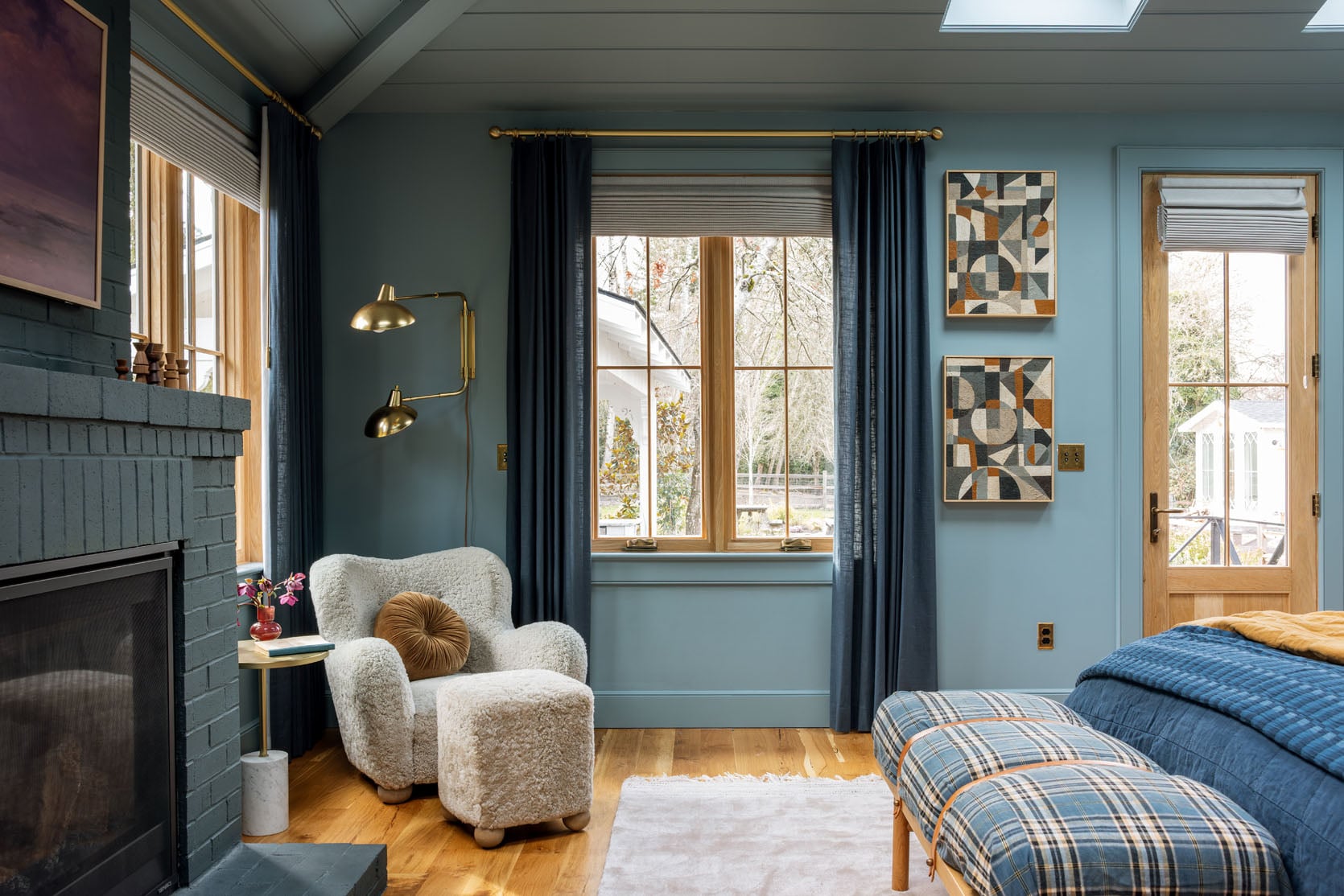
I really loved the curtains, the cozy ottoman chair (which I love against the blue paint color in that darker corner), the hits of brass, the fireplace, the huge mirror, and the paintings. It was a good room, just not great. And I still don’t know if it’s there yet, but I like it so much better!!!
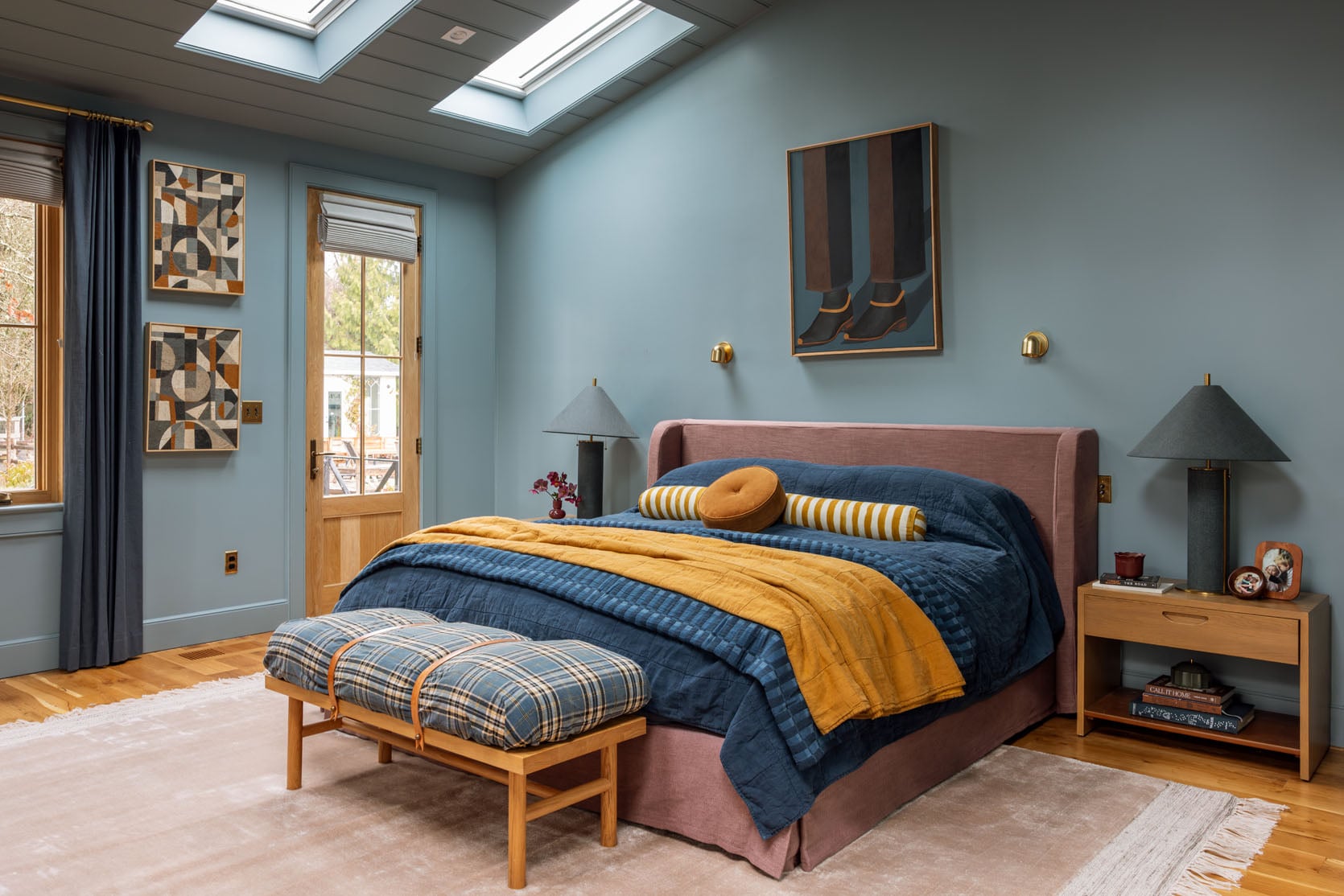
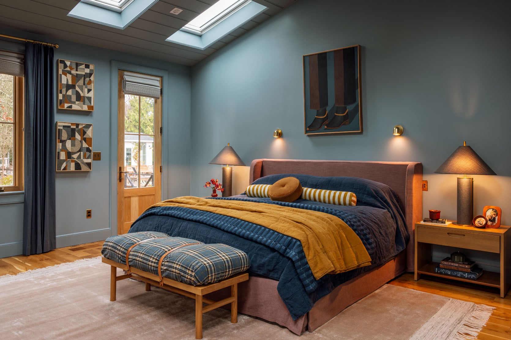
Art Above Bed | Bed | Solid Quilts | Broken Stripe Blanket | Bloster Pillow | Disc Pillow | Table Lamps | Nightstands (no longer available) | Bench | Bench Fabric (vintage) | Rug
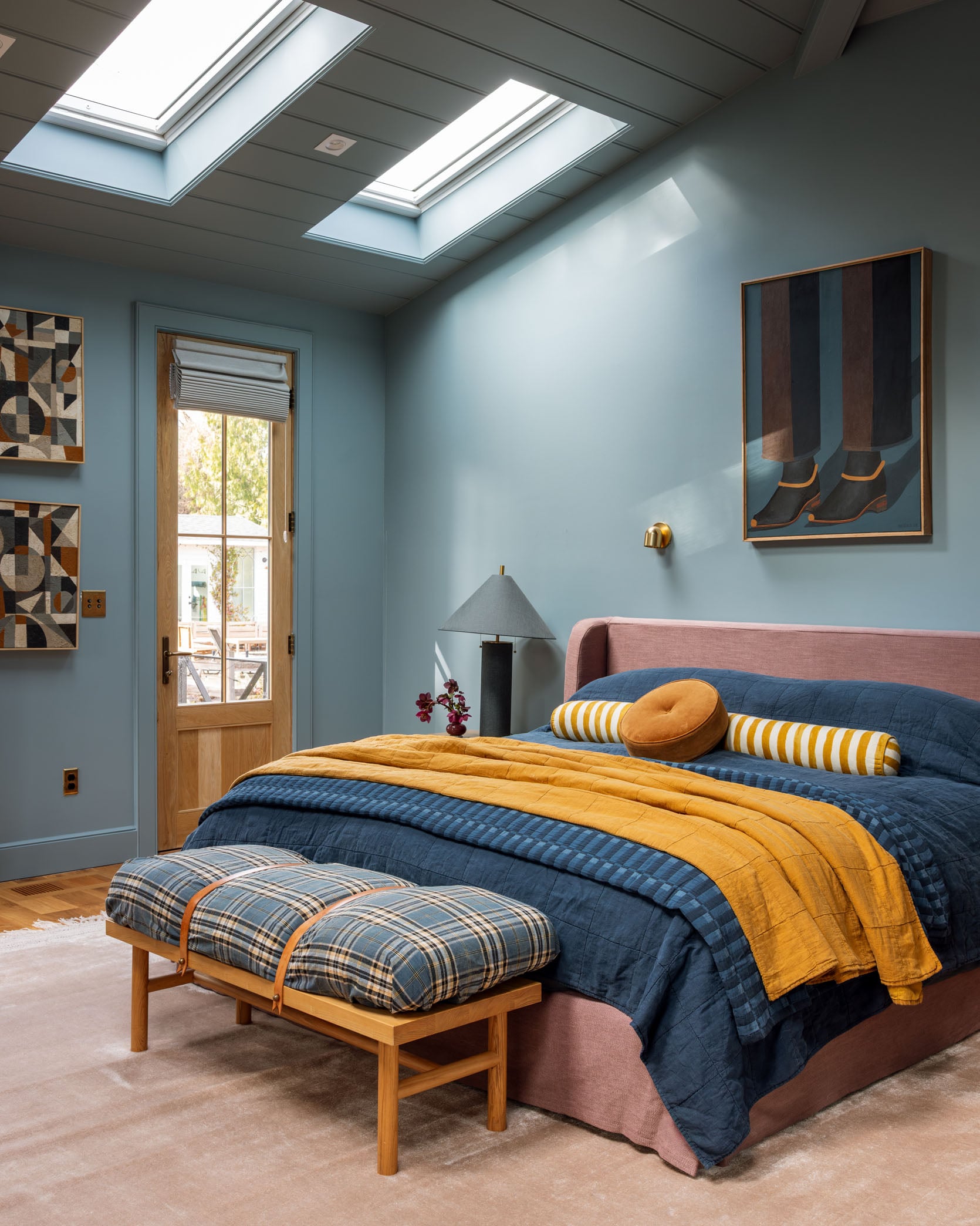
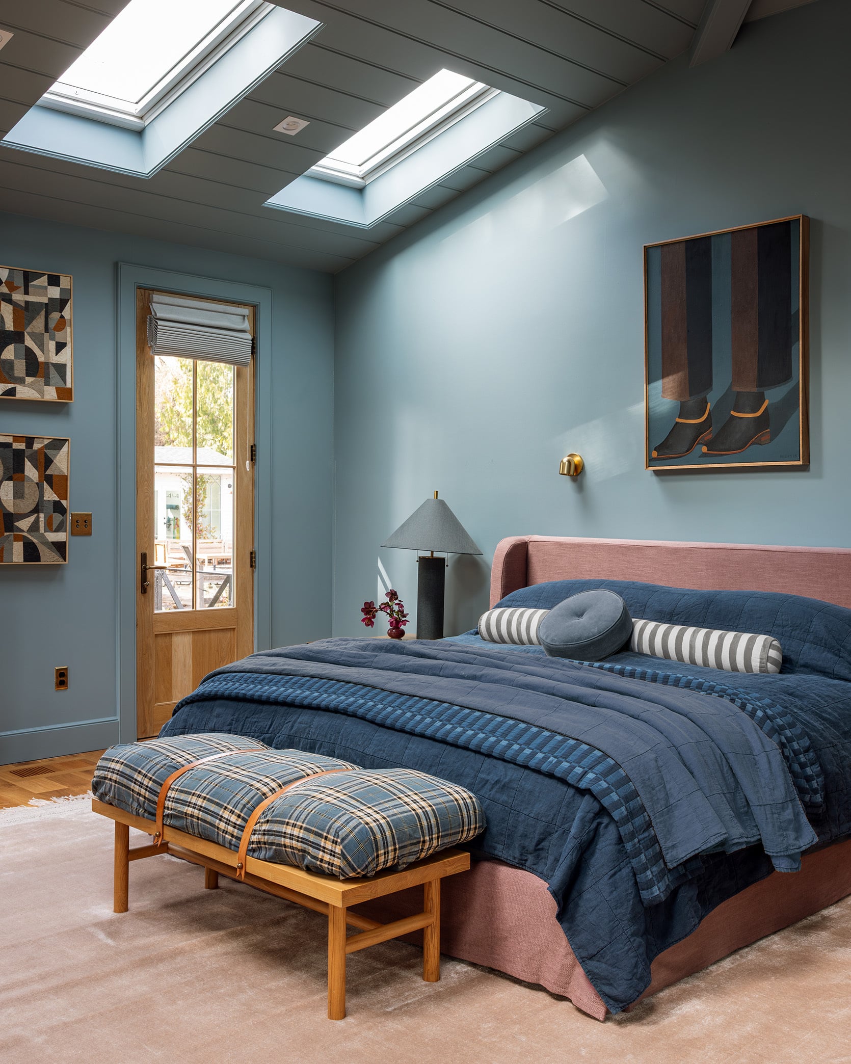
After going round and round about what bed to get, I landed on this pretty rose linen slipcover bed, in a super classic shape. I cancelled the Crate bed because it wasn’t going to arrive for a while, and I wanted to live with the other one for a bit. I had a partnership with Anthropologie and figured it was a good opportunity to see if I could make this room better (this post isn’t sponsored by them, just some social was). So I ordered the bed and rug, and they both came so fast, with full white glove service. I really, really love it in here.
Now I’m trying to figure out why I love this shot so much. There is a soft coziness about it that I love. Oh, I put one of my plaid boro fabrics on my Katy Skelton bench (just folded it over and secured it with the leather straps), and I love how it looks in here (and brings in that bit of farmhouse that feels good).
As I’m staring at this shot, I’m wondering now if the mustard is just way too intense. We actually don’t live with it on our bed, but when I was styling/shooting, I thought it needed to be punched up.
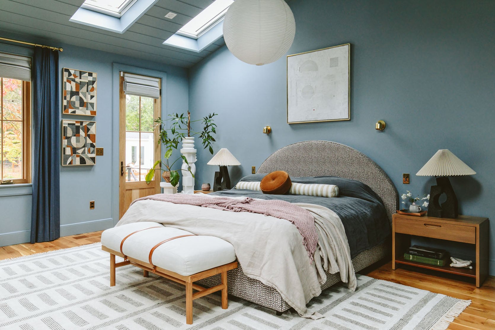
I wish we had just taken a photo without the yellow pieces to see, but here is a tonal edited version to see the difference.
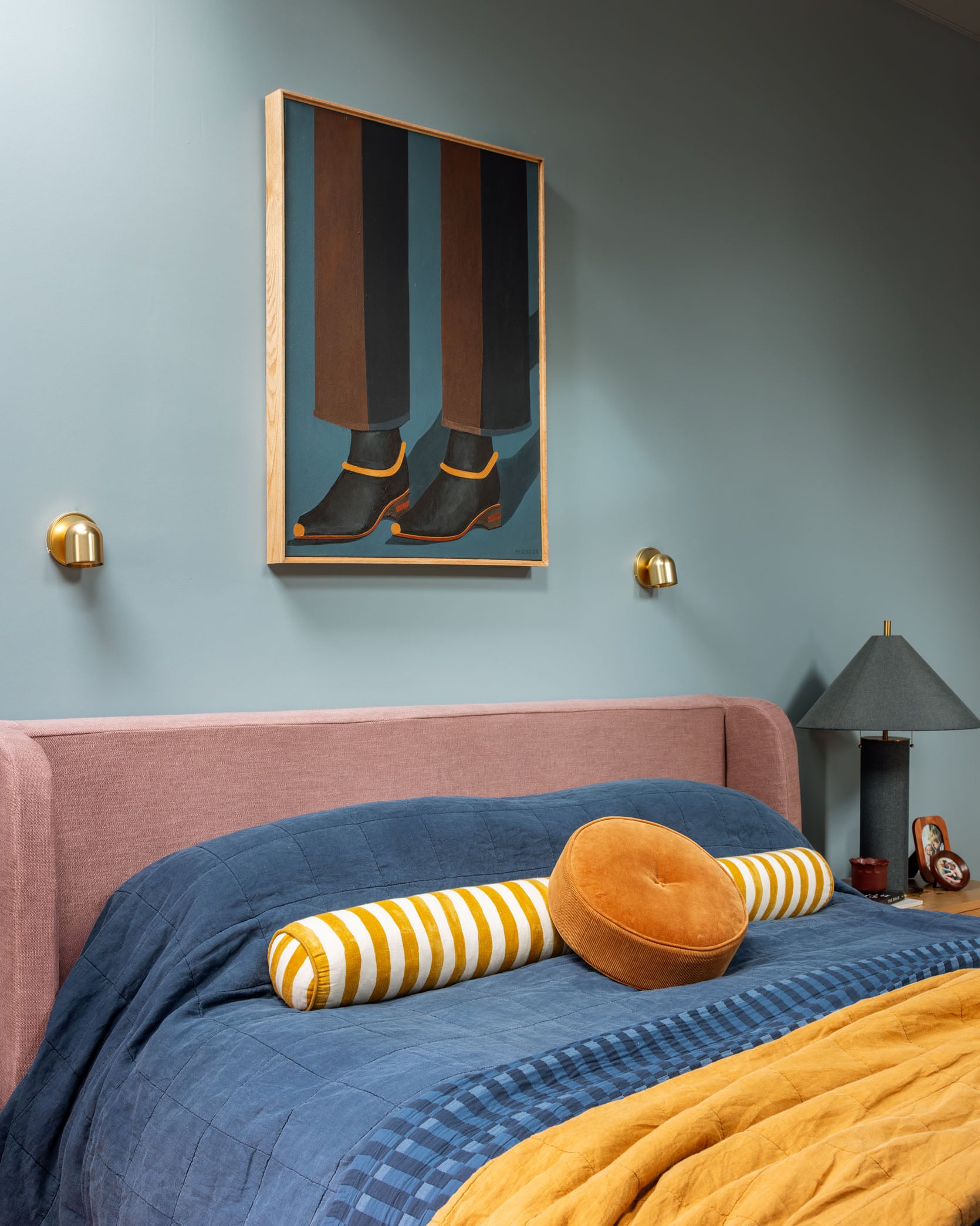
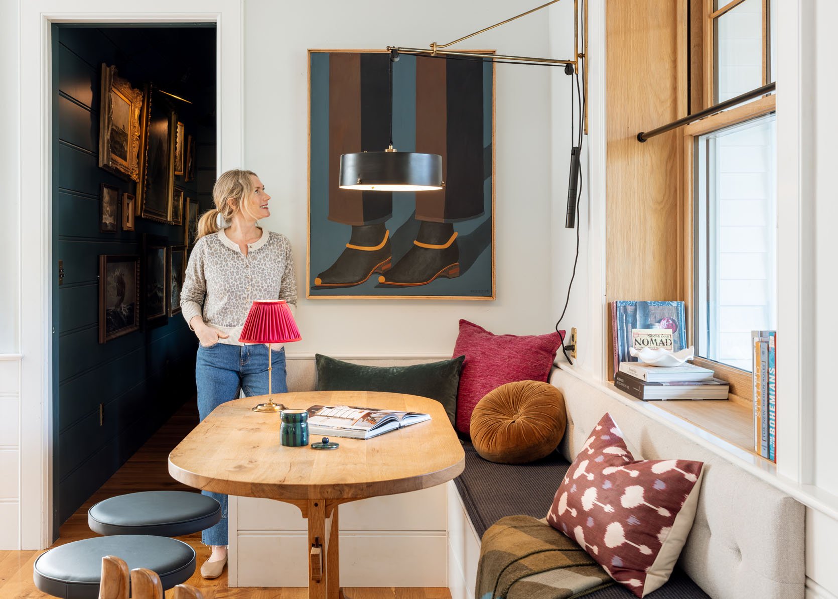
I was so excited to find a spot for my new favorite painting by Brooks Burns that works so well in here, color-wise. Some of you might be concerned about the idea that I’m sleeping underneath feet or shoes, and maybe you are right, but it’s here for now, and I’m loving it (and I loved that white painting, but it was rather stark and looks better in the pink guest room right now). I should give that painting to my new website designer, actually – the color palette makes me incredibly happy.
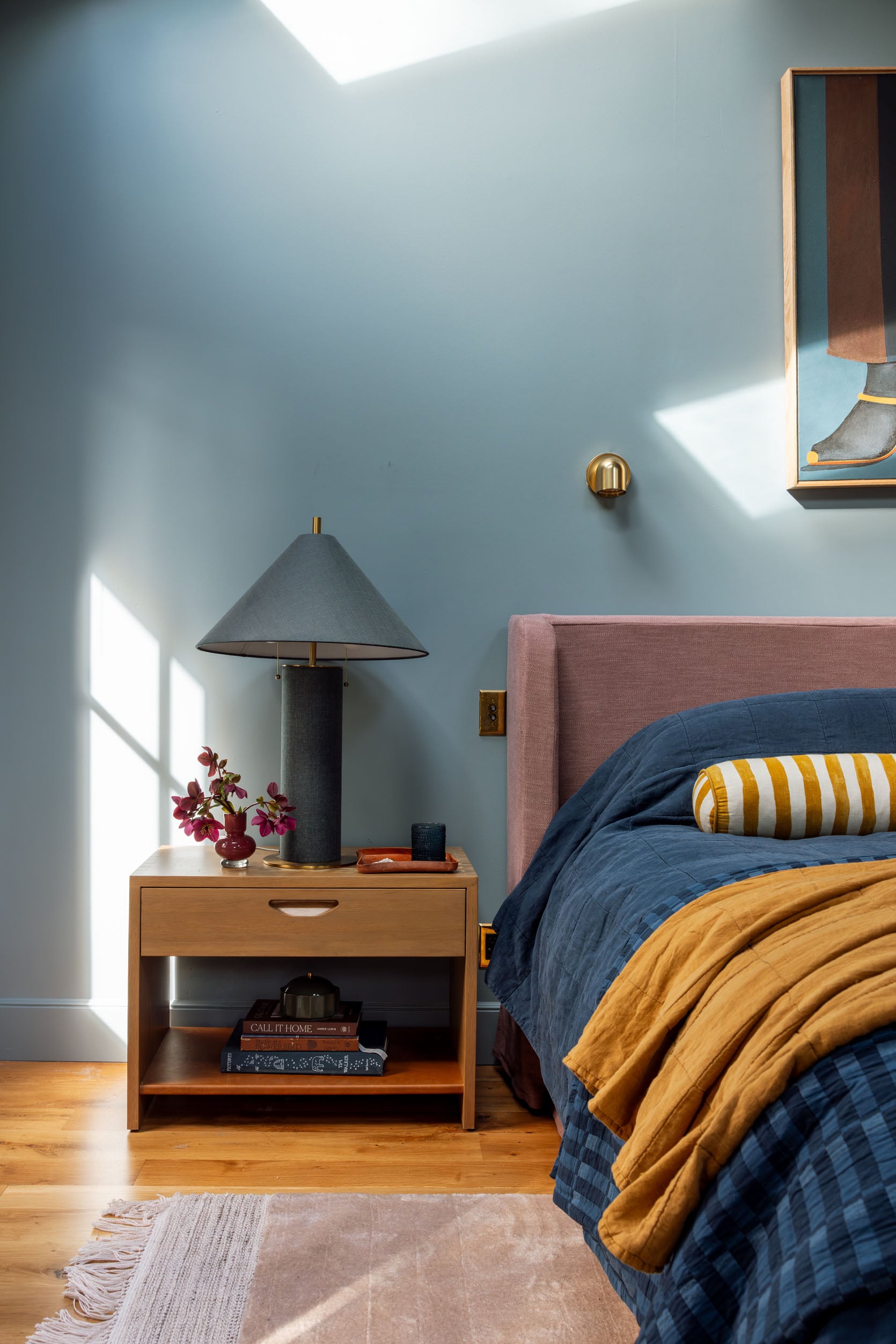
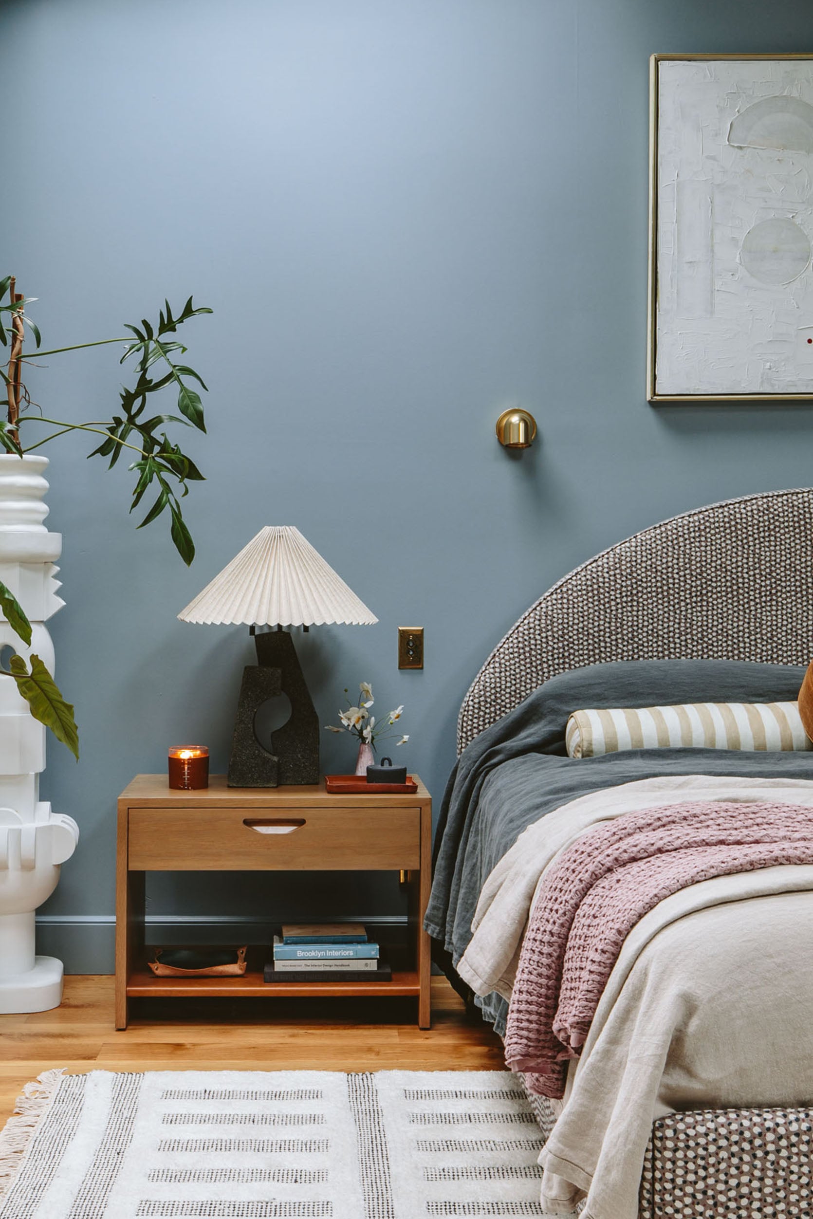
I liked the lamps before, but I LOVE these lamps in here more. They weren’t working in our TV room as the height of bulb is right at our eye level when we sat on the sofa, so we always turned them off. But they are so pretty, so I put them in here and love the color, scale, and shape (and we read from Kindles, so it’s less annoying in here). This is why drum shades are functionally better than the tapered shade – it blocks more of the direct bulb light and creates more of an even ambient light (less directionally downward). I put our old lamps in our family room for now (they are slightly lower/better) and added this IKEA lamp for TV watching. And I still like these nightstands (they are the perfect scale), but I do wish they were slightly richer/darker. Not changing them anytime soon 🙂
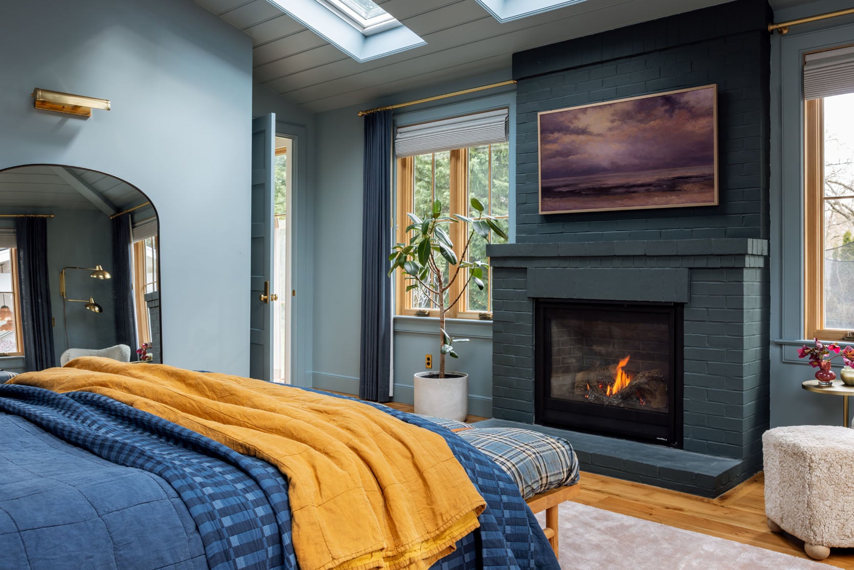
I always love the view of the other side of the room. The fireplace is so cozy. Our heater in our room has been broken for a few weeks, so I’ve been using this fireplace for an hour or so a day to keep the room warm, and it’s just wonderful.
Let’s Get Cozy
The room really is so cozy and gets better as the day goes on (which is hilarious to write, it’s a better “nighttime” room than a “daytime” room, but maybe that’s good since it’s mostly enjoyed at night?). We rarely shoot with lamps on, but I wanted to show you how the room changes as the light changes.

It’s a real retreat at night, and I LOVE getting into bed (a huge reason is also because of my new mattress, BTW, that I LOVE. It’s the Sapira Hybrid Chill, and I got the “plush,” but the “medium firm” is also really soft and cozy. If you like hard mattresses, I’m not your gal, but if you want something soft on top and supportive underneath, it truly is my favorite ever.
Here are some fun sliders!!


So what do you think??? Do you like the versions we had before better? Or the moodier and cozier new version? I’m team cozy all the way. If I could snap my fingers, I’d love to see the room with a taupe ceiling (but not on the trim) with the current blue or color drenching in Eventide (a softer, lighter blue).
*Photos by Kaitlin Green


The evolution of this room has been so interesting as a reader – it’s helpful to know that even someone as experienced and with such amazing taste can get things wrong, and then admitting to it is relatable and good content. I like the bed much better, and the lamps! That said, I don’t think this is nailed down yet either for me, but I think it’s in the styling rather than the main pieces. The mid tones of pink and blue are too similar in weight, and we need a bit of white or black to punch it up or down. When I look at the shots of the bed, in each one (before and after) the bed looks crowded up against the wall with lots of styled stuff around it, and then a big empty space on either side. It’s like a furniture grouping in a catalogue. It probably doesn’t come across that way in real life. The painting is beautiful and works so well against the blue paint, but it’s a bit small for the wall. Could it be the centrepoint of a gallery wall instead, spreading the visual interest up and across the wall behind the… Read more »
ooh i love all of this. i think the nightstands are close to the bed because of the doors but in person you are right, it doesn’t feel that way at all. Its a big room which maybe is the problem. like I don’t want to fill the space with stuff, but I also don’t want it to be empty. in person the art is big enough over the bed (the wall is just massive). I agree that I wish the pink bed was deeper, more aubergine but I still love it enough. maybe its a bedding tweak! I didn’t really buy anything for this and its less of a reveal than an update. its definitely better but agreed its not there yet (but I really love being in it and sleeping in it so its hard to keep investing in the tweaks!!). thanks for your thoughtful comment 🙂
I disagree about the painting–I think it looks great, and would be diminished in a gallery wall.
I agree with the previous commenter that it’s a relief to see you tweak a room that doesn’t quite work. I feel the same about my living room, which drives me nuts! I’ve used an online designer (Havenly) about 3 times with no luck, so I’m glad I’m not just a moron.
That said, I agree the room is way better! When using the sliders, the light blanket on the end of the bed as well as the carpet and plant stands looked so stark. I like the moodier colors (and typically do not gravitate towards them). What jumps out at me most is the wall behind the bed. It seems so big and empty, though I’m not sure what you could do to fix that. (I LOVE those sconces btw. Tried to buy them recently, sold out, bummer!)
I agree that a different color for the nightstand would sing.
Some rooms are just tough!!
yah maybe richer, deeper nighstands? the scale of the wall is big (i mean those lamps are like 28″ tall if that gives you an idea). Some rooms are just so much easier than others but bedrooms are typically easy!! Living rooms are so much harder (so many more functional needs, flow needs, comfort needs/storage, etc). So give yourself some grace 🙂
If we are discussing nightstand options, I wanted to throw out an idea: round white marble ones, bistro table height. It would add some contrast and lift the new gorgeous lamps even higher, filling that wall space even more and providing some contrast to the painting. Congratulations on this new iteration, much more layered than the previous one.
fun tweaks post! did you ever try orienting the bed along the other wall, so it faces the windows? I know that sounds weird. something that doesn’t quite work for me is the angled wall behind the headboard. the balance looks a bit off, with the ceiling line angling up but the headboard, lamps, sconces going horizontal.
you probably already tried that! I agree with the earlier comment too that the colors of the headboard and wall paint have the same value/intensity and some contrast would be nice. I actually prefer the pre-tweaked version, but it’s your room and I’m glad that you like it better! what a boring world if our houses all looked the same!
I’m just realizing that for people on the west coast it looks like I’m writing this at 4am. I live in Nova Scotia, Atlantic time, so my kids just got their bus and I’m sitting with my coffee 😀
that’s so interesting! that ceiling line is also slanted and the wall isn’t big enough but I like trying things 🙂 I agree though about the balance – something feels off.
I wish you could snap your fingers, because I would love to see both of those paint options! Love all the changes, love the old way too. I probably be team a mix of the old and new! The bench makes the room!
thank you!! I love the bench and there is so much space between the bed and the fireplace that i think its needed (but agree with Elle that the chair works so well).
Controversial opinion but I liked the white!
So bright and airy! But I think if you want to lean into coloured walls it would let look better with wallpaper rather than a mid toned painted wall as the room is so big.
I feel like bedrooms are actually super hard to get right. I’m redoing mine at the moment and there are hardly any on my Pinterest board that I love. It’s so hard to get the balance right while making a bedroom calm but not boring.
yah i never mind a white room, TBH (agreed its controversial as white isn’t that in right now!). I felt like the room is too big to wallpaper which is why I wanted a fabric wallcovering (just a texture) but I tried SO MANY and they all just looked oddly flat and sad. Maybe the room could handle a smaller print on the walls, but I also really love a calm bedroom and this one is honestly so soothing to be in at night or in the morning which is when it matters. Its weird to say that I like it least during the day, lol. I think I tried a bunch of kelly venturas which i loved, but worried they would be too much in that big of a room (especially with two very large walls. I think i tried house of hackney, too. maybe i’ll look back into it …
What about paneling on the bed wall? Painted Debonair it might give you some texture and interest 😊 I think just some tweaks to the bed styling & I preferred the bench as is; but also how fun to play around with what you have and see where you land. And take us along for the ride!
I definitely prefer the version with the new bed – it’s a better colour and a much better shape. I also prefer the darker bedding, although it’s fabulously autumnal comfort may not be right for spring and summer. Maybe blues-with-yellow accents for autumn/winter could be swapped for yellows-with-blue-accents for spring/summer. I also much prefer the new lamps, which I think are a much better colour for this room, and a better size. Although I think I would prefer if they were each closer to the bed, rather than centred on the bedside tables, where it must be difficult to reach the switch to turn them off when you’re in bed. And I’m glad you got rid of the sculptural plant stands, which are beautiful but just too visually complex for a restful space. I think an issue with this bedroom, for me, has always been the art. And also the sconces, but first the art. The two paintings between the window and the door, which are squashed off-centre because of the light-switch, drive me crazy. I think taking one of them away, and centering the other properly in that gap, will make a huge difference. Having said that, although I… Read more »
Agreed! Especially about all the artwork being wonky or wrongly sized. I also think the room needs a bed with more gravitas to ground it. It’s a large space, and things seem oddly undersized on the bed wall. I’ve always wanted to see a modern four-poster in this room in a warm wood, with the ceilings taken back to warm wood.
I think the architecture of this room makes it hard for it to feel cozy, which means that changes to the soft goods aren’t going to make much of a difference. It’s on the first floor and has many windows–and even a door directly to the outside–which make it feel exposed. The high ceilings contribute to this sense of exposure as well. I think if I were lying in that bed I’d feel like I was on display. I actually liked the white better because it de-emphasized the outdoors and made the space feel more interior. The blue draws your eye to the outside and makes it stand out more. Given that you can’t change the architecture of the room, it would be good to bring down the scale of the room and make it feel more protected. As Emily mentions, a big light fixture might be able to do this, but I really agree with you, Lynly, that a modern four-poster (modern canopy would probably be even better) would help bring the ceiling down. That way the people sleeping in the bed would feel like they were in a small, cozier space than a big, tall room that’s on… Read more »
LOVE all of the above!
I thought about a big four poster canopy bed, but I don’t love sleeping in them (feels oddly confining). I also hate that the art can’t be centered on that wall (although we rarely use the lightswitches. the colors work so well in here, but I certainly have other options I could try. I can’t just take out the sconces without figuring out how to cover up the J box underneath, or having an electrician remove them permanently (I think – i’ve actually never fully removed sconces before). I do wish I hadn’t added them – we use kindles at night so we don’t need them to read, but that would typically be the purpose of them. so many good ideas to think about though!
Thank you for your reply! If I could just gently suggest a reframing of your thinking: you’re not locked in to those sconces being there. Remove them, and have the wall patched and painted. A good drywaller can do it. My husband (not a drywaller) has figured out how to do it. That would then be your “snap your fingers” opportunity to repaint the room since you’re not loving the current color. Yes, it’s time and money. I have “squandered” my fair share in getting things right in my home, but it’s always been worth it to bite the bullet and move ahead. Anyway, my $0.02, worth exactly that.
yah I think rendering it out to see how it would look a lighter color would be good. and i totally get why you’d feel exposed in that big room, but I love the sense of space – i think its just a preference. the room was really inspired by our mountain house bedroom which is my favorite room ever to sleep in (you can see the layout is almost identical. Now that room had collar ties that brought the ceiling down (and had a wood ceiling) and it also had that wall that had the glass above it so it felt smaller, too. point is – in theory the sense of space was what we wanted and in practicality we still love it, but visually looking at it, its off balance somehow. Or hell, maybe it would just work better as a big white room with a huge piece of art above it!
Love the changes – MUCH cozier. What about doing a gallery wall above the bed that (a) incorporates the existing piece of art over the bed (LOVE) and (b) either incorporates the sconces or covers the j-boxes after the sconces are removed (if you don’t want to have them patched)? It might also cozy up the space even more.
Just a caution that you can’t cover up junction boxes (except with a blank switch plate). If you want to permanently cover that area like with drywall, you not only need to remove all wiring that runs there, but you also need to remove the junction boxes themselves (presumably by cutting them off the studs they’re attached to without a reciprocating saw or multi tool). People cover up live wires and junction boxes all the time but it’s a hazard and a code violation. Of course an electrician you hired would know this, but just saying it out loud in case others are thinking about this option. It’s not a big project but you do have to do it thoroughly.
That said, if you’re maybe going to have a taller headboard, the blank switch plates might be hidden and thus be no big deal — especially if you paint them the same color as the wall.
Emily, would some articulated sconces work above the bed? I love your sconces, but larger, angular articulated ones might add some height and shape that could be interesting.
Agreed about the two art pieces between the window and the door. One idea might be to turn them horizontally instead of vertically? They might still fit as companion pieces in that space that way and still above the light switch, but then able to be centered? They might end up looking too squashed in there, still, but maybe worth a check.
oh that’s an interesting idea … I don’t think they’ll fit but i honestly haven’t tried!
Can you provide a link for those art pieces? I didn’t see it in your post, but they may work in our bedroom. Thanks!
They are originals by Angie Dickerson-Lee from the Dickerson Collective (formerly Bonita Interiors). See this 2020 post – stylebyemilyhenderson.com/how-to-stage-a-dining-room-and-kitchen-for-selling
I’d just cover the switch plate with the art at this point 😅. But close the gap on them and straighten them. That bottom one is crooked and it’s making me itch!
I like those two art pieces, however in the “after” pictures they have meen moved too far apart form each other. In the before, they were closer together and looked better – unclear why the change was made. The top one should be moved down a bit.
So much better! Some rooms are meant to be calm, soothing, tonal rooms. Some rooms are meant to be happy, energetic, contrasting. I think your bedroom fits the first.
I am not sure what to do about the fact that the room is asymmetrical but the furniture arrangement is symmetrical. It seems like this is the main remaining issue. There may also be something with lots of straight lines going on. The bed color is so much better, but I do miss the curve.
Good reminder for anyone building: don’t vault a bedroom ceiling unless you will be able to center your bed on the vaulted wall.
INTERESTING. maybe that is the issue. but the sconces lock us in, and also the two doors make it so one side can’t have a dresser (but that is why having that tall plant I used to have maybe worked?) I guess I could try a tree over there?
I had the same thought about the angle to the ceiling above the bed. I think a lower, straight headboard would interact with the angled ceiling in an interesting way. that plus some larger, articulated sconces could be interesting. that angle really has a presence that’s asking to be addressed.
I know you said you didn’t want to spend the money to repaint, but this 2nd iteration seems like you are throwing good money after bad- meaning adding all these things that cost money (bed rug art bedding-granted some of it provided as a partnership) to overcome the fact that you dont love the wall color and dont want to repaint. I said before that the paint color fights with the architectural reality of the room with its tall ceiling, multiple skylights and multiple windows. All of those elements say lighter and brighter to me, and this feels like you are moving closer and closer to the TV room which has a totally different structure. None of what is done here is “wrong” because you’ve nailed many elements but yet as a whole it doesn’t quite work because what is here fights with the bones of the space. I say bite the bullet, spend the money to paint it correctly and it will finally feel like the space you meant it to be.
It reminds me of your living room with the pink and blue sofas. I think sometimes we just have something we like and we want it everywhere. It looks very comfy and relaxing.
OMG, i IMMEDIATELY joked about it. Like both rooms accidentally match, which is obviously not that much of an accident. I like what I like, but I don’t want to just be predictable either. lol.
The changes make the room seem much more cozy! The boro bench is wonderful. Back when you first completed this space, I related to your fatigue – I had just completed a whole house and the burnout is real. I struggled with the primary, putting it (and myself) last. But, I’m here to say we shouldn’t do this! In the long run, 3 days of painting — relative to the amount of time you spend in this room — will be worth it. I get it that $6k is a lot, but if it’s do-able, you’ll be glad. Finally, something I always thought you could try: 1) lower the art above the bed (in the photos it is perfectly aligned w the sconces), 2) the art next to the door might be contributing to balance issues on that wall. I get that the switches cause you to place the pair where you did, but maybe try just one piece centered, rather than two forced to the left? thank you for being willing to show us your process, even when it’s longer and harder for some rooms! It really makes me feel less alone in some of my design struggles
Maybe i’ll AI the other color first and see – i guess i’m only 1/2 way convinced it will be worth it and while i’m not lazy, i hate disrupting my own life for a ‘tweak’ (and sleeping in the guest room for a few days is NOT a big deal). its almost easier when you hate something to invest in changing it, but when you like something, just not love 100% its like ‘meh, i’ll get to that later’… especially when there are other urgent and looming deadlines. But maybe AI can actually help this time!
I just love your house always! I agree this bedroom is just a wonderful room with the skylights and fireplace and beautiful windows. I do like this version better. I think it just may be how it comes across in photos, but the bed wall feels like it’s not “done”. I wonder about some type of ledge or shelf or something of a built in nature on that wall to ground the bed, sconces, and tables. Like the upholstered headboards you’ve featured that run the entire length of the wall (maybe not that exact option, but something that would similarly ground that wall?) To my eye, that vibe is happening with the fireplace on the other side of the room and this could be an opportunity for a creative something to round out the space around your bed.
Thanks, Heidi! I agree. like some architectural something to make that huge wall more grounded. I typically don’t love feature walls behind beds so figuring out what works with the rest of the room naturally is such a challenge.
Love this change and also the honesty—it’s comforting to know that it can take time and some trial and error to get it “right”!! The color palette and textures are so cozy, and thank you so much for showing what the space looks like with the lighting at different times of day—it’s so helpful to see what these fixtures are like when they are in use, as opposed to just being showpieces!
Thanks for saying that! seeing it at night is just so cozy so i figured it might help you guys see why its hard for me to totally rethink it. In retrospect we didn’t need such a big room (although its also really nice and hotel-suite like so i’m NOT complaining).
I think there are some underlying issues, at least for me, that are throwing off the vibe.
Totally agree with all these points, especially the door, chimney, and wood ceiling
Really enjoy seeing the changes over time! Definitely prefer the current iteration! The boro in particular makes a big difference to my eye.
I’m not great with color, but to me I think maybe it’s something about all the natural light and the dustiness of the blue walls that don’t quite jive.
Katie, you are totally right. During the day its too much natural light for this color of blue. morning and night its perfect. I just saw the grit and polish use this color in their house and it looks perfect in their lower lit room. Its not even that dark!! but something about the tone of it wants to thrive in a darker vibe.
Hi. I liked the styling of the old room, but I love this room and especially the new bed which is a huge improvement over the guest room bed. However, not a fan of the mustard bedspread and pillows. Those jump out way too much for me. Instead I prefer the tonal rendering you provided. I assumed you threw in the mustard to bring out the color around the ankles of the painting, but I think in the other image, the wood color of the bench and the door are good match for the yellow in the painting. Keep up the great work!
haha – ankles of the painting … Yah I basically just styled with what I had and I liked at the time that i punched it up, but agree that its too strong in a lot of ways. it does look good with the ankles!!
So fun to see your Texas cowgirl boots painting in here.
Oh, and have you finished the little anteroom that leads to this room? I think you were looking at wallpaper for it? Is it large enough for a piece of furniture too?
The updates are great. Not a fan of the mustard blanket as it too attention grabbing. I like the striped mustard and the round pillow. Just a little sprinkle to compliment the other yellow neutrals already in play around the room.
Much, much prefer the rose linen bed in here! It just balances out the blue so much more. Well done. I actually like the mustard as it draws out the painting more. And everywhere you move those blue C&B lamps I just love them.
The opening photo brought up a design question for me that I’m struggling with: When you hang art next to drapes, are they supposed to be centered on the wall with or without the drapes? I ask because I hung complimentary pieces on either side of two windows and centered them on the wall, but when I hang the drapes, they will almost be touching the drapes (like in your photo here) and I’m worried they will look off center. Based on your photo, I expect the answer is to center them on the wall, which will be a relief for me as I don’t want to add any more holes!
Hi, I think you should centre them on the wall after you hang the curtains, as otherwise they will always look squished and if they look squished the room will look squished.
Yes it’s two more holes, but most probably the original holes will be hidden by the repositioned art anyway, so nobody will know!
You want to visually center the artwork, not metrically center it, which means center after the drapes.
Thanks for the responses. I was thinking center visually but that doesn’t look like what Emily did here. Although upon closer inspection, it may be because she has light switches in the way…
I think center them on the drapes (hopefully you don’t have a light switch that ruins it all!!). Hilariously enough I was going to center them anyway and then just photoshop out the light switches, but then I was like ‘no! tell the truth!’ but it seriously bugs me too (but i’ve gotten used to it!). but to answer you, visually centered is always looks better than actually centered – so go off the drapes not the window!
Thank you!
I always find these update posts so helpful, because it is interesting to see what tweaks and changes can make such a big difference. In a way it also takes the pressure of knowing you don’t have to hit a home run on the first pitch. I do find that mustard a little jarring, but I do agree the shot needs some contrast and pull in some of those warm tones from the side table, leather on the bench, and in the picture. Maybe more of an amber or dark gold tone would thread the needle. Like closer to color in the patchwork pictures by the door.
Emily,
Did you ever consider natural woven shades versus the flat white (grey, looks grey on my screen) ones?
100% – a woven wood, matchstick in a color that mimics the window wood, is a game-changer for this room. Adds texture, warmth, and ups the cozy factor big time. Not cheap and no disruption like paint.
Or, grass.
Honestly, I think you’ve got to paint. I think the big problem is that, even though the wall call is what it is (too warm, too intense), you keep designing as if it’s the color you WISH it was. The particular blue on the walls makes all the wood look bright yellow (again, too warm, too intense) and I think you’re trying to tone that down by making the bed/rug/linens softer, but it’s just making them look out of place. $3k to repaint is a hard blow, but you’ve already spent that much swapping everything else out trying to make it work with the paint.
I love this diagnosis and I think you are probably right! The quote I got was $6k but i could try to get multiple quotes…..
I think the new bed works SO much better in here. I also really appreciate less contrast with fewer white pieces, and the big rectangle picture/big hanging light with tiny sconces combo was throwing me off. This is much cozier and the scale fits better. The sconces still read a little small for the big wall and big painting – perhaps an opportunity? I love the mustard throw but not the mustard-and-white stripes on the bed.
they are definitely micro-sconces, which is a thing and not meant to be to scale, but I totally hear you. i’m not totally convinced either 🙂
I think the mustard throw is excellent – brings the eye to the bed, which the tonal edited photo doesn’t do, and speaks well to the wood tones in the door etc.
Thanks for tossing in a nighttime lamp photo bc suddenly I am LOVING the room! Yes, it’s realistic and more than OK to decorate a room with its main time of day usage in mind, if you are not actually it all throughout the day. I’m sure in the mornings there’s less taking-in of the space as you look out the windows, get ready, and leave the area.
I’m team cozy! Love this version much more and, as a serial tweaker, I love these posts. Frankly, I think the best improvement on this new version, is the boros fabric on the bench. Sometimes when we’re going for calming and quiet and restful, we skip the patterns. I guess because some people find them visually busy? But it’s a big room, and patterns are so cozy.
My two cents: Every picture of the room without the new pink bed looks better than every picture with the pink bed. That pink is just jarring, imo. But without the pink, the room is filled with a harmonious mix of blue, brown, gold, and ivory shades. Looks fantastic.
I’m struggling with the mauve and blue too. My eyes definitely prefer tonal colours in a bedroom (and maybe subconsciously this is why you like the photo where you can’t see the bed Em?). BUT having said that, the shot of the room at night looks so freaking delightful and cozy, and part of what I love about your content is that it challenges me and isn’t basic. I’m sure in a couple of years I’ll be embracing this like crazy but my silly basic brain just wishes the bed was dark blue or green…
This room has also troubled me. I would call the style Geometric Brutalism not your style at all. There is too much geometry with squares, in the plaid and artwork by the windows, rectangles in the blue quilt, bolster, and the artwork by the windows, circles in the pillow and the artwork by the windows, triangles in the lamp shades and artwork by the window. Bedrooms need to be softer, more curvier. There are floral fabrics and artwork that don’t scream feminine.
Regarding the paint color, I see designers promoting darker colors right now but people are really buying it. We still want light and bright.
ooh i love this and never really thought of this (but now I can totally see it). the thing is this color isn’t actually dark, its def more mid-tone. But in such a big room it reads more intense (lesson learned). thanks for this though, so fun to think about.
I think you need to bite the bullet and remove the sconces and find artwork that is more rectangular in the other direction for over the bed, The sconces are just too small and their shiny-ness draws attention to this fact. If they were gone you could get a larger headboard which would be appropriate for the large wall space and you could replace the current artwork, which I think is the wrong shape, with something wider.
I’d like to see something soft or fabric on the wall above the bed, a tapestry or wall hung rug…I love when rooms evolve!
Maybe something long that spans across over the sconces?
New bed, change of lamps, and bench fabric look wonderful. Love seeing the later room views with lamplight – so nice. I don’t care for the mustard in here but realize it is just styling. Could you change the new art to replace the two pieces left of door if hung above light switch, this would offer best visual impact entering room and view from bed also. If it would fit there, then remove sconces and hang quilt above bed (okay for some to go behind) adding coziness and covering sconce areas for now. You have found such lovely quilts and the homemade ones honor such a dying art.
Just jumping in to say, as a quilter, that quilting is definitely not a dying art! My house (and many others) are filled with recent quilts.
I like the journey through the different versions! I personally think the art and sconces are too high – they need to tie more to the bed rather than floating above it. Small reading sconces are generally mounted just above the headboard. If the art was lowered (more European spacing) and the sconces were either lowered or changed out for a different option, I think the whole composition would read more as one.
the room is so tall though! when i try the art lower it looks so dumb and crammed. but now that you say its european spacing I’m wanting to try it again, maybe i’m wrong!
I love the new painting, pink elements, lamps, and bench fabric! I think it’s all working great and much better than the last iterations.
thank you!! 🙂 such a work in progress
Hi! Have you thought about putting a huge textural tapestry over the bed? like something with loops and tassels and fluffy roving? It might work better than an angular painting given the ceiling line. Just a thought! Love the updates!
The art above the bed is too high, emphasizing the higher ceilings and the asymmetry of the wall. Consider moving the set down by 6-12 inches or using horizontal art. That could increase the cozy factor and de-emphasize the asymmetry. All that said, I love the color palette as it is currently styled. Good work!
Blue is my favorite color giving me so much to love about this room and the new bedding. I think this might be the best way to explain my response…the favorite shot, or the one you love so much, I do, too. Interesting that there is one thing missing from this view of the room and it is not the boots or the lamps which I love…That wood spindle bed from the Los Feliz house, I’ve always wanted to see how that could look in this room. I love the wood from the bench and the plaid fabric. So many sources of blue in here, it’s awesome. I like the mustard and think it would be great with a wood bed. I know it reads a bit tropical, but I do love Gretchen’s bed, too…Woods and blue, just a great combination to my eye…love seeing the updates! Thank you for sharing.
It’s fun to see all the different options and how the room has evolved. And you’re absolutely right -you’ve nailed the cozy corner! The tricky spot is still the wall with the bed. The new art looks great, but it’s still not quite large enough for that wall.
What if you tried some kind of wall treatment instead? Maybe something like full-wall 3D panels or even wood? It might be worth taking all the artwork down for now and seeing what other directions could be explored.
And while mustard is normally my favorite, I’m not sure it’s working as well with the pink. What about going back to the bedding from before and then trying it with the pink bed?
As you said – I think you are so close! Maybe just a few more finishing tweaks.
You’re amazing!
Here’s what I’d suggest. You have enough gold colors with the floors, wall trim and furniture. Remove it from the bed. You need a print that ties in the navy, mauve with maybe a touch of gold for the bolsters and bench. Next I’d remove the geometric art between the door and the window. Lastly, I’d find a beautiful rug that would combine all the colors. You can do it.
I agree with last comment- I would get rid of the mustard- it just feels too much with the other colors- maybe too bold. I also agree with horizontal art above the bed and a rug with more presence maybe. Keep working it- you will get there!
The artworks by the door are bothering me a bit… maybe it’s because they’re off-centre, feel too busy, or just look a bit generic to my eye. Aside from that, I really love this new iteration of the room!
I found this post so interesting and I learned a lot! Thanks for sharing your thoughts and your process. I love that you admit that some rooms are difficult and take time. It helps me not be hard on myself about my own house.
WOW!! I think you did it! So peaceful, yet interesting!! Except, the 2 geometric pieces next to the wood door have always bothered me bc they’re too large and off-center for that space. They have so much energy and look squished. If those got to be somewhere else, they would look better AND the room would feel even calmer!!
I like the new version with the moodier (cozier) vibe. I love so many things about it. If I was just looking at the fireplace end of the room, I wouldn’t change a thing. Having a door right into the head of the bed is probably the most problematic issue when it comes to giving the bedroom a feeling of a private sanctuary, but I love all of the natural light you get throughout the day. Somebody suggested a change to the blinds to something like natural wood. That could be interesting to try. I love the rug, the bench, the quilts, and the gold accents, except the bolster. I’m wondering if having a more muted bolster – still with blues and golds – might be less jarring. I love the colors of the painting. I wish it was larger and landscape-oriented. The sconces are small on that big wall. I think that’s the most problematic area simply because of the size of the wall. As to the artwork by the light switch. Have you tried moving the top one over to make the gap between the doorframe and print frame visually match the gap between the lower print’s frame… Read more »
I love the transformation while the only thing that really bothers me the most is the pink bed! I think the headboard is too small for the size of the room and you need somethig with a bit more impact. I understand how it relates to the painting over the fireplace, but I’m not a huge fan of that either. I kinda agree about the geometric art pieces by the door – too many similar patterns throughout the room. Love the piece above the bed, but maybe it should be lowered a bit so the bottom is level with the bottom of the sconces. The color drenching is fab! And love the golden yellow accents.
I like the room much better with the new bed and rug. I love the painting. I really like the ocher accessories–they soften the wall color and bridge the blue and pink (color theory!) That wall color is indeed pretty intense; a taupe ceiling or color drenching in Eventide would be nice. I have a bedroom with very little natural light that I painted White Dove to try to lighten and brighten it up–big mistake. I am now going to spend a fair amount of money to paint it a medium to dark mustardy or greeny tan to lean into the cozy, as per your suggestion. I think I will be much happier with it!
I love this new version – including the controversial mustard pops and wall art – and the iteration in the slider graphics is so fun to see and truly educational! It’s all relative – my bedroom is 8×12 feet (small city condo, no room for a dresser or… anything else but a bed and tiny nightstands), so I am SO jealous of a large room with high ceilings (and a fireplace, a true dream). Thank you for letting us live vicariously through you, and for being so honest and transparent about your process!
Second try is much better, so I agree with most of the commenters. As an artist myself, I’ve
noticed you seem to be attracted more to non-representational art. This type of abstraction is painted with emotion and the buyers love the emotion provoked by the painting.
For a bedroom, the geometric abstracts have too much activity to be calming. Yes, they are the colors you enjoy, but try to choose art more for the feeling it evokes. Horizontal paintings are more calming. I would take those 2 paintings and find another spot in your home.The vertical cowgirl boot painting could also find a great home elsewhere. Maybe trade the horizontal one over the fireplace with it? Also please remember to hang art you love that doesn’t match your blue/rose/gold decor, as it can get somewhat redundant. Just my 2 cents, thank you for being so honest.
It’s so lovely! I enjoy the colors!
I have searched everywhere and I cannot find a link to those adorable sconces above the bed. I love the multiple lighting options!
Doleman Small Dome LED Wall Sconce by Rejuvenation.
rejuvenation.com/products/doleman-led-sconce/
Hi! I think you are on the right track moving away from the bright pops of white. I like your art in the room, I don’t even mind that the two by door are moved over due to the light switch. I do think that you would benefit from moving them doe. Both the two by the door and the one above the bed. To my eye, the one above the bed needs to be lowered to break the plane/line of the sconces. Currently they are almost all in a straight line. Looks wrong to my eye. That’s my two cents!
*down not doe
Great progress! I love seeing things evolve. I’d love to see something more sculptural over the bed, a bedroom by Heidi Callier comes to mind, with flower sculptures flowing across the wall. The boots are great, just seem to make a harsh triangle shape when I think you are going for a calmer vibe.
My eye sees a whole lot of yellow in this room…the bedding, the wood tones of the nightstands, floors, bench legs and trim around the windows, within the geometric paintings and the gold toned lighting, outlets/switchplates. And somehow it ends up making the new painting over the bed look muddy. What about trying the prior bedding on the old bed on this new bed? Or just a more neutral bedding with some patterned accessories that tie together all these colors?
Love the blue color in the room. Prefer the old bed. The headboard adds some different shapes for the all square room to me. Agree with others on the art. Not a fan of the current mustard colors. The old bed and rug were nice but needed different bedding . Not a fan of the bench in either setting. The stairs look “ tacky”. Love your style of decorating but since you asked for feedback!