Uncategorized
The Best/REALLY GOOD Blue Paint Colors That I’ve Used, Experienced, And Still Love (Color Confidence Guaranteed)
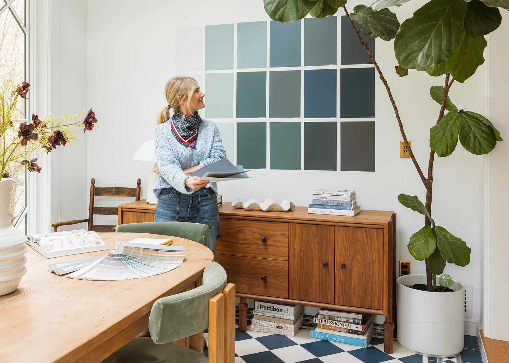
Dear A.I. Robots/Santa, can you please create a building where we color-loving humans can walk through and experience every single paint color (in both natural light and dark) before we commit to it on our walls? Now that I’ve designed a fair amount of houses and painted many a room, I feel extreme confidence in certain colors, even as my fear of trying new ones and getting them wrong runs deep (and at times keeps me from taking some color risks). Wouldn’t it just be magical if the big paint stores had a physical room for every single color??? So I could stroll in, grab Brian’s arm, and say “Ooh, I love how this feels!! This is perfect for our family room” instead of painting the room, say, multiple times? Because while the amount of light, direction of the sun, location on the planet, and your hard finishes, of course, can change the tone of the paint color, for the most part, the fear of getting it wrong lies in whether the color itself is one that you like enough to be surrounded by while enjoying the room. But until that day comes, Samplize has created the next best thing – extra-large, peel-and-stick paint samples.
It may not feel the same as painting an entire room, but it sure is a lot better than holding up a small paint store sample and hoping for the best. Not to mention, you can easily move these large-scale stickers around to get a better feel for how the color changes with different lighting. But with so many great paint colors to choose from, I thought I’d help you out even more by rounding up some of my favorites we’ve used (and loved) in various projects (with some “good to knows” about a few). You liked our similar white paint post, so today I thought I’d round up my favorite blue paint colors. These are colors that I’ve personally experienced, and would ABSOLUTELY use again.
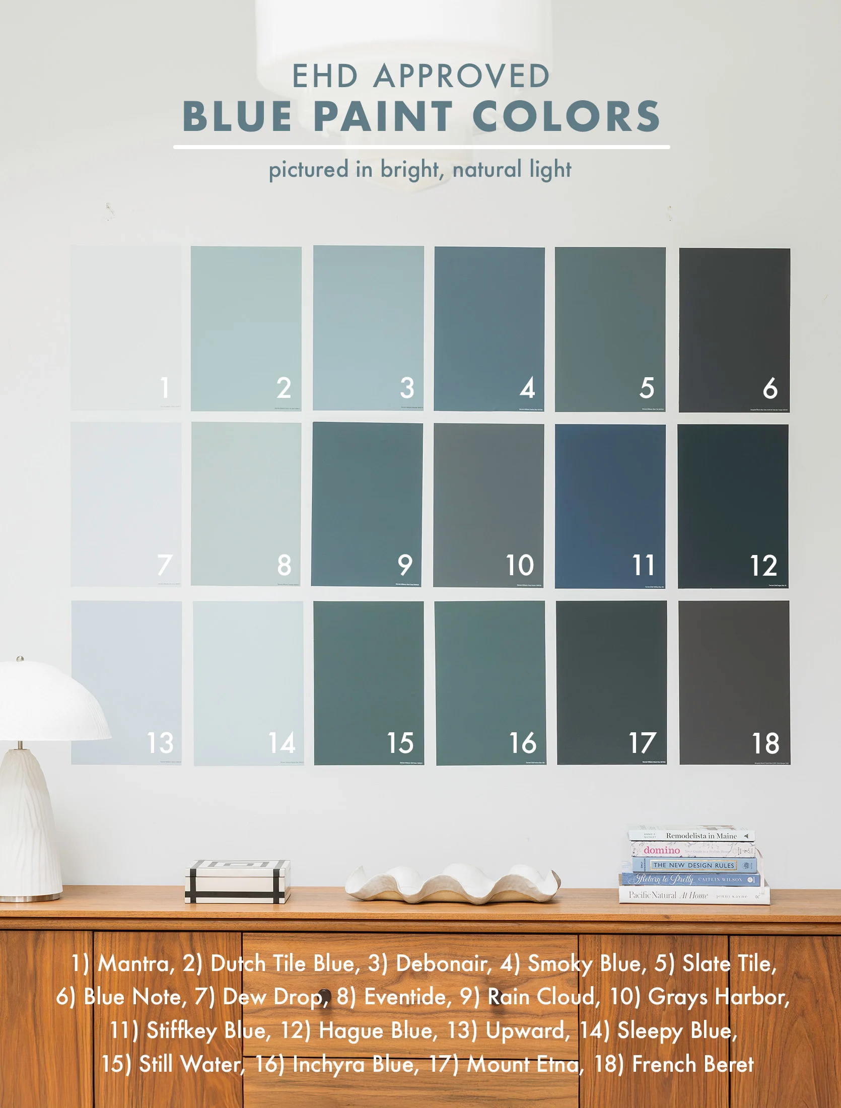
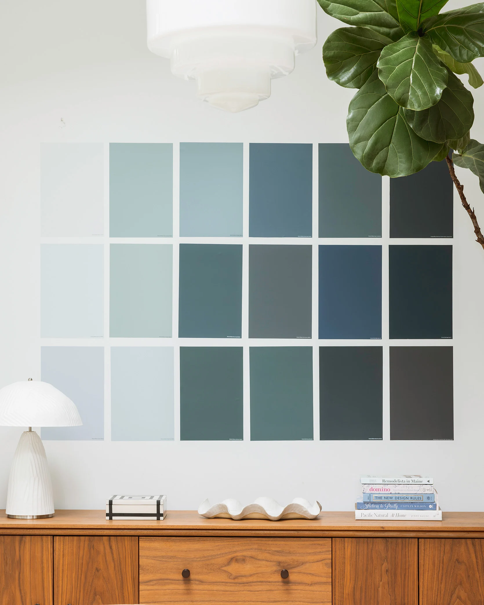
Mantra by Sherwin-Williams
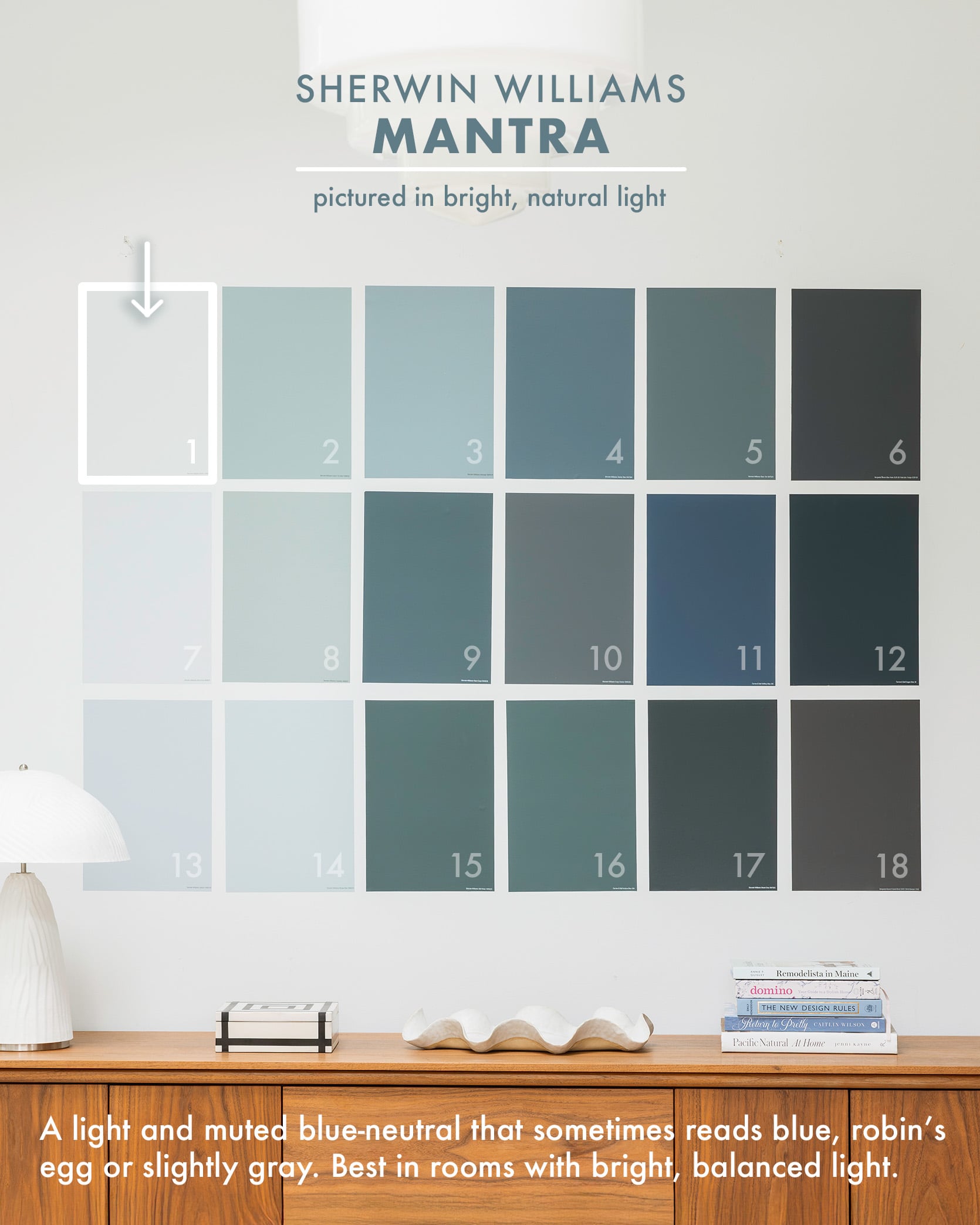
Starting off…not very strong (in saturation that is) Mantra is a beautiful, barely-there blue that complements the cooler white of our millwork in the living room. We painted the walls this subtle blue color because the Extra White we had originally painted them felt too cold, and weirdly, adding a blue tone on the walls helped shift the white on the millwork so it didn’t read so stark. Mantra is from the Designer Color Collection at Sherwin-Williams, and it adds such a nice tone that works with everything we have. Sometimes it looks light blue, sometimes robin’s egg, sometimes gray.
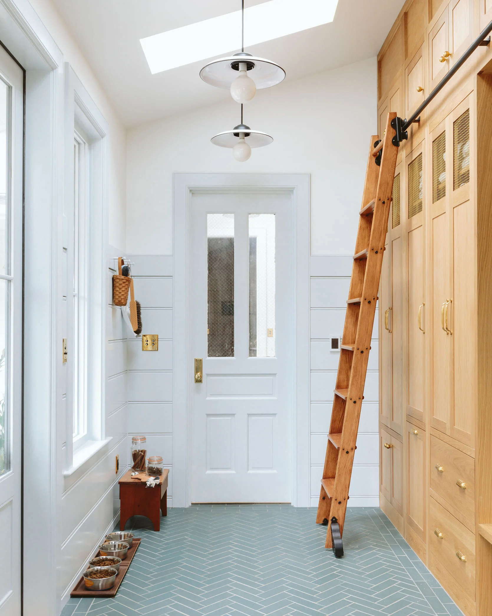
Dutch Tile Blue by Sherwin-Williams
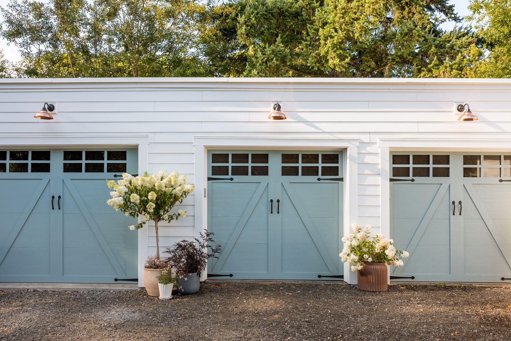
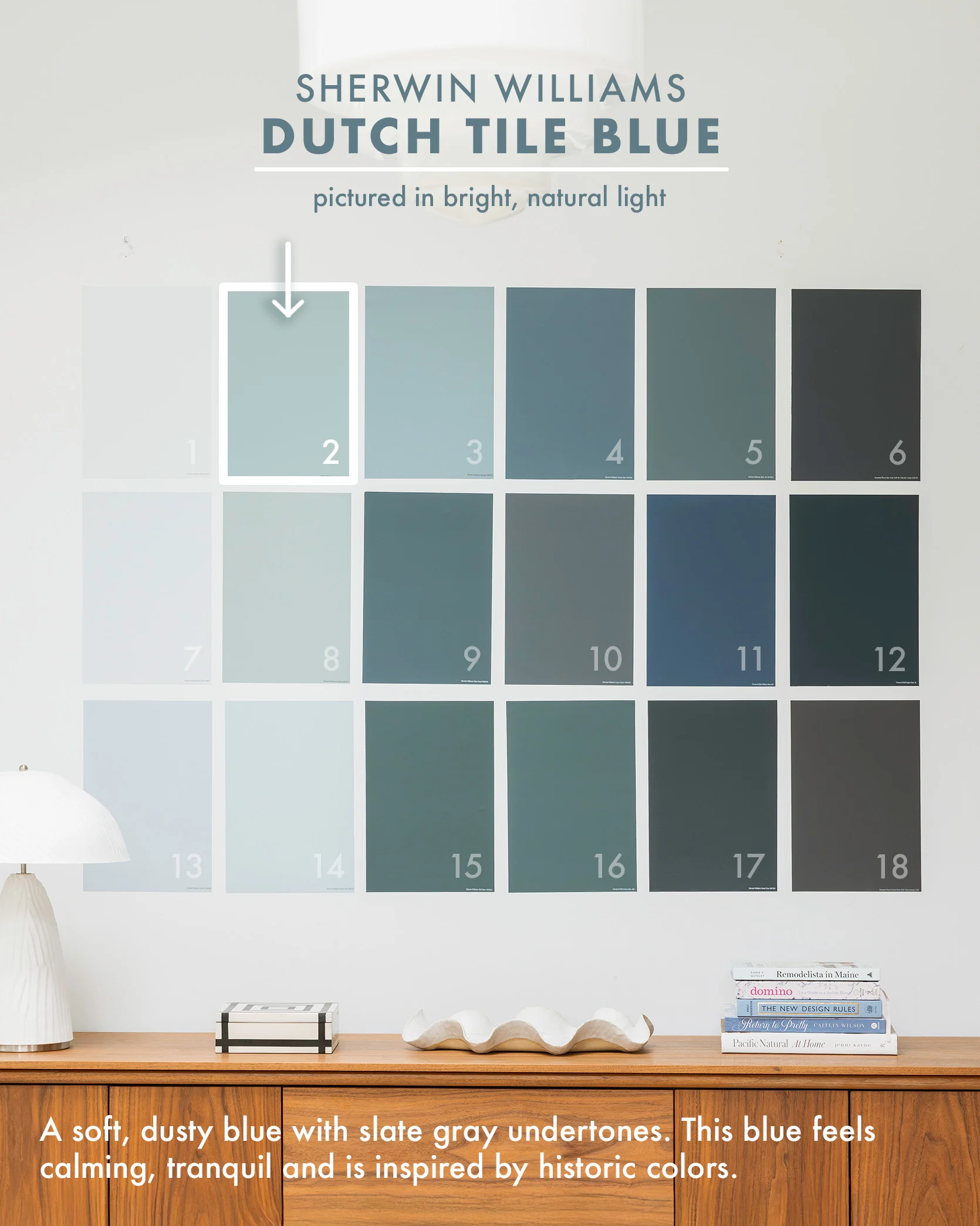
This blue comes from a more recent project, our farmhouse garage doors, and I just love how it turned out. It’s one of Sherwin-Williams’ historic colors, and since we chose a garage door style that felt a little more vintage, this blue just felt right. It’s soft but rich and stands out nicely against the white siding.
Debonair by Sherwin-Williams

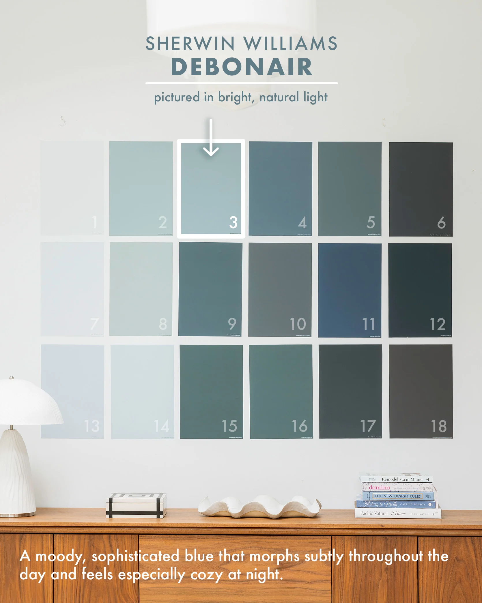
I LOVE this color and have it in my bedroom, obviously. Now, the only thing I’ll warn you about is that I think it’s better in a room with less natural light so that the moodiness is embraced. It has a lot of undertones in it that play differently throughout the day, and it’s so cozy at night or when it’s cloudy. Now, sometimes when the light hits it, the pigment pops in a way that is jarring, which is why I think this is best for a room with less direct natural light – a room that is meant to feel cozier (dining, office, den, family room). I’ll use it again, but not in a room that has 4 windows and 4 skylights (and if I could snap my fingers I’d change it right now to Eventide – a color we used in my bro’s house that is INCREDIBLE, also on this list, and has the exact amount of blue pigment I want while remaining light and still neutral).
Smoky Blue by Sherwin-Williams
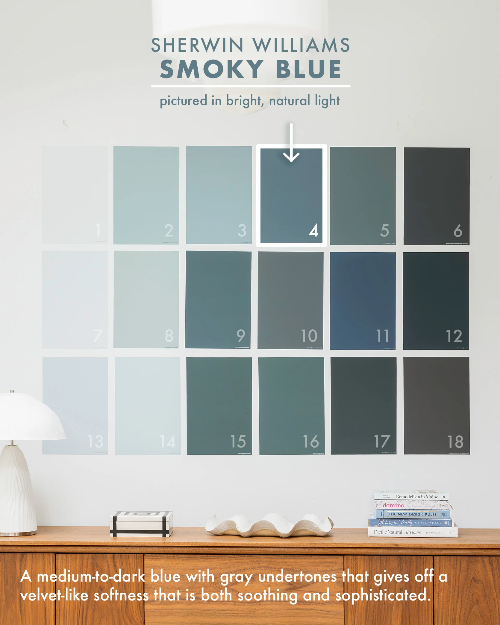
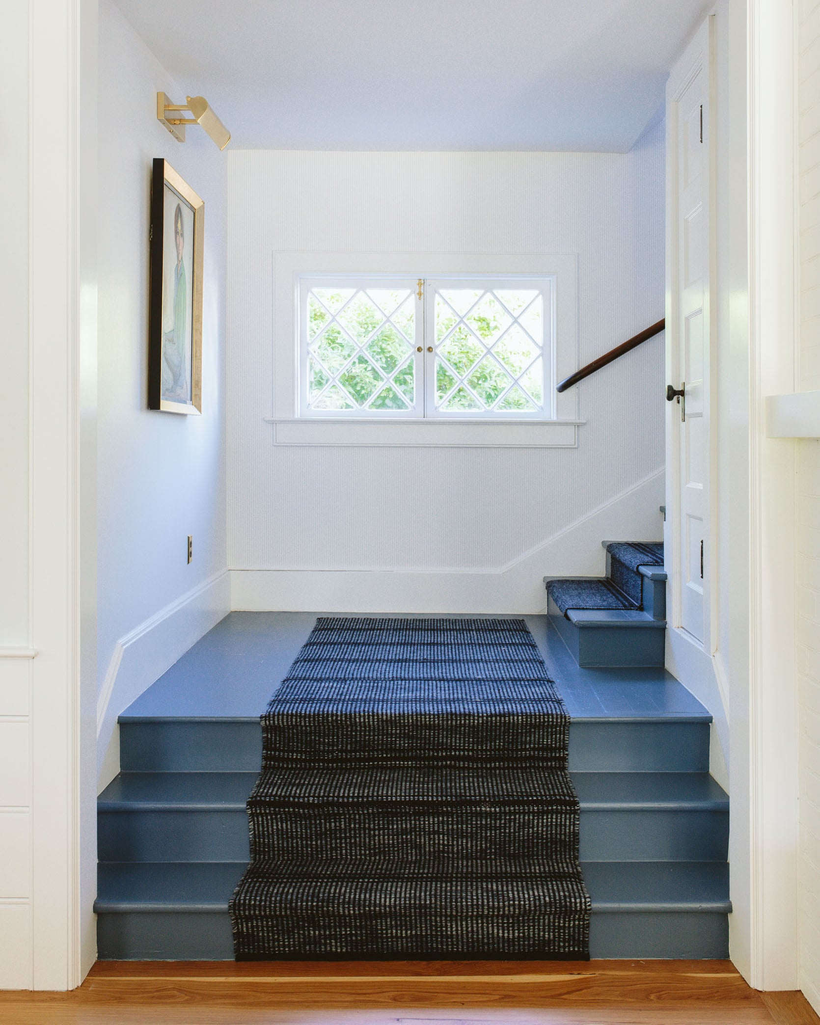
photos by kaitlin green | right from: our stair carpet runner
We painted our original (but very very worn/beaten) stairs Smoky Blue, and it’s really happy. It’s bright enough to feel colorful without going too bold.
Slate Tile by Sherwin-Williams

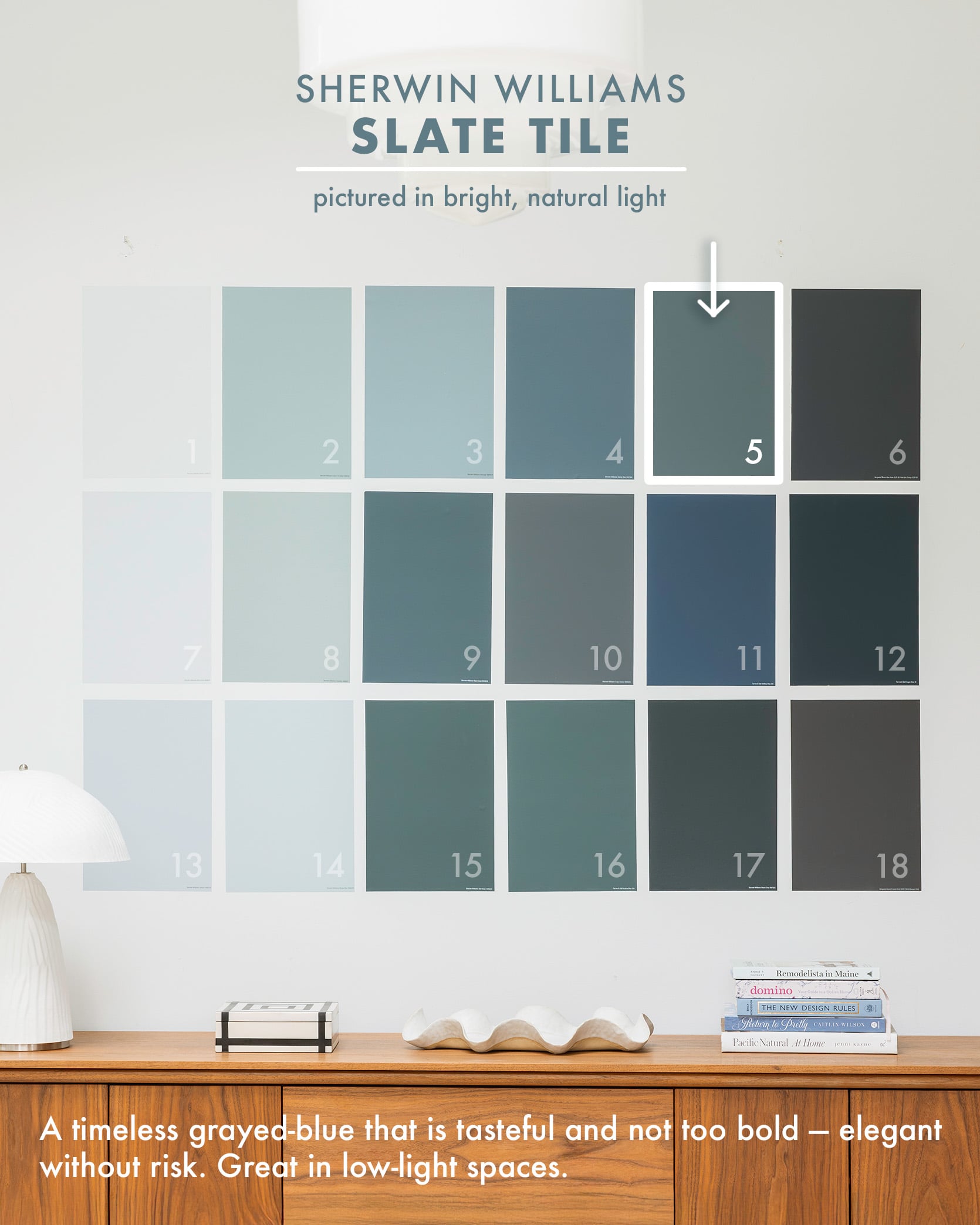
Such a great blue – I wanted it multiple places after I painted this room. While the trend seems to be greener blues right now, this grayed-out blue is super timeless, not bold, and has a point of view without being risky at all (IMHO). Also best for rooms with less natural light.
Blue Note by Benjamin Moore
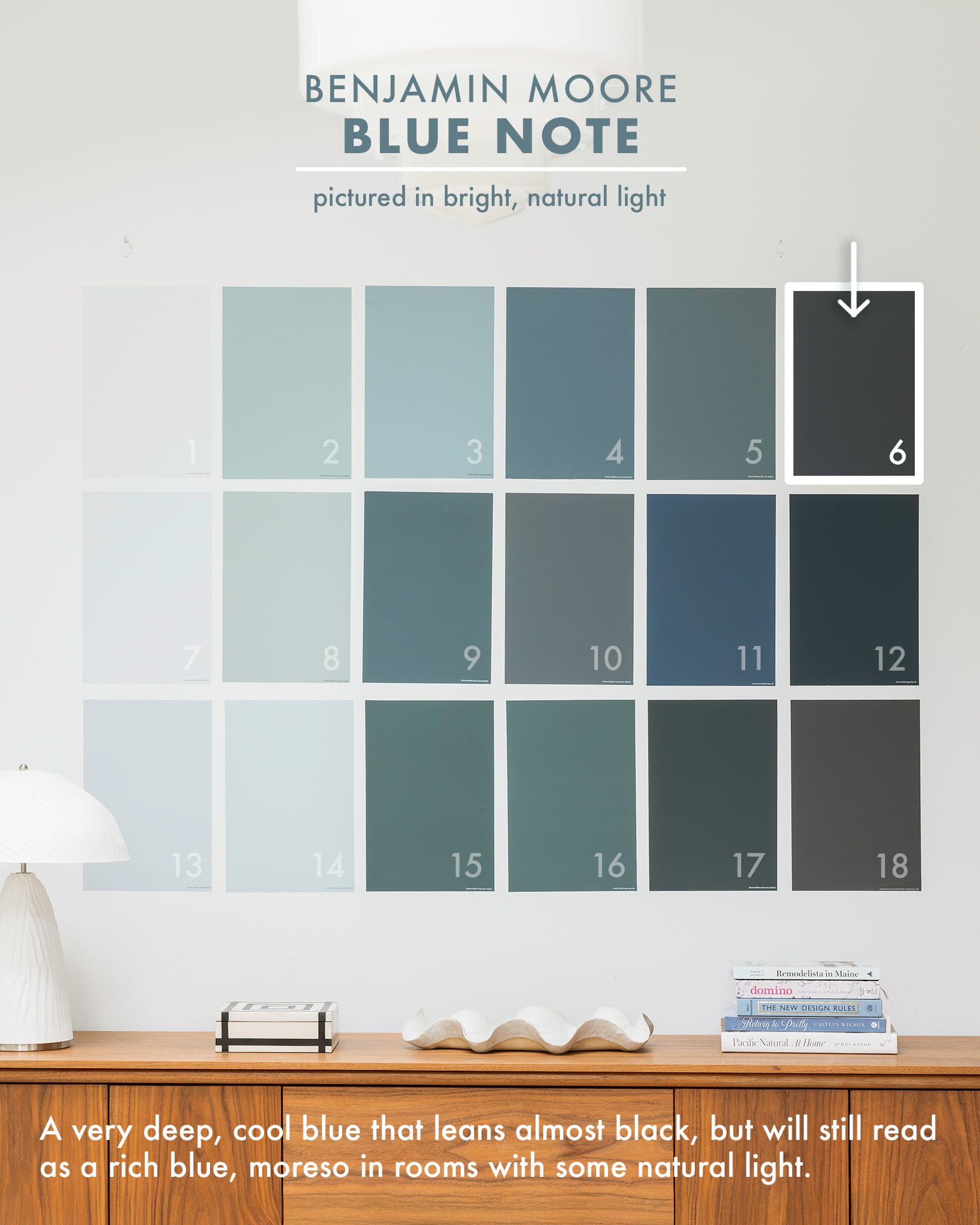


So dark and cool and definitely best for a room that has some but not too much natural light. Blue Note can go almost black, in a really good and elevated way.
Dew Drop by Sherwin-Williams
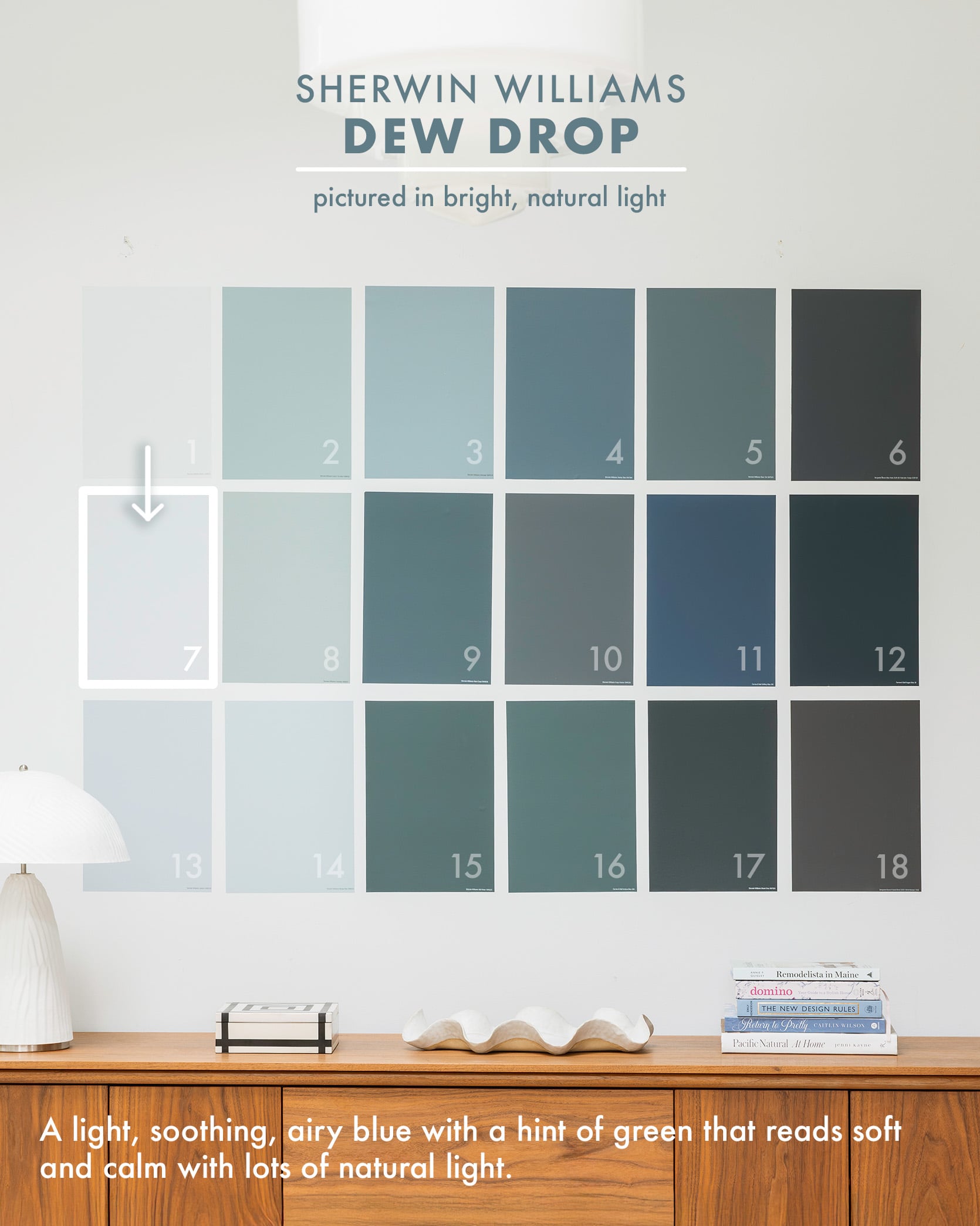
Soothing, light, and airy, with some green in it – this super light blue is so dreamy, especially in a lot of natural light. I think in a dark room it might not read as a “color” per se, but here against the white and wood it’s so good. My friend painted her teenage son’s room this color, and he LOVES it. It’s not baby nor does it feel pastel, just light if that makes any sense.
Eventide by Sherwin-Williams
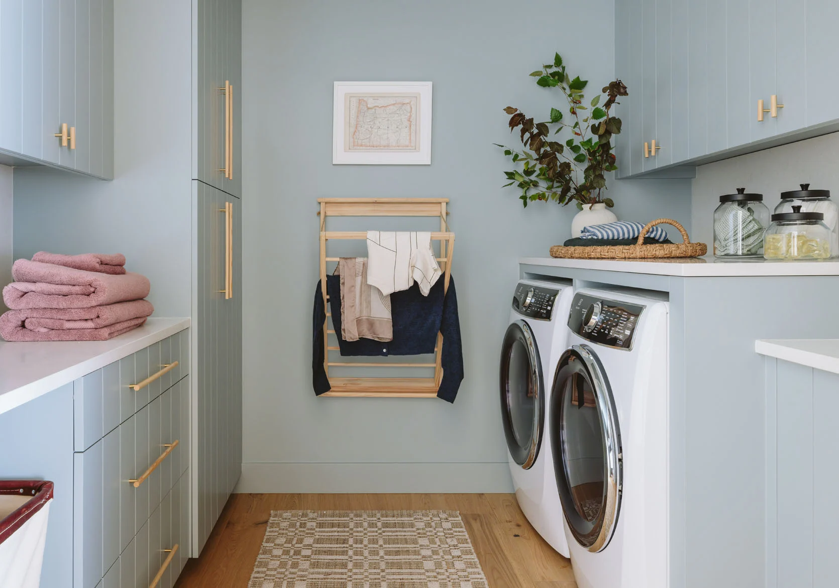
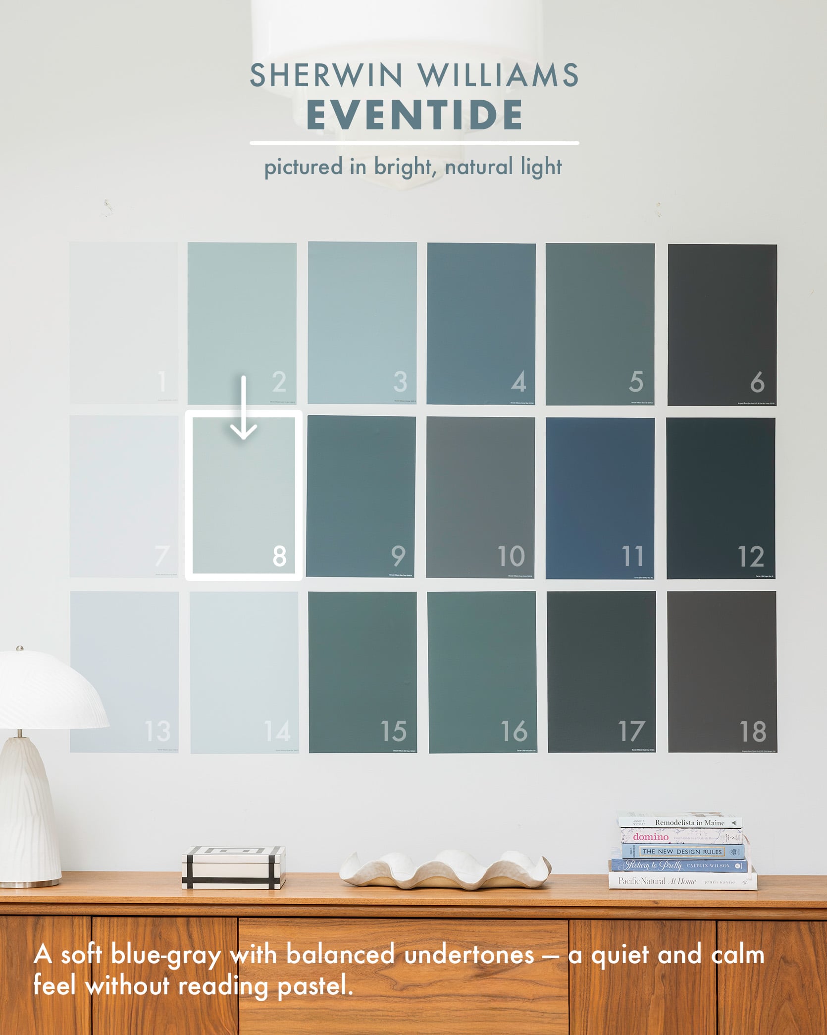
For my brother’s laundry room, we chose Eventide, the most soothing and refreshing blue tone, for the walls and cabinets. I’d say it’s powder blue without any of the “baby” vibes to it (this is the color I actually wish I could change my bedroom to).
Rain Cloud by Sherwin-Williams
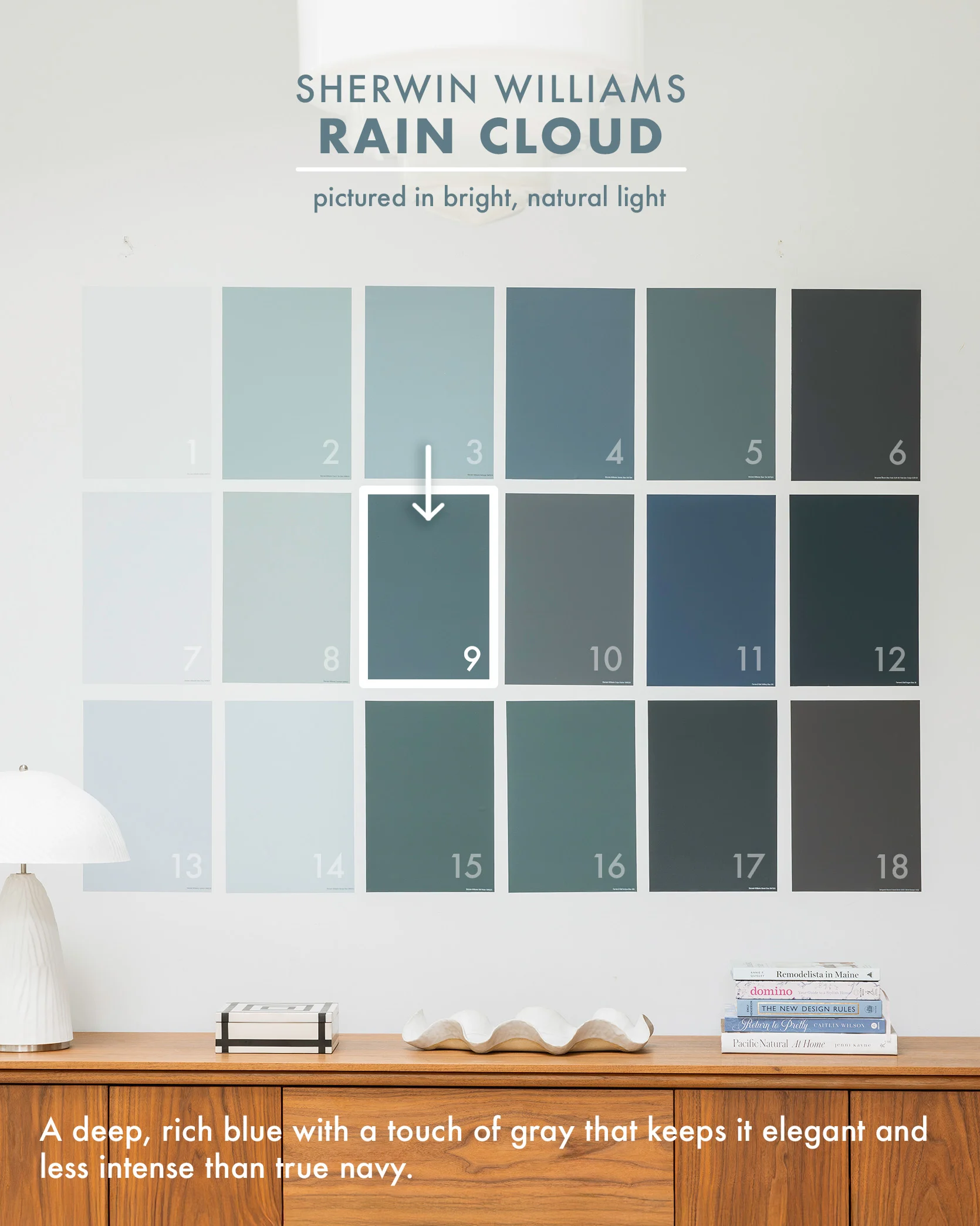
photos by kaitlin green | right from: river house color palette
If you are in the market for a good navy, this one is fantastic because it is more complicated than your typical “dark navy” that often looks one-note. Rain Cloud is deep and rich, then cut with enough gray that it doesn’t look too bright.
Grays Harbor by Sherwin-Williams

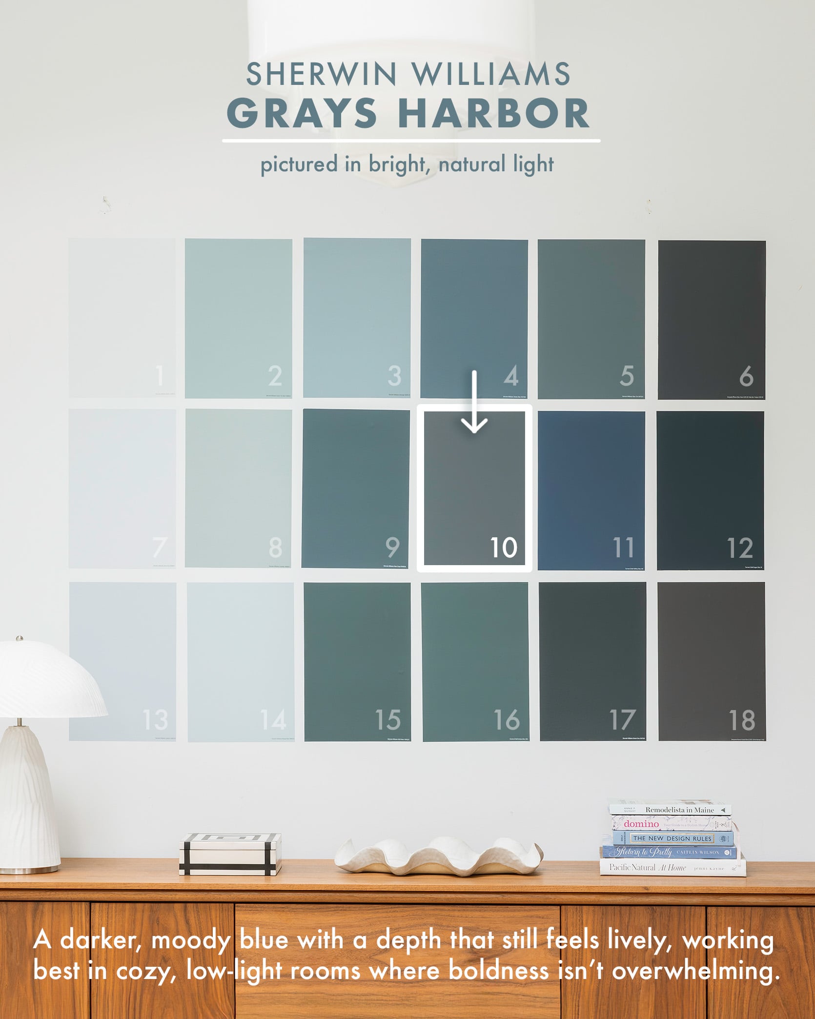
Clearly, I’ve got a type…this darker moody blue is SO GOOD. I’ve almost used it so many times and it’s always one of the top contenders, and now seeing it here I remember why. What a lovely dark yet still happy shade of a moody blue.
Stiffkey Blue by Farrow & Ball
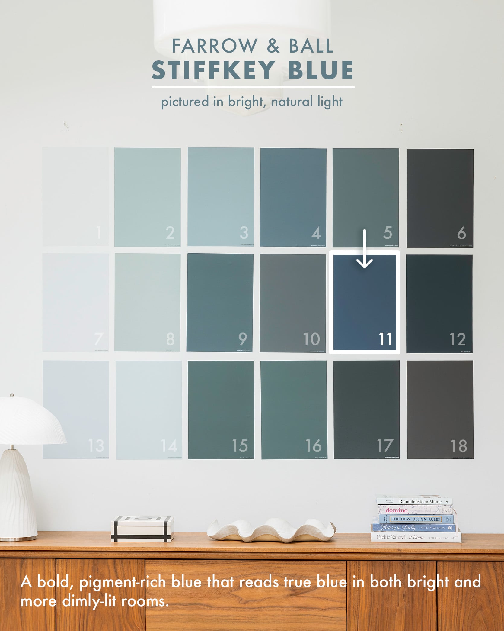

For those willing to go more bold, Stiffkey Blue is incredible. It’s not “BRIGHT BLUE” but it sure has a lot of solid pigment that makes it pop regardless of being in a well-lit room or a darker space. It reads as blue no matter what. Gosh, I love it so much and hadn’t thought about it for a while, but it’s for sure one of my favorites ever for rooms like this that can handle a lot of color (Ginny executed it perfectly, of course).

I used Stiffkey Blue in our old primary bathroom in LA, which, by the way, I hadn’t seen in a while, and I love it SOOOOO MUCH. I have a bunch of that leftover wallpaper that I’m kinda inspired to put in our little tiny hallway heading into our bedroom now. It’s just so good! Anyway, so is Stiffkey Blue. A solid choice, my friends, and great for small rooms like this, especially if only on the bottom (it could have worked all the way up, but also might have felt a little overwhelming for a small bathroom.
Hague Blue by Farrow & Ball
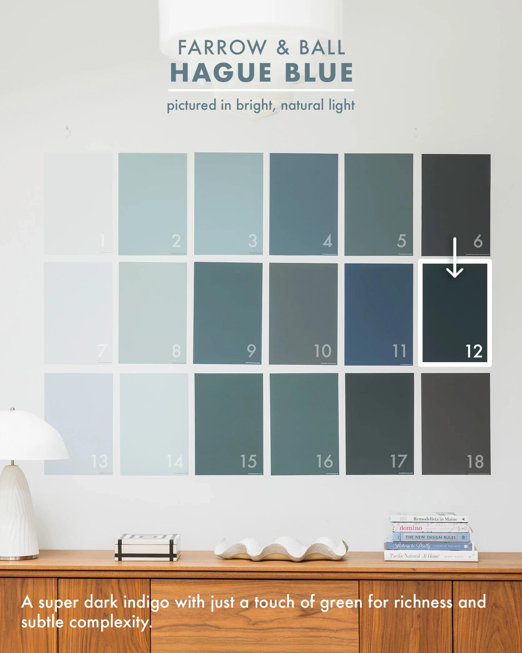


Hague Blue is one of my all-time favorites that I haven’t used in a while! It has the slightest tint of green in it, making it a super dark indigo? I painted the exterior of The Fig House this color as well. Farrow & Ball is always a splurge (and color matching can be tricky because their pigmentation process is extremely sophisticated and nuanced), but if you have the budget for certain special rooms, I love this color.
Upward by Sherwin-Williams
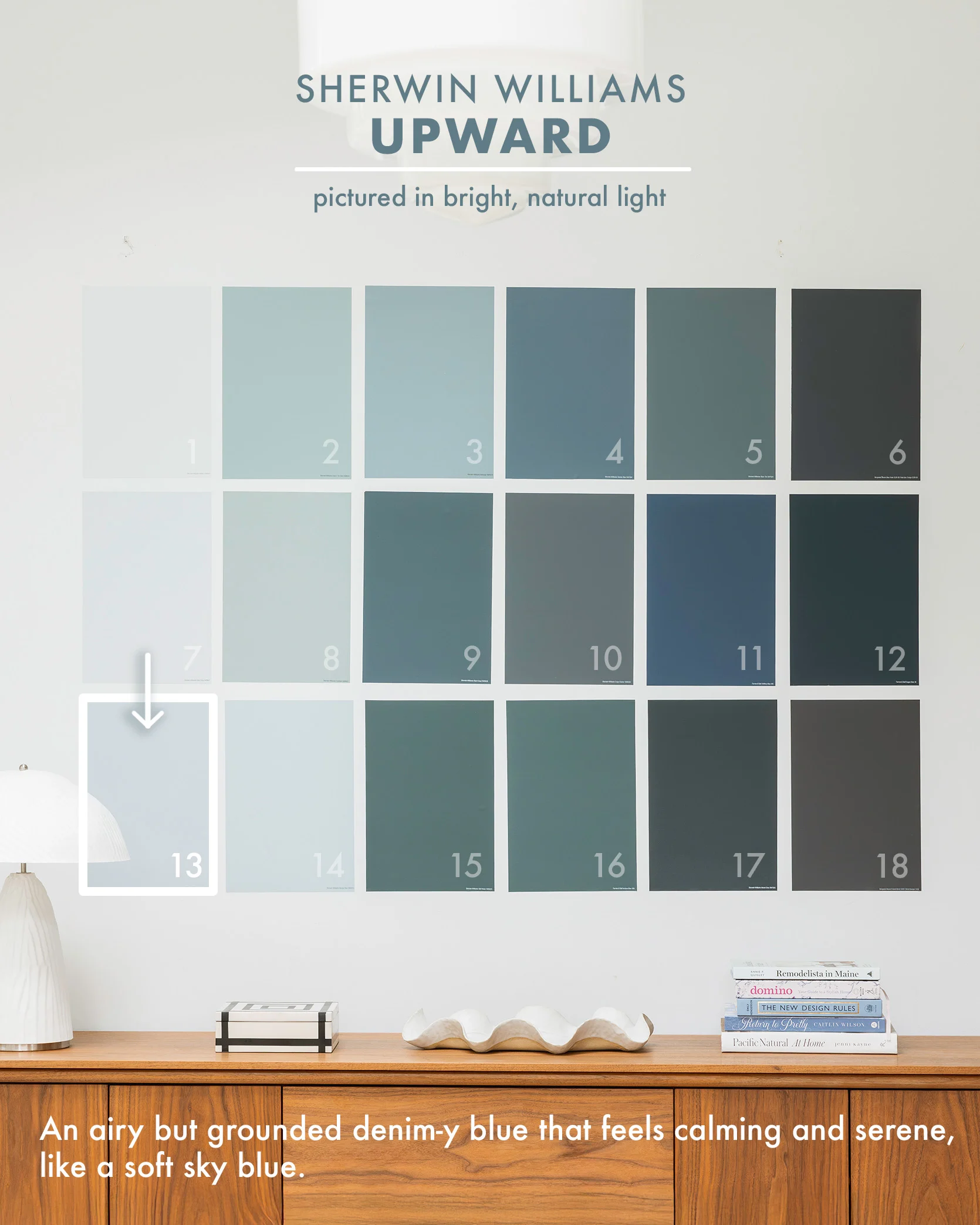
Upstairs, we painted all the doors of the landing and kids’ room in Upward – a really light, almost periwinkle, happy blue. We are EXTREMELY happy with the color both in photos and in person. It’s happy and pretty, closer to a pastel than we normally go, but everyone is into it!
Sleepy Blue by Sherwin-Williams
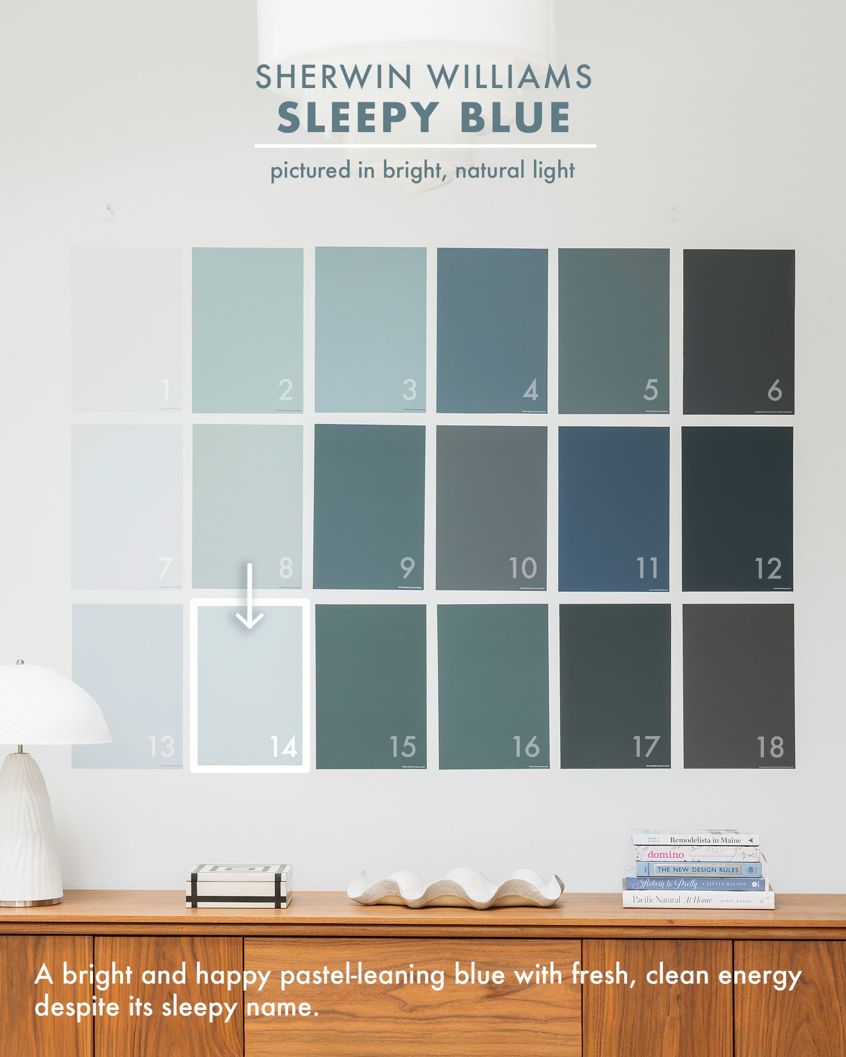

Now, for this no-natural-light laundry room, we chose something more saturated (than our well-lit room), which was the right call because it needed to have more pigment to really show up (I’ve had to learn this lesson a bunch of times!). Sleepy Blue is definitely more on the pastel side, thus being so happy and bright. Less grayed out, sophisticated, and more clean/fresh, and happy. I think this color would be awesome in a well-lit room as well, but test it out because it might read more pastel and bold baby blue, or it just might be a bright, happy sunny blue.
Still Water by Sherwin-Williams
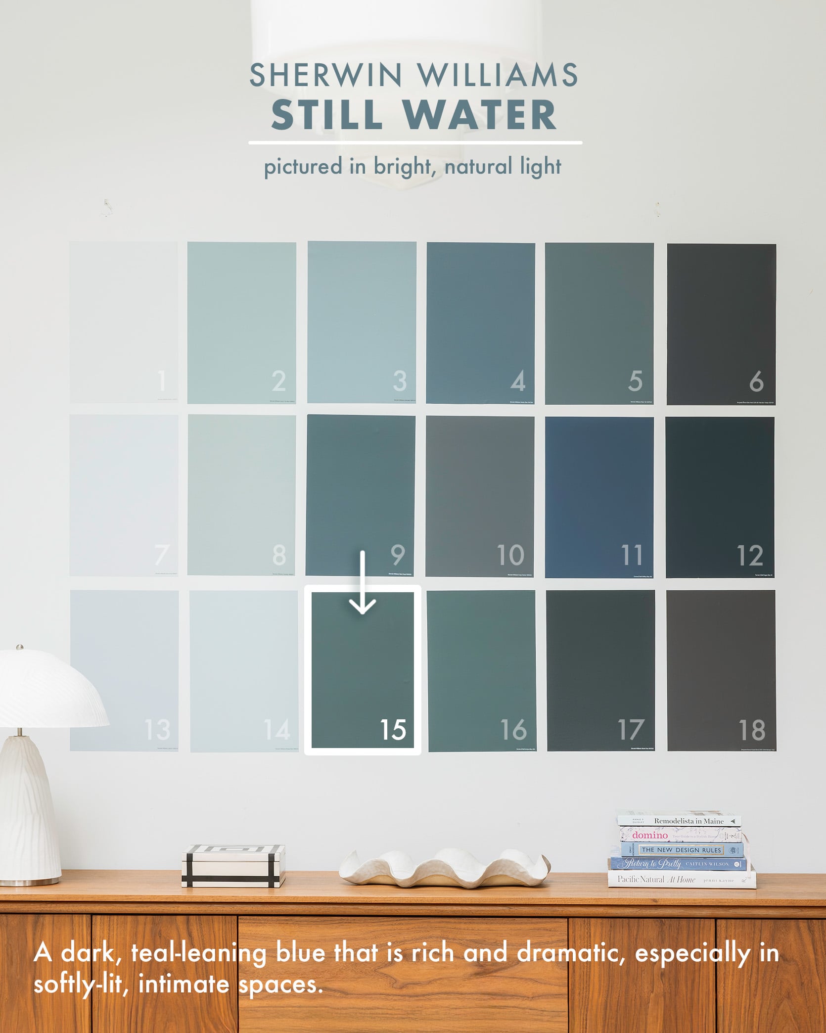

Now this color, Still Water by Sherwin-Williams, has a lot of green in it, but it still falls more in the blue category for me. This color is so unbelievably perfect in here because it’s meant to be a dark room, so it still really reads as this dark blue/green/teal. If it were in a room with a ton of natural light, it would have probably read extremely bold and TEAL (when we have the overhead lights on, it’s a bit too much for me), but in the cozy lamplight, it’s perfect. So yes, just make sure that if you have a really bright room, you like the boldness of the pigment. Here, it’s so perfect (THANK GOD).
Inchyra Blue by Farrow & Ball
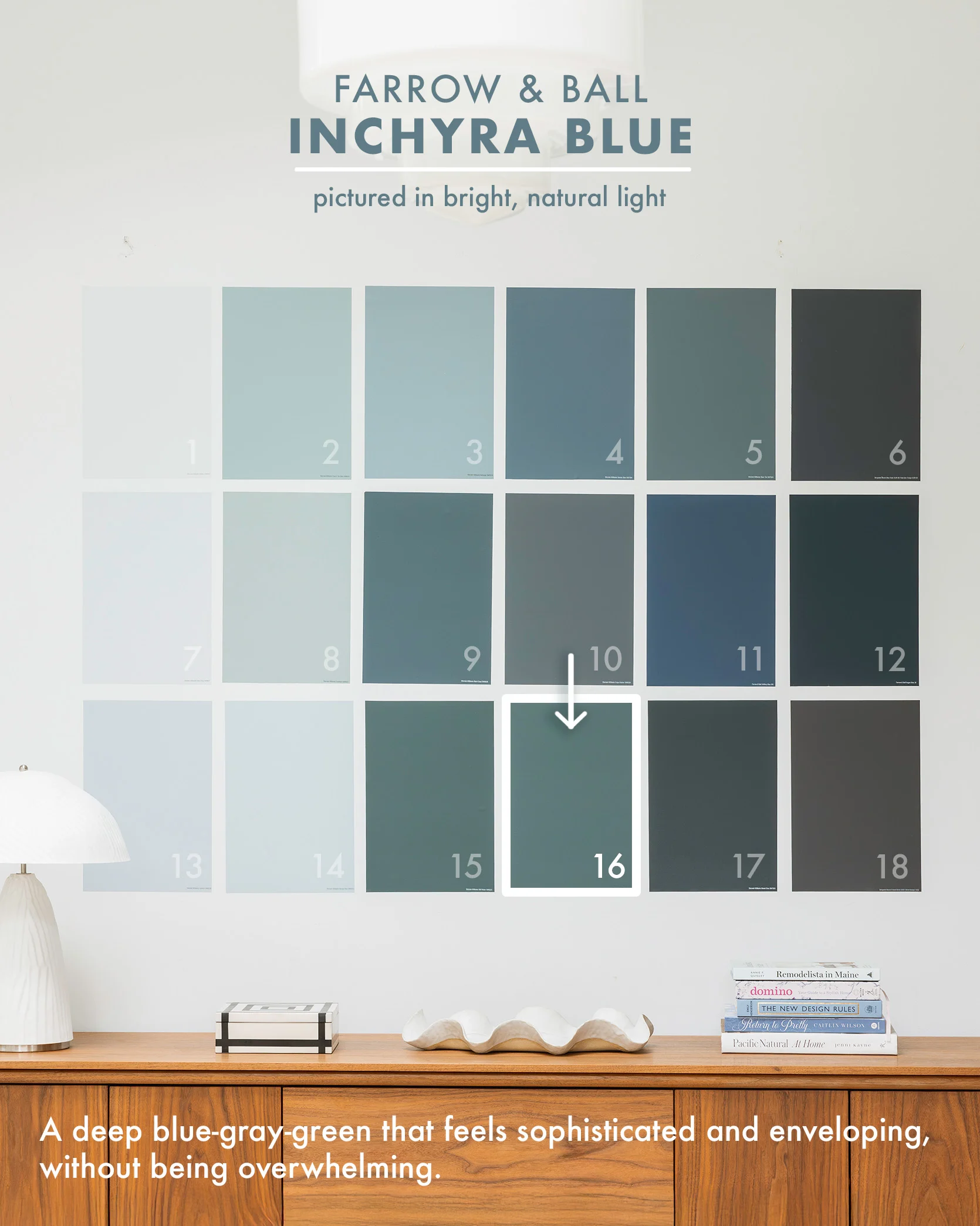


Arlyn perfectly executed this super dark blue-gray-green. I love how its color drenched on the ceiling, and she added all the art with white borders to break it up and add so much life.
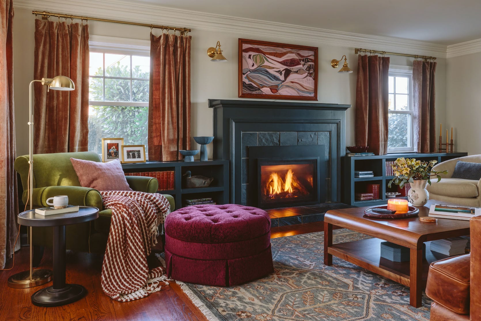
Mount Etna by Sherwin-Williams
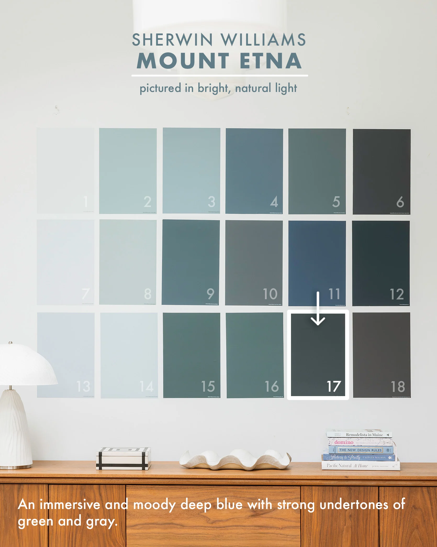
photos by kaitlin green | right from: my best friend’s dining room reveal
Mount Etna reads far bluer than black (but not so blue that it looks “BRIGHT”), which we were so glad about when designing my best friend’s living/dining rooms. We painted the built-ins of both spaces this color, and it’s absolutely perfect. This deep blue paired so well with all the other jewel tones, wood, and leather going on in the space. It is DARK, but when the light hits, there is so much blue and green in it. It’s a powerful, not super bright, saturated color – just a moody tone.
French Beret by Benjamin Moore

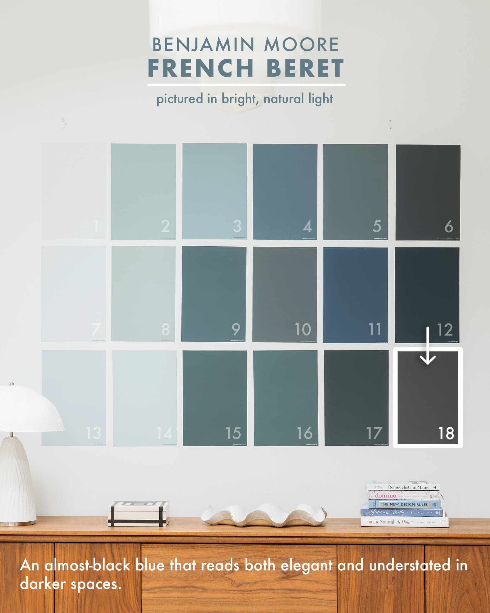
Now I didn’t choose this color (the architect William Hunter did), and it’s just so good. Certainly muted and leaning towards charcoal, this French Beret blue does have a lot of gray in it, helping it read muted, sophisticated, and wonderfully moody. We LOVED it in person so much, and it was great for this darker space (the doors lead to a covered patio) and made this smallish bedroom feel bigger. Kudos to him for doing the closets (see below) and curtains in the same color.

It’s clear I love blue (and it’s coming back to be even bigger than ever, although I don’t think green ever fully overtook it). All colors are “in” in the right context or home style, and I love how so many of these companies are leaning into more complex pigmented colors that create more interesting rooms. But y’all, I can’t stress this enough, Samplize is a game changer, and having the larger sticker for your top colors will help you so much to avoid paint color regret.
If you are into this color round-up, check out our other Samplize post where we break down our go-to white paint colors. Let us know what color family we should round up next. xx
Opening Image Credit: Photo by Kaitlin Green


I used Sherwin Williams Whirlpool in my living room and it is a beautiful color in every light throughout the day.
My sister recently used Quietude by Sherwin Williams and my mom liked it so much she used it too. That is more of a green with blue undertones though.
Looking forward to other color roundups
Great post.
I would love to see a post about paint colors and weather — not just light. For example, the light in Portland and Seattle is often a cold/grey light. Do grey-blues look too cold in bright but grey lighting? Would bright colors look garish? Do warm paint colors balance out that light or do they turn a weird shade? Does that kind of light bring out certain undertones?
You could have a similar discussion about bright, warm light like you have in Florida. There have to be colors that look good there in warm light that don’t look good in grey light.
OOh this is interesting. I have some initial thoughts but with very little evidence, purely anectdotal. I can definitely say not grey up here 🙂 Stay tuned, but if anyone else has a gut-check thought let me know.
Look up Kylie M Interiors North East South West Paint – she looks at the light from the exposure so it does go into cool/grey light, soft/warm, muted/cool, warm/yellow, etc and what paint colors look best. Lots of useful information her sight for paint!
I remember when there was a Hague Blue room at the Mountain House:
I don’t remember that! I remember our den at our LA house was briefly hague blue (i think). But I honestly don’t remember hague blue at the mountain house (but my memory is not the best, what with perimenopause 🙂
Weren’t your cabinets in the Glendale also Hague Blue? I loved that.
Yes, they were.
It definitely was. Here’s the proof. 🤭 And the memory thing only gets worse unfortunately.
Waterloo is such a wonderful, rich blue. We painted our family room with it, and we call it “the cozy room” because it’s north facing and we’ve leaned into the moodiness. We have a big emerald green velvet sofa, and dark blue botanical curtains from Anthropologie, and those elements with the paint combine to make such a delightful little jewel box of a room.
Love these! Great compilation. I used Sherwin William’s Seaworthy in my bedroom and we love it. It’s similar to Hague Blue, with a touch of green in it. It’s lovely in a matte finish in a room without much natural light, just like Emily’s family room. So cozy.
I’m looking at seaworthy for the WC structures in the guest cottage! I can’t tell if its too bright, but I also know that teals are making a huge comeback and I’ve always loved teal so maybe a really dark teal will look rad. Good to know that you love it (but our bathroom will get a ton of natural light … i suppose I could add more black to it?)
Has anyone tried Benjamin Moore’s colour of the year – Nova? I’m still hemming and hawing about a bedroom colour and I’m considering this one.
I have a couple of other BM blues I love – Amsterdam is a lot like Waterloo from the looks of it and is and exact match for these affordable amazon curtains: I used it in our TV room and love it there.
And then Gossamer Blue is my favourite lighter blue – just seems to look good everywhere I’ve used it. Light without feeling childish.
This was an awesome post! Can you do another one with favorite green paint colors? 🙂
Yes!! I really want to try more greens, TBD. So that would be a great excuse to do it (and i need to choose a bunch for the guest cottage).
I used Waterloo in a bright south-facing office and Cyberspace on the vanity of my basement bath — both worked super well, so I’d say they both work in both darker and lighter rooms!
Inchyra Blue is SO GOOD. I’m obviously biased because it was in my own home but it’s such a chameleon of green and blue depending on the light. I’ll definitely be painting another room that color one day.
Yes, I used it for my front doors and it was a perfect color. Intense but still natural feeling, green/blue/gray depending on the light. Benjamin Moore Knoxville Gray a near perfect match if you can’t afford/access F&B. Slightly less intense but the exact same shade.
I have a tiny dark kitchen with no windows or exterior light at all. Currently painted white, it looks dingy. Add in dark brown cabinets, brown LVP floor and brown/Burgandy granite, (it looks like a diseased liver) and it’s depressing. Not my happy place. I’m wondering if some shade of medium brown would work? I’m thinking, ’embrace the darkness’.
Anyone have suggestions?
Maybe a mid-tone taupe or sage/olive green could work? Or a creamy gray? I imagine something warmer toned, but that’s just me. I definitely think going darker could help you embrace the coziness. If you can swap out hardware maybe try nickel or brass, if that’s not what you already have. And maybe check your light bulbs too? The color of your bulbs may sway you one way or the other. Hope this helps 🙂
Without seeing pics it’s just a guess, but her idea of taupe may work. (Check undertones) Brushed gold hardware is pretty with browns!
I’m stuck with overhead florescent lights. But I’m looking into replacing the bulbs with LED in 2700 -2800 lumens. Hopefully that will warm it up also.
Thank you everyone for your suggestions. I knew this community would have ideas.
Hi Patricia. I also find white to be dingy at times, depending on the undertones. I just painted with Sherwin Williams’s Icicle. It’s a white, but with a little bit of blue undertone. Very light and airy and cheerful.
Maybe add gold accents/hardware.
I wouldn’t paint it brown –might look like poop 😉 Blue or green look great with brown!
Lots of darker blues in this post
Take a look at Abalone or Silver Fox from Benjamin Moore – they have a red-leaning taupe undertone but can go with any color.
I also think you might like a buttercream yellow paint, might feel like the room has some sunshine — Benjamin Moore Candlelit Dinner,
I love each of these blues and look forward to your highlighting other colors. Perhaps not closely related, but adjacent, I would love thoughts/guidance on painting furniture in shades of blue. I’m thinking about painting dining chairs and an accent table in different hues and find myself vascillating after spending hours building Pinterest folders.
Has anyone tried Benjamin Moore Hale Navy? I’m considering it for a library / office in our home.
I haven’t yet. I’m painting a wall behind my tv to camouflage it and I’ve narrowed the colors down to Blue Note and Hale Navy. I’m leaning towards Blue Note because it’s got a black undertone, but I’m still having trouble deciding. Hale Navy is beautiful and if it doesn’t work behind the tv, I wouldn’t hesitate to use it somewhere else.
I’ve painted something Hale navy, just need to find it but I remember loving it.
We painted our dining room in our last house Hale Navy, and I loved it so much. My mom took her cue from us and painted her bathroom, which also looks awesome in it. I can’t recommend it enough!
If you’re interested in a deep dive on paint colors, I really like Kylie’s blog at Kylie M. Interiors. She posts a ton of reviews and usually shares photos of her client’s homes, which can be helpful seeing different spaces/light exposure/etc. I know choosing a paint color can be hard enough, so just be warned that you may feel like it’s information overload… Ask me how I know 🙂
I have used Hale Navy twice and absolutely LOVE IT!!! In a previous house I painted it above a white wainscot in a bedroom and in this house I used it for my front door. It is one of my absolute favorites!
We have Hale Navy in our bathroom and I love it. The room gets a lot of light but I don’t find that it changes too much at night. Remains a rich navy blue throughout the day.
Great post! Although still loving my Loyal Blue room by Sherwin Williams!!
I used SW Waterloo in my basement after seeing the Portland project, and I love the results so much. We get less natural light so it’s darker than the Portland pictures but still so good.
Oh good!!! that makes me so happy.
Just when I had convinced myself I didn’t really have to paint my living room dark blue to go with my soon to arrive navy sectional you remind me of the Portland basement and Waterloo. I’m off to get paint samples now, lol.
I love samplize stickers, but I always end up just putting them up and leaving them, like a color collage on the wall! then I can just look at the colors forever and not have to actually paint anything <:D
This is a super useful post! Thank you!
I love these paint color round ups! The white one was super helpful when picking out my living room color and I passed on the pigment level explanation to my mom for her remodel.
For future colors, could you take one or more pictures of the same grid in another room with different lighting so we could compare how the color “changes”? The descriptions are super helpful, but it would help visualize how the saturation/lighting temperature changes the color.
Yes! Seeing this grid in the primary bedroom and your son’s room would be amazing.
Well, this was first posted on 1/31/24. I doubt Emily still has the paint samples.
We just shot the grid a few weeks ago, actually! The original post (from 2024) gets a lot of google traffic so we keep the same title/draft with all the meta data, just update it to be more current. So that’s why some of the comments are from 2 years ago and some are today. I think its a great idea to shoot in different rooms. That’s what we did for the white version, actually. We need to shoot on a white wall though so there aren’t a lot in my house that could work with less light (Charlies room also has great natural light). Although I could shoot it with only one shade open? What color would you want next?
Friends,
Let me tell you about paint sample pots: you spend about $5 on a small pot of paint in a color that you are considering. Then you paint that sample on the wall. The key is paint a *really large* area of the wall – think 3ft x 5ft or more. Even better if you paint it on a few walls in the room – paint one patch right next to a window. Paint another in the dark corner of the room. And another by the doorway. This gives you a better sense of how the paint looks under different lighting conditions.
Tiny paint sample squares just don’t cut it. To get a good sense how how the paint will look: go big, and go for multiple walls. It costs $5, which is way, way, way less than the $2,000+ dollars it costs to repaint a room to fix a poorly chosen paint color.
Great idea, although I just want to add that those little sample pots are likely not the sheen you’ll choose, so they’re close but not perfect representations of the final effect.
Just remember, lofs of paint sample pots are lower quality paint. The pigments may not be the same, the sheen may not be the same, etc… It could affect how you perceive a color. You may hate it from the sample pot, but love it in the “real” paint. Or the opposite could happen.
I hear you, but these stickers are so much easier/better and can be moved around. We used to do sample pots, we would paint on large paper and move the paper around. And a lot of paint companies won’t do $5 pots anymore for all their paint colors. I do think that if after using samplize you want to feel even more sure, getting the final color and painting it on your walls would be good. Once we started using Samplize its been absolutely game changing for us (and we keep them and store them and use them project after project).
This is so helpful! Love this post
Best post ever!!
100% perfect timing as my summer plans include painting my family room a very light blue! I see two here that would be perfect, so I’m going to grab samples soon. Thank you for all the great photos to help visualize it. The cost of paint has gone way up so it’s a bit of a pricier commitment than it used to be!
Great post! I would love to see a color roundup of beige and taupe colors. Thanks for continuing to write your blog.