Design
Farmhouse Update: Testing Out The Barb Sofas In Our Living Room (Game Changing)
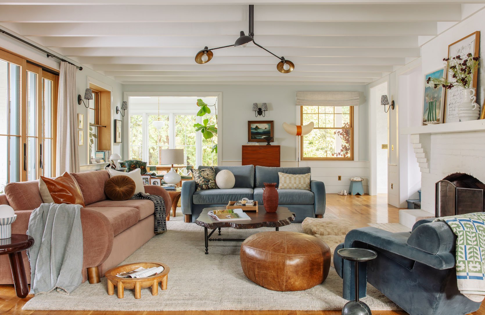
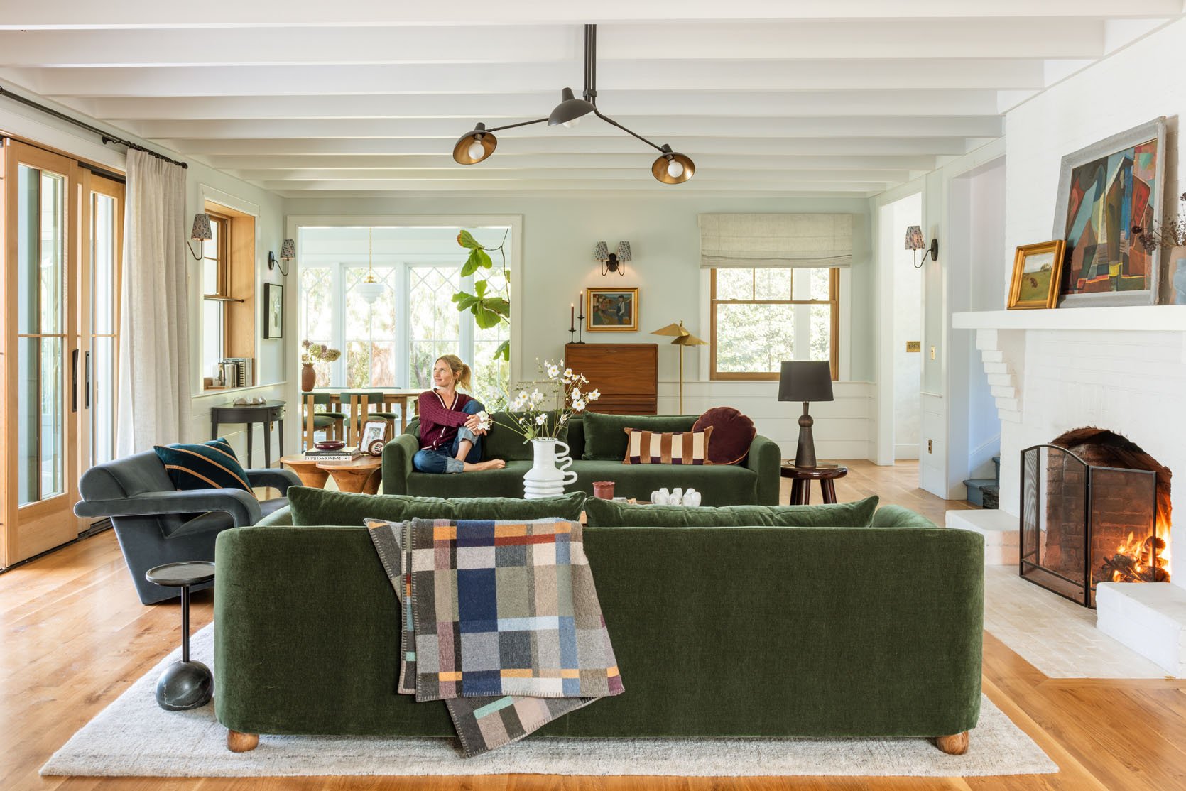
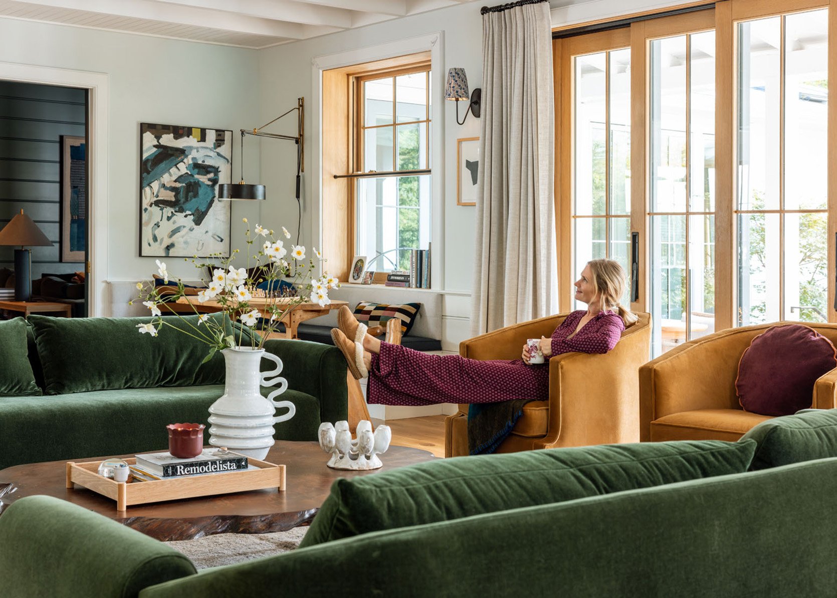
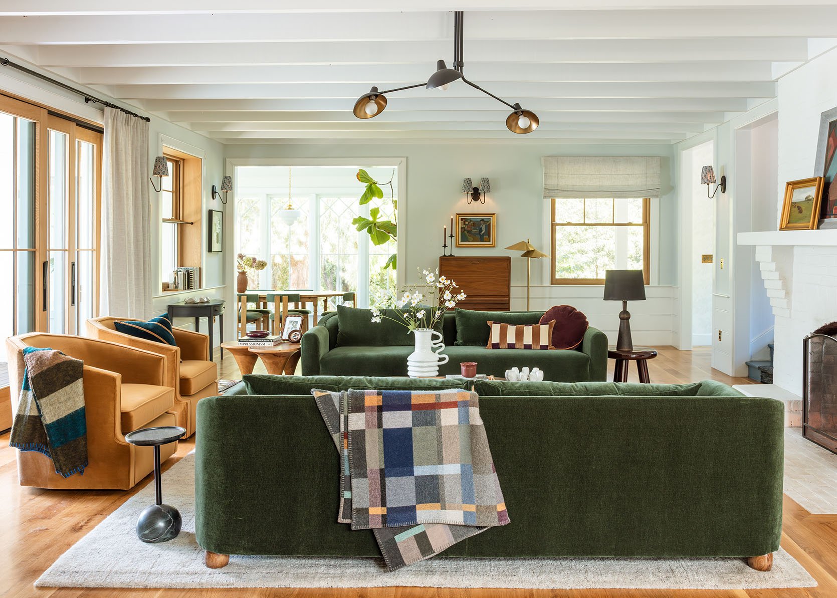
Y’ALL. What started as a “Let’s shoot the Barb sofas in here to give them some marketing love” turned into “oh dear!!! … is this actually the life I want to live???” (in a good way). A couple of weeks ago, I showed you the Alice sofas in here, which I literally designed for this room. Remember all the issues with balance and tones that we talked about? Well, they seemed to be solved here. I still love the Alice sofas, and yet I’m SHOCKED to say that I fear these work so much better in here!!! But you might not agree… (social media was mixed when polled). Here you go:
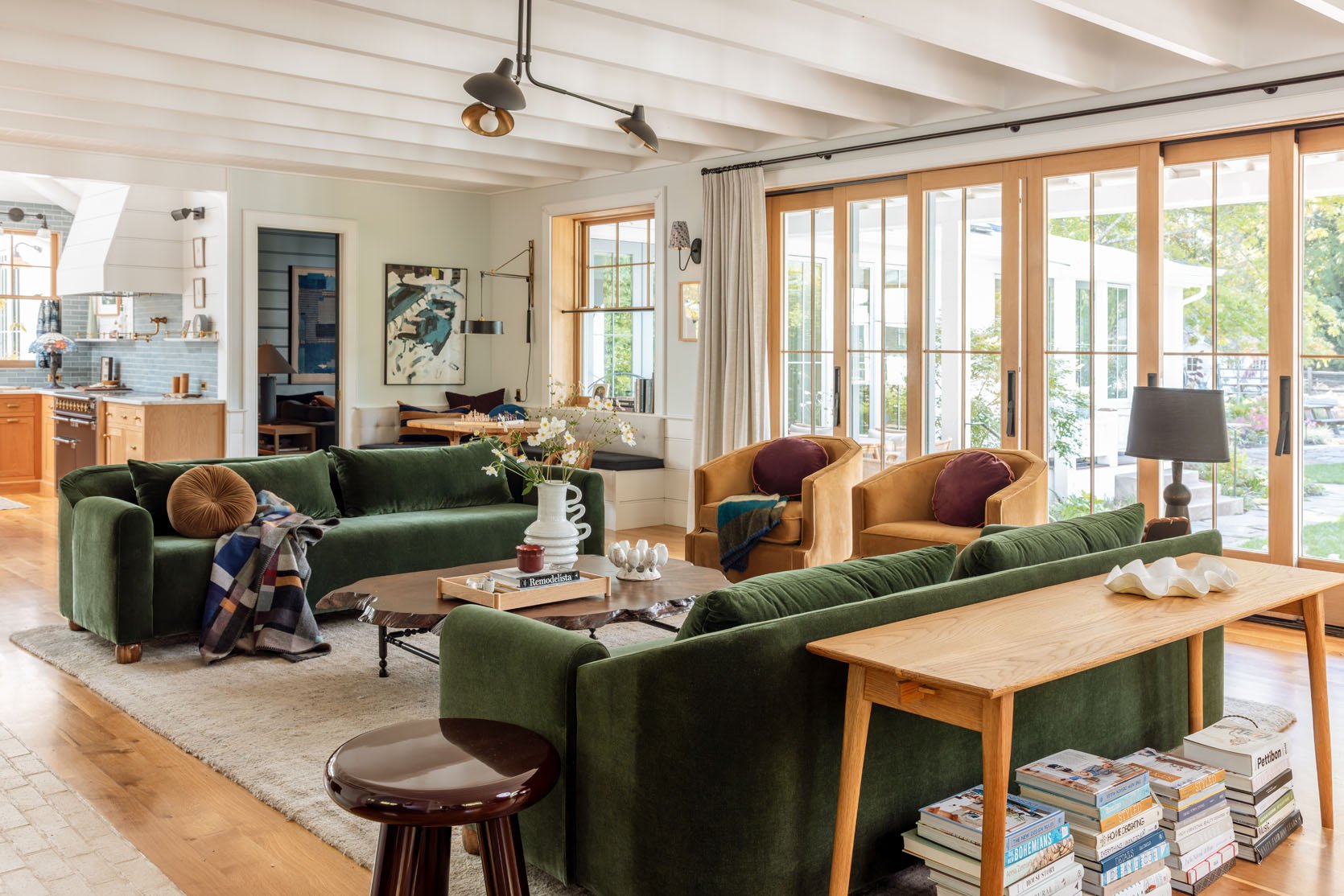
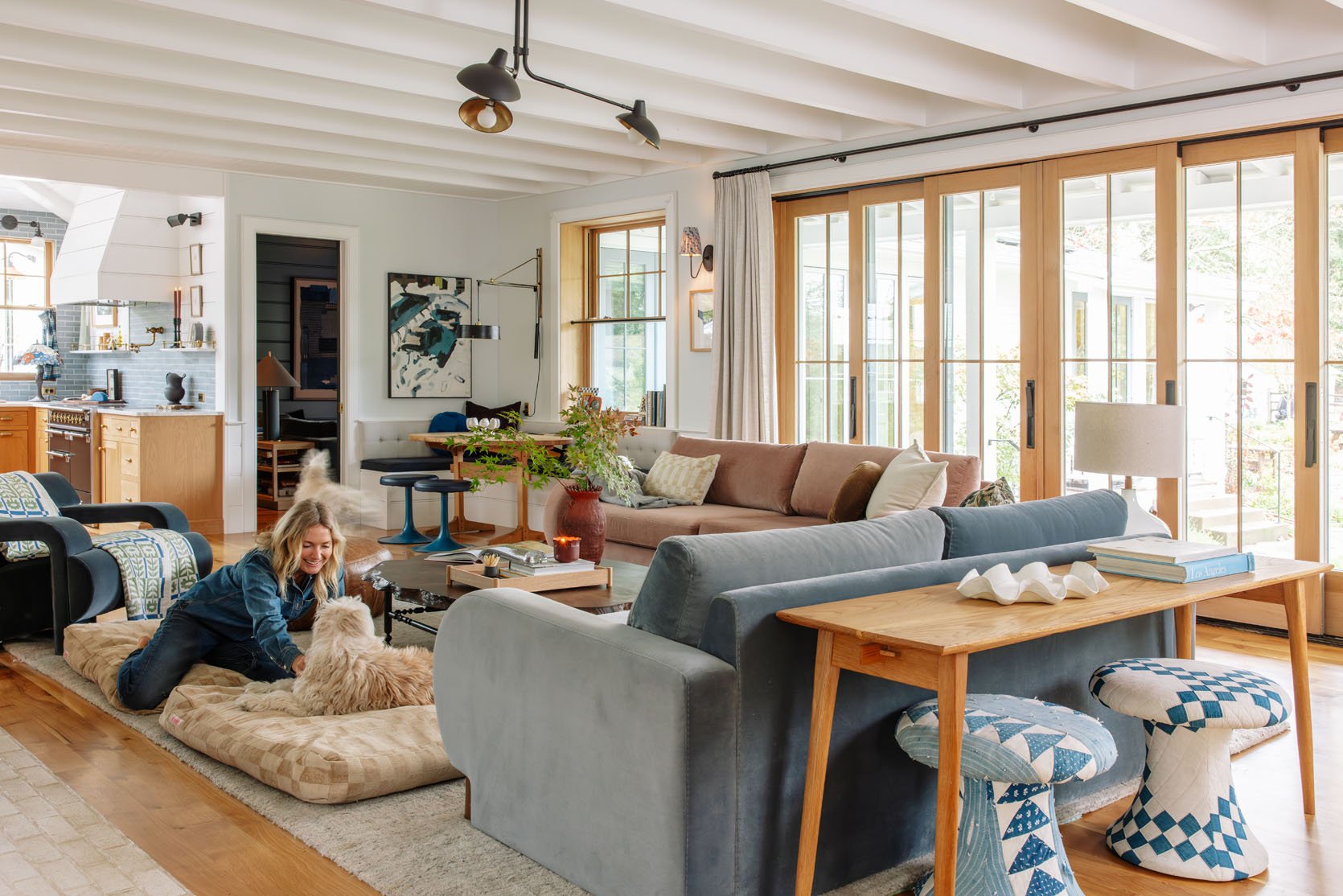
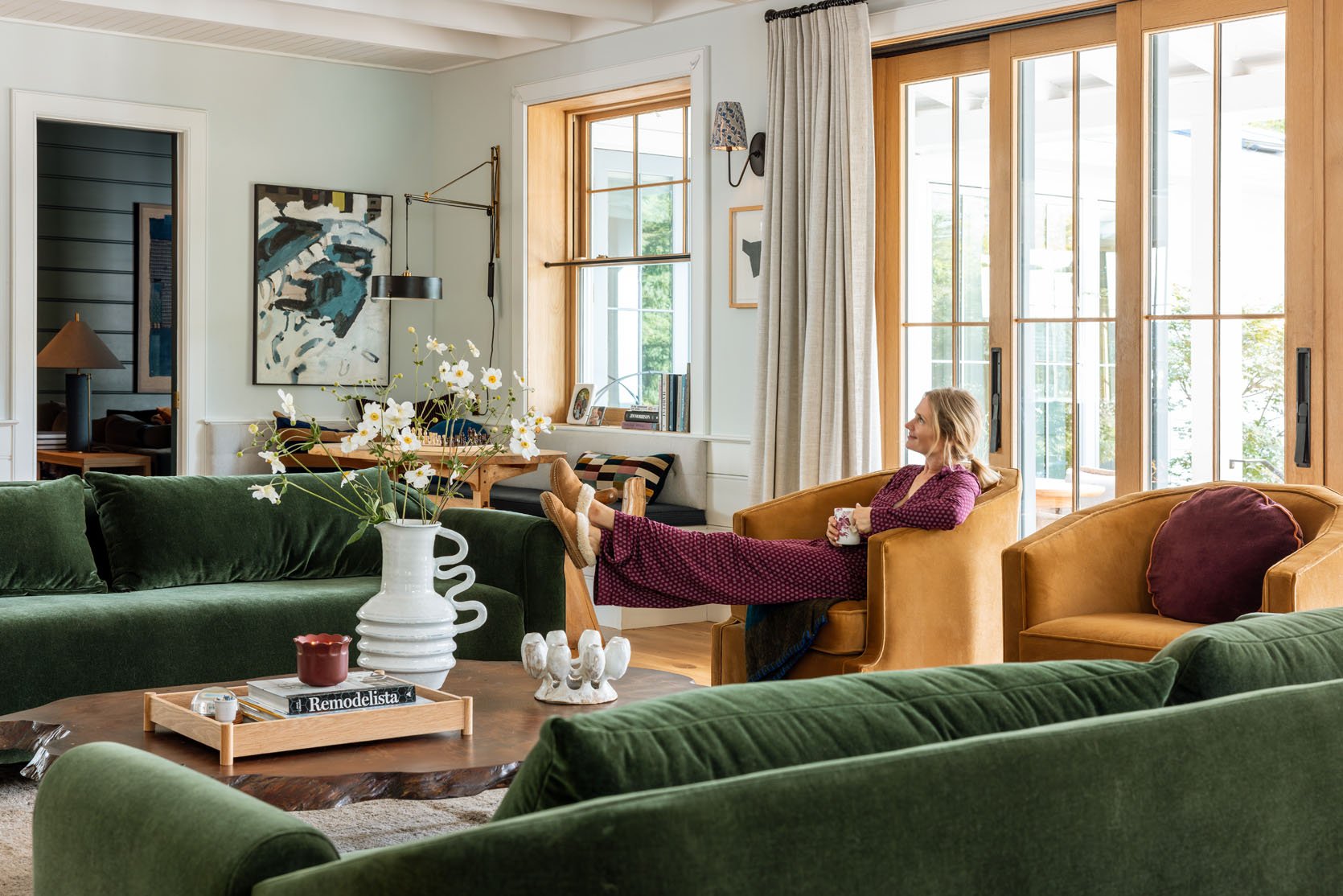
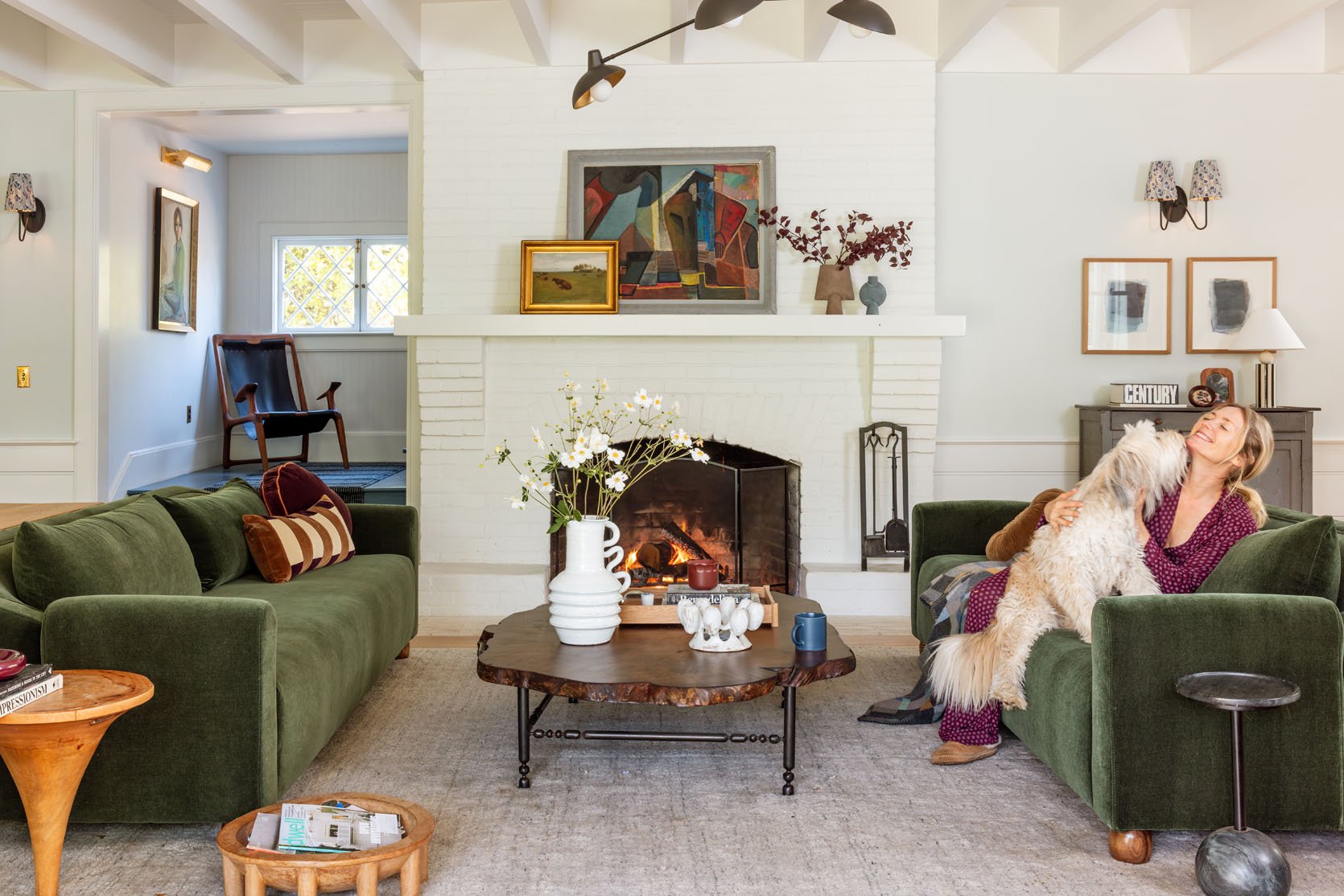
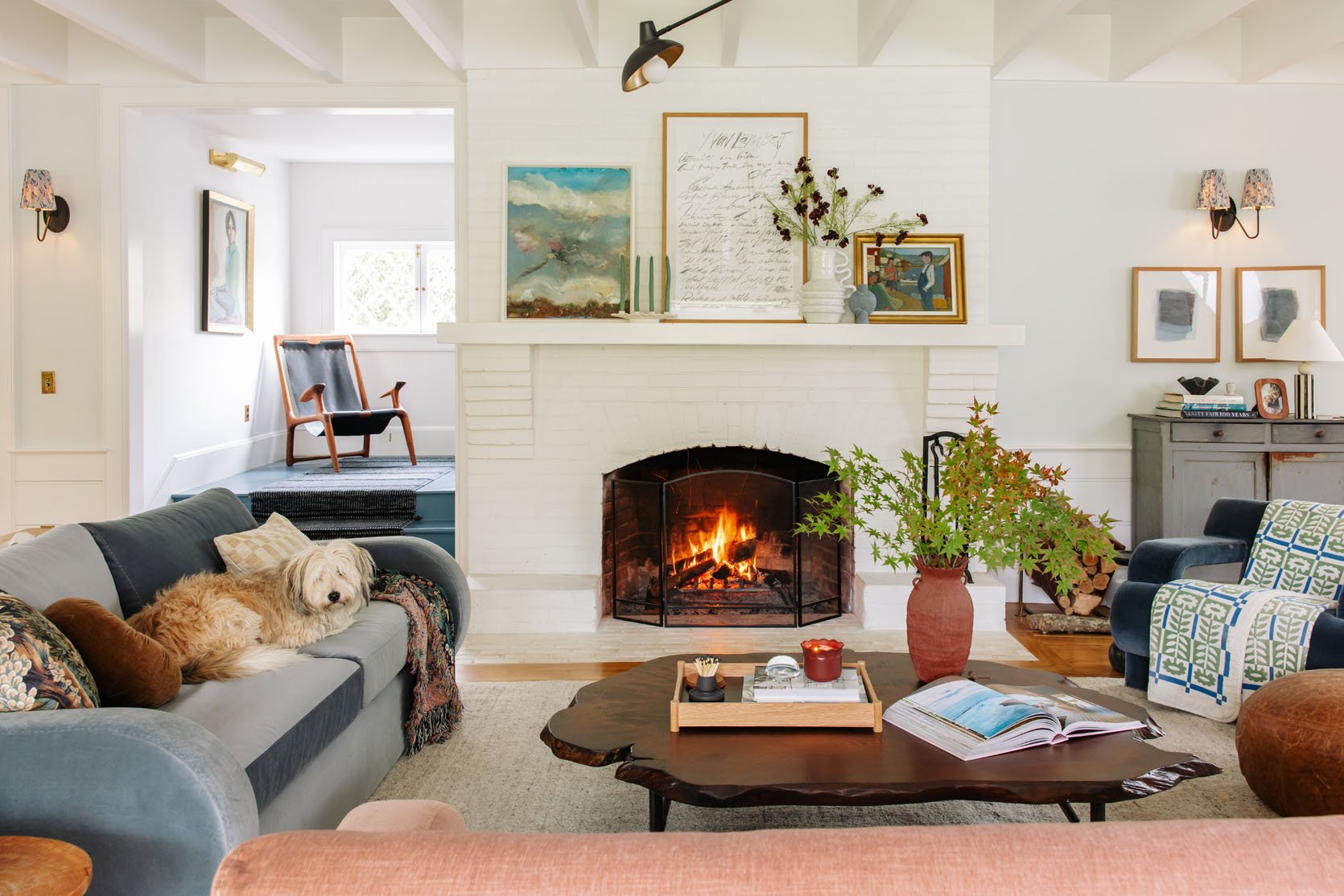
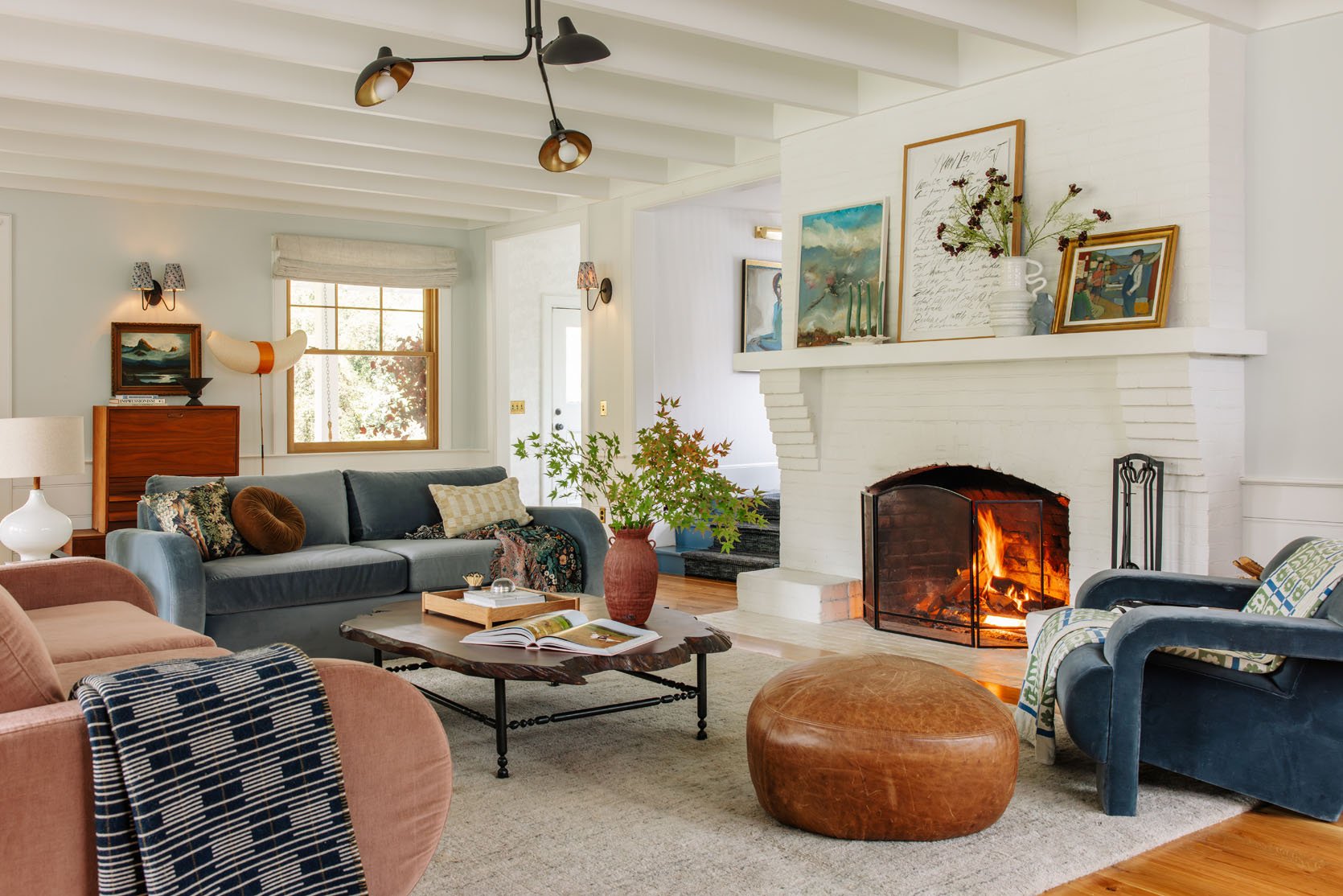
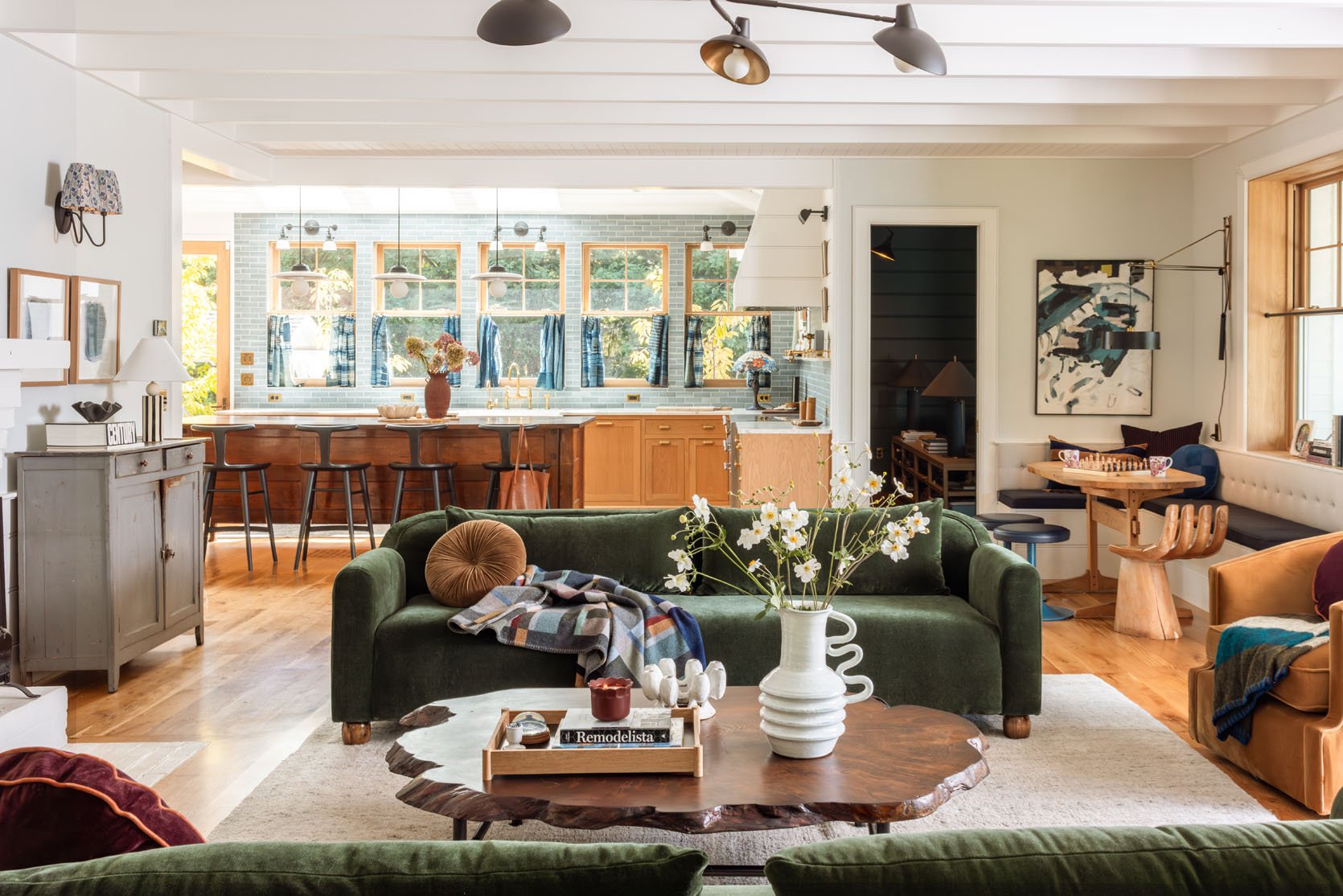
Going back and forth on the slider, it’s really just two very different vibes. The green feels richer, more high impact, more “design forward” in a way, but with that setup I felt that other things needed to change – the fireplace, the curtains, the wall color, and the rug. The balance of this intensity in the symmetrical sofas made the rest of the room feel unfinished (a lot of you had fantastic suggestions about mid-tones and more textiles, etc). But the second I got these two colors in here, in a non-symmetrical layout, the room gave a whole new good vibe. One that screamed invitation, and coziness, not to mention better scale and balance.
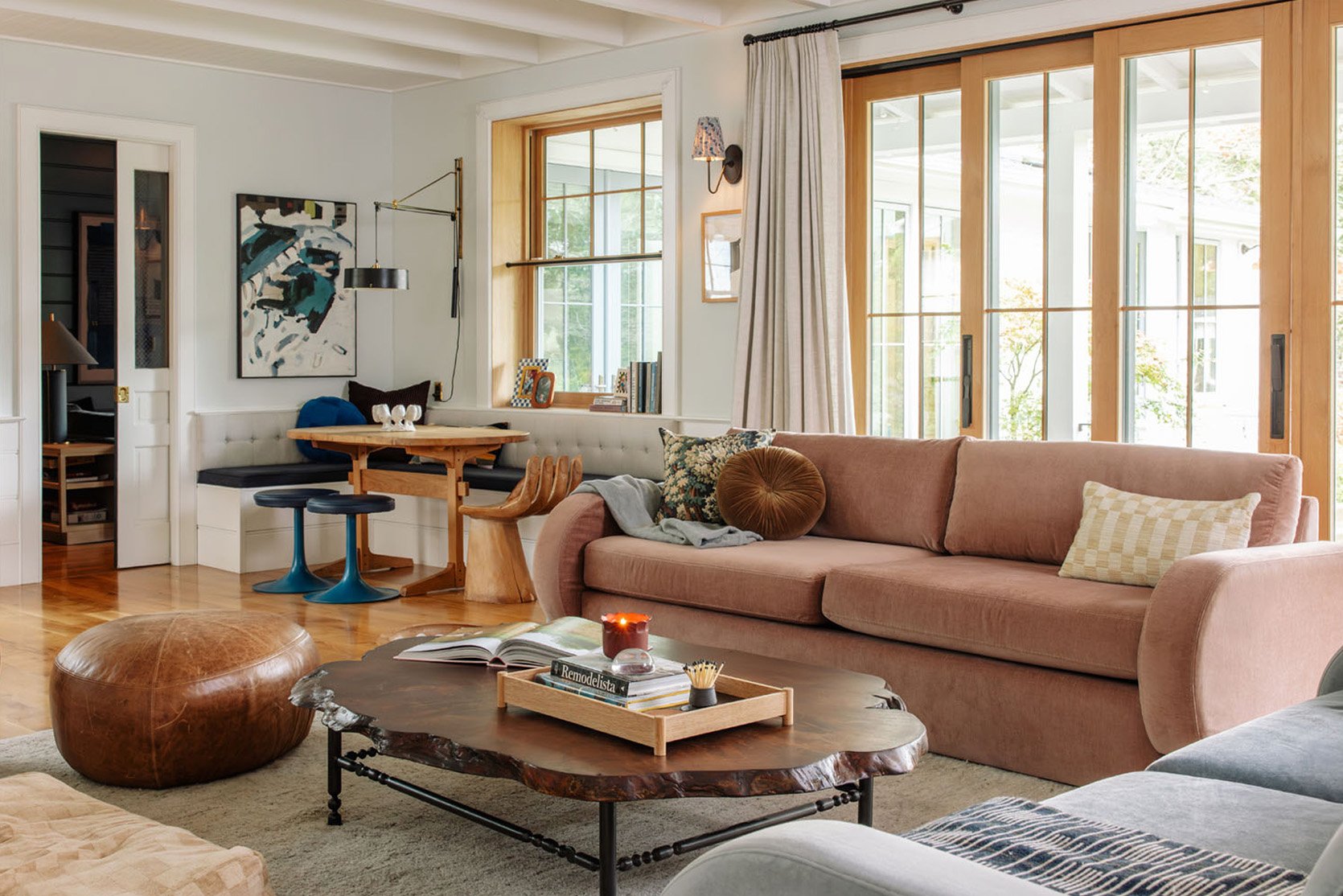
The tones, the warmth, the evenness of the vibe… the openness of the layout!! The lack of contrast really worked in a way that I should have known, but didn’t think it would work so well up in Oregon (that airy Scandi vibe worked so well in LA, but up here I thought not!). Strangely, the room feels warmer, despite being lighter? I might need a color scientist to weigh in on why that’s a thing. And I didn’t buy anything new for this, so I could still tweak it to make it better (like maybe lighter colored pillows on the dining nook?).
I think it’s just that all the softer colors played into this airy vibe, whereas the more intense colors might work better with darker walls (something I’ve known, but was just trying to make it work).
In this setup, I don’t even crave painting the fireplace or adding wallpaper. It feels just calm and cozy, with depth but not too much contrast. I mean, always room for improvements (again, I just pulled from my inventory and took like 3 hours to restyle), but walking into this room over the weekend over and over, I whispered “omg I love it” to myself.

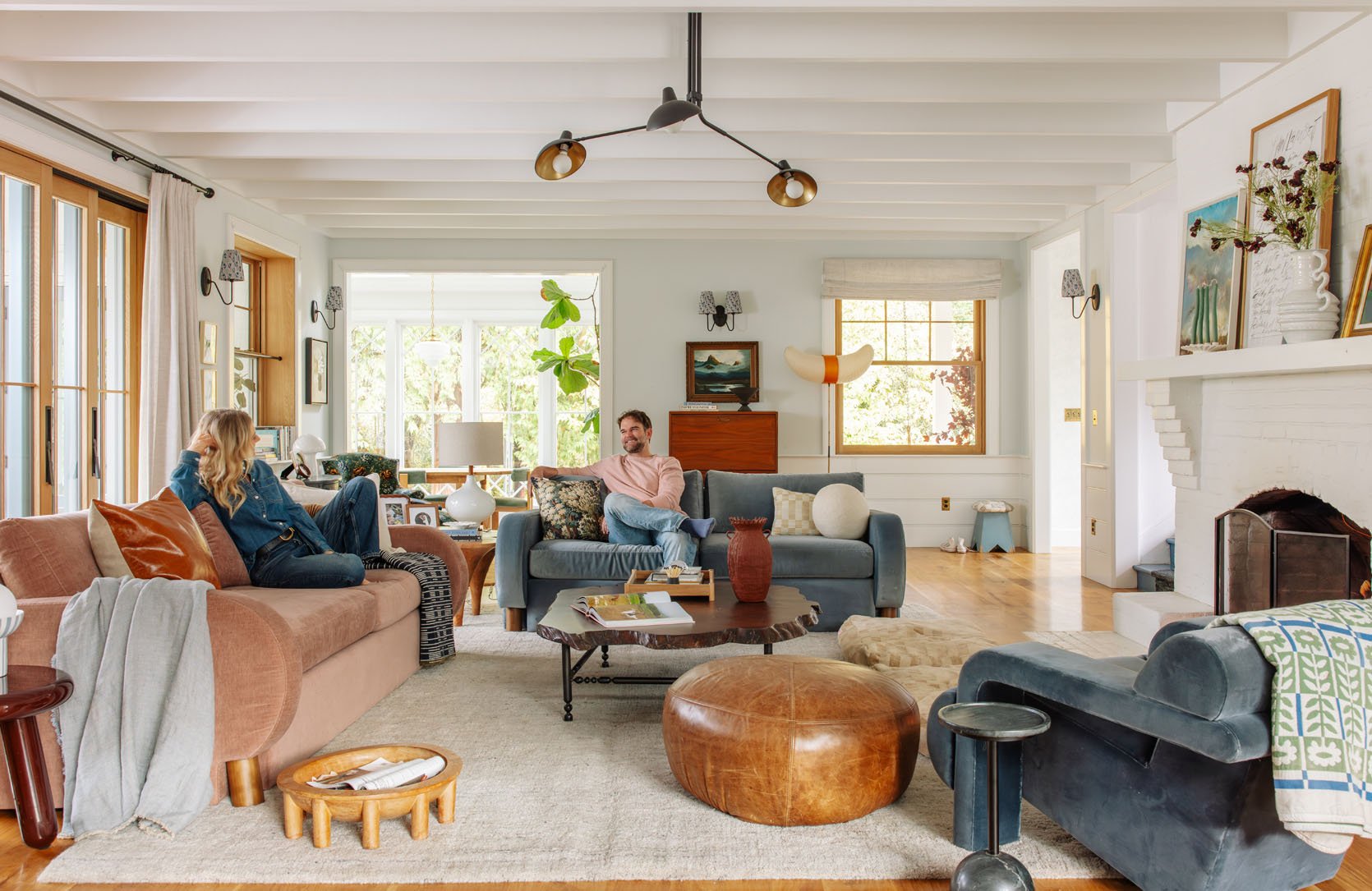
With the green, it pulls you in with the intensity, and with the blue/pink, it invites you in to relax. Brian and I both agreed that it felt more casual, which is way more us. Also, I think that the scale of the Barbs, which is big – she has big arms and a big back and a big base, it just works better in this big room. It could also be that I styled it in a more relaxing way?? No. It’s definitely the colors and layout.
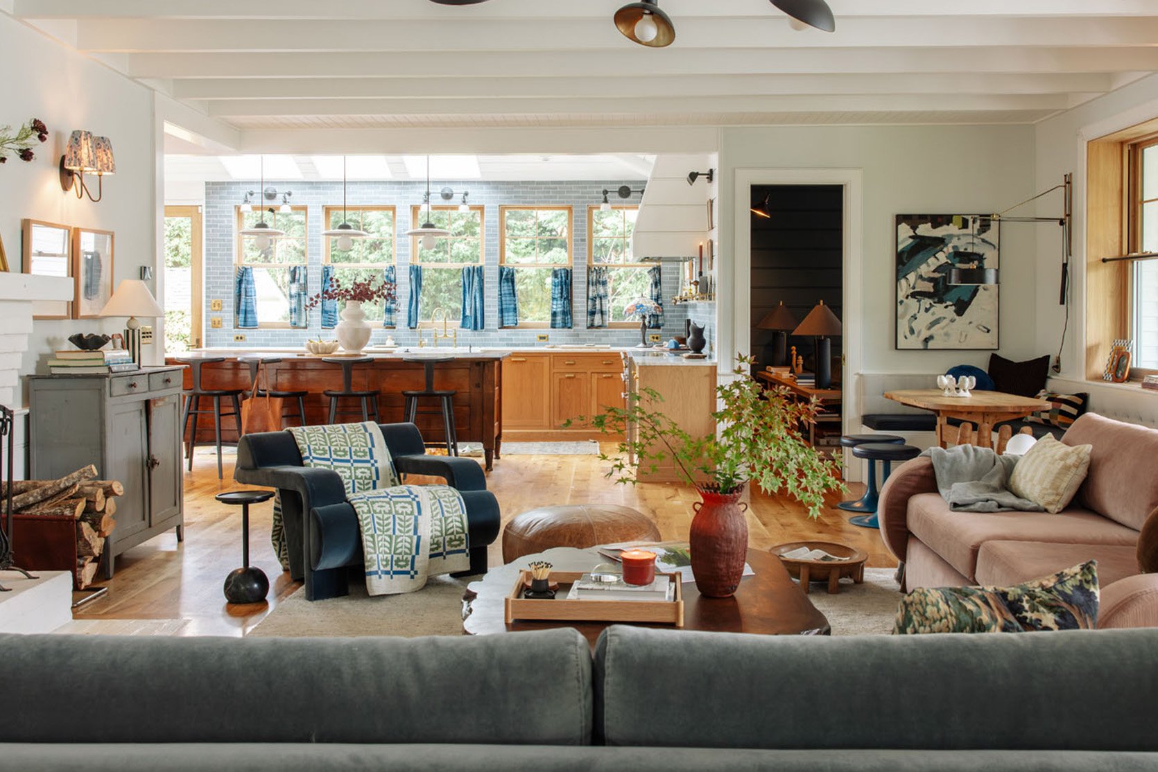
I loved sitting on the blue barb looking into the kitchen. I love that the blue/gray primitive French cabinet now looks more blue (less gray).
But Wait, Won’t The Dogs Sit On Top Of The Cushions Again?
NO!! I mean, this was literally why I didn’t put the Barbs here in the first place – I very much thought that our dogs would climb on up and make themselves at home. And they do…BUT it’s been a week with this setup, and they sit on the sofa bench, but not the top cushions. I think they are too high, and maybe the density of the foam (that is perfect, btw) doesn’t squoosh down enough like the down feather mix in the other sofas?
My Only Big Fear…
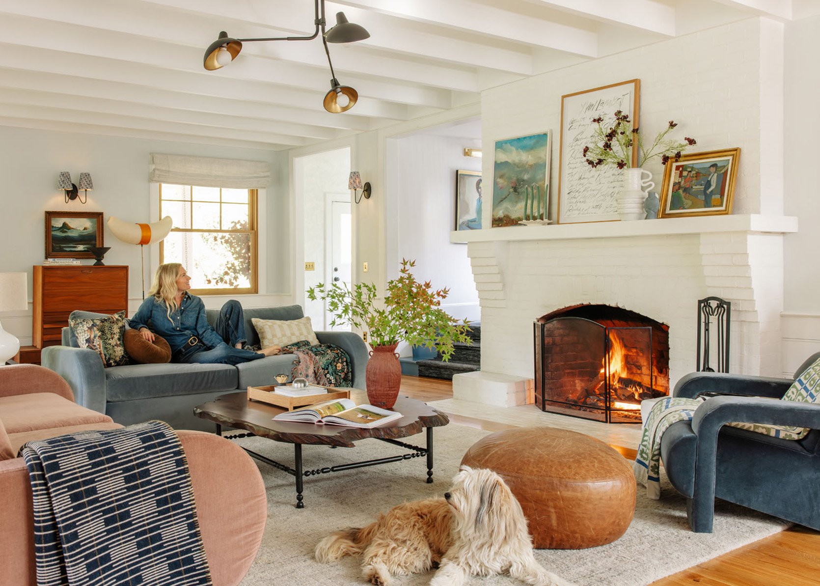
Go with me on this one. You know the women who wear the exact same hairstyle that they did when they were in their 20s/30s, that looks/feels dated now? Well, my theory is that they kept the hair the same from when they felt hottest, most beautiful, and youthful. I mean, I do that (I rarely stray from long blonde, wavy hair). This color palette is almost the exact same that I had in our Glendale house right before we moved out. See?
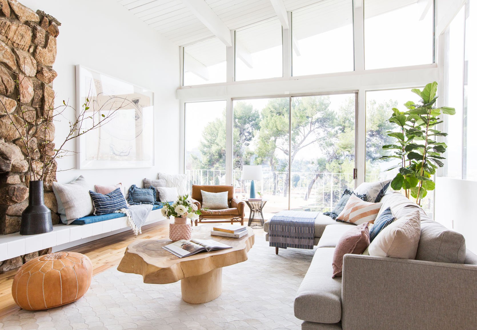
I actually still love that room, although there is something dated about it (it’s 10 years ago now). We stared at it and agreed that maybe it was the rug, maybe the type of photography (all white, super bright/airy, which was so 2014), maybe the pouf? So my fear is that I’m reverting to something dated, from a time when I felt like I was on top of my game. I know that warm Scandinavian design isn’t as in as it was then, but it’s always been what I’ve gravitated towards living in (with a dose of old-world Victorian flair). But the other way you could look at it is that these are my comfort colors and its just very me, regardless of how non-on trend it is (let me be clear, nothing about this is “dated” it’s just that it’s not part of what is super in right now which is layered old world patterns, moody colors, and European maximalism).
So, Which Will You Keep?
For now, we have the longer pink sofa and the blue barb flipped to face each other with our tree in the middle (opposite the fireplace), and I don’t love it as much (because they aren’t symmetrical, which kinda bugs me). But colorwise, vibe-wise, tonally… I love this more.
But Didn’t You Design The Alice Sofas Just For Your Living Room?
Sure did. And yeah, I feel kinda dumb not keeping them in here. Would I like the Alice in these colors instead? YES! But I think what’s working is also the layout, which we’ve had before; I didn’t love it as much.
But There Is One Thing I Don’t Love As Much…
Brian pointed it out, and I had already felt it; seeing into the living room from the kitchen feels messier unless it’s really perfectly styled. This could be because we have more throw pillows that the dogs throw on the ground or smoosh down, and it looks messy. But the symmetry of two sofas facing each other is just a really clean look to make your eye feel calm. I still like it more, but since it’s more eclectic and non-symmetrical we’ll need to keep things in their place.
More to come. We also shot this room with a sectional, and get this – we have to shoot our house decorated for the holidays two different ways. One for this year for the blog and another for a magazine coming out in October 2026. To make them look unique, we are shooting the green sofas for the magazine, which I think will be so fun.
The truth is, I like them both a lot, but the pink/blue colorway flows better and calms the need to “fix” the rest of the balance issues (like paint the fireplace, wallpaper the walls, change the rug). But I’m genuinely curious what you guys think. I’m so close to it and my judgement is so clouded by, well, my own opinion and preferences 🙂 I’m not saying I’m going to comply with what the vote is, but genuinely curious which you like more (as-is) or if you would change/combine them at all???
*Photos by Kaitlin Green
I like both and agree with all of your reasoning.
I think the blue sofa leans toward the kitchen colour and the more relaxed vibe that the cafe curtains help create so it looks good flowing from that room.
The green sofas I love as green is more my colour, but the colour and sharper lines (sharper than the blue sofa anyway), lends itself to the cleaner lines and green chairs in the dining room.
I love the more formal setup and colour of the green, but the blue, with the pink to warm, flows well with the kitchen, tv room and stairs. I know you need content and don’t want to be dated but it feels like you and Brian both want to go with the blue.
We do 🙂 I asked brian again this morning looking at the sliders and he voted blue/pink while Elliot was a strong ‘green sofas’ but I think thats because she loves bright/intense colors (and they pop so well in the photos).
Oddly, I find the new setup more chaotic, especially that shot from the left and behind the blue sofa, looking towards the dining nook. There’s no place for my eyes to rest. Maybe it’s different in person? 🤷🏼♀️
I see what you are saying for sure. In person i feel that way but I’m not sure why? Like the whole room just feels airy and integrated, with definitely less contrast. I agree that there isn’t a clear focal point and yet I love it??!! Very confusing!
Agree with this, it doesn’t work for me and doesn’t feel as cohesive and pulled together and cozy as the other.
I also agree with Carol. The two green sofas feel much calmer and peaceful. 🙂
Also agree. I am not a fan of open-floor plans so I like how the green sofa signals “new room!” I would feel a little adrift in this space with the Barb layout. There’s no clear place to go.
I think I am in agreement with you on this Carol! It looks way to cluttered to me, esp shot from the back of the blue sofa? Also, I think having 3 pieces of big furniture ALL in velvet looks too much. I COMPLETELY think you gravitate to those colors for the reasons you stated in here Emily! lol So, yeah, it does look a bit dated for those reasons. I think I am still voting for the green sofas in the living room-and I do like that they lead into the green chairs in the dining room! Emily, maybe you could put one of the Barb’s in the bedroom or guest bedroom if there is room? I do like them so much!
I do prefer this layout. I think you’re right about the colours – I think the larger sofas are just a lot of very solid green, whereas the smaller sofas are smaller blocks of colour. And the lower contrast with the rest of the room definitely works better too. But I think the main reason it feels better is the layout. The Green layout had 4 “entry points” between the furniture pieces, but the Blue-Pink layout only has 2. This immediately makes it feel more cohesive and cosy. Also, you say you prefer the squared-off layout but actually I think that layout is much harder to pull away from a “Please take a seat in Reception while we get the manager” vibe, especially in an open-plan space (although if anybody can do it, it’s you). The asymmetry and the angled armchair immediately makes the layout feel less formal. I know I’m not the only European baffled by Americans’ devotion to squared-off symmetry (and also their incomprehension of wardrobes), but there’s a reason you all have our living rooms on your Pinterest boards! I understand what you mean about the living area now looking messy from the kitchen, but if it’s… Read more »
Just curious what you mean by this: “and also their incomprehension of wardrobes.” What, exactly, am I not comprehending about wardrobes? 🙂
I think she means you don’t often use freestanding ones and always have reach-ins or walk-ins.
HAHA. yah we love a big proper closet over here … despite wardrobes being so pretty! Again, I think its due to our insane abundance of ‘stuff’ and desperation for ‘convenience and ease’. Neither of those things are great BTW (and I’m definitely not innocent of it), but if I’m thinking about it objectively it stems from that. Wardrobes are just so pretty 🙂
something I love about European style, and correct me if I’m wrong, but I think it is rooted in the function of a room/apartment/house more than what it looks like. you’d think the American way of doing things would be more practical, but that’s more of a cliche than a reality in the current popular design content world.
I like new layout. Agree with the sentiment that it is the styling of the second layout that feels a tad forced. I will love to see future styling with some believable practicality. Do you really have throws on all pieces of furniture and draped to the floor. You did not in the California picture. There are so many little items screaming for attention.
It will be fun to see a sequence of photos of this room or another that shows the furniture/rug and the slow progression of styling. You may get an audience response 3/4ths in the process when they tell you to stop.
I think a large artwork on mantel may be better than what you have at the moment.
I love learning the european perspective, for sure. I think symmetry seems easy to manage, clean, and look at – and maybe its American’s obsession with “convenience” and “ease”? not saying thats right but its fun to think about why we insist on certain things that we do, despite admiring European design more than American. I love the lobby metaphor, too. And yes to the throws = i actually folded them and draped them in a more graphic way after we shot this and like it much more. xx
As a fellow European I’m dying at the wardrobe comment 😂. I never realised what you mentioned about symmetry, but you’re so right! Needless to say I prefer the new lay-out as well, feels more organic/relaxed.
Oh, this is so nice! I agree that the colour palette is much better and more you, and that it no longer feels like the fireplace doesn’t match. I also prefer the way you have the mantel styled with the blue, and I even think the coffee table looks more casual like this – the dark wood and dark green combined somehow looked fancier.
Just curious, if you don’t want to look at the kitchen mess (mine would never be tidy), did you try one sofa with its back to the kitchen and one with its back to the French doors, so your L-shaped arrangement looks the other way? But perhaps there’s less room for that?
I do think the Alice sofas are nicer in themselves (I like the single back cushion and the feet), but I think the colours here are better. I think three items of velvet is too many though (two sofas and the big chair) so I’d suggest changing one to something else like linen or wool. But I am team there CAN be too much velvet and I know that is controversial in these here parts!
YES I agree that there’s too much velvet. I would keep the blue (with maybe the back to the kitchen? And add a neutral/linen in the arrangement suggested above. Perhaps leather and/or tie in some of the black that you have in the seating throughout the kitchen/nook.
Agree with this, the light blue and pink and velvet feel too pastel like boy or girl baby vibe but not farmhouse, mixing textures and more natural fabrics feels more farmhouse — loved how the green felt earthy, but a neutral belgian linen would work with either green or blue
Yes, it’s TOO much pastel for a farmhouse in these shapes I think?!
YES! TOO MUCH VELVET! And I LOVE me a great velvet sofa!!!
I also think visually the two Barbs are a bit heavier. I like colors of Barb in this room but with the shape and style (cleaner lines) of Alice. I agree there’s also way too much velvet going on.
I love velvet, but yes, you’re right that there’s too much here. I prefer one velvet sofa and then other upholstery for other seating. Let the velvet stand out!
hmmm.. I didn’t try it the other way because we love how conversational the living room and kitchen are with the opening being on the kitchen end (like we shot it). Its just so inviting. In the mornings before kids are up brian makes the kids breakfast and lunch while I sit on the blue sofa working/planning with coffee and when it was the two green sofas I would feel like I had to get up to walk to the kitchen to talk to him, but in this set up we can have a conversation easier (same distance, just a mental thing?). and haha re the velvet – I agree with you in this room, actually 🙂
oh and I want to mention that the blue and pink sofas are also velvet but they are different textures so somehow it works? Or maybe they just aren’t as jewel toned so that helps?
I see what your saying Emily. Hmmm. Maybe you can figure out a different layout for the green sofas in there? I think I just love the style of them way more in the room?
I think I am in agreement with you Elle about the layout. I might like the idea of switching where the 2 green sofa’s are placed? Or if the two once switched look too long in that configuration together, maybe sell one and make a green loveseat if you want some variety of size with the green? Someone mentioned that with no doggy beds the green sofa’s don’t look as inviting? I would maybe consider bringing in a leather comfy chair to break them up a bit?
I also def don’t like the great coffee table when it’s paired with the Barb’s. When it is, I hate to say but maybe the Barb color’s make it look cheap? I DO love that Blue chair however!
Did you try 2 blue Barbs facing each other like you had the green sofas? That might fix the “messy “ view into the kitchen and then you could bring the pink in with the chairs maybe?
Anyway it’s really fun to see all the combinations and your thought process!
Along those lines, I’m wondering if they tried 2 green sofas in the L-shaped layout or would that require a long and a short sofa? I definitely like the less formal, more open layout and the softer colors are a nice change but am curious how much of the appeal is layout alone vs color change.
I haven’t tried that (I don’t have two blue barbs right now) but totally thought about it! And I don’t think the two long green ones would fit as an L, but I do have an 80″ Alice in storage (a size we decided not to sell) that could work. But I go back to the intense color of the sofas created an imbalance in the room as a whole… i mean I do love playing around ….
agree, if it’s the layout, stick with the green
wow what an interesting decorating situation. I agree, I think the blue and pink sofas definitely flow better in this space and just looking at the pictures I feel more relaxed looking at the ones with the pink and blue. I think the old green sofas were a softer green color and that green color worked better. The darker green ones – while they are beautiful -seem too intense for this space. I think you hit it when right on the head when you said if you keep the darker green ones you would need to change out the fireplace color etc.. – the surrounding area is more light and airy and that’s why the lighter color sofas work best – in my opinion.
agreed 🙂 thank you!
Hmmmm. I love the green color so much but maybe your right? Maybe you could have one green sofa and then throw some other styles in so you can have a better configuration and more colors in the room? I do think with the green ones that it is too stark and formal looking to have both facing one another the way it has been. I say, maybe bring up the shorter green sofa to try an L layout, or maybe getting rid of one and pulling in some other colors and fabrics. I just don’t love the shape of the Barb’s IN this room. I like them in general though! Maybe you can mix some different blues and blush colored items in so that the green sofa won’t look so dark to you?
I love green (love it!) but the Barb sofas feel right in this room. And even your “but I’d still like to fix this” — messy pillows, etc — feels more livable than the previous issues of “the vibe is all wrong.” Stick with the new sofas!
I agree! Stick with Barb in here. It feels welcoming and cozy and lived in. Honestly, I’m shocked… I came into the post thinking I was going to be team Alice all the way, but these just work in a beautiful, real, and unfussy way!
Same! I really thought we were just trying the barbs to shoot for marketing. Part of me is so relieved and the other part is like ‘why didn’t you know this before?’ 🙂
Maybe it was the high contrast that was ultimately bugging you? Which someone might have already mentioned 🙂 it’s taken me a little while to realize that’s something I don’t like as much in terms of living in a space day in and day out!
I just think if you keep the Barb’s maybe get rid of one of the sofa’s and do a different fabric for texture at least?
Well when I saw the blue/pink sofas on Instagram, I was in the “no” camp. But now I’ve switching my vote to “yes.” I’m sure that helps clarifying matters. 😉 I’m also surprised by how much I prefer the L-shaped layout. But it’s also the colors. Personally I would always buy a dark green sofa over a pink one. But in this room, the blue and pink sofas look “right.” Everything flows better. Huh.
Exactly! On Instagram I was 100% for the green sofas and symmetry, but seeing it here on the blog I changed my mind. I love the softer look.
Same! I voted green on instagram but hearing your explanation, I’m convinced.
I think the green will work if you make other changes. The pink and blue do look better with the current walls, fireplace, etc.
haha thank you! yah i was SHOCKED that 75% of the voters voted team green but think it was just how we framed it – sneak peek versus professional photos? I get it – the green really pops in photos so maybe people are reacting to that. But i’m glad you are on team Barb now 🙂
Yes, we can “see” a whole room at once in photos, so we prefer more spare, more open spaces than we would in real life when you can only look at a few things at a time. The sneak peak gave a better sense of the architecture. (The all white California casual look proliferated in part because of Instagram, so I don’t think it’s just the contrast thing.) I fully support the softer palette – it works better with the other decisions you’ve made, which makes sense. It is your style (own it!). I was impressed you made the jewel tones work with styling, which was an incredible feat given the undertones of the walls, floors, etc. I still think this large, open room wants another conversation area rather than more large furniture. While I appreciate that with new sofas, people can reach the coffee table, it makes the dining nook and entry look cramped in comparison. The scale of the room wants smaller pieces. And it’s not possible to talk to people more than a few feet away, so it’s okay if people aren’t all looking at each other when you’re entertaining. (It would be different if this were… Read more »
I just appreciate your honesty. I can’t tell if I like things until I literally put them in my space and it’s caused me to make some dumb design decisions (and also, never make certain decisions). It’s relieving to me that I’m not as flawed as I thought – even a professional designer with your level of success can’t tell until things are literally in her space! And even then, you don’t 100 percent know WHY things work/don’t work. This honestly makes me feel so much better that it’s not just me. And maybe I just need to go for it more often instead of over analyzing.
I agree completely, Sarah! I watched Million Dollar Decorators a few months ago, and Madam Kathryn Ireland herself would bring several options for each piece (coffee tables, sofas, side tables, even fabrics for drapes) and swap things in and out in the space until the room felt right to her. That method will never be an option for most of us, so we kind of have to take our best guess (which is especially challinging these days since most things are sold online and we don’t even get to see them in person until they show up in a delivery box at our door). It’s HARD. Watching that show made me feel so much better about my many misses.
I LOVE this new color scheme and layout, Emily. It’s working so well. The green couches are absolutely beautiful, but these two Barbs are a match made in heaven for the space, especially with the kitchen in the background. I’m looking forward to seeing which direction you go in!
Also, see Anna Wintour for the power of sticking to a signature hair cut! 😆
Thank you!!!! I guess I have a new show to check out! 🙂
you are so not alone … design is so much about a feeling. Although if I had layed this out in a moodboard with all the elements (i.e. designed the room this way) I think i would have predicted it. Part of me is kicking myself for not “designing” the Alice’s in the room with all the rest of the elements …. think I could have predicted that they would look/feel to formal from doing that exercise. the rooms that I “design” in advance often do work the best (most need to be tweaked) but this room was more picking furniture over time which can get you a better room but takes a lot longer and there are usually mistakes/changes along the way … So many you can avoid, but some you just can’t, unfortunately 🙂
I love this! The new sofa colors are perfect for this room.
thank you!
I do think the colors look great but I still like the shape of the green ones more in that room. I think ESP having the two sofas in the same shape as well as all of the 3 pieces being velvet makes it look kind of child like? Here is an idea (if you can sell the green sofa’s) is to get those made in the color’s you like that are on the Barb’?!!
I love the blue-pink, asymmetrical layout. What I like most about it is the Barb sofas. They have interesting silhouettes that can stand up to the massive, intricate fireplace.
I guess it’s too late for this season’s shoots, but I feel the latest layout also offers more flexibility in placing your holiday tree. The symmetry of the older layouts called for placing the tree opposite the fireplace, centered between two identical sofas, but now you could consider other spots for it. I think having it in the approach to the kitchen might detract from any messiness there, and would be visible from the entry, which some people like. Thank you for the wonderful design education!
you know I thought about putting it there and asked Brian and he gave it an immediate no because our tree’s diameter is just so big, but after you said that I went and stared at it for a while and now of course want to move the tree there to try it … And and I think you are right about the silhoettes of the barb – I think they have bigger lines, and are bulkier (in a good way) which works so much better with the scale of the room and fireplace. scale-wise I thought the Alice’s were fine – they were long but low, but once these were in there the scale felt so much better. xx
I prefer the lighter palette and think they look great. My only concern if it were my own house is I wonder if only two people would sit on each Barb couch and that might be harder with a larger group.
Yah. Our rug is just so dang comfortable (its like 3″ of cushion) so most people love sitting on the ground around the coffee table (I sit on the dog beds all the time in front of the fire, lol). I agree, less actual seating in a way, but we’ll see how our holiday family party fairs. xx
Barbs for the win! The green ones look more formally stylish but the blue/pink combo looks like the room I want to hang out in. It’s the “come on in, relax with a glass of wine and chat while I finish making the pasta” vibe rather than (as another commenter put it) “have a seat in reception.” Not that I thought that about the green version beforehand, I don’t want to drag it too hard bc it was very pretty. But in contrast to this version, it is notably less welcoming.
Yes! Thank you!!!!
Another vote for the new Barb sofas! I liked your old green sofas in this room, but I’ll be honest – not the new ones. I just think they looked bigger and bulkier and I think maybe the tone of green just felt harsh in this room.
I too am surprised I am voting this way as I LOVE green and have always wanted a room with two symmetrical sofas facing each other in front of a fireplace … but seeing this new layout with the Barb sofas just feels so much better to me. It’s like I couldn’t quite figure out why I didn’t like the green Alice version, but now I see it.
I think sometimes we have to lean into the idea that things happen for a reason to lead us to the place we are supposed to be, even if it is not what we expected!
yes! and funny the Alice sofas are actually smaller than our former green sofas (like 4′ lower) but I think the color was intense – it belongs in a darker room or a room with more dark elements? Now I need to find a project to design/prove that they can look beautiful because they are such good sofas, but the color was too much for this room (comparatively). I am excited to shoot them next week for the magazine with a ton of greens and reds 🙂 You know, our “christmas sofas” lol.
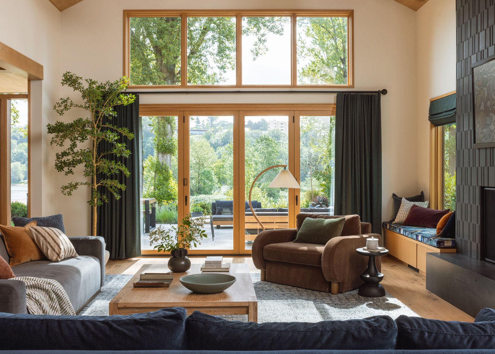
First off, I’m no designer. I notice when I look at the new layout (which feels more casual and open in a lovely way) my eye has trouble finding a place to land. Is that what you were going for with the green sofas: something grounding? When I look at the pics of your brother’s living room at the bottom of the page, I really like the dark curtains and fireplace and clean lines. Yes, it’s a different style, but it’s also got some solid places for my eye to land (like the big stone fireplace in the LA home). Like, suddenly the cafe curtains look kinda messy in the new layout, and I keep noticing the wiry light fixtures.
I remember when I moved to the South it took awhile to reclaim my wardrobe style. People dressed up more and wore lots of pastels and I was a jeans and black t-shirt kind of person, which seemed out of place there. All that to say, I can really sympathize with working to honor both your current location as well as all that you bring with you. 🙂
I hear you and don’t disagree – re the landing place. My brothers living room is so well balanced – thank you for saying that. Could this be balanced but in a light/airy way? I thought about putting the same Lulu and Georgia rug that i’m obsessed with in this configuration but I honestly love the lightness so much that I don’t want to bring in an intense pattern. But I will say that I think that the fireplace could still get painted, but now just a lighter color? I’m not done with the room but just soooooooo much happier. And yah figuring out my vibe in Portland for sure 🙂 I would have thought this room wouldn’t be cozy enough in the dark winter, but I couldn’t have been more wrong. Its just so cozy (especially at night with the fabric sconce shades)… and the fire… ugh. i love being in there.
that’s so interesting about us sticking to a style from our past…. my sister and I recently went back to the hairstyles from our best past selves (her: 80s chin length bob, me: pixie, though now it’s a middle aged lady pixie not a 90s girl pixie), and it feels really good! there’s also something about a time when we found ourselves, found out what we really like, what really works for us. when we are “feeling ourselves”, and maybe that’s a good way to think of it? not that you’re stuck, but that you found what you love!
as women we have learned the lesson very well to kind of pick ourselves apart, judge ourselves and our preferences. try to optimize everything. I guess in your job that’s very exaggerated when it comes to style. I say do what you love and everybody else can just deal with it! walking into your living room and saying “I love it” to yourself?? that’s goals!!
Ah thank you. and I agree – its like our comfort colors, our comfort hairstyles, our comfort fashion style – regardless of trends we should lean into them. I really really really try to ignore what I know is more ‘in style’ right now (l.e more maximalism, boldness, moodiness, pattern on pattern, etc) and just do want I want, but its hard at times (especially when I genuinely love so many different styles). Anyway, thanks for your support and comment 🙂
I agree, I have my comfort colors as well, which are very similar to yours Emily! lol Again, I think I vote change the color’s on the green sofas to these?
I genuinely love both options! I love the darker green, but I also feel that the new layout is casual, which speaks to the open concept and the family room vs formal sitting room. More than anything im grateful to see you give the casual option so much love. I have a somewhat similar situation (farmhouse, open living room to kitchen) and I have been feeling bad recently that it doesn’t have that perfectly lined up put together feel. But that’s just not who we are and it isn’t the stage of life we’re in. So thanks!
yay! yah I think you are right – had the green sofas been in a contained living room they would work a lot better, but if the house is designed to be open and flow then I should lay it out to be open and flow. xx
The dark green is too dark and doesn’t suit you or the room as beautiful as they are. The new way is more cozy and relaxed and as you rightly pointed out, eliminates the need to change the bones of the room to make the sofas work.
I think the hardest part is this conflict between what feels good to live in personally on the day to day and your need to show the world you have design skills, proven by the way you design and style your spaces for public consumption. Its similar to the way I get all dressed up for an important meeting but much prefer my fat pants and a blown out t-shirt once Im back home. Earrings Bra and structured clothes come off and I can just “be”. Somewhere in the middle is probably where you will find the livable-for-you sweet spot.
Totally. this feels like my braless/soft pants room 🙂 xx
They’re both gorgeous! I agree that the more tonal vibe feels better. I think it’s ok to have your signature style. That doesn’t make it dated. I think we should stop wanting our houses to be on trend. It promotes consumerism. You do a really good job of highlighting that conversation. If it’s the more tonal aspect of it that works I wonder if pink or blue facing sofas would fix the divide between option one and option 2?
yah I guess I just didn’t realize it was almost the exact color palette that I did 10 years ago (I don’t want to feel stuck), but hell its also such a fast cycle even if it was ‘out’ its back 🙂 Agreed, not to try to chase trends. I think about the mountain house, which was designed at the height of warm minimalism, and what I would do differently now that that style is less ‘in’ and the answer is nothing. It was perfect for the house and how we wanted to experience it (even if it is super neutral) and I would change very very little. xx
They are both beautiful but the new set up feels so balanced! And I would disagree that it feels dated. It feels very modern to me in a casual cool way. As a design school dropout, I ended up becoming a lawyer, I know the rules but often times struggle with what I like better. What the heart wants, the heart wants!
thank you for saying that (re dated). I agree, just as I get older and care about the trends less and less there are times when I have some self doubt (which I don’t think is a bad thing – i forces me to think/talk about things and not assume I’m always doing the right thing, etc). anyway, thank you 🙂
Emily, what set of fire logs do you have in your fireplace?
they are wood 🙂
I don’t love the silhouette of the Barb and agree that the whole area feels more messy to look at. I don’t think the silhouette matches the house. I like the structure of the Alice. I like the green, and if it were my room, I would pick a slightly lighter (mid-hue) grayish green. Or perhaps the Alice in another colorway.
well, I disagree re the barb (I love her arms so much) but appreciate your opinion 🙂
YES! I think so too Emily! I DO like the Barbs so much, but I don’t feel they match the style of the house, etc.
Yes! This version is awesome and looks like Emily in a beautiful farmhouse. The colors and layout look exactly right for this space. The Soho chair should be in the room, but the addition of the chaise and the quilted stools is delightful and all bring a uniqueness that you don’t get from the dark green sofas. Take away one pillow from each sofa and one throw if you need to tidy up, but I say you have beauty and comfort which we all desire.
ah thank you! and i put the chaise back in the corner but am debating swapping it where the soho home chair is. I’ll show you where it is soon – pulling that post together. but I LOVE having it back in my house and you are right – adds the quirk that feels more like me. Just more eclectic and less serious. thank you!
I like you LOVE cool toned colors, with blue undertones, and the green couches are warm, with yellow undertones. And having a big zone like the kitchen feel cool, while the living area felt warm, created a sort of weird tension. Like those two rooms just don’t go together in a way that’s calming and relaxed. I think you can play around layout and shapes as much as you want but, at the end of the day, if you want the living room to work harmoniously with kitchen, you need to have cool tones in the living room too.
I agree about the undertones of the green sofas and tiles. To my eyes, the original view from the living room to the kitchen has always been problematic. The value and saturation of denim blue tiles and the green sofas seemed out of sync. In addition, the position of the green sofa with it’s back to the kitchen has always jumped out to me. I’ve noticed that in a lot of images with open kitchens where the sofa has it’s back to the island they often are centered, providing more symmetrical repetition of shapes. In the original layout, the green sofas are budged over the right of the kitchen island due to the fireplace wall. And while intentional asymmetry can also be beautiful, this looks close but not close enough to parallel alignment. It looks like a hit and miss to me. My two cents, the new colors and intentional asymmetrical layout with the angled chair and full view of the beautiful island and kitchen is spot on.
thank you! I feel like undertones are getting easier and easier for me (one of the many reasons why I wish I had gone to art school, tbh). but I think you are absolutely right and i hadn’t thought of it like that. 🙂
I like the new look too. The sofas look inviting and cozy. It’s more casual than formal. I don’t like the pillows and throws. What happens when you remove all and add just a few in the same colors as the sofas? I find pillows add clutter unless they are in the same colors. There’s rarely a need to visually break up a large sofa into smaller parts. I agree about the colors working and wouldn’t worry about repeating the past. Some of my furniture have been with me since 2000s, arranged differently Most people live with the same stuff for as long as it’s not damaged. We sometimes worry too much about the spaces being perfect, whereas unexpected things make rooms interesting, fun, charming. What happens when you do the opposite of what you always do? Fewer pillows. Bigger and bolder decor pieces instead of smaller. Less worry about repeating your old rooms that you loved. Notice how the English and French fill in huge rooms. It appears different, less pressure about finding symmetry or centering things. Somethings are easy to figure out and don’t require changes ( your dining room, but it’s a smaller room and easier to… Read more »
I think you are right re the pillows. those are just what I had on hand and we need something but since we shot i have actually reduced the pillows and like it more. Tonal pillows is a great idea. I had a cream one in there that popped too much so I think just leaning into softer tones is a great call. TY!
I hope you get the room that you are looking for. I enjoyed aspects of my airy living room when it didn’t have all the furniture. I get why you want to make it work
I definitely prefer the lighter colors in here – they work SO much better with the room. Dark green is lovely, but just wasn’t working here.
I’m torn about the openness to the kitchen. It’s a weird thing, but I don’t like looking at sides of cabinets. Would have been great if the island could have been centered on the living room. And I wish that the eating nook was gone and that the door to the TV room could be larger. That corner always looks so cramped to me.
I also prefer this new layout and colors!! Isn’t it interesting how sometimes you end up just stumbling upon the right direction!
I like this layout a lot better but I just really want the sofas to be the same color! The pink and the blue are both gorgeous, you could pick either color. I’m excited to see the green sofas in the room all decked out for Christmas!
Both versions are very nice, but I like the blue/pink version a lot. One thing I’ve wondered … I’m 80, fortunately very healthy, but the thought of trying to crawl off of these really deep sofas is daunting. It doesn’t look like you could just “sit” on the sofas. Was any thought given to how older or perhaps disabled people could use your beautiful furniture? Just curious.
Hey Jeanne! The barbs are pretty high and their seat depth is slightly more than standard. I LOVE how they sit, actually, every time I sit down I think ‘this sofa is so ergonomic’. I can’t attest for all people though – my in-laws (who are 80) are coming to visit over the holidays so I’ll see what they think! The alice’s had the pillows that came with them that made it so they didn’t sit deep at all, either. But that soho home chair for sure is low and deep (and hard to get in and out of). We definitely talked a lot about this when we were designing – making sure that some sofas are easier to get in and out of and better for conversations – like the Alice. More to come though 🙂
I’m laughing – with total love – because as soon as I saw them I went, “we’re back to blue and blush!” Hey, if you love it, go with it.
YEP!!!! As they say ‘everywhere you go, there you are’. 🙂
They’re both beautiful. The green ones are more formal (and not just the layout, but the vibe in general). And I agree, they want the fireplace and walls to change to go along with their dark moodiness.
The bulkiness of the barb makes them a lot more casual but the soft colors and velvet elevate them. And they definitely fit into the lighter vibe that the room already has.
As for light and airy in Portland, I grew up in that area. Winters can be so gray and dreary that we want to brighten and lighten everything up.. just keep it cozy too with a fireplace, blankets, soft textures, etc.
My parents still live there and my mom just painted their living room soft pink and it’s beautiful!
Anyway, Scandinavia has long winters too and little light— isn’t that why they do most spaces light and airy in the first place?
I think it really depends on the overall vibe you want, and how you use the space, but personally I’d go with the one that makes you walk into your living room and say ‘omg I love it.’
I agree re scandy design. Brian used to consider scandinavian design ‘cold’ until we had the mountain house – it was so light and full of so much wood/texture that it felt really cozy even in the long winter. I love our dark family room at night where we watch TV. Its so dark and cozy, but as you pointed out light can also be cozy, which I think this proves (at least in person it proves). TY. xx
I love the openness of the blue and pink arrangement. It’s a much cozier, softer, inviting look. The green sofas are gorgeous too, but they look very formal – like you’re not supposed to sit in there. The green and gold might look more holiday though, which is something to consider. Can you keep both and switch them out as desired? 🙂
yah, we’ve been joking around a lot that the green will be my ‘holiday’ sofas, which is certifiable but since i have a line of furniture that I have to store in my garages its actually doable (Brian is going to LOLOLOLOL). i’m shooting them in here the first week of december and while i’m technically not allowed to release the photos til next year (christmas 2026) I’ll figure out some sneak peeks for the blog so you guys can see. xx
Both are lovely – and I love that you could rest where you like even if it feels dated. Sometimes the best design isn’t what you want to “wear” everyday. I love to see the Babs in either blue or pink facing each other.
ha thank you! really appreciating your directness here 🙂 The Cy Twombly is a lithograph btw and I think thats a fun idea, actually. I do love that other painting but willing to try Cy for sure. I love the styling of this mantel, but your passion towards how I had it styled is very convincing! the mushrooms and the floral chaise look fine together. would I have designed them together? Probably not, but they share some of the same colors and they are quirky. I don’t think we took a photo with them both in the same shot but i’ll try to next time we shoot (holiday decor this week). anyway, thank you 🙂
I definitely like the new color palette more. Feels more connected to the kitchen and other elements. I wouldn’t have noticed before, but not seeing the green connected to the overall design. Since we can’t see the view from the kitchen, don’t know about “messy” but is it chaotic or just lived in? And, isn’t it nicer to be surrounded by what feels right rather than what’s on trend?
I am loving the pink and blue Barb couches. I love the new layout, so pretty and cozy looking!
I’m definitely on camp “keep the green sofas and fix the rest of the issues.” It’s not that the pink and blue sofas look bad, they look great – they might even work better with the space as is. But with pink and blue, the space does not feel like something a design professional put together. White walls? Light wood floors? Light blue, with a splash of pink? A hefty brick fireplace painted white? This is design that anyone can achieve without thinking much. This is the beauty of your collection, this is what a designer’s collection is supposed to achieve for those of us who do not have the skills and budgets and teams to create something aspirational. But the green sofas are trying to go somewhere else. They are present, they do not fold into the background. They lean more traditional, so they participate in this new v. old conversation you have going on. This is why they demand more changes around them. Ultimately, they do justice to all the work and thought that has gone into designing this beast of a space, and this is why I want – pray for – you to keep them and… Read more »
Oh I like this point of view. Very thought-provoking.
I mean i very much appreciate your passion and confidence. I wish I shared it but it is making me think for sure! I disagree that this is a design anyone can achieve, but I hear your point for sure. maybe i’ll try to mock up what it would take to make the green ones work (not that i’m going to do it and spend all the dough but you know, just as a creative exercise). Who knows, maybe i’ll fall in love with it:) anyway, I appreciate your comment!
Thanks very much for responding. Just wanted to say that I’ve been following you daily since secrets from a stylist, and I’m coming back all the time because you invite readers so thoroughly to a creative process that feels so personal to each one of us and yet also very much your style in the end. So I definitely have more confidence in you!
Also I forgot you can change the colors of the couches or add them together or holy smokes so many options!
What if you tried the L layout with the green sofa perpendicular to the fireplace and then one of the barbs for the other?
Or, could change the Alice color to that blue and maybe use the baby barb in pink?
I know you can make any of them work. I’m excited to see where you end up. As long as you love it!
Maybe it’s just me but the big rounded arms of those sofas look so much like the old school La-Z-Boy recliner sofa from the side!
This is a good illustration of how much the look and feel of a room can change with different sofas and a few decorative tweaks! I really like them both, but the pink/blue is definitely less disruptive in terms of the rest of the scheme and I love the way you’ve decorated the mantel.
Team Barb.
I honestly love the Barb sofas! The Alice sofas are nice too, but it is a much more formal look. The blue of the Alice sofa looks so pretty with the kitchen tile, and the pink is really soft and pretty. I love that you are honoring the colors that make you happy and a layout that works better for your family. In the design world we get inundated with perfectly staged images that don’t necessarily work in a real home. I’ve been reading the blog for over a decade, and this feels like classic Emily, in a really good way! A fresh and updated take that looks beautiful!
I think both layouts work, but when I saw the Barb layout, I thought, oh, this looks like Emily’s house. The Alice layout is lovely, but more formal and cozy, and as you pointed out, needs tweaks to feel cohesive that pull away from what feels comfortable for you to live in. I agree with other posters that with the paint color of the walls and trim, the color of the previous sofas worked better. I LOVE a rich green and would choose it for my own room despite a white wall, but I have a rug and throw pillows and other furniture in dark wood and warm/earth tones. The layered, rich, cozy and maximalist aesthetic is trendy right now, but it originated in spaces that were smaller, with fewer windows than your home, and in my opinion, is harder to pull off in a large, airy white space. Looking at the Barb layout I thought that it feels much more comfortable for casual hosting, which you say you really enjoy- the openness to the kitchen is maybe messier, but also makes the whole space flow and I can imagine would make it really easy for people to circulate from… Read more »
I LOVE the new open arrangement with the Barbs, and I’ve always loved two different colored couches. It’s less of a contrast (in a good way) with the rest of the open space, the blue speaks to the kitchen subway tiles, and the pink speaks to the powder room and guest room colors, which had initially seemed out of keeping with the blue/green of the house. Now it all ties together so nicely! And I wouldn’t change a thing about the fireplace, so if this nudges you towards leaving it alone, so much the better! 🙂 Sure, it may echo the Glendale house, but it’s more like the older sister, and it’s fine to stick with what you love.
The lighter color blue and pink sofas definitely vibe better tonally. I think the layout is more welcoming too.
Pick the one you like! For the new option, maybe swap out the blue velvet chair for something taller and different texturally – to add some
variation and help “block” the view you don’t like?
Wow. I liked the green but much prefer this new layout and color scheme! Barb for the win!
They’re both so nice.
i don’t know how you do this………changing it over and over and over. I felt chaotic just looking at all the changes over and over again. But you do you.
STRONGLY prefer the latest version with the blue/pink. It’s so much more interesting and visually appealing to me. Plus it feels more ‘Emily’ – not in a same-ole-same-ole way, but because it’s eclectic, and quirky, and interesting, and laidback. I feel like it fits with the rest of the house better too.
The matching green and gold/camel setup…while beautiful, felt a bit ‘catalogue’ to me. But the latest version – I could obsess over the pics all day, I love it so much.
This is fun! I think the pink is working especially well, giving the room the warmth it has needed. The layout is definitely more casual and welcoming, I can imagine this room getting used more by your family and guests with the furniture set up this way. I do think the pink and blue are almost too one-note and “pastel.” What about swapping the blue Barb for a green Alice, and keeping the pink Barb where she is? That could be a way to up the contrast just a little bit and connect with some of the darker tones that are visible from the room (dining chairs, nook). But pink and green is my version of Emily’s pink and blue, so I’m for sure biased. 🙂