All Things Renovation
How To Choose Paint Colors That Are Happy But Not Too Bold – The Full River House Paint Color Palette
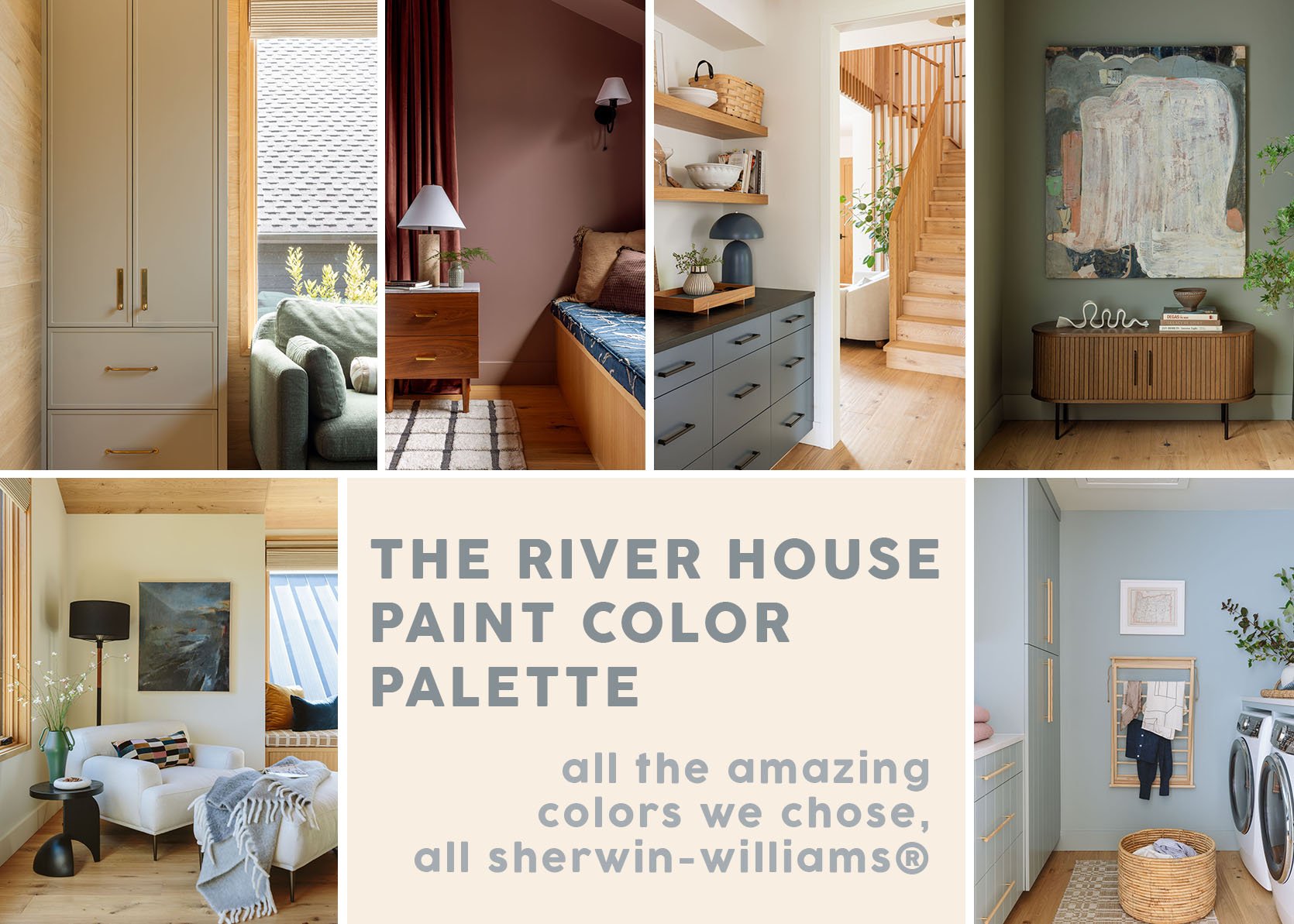
If you like big macro “how the sausage is made” posts, this one is for you. The art direction of this house was pretty clear from the get-go, four years ago. The intent was to create a warm, contemporary home that was family-friendly. It’s similar to the mountain house, but with more color. When you live in sunny southern California, you can get away with a lot of white walls, the light bouncing around, delighting your eyes, but in many other places (I’m learning), you really need color to make your eyes happy year-round. And when I say “color,” for this house we leaned more tonal – nothing BIG or bold. Of course, a pink bedroom might be bold to you, but not to us 🙂 We partnered with Sherwin-Williams on this house because they have an incredible assortment of paint colors that are very high-quality, many of which I have relied on in the past over and over. I’m pretty obsessed with this color palette and would use it all over and over again.
Choosing the right white…
Living Room/Kitchen/Dining Area/Hallways – Alabaster SW 7008
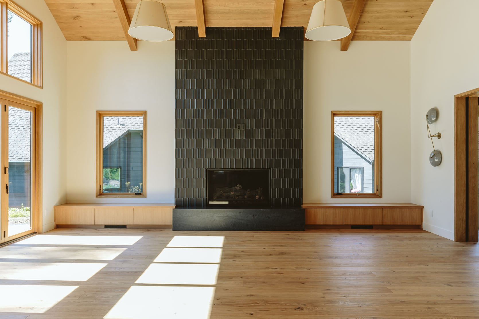
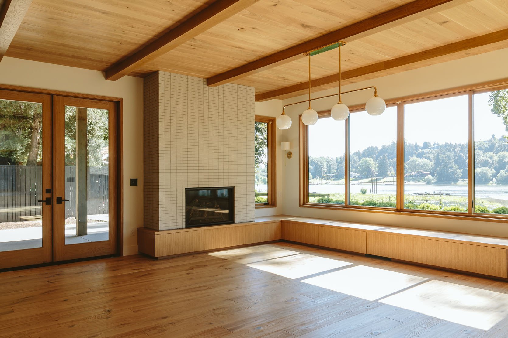
I have found my new favorite white!!!! If you have ever been driven crazy by staring at a billion different white tones that look identical to a non-expert, you are NOT alone. This is why designers have their go-to whites that they use over and over and over again. Well, I’ve found mine. We obsessed about this white for the right amount of time – we chose 10 peel-and-stick samples, stuck them all over the house, at different times of the day, on different walls, and stared at them like psychopaths. We finally chose Alabaster SW 7008. A very balanced white – slightly warm, without being yellow, more on the taupe side (but don’t get me wrong, this lady is white). It has an 84 LRV, which means that it reflects a lot of light. It looked great with the wood floor, which was mostly what mattered because this color would be in all the open spaces that flowed together – the entry, living room, dining room, kitchen (where there is drywall), and hallways. So yes, I had to really really like this white. Point is, if you need a new white, I think this is really universally good, while still having a slightly warm undertone.
The Mudroom – Rocky River SW 6215 (Cabinets) | Alabaster SW 7008 (Walls)
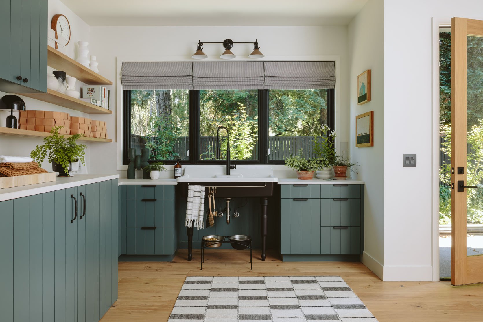
Rocky River SW 6215 was the first paint color we chose, and we all liked it immediately. It was actually our favorite. I didn’t have to hem and haw, and easily moved on. Thrilling! It’s a fantastic, darker green that is still subtle, while having impact. Technically, it’s green with a lot of blue/gray undertones, with a reflective value of 15 (so it’s not going to reflect light well). It looked so pretty with the white oak flooring.
Library Shelves – Malabar SW 9110
A sneak peek into likely my favorite room, the game room. This room is clad in wood, so we wanted the cabinets and shelves to pop a bit, but not be the star. So we chose a neutral tone, which we properly obsessed over. We wanted to pull the lighter tones of the wood out without going to pink, yellow, or brown. It was hard!! Thank goodness it was exactly what we wanted because the labor for painting custom cabinetry is so expensive (regular drywall can be easily DIY’d, but cabinetry is specific). Malabar SW 9110 is a light taupe, they call it a “sandy beige” with slightly yellow undertones and a 54 LRV.
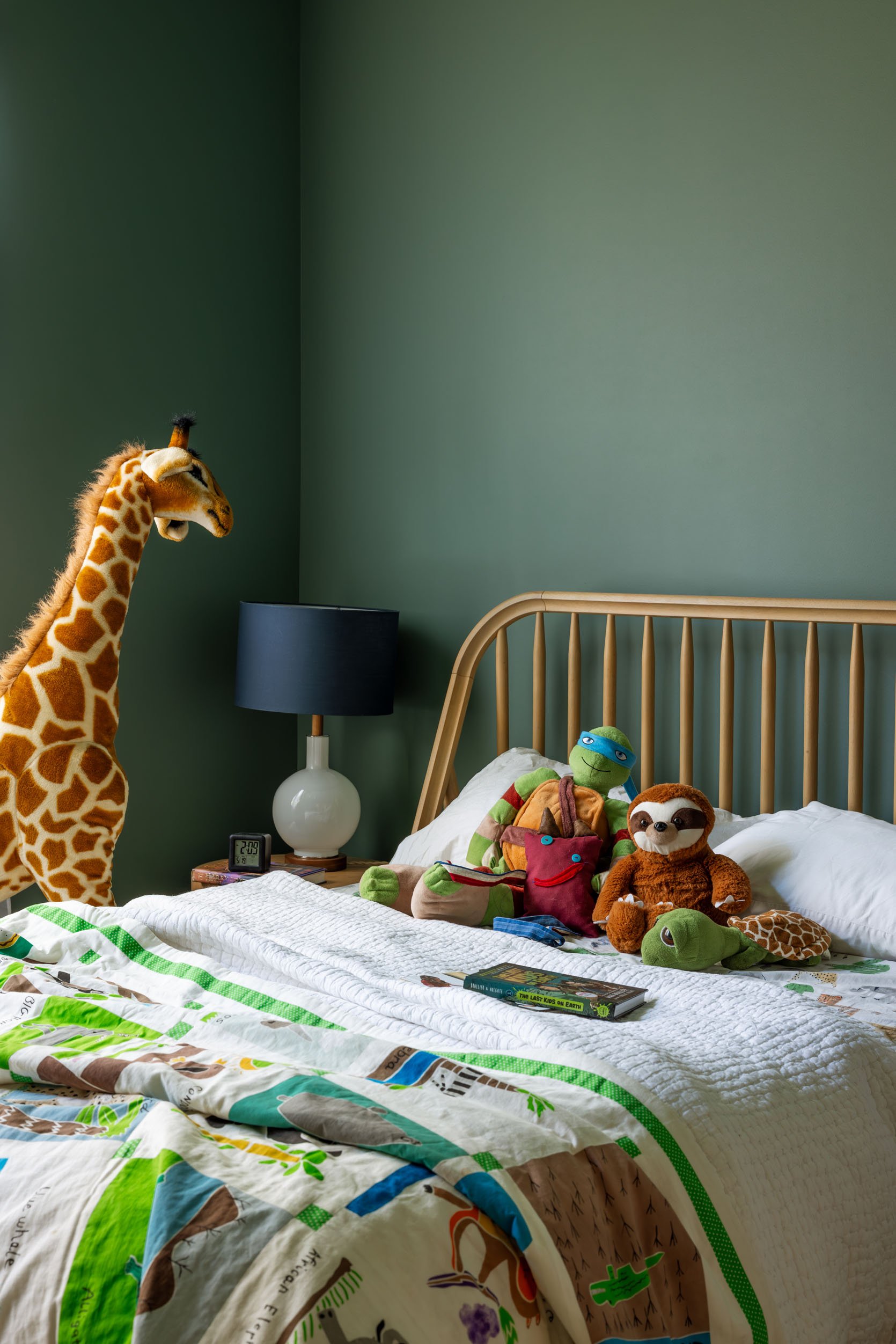
Family Room – Evergreen Fog SW 9130
This room is meant to be a darker, cozier retreat of a family/TV room, and yet it has a lot of windows, so it can actually get a lot of natural light. So the trick with this is to choose something that has an undertone that you love, but not so much pigment that with the light it becomes overly bold. In my family room, for example, we used Still Water SW 6223, which is perfect in our dark, low-light room, but that same color in a brightly lit room would be so bold and scream TEAL. So we had to choose a color that looked cozy in the dark but also lovely in the light – enter Evergreen Fog SW 9130. This was the Sherwin-Williams Color of the Year a few years ago, and I can see why. It has so many undertones – green, brown, blue, and is just so flexible. I will say that we tried a sample of it in Brian’s office, and it read as gray there, with just a small window providing natural light during the day. It’s a color that gives a lot of movement with a little bit of natural light. But in here, it’s a really inviting green/gray neutral that everyone responds so positively to.
Frank’s Room – Studio Blue Green SW 0047
I have wanted to use Studio Blue Green SW 0047 for a long time – it’s so good. Frank’s room (my nephew) is on the south side of the house and gets pretty low light despite having two windows. So we embraced the coziness and painted it (and the ceiling) this darker blue/green. It’s so high impact while strangely being soft on the eyes. I can’t wait to decorate this room (up next!).
Guest Bedroom – Cocoa Berry SW 9078
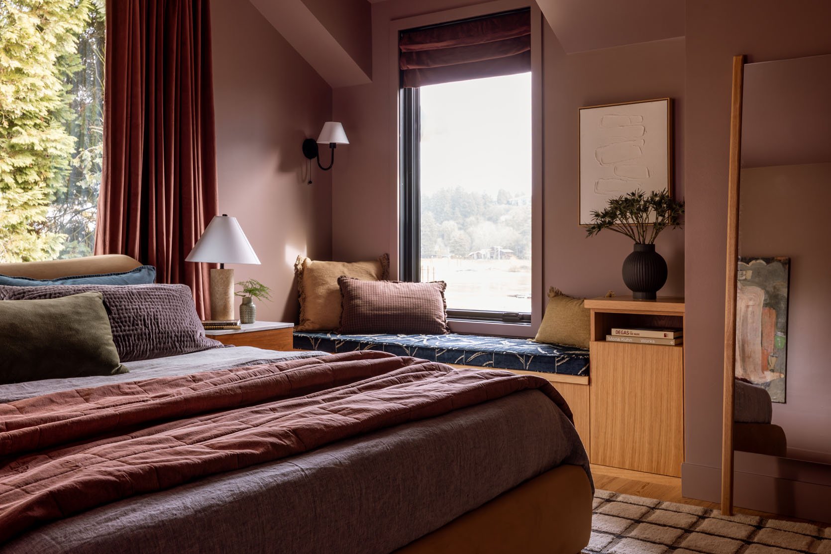
I didn’t mean to use the same warm pink twice, but we accidentally chose it again because it’s that good. Cocoa Berry SW 9078 is in my powder bath, and I love it – so soothing and inviting. It’s extremely womb-like in the best of ways and is the dominant reason why this room is where everyone wants to go when they need alone time or take a sick day. Just incredibly cozy and warm. 10/10 this color.
Laundry Room – Eventide SW 9643
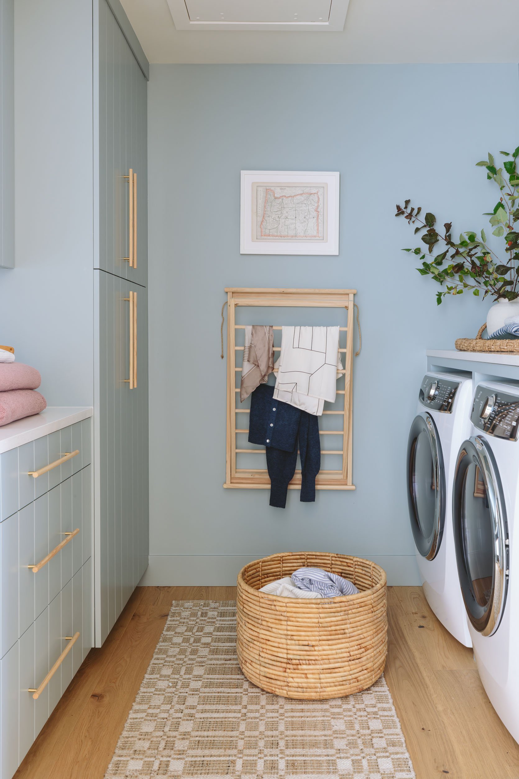
Once I saw these cabinets being painted this color, I vowed to use it in my home somewhere. Eventide SW 9643 is so soothing and calm and has the perfect amount of blue/green and gray in it. It reads as light blue, but not baby or powder blue. Getting the right blue/gray blue at times feels impossible, but this one is so pretty.
Pantry Nook – Rain Cloud SW 9639 (Cabinet) | Alabaster SW 7008 (Walls)
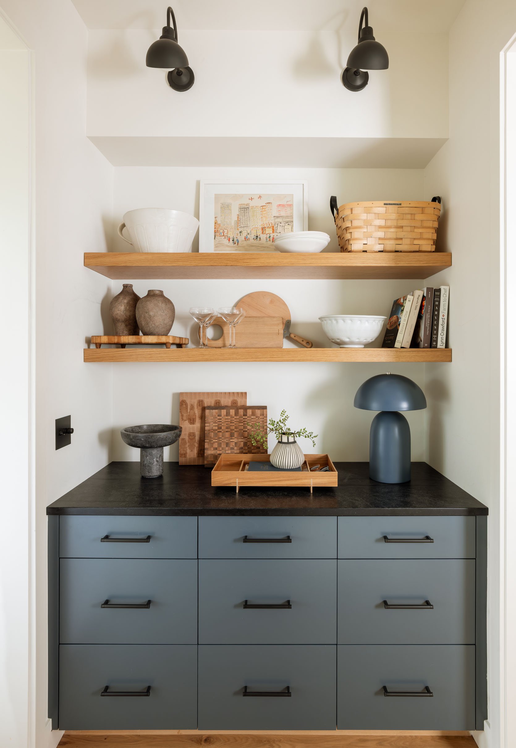
If you are in the market for a good navy, this one is fantastic because it is more complicated than your typical “dark navy” that often looks one-note. Rain Cloud SW 9639 is deep and rich, then cut with enough gray that it doesn’t look too bright.
The entire house flows so well, despite using blues, greens, and pinks. The warmer white is the throughline (as is all the wood), and we pulled the same colors from the paint and plugged them into all the fabrics, textiles, and art. I’m so excited to show you all the styled-out shots. A huge thanks to Sherwin-Williams for partnering on this project – it was a long time coming, and we technically aren’t done, but the colors are dialed in and we love every single one of them so much.
*Photos by Kaitlin Green


I love this palette but I thought this was a post about the farmhouse when I saw the first picture – they’re essentially the exact same color scheme. Like every room in the river house could be dropped into the farmhouse and no one would be the wiser lol.
Agree! And Emily’s friends house is the same color palette too. I’d love to see a project in which you deliberately went for colors outside your comfort zone, and documented the process of how to do that in an intentional expert way!
I agree that the color palette is similar, but I don’t think there is anything wrong with that, if it is to the taste of the client. You take what you have learned from experience and tweak it. As a gardener, I come up with original plant combinations, but if something looks great together (leaf shape, bloom time succession, etc.), you better believe I’m going to use it again! I appreciate Emily putting these colors and combinations out there so others can benefit from the knowledge and replicate.
I think it looks very professional and lovely. Also, that house is huge!
I had the same reaction. Same thing, different day.
I love these colors!!! They’re very elegant, rich and subtle at the same time! Gives me ideas fro my home…
Fun to see the changes in the Game Room after the walls and cabinetry were originally also painted Rain Cloud. Hope we get to see the rest of the reveals soon! Are they loving living in the River House now that it’s done? Do you all get to go over there much? Everyone seems so busy!
ETA can’t link original post for some reason but search for: “ Design Pivot – We Paneled And Repainted A River House Room Two Weeks Before Move-In (…And How I Feel About It)”
For those of you who think this color scheme is the same or similar to the farmhouse, I think you have to consider that this house belongs to Emily’s brother and they may indeed have a very similar color comfort zone. For instance, my daughter, granddaughter, mother and I all prefer varying degrees of blue-green – 4 generations no less! And both homes are in the Pacific Northwest, an environment that probably lends itself very well to the palette Emily and her brother’s family chose.
I guess that’s the challenge of having a design blog that relies so heavily on just two houses.
I actually prefer this focus on fewer homes! I’m more interested in a deep dive on a few beautiful properties than surface level snapshots of dozens. (I can get that other places, like Domino, Dwell, Apartment Therapy, Instagram, etc etc.)
I agree – and it’s three houses if you go back to the LA house. I read this blog because it helps to see how a stylists ideas and preferences stay the same and change over time. Emily has a strong point of view, with a recognizable style and yet each property has a unique feel, to me, even if the color palettes are complementary. It’s like meeting sisters or brothers in the same family. Sometimes you learn by considering similarities as well as differences. Loads of other sources can give you all the variety but they don’t al tell a story over time. Also why they made magazines.
Totally agree. Well said.
Emily has revealed at least six of “her” homes on this blog (one or two apartments, Glendale, Los Feliz, the Mountain House, the Portland Flip House and the Farmhouse). Plus there were tons of reveals from design clients before the design business closed. Plus employee reveals. Plus home tours.
Beautiful! And helpful to hear your observations and what you like about each. I clicked on the link for alabaster and was excited to see that Westhighland white was shown right next to it, presumably bc they are quite similar. I have westhighland in the main part of my house and once recommended Emily consider it for her living room. It is definitely white but it is soft and a little creamy. Just like alabaster!
We have used Evergreen Fog in our home. Its beautiful..
I’m dying to find a place for this color in our home. It’s so pretty.
Love all of the colors chosen! Saving this for my Reno!
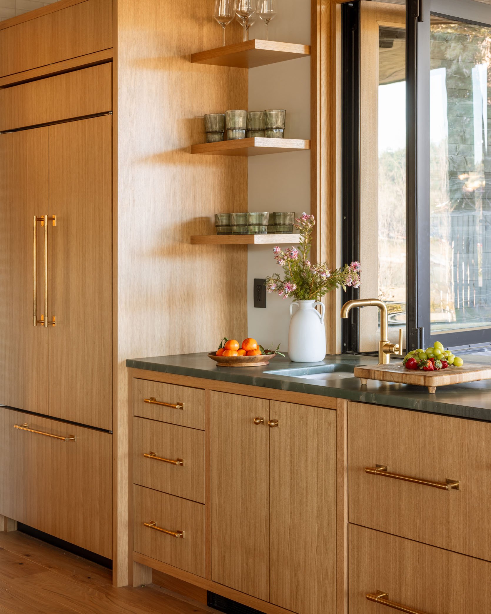
I love the way all these colors look with white oak. For those of us with traditional oak floors left natural though I’m struggling with how to modernize a palette and accommodate the extreme yellow/orange tones. I also have a 20 year old kitchen with lovely cherry cabinetry (too nice to replace yet) that is also very red/warm. I’d be curious how the take a palette like this for inspiration but show corresponding wood tone options….given that many people are not replacing wood as often as they paint.
Would love to see a post about _how_ you choose this palette – like how do you decide on all the paint colors and make sure they will look good together and flow like these do? Tips/tricks?