
Dining Rooms
The Griffith Park Dining Nook Reveal + Get The Look
I watched ‘Shakespeare in Love’ this morning on the plane. I had memorized that entire soliloquy in 7th grade. I can repeat the speech to this day and it’s a popular party tricky amongst my friends, often determining how “ready to go to bed” I am. (If you run into me ask me to do it for you, I’m AMAZING).
Remember the whole ‘envious moons, vestil liveries, cheeks and daylight doth a lamp, etc…?’ At one point he says, ‘See how she leans her cheek upon that hand? O that I were a glove upon that hand that I could touch that cheek.’
This styled room reminded me of that. I just want to be there, with that espresso near my mouth and the croissant 1/2 way down to my belly. It’s such a lovely room, with simple design and styling but such good energy. Sometimes you write a post while in New York, having a manhattan and feeling romantic. Other times you don’t. This is the former.

Welcome to the dining nook reveal of The Griffith Park home. In case you missed it, last week we revealed the sunroom and living room. This sweet little nook was one of those rooms that wasn’t necessarily a priority (check out the intro for the scoop) and yet, it sure did turn out pretty great if I do say so myself.
When we started the room looked like this:

The potential was certainly there – that circular shape, the simple millwork, the lovely wood floors and those gorgeous original windows. It just needed a round table, new curtains (although the client didn’t mind these that came with the home) and some styling.
The table was the biggest challenge as we wanted something timeless, with mixed finishes (ideally). I’m sure there are a lot of great round table options out there, but we all fell in love with this one, by the owners of Schoolhouse Electric (whose house we shot for my book), because of the mixed finishes and simple modern shape. Again – simple but special.

The owners of Schoolhouse had this table custom made but the didn’t end up manufacturing it for sale to the public, so we contacted them and asked if we could customize a smaller version of it (pretty much the exact :)). They, being lovely people they are, said, ‘Of course’. Mel sketched out a rough rendering based on the table and we worked with Clad Home to get it manufactured.
***Here’s a bit of a backstory – Mel used to work for Clad Home and so while technically we could have sourced these craftsmen ourselves for this project, she trusted the ones she worked previously with Rosa (Clad). But there is an unspoken rule that you don’t leave a firm and then take your former boss’ resources and give them to your next firm’s boss – therefore whenever we wanted a custom piece and we didn’t feel like we had the perfect vendor that we trusted (good metalworkers are hard to find) we worked with Clad to execute.

Now, of course we could do higher end renderings and we often do, but since we were hiring Clad to execute it was kinda their responsibility to make sure that all the proportions looked perfect. If you are customizing a piece of furniture I HIGHLY recommend you hire someone who has done it before or work with someone who will also render drawings and take responsibility for miscommunications (ha, who ever does that?). I have definitely had my fair share of ‘Well, that looks off…’ mistakes and it has normally been my fault because I didn’t specify one tiny dimension that threw everything out of wack. Write it on paper. And by paper I mean PUT IT IN A TRACKABLE EMAIL CHAIN. I’ve done that ‘oh-shoot-who’s-fault-is-that’ scramble a few times when something didn’t turn out as planned and the times when I wrote it in an email is when I had a recourse. When there was nothing to refer back to is when fault was either split or solely my responsibility.
*Sidenote: most designers ask their clients to sign off on dimensions before any custom work is begun. The tricky part is when everyone signs off, thinking the dimensions are perfect. Months later the piece arrives, as specified and it feels off – either too big, too small or just the wrong proportions. The blame is hard to find a home. I normally take responsibility because I try to put myself in their shoes. You hire an expert for a reason – to not be responsible for mistakes – I wrote a whole post about it (check it out here).

This table turned out as beautiful as the original, but a smaller scale to work in their smaller niche (yet still 54″ wide). We chose a matte finish instead of the higher gloss and I’m not sure if we chose the exact same wood (we went with oak) but if you are considering customization know that you have infinite options.

The top was glass, under painted white. I LOVE adding this finish to the mix – it instantly propels into modernity both in function and design. It gives it a softer feel and obviously makes it easier to wipe up. Now a warning – I’ve under painted before and unless you know how to do it professionally and give it proper drying and curing time with the proper materials, it will chip and scrape hard and fast. I’m sorry that I don’t recall the exact details (color, timing) but I know that we waited for the paint to be perfectly cured before we installed it on the table (now I’m realizing why Schoolhouse didn’t manufacture this table – it’s cost prohibitive. This table cost $4,465. So to retail it would need to be close to twice that which isn’t exactly affordable. Onward.
If you are wondering where that beautiful piece of art on the wall is from it is by our now good friend, Jackie Leishman. She also let us borrow some of her other pieces for the sunroom of this home as well as be half of the very talented, The Fourth Artist duo. If you didn’t catch the amazing custom piece (I even helped. HA!) they did for my Parisian Hotel Suite I designed then check that out here. This piece is now for sale and you can contact Jackie on her website.
Back to the room. The original window length curtains were admittedly kinda cute. Had they been a different color or pattern from the wall (we begged the client to let us paint this room) we would have kept them, but white walls with white moldings with white curtains just fell flat. It looks ‘ok’. But you wouldn’t enter that room and think a designer had been there. 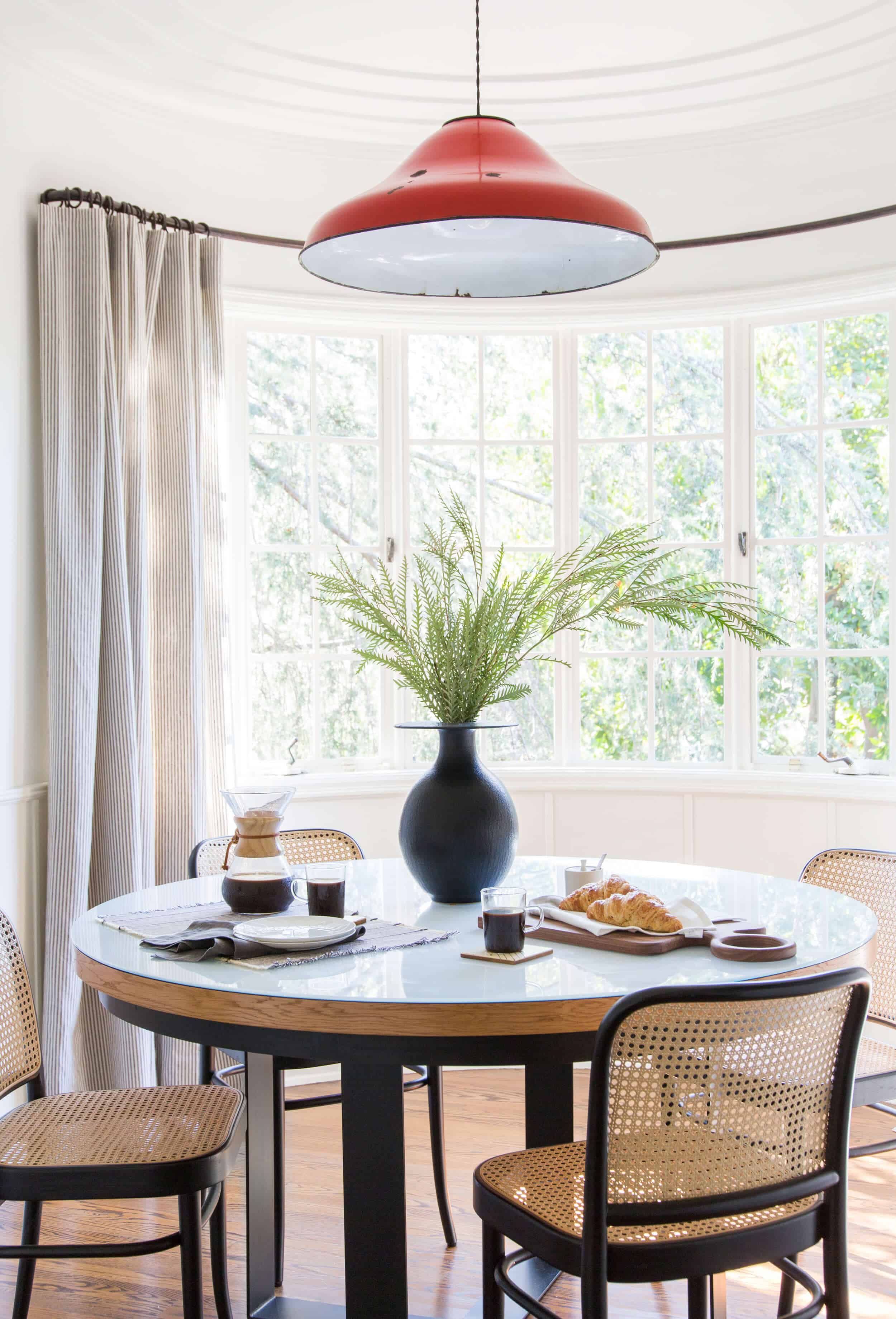
Not wanting to splurge too much we bought these curtains from Pottery Barn (sadly no longer available), which we LOVE. We hemmed them to the perfect size, fitting the french rods that existed as Lord knows we weren’t going to replace those curved rods. We loved the change and so did Dan and Kym (the clients).

This room turned out pretty great, even though it didn’t really need that much work. It had great bones, but we added some lovely decoration. Ginny, Mel and Tessa did a great job of shooting this space…perhaps of Shakespearean proportions.
I want to be here. Right now. If you like it, too. Here you go:

1. Drapery (similar) | 2. Red Pendant (similar) | 3. Black Vase | 4. Artwork (similar) | 5. Dining Chair | 6. Dining Table (similar) Custom by CladHome | 7. Woven Jute Placemat | 8. Coffee Maker | 9. Glass Coffee Mug (similar) | 10. Wood Serving Board (similar) | 11. White & Grey Napkin | 12. Sugar Jar | 13. Coasters (similar) | 14. Small Plate (similar) | 15. Grey Linen Napkin
For more of The Griffith Park House Reveals: Master Bedroom | Formal Dining Room | Living Room | Sunroom


This is appreciable and wonderful post that you have provided for us.Great site and a great topic as well i really get amazed to read this.
Your blog has nice information, I have good ideas from this amazing blog. TuTuApp iPhone
Ooh! Oooooh! I love the table! The metal base is integrated so nicely with the wooden top, especially because of the metal apron/ring/whatever you want to call it that the wooden slab sits on. Such a great detail. I wish this was my dining nook!
It sounds trite to say I LOVE IT! But, I do. And there aren’t any other words. The pop of red, the shape of the branch, the curtains, the colors, the metal, the CHAIRS. It’s perfect. This might be my fave house on the internet.
Beautiful! What is the source for the wallpaper from the entry viewpoint photo? Will you be revealing the dining room soon as well (I’m guessing that is the dining area)?
Great post, Emily, and I love that circular room!
Would you mind sharing what color you would have painted it? Would you have kept the molding white?
Can you share what type of greenery is in the vase? Is it real?
It’s Grevillea, and it is real. Well, I mean, you can get it. I’m a florist and we have used it quite a bit. It would last quite a while and one side is very silver, very cool stuff. I have no idea if theirs is real. 🙂
Love this! This renovation knocks everything out of the park! Totally my style.
What color would you have gone if you had been given the greenlight to paint?
I love this perfect little space. As usual with your work, the art is fantastic. Always fantastic.
A beautiful space for sure! Just a note on the back-painted glass though is that you can buy back-painted glass from glass manufacturers. We specify the product frequently for our clients. The best part is that you can have the color match anything you would want including pms colors!
Any suggestions on the best but most affordable manufacturers? I came across American Glass Top.
This is my favorite room in their house, probably because of that light, but also the curtains and the table. This room feels very approachable to me.
Would love to see a more zoomed-out shot from a similar view to the “before” pics.
Yes!!! Before and after shots much match to provide true context. But lovely room.
thanks for sharing – Liteblue login
Speaking of movies — that whole part about making sure about the dimensions in advance and signing off reminded me of the Stonehenge scene in Spinal Tap. If you haven’t seen that movie — you should. “It goes to 11.”
I love it all but the pendant looks a tad to high, as if the light would be in your face
What a lovely room!! I’m so glad they kept the pendant; it’s the perfect pop of colour and makes the space so special.
Is there a reason why the whole nook isn’t shown in one photo? I kept wanting to take a step back and look at the whole room, but i can’t. And that’s kind of disappointing.
I’m enjoying all the reveals on this house. It has amazing good bones to start with. Your team comes in and changes it up; either a lot or not very much, but it’s always just enough. The rooms look like someone with great furniture and fantastic taste just pulled it together. It doesn’t scream “DESIGNER!!!!” and I mean that in the nicest possible way. It looks like you can live in the rooms and set down your coffee cup or wine glass and not just ruin everything..
I love the table and the white under paint, it makes such a difference!
Eff yeah, Shakespeare in Love
Emily,
Looks so great, wish I could have that table! You posted several posts ago about the Target chairs in your living room, of course they’re out of stock everywhere – any suggestions on where I can find something similar? Love your blog and all the inspiration!
This is very educational content and written well for a change. It’s nice to see that some people still understand how to write a quality post.!
Black Magic for Love Solution Expert
When y’all discussed this room previously on the blog, it seemed like you were planning to change out the light fixture. Why did it end up staying?
I’m curious too. I see lots of commenters like the light but I see rust and don’t this it’s so fab. At first I thought the bubble light (in the table photo apparently from the table manufacturer) was the replacement.
What are your thoughts on a rug underneath a kitchen nook table? Or how do you prevent the table/chairs from scratching the hardwoods?
Ohhh I love that pendant!
Thanks to all the articles that you serve. I must recommend your website to friends. Good Luck
While I love the look of the entire nook, just gotta say I have not had success with cane seats in the past…just couldn’t hold up to family use!
I was just catching up on NBC’s “This is Us” and recognized these chairs and table (maybe?) in Randall’s dining room from episode 4!
So so nice. I really have enjoyed this project. Love the table and was VERY excited to see the source for that vase. It’s beautiful but oh man is that cost prohibitive. Wld love to see something like this in a high / low post sometime. Another home run. Thanks!
Great Post !! Very interesting topic will bookmark your site to check if you write more about in the future.
So simple and beautiful. LOVE!
great post admin thanks for this really helpful.