
Design
Revisiting A 2013 Project, DesignLoveFest’s Apartment (+ What I Think About It Now)
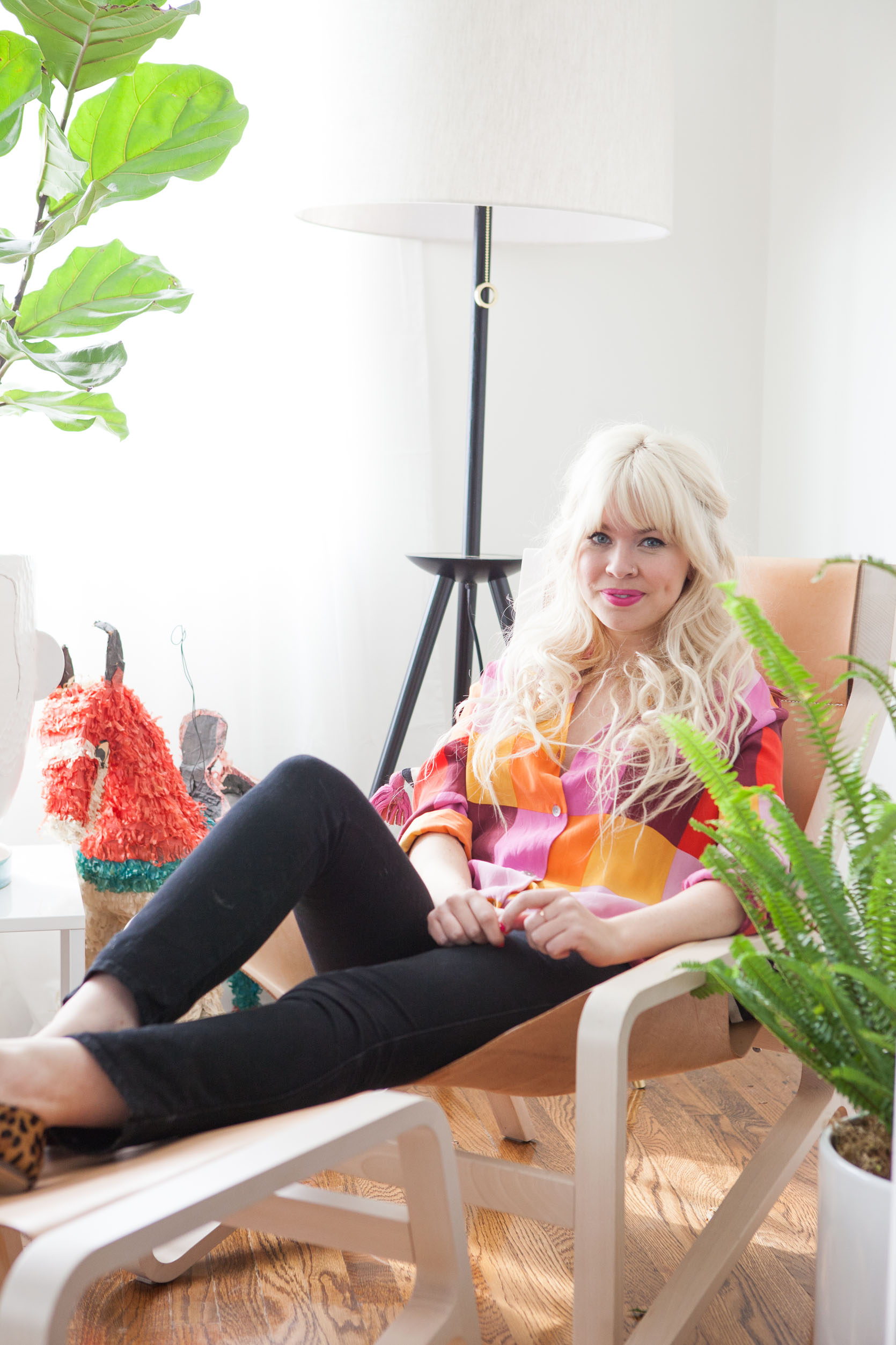
In our grown-up pursuit of “timelessness” (which gets more intense as we get older), it sure is fun to see a time capsule of our youth. The year was clearly 2013, and two “internet famous” bloggers collabbed on what now feels like OG vintage influencer content. When I stumbled on Bri Emery’s apartment from 2013, I gasped and then wanted to gossip about it with you. So much to talk about. It still pops so hard and is full of pieces that I love, while also just screaming “2010’s blogger time capsule”. It’s a real lesson in where to bring in trends as well as demonstrating the power of vintage and color. This was my last “blogger collab,” where I designed/styled famous blogger’s homes (who would be called influencers now) to cross promote, garner press, more followers, etc (I decorated Cup of Jo’s apartment, Oh Joy’s (multiple times), Nicolette Mason and then Bri Emery, aka DesignLoveFest, Green Wedding Shoes nursery, and many more). Bri redesigned our website (which has since been redesigned and is DESPERATE for a new redesign – coming soon, I hope), and I designed/styled her living and dining room. If you want to read the original post, check it out -it’s a funny read.

That’s Bri, aka DesignLoveFest, and if you haven’t seen her new kitchen in upstate New York, you MUST. She, like most OG design/style bloggers, made a lot of life shifts, and after taking a long creative/personal sabbatical from social media, she is posting again and collaborating with other old friends (which is so fun to watch on stories). She has always been wildly creative and such a visionary, so I’ll follow her forever. I dream of doing a “Bloggers: Where Are They Now” series because most of the OG crew that really took off in the 2010s, have changed careers and are thriving in such different and interesting ways (I think like 10 of us are still here, spoiler – social media caused burn out really fast). That’s a whole other story, but today let’s look at Bri’s 2013 apartment transformation:

I swear we didn’t try to take low-light befores back then… But here’s the super bright after! LOL

My first gut reaction: this room is undeniably still so fun. If I walked into this apartment now, I would think this person has so much style and creativity, an eclectic, even eccentric, point of view, and we are about to have fun. And then, of course, I’d want to edit it a bit, tweak it for 2025. So let’s talk through the main trends that were big then:
2013 Trend #1: Bright White With Pops Of Bright Colors
I was so guilty of this, doing it over and over in that decade (and still am!). The formula: all white walls, big pops of color, drenched in natural light. And the thing is, this still really works in Southern California. Of course, now we’d do a warmer neutral, and employ darker, more subtle greens and lots of muted pinks. Heck, my brother and SIL wanted a version of that in their bedroom (see here). I think for the most part it works, it’s just some of the colors here that make it feel a bit 2013. I would definitely get rid of that scalloped pillow on the sofa and reduce the amount of hot pink (the vintage ottoman could be more of a neutral).
2013 Trend #2: Fig Trees And Whimsical Plants Galore (In Whimsical Pots!)
Again, I still like fig trees, but my goodness, they were EVERYWHERE in the 2010s (mostly because of me, I think – remember DesignStar?), so I really don’t think we needed two here. And while having plants galore is more popular than ever, I don’t think doing it like this is working. I think it’s just a bit messy, the pots are a bit eclectic, and it feels generally over the top. If I could do it again, I’d do one big fig tree and a smaller green plant on the coffee table. Also, not sure we need a decorative piñata…
2013 Trend #3 Palm Springs Style Mid-Century Vintage Everything In Bright Colors
Again, I don’t mind this trend!! Mid-century is never out, and I don’t think that there is too much of it here. It’s just combined with the big saturated colors and the Moroccan rug and brass that make all the pieces feel 2013. But yes, in the 2010s, before any of us had a budget to buy investment pieces from adult stores, we bought anything from the Rose Bowl flea market, which was full of midcentury vintage from Palm Springs. None of these are dated; it’s just within the context of so much stuff and bright colors that it screams 2013.

What’s Not Working?? What Would I Get Rid Of?
That’s pretty easy – the black chair with the more Navajo-inspired woven pattern feels like we were trying hard to dip into that next trend (I’m not sure what to call it, I apologize if I’m not accurate here). At the time were really seeing the rise of African mudcloth and Aztec-style prints, and now we know better and to never buy them in a mass-produced fashion. Purchasing from the actual people whose culture these textiles belong to should always be a priority, like with my Boro fabrics. I do like the idea of the pattern, but it belongs somewhere with less bright, saturated colors or trendy pieces. I’d also nix the gold drum table (very 2013), and I’d reduce the amount of stuff by 1/3rd AT LEAST. And I really, really don’t like that colorful pillow on the sofa.


I think this was during my “miniatures” phase that I’ve never really grown out of, TBH, but I don’t force it on my friends as much now. Those flowers are WAY too big and busy in here, IMHO.

I still love those vintage lamps and would use them in the right project now. The art was from the flea market, and the Blu Dot table is so simple that it’s hard to call it in or out, but the collective vignette just feels very 2013 due to the color palette. Now I’d change the drum shades to be more tapered or pleated (or a color).


Nothing really dated here except all my EHD vintage whimsy, which I still love, but it’s a younger version of me. That lamp is still pretty darn cute.

The midcentury shelving unit is rad still, just needs to be styled with less stuff and with more grounding colors (i.e. less teal and yellow). So many plants shoved in this shot!!!

I really think the culprit here is mostly just the accessories and the styling, both of which were obviously 100% on me. And in a lot of ways, that is refreshing because those are the things that are less of an investment and easier to change.


I still really like this!!! It’s just a bit too much, too many small trends that inevitably read as 2013, and too much “stuff”. But those are almost all in the smaller pieces and would be so easy to tweak to make them work.


It’s visually so fun and stimulating,g so while it seems like I’m tearing my own work apart, it’s actually really easy to see that with a few tweaks it could feel 2025 really easily.

We kept with the same styles and colors in the dining room – that vintage dining set is still so rad, and Mid-century teak is having a big comeback right now, so do NOT sell your stuff, people.

Besides me holding the plant hostage in that cage, I think most of this works, but maybe just too much altogether.


The Brendan Ravennhill light fixture had just launched, and Max Wanger’s photography was so popular (they both pioneered a LOT of copycats).
While I wouldn’t go back to 2013 Emily, I think this room actually has a lot of timelessness.
The Lessons In Trends And Timelessness:
- You will not be able to avoid leaning into some trendy design elements if you are super into design (no one is immune to the zeitgeist), but if you want to avoid looking dated, buy the high quality version of it or just do it in accessories that aren’t as much of an investment to change out. I think the squiggle or amorphous shapes are great current examples – bring them in in limited amounts to avoid looking dated real fast.
- Bright colors will always be more likely to be “dated”, but that doesn’t mean we should avoid what we love right now. Will they call 2022 the year of dark moody green everything? Yep! But I don’t know how you avoid any color trends without just being so boring. Will warm pinks, browns, and burgundies also be less exciting in 10 years? Probably, but again, there is no such thing as timeless colors, and for the most part, there is a way to make them still work with styling. A well-designed room with high-quality materials done in a balanced way will likely still be very pretty in 20 years. Sure, there are some navy blue tones that feel fresher than others, but for the most part, blues, greens, and neutrals are timeless (coming from someone who has and will always love blues and greens, so I’m very biased). Although if you live in Texas or Arizona it’s likely warmer tones that feel timeless there. It’s so nuanced, folks. Good luck! LOL.
- Too much stuff can really overwhelm a room (and in this case, make it feel dated). I think this can be blamed on youth, especially when we are younger and we can’t afford the more expensive design elements, but we love to shop, we are drawn to smaller things that we love, because it’s what we can buy. Nothing wrong with this, but just know that displaying it all, on every surface, especially when they are all super eclectic, can just look a bit cuckoo. I had to learn this lesson over and over and over.
- Authentic Vintage will always be in style – it’s just context, styling, and color combinations that can make the pieces look dated to the specific era that it “came back” in.
For the most part, I think that this room could be tweaked so fast to make it feel “in” right now – the main “dated” culprits are in the accessorizing, which feels pretty harmless to me. Thoughts????
**Design by Emily Henderson (me!)
*Photos by Laure Joliet


Loved the scallop pillow, liked the room, but it is a bit “plant nursery” by that window!
This is a cute apartment and the retrospective of the era is fun (I’ve also got a gold side table from exactly this period!) The idea that Emily is solely responsible for the popularity of fiddle-leaf fig trees seems unlikely, though especially in light of the recent post about the ficus tree.
I LOVE THIS ROOM FOREVER!!! If I had to say ONE thing about this room it would be maybe just too much stuff. Not the colors, those are wonderful and I don’t think bright colors are dated< I think they are more a personal style choice! Sure it’s from the 2010’s so there will be certain trends and design elements that are on the outs now, but the room overall still works anyway!
The piñata was in the before pic so maybe it was special to the homeowner.
Love this!! I think design waves are often inspired by certain regions, and even once the trends have passed they still look pretty good in their region and architecture of origin. This room would still look good in LA or Palm Springs, if not the most up to date—and I also think we’ll-done “modern farmhouses” still look good as farmhouses in West Texas, and that the “grand millennial” style still holds up in the English countryside!
I love this room still. It looks to me like someone interesting lives here. Am not at all a fan of Fixer Upper style farmhouse, which I find cloyingly twee or a lot of neutrals which I find bland and slightly depressing.
Who cares if things date! What’s wrong with being of your time! Embrace a trend if you love it and so what if it captures a moment in time!
The things that date the most anyway are the things that are the most ubiquitous not the things that are most outrageous and the teal and yellow still speak to me.
As I get older, I’m more adventurous and more expressive not less and in our post modern age, anything goes.
For me – down with timelessness!
And thank goodness people of the art deco, baroque, modern, Edwardian, 70s and every other discernible age didn’t share our obsession with it!!! We would have lost so much if that had been the goal.
Thanks Emily, I remember reading this post in 2013 and loving all of the mid-century. I always look to see what I can incorporate into my home, but still keeping it ME. The bright colors and overly decorated smaller pieces were never my thing, but I took away some of the blues, greens, and again, the MCM! I even added plants to my small living room/kitchen area in my first home. I think I made a weekly trip to West Elm and was on a first name basis with most of the store. haha.
It’s always fun to follow trends and see how we can adapt them into our space over time. Like you, I’ve begun seeking a more timeless approach and have basically arrived at “Go with what makes you happiest.” I believe all of us have common threads that have followed us over time, like minimalism, a love of certain tones, etc. We should lean into these. Also, play with many different design styles and let them work together in harmony. One style may go out, but another may feel newer and fresh, repeat. If they work together, they never all go out of style.
I looooved this space then -and now : )
I also felt the black and white chair was out of place (then, and now ; ) but the reimagined vintage pieces along with the cheerful playfulness infused in every nook and cranny brightened my spirit and made/makes even my eyeballs smile. Also, this project reminds me that it was you, Emily Henderson, who gave me my first access point into design. In fact, when I look around my home now I recognize a similar infusion of buoyancy/brightness/playfulness -a joie de vivre of design if you will (as well as the issue of ‘too much stuff’!). Gosh -what a gift… thank you!
PS. If you were looking for more “what I think about it now” topics I vote for “Sexy Afro Glam” -I thought your ability to translate the feeling of a person into the design of their space was dramatically evident in that episode -and in a challenging footprint no less!
Since I wasn’t following you or design back then, this is so fun to me! yes, too many plants and too many things, but overall I would enter a room like this and agree that I am going to have fun. And some rooms should be like that. 🙂
I remember this like it was yesterday!!!
SIDE NOTE: THANK YOU for considering a blog glow-up. The search functionality is pretty much broken completely… I end up googling “Emily Henderson Dining Chairs” because I cannot find things on the blog and it’s a bummer, all your hard work!! We really do see this blog as a resource, so hate to see your efforts for not.
I love this, mostly because this is pretty much what my apartment looks like now only without the teal… I was voraciously reading design and fashion blogs in the early 2010s when I was in high school so to me this was the aspirational style and clearly really imprinted on me. But I also live in California so bright white everything with pops of color kind of never goes out of style…. Been loving all the retrospective posts recently, really fun!
I still love it! Yes, it’s busy and crowded and some of that could be pulled back if the homeowner wanted to, but if they love it, then great! It still makes me smile to see it. It’s a MUCH more sustainable way to go about design since many of the pieces are vintage thrifted / secondhand, and I bet the quality on those pieces is much better than a comparably-priced new piece. It’s also not the calm, sometimes monochromatic style that is very on-trend these days. I LOVE IT when everyone’s houses are different rather than following the newest Target trend. I LOVE IT when people fill their homes with the treasures they find while traveling or receive from family members. I LOVE IT when someone can teach me about their indoor plants because I’m learning to keep things besides pothos alive. Buy local, buy artisan souvenirs, buy vintage! 🙂 I still remember so fondly your work on The Fig House – similarly colorful, eclectic, and filled with personality.
I pinned this room ages ago as inspiration, and I still love it. I think it’s funny that Emily kept referencing things as “2013.” It’s so specific, but maybe designers do really remember what was in and out by year. I find this room timeless for those of us who love bright colors, mid-century modern style, and Moroccan textiles. And I, too, have that gold table which has lived in multiple spots in my home.
I also was amused by Emily’s frequent 2013 references. It made me think the best way to get a “timeless” room is to not read design blogs so that you don’t realize what you have has gone out of style! Obviously, I am here; so I don’t subscribe to that particular idea for myself.
Fun room. I don’t think HGTV Magazine got the memo about this style being 2013, as it looks like every one of their covers, to this day
I think this was the room I saw on Pinterest (almost a decade ago) that made me go, “who designed this? I need to find her.
And, ever since I’ve spent 6 minutes a day with you reading your blog.
I love the vibe that comes across from this room still: “I’m having fun.”
I love 2013 Emily. I also love 2025 Emily.
And I love the excessive plants, all the stuff, and the vibrant colors in those rooms.
Sometimes I think that our Internet criticism culture (and the price increases for everything) have zapped some of the fun.
Or maybe it’s just age? I’m looking around my house now and it’s definitely not as fun as my 2015 apartment.
I love this post and I love to see some mores of the 2010s. I would happily delete instagram, if I could just follow the blogs of some persons I am following now. It seemed much more manageable to follow people and I loved taking time to read my selected blogs instead of doomscrolling. It felt so much more intentional.
Yes to blogs making a comeback! So much less overwhelming than instagram.
I was OBSESSED with that coffee table when I first saw it, and that Max Wanger print will always be a stunner, especially when paired with teak or wood furniture. So pretty.
I remember STUDYING these posts – they came out right as I was moving into my own apartment for the first time and looking back at this I can totally see how much it influenced my choices in that space! I reupholstered the seats of my craigslist midcentury chairs with teal velvet, had a bunch of fiddle leaf figs- lots of brass candlesticks and pops of hot pink. Fun to revisit it and see what I still have in our current house and what has changed!
Oh I remember this room! I was absolutely in love. Especially with that pillow you now hate! It’s not my style now, but it’s still fantastic… honestly an iconic room. Oddly, I love the double fig trees… maybe because it’s different or ‘wrong’. I miss this kind of inspiration on the blogosphere. 🙂
It was lovely to see this room again, as it brought back a lot of memories for me and was the reason I started following this blog, hard to believe 12 years have passed! At the time I was decorating a living room and took a lot of inspiration. Yes it’s cluttered but the colour and energy are still inspiring
I agree with all the comments about this being an iconic EHD room. It is the post that brought me to the EHD world and I would not change a thing. So fun and happy and a great mix of vintage and modern styles
This room is not “ideal” maybe in terms of design, but to me, it was perfection for that time, I LOVED it and it reminds me of why I started following you.
I discovered you with this room. I fell in love with this design, it is playful, full of energy, the colors are mood boosters, I feel like it’s impossible not to be happy in such a room. I have been following you ever since. But we all do that, it’s normal, we grow, we mature, we see the imperfections in what we did earlier. But I assure you, this room makes me as happy today as it did in 2013
Such a fun post! This room isn’t really my style, but I like it anyway because it has so much personality. I appreciate the reflection on earlier style work and the thoughts about how to update it subtly over time. I “did” my living room in 2018 and I still love it, but I’m mindful of not wanting to suddenly find myself a decade later and feel like it’s totally dated and I want to do a giant overhaul. Better to change a little every year so it doesn’t get stale, but how to do that is the trick. More posts like this one where you revisit older work and talk about subtle updates would be great!
Agree with some, but honestly, I loved this room and still do!! It was definitely a big inspiration for me in my 20s and a post I revisited often, ha.
I would *LOVE* a “Bloggers: Where Are They Now” piece. It’s funny how much they used to be a bit of a part of my everyday life. Thesedays the only bloggers with websites I follow are you and Cup of Jo. Both of you seem to have found a sustainable way forward, hiring more writers to take on the load and providing a platform for more perspectives, curious about the journeys the other bloggers of that era have gone on (I’m not much of an instagram person)
Hah! I remember when this first came out, I thought to myself, that’s too many plants concentrated in only one spot; I think you should spread them throughout the room. 🙂 (But I wasn’t fixated on the scallop pillow or the too much stuff or the bright colours trend! The beni ourain rug though, yeah, I perceived those as trendy even back then even though they’re lovely.)
TBH this is a lot like my own designs minus the rainbow because you’ve taught me to edit to a specific colour palette. I am always an accidental maximalist! So hard to edit down all my stuff (especially now in London with less space).
This is my all-time favorite Emily Henderson designed room of all time! This makeover is what made me a full-time reader of your blog 12 years ago. I pinned it back in 2013 and I go back to it all.the.time. We move every 2-3 years and I look back at this room as the ultimate inspiration for every move. It just makes me so happy! It’s playful and whimsical and welcoming and creative — all the best of EHD. I kind of miss this era in design. I also love Bri Emery’s new kitchen!