
Weekend Makeover | Nicolette Mason’s New Home
Hold on to your palm leaves, folks because we have another intense living/dining room weekend makeover for your viewing pleasure. This time its the new home of fashion blogger/consultant Nicolette Mason, her new wife Ali and their pug, Frankie. I know I say this a lot, but this is truly one of my most favorite makeovers. It’s one of those situations where you go thinking yeah, this will be cute, and then you look around at the end and think Damn … how did we pull that off?
The answer: We worked hard, had a great client with great style and lots of help from Target who sponsored this bad boy (and yes, about 70% of what you are about to see is Target). You didn’t think that I could mix Target pieces with high end Hollywood Regency did you? Click on through and see the full reveal …

Nicolette had just move back here from New York and they had basically VERY little. Fun fact, prior to our arrival they didn’t even have that sofa in there because the movers “couldn’t fit it up the stairs”. Let me explain something – I’m the girl that thinks EVERYTHING can fit. I have a very bad spacial awareness with my own body (which gets 10 times worse when pregnant – as I slam this child into walls and chairs constantly), but when it comes to things fitting into other things, my optimism is unparalleled. So we gave it a shot and sure enough, we got that sucker up the stairs and into the proper room. Thank god. None of us wanted to have to shop/buy/pay for an awesome sofa when they had one stuck in their entry two floors down.
What we started with were simple white walls, that sofa, the side table, the glass/brass coffee table and the fiddle leaf fig – all things she already had (the coffee table was in another room). What she wanted? Old Hollywood meets contemporary. She is attracted to everything super feminine and pink, but her wife was less so, so we wanted to make sure that we brought in enough simple shapes and darker tones to even it out. You probably saw the post last week with the mood boards, but here is what she sent us:

My job is to take what my clients think they want and do the best version of that possible – so I wanted to tone the ornate detail back a bit by adding in some cleaner lines, bring in some more substantial pieces and find an updated version of that Martinique wallpaper (I love that wallpaper but its intense and iconic and I feared it could look dated in a new-ish apartment). The condo was so bright and simple and I really didn’t want to lose that by throwing a bunch of stuff in there.
But first … we actually have to throw a bunch of stuff in there.
We walked in on day one and made it look like total insanity for a day like so:

But then, as if by magic, it was done. Ready to watch the video that documents the process, shows the behind the scenes chaos and involves a pug trying on a dress?
For those of you who are going to watch the video later (I get it, your boss is looking over your shoulder wondering why Mr. Steven’s account is being neglected because you are watching a pug trying on a cardigan) here is the reveal:
It ain’t minimal. It ain’t masculine. It isn’t everyone’s style necessarily. But its undeniably so pretty and stylish and still feels so bright and airy despite the fact that it has so much more happening than there was before.
Just in case you forgot, here is where we started:

From Kate Goslin, to Ryan Gosling. That’s what that is right there.

It doesn’t hurt that Zeke Ruelas takes BEAUTIFUL photographs. The space itself is so pretty, but there are times when you photograph something really pretty and you just don’t capture how it looks, but Zeke really did.

Nicolette had a huge TV to install in there (that wasn’t really part of our makeover) and we grappled a lot with what to do underneath it. In a perfect world we would have done a built in cabinet with shelving around it but we got it quoted and it was going to be at least $2k so instead we installed those cabinets from Ikea (for about $400). The hardware is vintage brass that we had left over from another job – it pays to hoard, folks. The sconces were originally intended for the sofa side of the room, but once we put lamps over there we realized that they would look a) dinky and b) totally unnecessary because we had enough light. Next to the TV they helped dress up that wall and made it feel more special – plus they brings light over there which couldn’t have a lamp due to the TV situation. 
The chairs were this perfect minty- green that pulled the lighter tones from the wallpaper. They are the ideal scale, PLUS they are ultra-suede which is the most pet/dog/mess friendly fabric you can own.
All those accessories – the lamps, the lanterns, the pillows, the vases, the side table (on the right) are ALL part of the fall line (the eye pillow is from Jonathan Adler which she already had). It made our job so easy. The coffee table was already hers and I believe its from West Elm.

The benches and that mirror peeking in are from Nate Berkus’ new line and the black task lamp, side table and the wood lamp are hot off the Threshold production line. I know that some of these things are hard to find (for me, too) because they can be online but not in store or vice versa but keep checking back because since the line is only 10 days old some stores are just getting the good stuff. Luckily here in LA we have LOADS of it (go to Burbank, La Brea or Pasadena).
The rug is from Lulu and Georgia. Its a 9×12 and I was shocked and so happy with how well it worked with the chairs and the wallpaper. If you can order a sample first, I would do that, but this was perfect for us as it was a gray with a LOT of light green in it.

Instead of adding in a ton of pink, we brought in the metallic du jour – rose golds and coppers. I think that with that wallpaper had we added a lot of pink it could have looked really silly and young, but the addition of the that pink metallic (which Target has a TON of right now) kept things quiet but still super feminine.


Those wood/brass lamps are one of my favorite pieces but they aren’t on the site yet (CHECK YOUR LOCAL STORE!!!). I have one of them but had to give Nicolette the other and now of course even I need to go snag another at a store, too.
Let’s talk about that artwork for a second. Its by Jaime Derringer for Minted. It normally doesn’t come printed so large but since I know Jaime personally she made it happen. (See links below). The room needed something modern and abstract to keep it from going into glam land, and these helped all the black in the room really make sense and pop without being too heavy. The scale of them was perfect for above that sofa and lastly we didn’t want anything too busy or bright because that wallpaper was already so strong. So something graphic and loose was really the way to go.

The combination of mint and black was not something that I would have predicted that i liked so much, but lo and behold the striped blanket, plaid pillow and black task lamp with the club chairs and wallpaper created this really good tension that still kept the space feeling open and airy. Contrast is a tricky thing to balance in a room and if you have too much it looks insane and busy, but sometimes not enough doesn’t really represent the personality of the homeowner enough. This wasn’t a white on white on white situation, we needed action and energy so adding in the patterns and black/white kept the energy up without making it to intense.

We obviously had to take a new headshot for Frankie while we were there. Watch the video to see the wardrobe options we decided between, although she opted for the nude portrait. So LA.


The living room feels just so happy and it looks so pulled together. I think that if I had two goals for every single project it would be that – happy and ‘pulled together’. Not perfect. Not safe. But where the room, no matter what style exudes a happy feeling and at the same time, looks/feels like someone cared enough to make it work.
And now you can get that look.

1. Three Armed Chandelier | 2. Wallpaper | 3. Mirror | 4. Art Print / Art Print | 5. Wall Sconce | 6. Sofa | 7. Copper Votive | 8. Stoneware Vase | 9. Copper and Marble Table | 10. Gold Candle Holder | 11. Arm Chair | 12. Eye Pillow | 13. Small Glass & Metal Candle Holder | 14. Large Glass & Metal Candle Holder | 15. Geometric Votive | 16. Table Lamp | 17. Accent Table | 18. Beaded Pillow | 19. Rug | 20. Fringe Pillow | 21. Ottoman The black/white plaid just became available today. The black/white throw and the black/gold/white pillow are from Nate Berkus’ new collection and aren’t online yet.
Let’s head on into the dining room. What was totally blank and empty is now fit for a dinner party, specifically one with me and my crew. My favorite food requests in this order are french fries, ice cream, clam chowder and pho. That is why I don’t throw dinner parties. But now Nicolette sure can:

It’s pretty in pink with a heavy dose of simplicity and glam. We kept the foundational pieces totally simple and clean, then layered on the glam with the chandelier and the tableware. The dining room is on the smaller side and its shared with the kitchen (and living room) so I thought that the simple white/black would be the way to go with the furniture, but Nicolette was begging for more pink (a request that I firmly supported). So in about an hour we painted out that wall this pink.
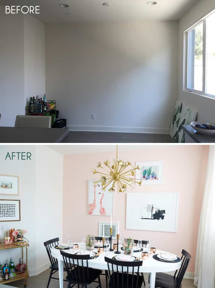
The table was found at a thrift store, then professionally lacquered (I’ll do a quick post on it). I knew that since the space was kinda tight an oval would be the way to go to keep the flow of it as open as possible. Those chairs are my favorite simple windsor inspired chairs from Target. I originally wanted the in mint but they sold out too fast and of course now I think that black is the right move because the mint with the pink could have been skating into candyland, whereas the black keeps it grounded.

They purchased these pretty stools in between the time we saw the space and performed the makeover, so it was kinda perfect that we ended up going with the black chairs anyway.
The Jonathan Adler light fixture from Lamps Plus was something that was on her mood board and probably her bucket list, too. She wanted it soooo bad so when we installed it, she was ecstatic. That room was so plain, so adding a fixture like that completely livened it up.
The art wall on the back was a collection of four pieces that really visually helped create one large focal point. We didn’t want to make it a huge organic salon wall, nor did we have the right pieces to make a modern grid. Instead we arranged these four pieces into a really simple wall arrangement where the larger pieces balanced out the smaller pieces. We included a variety of mediums and visual weight, while they all shared the same color palette and in this case white frames.

The tabletop pieces were a combination of what she already had (Kate Spade glasses, vintage plates) and Target (see the ‘Get The Look’ below for sourcing).

The newest barcart is an obvious favorite already and if you are interested in it I suggest you snag it asap. It lived in her dining room but we couldn’t resist shooting it in front of the wallpaper because that wallpaper is like 10 million times more exciting. The lamp on there is Target (not on their site yet).
Those copper-toned and glass lanterns got a repurpose by me turning them into a terrarium. Green thumb I am not but basically all you need for that are some cheap succulents, some potting soil and tiny rocks (all available at your general hardware store).


1. Chandelier | 2. Moscow Mule Mug | 3. Flamingo Canvas Print | 4. Bar Cart | 5. Art Print | 6. Gold Flatware | 7. Cactus Print | 8. Large Glass & Metal Candle Holder | 9. Champagne Flute | 10. Small Glass & Metal Candle Holder | 11. Pink Glassware | 12. Paint in Pirouette | 13. Charger | 14. Copper Martini Shaker | 15. Tall Taper Holder | 16. Short Taper Holder | 17. Dining Chair | 18. Dining Table
A makeover like this is never complete without a gif to show you how it all came to life.

The video tells more of a story. In fact here are a few things you’ll find in the video that you won’t get here:
- That rug wasn’t the first rug we tried (the first one was HOT PINK).
- Frankie, the pug, actually tried on dresses in the dressing room while we were shopping at Target (and yes, we caught this on camera).
- My sweater vest was actually screaming for release.
- Also the video producer (that hot guy below) is my husband. He’s not in the video but he and his company shot and produced it (and are available for hire). But he’s VERY taken, romantically, so please don’t get any ideas.

Thanks Nicolette for being such a great extreme weekend makeover client. Man, that is satisfying. I’m sure you guys have a ton of questions so let them rip. Meanwhile go and WATCH THAT VIDEO.
*Photos of Nicolette and I by Jessica Isaac for EHD. Photos of the space by Zeke Ruelas.
Want more about how we got to here? Check out the design plan post, as well as the feature on Refinery29 and if you want more Weekend Crashers? Check out our Mid Century Eclectic Makeover.
For more Weekend Makeovers: Oprah Magazine Weekend Makeover
I couldn’t reach the blog post from the home page, since there’s no link. I had to hack it and manually add the post title in the url bar…
Just a heads up 🙂
I’ve been having a similar problem since the Good Housekeeping post went up almost two weeks ago. No matter how many times I try, the blog homepage shows me only the September 16 GH post (even if I Google ‘Emily Henderson’ and come through Google). I got to this post through Emily’s Instagram link. I knew Team Emily doesn’t go almost two weeks without a new post. Just wanted to let you guys know in case anyone else is experiencing this issue!
I have been having the same issue. I have to clear all my history to get any of the new posts.
same issue. hard to get to any new posts.
Also having this issue! I’ve had it a few times in the past several months. I hack in through Emily’s twitter account.
I’ve had the problem for months now. I use Chrome. I thought you quit blogging for about 3 weeks there until I checked your FB and saw a link to a post.
EEKKK. Thank you guys so much for telling me. That is terrible news. So weird. We are on it now!!
Same issue with Chrome, have to refresh manually or type in URL to see the latest post. So the last few days I kept thinking I’m missing out on something. LOL. Hope this problem gets resolved soon.
Same issue here. Just hit Command + R (Mac) or Control + R (Windows) for hard reload to make sure your cookies/cache/whatever are not tricking you into thinking Emily has more important things to do than blog about pretty makeovers (and her new book)
I’ve also been having the same problem. I don’t get any new posts in Chrome since the Better Homes and Gardens post so I switched over to Safari, which worked for a couple of days, but now I don’t see any new posts. I clicked over from Instagram.
That’s what I came to comment, too! I still can only access through feedly on Oct 1! 🙁 But that speaks to the devotion of your readers, Emily — we want your content SO bad we will figure out exact URLs to get it 😉
Also, these rooms are GORGEOUS!
What I’m really impressed with is how much furniture is in the living room, yet it doesn’t feel cluttered and too tight. One day I’d love to have you help me arrange my furniture. You’re welcome over anytime 😉
Isn’t Brian a realtor?
Real estate is an easy side job to have, or easy to have other side jobs with. Half the people I know in my (non-real-estate) job are also realtors on the side.
Not really anymore. He’s been producing videos for about a year now.
Really nice to see he’s doing something related to your job, nothing thrills me more than seeing awesome talented couple working in designs!! Hope to see him involved with your work more as I love seeing loving married couples like you guys. Keep up the good work!
Omg, it’s just such a fabulous room! I ‘m not too girly, girly and this room really speaks to me I think it’s the great balance between all the gorgeous mid century modern pieces you added with the more girly, glitzy, glammy pieces. I just love it! You are an amazing designer, and your client has very exquisite taste.
I love this series!! So fun and accessible. Thanks, Emily!
SO GOOD. I would never choose that wallpaper for my own home, but it looks amazing in that space. And I really love the pale pink in the dining room.
I really like that Nate Berkus geometric mirror as well, but when I clicked over to Target is says shipping is unavailable AND not sold in stores! Sad face. Why are you torturing me, Target?!
Love it!! I need to pull together “my inspiration board” so you can help me….but I’m in the midwest, so it will have to be virtual!!
That wallpaper sets the tone, is the tone, and absolutely makes this room. WOW – and I agree this is one of my favorites! Also, from “Kate Goslin, to Ryan Gosling” — I’m dying
Gorgeous! And where can I find that stunning mint and gold striped vase next to the TV? Want! Need! This is just beautiful.
And what are the green stems and bulbs coming out of it? So fun!
Agree – I love / need that vase! Also, I am super interested in the post about lacquering the dining table, as I have been wanting to do this to my own table. I’m so curious about the cost / process.
I think its kate spade 🙂
I want to know same thing — I love it!
Absolutely beautiful. Can you please tell me where you got the curtain rod in the living room, it’s absolutely stunning. Thanks!
not sure if these are the exact ones, but Umbra makes these that are super reasonable and look exactly like the west elm ones:
they come in several finishes.
Thank You!
i bow down. Emily, you are amazing.
i used to love extreme feminine looks. i know how extremely difficult it is not not look like Barbie barfed all over the room.
You made it work, beautifully.
you can do no wrong!!!
Brian shoots video as well?! Great job, Brian!
I love that pink rug, although agree I like the mint better in that space. Do you have the source for the pink one? thanks!
Yes! I wanna know more about the pink rug!
It’s from Lulu and Georgia! I’m doing a post about it next week …
awesome, thanks!
Absolutely gorgeous! I love the mint and black combo with touches of pink and gold!!!!! One of my favorite makeover to far!
Super love this makeover! And for the record, I wouldn’t mind mint chairs in the dining room. “Skating into candyland” doesn’t sound like such a bad idea.
Holy schmoley, Emily!!!!!!!!!!!!!!!!!!!!!!!!!! Mr. Stevens’ account will be completely overlooked as I plan to STARE AT THIS ALL DAY! So insanely cool. Sometimes I envy these smaller spaces where you can do a pink wall and a wallpapered wall. I really want to wallpaper a random wall, but it’s a long one and one that is totally visible to everything. Don’t know if there are rules there but would love for you to post about it. This rocks big time and I can see how it’s your favorite. I just trumped Oh, Joy’s office as my new favorite. Bye–going to re-read the post and stare some more.
ah, thank you!
So in love with this place! Amazing as usual!!
Mint with black and pink? No way, but boy did it work! Absolutely love this space. One of my all time favorites. And Brian’s video was awesome. I know, too much hyperbole, but can’t help myself.
Beautiful room! Love the way you included black – it’s done so well – just enough. Perfection. Would you share the brand/ color of the pink paint in the dining?
cannot emphasize enough what an absolute DREAM TEAM you were to work with. this entire experience has been surreal in the most amazing way possible. you’re the best!!! infinitely indebted to you!
The most important question is…where did Nicolette get that perfect dress???
Way more feminine than I’m usually drawn to but I love this reveal! (And I may have found my dining room chairs.)
Ok, so this transformation just blew me away…you did an incredible job on this one! It may be a little over the top for my taste, but it still looks absolutely fabulous! You are a wizard, Emily!
Love! I wasn’t sure how all that green would work (in the sneak peek/mood board), but how could I have ever doubted you?! So gorgeous, feminine and grown up (in the best possible use of the word). The black accents really make the space. gah! Thank you for sharing!
Where did you get the TV console? Anyone know? Thanks!
She says it’s IKEA cabinets, but I would love to know which exact ones, too!
I’d also like to know which cabinets from Ikea. they look so sleek.
This is amazing! I love the light fixtures and the dining chairs!
Does anyone have reviews on the lexmod saarinen lookalike table – quality?! I’d love the original but…budget issues…
The pink rug is, I believe, from Lulu & Georgia. They have such gorgeous rugs!
1. WOW!
2. You crazy!
3. The after is wonderful: breeze, full but not packed, comfortable, inviting and so CHIC! Well-balanced in color, mood, gender… freaking genius, you are!
4. Poor kid in you belly! Working before it’s even out, daily steeping in style and chaos.
5. Great job! Want a back and foot massage? I bet you do.
Ha. I do want a back and foot massage. THANK YOU.
I love all the mixed metals in this design! It’s so pretty!
Paige
Woah, is this in El Segundo? If so, she is neighbors with my sister. It’s the exact same layout.
Also, I keep going back to Target to look for that wood and brass table lamp. My local Target in downtown Pasadena doesn’t have a lot of new stuff and the layout of the few new things they have is pretty bad. Really a shame considering that this is my favorite Target in Socal.
I absolutely love this room. The subtle hues play up other decorative elements in a space. And the rug really ties the room together!
This room is beautiful! You have me thinking I need every single piece. Which isn’t good. 🙂
I love the Ikea storage pieces and I’m wondering if they are mounted to the wall or if the legs were photoshopped out. If that’s the case, could you tell me which ones you used? This is the biggest take-away for me. Thank you!
Its mounted on a big old french kleat thing. I don’t know the name of it but we’ll look it up and update the post!
Yes! indeed. French cleat – I had to google that one. I am completely interested in any addition information you have on this beauty. What did you use as a counter top? Any info and I am ON IT. (And is a french cleat durable enough to handle small children who just might, even though they know better, sit on such a cabinet?) (Probably. French people know all sorts of good things…)
me too!
I love how fresh this looks! I love the banana leaf wall paper (it’s actually my cell phone wallpaper!) but agree it would probably be too much in a room. This you chose is so vibrant and great. Love a chesterfield! And I love that West Elm coffee table. I considered it for my own chesterfield but thought it was too low (I hate low coffees. I don’t like bending!!)
That wood/gold lamp is Target? I know what I’m doing with my upcoming paycheck! Woo! 😛
I was in LA last week and randomly stumbled into a vintage store in little Ethiopia and the shop owner kept going on about you, that you shop there! The store was 45 something modern vintage?! I was like “I read her blog every day!” Small world.
Thank you so much for using my artwork in both of these beautiful spaces! 🙂
Can’t wait for the post on the lacquered table…my beat up (craigslist find) dining room table and chairs are in need of some serious lovin. They are in great shape but are scratched to heck.
Love the makeover!
I love it, so pretty and the black chairs in the dining room keep the room from being too sweet. Perfect pink wall. Kudos to you for still having so much energy at this stage of your pregnancy.
WOW – this is all quite lovely and I am simply posting to say how much I love it. Also, the video was great fun! This really made me anticipate your book arriving on my doorstep even more. Thank you so much for bringing beauty into my home.
I absolutely LOVE this space. It is so feminine and beautiful, without being overly so.
Oh my goodness.. what a beautiful space! That wall paper has my heart. Totally thrilled to spot our fringe pillow too!
I was all set to buy that Nate Berkus mirror – it’s exactly what I’ve been wanting. However, it is impossible. It says ‘not sold in stores’ and also ‘shipping not available.’
Is it just not out yet? Gone already? A phantom product?
Did the pictures come framed from Minted or did you frame them? If you framed them, was it custom or ready made? Thank you!
They came framed – and beautifully framed, by the way. I highly recommend it. xx
It’s gorgeous! And look at you popping up outta that chair all perky and non-pregnant like:)
Gorgeous! The link to the pink paint goes to a pillow – can you tell me what color it is? Looks like it could be perfect for my baby girl’s nursery!!
Oh no! I think its called piroette. or pirohette. ugh. the ballet move, however you spell it 🙂
Found it, thank you so much!! It’s by Valapar if anyone else is interested 🙂
Thank you!
That wooden/ gold lamp drove me out of my mind. I have checked Target every week for it! And I have one!!! It’s out there people! The dream is real! (Though mine is small. Still, it was the only one, so I snapped it up!)
Very pretty! So much of it I am instantly drawn to, the palm frond wallpaper, colors of mint & pink (and I’ll take that first pink rug), and naturally always the vintage.
What color is in the pink dining room?
It’s not my style – and – I absolutely love it! Gracious! It’s elegant and still comfortable. The pug is the cutest! Loved the video, too. <3
Bravo. Just bravo.
🙂
so this is actually my favorite thing ever. i went to high school with nicolette – she is amazing and talented and deserves every bit of success that comes her way, INCLUDING BUT NOT LIMITED TO THIS AMAZING COLLABORATION WITH EMILY HENDERSON MY FAVE PERSON ON THE INTERNET EVER. this redesign is SO good and SO nicolette. plus i am dying over frankie. kudos to you and your team emily!
Wow. This space is GORGEOUS! I’m so glad you went with the more neutral rug, works way better in the space than the pink. And I cannot believe how much is from Target. They are killing it!
This makeover is sooooo good.
xo, Sarah
GAH. Love love love. So I have to ask- the mint chairs say velvet on the site, but you claim it’s ultra suede and pet friendly?? My cat doesn’t like ultra suede or micro-fiber material but rips up everything else. Is this like velvet or ultra suede? AKA really pet friendly?? IF yes, I am putting it in my cart right now.
Dude. THANK YOU for making your posts so detailed!!! I LOVE to know where every single thing is from and all the things you tried and decided against for each room. No one gives room backstory like you do! Love it!
Love it! I’m curious as to the height of the ceiling though. I desperately want that ceiling fixture, but am afraid it may drop too low for my 8 foot ceiling.