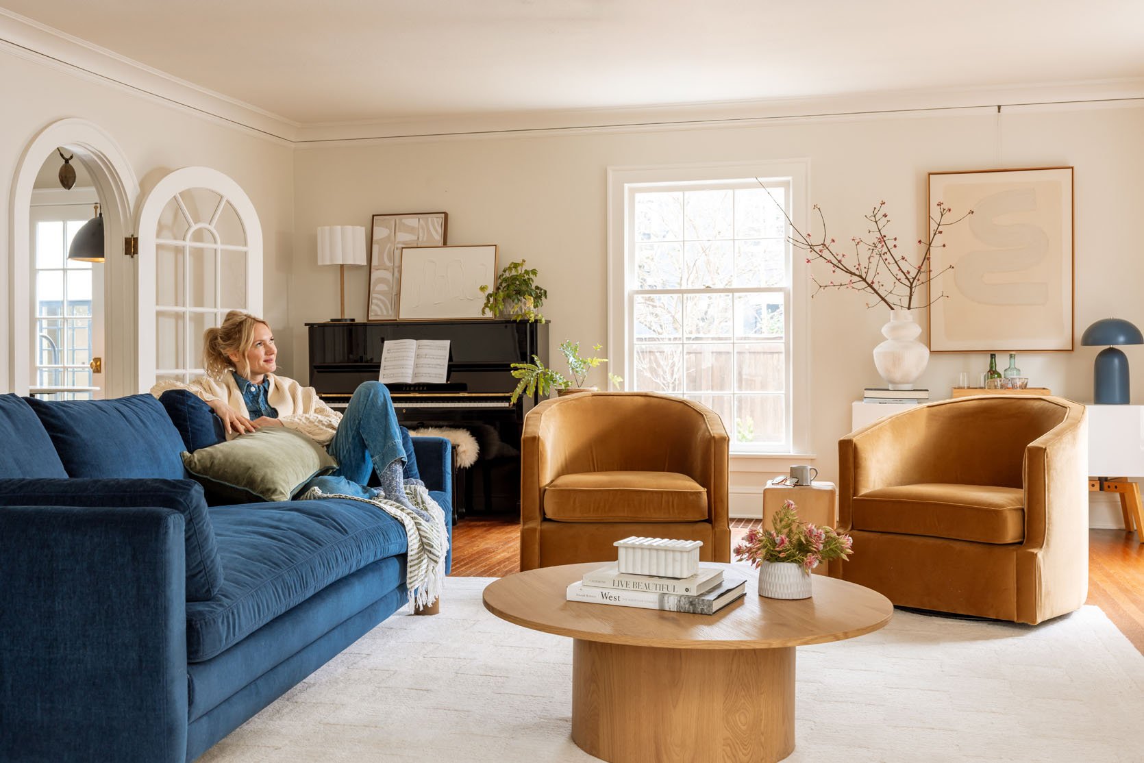
Uncategorized
Our 12 Go-To White/Neutral Paint Colors (+ How To Never Make The Wrong Paint Choice Again)
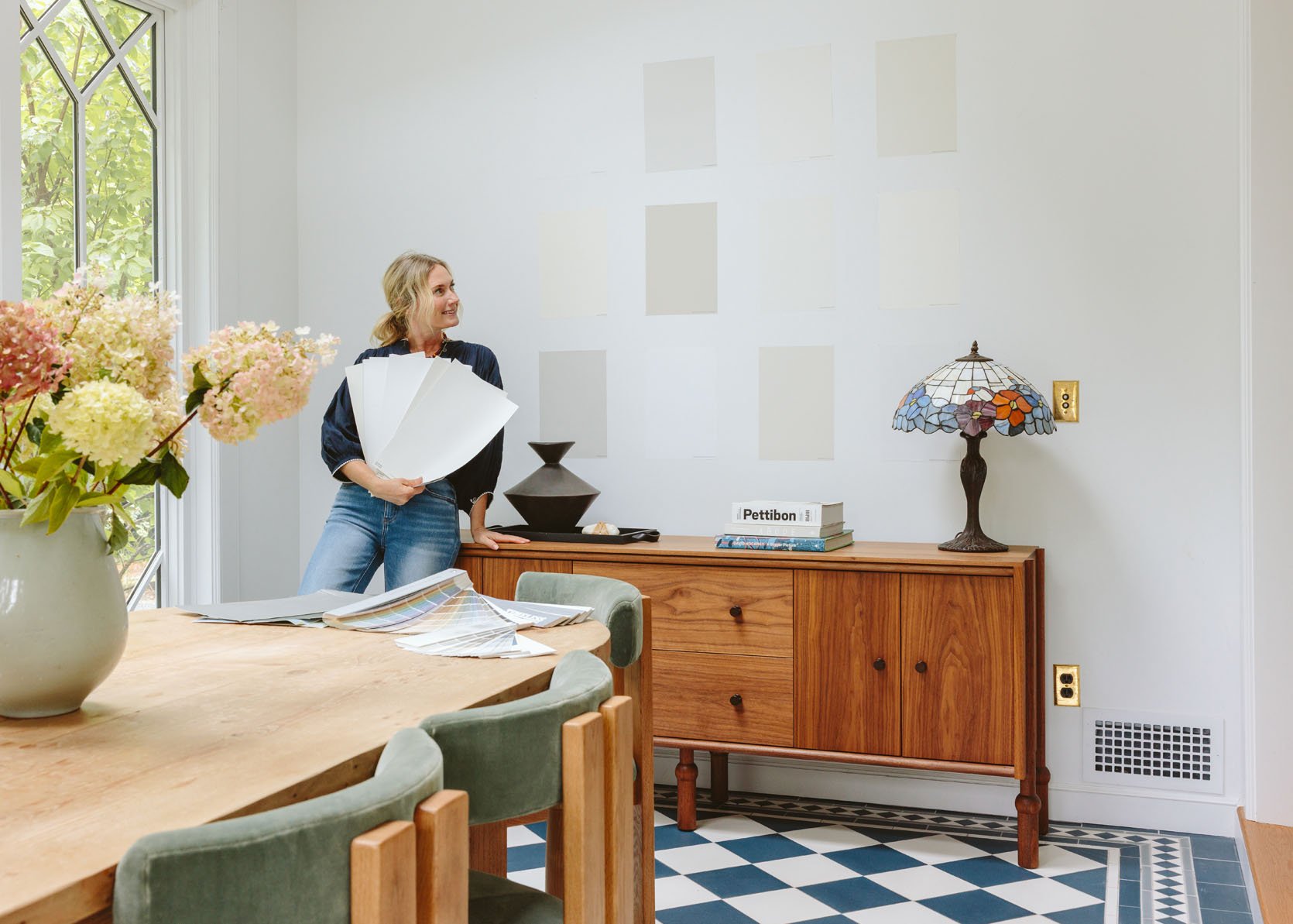
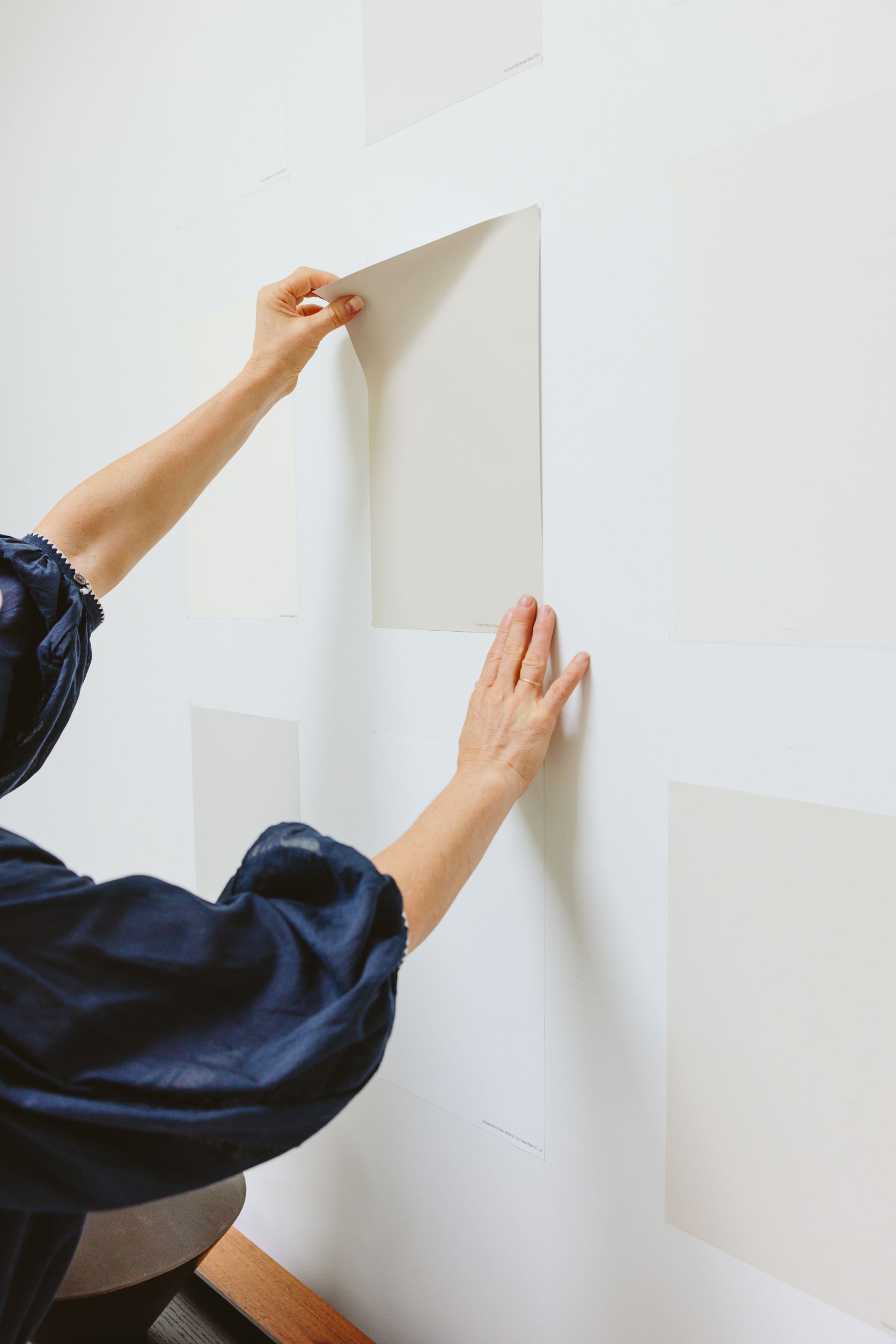
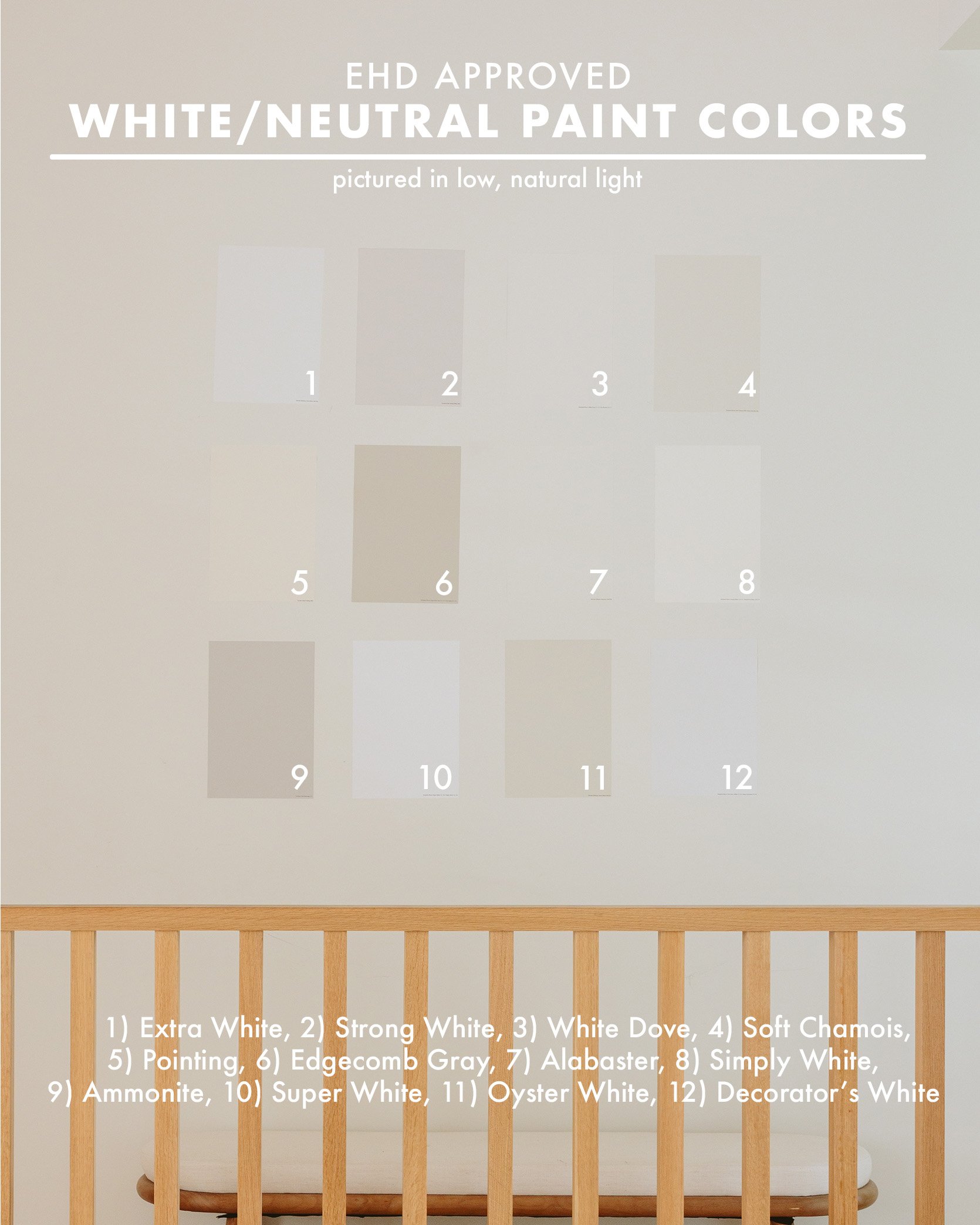
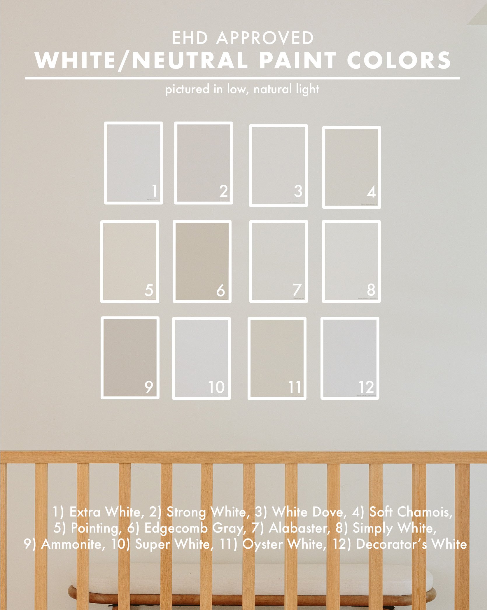
If you want to know the best designer hack right now, read today’s post. This new product has become something I absolutely depend on (and collect), and I haven’t painted a room in the last 3 years without buying a few. Samplize is a company that sells large sticker paint samples that are made with real paint from almost every paint brand (Sherwin-Williams, Benjamin Moore, Farrow & Ball, etc), and they arrive the next day. It’s almost too easy (and at $7 a pop, it’s affordable enough to ensure you are making the right decision – and don’t be afraid to keep them for next time, like me). It’s a total game-changer versus fan decks or paint pots. So today we used Samplize to order 12 of our favorite whites or neutral paint colors and show you how they look in two rooms – one with a ton of natural light and another with way less.
Whites or light neutrals are harder for me (and anyone, really) because it’s SO hard to see the undertones on a small paint sample. Additionally, the wrong white in a low-light room can look so sad and dead, while the right one can bring warmth and dimension. All the samples we tried actually look so light and white once the whole room is painted, but as you can see above, some are so much darker!
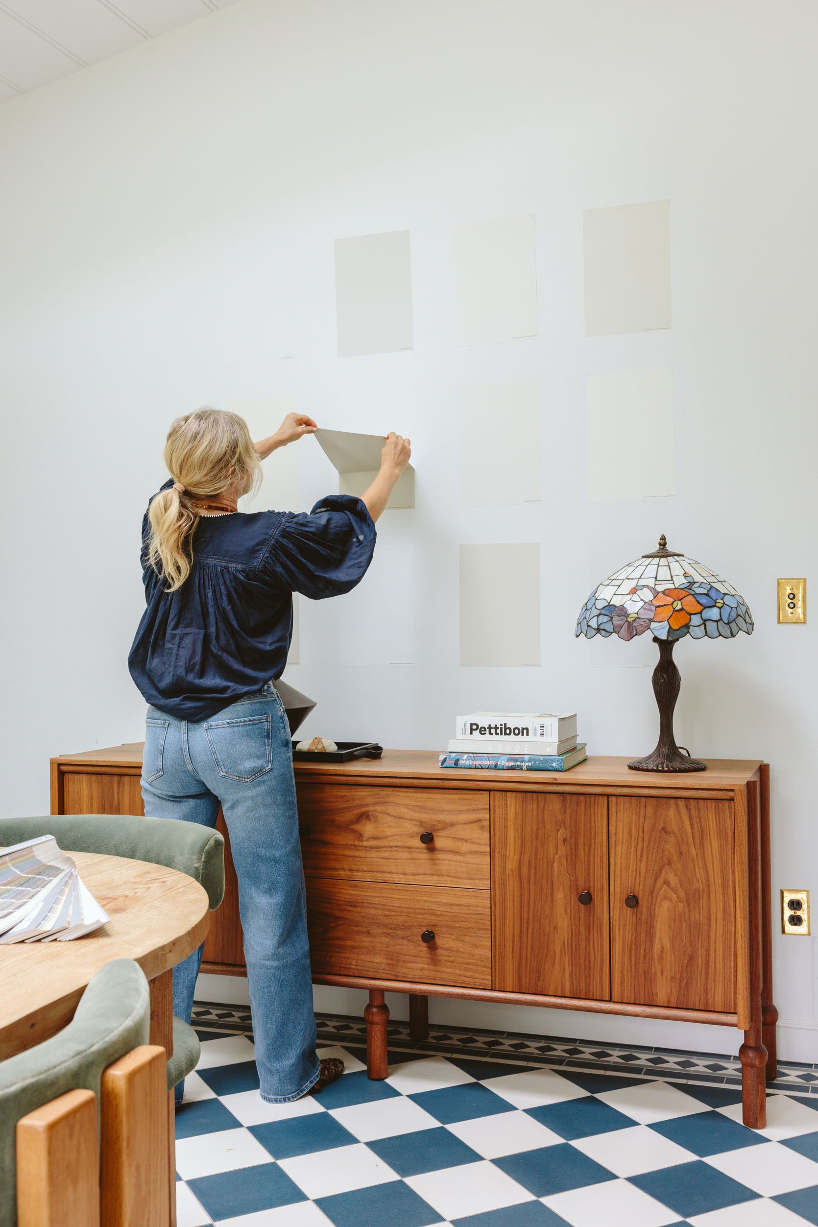
These Samplize stickers are big enough to really see the color, are repositionable so that you can try them on different walls or different rooms, and you can keep them up for a few days to really look at the room at different times. My two biggest rules for choosing whites are this:
- Don’t paint a dark room white. White can look really flat and dead without natural light bouncing off of it. But in a room with a ton of natural light, you have a lot more options (it’s easier to not go wrong). I get it, you are scared of a really dark room – just do a more medium tone that has a lot of undertones then.
- Stay away from overly blue or overly yellow undertones. Most of our favorites are so nuanced – they have so many undertones that work well together. Gray and beige both have tones that can be so pretty, but if they are too simple/basic, they look cold or dated.
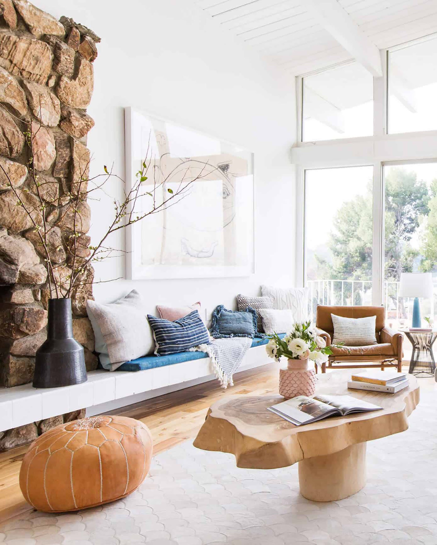
Bright Natural Light Versus Low, Natural Light
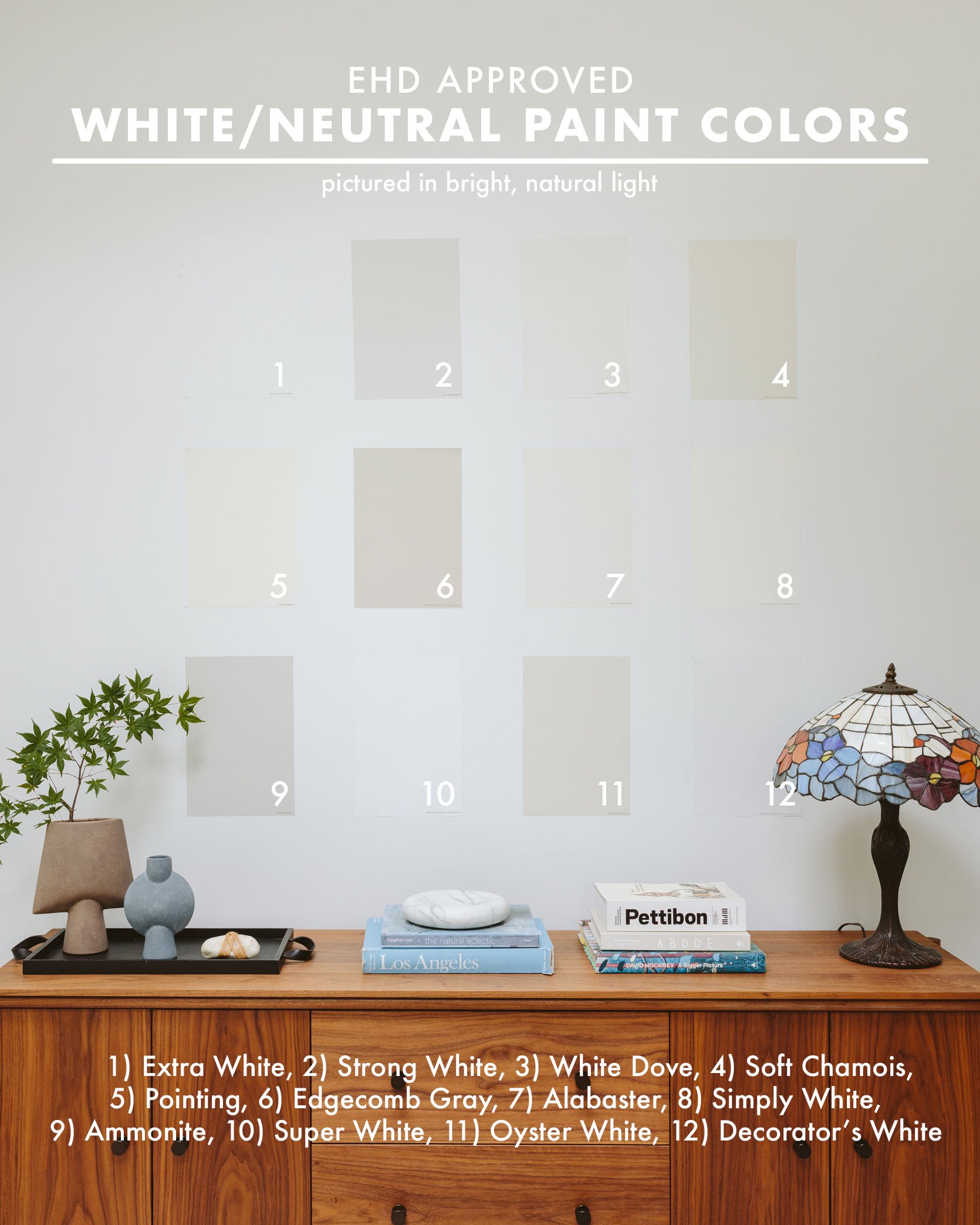
Sherwin-Williams – Extra White
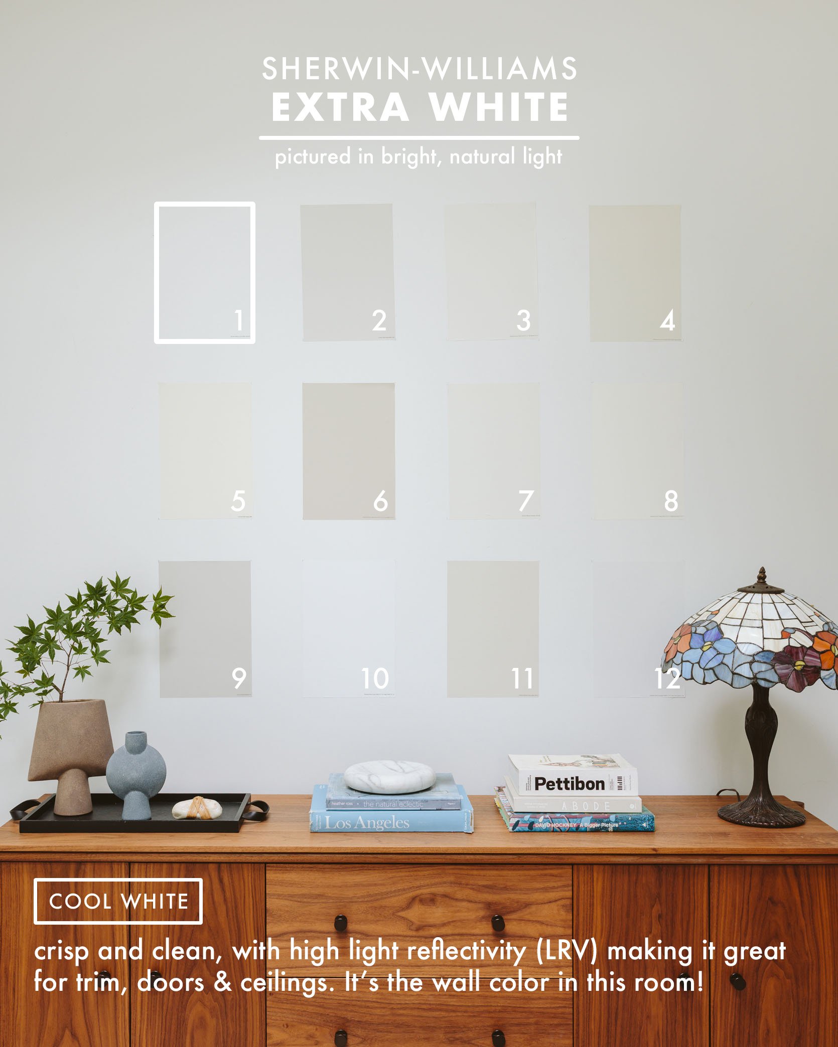
Sample: Sherwin-Williams – Extra White
This white is best for really bright natural light and definitely has the coolest undertone, but I wanted to show you what a cooler white would do to a room (and mixing it with wood is a great idea). But this white doesn’t look as good in our living room, which has a lot of indirect but not direct light.
Farrow & Ball – Strong White
photo by tessa neustadt for ehd | from: our modern english country kitchen reveal
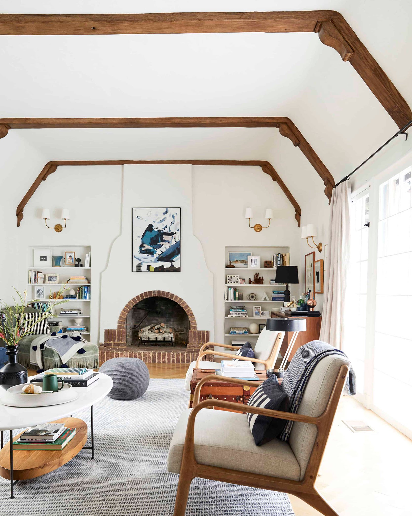
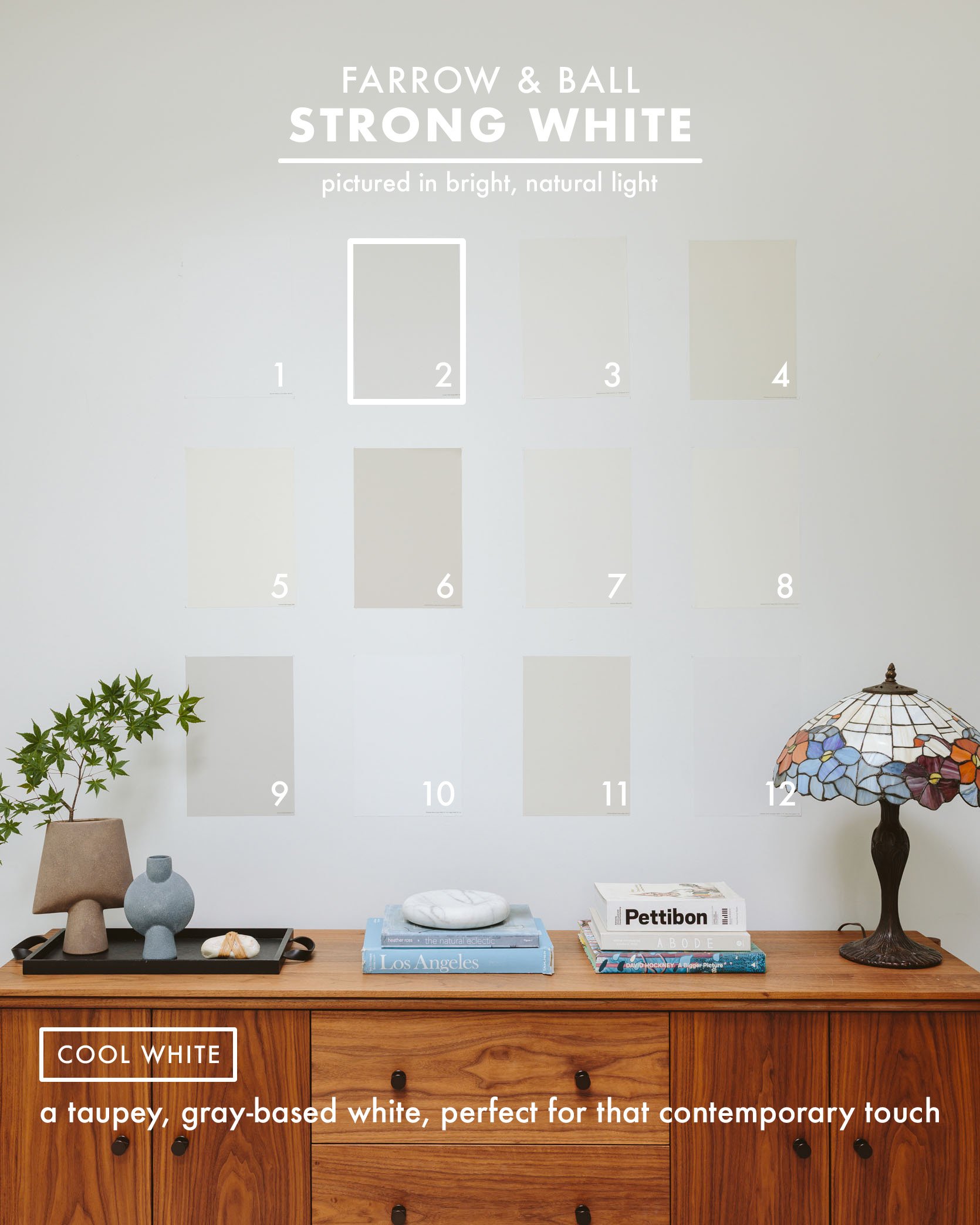
photo by ryan liebe for ehd | from: my living room design, updated
Sample: Farrow & Ball – Strong White
This is a gorgeous taupe-y gray-white that I painted my cabinets (the perimeter, not the green island, obviously). I loved it so much that I went ahead and painted our living room the same color – I miss that living room! The swatch online reads very beige, but it’s a lovely creamy grayish tone that can still read white enough in a large setting.
Benjamin Moore – White Dove
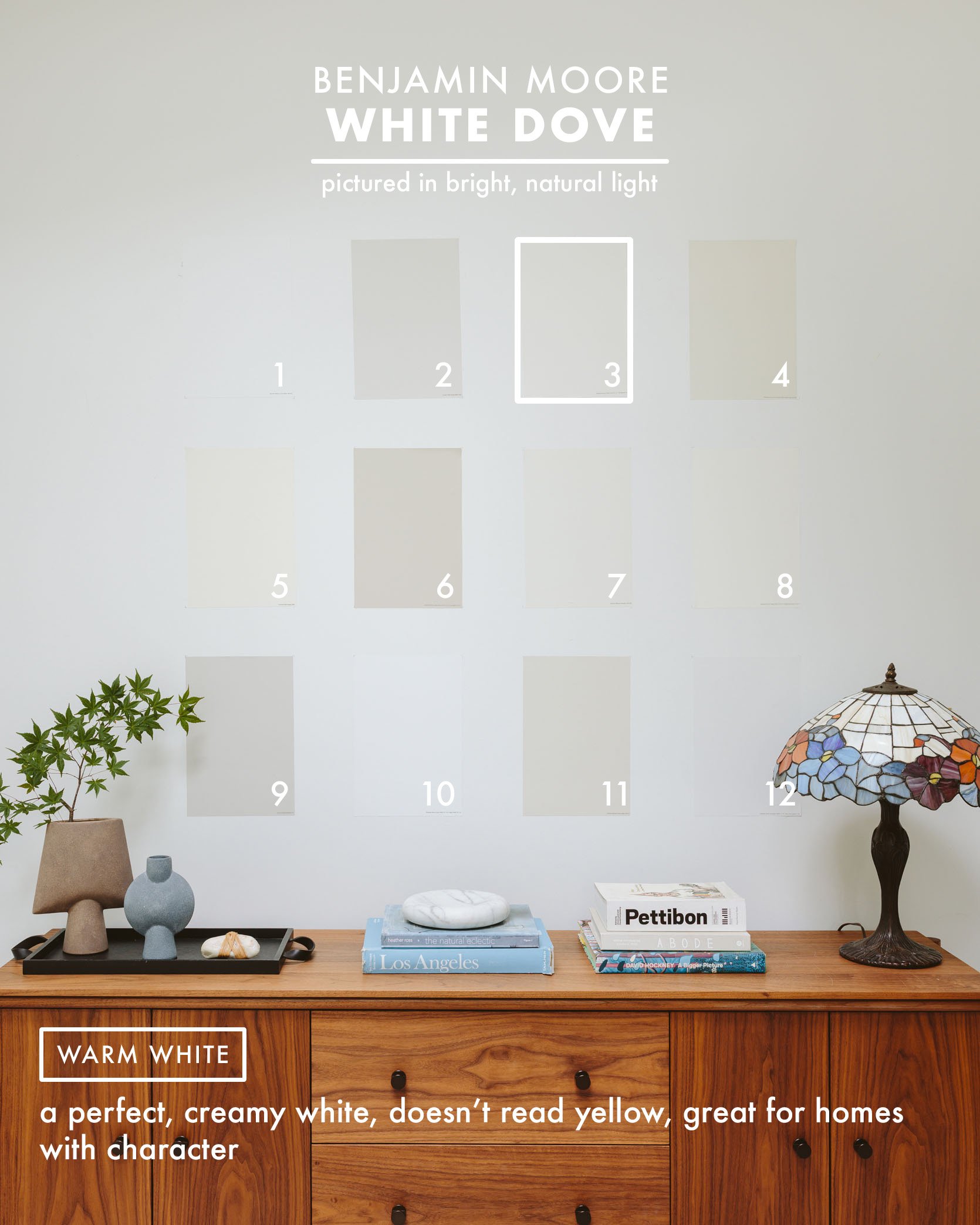
photo by zeke ruelas for ehd | from: silver lake hill’s living room reveal
Sample: Benjamin Moore – White Dove
Arlyn painted her living room this same white, and she said this: “It’s a creamy and warm white in the way that vanilla soft serve looks creamy without being beige-y. It’s the type of color you strangely just want to look at, except it’s white, so you feel weird being kind of obsessed with it. Evidently, it was Benjamin Moore’s “Color of the Year” a few years back, if that says anything to you. But yeah, it works well for homes with more character (i.e., nothing super modern), and is warm without being the least bit yellow.”
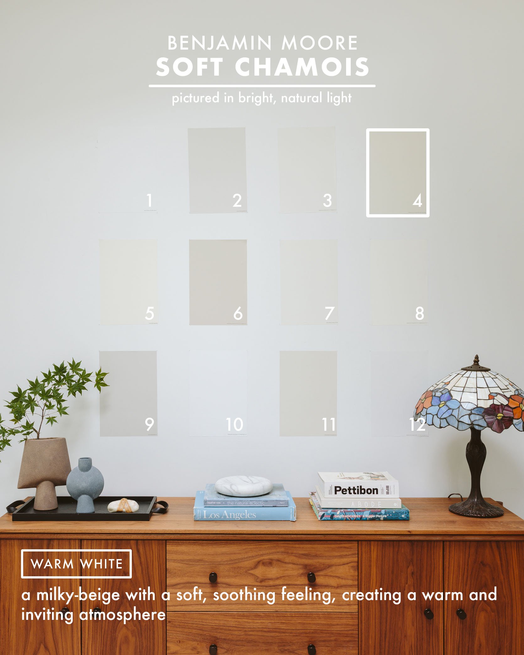
Benjamin Moore – Soft Chamois
Sample: Benjamin Moore – Soft Chamois
We recently shot our furniture line at Catherine Sheppard‘s house for Room Service (her house is absolutely gorgeous). She painted her walls BM Soft Chamois, and trim is BM Simply White. It was so pretty and yes, light and airy, but still warm.
Farrow & Ball – Pointing
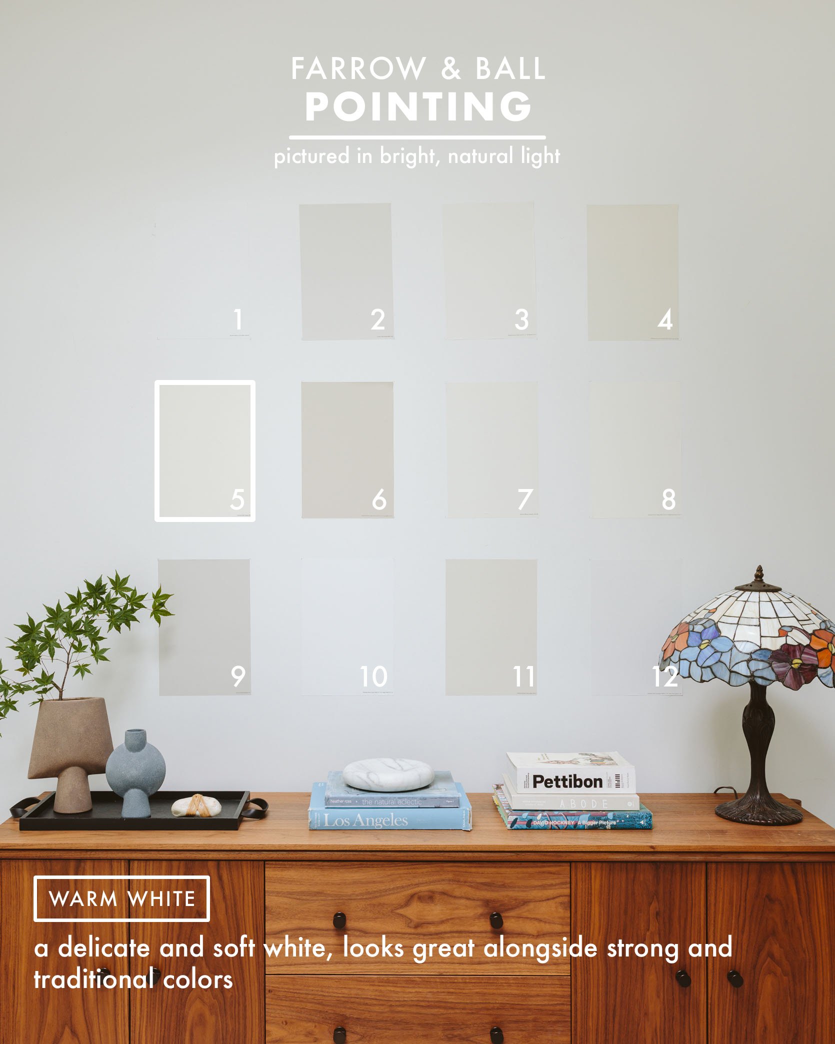
photo by sara ligorria-tramp | from: jess’ small space living room reveal
Sample: Farrow & Ball – Pointing
Arlyn wrote this, which I think is totally accurate and well put: The swatch online of Pointing looks SO warm and beige-y, but in person, it’s such a lovely warm yet neutral white. Jess used this in her living room and kitchen and was very happy with it. It’s warm enough that crisp white curtains pop against it, but looks very “white” against most other colors. Farrow & Ball paints tend to be more expensive than traditional hardware store brands, but the paint is VERY thick and super high quality with a wide range of finishes.”
Benjamin Moore – Edgecomb Gray
Sample: Benjamin Moore – Edgecomb Gray
We had our retreat out at The Carly in Oregon wine country (it’s incredible) and couldn’t believe that the warm neutral on the walls, which felt white to all of us, is in fact this dark!!
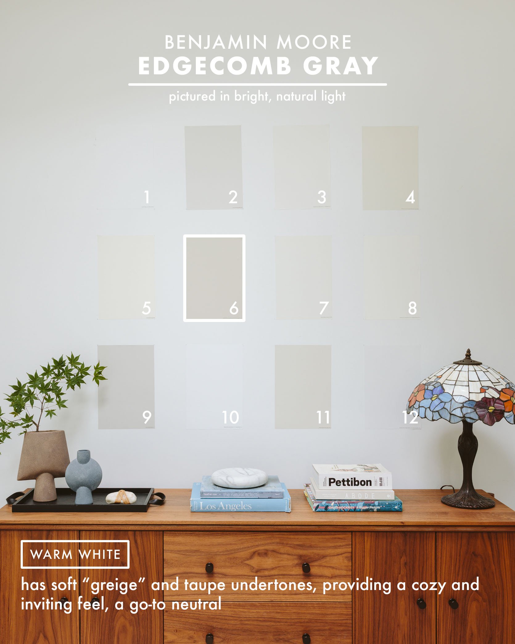
This is such a great example of how you need to rethink whites to include medium-toned neutrals that you think are going to be really dark, because in a larger space with a lot of soft indirect light, it will read lighter. We loved this light neutral so much in person.
Sherwin-Williams – Alabaster
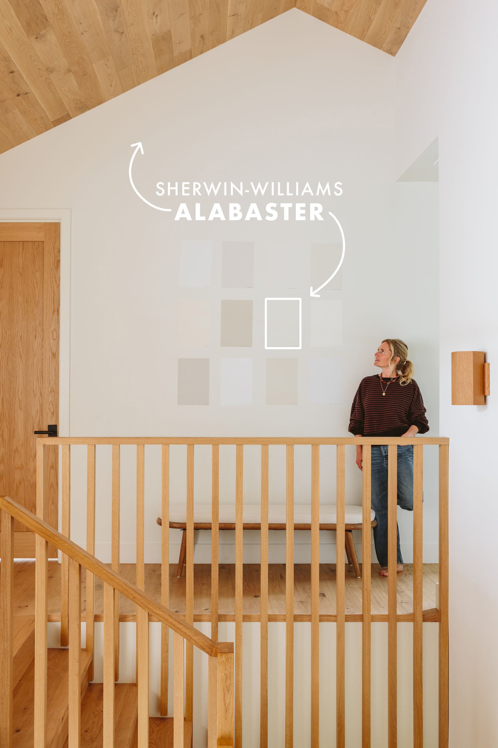
Sample: Sherwin-Williams – Alabaster
We shot the “low natural light” portion of this in my brother’s upstairs hallway. It actually gets great natural light, but we closed the shades so they just let some light in to give you an idea of what these would look like without beautiful light bouncing all around.
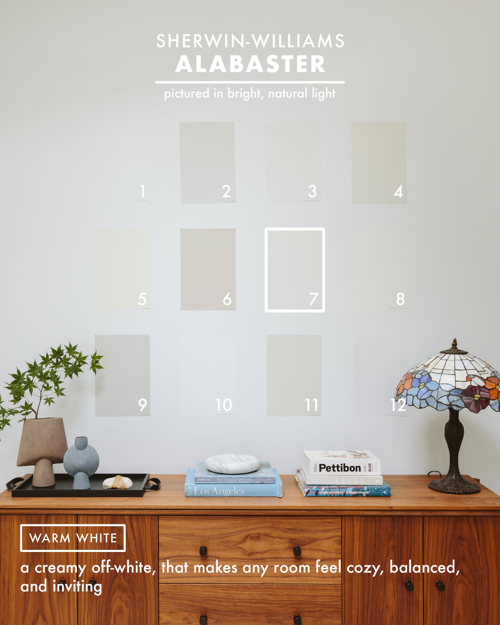
I absolutely love how Alabaster looks in every room of their house – in fact, I’d go as far as to say that if anybody asked me on the street what a no-fail good white is, without seeing their house, I’d tell them Alabaster. We looked at it with the wood flooring and moved the Samplize sticker around in many rooms in their house, but it worked in every single one of them. It’s so solid and pretty, with a slightly creamy taupe undertone that makes a room feel really balanced and inviting.
Benjamin Moore – Simply White
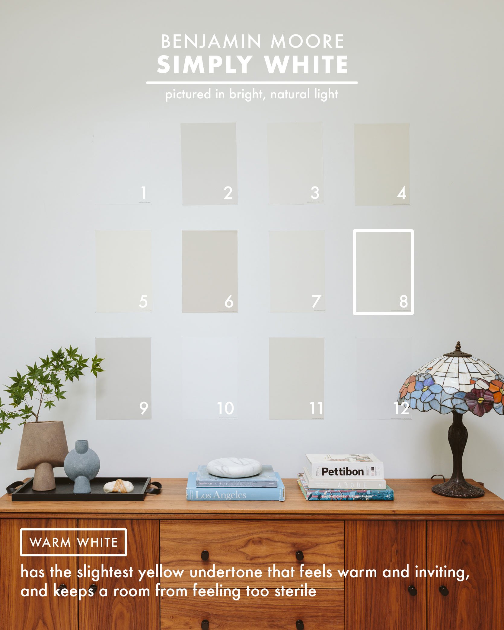
Sample: Benjamin Moore – Simply White
Kaitlin painted her entire house Simply White, which is pretty dang similar to Alabaster, if not a tiny more saturated. Creamy undertones that still read as very white, yet with warmth.
Farrow & Ball – Ammonite
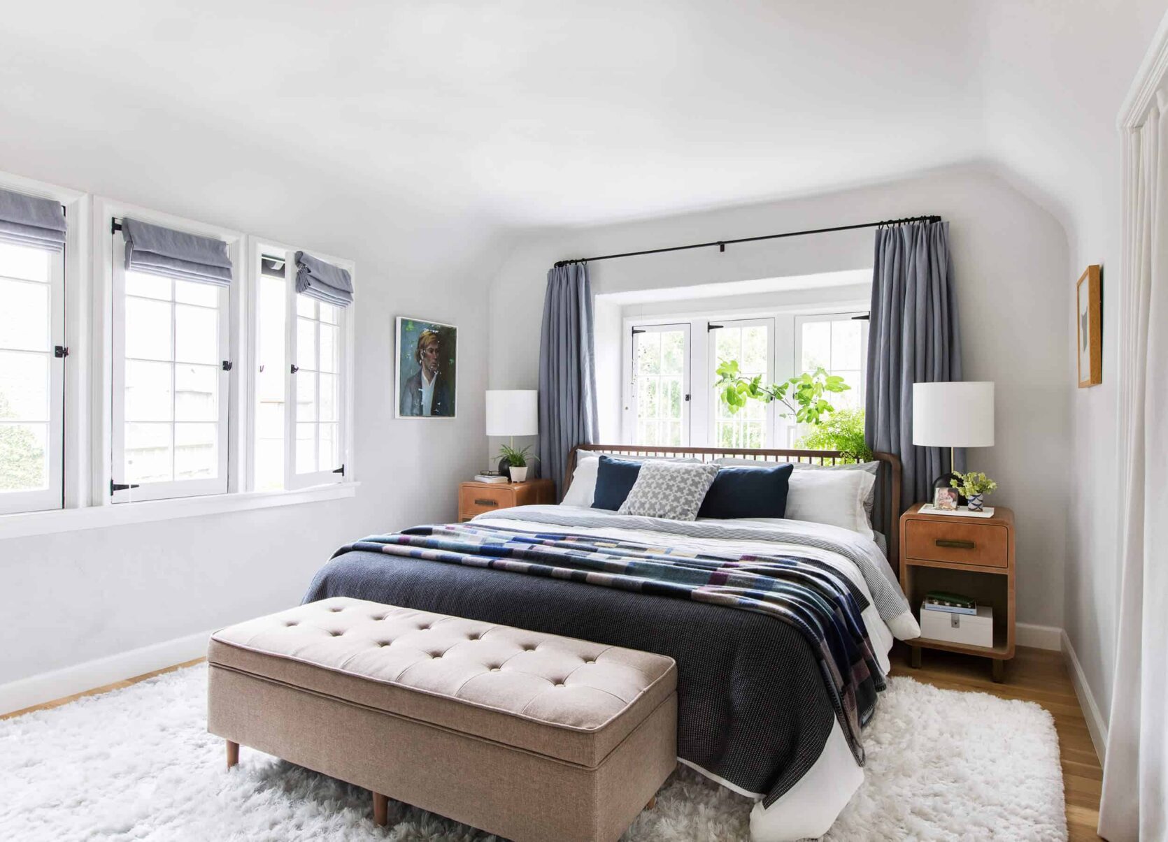
photo by tessa neustadt | from: my master bedroom reveal
Sample: Farrow & Ball – Ammonite
I loved this color in our old primary bedroom in LA. If you are looking for the softest, lightest gray that is so warm but not taupe, then this is for you. I love how subtle the color is, all while bringing some different hues into the home besides white. This color felt really clean, even though it has a lot of nuance.
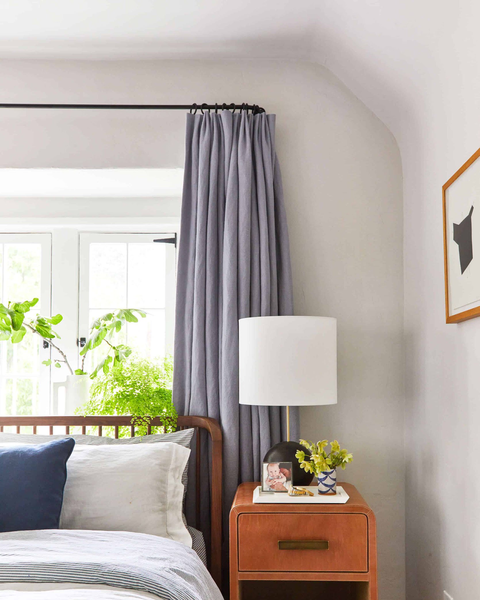
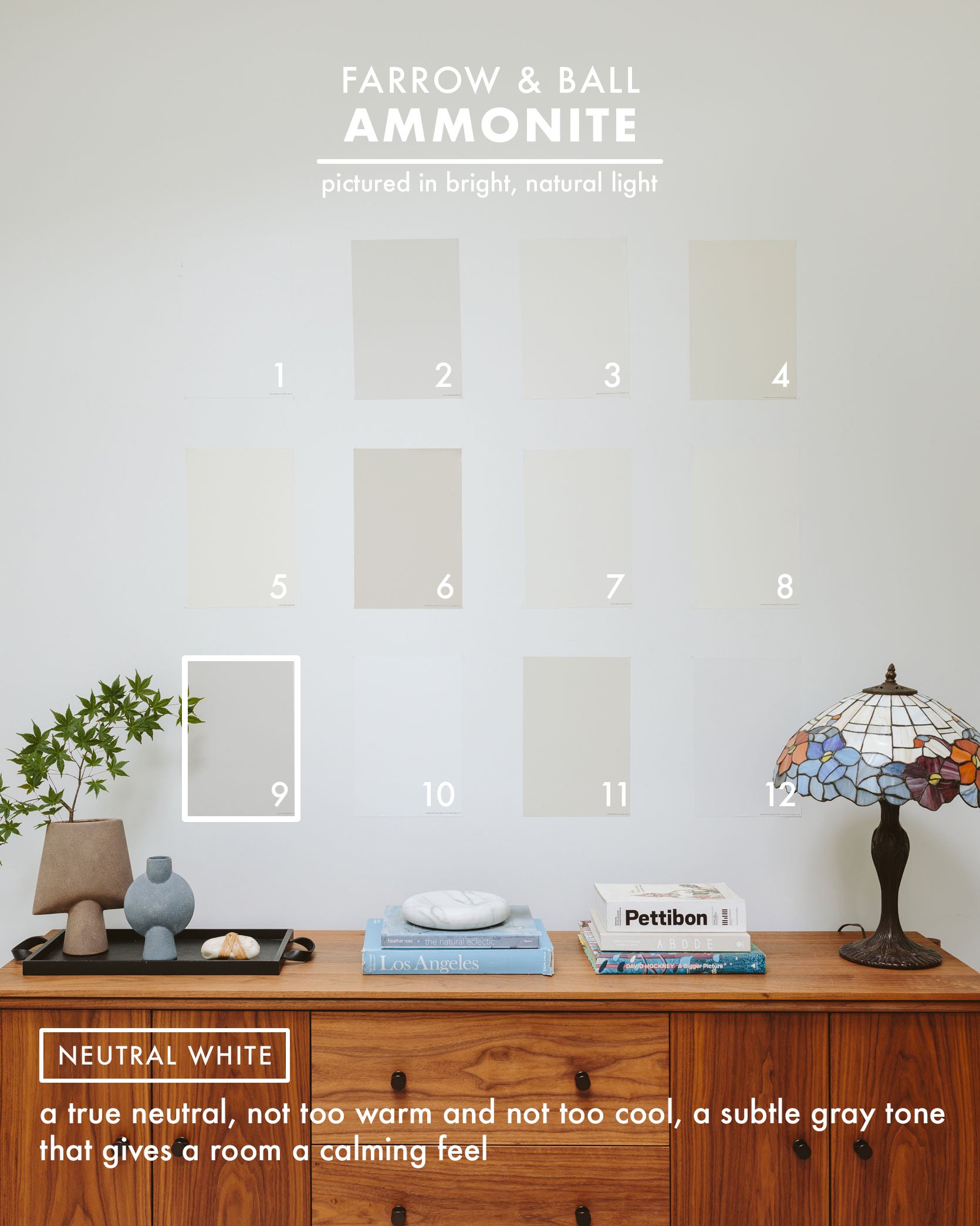
As you can see, the #9 swatch looks, even a bit muddy, but with the amount of natural light the bedroom got, it felt bright and happy, but definitely a tone.
Benjamin Moore – Super White
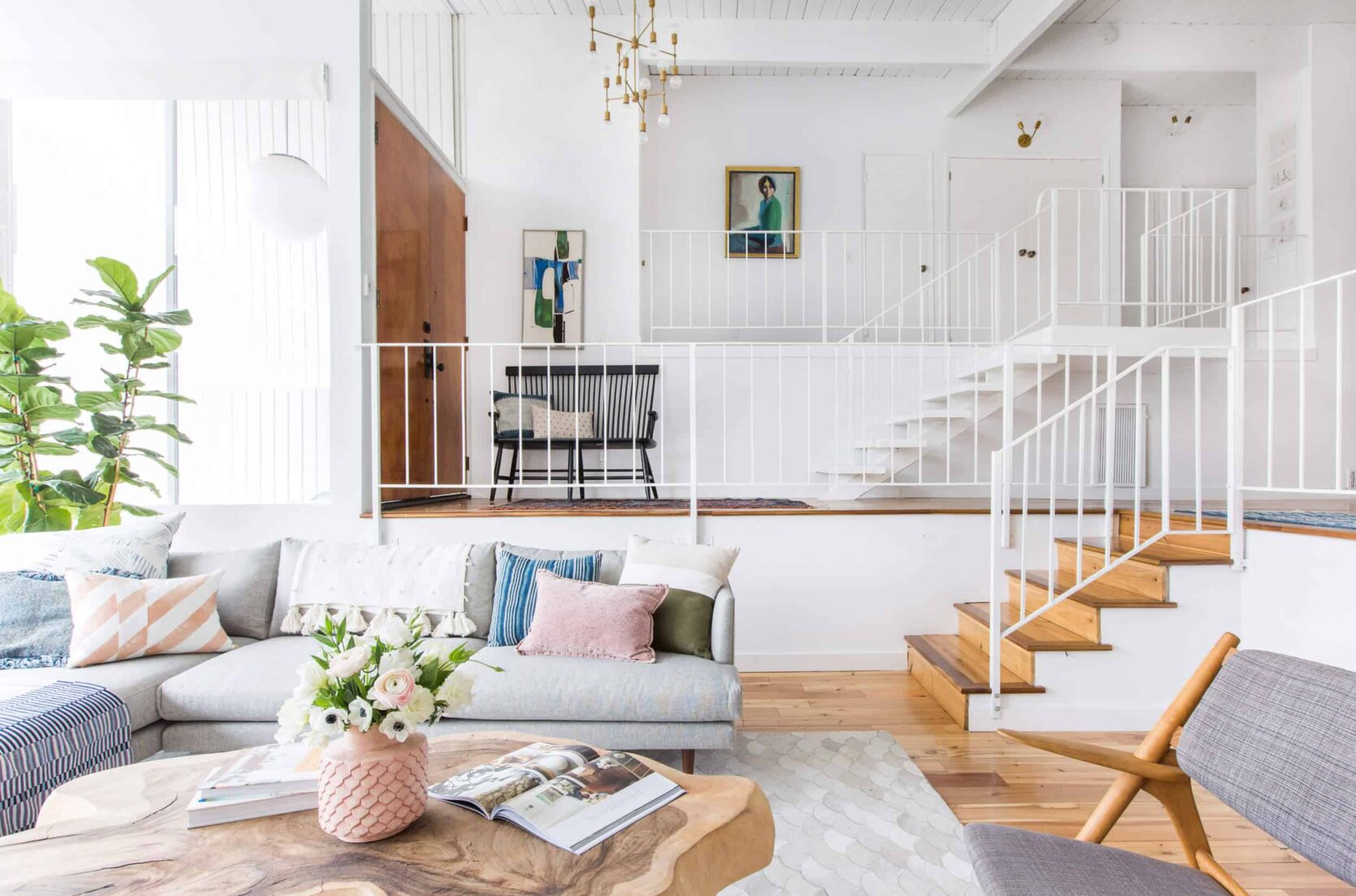
photo by tessa neustadt | from: how we styled the living room to sell
Sample: Benjamin Moore – Super White
This was our go-to white for a while (I used it in our old Glendale house, and Brady used it in his kitchen). We still love it, FYI, but have since turned to Pure White by Sherwin-Williams for recent projects. This color is great if you are looking for a modern, clean color. It reflects light in such a pretty way and doesn’t have any cool tones that would make it go blue or warm tones that would make it yellow. It’s just really white.
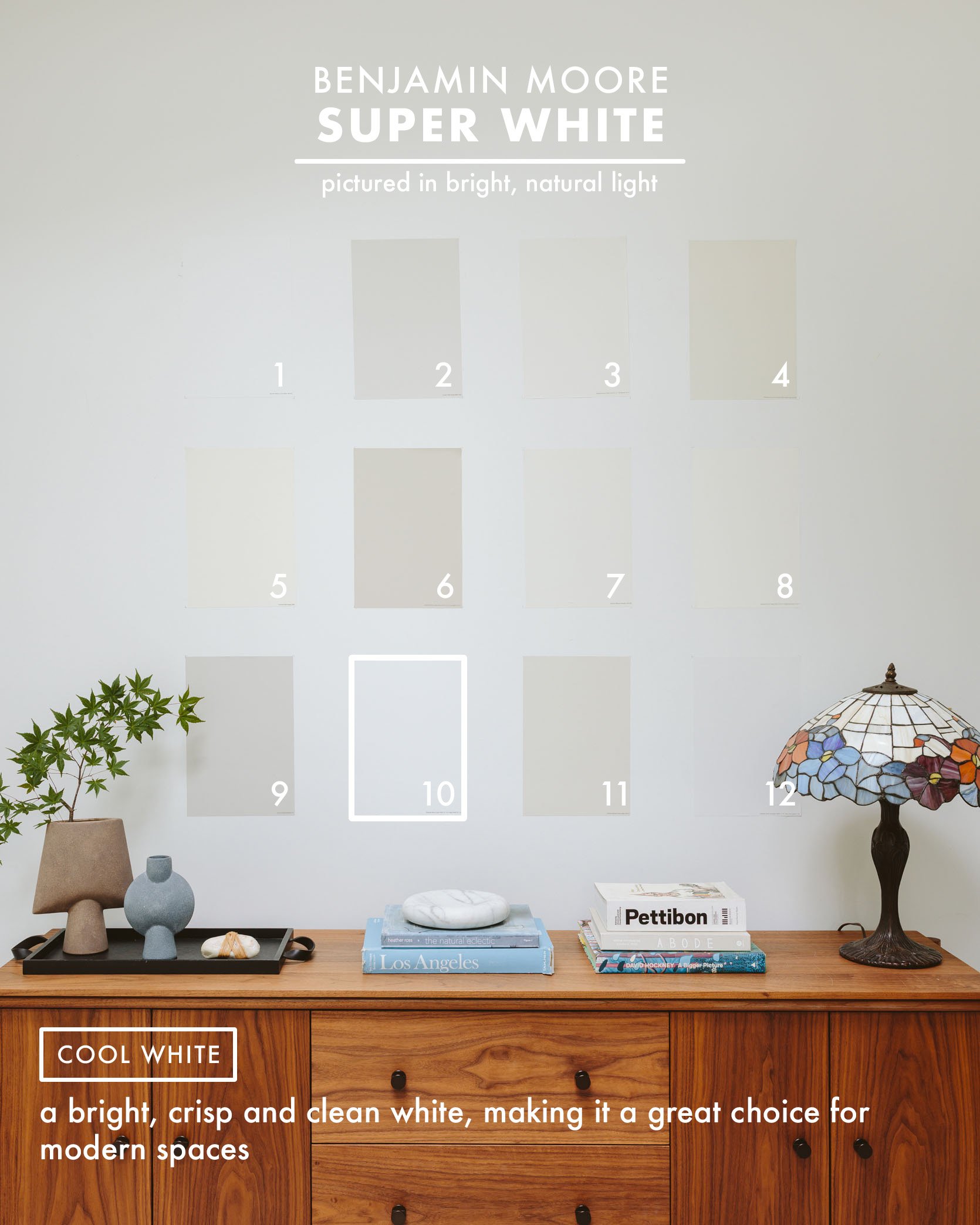
Again, my advice is that a clean, bright white like this is best for rooms going for that extremely airy vibe, which requires a lot of natural daylight. So don’t put this in your dark bedroom – it will just look cold.
Sherwin-Williams – Oyster White
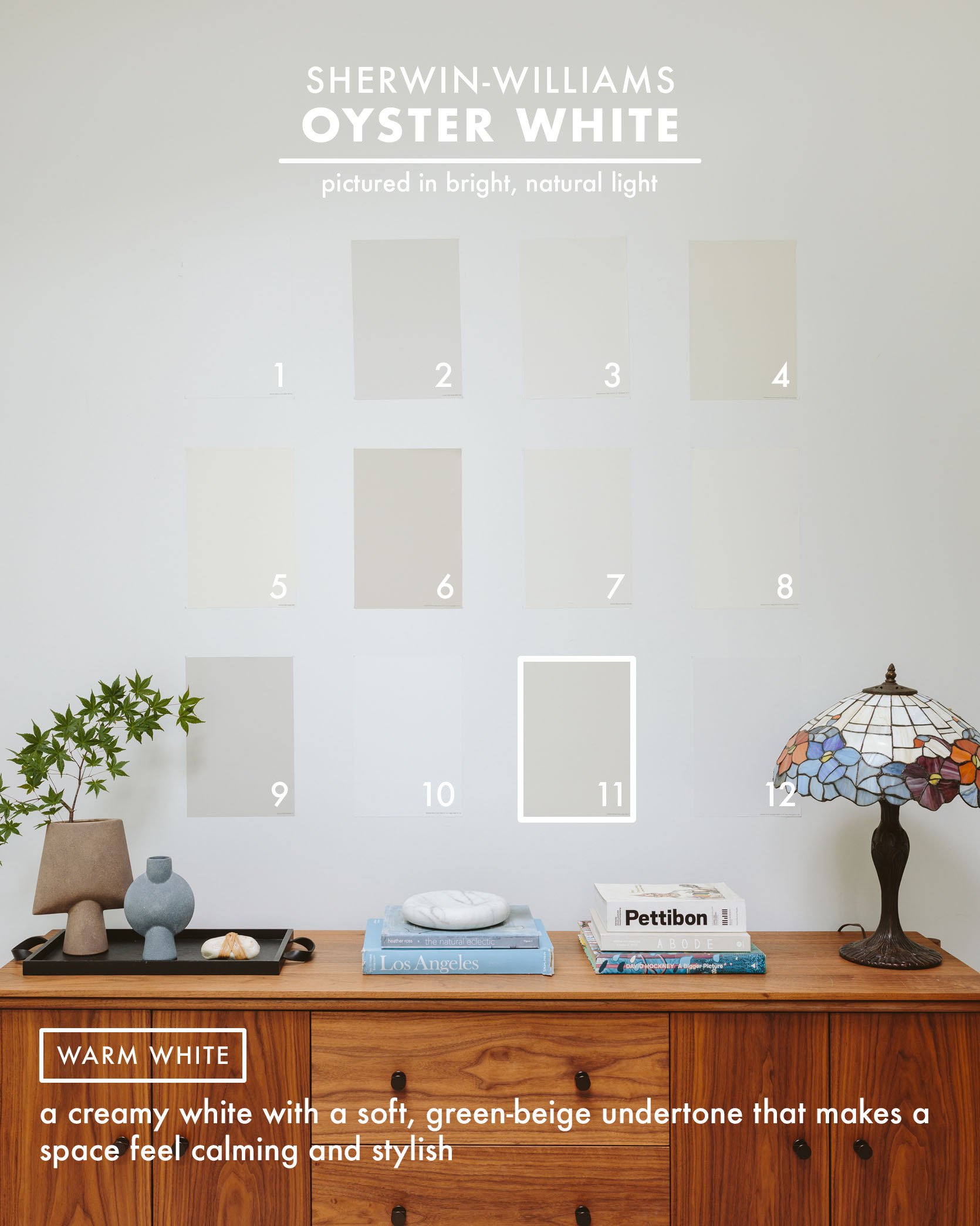
photo by sara ligorria-tramp | from: the portland project family room reveal
Sample: Sherwin-Williams – Oyster White
For many of the public living areas of the Portland Project, we used Oyster White from Sherwin-Williams. It’s almost a touch taupe-y gray in comparison to the crisp white of the molding (Pure White from Sherwin-Williams), so it works really well in that sense. During the big open house event, the most asked question about anything in the house was “What is this paint color?” It’s cozy and comforting but still white enough not to run too deep into gray territory.
Benjamin Moore – Decorator’s White
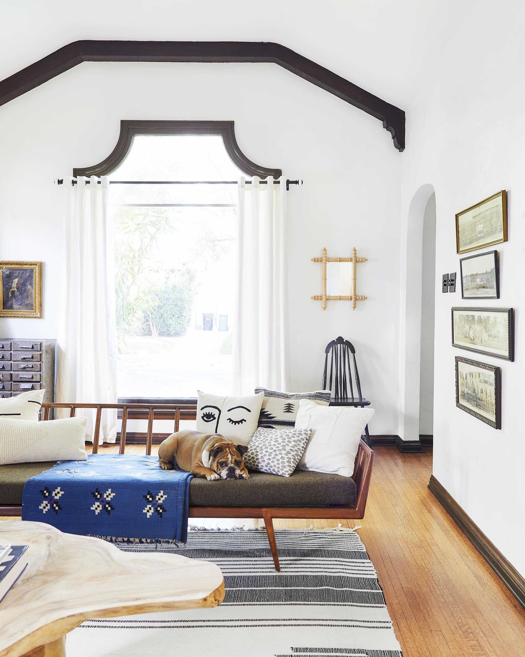
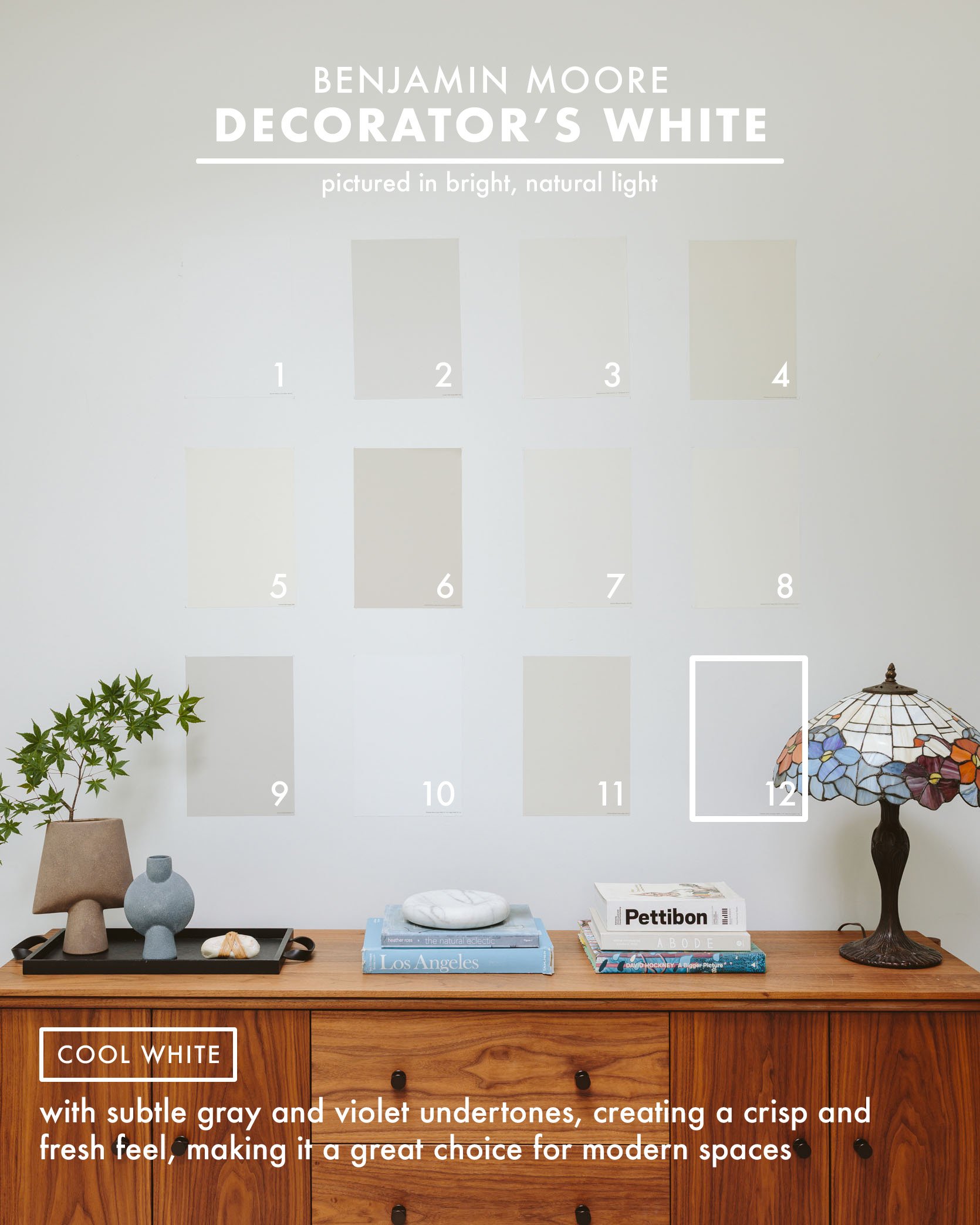
photo by sara ligorria-tramp | from: michael’s vintage-filled living room reveal
Sample: Benjamin Moore – Decorator’s White
This is called “Decorator’s White” for a reason. A ton of decorators and designers use it (honestly). Michael picked it for his current home because it mixes really well with other neutrals but also pops of color. It’s calm yet bright and an “elevated” sophisticated white. Not too clinical, just a great backdrop for lots of styles.
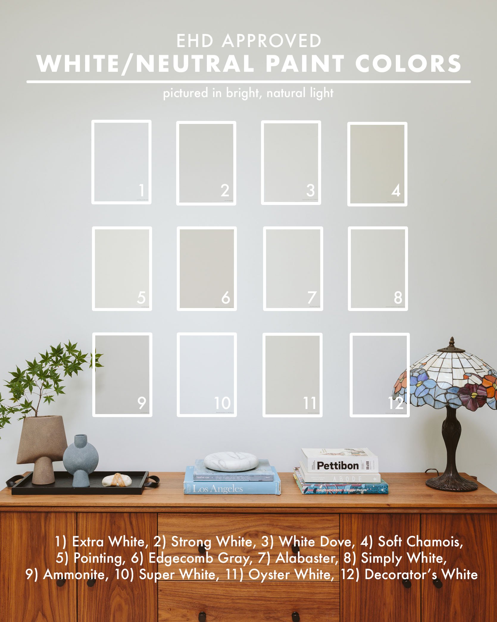
If you are about to paint a room, I can’t express how important it is to order these samples from Samplize, that is, unless you walk around with some magically inherited paint color confidence. Sometimes I’ll just order the final two, just to make sure (ordering a ton can add up, I know). I’m seriously so grateful that this product was invented and that it comes so dang fast (faster than going to the paint store to take home those tiny chips). It’s been an absolute game-changer. And for your convenience, here are all of my white and neutral paint color samples to choose from in one easy place! Let us know what paint color roundup you’d love next 🙂
*Unless Otherwise Noted, Photos by Kaitlin Green

I used BM decorator’s white in my last home and loved it. However, I just moved and the light in my new home is a little dimmer (lots of windows but also lots of tree cover) and BM DW didn’t work there, it was reading … dingy. After a lot of white testing I went with BM white opulence. It has a very very slight pink undertone but reads totally bright white on the wall. The pink/warm undertone cuts the gloomy factor. I would definitely recommend it.
BM White Opulence has been my secret weapon for years! I love that color! It goes so well with a vintage/ eclectic style… I think they recently renamed it Opulence. The other one I really love is BM Alabaster, a great tone for North facing rooms.
+ 1 on alabaster, but the Sherwin Williams Alabaster! We used it inside a 1920s cottage in Honolulu with old redwood walls, it was a perfect warm white with no yellow. the interiors ranged from quite bright to less directly bright and it was good in all of it.
I’ve used Benjamin Moore Cotton Ball 3x and love it. It’s a warm white without going creamy. I’ve used it in a basement that got a reasonable amount of light and it read as very white, a very sunny bedroom where it was warmer, and now my whole (dark) house where it’s a bit cooler. It looks creamy on the chip and online but I’ve never had it go that way.
BM Cotton balls is one of my favorites as well. It is the best trim color too. It took us forever to find a white that would match our vinyl windows and this was one step away from a pure white (like BM Chantilly Lace) without being too creamy.
Oh this color sounds very nice! I tried Chantilly Lace on my walls (way too cool-toned in my living room that gets a tone of green in it from the surrounding trees), but didn’t know about Cotton Balls. I ended up with White Dove, which I love, but will check it out if I have another space to refresh!
Oh no! I love Chantilly Lace (it’s all throughout our house), but I could see it feeling too cool. In our space, it’s super crisp and feels like a pure white
I’m with ya’!
So funny! White dove went cool and grey in my house. I tried swatches painted on those poster boards with adhesive and moved it around. Nope. Didn’t work. We ended up with BM ivory white with chantilly lace trim upstairs. In the basement the ivory looked yellow so we did chantilly on the walls. it’s crazy how a color can vary so much in one house based on lighting!
I painted my living room and dining room with BM Cotton Ball and I love it! I will say I had a hard time getting it to cover the generic beige the contractors painted my house before buying. My floors are original to the house and the lean to the orange tone and I found Cotton Ball was the perfect white for them. It’s warm but it’s white.
My kitchen is BM Cotton Balls and I’m in the process of painting my laundry/ mud the same color. Love it. Seems to work well in a variety of different lights. My kitchen is bright, but the laundry room is dark.
I’ve used Swiss Coffee from your list and loved it. BM Pale Oak is another good one that I used in a different home when the lighting suited it better.
Nice list to use to get samples and see what’s best for the space. Very useful post.
We used BM Seapearl and it reminds me of Pointing. It feels very neutral but has a nice contrast with a white trim.
These are some photos of early days in our house (more work has been done since!) and all of the main living areas are painted Seapearl.
Your home is beautiful!
It’s fun to see other readers’ homes. Thanks for linking your gorgeous place.
thank you for sharing! So lovely.
When you have all white walls do you usually stick to the same white for built-ins and trim or choose a different white? This is breaking my brain. Thanks!
I chose BM Simply White for my baseboards/crown molding, and had the living room built-in cabinets, fireplace, and stair treads painted the same color, but I used different sheens depending on the application. Built-ins (with cabinet doors) had an eggshell finish, then fireplace, baseboards and stair treads had a glossy, don’t-mess-with-me finish. Our walls are matte BM Swiss Coffee. Hope this helps!
What’s your rule of thumb for trim color? If you’re already using something pretty white (I.e. white dove), use the same color for trims (and ceilings?) but in different sheens? While I’m talking sheen, what’s your go-to wall sheen?
I would love an answer to this question! I’m about to paint my home white, usually my go to is decorators white for trim/moldings, but wasn’t sure if the walls should / could be the same white? And should they be a different finish?
We were actually just talking about doing a post on paint sheens. When and how to use what. We typically go flat or matte for walls (unless it’s in a bathroom or high-traffic area) and then do one sheen up on moldings and trim, but there are so many things you can do as design details here. You can go tone-on-tone with a color in either the same finish, or in different sheens (flat and then high gloss for instance). My apartment is White Dove on the walls and Swiss Coffee on the trim (the trim is not my choice, it was my landlords and she told me not to touch them), but it actually works really well. But honestly, to keep things simple, I would have gone all White Dove across the board, just with a subtle sheen finish on the moldings and baseboards. Hope that’s helpful!
My last home (a very modern 3500 sq ft new build) was 100% painted in SW pure white, and it was perfect. We just did our 1925 Dutch colonial in a mix of bm white dove, FB winborne white, and bm super white, and love them all. If you are looking for a blue/grey neutral, we painted our mud room FB light blue and it is the absolute perfect color. I wish I could paint more rooms that color. I needed a paint color and didn’t have time to test, so picked off the swatch and cannot believe how good it turned out.
We used Sherwin Williams – Nuance in all the common areas of our home and I LOVE it! I wouldn’t say it’s for everyone. It’s a creamy gray, but not beige. In the morning and on cloudy days it definitely reads the faintest of grays, and if it wasn’t for the white trim you would likely see it as white. In the evening, with the warm, west light streaming in, it’s slightly creamy. This insta photo shows it best!
Thanks for this post! Perfect timing! I’ve been stuck in paint color paralysis for a long time now (with swatches everywhere) and this may be the perfect thing to nudge me into a decision!
paint color paralysis is SO real. good luck! I hope there’s something here that will help you shake that and land on your perfect paint.
Bury me with my fan decks rather than sending me to hell; fan decks are punishment enough
We basically slathered our house (doors, trim, ceiling, walls) in Ultra Pure White by Behr. It’s the base color before any tint is added, so you don’t have to worry about matching the color later and you can just take it off the shelf and go! ? It’s the perfect white if you have a lot of natural light coming in. You are the one that recommended it to me after I emailed you asking about white paint about 9 years ago!
Ultra Pure White in our recently remodeled kitchen…
Hmm, I did this once to paint over a deep teal door in a rental and it was impossible to coat (I think it was even Behr Marquee, which has a one-coat guarantee). When I went back to the store to complain, they told me that even if I was going white, they need to add “pigment” to make sure it coats properly. It didn’t sound like you had this issue, so maybe I just grabbed something different? Who knows! It was several years ago.
Fundamental White by HGTV Home by Sherwin Williams. When I discovered this color I didn’t understand how it hadn’t been included on one of these “favorite white paint” lists before. I don’t know what it is about this color but it glows. It reads as a true crisp white that is not blue at all but has the tiniest hint of glow-y brightness/brilliance that keeps it from feeling stark. There is no creaminess or yellow but it somehow radiates this ultra subtle warmth. It lit up the north facing entry of my last house and is now my go to trim and door color for our new house. I’ve only ever seen it at Lowe’s but it’s been a game changer for my home! I feel obligated to share.
We also use Fundamental White by Sherwin Williams throughout our house and love it. It does add warmth but also depending on the light it can have a very subtle blue/grey undertone (in our bedroom we don’t have a lot of natural light). We can’t recommend it enough.
OH that sounds SO nice. I like my walls like I like my face…with a subtle glow.
What color white is the mountain house bedroom?
All the walls there are Pure White by Sherwin-Williams! A SUPER crisp, modern white.
If all my walls are White Dove, how would Oyster White look on kitchen cabinets and island?
hmm, it would definitely read creamy taupe, but I actually think it might be a nice subtle contrast. It would be similar to the photo above of the Portland family room (painted Oyster white) where the moldings are Pure White (which is much brighter than White Dove, but both are pretty neutral whites) and the walls have a defined warmth and depth. Just be sure to put two swatches up next to each other in the same room so you can see what they do in your sunlight.
Such a HELPFUL post! Thank you!!! This is what I come to EHD for. (Dangling preposition, ugh! Oh well.)
Would you do a round-up of exterior colors that EHD has used and loved??? I find exterior colors REALLY hard to nail down. Thx!
I have to throw Sherwin Williams Crushed Ice out there for an amazing grey. Almost our entire house is painted this color and it looks almost white until it’s up against a white trim which is where we use our go to white, Swiss Coffee. Our house gets lots of light so I’m curious whether it will hold up when we move.
This post is SO great!!! Always looking for good grays and whites to paint my rooms. As a follow-up post, maybe you can talk about some “rules” regarding what tones of whites go in different lights or exposures? Like, would a cool gray go in a northern facing room or would that be too cold? Or would a warmer white go in a western exposure without a ton of light? These are the questions that wake me up from a deep sleep. Well…not really, but I do worry about them when trying to pick neutral paint colors.
Fabulous post and what a great resource! I recently did a bathroom with no natural light in a creamy white and love it! So interesting what the natural light (or lack thereof) does to a paint color.
PERFECT timing. Thank you! Trying to figure out the best white to paint the main living areas in our new (to us) 1920 craftsman…hoping to find a perfect white/neutral that works well against all of the original wood work.
Love the post, super helpful! What sheen are Emily’s Strong White cabinets?
According to Emily, the cabinets were actually color matched because her cabinet guy wanted to use a lacquer instead of a water-based paint for durability.
Super helpful post, thanks! Btw, what sheen are Emily’s Strong White cabinets?
Great post! I’m thinking of painting my daughters room white but all her trim and doors are cream and I really don’t want to repaint them – and would like them to continue matching the rest of the house. Should I stay away from white and just pick a light gray? I’m worried white against cream will make the cream look dingy as mentioned in the post? Any thoughts, readers?
Literally have this exact same dilemma. Help us?
My favorite is Droplets by Dunn Edwards! It’s such a nice neutral white that can work as a trim color, or used on walls with whiter trim.
I painted the main level of my home BM gray owl after the Ryan Gosling gray post some years back. Best post ever btw. And I still LOVE the color in my home. It’s just perfect. Thanks for this very helpful round up.
We have SW Alabaster in our mudroom and on our painted brick fireplace. We picked it after a lot of research. It does not have yellow undertones but is also creamy (actually, I would say milky 🙂 ). It also matched our Pottery Barn desk perfectly, which was important in the mudroom. We are about to do all of our trim on our first floor this color, as well! I should report back when all of that is done. Here it is in the mudroom if anyone is curious.
I have used SW West Highland White in my last two homes and I love it.
My painter laughed when he saw what little pigmentation went into a gallon.
He said why didn’t you just get Pure White?
I said…..this looks good and maybe I just happened to like the name:):):):)
I also use it on trim in a semi gloss.
I have it too on the walls in my main room and the ceilings/trim everywhere in the house. I love it! Looks white but not stark and no undertones come through.
I’ve used both F&B Pointing and Blackened and both have worked perfectly in their respective rooms. My absolute favourite F&B colour that I’ve used though was Borrowed Light, it’s the loveliest pale blue
A million votes for borrowed light. I have it in my bedroom and I am in LOVE with it. So so pretty.
I will echo the rule of testing the color first. We used a light grey paint in our kitchen and it’s lovely. We decided to use the same color in our bathroom; with different light it looks lavender in there! Terrible, but we painted the whole thing and haven’t been able to bring ourselves to re-paint. It’s been 8 years now and I still don’t like it.
Always test and look at it at different times of day as the lighting changes.
Oh goodness bathrooms are literally the WORST to paint. And yes, it’s a good point to test even if you already know you love a color. You have NO idea what’s going to happen once that color hits the wall in a different room. It could look VASTLY different.
Such awesome design, I am planning to spend some money and time on my own apartment this summer. And I am so glad that I learned a thing or two from your blog today.
I absolutely am in love with this article not only for the white and grey paint choices but for all the beautiful design elements of each room. I used BM White Dove on new 5″ baseboards in my recent remodeling, and on all my other trim, and love it. It blends really well with the BM Revere Pewter throughout most of my home. I’m now looking for an accent dark blue for my family room and living room walls. Love the images with the Blackened and would like to know what that blue is on the dining room wall and will click on those links to see if it’s noted there.
Not sure if it’s the type of clue you’re looking for, but my dining room is BM Templeton Gray. It looks super pretty with my Revere Pewter living room and the White Dove trim.
Ha, sorry, I didn’t realize your comment is from 6 years ago! I’m sure you’ve found the right blue by now!
Thank you for this EHD Team! We are trying to decide which white would work in our 500 sq ft summer cottage right now! The style is going to be mid-century modern, the ceilings are vaulted with all wood walls and beams.
My question is should we use Eggshell or Satin finish?
I just painted my north facing living room a color called Mannequin cream by Benjamin Moore. It’s perfect if you want a creamy warm color. It does not look yellow or beige, just a creamy white. Some other whites I tried looked too stark or too gray in the room. I will send a picture when it is together. I just did it this week
BM Cotton Balls is a gorgeous, happy white. Just painted my whole house and it looks great in North-facing rooms, too. No yellow, pink or blue.
This is so helpful – thank you! I’m bookmarking this forever. Another paint post I would love to read is about how to do paint from room-to-room when you can see into one from the other. What are the tips? Should they all have the same undertones? Are there certain things to avoid? What are some paints/color-sequences that go well together? I love the idea of not having the entire apartment the same color, but I can see from the living room to the hallway, and then the hallway to the bedroom – so I think it needs some flow.
Emily,
What about a cream color for kitchen cabinets?
Loved this article and was thrilled to see White Dove in your top 15. A large portion of my house is painted that. Everyday I look at it, I love it more and more.
great post admin thanks for this. jio tv for android tv, opera mini apk old version.imo app pc, soul knight codes.
This was super helpful, especially because I like to use whites and grays with subtle undertones, instead of a totally clean color. I absolutely love Sherwin-Williams ‘Popular Gray’. It has a warm, greigey vibe that adds interest to a room. It can read slightly lavender…so test before using. 🙂
Sherwin Williams – Snowbound. We love this color in our design office. It is one of our favorite paint selections when clients are looking for a pleasant white.
We have Snowbound on about 2/3 of the walls of our house and have really liked it.
We used Snowbound everywhere, lots of different light situations, and “pleasant white” is a great description. I’ve been agonizing about what to do in a basement with almost no natural light, and deep down I know I’m probably going with Snowbound and hoping for the best.
We used BM Silver Satin (as far as I remember haha) in our kitchen and bedrooms and we’re sooo happy with it. It’s warm but not too warm, and just dark enough to make the trim pop:
My favorites are BM Simply White and BM Paper White. Simply White is a slightly warm white which I love. Paper White is almost light gray.
You definitely should check out Dunn Edward’s Droplets DEW381. It’s a perfect white!!
SW Lattice is not talked about enough! It’s a warm gray in the same realm as Gray Owl, without the green undertones, and maybe a hint warmer (leaning towards taupe). SOOO lovely!
And score! We just painted all our trim SW Pure White. Extra White is their base color (the white all other colors are mixed with), but it seemed too cool. Pure White is just right 🙂
Can you not just buy sample pots? Are they a thing in the US? Here (Australia) you can go to any paint place and they will sell you a little pot of whatever colour for like 5 bucks in store. Then you can sample on your wall or a big swatch of cardboard at home
Yes! Samplize may be a product placement here. The sample pot size doesn’t allow for different types of paint, though, at least in the US. So, if you’re looking at a specific sheen, for instance, that’s only available in larger, more expensive sizes. I don’t know if Samplize offers different sheens. If it doesn’t, I’d just go with the cheaper, quicker sample pot option.
Is white still as popular as it was six years ago? I’m such a color person, I wouldn’t think to choose it, but I don’t know—would it give my home an updated look?
I am a color person, too, so I look to the whites for mainly ceilings, trim, and accents. My house was painted mostly dismal whites when we bought it, and it didn’t have enough natural light to pull it off. Maybe now that my house has more windows, whites could work. Nonetheless, I only like whites with a hint of warmth.
I guess it depends on the rooms and lighting in your house. Color can always come from decor.
Just had my very light filled kitchen painted F&B’s Schoolhouse White. It gorgeous.
I would love to see these samples in your farmhouse living room since you aren’t thrilled with the SW Extra White or SW Mantra colors you used there.
Agreed. Seems like they would have been helpful in avoiding repainting costs!
Me too!
I’ve been using Shoji White from Sherwin Williams recently and clients love it so much that I finally did it in one of my spaces. Very pretty.
Great post, but I’m surprised that a paint discussion doesn’t mention LRV (Light Reflectance Value), which is a lesser known but important factor when picking paint colors.
BM Cloud White is on my list along with Simply White and White Dove. I really like Soft Chamois, which totally new to me. Thanks for the list!
Yes to Samplize! I’m painting a whole house and it was so nice to just move cards around from room to room to look at options, and now I just have a fedex envelope in my basement instead of sample pots. They have fairly frequent 10% or 20% off sales, or a free color after you buy X so worth looking at.
BUT! I learned afterwards that Sherwin-Williams also offers these and for cheaper. So if you are looking only at SW colors maybe order directly from them.