Design
The Most Magical (And Rentable) Retreat That My Best Friends Created: The Carly Tour
As you know, I took my team to the new luxury estate property in Oregon Wine Country for our last retreat in May, and as the first guests, we were blown away. Now, what you might not know is that it’s owned by one of my best friends (of 25 years), so I write today’s post with an extreme amount of pride, despite having nothing to do with the design. It’s something we’ve talked about since they closed on the property four years ago, and I’ve gone out to visit it many times to see the progress. So I’m extremely emotionally invested in The Carly (just not actually invested). The design of it is so incredible, and I just want to shout it from the rooftops – group retreats, corporate retreats, bachelorette trips, family reunions, weddings – it’s an incredibly luxurious place to stay with the most beautiful setting. Max Humphrey designed it alongside my friend (and the architect Beebe Skidmore), and the result is stunning. So today we are going to talk more design elements, point out what we love, how they broke rules, layered in ways that surprised us, and created a truly unpredictably homey and totally stylish vibe. If you like Soho House designs (not a member myself, but who doesn’t love the design?), then you’ll love The Carly.
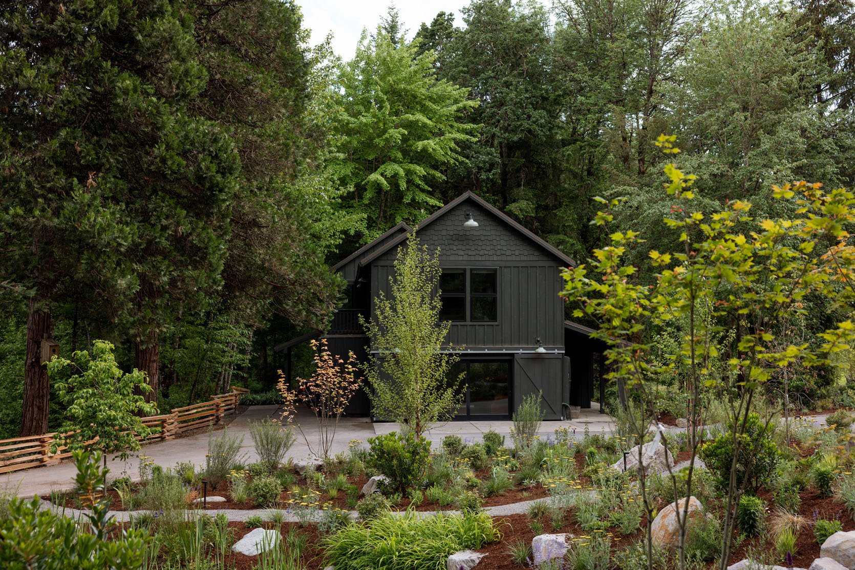
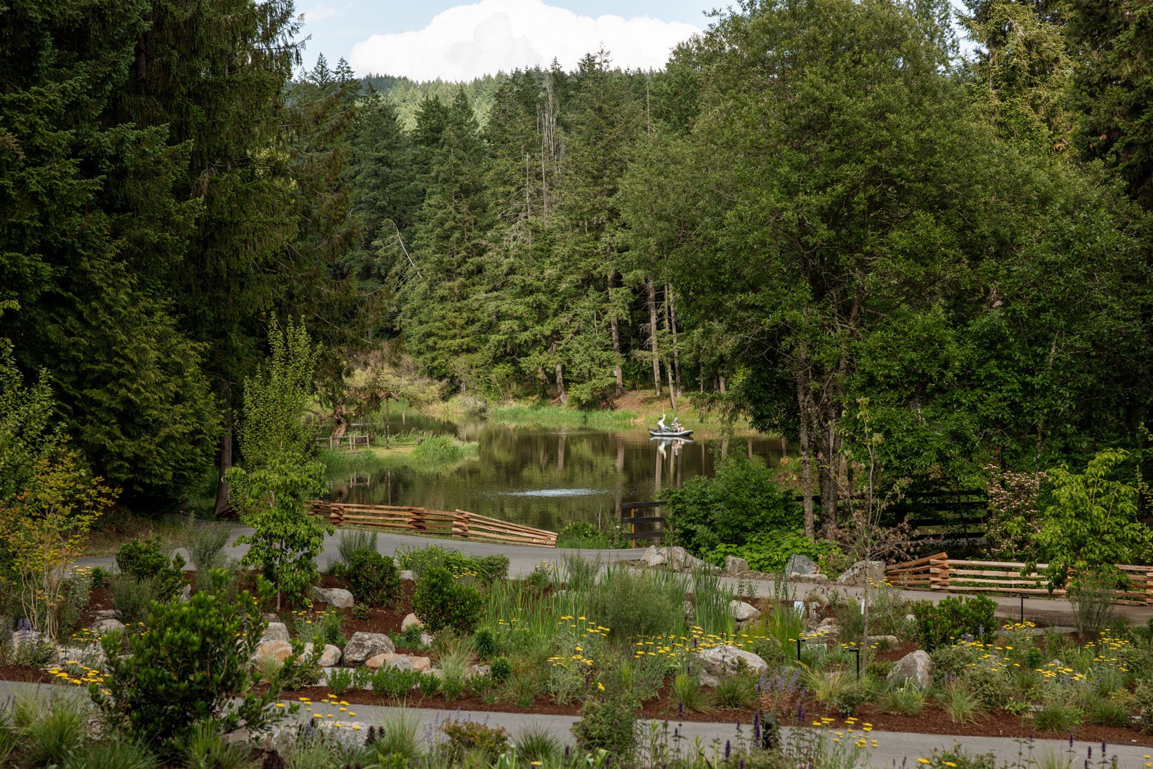
It’s out in Carlton, Oregon, which is only an hour away from Portland (and the drive is generally gorgeous, not on a freeway). It has a large pond (for dipping and swimming) and a few outbuildings for fun, with a massive field for weddings or larger events.
The Fern Lodge
There are two main buildings for sleeping – the Fern Lodge and the Hummingbird Cottage. Pistils Landscape Design did the landscaping, and it’s pretty amazing. The Fern Lodge has five suites (sleeping 10), all with king beds with en suite bathrooms. It has a commercial-style kitchen that is still so cozy for pizza nights and a media room for movies/presentations.
I was blown away by all the hard finishes. Not a spec of drywall in sight. Every surface has paneling, tile, and/or trimwork, making the details so fun to soak in (we nerded out for hours looking at how and why they did everything).
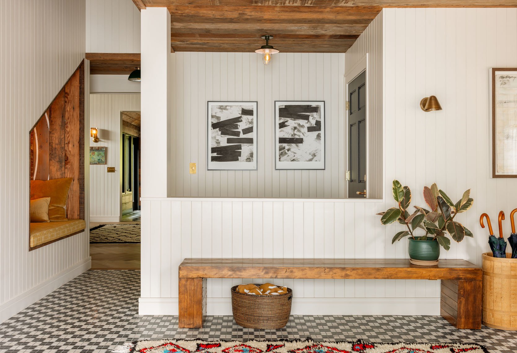
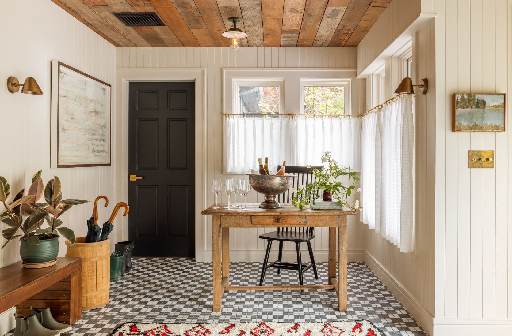
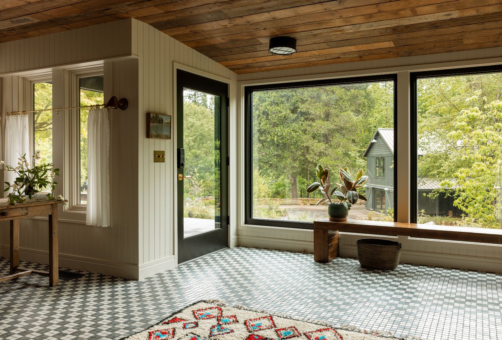
That is the entry – a massive window with smaller cozy vignettes, styled out like a home (but a home that a butler set up perfectly for you).
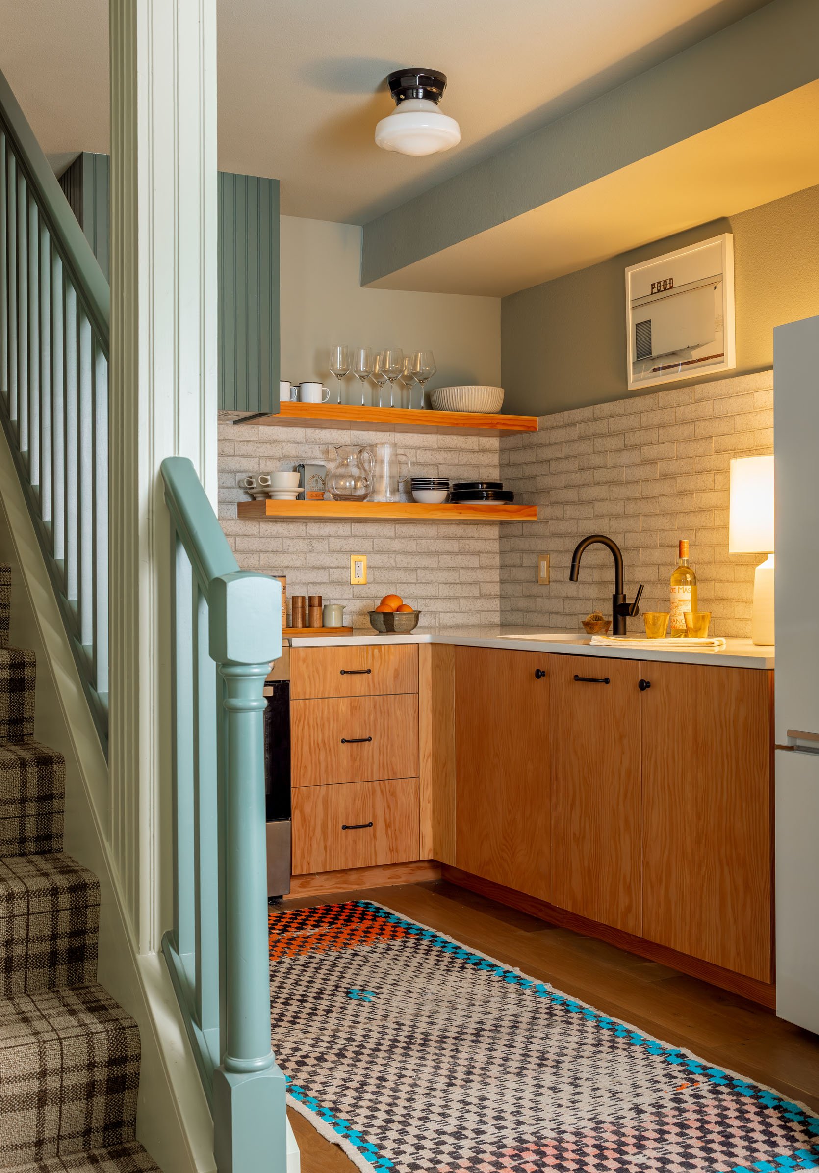
The Kitchen
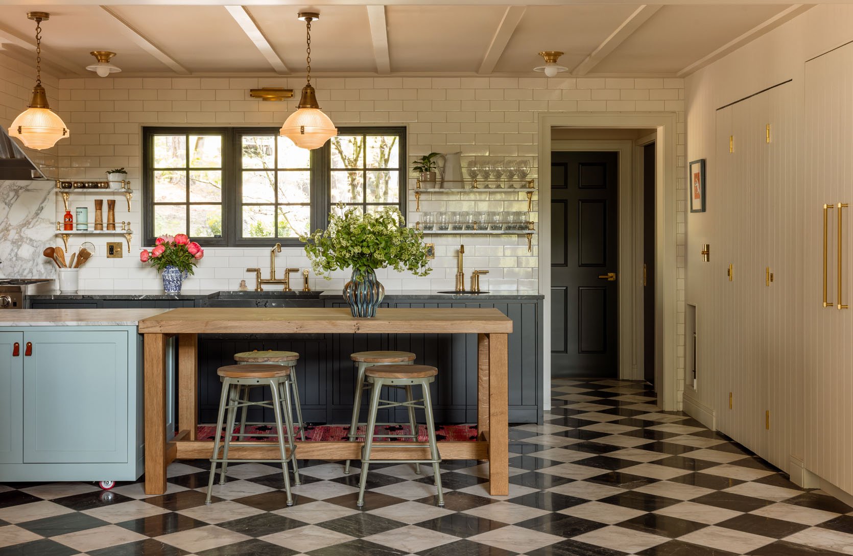
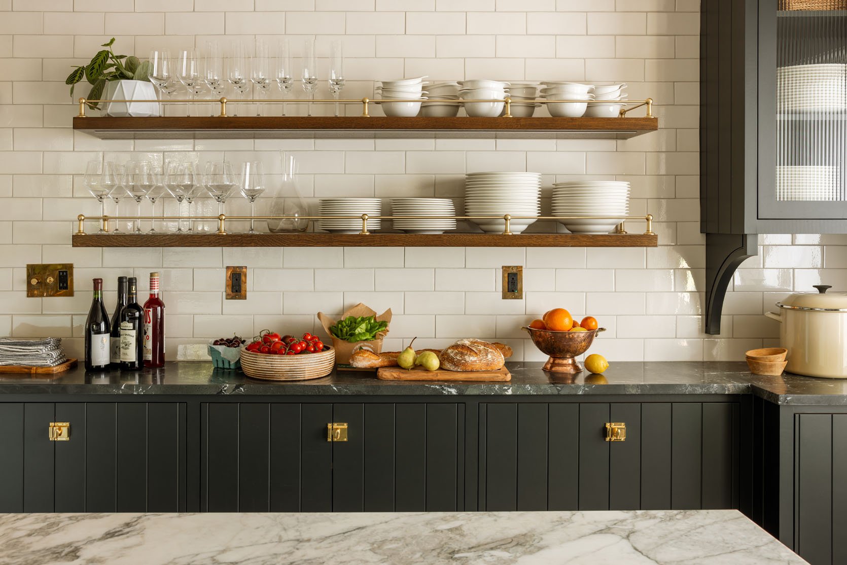
The kitchen is stunning – mixing a lot of patterns (floor) and colors (the black with the robin’s egg blue is so surprising). It can be shut off with a huge barn door should the guests want to bring in a private chef, like we did. It’s well stocked and feels so homey. What you can’t see is the scullery (the dishwashing room is hidden and closed off). Curtis (the owner and my friend) really thought of everything for every style of guest/stay.
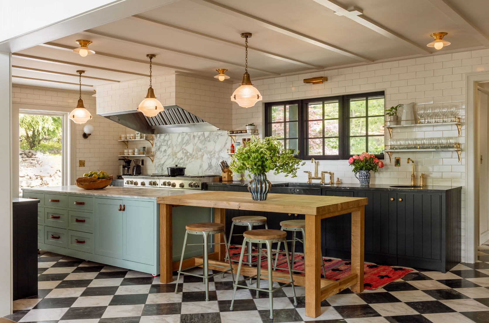
I love how they mixed those pendants over the island with the tiny flush mounts on the ceiling and picture lights – it looks so special and custom. The ceiling paneling is a nice detail that is a great design hack – low work with high impact, as it’s in semi-gloss, so it catches the light so nicely.
Totally classic and timeless, but still interesting and warm. Max really nailed it (I also love the reeded glass and the decorative shelf bracket).
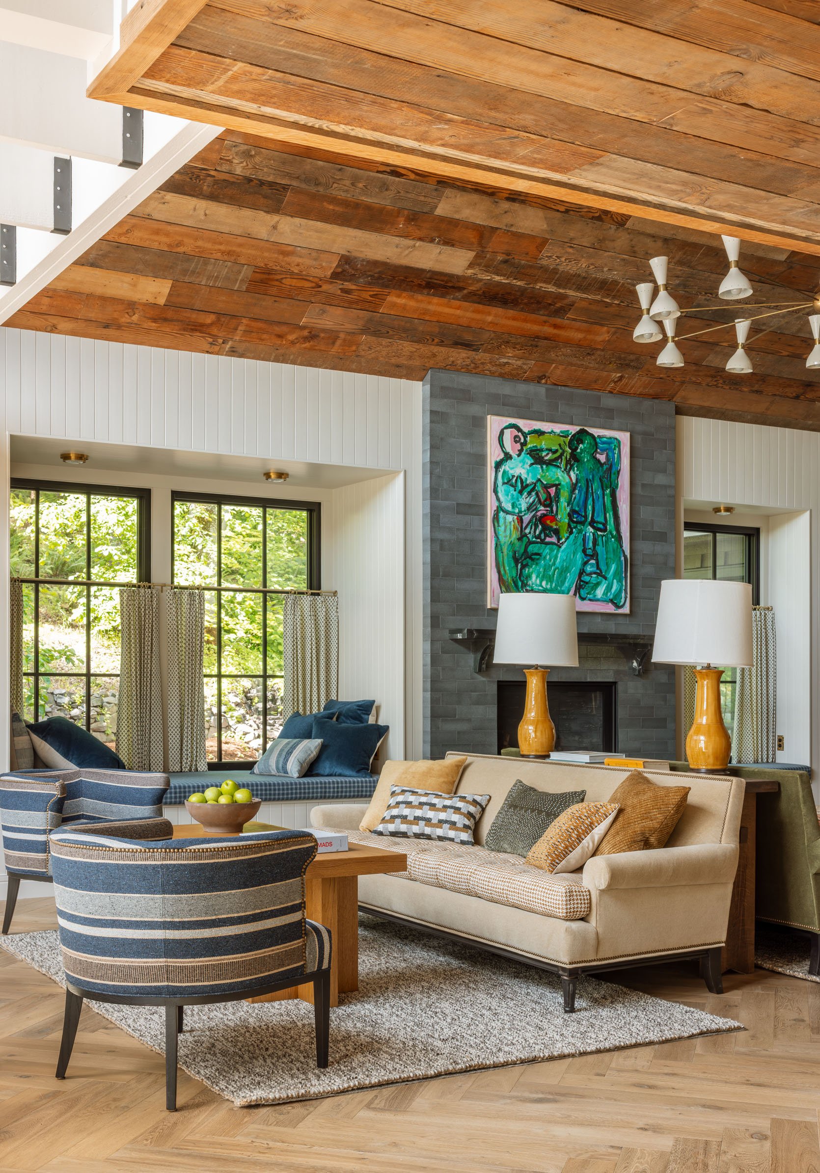
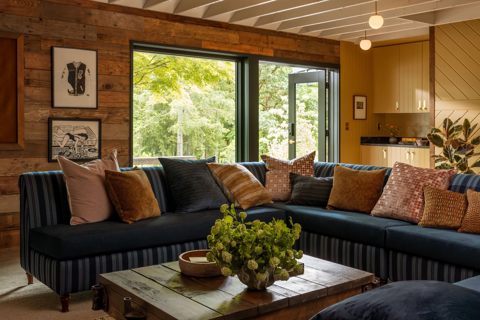
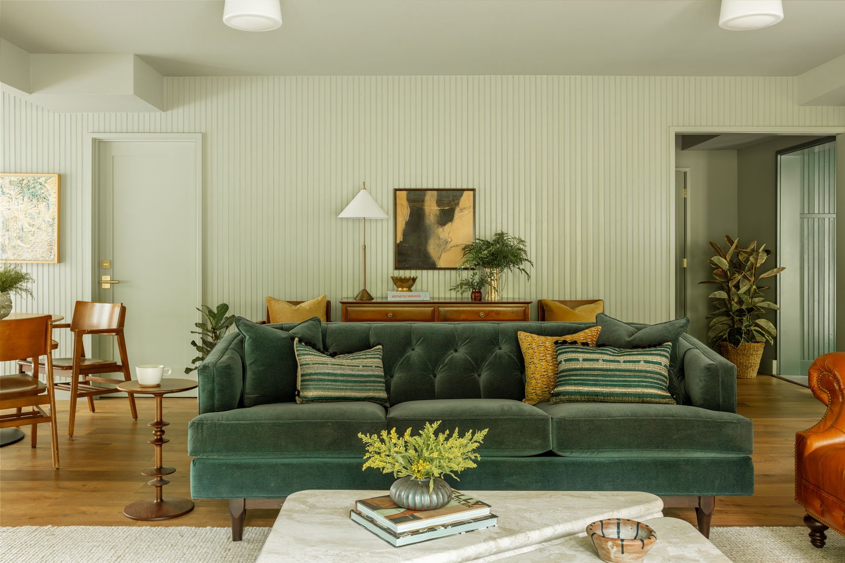
The Main Lodge Lounge
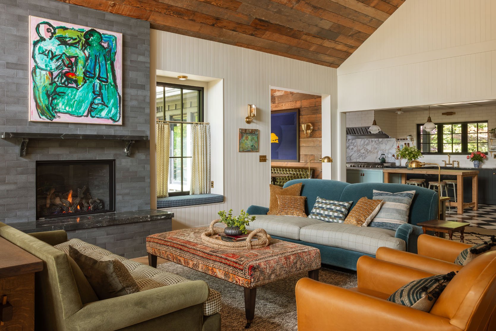
This is where we hung out most of our retreat – the living room and big dining table. Such an incredible mix of textures and patterns, and styles. Eclectic and cohesive FTW.
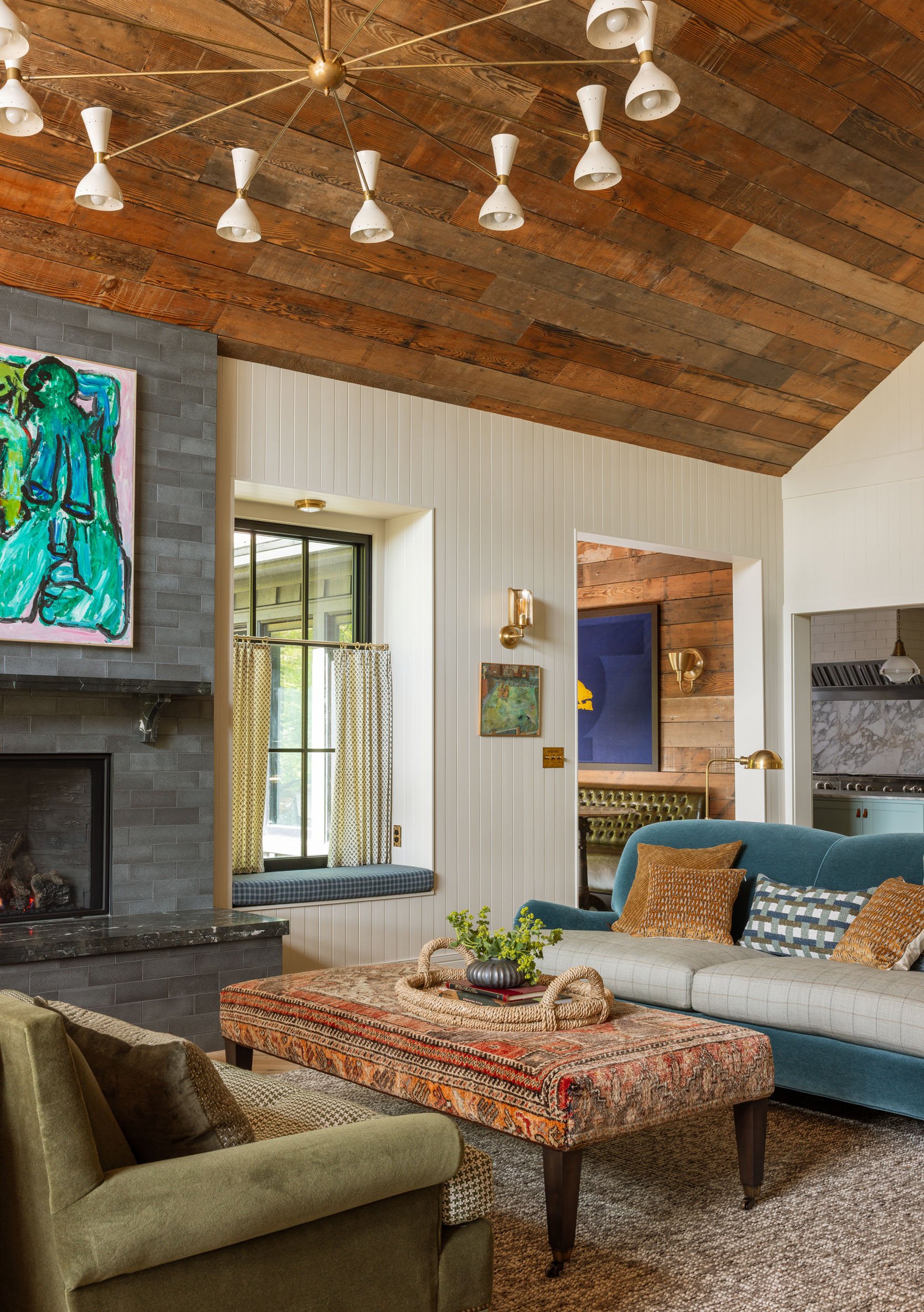
That epic light fixture was one of the first things purchased, bought from the Rejuvenation Vintage collection – a 1960s Italian piece. It was originally in the iconic Portland bar on NW 21st called Gypsy Restaurant & Lounge that closed in 2014.
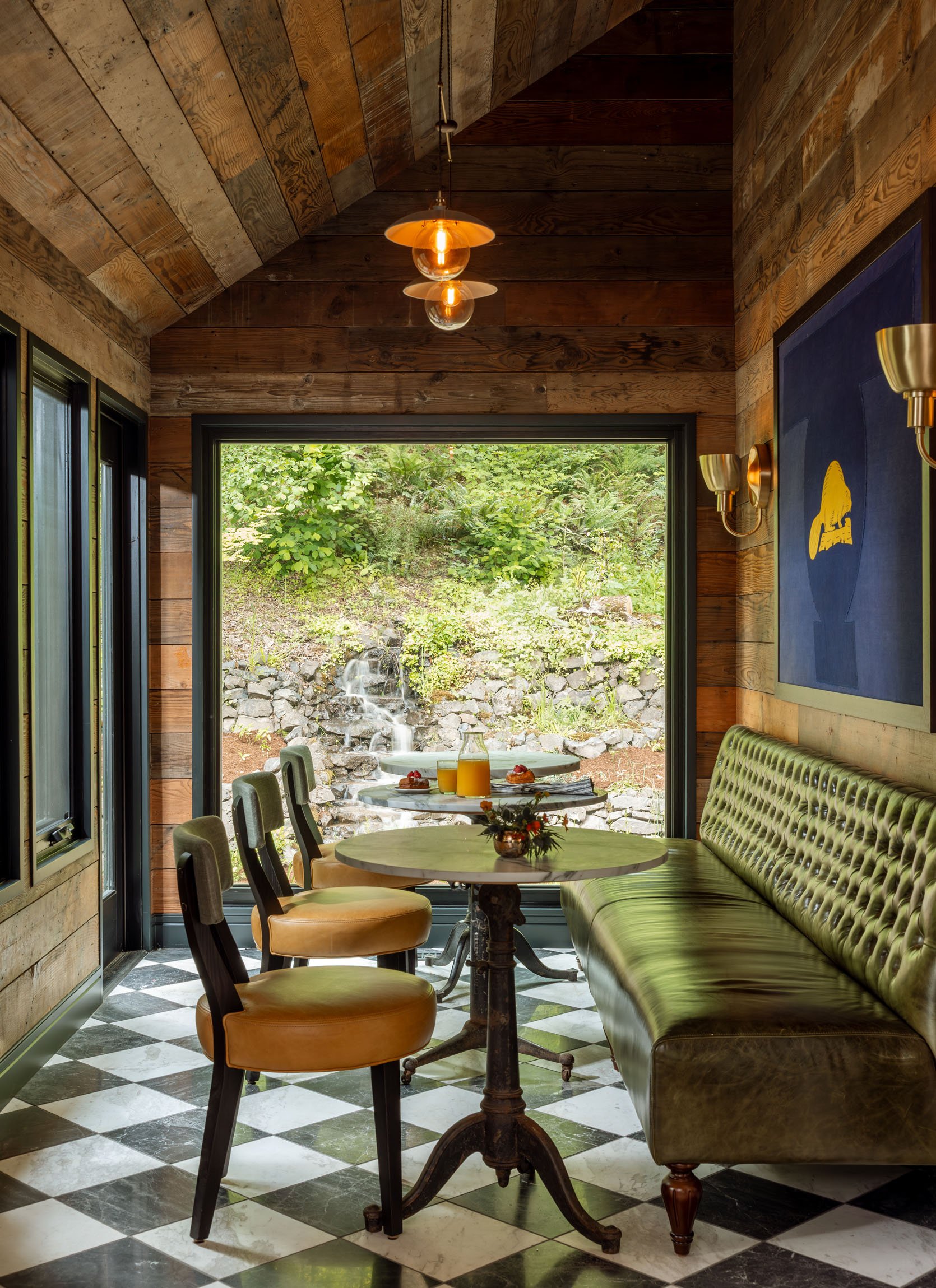
This was one of my favorite places to sit in the morning with my laptop and coffee. Please note the seasonal stream right out of the huge picture window. The custom green leather banquette adds so much dimension – I love how they chose such tight tufts to catch the light like that, creating a pattern out of a texture.
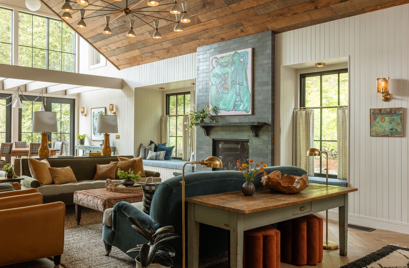
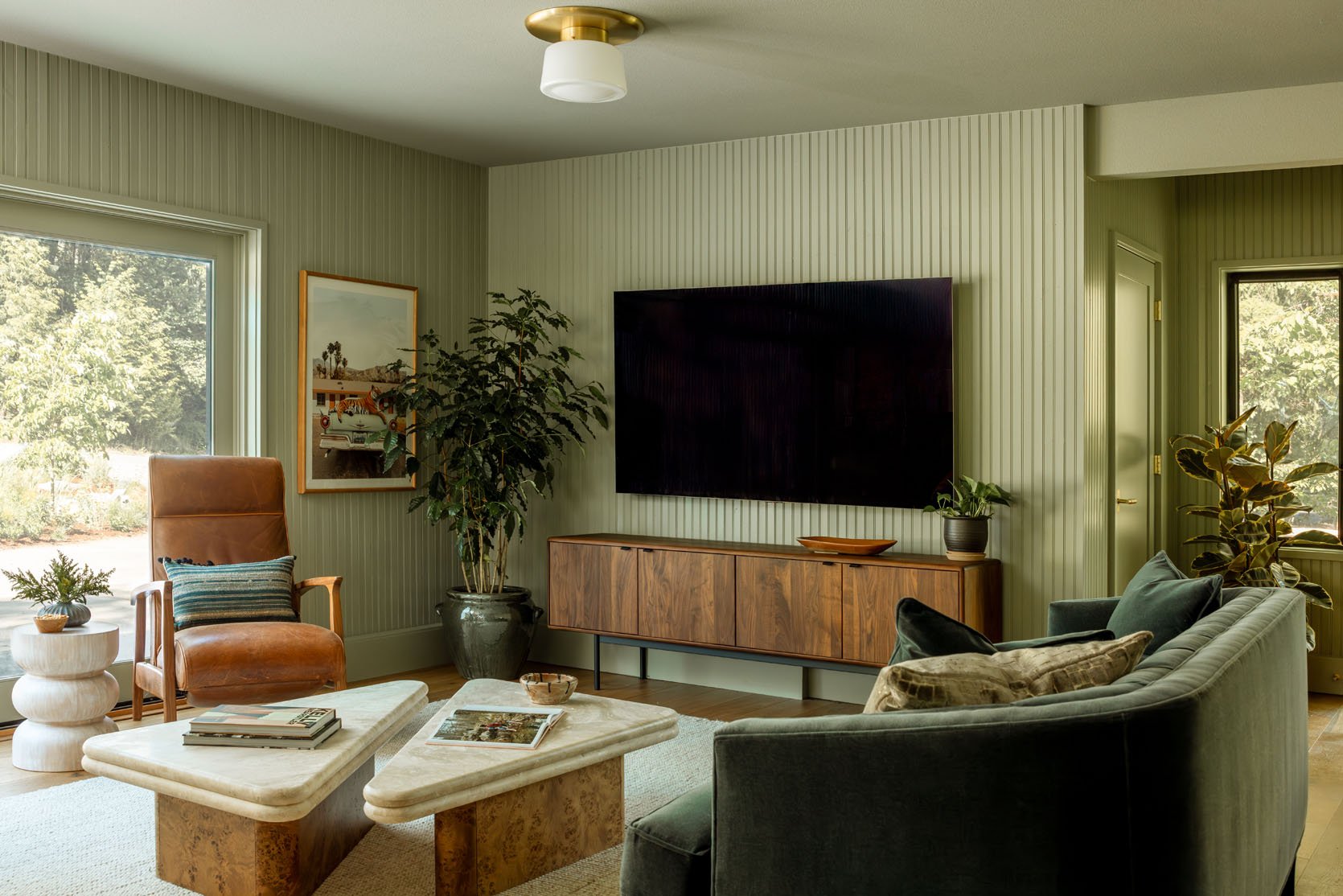
The ceiling change in this room adds such contrast in both style and light. The architect, Beebee Skidmore, really knows how to constrict and expand spaces in a way that feels dynamic (and yet so quiet). The niches do the same thing – while in them you are cozy, but the rest of the room still has a lot of light, creating an unpredictably good vibe. So much inspiration in this lodge.
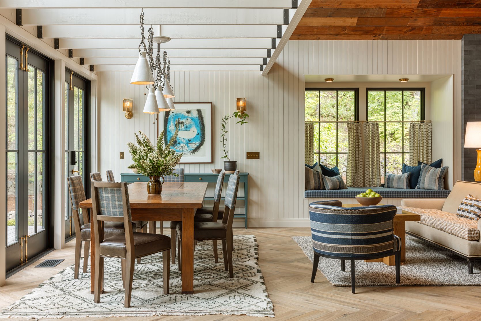
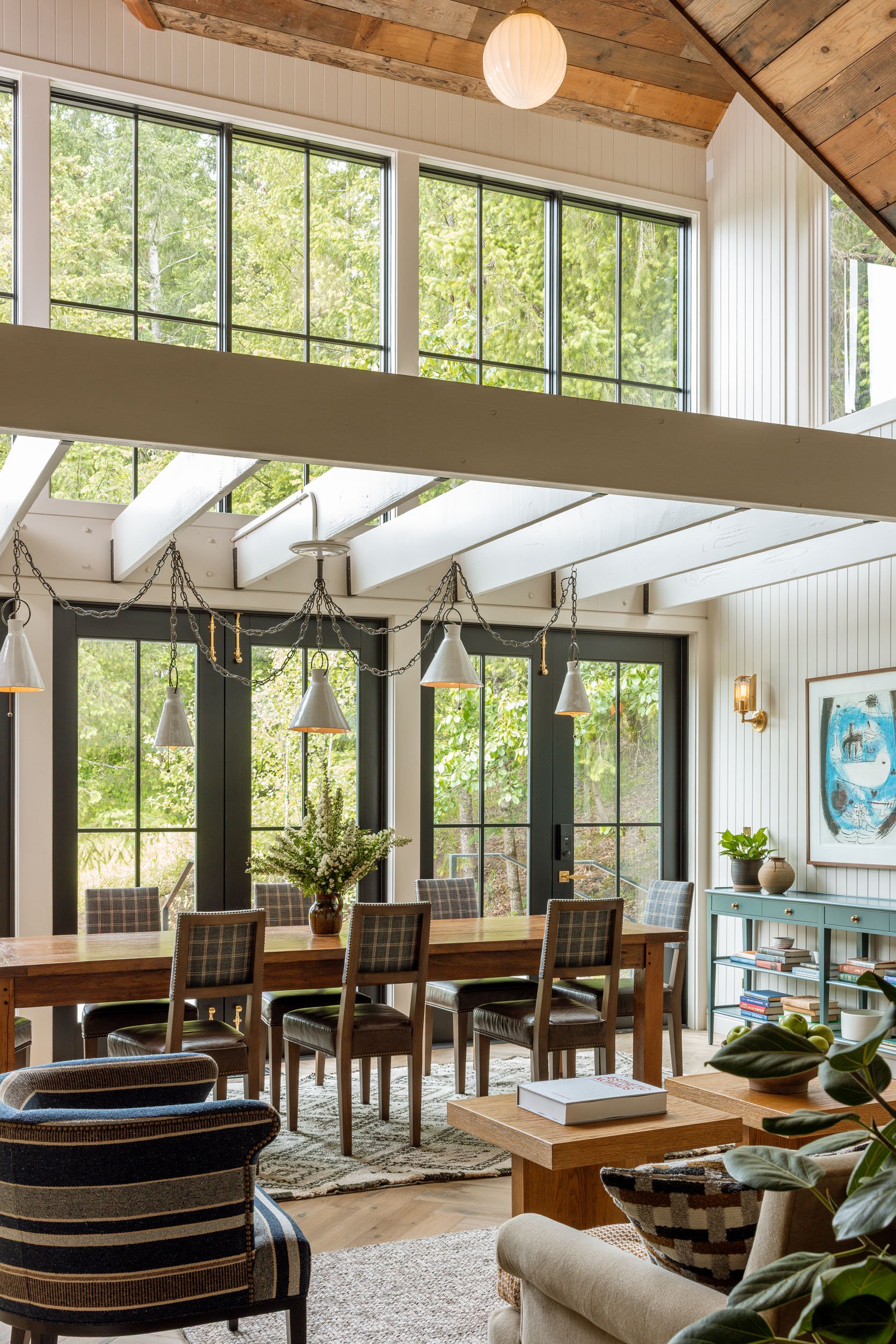
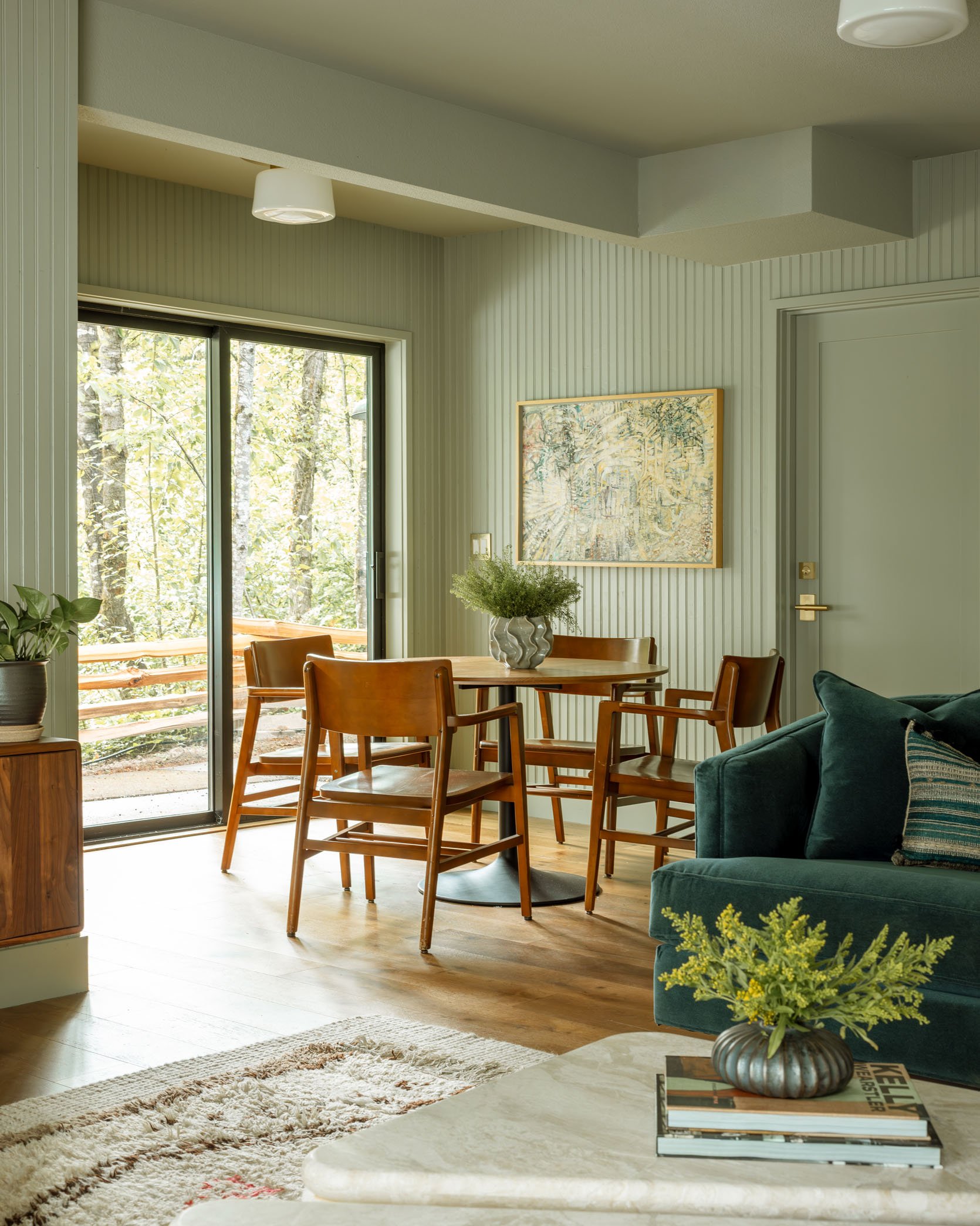
I think one of the most powerful moments of the whole property is the dining room – not the table and chairs, necessarily, but the chandelier on the beams, the windows above, and the feeling of coziness and expansiveness at the same time. Truly special to sit there.
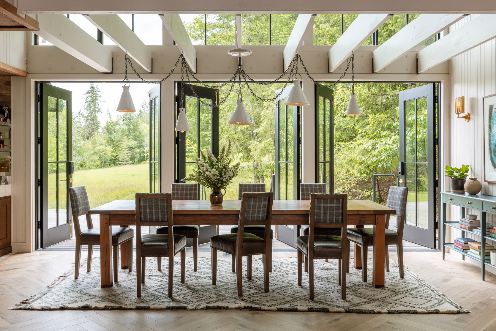
The doors open to the property, 26 acres of hiking trails and fields for future glamping opportunities. We did a big team workout on the back deck right there. Even on a cloudy morning (which can be typical in spring), it’s so beautiful, lush, and green.
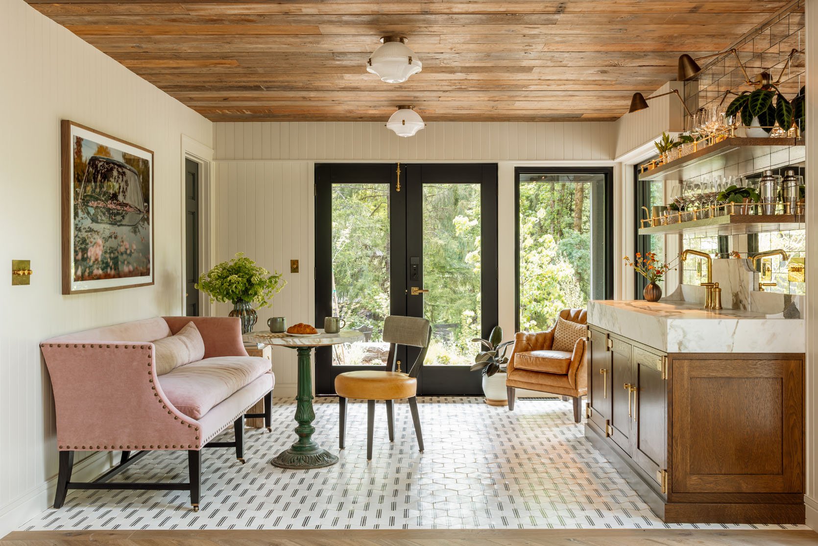
The bar area offers this fun patterned tile on the floor, contrasted with the reclaimed wood (from the old Portland race track) on the ceiling. The unexpected pink sofa delighted all of us.
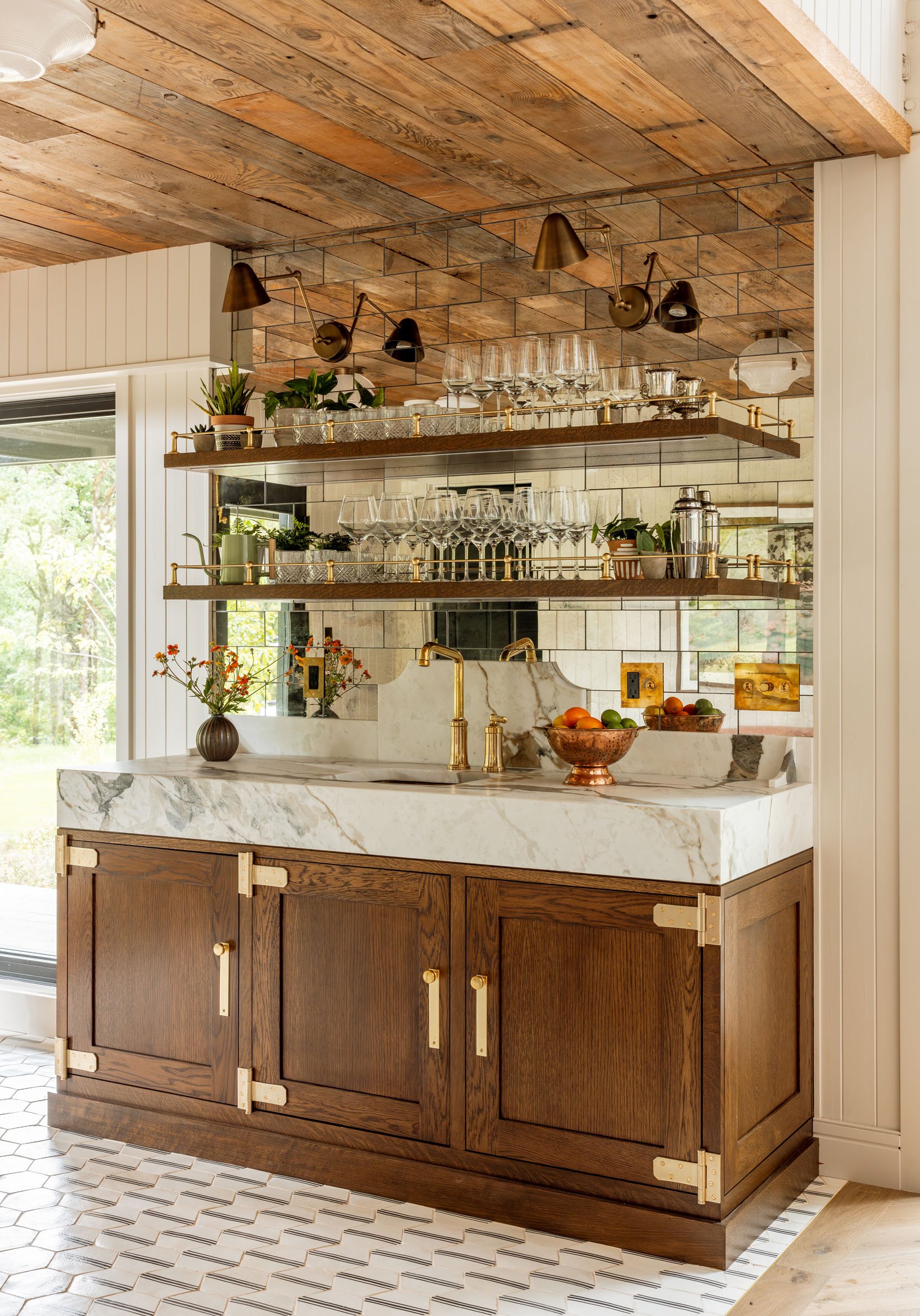
That bar is so incredibly designed – the chunkiness of the cabinet in that dark wood is classic, but unexpected, and the huge hinges and hardware pop. Not to mention the stop counter and backsplash. They spared no expense. I love how the mirrored tile backsplash reflects the warmth of the ceiling.
The Media Room
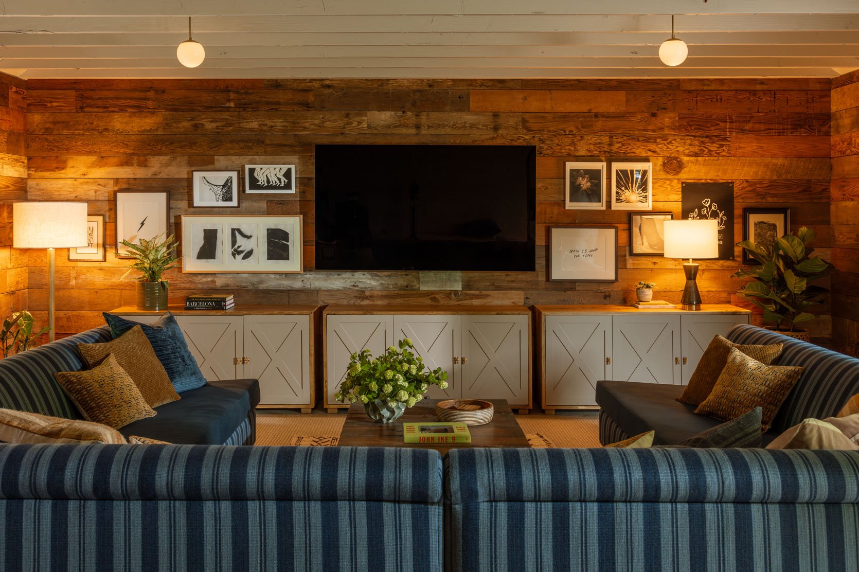
Should you want to watch The Secret Lives of Mormon Housewives like we did as a team (or perhaps cast work presentations or family slideshows), their media/TV room is off the kitchen and provides such coziness inside a more industrial space.
Max designed this big custom sectional, again mixing fabrics, which truly is why you do custom. Designing something custom warrants taking a risk; otherwise, there are a million great sofas/sectionals on the market. I love how he made all of their furniture really special by playing with the fabric patterns.
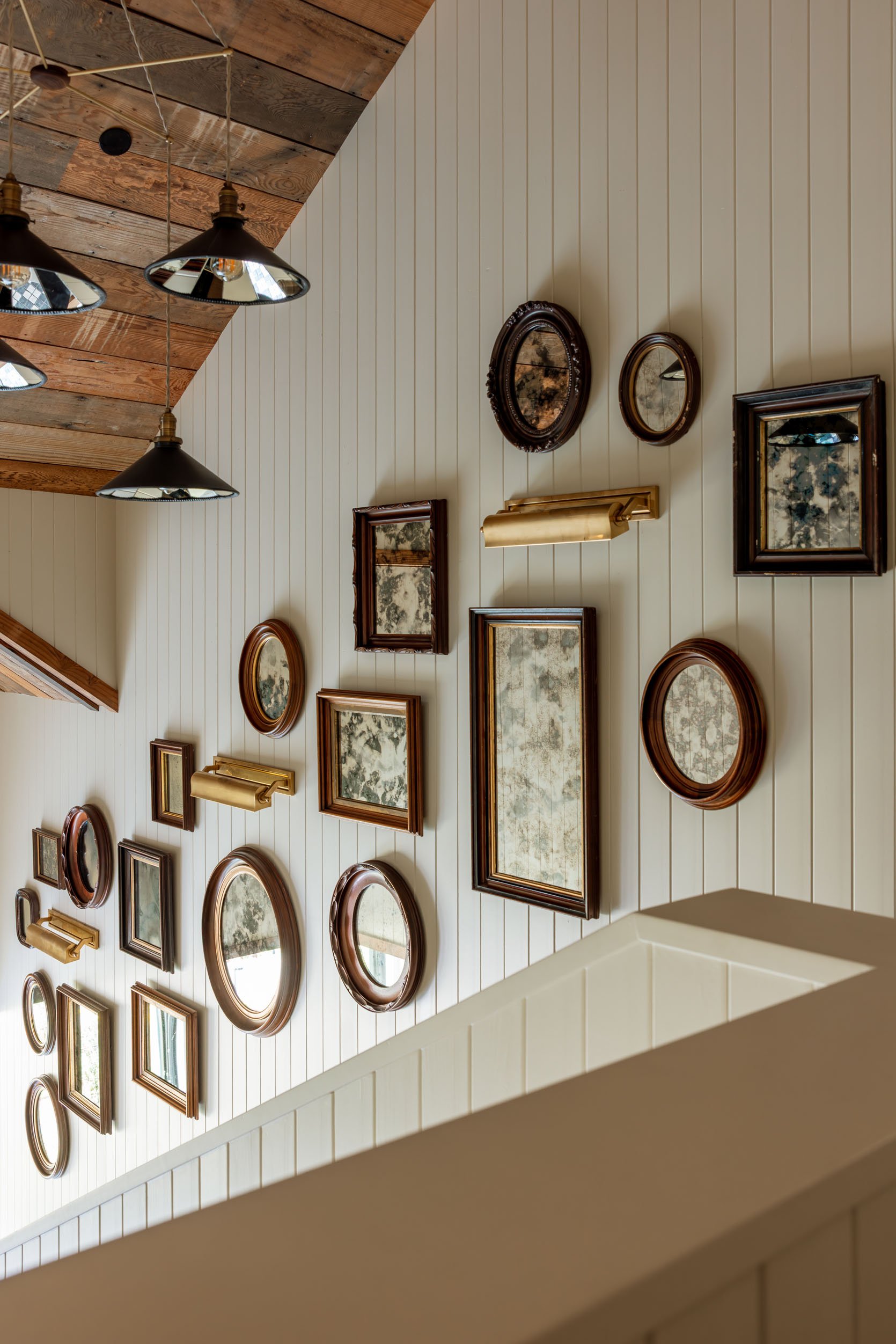
Headed upstairs, you get to walk under this incredible mirrored chandelier – well played!!
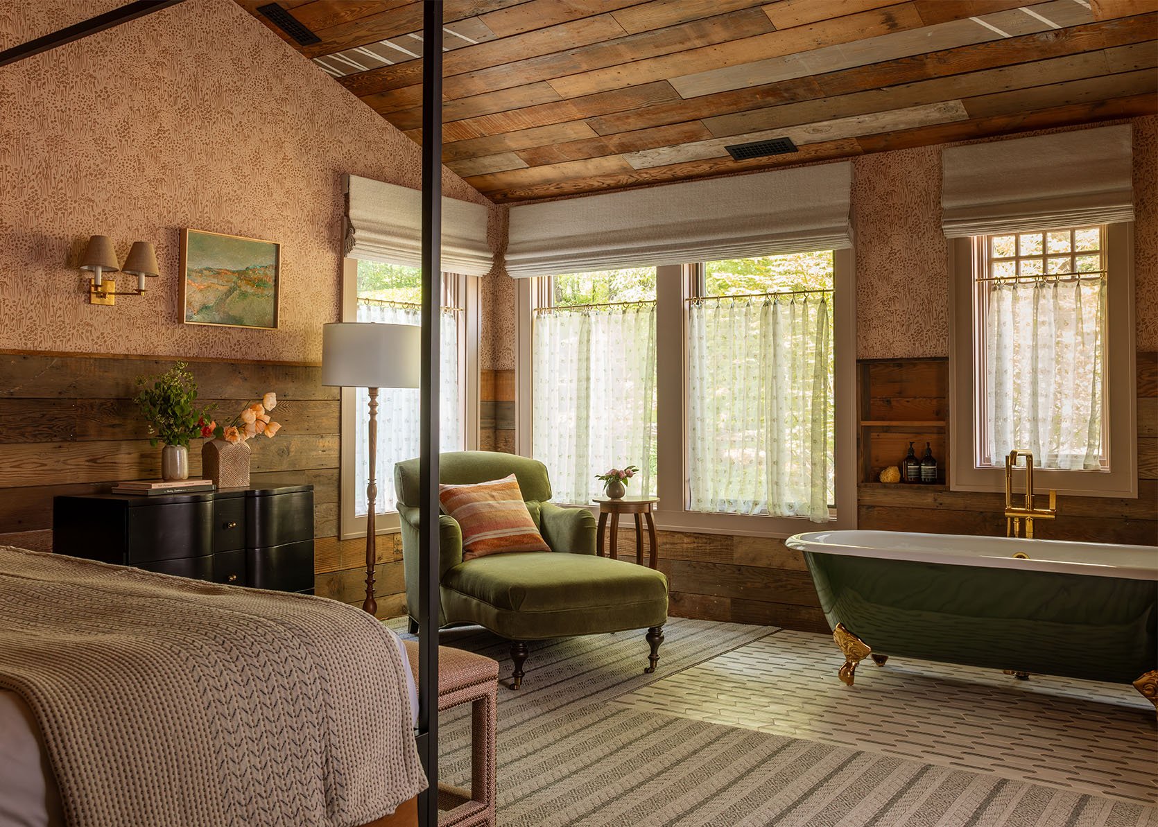
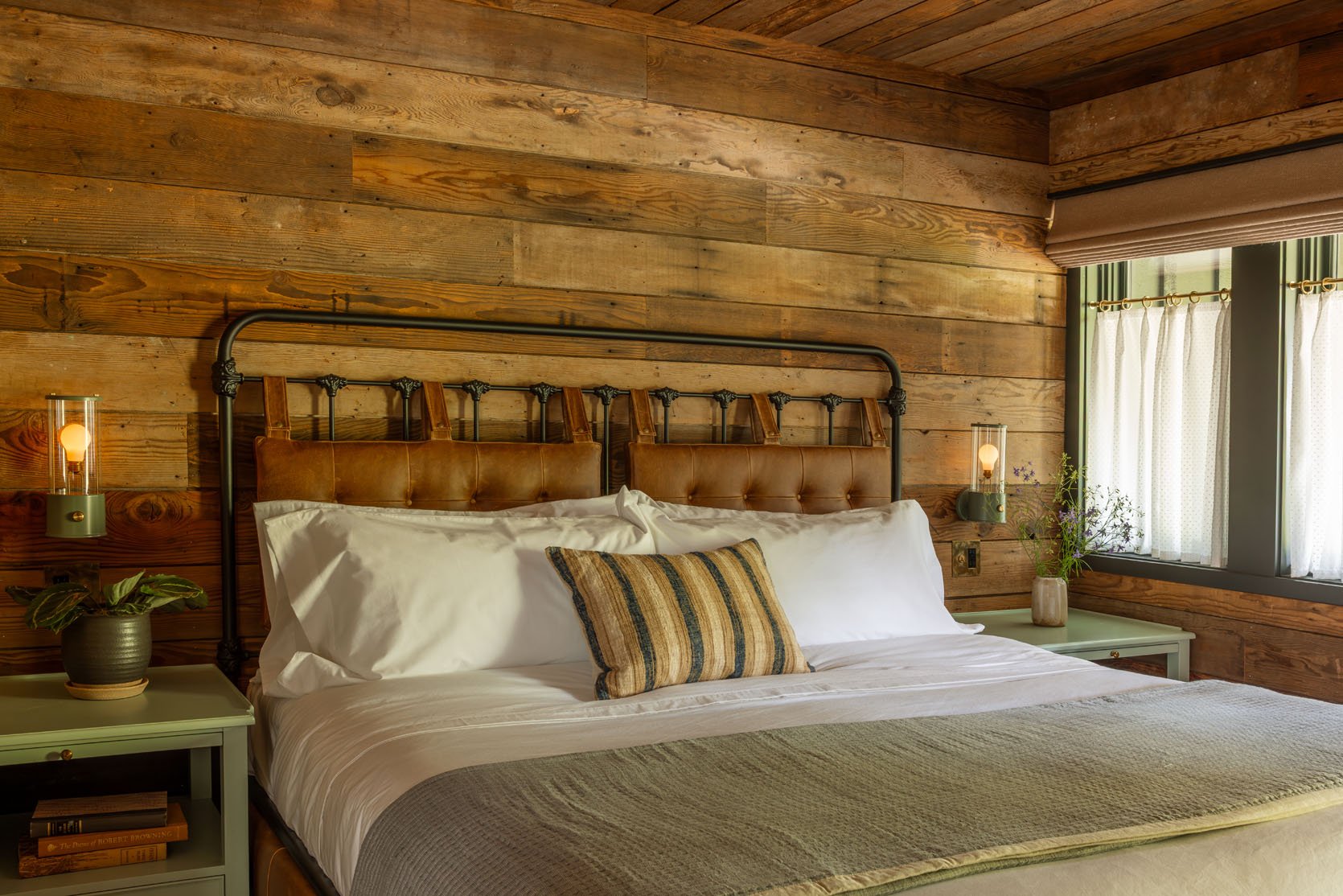
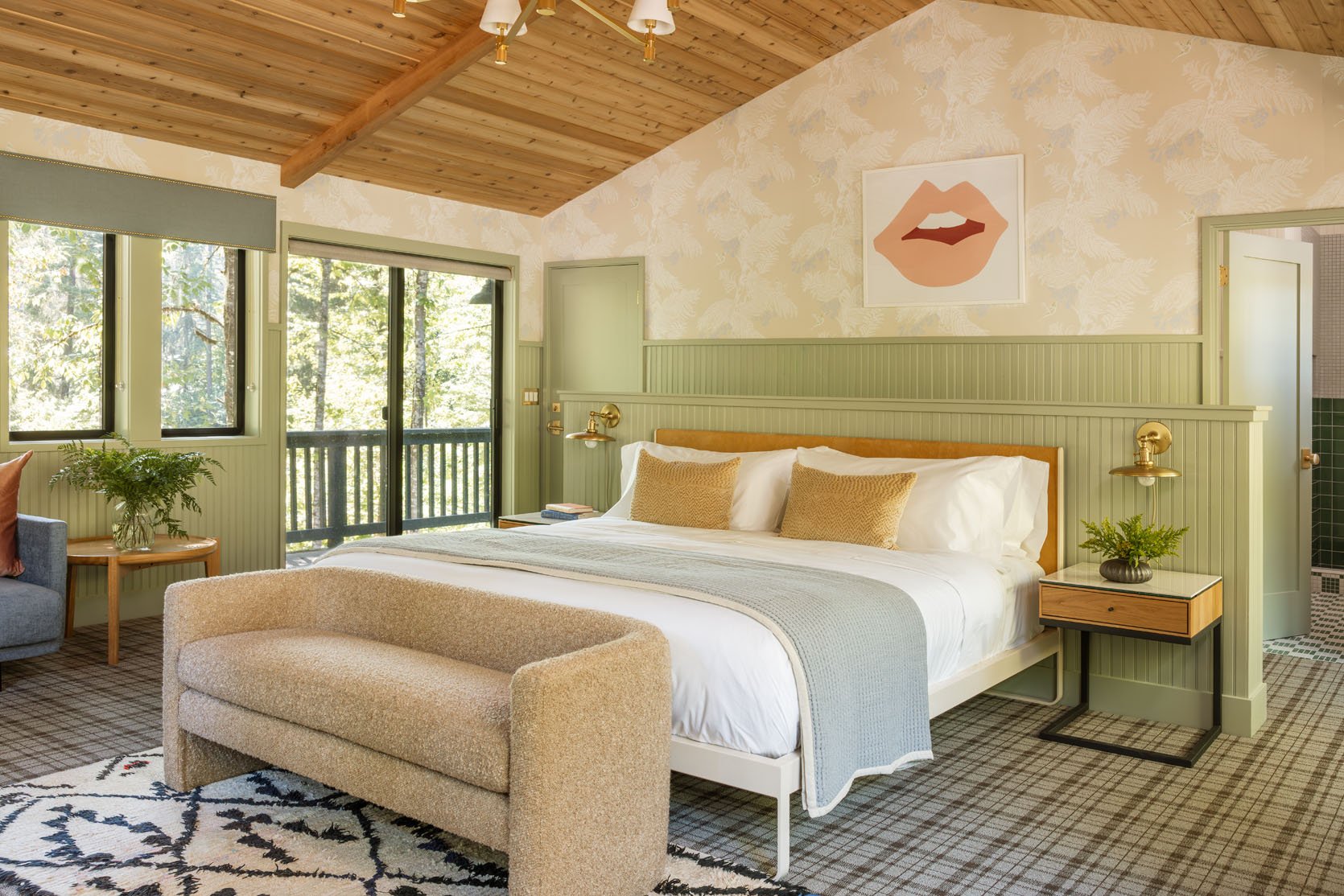
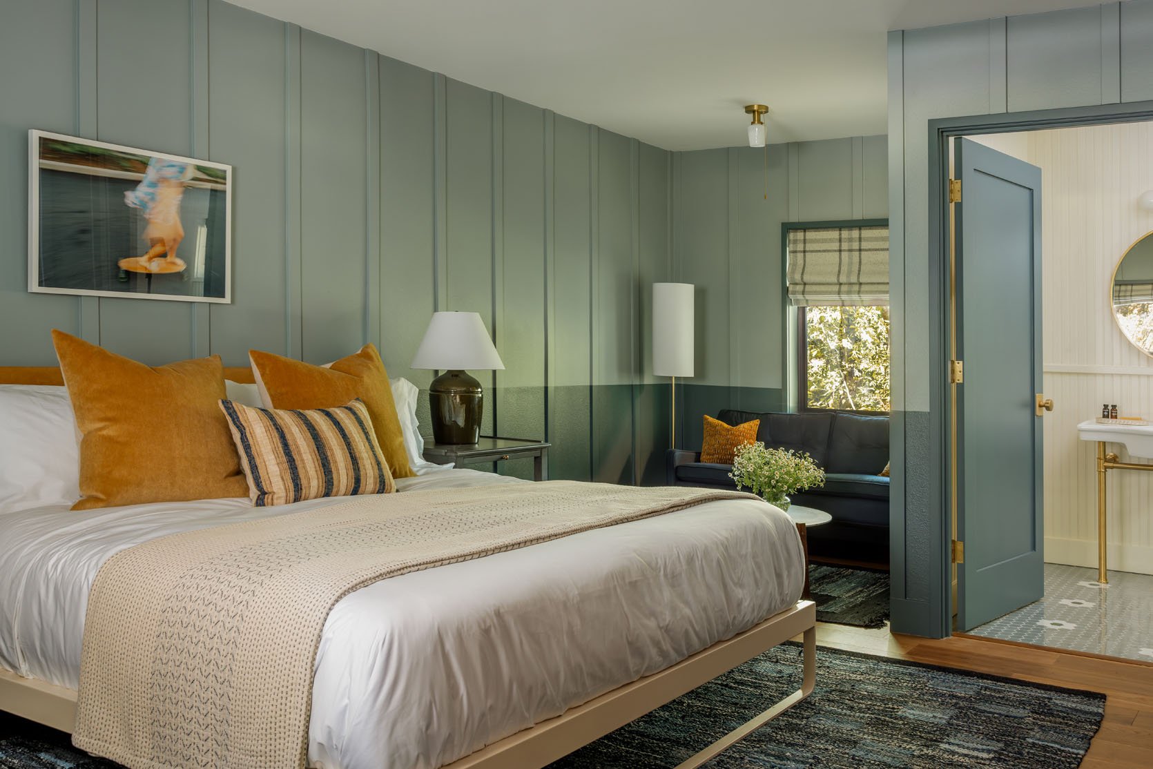
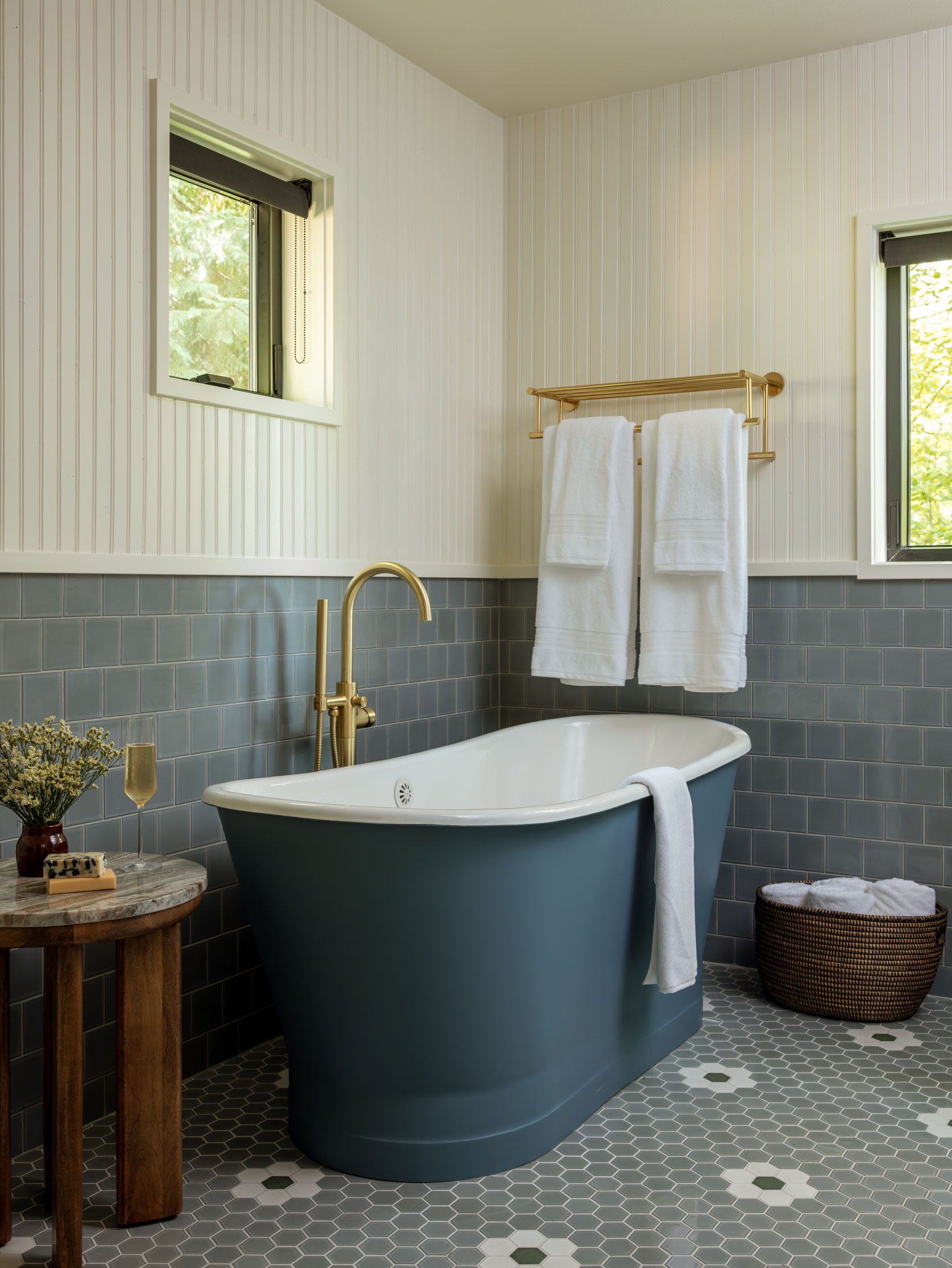
The Biggest Suite – Pembridge Suite
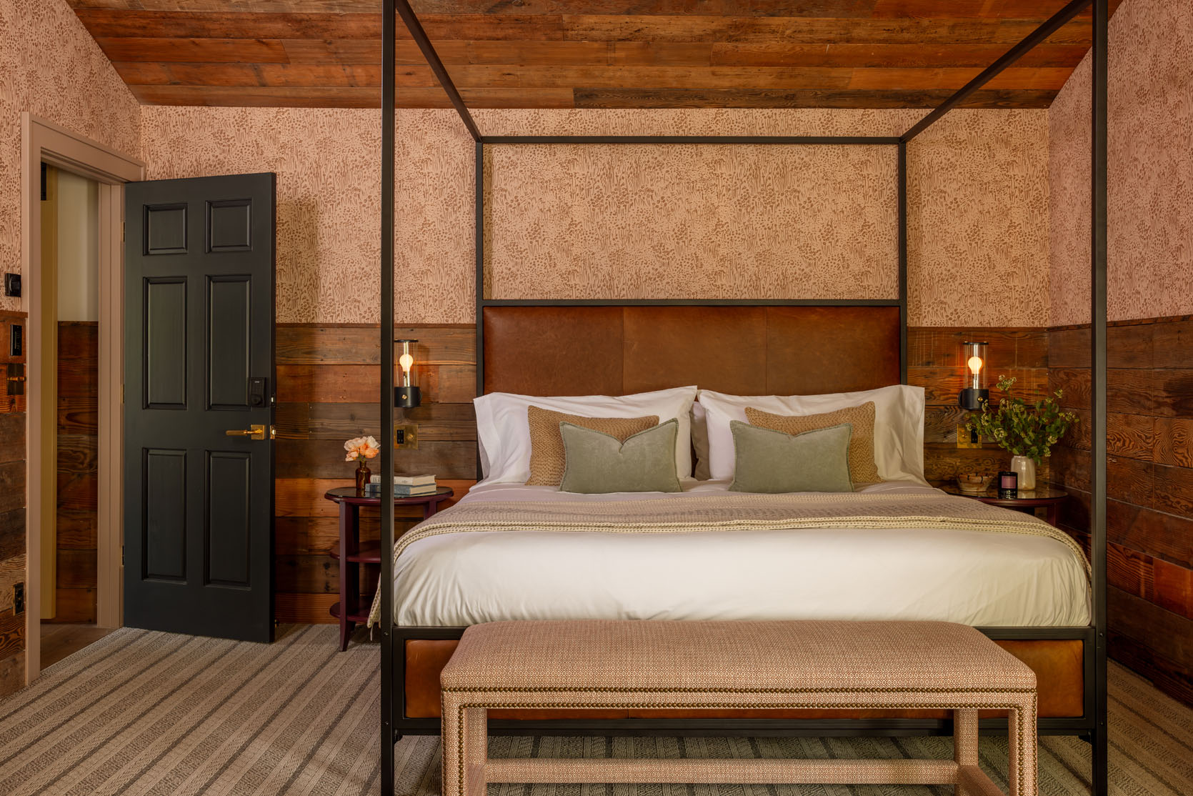
This is where I stayed because Curtis told me I had to get the best suite, and I didn’t argue. It’s so cozy and warm, and due to my bathing habits, I got to be the first one to christen this tub in the room.
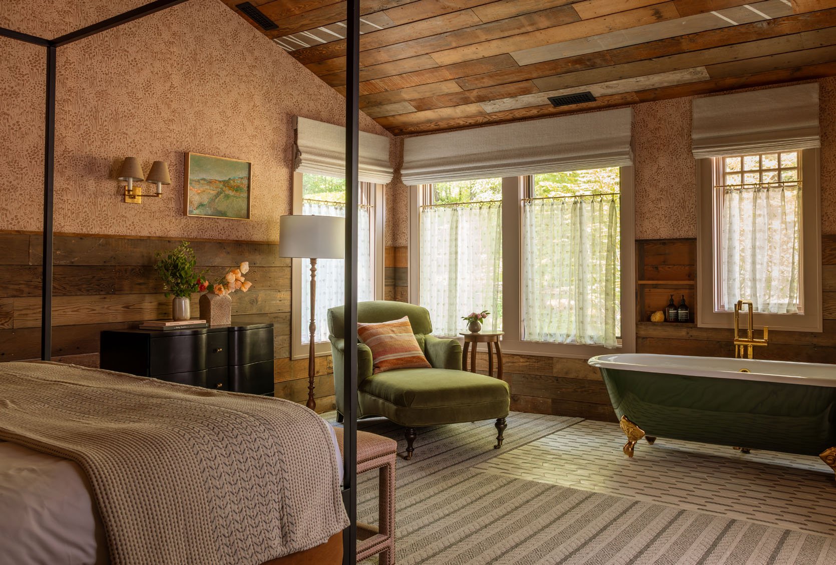
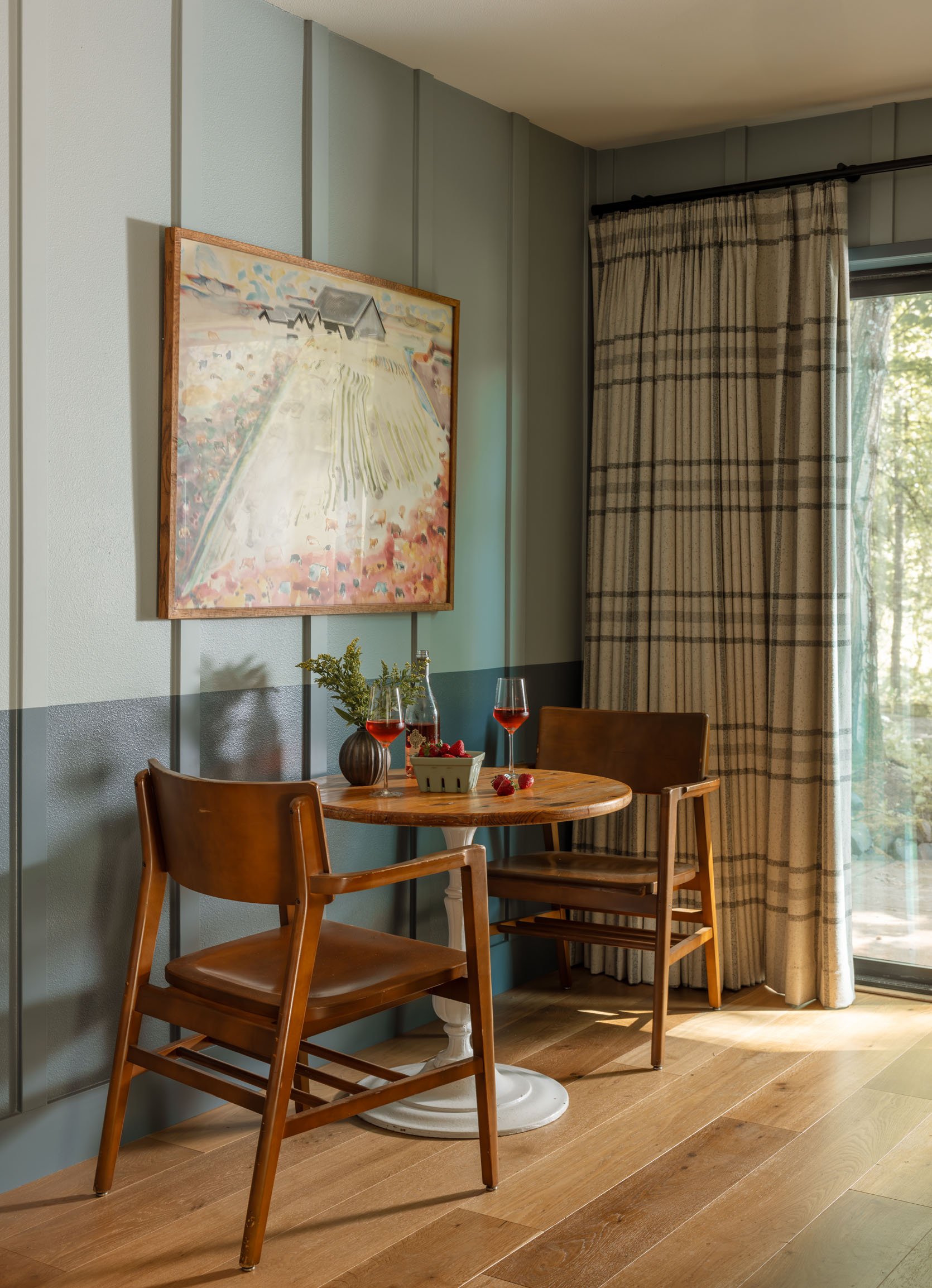
The window treatments in every room are epic – both cafe curtains for privacy and texture, then motorized shades on a light switch for blackout shades at night.
Fun Fact: All the Suites are named after places my friends frequented when they lived in London, where their kids were born. Places like parks, tube stops, pubs, etc.
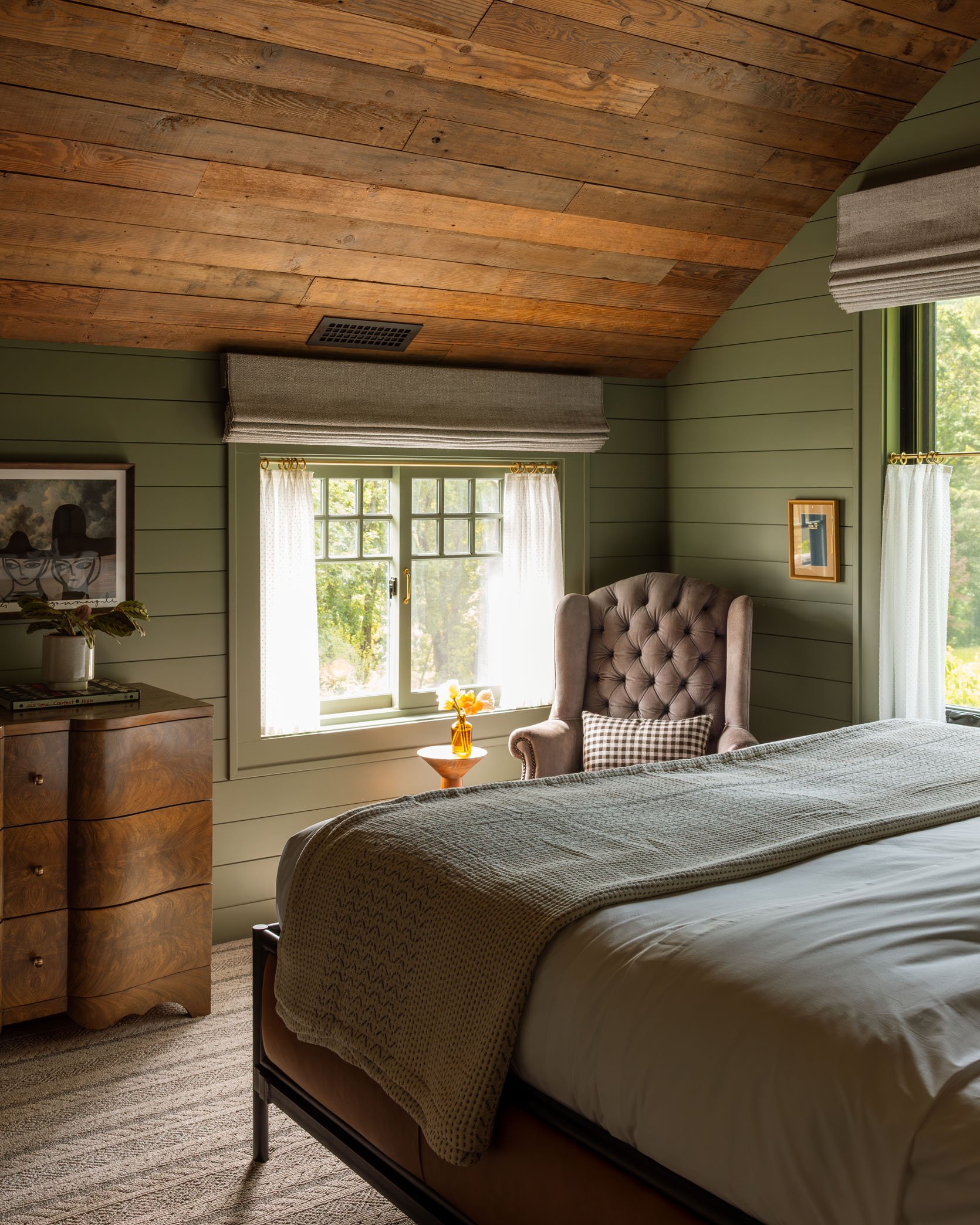
The Holland Park Suite
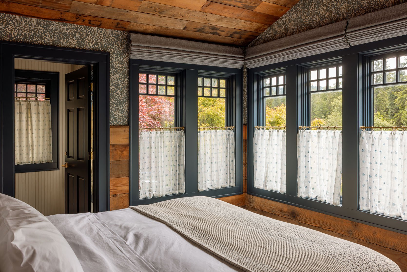
This room was a favorite because of the windows (which were original) and the color palette. I have to say I would have been nervous to do the reclaimed wood and the wallpaper, fearing that it would be too busy or overwhelming (and maybe in a home it would be, at least for me), but as an experiential space it’s so incredible and exciting. There is enough going on that it feels balanced, and your eye moves around, lands, then moves again in a really fun way.
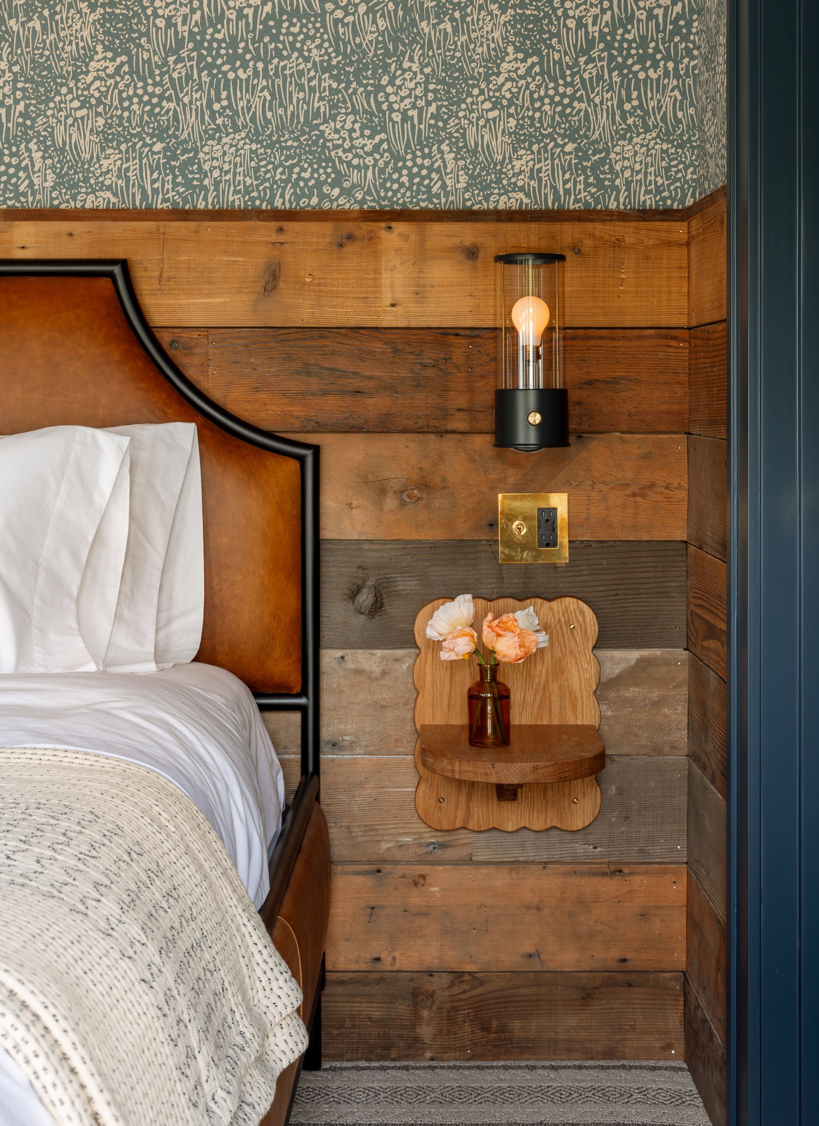
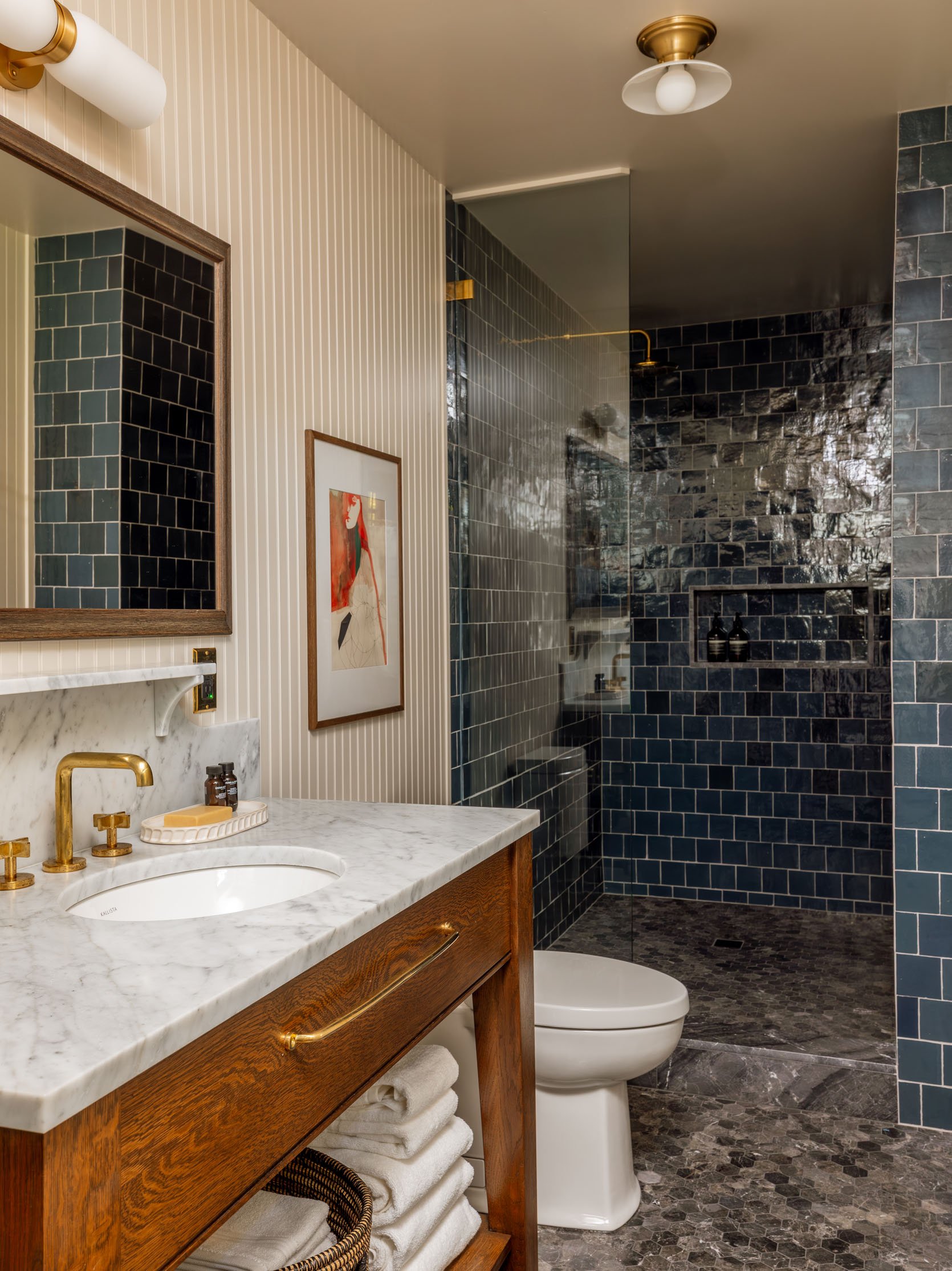
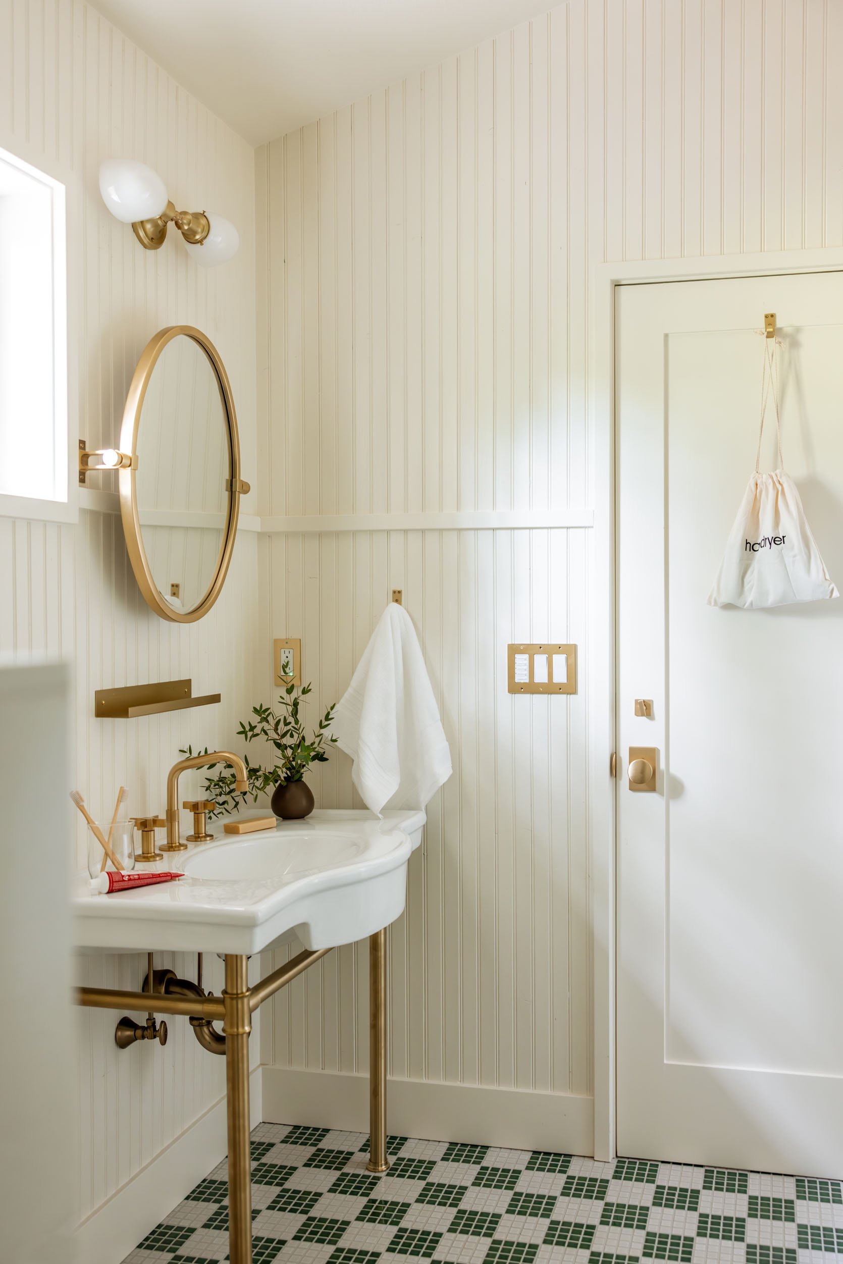
We loved the shelf nightsands and the hard-wired lantern sconces. The bathroom was so full of texture and pattern – between the paneling, the floor tile, the wall tile (with contrasting grout), the marble, and the wood – again, a lot going on but the right amount of balance and tonal shifts to keep it flowing.
The Primrose Hill Suite
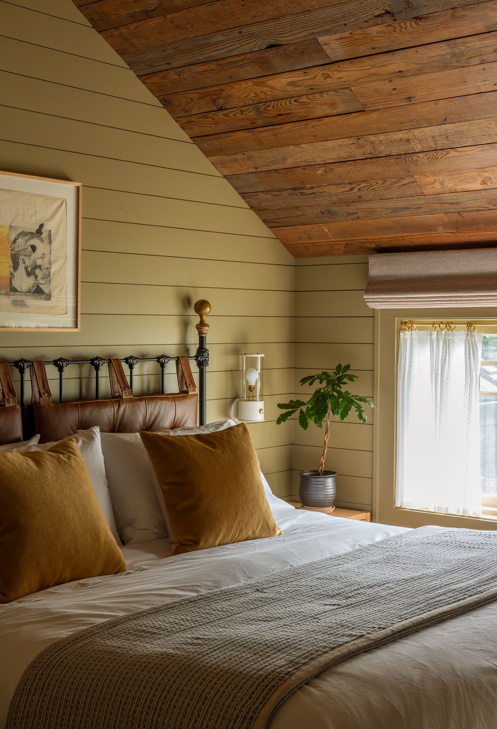
Another room with a huge king bed and a cozy paint color. Fun fact, they picked up that tufted wingback 12 years ago right after I won Designstar 🙂 The wall-to-wall carpet in here is so chic and cozy.
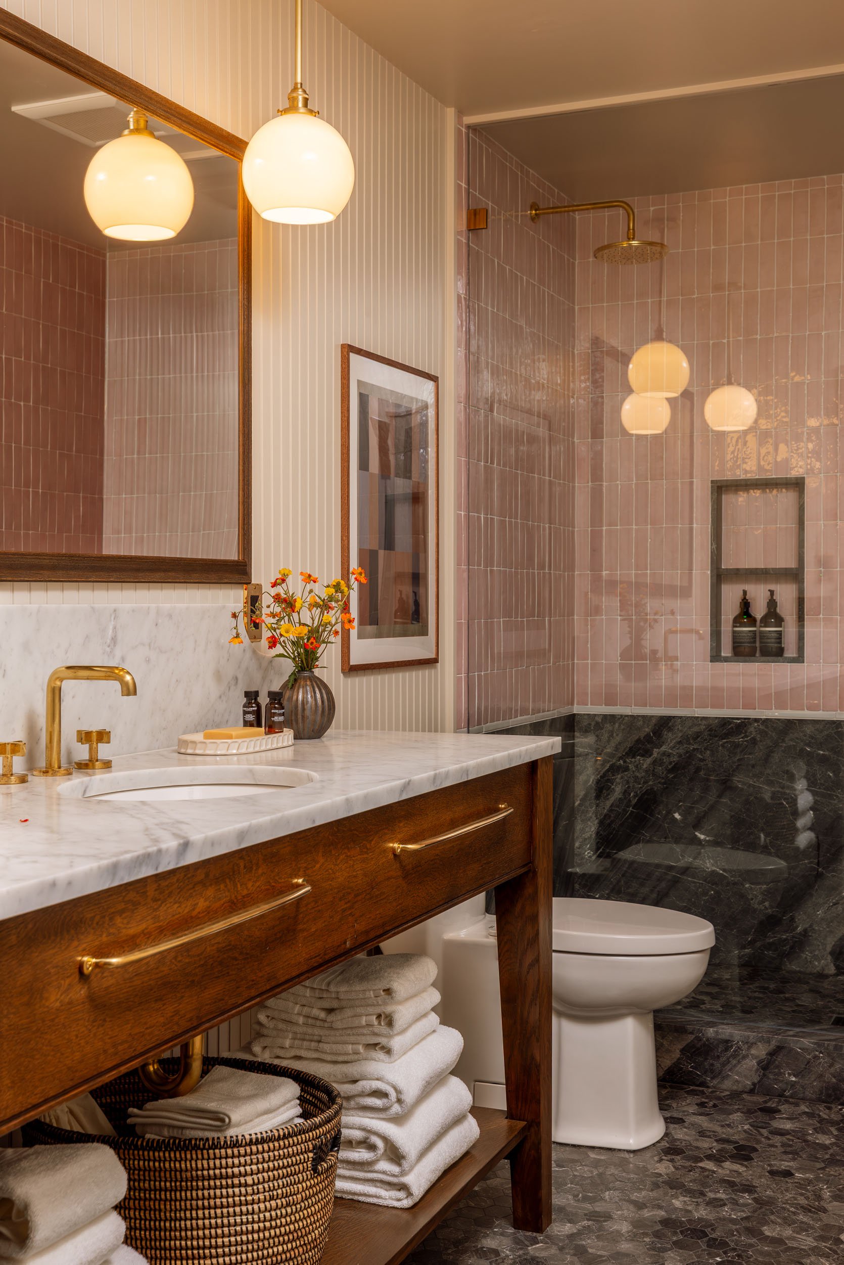
All the bathrooms were different with a great mix of stone, tile, and unexpected trim work. Everything felt so custom but with some clear through lines. I asked myself so many times, “Would you have done this?” and the answer was often “no,” but only because I’m more risk-averse than I wish I were. Next project (that isn’t a home that we live in forever), I’m going to take inspiration from this project.
This room is ADA-friendly and on the first floor (a secret door, in fact).
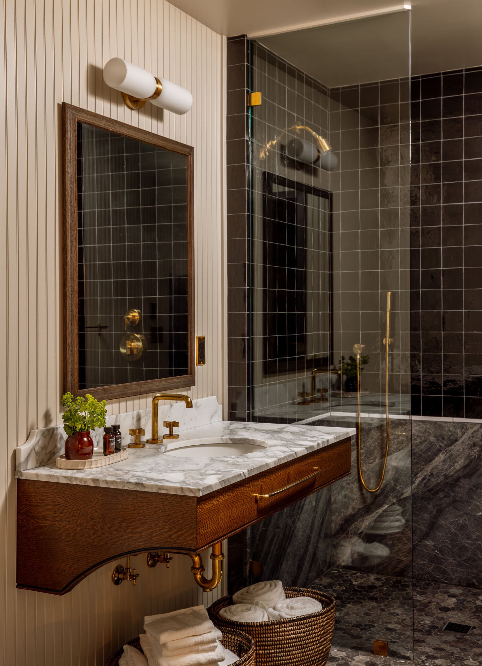
With the prettiest ADA-friendly floating vanity. I think my favorite bathroom design-wise.
Through the entry, you can see the other house on the property, the “Hummingbird Cottage” that they actually did first, more of a cosmetic remodel while they were waiting for permits on this larger lodge. You can rent out both buildings, which gives you 4 additional suites (so 9 total) and more of a family vibe.
The Hummingbird Cottage
Pistils did the landscaping, quite an exceptional job with a lot of dynamic boulders and a prairie vibe.
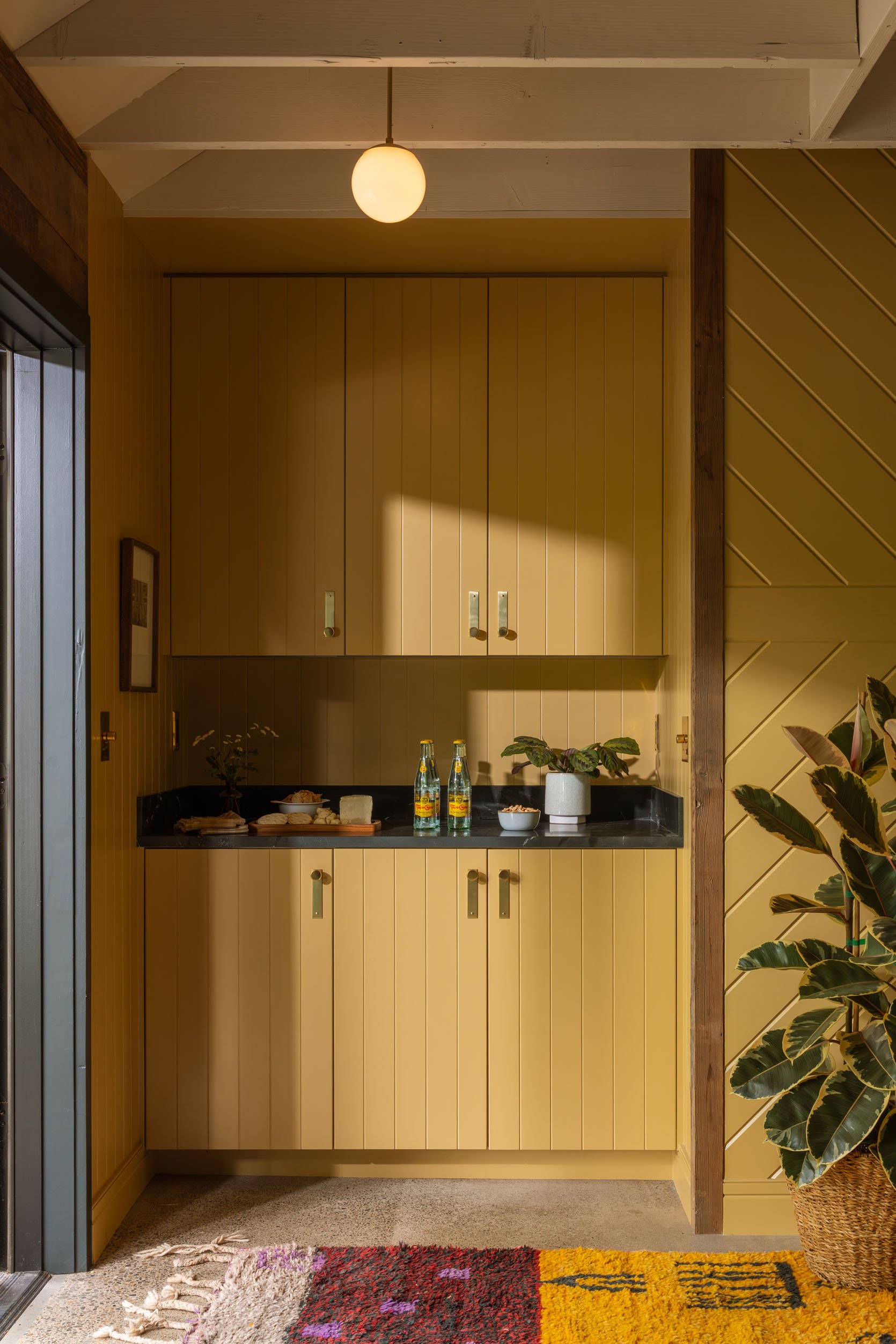
This cottage houses another big hangout space downstairs (shout out to the coffee table I got them for their living room that made it out here) and is cozy and eclectic. It’s a “quirky younger sister” vibe in this cottage compared to the lodge.
Meant to be self-sufficient, there is a big hangout space and a small kitchen, but far enough away that, should you have kids, that say, throw temper tantrums, or cry in the night, there is more privacy.
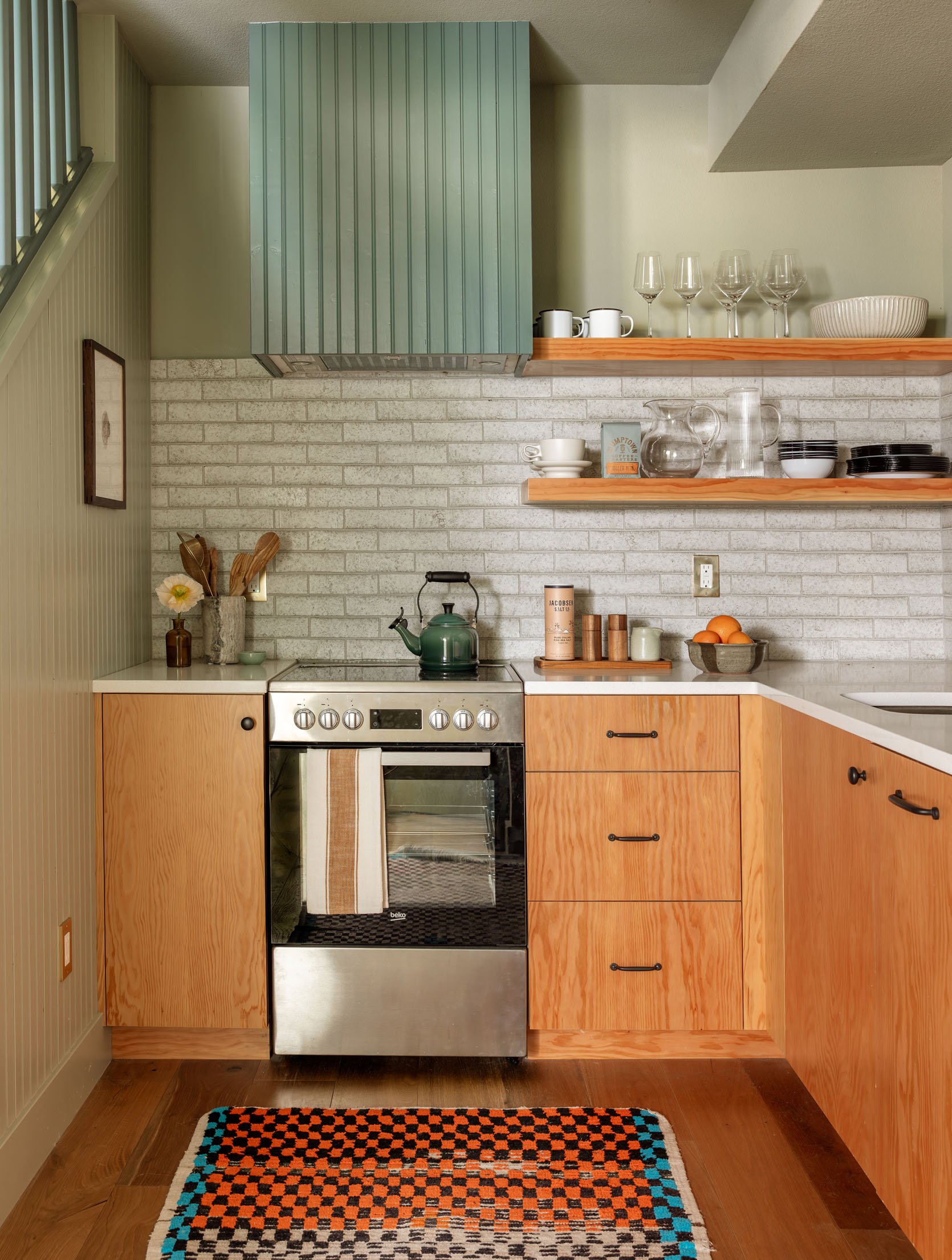
We loved the paneled hood with the brick and plywood cabinets. More of a youthful, apartment vibe, but highly functional and well planned.
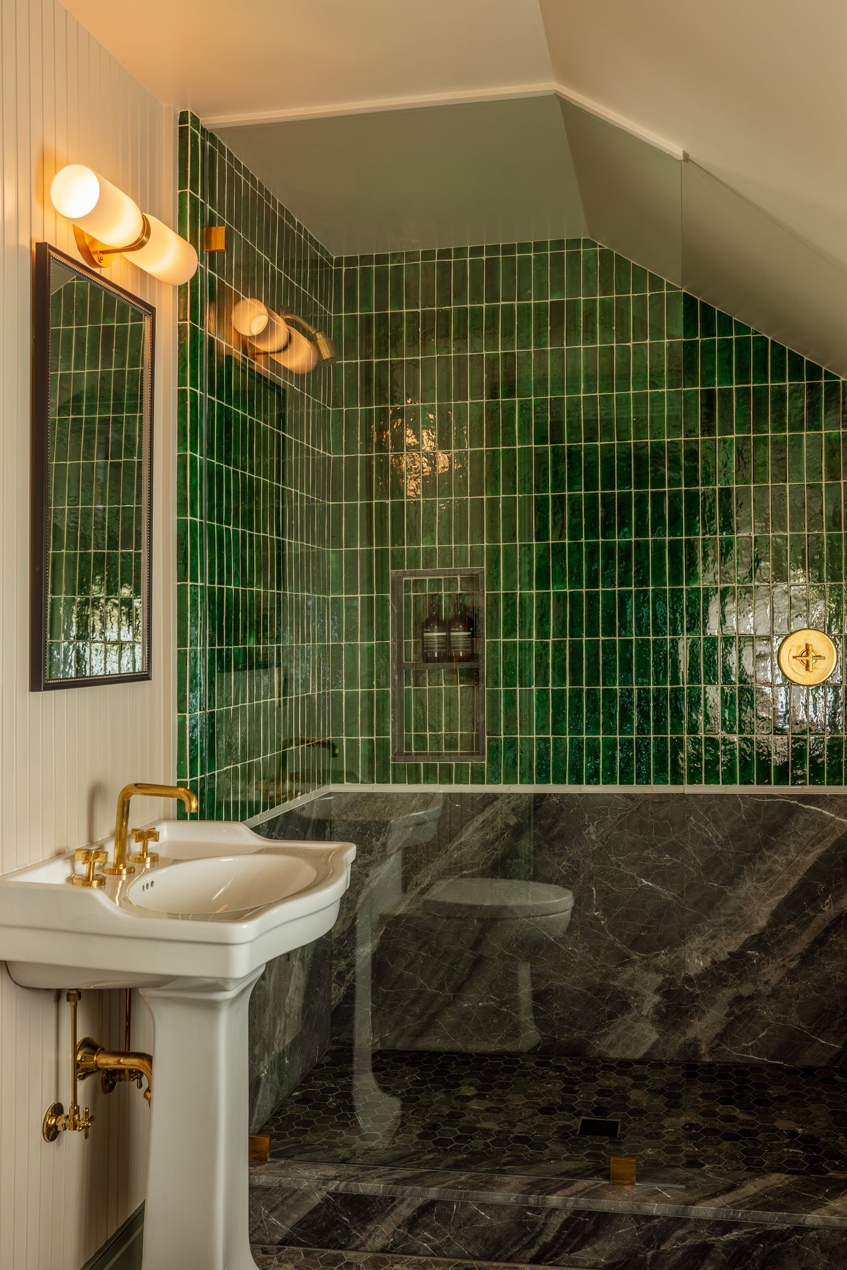
Upstairs, there is the first suite in a green that I would never have chosen, but really love in person! This is why actually being inside inspirational design is so valuable – I’ve got to shake up my “go-tos” when designing the carriage house (cut to me very much not shaking up my preferences ever, but continuing to wish that I would).
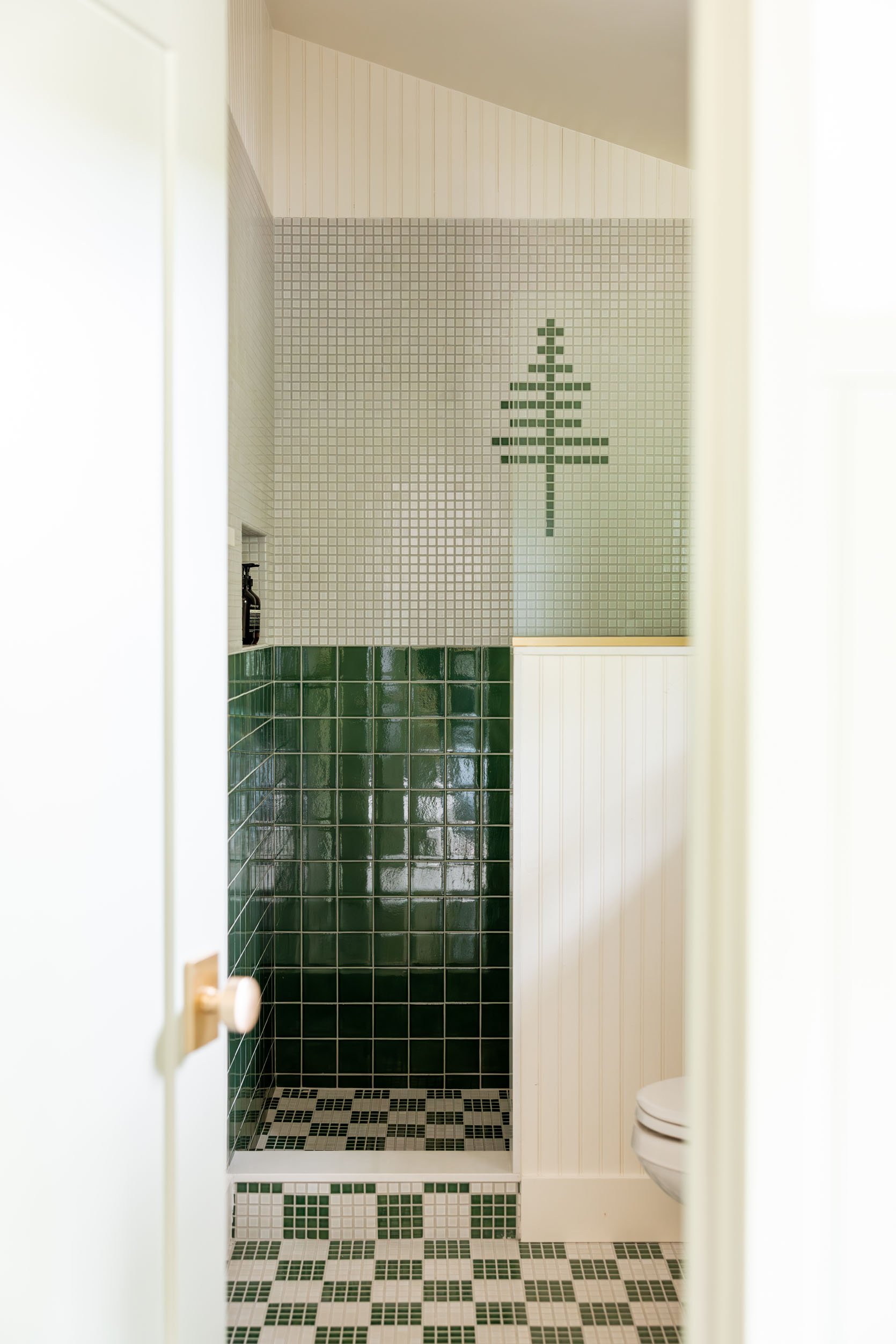
This bathroom felt so “Max Humphrey” to us – the whimsical tree tile element is extreme Pacific Northwest charm. I love the checkered mosaic floor in that bright grass green.
We also loved this suite with the two-toned walls and the simpler paneling. Clearly, a color palette I am comfortable with, with continued cozy vibes, and my second favorite bathroom.
The tile combination and the paneling felt so sweet and cottagey, in a modern way (with a lot of updated, luxurious amenities).
The Napping Cabin
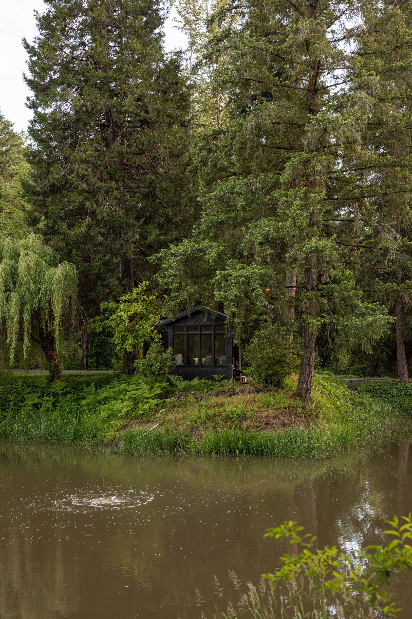
There are two other little outbuildings for guests to explore – the napping cabin and the game room (which I don’t believe they have shot yet). We didn’t even go in the napping cabin, but you need to see it.
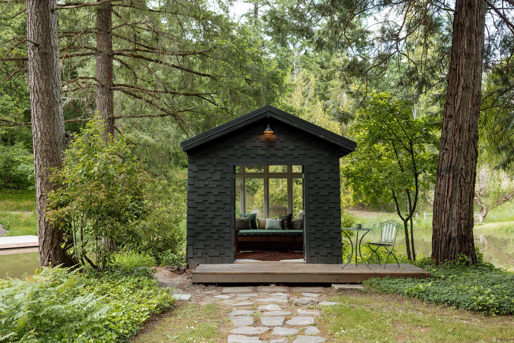
It’s a sweet little shed near the pond, converted into a quiet place to have some alone time. Or if you get married here, a really lovely photo op.
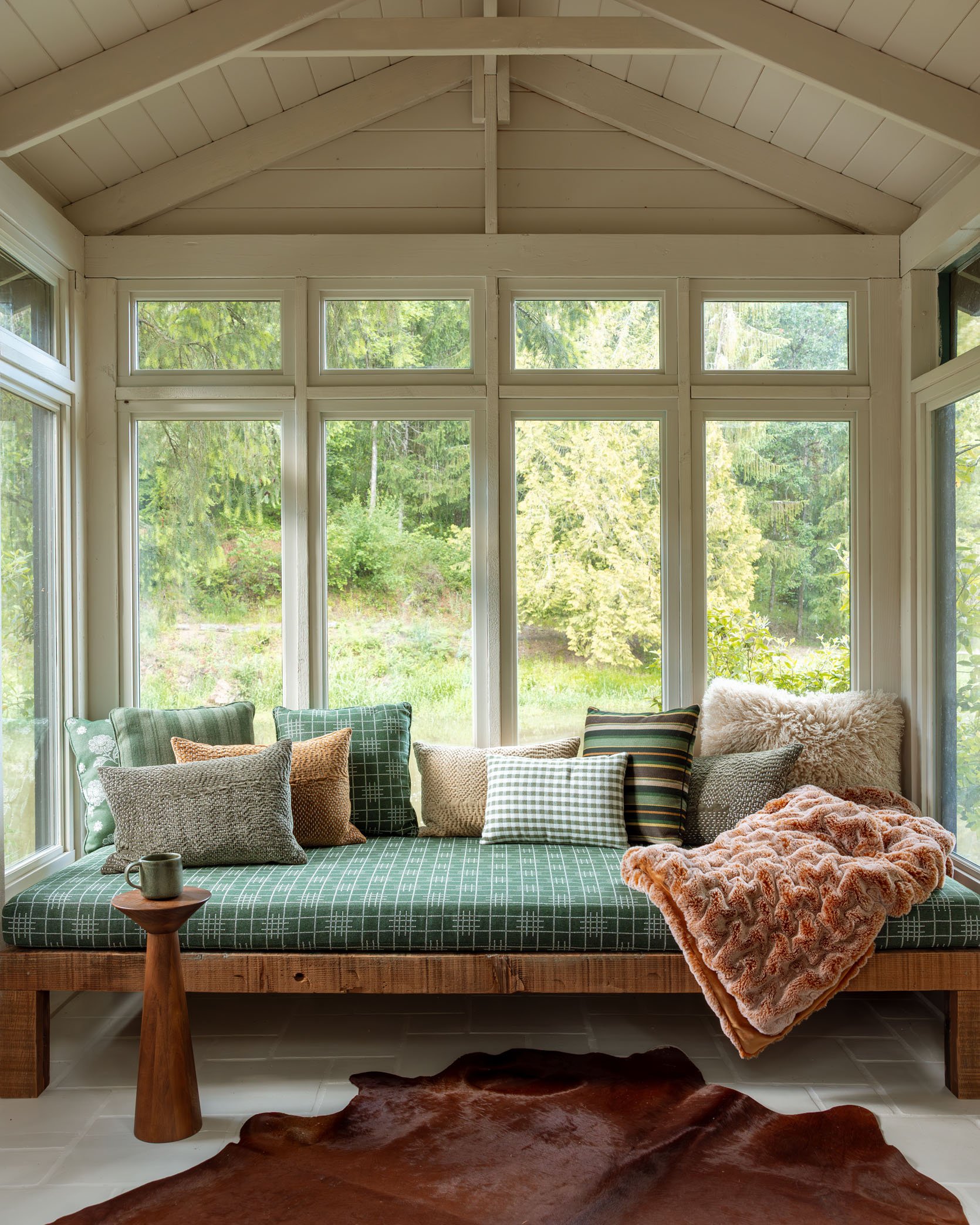
Inside, you have a lot of Max’s fabrics for Sunbrella/Pindler and a real analog vibe.
If you are interested in renting the Carly here are a few fun facts:
- You can rent the entire property – both houses OR, should you have a smaller party, rent just the lodge.
- Yes to weddings, of course, but mid-week work retreats (like ours) are a way to experience it at a lower rate.
- It’s a luxury property, no doubt, so planning in advance to pull together your group is a great idea, but since they just opened, they have a lot of availability this summer and fall (which is the magical season). Winter is awfully cozy, though.
- They have a lot of extra amenities you can opt into – car service for wine tastings, private chef, massage therapist to come to the property. It’s a full concierge program for special occasions.
A huge shout-out to Max Humphrey for designing The Carly. Architect: Beebe Skidmore. The General Contractor is Owen Gabbert LLC. Landscaping by Pistils Landscape Design All photos by the lovely Kaitlin Green with some additional styling and art curation by Kate of Rodeo Queen and Colleen Mote.
*Architect: Beebe Skidmore
**General Contractor: Owen Gabbert LLC
***Design by Max Humphrey
***Styled by Kate Webb of Rodeo Queen and Colleen Mote
*****Landscaping by Pistils Landscape Design
******Photos by Kaitlin Green


Oh my gosh everything about this is gorgeous. I love the mix of pattern, texture, and material, but it never looks overwhelming. Also despite being a luxury property with (clearly) expensive finishes, it still kind of feels like a cozy, eclectic lived-in space, not something overly designed – maybe because those unexpected choices feel confident and authentic instead of self-conscious or trying to please everyone? Whatever it is, well done!
Totally agree; everything feels perfectly suited for the environment and organic without seeming contrived. Major applause.
Wow. I was soaking up all the details in every room. Like nothing else out there. So lovely
Incredible color combinations. I’m still reeling from the black and robin’s egg blue together. Thanks for the fresh shot of inspiration!
Big kudos to Kaitlin for these stunning photos! The place is obviously gorgeous but her photos capture it in such an inviting way. Beautiful work!
None of my business, but I am so curious about this as an investment/business venture. These details are so, so gorgeous – every inch! And also, soooo costly, I’m sure! When do you break even?!
That would be a great convo to have with Chat GBT tbh. It’s a little like asking how long to pay off a house – the specifics of where, loan rates, how much down, utilization (night rented at full price) and services (allow outside catering or support a full time restaurant) etc. matter. But AI is actually quite helpful for things like this: where there is a lot of data, a lot of people have already done it, and questions are 101. another prompt might be to ask what kind of debt to operating income ratios are successful in the area where you are looking to invest. Just a suggestion.
Interesting! I’m behind the 8 ball with AI, have to look into stuff like this.
My jaw dropped for nearly every photo!! What a magical destination!!
This property is so beautiful, I want to check it out. But I’m very confused — which of the people involved are Emily’s friends? Max and Beebee, or are there other owners? The first few paragraphs don’t quite make it clear
The owners are personal friends of E, not Max and the architect. One of the friends whose living, dining and breakfast room she chose and staged furnishings for.
“If you like Soho House designs…” You’ve mentioned Soho House a few times in the last little while and I looked it up and thought I had a sense of what you meant. But the rustic elements here surprised me. I would love it if you could say more about what makes the Carly feel “soho house”.
Thanks
Agree. Soho House is like sophisticated confident cosmopolitan townhouse. Real city vibes.
This is more confident sophisticated country lodge.
Does anyone have any idea where the nightstands in the ADA compliant bedroom might be from? I have been looking for nightstands like those that have a little border trim detail on the top to make it harder for things to fall off and they are hard to find.
What a talent Max is, especially with hard surface and color choices. Would love to see his personal independent vision for the River House and where he and E might have differed.
I love so this project. It is sooo special. It’s inspiring to see “rustic” and modern mixed so well. I’ll be revisiting these details over and over for our own home. BeeBee’s talent is a highlight because I think we’ve all seen huge open spaces that just feel like huge open spaces. More 80s style great rooms would benefit from strategies like that dining room where you get the best of both high and normal size ceilings…. but also wanted to say THANK YOU to the owners for considering ADA needs. As my parents age we are continually seeking options that can accommodate mobility issues (not full on wheelchair but assistance needed). Accessibility seems so often overlooked in design-forward hospitality properties.
This is gooooood. Seriously top level work in every detail! I’m in awe of that lodge – I live in an old lodge myself and am Taking Many Notes for once we get to the decorating stage. Thanks for sharing this one in such detail.
What a stunning retreat! The art in the living room gave me pause, it felt a bit incongruous with the rest of the design, but loved the rest so much!
Glad I’m not the only one! I kept coming back to that photo and wondering if there is a color tie-in that we can’t see, or art w/ personal meaning, or if it is a temporary placeholder.
that’s so funny!!! it didn’t feel that way in person but i can see what you mean when i revisit the images – it does stand out more than i remember! but i think it worked IRL for a few reasons – there are so many pops of saturated color (like the rugs in the kitchen and entryway, the pink bathrooms, etc.) that the whole home feels cohesive as a whole despite the disparate styles to that end – man, they NAILED the “collected, not designed” aesthetic! it felt like a real home – the piece just sang in that place of pride above the fire!!! the gallery wall (with the hidden door) runs parallel to the fireplace and is similarly stacked with the other pieces of irreverent art (our team was especially partial to the hand-painted “total non sequitur” sign), so that big living room art has “friends” in the room with the same spirit, so to speak 🙂 EDIT – oh man there are no pictures of the aforementioned gallery wall or secret door in this post! but if you peek at em’s instagram, you can get an idea of the other art in the room. it was… Read more »
wow. I love everything about these spaces. The mix of color, texture, and pattern is masterclass. I want to immediately move in, or bring them to my house to redo top to bottom.
Oh my, LOVE it all. I find this quite inspiring, as “sweet and cottagey, in a modern way’” kind of sums up what I’m going for in my own very modest little home.
Beautifully photographed! I am so in love with the landscaping.
I nearly didn’t read this story because I just thought it was another giant advertorial but I’m so glad I did.
What a stunning place. The perfect mix of colour and neutrals, classic and whimsy, and homeliness but sophistication! Just loved it. One of my favourite house tours ever.
Only thing I’m not a fan of is the mixed fabrics on the chairs but there is nothing else that I wouldn’t love in my own home.
Particularly loved the soft black and light blue kitchen – just gorgeous and the blue reminded me ever so slightly of Velinda’s downstairs kitchen which I also love absolutely love.
Really loved it and thinking I should consider a visit to Oregon (something I have never considered before as an Australian who thinks of other places first and probably won’t visit anyway till that crackpot leader has gone) just to stay there. Beautiful!!!!
Absolutely stunning work! I spent so much time absorbing every room. Gorgeous.
Wow – just spectacular. I love it all: the gorgeous light fixtures, mix of patterns, amazing tile work. What a little piece of heaven!
Truly gorgeous property, inside and out. I had to scroll through several times to take it all in. Love that dining space in the Fernwood. I’m including a link to this in my Friday Finds on my blog.
In a world where we are told constantly that curtains need to be full length, I squealed when I saw the curtains skim just past the windows in the third picture.Bravo! We also have this length in our home and it is just right. This whole spot feels like a dream to stay at. Everything feels comfortable and cozy and delightfully mysterious!