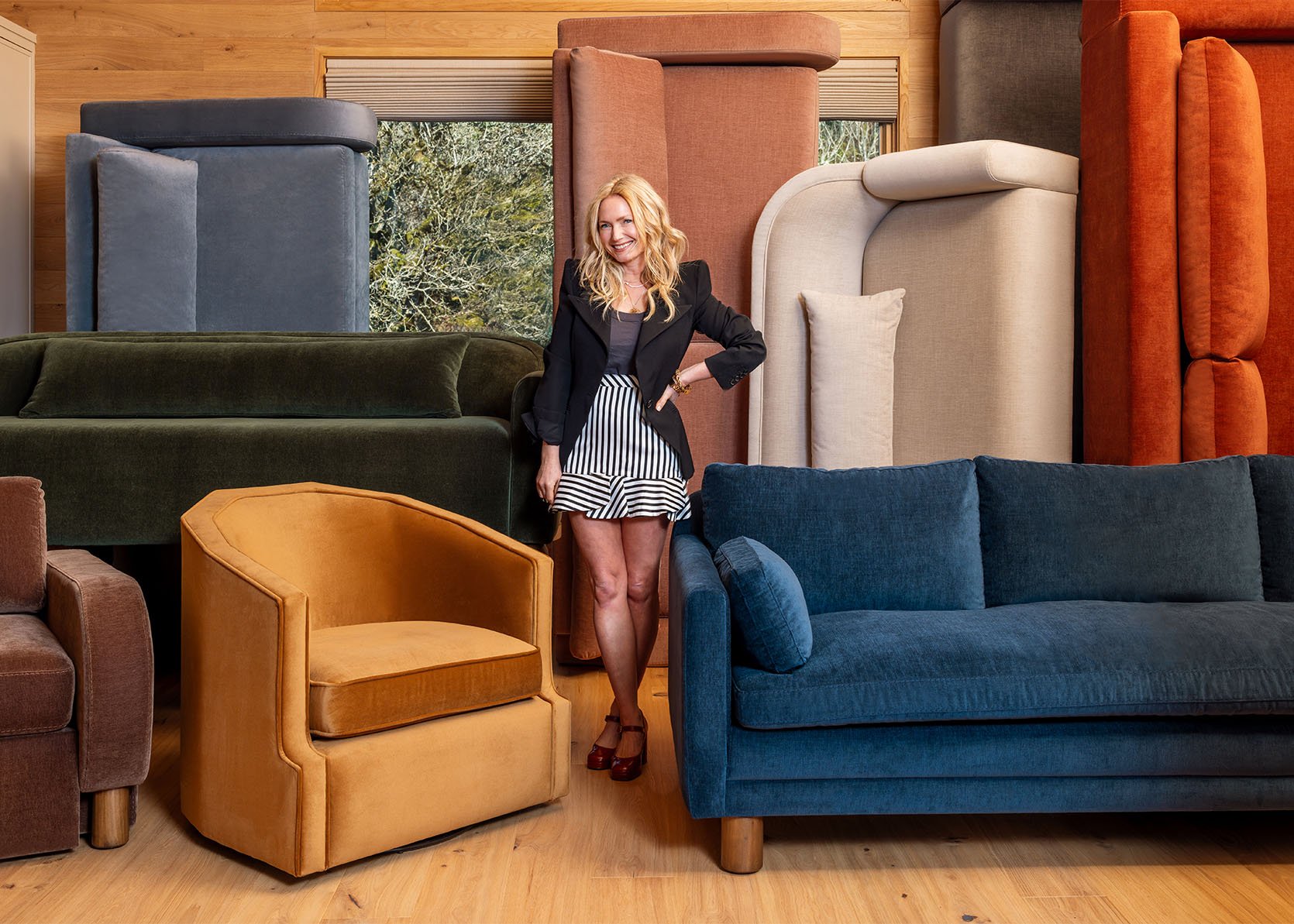
Design
Farmhouse Living Room Update: The Sofas I Designed For The Space Are Here (And So Many Changes)
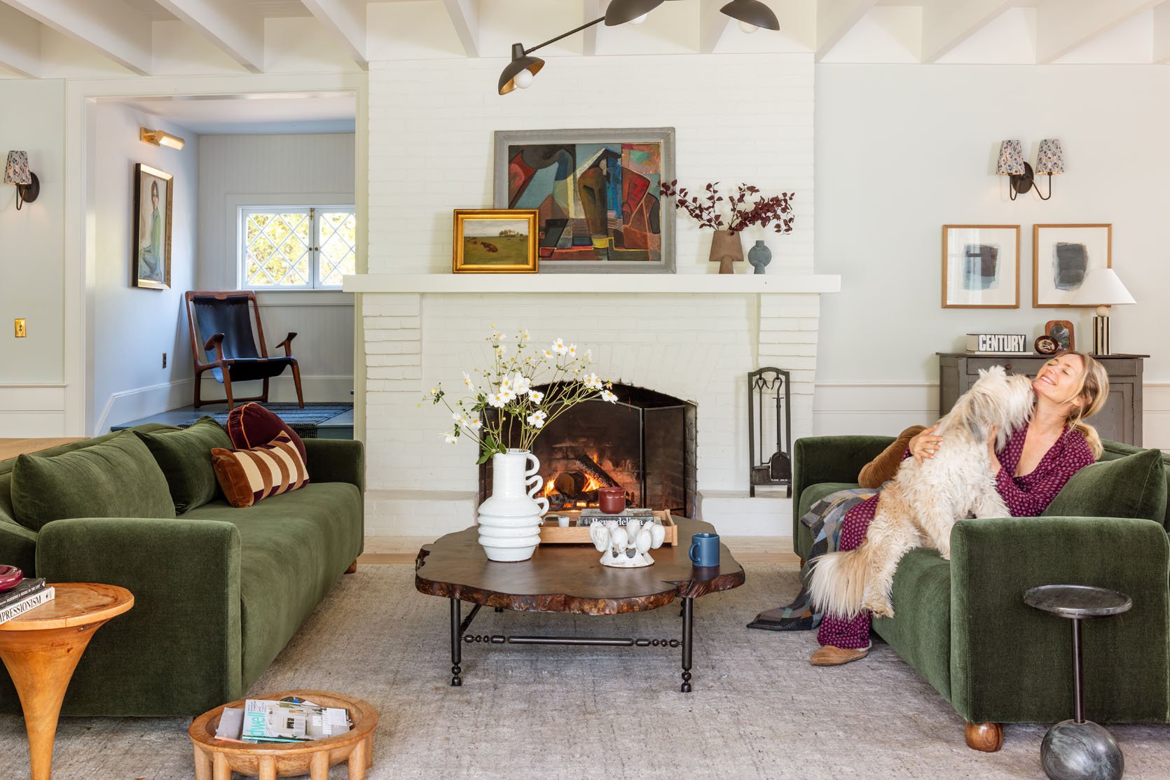
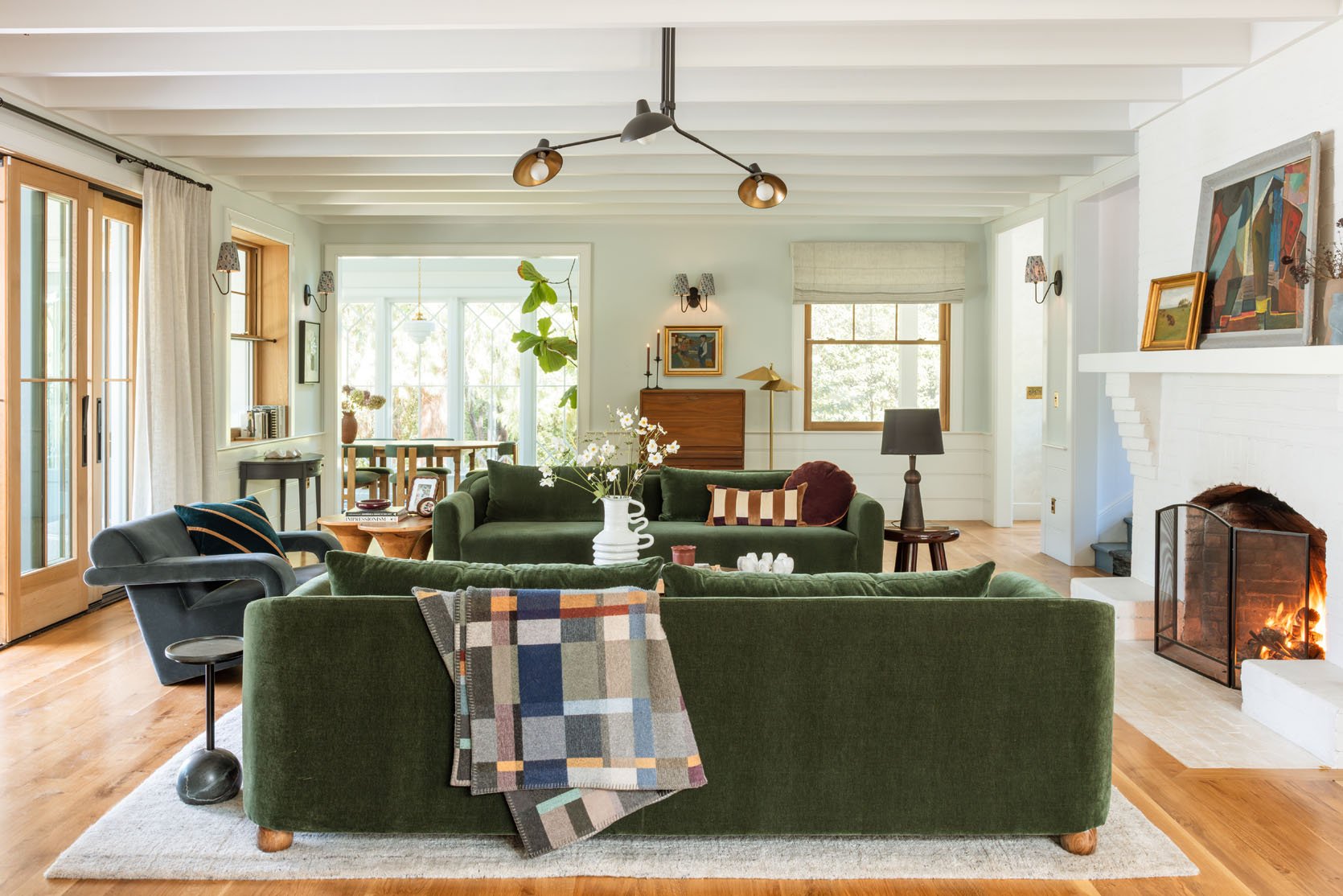
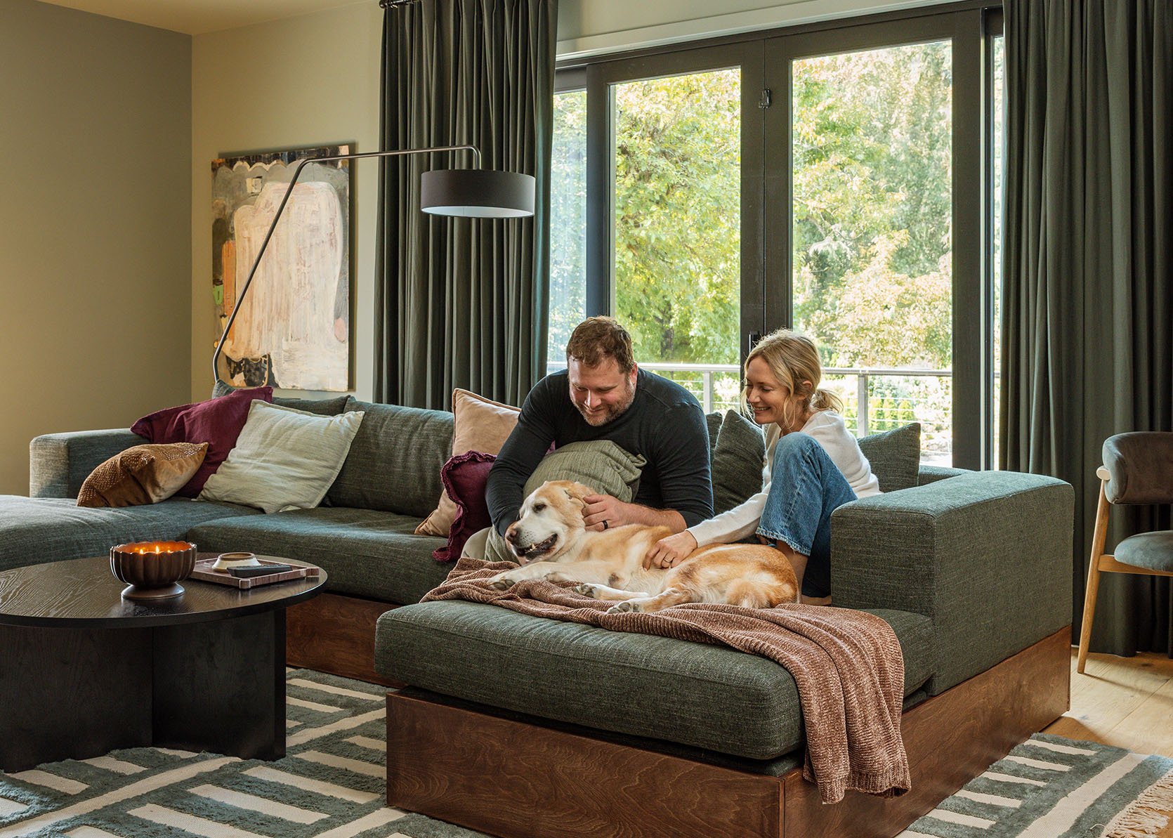
I “finished” the living room over 2 years ago, and while I was never 100% happy with it, I couldn’t put my finger on what/why, and loved it enough (and we had to shoot it for a magazine, so yes, I might have chosen some things based on timing). Now I want to be clear – I know intellectually that it was super, super pretty and functionally it worked so well for our family, but all I can say is that I know when I nail a room and I wasn’t there YET with this one. Today, friends, we are getting so much closer, thanks to my new sofas arriving (and some surprise swivel chairs!). And I feel like I might even know the three things that I could change to get it to the 100% true love phase (which I feel for our sunroom, kitchen and family room – good design takes time).
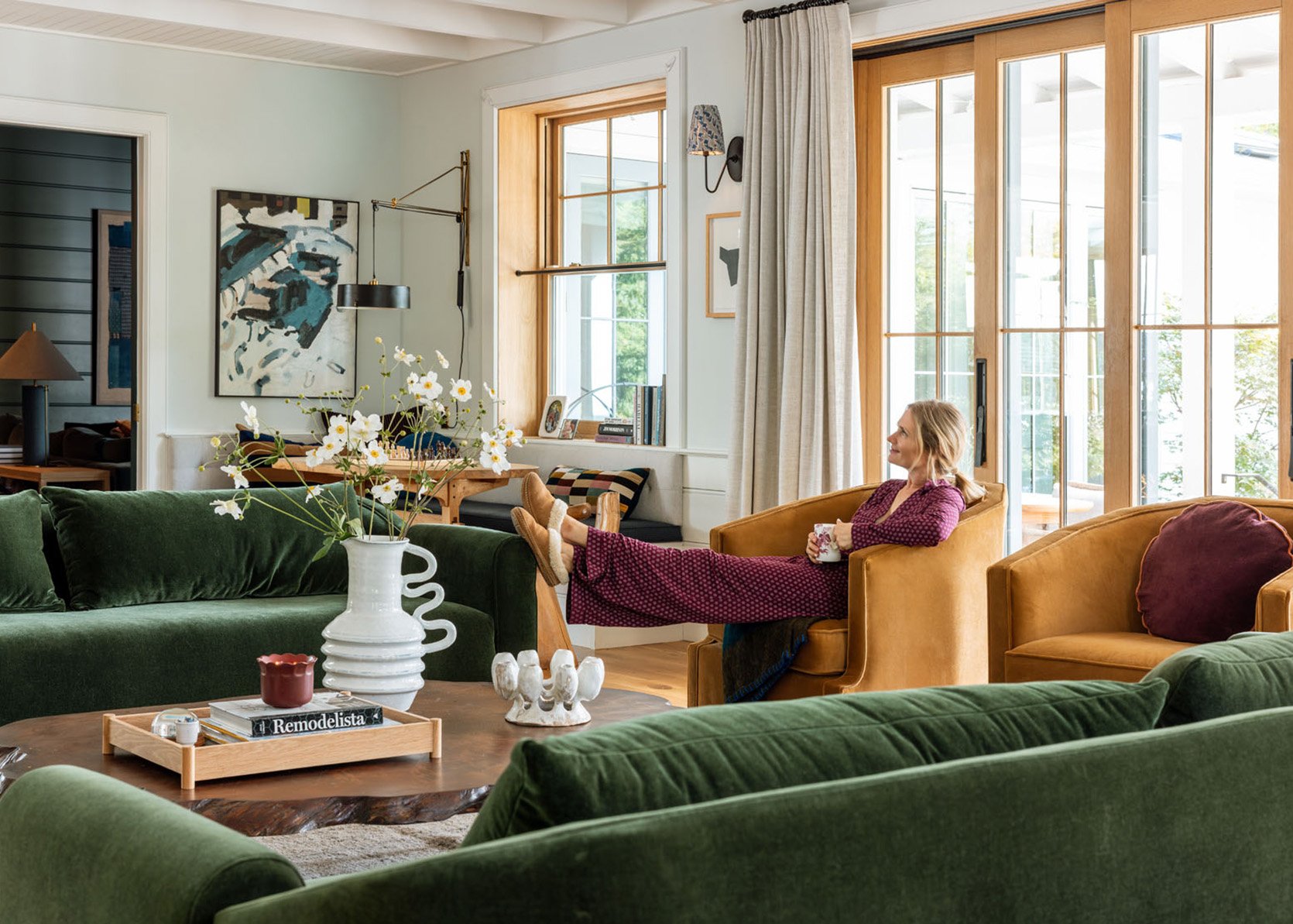
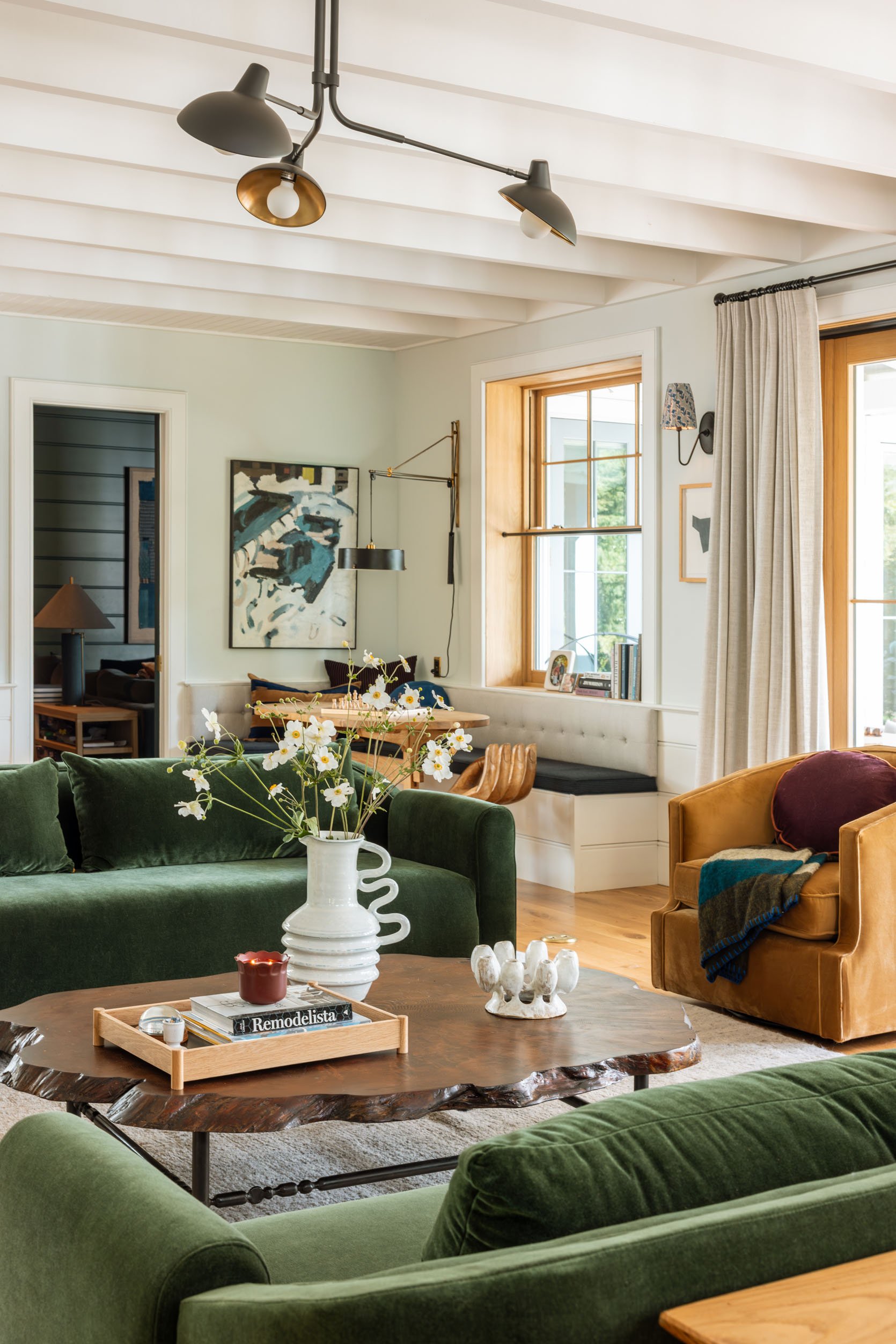
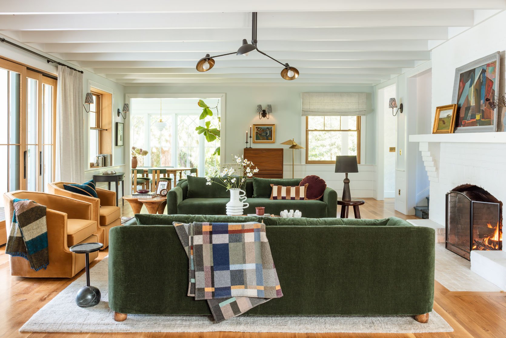
My Alice Sofas!!!
Alice Sofas | Suz Swivel Chairs
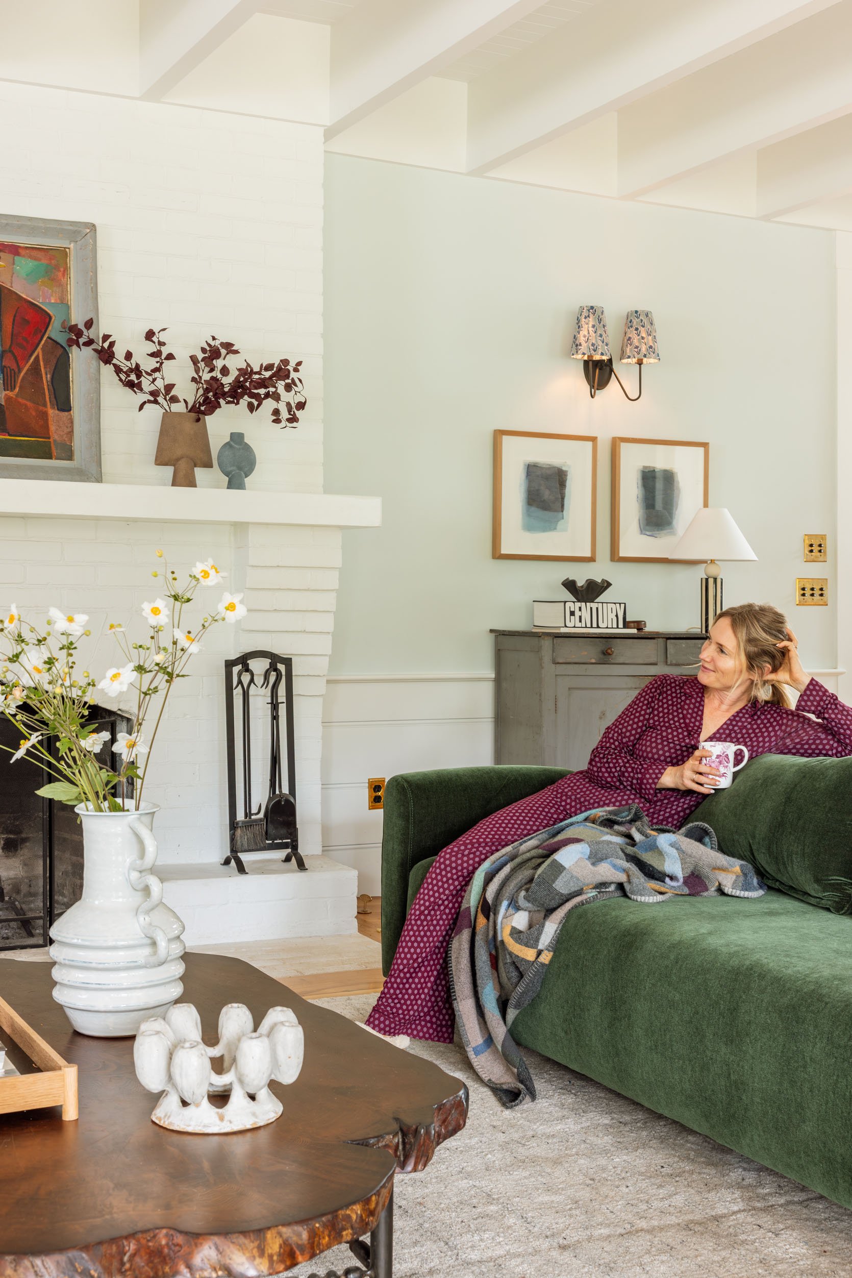
I am in LOVE with these sofas, both visually and functionally. The arms are so pretty, the seat is cushy, the back curve is so elegant, and that darker green pops so well in here. I loved the two facing sofas in here, and our prior sofas from Lulu and Georgia were so comfortable, but the dogs lying on top of the back cushions made them almost unsittable unless I did the daily Herculean effort of taking off the back cushion and pushing, stomping, or jumping on it to make it a rectangle again. It was so annoying. I fixed them daily or avoided sitting on them altogether. So every morning since we’ve had these has been such a treat.
Wait, Do The Dogs Not Sit On There?
They sure do, but these sofas were designed as a tight back yet deep sofa, meaning it doesn’t need the two back pillows that come with it – they are optional. Since they are deeper, you might want the pillows, but they are so pretty without them (with throw pillows). As of now, we are using the back pillows but setting them flat on the sofa seat during the day while the dogs lie all over the sofas, and then they are so easy just to prop back up when ready to sit (they are small, lightweight pillows instead of one huge back cushion). I may end up not using them and just using throw pillows (which my dogs will also sit on), but I love the streamlined look in here.
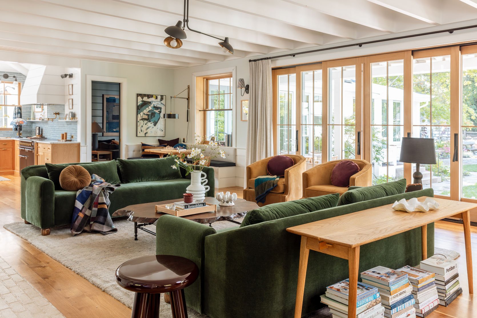
If you are wondering why the sofa isn’t centered on the rug, I have a rambling reason for you. At first we shot this room with the Soho home chair (the blue velvet). The sofa and chair clearance was different. But Gretch was like, “Shouldn’t we just try the Suz chairs?” and we did, and they needed to be off the carpet (or fully on) since they are swivel. So we just forgot to center the sofa or move the rug!! You probably wouldn’t have noticed! But it’s driving me nuts 🙂
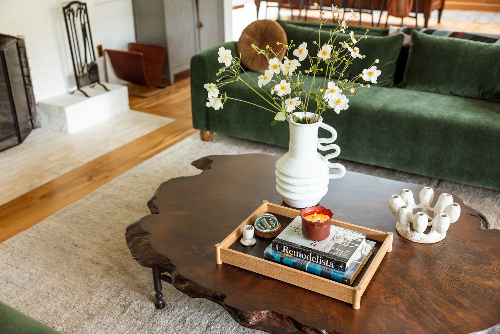
Coffee Table Vase | Wooden Tray
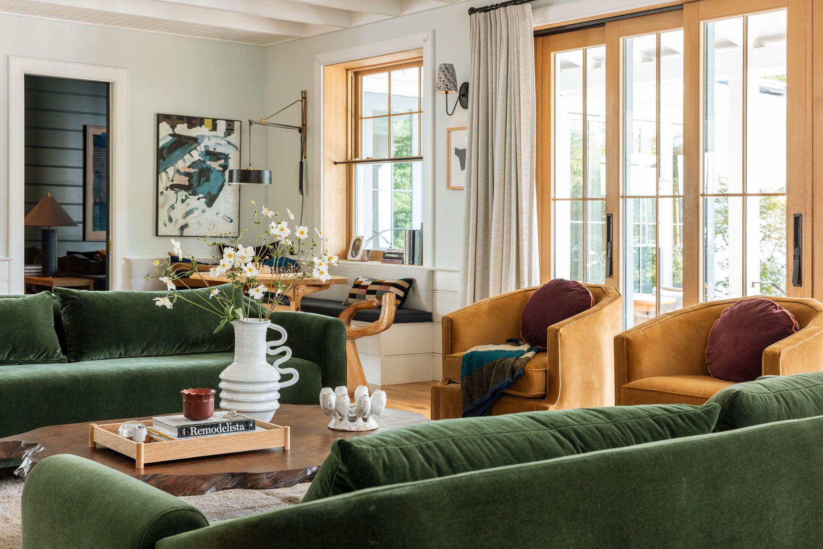
OH MY. How I love that shot. I joked a lot that it’s a very “Go Ducks” room (green and gold), but my team assured me that normal non-Oregon Duck-obsessed people wouldn’t think this. I think with all the blues and deep burgundies it doesn’t feel that way. I’m LOVING the Suz chairs in here, mostly because of the additional seating, how it feels more filled out, and the swivel is so fun. You can turn and look out into the backyard.
Striped Velvet Pillow | Throw Blanket | Striped Table Lamp
The Alice looks really firm, but it’s just streamlined with a lot of give. I know I’m biased, but I hope you trust me that I wouldn’t say something is super comfortable unless it was (I know you’d tell me!!). It’s not something you flop onto and sink 4″ into (like our Oscar), but it’s cushy and has a nice soft give. It’s perfect for our needs in here, which is mostly morning coffee with our laptops and lots of conversational hangs with our friends or games with our kids. But I assure you that if it were your TV sofa, you’d be so happy as well. It’s very comfortable, just looks more streamlined intentionally.
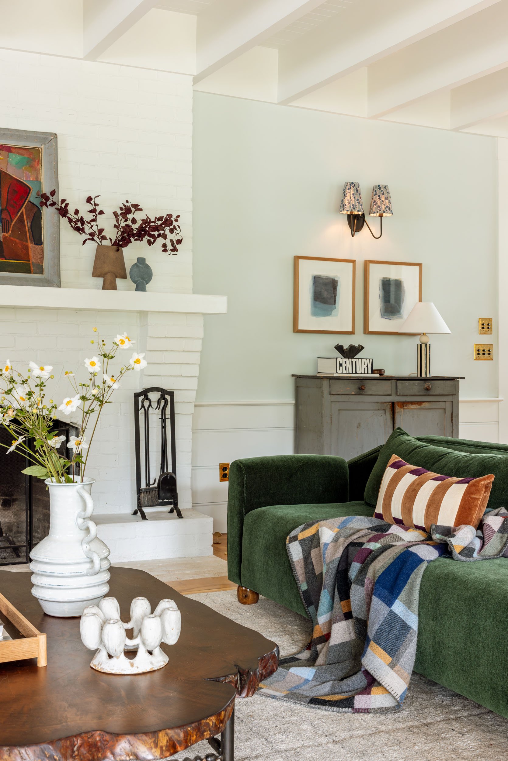
I’m really loving how they look in here. I LOVE this deep dark green in a super family-friendly velvet, especially with the darker coffee table. It just feels so rich. The dog’s hair sticks to it as much as the other velvet sofas, which is not very much (our dogs shed twice a year, but otherwise aren’t huge shedders; they are a huskie-poo mix). If you have heavy shedding dogs, the Alice also comes in a nice cream linen that has a lot of different tones to mask hair.
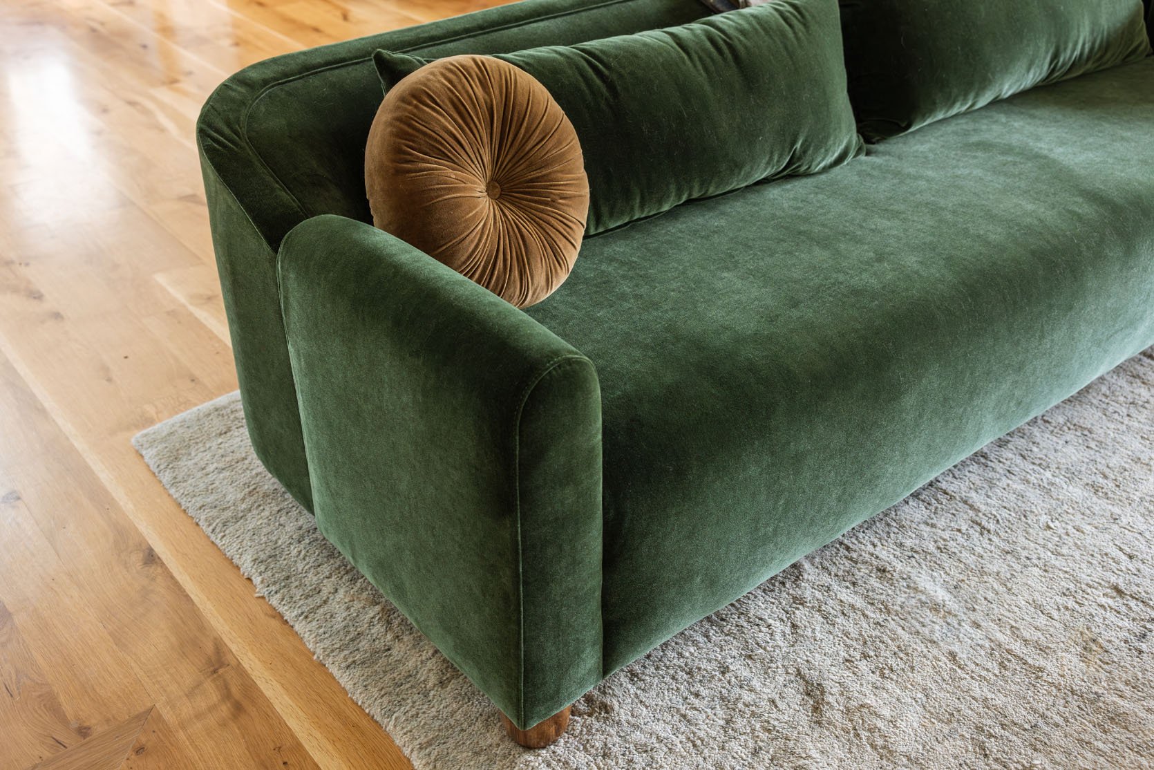
The sofa is just so pretty and streamlined, but with that arm and leg that says, “I’m not boring, I’m special.” The roll on the arm gives it a slightly traditional look, but obviously not hyper traditional (not a tuft or carved wood).
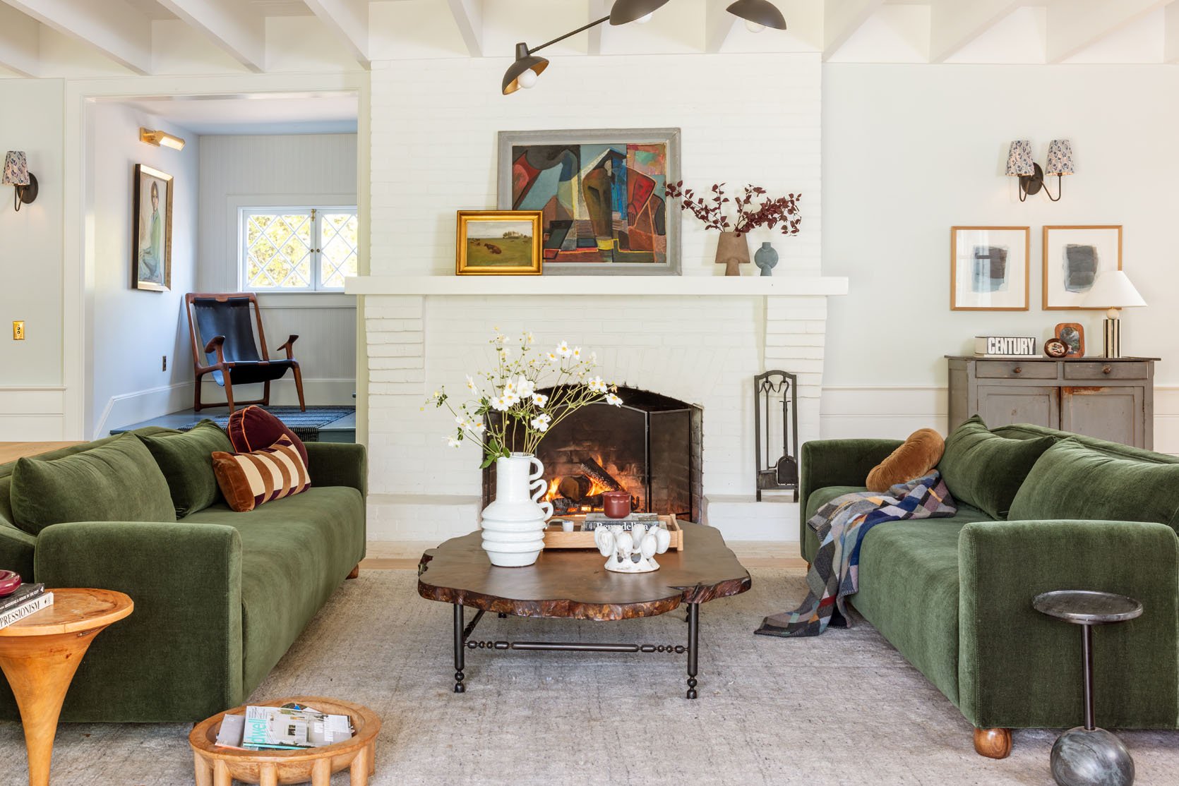
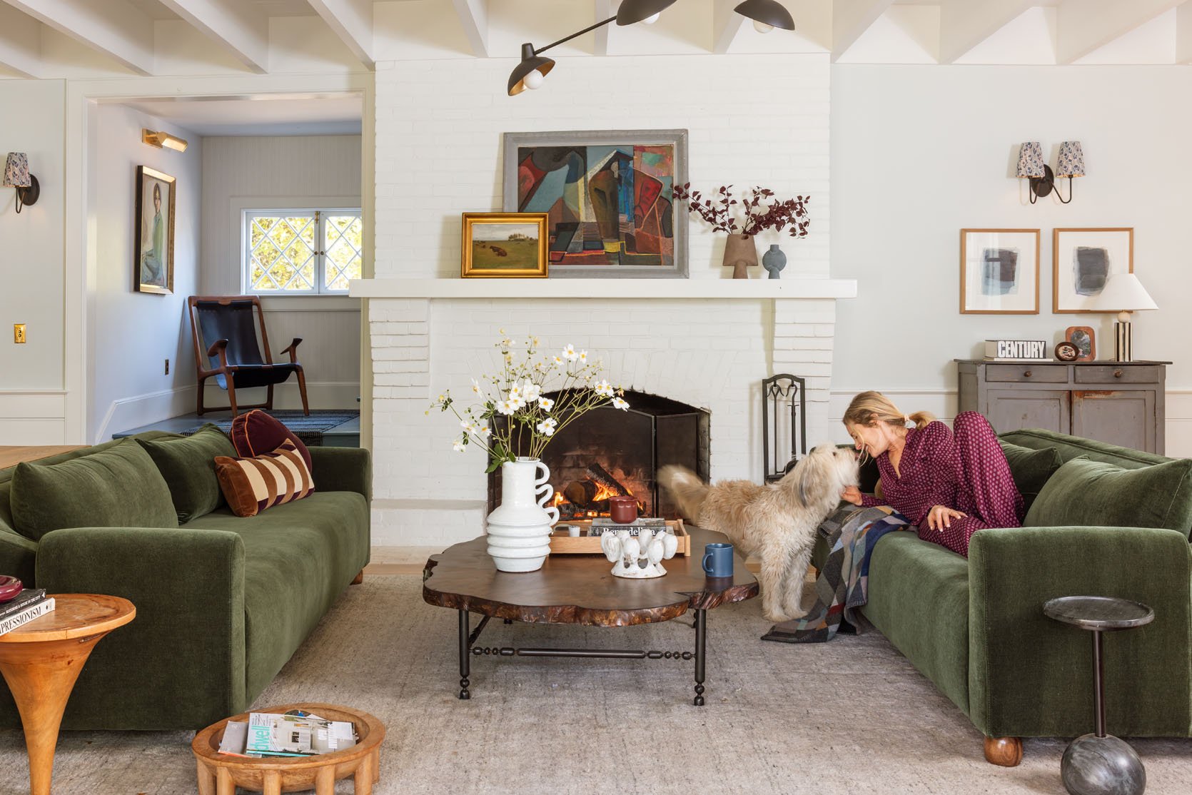
Regarding the fireplace – I’m still not happy with how cold it looks, but you guys, I can NOT decide on what color to paint it!! My latest idea is to just wallpaper above the paneling and leave the fireplace white. My MIL got in my ear that painting it might feel too bold, like a big dark block in the middle of the room that would stop your eye in a bad way (I thought it would just look like a proper focal point). But I really do see her point and I fear she is right (also paint is just paint- like, Emily, JUST PAINT IT AND SEE, it would likely take one day!! ). But perhaps a soft wallpaper on the walls would help give it depth, texture and definition? I’ve ordered samples, and I can’t wait to belabor this for another 3 years.
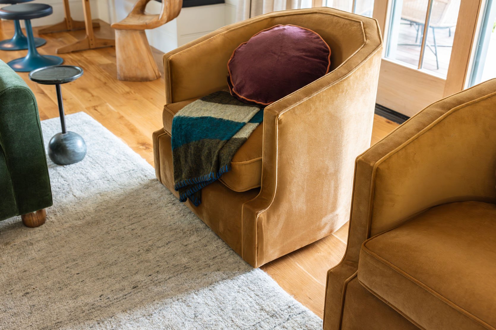
Our Suz Chairs!!
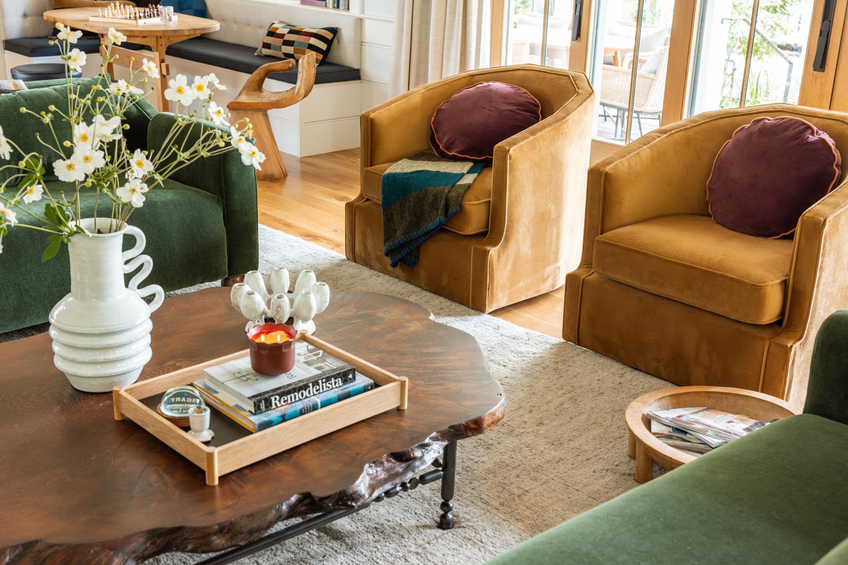
Round Burgundy Pillows | Throw Blanket | Suz Swivel Chairs
Y’all. These chairs are so good. There are million swivel chairs on the market but these are special. Mal (on my team) designed them for Room Service, and they def have more of a regency vibe, which we love. They are deep and the seat is so comfortable. I put these round Schoolhouse dark burgundy pillows on them, which look pretty great, IMHO. And if you are wondering if you can have too much velvet in one room, we decided, collectively years ago, that “no, no you can’t.” It’s just so pretty and soft and therefore wins every time.
Which Chair Do You Like More???? Two Options…
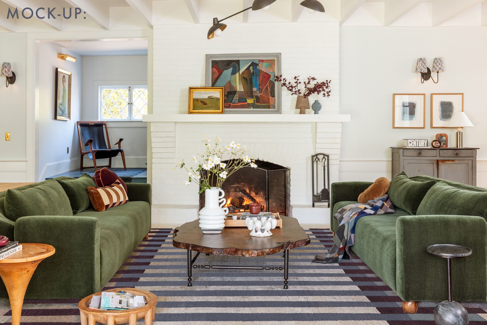
Ok, so when we started shooting that day, we had the Soho home chair in here (above), and it looks really good (she’s a big lady). As you know, I love a really tight color palette (mostly so I can go nuts with my accessories), so this blue/green world works for me! Also, what you don’t see here is that I brought back the floral chaise in the corner (it looks way too dark/crowded in this angle, so we removed it for the sake of a better shot). I haven’t shot it yet (just ordered a rug for underneath it. But ANYWAY, that’s the blue chair version, and now check out the Ochre Suz swivel chairs option:
Ochre Swivel Suz Chairs
GAH! When we looked at the laptop screen, after clicking the photo were like, “Whoa, this looks so much better”. Which we totally didn’t predict!! It’s just fuller, more balanced, looks like a better design.
Wait, What Are The Other Changes You Made??
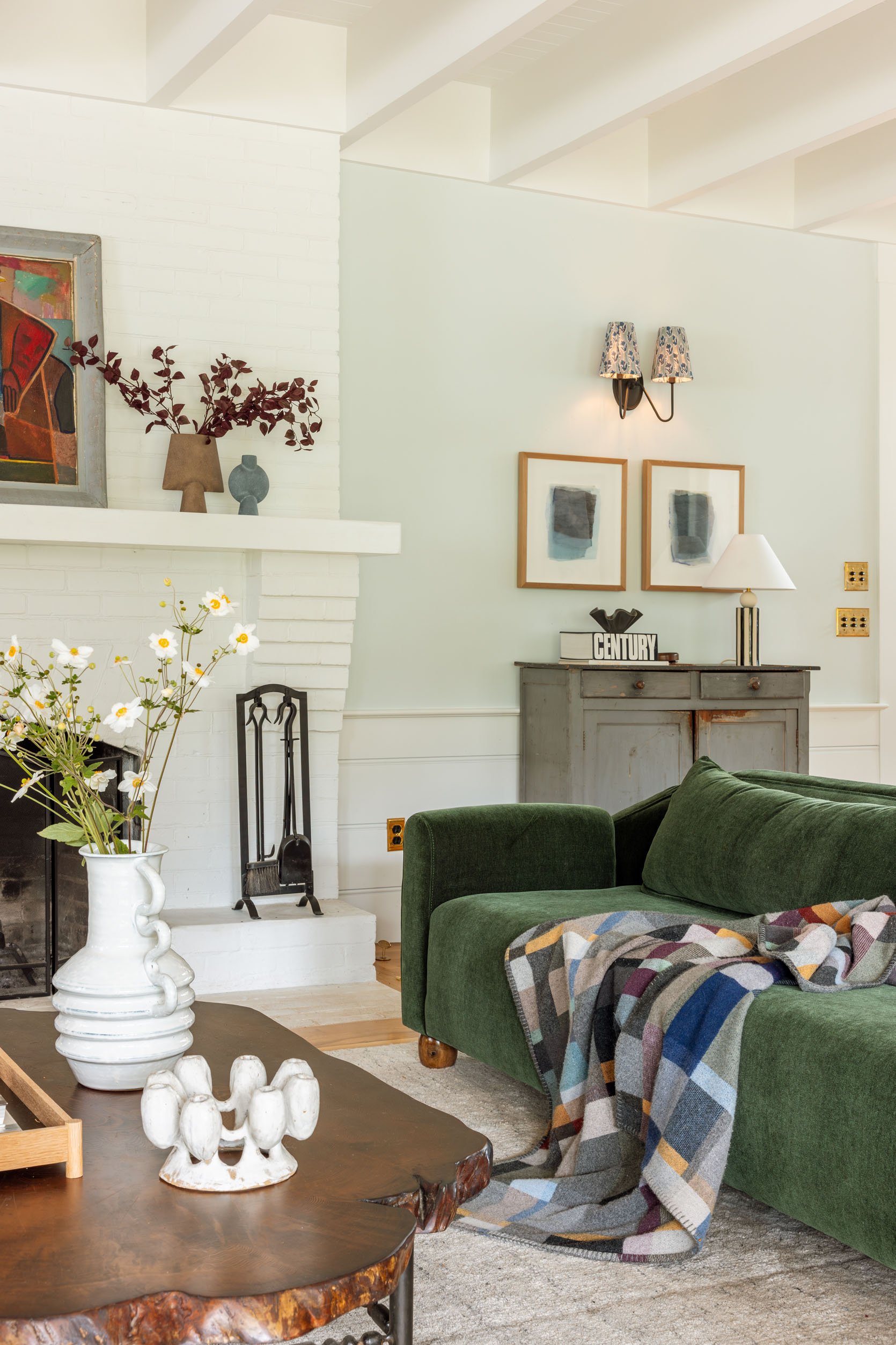
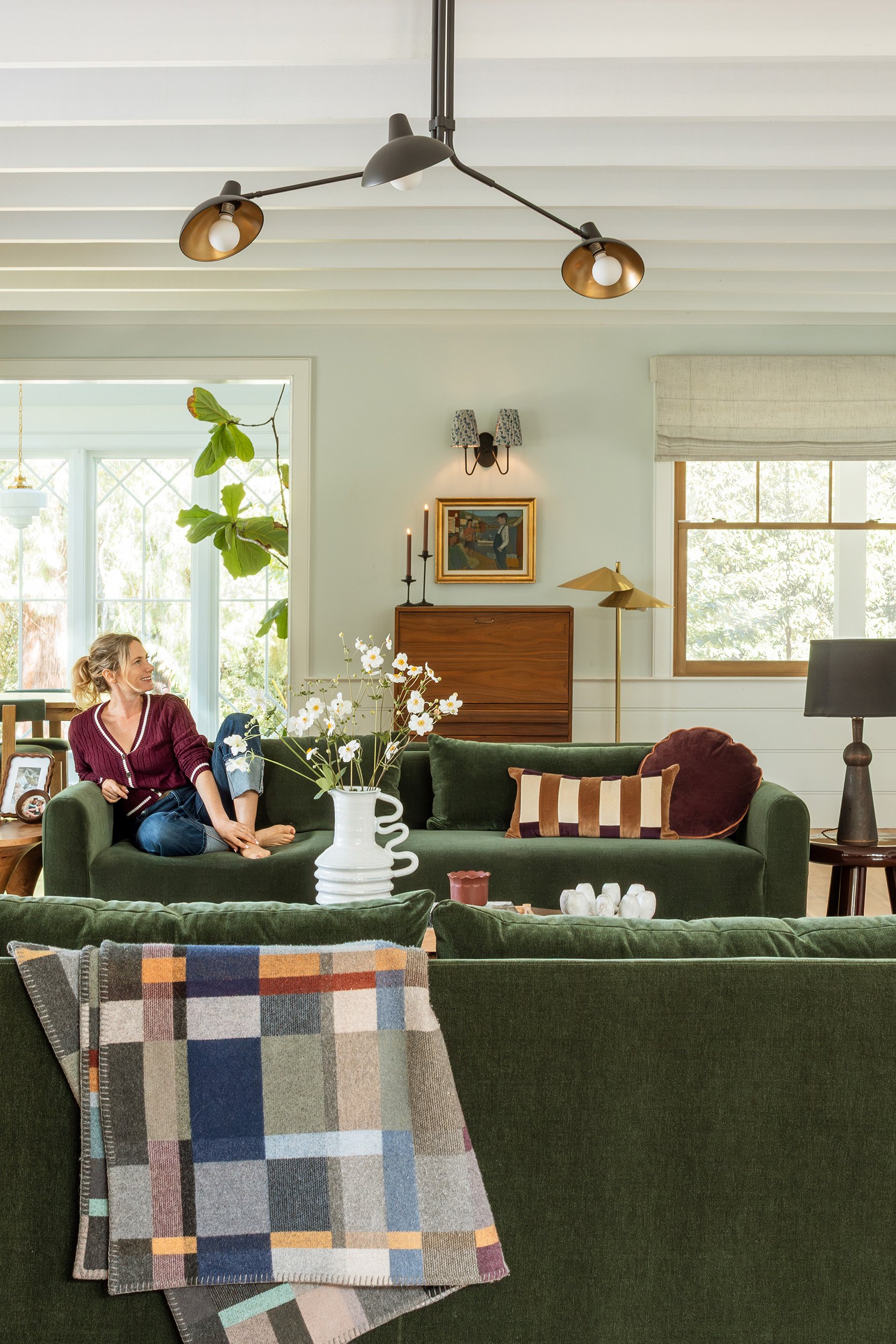
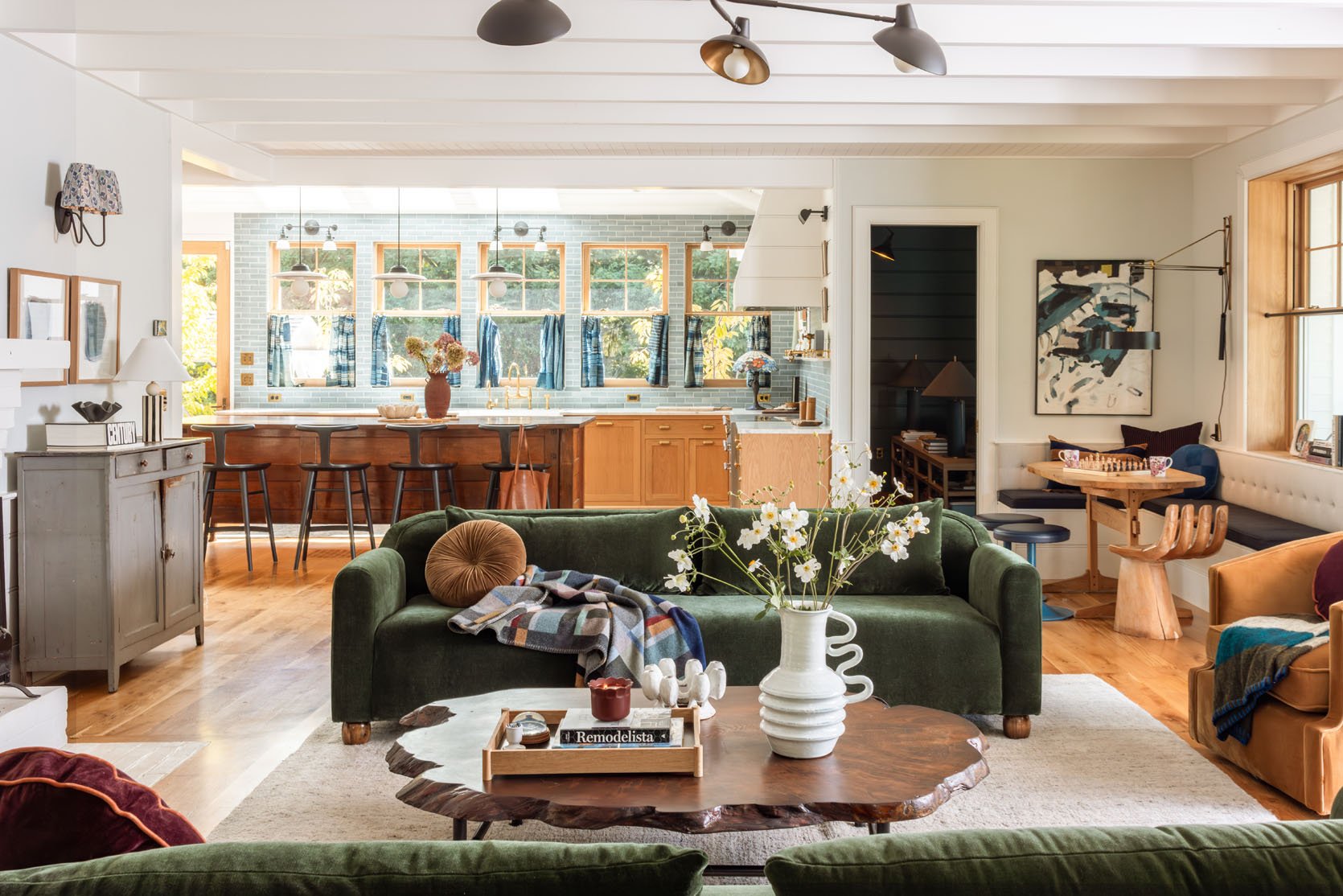
Well, for you eagle-eyed readers (thank you!), you’ll notice that I swapped the midcentury cabinet and the French farmhouse cabinet, and my goodness, it’s so much better. The blue cabinet looked sad and grey over there and it gets way more light where it is now. And the richness of the midcentury teak piece is a much better backdrop to the green sofas and balances out the Suz chairs.
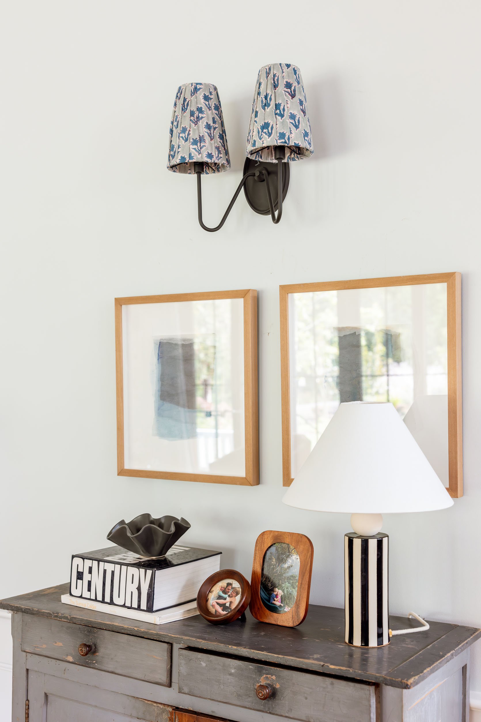
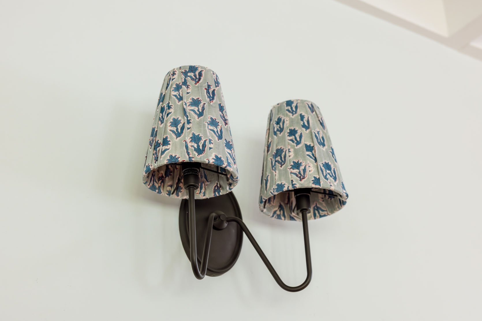
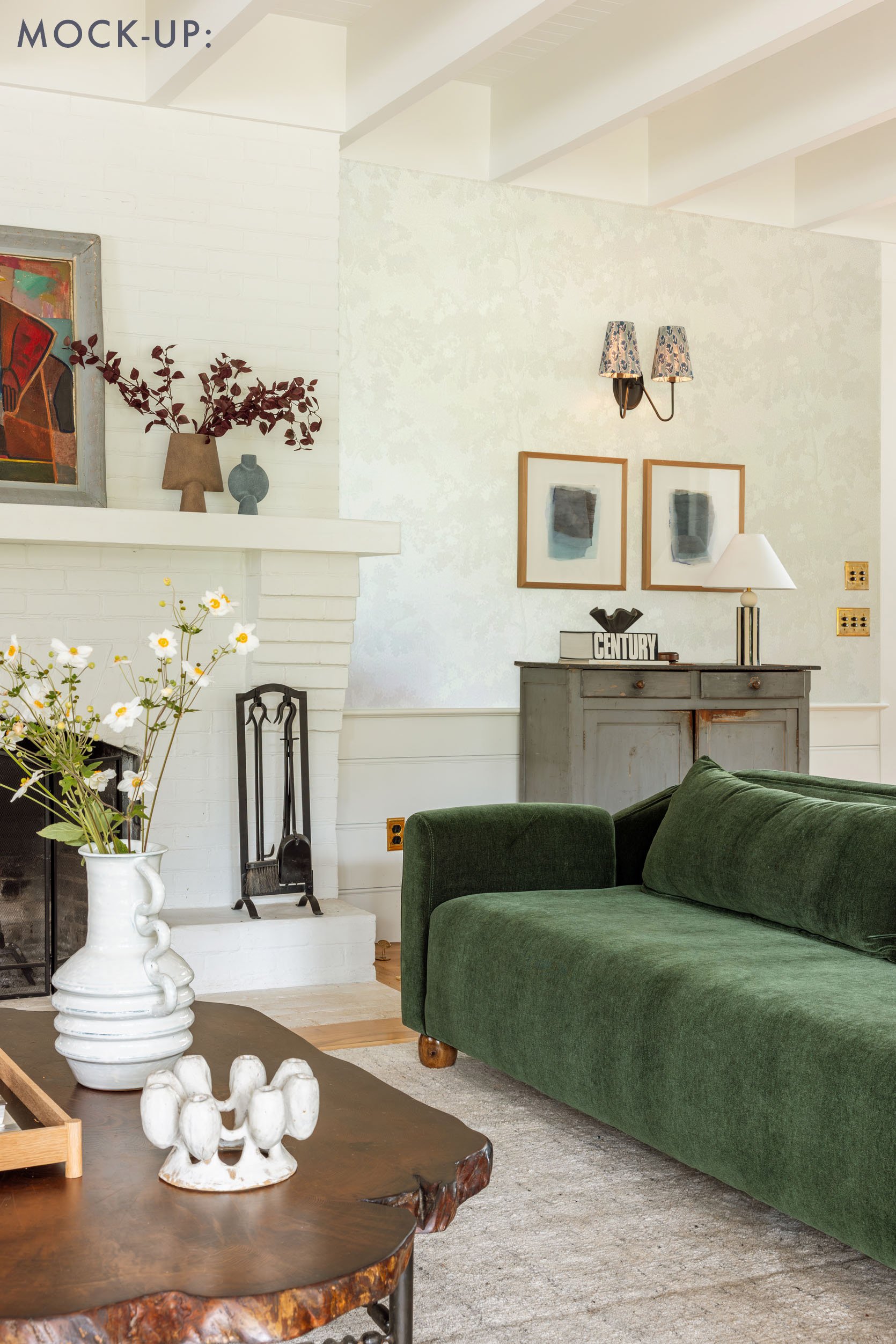
I DIY’d pleated lampshades!! Look at me! Of course, I did it on the weekend and didn’t shoot the process, but honestly, I just copied how Lone Fox did his and didn’t want to steal credit, so please watch his tutorial. It’s SO EASY. I used a stamped thin batik from Etsy that is so forgiving, meaning that these are not perfectly done at all, but you can’t tell. They don’t give as much light as the white shade, which we hope is fine in the winter, but meanwhile, I LOVE the more traditional pattern popping off the wall (but will make selecting a wallpaper slightly more challenging).
So, What Changes Do You Still Want To Make??
Ok here me out. Again, I recognize this is a great room but no, I have still not nailed it. Here is on my list to slowly tweak:
A Bigger Rug
This room always wanted a 12×15 rug. My RugsUSA collection didn’t come that big (I begged and begged and begged) and frankly very few rugs do. And I love a big Persian rug, but the colorway I want is so hard to find, and they aren’t nearly as cozy (and just so expensive). I sold my brother my OG 12×15 rug, which didn’t pop in here nearly as much as I wanted it to, and looks so much better in his house. A 12×15 rug would allow the full swivel chairs to be on it (we think). However, this current rug is the most cushy, comfortable, and forgiving rug on the planet (for being so light). I can’t link it because it was a one-off from the now-gone H.D. Buttercup, for $2k, which is not bad for a 10×14, but if I could link it, I would sell it all day, every day, because it’s famously the best rug I’ve ever had. I tried to recreate it with RugsUSA but they couldn’t figure out how to make it so cushy, to have so many different yarn colors, and stay within their standard price point. It’s like sitting on a cloud, and yet it doesn’t look like a shag (I also have a memory foam carpet pad underneath), and you can’t see any dog hair and barely even stains. So I’m hesitant to downgrade our comfort in the name of upgrading the design. But I’m so in love with this rug from Lulu and Georgia that does come in a 12×15, and I think could really punch up the room, so I might do it. We used it in my friend’s dining room, and it’s just an incredible colorway and pattern. It’s still forgiving but not as cushy (because no rug is, Brian and the kids are going to be so bummed if I change it). But then part of me is afraid of it being too bold. So Gretch mocked it up for you…
I also ordered a sample (3×5) of this rug (Arvin’s denim rug from his old collection) to see if it would do the trick and not add the busyness of the above pattern. It’s such a pretty color in person, but it’s a magnet for our dog fur, so I don’t think we can do it (but I was impressed with the color/texture). I bought the round version in camel for underneath the chaise since our dogs don’t really lay there (I’ll show you soon).
Adding Wallpaper Above The Paneling
If I could go back in time I would put the white/cream rafael wallpaper in here instead of the entry. Brian gave it a hard no at the time, which I didn’t understand then, but I kinda wish I had just steamrolled it. I know that it’s a popular paper, but it’s PERFECT for what I want (which is to still keep it light and airy, but give the walls some sort of definition). Remember that the room as a whole has so many openings/doorways/panelings that going high contrast would be SO BUSY, you have to trust me. Part of me says just put it up in here and re-paper the entry with something more bold since that tiny room can handle it. But I’ve ordered some more samples of subtle patterns that could work. Stay tuned.
Other Options: Darker Curtains Or Paint The Fireplace
Listen, I went safe with the curtains but they are custom and I really don’t want to replace them. They are really pretty, high quality, and nothing is wrong with them. But I wasn’t as in love with florals and tapestries as much as I am now, so if I could snap my fingers and have a patterned curtain/shade situation, I would, but for now I’m really trying to make the room work without changing them. For the fireplace, I really do want to do something to it, even if we redo the mantel. After we tiled Kaitlin’s fireplace, and it became such an incredible focal point, I got really jealous. I want this fireplace to be prettier, full stop. Oh, and I want to frame that painting on the mantel to be bigger and in a better frame, and hang it instead of leaning it.
Furniture To Add/Swap
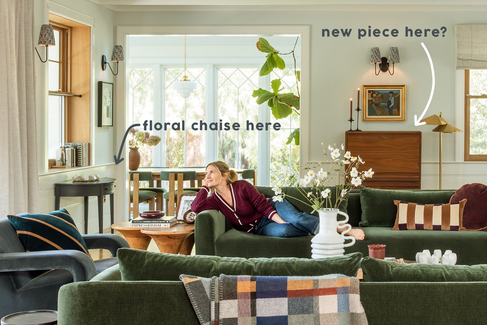
I brought back in the chaise lounge where the blue demilune table is in these photos, and LOVE IT. Will shoot/show you soon. I want a prettier cabinet where the midcentury one is (I like that piece, but found it on FBMP the weekend before the shoot). And I want to add a footstool for the swivel chairs (thinking of this one) as well as a prettier fireplace screen (our opening is huge, so it’s hard to find one that fits).
OMG. This has been quite the ramble. This room has been hard! It’s a pass-through room, open to three other rooms with multiple focal points, and needs to be highly functional (dining nook and lots of seating), so it’s just hard to nail. Its so lovely to be in right now, thus the lack of urgency but every weekend I spend hours thinking about it while I drink my coffee 🙂
*Photos by Kaitlin Green
As a major fan of the blue/green color scheme, I’m surprised at how much I prefer the version with the gold barrel chairs. Beautiful!
One thing I notice about velvet-upholstered furniture, seemingly more so than other fabrics, is puckering by the seams. A million years ago, when I dipped a toe in sewing, I was told that puckers are bad. A sign of improper thread tension, I think? I see a tiny bit of it in some of the product photos for your line and wonder about that.
Regarding a [minor] curtain update—you could add a bold trim to any of the edges [I would probably choose the leading edge of each panel, but there are different options]. Maybe figure out the fireplace and rug first, and then choose a trim that echoes the colors and/or forms found elsewhere in the room.
I’ve totally thought about the curtain trim, too! and in person i don’t see the puckers, maybe they are catching the light because its velvet? or maybe they are there but i’m just not noticing. xx
I don’t see any puckering on the velvet upholstery either but just FYI, sewing and upholstery are completely different, so it’s not a fair critique.
I love the draperies and might consider adding a trim to the borders, if after adding wallpaper and painting the fireplace, it’s still something you feel is missing.
The sofas and swivel chairs are beautiful, cozy and warm up the seating area!
I’d like to see a solid colored rug along with a painted fireplace, rather than the striped rug: it’d be more balanced (walls & floor) versus so much attention on the floor. Yes to wallpaper that brings some colors to the walls, but not too bold. This room seems to want more depth and richness (without going dark). Excited to see the evolution continue!
I think you need to paint the fireplace! You’ve agonised over it for years, and it wouldn’t be hard to change if you don’t like it. Do it before you do wallpaper, just to see, as it might change your wallpaper plans (and will be cheaper and quicker). How about a mid-tone rather than a really dark one, like a plum colour or a slate blue rather than a deep hunter green? For my two cents, the issue with this room is that all the bones of the room are light and a bit Scandi farmhouse – oak, white brick, pale pale walls and white wood panelling, but then you’ve added a warmer and more luxe palette in the furniture and the two aren’t blending enough yet. Something in the architecture needs more luxe to bring them together, and the sofas need some textures that aren’t velvet to bring in the smoother, more pared-back aesthetic of the rest of the room. Literally a sheepskin thrown on the sofa might help, they’re a block of saturated colour in the middle of a very white room. Then would you consider changing the back cushion on the nook with the table to a… Read more »
I think you are TOTALLY RIGHT. the lack of balance is what is driving me nuts!!! too white, too saturated – i’ve said the same thing over and over. Gretch and I talked yesterday and we are committed to painting the fireplace just to see – it will take one day and if its not the right tone, then we repaint the next day. we don’t need to do lime wash either, like lets just go for it. anyway, thanks for the comment – you said it better than I could.
Yes, Elle described the balance issue perfectly!
I keep wanting to see more traditional and English country house things in this room/house. more old things. a rich, vintage rug with deep red or brown tones would do wonders. something earthy. if you get a new piece for the wall, make it a vintage piece. how about the cupboard that’s in the carriage house? like, if the vibe is Scandi, a beautiful, old Scandinavian cabinet, maybe with painted embellishments. a tight palette is great, but then there needs to be textural and material variation. different fabrics, stone, old woods of varying colors.
I think the previous commenter was spot-on that there are some gradations missing in the room in terms of texture and materiality. like, it goes from soft, fuzzy, jewel-toned sofas to pure white brick, but there needs to be something else between those texturally and in palette. textiles to the rescue, prints. also some gradations in the age of things; not so much that is new and recently produced. makes it look a bit show-room-ish? I know that’s in a way what the house is, but making it funkier would add warmth and richness and life to it.
Yes I also crave some warmer tones here. I keep seeing the original fireplace as being an effortless and classic focal point that would anchor the room and tie things together if it were stripped back to the brick. Then you could parge it if you wanted to lighten it up. The fireplace is very classic and could add a lot of period charm if it were allowed to shine. no shade at all, but its almost the only original thing left in the room. I think replacing it with modern tile would look very dated very soon.
I agree with this. MIL is right that paint will make the fireplace look blocky, especially because the rest of the decor also leans color-blocky. Natural brick, even with a wash, would add texture instead, and it would work with the jewel tones.
we’ve totally thought about stripping it as well or even cladding over with reclaimed brick veneer (the really thin verson) to get the OG brick look…. both are quite a thing so we are thinking to paint it first…
YEP. I think you are right!!! more texture. I think i’m just so fearful of going too busy. if you could see the house right now (the day after a massive halloween AND christmas shoot) I think you’d understand why i’m afraid of adding MORE. But on a normal day it needs more, but on a busy week its so chaotic that i want to chuck all the bits and bobs into the dumpster (not really, but you all know what i mean when you are operating out of a little overwhelm). I”ve even thought that maybe two of the light blue barbs would work better in this current palette, but i’m loving these green sofas …
They are too low for me but the sofas are beautiful. The feet are killer. Your burgundy outfits look so great on the sofa and tone with the cushions on the Suz, which also look great btw.
The new rug would make the room too overwhelming for me with the abstract art, stripey cushions etc. Too jarring for the eye.
I don’t see a problem in having the same wallpaper in the entry as the living room. Is your reason because as a designer you need changing content, or is there something else wrong with having the paper in two places?
I’ve just bought a new upholstered bed and wanted cream to make more of a serene and larder feeling room, but for practicality I went with dark green velvet and now need to rethink to a cozy enveloping mood rather than simple and classic. I love velvet and agree that you can pile it on and still have it look great.
I guess it just feels like a missed opportunity to do the same paper in two distinct places next to eachother. like the entry could be more of a jewel box (but i love how the art works on the quieter paper in there). But maybe i’m overthinking it (shocking) and doing the same would look good?
Can’t you photoshop the fireplace to see what it looks like, like you did with the rug? It doesn’t even have to be a dark or strong colour.
Something earthy like a warm grey or even an off white might add a bit of shadow and dimension. I personally quite like dirty colours in amongst the brights you’ve got to provide some balance (I think that’s why the mustard chairs work).
I find looking at MISSONI pattern mixes and similar gives some really good colour combo ideas or I look closely at all the colours in something like this Schumacher fabric to see what colours off set the green.
Can see better here.
This room feels so balanced! the print on the chair pulls the green and light blue together. I think that is what is missing now in Emily’s room is a bridge between the modern shapes of the sofas and swivel chairs and the spare skandi look of the rest of the room.
My opinion is a bolder wallpaper in the family room that ties the styles together would make it look more intentional.
Lol I have a pillow with similar colors and used it to guide redoing our main living area.
OOh i love this idea. and yes we have photoshopped it but with too dark or too muddy colors so we could give it another go. but when you just photoshop the straight on shot you don’t get the context of the entire huge room (open to kitchen, open to sunroom, open to stairs, open to family room, open to entry) its just so open with so many other factors. but maybe we photoshop it on an angle instead so you get more context …
Ditto the Missoni patterns for color. It makes life so simple, let the Experts make the color combinations. Works for clothing colors too!
I, too, love your color scheme of green and blue and agree that one can never have too much velvet. The mustard color is striking but I think I would get tired of it quickly. A mustard vase or lamp would be enough for me. Paint the fireplace first and see if you like it. I think you’ll be happy you didn’t take the wallpaper route.
I LOVE the mustard chairs in this room. They pick up the wood tones in the room and make the whole space feel more cohesive. Also love the dark green sofas. Such a great shade of green.
Maybe upgrade the size and frame of your art above the fireplace first before painting/wallpapering. A larger, more dominant piece of art above the fireplace might be the focal point you want (probably not, lol!, but worth a shot).
Overall, love what you’ve done here. So beautiful!
The sofas are gorgeous and I like the mustard chairs more than the blue velvet chair. I think the room could use some pattern. A rug is a great way to do that, but I find those stripes too jarring. I agree with some of the other commenters that the furniture feels more modern than the architecture—adding a more traditional, patterned rug might help tie all of that in. It’s been fun to see how this room has changed!
I’ve thought about a persian rug for sure. my hesitation is that this one is unbelievably comfortable underfoot and persians aren’t (they are fine, though, its not a big deal we are jus spoiled by this). But certainly a vintage big persian rug would look stunning in here …
I love the gold chairs – swivels are so fun. One idea for the fireplace – would it be too nuts to paint just the mantel and the bricks that are supporting it (they look like steps/corbels – not sure if these have a name)? I’d choose a color like the stairs or something else that isn’t TOO bold but will add contrast. It’d also be way easier to paint over or extend the color if you decide you don’t like it! For me, I’m mostly missing the mantel itself popping – I’m not sure you need the whole fireplace section to be a color, per your MIL. Thanks for sharing, as always!
Came here to say the same thing! I was also wondering about just painting the mantel and the corbels instead of the whole fireplace or wall above. Perhaps a wood mantel would add warmth and not be too bold of a focalpoint.
Also curious how Gretchen mocked up the carpet? I would love a tutorial – very much in carpet indecision mode over hear.
One of the rug places makes it easy to see different rugs in your own space, probably where Em’s rugs were because I tried out a few of them. Turns out, I really like rugs with a border …
ooh interesting. I hadn’t thought about that. the mantel def needs some definition. I don’t want it to be too high contrast, but could be wood or something if the tone of the fireplace were a bit darker …
Stopped by comments to add the same thing about a wooden mantle – even matching the window & door moldings. Perhaps thicker than what you currently have? Add warmth texture and definition.
I too was thinking wood! Either wood mantle or – call me crazy – even scandi-esque wood paneling.
I’d love love love to see the fireplace stripped to its original brick! The texture and tone could be so pretty with everything else in the room!
Yes x1000!!
It’s such a beautiful space, and I love the sofas and especially the colour of the armchairs. I agree with other comments that there is a lot of velvet there now, especially as many (most?) of the throw cushions also look like velvet. I think mixing textures here would help a lot (and I do love a bit of satin for winter, reflects fire- and candle-light beautifully). Re the fireplace, I think you should just replace the mantle with a wood one. This would actually be very easy to mock up in real life by just “giftwrapping” the existing mantle in brown paper. But I think the real issue is the proportions of the seating area. I think the green sofas are too far apart, so they don’t really relate to each other conversationally, and feel very separated by the coffee table, which in turn is too far from either sofa to really be able to put a drink or a tray of afternoon tea on. I think the arrangement also suffers a bit from having so many passageways around and through it. Again, tightening the spacing between the sofas would at least eliminate the passageways between each sofa and… Read more »
OMG. i went through the U shaped idea 2 years ago – that was my first idea! i actually have the old one from Ken’s that we shot (from my line, but i tweaked it so now its just in storage). Could try it. but yes I think that could really work (I just didnt fine the right one and functionally we love the two facing each other. they really aren’t too far apart for conversation, but I hear you and maybe i coudl bring closer? I also love this: “and I do love a bit of satin for winter, reflects fire- and candle-light beautifully” – GREAT POINT
I love your three sofa idea! All the same, making a “pit” like you said but could still have a couple of side tables.
Can you just change the mantel to be a rich piece of wood? That seems to be what is missing for me. It doesnt have to be a dark tone. Also, I agree with someone else’s comment that adding mid tones to bridge the transition between the dark rich furniture and the pale walls would help. I also think the grey painted cabinet would look perfect in your 1850s house. I would love to have those swivel chairs. They really add function.
I had the same thought about a wood mantle!
YEP. i’d love to see one in here, too!
wood mantle for fun. I am procrastinating (can you tell? haha)
mantle
I love these posts where you are switching furniture around in your own home. I’d love to see a bedding post in your primary or guest room where you try out some different colorways.
I like the photoshopped rug A LOT. The swivel chairs seem super functional for a pass through space – I wonder if they could fit on the rug if all the furniture was moved slightly closer together?
Yah I think they could and that would be part of the desire to get a bigger rug …
I do love both iterations of your living room but I feel like I see YOU more in this one. It feels cozy and welcoming. It’s beautiful! All of it!
OMG those sofas are so cute! OK, here’s my unsolicited advice, because I totally feel all the design conundrums you’re having (and I have a lot of the same ones in my own home). Firstly, I think Brian is right, I don’t think the walls in there are asking for a pattern because there’s already so much going on architecturally with the beams, the sculptural ceiling fixture, multiple areas with different uses, and the windows/lighting. I think grasscloth of some sort would be really pretty though or some sort of pretty paneling that contrasts with the lower paneling (like beadbord or vertical shiplap). Your fireplace is SO pretty, but I would feel the same if I were you. Sometimes with clients I do an exercise where I think to myself “If this were literally in my house what would I do?” I think here I would drywall the brick above the mantel, wrap the mantel in some sort of pretty wood to make it look like a solid wood mantel, and do something to address the lower portion. I think what you’re responding to is that you want it to feel warmer, earthier, so as much as it would be… Read more »
yes, earthier, more grounded is a good way to put it. I’ve def thought about re-cladding it, but i haven’t thought about drywalling above the mantel which is very interesting….. I feel like I can nail other peoples living rooms so much better than my own!!!! WTF. so i often do the opposite – if this were a client what would I tell THEM to do and often the answer is right in front of me. maybe I need to do that more…
If you are interested in grasscloth, don’t even bother looking at “real” grasscloth. The color is always too inconsistent, the seams too obvious and the product too delicate to use IRL. There are so many top quality lookalikes to sample instead.
What if pulled one of the tones of blue from your kitchen tile for your walls – and just continued that throughout the room. And then the fireplace would be more of a focal color and stay white – and maybe bigger art over fireplace (I probably went too big but you get the idea!). Just ideas! Love your new furniture!!
Here is the fireplace
If you think paint would read too flat…you could also do a grasscloth wallpaper in that same tone from your tiles. Or even a creamy/white grasscloth to add texture and depth to walls. It would be an insane amount of wallpaper!!! however it could add some interest to your room without pattern. I know sometimes grasscloth can go beachy…but in your space I think it would just feel organic.
oh this is so much fun, thank you for doing that! I do think that the blue tile is such a pretty focal point that adding more blue might take away from it, but i coudl be wrong. and re grasscloth – we put up sample after sample and most looked dead and gray in here. but I really only tried the linen fabric from the Stark collection that I love in a light room, but looked dead in here so I could get grasscloth. I don’t LOVE the seams in grasscloth though (You couldn’t see them in the fabric). HELL now that i’m saying it maybe i try to put up fabric like Gretch did instead of wallpaper so we could DIY it (and so much easier to take down). …
Could be so fun to do fabric!! And like you said – less obvious seams! Might be a way to soften things up a bit. Don’t be afraid!!! You can always paint it right back to where it is now 🙂 So fun that you share your life and home with us! You have been an everyday part of my life for YEARS. And might I add – a favorite part of my life – always a little burst of design joy to look forward to each day. I have learned so much from you. THANK YOU! I am so grateful!
Ok last comment (promise). Do you remember those amazing Ralph Lauren paint brochures from the 90s? They had different paint finishes and techniques. If you wanted to avoid wallpaper seams you could try (if you dare haha) to do a paint finish. Google or search Pinterest for Ralph Lauren Indigo Technique. I’ve been too timid to try (as we all remember sponge or feather painting from the 90s OOOOF), but if done well could be so simple and stunning!
Grasscloth 🙂
Grasscloth
Grasscloth (kitchen view)
oh that does look pretty ….
One more bc it really does look pretty
dining nook
I think this is perfect -pulls in the missing mid-tones!
Neutral grasscloth
I agree with pulling the blue from the tile into the living room. I wouldn’t necessarily go the wall paint route, but perhaps mixing in a pattern/rug/art piece that echoes that blue. And also: Too. Many. Geometric. Patterns. Going. On.
If you do the bold striped rug, the more delicate wallpaper pattern really does not have the same vibe…I think do one or the other. Also please, please, please get a wood mantle first before doing anything more drastic to the fireplace!!
I like your suggestions, as this is what feels cold and off for me as well, the wall colour. I would change that, leave the fireplace as is and add a gorgeous, huge rug in warm coordinated tones.
I think the functionality of the ochre swivel chairs is great–to be able to swivel around and look out at the yard is really nice! Are there places to be able to set down your coffee without getting up to use the coffee table? Maybe you could put an ottoman height table in between the chairs that can be used as a footstool with the chair when facing the glass doors?
Have you mocked up (photoshopped) the fireplace a different color (I feel like you have)? Maybe try the same wall color, but a couple of shades darker?
I’m ordering an ottoman for it, but we can’t put a table in between without it being knocked over. so I have a drink table near the sofa and the cocktail table near the other sofa, but its not ideal for sure. and yes we photoshopped them but we just relooked at them and none are the right color, but maybe we should just choose new colors 🙂
What happens to the “old” sofas now that you have new ones?
We are selling them. we have one person coming next week for one of them but we have one more to sell if anyone is interested ($1k each). quite the steal and I kind of want to hoard them for another project but they are in good enough condition that someone else could enjoy them and storage is always dodgy. but with our dogs being how they are I think they aren’t going to work for us.
I commented on an earlier post that hinted at the new living room reveal – I’m interested in the sofa! I’m the person that ran into you the other week in NE 🙂
I had the same concern as your MIL about painting the fireplace! I agree with previous commentors that what is missing is mid-tones and varied textures to bring gradation to the room.
Maybe a mid-toned rug and/or a mid-toned, visually textured wallpaper?
Two chairs looks much better and intentional than one random chair. I am not crazy about a chair by the sunroom and the chaise sounds like it would block traffic even more. Since your coffee table is live-edge and it isn’t centered over the legs, the strong geometry of the rug is really going to show that the coffee table can’t be centered between the sofas (because either the top has to be centered or the base but it’s impossible for both parts of the coffee table to be centered).
Hmm. the coffee table is centered over the legs as far as I can tell. interesting! I’ll take a pic of the chaise once we get the rug over there. i love it 🙂
I think the new furniture looks great and love the green and gold combo. I can’t remember what your fireplace mantel is made of, but could you swap it out for a big solid piece of wood- ideally something that is or looks old and reclaimed? The white overall doesn’t bother me for the fireplace or the paneling, but I am excited to see the wallpaper samples. I would love to see how a small busy floral pattern in something darker/ higher contrast to the white would look.
I love the idea of a floral in mid tones but the amount of starts and stops would make it so high contrasty. there are literally 9 openings so just feels so choppy!
If the wallpaper is low contrast it wouldn’t have to feel that way. I’ve been in favor of seeing wallpaper as part of this room since the beginning. Something along the lines of a Morris and Co. Oak and Blossom or Marigold or Apple in blues/greens would be lovely and bring in more of a mid-tone but subtle. Pics below.
Oak and Blossom
Marigold by Morris and Co in Artichoke
Apple by Morris and Co in Bay Leaf
Love these posts about tweaking things over time!
Not that you asked, but to me the wall color has never looked quite right in there. Maybe it’s better in person, but in photos it reads as too-light pastel when all the other colors in your house have more depth. The right subtle wallpaper could be lovely but maybe so would painting the drywall the same white as the paneling?
the wall color is like fine, but agreed – its never been ‘we nailed it’. but without a clear alternative i haven’t anything about it. 🙂
I really love this new version, which just fits my particular aesthetic. I do think there’s some danger in getting busy with too many “design moments”, but if the artist (you) can’t enjoy and play with her own durn home, what’s the point? My Mom was a painter and it was a running joke that we never knew where the furniture would be when we got home, she moved things around so often. Have fun, and thanks for sharing!
I definitely think a wallpaper like that is the way to go, and then you can decide on the fireplace after that. I saw someone saw a big wooden mantle, and that might be all you need. Or maybe a slightly warmer white/cream that you pull from the new wallpaper. Those gold chairs are to die for in the room! Everything is looking so good
Agree with you…wood mantle and a subtle cream paint on the bricks.
Thank you! thats one for wallpaper!!!
The first thing I noticed in the mock-up was how nicely the stepped brick of the fireplace continues the stripe in the rug.
the bold Lulu & Georgia rug is what you need. I repeat, the bold Lulu & Georgia rug is what you need. it feels like you won’t need paint, wallpaper, or change curtains if you get that rug — it just ties everything together so well and brings warmth with modernity!
I like your confidence and I wish I shared it!!! I LOVE that rug so much just fear it would be too high contrast, or hell, maybe its ABSOLUTELY PERFECT.
As someone who also has a blue/green room with mustard accents I love those swivel chairs! I also seem to be in the minority since I love the room basically “as is”. I like the way the fireplace is an accent rather than a darker focal point, and I also like the curtains. They keep to themselves, like hanging introverts, and allow the wood windows to really show off. It’s a terrific room!
well thank you 🙂 I really like the room as-is, just not in the ‘omg nailed it’ phase which i’m not stressed about but sure if fun to figure out why/how.
Yes! I agree with you! Imagine only changing the print to something large and whimsical – think one large Marimekko flower. Something as heavy and bold and solid as the furniture.
Such an amazing home!
I personally love your fireplace as is, but I get where you’re coming from. If anything, I would consider doing the mantle in a pretty wood, to break up the white. OR tile the top half in some amazing textural tile. (or even just find a few really special tiles for under the mantle. It would be appropriate for a farmhouse and sweet, but perhaps not bold enough for what you’re wanting.) Either way, my vote is more texture.
What is the focal point of this room? The upholstered furniture? The art? The striped pillows and throws and accessories? The fireplace? The focal point needs to be defined and the rest of the room must support it.
Agree. It’s a big, pass-through room that probably doesn’t seem like it has an overabundance of stuff when you’re in it, but in photos the many colors, textiles, lamps, side/end tables and knick-knacks seem to be fighting for attention with each other. The most visually jarring things to me are items that seem too dark/thin/wiry/small for the spaces they’re in (the main light fixtures, fireplace screen, demilune table, farmhouse cabinet).
Bigger, more sculptural items with cleaner lines in warm wood tones + a wooden mantel could do a lot to help ground the room.
I love all the ideas! What I think is missing are the “mid-tone ” colors. Someone did a mock up of blue grass-cloth wallpaper and I thought it looks perfect! 1/2 way between the darker colors of the furniture and the white in the room!
Love the mustard chairs! I think what’s missing is something to draw the eye up. Like a larger painting on the mantle or a larger cupboard where the brown one is now. Good luck!
This post was really fun to read. I love drinking coffee and daydreaming about my rooms!
So obviously this is a beautiful room, but since you are open to ideas to take it from “good’ to “great”…. I think the issue—and the reason why the mocked-up larger mantel art and busier rug make the room really sing—is that the architecture of the room (its openness) means the furniture feels a bit like its floating in space. The stark white of the fireplace, pale wall color, and the relatively flat tone of the grayish rug add to that. I’d say the three things that will really make an impact (without any labor at all) are a rug like the Lulu and Georgia one; a larger, more defined piece of art on the mantel (think the portrait in your brother’s lake house dining room, but in colors more in tune with your room); and a different light fixture. The fixture you have now is lovely and I had a very similar piece in my old house, but the furnishings of this room are starting to lean in a very different direction (more granny trad, which I say with love), and I think a denser, less angular ceiling fixture will really hold the space in the center of the… Read more »
Agree that the light fixture errs too modern but I’d be curious to see how a wood or fabric (drum?) chandelier would look as well. Give the teak midcentury cabinet more company!
+1 to Maya, I am surprised how much I like the gold swivel chairs. I am a huge fan of your streamlined green/blue scheme, overall. It’s gorg!
I really think a different paint color (or wallpaper, as you’re considering) would make this space come together better. I like the paint that’s there, objectively, but it’s always looked too airy/cool compared to the rest of the elements in the room.
The fireplace could be a light/mid tonal taupe to give it dimension but not overpower. You don’t need to do some major contrast-y shade – anything but white could make it pop more!
Hard yes on that striped rug. Huge difference and not at all “too much”.
What fun! That wallpaper mock-up felt gooooood. Big crush style smitten with your DIY pleated floral lamp shades -nicely done. Peeks like these into your thought process remind me of your early day blog posts when you would break down Secrets From a Stylist episodes -I always learn so much. Lastly, those Alice sofas are d e l i c i o u s !!! I am mid process between asbestos abatement and mold remediation unsure of what portion of my furnishings might need to be replaced and the Alice sofa sits atop my favorites to daydream about. Except… except, there are so few images of anyone actually sitting. on. them. ! I was so pleased to see the images in today’s post but it got me thinking: What do you think about doing a post similar to ‘swimsuits for all body types’ that showcases multiple people of various heights in the same 5 sitting positions + 1 prone on your lovely Alice sofa..? Cool social media content possibilities abound : )
Does the velvet fade in the sunlight? I have the Article Sven sofa in velvet and it’s faded so much in the sunlight in the 8 years that I’ve had it. I need to replace and the Alice is my top choice!
Follow-up question: there’s so little info about the sofa fabric on the Wayfair website or in this post. Why is that?
Beautiful iteration! Home takes time and I love your description of knowing when its good vs you nailed it. LOVE the ochre chairs! I’m against the grain in that I didn’t like any of the painted fireplace mockups. I also don’t particularly love the white but it feels too chunky to have a darker color.
The feel of your Portland home is lovely, and has such a stylish and comfortable vibe. Definitely a room where one would love to hang out, read, or even nap! Would you mind sharing the height of those oval cylinder sofa legs? I love the chunky look and it’s the perfect height. I’m switching out my sofa’s legs for something taller, and am trying to figure out what is an appropriate height. The seat height is currently too low at 13.75″.
Wayfair says: Leg Height – Top to Bottom 3” H
Can you remove/blast away the tiered brickwork around the fireplace, just below the mantle shelf? Then how about tiling the entire fireplace surround, the left and right hand sections and the whole length of the brickwork beneath the shelf, including the two little bench areas on the floor to the left and right? How about a zellig tile in a milky, pale, teal or pale blue.
What about a limewash paint on the fireplace rather than regular paint? Bauwerk is a popular one in the UK, but I’m sure there are equivalents in the US. It would provide colour and contrast, but in a more textured and subtle way than paint.
Please make the fireplace special again! I like letting materials just be themselves so I like unpainted brick but if you don’t, please paint darker! When I saw the pictures I was craving dark rug and darker fireplace but that’s just me. It just feels wrong. But totally get that you like bright whites and it’s your house!
I love the Otti rug mockup and actually think it makes the fireplace pop more because it’s a plan color in relation to the pattern.
I’m mostly a lurker here, but want to chime in and say how much I enjoy these process posts and the comments that come with them. It’s interesting to hear everyone’s thoughts. It’s great that you keep tinkering!
ps. I vote for the rug, a wooden mantle and a larger piece of art.
Great post. Thanks for the update. Things change. I know the feeling of a room just not being quite right. This post inspires me to listen to my gut.
This furniture really is such an improvement- the whole look is so much more cohesive. Amazing! And I agree, the gold (ochre? mustard?) chairs are the way to go. Regarding, the Lulu rug, the mock-up looks better than I imagined it would, but when I looked closely at the rug on the staircase and thought about everything else in the room, I came to back to my first instinct, which is a hard no. You already have a lot of drama going on here- that rug would be overkill. Just my humble opinion- it’s your house, obviously. I’m with everyone who says find a way to restore the brick to its natural color.
Brava, Emily! Thank you so much for sharing your adventure of making this challenging room a *chefs kiss.* I LOVE THE ochre chairs! I could envision your fireplace painted the slightly darker color in the wallpaper you mocked up, and the mantle wrapped in wood. It’s a minor change that I think would make the fireplace fit in a bit more. Of note: I used to have swivel chairs that were half on/half off a rug and with “wobble wedges” they worked perfectly. I would also move your martini table to between the two chairs. This room is on its way to NAILING IT. Keep going!
I think replacing the grey cabinet with something in a rich natural wood finish would help balance things.
Also the couches really are beautiful! Well done!
This post is a great candidate for those “before/ after” / comparison sliders!
Realy very nice.