Design
Our Farmhouse Christmases – Has It Been Four Years??
I know that most of you today are scrambling towards the finish line and likely not here to read a long post. Hang in there. We are so close to the most magical week of the year – the days between Christmas and New Year’s, where the world goes quiet, and the high expectations are over. It’s a collective sigh and snuggle. So today is a quick progression of the holidays over the year. Perhaps it can remind you that decorating takes time, that you have to be in the mood to do it (I wasn’t in 2022), and that the internet is a rabbit hole of ideas that I promise you, you don’t need to do unless you want to. A big part of my job is to literally decorate my house and I have a team to help, so if you are any sort of comparison cycle (I get in to those, too) know that this isn’t normal and certainly not “effortless” (we are done with that word!) but maybe it can distract you or inspire you depending on what you need today. So here is the farmhouse throughout the years…
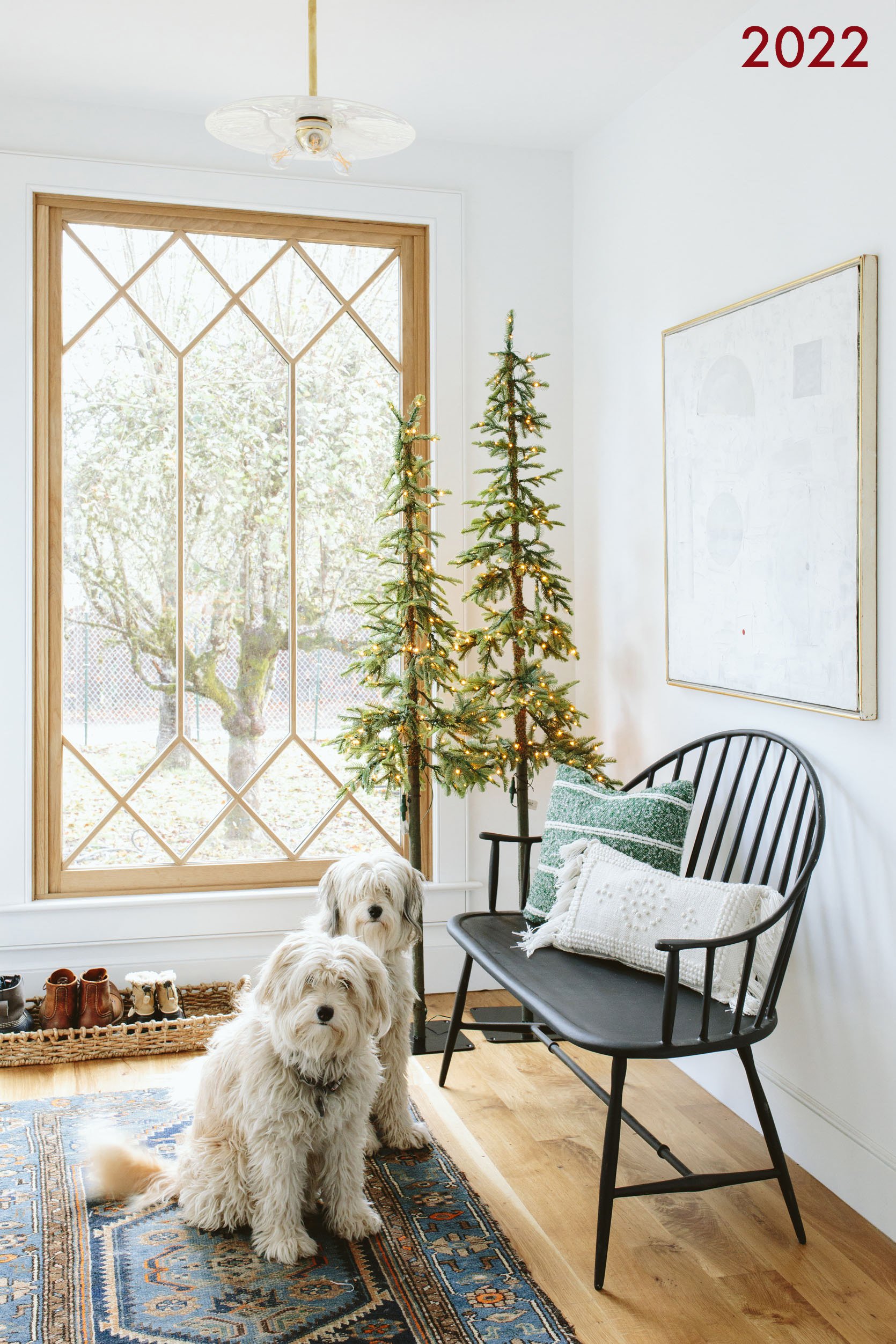
In 2022, we had just moved in (In August), and I just couldn’t get there with the holiday decor, but I did my best to add some bits of joy around. Seeing this post is fun because you can really see the evolution of the layers.

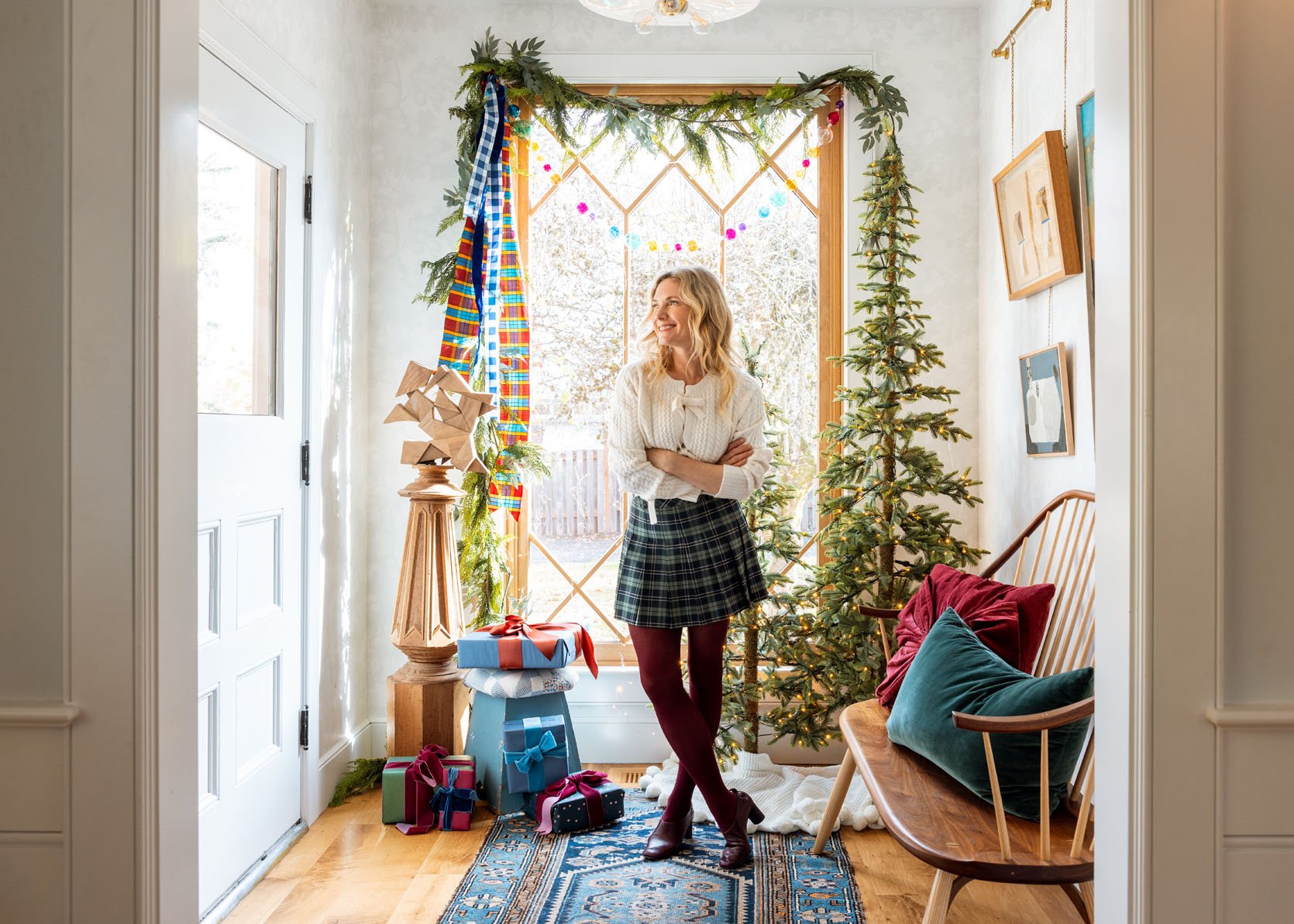
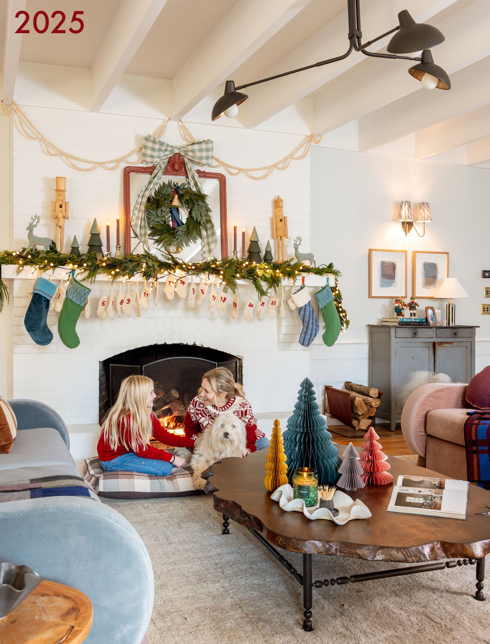
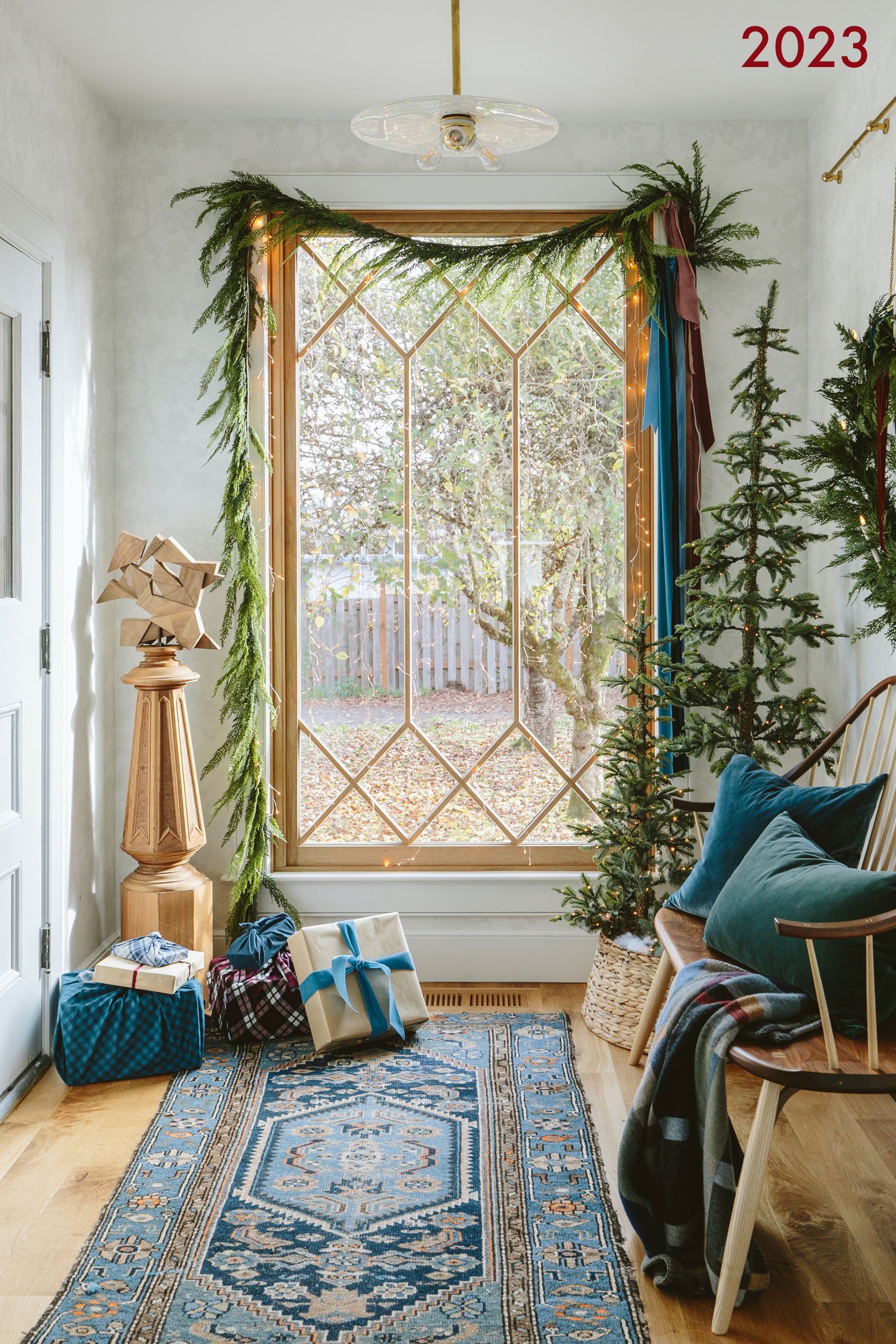
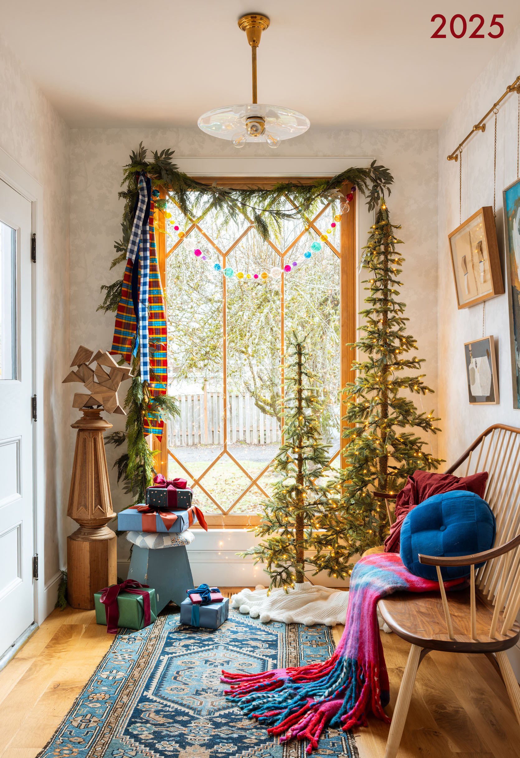
I LOVE this entry so much, and I finally felt like it got its moment in this shoot. We didn’t change a thing for 2024, so we didn’t shoot it, but then this year I added another layer or two.

…And I’m obsessed. I think the punch of the red in the throw and pillow, the glass bauble garland, and the plaid silk dupioni fabric just make it all come alive. I also think that we shot it later in the day, where the light was warmer, and I love it so much more. Kaitlin, you are a dream!
This is certainly more minimal but sweet (if not cold). This was before our house was furnished, so I kinda just put things in places for now.

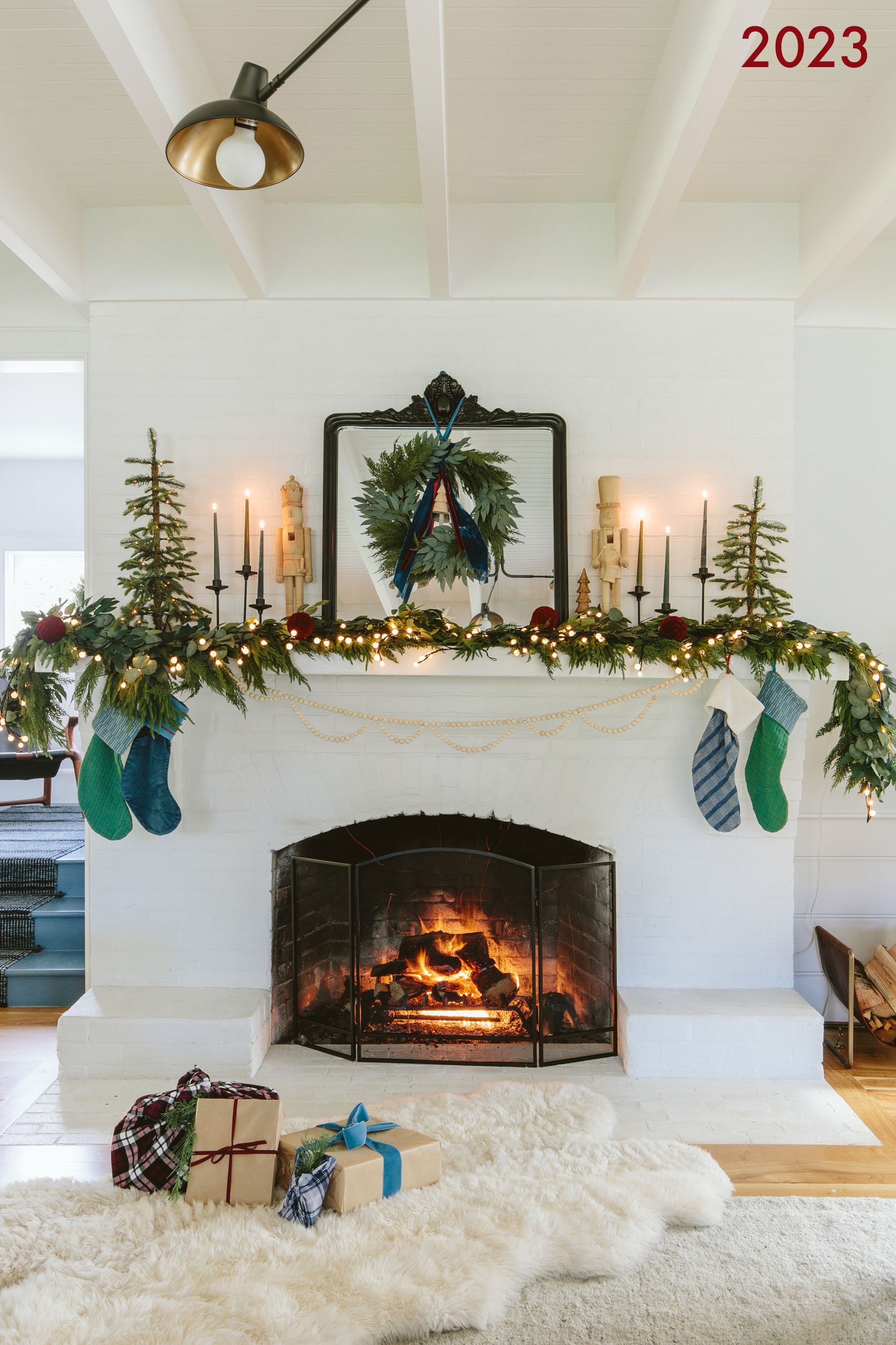
GAH! I’m just now remembering that I have those awesome Schoolhouse stackable candles (similar) in the prop garage. Going to snag them today. This vignette was also sweet, but not really my favorite (that awesome French antique piece I got at Round Top just looked like a side of the road find over here, and I don’t know why!).
This year, we didn’t shoot that vignette on its own (it was cute, but not really worth the time). But you can see that I added lit greenery and some white villages.
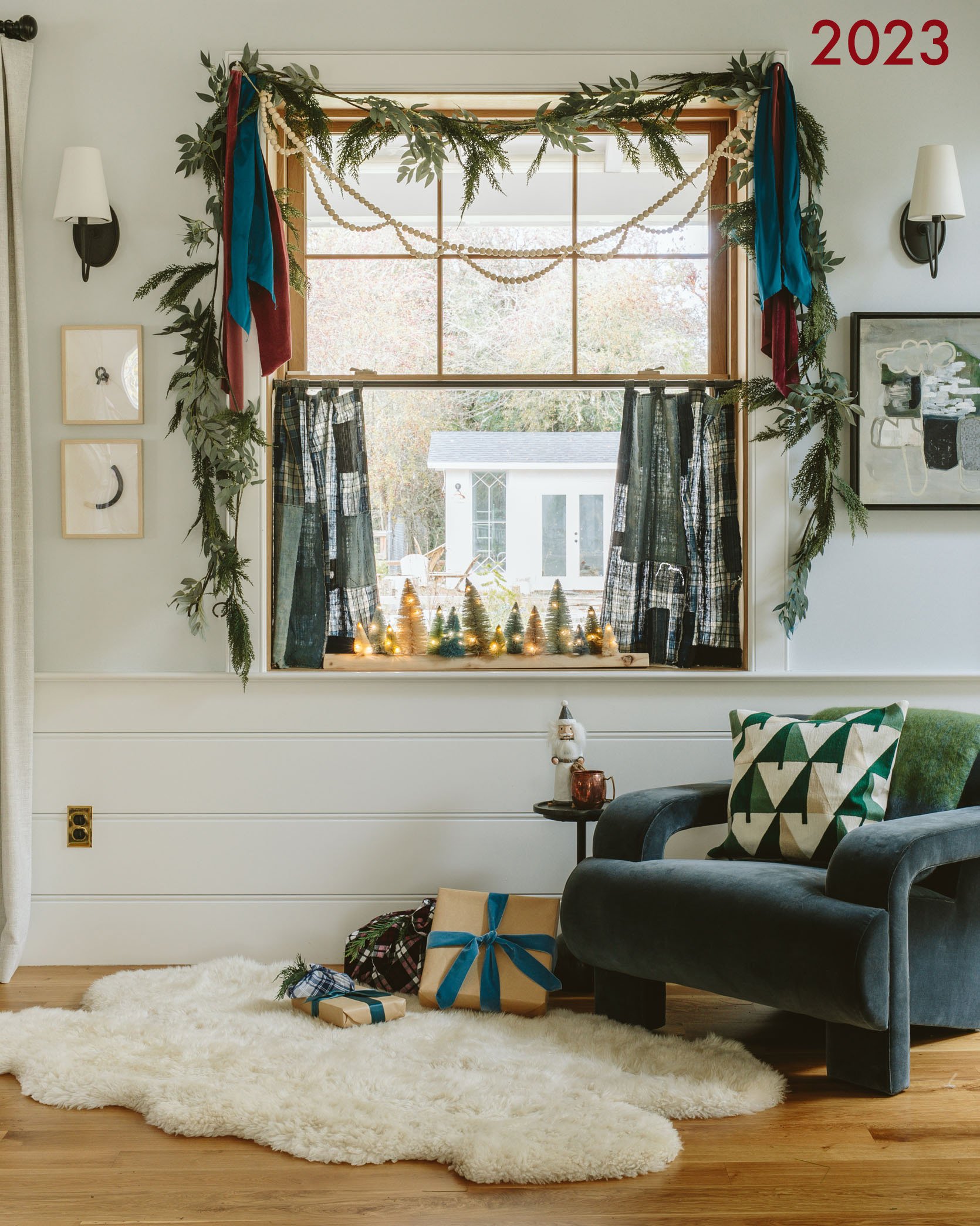
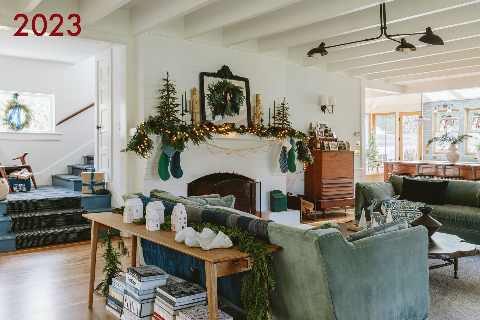
I really loved this vignette and shot (and still do). I think I miss the boro fabric cafe curtain, but I also love how we did it this year:
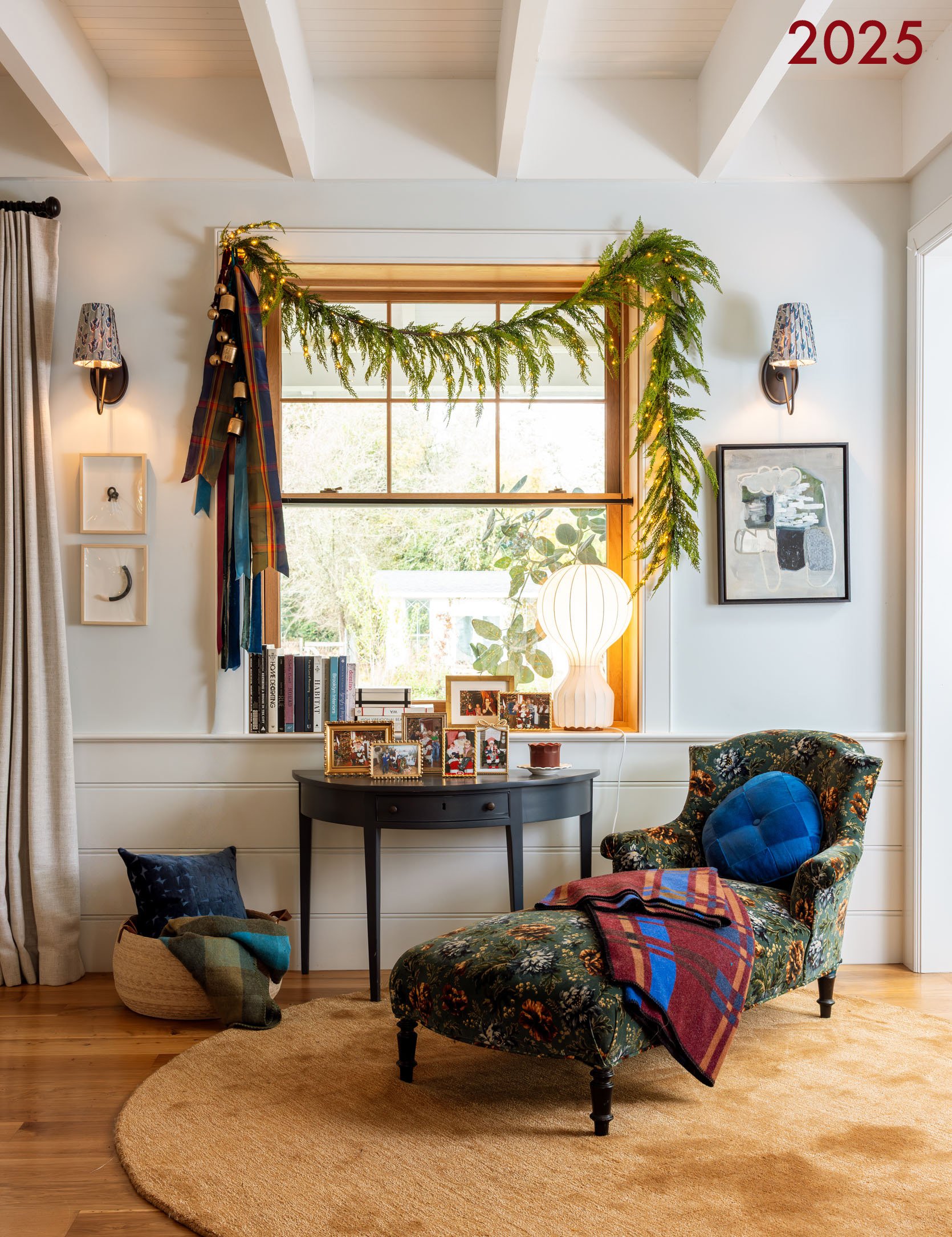
There is something about the shot above that feels more intimate, but I think it’s just a tighter angle. I LOVE this chaise, rug, and Santa photo collection here. It’s certainly more “stuff” which I originally intended to have NONE of in this house (LOLOLOLOLOL) but turns out I like “stuff”, y’all.
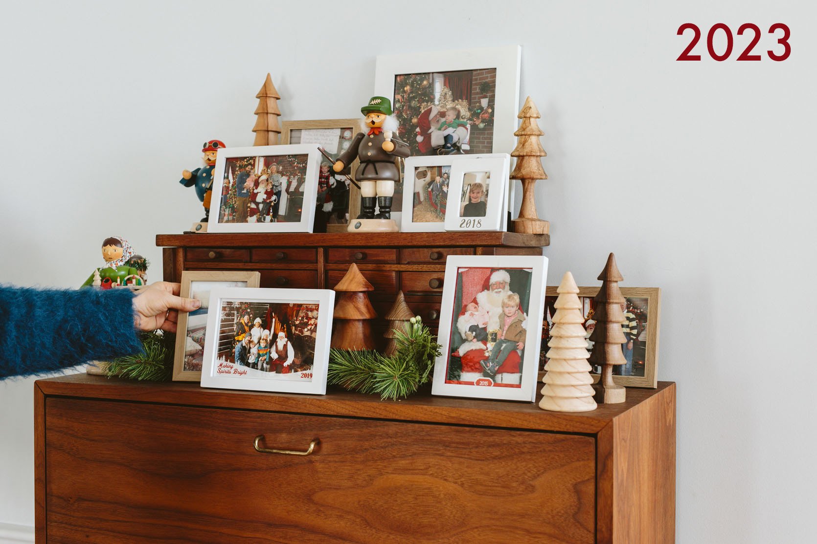
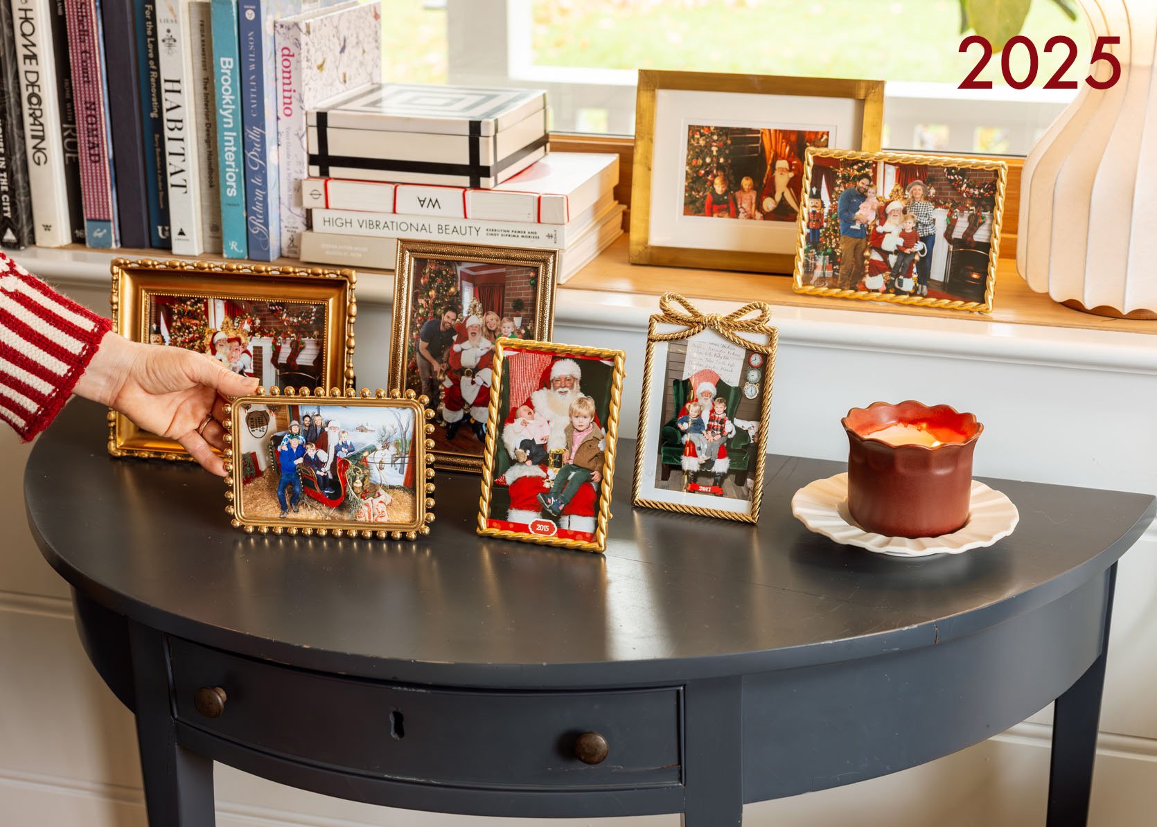
In 2023 (and last year), I had our Santa photos all on this piece, but I love them in the gold frames more (they started in white frames at the mountain house, which worked well there).
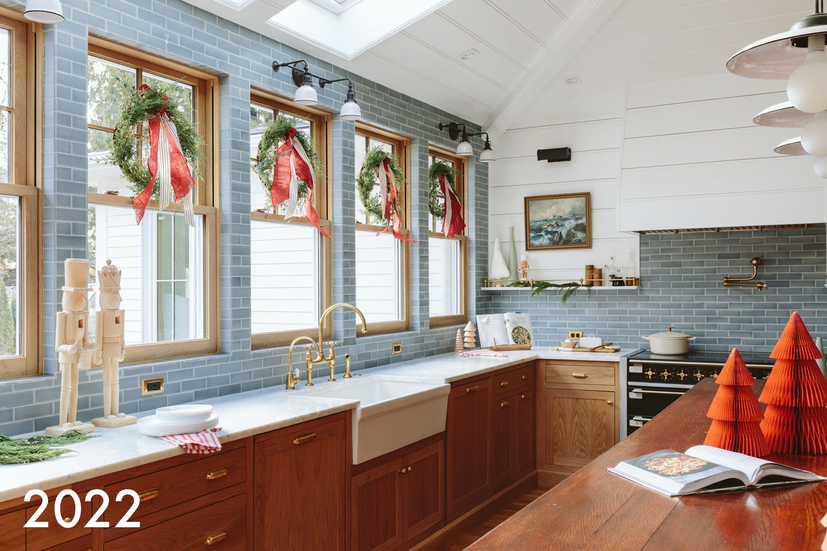
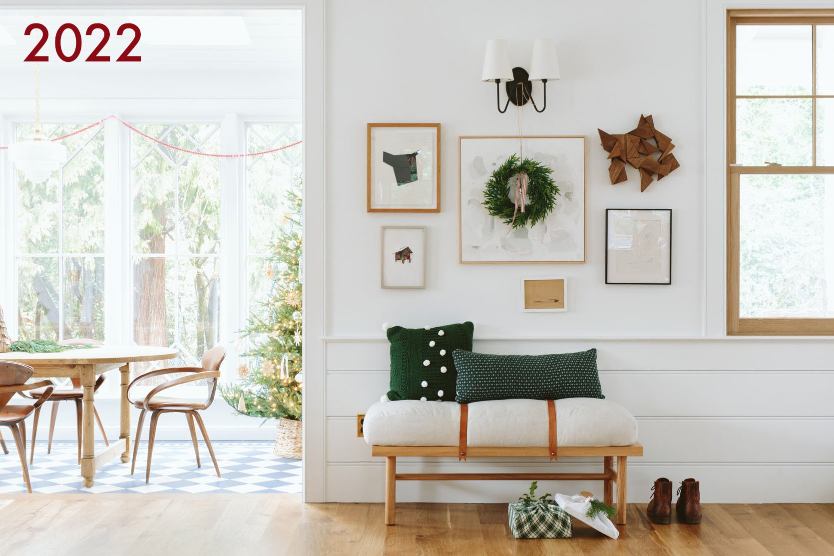
Year one Christmas here didn’t feel as “me” as I wanted in the kitchen, and yet I look back here, and it’s still really pretty. It’s on the more minimal side (for the internet, this is ample for normal people).
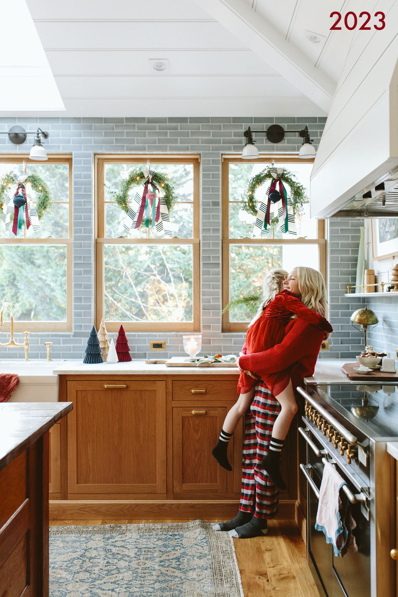
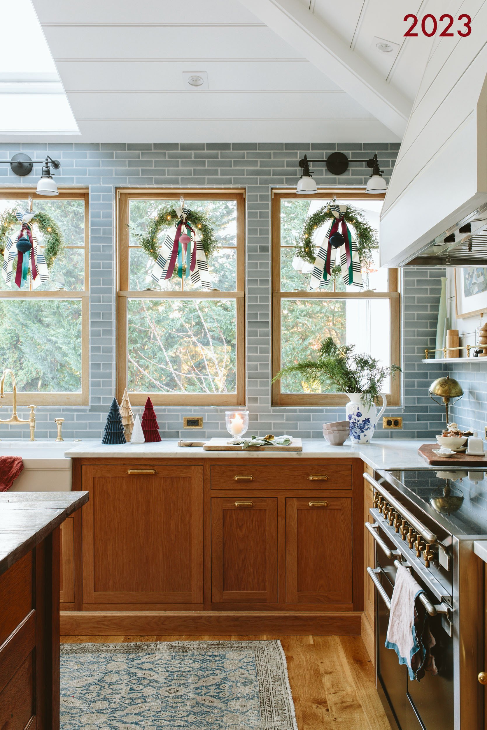
The next year, I made it a bit more “me” and I really loved that ribbon combo and colors.
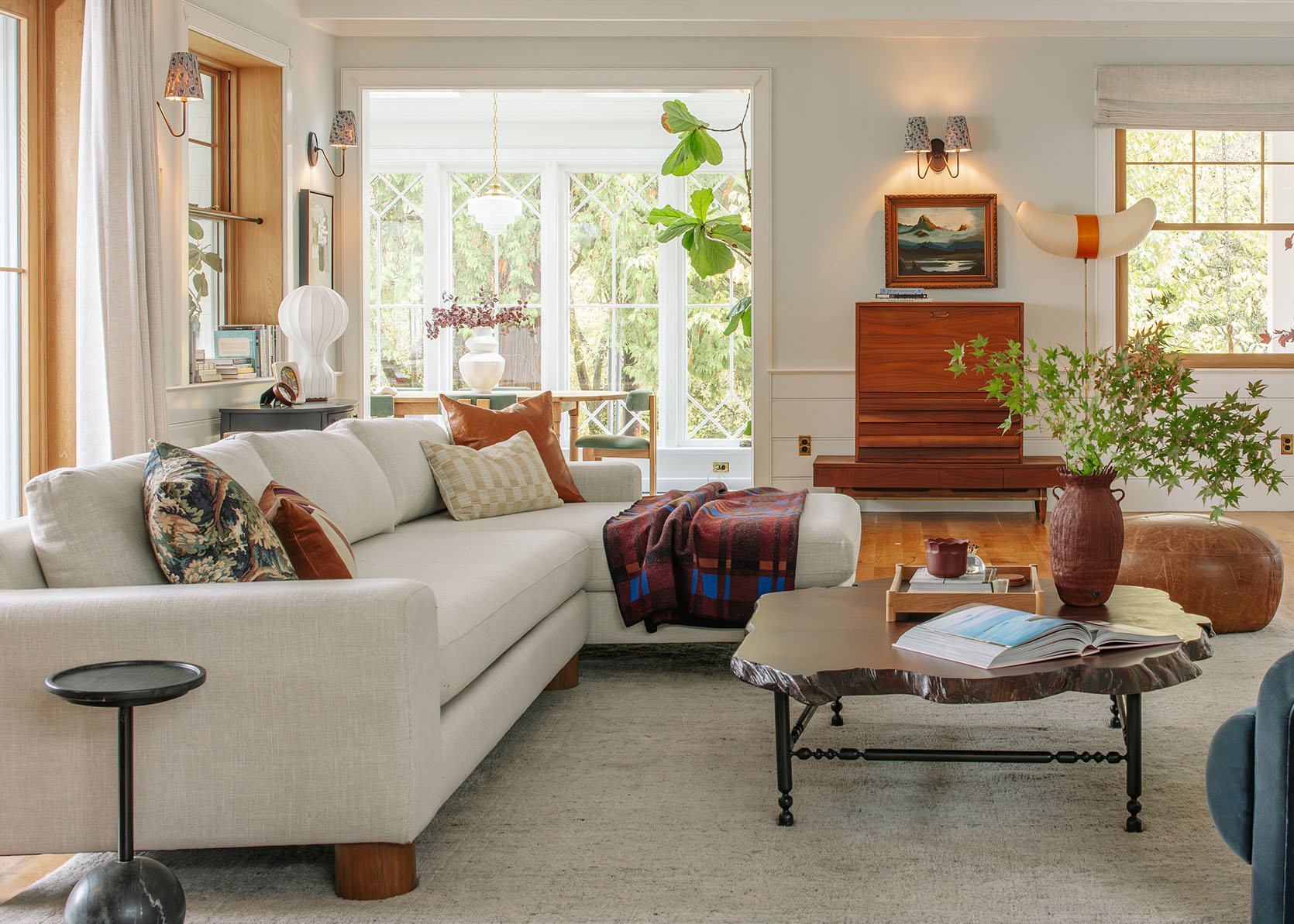
We didn’t shoot the kitchen this year, but you can see it in the background. The cafe curtains certainly add warmth. Gosh, I really love this color palette with the sofas! We switched them to our Green Alice’s for the holiday magazine shoot we just did, and it also looks good, but I think I love the lightness and soft colors of these sofas more.
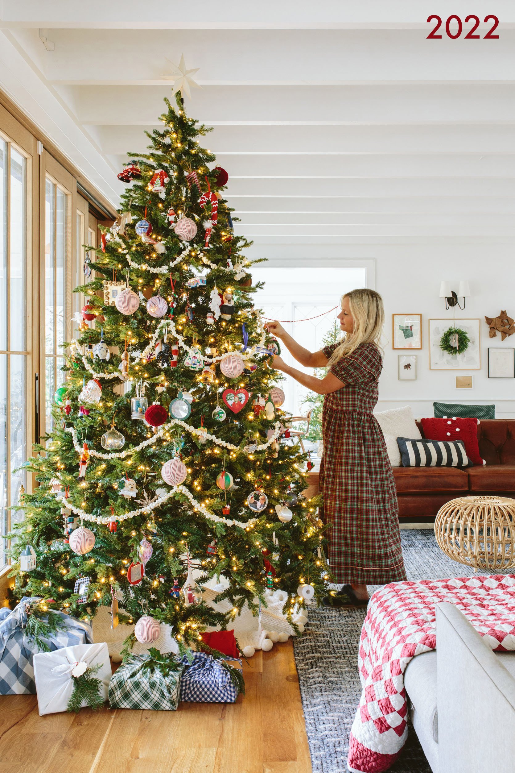
In 2022, we had more placeholder furniture, and it looked sweet for sure. Also, the popcorn garland took hours and hours (and we had to cheat most of it for this shot). Paper chains for the win 🙂
I still can’t decide between this more bare, Scandinavian-style tree or the fuller one that we used in 2022 and this year (same tree). Brian prefers the fuller one, but the lights are a little cooler. I think I prefer the more Scandi one, but I can see that it might be more bare? Both are pretty great, though. It’s just a style preference.
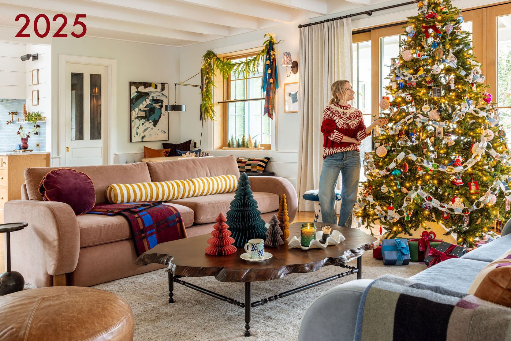
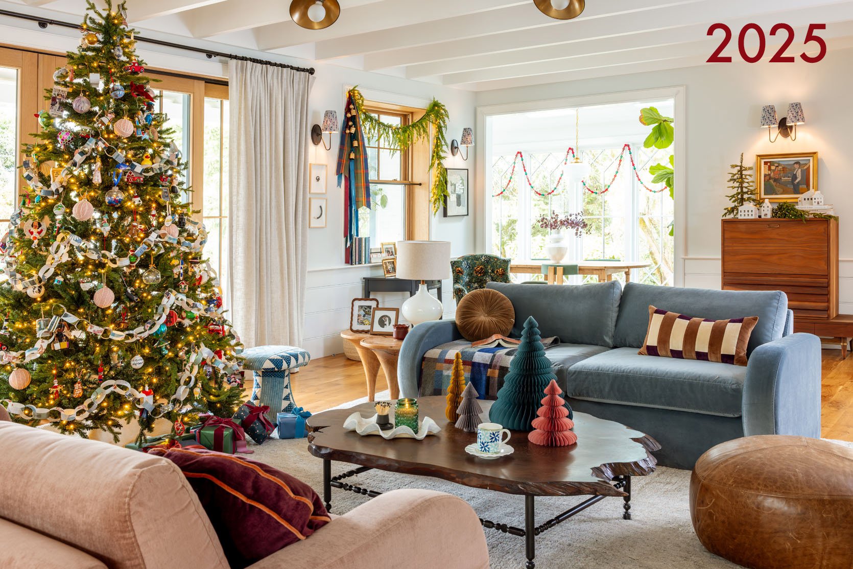
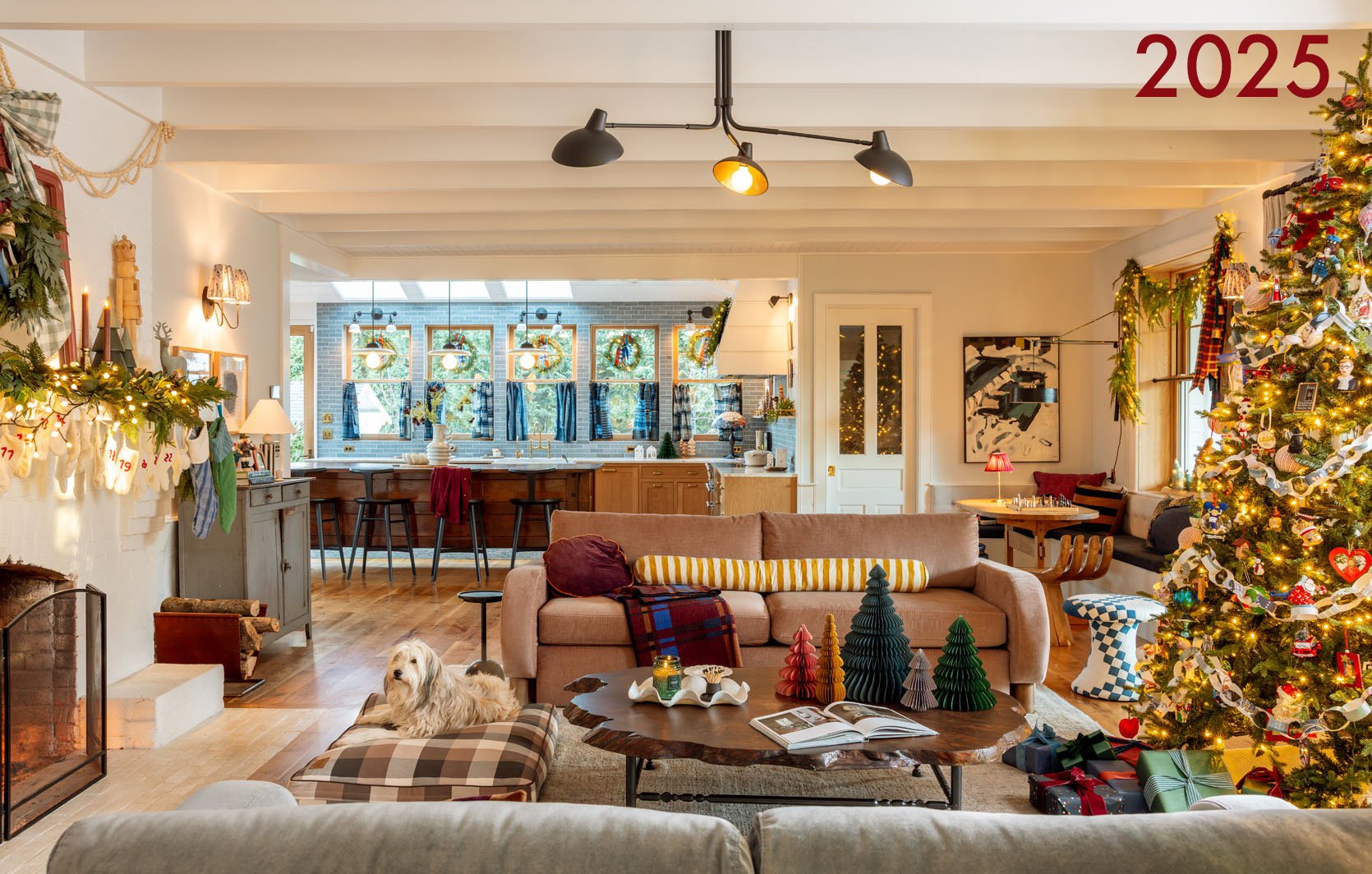
Admittedly, 2025 looks warmer, a bit happier, which might be that it’s just more layered, a warmer glow with warmer colors. There is a lot more color variation and texture, which I love.
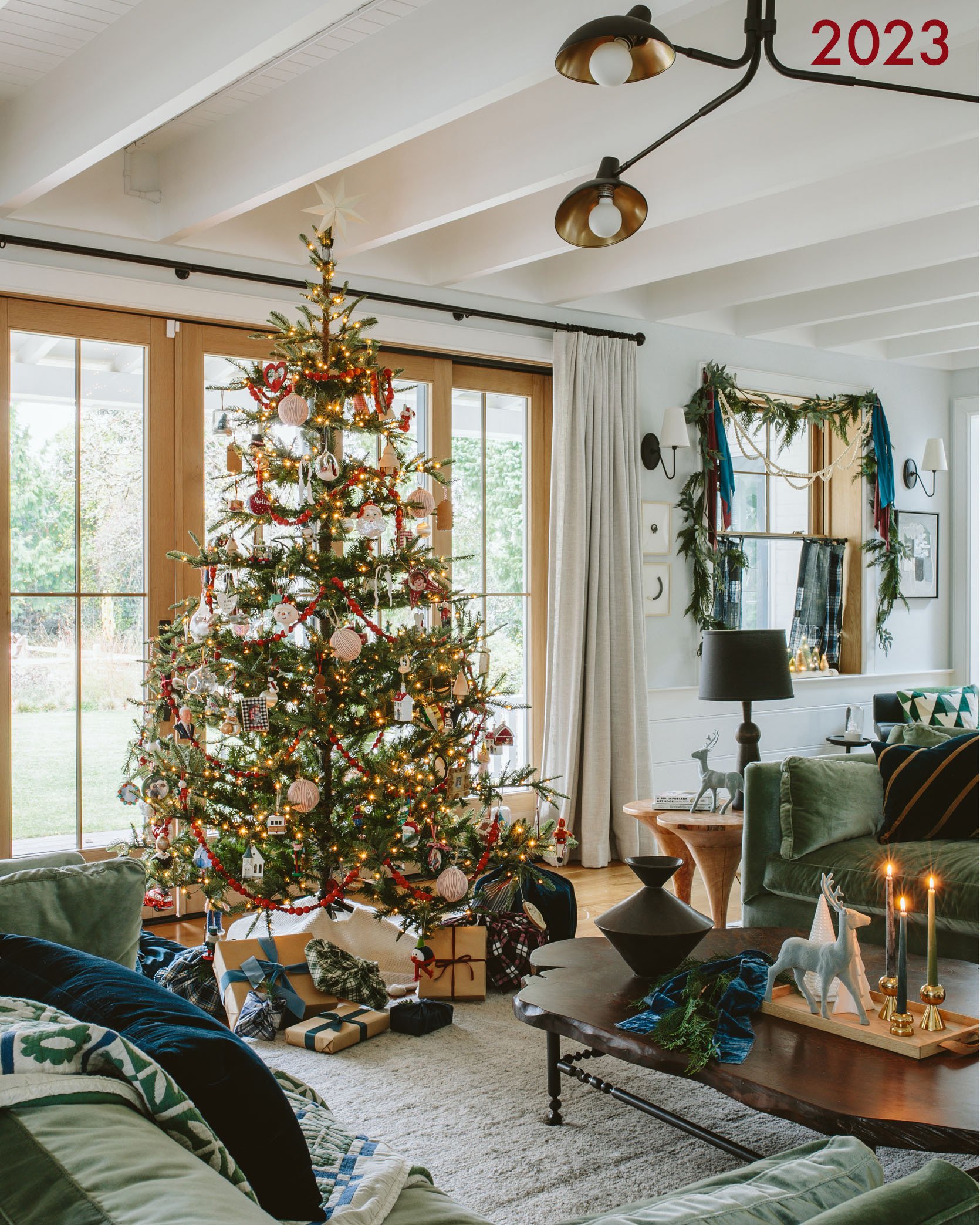
2022 looks a bit sad here, but it was also fine! 2023 looks more filled out, for sure, and yet…
There we go!! I mean, I thought it would look too “extra” because we just kept layering and layering, but nope. Just looks happy, playful, and warm.
2023 (and 2024) was really layered, too, but with way less warm tones and warm light, so it indeed felt colder. Especially when you compare it to…
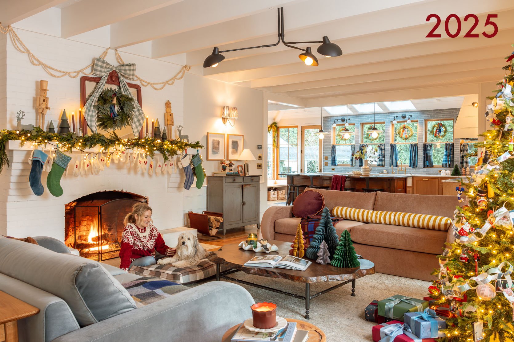
We shot this later in the day, so we had to turn the lights on, and while this is typically a photo faux pas, I’m so into it (and I believe the trend is changing). Maybe it’s the fire and the pup 🙂


I hope you enjoyed a quick little memory lane tour. For me, it’s clear how I was feeling mentally every year:) It’s also clear that more layering is the way to go, with warmer colors. So we’ll see how this holiday magazine shoot turns out (I’m writing this the day before we are shooting, on the 16th). So which one do you like the most??
Opening Image Credits: Photo by Kailtin Green | From: Christmas In Our Home 2025 – Whimsy, Color, And Non-Traditional In A Really Cozy Way

Beautiful!!! All of them. LOVE Christmas so much.
But I agree decorations follow your mood. Some years I go cray-cray. Other years, I can’t bear the thought of the pack up and dial it down. And sometimes (especially when the heat kicks in early), I just prefer a more minimal, cooler look. But that’s ok – I’m fine for each year to have a different vibe. I’m feeling all of yours!!
🎄🎄🎄
PS I love stuff too!!
I really loved watching the progression! Beautiful home– especially at the holidays!
The warmer colors make my heart sing, so I’m here for the 2025 look! This year we got our decor out before Thanksgiving, but life’s circumstances got in the way, so we pared down somewhat.
So fun to see all your Christmas decor!! Such an inspiration!!
Christmas has always been problematic for me, a quiet atheist who dislikes open displays of material abundance. But, surprisingly, I absolutely love seeing other people’s lights and decorations. The one thing I absolutely adore is Christmas stockings, so that’s all we’re doing this year and let me tell you, Santa has made some odd choices – fancy sardines, drain weasels, and sunscreen (plus books and a treat or two to stave off rumors of Santa’s cognitive decline). But here we go into the land of holidays with adult children and no grandchildren – honestly it’s pretty great!
Well, thank you for posting this for so many reasons. 1st off, it’s just fun to see the progression over the years, and all are great in their own way. 2ndly you are making me feel SO much better as we just moved states in August and I feel like Christmas just isn’t looking it’s normal self at our new house. Sometimes it’s hard to give ourselves grace, especially when we’re trying to make Christmas, or whatever holiday you celebrate, a special time for all those you love. It’s easy to feel afraid of letting your family, or yourself, down. I LOVE all the years at your beautiful home, it’s fun to shake things up and use your creativity in different ways. Thanks for posting.
They’re all beautiful, but gosh that 2025 living room with the fire and warm, sparkly lights is sooo inviting. I love the color, too!
in 2 years I can sigh with the rest of the world, when I retire. Payroll has been my career which means no days off end of Dec and January. 1st thing I will do is travel somewhere! Beautiful post as always.
I think color is finaly coming back to home spaces in a big way, and this progression is proof! Im here for it, no more gray and white everything thank goodness. Iove this for all of us!
That entryway is my all time favorite. 2023 is so classy with the couches and live edge wood table. My favorite designer of the year!
I love them all, and my reaction to them is more based on the lighting than the content of the rooms. Similar to how most before and afters show a dark room vs a well lit room to really “sell” the after as being amazing…which it usually is, but the tendency is to make the before more depressing light-wise? I see this everywhere, not just on this blog, so maybe we are all used to this??