Design
What Happened To My Vintage Floral Chaise Lounge?? Let Me Show You Where It’s Living
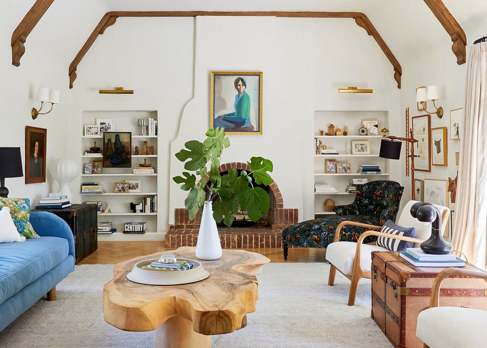
I think if I had to name a favorite piece of furniture of ours, it might be my antique floral chaise lounge (followed up quickly with our coffee table). The older I get, the more I just love mixing different eras of my life in a home together, regardless of the current home style architecture/style. In fact, I can’t even think of a type of home that I couldn’t make this chaise “work”. A few of you wondered if it looks good next to the quilted mushroom stools because they are just such different styles, almost like coming from different worlds (old world European meets American country). I think I would wonder the same thing, but I didn’t even hesitate. I guess it tracks because I used to say that my style was a mashup of Sofia Coppola’s Marie Antoinette + Footloose (Kevin Bacon’s version) + The Royal Tenenbaums. While I don’t know if it was ever true, accurate, or maybe just a fun way to talk about style (I fear I’m not that eccentric), I do still really love fringey, velvet, florally things while also loving unpretentious rustic, primitive, and casual plaid elements. I think they do in fact work together because of the shared color palette and the fact that they are both cleaner lined with very decorative fabric? But let’s revisit this piece.
I bought it from Jayson Home probably 8-10 years ago. It was in pretty good condition for an antique, but I was mostly drawn to the lines of the arms and back – more of a delicate curve like the Scandinavian greats (not big and bulbous or overly decorative). I kept it in its original fabric for a few years, but it didn’t hold up to our kids and cats at the time, and it started splitting.
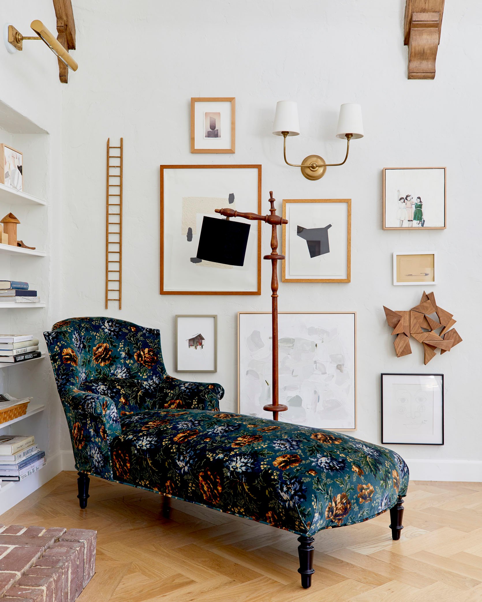
So I had it reupholstered (by BuildLane) in my favorite floral ever, this gorgeous blue and green velvet from House of Hackney (the color combination with the browns is just perfect). I chose not to fringe the bottom because I couldn’t find any that I loved enough (I would have done it had I found the perfect blue/green tone in the right length). I don’t think it misses it (and I can always add it?). It’s just so pretty.
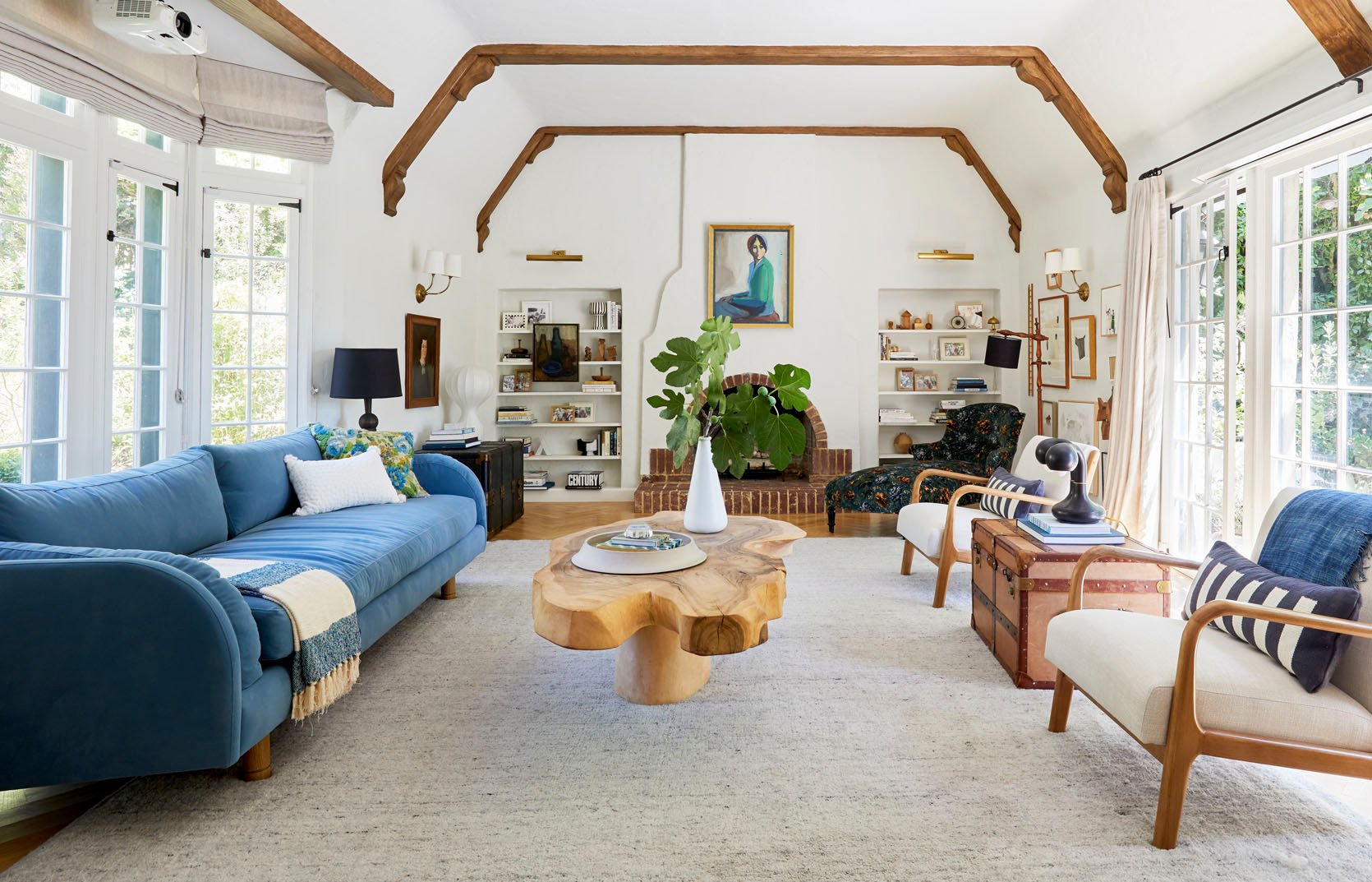
This was how we styled the house to sell it (I think), and it’s fine in here, but perhaps got lost from this angle.
Moving It Then To The Farmhouse…
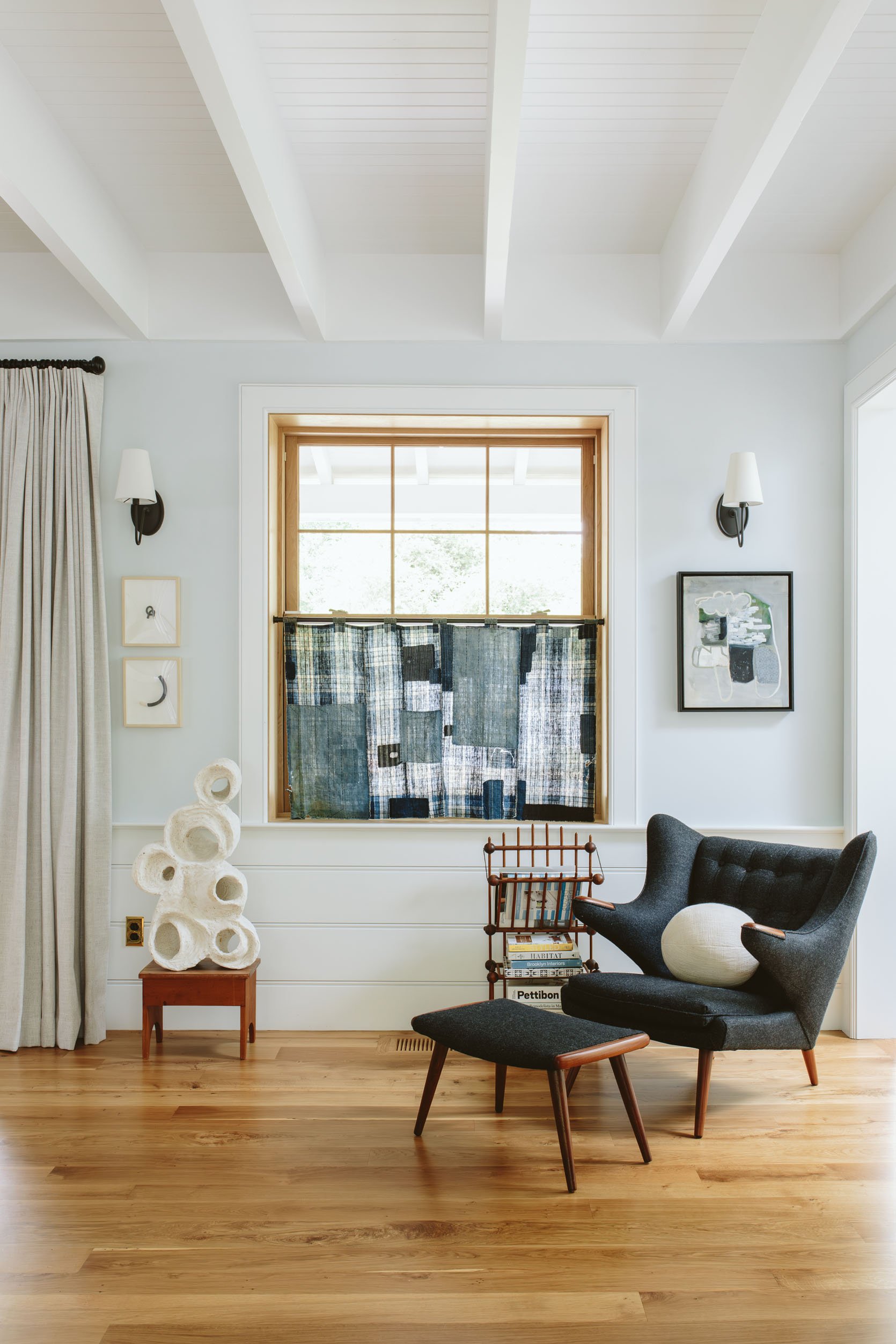
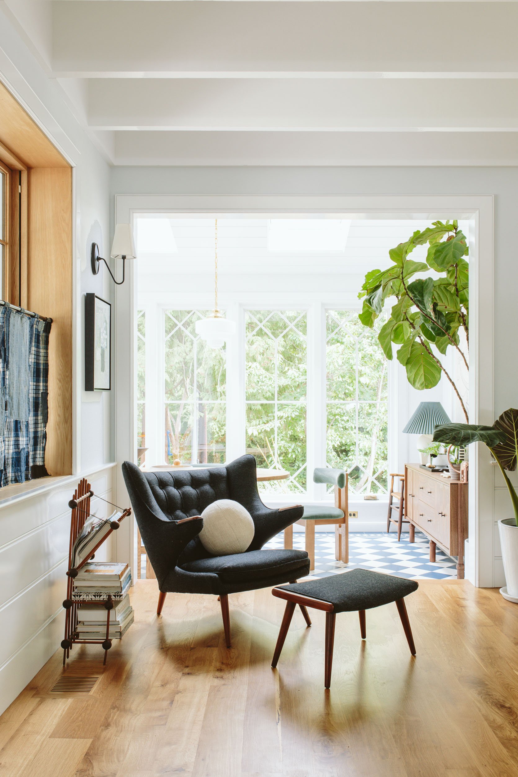
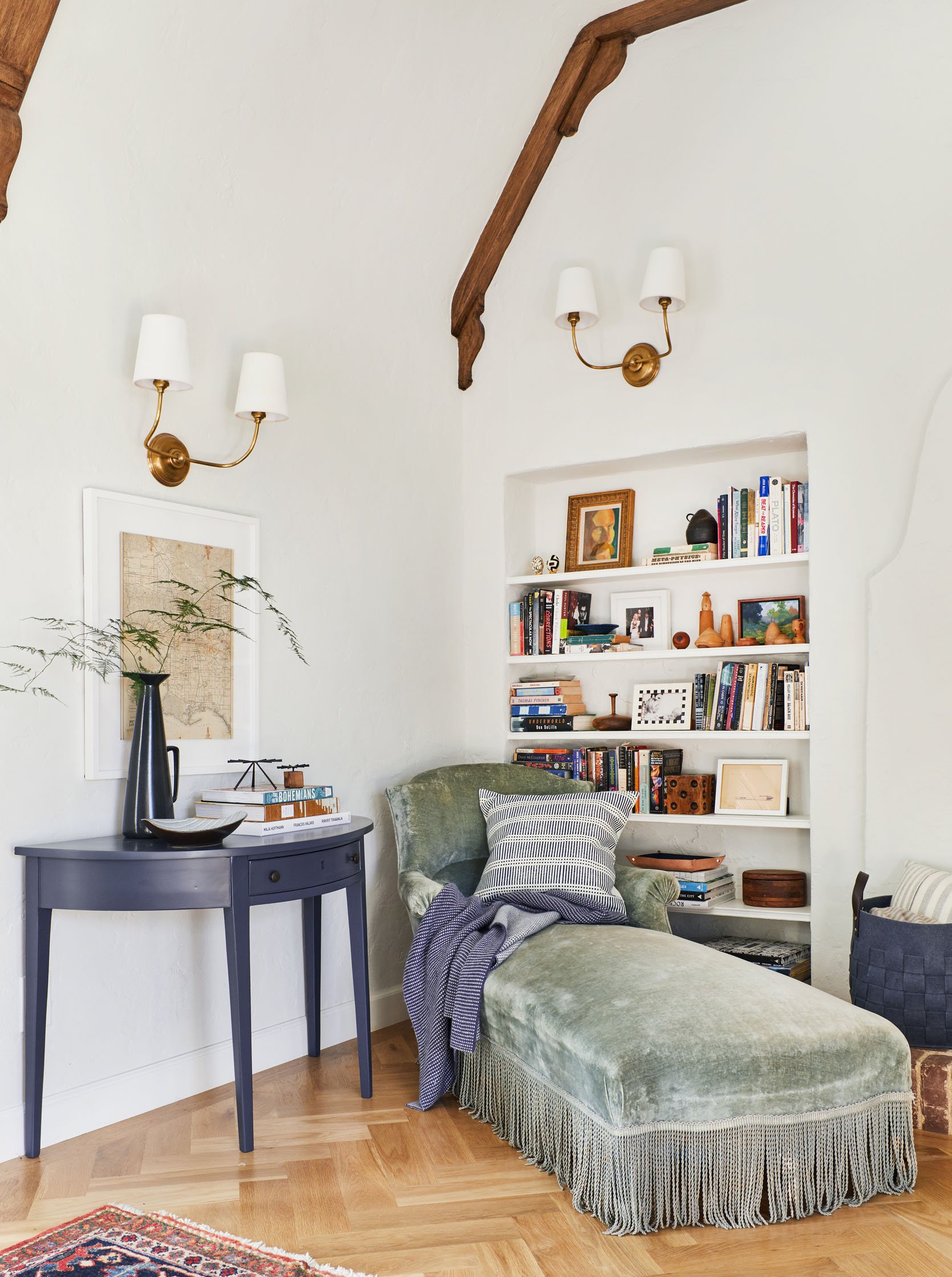
Ok, so at first the chaise lounge didn’t make it in (not sure why). We were still figuring out how to flow through the house. I put this papa bear chair and ottoman here. It looks really cold now (this corner is so hard to shoot – the light is just so dead).
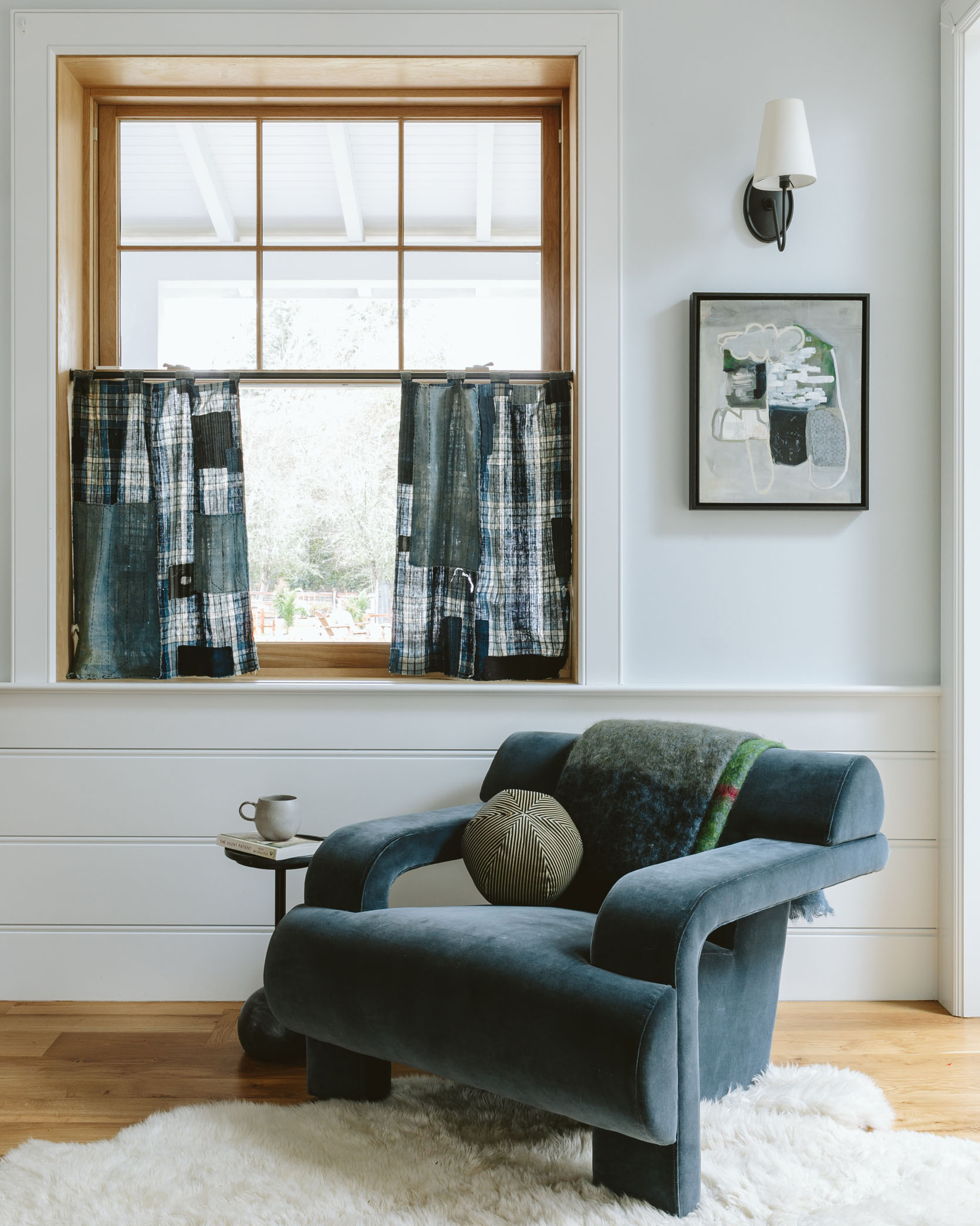
I changed it out for this Soho home chair, which I love (that color is perfection). It looked better for sure, and I liked seeing it when I walked down the stairs.
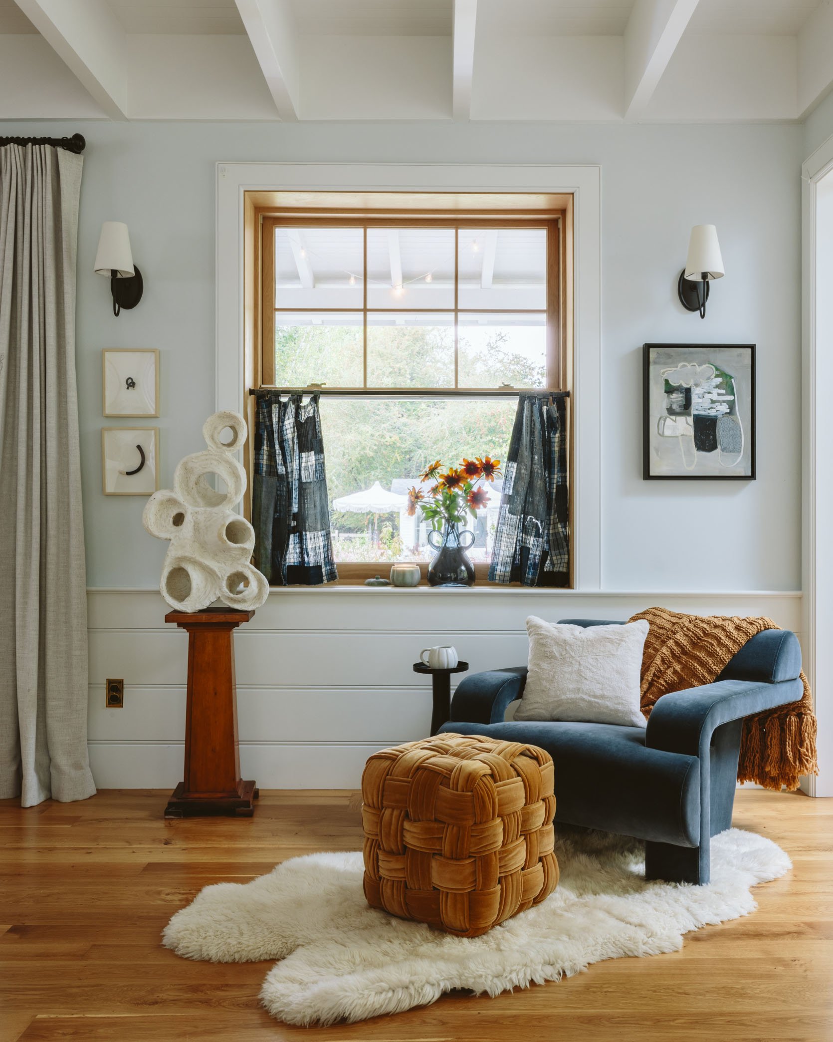
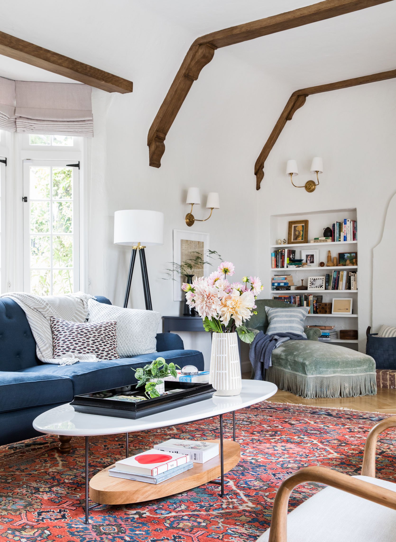
Here we shot this vignette again for a Target collab with some ‘fall’ elements, and it started getting warmer and warmer, and more filled out.
But Back To The Chaise Lounge…
But recently I just missed it. Surely I could make it work here and use the blue Soho Home chair somewhere else.
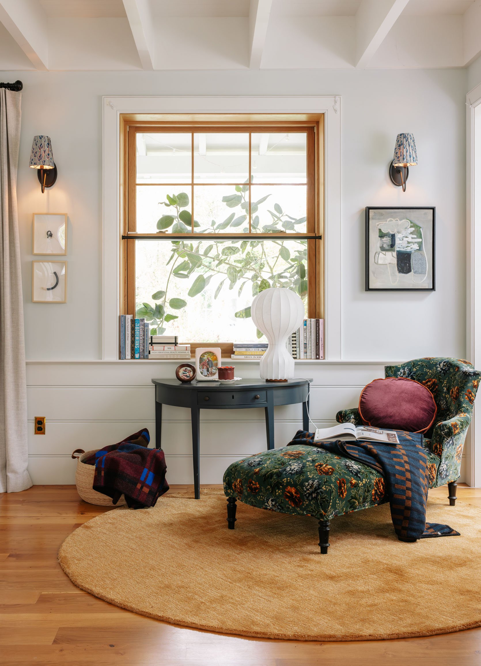
So I brought it back, and I LOVE it. I love looking at it every time I come down the stairs or walk towards the sunroom. And the rug underneath was crucial. I chose a round one (8′) because it’s kind of a pass-through space, and an organic or round shape would help with the flow versus a rectangle. Now, for those of you who don’t like it when we photoshop, please ignore the command strips that I leave up year-round for our garland and the black cafe curtain rod that I haven’t removed for whatever reason.

So you can see it in the corner, and I love how it looks with the rest of the furniture.
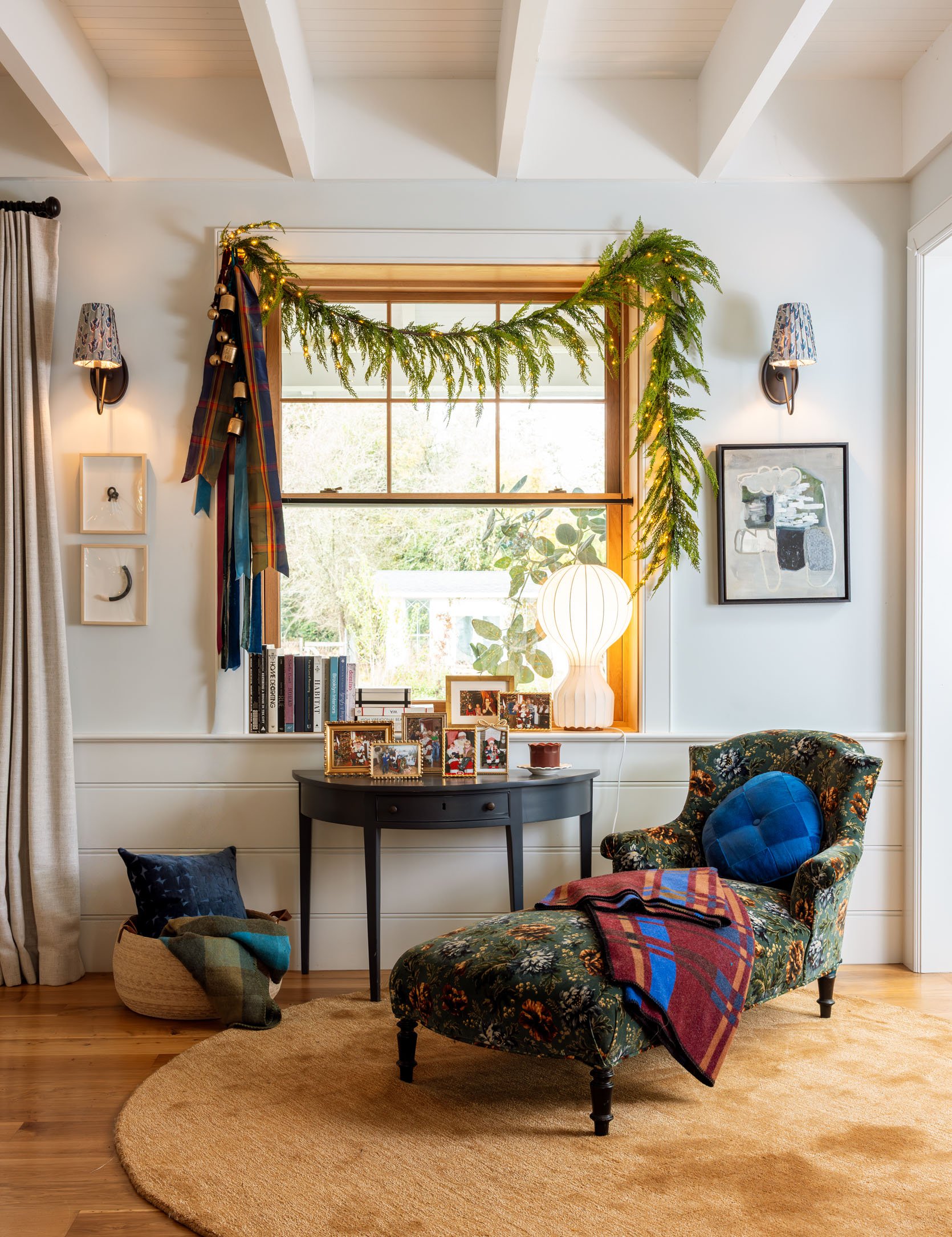
Here she is all decked out for the holidays, and I love this sweet little vignette. And yes, I agree that the garland is a great balance and makes me want to put up roman shades, but they would just be cream/taupe in order to match the huge curtains (which are custom). And if you are wondering why I didn’t do shades in the first place, it’s because we did cafe curtains in the same cream/taupe fabric instead (thus the rod), but once they were installed, they looked just so boring and corporate (my fault), which is why I put the Boro fabric panels there. The OG fabric was just too thick to be cafe curtains, and they did a really thick top and bottom hem, which made them really stiff (I think cafe curtains are inherently best as thinner fabric without being lined or with a really thin lining if you must). Anyway, the point is I can objectively say that having a shade over here would look good, but no real motivation to make that decision. And I love a table full of family photo frames, so I think after Christmas I’ll add even more here (these are our Santa photos). It’s giving “cozy library” in a really lovely way. Oh, and you might think that a more contrasty rug could look better, but when you look at the room holistically, it’s nice that this is quiet and flows with the color of the floor. This is a rug from Arvin Olano’s former collection with RugsUSA, which I have to say is really nice and high quality for the price. I ordered it in both 6′ and 8′, unsure which size would be better (which I don’t recommend, I didn’t realize that it’s $50 per return). We ended up keeping the 8′, and it’s pretty great. Next time we shoot this room, I’m going to shoot this vignette towards the sunroom so you understand where it lies in this massive, open room. It’s not ideally designed, but I love looking at it too much, so I’m going to continue to make it work. 🙂
Opening Image Credits: Photo by Sara Ligorria-Tramp | From: Living Room Update – AGAIN – Our New Sofa, My Dream Floral Chaise And The Pop Of Red I Always Wanted In My Life


It’s really pretty. I love this chaise too, and the whole thing is a moment. It’s great that it gives you so much pleasure. That’s what our homes should do.
What a fun post, loved ‘the chaise: through the ages’ haha
My mom had a very similar chaise lounge chair in her bedroom while I was growing up. I just loved it so much. But my sister got it when we split things up and SHE SOLD IT without telling me. I still have pent up anger about that. I love seeing yours in your home looking all gorgeous. Thank you for talking about it! I have such conflicting love hate about it. I really want to buy it from you, actually. Haha
omg i’m so sorry. I would be upset, too! I don’t have any family heirlooms (yet) but I have my eye on a few things that if someone else got (fine!) but i’d be so bummed if they didn’t offer to me (or someone else in the family) first.
It probably looks different in person but in the photo, that gorgeous fabric on the chaise seems to pick up the colors (in a subtle way) of the blue and pink sofas. Really fits this room well, IMO.
I agree, and this confirmed for me that these sofas work better than the green sofas because then the chaise would be too matchy
It does look really good with them! it “matches” the green sofas, but its a lot of deep dark velvet.
Nice work, I love the chaise there! So cozy and inviting. Something is driving me crazy though — did I miss an update about taking the Boro cafe curtains off?? What happened to them?
They are in the kitchen. See this:
stylebyemilyhenderson.com/cafe-curtains-update-in-the-mind-of-a-designer-trying-to-make-a-decision
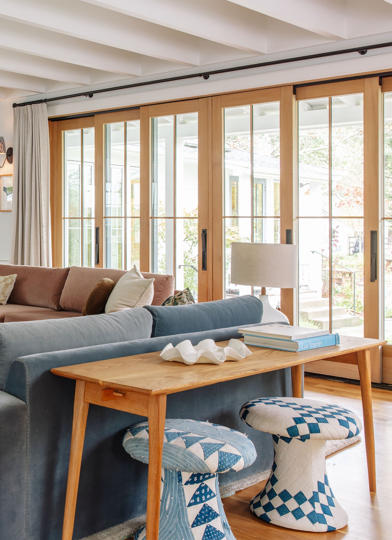
Yah it bugged me a little that they didn’t match the main curtains so I moved them to the kitchen (and added more). I love the vibe/color of them, but they can look really messy and hang off kilter at times.
Seems like an odd spot to put furniture where it’s blocking the entry to the sunroom. Except maybe just the little demilune table.
It is and it isn’t (blocking). the walkway is huge so plenty of room for flow but its not like I would have planned it that way. Its a case of ‘either here or no where’ as of now and I love the vignette, but totally understand how its not conventional. sometimes I think about putting it in my bedroom, but it gets so much more visual attention here (even by me who spends most days flowing through this room).
So … the chaise offers so much pleasure to “look” at but not to actually use? I guess that means it’s little different than a painting or a gallery wall, just one that fills floor space not wall space? I once met at an architect’s home and swear to god, the home had 87 places to sit for just two people. Maybe it’s scarred me!
I mean, its very comfortable and very sittable, so one could totally sit on it, but no its more of a pretty collection of things. i think this might be specific to those of us who are addicted to cool chairs (i.e. vintage shopaholics, etc).
I love how it looks there and I think you could easily turn it into a space you use a lot – designate it one of your “ritual” spaces that you use as part of your normal routine. A cup of hot tea and a book right before bed, for example. This is also a bit of a life hack because after a while, just seeing the space keeps you committed to keeping the good habit. Kind of like how folks will lay out their workout clothes the night before because it makes them motivated to put them on to exercise in the morning. One other comment – I didn’t realize it until seeing the shot of your old living room, but the Barb sofa’s lines really seem inspired by the custom Lawson Fenning sofa you had made back then!
OOh i love this idea! yes maybe i’ll dedicate my saturday morning Etsy shopping/coffee drinking here!
This is so inviting. I would just need a lower table to set my cup of tea on and a reading light and you wouldn’t be able to get rid of me.
Coincidentally, last night I was reading the new issue of Homes and Gardens and they had an article about velvet, and I recognized your chaise velvet in their selections.
Will we ever see a reveal of the staircase, kids landing or your son’t room? Just curious (maybe your kids don’t want their spaces featured anymore).
you know, i’ve made progress for sure! there are like 10 framed family photos on the way up. then I hung a bunch of kids are in the landing, but I still haven’t painted the floor the pattern that I want to (i think they need to be out of town for it and whenever they are out of town I tend to go do something fun with brian). I’m also not set on the pattern or colorway. Charlie’s room might get dialed in this year but he just begged us to move the bed into the corner (so its shoved in there with his big round sofa) and lets just say the layout isn’t ideal. but he loves it so I dont’ really care. he doesn’t really want me to ‘decorate’ his room which I get, but he doesn’t want more storage, shelving and a cooler light fixture. that’s all to say that its hard to be super motivated for it when his style is changing and he doesn’t want a perfectly decorated room (he wants posters on the wall, tons of space to play basketball, etc). Elliot is still begging to change her wallpaper but we are waiting… Read more »
This chaise is so awesome and unique, I feel like she should have a name. I vote for Felicity. 🙂 She certainly has a fan club amongst the long time followers. Thank you for bringing her back!
omg yes I love this. Also was low-key obsessed with that show (one of the reasons I wanted to move to New York along with every other college senior in 2000). Felicity it is!
Love this little area! Will you share where the garland is from? I can’t ever seem to find good quality, natural-looking garland.
shopterrain.com/shop/pre-lit-faux-cedar-garland-evergreen-6-9
Pre-Lit Faux Cedar Garland, Evergreen 6′-9′ from Terrain
its sold out which is a bummer because I need one more for the blank window!
I have always loved the chaise, and can’t wait to see it with the green sofas (I think I saw a peek of them on Instagram). I think it will look really great with the autumnal palette that was in here before.
Unfortunately, I think it looks AWFUL anywhere in your home. I’m sure it would look much better in my house, she really wants to move to Arizona, and I’d be SO kind to her!
I was like wow, harsh, and then I chuckled 🤭
HAHAH. me, too!!
Ok, I confess that I was trying to STEAL it..in a NICE way! I’ve loved it in every space you’ve used her, in both fabrics. I think she’s very versatile and fits in anywhere. I really appreciate the mix of vintage and current styles, and she adds such soul.
I’d be glad to drive to pick her up and score some other vintage Oregon shopping, in case you change your mind:))
I love it so, so, so much. I’ve always loved how you contrast the chaise with some modern elements (ie abstract art in the last house, lamp in the current iteration). It’s just so interesting and fun to look at and makes my heart go pitter-patter! That adrenaline rush of joy and pleasure upon seeing interesting, good design is just the best.
Oh boy, swoon ….