Design
Guest Cottage Kitchen Update – Where Are We At??
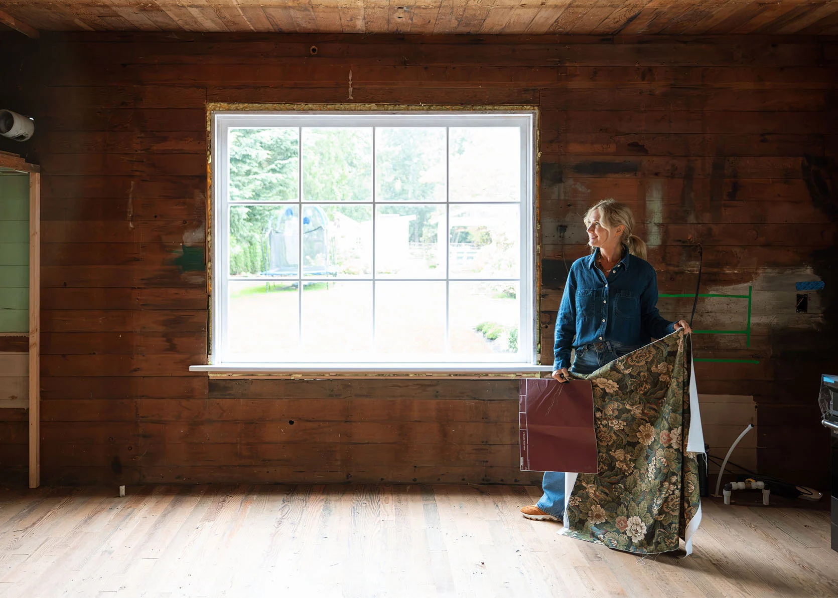
Progress has been made!! All summer long, there was some sort of banging from the guest cottage (and the guest cottage kitchen). We were in and out a lot and often didn’t know what was happening or when, which isn’t typical for any remodel I’ve done, but I was fine with it because I loved the crew and, frankly, I’m not ready to answer all the questions anyway. Without a hired general contractor on this job (my brother is helping some when I need it), we are basically getting different subs and workers when we can, hoping that we are here to answer questions. So the progress has been slow, but honestly I’m so behind on the final design that I’m grateful that I have more time to know the answers to their questions. But the floor in the kitchen is done, the restored and repaired window in the kitchen is installed, and we have some clear next steps.
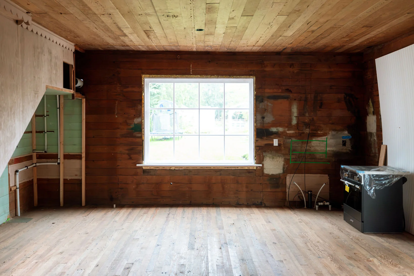
If you are wondering if those are the original floors, that is the point! There really was no “original” floor; there was a subfloor that had a lot of big gaps and damage, and decades ago (probably the 40s or 50s) they laid some pretty intense laminate flooring over it. We started to remove the layers, and it was clearly a disaster. After testing negative for asbestos, we decided to just put flooring over it all.
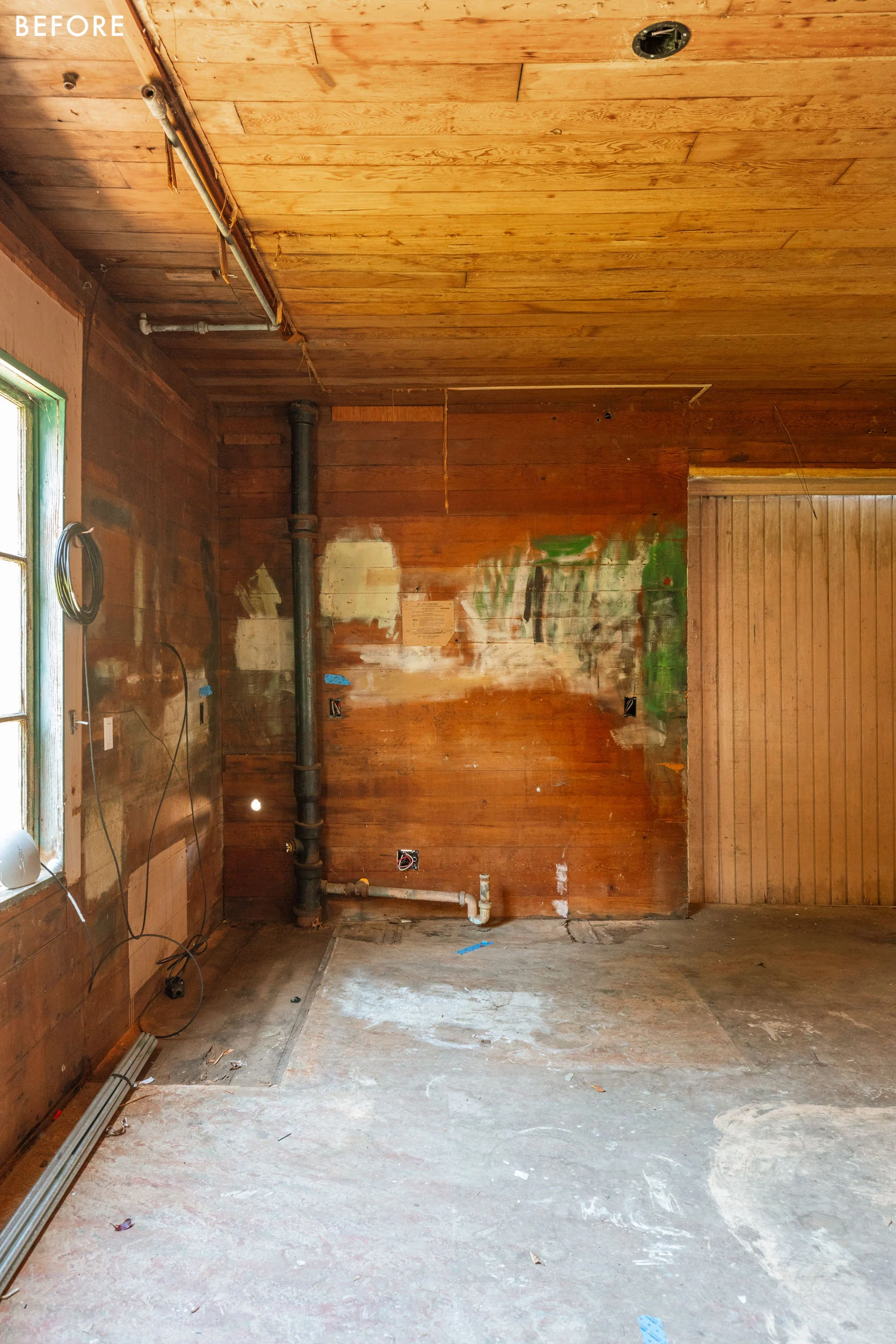
See what I mean? Not good. But now…
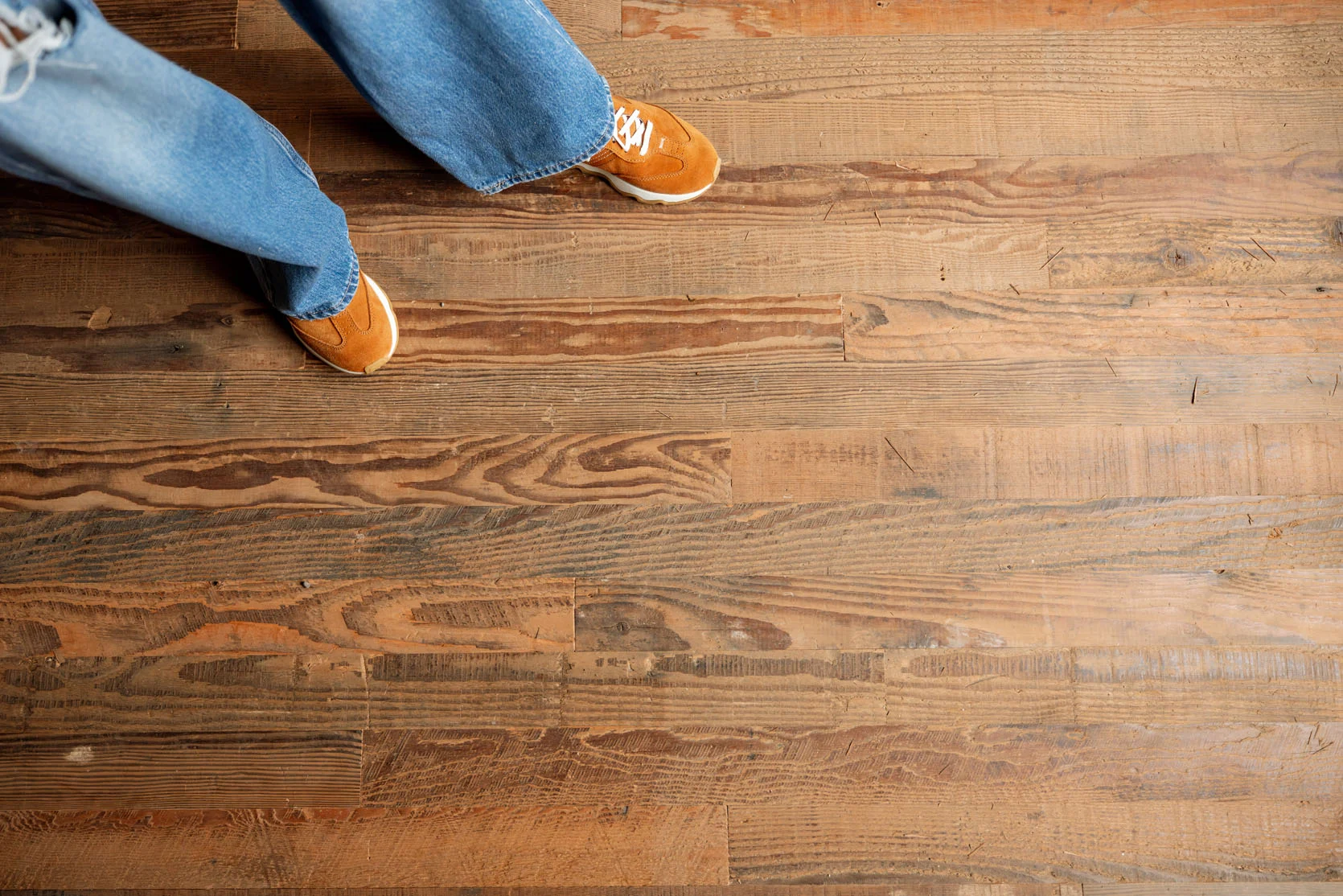
Our goal was to make it match closely in vibe with the original clad ceiling, which we definitely wanted to keep, and the clad walls (which are in ok shape, but we have a solution below). So we found some reclaimed fir wood locally from Good Wood that matched the best. After months of deciding, we made the call to go for it, but with a lot of unknowns because reclaimed wood isn’t just copy/paste. We had a big sample board, of course, but there is no guarantee that the samples would 100% match the product that we would receive after milling it, and reclaimed wood is pretty expensive ($9-11 a square foot), with a lot of little add-ons per linear foot that can really add up (think slight wire brushing, adding a bevel, end cutting, cutting out conduit holes). Anyway, long story short – it wasn’t a one-and-done decision or process, and we were nervous! We really wanted this look, but we had no real guarantees that it wouldn’t be splintery without sanding off the finish completely (which we didn’t want to do) and sealing it. We love the color and finish! Now that it’s installed, it’s gorgeous, AND yes, there are definitely splinters, so we plan on rolling a coat of some sort of sealant to bring out the richness of the wood and also seal down some of the looser bits. We also plan on rugs, and maybe this isn’t a “barefoot” house. We are also open to sanding if we need to.
We used 3″ reclaimed planks on the floor (milled by Good Wood from old barns to be tongue and groove), and it’s so pretty and, yes, feels very old and original. I don’t regret it; I still think we made the right decision. The only other thing I think I could have done is sourced a richer, darker red-toned new wood and mostly covered it with rugs, and I bet your eye wouldn’t figure it out. But after having reclaimed wood in two projects, I will say that it really adds soul and richness to a house when appropriate. And in our case, I just felt strongly that we shouldn’t mix new wood with this clearly rustic wood on the walls and ceilings. If it bugs us, we will likely sand it completely and stain it a rich fir tone that still looks good with the walls but hopefully eliminates the splinters.
Old/New Windows Are In
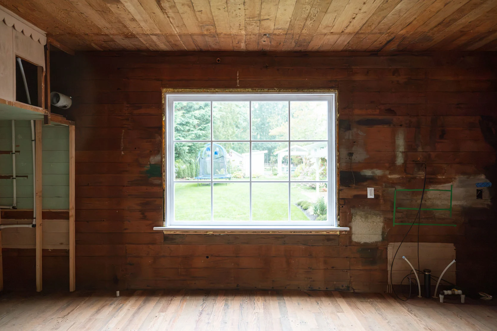
Look how gorgeous these windows are!!!! Don’t worry, they’ll be painted a dark color, but my goodness, they are perfect replicas of the original windows, restored (and glass replaced) to be strong and high quality for 100 more years. We hired a local small family business, Sash and Cord, who did a fantastic job (with great communication and customer service – not just a salesperson who just hands over the job to the craftspeople). Although the sashes ended up being beyond restoration once they got them back to the shop, they commissioned replicas through a local workshop, made and installed fresh components to match the original windows where necessary, restored what could be saved, and glazed the new sash with tempered glass and traditional linseed oil putty. They are made out of CVG Douglas Fir. Daniel and Matt cared so much and did such a beautiful job.
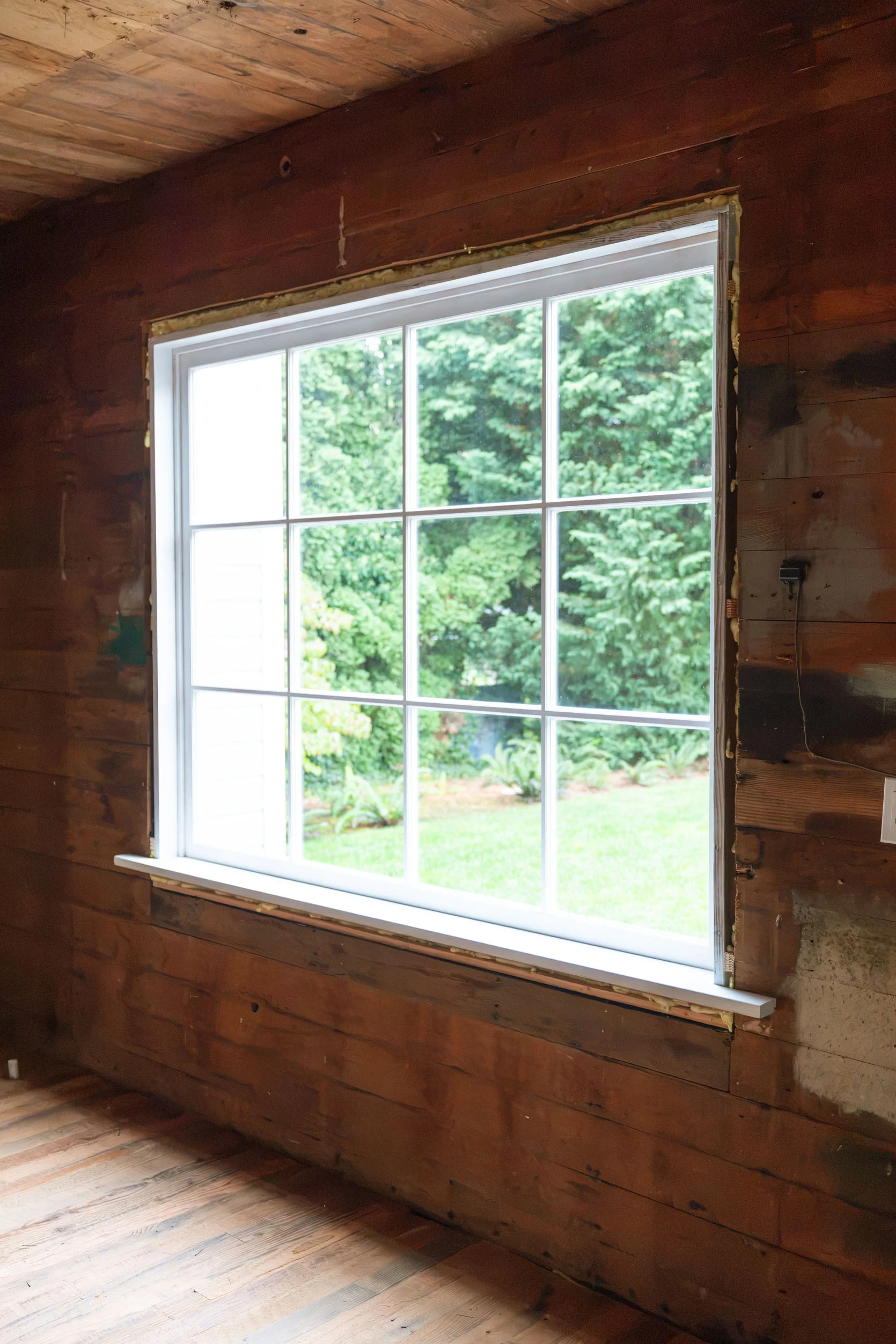
We had our framers do a new, clean rough opening, and then it took a day and a half to install them on site (including all the shimming and insulation). Up next is trimming it out and painting.
But What Color Should We Paint The Guest Cottage Kitchen??
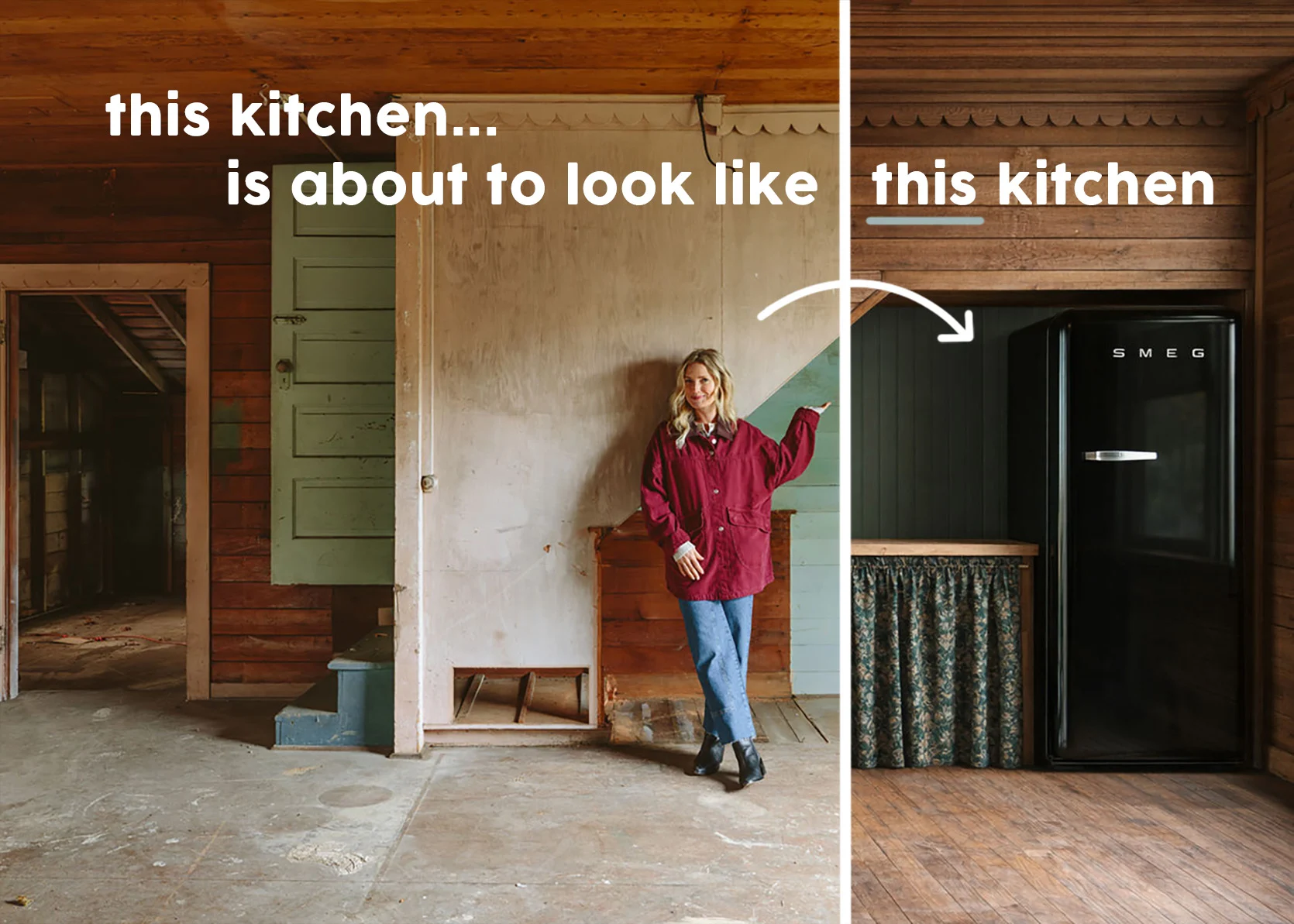
Remember this render of the guest cottage kitchen? I really loved it, and honestly we haven’t revisited the design in a while. It was never final, just more of a vision to work towards while we make allllll the decisions.
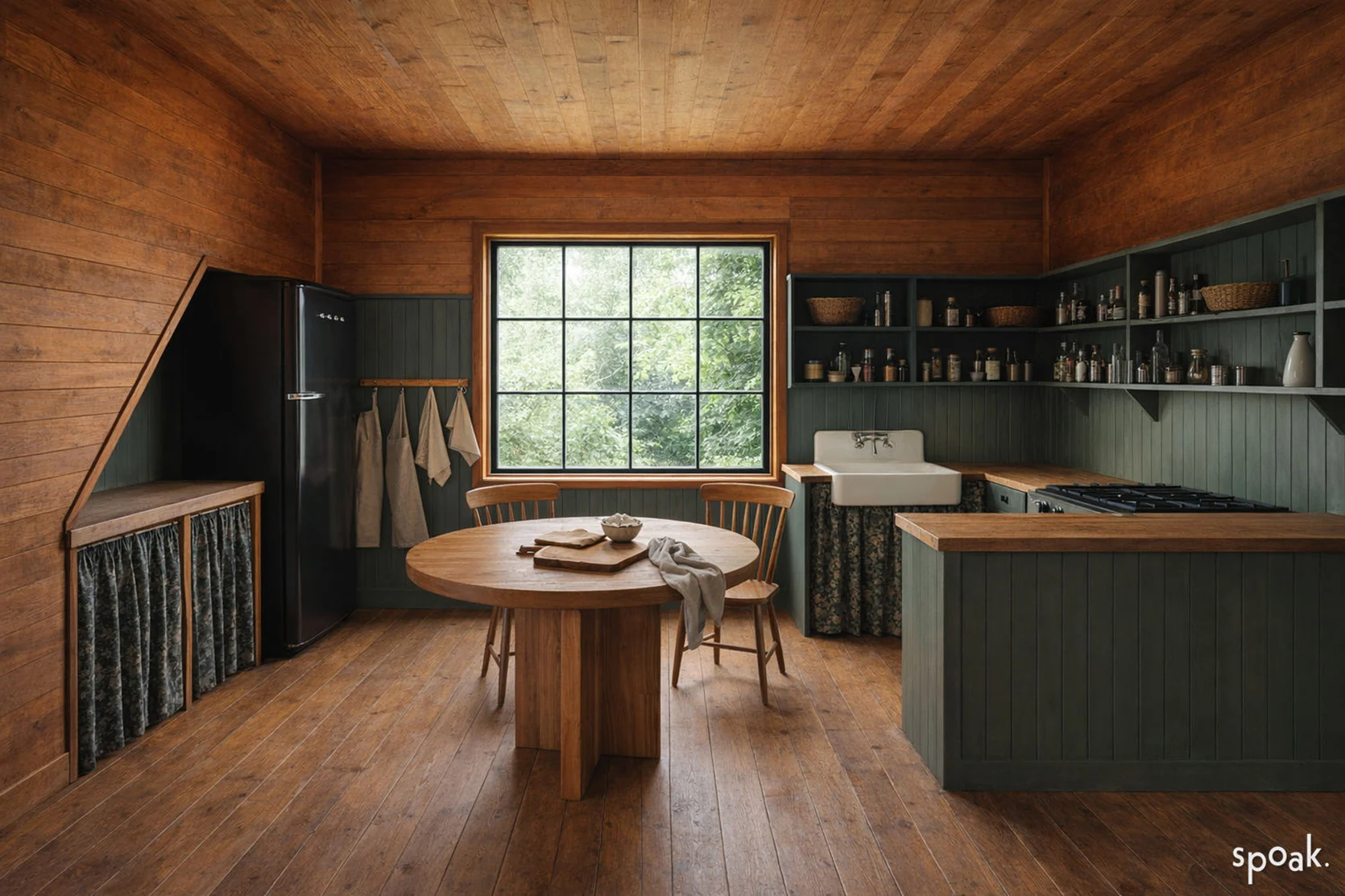
Now let’s talk colors.
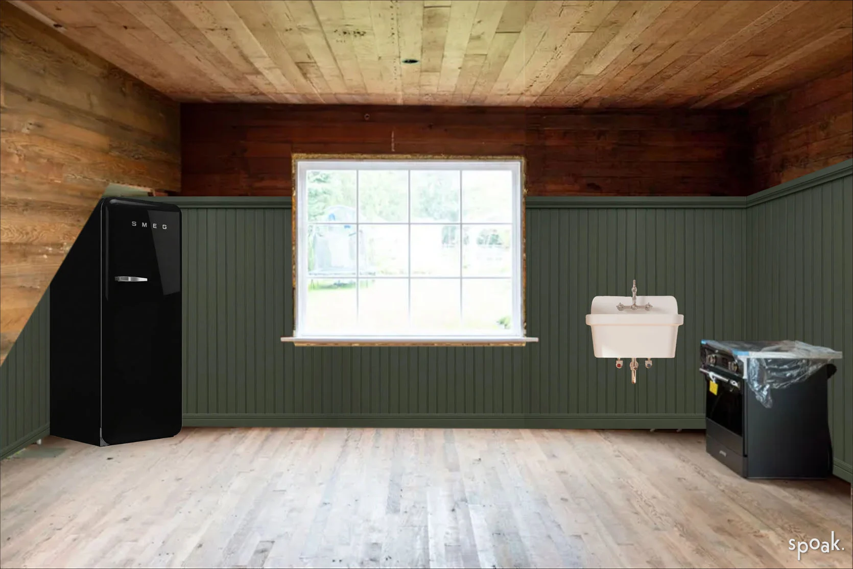
We originally wanted green in here, and it was a slam dunk. Our plan is to put beadboard behind the fridge area and take that same line throughout the room. While we love wood, two huge rooms with floors, walls, and ceilings felt like a lot, and having some more solid colors could be a nice break. The wood on the walls in here had a lot of graffiti and patching, so we figured a great solution is beadboard on the walls in the whole room. But I started having my doubts about the green…
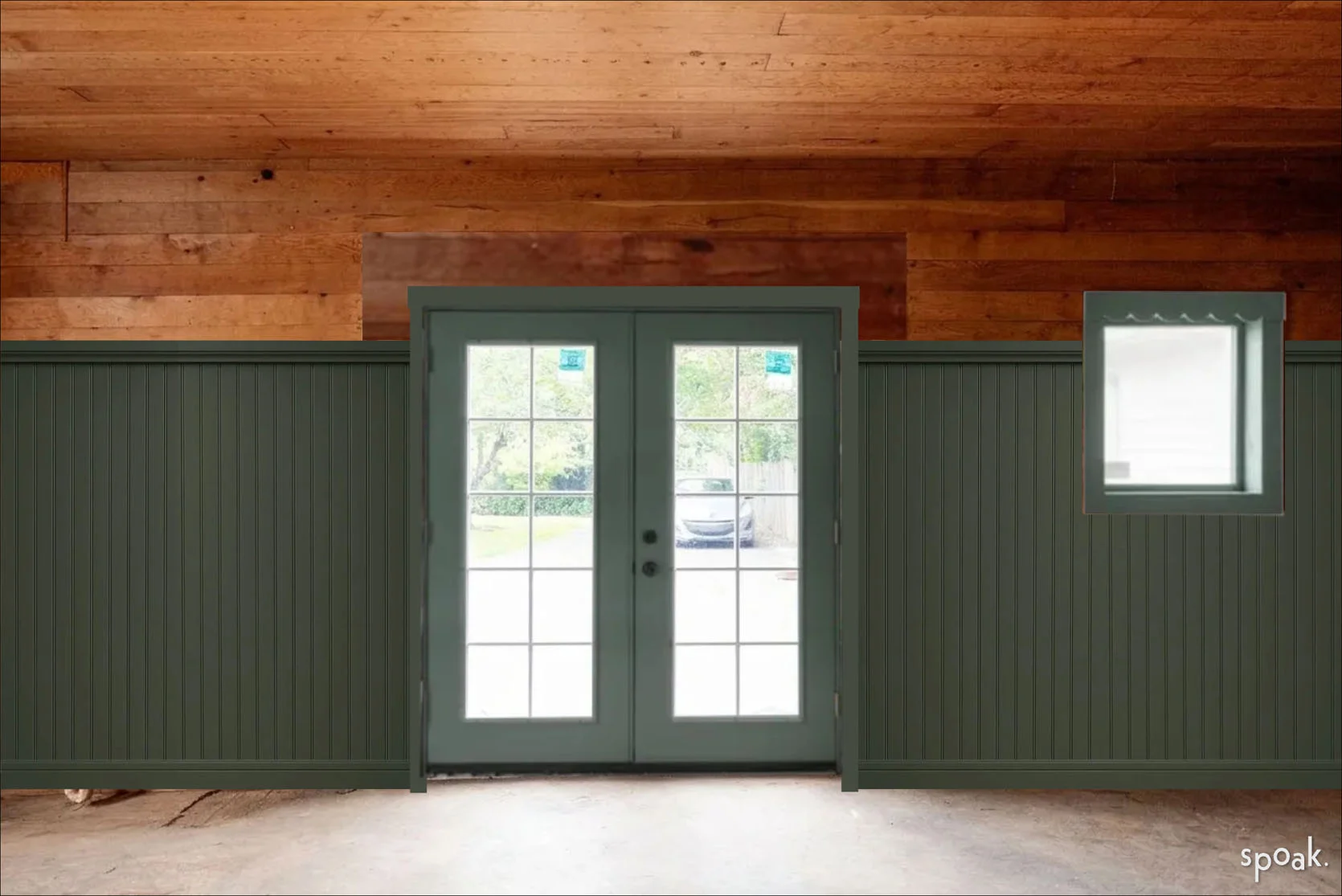
It’s pretty, but is it too high contrast? Does it complement the wood enough? I mean green and brown work together – think trees! But once I held up this dark, rich red, I got so excited.
So what you see in my hand is the floral fabric I want to skirt the cabinets with and the dark red paint that I fell in love with. Gretch did a quick mockup.
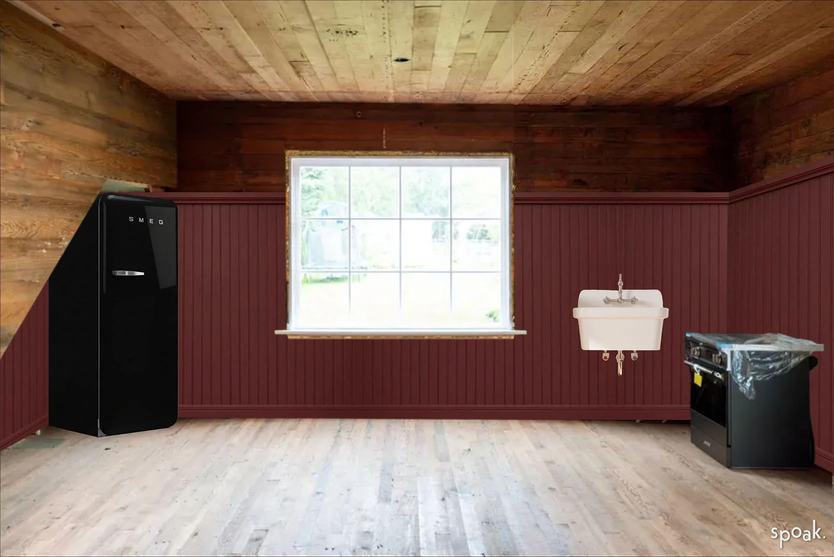
This definitely reads a bit pinker than red, but you can see how it complements and really works with the wood better than the green and just feels like a more seamless and rich experience. Both could look good, I know. And the only for-sure elements that we have ordered for the kitchen are our gorgeous Smeg appliances (we chose the black high-gloss small version without ice/plumbing and the induction 30″ black range to match). They are beautiful. We have that sink that we bought from Wayfair, but man, I wish it were a color. There is such a hole in the market for the 15 of us that want colorful plumbing for our darker spaces. I chose a wall-mount utility sink becasue its smaller and not cabinet-dependent (meaning we could still DIY the cabinets around it), and it doesn’t need a backsplash. But there are times when I wish I had done an undermount sink that doesn’t have a bright white apron and backsplash.
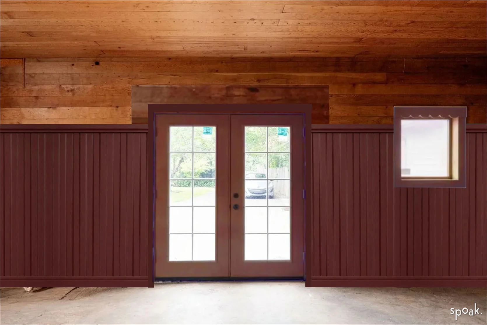
I’m excited to have this juxtaposition between the beadboard (that is all over the house) and the original wood. I think it will feel cozy but give more cottage than cabin.
So what do you think? Green, red? Let’s chat. xx
*Photos by Kaitlin Green
Greeeen !
Greeeen !
I love love this shade of green
1000% green. The red looks dull and somehow makes the wood less lovely.
Agree. The red is muddy with the walls. Green reads cabin-y but I love it. Maybe paint the peninsular red or have more red in rugs if you’re desperate for it.
Hard YES to this! Also: do you have a moodboard put together with all interior house paint colors? My type A brain would all want them to be similar in tone/saturation . . . like how does that green speak to the blue on the stairs?
I agree that green is the better choice
Love the green, but maybe a less smoky shade? I always like muted yellowy greens, like Terrapin Green, Brookside Moss or Georgian Green from Ben Moore. I’d use red toned fabric for cupboards and accents for contrast , I think that will make the green pop more.
Replying to say a muddy green like F and B ” Dibber’ or Ben Moore ‘Cleveland Green’ could be great too
I love the muddy tone of the green. I think a brighter green will be too much contrast.
I like both, but the red is more unusual so I’d vote for that – they’re both beautiful though. I wanted to ask – why put beadboard over the wood? Why not just paint the wood? You could add a piece of trim to make a division point (maybe a peg rail?), and paint up to and including the peg rail to create the dividing line. Then make your peninsula kitchen out of horizontal wood (painted) to match the walls rather than having a contrast between vertical and horizontal wood. You say it’s got graffiti and patching on it, but that would be covered by the paint/bit of filler.
While I disagree with your choice of red (it all makes the wood look reddish and one note, not enough contrast IMO!), I hear you about the beadboard. Too many lines maybe? All the lines of the planks on the walls, ceiling and floors and now vertical grooving on beadboard. It seems a little dizzying.
It’s not just that, it’s using extra materials when you don’t need to. You’ve got lovely, textured old wood, and you want to cover it up with modern beading? Sure, you’re not keen on the stains and some bits need a bit of patching, but wood filler is magical and it sorts out all sorts of issues, so long as you paint over it. You would be amazed at how beautifully they come up with a bit of sanding and filling, and that could easily be a DIY job. And beadboard was designed to be practical – wipeable, strong, protects against marking your plaster – and this isn’t doing anything practical that the wood wouldn’t do.
Agree with trying something besides the breadboard. It’s a lot of stripes. On colors, definitely the green.
Green!
I’m a green girl.
How fun! All in on green.
I like green, too. What about a stainless steel sink?
100% green! It has an earthy feel that ties to the outdoors.
Happy Thursday!! LOVING the guest cottage content. Whenever I let myself dream of renovating our cottage that is equally woody, I have one primary project for inspiration: Commune Design’s Marin Compound. Take a look – it’ll blow you away. Every detail is perfectly considered, and the use of colour against the wood is absolute perfection. And the windows and doors are all green….
Happy Thursday!! I’m loving the guest cottage content. Whenever I let myself dream of renovating our cottage that is equally woody, I have one primary project for inspiration: Commune Design’s Marin Compound. Take a look – it’ll blow you away. Every detail is perfectly considered, and the use of colour against the wood is absolute perfection. And the windows and doors are all green….
ooh, yes that is good. and the green is good; not smoky, pretty saturated. my eye is wanting to see saturated colors in this house.
Beautiful. The more saturated colors really work with the wood better than the dusty muddy colors we’re seeing.
Oh, that design is AMAZING. No freaking notes. I have a similar type of cottage that I’m dreaming of (especially when I should be working). Thank you for sharing!
Both colors look good, but I think the red is going to pull weird shades out of all that wood where the green will complement it. Like you said, “trees!”
Green!
Green!!!!!
Green!
Love the green! I feel like the contrast complements the wood much more than the red.
green!
Team green! The red makes the wood look so dull.
Yes, kinda sucks the life out of the wood!
GREEN!!!!!!!!
green, but I would also leave all the wood as is as a top preference, so my opinions might be less relevant :D. and I still think you should call it the carriage house!!
I vote green. Looks stunning with the wood.
I am also team green, but your house, your design! The floors are gorgeous. Very fun project to watch come together.
I love the green.
Red! It’s rich and cozy and moody. It’s a less expected choice and the guest house is all about adventurous design!
Honestly, both colors are great options! It’s a win-win situation.
For me personally, the green mockup really spoke to me. Ironically, the green French doors did not – I’m not sure why. Maybe consider different coloring for the doors?
I like the green! I prefer the tones it draws out of the wood. (To me, the red beadboard just makes the wood look ruddy, too.) Thank you for sharing the progress and letting us live vicariously through you!
I LOVE the green in this room. It goes so well with the reddish wood colors, adding just enough contrast (and taking beautiful inspiration from nature and trees). The pink isn’t doing it for me at least in the renders, but I know you’ll mar both options look beautiful.
GREEN for sure! Timeless. Natural. Freshhhhh.
I don’t care for the red at all. Team green.
Ooh I like both. My preference still leans towards the green, but that is also comparing the complete mockup with the cabinets and fabric. Although that red color would be so cute with the coordinating sulking pink color if you could work that in anywhere!
Team green!
Team Green, all the way!
Team Green
I vote green, it looks really good while also seeming more in keeping with the historicity of the cottage.
Green. No contest. The muted dark green in the first shot is perfect and woodsy. To me, burgundy tones are too 90’s grandma, particulary when paired with floral fabric.
Some shade of green seems like it fits the age of the building. Not sure of you all’s obsession with reddish-pinky-mauve paint, like here and in the meeting room. But you be you, it’s always pretty.
I love the green but would probably do the bead board only up to where the shelves start and then keep the shelves green but have them open to the wood wall behind.
I LOVE this idea !
I would also put 2 small but cozy lounge chairs under the window with a little tiny table for coffee talk, get rid of the peninsula and just extend the cabinets a bit longer and put as big of a charming table as I could in there! I’d also get a green Smeg and color match the paint if their green is good enough.
Team Green
Green!
100% green. I literally gasped when you showed that first rendering awhile back.
Oh I like both but am partial to the red.
You could do both? Paint trim one color and beadboard another.
Red is more cottage, green is more cabin.
I love the green! But I can understand why you would gravitate towards the red because it is a bit more of a design risk than your standard palette. Could you bring in the red in smaller doses with accents? I don’t remember what you ended up going with on the pendant lights, did they have the red shades?
I vote green! Somehow the green really makes the wood pop and look amazing, and I think the wood looks less nice against the red on the walls.
I know red is having a huge moment in the design world right now but in a kitchen it makes me think of dried blood. To me the green compliments the wood everywhere. Maybe just choose a different shade of green.
If you ever need to shoot products in that space, I think green might be more versatile as a background — red can get kinda bossy when it’s around other colors.
Yes, especially since you already have a pink and red room for shooting upstairs!
Green! Don’t see the appeal of the red at all.
1000% green
The red is a gorgeous shade, but team green all the way! The renders with the whole green kitchen are just so earthy and cozy. The red is pretty, but somehow amps up the red tones in the wood? Still will be lovely (especially with styling/complimentary colors in the rest of the space), but I just love a green + wood moment!
Team Green also and maybe not this one. With all of that wood maybe something lighter, like a retro pistachio. Soften up the wood and gives some vibrancy. Reads more cottage and less cabin in the woods.
F&B breakfast room green
SO pretty! This!!!!!!
What about pulling a darker version of the blue on the floors upstairs? Or a more maroon-y, figish cooler red with blue undertones? The red looks like you were trying to match but didn’t, the green is kind of ubiquitous right now. I like it, so if it were to live in, I’d say green, but because it’s got to be unique and shoot-able, I would do the blue or fig or maybe a more olive green.