Design
The Easiest Way To Paint A Pattern On Your Floor
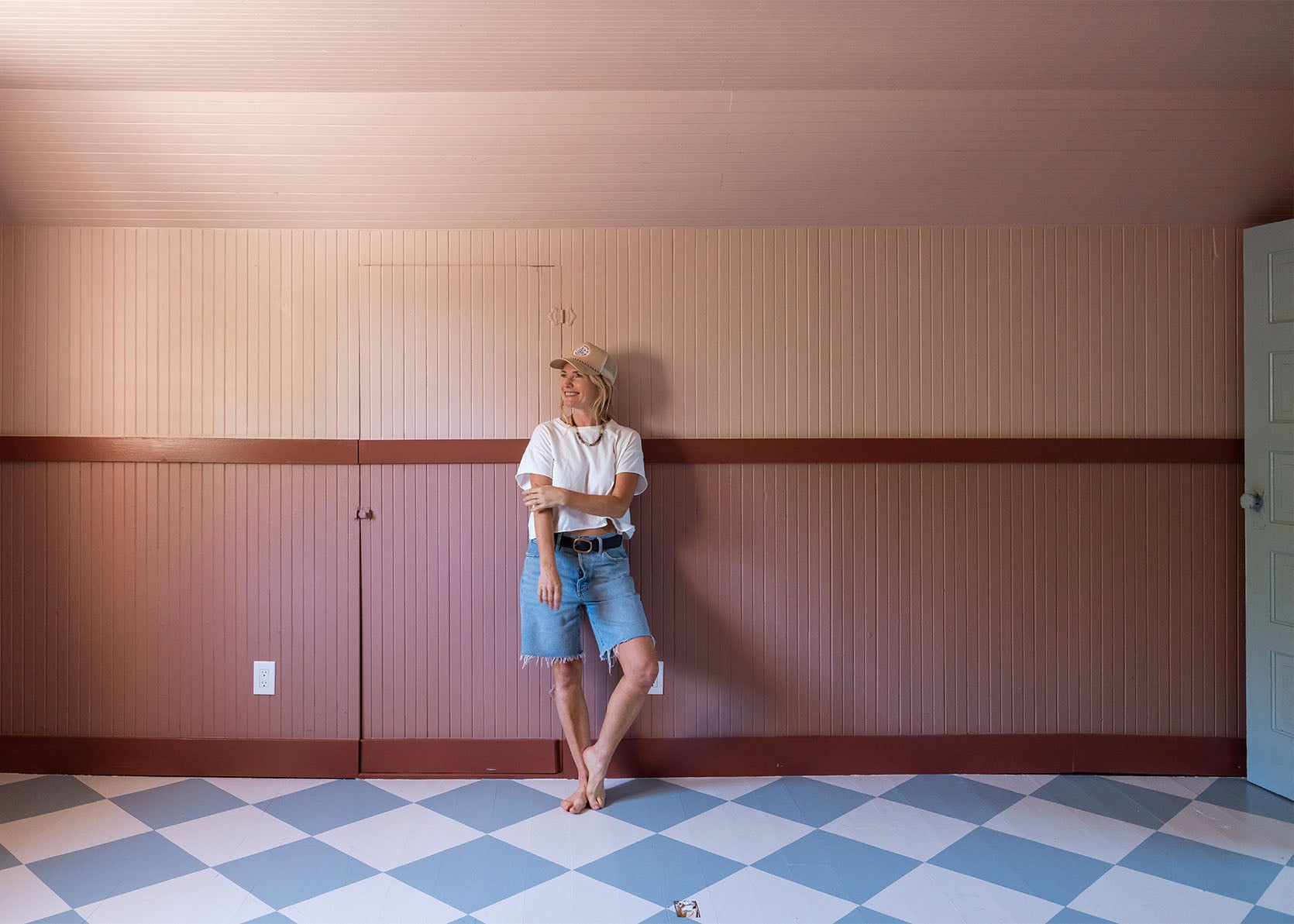
Our upstairs meeting room is usable!! I won’t say it’s done, but we can absolutely start meeting up there as soon as we get our AC Quilt unit in 2 weeks (it’s been hot and smoky in Oregon). Now, to get the room to this point was fairly simple because I consciously tried not to complicate it by making it perfect – we patched major holes, left a lot of the minor ones, and painted it five different colors (ha, so I guess not that simple). I love how it turned out thus far, and I can’t wait to show you our first big shoot in there that comes out next week. But now, let me walk you through all of the paint fun we’ve been having… like showing you how to paint a pattern on the floor:)
Before
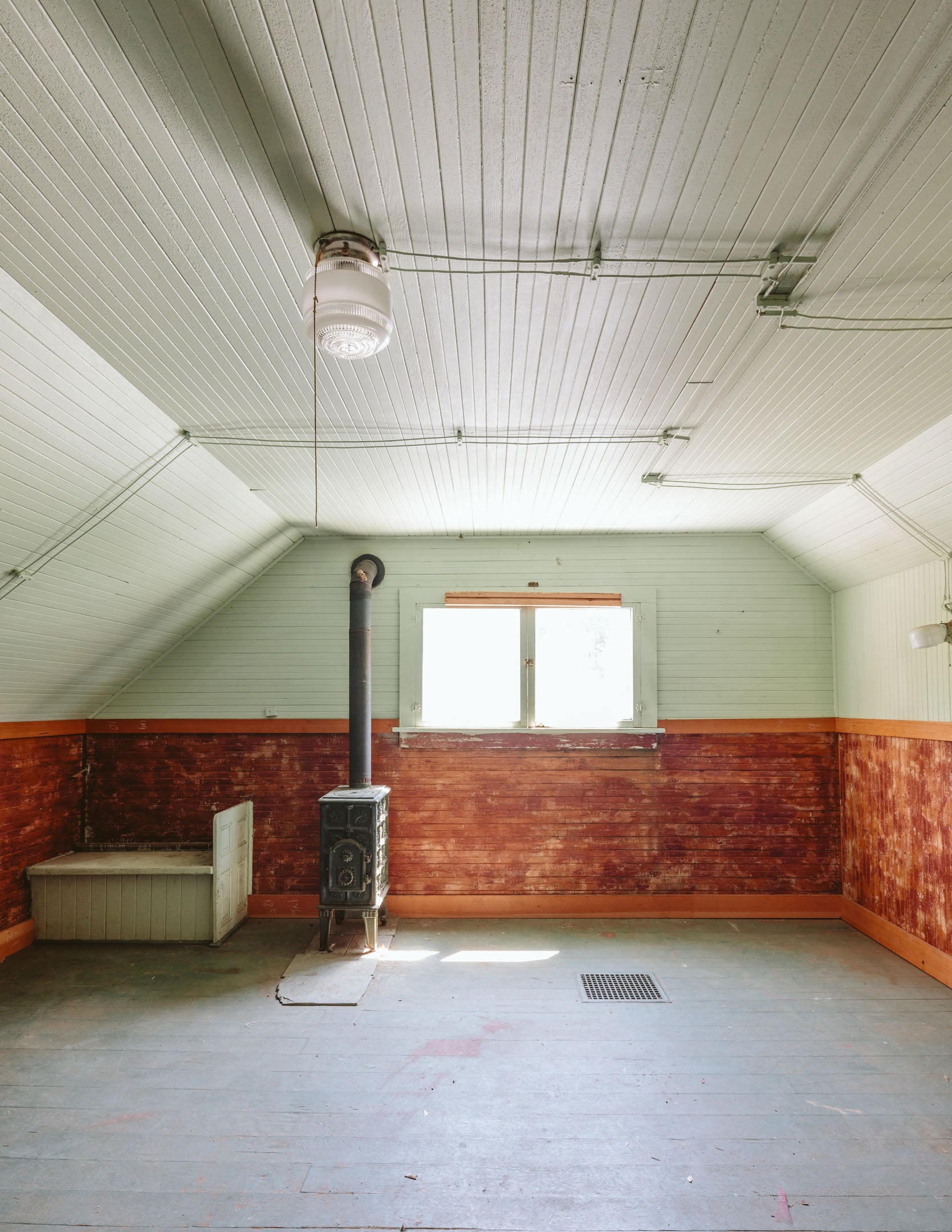
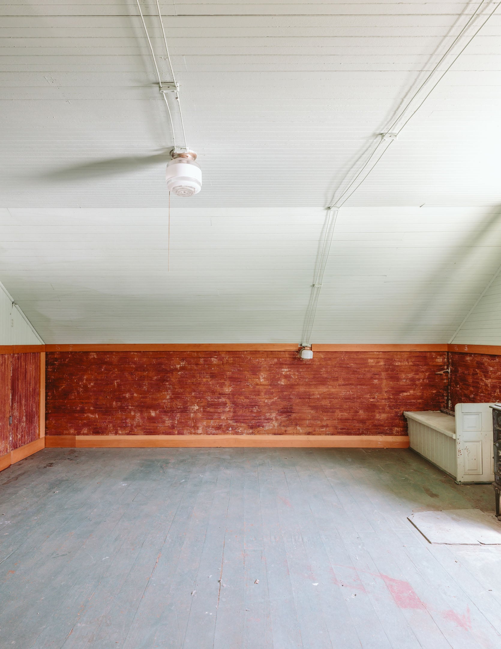
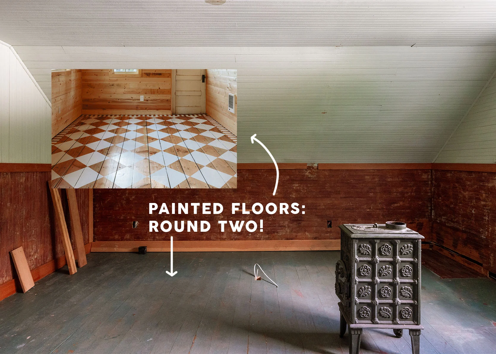
Real quick! This is how it looked for the last 5 years (with a heavy layer of dust).
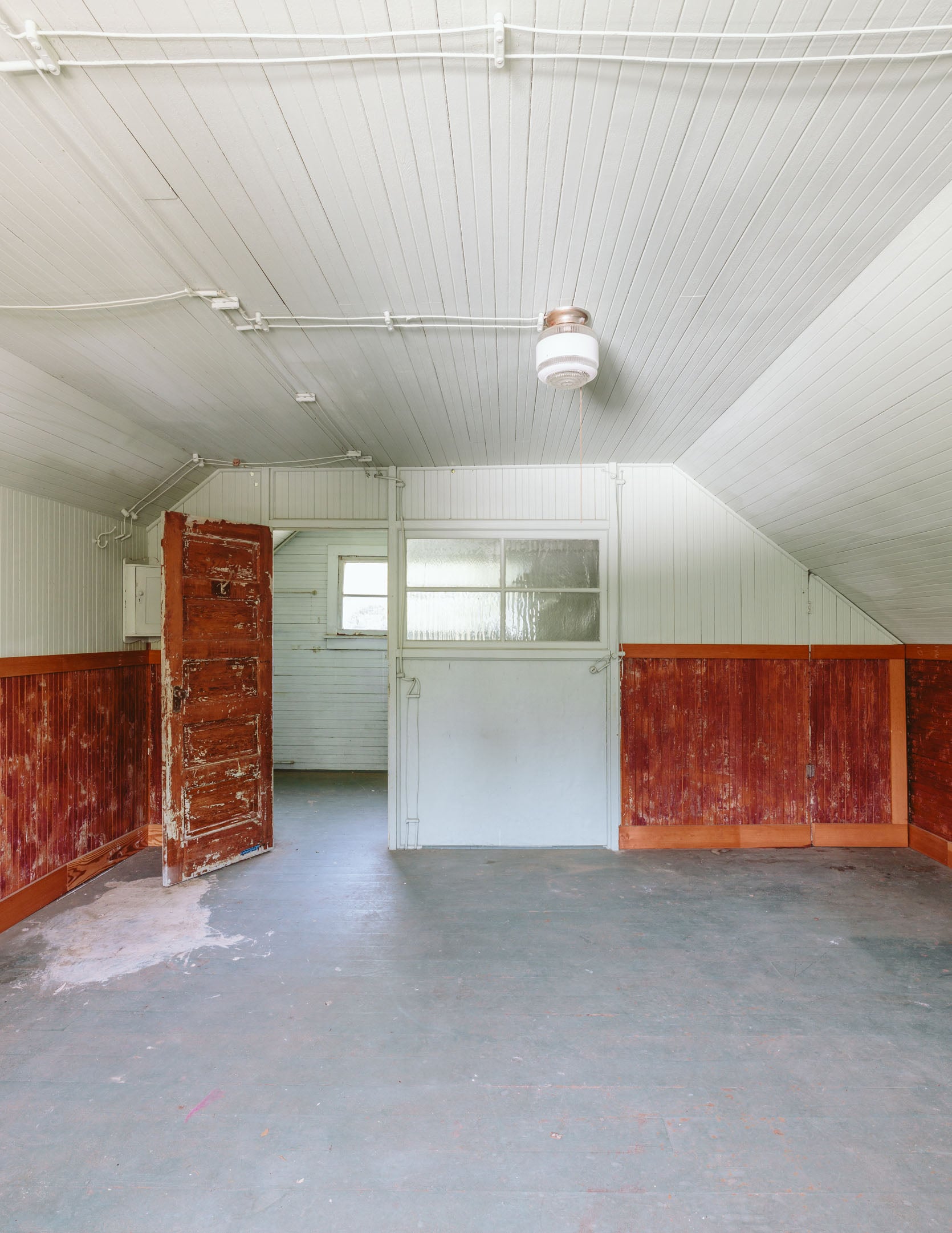
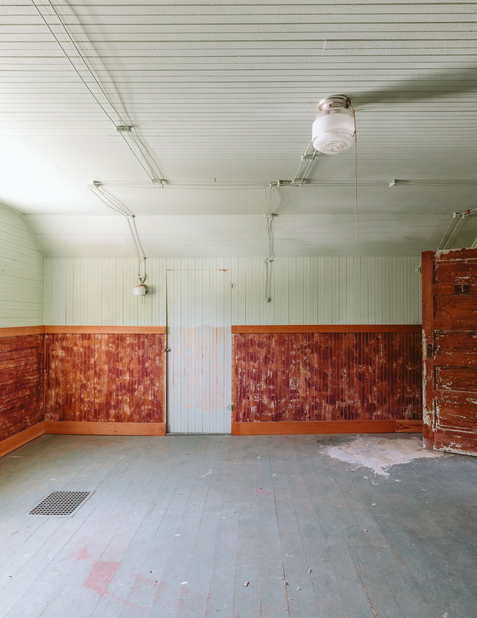
It didn’t have working contemporary electrical. The old knob and tube hadn’t worked in decades. There were multiple types of paneling that were a bit of a hodgepodge, which we embraced along with the interior window.
Primed And Ready For Color
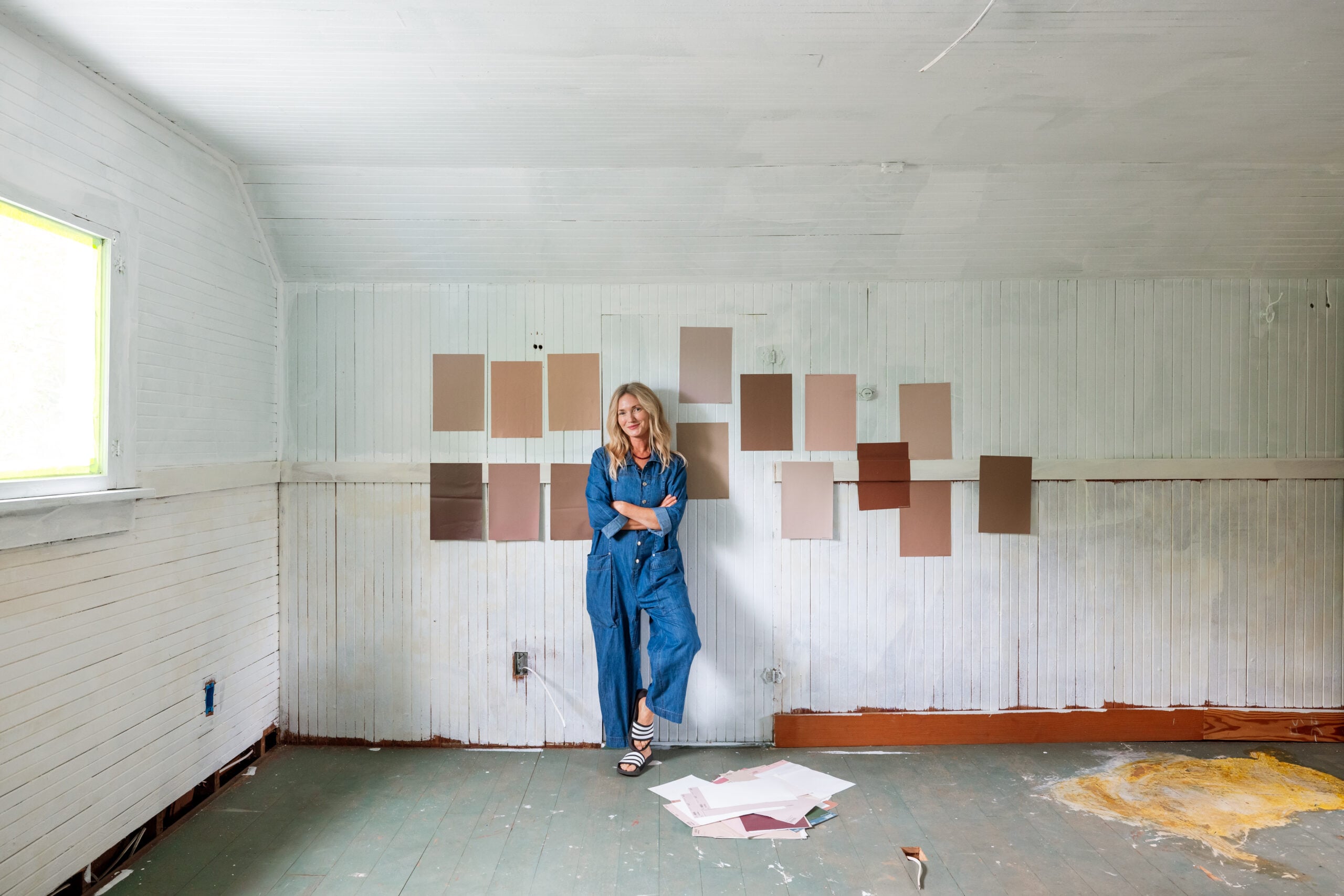
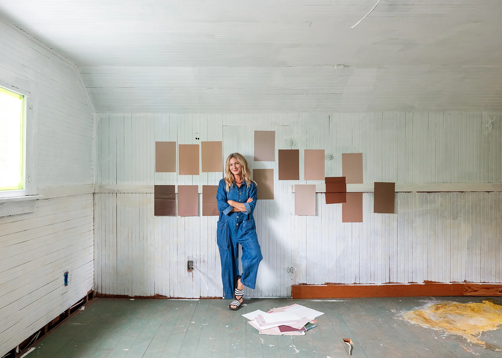
We wanted to lean pink up here, because why not? Gretchen, Marlee, and I chose the colors together since this will be where we meet the 2-3 days a week we work in person.
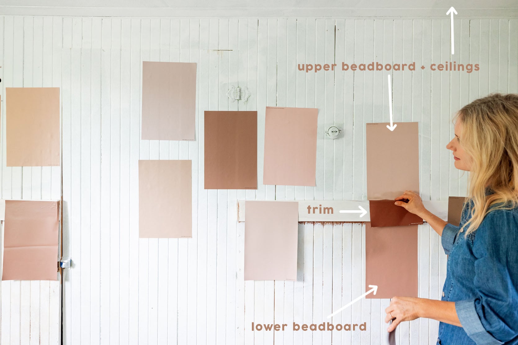
We chose three different colors, and we all felt really solid about them. Lighter on top, medium on bottom with a darker trim in the middle and on the bottom.
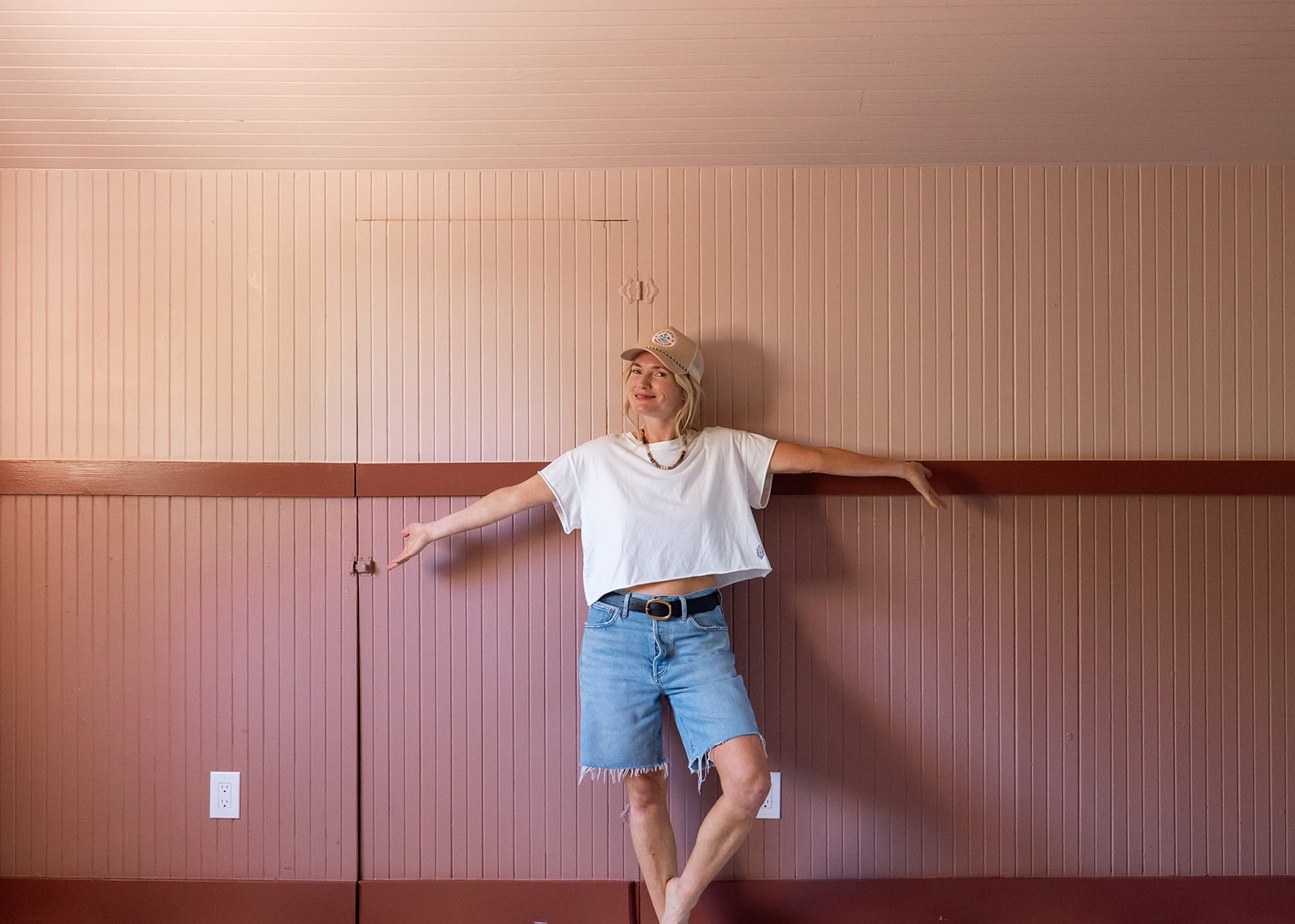
I love the colors together. When I walked in, I thought, “These colors are so pretty, but wait, is this room now too heavy??? Or am I just used to working in bright light rooms???” The original idea was to take two of the colors and do a checkered pattern on the floor with them, but being in the room made me want to go lighter, both color and brightness.
Our painters were coming the next day and so I needed to choose a white paint color, like NOW and order in time to pick up by 8 am. We were going to paint the checkered pattern on top, but this white would be the base color. At first I thought we would do a dusty blue and a beige on the floor – keeping it tonal. But I looked at the one million Samplize samples all day on a Sunday by myself (not ideal), and the beigier the color, the muddier the room looked. I just got so worried that once the light stopped coming in the window (around noon), it would just look dull. And guess what? I was right. In the afternoon, it looked just sad and dull. So I panicked. Instead of choosing Slumber Sloth by Sherwin-Williams (which was my first choice), I went with Oyster White (a decidedly lighter beige). It also didn’t help that SW couldn’t mix Slumber Sloth in the Forte paint (self-priming durable floor paint) that I wanted to use since it’s a designer color. It was a panic choice which isn’t ideal, but it’s not the first nor last panic paint color choice I’ve made, and so far no one has died.
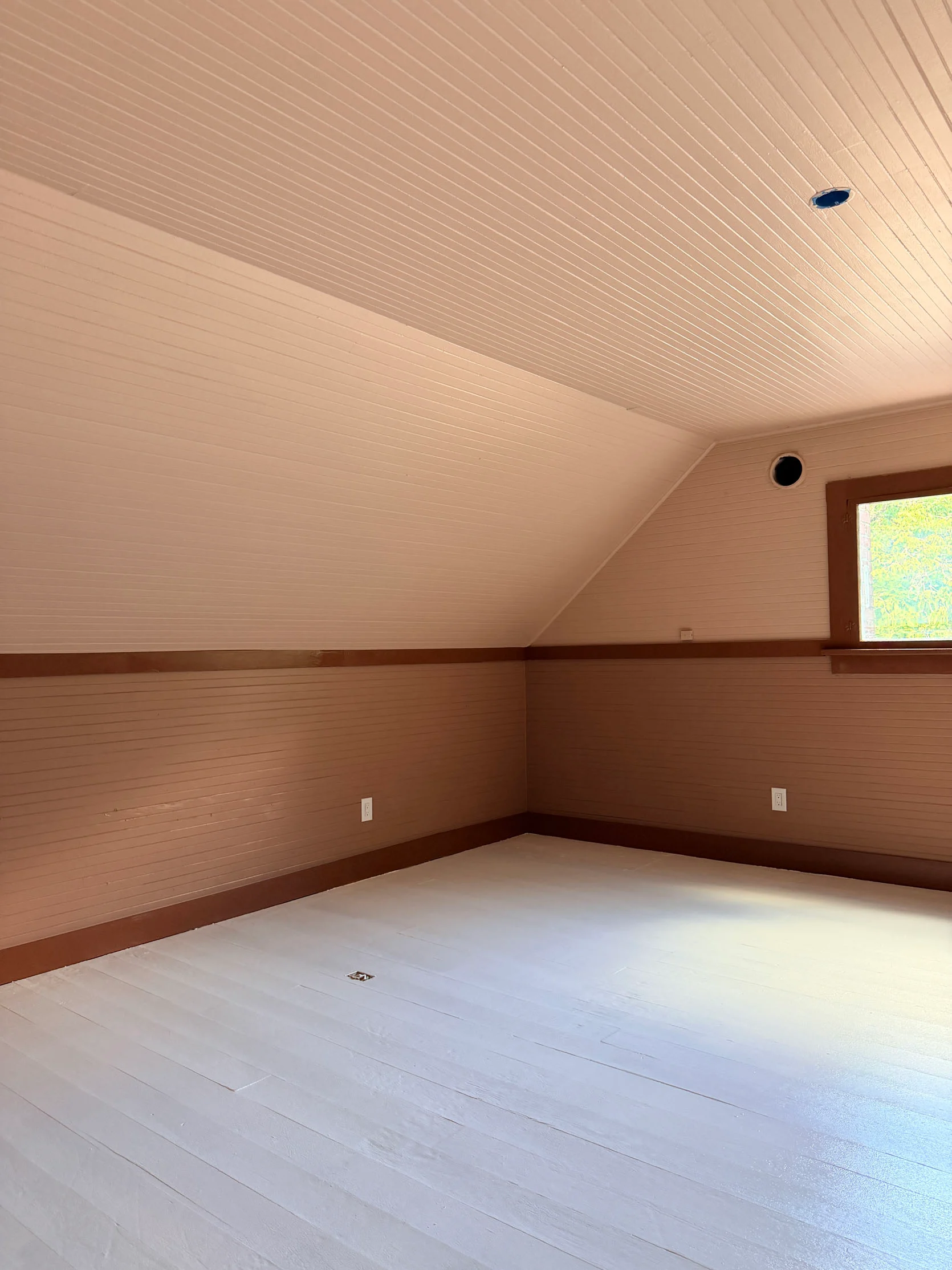
So I walked in and was like, “uh oh”. I feared I had chosen a too-light beige that looked mostly white (and it is; I mean it’s called “Oyster White”). But with the first shoot 4 days later, we didn’t have time to redo it (we needed to do the pattern on top and then give it enough time to dry).
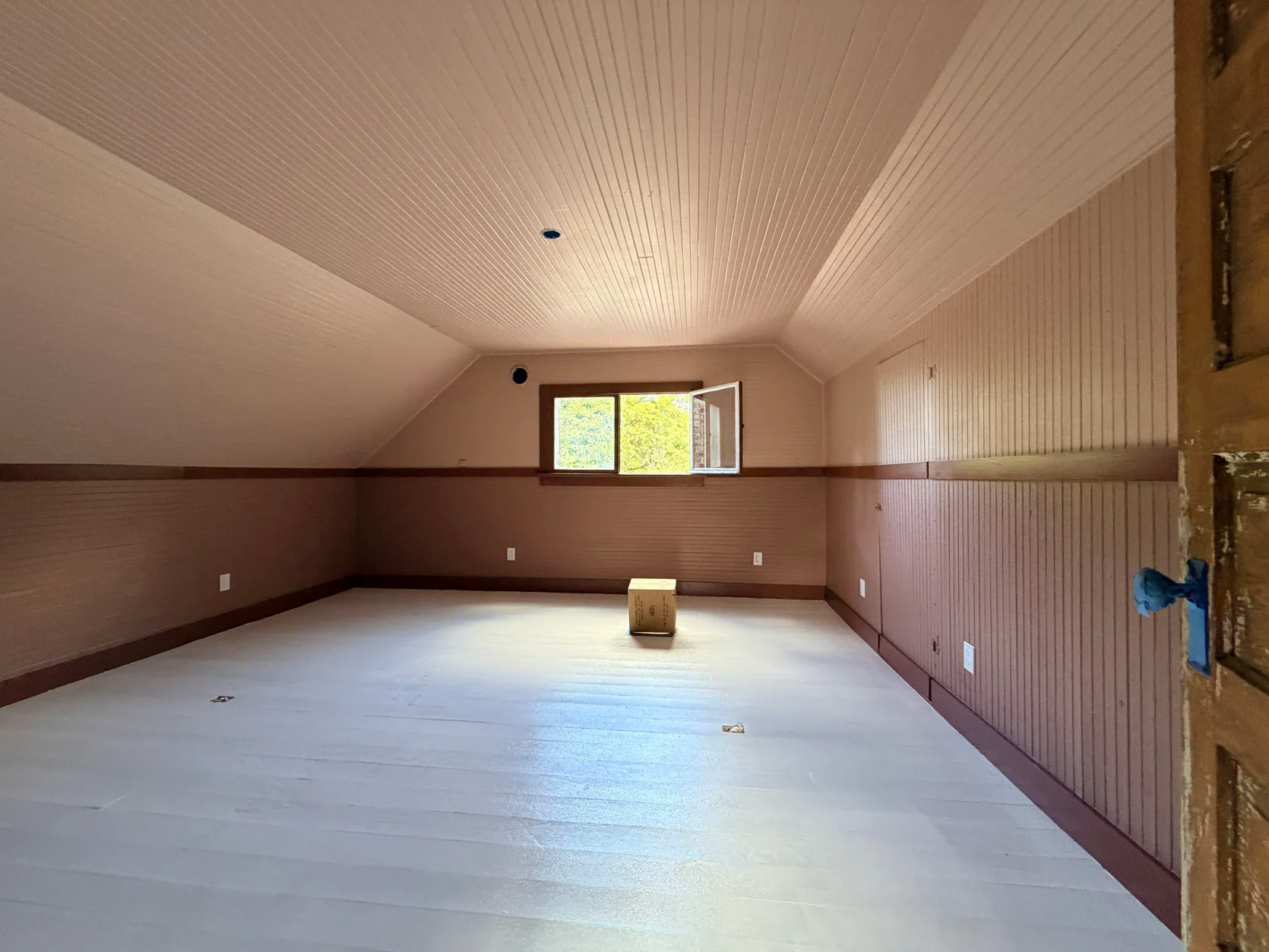
I did like that I could tell it lightened up the room, but I wasn’t convinced. My team thought I was overreacting and overthinking (ya think?) and said, let’s just work with it. So we had to choose the blue paint color.
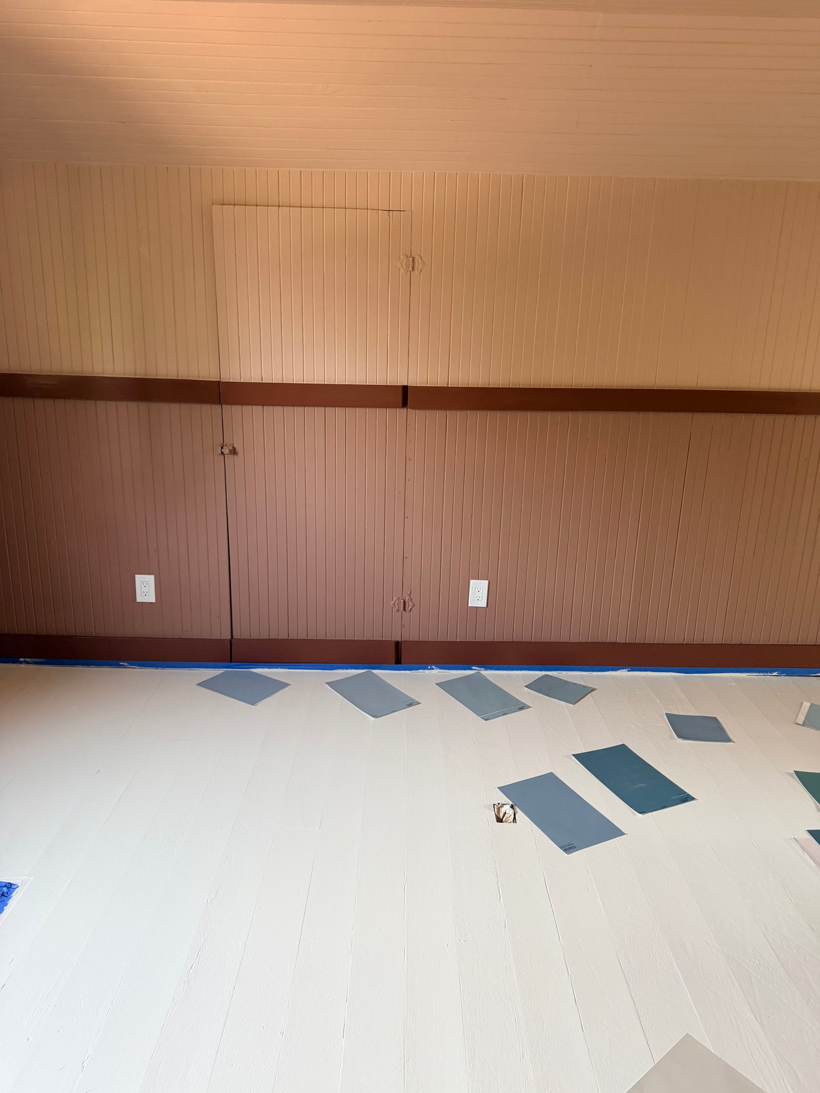
Once we put down the blue paint colors, I started to feel better. The contrast made me happy. And choosing the blue was so much easier. We debated between a lot of my favorites that I’ve used before, but ultimately chose Breezy because Gretch and Marlee were so sure about it, which made me feel so relieved.
Creating The Floor Pattern
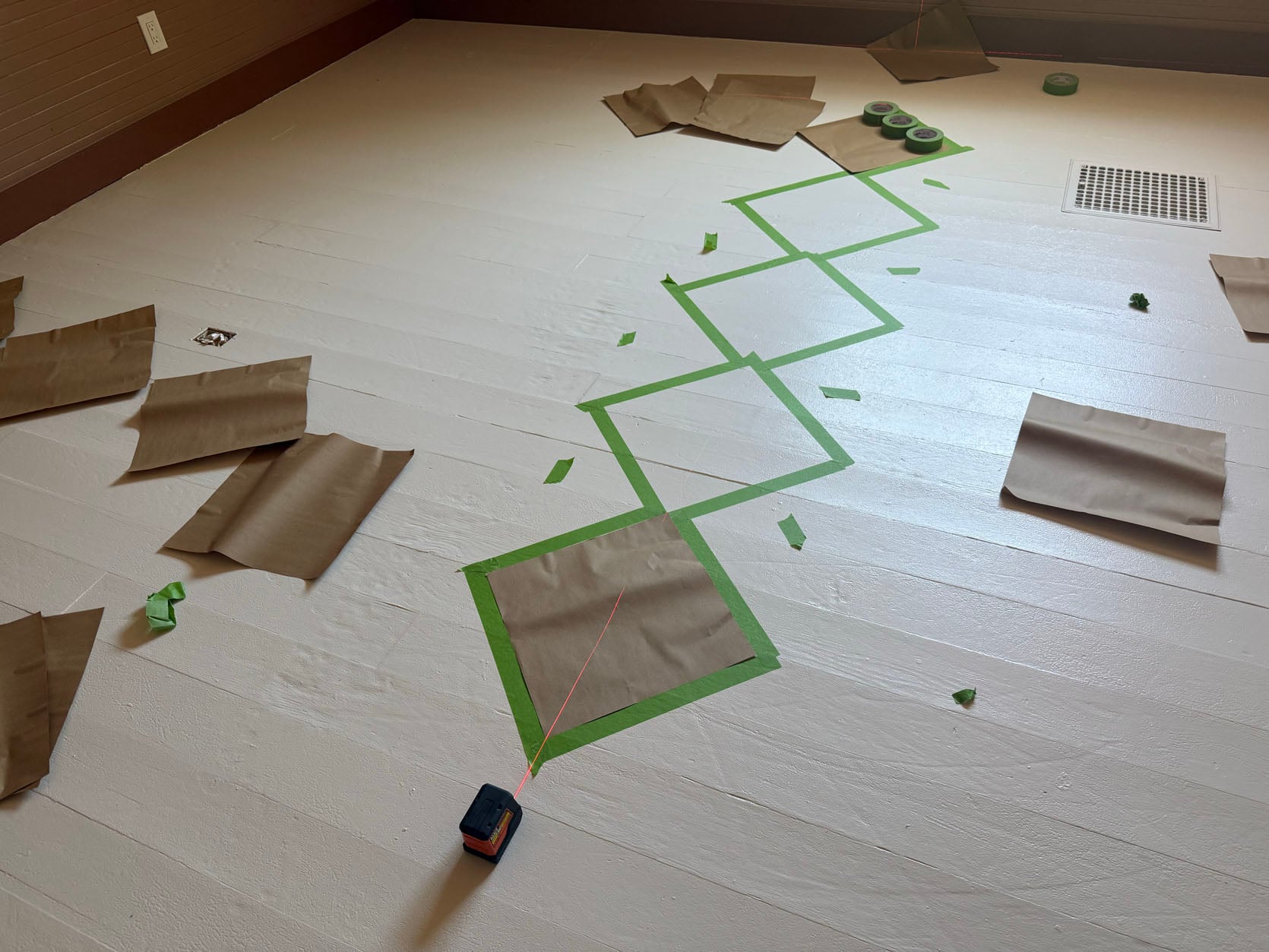
Ok here’s where it gets tricky, and honestly my brain is not suited for this. Gretch took the lead on this in the art barn, so this is our second time at it, and it definitely went a little fast this time. For this room we started with a 15″x15″ square paper template (in the art barn we used 12″x12″ scrapbook paper). We taped out around the outside of the square and then repeated the process diagonally, making sure the corners of your paper template touch, rather than using the tape as a true guide. Using a laser level here is pretty much crucial to make sure your squares are aligned corner to corner in a straight line. We found the center point of the room, taped a row down the middle of what would be just blue squares to start and worked our way out.
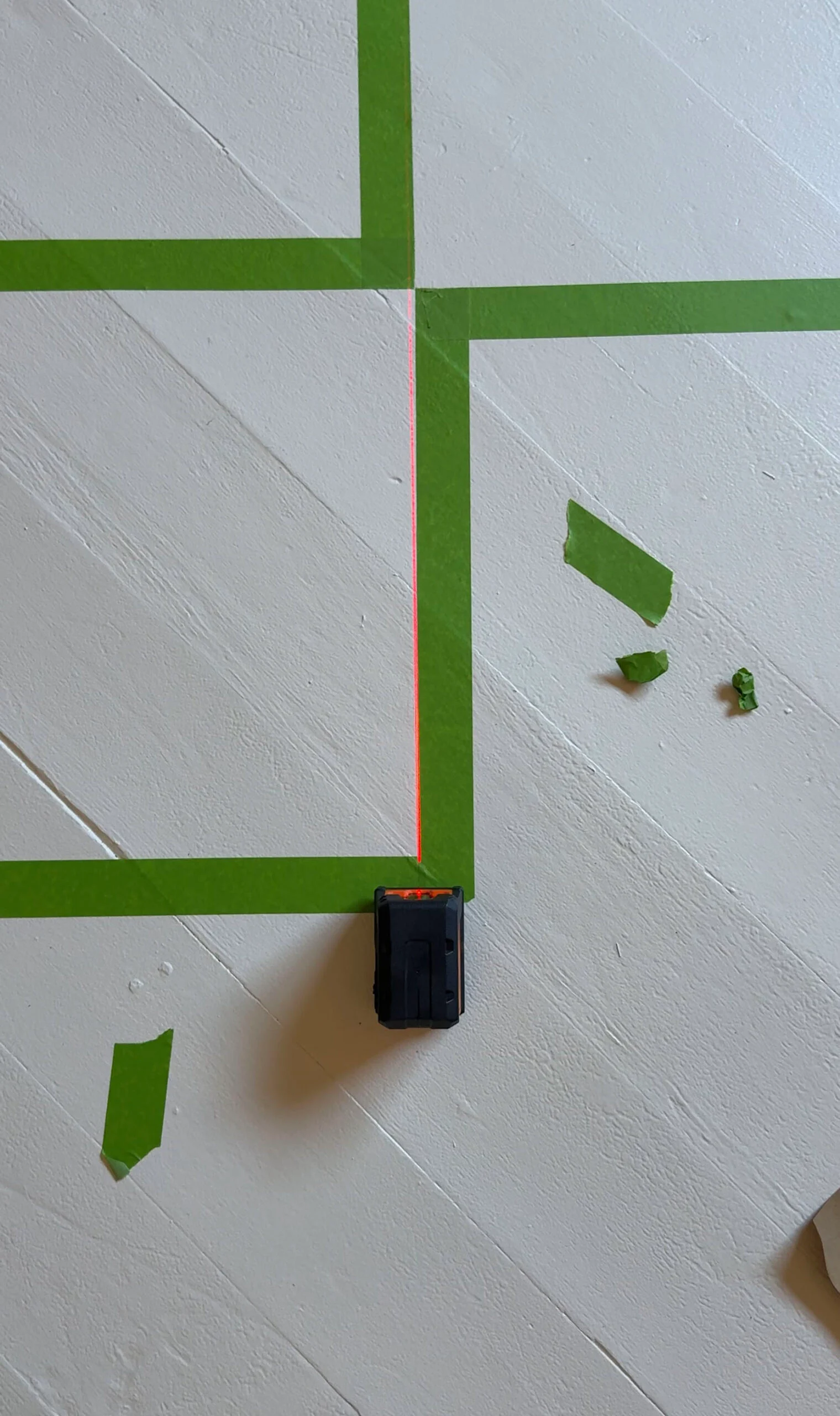
After you outline the paper with tape, you will inevitably have tape overlap into the next blue square. Use an Xacto knife to cut off the excess tape and return this shape to a true square before paint. This can all be a bit tedious, but we split up the work. Gretch focused on taping the whole pattern, and I followed behind her cutting out the corners. The laser level is also a great tool for making sure your lines are straight across the whole pattern. We used it to speed up the pattern process by lining the level up to the sides of the taped squares to help guide the next row. Once you have a good starter row, you can move on to the squares remaining the base white color. To identify these, we marked them with a “don’t paint” sign, which for us looked like the leftover pieces of extra green tape I was slicing off. So anywhere we saw a collection of tape offcuts, we knew not to paint.
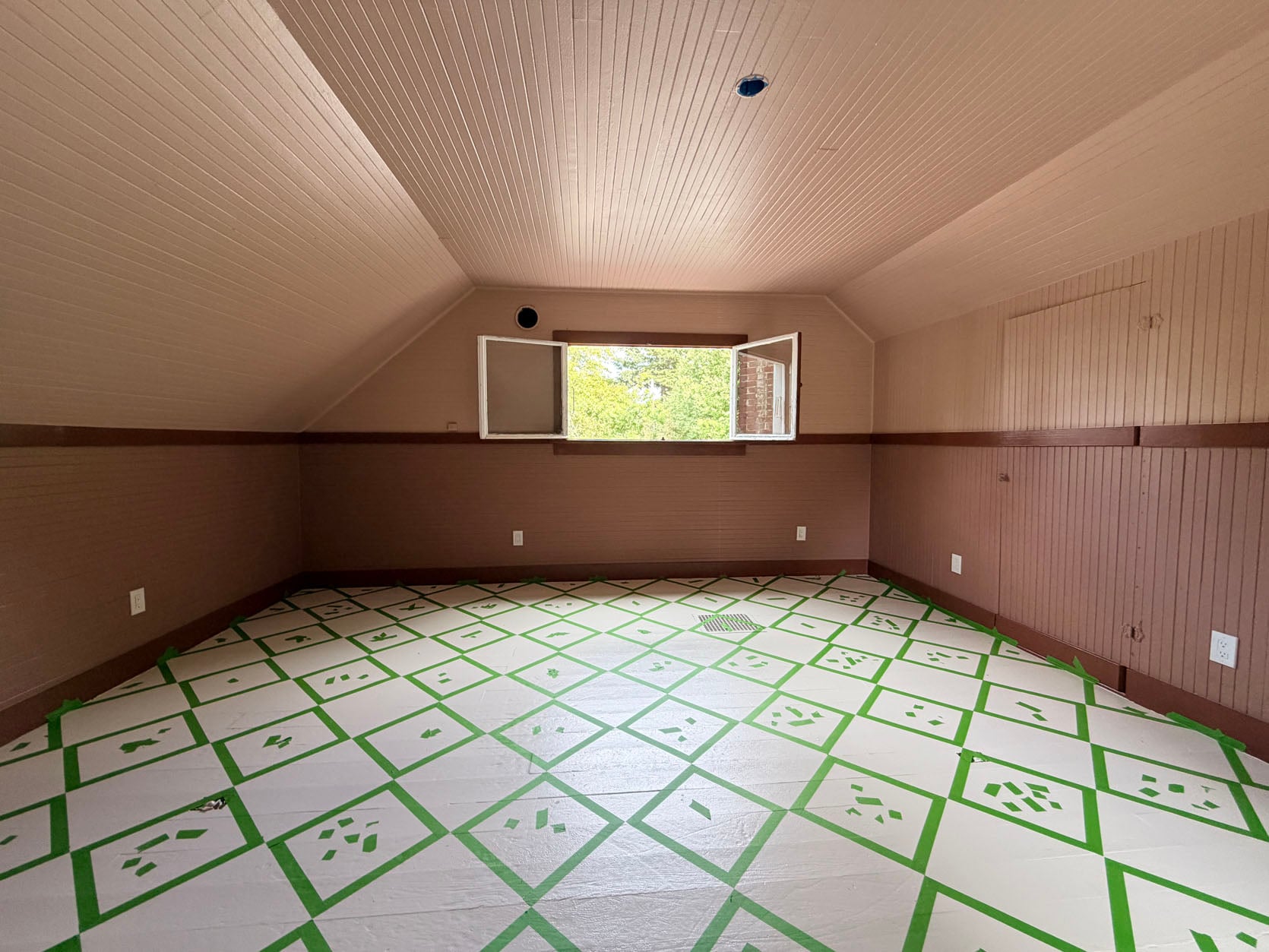
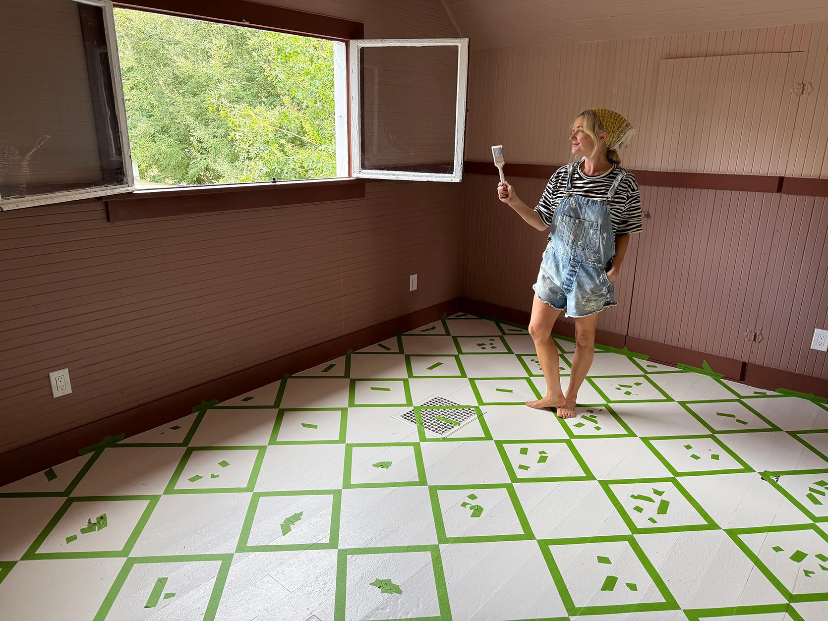
The trickiest part about taping a pattern like this is wrapping your head around why the tape scrap squares appear to be smaller than the to-be-painted ones. This photo does a pretty clear job of illustrating the difference in size between the two. Once painted, they are exactly the same size. Because we taped around the edge of our 15×15 square, that means that whatever is under the green tape will remain the base color. What you can’t do here is run one longgg line of tape. As seen in the laser close-up, the tape alternates on either side of the laser line, running along the sides of the squares.
Our step-by-step for the art barn is basically the same, so I would read that post here if you want an even clearer tutorial. Also don’t forget to tape off the baseboards where the painted (blue) squares will meet!
Meanwhile, right outside, on the landing, the painters had already painted the Breezy blue on the trim and against the Oyster White; it looked SO GOOD. So we knew that we loved the color combination and felt certain enough to go for it. Now the landing has a lot of eastern light; this room gets mostly western light. But we felt really good about the color, so we continued on the plan – Breezy Blue over Oyster White.
Our Pint-Sized Painters
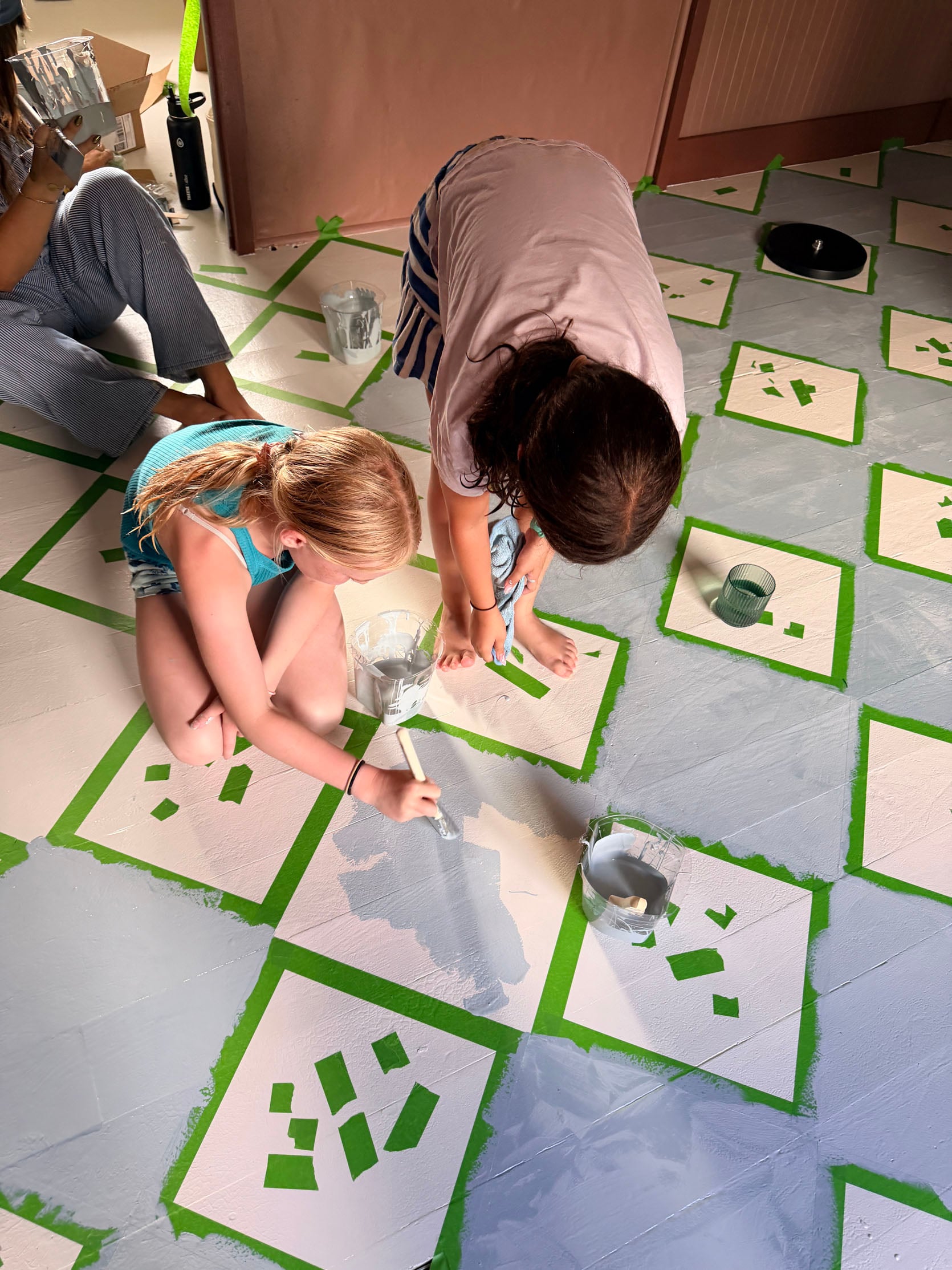
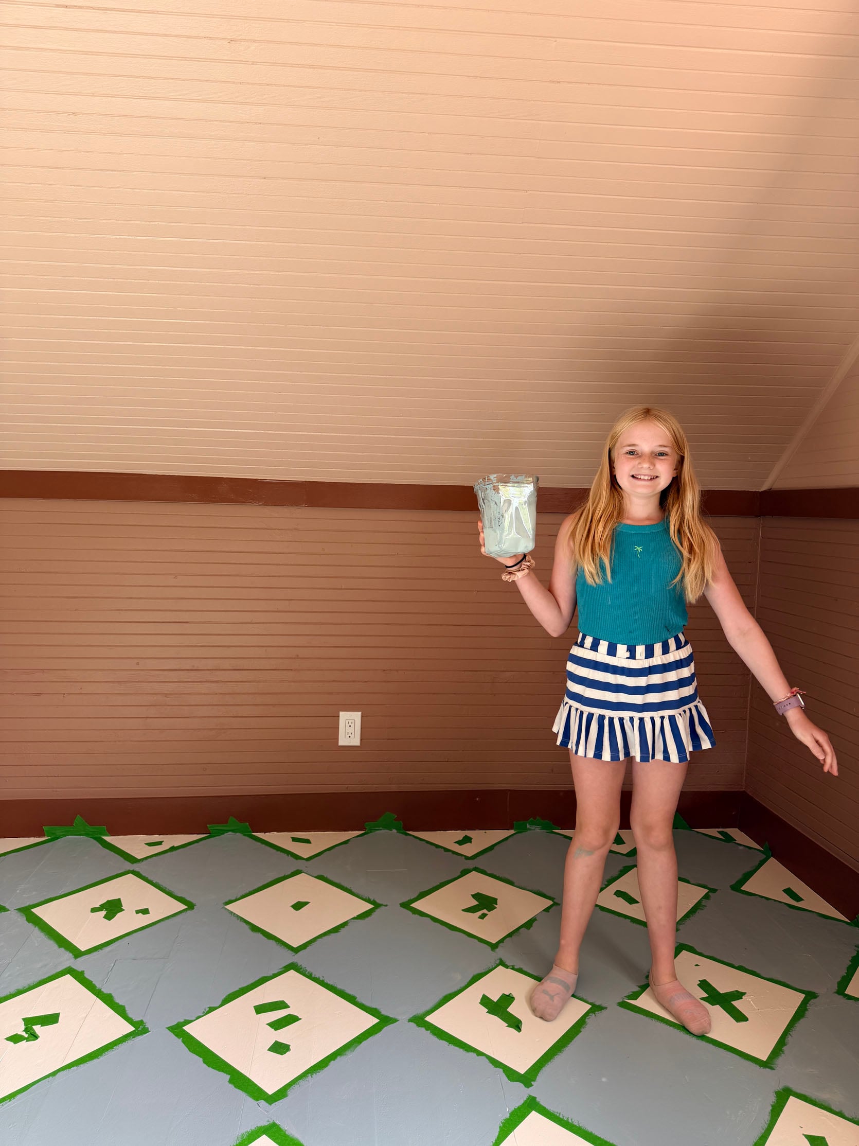
Elliot and her friends were dying to help paint, and this is such an easy and satisfying paint job for tweens (and I get so excited any time they want to help – these 10-year-old girls are so fun to hang out with). Of course they played a lot of hopscotch at the end with so much wet paint on the blue squares, which was hilarious. But I couldn’t stop them – they were having too much fun! So I had to go through and wipe up so many little blue footprints afterwards. Taping took a full day, painting took 2 hours between 3 10-year-olds, me, Marlee, and Gretch.
Shots Of The Floor Done With The Green Tape (I Was So Scared)
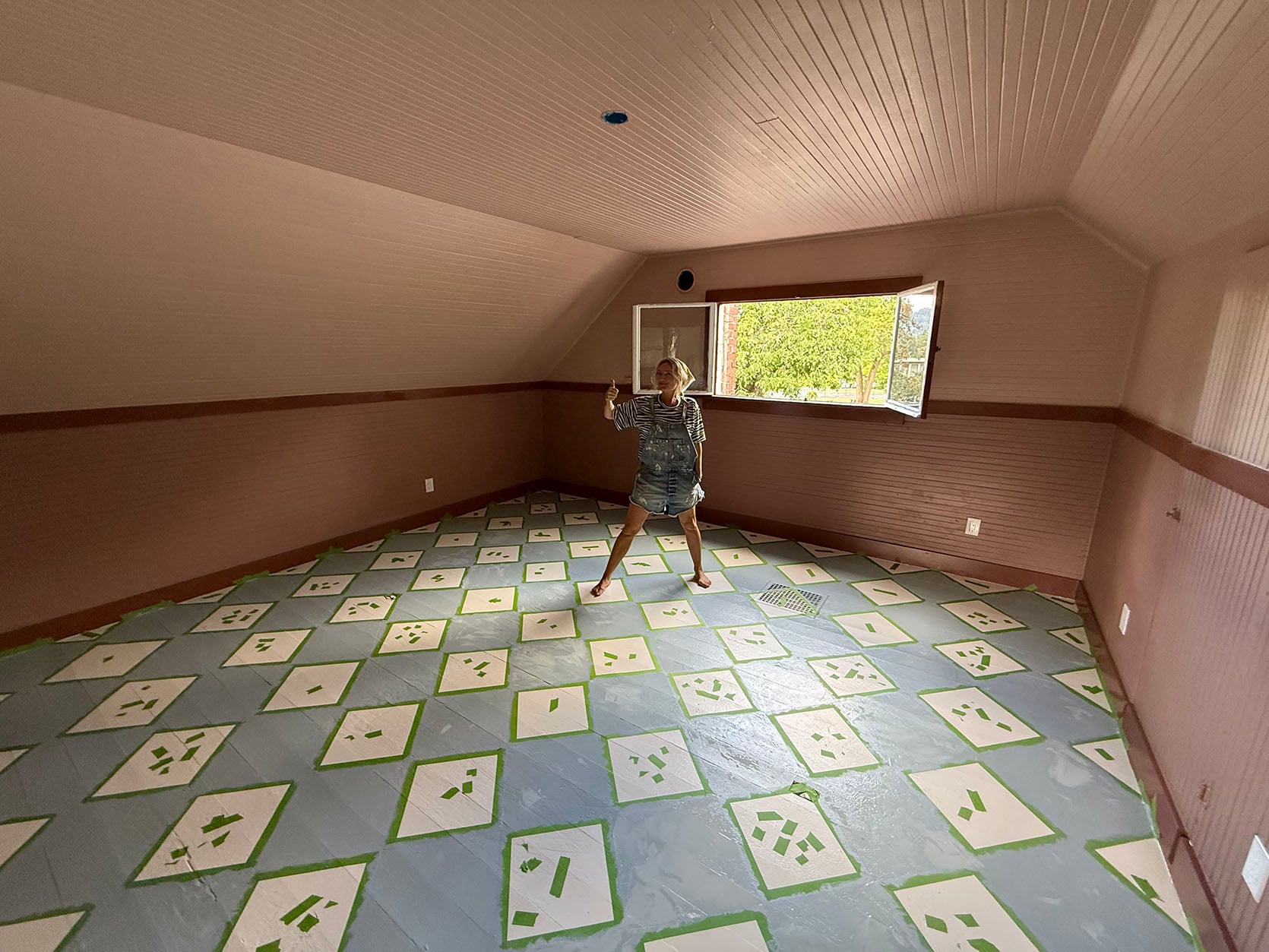
This was after the first coat at the end of the day. As we were painting, I thought it looked SO GOOD. But as it dried, the blue started looking less dusty and more periwinkle. Was it the afternoon eastern low lighting? The green tape? It went from this soft tonal to more bright and kiddish.
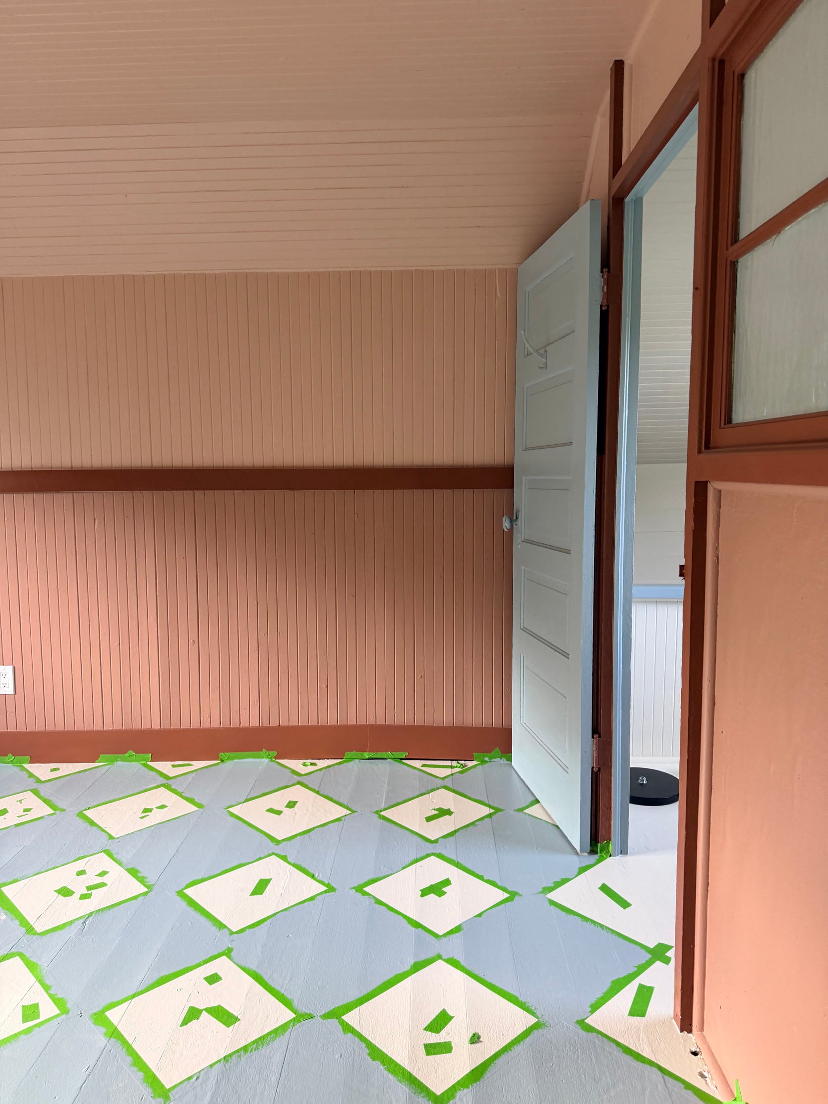
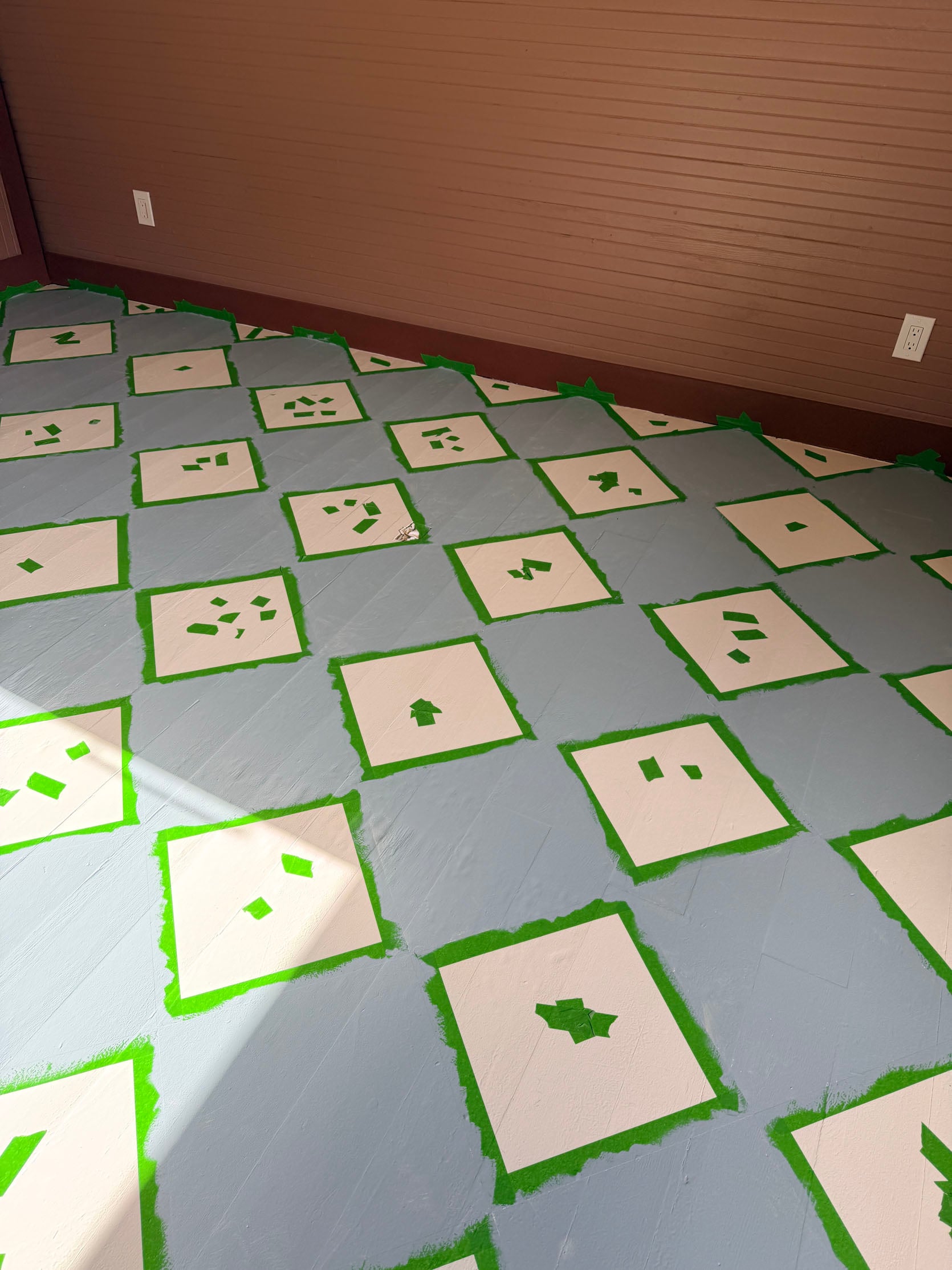
The afternoon light was intense, and I did my usual self-doubt spiral. Was the blue too blue? Was the white too white? Was the green tape totally messing with me???? But honestly this whole project feels low stakes to me (and paint is just paint), so I wasn’t actually stressed.
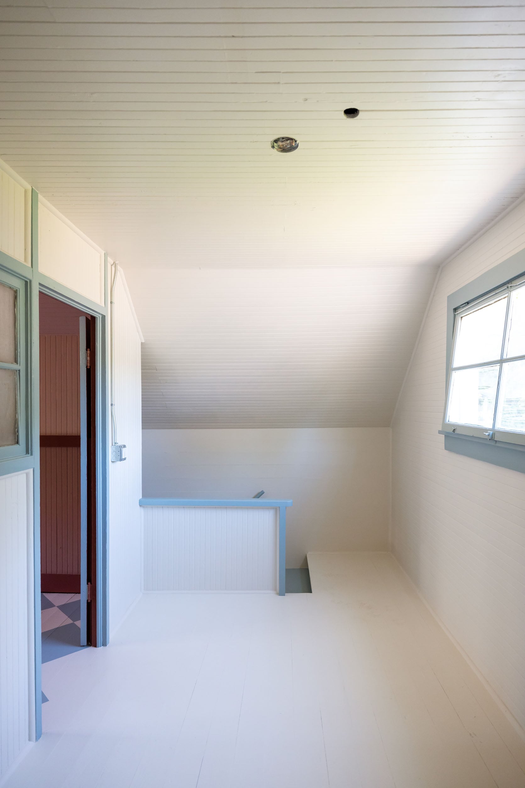
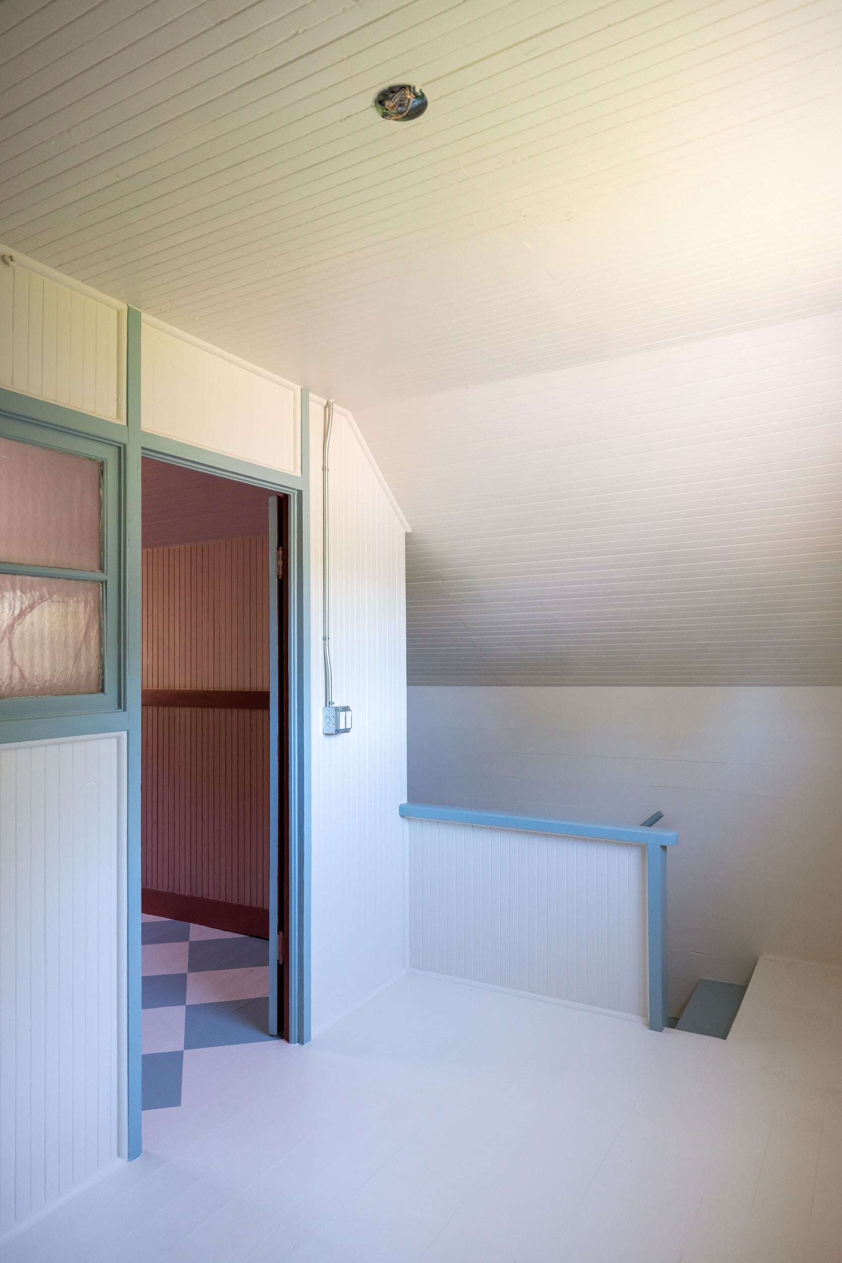
And not for nothing, we painted the trim in the landing the same blue against the same white, and it’s GORGEOUS, the perfect dusty blue and creamy white. We already saw the blue on the door against the pink, and we loved it.
The First Layer Finished Pattern!!
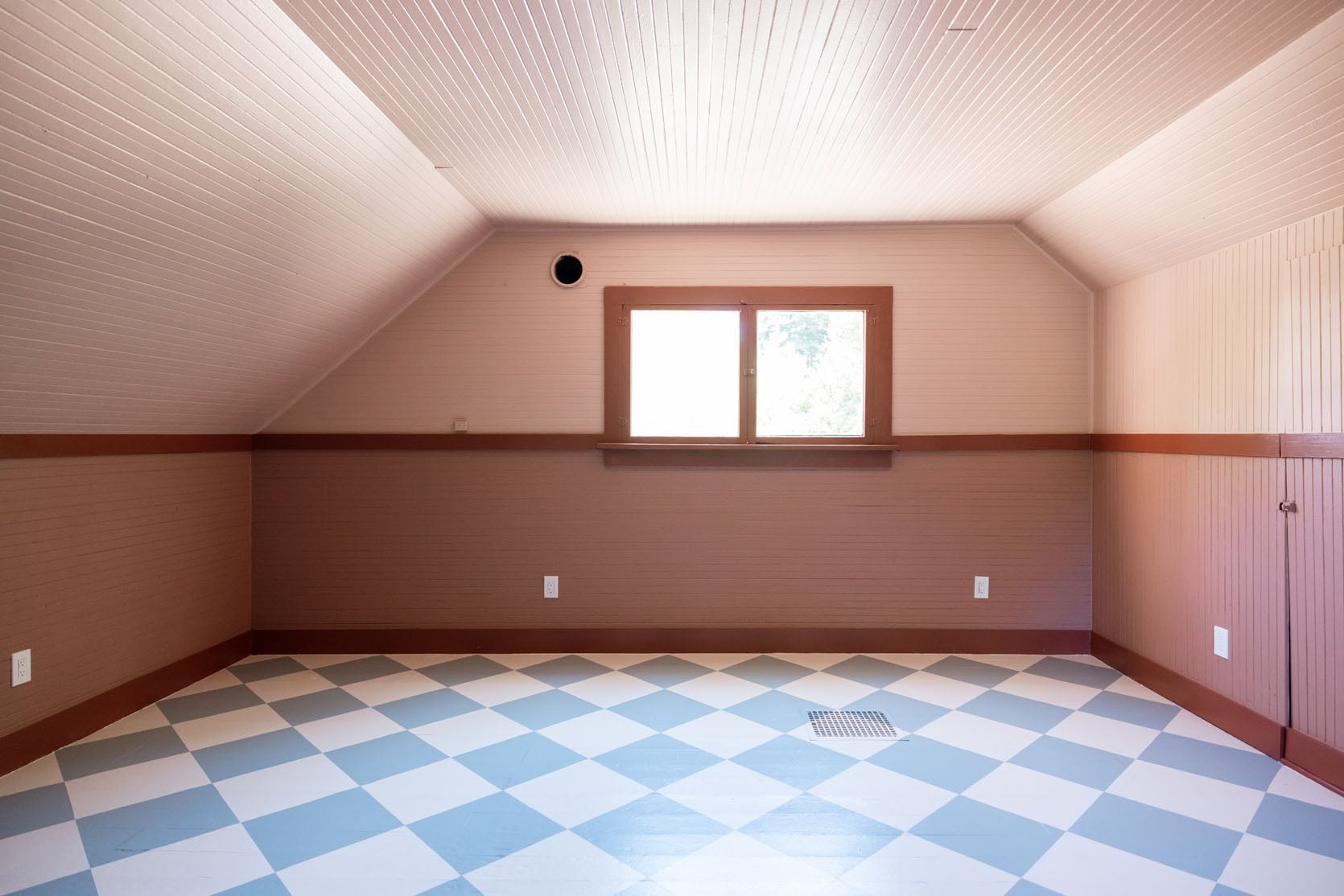
So here she is after 2 coats of each paint color (the white was done first). My first reaction was “fun!” with a side of “is it too bright”? But everyone else thought I was nuts and they all loved it. And then later, as we populated it with furniture (which included some deep woods and creams), it totally came together.
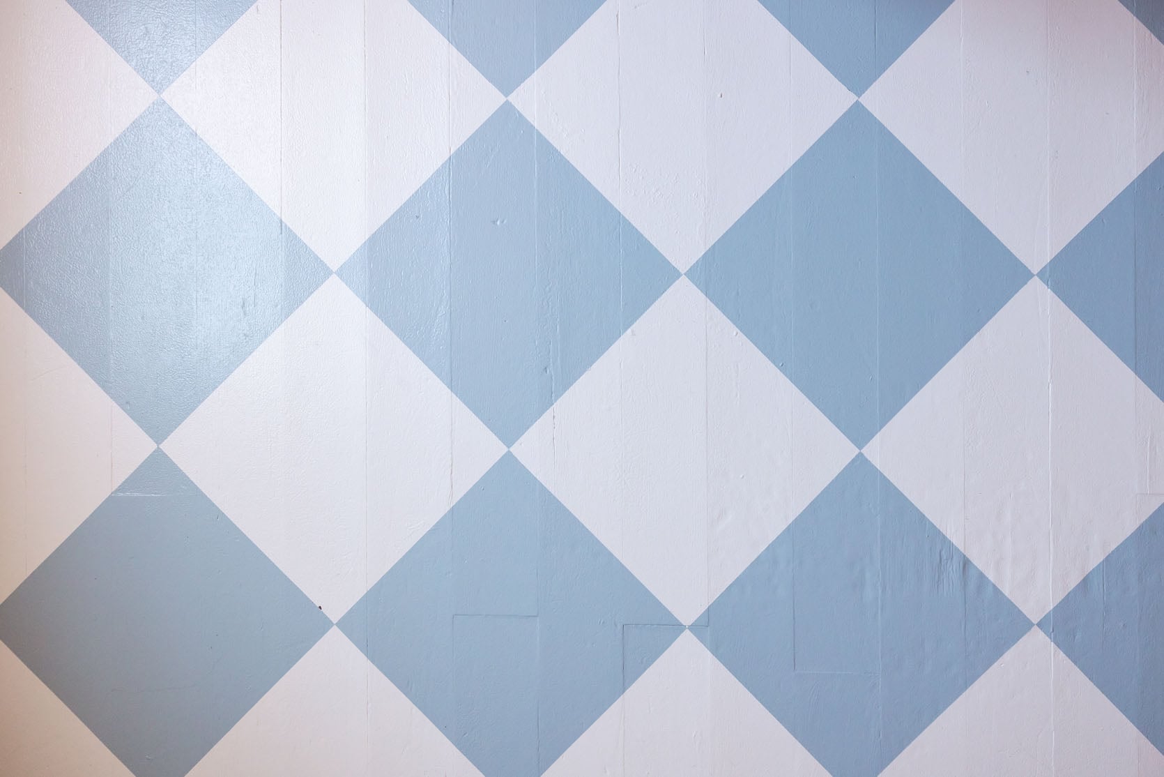
We used Sherwin-Williams Forte paint, which is a self-priming, durable floor paint in satin. This isn’t sponsored, but it was great to work with and feels really easy to clean and hard to chip, but maybe I’ll do a review in 6 months to let you know how it really holds up. Look at those crisp lines!!! That green tape really worked, and Gretch’s laser method nailed it.
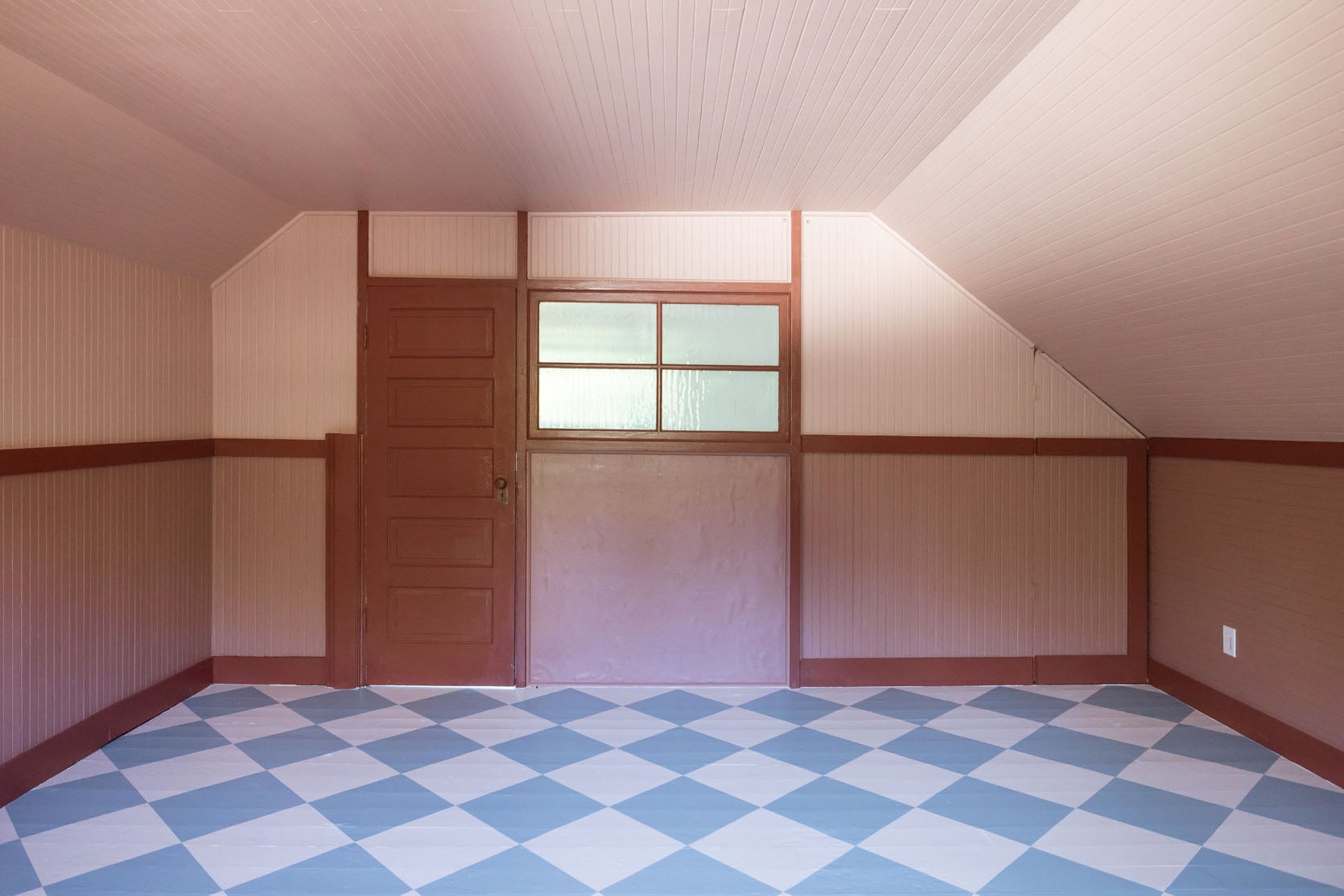
We painted this side of the door the darker Canyon Clay color (along with all the trim). Staring at this photo, I wonder if we should paint the little vertical trim pieces back to the lighter pink color? And then we wonder if the part under the window should either have beadboard to match the rest of the room or some different treatment. TBD.
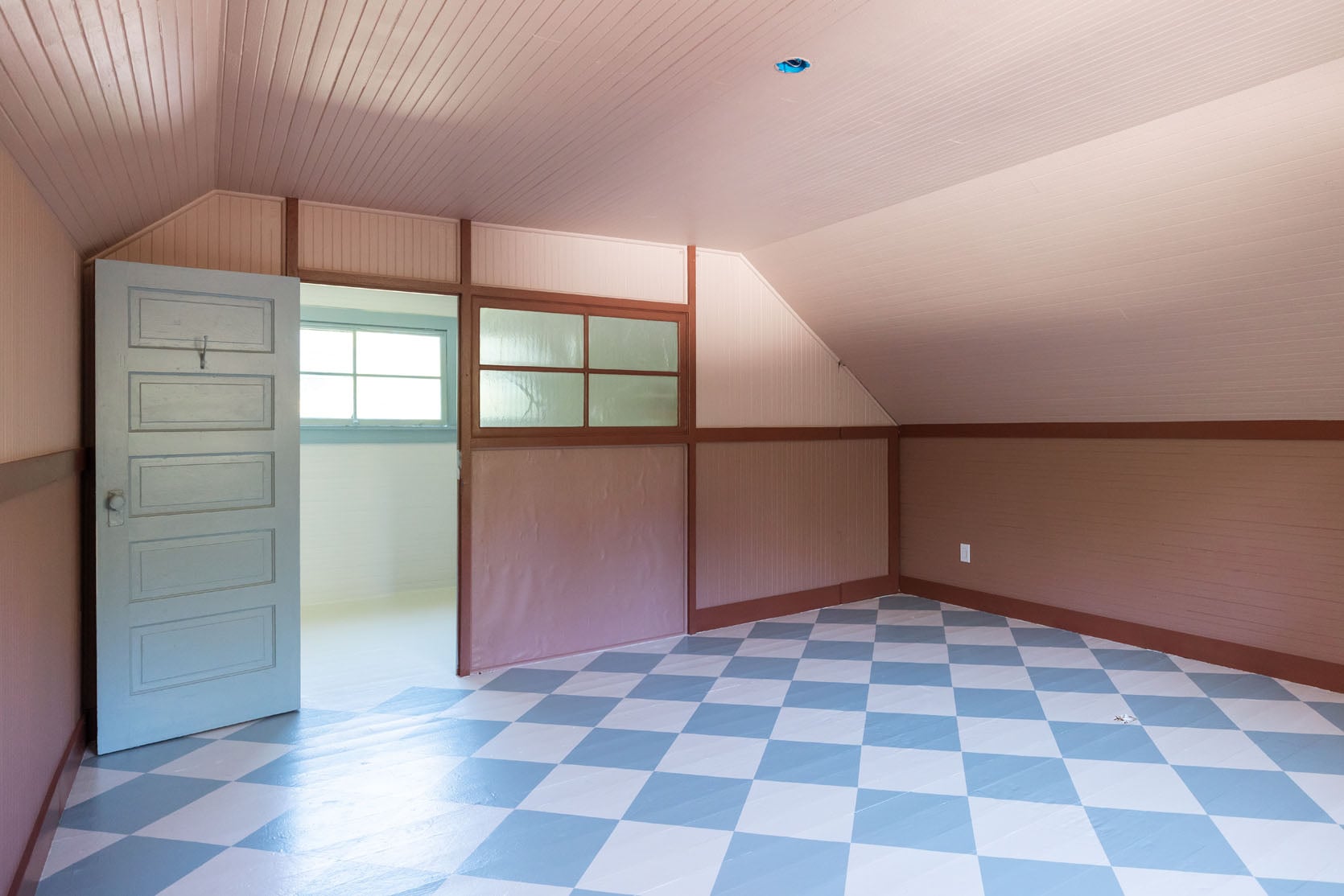
Isn’t it funny that the blue on the door is the same as the blue on the floor??? It felt so different to us in person, too. I checked the paint cans over and over, and it’s the exact same color, finish, and type of paint. One is just vertical, and one is on the floor, mixed with more white.
We Aren’t Done!
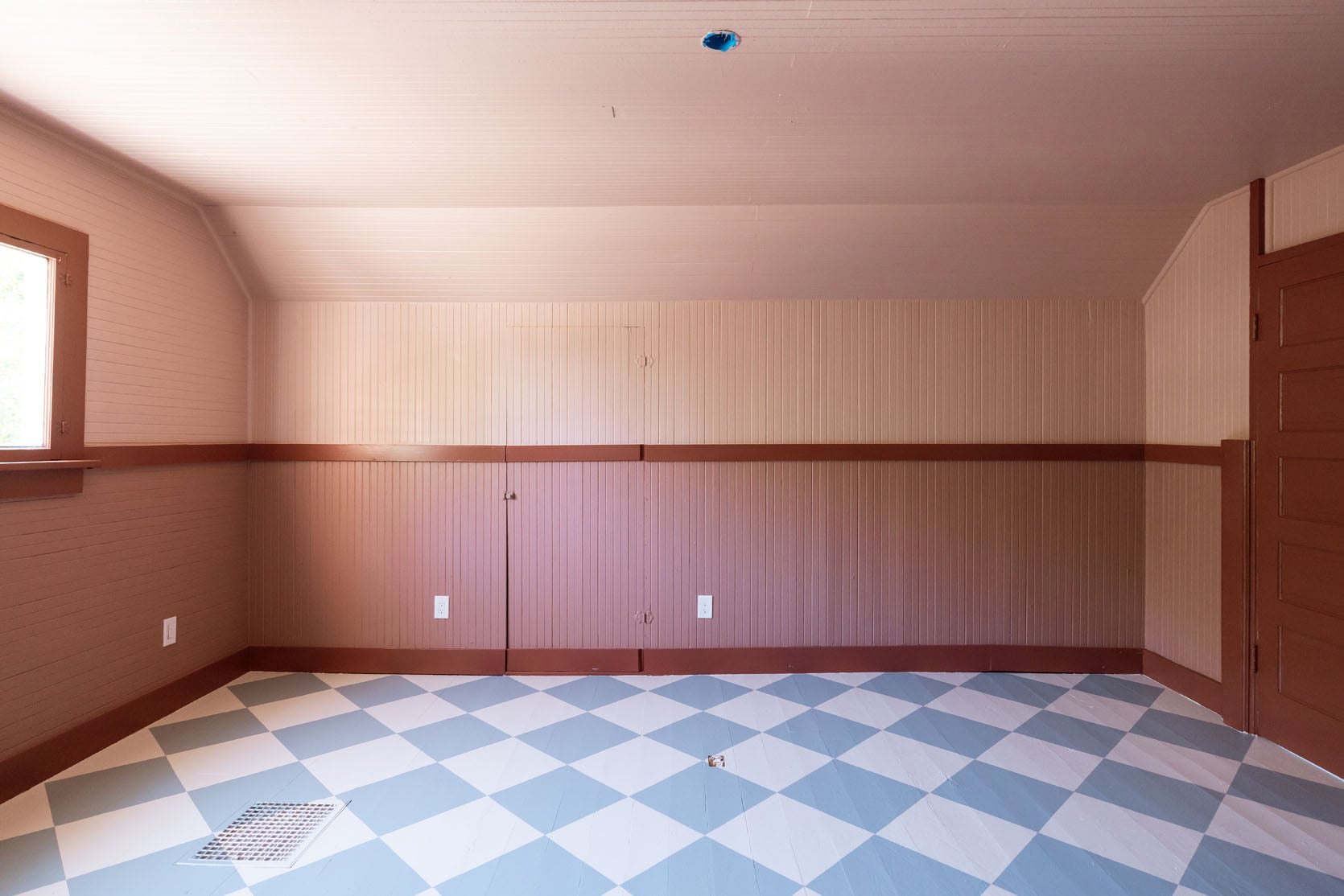
Now two quick things before you think we are done:
1. Yes, we bought paintable outlet covers, these, that we hadn’t installed yet. So those white outlets will go away.
2. We want to add one more color/layer on the floor. We are thinking either a floral motif in the middle of the white squares or an emblem where the blue and white squares touch. We had a shoot last week with furniture on a deadline we couldn’t shift, and I didn’t want to rush a fun decision, so we shot it like this, and we’ll add that final layer later (hopefully when it’s not a sauna up here painting:))

I forced Gretch in a photo because she deserves credit for figuring out the laser level/taping situation again. I swear I was ok at geometry, and I really don’t think it’s that hard, but she really led this pattern.
Waddya think? Come back next week to see it styled out. Once we got the furniture in, it really looked so alive and awesome. I can’t wait to show you.
Now, in case you want all the paint colors in one place, here you go:
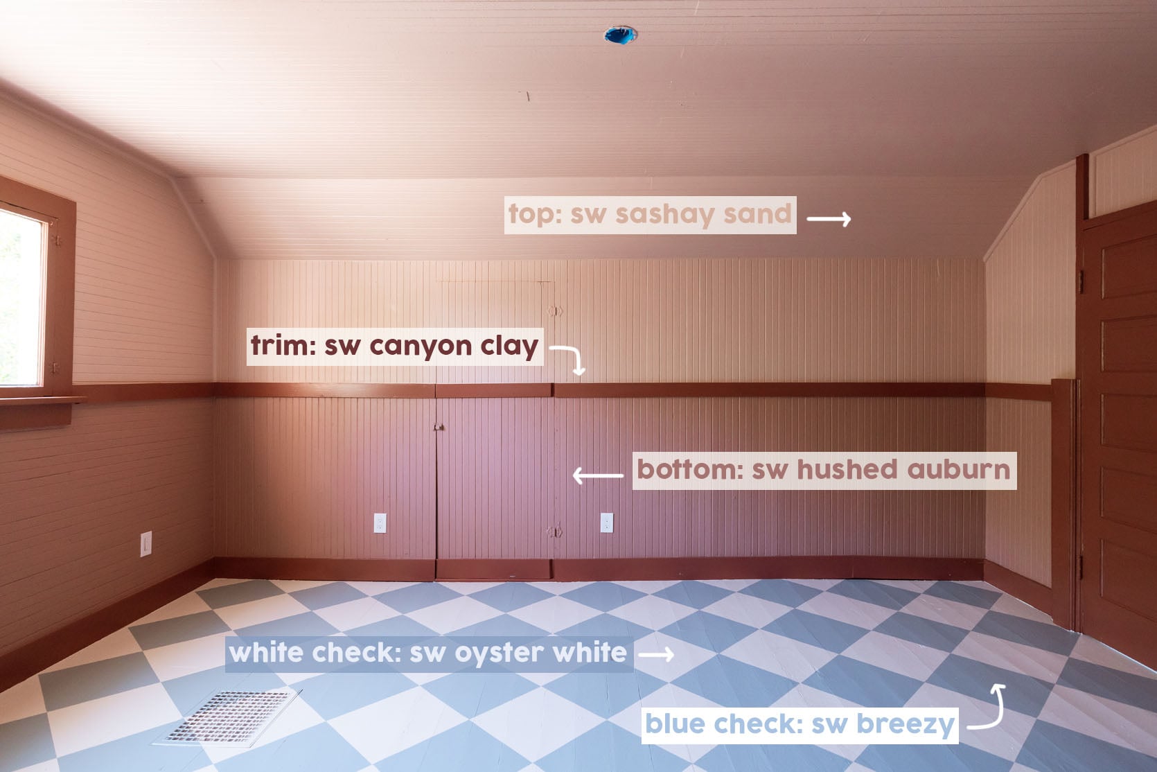
Top Beadboard: SW Sashay Sand | Trim: SW Canyon Clay | Bottom Beadboard: SW Hushed Auburn | White Checks: SW Oyster White | Blue Checks: SW Breezy
*Photos by Kaitlin Green
What a great workspace! I have a hunch the colors will feel so warm and welcoming once the gray of winter sets in.
I love it! I do think making the spot under the window match is a good move. At the very least, the same trim. So fun =-)
definitely beadboard on the bit under the window. floor looks great!
what are you doing with the little wood stove??? it’s so gorgeous and precious. send it to me in Nova Scotia if you don’t want it 😉
i love a good paint project like this. When I’m finished, I find myself walking back into the room about a zillion times to admire. Anyone else? But really well done and having the girls all help will be a great memory for everyone. But it is looking great!
This combination!! Saw the mood board and had all sorts of opinions but I’m now a believer. Also, ran into the exact same one at a historic workers tenement in Tampere, Finland. If scandi is the goal, documentation that you nailed!
This looks great! But am also wondering what ever happend to the meeting room in the garage space that you worked so hard on?
That’s mostly her prop storage, and the table is used to pull all the items they want for a shoot. I think Emily has said that it’s not so nice in the winter with the garage doors closed
What an undertaking! I had a hard time envisioning the completed project looking at all the swatches and texture in the room. I’m looking forward to seeing it with furniture. Great job ladies and Gretch!
Idea – I do think the part with no beadboard could use it, but before you do that I wonder about painting that area (as well as the areas above the door between the trim pieces) the same color as the trim? So the whole portion of that area would be a big block of that Canyon Clay color. Probably fairly easy to mock-up in Spoak to see if it is a good idea or not…! Overall I really like the color scheme and I can’t wait to see it styled out.
I could totally see painting the non-headboard area the trim color. Would unify it with the door.
That was my first thought, too.
Shout out to Oyster White. I used it in my bedroom after seeing it in the Portland House and I love it. It’s so calm and subtle, and changes throughout the day depending on the natural light. My contractor even recommended it to another client.
First, very loyal reader and love this site, the team, all things EHD. But, I have a question/possibly negative comment: maybe it’s just me, but does combining pink and blue seem weird to anyone? I felt this way with the Barb sofas too. Maybe it won’t look so off to me once it’s fully styled with other colors and wood tones, but those are not two colors I would build a room around. That said, I can’t wait for the full reveal, and it’s been fun to follow along with this space!
It’s probably not the more normal color combinations people usually choose?
I do love it. But also maybe I’m biased on the color combination because we have blue mountains right outside our door that glow pink and purple when the setting sun hits them ☺️
I, for one, am excited to see more personal design. I think I need a little house or cabin in my backyard to have some fun with!
I think it’s personal preference. I personally love the color combinations!
Definitely personal preference, but I am also not a fan of blue and pink combos no matter the saturation, etc. Love this blue and white checked floor though! The execution is impeccable and the color choice wonderful.
My husband is an architect and has very strong opinions about paint colors. There are only two approved interior paint colors in our house and one of them is Oyster White! The other one is Pearl White.
Only white? I could never!! 😂
So the easiest way to paint a floor pattern is Gretchen, then.
She is so lucky to have the amazing people she has on her team!!
I would have painted the ceiling a lighter blue to connect it with the floor color. Have you noticed that low porch ceilings are often painted blue? The blue paint makes the porch ceiling seen a little lighter. The pink ceiling seems a bit oppressive to me.
Hi Renee! Interiors architecture major here. I am not sure where you live but in the South porch ceilings are often painted a blue color to ward of bad spirits. It’s one of those things that is most definitely present in a lot of interior design in the South. The color is often referred to a “haunt or haint” blue.
I heard it helps with bugs, too, though I’m not sure exactly how…
Cute cute cute, don’t do anything to make the trim the lighter pink or add beadboard in that odd little square or anything. The situation appears to be exactly what it is – you’ve brought some love and fun into a historic, funky space. It’s so perfect as is!
AGREED!!! I’d keep it just how it is–it’s perfection.
This is so blast-from-the-past retro! It reminds me of my Grandmother’s kitchen (all it’s missing are a few ducks with gingham neck ribbons).
Another vote to add beadboard and trim to the wall underneath the window! Can’t wait to see the room furnished!
It’s very charming. Even though everything was so carefully planned, it still has that mishmash feeling of old places, where someone might repaint the floor with whatever they had on hand, or do a wall and call it a day.
Looking back at the picture of all the pink samples on the wall with the chosen pinks labeled does anyone happen know what sample color is all the way to the left on the bottom of the picture?
Love the blue & whit checkered floor! And yes, paint the little vertical trim pieces back to the lighter pink color. And the part under the window should have beadboard to match the rest of the room.
beadboard under the window! there’s so much else going on in here i think it would add cohesion to the walls. you have totally made me want to paint a floor! love the blue and white.
This was such a bold color combo, and I am here for it. As a visual artist, I would normally run from mixing a cool toned paint with the warm toned pinks and maroon. I even shuddered a bit when I saw the light blue door against the pink walls. I am 100 percent confident that when you style it the room will look fabulous and I don’t hate these color combos at all. I am just wondering with the hopes that you might enlighten is why do these contrasting tonalities work? I love color theory so much. Thank you for this great post.
Go Gretch! Figuring out something like that is…not my forte so I am very impressed!
Emily! I feel like I can feel you having more fun with design lately through the screen. The creativity of the projects (my heart beats for the art barn) and also your more casual writing (you’ve had me cracking up with the s*x bathroom for Brian and the panic color not killing anyone) gives the impression of lightness and joy coming from you! Really enjoying this era!