Design
Our Guest Cottage Upstairs Meeting Room Gets Its First Internet Debut (+ Great Fall Dining Room Ideas)
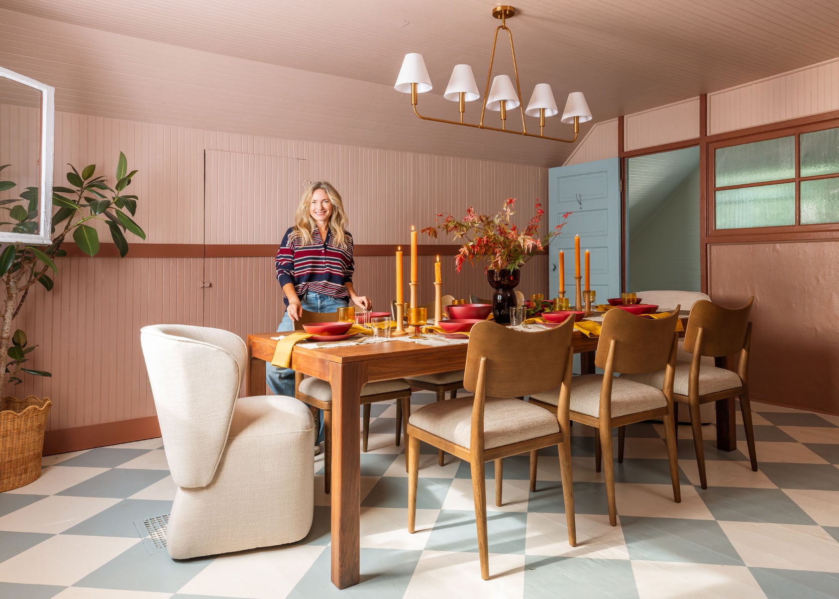
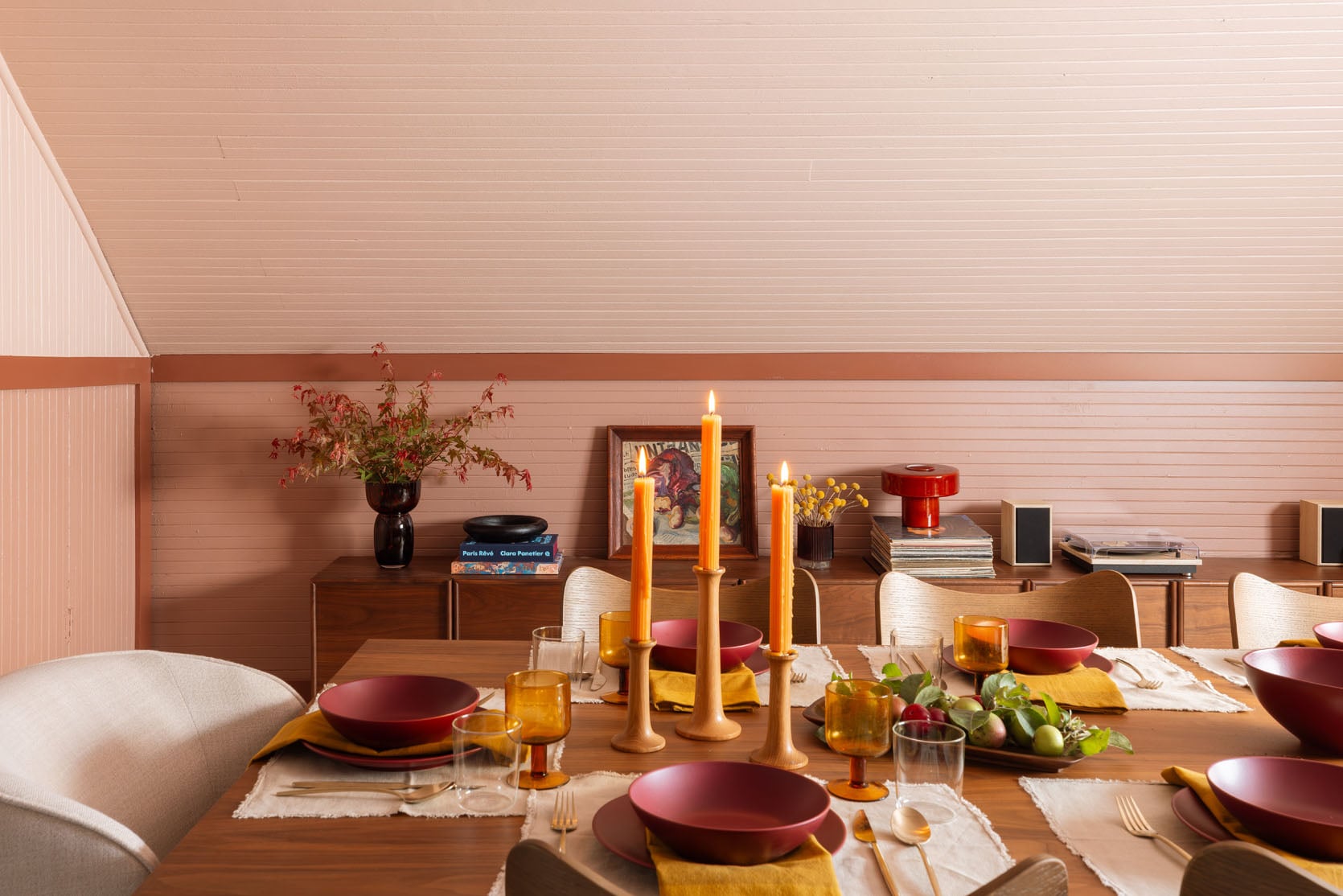
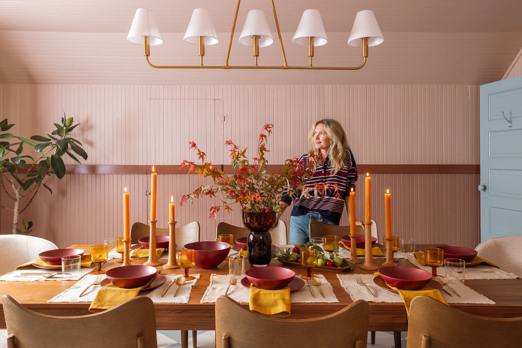
The upstairs meeting room has its first big debut on the internet, which is a lot of pressure for a lady so old and sweet. But with the help of some solid modern furniture and decor, it went from just being old and sweet to being such a pulled-together, cool dining room. With fall around the corner, and – dare I speak the words so soon – the holidays right around that corner, we set it up for a dinner party with casual and elevated fall vibes. If you are readying your house for hosting family, dinner parties, and wanting cozy vibes, today is for you. Get ready for some pretty beautiful fall dining room ideas.
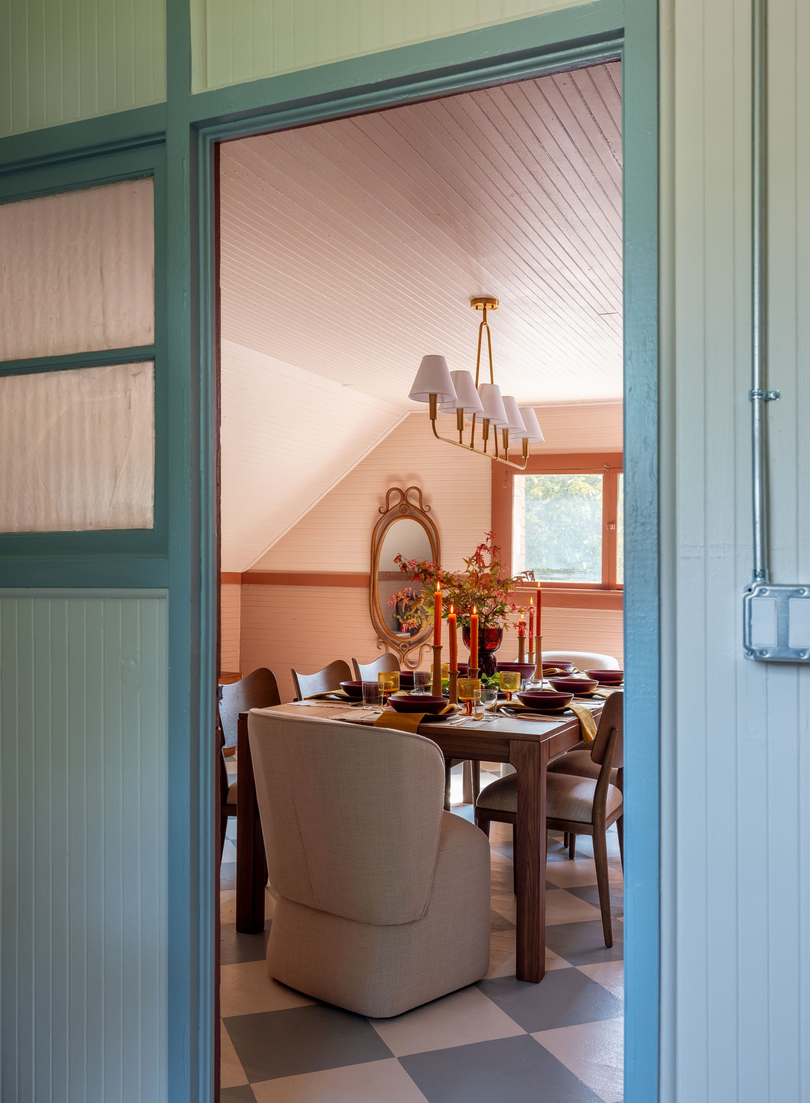
Once we got all the furniture in here, the room just came alive. The deeper tones of the walnut furniture and the creamy oatmeal upholstery were all part of the plan, but it wasn’t til it was all in there that we congratulated ourselves. It looked so good.
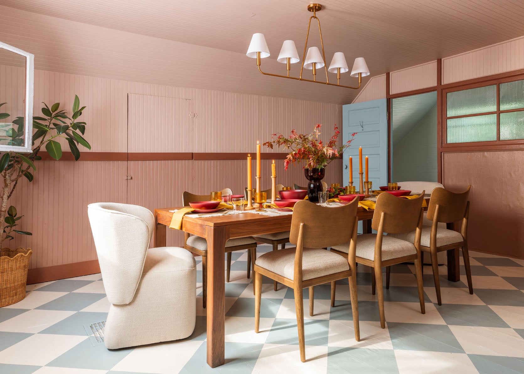
Chandelier | Dining Table | Upholstered Dining Chairs | Side Dining Chairs | Rattan Planter
We leaned into fall colors with the darker reds (remember those dishes from the holiday shoot last year at The Carly?). While I don’t usually gravitate so much towards dark red dinnerware, I swear this set has so much power and the shapes are so simple. I used them for Christmas last year, but here you can see they can lean fall so easily too (or Thanksgiving, obviously). I think if they were red and glossy, they would be garish, but the tone is actually really soft, and the finish is muted so it balances really well.
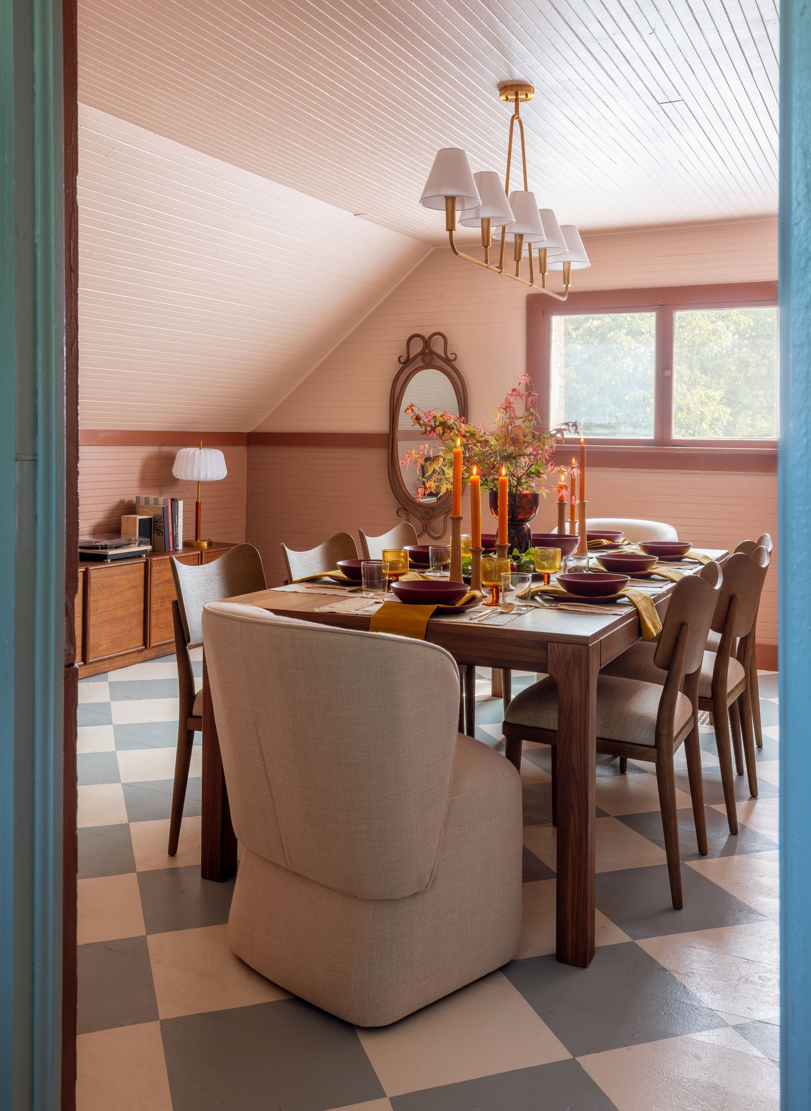
Dining Table | Upholstered Dining Chairs | Side Dining Chairs | Table Lamp
The table is part of the Jacobsen line, which I had eyed at AllModern a lot for the river house (I love the coffee table version), so I was excited to see it in person. It’s so solid, classic, streamlined, but the grain has a lot of integrity. Instead of getting 8 matching chairs, we ordered 6 dining chairs (that are really generous in size) and two upholstered end chairs.
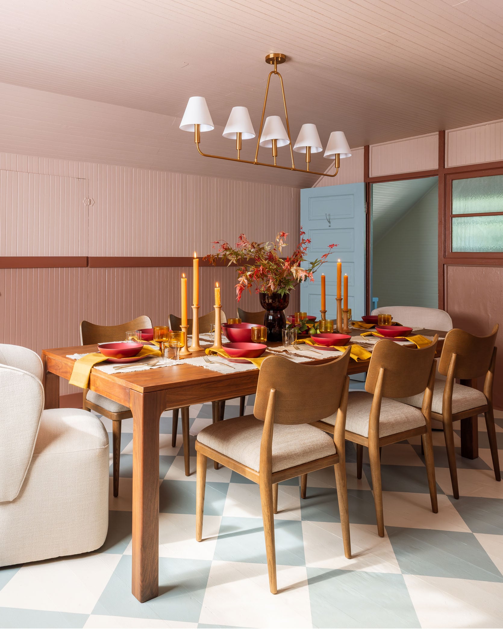
The two cream upholstery fabrics don’t match, which we knew, but I was thrilled to see that they looked really great together. Same with the wood tones – that’s always a bit scary. But once we got it all together, the lack of matching really helped it feel more homey and natural.
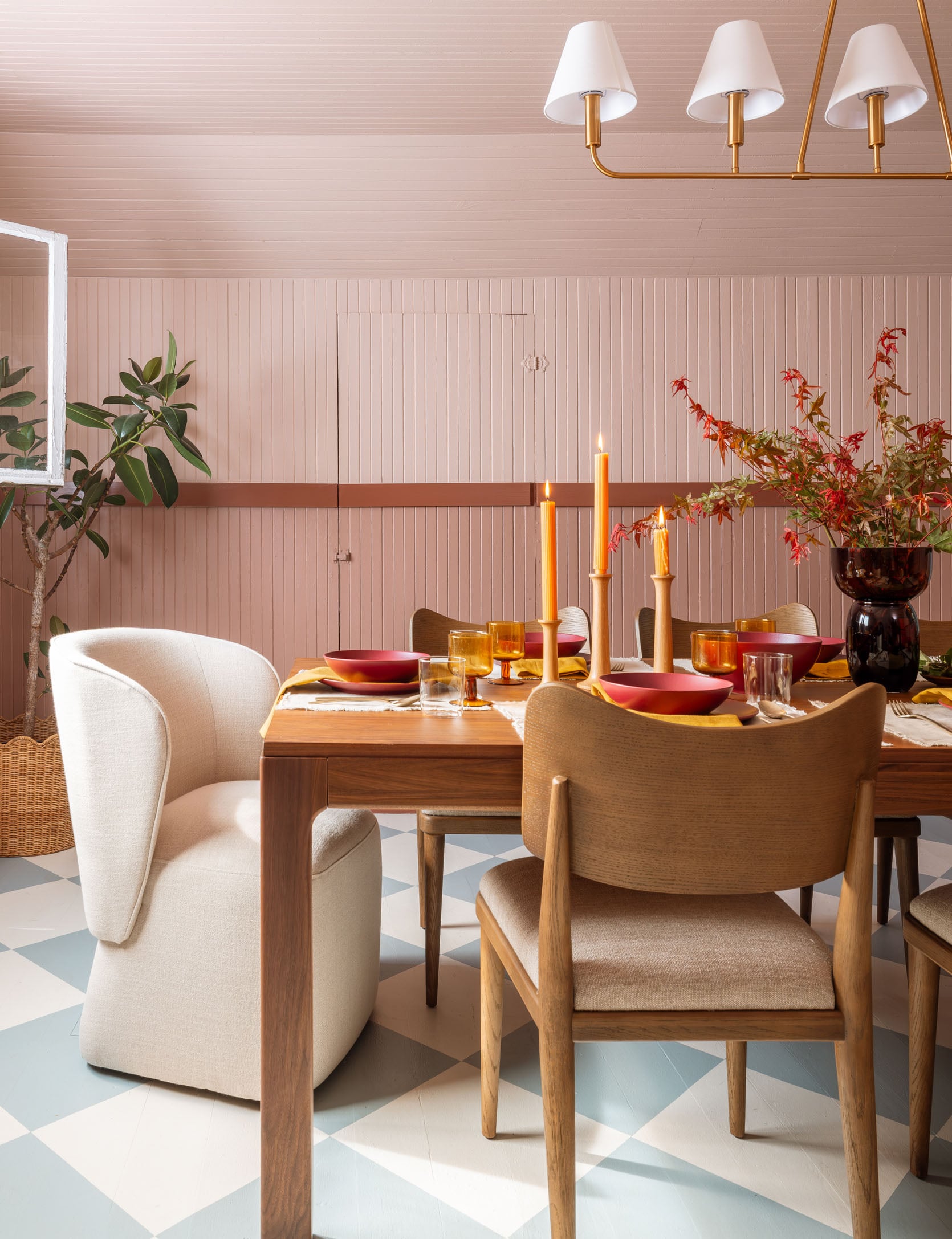
The head chairs have wheels and are really comfortable. So are the chairs – they have a generous surface space for your bum and the curve of the chair really cradles your back.
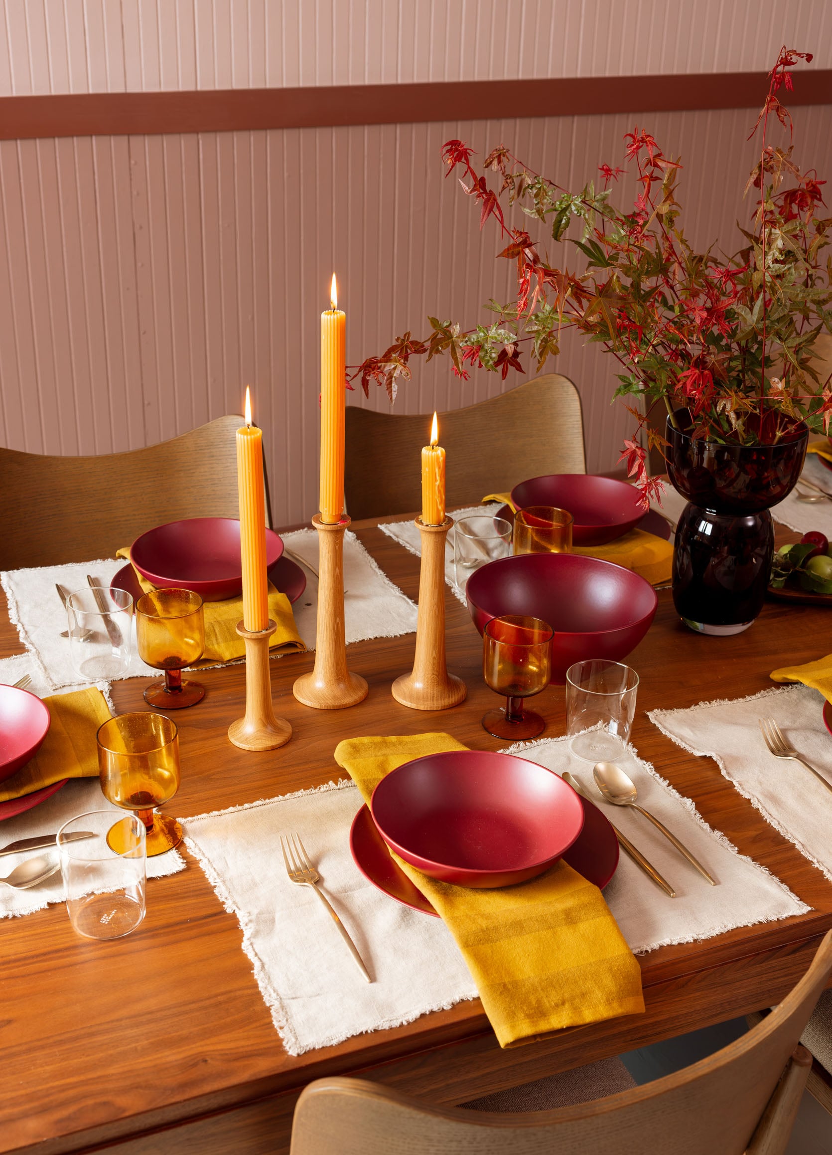
Placemats | Dinnerware | Napkins | Flatware | Wine Glasses | Water Glasses | Candlesticks (similar) | Candlestick Holders | Vase
In this room, all the pinks, mustards, reds, and woods just look so warm and inviting. We were all so delighted with how it came together.
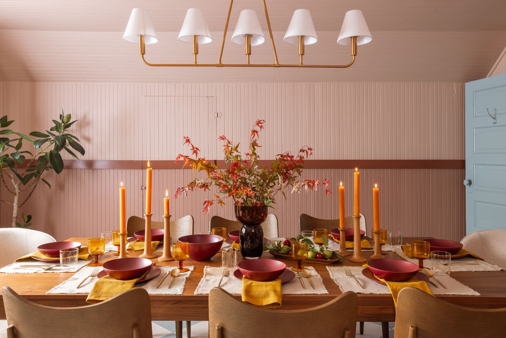
Now this isn’t necessarily the reveal of this room. My job isn’t typical, and we often need to transform rooms into a set to feature furniture and decor, so we try to integrate it into what we will obviously use long term, but this room will function more as a meeting room than a dinner party 🙂
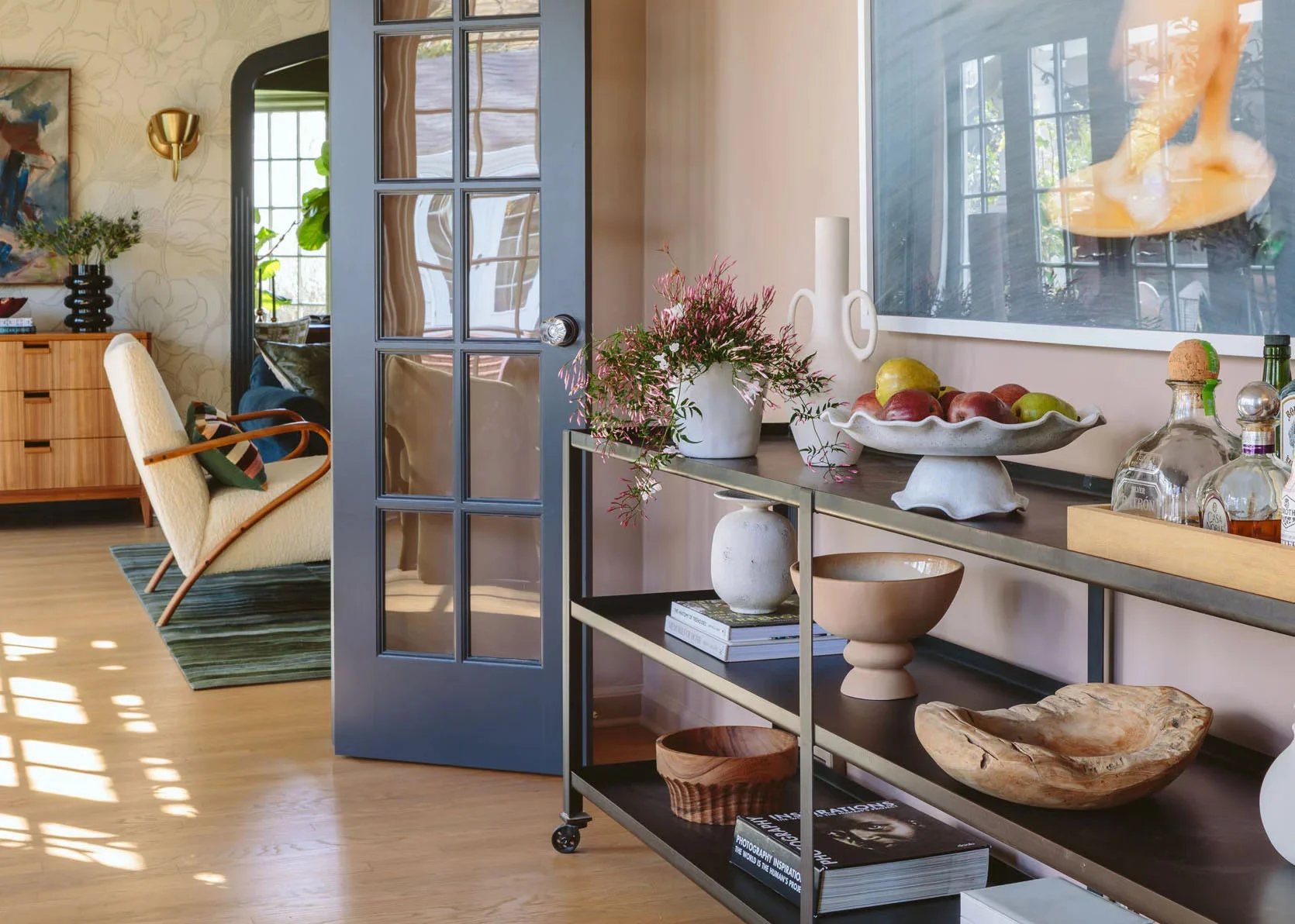
We ordered two credenzas to go along the back. Now technically these are media units, so they are lower, which we knew. That wall is pretty low, so we didn’t want two massive pieces.
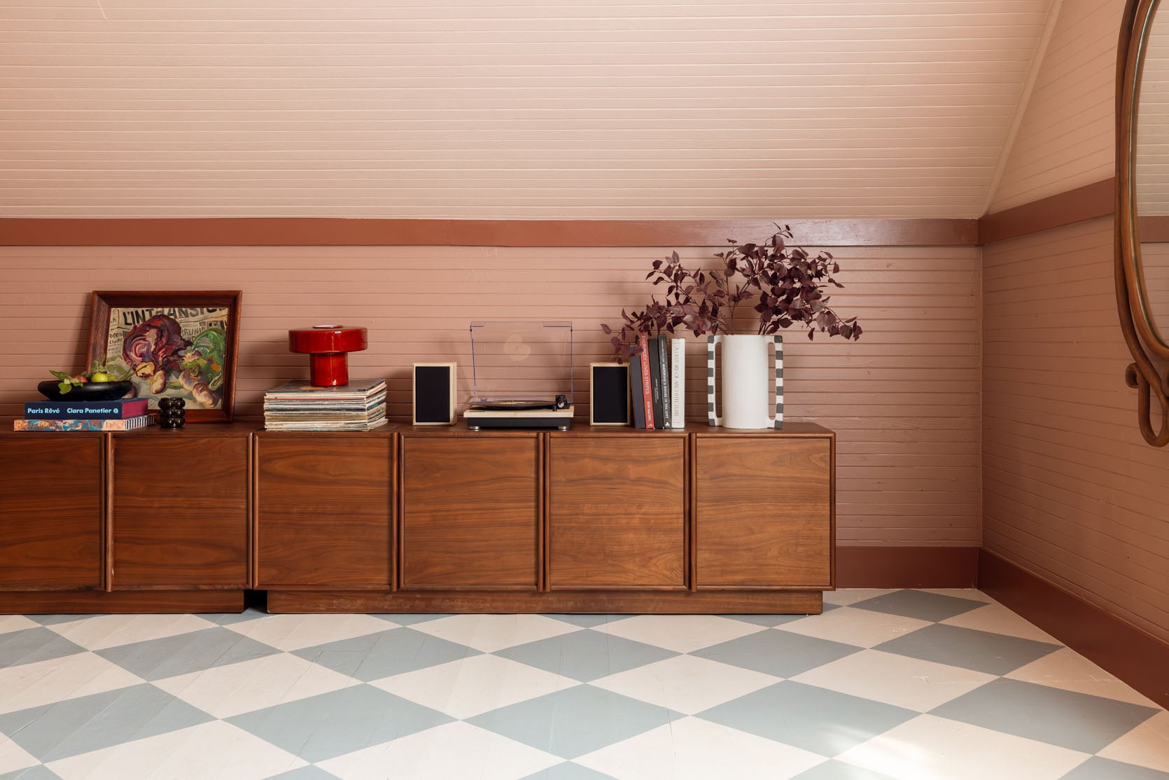
Media Units | Wood Bowl | Glass Bubble Candle | Lamp | Striped Handled Vase
We shoved two together, and it just looked really pulled together. We don’t have a ton of storage needs up here right now. But our plan is to keep the materials that we are currently playing with for very specific projects up here while the rest of the materials and all our props remain in the prop garage. This room is more of a meeting room and a set for shoots like this. But I also wanted Gretchen and Marlee to have a place to put personal items, so we joke that these are their “lockers” and they can keep their things in here. They have shelves and holes for outlets through the back. Super high quality and beautiful, with that super simple lip on the cabinets that gives dimension and keeps it from looking too flat.
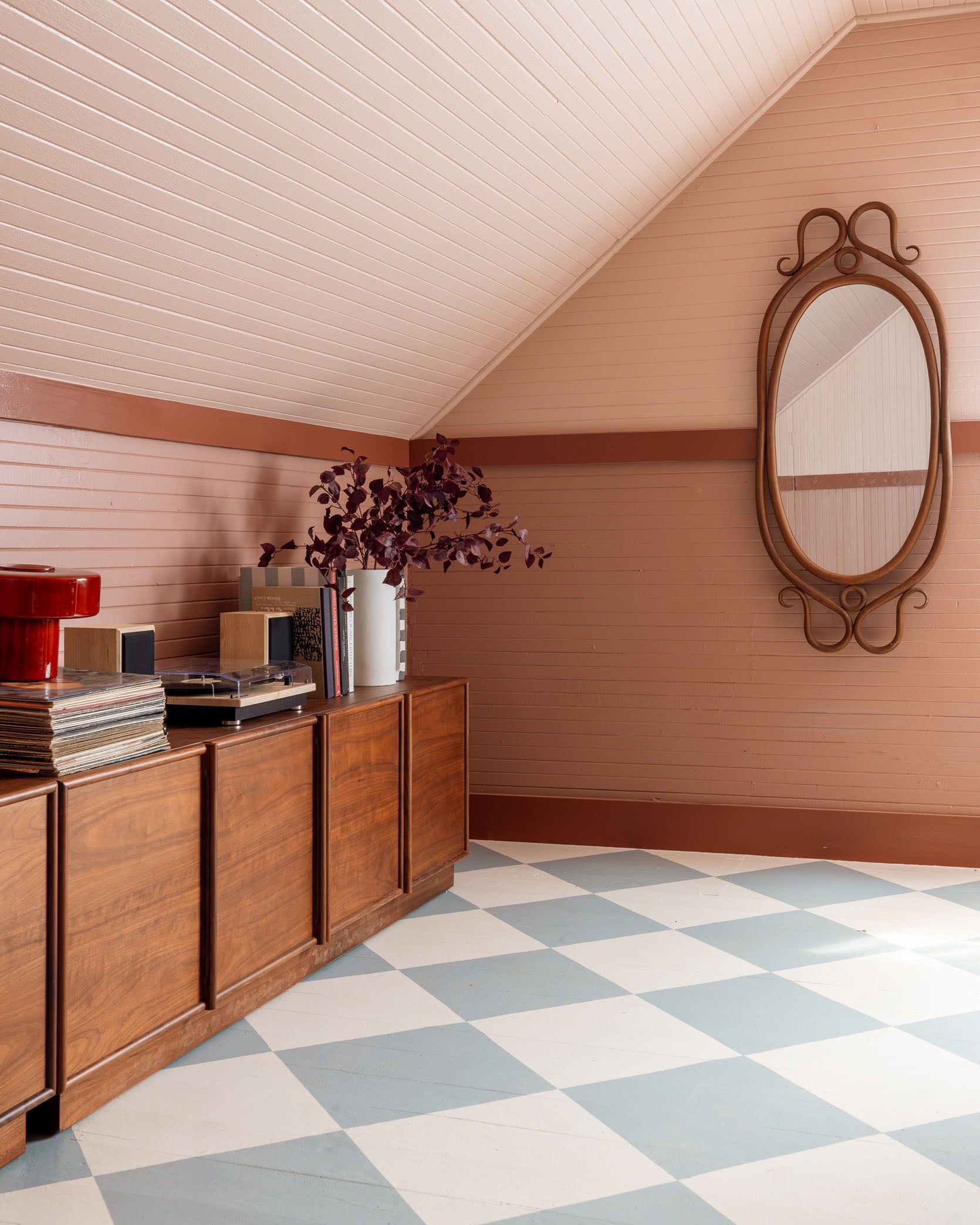
We propped it with a lot of AllModern pieces to feature in the shoot (technically they only sponsored a reel but we loved everything so much that we wanted to shoot and post it here, obviously).
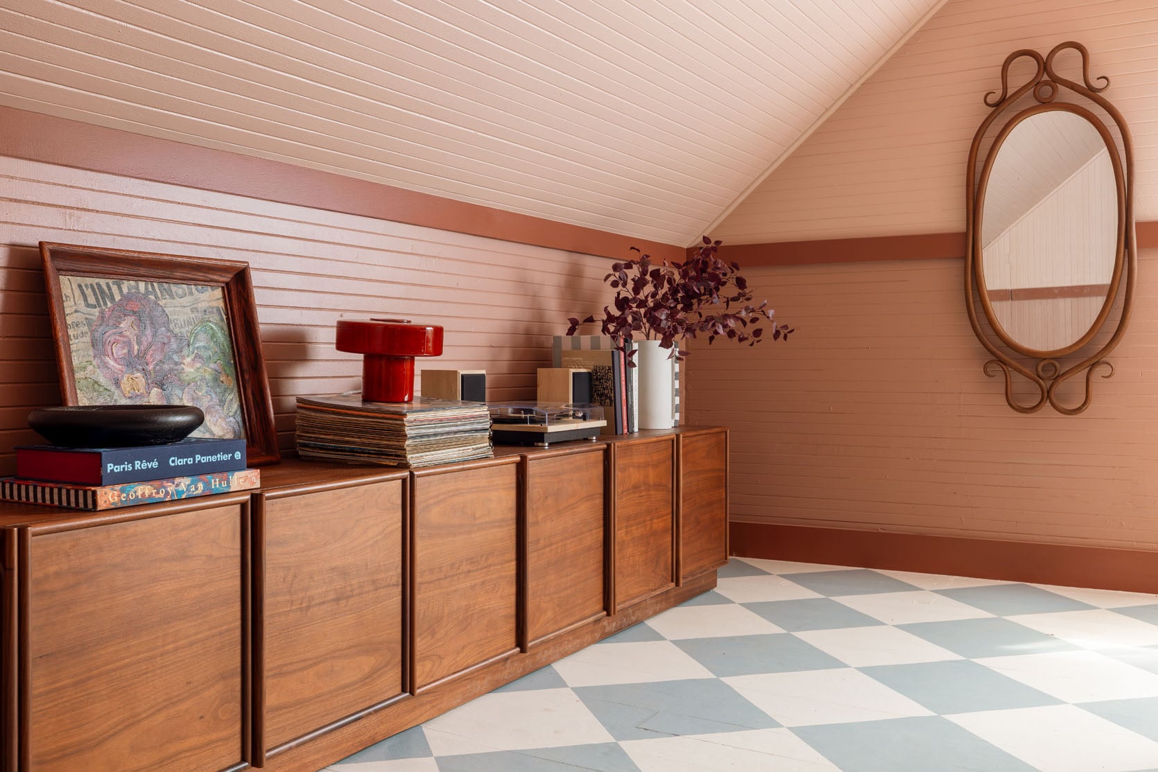
Art (vintage) | Mirror (vintage)
Shout out to my bentwood vintage mirror and that gorgeous still-life oil painting that I’ve been hoarding for a while. It finally got its debut 🙂
The first shoot in the guest house is in the books. It was so fun and easy, and we are really excited to start meeting up here and see how this room continues to transform. We love all this dining furniture so much, and we figure in the next few months we’ll work up here when we are together and see how the function of the room shifts as we furnish and decorate the landing and downstairs. More to come, and a huge thanks to AllModern for being a fantastic resource and partner. xx
*Photos by Kaitlin Green
I appreciate the work in progress nature of this. I wonder would a collection of vintage mirrors along the flat wall help to lift the upper layer of the room? Everything feels quite enclosed and concentrated low down in this iteration. This would also help to bounce more light and give a sense of more openness to the outdoors.
I agree. Something feels very off and attic-like about the space to be staged as a dining room.
I think maybe the purpose was to “reveal” AllModern furniture vs. really reveal the potential of the room.
You’re mostly right, Julie! This was just to give dining ideas in a pretty room that can also double for now as a work space for the PDX gals. I’m sure no one is shocked that Em was ready to show off all that hard work painting:) More to come later!
Oh I know what the intention was, but my point was the attic space doesn’t really complement the dining room set up, imho.
Agree with you Lynly!
So agree! The rustic, painted room doesn’t work with these new, modern furnishing. Sellers gonna try and sell but this doesn’t work for me.
Wow, just wow! This turned out to be so much more than I even imagined! So many things to admire. Standouts to me: the media units and vintage mirror, chef’s kiss. Beautifully done Emily and crew! <3
What type of record player and speakers are on the credenza? I’m looking for a record player that doesn’t take up too much space, and this one looks great.
Crosley Brio Vinyl Record Player with Speakers and Wireless Bluetooth – Audio Turntables?
They look kinda like U-turn Audio brand. Either way, I have U-Turn and it’s soo beautiful and high quality. They were recommended to me by my audio engineer brother.
I love the room so much! I don’t know how it is in real life, but I feel that the side chairs are a bit too big for the room and throw off the proportion of everything, even in the photos. I think vintage and old rooms fits better with ‘older proportion’ chairs that is a tad smaller than the modern scale chairs.
Agree with comment about the large chairs- I don’t care for the scale
Same, was feeling scale is off, for both simplicity, era, and scale — simple tiny rustic farmhouse calls for something that matches that scale and vibe.
This is for a photo shoot. More to come, but thanks for commenting. xx
Emily, if I may, and I don’t mean this in a rude way at all, but I think I might be able to explain why your comment got so many downvotes. I think every one of your readers understands that this was just for a photo shoot; that’s not where people have a problem. But even if just for a shoot, I imagine the main job of a design blog is to showcase anything — paint, architectural features, personal objects, or in this case, furniture — in a styled and inspirational way. So when people say that the scale of the chairs looks off, or this looks like an attic instead of a dining room, what they mean is that for whatever reason this particular styling and shoot did not let them leave feeling inspired. I understand for a partnership there might be certain elements you have to showcase. I’d imagine the job on a blog’s end would be to take those elements, and instead of shoehorning them into a space that might clash a bit, to showcase them in the best possible setting. I think where people might have a a problem with this particular shoot is that they… Read more »
Thank you, LG. I think you captured the spirit of the feedback in the majority of the comments here just right. We can do our best, and sometimes miss. This particular effort, which may have been rushed based on the tight deadline Emily mentioned in previous posts, did neither the room nor the products featured any favors.
This looks so pretty! I think the upholstery looks great with the chairs. I am excited for any/all fall content to help get me inspired for the upcoming season.
So from a business standpoint, do they give you all the furniture free of charge in exchange for the promotion, or do they come and take it back after the shoot airs, or do you just pay for the items you want to keep from the shoot like the 2 credenzas? Just curious how that works.
I agree that the room looks lovely. But doesn’t make sense to have dinners there, does it? Carting all that stuff upstairs with no kitchen nearby or sink?
I didn’t get the impression they will be doing actual dinners here. Just staging styled tables for shoots. 🙂
Hey all, So basically as design content creators running a medium sized busieness this house gives us an opportunity to do our job faster, showing new spaces with new ideas, shooting with more flexibility rather than trying to make it work in my house. This was a super fun shoot for sure, but no this is not a dining room where we’ll be eating 🙂 Our job is to feature furniture that we love in environments that we think will be fun and interesting to look at. It will evolve as we settle in to using it and shooting more content. What we do is totally atypical and this house lets us shoot more content for the blog/social and brand partnerships with less disruption while getting to change things up a lot more which we hope is fun for readers and followers. Lots more to come 🙂
This ti me is the equivalent of going to the store, buying a bunch of clithes you don’t intend to wear… selling them to masses and then returning them. I know you also do this, but I hope this post is a wake up call that people don’t want this. It’s not inspiring, it’s not really design, it’s wasteful, inauthentic and frankly a turn off. You would have been better off donating these pièces and shooting them in an inspiring room.
I understand it is very profitable to be an influencer, but if you want to do design I’m afraid you actually have to try to design. Not just create a prop house.
Kudos to you! I thought I hated this room when revealed, but what a difference furniture and lighting made! I am impressed with how perfect you have made it.
HAHA 🙂 Well, glad you like it!
Such beautiful colors! Are stems in the vase on the table foraged or faux? So pretty!
Real! from my Japanese maple (which I felt bad about but the colors were perfect).
It’s nice to have a reveal and I love the colours. I can definitely see this room working as a meeting room rather than a dining room. I do wonder if you ever feel like breaking out and doing something different and non-allmodetn for the sheer joy of it. All modern have got the influencer market so firmly under their thumb that it brings a certain sameness to the internet or at least the American portion of it. I think there will definitely be a time when everyone looks back and realises the Allmodetn look has defined an era.
I think it just shows that we live in a throw away society. Everything built in China with a very limited life span.
Obviously this room was never intended to be a dining room. I’m really surprised that you chose it for this post because I feel that it doesn’t showcase the pieces as it should. Modern furniture should be light and spacious, this feels very dark and claustrophobic.
Agreed, I think it does both the brand and the room a disservice because the modern furniture just highlights the age of the room. And I don’t understand if the intention was to use this room as a set, why you’d choose this color scheme – the paint is overshadowing everything else.
Agreed!! I understand needing brand partnerships but why use this room?? Doing a partnership should showcase design skills
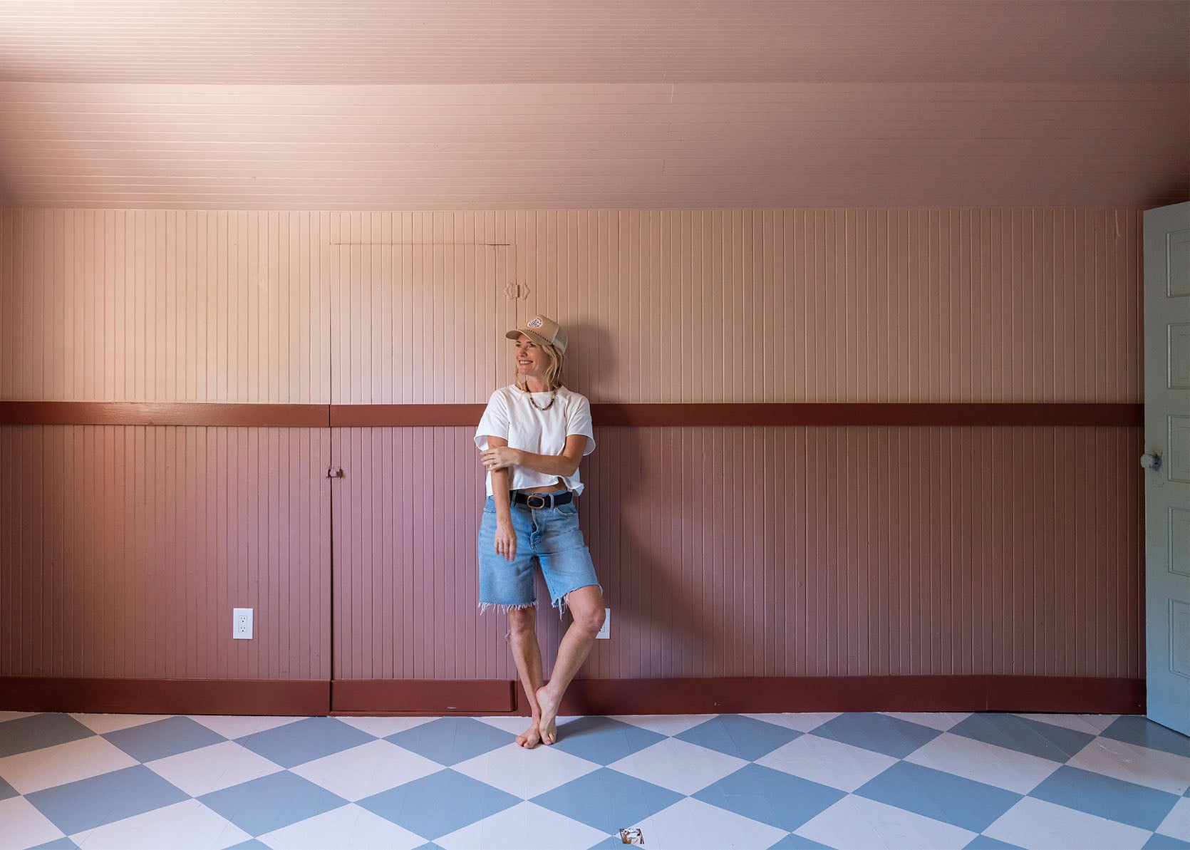
I love the blue of the floors with the pink! You guys nailed it!
The table looks great. The furniture looks great. The painted floor looks great. I just don’t get the room’s color scheme. At all. I feel a bit like Regina George in saying this but: Quit trying to make pink and blue happen; it’s not going to happen! lol.
Oh its happening 🙂
I love pink and blue, its my fav combo of all time!
I have no problem with the room being staged as a dining room. I do believe that the blue from the floors should be repeated somewhere in the room.
Agreed 🙂
I think I must be missing something or the design gene. It feels like an old farmhouse attic with contemporary heavier furniture, which overtakes the space. Love so much of what you do, but this one isn’t feeling in sync. I am wondering about the colors, I think these are the same from the main house pink and blues, which don’t scream old rustic farmhouse to me. Historic colors perhaps, is there a way to simplify and lean into the charm and simplicity of the rustic building. I picture an old scandanavian long farm table as the meeting table with farm style chairs. And, will you be dining upstairs in the attic? So many questions.
Mary you reminded me that Benjamin Moore did a collection of historical colors with Colonial Williamsburg that features some amazing styling and color combos!
I have mixed feelings about this space. I love the color palette and the furniture. That all looks lovely together and your stellar design skills definitely pull it off at first glance. But upon closer inspection, I’m not at all convinced by these photos this could realistically pass as a dining room… Maybe in the reel it was harder to get a sense of the full space. I’m thrown by the wall underneath the interior window (bead board would certainly help it look more cohesive) and also the little door built into the wall. It is clearly a historic space with historic proportions but all the modern furnishings feel like a jarring contrast. I know this isn’t a finished space yet and I absolutely appreciate a peek behind the scenes on these type of very specific sponsored shoots. It was a fascinating blog post. I’m curious how this space and the whole house project will end up. I have been excited because you seem to be leaning into the quirk of the old house, which I think is 100% the right move (I live in a 130 year old Victorian and have struggled to find the balance in decorating). I… Read more »
I feel like this room could be many things..but not a dining room. And eventhough I know you have a certain style that works for you, I think you could maybe benefit from stepping out of your comfortzone where paintcolors are concerned.
I wouldn’t complain about having dinner around this table! I suppose I just don’t understand the point of this reveal beyond it serving as product placement for AllModern. This is the newly polished, blank space on the property that can accommodate a bulk order of new furniture. But without that context, it’s an odd place to stage a dining room bc it looks like an attic meant for a different purpose (which it is).
I don’t like it. I’ve been following Emily‘s blog for years and I like most of the things she does a lot, but I just don’t like this. I don’t like the colors and I don’t think it’s up to par with what she usually does.
I’m honestly chuckling a little at these comments – tell me you didn’t read the post without telling me you didn’t read the post.
This is a set for an instagram reel to sell product. Read the room, as they say. The colours are fun, the display works, it offers something that feels fresh in a pretty stale online space – nice work team EH!
Lia says it works, so there you go!
LOL – I just think people are taking it way too seriously. It’s a set, not an actual dining room. No one is serving dinner in here and carting up plates from the kitchen.
Get that promotional money, Emily, so that we can see Robyn’s living room and Kaitlin’s house and hopefully Caitlyn’s always interesting spaces down the road.
Thanks, Lia. 🙂 We have clients we love. We have fun while doing it. I actually think most people get the business model at this point and I’ve actually written about it a lot, but if you don’t follow closely it might just seem weird what we do. Creating daily design content (for all platforms) requires flexible space and a lot of resources (people, labor, props, production costs). We do our best finding the right space for the right job and we work our asses off doing it. My team is awesome. More to come always 🙂
Oh yes, I completely understand your business model. I just think this reveal is a flop on so many levels. Definitely doesn’t inspire me to purchase anything you are trying to sell. Hopefully your next project is more successful.
Lia, not sure you understand the audience here or that this is a safe space. Many readers have been following Emily and her team for years and we’re fans or we’d stop following. That doesn’t mean everyone has to love everything and in this environment it’s fine to say so, and while it’s likely disappointing (and unusual) for Emily to experience a reveal that not everyone loves, I’m pretty sure she can handle it and takes it as part of the process. You don’t need to be defensive on her behalf or condescending. People here are interested in design and like to analyse and talk about it. That’s what we follow for.
LOVE, and especially appreciate the photo where the stripe in your sweater perfectly aligns with the chair rail. Chef’s kiss. 😘
fantastic job. What an incredible make over from a dumpy little space to a beautiful room that oozes with class and beauty. I love your creativity and your vision. It is amazing.
I know they just painted the floor and walls but this would look 1000% more grounded if there was a rug under table and some art which reflected both the blues and pinks – I think it would make the room look more finished and put together and the floor and walls in better conversation with each other.
Oof. I love a good contrasting room, but the modern furnishings feel so out of place here. Love the room on its own and love the furniture and decor, but this is a bad first date with two incompatible people. The vibes are not vibing and it feels off-brand for EHD. And I get you gotta make the money, but plunking down beautiful pieces in spaces that don’t work with them just to make a buck feels disingenuous. It’s a swing (for the record, so glad you’re taking them) but a miss for me.
Agree that something looks unfinished here. Walls, I think? Maybe the host chairs look too modern? And the light fixture looks much too high. Kind of a disappointing post for me.
Gotta disagree with a lot of the comments here…. l love this room! It reads very European in it’s quirky roofline, lived-in wall textures, audacious colours, and modern furnishings. It’s the contrast you get from embracing the old structures and adding a layer of newness, that people do so naturally there. I think that you really captured the vibe and l’m here for it! “It doesn’t look like a dining room”… Sorry folks, but that’s hilarious to people from other countries who live in old and historic buildings that don’t have designated dining rooms in the modern, suburban tract home sense! If it has a table in it, then it is, for this moment in time, a dining room. This room brought a smile to my face.
Yes! I am European and I love this room, it absolutely does not look weird to me, and I never would have thought that it didn’t look like a dining room.
When reading this post, I actually thought that EHD stepped out of their comfort zone and created something old, fun and relatable.
To lean even more “fun Parisian attic apartment” I would switch the blues for greens in similar shades and add different colors on the candlesticks.
But really, this room looks great to me !
The room looks amazing! You all worked SO hard but looks like it all came together effortlessly! I feel like this is a room that you would walk into in person and gasp out of amazement! The color scheme is bold, yet calming…and different, but not jarring. Thank you for taking risks and taking US on the journey along with you 🙌
The sunroom was the first office to keep away from kid noise. Then the art barn, picnic table, garage fully set up with perfect lighting, a/c unit, table and chairs. Then this upstairs room in the guest cottage, which could be a problem with the kids doing pop-a-shot and tv downstairs. And before it’s even begun, it’s already consigned to a shoot and “meeting” space. Has there ever been an intention for an office space? Was it just content, with the plan to keep moving with each new space? Did employees know?
It seems like every space was picked to keep away from the kids during working hours. Totally reasonable
But none of the spaces worked out bc no kid and office zone rules were made or enforced. How many more offices will there be?
These colors all look so beautiful together!
I am so confused how readers cannot understand that this is a staged area. And that the entire “Guest Cottage” is intended to be an easy place to do brand photoshoots. I think it looks amazing! The contrast is so nice. I cannot wait to see what the office space will look it. I do love the old farmhouse style mixed with more modern furniture. I think it looks fabulous.
Because we’ve been given specific purposes for each room. The bathroom was for party guests and potential future bridal room.
The kitchen was for the office. The big room was for kids’ entertainment equipment and movies for anyone. One room was for Charlie’s drum set. The upstairs room was for the office. The house was also for potential future residents.
Of course, we were told from the beginning that it was a space to be creative with design and for portfolio pics. We were not told it was solely a staging building. So now there is a different narrative.
Em is very clear that this post is staged, so maybe some of the comments are from people who scrolled without reading? But the guest house as staging house is new to readers. I haven’t seen any acknowledgement that she changed her mind. Maybe it was said on Insta which I don’t use. But suddenly here it is for blog readers: this house (not just the upstairs office) is for staging. I’m happy for her to have a big place for that. It’s just something to expect us all to know it when it wasn’t said.
Someone do a line of mirrors and recreate the lines of that big vintage curly beauty, I love it so much!
Gorgeous space & gorgeous colors!! Money needs to be & should be made – however , – your eye is better than this.
The whole when to comment when you don’t like something design-wise is soooo tricky! Competing things… 1) this is Emily’s art. Art is inherently controversial. If this is a community about art, we should comment freely re: what we think, without needing to be mean – we don’t need to tear something apart to have it not work for us. So we should comment, even if it’s not complimentary. 2) this is sponsored content. Commenting negatively feels crappy, because we love getting free content (more on that below), and sponsored content pays for it, so we shouldn’t comment negatively if we want free content. 3) but this is supposed to be a community of people, many of whom have read this blog for 15 years. If all we can do is compliment, why bother? It doesn’t feel authentic, and when you’ve been around for this long, it feels yucky to be part of a community where you can’t be honest. So we comment freely and honestly. 4) but Emily gives this to us for free, and we like her, so if we don’t have anything nice to say, we don’t have to say anything at all. Clear as mud? Only… Read more »
I don’t think the paint color on the walls suits this room well. Furniture is gorgeous, designs are gorgeous, and I love the flooring- it’s cute and whimsical! Something just feels off though.
I think the room really needs another window or skylight, and a less dense shade of pink or another color all together (it’s unfortunately an oppressive feeling space to me).
As someone who actually loves pink (and blue!), I think I have landed on what doesn’t quite work for me here and it is sharing your opinion that this pink (and the blue outside the room) is too dense for me too. I think I could handle one of them being dense if the other was lighter maybe? And I think, for me, seeing designed rooms in actual homes is more appealing and relatable… I like seeing books on bookcases, personal artwork, dog beds in corners… things that make a room a home…
Maybe you could clarify something? Is this your work meeting room or is it a staging room for showcasing brands? Or both?
If both, the strong pink color maybe a difficult all purpose color for staging?