Design
Farmhouse Guest Bedroom Update – New Bed And Dresser Alert
The guest room famously gets the leftover furniture, which is kinda fine, as it’s a great place to put the stuff you like that might just not work in other rooms that you care about more. So this room is still a work in progress, but there was enough newness to show you. Close to four years ago, when we first moved in (WHAT IS TIME), it looked like this (and it was so sweet).
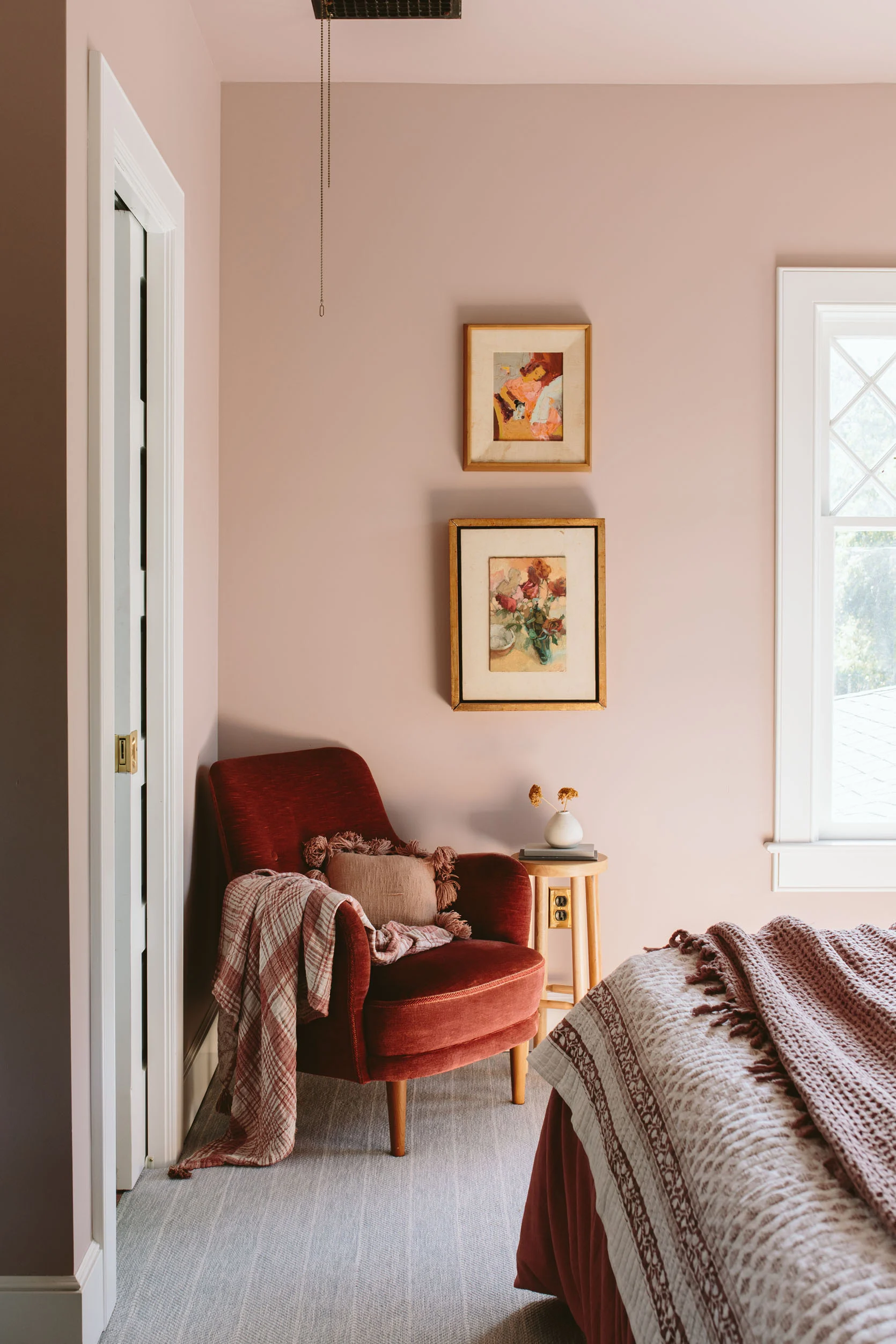
It didn’t have a bed or much really, but some leftover furniture and lamps that I think actually looked pretty great. It was cozy and soft, and everyone who slept in there loved it.
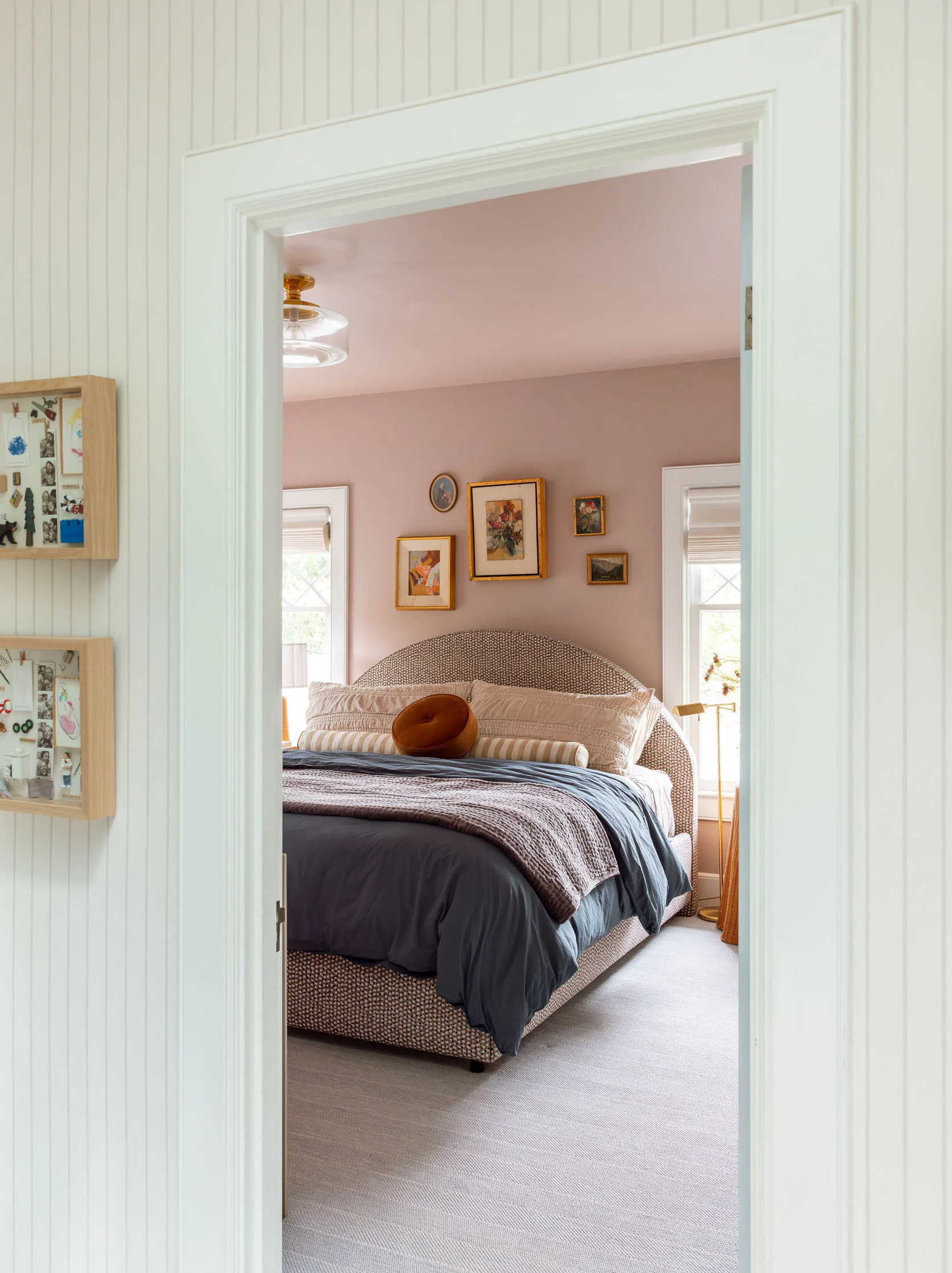
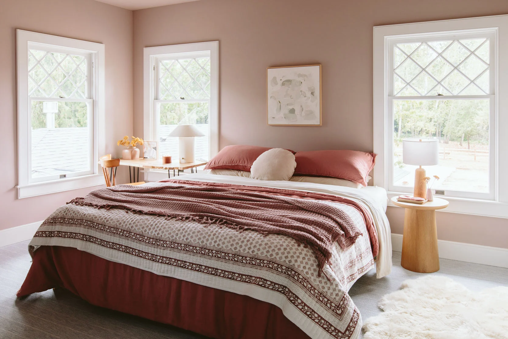
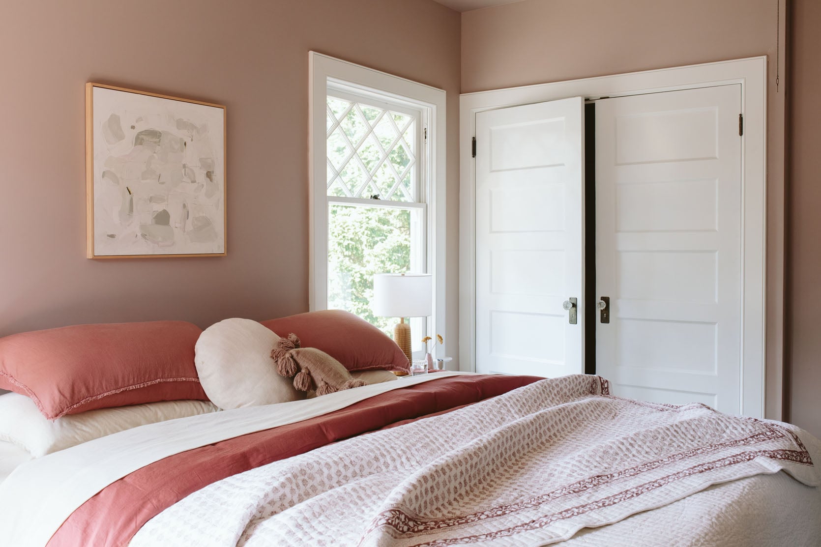
But for whatever reason, I designed a custom bed for in here to fit right in the middle of the windows (at the time, I was like “king beds and only king beds forever”). It’s upholstered in this sweet print by Rebecca Atwood that I thought would just add a texture and slight pattern, without being too bold. But we had to pivot. You know the story – the bed I had ordered for our bedroom didn’t arrive in time for our big Real Simple shoot, but this one was about to be delivered, so we put it in our bedroom. And since it’s so crazy heavy, and we’d already assembled it, we left it there for years. But it always was meant to be up here.
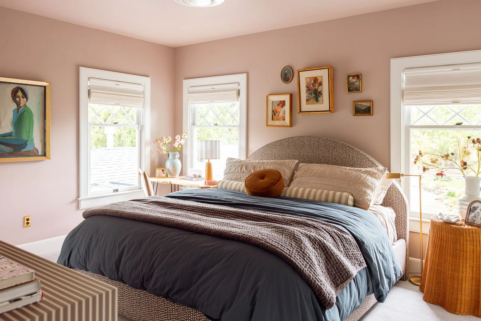
Wall Color | Trim and Ceiling Color | Art (vintage) | Bed (custom) | Bed Fabric | Shams | Bolster | Disc Pillow | Duvet Cover | Quilt
So we finally moved the bed up here, and I like it so much, but it’s not a total slam dunk. She’s big, but it could be that I’m not used to it? I’m the one who wanted the king bed in here, which is admittedly really cozy for guests. It’s not that it doesn’t fit, and the old mattress on the simple base was also a king, but this one is higher, and the bed frame and headboard themselves add volume. And it feels slightly crammed in the window, but not criminal.
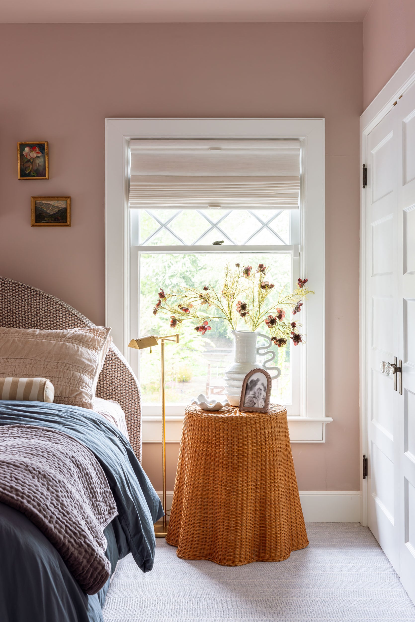
Floor Lamp (vintage + similar) | Side Table (vintage + similar) | Vase | Dish | Frame | Roman Shade
I do love that I finally found a place for my vintage wicker ghost table (shout out to Shop Wilma in town). I think it gives “quirky bed and breakfast,” and it still allows the linen closet to open for the most part (or is at least lightweight).
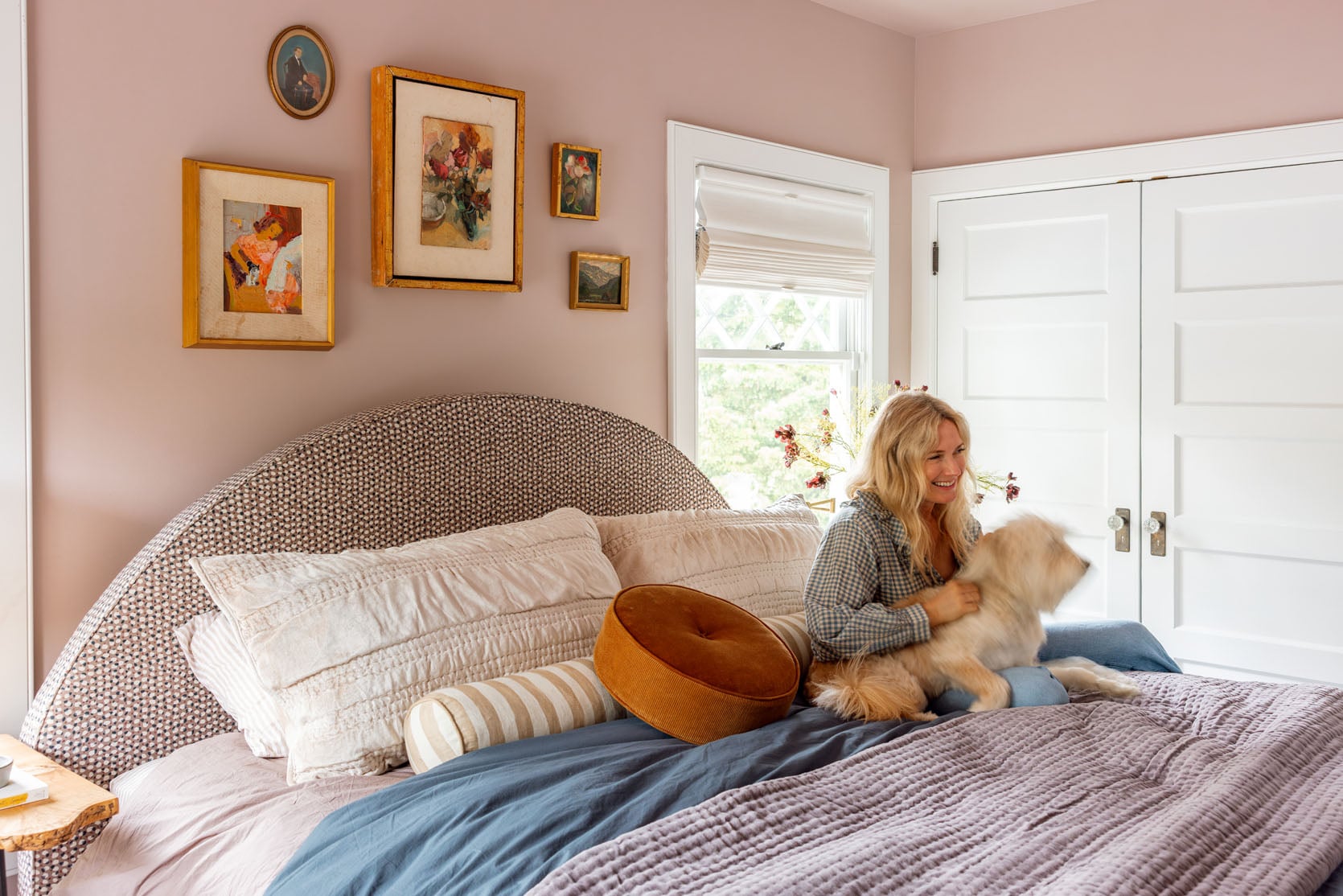
I hung a small gallery wall above the bed with pieces I already had, which I like, but the small ones feel too small in this room (maybe because the bed is so big!). I didn’t really have an alternative, so I left them, and they are cute, for sure, but not there yet.
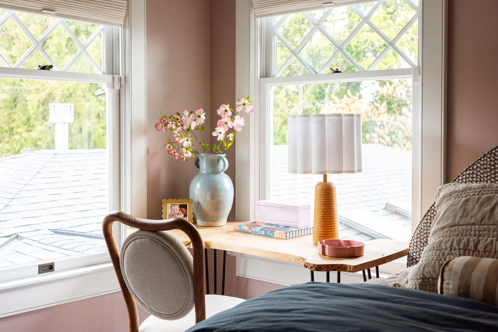
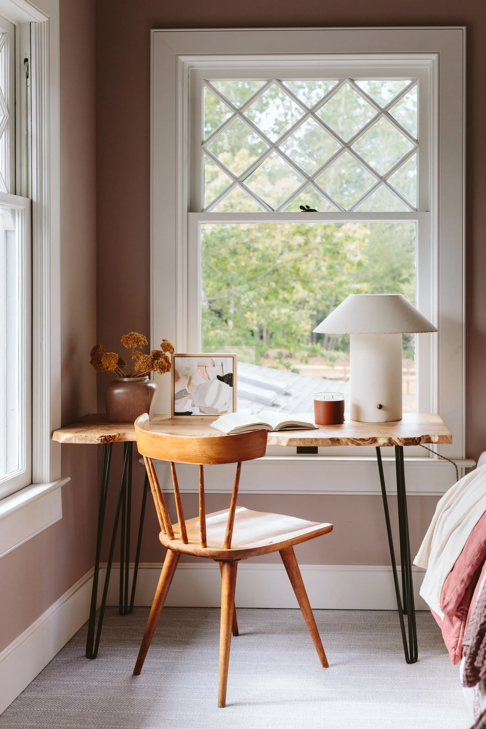
Desk (unavailable) | Picture Frame | Pink Box | Vase | Lamp | Dish
I tried no less than 6 pieces here – the blue demilune, Elliot’s blue vanity, the ghost table, but ultimately, this desk is the best scale and function for this corner. The desk chair was borrowed from Anthropologie (and I might order it), which adds such a nice softness through the shape and the fabric. Brian still sits up here to take his therapy call and work from home when he can’t get to his office to write. So the desk actually gets a ton of use.
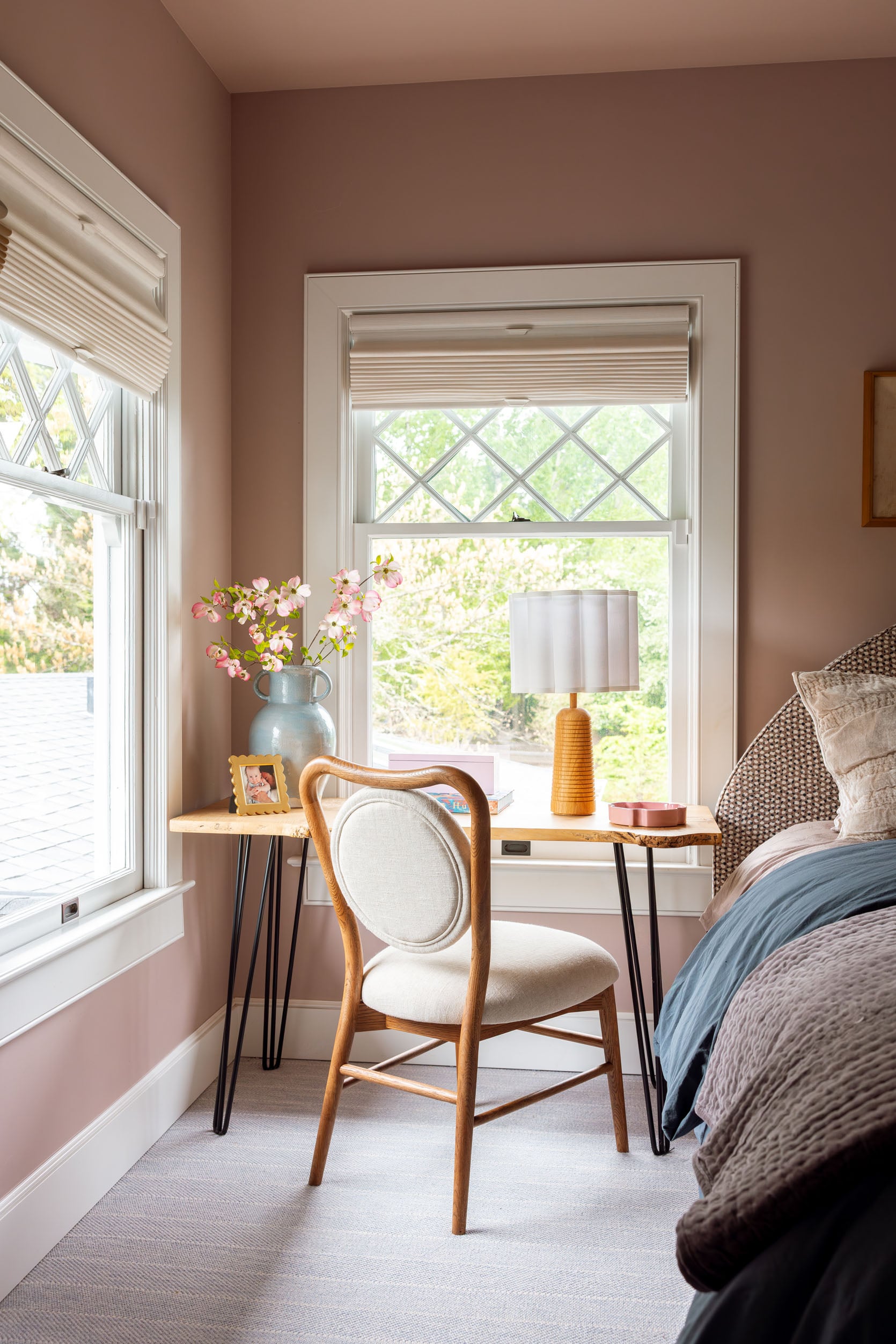
I bought the desk from a local maker who turns slabs into furniture, and I like it, but it doesn’t fit the style of the room at all. But I’m just not that motivated to find the perfect desk or piece that fits here (that doesn’t stop me from looking on FBMP most Saturday mornings). It works well enough!
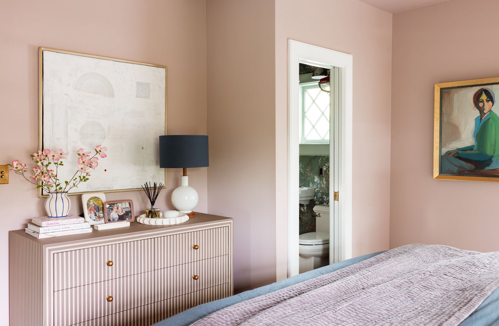
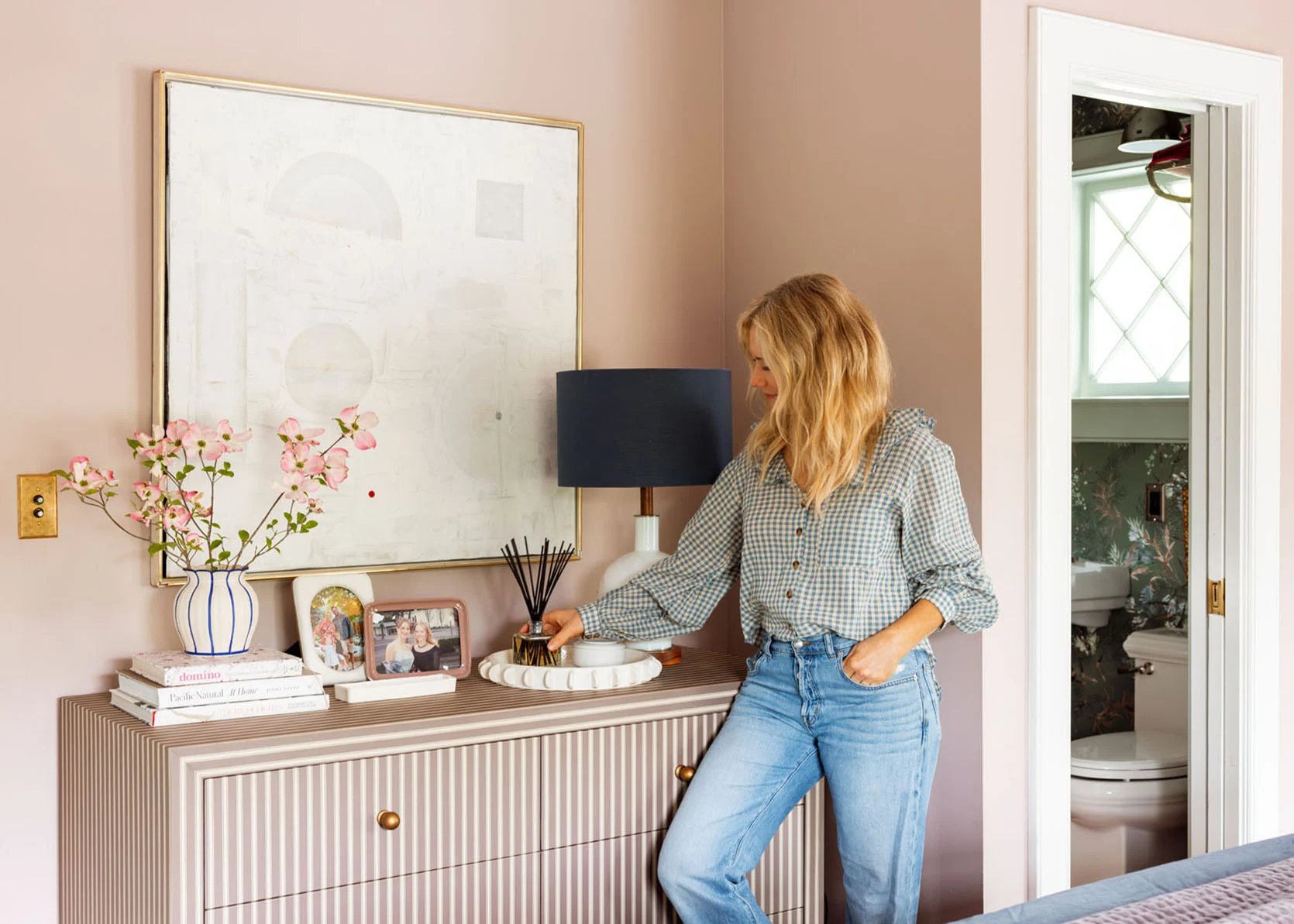
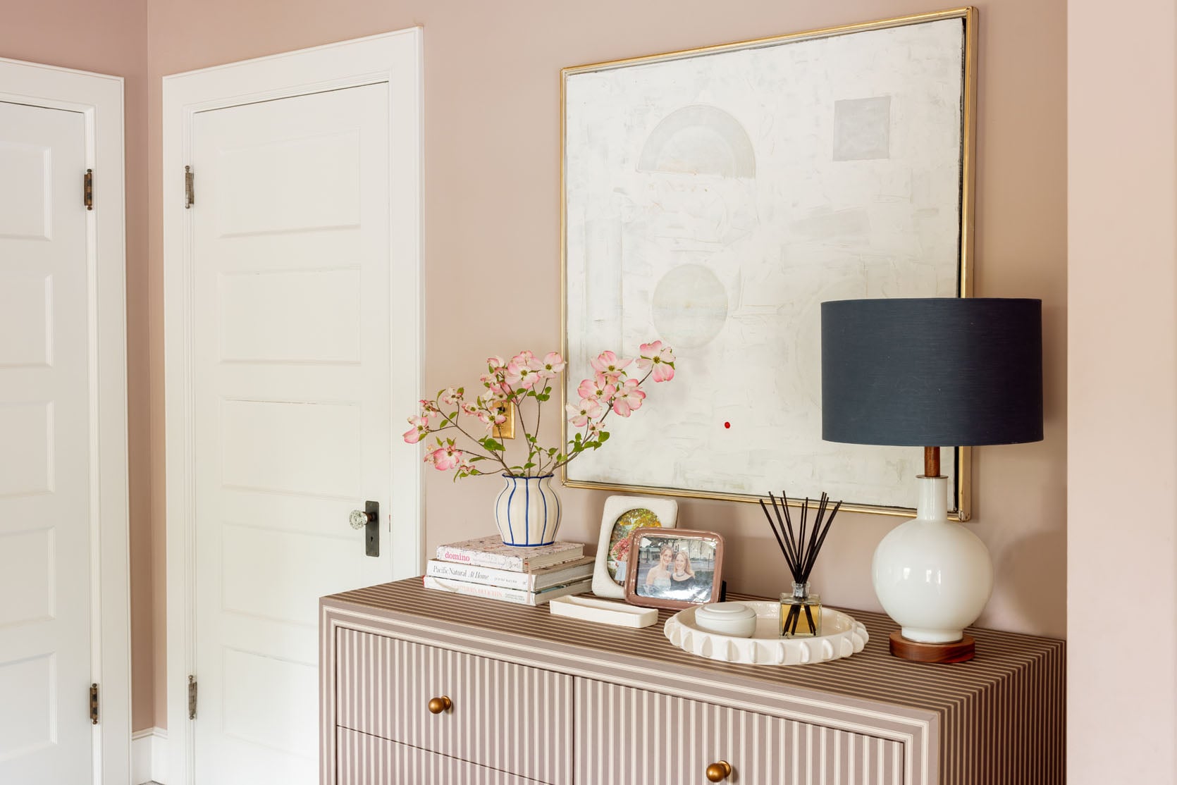
Now, the corner of the room that is working really well is this new dresser vignette. It looks tight with the bed, but there is a solid 2 1/2 feet of clearance, I promise. The colors are perfect (it’s called a brown stripe, but it’s definitely giving a taupey-pink). I love that white painting here (but the kids are begging for the massive TV back, so I need to figure out a solve there). I also hung my lady painting in here, which I love, with the bathroom wallpaper. I removed the pink chair because it was feeling like just so much furniture, but I’ve since brought it back so I could put all our clean laundry on it, lol (we have two of them – one on the bottom landing and one here).
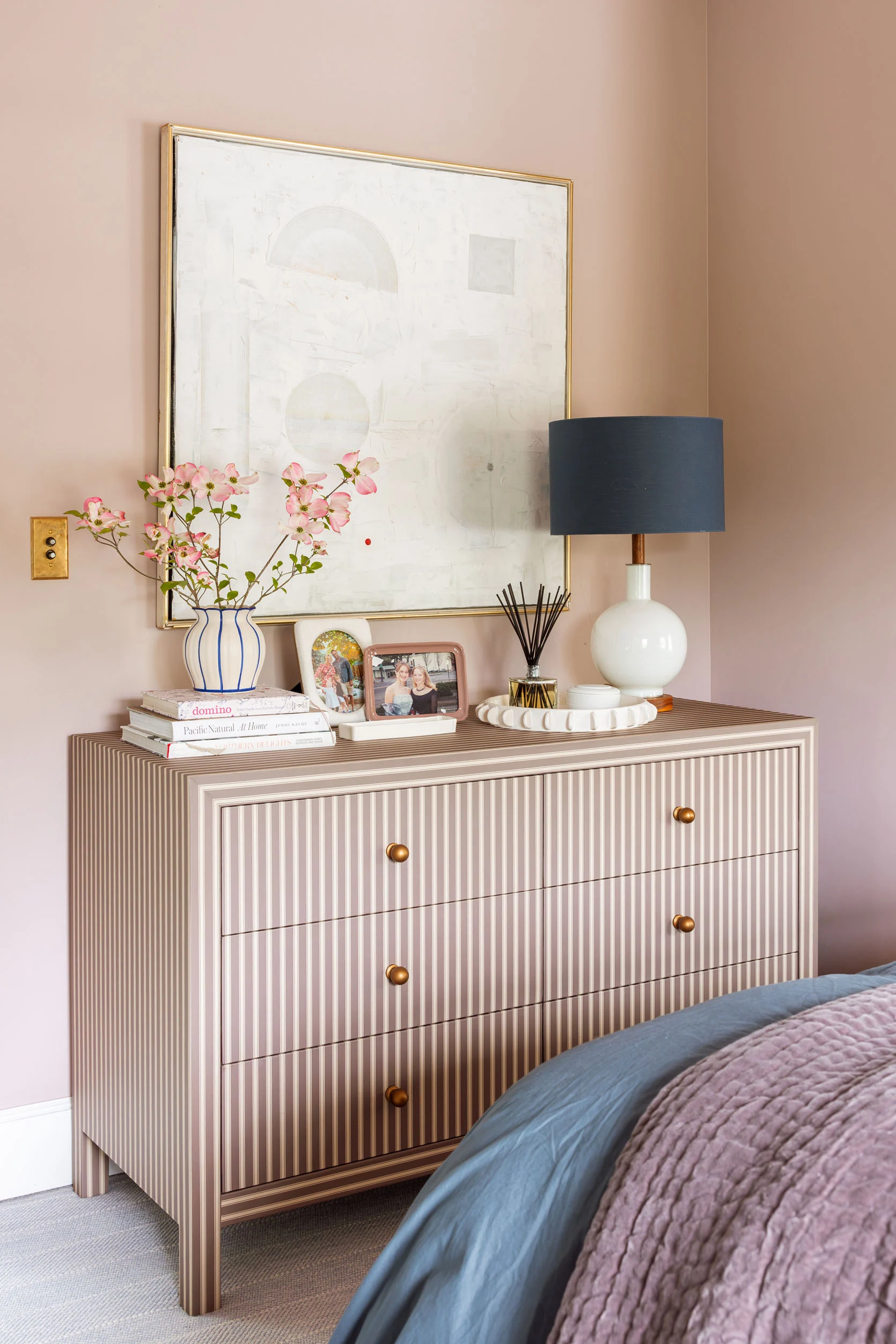
Wall Art | Dresser | Blue Bordered Vase | Vertical Picture Frame (similar) | Horizontal Picture Frame | Oil Diffuser | Round Tray | Lamp (unavilable)
The scale of the dresser is perfect in here, and it adds nice storage. Before we had this really low bench that was a placeholder, with the world’s biggest TV on it (which we all got used to using). I’ve had that Schoolhouse lamp forever, and then collected a new things from Anthropologie (that new vase and tray are both awesome). And yes, those are our dogwood branches from my tree 🙂
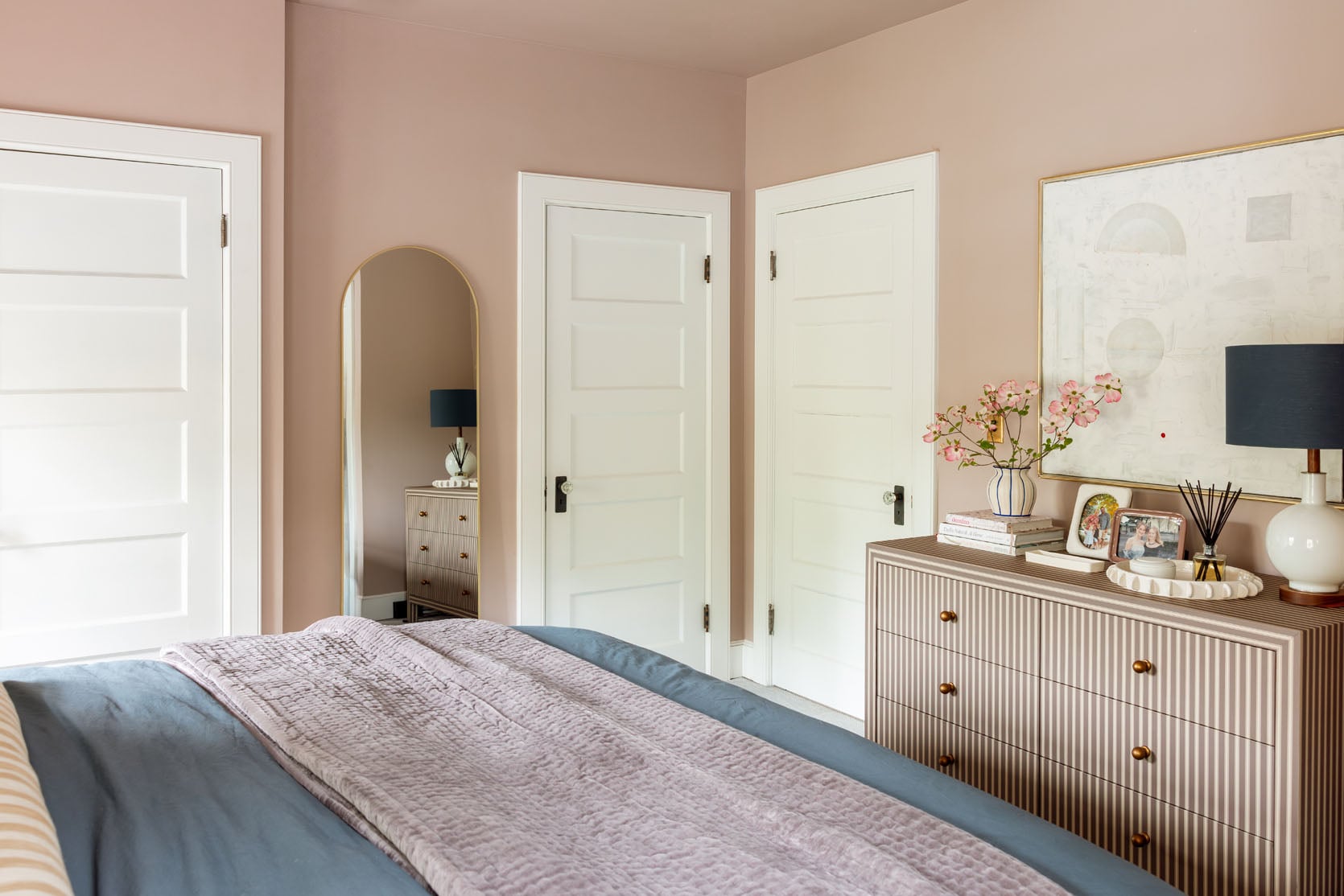
I swear there is enough space, but it looks so crowded in the photo. I stayed up here the night before my colonoscopy, and it was extremely cozy and comfortable (the Leesa Sapira Hybrid chill mattress certainly helps – my goodness, these mattresses are so soft).
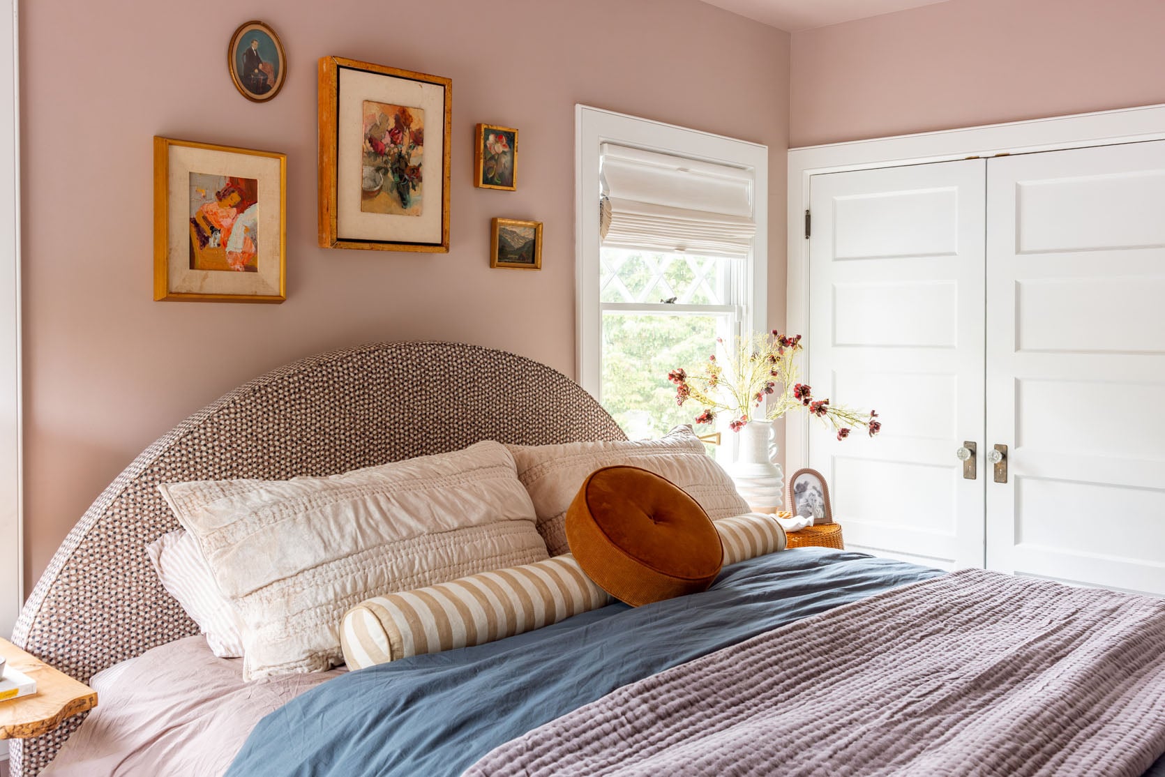
I layered bedding I already had in what no one can deny is my color palette du jour (or du decade). It’s the same as my bedroom, living room, and powder bath. Unintentional, I promise. These are just my comfort colors.
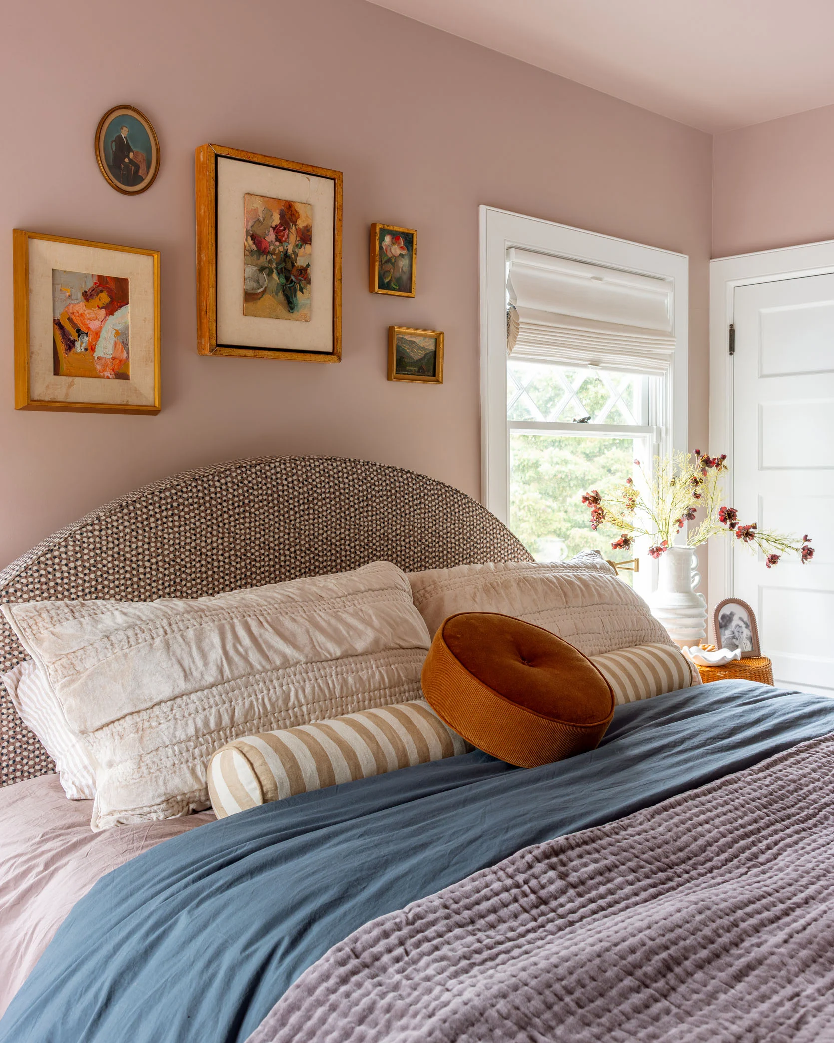
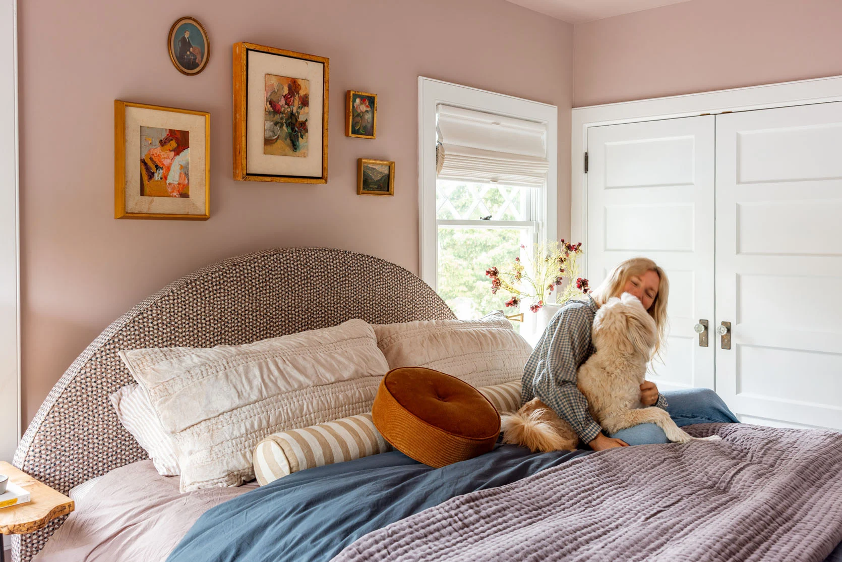
So that’s the update! Part of me thinks that nothing should go above the bed and that the art is what is making it feel too busy, and then making the bed look too big? Then I wondered if this room needs curtains to add some more visual interest and texture, but it also might be a lot, and we don’t need them (the shades are blackout, top down/bottom up, and just functionally incredible). I feel like you guys have good, fresh eyes with this stuff. I also have zero stress about it all because I know that for a guest room, she is dialed in 🙂
*Photos by Kaitlin Green


that wall color is so pretty! Re: above the bed, what about a swoopy garland or two? It would echo the headboard shape which is fun. I made one with some random tassels in my tiny bedroom and it works out.
It’s Sherwin-Williams’ Artistic Taupe. I remember because I used it in my en suite bathroom, and it’s really lovely!
I think less small things are in needed. It feels cluttered. How about a regular night stand and lamp in place of the ghost table and standing lamp, and I single picture over the bed? Less stuff or put stuff on a tray. Maybe it is just the styling and IRL it is doesn’t feel like this. It is such a pretty room with some very cool things in it, but it seems they all get lost because there is so much there. Perhaps less color on the bed itself and more streamlined bedding would help?
I agree about removing some small things. Maybe this is my personal preference but I’d avoid family photos in a “guest” room. Overall, it’s a lovely room, though.
I had a similar reaction and must have a similar preference. 🙂 I’m sure it’s because it’s used for grandparents mostly.
I like the ghost table as the night stand, but it needs much less stuff on it. I do like the big funky pitcher/vase, but not there. If there must be a vase with flowers there (there are three in the room by my count, which feels a bit repetitive for one room) perhaps it could be way more simple.
I know. we were laughing about the amount of flowers. lol
It’s lovely to put a photo of you & the guest in the guest room during the stay. A throwback pic is fun to reminisce.
I totally agree, too!
Came here to say this as well – there are a lot of beautiful textures (carpet, dresser, bed) that work well together, but then the colorful bedding and too. many. oil paintings. distract . . . and make the bed feel out of place. I think neutral bedding would complement your existing textures, and let the bed be the star that it deserves to be!
Also agree with too many itty bitty elements in the styling. This is another instance where form is considered first, then function. Really, this room needs a nightstand and some good task lighting. I would suggest a more solid, functional nightstand in the corner where the desk is currently located, then some sconces over the bed for reading. The wicker table is lovely, but it’s really not necessary – removing it could open up that side of the room visually.
But they actually need the desk, not a nightstand, for function. If’s a guest room 1% of the time and a backup office 10% of the time, then function would say to choose a desk over a nightstand… guests can use the desk as a wider nightstand, anyway.
Personally I like to keep my guest room surfaces clear so that guests can arrange their stuff on them, but it wouldn’t be nearly so nice of a styled photo with zero accessories on the dresser and tables, lol!
I know. its so tricky! i actually liked it more when it was WAYY more paired back. was such a calm room to be in. i still love a lot of the elements, but its too crowded or something. but when I stripped it back the bed looked like ALLL YOU SAW. i’m not too concerned about it, but its a fun conundrum to solve.
I agree. The bed is too busy. I liked the tone on tone look from the first iteration of this room, it felt welcoming and restful. Let the headboard speak. Remove all the small art from above it, and simplify the bedding. I like the ghost table and desk, I like the dresser and its styling, and I really like the chair in the corner, with the either the single painting or the smaller art that is shown with it! I don’t think curtains are necessary either, the simple shades look great. This looks like a really inviting place to stay.
I love the new dresser, the stripe is just beautiful and it’s wonderful with the wall colour I also love the bed in this room and again it’s wonderful with the wall colour. Having a headboard also makes a huge difference. I do think you’re right about the scale though and I do think you can trick the eye a bit. I agree that the small pictures over the bed are making the bed look huge, and a single wide piece would make a huge difference and match the scale. Failing that, and if you have them handy, a line of 3 identical frames of the size of the middle picture or bigger, might do the trick. I also think that small round cushion is too small and dwarfed on the giant bed. It kind of looks like a large throat lozenge, scale-wise, and emphasises the largeness of the bed. The frilly pillows are also very large, in line with the size of the bed but also contributing to it looking huge. I notice you had smaller pillows on the bed originally, and that they were stacked rather than propped up. I think if you use those original pillows, and… Read more »
I think the room is cozy and comfortable. The dresser is beautiful and really works with the color palette. Love the ghost table and side desk, and the bed looks nice here, too! I’d just make some small changes to visually open up the space–remove the floor lamp and move the ghost table closer to the bed, put just one painting above the bed, and remove the round pillow. Otherwise I think it is a great guest room. Would love to see update pictures if you make some tweaks.
I think the room looks super cosy and comfortable, but the bed really is too big for the space. I agree with others that there’s too many bitty pieces in the room which are too small in scale compared to the bed, making it feel even chunkier than it is. So it could be made to look less bulky, but it does not look like a bed that was custom made for that space as it’s too big. Would totally love to sleep there though and I don’t really think it matters if a big cosy bed is what the room is for… Do either of your kids want the king bed? Or might they want it in a couple more years? Speaking as a mom to teens, one of which ended up with the king bed in her room when our guest room got moved. Sounds like your guest room might be better with a really nice sofabed in there – kids can watch TV up there, makes for a nicer occasional office for Brian and still functions as a guest bed when required. That’s what we did and it works great. And the teenager with the king bed… Read more »
Agree that (in pictures at least) the bed is a little big BUT also agree that the point of the guest room is to…be comfortable for guests. Personally, when I am a guest, I would much rather have a big bed that is slightly out of scale w/ the room vs a bed that may photograph better but doesn’t give me the space to sleep spread-eagled without pushing my husband off the bed. 🙂 That’s the tradeoff we made in our guest room and our guests always comment on how lovely the sleeping situation is for them…and nobody has yet complained about the fact that the bed encroaches on the window frame a bit. When you can design for photos and real life at the same time, great, but if you have to pick one it’s real life every time!
And on a different note– the small art gives eclectic B&B, so I don’t mind it, but I agree it would feel calmer and less cluttered to swap out all those small pieces for one calm large piece (the white painting?) or no art at all.
I feel less like maybe the true home for the custom bed in in Elliot’s room? Those colours would look great with the new paint colour – then you could get a queen with a minimalist frame in here to allow some breathing space for the desk and side table.
I also think maybe the orangy tone of the wood /wicker is throwing things off? I know it is “in” but that pink is cool toned so if you wanted warm toned contrast it would be better in burgundy family nor orange.
Love this update and how can it be almost 4 years ago already? Time warp for sure. OK, let’s see. Dresser: love, absolute perfection. Desk: what if you got some white/cream painted turned legs for it instead of the hairpin legs on it now? Agree the chair is pretty. If Brian feels it is comfortable for desk use, then it could be a winner. Bed: I do think a queen would have been better, but still looks nice and definitely a luxury for guests. Art: The orientation is the challenge here. The right side of the vignette almost mimics the arch of the bed so one option could be to have 2 similar smalls on the left so it creates an arch type shape, with the one larger piece in the middle. A different option would be to square off the layout a bit. For this I would keep the largest piece and shift it to the left, and then have the 2 rectangular smalls next to it stacked one on top of the other. Or, one large rectangular piece. Overall, I like the updates, I love the painted lady in here, and the bedding layering is really nice. Our… Read more »
Having slept in my share of uncomfortable guest beds, let me reassure you: The guests who sleep here won’t be saying, “Gee I think this king sized bed is a tad too big for this space.” They’lkl be saying, “It’s so awesome to sleep in this king size bed!”
Beautiful room. The dresser is so cool. I’d vote no on curtains. And I’d probably just eliminate the art above the bed. Let the bed be the star.
What a warm and welcoming room! I actually think that nothing over the bed would be just fine. Sometimes it’s okay to have an empty wall. Take down the pictures and see what you think!
What’s your shade brand of choice? The ones you have there are nice. We’ve done hunter douglas throughout our house and need a few more, but the prices have sky rocketed recently!
These are by Decorview
I love the bed in here! It’s so lovely and inviting.
If this were my home, I would remove everything (and I mean EVERYTHING) except the bed and the art.
And then I’d add:
– breezy curtains
– matching night stands
– matching lamps on night stands
– a desk in place of the dresser.
– a frame tv above the desk
– one large plant
This would look peaceful and welcoming, and would be functional and comfortable for the three room uses:
– Brian using desk
– TV
– Guests
Thank you Emily for the update, and for welcoming our ideas (it’s so fun!)
Wasn’t the bed designed to fit between the windows? Or was that when it was a queen, not a king?
Love the pillows!
Can you take a photo of the painting (and possibly amp up the texture in Photoshop) and then use that on a Frame TV in the same spot?
I,m in the minority, but I adore the gallery art above the bed! I’d edit somewhere else. Having a desk in the guest room is so functional—my in-laws had one and it was so helpful, sure it’s a live edge ,but it’s tucked in a corner a looks fine.
I agree! I love the gallery art above the bed and think it feels quirky and fresh. I actually love this iteration of the room and would personally keep it as is. It kinda seems like we’re searching for this perfected magazine-worthy version of a guest room and I’m wondering why it needs to feel more dialed in?
The dresser vignette= so good.
I agree there’s a sense of visual clutter. Would also suggest removing the round pillow, pics above bed, see how the frilly pillowcases look stacked to see more of the pretty headboard as another reader suggested. Also consider mounting mirror on inside closet door. And, in the spirit of paring down, as lovely as the dresser vignette is, consider removing the small white rectangular tray.
To eyes, even those quick and easy moves would go far towards my eyes resting and appreciating the room’s sweetness.
Only partially related to this mini reveal … But does anyone else avoid portraiture? I don’t know why, but I don’t like people in my artwork and have zero at home. Just a me thing? 😂
I’m similar. I don’t really want portraits as my artwork. I used to be an almost strictly abstract/non-objective art person. But in the last few years I’ve leaned into all things floral: oil, acrylic, watercolor, plaster reliefs, block prints, and collage. I also have a few plein aire pastel paintings from a local artist I love. So no portraits, just anything that brings the outside in.
The exception… portraits of pets!
I think it looks beautiful and love your updates! The nightstand, desk chair, and art in the corner are my faves! I have two thoughts from the peanut gallery but I really do think it looks lovely and that the scale of the bed plus the art is all totally fine as is. For me what would really bring it all together and balance it out are, in order of priority, 1) sheer, lightweight drapes hung high of course, maybe with a subtle pattern but not necessary, and 2) painting the ceiling a lighter version of artistic taupe. I love the reflected color on the ceiling and something like that across the entirety of the ceiling would help soften the line between the wall and ceiling that feels stark against the softness of the room below and the charming gallery wall. But it’s all really lovely already 🙂
I agree stuff everywhere makes this beautiful room look cluttered. The bed is big and affects the lovely windows. It minute look odd from the outside view as well. Above the awesome bed maybe look good with nothing and the headboard with fun linens. Wall sconces above bed would be nice. Furniture everywhere. I live the room no matter what you do.( you asked for input)
I love this space! I think moving back to bedding that is white or similar in tone to the rest of the room would make the bed feel more cohesive/take up less visual space, and moving the painting that is currently over the dresser to over the bed (or skipping art over the bed entirely) would also visually streamline?
The headboard, dresser, and whicker table look so good! I’ve been eyeing the wider version of the dresser-how easy & quiet are the drawers when they slide in and out? I am team less knick knacks on the surface only because guess need clear surfaces so they can put their own things on top. I love the two larger pieces of art that were stacked above the red chair. What if you put them side by side above the headboard and forgo the other small round art pieces? The frames of the original pieces are so thick and the color of the art is so moody I think they can stand on their own in the small wall space between the windows. I want to like the bed styling more, but the frilly shams add clutter not charm IMO. I definitely appreciate the square light art piece above the dresser more. So good!
I love the new dresser, it’s so pretty and looks so nice and soothing with the wall color. But agree with others that the bed looks too big for the room…I liked the look of the bed/guest room before, without the huge upholstered bed. Glad the chair has returned…even guests need a place to throw their “in use” clothes!
This room feels to me more like the rooms from secrets from a stylist than any other room in the house, and I mean this in the most nostalgic and complimentary way. The color story is very coherent, there is a playfulness to it, many different patterns that work together, quirky accessories that catch the eye, and even some hallmarks like the navy lampshade. The choice of pink itself is very typical of that era, and even though Emily has used the palette before, here pink dominates. I think it’s because Emily designed this room with only her own taste as the design direction. No need to think of what kids want, of how Brian would feel or operate in that space, no other person with stakes, just herself. No practical mom vibes, just sweetness and calmness.
The bed is gorgeous! Your guests are so lucky. I think if you swap out the ghost table (sorry!) for the little pedestal table you had there before, that whole corner would be instantly cleaner and lighter. And your guests could even set a drink down, which I assume they can’t on the wicker.
Sure the bed is slightly big but I agree with others that as a guest, I would love to stay in a big cozy room with a cool headboard (vs no headboard or a bed that’s smaller).
What I think is missing is the colors of the bedding from the previous version. I think they’d help everything come back together and work well with the headboard. I also think bringing back the chair helps bring that rich/saturated yet romantic look that the previous version hit so well. A smaller nightstand may also help to bring back that soft/romantic look.
thanks for sharing as always!
I think everyone is focused on the bitsy bits, because the shots are pulled back versus vignettes. And cleaner images look better on our little screens. The scale of the stuff in the room looks fine from the hallway shot imho.
If I were a guest, I’d want the ghost table closer to the bed so I can have my phone / alarm near by (addicted, but don’t think I’m the only one). Maybe the move for lighting is plug in, swing arm sconces — symmetry and more surface space. And is there room for luggage in the closet?
I think the design might feel more cohesive with a tighter color palette, since the furniture pieces are eclectic. Sheer draperies would add some softness without heaviness, but aren’t essential.
Is a frame TV out of the budget bc that might solve the problem – but yes I know you need to get an electrician and the TV so I get it if you dont want to spend that in here. I think it all looks so cozy and amazing.
I’m going to guess you don’t have gamers in your house. Sadly a Frame TV is worthless for gaming.
If I were a guest and staying in this room, here is what I would want, space on the dresser to put my purse and other stuff. A mirror on the dresser as the mirror in the bathroom is small and my traveling partner would be able to use the mirror in the bedroom while I was in the bathroom. Maybe even lights on the sides of the mirror. The ghost table with the big pitcher of flowers would make me nervous. What if I accidentally knocked the vase over as I opened the closet door. Then I’d wonder what should I do with all these extra pillows during the night, throw them on the floor? Please just give me nice crisp white bedding. Staging a room for a photo is very different from making a room comfortable for guests.
I like this room so much: it does feel like a warm hug! Farmed this out to my daughters: 9 year old: she likes the dresser but would change the bedding for less layers; 14 year old: immediate answer was the paint color. She then to mentioned the pictures over the bed seem too small and she liked the first itteration (with one large picture over the bed) the best. 46 year old: I think the bed proportions just seem too big for the room, even if it fits. Old houses and king beds are tricky and a queen seems like it would just fit better. We all love the variety of art and voted to bring back the red chair in the corner.
Seem to be in the minority but I love the gallery wall above the bed. I think it’s perfect and very pretty. I don’t think this room feels cluttered. It’s a guest room. It should feel pretty and acknowledge the fact that your children watch TV in there and Brian uses the desk. I think styling it to perfection and then just leaving it there while you wait for your guests to arrive is a missed opportunity. And I’m glad you put the pink chair back. It’s a king bed in a small room so it’s always going to look a little crowded because of that, but that’s no reason to go minimalist.
I think the room is warm, cozy and inviting. I personally do not like “ hotel” rooms in people’s homes. It’s not a commercial space and it should reflect the family that lives there. Not too crowded or over done. Perfect.
I think it’s beautiful! Maybe some symmetry on either side of the bed – matching bedside tables and a set of matching lamps – would bring some balance to the room and allow you to keep the artwork and other styling pieces and continue to play around with bedding and accessories! 😊
Really lovely room. Love the dresser and the bed. To me, a lot of the visual clutter comes from the amount of woodwork you have in this room (so many doors!) and the contrast between the walls and trim. Not an easy change, but if it were my house, I would paint the doors/trim to match the walls and add curtains to amp up the sense of calm/softness.
I would start over, keeping only the dresser and, if you feel you must, the be though zi am not a fan. It might be fun to have someone else design the room. It sounds as if you might be over it and how fun would it be for you, Brian and your kiddos to be surprised??
I like the play of small and large elements. The contrast makes the larger bed work in a “know the rules so you can break them” sort of way. I like the variety in the bedding and how the stripe speaks to the dresser. Maybe just a little editing: only the flowers on the ghost table and no lamp. Then remove the flowers and photo from the desk. The lady painting with the bath wallpaper is terrific.
I like the bed but agree there is too much going on in the room and would remove many items to clean it up. I would remove the pictures over the bed and leave it alone. I also would do more neutral bedding. It’s too busy. I don’t like the wicker side table. It does not look proportional, and I would not find it useful as a guest. I would change the blue shade on the dresser to a neutral shade, and I would reduce the amount of things on top, especially the pictures. I do love the dresser and the chair corner. It really just needs editing- less is more.
Thank you for the update, Emily! I loved the room as it was before – it felt warm but also light and airy and I guess those are my favourite rooms to be in. I also really like the new vignette with the dresser.
Just lovely! Is the ceiling color the same color as the wall color? I think it may be linked/labeled wrong above. Thank you!
Yes, it’s the same color as the walls. I think that link should say trim and door color not trim and ceiling color.
How about painting the trim and doors one shade darker than the walls?
Squinting at it, I would also remove a few more items from the bed linens, dresser top, and mini gallery wall. The dresser top feels like too much white, more wood and brown might help it feel more layered and insouciantly cute.
Love the corner vignettes around the chairs, dresser, and desk.
Agreed that the dresser area is great.
The bed frame just takes up WAY too much visual space. I’d probably go back to no headboard or something that is much more basic — no pattern and not rounded as it introduces another visual shape to the room.
Definitely no to curtains. The room looks fresh and bright while still feeling cozy! I think the bed is too big unfortunately, but you put it so well, “not criminally”. So just keep it! Until you stumble upon the perfect solution on FBMP one Saturday morning 🙂
Could you do a Frame TV in there? We also have a folding table (gasp!) with a giant TV in the guest room because my parents are incapable of sleeping without a TV and it’s become a beloved family movie spot for my family when we don’t have guests.
I actually preferred when you held up one small piece of art above the bed in an instagram story. I thought the oversized feeling of the bed was fun with the too-small art. It felt like a little breath of space.
The dresser is amazing! And I love your styling here. All your vases and branches look so beautiful! It’s a lovely room.