Design
Design SOS: The Small Color Palette Shifts That Took 2 Reader Bedrooms From *Almost There* To Complete
Welcome back to another edition of a reader favorite column: Design SOS! We do about one of these a month. Here’s a quick catch-up if you’ve missed the last few, but if you’re ready to explore today’s reader design dilemmas, then let’s do this! The homes in this post all have good design bones; they just haven’t quite crossed the finish line in terms of styling or color palette. For instance, the first bedroom we’ll get into has great intentions with a vintage Persian rug and a super bold custom-upholstered tangerine headboard, but the reader is struggling with making it all work together. Then, we get into more of a blank slate of a color-drenched guest suite, submitted by someone dipping their toes in the world of colored walls. If you know me, then you know I’m going to have fun with this one.
Practical Design Advice For: Leaning Into Existing Warm Hues
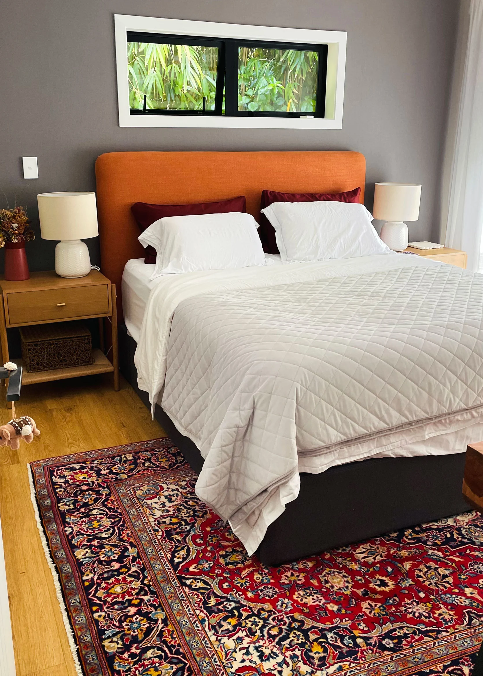
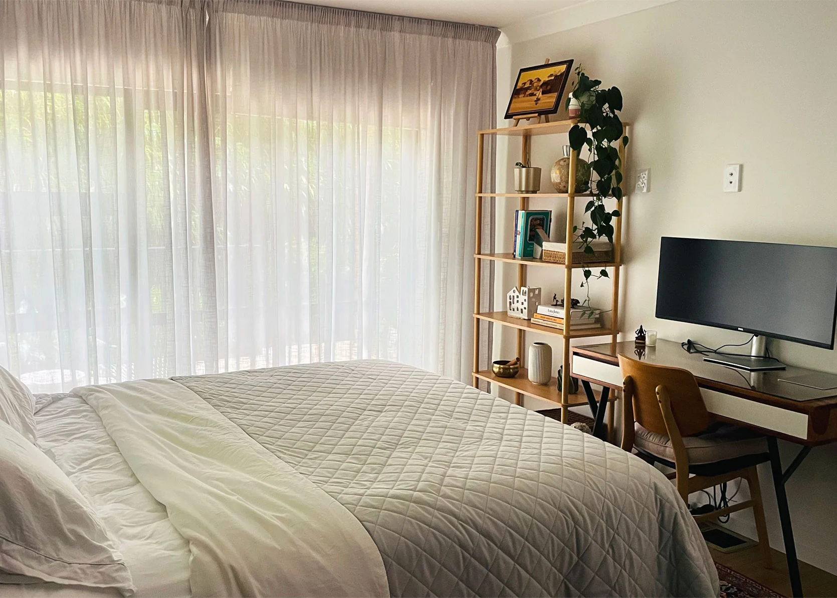
From Reader: “Please help me solve this guest room! I am so stuck with it! This is a spare room/ guest room and occasional office space. I have bought this vintage Persian rug and thought it would solve the problem and bring the room together, but it still looks wrong. I have tried many pillows and throws (with AI), but nothing really works. I need a human touch and talent at this point. I am trying to create a moody room (it’s a naturally dark space) with burgundy, rust, and camel tones. I am looking for finishing touches, and hopefully the room can be fixed with small fixes, soft furnishings, and a small budget. I have reupholstered the headboard myself recently, so I would like to keep it. The vintage rug is also a recent buy in an attempt to bring burgundy and character. The room still feels unfinished and not sure what cushion and throw to add to bring things together. Also, ideally don’t want too many cushions. Anything else missing in the room? Do you think the rug works there? Sort of regret the buy a bit and not sure it creates the stylish room I wanted.” — Maria W.
Design SOS Checklist:
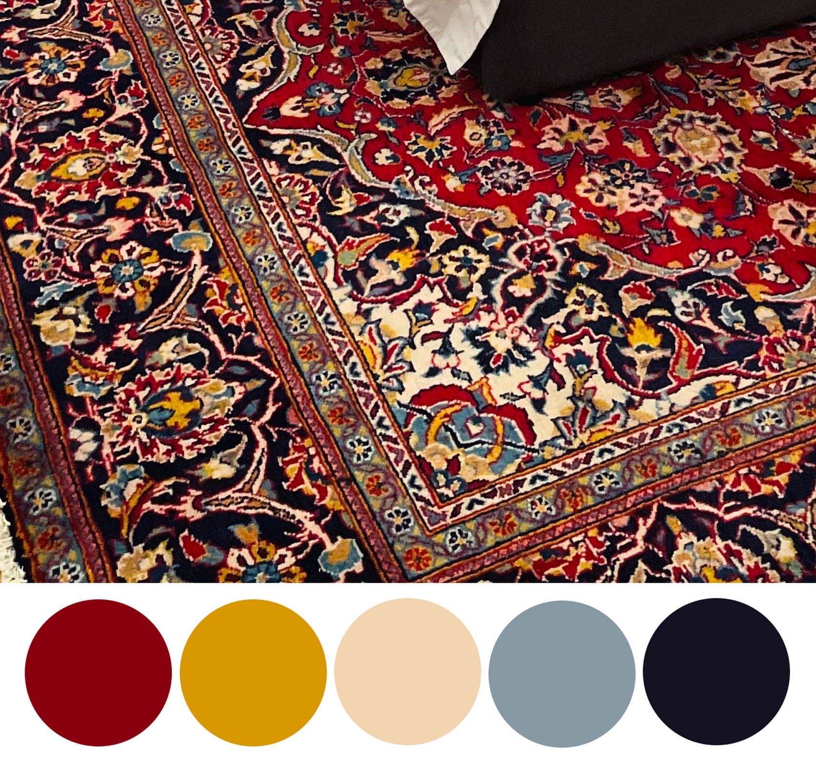
Reading that Maria wanted a moody room (especially considering this space doesn’t get good natural light according to her), my initial instinct is to completely change the color of the walls. In all honesty, the gray accent wall isn’t doing much to show off the red and orange colors of the rug and headboard. In fact, to me, it’s fighting it and making them look a bit dated. Instead, she needs to lean into those earth tones more. You can see above that I zoomed in on the rug to pull out some colors to play with, including navy, dusty blue, mustard/gold, cream, and, of course, red. Her mission here is to pull this color palette through some new bedding and accessories, and also consider some of these to-dos:
- Change the wall paint and unify the color. I’d opt for a dusty, earthy pink to add drama and moodiness, but also create a color bridge between the red and orange in a soft way.
- Update the bedding and window coverings to move away from the gray tones and opt for beiges, ivories, and flax instead.
- The rug has such a powerful design that you don’t need much to make an impact, but I’m dying to balance it a bit with some more subtle patterns. I’d do this through bedding and a pillow or two.
- Cover the clerestory window above the bed to add softness, but also detract from the heavy black window frame that’s adding too much contrast.
- Use accessories like a cool, modern lamp to amp up the personality (and bring in more of the rug’s colors).
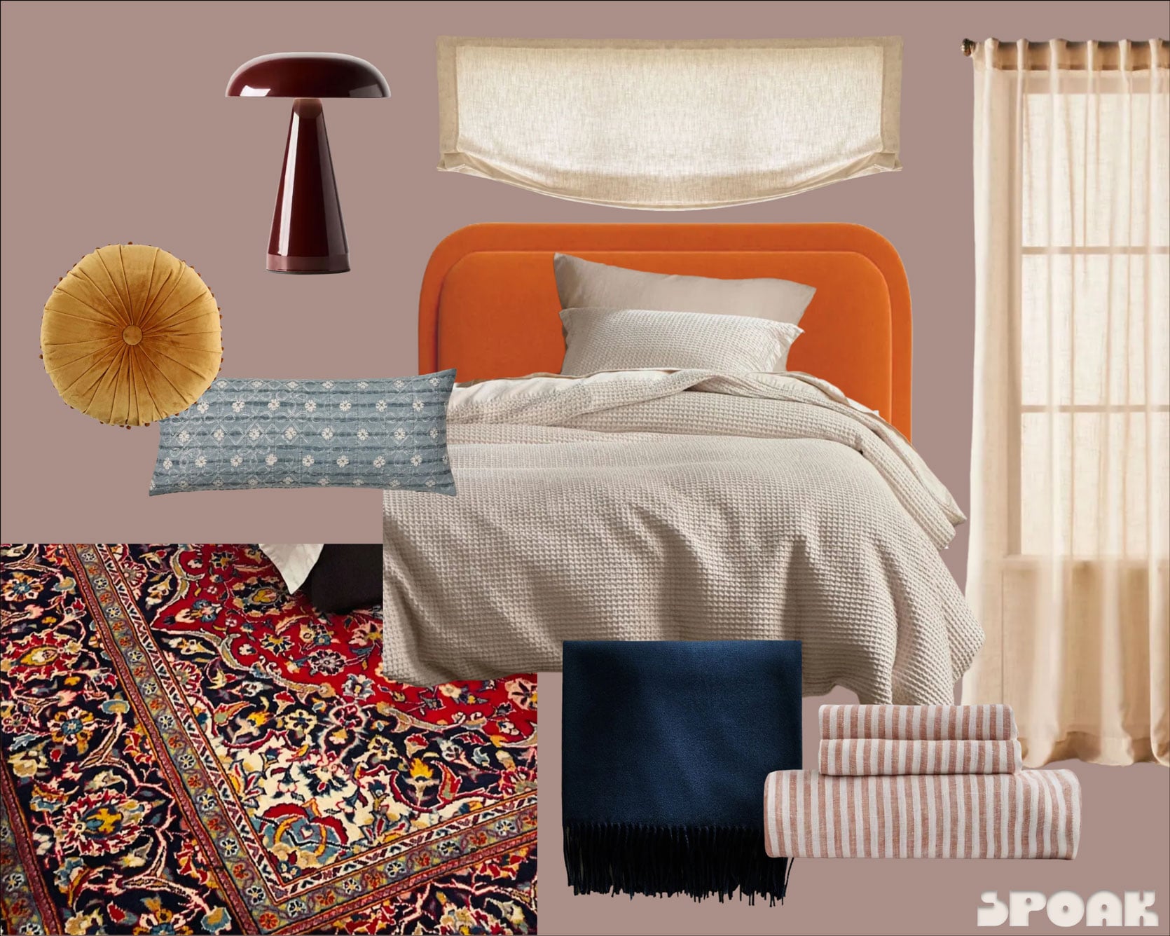
Paint Color | Burgundy Lamp | Roman Shade | Curtain Panels | Striped Linen Sheets | Navy Throw Blanket | Cream Duvet Cover | Orange Bed | Blue Lumbar Pillow | Gold Round Pillow
Making a bright orange headboard feel intentional can be incredibly tough. I understand why the reader added burgundy pillowcases to try to tone it down and make it work with the rug. Out of respect for her desire to leave it alone, considering she just upholstered it, I wanted to bring down some of the temperature contrast between it and the bedding, so I hunted down a super affordable duvet cover and sham set in a creamy linen hue, with the added benefit of a waffle texture for quiet visual interest. Given that I didn’t want it to be the only orange thing in the room, I picked some fun sheets in a striped terracotta (orange, but not ORANGE!!!!!). From there, I plucked all the colors of the rug and layered the bed with a dusty blue lumbar pillow, a gold yellow velvet round pillow—she didn’t want a ton of pillows, so I had to make it count with just two—and a simple navy throw for the foot of the bed to bring in the depth of the rug’s navy backdrop.
I haven’t really talked much about that paint color, but it might be my favorite part of this whole transformation! I went with Farrow & Ball’s Sulking Room Pink for a deeply saturated, milky blush that plays so well with the orange IMHO. I almost decided on a taupey mushroom color, but it just wasn’t sitting right with me. It needed MORE, and after some Pinterest searching that may have involved terms like “bedrooms with orange headboards” and “orange room color palettes”, I landed on pink. Depending on what the light does in this room, she could also consider something like Dead Salmon (also from Farrow & Ball). Or skip the bougie paint altogether and just test some rich, fleshy pink samples until she lands on something she loves.
Given that the curtains were also gray, I swapped those for some cream sheers, and then had some fun with contemporary burgundy lighting rather than the simple white ones she already had on the nightstands.
Altogether, the total for these changes was just over $1,000, including a custom Roman shade (I had to guess on the window’s size so it’s not super accurate), four curtain panels for the large stretch of windows or sliding glass doors, and one gallon of Farrow & Ball paint. However, I calculated that she could save over $600 if she went with a more affordable paint dupe from the hardware store, DIYed a Roman shade as I did in my old breakfast nook, and even tried dyeing her existing curtain panels to more of a tea-stained look if the gray will play nicely.
I put my moodboard through the rendering engine of Spoak and here’s what it came out with:
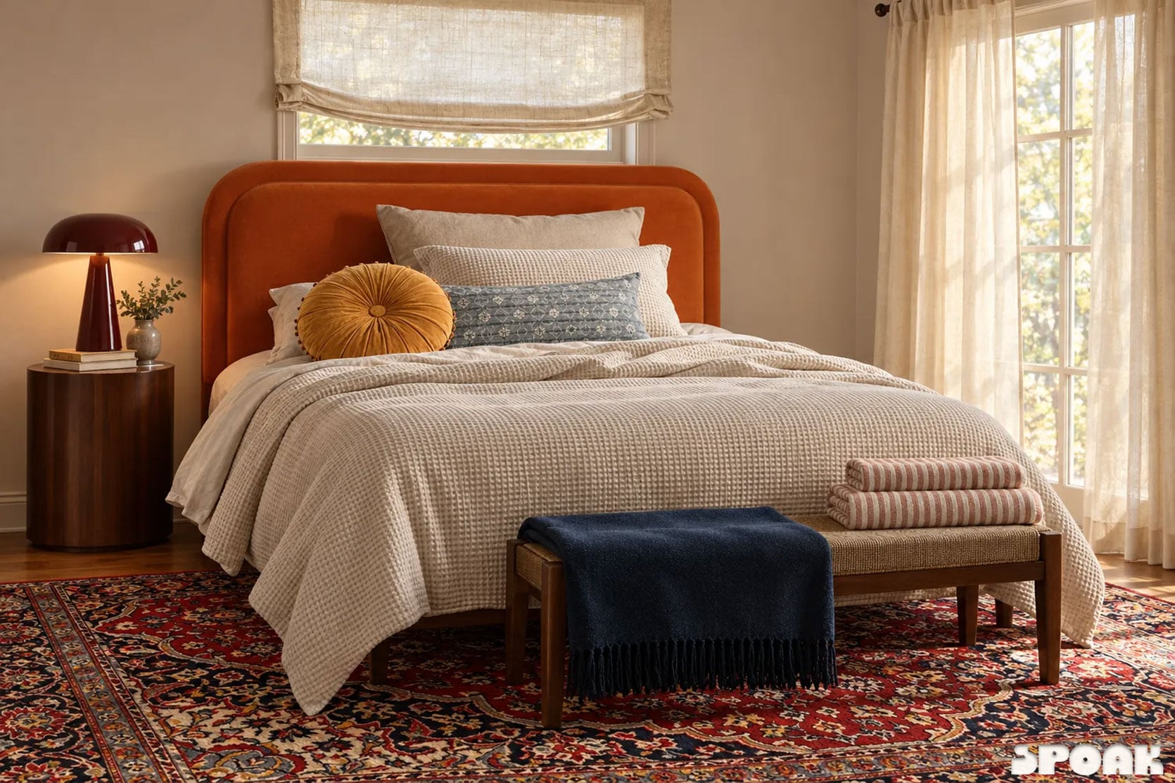
It’s not perfect, and the wall color is considerably more beige than pink. However, I think it puts everything together in a way that makes it far easier to imagine what it would truly look like in the room. I’m into it, and shockingly, that orange headboard works now!
Onto the next…
Practical Design Advice For: Making a Color-Drenched Room Look Layered & Cozy
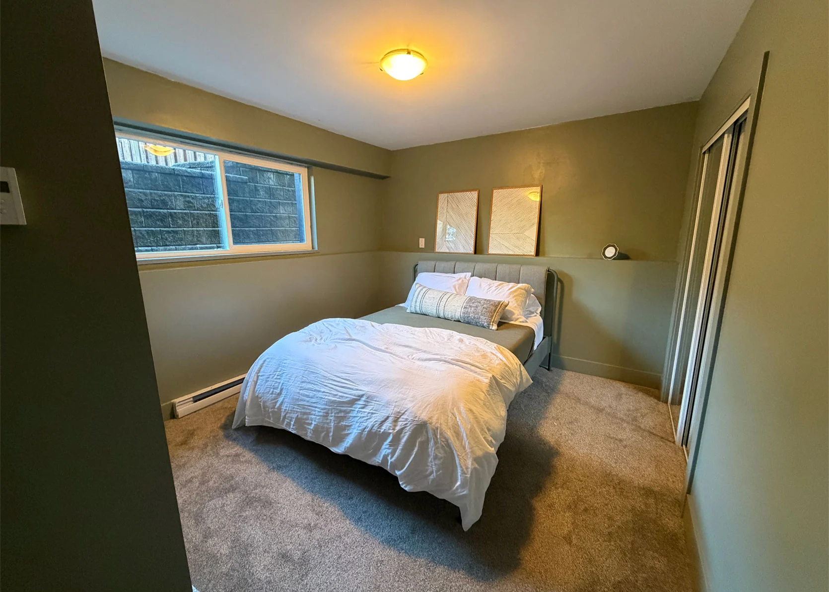
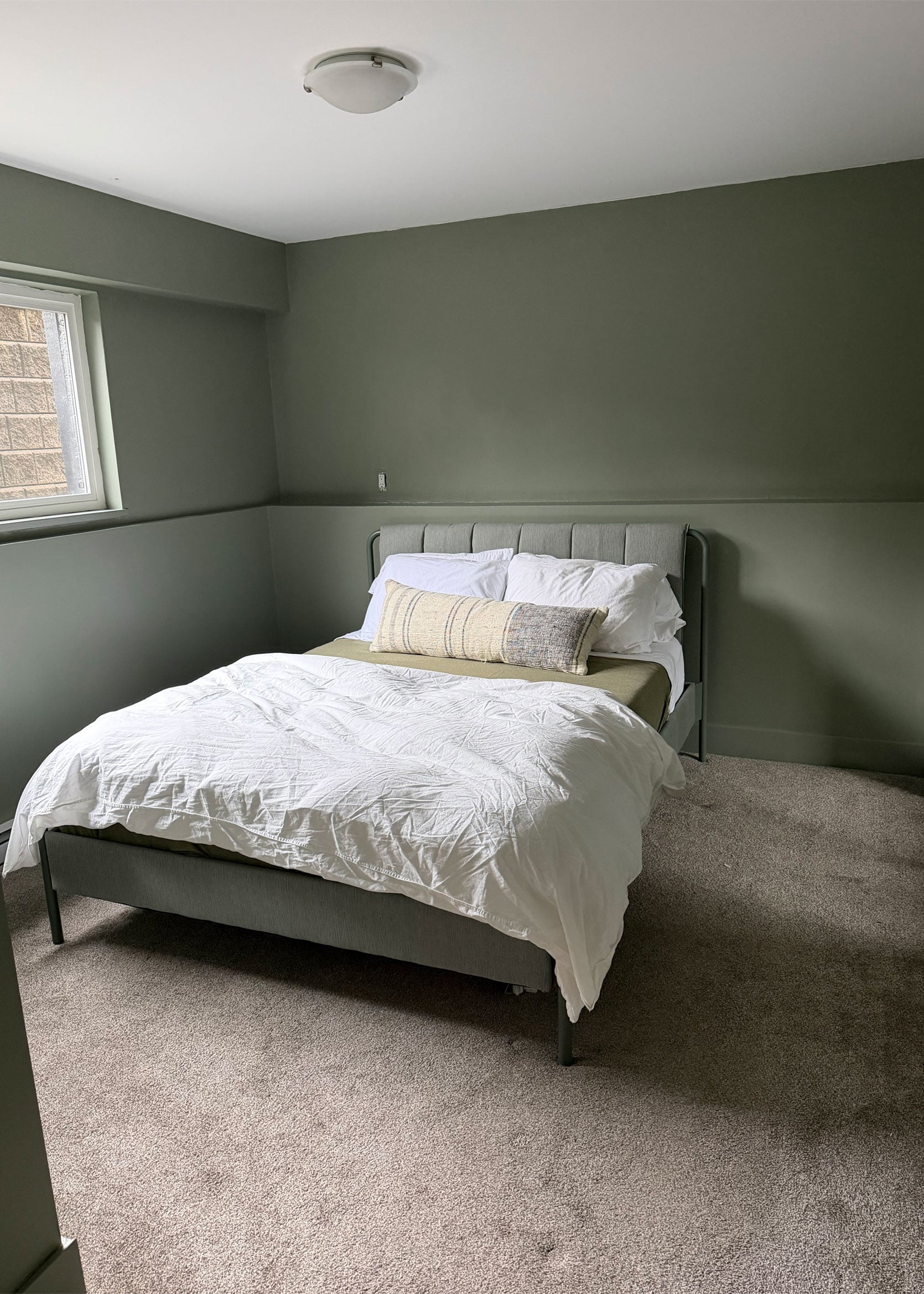
From Reader: “I live in Vancouver, Canada, with my kids (ages 8 and 10) and my husband. We have recently taken over the downstairs of our house from renters. I have a spare bedroom for the first time to turn into a guest suite. I started by buying a bed and painting the room SW Evergreen Fog. I love the color! Now I need to put the finishing touches on the room, and I need help, as I am overwhelmed. The rest of my house has white walls, so this was my first attempt at colored walls, hoping it will make the guest room cozy for friends and family that visit us. I love the color so far, but now I don’t know where to go with the rest of the furniture and accessories. Style-wise, I was thinking layered and cozy, but not too overwhelming visually; remember, I am a simple white wall girl at heart! I will not be spending much time in the room given that it is a guest room, so I am willing to take some risks and layer textures and prints to make it feel finished. Budget is $2,000, but willing to go a little higher if it means that I love it.” — Shannon G.
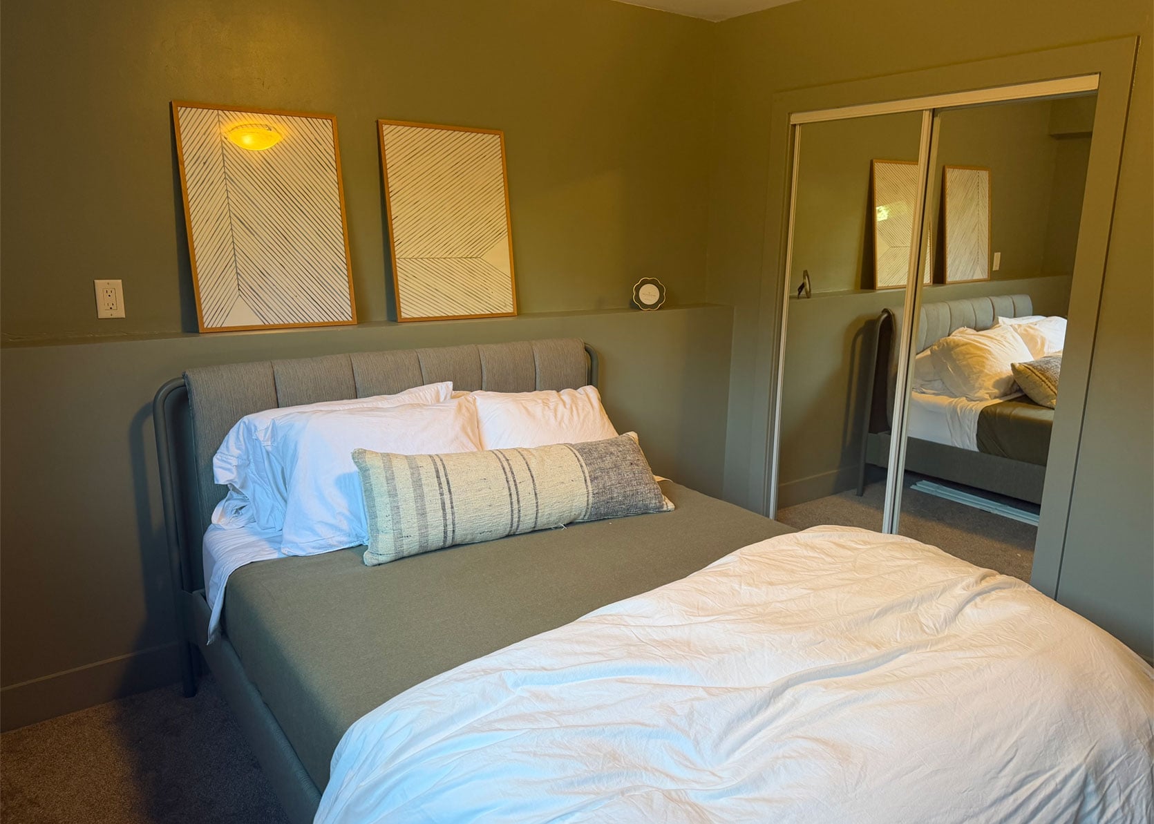
Design SOS Checklist:
Shannon, I applaud you for stepping outside of your white-walled comfort zone to try something new! I love the sage green, but I can see the challenge you’re having with how drastically the color shifts during the day with and without natural light. Wow! One is almost cool-toned and grayish green, while the other is very warm olive. Wow! My suggestion with something like this is either play to both of those cards with your color palette (meaning, make sure to balance warm- and cool-toned greens throughout the rest of the space), or figure out what time of day you spend the most time in here and work with that shade you see at that time of day. It’s not a perfect science. You could also make sure that the bulb in the ceiling light is more white or neutral than the warm kelvin rating it looks like you have here.
Here are some other details I cut out of Shannon’s write-up that are pertinent to know: They bought this bed from IKEA, which is roughly 66 inches in width. The length of the wall the bed is on is 125 inches, leaving 59 inches to play with for nightstands before you hit the closet doors. She specifically asked for help with: window coverings, whether she should paint the ceiling (YES), picking bedside tables and lamps, interesting bedding, art, and a rug. She also doesn’t love the mirrored closet doors, but TBH, if what’s reflected in them is something you love, you might find that you tolerate them way more. Plus, they reflect light in the room, which looks a bit dark, so they’re useful!
Here’s what I’d suggest:
- Paint that ceiling! You can either go with the same color you have on the walls, or have your paint provider go 25% lighter to account for shadows and lift the ceiling a bit more than if you went 100%.
- Change the flush-mount. I’d stay in the realm of a flush mount, but with a cooler shape. A fabric shade will diffuse the light, which is best for a bedroom space.
- Cover the small windows with shades. I’d go with a natural bamboo shade for warmth and texture (but a fabric shade would also be gorgeous).
- Add a rug with pattern—something neutral or in a similar sage green will keep things from feeling overwhelming
- Mix prints on the bedding for a cozy, layered look, but also to expand the color palette.
- Bring in some more intriguing art along the ledge, and hang one or two of them to make the arrangement feel eclectic.
- Speaking of eclectic, she can, of course, do matching bedside tables and lamps; but I’d prefer two different profiles to avoid anything too symmetrical. With some color-drenching, you already have a lot of visual symmetry to some degree, if that makes sense, so I’d shake it up.
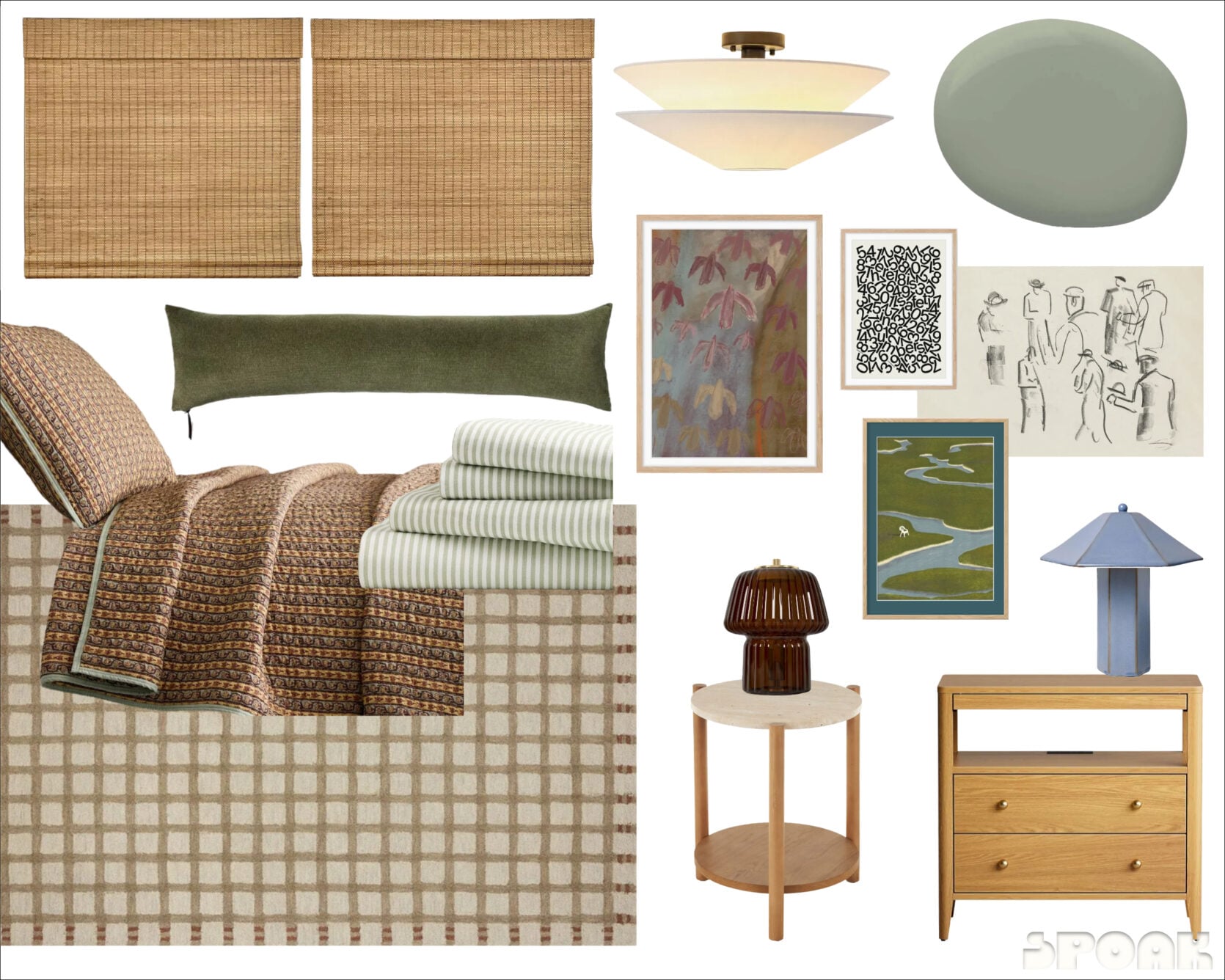
Woven Shades | Ceiling Light | Paint Color | Green Lumbar Pillow | Quilt & Shams | Striped Sheets | Rug | Nightstand with Drawers | Blue Lamp | Round Side table | Brown Lamp | Bird Print | Number Print | People Sketch Print | Green and Blue Framed Print
And here is where I landed! Originally, I had two of the same nightstand, but the dimensions ended up too large. This opened up an opportunity to shake things up with a smaller nightstand in the less visible corner (I was inspired by Malcolm’s bedroom here). A green striped sheet set carries the green into the bed—these are so affordable!! Oh, and that quilt and sham are SO GOOD! I wanted to create a palette that leaned into some warmth, as I mentioned, and the colors in this set from Pierce & Ward for West Elm showcase a sagey green mixed with gold and a hint of plum. The rug features varied beige tones with a more interesting border. I echoed that brown in the glass lamp (obsessed with it) but then went with a soft sky blue for the other lamp (also obsessed). One long lumbar pillow in an olive green rounds out the bedding.
Everything except the art comes to $1,861, which is under her $2,000 budget! I didn’t include the art in the cost because I used it more as inspiration. If she likes the pieces, great! But I don’t love picking random or generic art for people just for decorative purposes. Besides, art prices vary drastically depending on whether you pick a canvas, a print, if you frame it (with or without a mat), how you frame it, etc. For instance, you could buy all of these prints in a variety of sizes, then head to a place like IKEA for inexpensive frames and only spend a few hundred bucks. Or she could get them all custom framed and matted, and it would cost well over $1,000. But she still has wiggle room to buy some accessories for the nightstand and the ledge above the bed, and yes, even art!
Here’s a “just for the vibes” rendering:
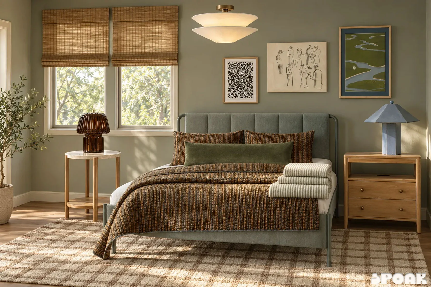
The photos of the actual room weren’t working well with Spoak to get a proper rendering, so instead, I just rendered the moodboard to give you and the reader who submitted their home a sense of what everything would feel like together. The rendering engine had issues with the sheet set here, too, and the bedding is cut off and askew, but you can still get a visual check of all the things together. I think it hits the mark of being cozy, layered, but not overwhelming, don’t you think?!?
—
And that’s all I have for you in this month’s Design SOS. Stay tuned for next month, and please submit your spaces for consideration in a future article. Email me ([email protected]) or Jess ([email protected]) and be sure to include plenty of photos, room measurements, budget details, and specifics about what you need help with. Remember that this is a styling column rather than a renovation or full-room-design advice. For instance, anyone who emails “help me design my whole space from scratch” probably won’t get selected here. Just keeping it real!
Oh, also! If you’ve been featured in a previous Design SOS and have taken any of our advice, please reach out and let us know! We’d love to feature any updates we can in the future.
Until next time, friends…
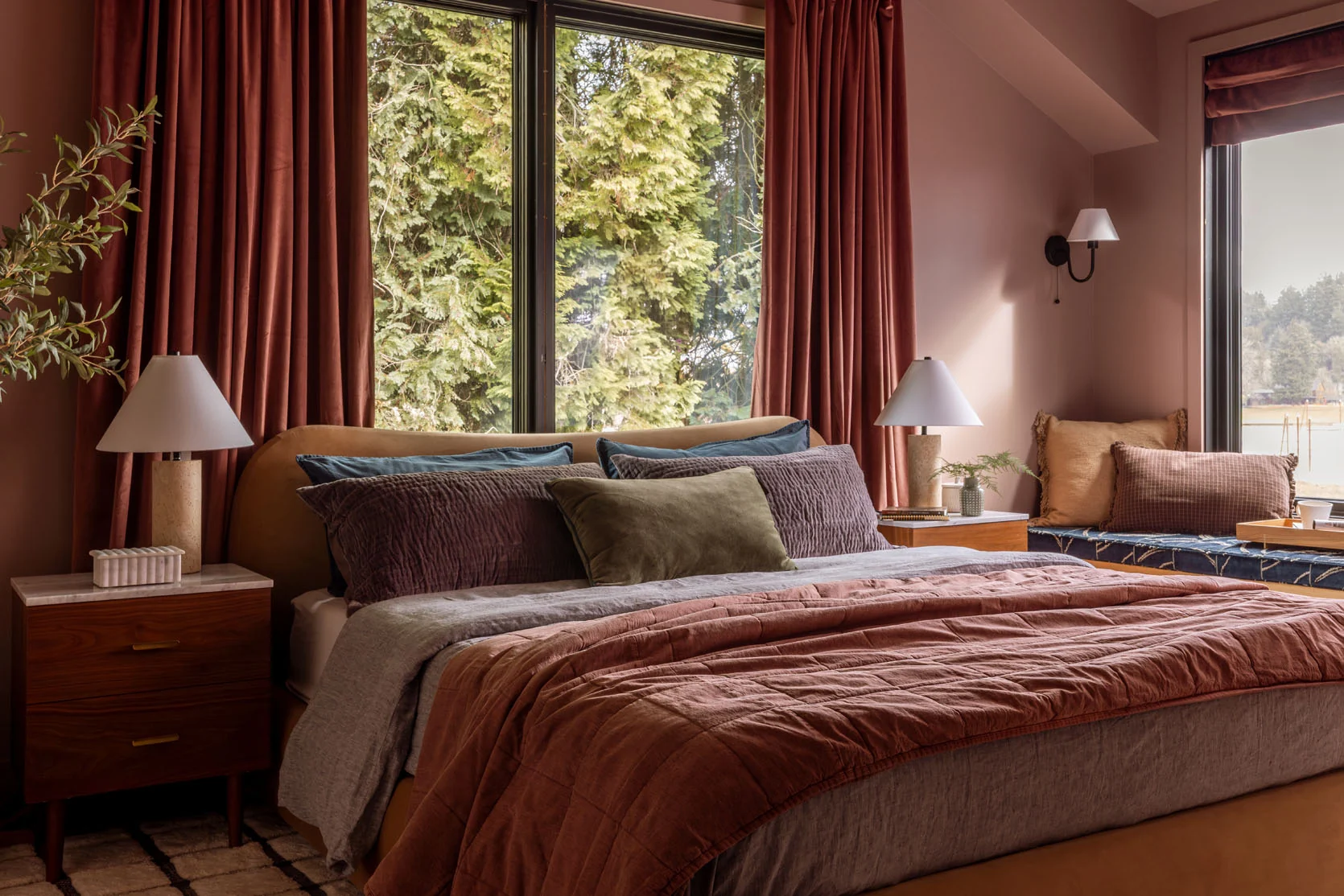
Opening Image Credits: Design by Emily Henderson and Max Humphrey | Styling by Emily Henderson | Photo by Kaitlin Green | From: My Brother’s Beautiful Guest Bedroom – A Warm and Modern Retreat

A Few Favorites
Subscribe
0 Comments
Oldest