Design 101
Design SOS: What Do You Do With a Very 2000s Tuscan Bathroom? Plus 2 More Reader Design Dilemmas We’re Solving
Welcome back to another installment of everyone’s favorite practical style advice column: Design SOS! If you clicked through, you likely already know what the deal is with this post, but just in case you’re new (everyone is new at some point, right?!?), let me catch you up. Design SOS is where we make somewhat easy, doable, and realistic design and styling advice to real readers who submitted their homes to us along with a short description of an issue they’re stuck on in any given space. As a reminder, this isn’t a huge overhaul; there’s almost no reno involved, just quick and practical advice that works with what they already have (unless they ask to change specific items). I say that because sometimes the comments run away with ideas for what to do, which is fun and helpful, of course, but not really the nature of this specific column.
Got it? Okay, let’s start off with a house that has fantastic bones and some good ideas to start with. It just needed some mascara, so to speak.
Practical Design Advice For: A Two-for-One Living Room/Entryway
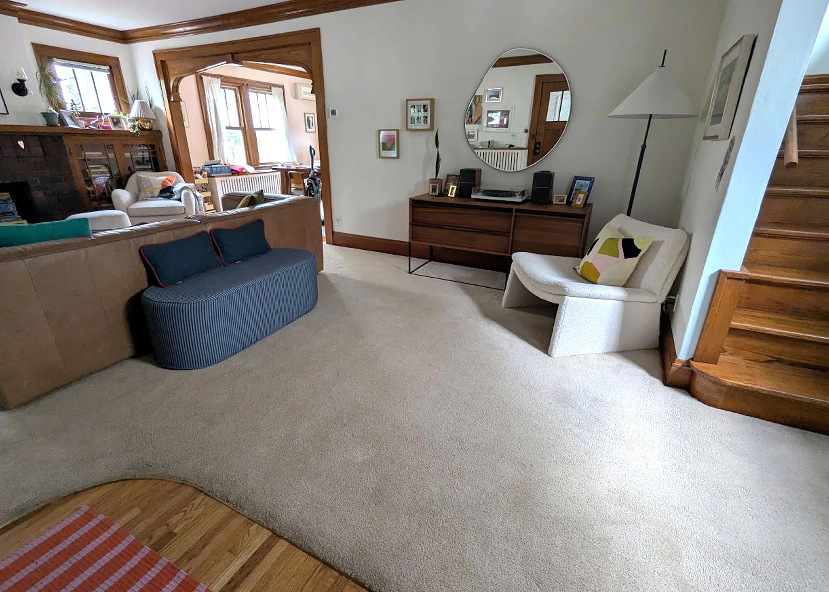
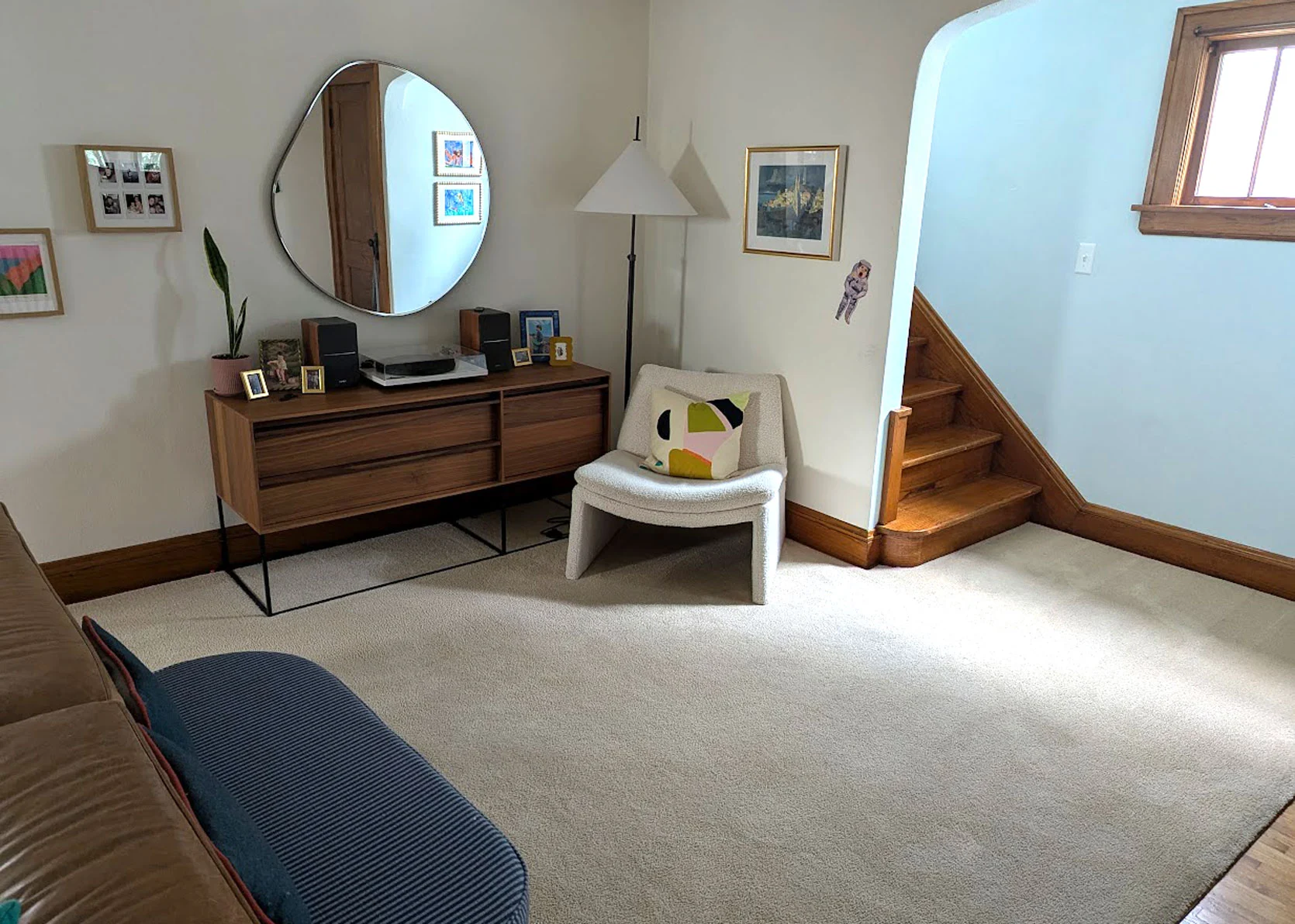
From Reader: “Our front door opens into a long living room, which I’ve divided into two areas: One as our more traditional living room space, the other as an entryway/music listening area. I can not seem to make this half of the room feel complete! I know it’s begging for a rug, but is there also something I could do on the long wall where the mirror is hanging? We have two young boys who flip over the couch, hence that soft blue striped ‘bench’, but would love to see what other options you’d put in that place. Since the room is so neutral, I enjoy fun pops of color and pattern to balance it out.” — Sarah F.
Thank you, Sarah! Before I get into what I’d amend, let’s chat about what I think is currently working. First off, the move of splitting this space up into two purposes was smart! I love that they already have this earmarked as a listening space, because honestly, one of the hardest things to do with an empty, kind of random space is to figure out how you want it to function for your home and life. I also love the juxtaposition of some of the more modern elements (that mirror is great!) with the classic architectural details. There are some fantastic bones here, but it just needs some oomph.
Design SOS Checklist:
- Add in a graphic, punchy rug to break up the white carpet.
- Treat part of this space more like an entryway (with a bench with storage space underneath, if needed.
- Really elevate the walls. The architecture and millwork are so great; the white walls are really falling flat.
- Lean in a bit more into the “listening lounge” concept with some cool vinyl frames plus some mood lighting.
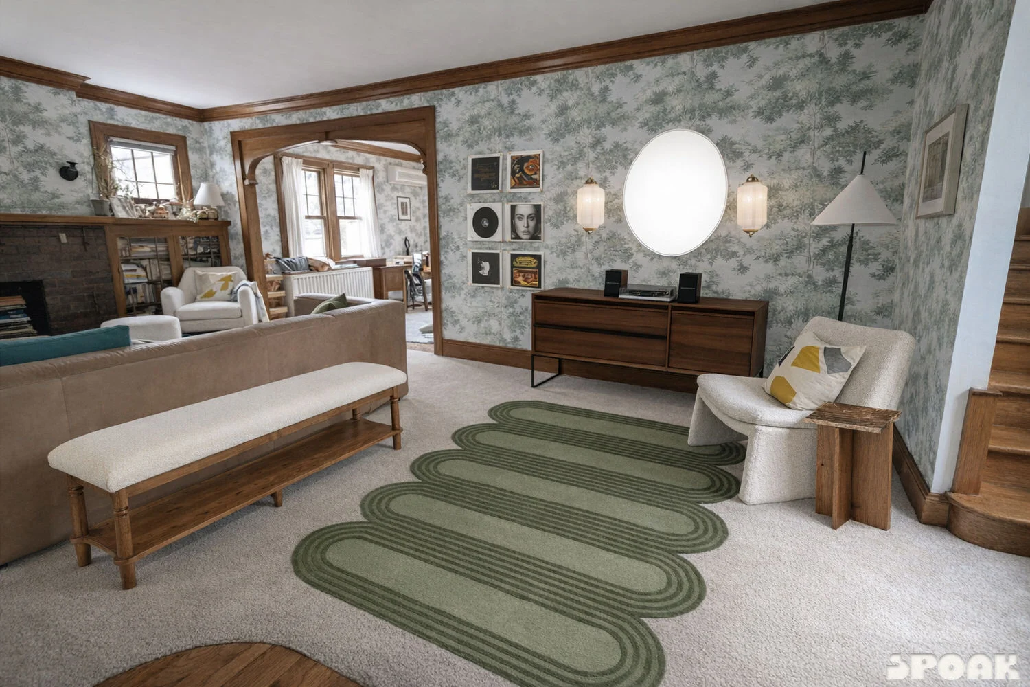
Bench | Rug | Sconces | Wallpaper | Side Table | Vinyl Record Frames
Based on some of the more contemporary patterns I’m seeing on the pillows, I wanted to stay in that modern realm with a rug to better define the area. Honestly, I wouldn’t have even thought to put a rug here, as I’m not a big fan of rug-on-carpet. But the reader mentioned it, so I went with it, and it really does make so much more of a statement in this area. She’ll want to be sure to put a rug pad underneath that’s specifically for this layered floor coverings move to prevent bunching and shifting. Emily used this same rug in the River House. It’s a bit groovy, which I liked next to the wide-slung accent chair.
Next up: The walls. When you study the original images, you can see that this reader went with a blushy pink for the walls in the room beyond the arch by the sofa, and an icy blue going up the staircase. Basically, they aren’t afraid of color. To not add in another solid paint that might end up looking like a box of crayons, I opted for a wallpaper. I was very tempted to do a stripe or bold geometric, but instead, I picked this leafy Sandberg paper for more of an organic touch. Soft blue and green felt like a safe choice, not knowing that much about what colors this reader likes. Not to ignore the pink from the other room, I brought in these milky glass sconces in a hushed pink hue.
To round out the area, I’m changing out the blue kid bench for something that’s also soft, but more grown-up and better scaled to the sofa. This is more of an entryway bench, with a shelf for shoe storage underneath. The reader didn’t mention needing anything with that function, but hey, she has two kids…storage is always needed. A side table I found for a super affordable price at At Home’s website makes the chair feel more purposeful in this nook, and cool acrylic-and-brass square frames give them an opportunity to display any cool vinyls they might have.
Practical Design Advice For: Too-Much Travertine Tuscan Bathroom
Next up is a bathroom that I very much understand, because I have some in my home that look just like this (minus the sconces). As soon as I saw it and reviewed the reader’s prompt, I knew I needed to include it today. This super common Tuscan-style renovation plagues many of our homes, but ripping it all out for something fresher and more “now” isn’t always an option. Let me have the reader walk you through her quandary, and then I’ll dig into how I’d fix it up in her target budget.
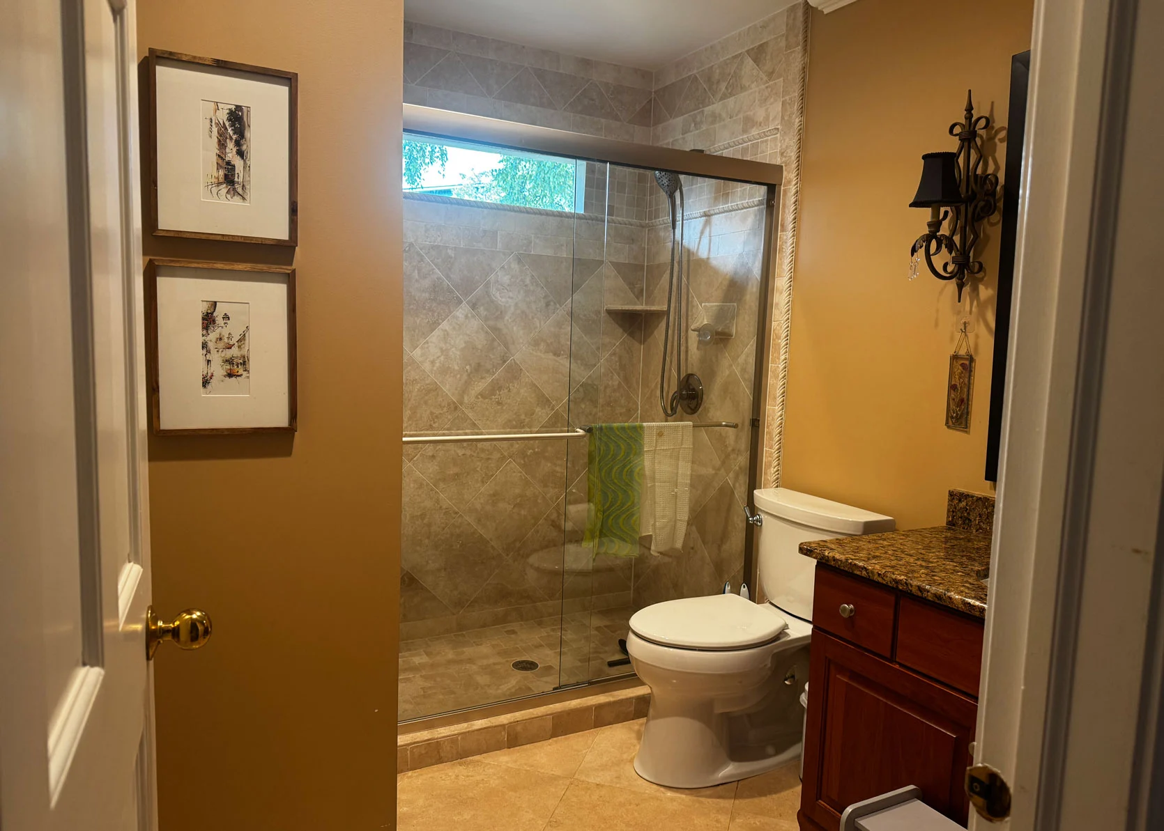
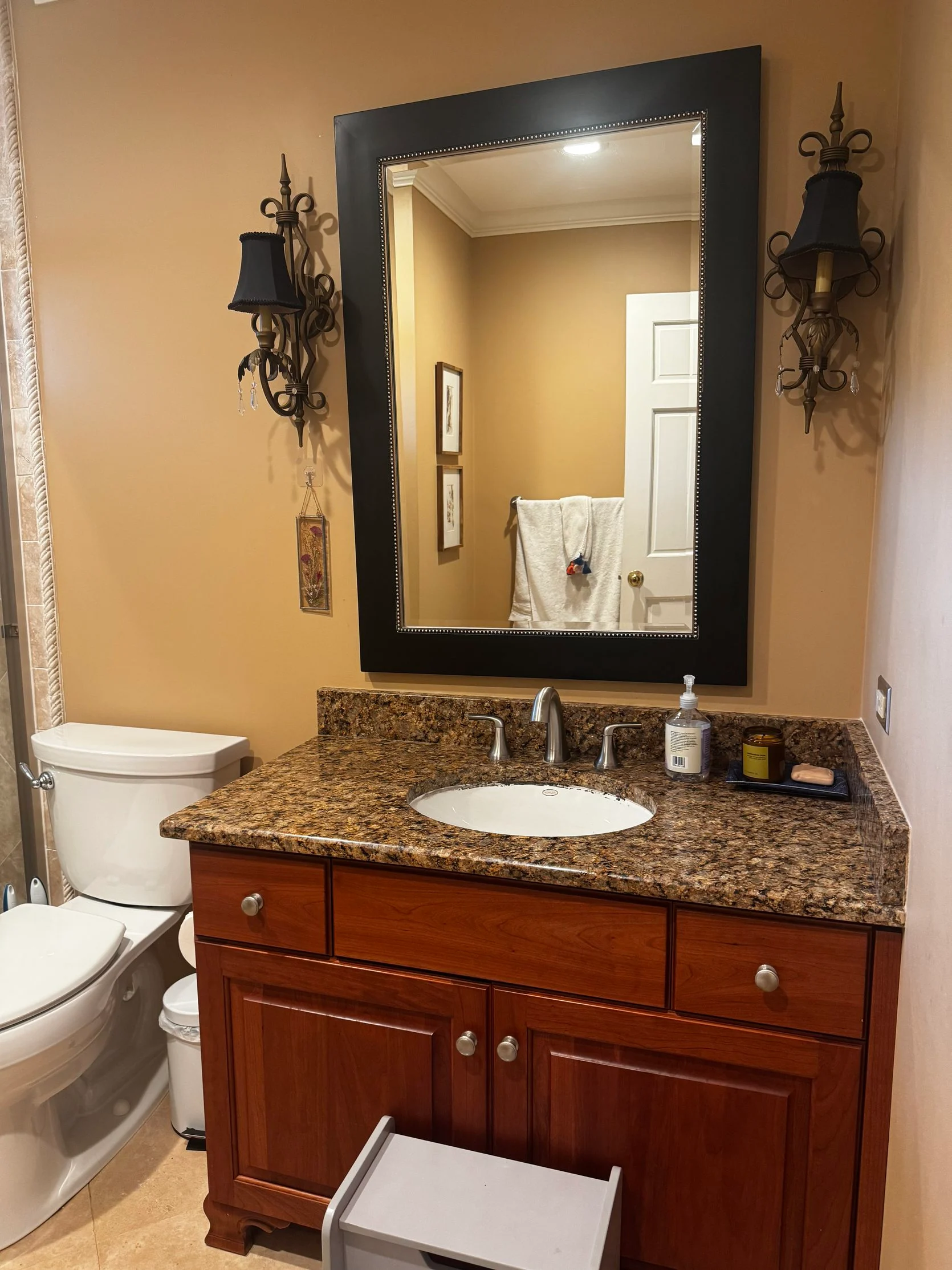
From Reader: “I live with my husband and three young kids in a lovely home in the suburbs of Chicago. It’s a prairie-style exterior architecture built in the 1980s, and I’d like to think my style is a mix of MCM, modern traditional, a touch of whimsy, but ultimately practical. I lean towards walnut colored furniture, brass and polished nickel, neutral with a hint of color. I’m attaching a photo of the upstairs bathroom we renovated last year that I think captures a bit of the design vibes I like. A previous homeowner renovated the kitchen and downstairs bathroom with heavy Italian villa influence, which is decidedly not my look. There is a LOT of very nice travertine tile between the kitchen and the bathroom that is too nice to rip out, but I’m perplexed about how to work with it. Perhaps I’ll get lucky, and the Tuscany Villa look will make a comeback, but currently I’m not loving the grapevine corbels and the amount of tan/brown I’m left with. I’m willing to paint and spend maybe $1000-2000 if it means new light fixtures, maybe even a new vanity or stone? (Although the vanity is of nice wood and in good shape, so I’d like to try and work with it if possible). This is the only bathroom on the first floor, right off our kitchen and dining room, so all our guests use this bathroom. I love the idea of a jewel-box powder room, but not sure if it would work here.” — Angela P.
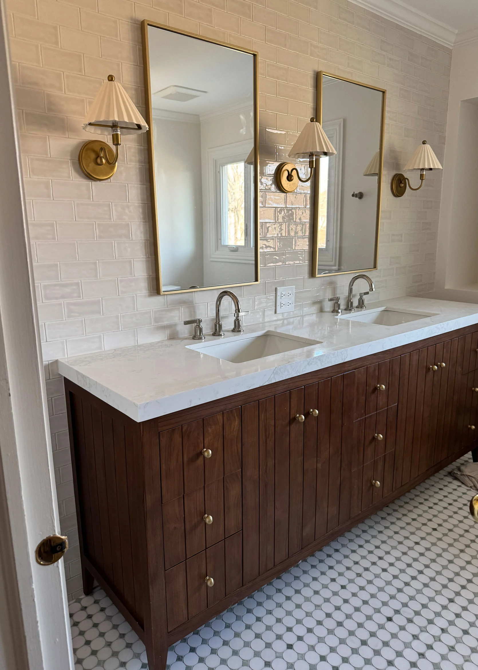
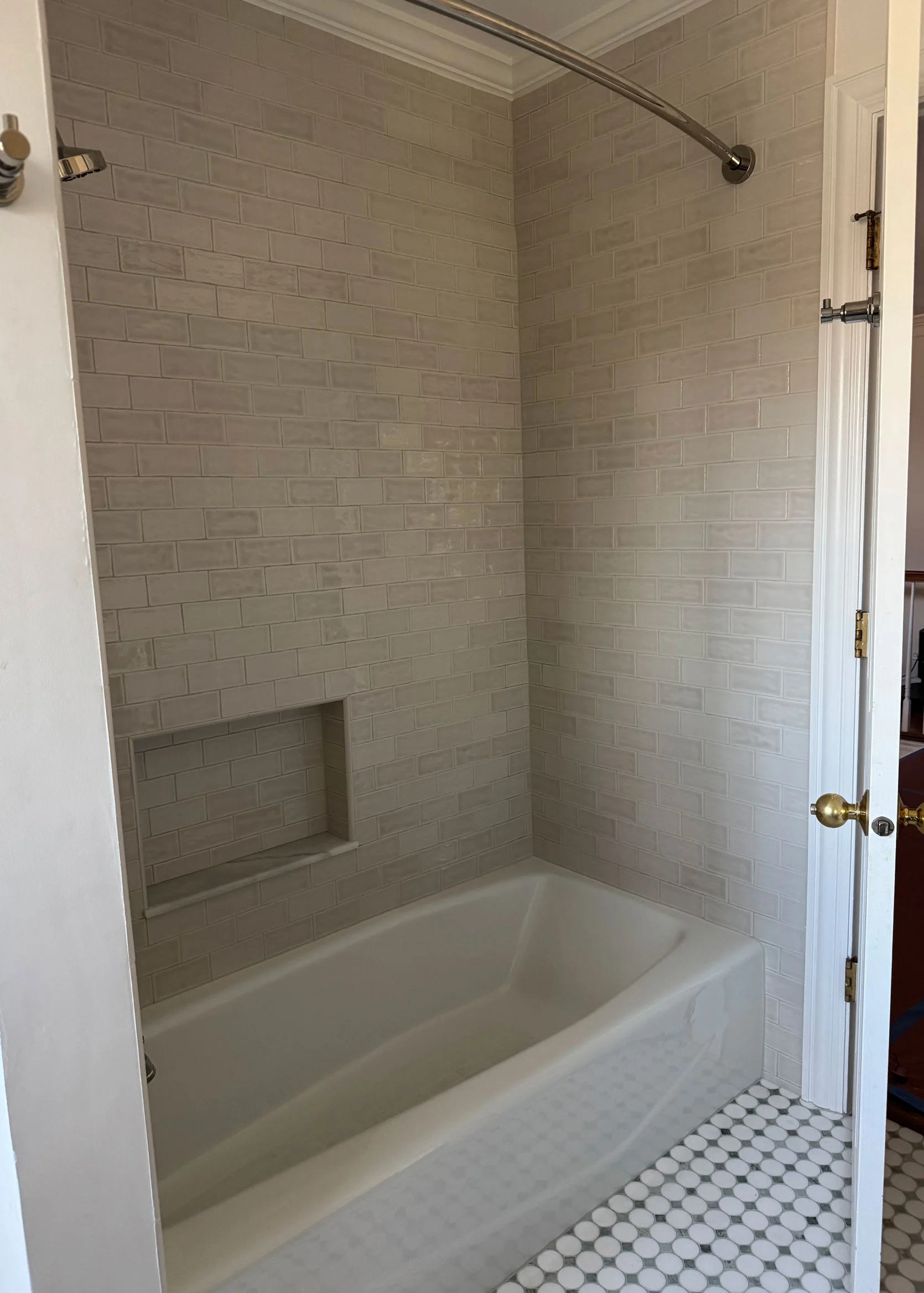
It was so helpful to have this reader share images of a renovated room in her home. I can see she likes classic tile, warm woods and metals, and clean lines. Beautiful! I also love that she included a budget, which is rare for this type of thing, so I mostly just pull stuff that looks good to my eye without knowing if any of it is feasible to purchase.
Design SOS Checklist:
- Immediately remove the sconces (ha, sorry, but they are…specific).
- That mirror is too heavy with that thick black frame, so swap that, too.
- The paint color isn’t right with the travertine tile on the floors and in the shower, or with the red undertone of the vanity wood. I’d pick something still in this world of warmth but lighter. Ideally, it would match the travertine tones itself.
- Layer in some personality through art and rugs.
- Hang actual curtains high up in front of the shower wall/door to detract from the tile they don’t love. They can even close them all the way to feel more like window coverings than a shower curtain.
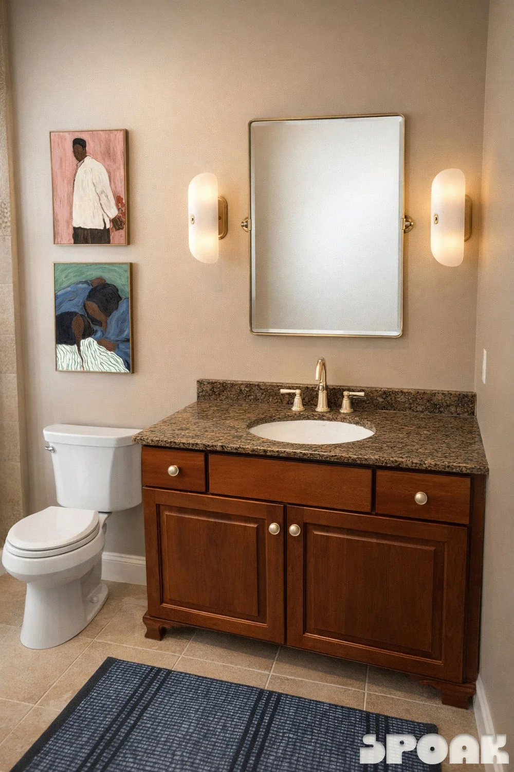
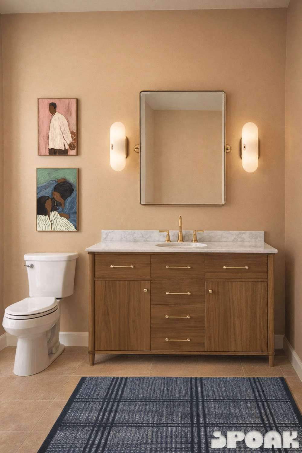
Rug | Curtains (Below) | Wood Vanity (Right) | Brass Knobs (Left) | Faucet | Sconces | Mirror | Pink Art Print | Blue Art Print | Paint
And here is what I did! You’ll see two options above: One with the original vanity, and one with a different one. Because the reader gave me a range of $1,000 to $2,000, I wanted her to see what both ends of that price spectrum looked like. I don’t have measurements for this room, so I’m not sure what would really fit in here (the one I pulled is 48 inches, which I believe is likely too wide), but this is meant to act more as inspiration than as design doctrine. Either way, I think the faucet should be changed out (this one is almost $100!), as well as the knobs for the original vanity. She could even go through the process of painting the existing wood.
Speaking of paint, I know the reader mentioned being interested in a “jewel box” vibe, which this isn’t, obviously. A darker paint or wallpaper is usually a fun route to take in a guest bathroom; however, I thought so much contrast would bring more attention to the very thing she mentioned not caring for (the travertine). So instead, I wanted the beige stone to fade into a monochrome scheme between the walls and the floor, hence why I went with this Benjamin Moore taupe.
Not to totally ignore her need for some drama, I picked a pretty, deep navy rug that detracts from the tile floor and speaks to the curtain panels I picked. These are real curtains, not shower curtains, FYI. The split panels look elevated and chic, and hanging them super high hides most of the shower if closed. Don’t be afraid to get creative!
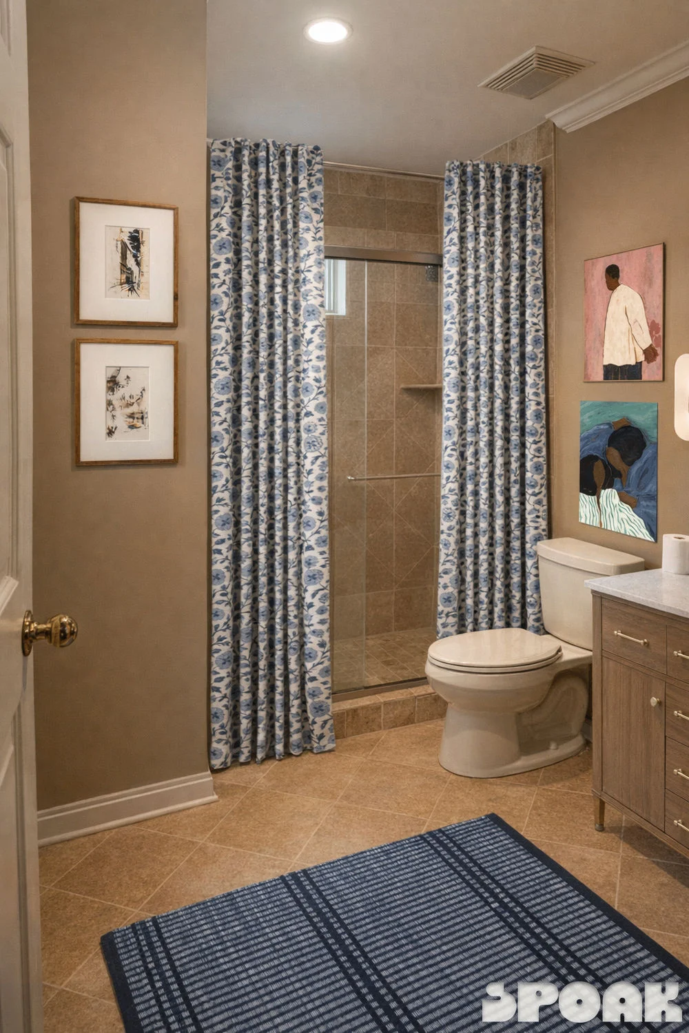
All in all, the total purchase price for the option with the new vanity is about $2,200. She could bring this down with a less expensive (and smaller) vanity, as this one was around $1,000, and of course, cut the budget in half by keeping her existing vanity with some small upgrades. I also picked some more expensive sconces because there are few moments here to really do something cool and special, but those could easily be simplified and cheaper.
Practical Design Advice For: A Pass-Through (But Plain) Dining Room
Lastly, a Florida dining room I’ve been sitting with for a while. When reader Tiffani sent this in to our team, I was drawn to it. I knew it could be *something*. A blank canvas just screaming out for some impactful design elements. Let’s hear from the reader and then have some fun.
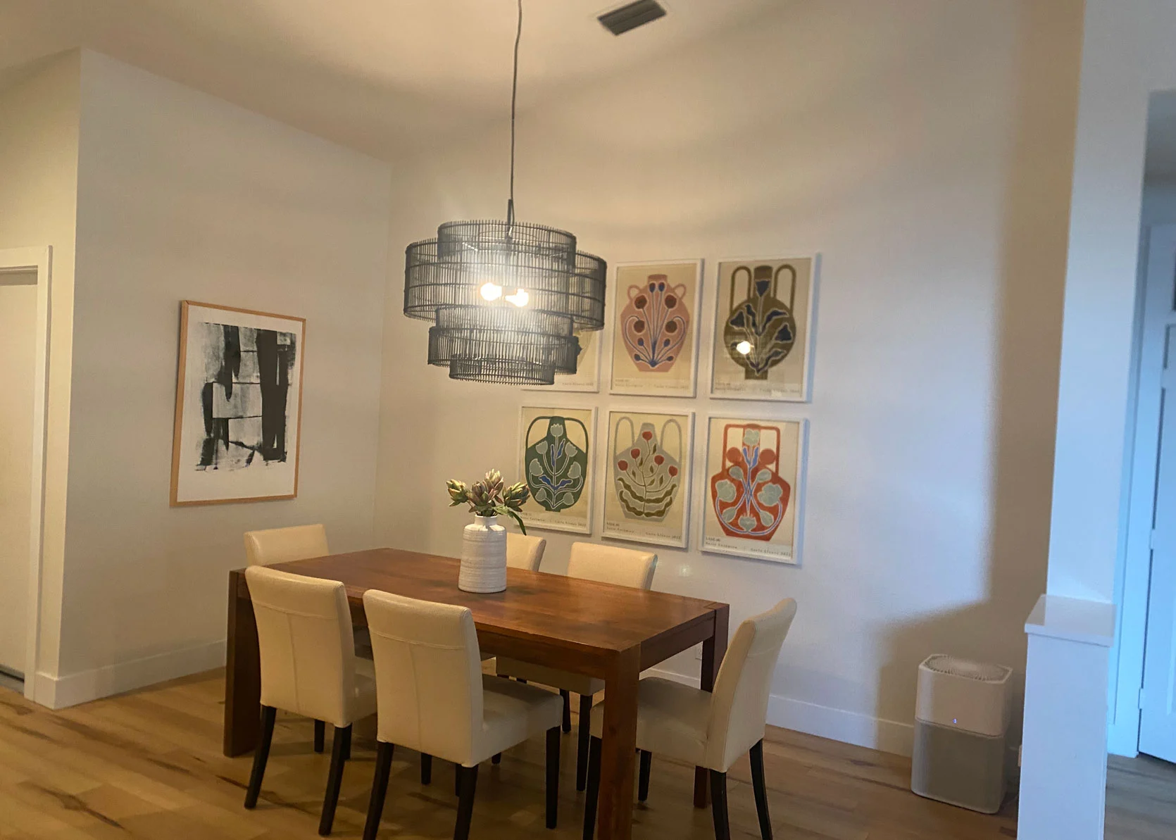
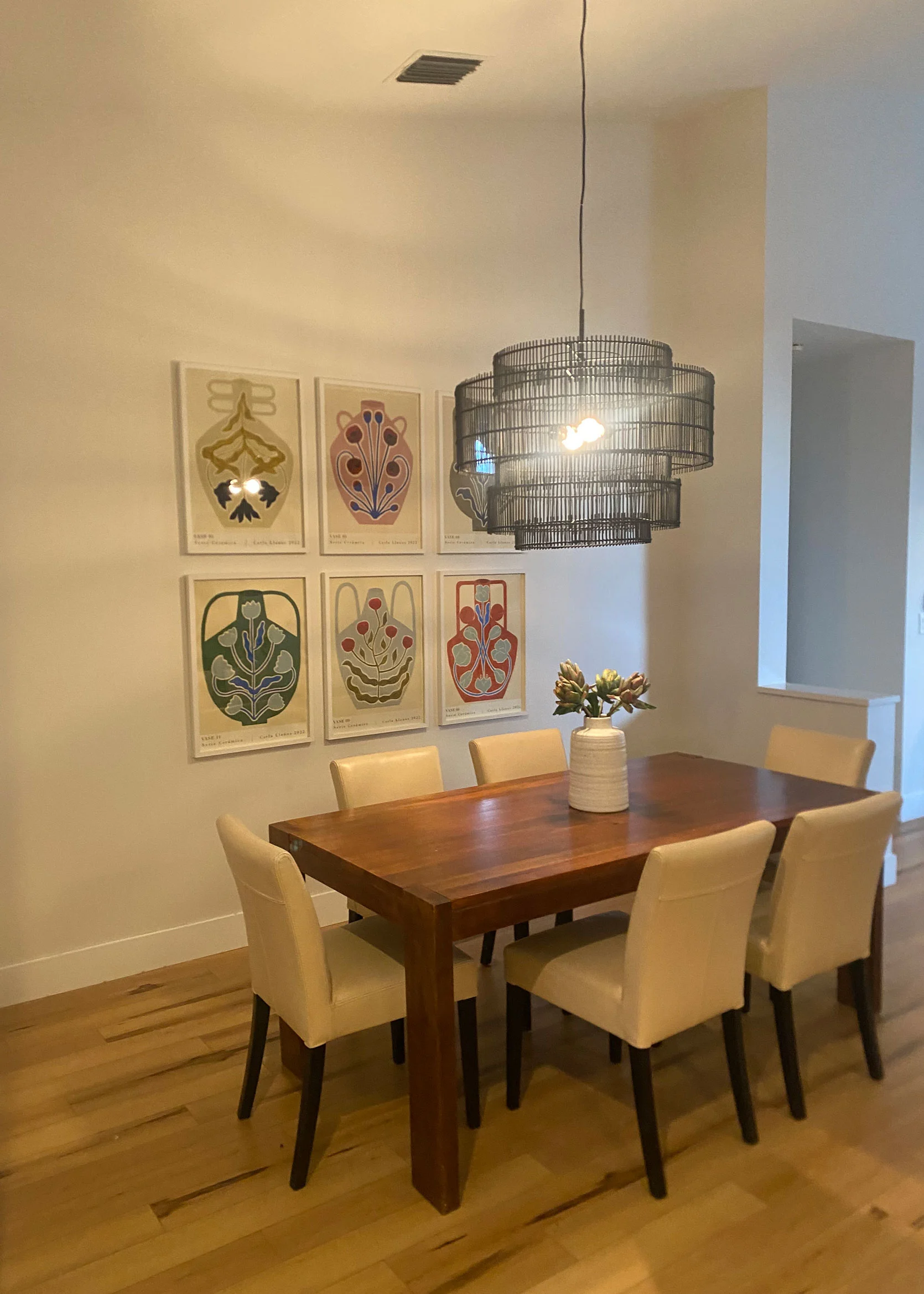
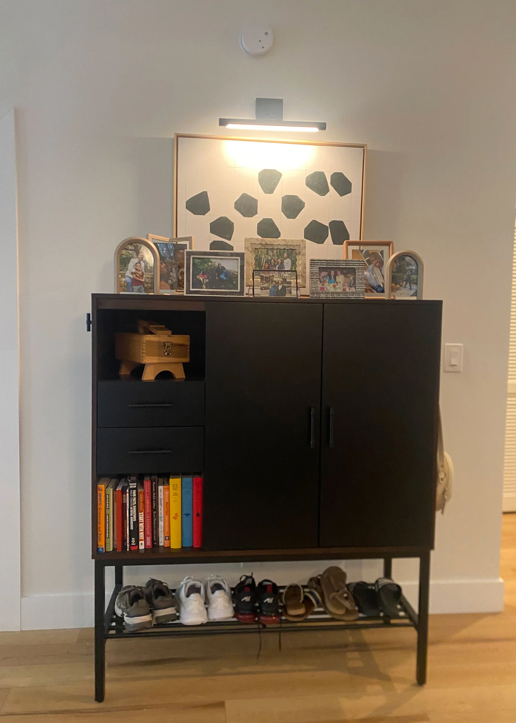
From reader: “Post-divorce, I’ve downsized to a villa for my 10-year-old and me. This means I have fewer windows and less natural light throughout my home. My dining space is windowless; nearly every light in the adjacent spaces was turned on for these pics. I would like help restyling the room. Nearly everything is up for grabs: Lighting, art, chairs. The only thing that’s a keeper is my mango wood dining table (72″x36″). We use the table for dinner with guests, school projects, but mostly it’s the surface for everything that comes into the house. The front & garage doors are to the left. I love color, favorites are green, ochre, blue, and apricot. I want this space to have presence, as it’s the first thing you see and interact with when you come into my home. I want my home to feel welcoming, comfortable, minimal, clean, and intentional. Room dimensions: The wall with the B&W art is 78 inches wide and nearly 10 feet tall. The back wall is 154 inches long and slopes to probably 12 feet. The pony wall has a 20-inch-wide full wall, then goes into a 24-inch-wide pony wall. Across from the dining space is the entryway cabinet. Sharing that too to give you more of an idea about me.” — Tiffani H.
Design SOS Checklist:
- Add serious style with more color and pattern through textiles, like wallpaper and an upholstered dining bench.
- Swap the dining chairs for something that feels more coastal and inviting (the cream leather is probably very easy to clean, but feels a bit too corporate-extended-stay-hotel).
- Showcase the shape of the room with a long, linear ceiling light
- Bring in a rug for softness.
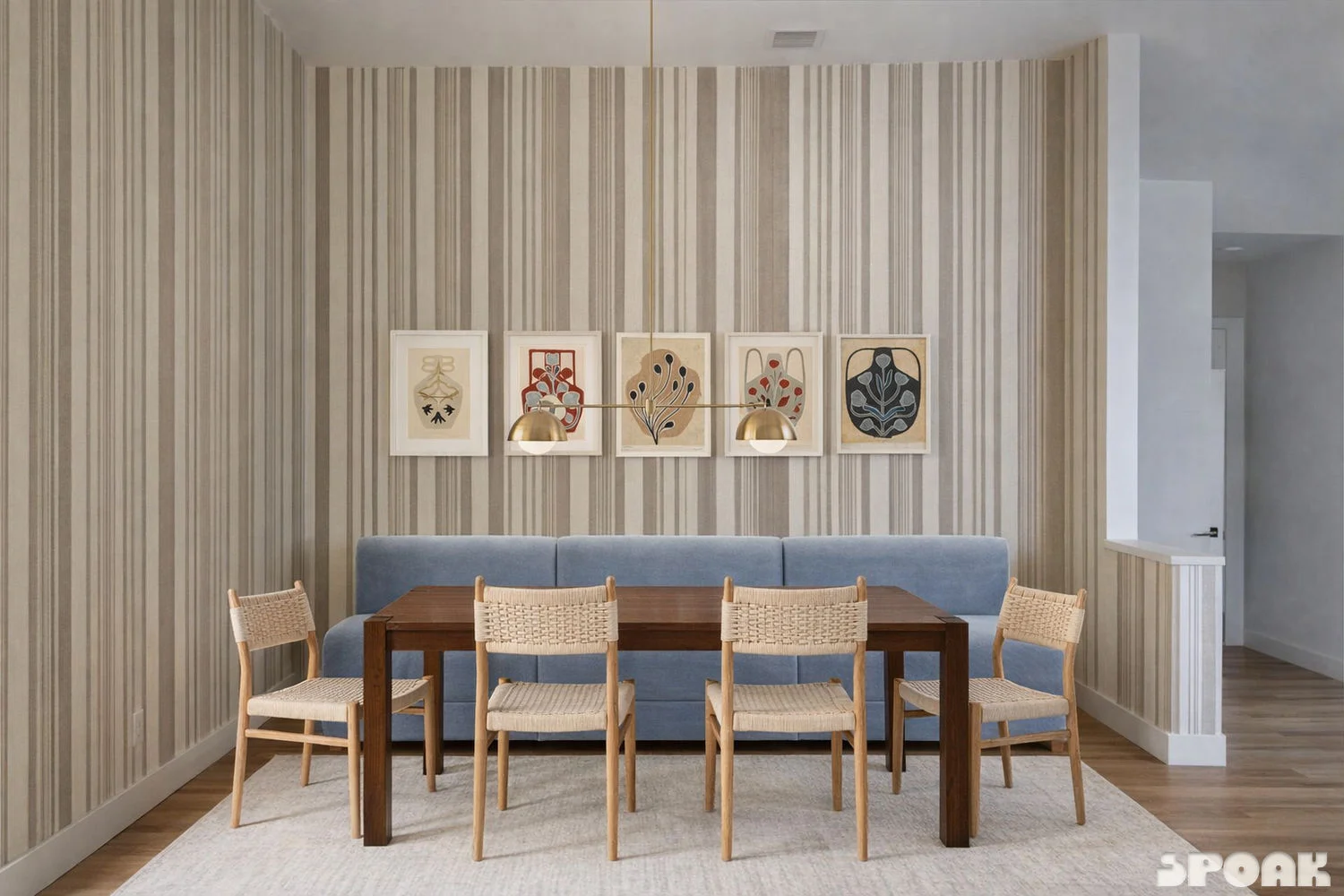
Dining Banquette | Dining Chairs | Ceiling Light | Rug | Wallpaper
Ignore the wall on the left that is incorrect. I messed up the rendering and didn’t want to spin my wheels trying to fix it. SO, here’s where I landed! As soon as I saw this room, I knew it needed something “built-in” like a custom banquette, or even a modular set that she could take wall-to-wall. A soft, slate blue adds personality without taking over, giving the wallpaper more of a voice. Vertical stripes always elongate, which I wanted to do here to really showcase the full 12 feet. Given that the upholstery here is velvet, I wanted to tone down the glam with a natural woven rope and wood dining chair. Plus, it all felt very beachy chic (I edited it out for space in the reader’s submission, but she noted this is a condo in Florida). And since we are stretching up with all those stripes, I wanted to widen with a horizontal chandelier to echo the width of the banquette.
I’m realizing as I write this that she could also add some hard-wired sconces to the wall behind the banquette, left and right of the art, to increase the amount of light in the room given that she noted it was windowless (and dark). A light colored rug underfoot feels welcoming and comfortable, plus it’s washable because, uh, a cream rug where a preteen can drop ketchup all over it isn’t exactly practical. The existing art was so fun and punchy, so I left it but just rearranged it to stretch across the wall. I could even see her adding a thin floating wood shelf and then leaning those along it.
—
This is where I leave you today. As always, my suggestions are to be taken as a jumping-off point for the readers who submitted. It’s hard to make a true design mock-up that I expect them to follow to a T without really knowing all that much about their own personal styles, needs, and preferences. But sometimes, all you need to do is see what is possible to get those creative gears churning. If I included your home here, thank you so much for opening up your home to us. It’s not an easy thing to do! Let me know what you think, too! And if other readers have more suggestions, go for it in the comments!
Until next time, friends…
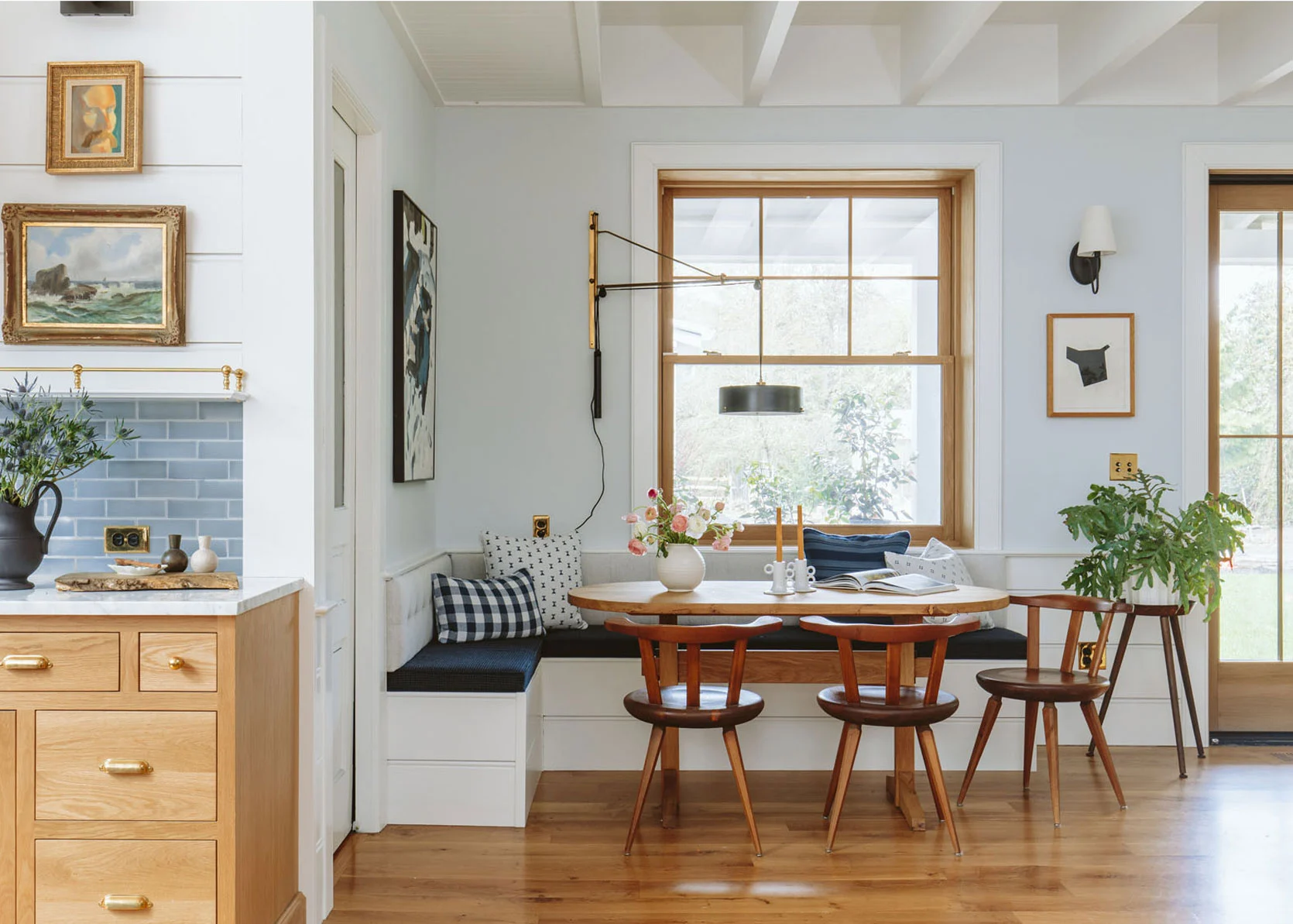
Opening Image Credits: Design by Emily Henderson and ARCIFORM | Photos by Kaitlin Green | From: Our Custom Farmhouse Dining Nook Reveal (And What Makes It So Incredibly Durable…And Pretty:))
I love these posts; it’s always fun to see readers’ dilemmas! Living room/entry – I wish we could see more of the space! I kind of wonder if the better option might not be to try to reimagine the whole room instead of just this part? You couldn’t listen to records here while anyone was using the living room area to watch TV, and does only one person listen at a time, and wouldn’t they rather sit on the sofa? So your options are to make this more like a social space for a few people to sit in, which has its back to the actual living room and feels all squashed in, or to reimagine how you’re using the living area so they’re not so divided. That said, a tall double-sided 1970s-inspired shelving unit/room divider behind the sofa would zone the room, prevent the kids rolling over the back of the sofa, and you could keep the record player on it with shelves below for the records (where are they?), get rid of the chest of drawers and change the armchair for a colourful chaise longue (think Emily’s vintage floral one, though I’d go with a retro 70s… Read more »
I love these posts! One other option for the bathroom: you could just replace the granite vanity top with a lighter stone one. I did this with one of my bathrooms and also painted the cabinet, which turned out beautifully (my painter used an oil-based paint).