Design 101
Reader Design SOS: 3 Home Transformations Through the Power of Textiles & Paint (Just Wait Until You See the Vintage Pink Bathroom)
Today’s edition of Design SOS has a few things in common across the board of our reader submissions and their future home transformations: Concise comments and requests, meaning I don’t have much to work with besides the images; some mid-century style; and the need for surface-level tweaks that will make a tremendous difference in the finished product. No major overhauls here, though that’s not what this series entails anyhow. Honestly, every single room here can be absolutely transformed with either something as simple as paint (in the case of the bathroom), and rounding out the decor to home in on a style and color palette (for every one). Never underestimate the power of deciding on some soft goods for your rooms. A rug, some curtains, and a piece of art or two can take a room from feeling stuck and unfinished to you walking in, taking a deep breath of relief, and feeling like you can finally see some design direction happening.
For anyone just joining us here, you can take a trip through all our recent Design SOS posts here:
- Design SOS Is Here To Help! 3 Rooms Get The Practical Style Advice They’ve Been Looking For
- Reader Design SOS: 3 Reader Homes & The Quick, Affordable Fixes We Suggest (The Stairwell Is A Favorite)
- 3 Readers Get Some “Design SOS” Help To Make Their Homes A Little Better (+ An Accent Wall Dilemma!)
- Reader Design SOS – My Quick Gut Styling Advice On How To Fix These Rooms
Catch up now, or later, but either way, let’s get into today’s home transformations, starting with my favorite pick, the vintage pink bathroom in need of some color love.
Home Transformations: The Vintage Pink Bathroom
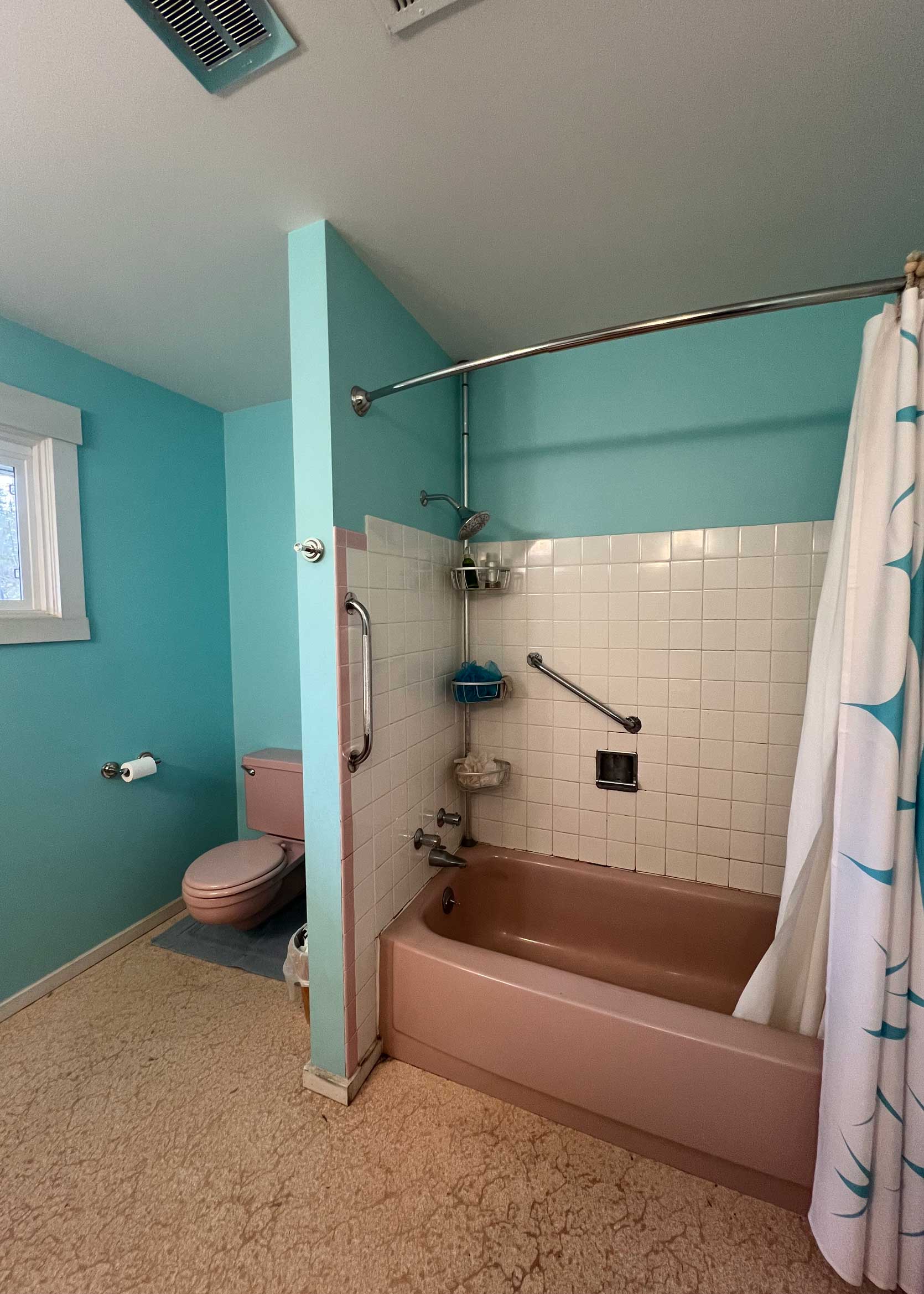
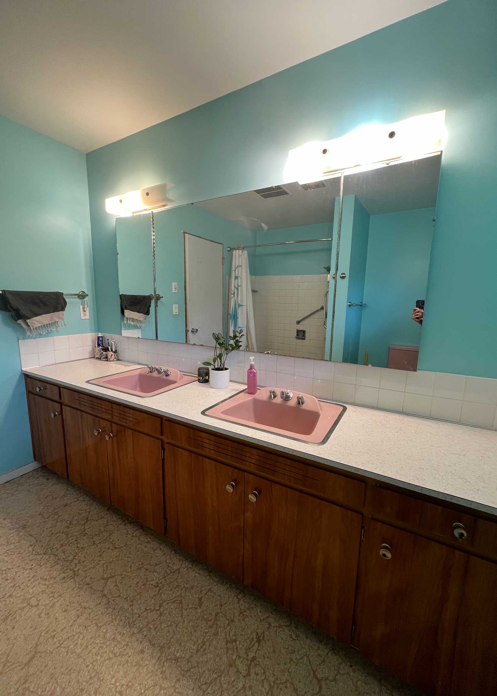
From reader: Hello! I would love to get your suggestions for my mid-century pink bathroom. You’re my favorite insta follow! Thanks!
My quick style swaps: Show me a vintage bathroom with colored fixtures, and I’ll show you my attention! Living in Los Angeles really made me appreciate the hidden beauty of an older bathroom. Where most people would be tempted to just rip it all out, I’m not certain whether this reader is after an intense refresh/reno, or just some ideas for how to like this space some more. Off the bat, I’d immediately change that blue. The shade of that with the floors and the dusty pink fixtures feels like cotton candy. When your color combinations are off, it can make things feel way dingier than they likely are. So let’s fix that. Here’s what I suggest:
- Paint the walls a warmer shade, such as a soft yellow or a blushy pink to just lean all the way in.
- Bring in some texture with rugs, towels and an updated shower curtain.
- Layer in some accessories and art.
- Optional: Do a quick, affordable floor upgrade with some peel-and-stick that suits the age of the bathroom. It’s hard to tell the exact color or material of what is there right now, tbh.
- Optional: Swap out the lighting and mirror.
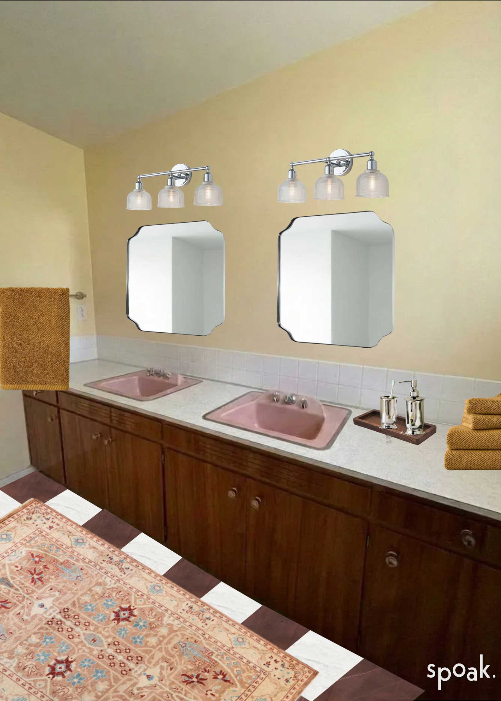
Paint color | Peel-and-Stick Floor | Rug | Shower Curtain | Artwork | Waste Basket | Towels | Wood Tray | Soap Pump | Toothbrush cup | Vanity Lighting | Mirror
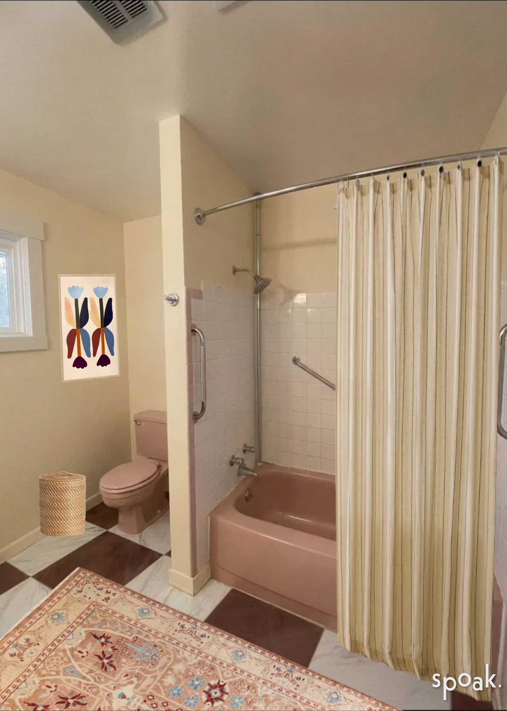
You guys. I LOVE THIS BATHROOM NOW! Taking the kid-room blue out of the equation and layering in a more grown up and warm color scheme (which I grabbed from this bathroom color palette post I did recently because no use of letting that work go to waste, right?) is absolutely transformative here. There is zero renovation that happened hear. Just some swaps in soft goods, adding in some more style via the rug, towels, art and accessories, and making some reversible swaps like the peel-and-stick floor in the checkerboard with the burgundy (which plays well with the deep rose of the fixtures), and the mirror and pendant lights. This would still look great even without the new mirrors and lights, tbh. And as long as the rug were large enough (go with at least a 4×6 if you can here), the previous floor would also likely be just fine. I like the depth the burgundy check adds, but it’s far more of a commitment, of course.
I kept the finishes on the new accessories chrome to better work with the mid-century style in here. The art is in a funky place above because I wanted you to be able to actually see it, but it could go above the toilet or even in that more open area to the right of the mirrors.
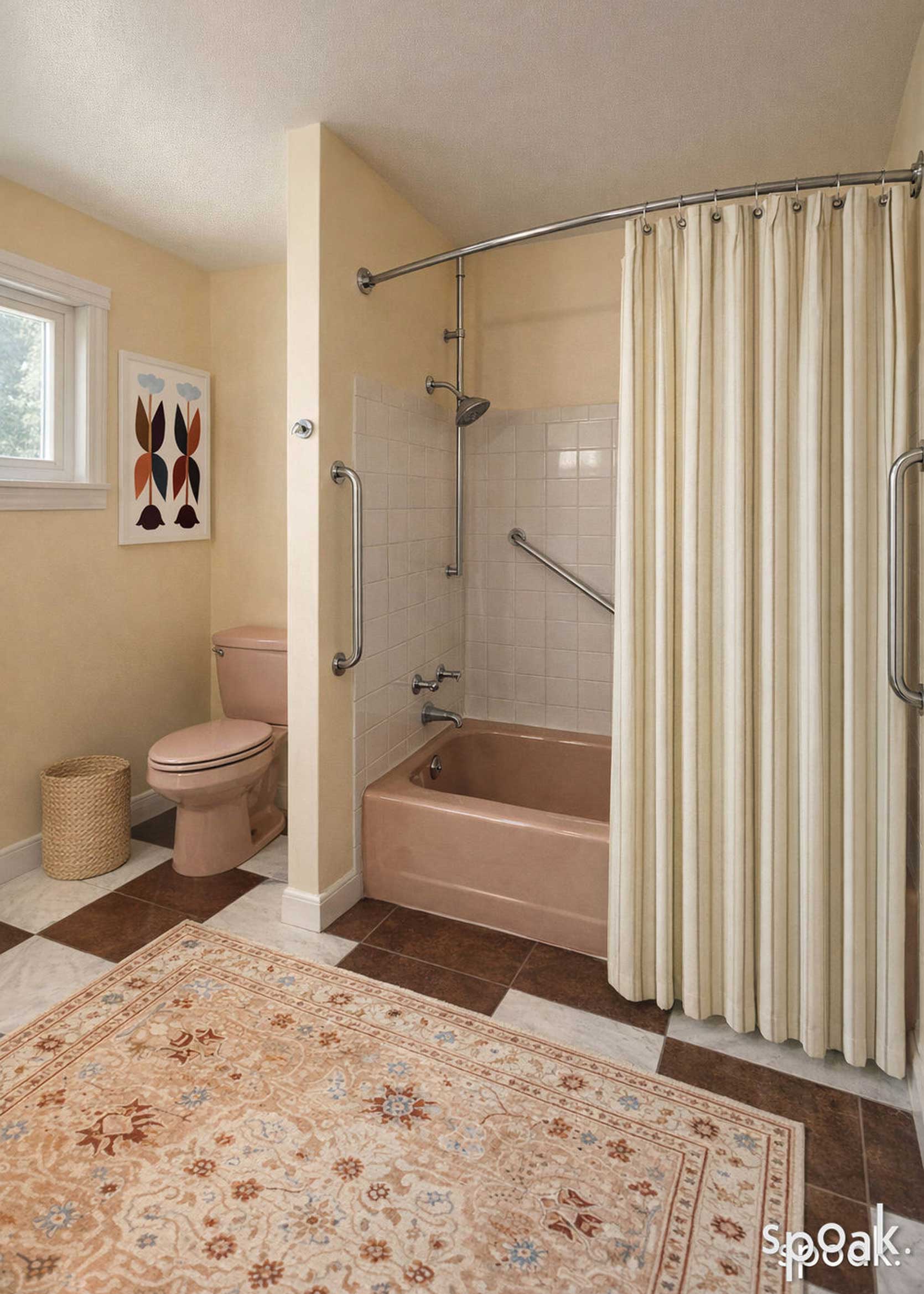
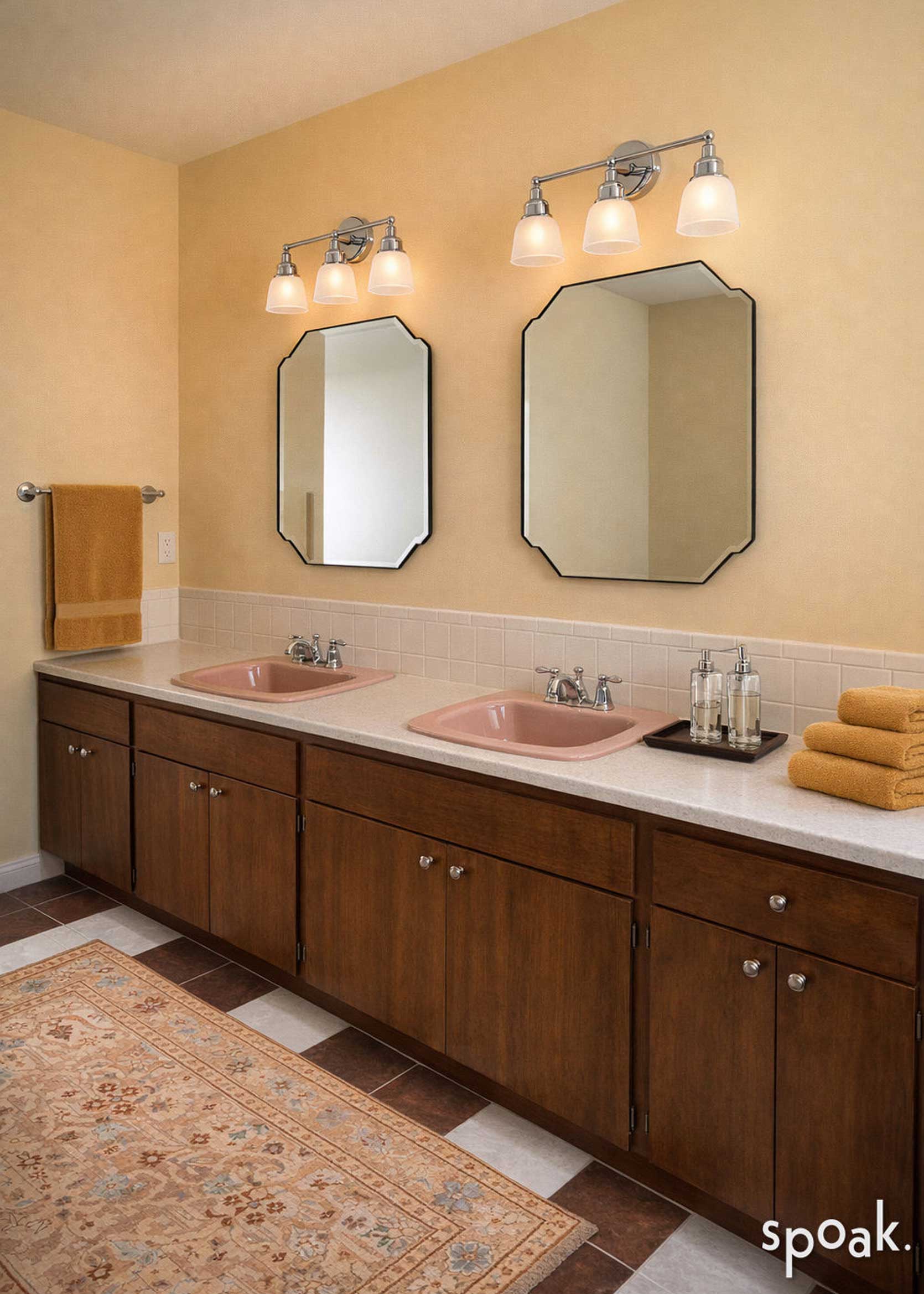
Here it is with some Spoak rendering magic (the program we’ve been using to help us bring these designs to life more realistically). Fair warning: It takes a lot of creative liberties with the products I included as well as the existing features of the room, but I wanted to show you anyway even if half of it is wrong to really drive home the “feel” of it. The paint color is off in the right photo (too orange), but I do love that buttery cream with the pink throughout.
Next up, a dining room in need of a personality:
Home Transformations: The New-Build Dining Room
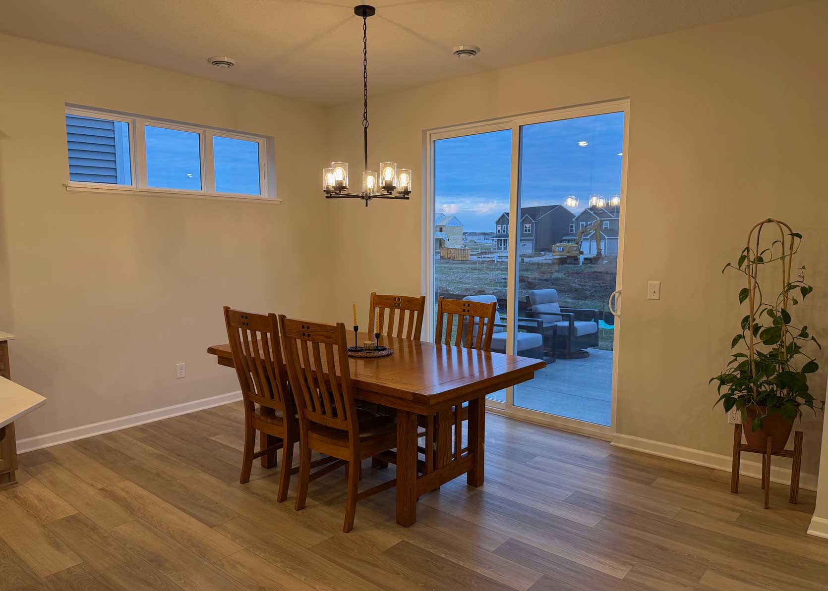
From reader: Hello! Submitting photos of my dining room for consideration! I plan to replace the dining room table as it’s from our old house and the color doesn’t look good in this one. I know I need a rug and curtains but I’m intimidated to pick them and would LOVE any and all suggestions!! Thanks for considering!
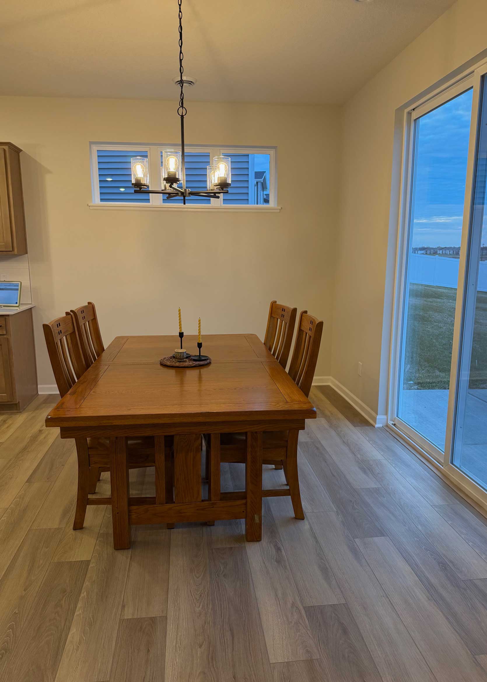
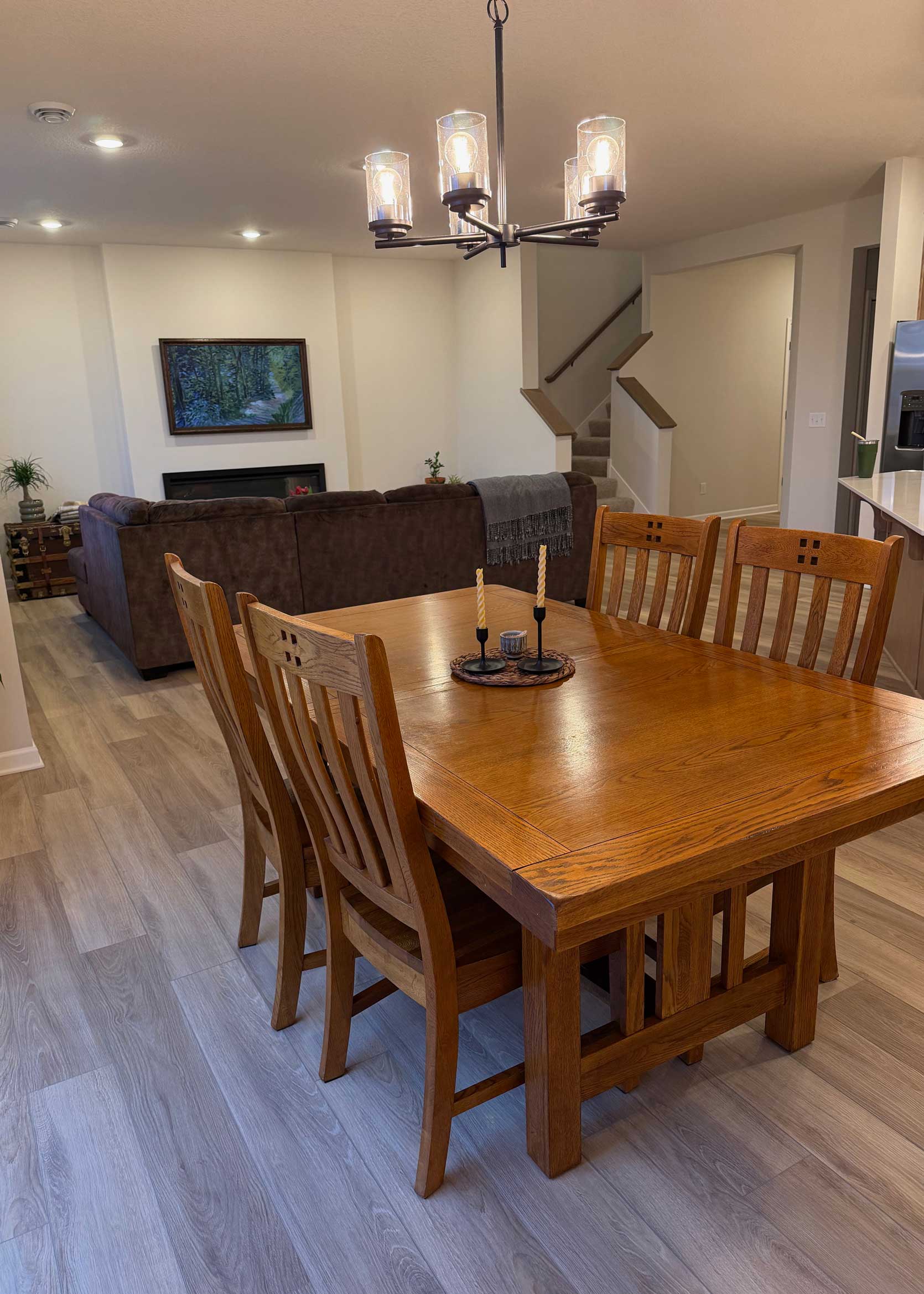
My quick style swaps: WAIT! STOP! Don’t change that table and chairs. (I mean, of course, do it if you want to or need something larger, but that looks like a seriously sturdy, well-built and beautiful craftsman table and chairs that could probably last for another 100 years). I know this reader is concerned with the wood tones. Her original table and chairs are a warm golden oak hue while her new floors are a grey/weathered wood finish. Typically, I’d agree that doesn’t work because the undertones do not match, HOWEVER…this can all be solved with a rug to create seperation. Some other design moves I’d suggest:
- The four side chairs in this larger space feel a bit dinky. We need something at the head and foot of the table, so let’s add upholstered headchairs here. You can keep them neutral (I have zero idea what colors this reader likes and honestly cannot tell what color that sofa is in the background), or go for it with something that has some more personality…which is what I’d do, duh.
- Bring in a rug larger enough to hold the now-6 chairs—8×10.
- Considering there’s room, bring in a credenza under the celerstory window and style it with pretty things you love.
- Swap the pendant light to something a little less generic.
- Add soft light-filtering curtains.
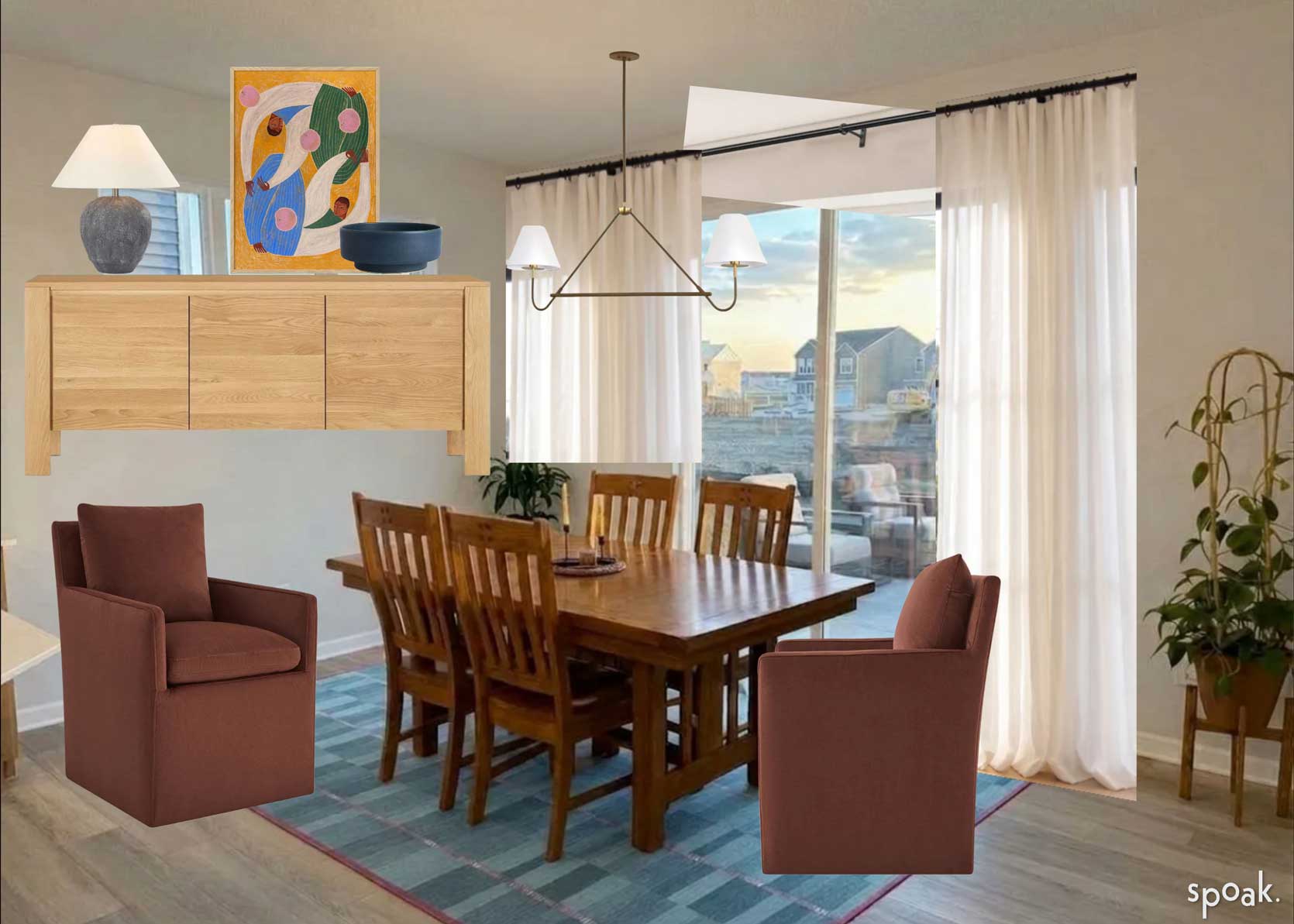
Rug | Upholstered Dining Armchairs | Chandelier | Credenza | Table Lamp | Blue Bowl | Art | Curtains | Curtain Rod
All of the above would still easily work if the new dining armchairs were a cream linen, for instance, and the rug was also a neutral. Just adding in these textures—let alone dialing up the design with some color—makes a huge difference to this area of their home. It feels inviting and intentional rather than what it felt like before: Like a spot with holdover furniture from a previous home. To make the mixed wood tones make even more sense, I brought in yet another tone via the credenza which works with the warmth of their kitchen cabinets just out of frame but lends more of a modern touch in the white oak.
The rendering below makes me laugh because the credenza got put up on stilts, but again, this is more for the aesthetics of it rather than a real-life creation:
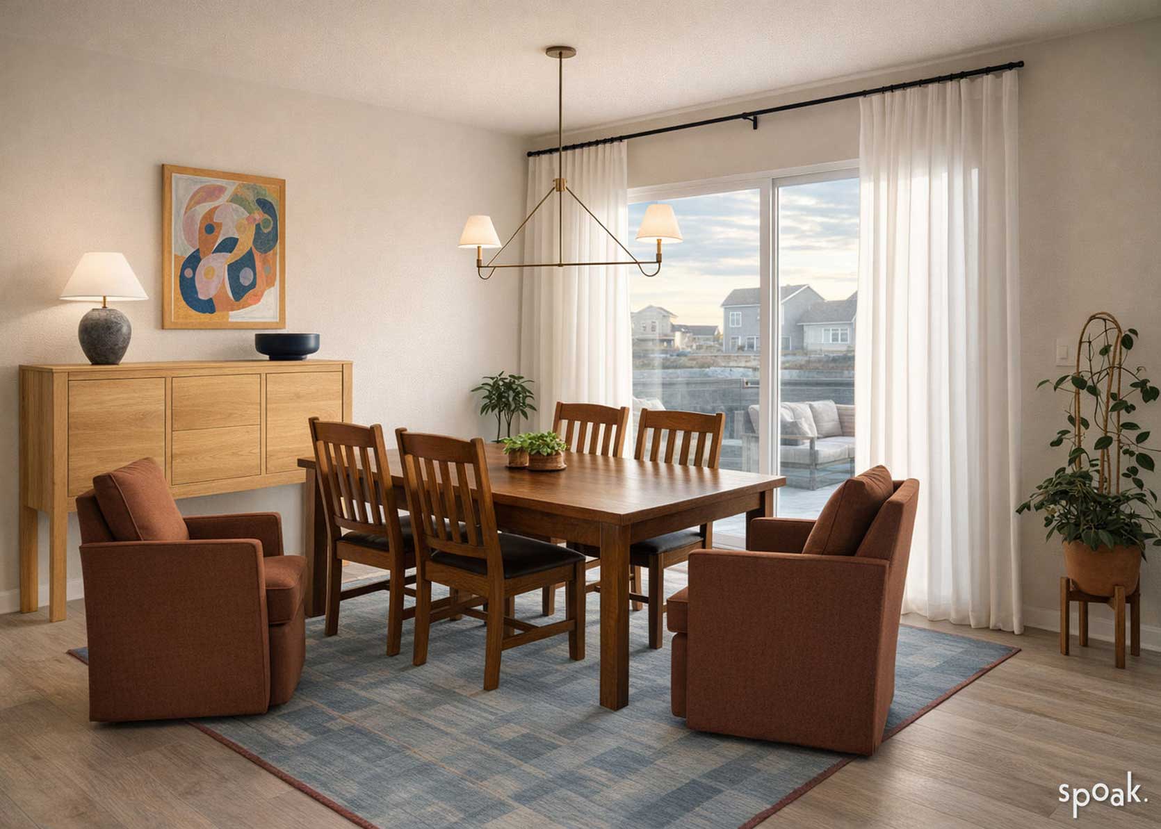
The colors aren’t right here, but I love how the edge of the rug picks up the tone of the chairs, the chandelier is linear while the table lamp is chunky to create tension, and the artwork (not the one above, but the one I actually picked), layers in a touch more color beyond the burgundy, blue and wood tones).
And finally, another mid-century space crying out for a rug:
Home Transformations: The “Needs the Finishing Touch” Living Room
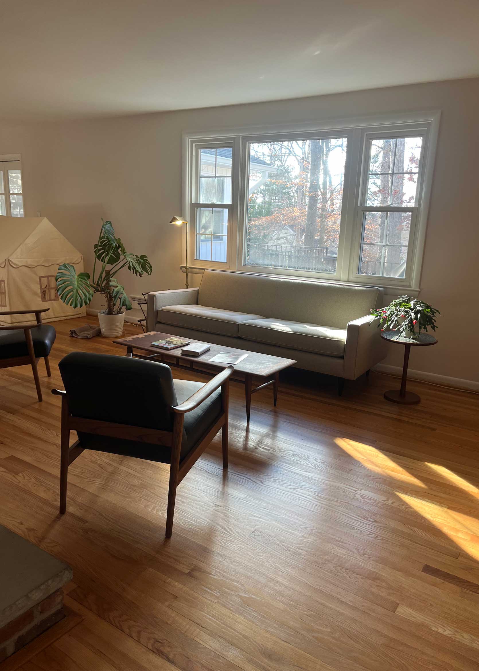
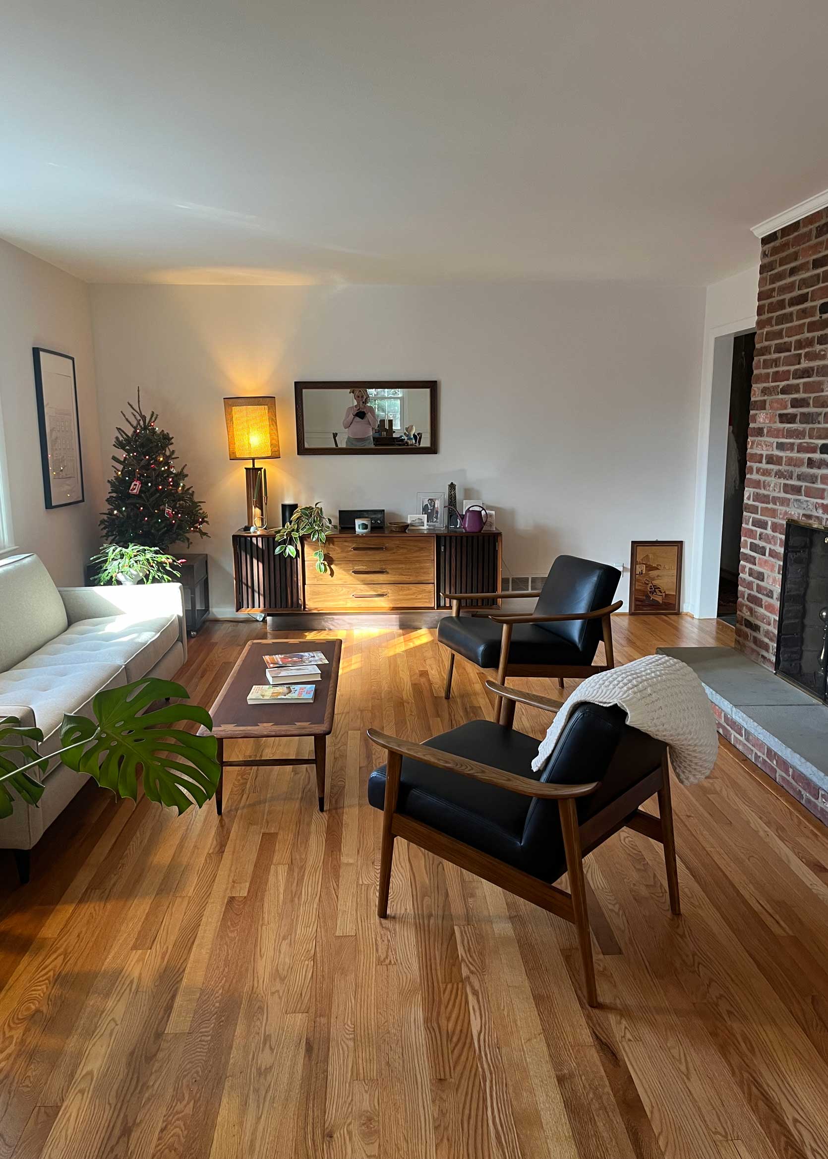
From reader: Hi! Moved into our 1960s ranch last week, and this room has made almost no progress because I simply do not know what to do here (also had a newborn and a 2-year-old, so…). Help!
My quick style swaps: Reader, you have a beautiful home and congrats on the newborn (and Godspeed with the toddler in tow!). I wouldn’t see this room and think “family home” at all. This homeowner clearly loves mid-century silhouettes between the classic tufted seat-tight-back sofa, the Lane Acclaim coffee table, and the armchairs. But we need to take it from corporate office living room to comfortable hangout room. Here’s how to do it:
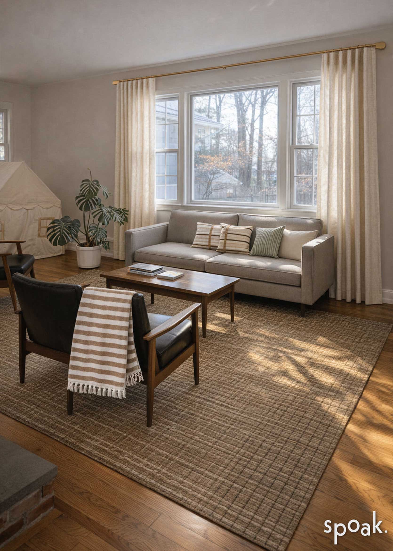
- Lay down a large area rug, at least 9×12, to ground all the main furniture pieces.
- Hang soft, neutral curtains that let light in (the room seems a touch dark, so we don’t want to block more light with anything heavier than a thinner linen or cotton weave).
- Add throw pillows to the sofa and chairs, as well as some throws.
- Print out large family photos and get them framed. We don’t want anything dinky here. Go big for impact and add them to the sofa area and around the wall with the credenza. (I’d also lower the mirror over there considerably, or get a larger mirror, but I didn’t render out that side of the room).
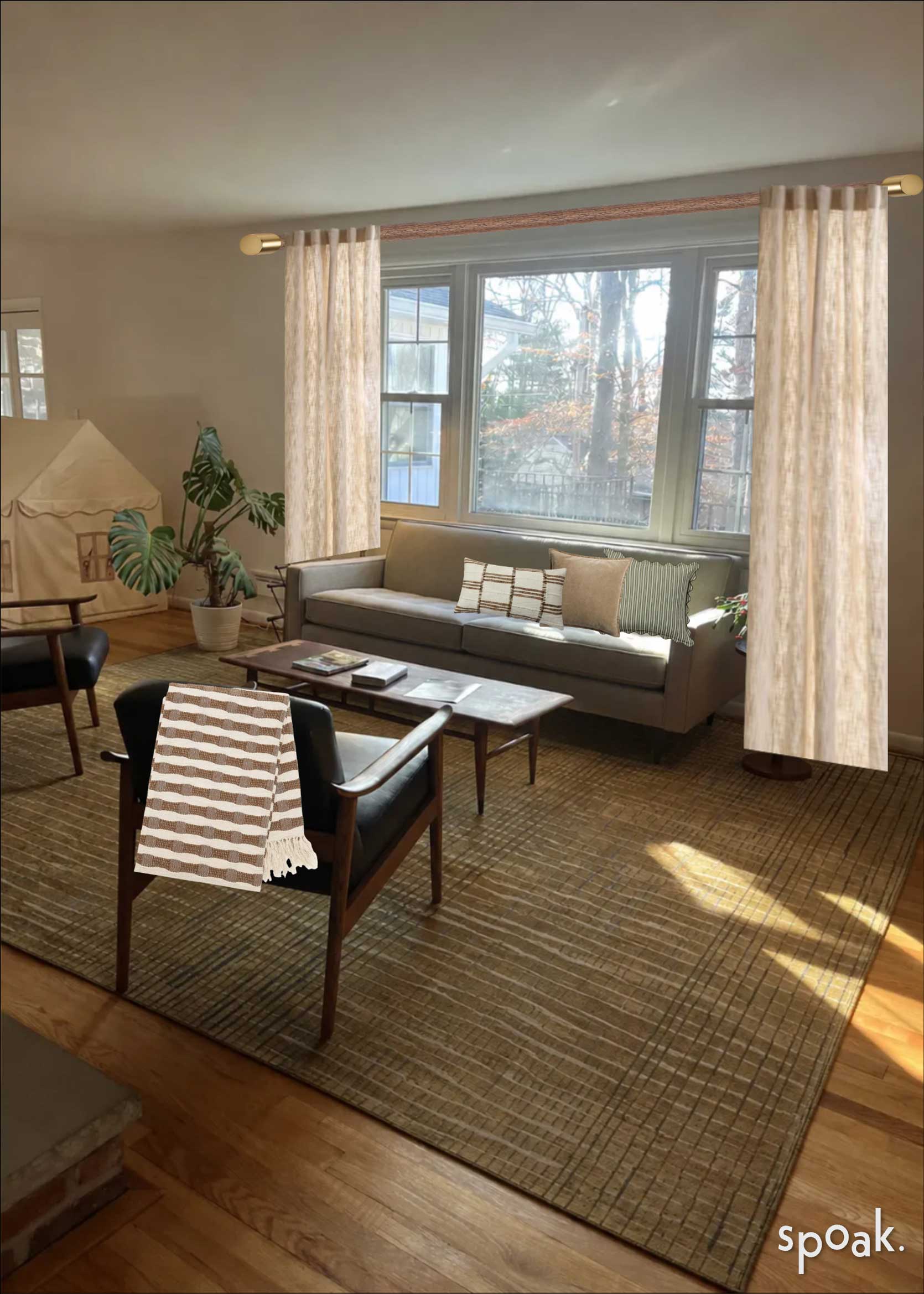
Rug | Curtains | Curtain Rod | Lumbar Throw Pillow | Neutral Throw Pillow | Striped Throw Pillow | Striped Throw Blanket
Here is a side-by-side of my rough-and-dirty edits on the left, and Spoak’s rendering on the right (it struggled today with using my actual product picks and keeping the original furniture intact). A single armchair turned into a mini loveseat somehow; the cool coffee table turned totally generic, but hopefully you get the gist. I didn’t add in the family photos here, but they’d really bring this whole room to a place that feels finished, welcoming, and like the people who live here. Don’t get me started on my crusade to bring back family photos into our homes. It’s all cool, chic art these days, and we never get to see who lives in a place. PUT YOUR FACES UP ON THOSE WALLS, PEOPLE. Okay?
—
And that brings us to the end of today. These home transformations were a clear display of the power of soft goods and paint. Remember, you don’t always have to make drastic changes to feel better about your space. Small tweaks and added style through accessories and textiles will 100% make your spaces feel like home.
Until next time, friends…
Opening Image Credits: Design by Caitlin Higgins | Styling by Emily Edith Bowser | Photo by Sara Ligorria-Tramp | From: Caitlin’s First MOTO Reveal – A Vintage Bathroom Gets A Modern Update
Love these transformations, especially the beach house (second) one.
For the bathroom, I think the owner should lean in to what they already have. A slightly different, richer, pink on the walls would make the pink porcelain look loved rather than distracted-from. And I think some 1960s posters (Travel, TV shows, Films, Drinks, etc) would bring a bit of fun to it too.
For the third room, I love every individual piece of furniture (especially those armchairs) but they are all square and on legs so collectively the whole thing looks very spindly and temporary. I think you need at least one piece of furniture that is heavier. Maybe the coffee table could be replaced (you may be thinking of this anyway since you have such young children). I think the current one is too small anyway. If you got a heavier, rounder (or ovalier) shaped one, maybe with a lower shelf to make it look less leggy, that would anchor things a bit better.
Yes totally agree on needing something leg-free and chunky in the last room. I just wanted to work with what they had. As a reminder to anyone who finds it useful, I wrote a piece on this very thing a while back. I’m struggling to post a link but if you search “Mixing “Leggy” & “Chunky” Furniture Is The Secret To A Balanced Space” you’ll find it!
Yes totally agree on needing something leg-free and chunky in the last room. I just wanted to work with what they had. As a reminder to anyone who finds it useful, I wrote a piece on this very thing a while back. I’m struggling to post a link but if you search “Mixing “Leggy” & “Chunky” Furniture Is The Secret To A Balanced Space” you’ll find it!
Haha, maybe that’s where I got it from!
I love all the suggestions here, and it also served as a nice “commercial” for Spoak – not sure if you have any type of partnership with them but maybe you should? You are demonstrating how to use AI in an ethical way in terms of rendering out original ideas rather than replacing the creativity of humans.
Do you work for Spoak? 😂 Because I had the opposite reaction, as in why does Spoak keep doing crazy things with the inputs Arlyn had given?
I think it demonstrates some of the problems Spoak has and am not sure why the mistakes were included in what I assume is a sponsored post.
Not a sponsored post by any means. We just use it to help with things like this. And it was included because the rendering itself isn’t really the point, but more to land a “vibe check” so to speak of making certain changes throughout the reader’s rooms.
Definitely do NOT work for Spoak. Just a long time reader who has seen the writers here talk about how and when to use AI. For me, it is refreshing to see the weird quirks here because it reflects the appropriate use – not trying to make things perfect, just trying to help folks visualize things. I tend to struggle with translating a 2D idea to how it will look in real life, so I find this helpful even if the renderings are a bit wonky. And I definitely wouldn’t want people trying to fix the wonkiness – it is “good enough” for the purpose for which it is being employed.
I’m wondering about the Spoak connection as well. I imagine that it’s being used so much, and named so frequently, because there is some sort of commercial relationship. If that’s the case, then I have to admit that I’m underwhelmed by its capacities as showcased on this blog.
As far as I can tell, there are two modes of visualization. One is akin to a Photoshop mockup, where the perspective and ambient lighting are off and everything is obviously mocked up for presentation. There is also the “perfect” mode, where everything seems to make sense at first glance, but then I notice that the space has been changed, or the furniture has changed shape or size, and there’s a kind of shrug about that, leading me to believe that this either can’t be fixed in Spoak, or the assignment isn’t worth more time. It’s bewildering.
That pink bath is my fav for today’s post. Love it so much! Love these posts the best of all. So relatable
Wonderful suggestions! Following the third house suggestion, you have any old post or article planned for how to hang/display family photos (lots of photos) tastefully/EHD way?
Yes! Search “Our Favorite and Design-Friendly Ways To Display Family Photos (So That Your Home and Family Look Their Best)” to find it.
Would love a post about chic, modern ways to put up family photos.
We have one! If you search “Our Favorite and Design-Friendly Ways To Display Family Photos (So That Your Home and Family Look Their Best)” you’ll find it.
I also love this DIY from YBH – I’ve done it twice: https: //yellowbrickhome.com/another-engineer-print-diy-to-try/. (take out the space between the colon and the slashes to make the url work)
There is also a great LARGE photo DIY from YellowBrickHome if you search their site for photo print.
I love the bathroom and leaning in to the pink, but dare I say, I would go even bolder with the paint color and maybe do something tonal? I mean lets lean in for real! I know thats not everyone’s comfort zone but it could really be magnificent with a darker deeper pink on the walls.
Yes I love a tonal look. The pink should be a different level of a similar tone of the fixtures. Either much darker or a bit lighter. Figured the cream/yellow might be less daring for someone, but 100% love more pink.
Regarding the mirror in the bathroom: Along with the little plastic brackets, it maybe held up with mastic which leaves holes in the wallboard when you take the mirror off. Then you are left with a mess to clean up.
These are the EH blogs at best! #moreofthese
Great post Arlyn! I have a question about the bathroom and the lights. I was interested to see that you’d put overhead lights above the two mirrors but I thought the design ‘rule’ was to put lights flanking bathroom mirrors (if there’s space). But maybe I’ve got that wrong and that’s no longer the case with new lighting options or dimmers etc? I’m making decisions about bathroom lighting soon so this would be very helpful intel! Thanks!
Generally it’s better to put vanity lights on either side of a mirror, so in front of your face rather than above. However, in this case, it would require moving junction boxes from their existing location. Much easier to swap light fixtures in the same location than to move junction boxes.
Thanks for jumping in and correct! I got the sense that this reader wasn’t looking for any major changes, and moving around j boxes would be tedious and an expense. Overhead lights work just fine, even if they don’t give you the best lighting for your face!
Thanks both! Very helpful 👌🏾
I’m a little late, but I also have vintage pink fixtures in my bathroom and I painted the walls a navy blue, and then have white and wood accents. I LOVE the combo (and pink is my least favorite color but I am not about to change out the original fixtures).
Here’s the colors
A vote to keep the light fixtures in the bathroom which look like they are original and have a lot more personality than the suggested replacements. I am also guessing there is an enormous medicine cabinet behind the mirror which seems like a lot of functionality to lose (also a bigger project to tackle if it is recessed). I love the new color scheme, especially with the peel and stick floor tile. I think that alone makes such a huge difference!