Design
Design SOS: Time for Some Practical Style Advice to Transform 3 Readers’ Rooms—A Foyer, Kitchen Nook, & Living Room
We’re back with everyone’s new favorite column (at least according to the comments and page views): Design SOS. As a quick recap, this is where we take reader-submitted rooms and give them quick, practical style advice to elevate things and get everyone feeling great about their homes. It’s so fun seeing into people’s personal spaces, but I also know how vulnerable it can be to show them off (especially something unfinished) to the world, so thank you to everyone who continues to submit photos of their rooms to us. As a quick catch-up, you can see previous Design SOSs from me, Jess, and Emily here, here, here, and here. Now, let’s get into today’s lineup!
Practical Style Advice For: Rounding Out a Blue-&-Brown Color Palette
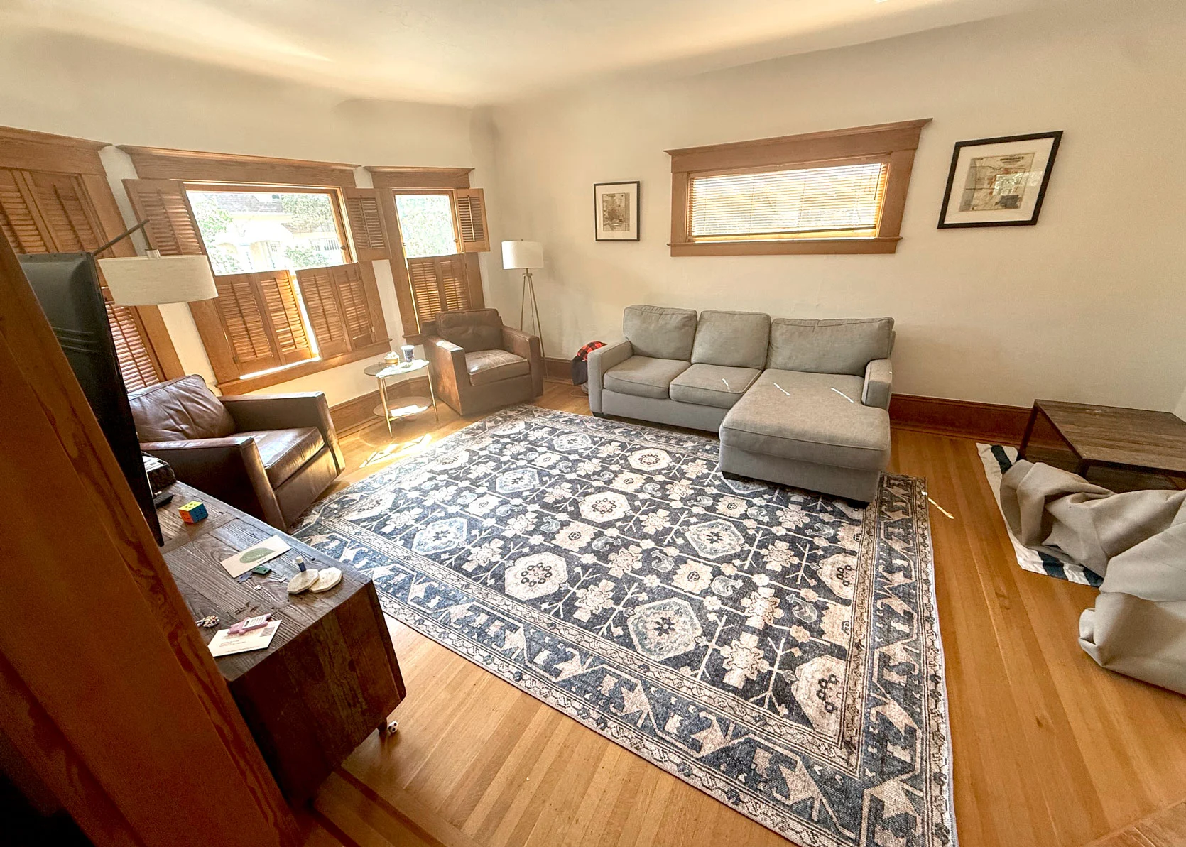
From the Reader: “Here’s my predicament: The couch is a cool light gray, and I’m not sure that it goes with the new rug I’ve just added from Quince. I’d love any advice on how to style the couch to make it blend better with the rug and how to style the rest of the room to pull it all together. I did read and love the long post on all the different couches you’ve reviewed, and eventually I think I’ll replace this couch, but I’m not ready to do that yet. In the meantime, I’m looking for some design solutions that can pull the room together and make it feel intentional with the current brown leather chairs and gray couch alongside this rug.”
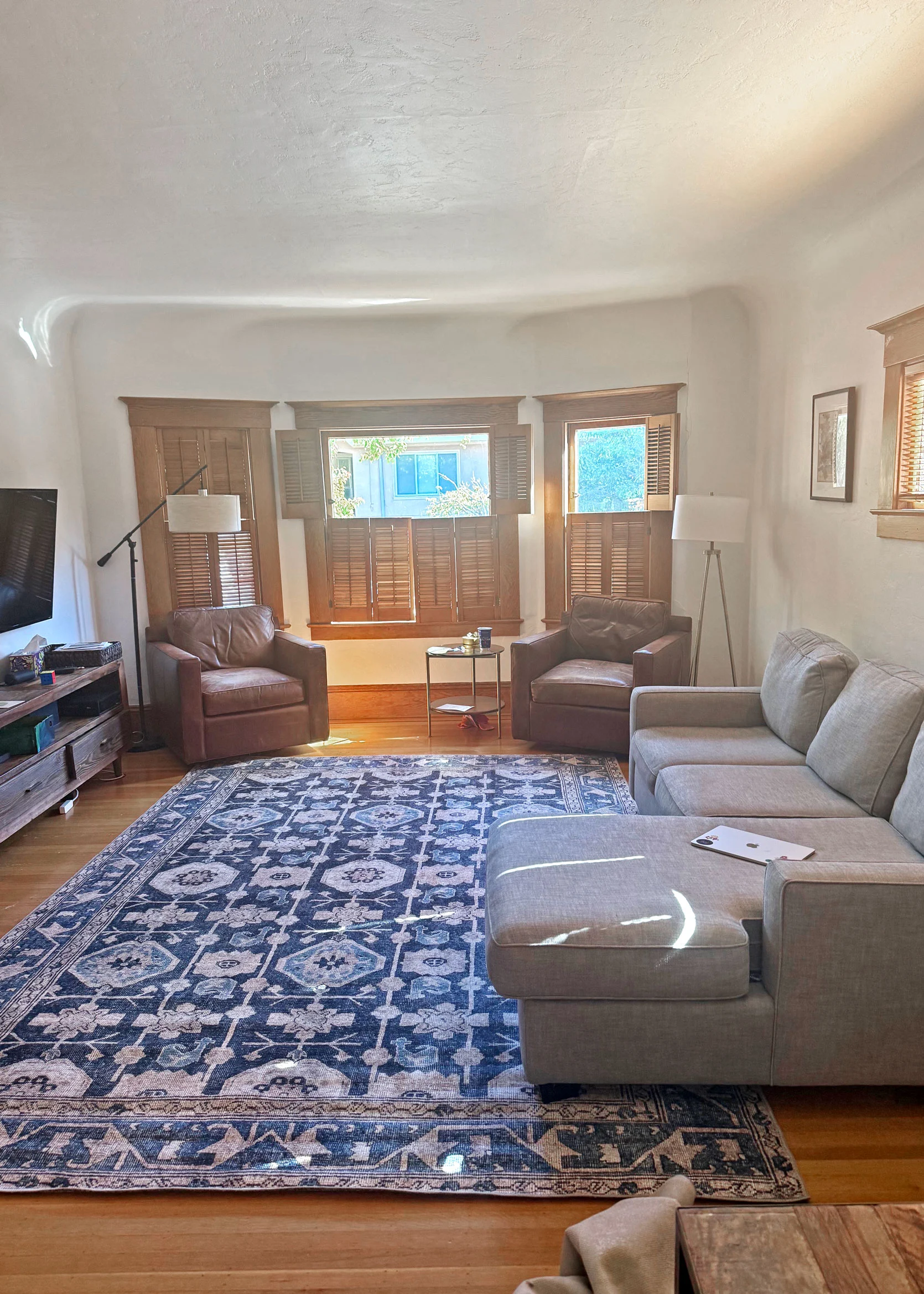
I can’t tell you how many times in my own home and life I’ve bought a big statement piece of decor thinking it would solve all my problems, only to introduce new problems. While this reader is worried that her new rug doesn’t go with her old sofa or leather armchairs, I promise that with a little styling and the addition of another color to round out the palette, everything will start feeling much more cohesive. Because to me, that’s the biggest issue here: It’s playing it too safe. Sure, grey, blue, cream, and brown work well together, but it’s not enough. The blue from the rug isn’t showing up anywhere else, neither is the grey, and then everything else is just brown or mid-tone wood. Let’s introduce some variety, shall we?
But first, there are some other things she can do to make this room feel more pulled together, and it doesn’t involve spending a single dollar. Here’s my checklist of what needs to be done here, starting with easy (and free) shifts:
Design SOS Checklist:
- Move the sectional off the wall about 6 inches so that the front legs of the sofa (not just the chaise) are on the rug.
- Take the chairs and be intentional with their placement. My preference would be for them to have their front legs on the edge of the rug, side-by-side and straight (facing the long way of the rug). Put the side table between the chairs.
- Add rug tape to the edges of the rug where it’s kind of bumpy and curled up.
- Move one of the floor lamps to the right side of the sectional
- Consider taking down the plantation shutters to let in more light and limit the brown of the wood.
- In terms of styling: Bring the blue from the rug throughout the design of the room via curtains (in a soft denim) and through pillows; introduce another warm color in the palette (in this case, cream, rust, and a touch of brown) to balance the coolness of the gray and blue; add in a coffee table in a lighter wood tone than the floors for variety; consider swapping the media console to a lighter tone to add contrast between it and the leather chairs.
Here’s a moodboard I put together of some of these new decor additions to give you a sense of how it all comes together with the help of Spoak.
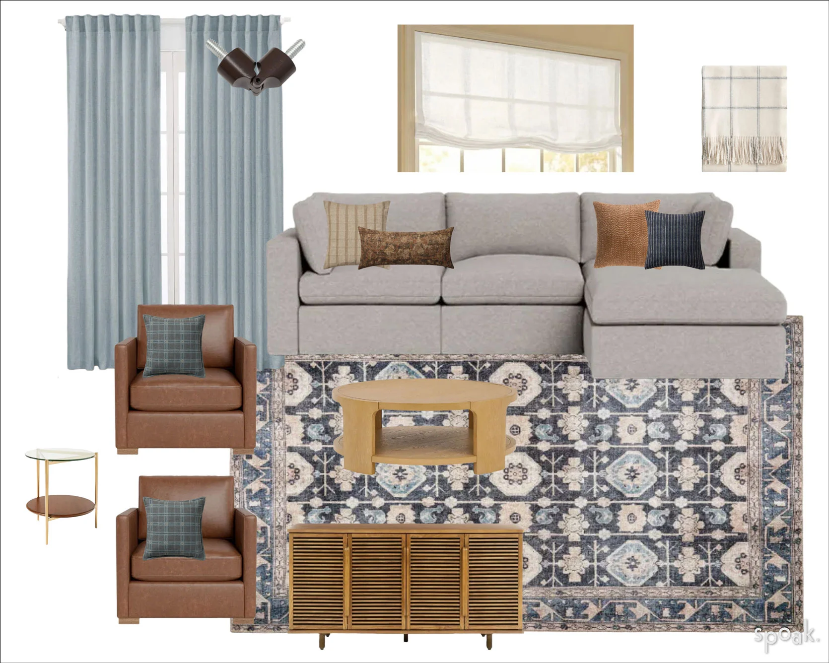
Curtains | Roman Shade | Curtain Rod Pivoting Corner | Coffee Table | Media Console | Rug | Throw Blanket | Striped Cream Pillow | Floral Lumbar Pillow | Rust Striped Pillow | Navy Striped Pillow | Blue Plaid Pillow | Sectional | Leather Chairs | Glass and Wood Side Table
I sourced a sectional and leather chairs that were similar tones to what our reader had in their home and pulled in the rug she recently bought from Quince. Given that the rug is dark blue, light blue, and varying shades of creams and off-whites, I pulled from that and just shifted the tones a hair to make it a bit more interesting. I take any chance I get to use a light blue linen curtain (you might have noticed, if you’ve been paying attention to my designs)! Here, I went with a hue that leaned a touch more warm than icy and then echoed that color in a plaid of a dark blue throw pillow I popped on the armchairs. (If she’s willing, I’d take down the wood mini blinds and replace with a white or ivory drapey Roman shade for some softness against all the squared off angles.) A navy pillow on the couch brings in the darker shade of the rug, as well as an oatmealy-cream option with a fun, modern pattern. I didn’t want to go too wild with the color palette, but I took the brown of the leather and slid over on the color wheel a bit to orangey rust for another pillow, as blue and orange always play nice together. A dusty, floral lumbar pillow brings in some of the browns and oranges but in an unexpected way so things didn’t feel overly matchy-matchy. A creamy white throw with a navy grid pattern rounds it out. Notice how I didn’t add in any more grey or true brown. Even the new coffee table is a lighter yellow-toned oak, and the same for the media cabinet. This all breaks up the monotony of the wood finishes and introduces contrast and warmth.
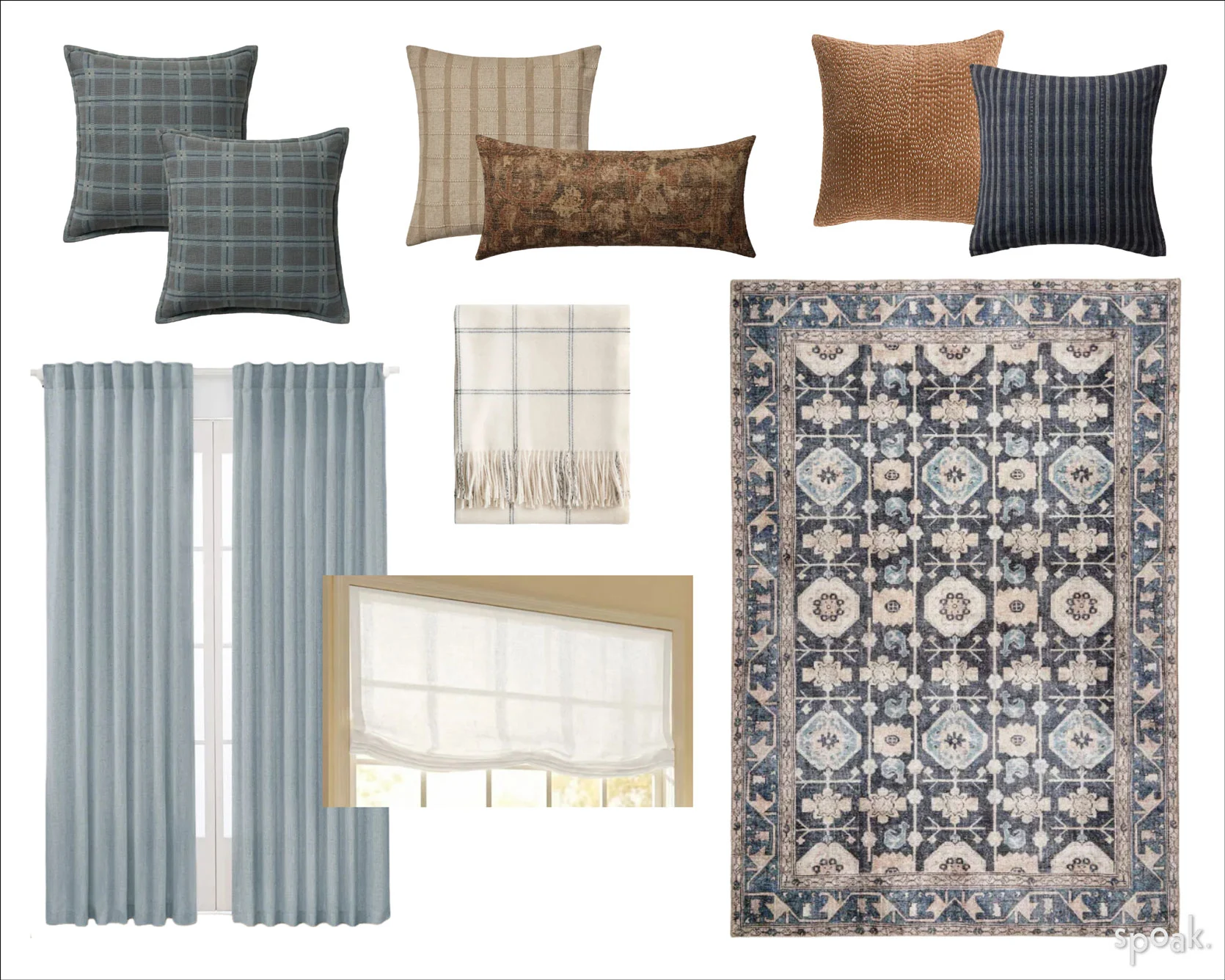
For a better look at some of the selections, above is a moodboard of just the new soft goods, as you can’t see them very well scaled down on the previous room moodboard.
Practical Styling Advice For: Transforming A Foyer Or Entryway
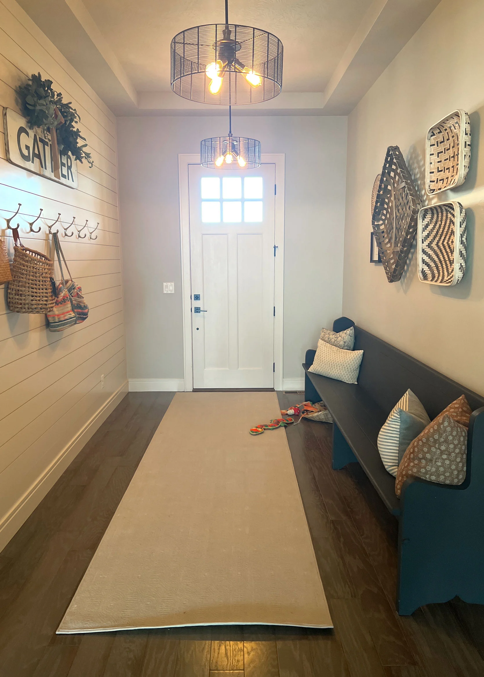
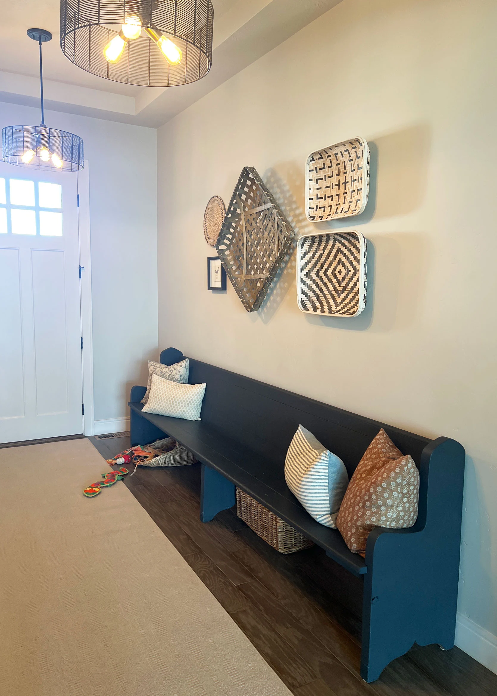
From the reader: “My entryway has been the same since we moved in 8 years ago. I’m not a modern farmhouse gal and don’t know how to make this better. I do like my gigantic pew, and it’s very practical. I’m up for painting it but don’t want my entry to look like a preschool either. Please help!!”
As soon as I read our reader’s email, I knew I wanted to tackle her modern farmhouse foyer transformation! While I don’t actually have much information as to what her design aesthetic actually is, I’m hoping something I did below at least inspires her to make choices that better align with what she wants her home to look and feel like. Here’s what I think could take this space and flip it on its neutral, Kirkland-Signature-Chic head.
Style SOS Checklist:
- Take down all the “modern farmhouse” choices, such as the pendant lamps, the “gather” sign, faux greenery, and the baskets on the wall.
- Swap the solid tan rug with something that makes a real impact. Your foyer is the first peek into your personal style; what you see immediately when you walk across the threshold. Go ahead…lean into your style vibes.
- You can’t see it in these photos, but the exterior part of the front door is a fun yellow, so she clearly isn’t afraid of color. Go with that. Paint the baseboards, door frame, and door something—may I suggest an olive green?
- If she’s into it, maybe try a playful wallpaper on the walls. (You can either take down the shiplap if it’s not overly destructive, or just paint it the same color as the door).
- Add a long, narrow console table under the hooks. This not only balances the pew, but it adds a spot to throw keys.
- Bring some greenery in and pop it on a plant stand. Pick something that doesn’t need a ton of light.
- Put a mirror (or art) above the pew; I picked the mirror as a helpful spot for a last look before going out the door, as well as its practical ability to increase light in this somewhat dark corridor.
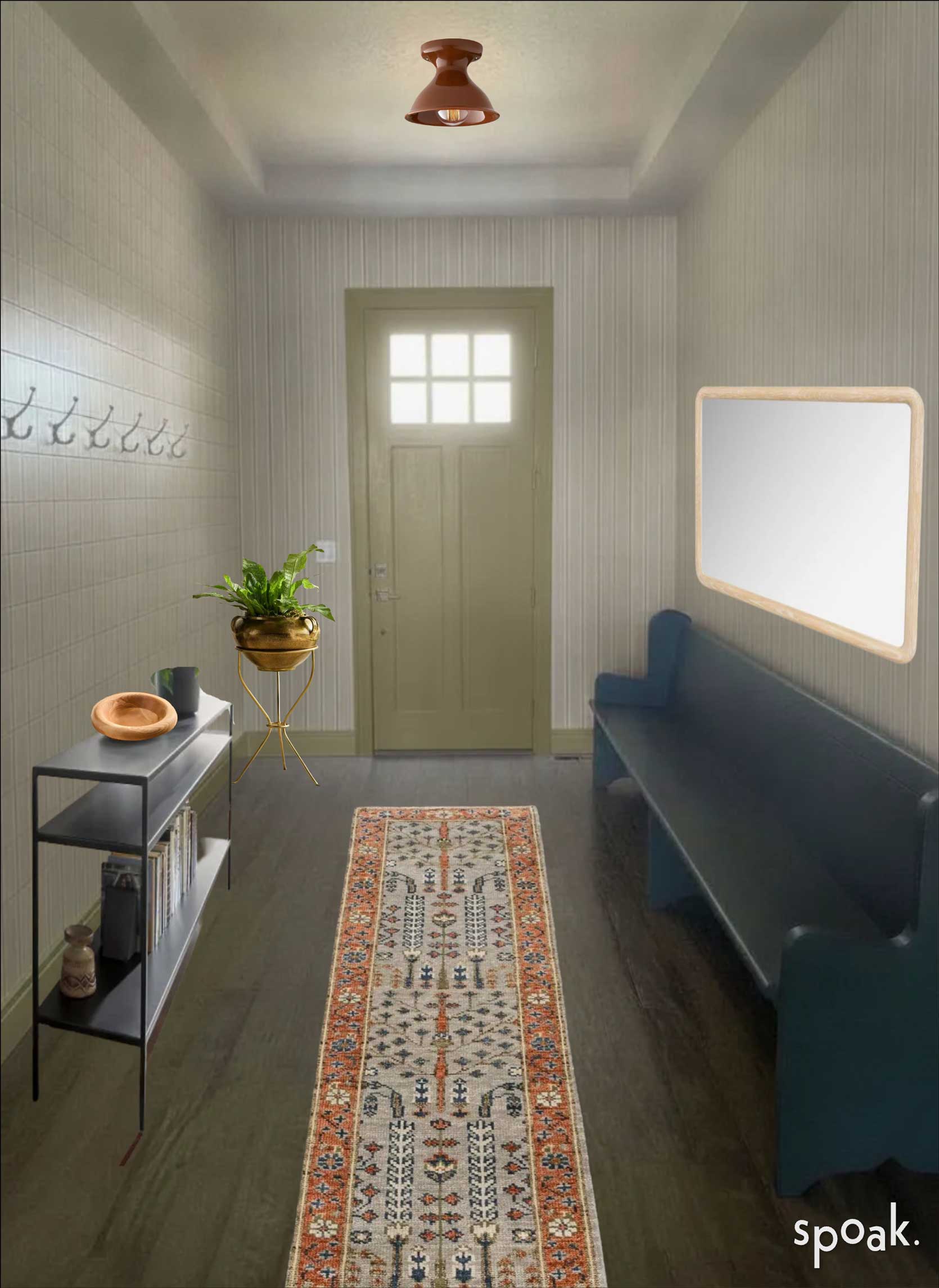
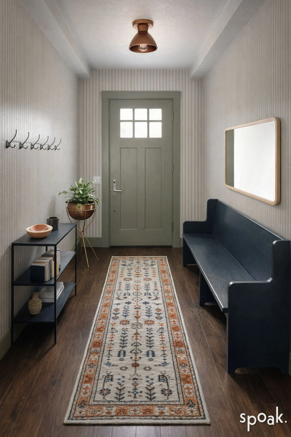
Here’s a side-by-side of a rough placement of some of my selections and a Spoak rendering for something a bit more realistic (even though it altered a few things slightly, like the runner and light). The green is a bit more sage than I was intending, but it’s honestly not a bad option, either! Though I do prefer the Mountain Olive from Behr I link below.
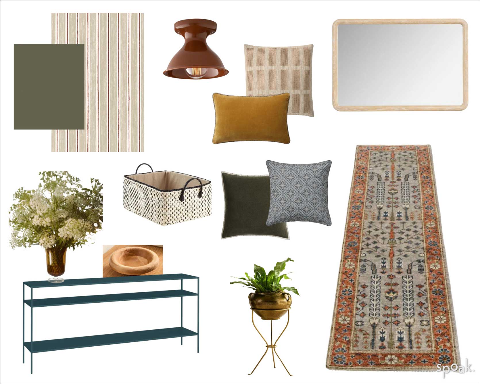
Olive Green Paint for Door & Baseboards | Wallpaper | Flushmount Light | Runner Rug | Console Table | Plant Stand | Mirror | Wood Key Bowl | Amber Glass Vase | Solid Olive Pillow | Blue Patterned Pillow | Beige Check Pillow | Mustard Velvet Lumbar | Under Bench Baskets
You’ll notice in the above moodboard some additions: Throw pillows in a combination of colors pulled from the runner (olive, blue, cream, ochre), an amber glass vase for a big pouf of fresh-cut blooms on the console, and baskets to pop under the bench to throw shoes or anything else that ends up in a foyer. I have these same baskets, and they’re great, FYI. And considering how much baskets cost these days, these are incredibly affordable compared to many other options this size and quality. Also, you can’t see it in the above renderings, but I picked a Sandberg striped wallpaper; it has almost a hand-sketched quality to it, which I like for a family home so it didn’t feel too serious. Another move in the “not-so-serious” game is the auburn ceramic bell Schoolhouse flushmounts and the slate blue hue on the console table; sure, she can do something in black or white or wood, but I couldn’t help myself. The table is only 12 inches deep, which is important for a narrow space like this, so you can still move around and not want to scream every time you walk in with both shoulders weighed down with grocery bags, for instance.
Practical Style Advice For: Creating A Cozy Multi-Purpose Kitchen Nook
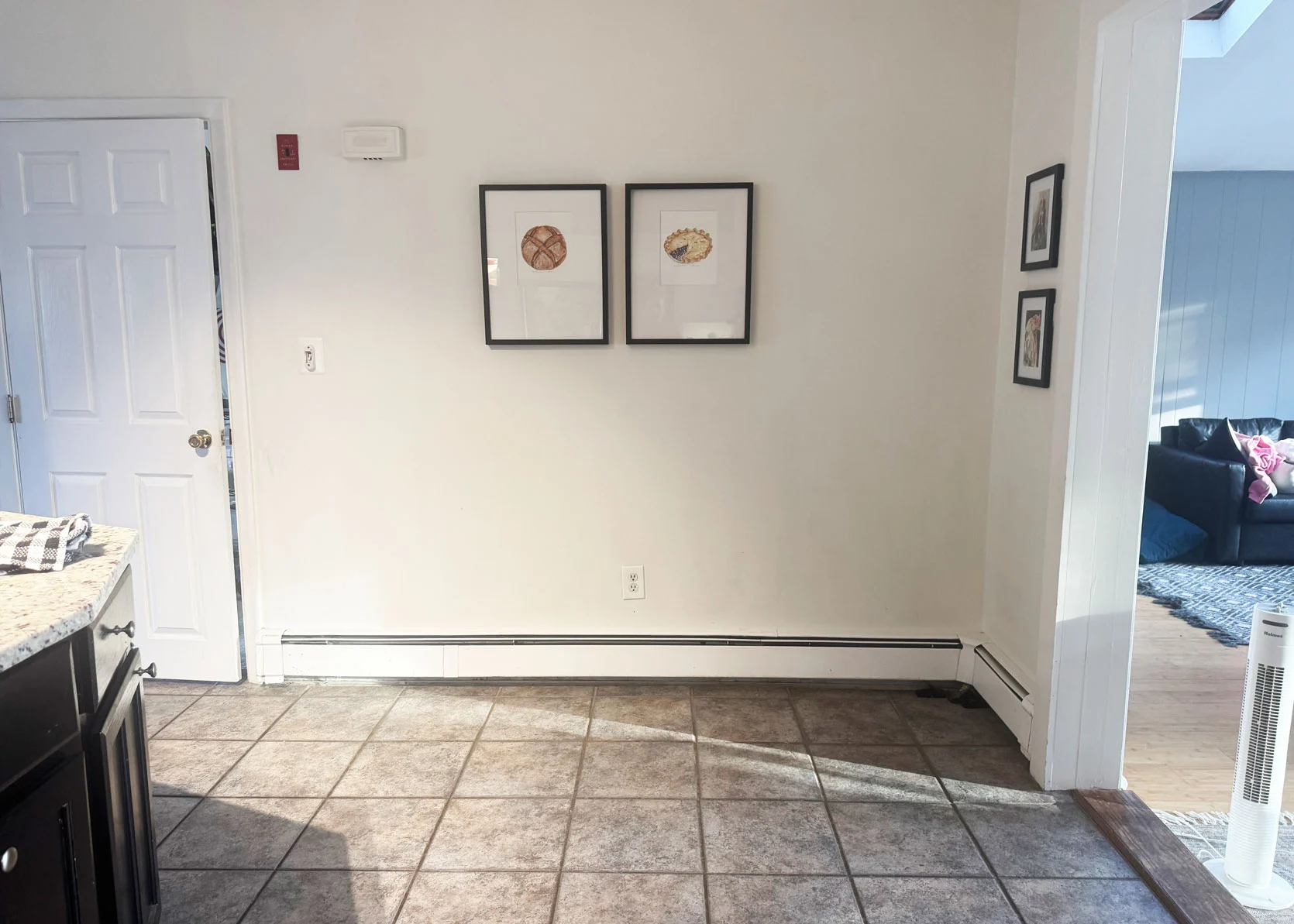
From the reader: “I have this area in my kitchen that I don’t know what to do with! I used to have a small round table with a drop leaf and three chairs so my kids could sit and eat breakfast. I love the idea of having an eat-in kitchen, but I would also love to have a little spot for me to sit and have my coffee or even a spot for additional kitchen storage.”
This last reader submission is also something I’ve actually been sitting on this one for a few weeks. I couldn’t figure out what I wanted to do here to satisfy her requests, but then I just decided to play, and I like where I landed! Some difficulties that could affect whether what I suggest works or not spatially: I don’t know the measurements here. I can assume each tile is 12 inches, but they could be larger or smaller; I don’t know what the path of travel looks or functions as in this part of the kitchen; what else am I not seeing here that could make my style choices feel either cohesive or like a bad fit? BUT, either way, as is always my hope, perhaps this reader can see what I did, and follow the formula but in her own way.
First up, our to-do checklist.
Style SOS Checklist:
- Lay down a rug to set this space apart. Something small, such as a 3’x5′ or a 4 or 5-foot round rug.
- Opt for varied seating to give you a soft landing spot for coffee sipping, but add in traditional dining side chairs for anyone else in the household who needs a spot at the table for a quick nosh.
- Add lighting, as this corner feels dimly lit. My preference would be a plug-in long-arm wall sconce that can function as an overhead without having to hardwire anything.
- Introduce art in a unique way (such as a hanging art rail) or add a floating wall shelf for storage of collections or some kitchen goods.
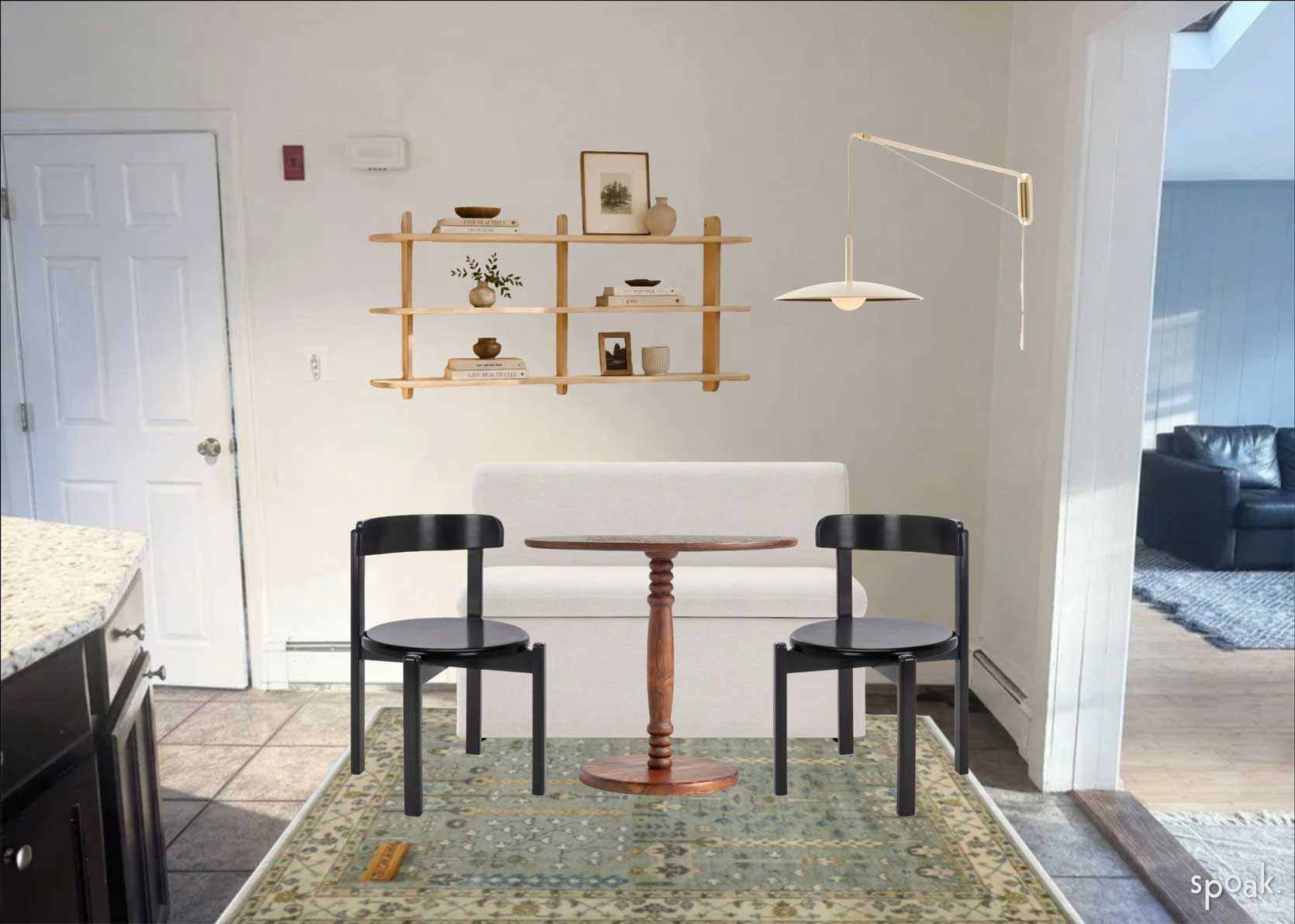
I kept most of my choices fairly neutral considering I don’t know much about this reader’s style choices, but I can gladly say that the banquette has some storage in it under the seat, the bistro table is on sale, and the chairs are lightweight so they can easily be moved if they end up in the way. I also found this shelving unit on Etsy, and it’s an incredible price, though it is incredibly narrow, so it’s more for small cute little pieces of decor rather than storing anything substantial of a kitchen nature.
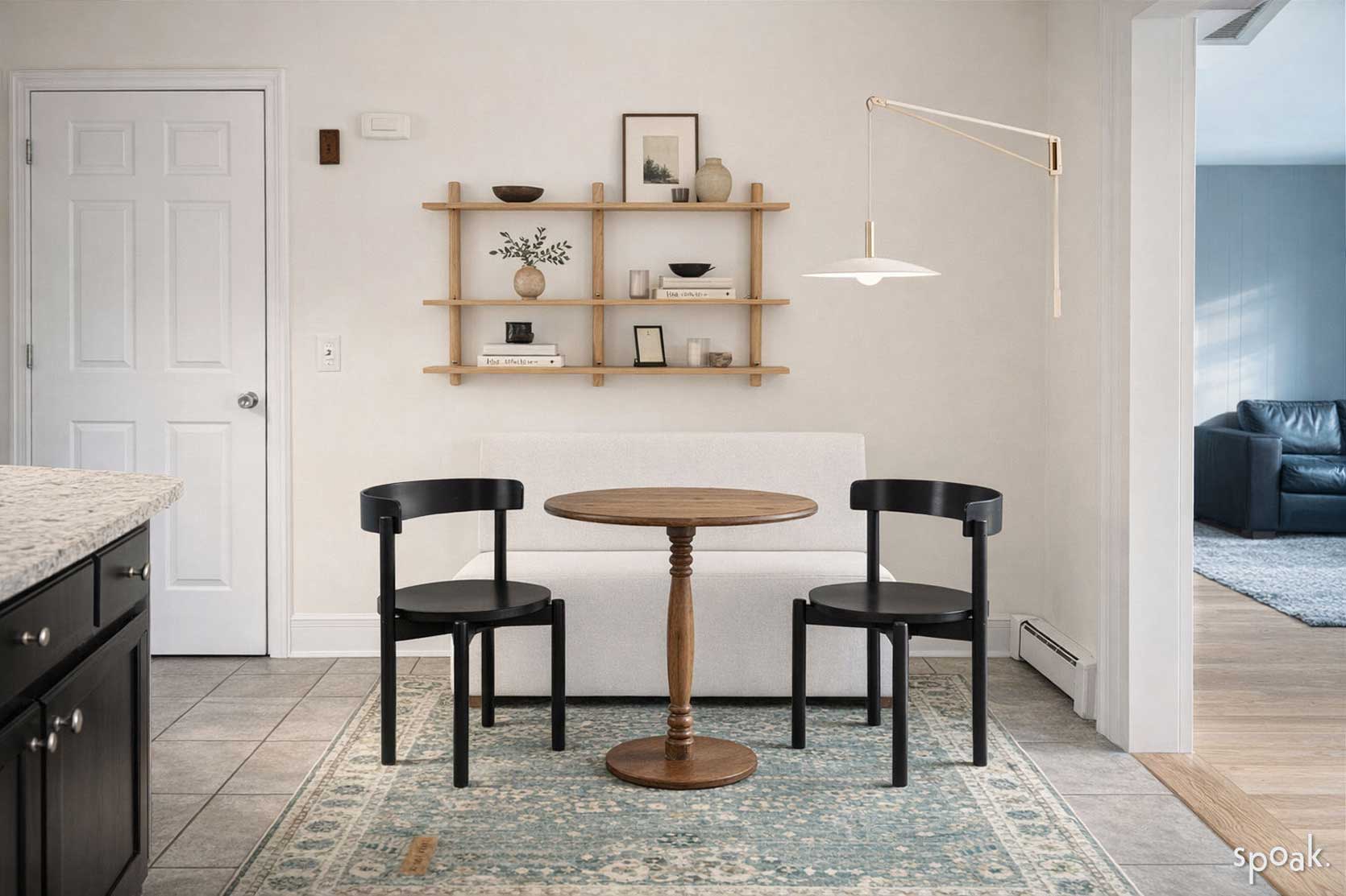
For anyone who likes the more realistic take, above is a Spoak rendering. But for the nitty-gritty details and some shopping links, see below:
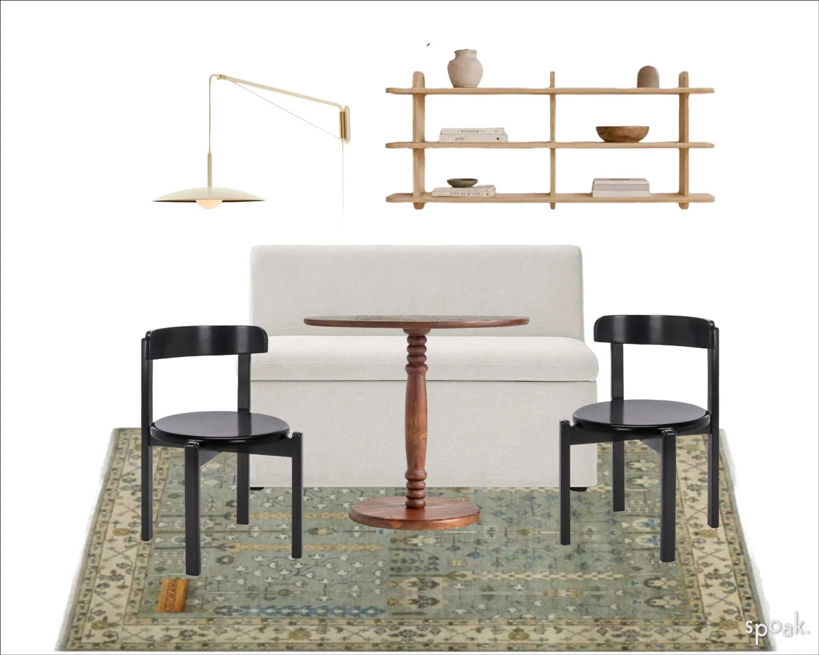
Storage Banquette | Bistro Table | Side Chairs | Rug | Wall Shelf | Sconce
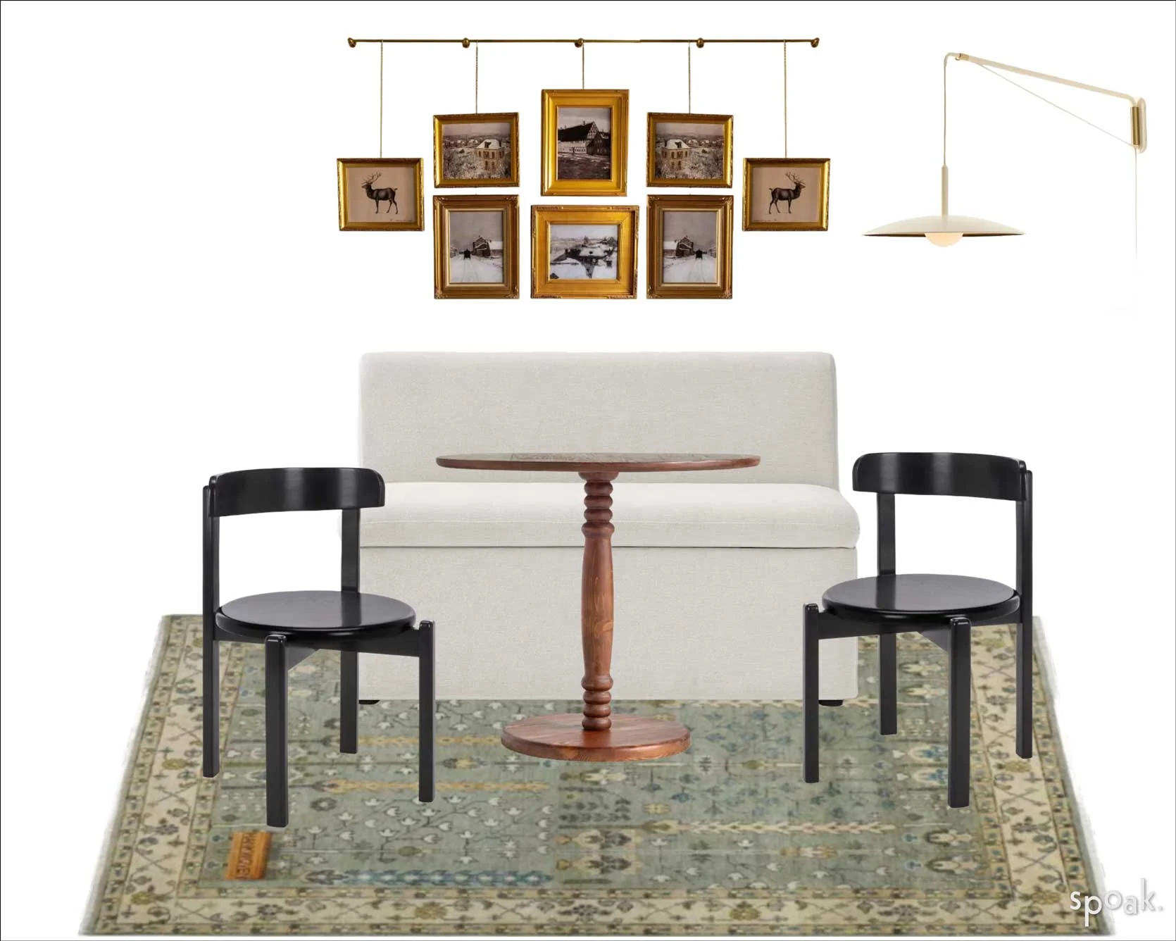
I also really love the idea of adding some real character and a personal touch via photos or small art in a hanging gallery wall style such as the below. It really leans into the charming coffee house or bistro aesthetic I was going for for her nook:
—
And that’s where I leave you today. Please keep sharing any rooms you need help with (small things, not huge overhauls, please…that’s not the nature of this series) and include as many deatils about what your needs are, what your style preferences are, what colors you tend towards, and the like. The more, the better! You can send them to me ([email protected]) or Jess ([email protected]). Can’t wait to hear from you, and for the readers who were featured today, let me know if you’re here today and what you think!
Until next time, friends…
Opening Image Credits: Photo by Sara Ligorria-Tramp | From: Portland Project: The Entry & Staircase Reveal
👏 👏
It’s true, this is one of my favourite series! And, as ever, I agree with nearly all of the advice here. But I do have some thoughts… For the Living Room: Everything in here is very square – the sofa, the chairs, the coffee table and even the shutters (and I agree just getting rid of them will make a huge difference). Definitely pulling all the seating closer together on the rug, around a circular or oval coffee table (with things on it) will make a huge difference. As will any kind of textile furnishing, like the curtains and cushions suggested. I also think it’s in dire need of some books and some plants. A shelf in the corner where the square coffee table is now, maybe with a reading chair and lamp, would define that corner and humanise the space a bit. For the Hallway: I too love that bench, but everything in this hallway is elongating it, particularly the bench, and I think you need to visually shorten it. So, alas, I think you should move the bench somewhere else and replace it with something shorter. I agree that a patterned rug will also make a big difference.… Read more »
As for the hallway bench moving elsewhere: it would work to move it if you don’t need that much room. As for myself, with 5 children the bench would stay and there’d be a lot more hooks!
I too love this series!! I wanted to say that the first reader clearly wants light by also privacy, since these windows probably open out onto the street. How about removing the shutters and adding a set of sheer blue cafe curtains, only on the bottom 2/3 of the window?
1: that’s a lovely rug! Agree with all choices here, but I’d push a bit further and go for a burnt orange or tan or dusty pink cushion as well as the brown and blue ones. They’re beautiful but perhaps it’s still a little too restrained? I don’t hold with putting armchairs side by side and at right angles to the sofa; it’s too regimented for me; I like where they are. A big plant for the corner when you move the standard lamp would be really helpful. 2: Lol at removing all her decor, but hard agree. That is a very cute light fitting you’ve suggested, and the pew is great, too. You can’t use the hooks if you put a console under them, though, do you need the hooks for coats or just for decor? If decor, could the hooks be less functional and more pretty, like pegs? 3: This one is so tricky! If that alcove is only a couple of feet deep, it seems unlikely a banquette is less than that, so the table is now in the way of the doorway to the sitting room. I’d do a built-in bench with a thick cushion, and… Read more »
Love them all! Love this series. So so helpful
For the entryway – I think changing the rug for one with pattern is the key here. I like the idea of a console table, but would push it towards the front door. If it is under the hooks it will be impossible to actually use the hooks for coats- and hanging coats is a big part of entryway function!
Have any of the submissions followed the advice and done a room update? It would be so fun to see those afters, too!
New series!!!! Love this idea!
I did! Slowly over time, and not completely. Arlyn gave me advice in a Fix it Friday two years ago (can’t link but it was Feb 16 2024) and a pic of current state. Always a work in progress). Thanks, Arlyn.
OH! I remember your home!! It’s looking fantastic. 🙂 Thank you so much for sharing.
I had to go find your previous post. Looks awesome!
Thank you for updating us!
Beautiful!
For anyone looking for it, the post with this living room has the title “Fix It Friday: Watch How Just a Few Colorful Design Swaps Completely Overhaul 6 Reader-Submitted Rooms (w/ Real Photos!).”
Beautiful!
For anyone looking for it, the post with this living room has the title Fix It Friday: Watch How Just a Few Colorful Design Swaps Completely Overhaul 6 Reader-Submitted Rooms (w/ Real Photos!).
Will you share a link for your sofa? It’s gorgeous!
oooh I’d have a gallery wall to share! I’ll have to see if I can dig it up
Is it possible to add a Spoak rendering of the new Living Room layout? The mood board is great but challenging to visualize how it would all come together in the space. I really enjoy this series!
This series is one of my favorites!
This is such a fun series and I love all the ideas! Without any measurements, I have no idea if this is possible but that kitchen is screaming for a built-in. Some storage that goes up to the ceiling and gives you a place to keep cookbooks, glass canisters, small appliances… you could even do a built-in bench with shelving above it, and a narrow table in front of the bench.
Like this –
Yes that’s lovely! It would require insetting into the wall and I’m not sure what’s behind there, but a worthwhile investment! We try to keep our suggestions for this series more topical, less renovation-focused, so our ideas tend to be smaller and simpler. But thanks for putting work into this for the reader!
That makes total sense! This is how I drive my husband crazy. “You can totally do this, hun! It’s easy!!” (Because I am never the one doing the work)
Love this idea soooo much!
Agree. I think that kitchen corner calls for elements with some strong visual weight. While I liked the post’s suggestions, the pieces looked like they would feel lost and floating instead of solid and anchored.
My only concern here is about the baseboard heaters in the last makeover images, its not safe to put a piece of furniture up that close to them, but maybe something with legs and no skirt so the air can flow? Otherwise love the suggestions.
Such a fun post! I agree with almost everything. That dining nook is so pretty! The only bit of advice I’d counter is the removal of the wood shutters in the first scenario. I think they add character, I like the wood tone, and they can just be left open to allow for more light. Plus, they probably feel pretty cozy closed at night.
These advice features are the BEST thing this column offers! All the other offerings here are simply ads with sponsored content and materials free for the mention.
We Love these REAL homes featuring REAL people problems and REAL (unbiased) solutions!
Yes!!!
Totally into these design series, love the suggestions to consider. However on the living room I would definitely not take down the shutters, they look awesome with the woodwork and shape of room. Plus I think doing the other changes of shifting furniture and lamp plus color from pillows, throws, plants will make the room sing!
For the hallway – I would remove the hooks. Put the mirror there, where it’s useful over the table. Use a simple coat rack in the corner to the right of the door if needed. I’d keep a couple of the baskets on the wall above the bench, along with a couple of framed prints. Though you could paint or wallpaper the walls, I also think you could keep them as-is. I do like the contrast painted door and trim. No plant/plant stand.
Such good advice!
This is your best series!!!! Please keep doing these.
I think the first living room needs bigger pictures over the couch.
Would love to see what any of the previous featured SOS submissions have done with their spaces after receiving advice here!
These are truly the best!
Just here as a defender of interior shutters. The ones in the Blue & Brown living room are so beautiful, and so practical! One of that reader’s photos shows they live on a block with similar houses directly across the street, as I do. Shutters let you control light and views into your house in a way curtains or roman blinds fundamentally cannot. And with shutters (and blinds), by controlling light into your house you can help control the temperature of your house and reduce your need to run AC or your furnace.