Design
10 Tile Patterns To Try If You Love Checkerboard But Are Tired Of Seeing It Everywhere
Checkerboard floors are a classic. They will never go out of style. I want to settle that up front in this post because I don’t want to mince my words here. Today’s post isn’t about this alternating floor pattern being out of vogue; actually, quite the opposite. Checkerboard is absolutely everywhere, due in great part to how accessible it has become with the many fantastic renter-friendly peel-and-stick products there are on the market. It’s the darling flooring choice of many a design content creator; a cure-all for adding character to modern or traditional rooms alike.
For that reason, if you’re anything like me, you might be growing tired of seeing this as the default in home after home after home. Attractive? Yes! Novel or innovative? No. For those after something with just as much graphic punch that feels fresher and a bit more intriguing, I have some new ideas for you! All of the 10 alternative patterns I rounded up today have similar hallmarks of checkerboard:
- Alternating colors (often in high contrast)
- Geometric and graphic, mostly made of squares and rectangles
- Timeless appeal, as something that would work in many room styles
- Tidy but punchy
Now, before continuing, I want to warn you: I made up all of these tile pattern names. None of these are official, so please don’t go to your contractor or tile setter and say, “Please give me the two-color basketweave” or “Do you know how to do an alternating rectangle checkerboard?” because they will likely look at you with a scrunchy, confused face. BUT, you can surely show them some photos, and they’ll understand!
#1: Alternating Rectangle Checkerboard
This is the most varied and filled-out option, and depending on the color choice and material selection, this combo of thin and thick rectangles can feel super modern (unlike checkerboard) or like it’s been there for 100 years.
It’s hard for me to tell here if we’re dealing with squares or wide rectangles separated by slender rectangles, but frankly, either would be a fresh take on checkerboard patterns. The key here is the meeting of the corners of each long and skinny tile.
I originally picked this, thinking the cream and rust sections were two separate tiles put together to create a grid, but now I realize they are actually one tile, and this is just square tiles laid on top of each other, but flipped back and forth in each row. Either way, inspiration can still be pulled from it if using solid colored tiles.
This one, which I found yet again on Zia Tile’s profile, is similar but without the horizontal shift. The IKEA-like palette isn’t for everyone (including me, TBH), but the pattern itself is quite amenable to coming to life in many ways depending on color choice. I like how clean and tidy this is, which would work really well in a more contemporary home, though I could definitely see it in something more classic if done in marble, terracotta, or zellige.
You can see how different that pattern feels in more neutral, earthy tones (and in marble). This one, by Studio Keeta, features a longer rectangle, which suits the floor of a space like this one to lead the eye along the cool architecture.
If two colors aren’t enough for you, this tri-color marble application is super eye-catching. Kind of a broken stripe with another broken stripe running through it perpendicularly, custom-designed by the duo behind Ome Dezin.
A subtle tweak in proportions makes such a difference, as the square and squatter rectangle feel less modern, like something timeworn in a house from the last century (and I don’t mean the 1990s). Canales & Co. Interiors went with a low-contrast color pairing, which really has my heart at the moment.
#2: Same-Tile Square Grid
I didn’t go into this post thinking I would include, well, just some square tiles of the same color together. BUT HEAR ME OUT! It checks some shared boxes: Streamlined, classic, and eye-catching if you pick a saturated tone.
Maybe it’s the other items in the room reflected on the high gloss finish, or maybe the tiles are slightly varied, but the latter—accomplished with a hand-glazed tile—keeps this style from looking overly ’80s. Designer Andrew Brown used the solid grid in a bathroom in the Dominican Republic, published in Veranda magazine.
Okay, so not exactly solid in color, but I wanted to include it anyway because it’s a single tile with sweet little corner details that come together to create something larger than itself, just like checkerboard. W Design Collective used a Delft-inspired tile in both the bathroom and what looks like a kitchen or pantry, and I just love it.
#3: Two-Color Basketweave
This whole home, by Elena Uchaeva, is so warm, inviting, and beautiful, and the floors are a big part of that design gold equation. Here in this hallway, she went with a basketweave pattern with a brownish-red center and grout lines. It might be a lot of movement for some eyes who prefer calm, seamless patterns, but to me, it’s just enough interest in an otherwise peaceful space.
#4: Diamond (& Square) Accent Grid
This floor tile design, with its diamonds and clipped squares, is as classic as traditional checkerboard but with far less market saturation. It’s also lower in contrast and much more subtle, which could suit the home of someone who wants a touch of graphic punch but without the intensity of checkerboard.
The mosaic floor in this bathroom by Meghan Eisenberg is gorgeous! The little detail of the added white square makes an interesting but understated statement. Same black-and-white combo, just a bit different.
#5: Alternating Square Size Grid
Similar to the first category in this post, this pattern seems to be getting a lot more play lately, and I LOVE it. It’s comprised of a large square and a small square installed in an interspersed diagonal direction.
I’m so smitten with this kitchen space in a rental cabin near Big Bear Lake, California. The floor has so much impact but still feels so grounded, likely because of the terra-cotta hue.
Here’s a smaller version, with an additional color larger square to get a bit closer to the beloved checkerboard scheme.
Remember I mentioned two images from Elena Uchaeva? This is another space in the beautiful home I shared under the basketweave section. This floor is a totally different pattern, but built out of the same colors, which creates cohesion throughout the home, but with a distinct personality for each room.
#6: Checkerboard Border
Maybe this one is cheating, like using the word in the definition of that word. BUT I still want to point it out as an alternative because it’s like a checkerboard amuse-bouche. Just a peppering of the look so that it’s not the whole visual meal, just part of it. You could do this in any application, similar to the bathroom above, on a floor, on a wall, anywhere really. Make sure the scale of the tile matches the surface it’s on.
#7: Plaid
Caitlin wrote about plaid tile previously, so if you love this look, I suggest you go read her deep dive (no one can do a deep dive like that woman!), but I collected a few more examples here as a viable checkerboard replacement. In some cases, it’s a more intricate plaid mosaic; in others, it’s just a reconfigured checkerboard with an additional color in the mix.
Here’s an example of the more detailed mosaic plaid (a.k.a. more expensive, because more tiles equals more cuts and more specialty to lay out appropriately). But it sure is preppy and fun, huh?
This plaid design is made using the same size tile across the board, but in three colors, laid out in a plaid-like motif.
#8: Stacked Checker Grid
If you really love checkerboard and don’t want to veer too far off course, let me introduce you to what I’m calling the “stacked checker grid.” At this point, I’m kind of just throwing names like one does spaghetti at the walls, but basically, it’s a checkerboard grid made of stacked tiles of either non-square shapes to create an actual square, or small squares which create a larger square.
I found this casual snapshot of a beautiful bathroom by Sarah Sherman Samuel on her feed, and the floor here is a perfect example of this. Two rectangles in the same color come together to create a single visual square. The grout line in the middle creates more texture and interest.
And here, four small squares of each color combine to create a larger square, resulting in a checker grid but with a little more oomph.
#9: Scattered Color Square Grid
For a bit of a more eclectic and visually organic vibe, there’s the “scattered color square grid” tile installation technique, which basically includes taking at least three colors of the same size square tile and seemingly randomly scattering them across your surface. It’s fun, quirky, and cute.
#10: Micro Checkerboard
And finally, another “you’re cheating” moment here, but I stand with its inclusion regardless. The micro checkerboard mosaic (bonus points for a border in a different pattern) is an option that works in a smaller space, such as a bathroom, entryway, or compact kitchen. I’d keep the grout dark here to limit how dirty it could get, but it adds an edginess you can’t seem to get with larger 12-by-12 tiles.
—
There you have it, my 10 checkerboard tile alternatives if you love the look but want to be a bit different. As you can see, it doesn’t take a big shift to get a fresh perspective on the classic motif. They’re all lovely and have their merits, as does the original, of course, and it’s fun to explore slight offshoots of beloved designs. If you have another you’d like to see me get into, just let me know in the comments.
Until next time, friends.
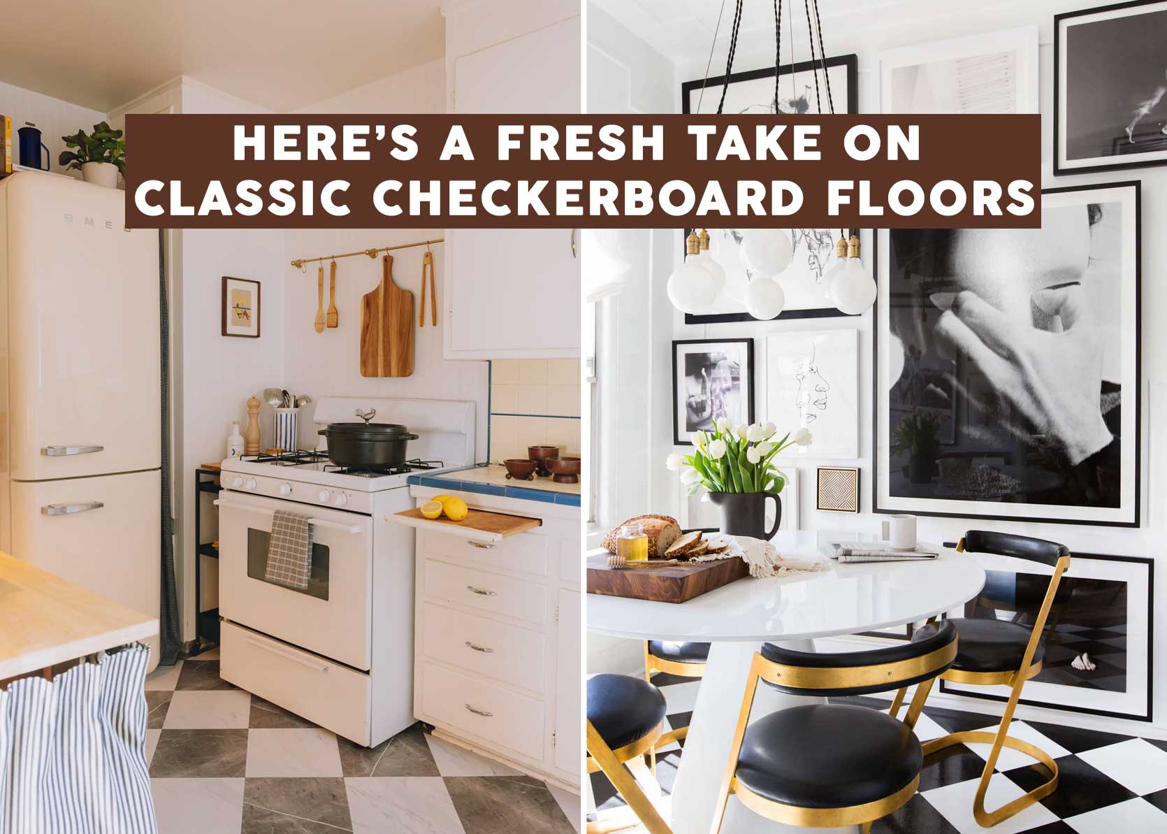
Opening Image Credits: Left: Design by Mallory Wackerman | Photo by Lyle Nelson | From: Mallory’s 1950s DIY Kitchen Makeover (You Won’t Believe This Before and After) | Right: Design by Brady Tolbert | Photo by Tessa Neustadt | From: Brady’s Kitchen Reveal
That was fun! Always enjoy your original posts.
This is a mind-reading post! Planning a remodel of a bath and trying to inject a bit of mid century patterns into it (an addition to a 1960s house) and checkerboard was never going to be the answer, but these are just the ticket!
Thanks for the on point design inspiration and expertise Arlyn – always so excited to read your work.
Thanks, Arlyn! Such a helpful resource — all of these great designs in one place. Will be referring to this in the future!
I love every single one of these except the basket weave. WEIRD!! (It’s just too much going on for my eyes.) The plaid is SO PRETTY but is super high gloss… I wonder if it’s slippery?! Would love to talk to the homeowner about that one. 😄
Great research and images as always, Arlyn! Thanks for sharing with us!
Enjoy these design posts and the quality of the writing, and the work EHD do across channels to elevate diverse voices. Until Russia has ended its war on Ukraine, do encourage you to showcase and amplify voices from other parts of this big, beautiful world.
Just a suggestion. When I see the designers name hyperlinked, I assume the link will go to their website for me to find an image I can actually save, not to the same instagram post there is already a hyperlink to in this article.
I can always tell an Arlyn post because it always addresses a trend I’d just begun to think about and has a super comprehensive, solution oriented coverage. Just the best!
Thanks so much Sunny!
I’m in the ideas phase for a bathroom re-do and was leaning towards a hex tile for the floor. Now you’ve got me thinking! These are all such great variations on a classic. Thank you for the inspiration!
So many beautiful bathrooms and tiles! I’m not at all sick of chequerboard (although I don’t have it in my own house) but my favourite by far is ‘scattered checked’ in three or more colours. Hadn’t really realised it till this post but I have quite a few versions saved on my personal style board, where I save my top 500 (out of around 10,000 pins). Like all things it all comes down to the execution though!
Also loving big check, little check.
For a colour and pattern lover, tiles and textiles provide the perfect opportunity to go for it. Will forever love Kaitlin’s children’s bathroom with its pink and yellow checks, (although I love her ensuite bathroom as well, and have in fact, modelled one of my own bathrooms on it).
Thanks Arlyn, look forward to exploring some of these further. Have been needing a little style inspiration recently.