Design
COLOR TRENDS 2026: These 7 Colors Are Going To Be All Over Our Homes (One Might Totally Surprise You)
If you love color as much as I do, buckle up, because today, we’re talking color trends 2026 in interior design. Spoiler: There aren’t many drastic moves from the last time we talked about this, really. Millennial gray isn’t back (yet), cool whites haven’t taken over, and orange is still a bit fringe. But many of the shades we talked about last year are still very much on trend for this year…with a few additional surprises.
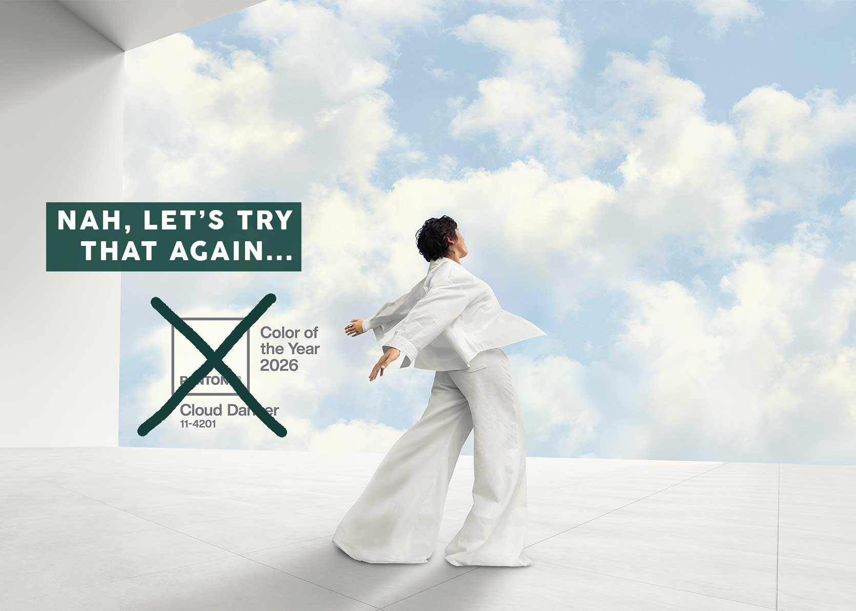
After consulting fashion trends, trend authorities such as WGSN and Pantone—yeah, even after that Cloud Dancer debacle—and digging deep into my own intuition based on my observations of designers’ work and retail product offerings, I’ve come up with seven colors I feel strongly are already impacting or about to impact how we decorate our homes.
Before diving in, you know I always have an aside. Scrolling through the images I collected made me stop and admire in total awe the absolute treasure trove of beauty we have at our constant disposal. Trendy or not, it’s like…WOW. There is so much to take in all the time that it’s easy to take it for granted, but for just a moment, let’s pause and be in wonder of just how many gorgeous and unique homes and rooms we get to peer into on the daily.
::pauses:: ::wonders:: ::awes::
Alright! Time to admire some colors, shall we?
Color Trend #1: Ice Blue
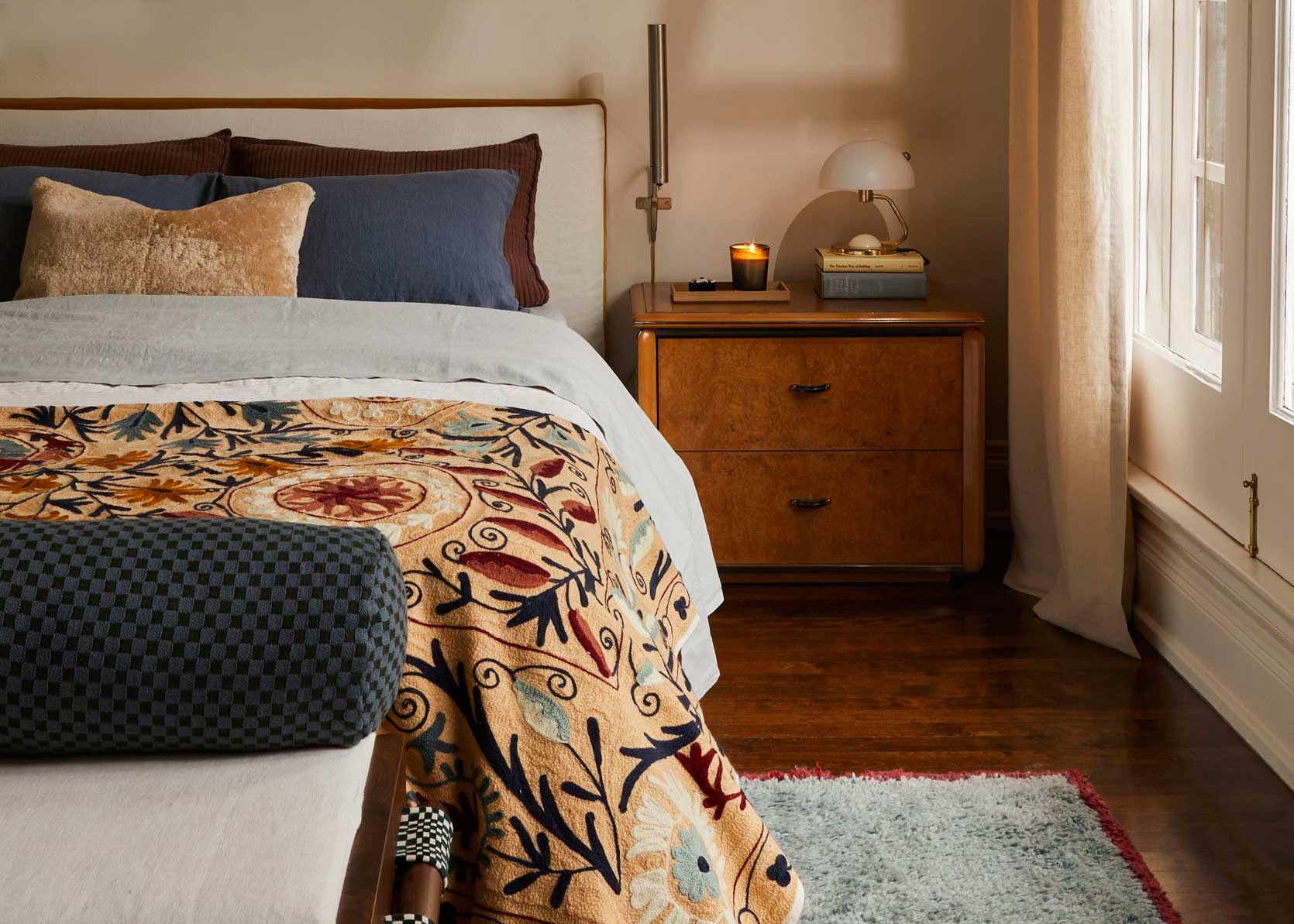
Let’s start this list off with a color family that is as dependable as water boiling at 212 degrees Fahrenheit: Blue. This cool hue manages to present itself over and over again in different iterations with every new trend wave; last year, it showed up as an icy iteration, and that same ice blue is still ahead of the pack. I personally think it’s a fantastic palate (and palette) cleanser as an addition to all those deep, moody reds and browns we’ve been seeing, but more on that later on the list, so keep scrolling. Icy blue isn’t overly milky or saturated like other denim or Swedish blues that have been popular for the last decade. It’s crisp, clear, frosty, and pale.
James Huniford used an icy blue velvet sofa as the bright point in the otherwise earthy room he designed for the Kids Bay Showhouse last year, featured on Domino. If you leaned hard into the warm neutral trend and want to inject a little extra oomph now, misty blue is a great way to do that without things feeling overly colorful.
Case in point: This large room-scaled cabinet unit in a fairly neutral room. It’s such a wonderful way to use a color in a very large way that doesn’t feel overly burdensome or heavy.
Over a decade ago, I painted my bedroom a similar barely-there blue (with enough depth that it doesn’t feel like it belongs in a toddler’s nursery) and proceeded to recommend it to everyone close to me to the point that I made them feel like there was no other choice. As it happens, I moved on from the color, but it’s back, baby, as seen in this lovely and fresh space by Kerv Interiors. (Be sure to scroll through to get to more images of the bedroom it was used in and all the fun colors paired with it!)
First, scroll to the second image. Okay, now I can talk. Using ice blue in small but punchy moments like a pendant, sconce, or even piping on upholstery or soft goods is a fun and unexpected way to bring in this color. Another inspiring takeaway from this project by Alice Grace is how utterly delightful this cool blue looks with cherry red (and khaki, which is a trend further down on our list!).
Icy blue has been increasingly paired with burgundy; in fact, that combo is absolutely everywhere right now, like the previous one I mentioned, but with some more gravitas. It really does a great job of lifting up dense shades, not to mention it feels retro (like the vintage bathroom above shared by House of Moore Design) yet timeless.
Color Trend #2: Teal
This is not the first time I’ve called out teal as a color to watch (you might recall this article, and even here where I mentioned it, as well), so you know I’m serious about it. I’m not the only one, either. WGNS, an international trend forecasting company, named “Transformative Teal” the color of the year for 2026. I personally think, after years of milky and cottage-y versions of blue and green, we’re open again to move complex shades of those colors. Like both blue and green? Then BOOM, Teal knocks them out in one single dramatic punch.
The more I see designers use a color in more permanent applications, such as tile, the more I know it’s going to have lasting power. Case in point, this sweet little bathroom above by Bright Design Lab.
Designer Robert Stilin celebrated the color in this beautiful home that was featured in Architectural Digest. Something in this first photo that I want to call out is how radiant teal looks in natural light. It’s one of those hues that plays as nicely in a light and airy space as it does in something moody with limited lighting. And it practically begs to be on a material or surface that has some sheen.
When I worked at a furniture company after my EHD days, I was shocked that a peacock blue similar to the beautiful velvet above (a space by designer Mimi Shin) was one of our most selected fabrics. It held rank in the top three, sometimes even right at the apex of the list, along with gray and beige. Which makes me think, perhaps teal is just one of those colors that is always with us, whether it’s part of the zeitgeist or not. That said, it’s definitely part of it now and will be for the foreseeable future, IMHO.
A bathroom fixture such as this sink above in a bathroom by Sophie Rowell of Cote de Folk feels like a firmly cemented approval of teal. Could you swap it out? Sure, but chances are, you’re in it for the long haul with this. It’s a good thing, it’s absolutely marvelous and would make anyone stop and stare for a moment when they entered the space.
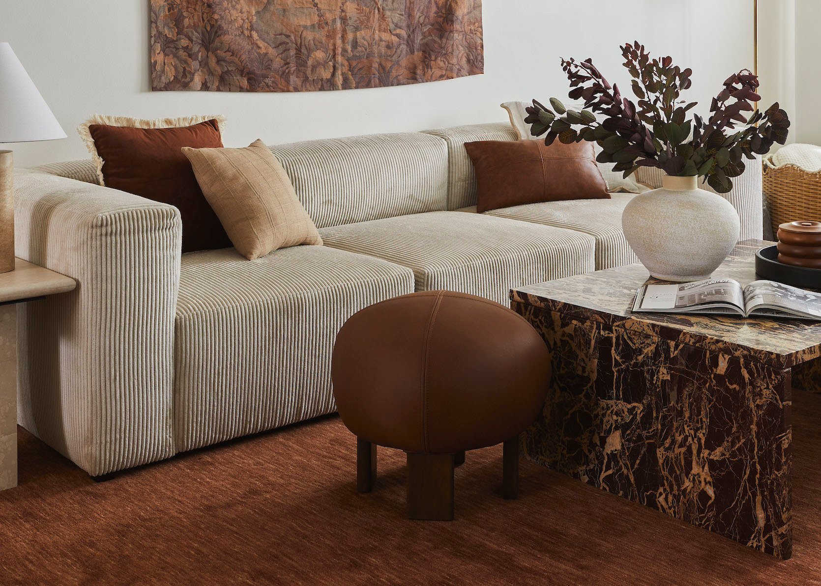
Color Trend #3: Amber (A.K.A. Burnt Caramel)
I may have amber down at number three, but TBH, it’s one of the top color trends I’m seeing, especially in bathroom design—which I’ll be covering more in depth next week, so stay tuned for that. But yes, amber, or burnt caramel as I’ve been seeing it called in some places, is absolutely everywhere. It’s a rich, unctuous throuple marriage between rust and mustard (which both had their heyday a few years ago), as well as brown. Some iterations of amber are a bit more yellow, while others are a bit more terracotta brown, but anywhere it lands, it’s earthy but fashionable.
As mentioned, amber bathroom tiles are *the* material choice of the moment in that space, specifically of the zellige variety. I love how designer Alisa MacConnell paired it with buttery yellow walls and bright brass to keep the jewel tone feeling fresh instead of dour.
I think the color of this sofa and the walls (in a room by designer Hugo Toro) are kiiiind of up for debate, but I’m including it in the burnt caramel camp anyway. The beauty of this color is that it’s very much a warm neutral but still feels like a color-color. If you’re scared of color or don’t really know how to use it, amber or burnt caramel is a great gateway.
I just need a moment to take in this gorgeous tile backdrop in a space by Studio Mountain (the tile is by BDDW, a favorite of mine and EHD as a whole). I’m a sucker for a scenic tile, which we normally see in Delft blue and white, but in mustardy amber, it’s so unusual and special.
Chocolate brown upholstery was all the rage last year, and while it’s still very much trending, a less dense or heavy option is a deeper amber. Isn’t it just delicious on this sofa and basically on every surface of this room by Katie Harbison?
Color Trend #4: Chartreuse
Slap my knee and call me surprised because chartreuse snuck up on me. Really, it shouldn’t have, being that both yellow and warm-toned grassy greens have been climbing the popularity charts over the last year. But chartreuse? That one snuck up on me. Like a new word you’re hearing for the first time, you start to hear it everywhere; this acid greenish yellow has been very much the same for me.
What’s funny, though, is the last time icy blue and chocolate brown were on trend for our homes, chartreuse was also popping off. Curious how that happens, but also, everything has a season and a cycle, and nothing is new under the sun.
Kendall Jenner’s home by Heidi Caillier was the home tour heard around the internet. If you haven’t seen it, you probably have and just haven’t realized. The image above shows Jenner’s camper, which Caillier also designed. You’ll see this limey chartreuse here as a call back to other spaces inside the actual home, such as the bathroom below:
Caillier used a chartreuse Zia Tile zellige to wake up all the dark, natural wood tones in the cabin-like bathroom above. A soft neutral or even a burgundy or blue would have been beautiful, but the tart green takes on a whole new life and flavor, similar to squeezing a lime over your tacos. They’d be delicious without it, but with it, they’re exactly as they should be.
I contemplated not including this photo because the upholstery isn’t necessarily as punchy as chartreuse, but the olive green and golden yellows come together in a similar way for my eye, so here it is for your enjoyment. Cortney Bishop masterfully brings the warm palette together with cognacs, bronze-like wood tones, and natural materials.
Electric Bowery, shot by Laure Joliet, is quickly becoming one of my newest sources for fresh inspiration. They use color in a way that feels natural, though, like you’ll see in the next project, they also totally go for it. But here, a just-barely chartreuse sofa is absolutely wonderful paired with ambers, caramels, browns, and a hit of cobalt blue.
Speaking of Electric Bowery, this dining room showcases my favorite way to use color: pick complementary hues but shift them a bit. Instead of traditional red and green, the chartreuse curtains and wall check the green box, while the brick-toned leather chairs carry the weight for red. It works because that’s simply the science of color, but also looks interesting and unexpected because there are some liberties being taken.
Color Trend #5: Burgundy/Oxblood
Chartreuse may have crept up on me, but oxblood (or burgundy or maroon) sure didn’t. It’s been one of the hottest colors in both home and fashion for the better part of last year, and for me personally, it’s a long-held favorite of mine. It’s such a statement when you use it to paint cabinetry, unapologetic on soft goods and walls, and downright luxurious on stone surfaces for kitchens and bathrooms. If we’re lucky, this one will be around for some time.
Electric Bowery, I just can’t quit you! Pairing a deep red with dark wood tones is such a gorgeous way of bringing down the visual noise of a burgundy. Keep the contrast low with creamy highlights instead of going for something overly white as a paint companion.
Daring to use a dramatic color in a small bathroom—such as the one above by Ainsley Brookins Design—is the design tale as old as time, and burgundy really shines in this application. On the walls, on fixtures, in tiles, with stone…it doesn’t matter how you bring it in, the result is always going to be lush, sumptuous, and grandiose, no matter the scale.
Dabito of Old Brand New is a master of #sorrynotsorry color use. This amount of non-neutrals is not for everyone, or even most, but it’s so fun to study and pull from to use in a way you feel most comfortable. I’d never think to pair maroon walls with a rusty brown rug, but it totally works, with a soft green as the bridge.
Using oxblood in conjunction with neutral woods, and black and white—like Nuova Home did above—renders something very high-end and easy to digest. A big thumbs up for the color drench on the desk area (between the desk, chair, and lamp).
Give me a home library or den, and I’ll dive headfirst into a color like this on all surfaces, as Marie Flanigan Interiors did here. Note her use of sheens to really bring out the character of the wine-like shade.
Color Trend #6: Plum
A hop, skip, and (short) jump on the color wheel from burgundy will give you plum. This cooler-toned cousin of red (or warmer-toned cousin of purple, depending on how you’re looking at it) is more playful and youthful than oxblood, but just as impactful. There’s something about aubergine that always feels like such a risk, but when you pull it off, it has huge rewards. And now that I think about it, plum is kind of like the teal of this side of the color wheel—a hybrid of two colors with its own very distinct personality.
Jase Sullivan, I applaud you. The use of plum on this dresser (and the wallpaper) is remarkable, particularly when used in tandem with the cobalt blue lamp and the earthy green door. And like any other jewel tone, just add neutrals and natural textures to keep things feeling grounded.
An oldie by a goodie from designer Zoe Feldman. I’ve admired this dining room for years, stopping every time it hits my feed. It strikes this very difficult balance of being elegant and “fancy” but still casual, welcoming, and interesting. I think the plum color on the walls, trim, and wallpaper plays a big role in that successful balance.
Another one from Zoe Feldman Design. As you can see, plum is hugely successful with a variety of green and other warm neutrals. Throw in some pink or fuchsia, and you have a well-rounded palate that’s full of intrigue, friendliness, and fun.
Duelle Studio via Domino shows how plum can transform from grounded and serious to joyful and springy with the addition of lilac, blush, and peach.
I mean, what’s not to love about this bathroom by AM Interior Design? A plum toile? Yes, please!
Natalie Myers is so good at modern California cool, using color in a very deliberate way. Mixing that plum hex ground with a chalky mauve-meets-lilac cabinet feels contemporary and unexpected.
Color Trend #7: Khaki
For anyone reading here waiting for something less in-your-face, I’m happy to tell you that we’re rounding out our list with khaki. Look, I wasn’t that excited about it when I first read about it, probably just because the name “khaki” itself is so blah, but khaki is here, and honestly, it’s the absolutely perfect companion to almost every other saturated shade in our lineup. It’s the color that’s quietly been in the background for a while, often being confused with mushroom, or taupe, or beige, or cream. But no, khaki has a depth to it that all those others fall just short of. It’s all those colors combined with just enough yellow and green in it to make it interesting.
Heidi Caillier Design has been on this khaki game for years. It’s her base for almost everything if you go back and look through her work. And now I understand why. It gives brown without the heaviness, cream but with more personality, and whispers while taking up space. Honestly, it may be the ideal neutral.
Another one by Heidi Cailier, styled by Mieke Ten Have. The khaki print of the wallpaper works so well with the putty gray-green trim and all the rich wood tones and limestone floor.
And finally, I showed this space by Alice Grace as an example of icy blue, but it’s coming back around for its khaki-colored cabinetry. Bonus points for its surprise blue interior (you can see on the eighth slide!).
—
Raise your hand if you’re feeling alive after all that glorious color! Raise your hand if you’re thinking, “You do you, but not for me!” Both opinions are welcome here, because I am an equal opportunity color lover. And honestly, my mantra, which I share often, is that there are no bad colors, just bad uses of color, so on-trend or not, it’s all good.
Take care, design friends. Until next time…
Opening Image Credits: Design by Jess Bunge | Styled by Emily Bowser | Photo by Sara Ligorria-Tramp | From: Makeover Takeover: Jess’ Colorful Yet Calm Bedroom Reveal
Ice blue (I’ve always called it powder blue), teal and chartreuse are three of my favourite colours and all over my house. I love them. But I agree – there are no bad colours!!!
In the mid 2000s I was a bridesmaid in a wedding where the bride chose chartreuse silk bridesmaid dresses and blue hydrangea bouquets. And I loved it! Tbh that dress was great for re-wears — I remember wearing it to a Christmas party and enjoying the “green but not the green you expected” vibe. Fun to see these colors making a comeback.
Amazing eye candy to start the day! Very fun to think about how to use some of these colors. Also, I have a beloved chartreuse velvet settee in my formal living room! I love how by changing the throw pillows and accents in the room, I have been able to use it almost as a neutral. I’ve had it for over a decade!
Plum/aubergine is my favorite color. I painted my kitchen cabinets purple/brown in 2022 and I’m still OBSESSED three years later!
Can yall do a rundown on some of these? useful actual paint colors that we can try at home? I planned to color drench our office in plum and it looks absolutely bonkers, but I maintain it is doable and very cool if I can find the right tone!!
Agree…. can we get some actual colors from SW, F&B, etc….?
Dont know if this helps but if you choose a slightly “muddy” or “dirty” version of a color you love for your walls, it will be more liveable than the original color that you fell in love with. (Just based on my experience as an interior painter) The difference is slight but can have a major impact. Another tip is to find a farrow and ball display of all their colors (my local BenjaminMoore store carries it) and find one that’s close to your preferred shade, you may find it to be more easy on the eyes. Their color pallette is limited but time tested. Doesn’t mean you need to use their brand but it can be a great jumping off point for choosing colors that you can live with…
WOW, I was not expecting to like khaki that much, but it’s gorgeous when paired with a little color. Also that color-drenched desk, chair, lamp situation is a knock out.
The BEST most inspiring content in months!
Thank you Arlyn Hernandez – you’re the best!
Most of these colors are giving a bold 60/70’s vibe and Im in to it, which is interesting given the political climate right now that calls for bold action. I think sometimes design mirrors culture in fascinating ways. Anyway, abolish ICE, freedom for Iran, and down with fascism!
Teal? It’s not green enough to be teal. Petrol blue, Prussian blue perhaps. In any case love all those colours. Will be sad when the trend pendulum swings back toward neutrals and whit,e as it always does
Agreed… I skimmed through the teal section thinking “these are just blue”. Loving the bolder colors in this roundup, though!
“in total awe the absolute treasure trove of beauty we have at our constant disposal”
Honestly, this is one of the things I love about this blog. You do the digging and I get to just come here and enjoy the treasures you share. Don’t underestimate that curation is one of your best offerings.
Can’t say any of the pictures left me excited to make a change. Overall I thought they were all horrible!
Teal, amber, and burgundy? I am so happy. 🙂