
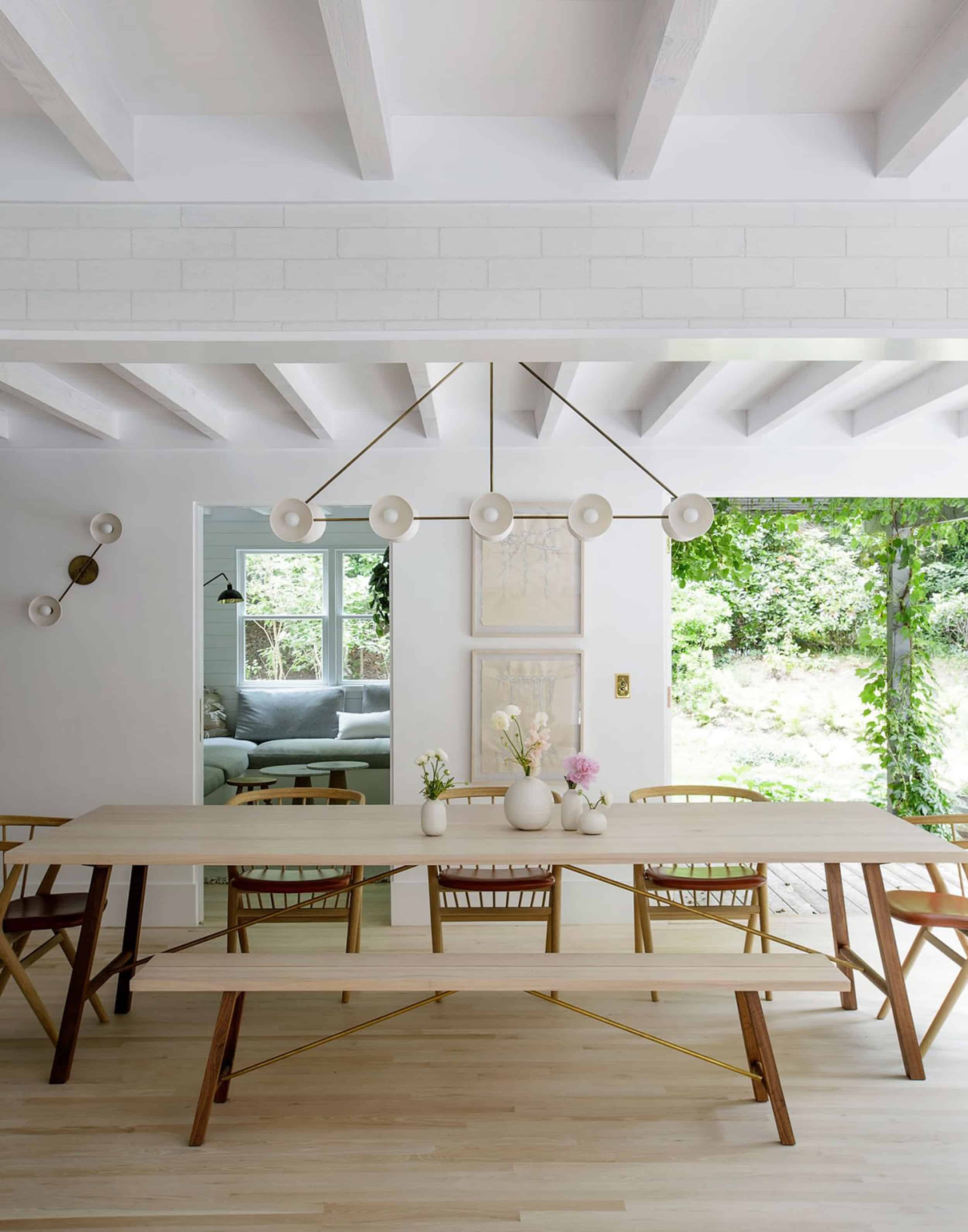
Dining Rooms
Mountain Fixer-Upper Lighting: Modern and Traditional Options
If I were a single lady on tinder I would be enthusiastically swiping, left, right, left, right all day, muttering ‘ooh, he looks nice!’, or ‘oh yep, he could be the perfect date to the Oscars’ or ‘Ooh I love his beard! …. I’m super optimistic and open, but ultimately so picky. While choosing lighting is far less stressful, important, daunting or entertaining as choosing a potential partner it is still challenging when you just like a lot of different things and can see how they could work in different ways.
In my quest to design this ‘Modern-Scandinavian-Rustic-Cozy-Mountain-Californian-Cabin-Chalet’ I’ve really scoured far and wide for lighting to help tell that story in an accurate yet forward way. Last week I blogged about the more soft and a more Scandinavian options, and today I’ll show you the more classic, cabin-y or UBER modern and minimalist options. I like too many styles. It’s a problem. Combining them all could look chaotic and messy… OR totally interesting and incredibly curated.
First up. The trend that is the least ‘me’ and therefore the most attractive right now – the linear, super simple. minimal lighting style. It’s hard, severe and just so graphic. Do you think it can work in a cabin? Looky here ..

These lights give INSTANT edge and take it next level – design-wise. They are just so simple while making a statement.

Often they’ll do something architectural or sculptural, but always thin, never chunky and certainly refined.
It’s the Tilda Swinton of design. It’s cool, smart…Not trying too hard and at times it feels intimidatingly edgy, but in a more homey cabin that isn’t super minimalist, I think it would be beautiful.
Now I present to you the linear lights that I LOVE and really really want to use.
[drawattention ID=”148087″]
1. Ginger | 2. Workstead Brass | 3. Le Lampe Sconce | 4. Cross | 5. Satellite | 6. Bastion | 7. Minimalist | 8. Astro Dome | 9. Workstead Black | 10. Krane | 11. Maison | 12. Cast | 13. The Double Arm | 14. Arrow | 15. Caravaggio | 16. Stanley | 17. Contrapesso Pendant | 18. Skal Arch | 19.Vela Octagonal | 20. Contour | 21. Leo Spotlight | 22. Le Lampe Pendant | 23. Folk Abigail | 24. Dixon | 25. Leather Wrapped Linear | 26. Gideon | 27. Haleigh
I want every single one of these and can picture where they would go easily in this house. #16 would go over the island in the kitchen. #19 could flank a mirror over a vanity. #20 could be in the living room near the fire place. #4 in the master bath, #17 in the guest rooms. They are all so simple that I don’t think that I’d get sick of them – HOWEVER, they are all also pretty trendy and I fear that the knock-off world is coming fast for this trend. Most of these are expensive and worth it, but that is another consideration – you know, budget. So I might splurge on a couple (#16) and I think that #4 could look great lighting a special ceiling (as well as down lighting).
Next up is glass.

In the name of ‘quiet minimalism’ nothing is more minimal than what you can’t really see (well, except if we only used can lights). And glass certainly keeps rooms feeling open and airy.

I would be opting for more handmade (mouthblown?) glass that doesn’t look basic and has some warmth to it. Something has to be more interesting about it – maybe it’s the texture, the shape, the color or the hardware.
[drawattention ID=”147928″]
1. Glass York | 2. Watts | 3. Parison | 4. Melt Surface | 5. Tim Lamp Cord | 6. Celestial Pebble | 7. Brass Glass | 8. Sculptural Glass Pebble | 9. Industrial Glass | 10. Classic Flared Glass | 11. Hemisphere | 12. Modern Vintage Globe | 13. Branching | 14. Crux | 15. Brompton Pendant Size 2 | 16. Hector | 17. Classic Textured Glass | 18. Rowan
#5 is GORGEOUS and the photo doesn’t do it justice. It’s so simple but there is nothing mass manufactured about it because it’s shaky and the thickness of the glass varies. #3 would bring in some color and maybe it’s not that color, but I like the idea of something special about it. #4 is weird and would definitely not necessarily work with all the other lighting we are talking about. When searching for glass sconces you find very few that peak your interest. #9 and #16 feel very scandy and simple to me, and would provide good lighting.
Next – the more utilitarian. This could ere on the side of ‘industrial’ but for this house, it wouldn’t. It would feel more simple and accessible – with a lot of directional light that goes old-world-European pretty fast.

This cabin won’t be too ‘modern farmhouse’ (although I love that timeless style) but if you think about older Scandinavian homes, there is this super simple utilitarian thing going on. It’s under-designed and I love that about it.

The shapes are simple and graphic and there are no bells or whistles or extra unnecessary parts. It’s just one pendant. One bulb. It also doesn’t create the best ambient lighting but WHO CARES? (JK we care)

[drawattention ID=”147933″]
1. Minister 1 Prismatic | 2. Heirloom Historic | 3. Classic Metal Bell | 4. Ship’s Large Deck Light | 5. Dalston | 6. Original 1227 | 7. Tied | 8. Metro | 9. Mac | 10. 20th C Factory Filament | 11. Coolie Prismatic Rise | 12. Atelier | 13. Leighton | 14. Malplaquet Double | 15. George
Couldn’t you see those in the cabin/house as well? #1 is strangely appealing to me – not at first but it’s porcelain and hand-cut fluted glass so I think that in a way it’s actually really simple but special. I’m OBSESSED with #8. That detail of the mechanism takes it from basic to special (I almost wrote ‘basic to bitchin’ for phonetic reasons then decided against it because, THAT WOULD BE SO BASIC).
Of all the categories this is the one that I’m least excited by (except those two that I just called out), but I wanted to walk you through my thought process and blab what is in my head. #externalthoughtprocessor
Next up. One that is EXTREMELY tempting is the ‘updated simple classic’. It’s hard to say no to these profiles.. how functional they are. How simple they are in design and how well they light a room.

Matchstick sconces, arched double sconces, linen shades – these are all the things we’ve updated for decades and every year we simplify them even more.

I love every single one of these below very much.
[drawattention ID=”147939″]
1. Shaded | 2. Kings Point 2-Light | 3. Malden | 4. Lucca | 5. Berkshire Double | 6. Wright | 7. Modern Taper | 8. Petite Candlestick | 9. Berkshire | 10. Jax | 11. Belle Meade Double | 12. Mel
#4 will likely be in one of my houses at some point. #11 is SO BEAUTIFUL and when done in black (which is available) it’s a tension-filled statement. It’s like your eye thinks it’s standard but the proportions and the dimensions are extreme in such a good way. #1 can articulate so that it moves to the side which I LOVE. #2 #5, #7, #8 are all classic and will never ever ever ever be dated. That is super tempting.
Q: Why choose anything that you are worried will at some point will be dated?
A: Because the pursuit of ‘timelessness’ often kills creativity. Also, do you know what else kills creativity? Pursuing mass appeal. But I’m trying to do all those things and it’s doable (just hard).
Last up – the lantern. It sounds boring, I realize but I LOVE A LANTERN SO MUCH.

It feels warm, grounding, familiar and effortless. It’s like ‘of course, there is a lantern pendant’ in this Scandinavian inspired cabin. It says ‘old world’ while also being new world.


Ugh. I know you guys voted for ‘Refined Scandinavian Chalet’ but these lanterns are just so perfect for a cabin. So we have to figure out how to do ‘lantern’ in a modern way.
[drawattention ID=”147935″]
1. Vic on Bracket | 2. Chisholm Clean | 3. Manor Contemporary | 4. Virginia | 5. Altamont Wet | 6. Square Pendant With Four Lampholders Closed Top | 7. Ship’s Well Glass | 8. Patina | 9. Carter | 10. Manor | 11. Narrow Box Wall | 12. Piedmont | 13. Chase | 14. Square Pendant With 4 Lampholders | 15. Lombard
I think my favorite light right now is #2 (but then again, I apparently have a ‘swipe left’ lighting personality and have already forgotten the first 3 categories discussed above). I LOVE THAT LANTERN SO MUCH AND YOU WIN ALL TINDER LIGHTING AWARDS IN MY HEART.
#1 is also a huge favorite until Brady told me that you had to put in a gas line to have it be lit all the time. I fired him for delivering that news. I then realized that they gave you a normal bulb option, so I rehired him. We are all good, although I may never forgive him for breaking my sconce heart. But it’s seriously so beautiful and warm and perfect for this cabin. We are using #15 in brass in the Portland house (and it’s so beautiful and simple and classic) and #9 #10 and #12 are super attractive to me for a variety of reasons. They are all classic, but feel modern or special in different ways – the lines, the shape, the scale, the finish …
WHO WILL GET THE FINAL ROSE?
Now that you’ve seen all the categories I’ve chosen from you’ll start to get some lighting plans per space. I’m mixing a lot of these together (not all, obviously) and I’ll come up with a lighting plan that is both functional, beautiful, unexpected and yet appropriate.
But for now, how are you feeling? Do you think I can mix all these styles seamlessly? (I don’t .. some will be eliminated). What are your favorites and which ones would you be sad didn’t get picked?
Update: Check out all of The Mountain House REVEALS here: The Kids’ Bedroom | The Kitchen | The Kitchen Organization | The Kitchen Appliances | The Powder Bath | The Living Room | The Downstairs Guest Suite | The Loft | The Hall Bath | The Upstairs Guest Bath | The Dining Room | The Family Room


Hi Emily! I’m a huge fan of your work. I just have a suggestion for your photos on the blog. Whenever there is a vertical photo I can never see the entire thing because my monitor isn’t tall enough so I have to scroll through a photo. A lot of bloggers, when posting a vertical photo, will post two photos side by side to make the tall photos smaller and more view-able. Just a tip. I find it hard to look at a lot of photos on your blog because I can never see them in their entirety and it just gets frustrating.
Keep up the beautiful work! I’m enjoying seeing the mountain house progress.
Have you tried reducing the size of what you’re seeing on your screen yourself? Is it a laptop? If so you may be able to just use your finger and thumb on the mouse tracking area and pinch them together. This will reduce the image by whatever percent you want. Then when you are done you use your fingers to pinch out and away from each other to reset it.
Hiya! You can actually click on the photo to make it full size (but smaller). But that is a good note! The reason we do it separately is so people can pin just one image, but maybe there is a way to put in to images, that aren’t combined but instead just sit next to each other. I’l look into it… thank you for your feedback!
Hi, web designer here! Photos side-by-side are not mobile friendly at all. Those of us on tablets, phones, and even small laptops would not have a good experience with side-by-side photos. To improve large monitor experience, a better solution would be to reduce the max width the content on the page is allowed to stretch to.
In other words, the site needs to be much more optimized for reading on ALL screen sizes: tiny to huge. Personally, I mostly read the blog on a small iPhone SE and a large tablet, and it’s not optimized well for either. I usually am forced turn on Safari reader mode in order to read the content because the default experience is so poor.
I hope that’s constructive. I love your work and still read the blog daily, site accessibility/readability issues aside!
I like linear and graphic, personally. It’s a nice juxtaposition to the cabin vibe. 🙂
I love the Lanterns too! I would be sad if you put too many modern fixtures – I gravitate toward the classic and simple myself. I think you should stay classic in the lighting and use wall treatments, paint, furniture and styling to evoke the “changed style” you want. I think it will be stunning when your done and I think you will not be sorry later.
Linear for sure.
And from a content-generation/trend perspective, definitely not utilitarian, classic, or, lanterns. Have seen that all so often.
(Also, seems like you have a new ad manager? I have no issue with ads, but the popup for email, the bottom banner, and the side panel that changes seem to slow the load of your images, and make for a lot of reloading of the page? Am I making that up?)
I agree about the ads reducing the viewing pleasure. I find it annoying to be reading something on the screen when that constant movement of the coming and going in the side panel catches my eye.
I realize that the ads pay for the site (along with sponsors) but is there a way to halt the movement of the ads in that right hand panel?
Thanks for considering this.
Hey guys, I’ll look into it! We definitely don’t want to slow things down …. thank you!
I’m glad it’s not just me! Especially since I often come to the blog posts through instagram, which is just a little more clunky and slow than accessing them on a regular browser, the ads seem to be slowing down the page loading quite a bit, and the pop ups about signing up for email can be tough to dismiss. Ugh, I can’t imagine trying to optimize a webpage for not just mobile browsing, but browsing through insta/pinterest and all the complications that come with that. I don’t envy web designers!
For this particular house, I favor the glass lighting most (particularly Glass numbers 3, 4, 14 and 16). The glass lighting looks very hygge to me, and juuust right for this house. However, there are options I like for this house from all of the categories in this post (e.g. Utilitarian number 3), with the exception of the lantern category.
While I love a good lantern (e.g. in a colonial house), I don’t feel like it’s the right direction for this house’s style. It seems like the lantern “frame” parts could make the space feel more closed off visually, as in, the lantern-style lighting would read more like an interruption than a continuation of the stylistic flow. Maybe it’s just that the lantern shapes shown in this post are boxier and less curvy than all of the other lighting shown here, and I think curvier lighting would work better for this house.
Hi. I feel like the last 2 options are kind of safe. The classic and simple remind me of what you have in your current house and they work beautifully there. This cabin should have a completely different feel so I like the first 3 options, they are interesting and fun!
You are totally right – the classic and simple is what we have in our house. I do love it though!!! and its just so safe …. 🙂
I’m so in love with all these options and have a whole new appreciation for how you and your team scour the web for these interesting options! That said, I’m getting so lost on what the vision is for the mountain house! Is it modern? Rustic with pebble tile? Country cabin? Its like I’m reading a psychological thriller and have no idea whodunnit yet! Itching for the next process photos to know more!
HA ME TOO 🙂 Stay tuned ….
Linear and Graphic! Would be a cool juxtaposition.
The glass and linear are my favorites. One thing that stood out to me in this post is how neutral all of the photos are. Every picture is pretty much white, black, gray, and navy. I don’t know if I would have noticed in the past, but my two daughters (five and four) are always insistent on color…in clothing, pillows, furnishings, everthing! Although the photos are beautiful and refined, they seem like a less fun place to live. Or maybe I am just telling myself that because my house is a rainbow right now. 🙂
Wow, so many beautiful choices.!
From the “before” photos of the house, it looked like there were some spaces with flat (not vaulted) normal height (8-8.5 ft) beamed ceilings. I’m not sure if this is correct or if they will remain but I have this situation in several rooms in my house and am struggling to find good ideas. I think it’s difficult to photograph but I rarely see anything like this so I’m watching with great interest.
#5 lantern (I don’t mind seeing bulbs in light fixtures in general, but for some reason in a lantern it drives me bananas. Except in #5. I think the black background makes it work.) AND #6 glass, hands down, love them both for the mountain house. I have zero explanation to back this up–but those are the one that completely jumped out to me!
If I had to choose a category — i’m all glass, all in, 100%! Non-clear glass with a some curve and texture would give a little cozy, a little sleek, a little shine & a little unexpected.
My favorites for a Scandinavian-inspired California Rustic Modern Mountain House…
Linear & Graphic: 6, 15, 21 // Utilitarian: 1, 11, 14 // Modern Lantern: 2.
Classic & Simple feels too close to your current house and maybe too refined/elegant for the mountain house. I love many of the glass options but none of them felt appropriate for this project. A lot of the ombre/tinted/smoked glass does feel trendy and maybe too contemporary here. LOVE Modern Lantern #2.
i’m totally in line with you. couldn’t agree more you. you need a job? 🙂
Agree with April’s choices 100% – also her comments on the glass choices – so won’t repeat them. I’m really excited to see you use some modern lighting than you (and I) usually wouldn’t use.
The modern lantern #2 seems like it could play nicely with the linear options, but I wouldn’t be sad to lose the rest of that category or classic and simple.
P.S. I have different versions of the HTC Hector lights, and the shade glows beautifully.
I love learning about your process for decisions like this as I can tie myself in knots over such questions! I tend to go for more traditional lighting in my own home, as changing out light fixtures is one of the last things I ever want to do (as I have already tied myself in knots to pick the ones I have!).
I do love some of the linear options and think that well designed & made things can hold their own as trends come and go. I could see either utilitarian and traditional mixing well or linear and traditional, but linear and utilitarian seem to me like they would not play well together!
If you do go lantern – I would go for one without glass in it – one less thing to clean!
I second the “without glass” idea. Ease of care is good everywhere but especially for a weekend house 🙂
linear and graphic all the way! the utilitarian is my least favorite… too 2013 for me 🙂
I NEED those glass lighting fixtures in my life (and by in “my life” I of course mean in your home that you take pictures of and let me ogle at). I may have gasped at the lights in the first picture in that section. Love them!!
You will work out a mix that is uniquely right for your mountain house and you! Bravo for daring to combine rather than pick from an already curated collection….it will be so much more interesting! (But harder on you!)
Here is one thing to consider (from my painful experience) in case it might help weed out some of the beautiful fixtures you are looking at: the glass fixtures will ALWAYS look dusty. If the fixture is far enough away that you don’t see the dust, maybe it won’t matter, but if they are anywhere near eye level it might drive you crazy. And cleaning them without creation streaks is not easy (impossible?)
Of course they all gather dust but some styles are more forgiving than others.
Just one factor that might help….
this does help. The glass was kinda my least favorite, although provides a ‘clean’ look. Looks like a lot of you are saying that it will look dusty which would bum me out … i’m trying to think if I have any right now and I don’t think that i do!
In my experience, the dust issue isn’t quite as noticeable if the glass is bubbled or textured in some way, but otherwise it can be horrible.
I’m about to choose lighting for a guest bedroom room, but I’m stuck! What is the light quality of a metal vs. a more permeable shade like glass or fabric? Do you like how it works in a bedroom? What about a chandelier?
Or we might scratch the whole thing and choose a ceiling fan. Although we have central air in this old east coast townhouse, it doesn’t work great in that room and a fan is a must in the summer anyway.
I don’t think you can go wrong with any of these choices! Usually I have strong preferences for some of your options, but these are ALL gorgeous.
In picking lights for my own house I am finding myself leaning toward glass options, especially the ones that are textured and/or tinted. I’ve also been trying to figure out how to afford the Apparatus lighting in your example of the “linear” fixtures, though 7 or 8 thousand dollars is just not in the works if I want to have things like an oven and a refrigerator. I LOVE a lot of their work, and the trapeze series is just perfect: if anyone wants to look at the whole line!
I love them all but I would definitely incorporate some of the glass ones; they just feel so nice for the cabin. Not that you need any more lighting ideas, but I’m in love with this sconce and thought of you when I saw it a few weeks ago.
If the base were white it would feel very Scandinavian-cabin (to me anyway) although I love the mint too for a kids’ space
Linear/Graphic all the way! The chalet/cabin will definitely still feel cabin, but the lighting will edge it up a bit. I definitely still think it would be cozy! And for added coziness, you could add a table lamp or two with linen shades for more ambient lighting.
So excited to see where you are going with this!
The tradition part tells us the creativity of the person. It is amazing.
I’m obsessed with Linear and Graphic!!
The glass category is my least favorite. Low impact, and I really dislike wavy wires. Love all the others but the minimal style is my FAVORITE! The lights you chose in that category are gorgeous!
Thank you for teaching me so much. I think I love the first round up things so much.
But–my real reason for commenting tonight is to ask if you have seen “The Great Interior Design Challenge” on Netflix. It’s what you did on HGTV but very, very British and crossed with Trading Spaces. The hosts can be so wonderfully snarky while trying to be nice or constructive. Their adjectives make the show.
It’s worth a binge watch. I skip through some of it. It’s relaxing to me because this is just my hobby. I wonder if you would enjoy it?
But others, it’s probably too late at night and no one will read this, but man is that a funny show.
I just got into this show and I LOVE it! I commented above about how I am noticing so many neutral rooms lately, and this show is opposite of that. Those people are not afraid to go huge on pattern and color. And their expressions and accents are a delight to listen to.
I love the lanterns more than I ever thought I would. #1 with the gas is STUNNING. I also really like the idea of a graphic linear one somewhere in the cabin. And how do you say no to a sconce?
Omg!!! It’s crazy about sacrificing timeless for style I’m always thinking about timeless just incase I need to sell in the near future. Rearely do i read full blogs but yours are amazing. Ive learned a lot of great tips as I am renovating my house.
I just purchased Modern Lantern #2 for a project and right now it ranks as my favorite light fixture.
Wow, so many great choices! I love the glass lighting the best, especially #2, #3, and #9. I think they would look great in a mountain house! The Utilitarian lighting also seems appropriate for a mountain house. And the Lantern #2 is another great one! I hope you mix up the lighting. Lighting an entire home in the same style is kinda boring! Whatever you do, I know it will look great!
Also, those glass doors (lantern pics) though? ?
Emily, you are a design rockstar! And I admire modern design more because of you. I like the black fixtures in the first two pictures. They remind me of a wood stove you would find in a cabin. I like 2#, 15, 17. Lanterns are always safe but maybe just ones without glass since it’s a vaca home-less dusting. 😉 I also love the antique brass finish fixtures. Wishing you luck from NC!
For the mountain cabin I would tend towards Utilitarian, with some Linear accents.
I tend to go with classic/background fixtures, with just 2 or three punches of very good (and expensive) design-y ones. Lighting can really elevate the design. You always make tasteful, fun and surprising choices, so just keep looking until you know you found the right combination.
I like all of these so much better than those in the first lighting post!!
Great blog with information about modern & traditional way of lighting. Nice keep writing. You can get also great furniture ideas from . Thanks
Lanterns all the way with some classic. I’m remodeling our house in a modern lodge style and your extroverted processing is helping me enormously.
This post was like an interior design journey–around every corner, something new to consider. Very intriguing! I’m confused by the first grouping; they seem to be a bit too modern for a house with pebble tile and a corner fireplace. Loved the organic glass shapes in the second group and felt that they most closely resembled *my* vision for this house (ha!). I could get behind something rustic or industrial. Lanterns and the “Classic & Simple” groups seem too traditional. But, I bow down to your design genius, so mostly, I’m just excited to see what you choose!
You are right. You need lantern #2 in your house. I’m not normally a big fan of lanterns, but that is one astoundingly awesome piece. Its a perfect mix of modern, simple, and familiar (which is an important component in coziness). It will mix well with some of the other styles you are looking at as well. I can’t wait to see what you come up with.