
Design
It’s Been 5 Years – Finally Trying Out My “New” Vintage Hutch
It’s a real “give a mouse a cookie” situation. Here’s what happened – I added that incredible painting in the stair landing, which brought so much joy and happiness to the room (and to me) and reminded me that I love color! Gosh, I really go in and out thinking “I’m sophisticated and love neutrals,” to “GIVE ME ALL THE COLOR”, like my daughter when she was 6. It has to do with life phases (when my life is more chaotic, I need neutrals, but when things feel manageable, I can go bolder). Surely a therapist could diagnose this as something. I mean, I always love color, but sometimes I want more and other times less. Right now it’s clearly more.

So yes, first the painting. Then we had to hire movers because both Gretch and I had hurt our backs (moving furniture, obviously), so while we had two dudes here moving a bunch of other stuff (switching the kids’ beds, bringing the arch cabinet and piano into the garage, etc), I got quite the idea. We’d finally try the world’s heaviest hutch in the living room. And I have a lot of feelings about it (the verdict is in, but the jury was not clear in their sentencing).
As a reminder, this was what was there years ago when we first revealed the living room (obviously in a more neutral phase of life). I bought that piece from Round Top. I think it’s French, definitely primitive, farmhouse, etc. But honestly, because of the light here, it just looks like a beat-up gray piece. Not the pretty blueish gray that it felt in our house in LA (I’m blaming the light here).
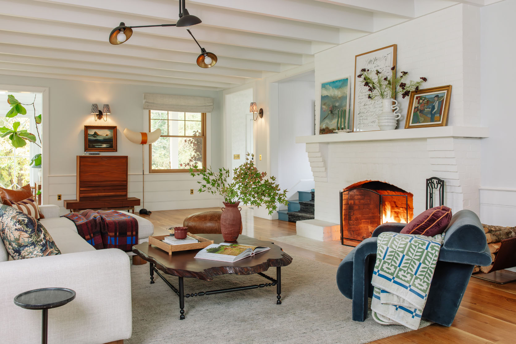
So then we swapped the gray antique piece with the midcentury piece, and I like it better for sure. The teak piece is a lot richer, simpler, but if I’m being honest, it’s not my favorite piece either. It was a last-minute FBMP purchase the weekend before the big Real Simple shoot, and it checked the box (and has fantastic storage), but it’s not super special or anything. So when I had the opportunity to try out the hutch, I did.
Where Is This Vintage Hutch From?

So that hutch was bought on 1stDibs a year before we moved into the farm (so 5 years ago?). It’s from Sweden (I think, maybe Finland) and I fell in LOVE with the color and patina. I was originally going to put it in the sunroom (aka the formal dining room that I use as my office), which felt appropriate. But that was the only wall in the entire house that the Blimp art could hang (and it’s my favorite of all my vintage art). So the fancy Swedish hutch, weighing no less than 600 lbs, stood in the guest cottage, cluttered with stuff for almost 5 years now. It’s finally inside, and I have a lot of feelings.
Why Wait So Long To Try The Vintage Hutch Inside?

There really wasn’t a spot for it (remember, there was a sconce here), and it was so unbelievably heavy that I wasn’t going to torture Brian by “playing around” when even I was extremely doubtful. The night before it came inside, I told Brian that it’s time to try the hutch inside and that the movers were doing it. He said, “Are you sure?” and I was like, “Absolutely not. In fact, I think there is only a 45% chance that I’m going to like it in here”. Those are bad odds. But we wouldn’t know til it got in here. My doubts were high, but my hopes were higher, and with skilled movers, now was the time.
Blush 96″ Barb Sofa | Blue 84″ Barb Sofa
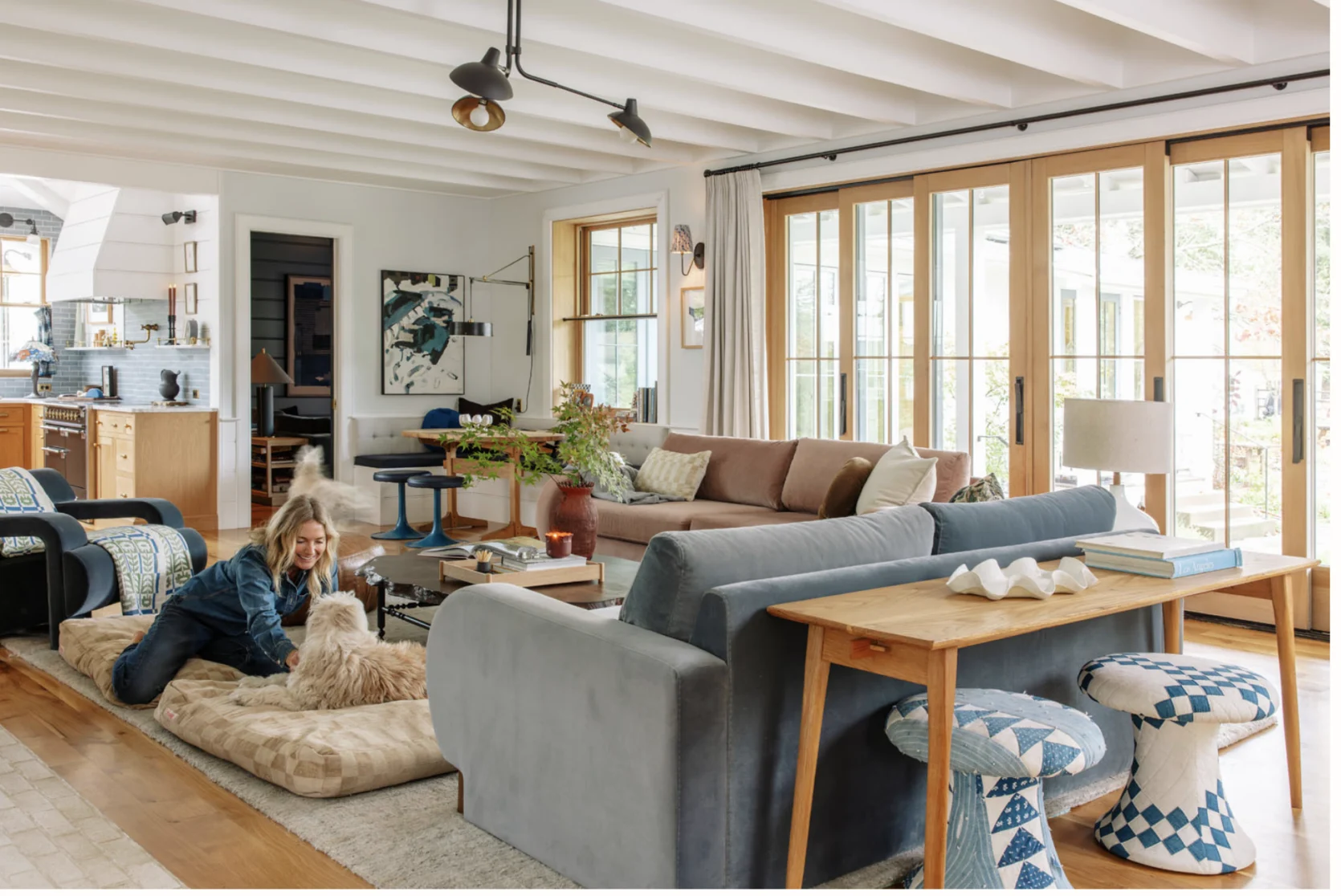
The second it came inside, I knew it wasn’t a “hell yes”. Let’s break down why it’s not a slam dunk (or even a layup):
- First off, the blue behind the blue sofa is not ideal (and we knew it, but wanted to see if I could make it work). It’s not balanced (which is why I brought the chaise to the foreground – the tones work better and the antique-ness of the two pieces talk to each other).
- For whatever reason, stylistically it feels off. Something about the patina on the wood with the luxe velvet and newness of the sofas, maybe? Gretch, Kaitlin, Marlee, and I stared at it, and we just couldn’t put our finger on why it’s not a “hell yes”.
- At first, it was centered between the sunroom and the window, and it was just really intense, dark, like a monolithic, big dark thing that pulled your eye in a really bad way and felt so abrupt. Once I offset it and softened the lines with the cherner chair and the art, we liked it so much more, but it’s still just fine.
- It’s too intense, and it competes with the white fireplace, and it wins, but it shouldn’t win – the fireplace should be the focal point.
It’s not the worst! Oh, and yes, I was going to replace the handles with unlacquered brass, obviously. I think you can see why I wanted to try it, but all of a sudden, the living room became busier, messier, and just off-balance.

Once we got that in, we had to move the vignette in the corner (the chaise lounge or the Soho home chair) because it felt like SO MUCH FURNITURE. So I brought the bench from my bedroom, which I actually really like, so I might either get a bench for here or a new one for our bedroom.

Originally, I was nervous that coming into the side of it would be bad/overwhelming, but that wasn’t really the problem.

Blush 96″ Barb Sofa | Blue 84″ Barb Sofa
I think if this room were darker in color, it wouldn’t feel like quite the monolith that it is. Color-wise, it’s good, it’s just the location, the size (huge) made my fresh, colorful Scandi room feel immediately crowded.

But I wanted to show you how the landing vignette looks from the living room – I LOVE IT. And here you can see the French piece from Round Top working better on this side of the room, where it gets more light (but it still looks drab). I think that both of these pieces are going to look way better in the 1850s guest cottage with rustic wood all over the walls.

It’s cozy. It’s eclectic, and it’s a room that is fun to be in. But just too much going on. So fun to try and see, but ultimately it’s a no.
What Piece Could Work??
So I asked Gretch to Photoshop in some alternatives to see what direction I should head.

At first I thought a lower, wider, and lighter wood cabinet would be the solve. And I like this one (from Lulu and Georgia), but then I realized it still felt heavy. So we tried another one…

This one is smaller in scale and would give more breathing room around it (and under the sconce). I don’t mind this – the lightness of it works more!

But then I realized that maybe we need to go back to a more counter-height table. Our wainscott is 31″, which is actually kinda low for a lot of sideboards. But I did find this one from Rejuvenation that is 29″ tall, so it would fit at the height of the molding (which sticks out). I love how this looks, for sure. It’s a more serious piece (more trad than Scandi). The room feels so much more open and less cluttered. BUT…
You have to remember that there is a sofa table behind the blue sofa that I love (and fits perfectly, and houses my cute mushroom stools), so I don’t really want to put two consoles so close to each other.
Then I Had An Idea…

Maybe it needs to be a lower chunky living room dresser, more of a “chest of drawers” than a bedroom dresser. I love the one above, and it is sadly a few inches above the wainscott, but otherwise it’s pretty perfect. The shape, size, and function of it are different than the sofa table, so it doesn’t feel weird that there are two surfaces so close to each other (and P.S., we use the sofa table for drinks when we are hanging out in the living room). I also love that this dresser gives a rounded vibe, versus the very linear sofa table.

Here’s another rounded-shaped cabinet that is so pretty (but admittedly hard to see in the render). It’s darker (and comes in different finishes), but I thought that the darker tone might go with the kitchen island in a nice way.
All in all, it was a fun experiment, and I figured even if trying the hutch here was a fail (which it turned out to be), I’d get to talk through why and maybe it would help me figure out what would work (which it did!). I probably could have just photoshopped it in (and we did), but living with it for a while has solidified that it’s too heavy, dark, and big for this room. I also want to say that those dog beds worked a lot better when the living room was more neutral. Now there are so many tones in here, and it doesn’t know if it wants to be bright and colorful or neutral and warm.
Style. Play. Every day, right??? And for the sake of democracy, I think a vote is in order. Which pieces would you replace the hutch with?
*Photos by Kaitlin Green


I am pro dog and dog beds, but they are distracting in this room.
I actually love the hutch in the room- color, placement and all.
But my vote would be #4- adding a dresser is always a win for me- I love the extra drawer space, too.
I love the room😊 cozy, fun and welcoming.
My vote would be the room needs less furniture not more – if you absolutely need something there move the sofa table to where it is and put a pretty quilt on the back of the sofa.
i was going to try that this week. I agree!
I honestly think the hutch looks absolutely fine where it is. It has personality, gravitas and being slightly off in the best way. It is probably you are used to seeing neutral things that this looks overwhelming at first. The other 5 new options doesn’t have the same level of interest a the hutch has.
Keep the hutch and bring back your original pair of green sofas facing each other. The actually-Scandi, actually-farmhouse hutch is what works here! The chaise looks fab too. The sofas I feel are the problem…!
I so agree with this! The hutch is beautiful and adds some real scandi/farmhouse vibes and brings in some richness with the chaise. The richness of the color also adds a nice counterpoint to the TV room sneaking through the door on the opposite side of the room. I think switching the sofas (blue for pink) as another commenter suggested could also make things sing.
Agree 100%. It looks fun and cozy!
Came here to say exactly this.
Absolutely! The hutch communicates with the history and bones of the house in a way that feels lost currently with all the trendy/midcentury inspired forms. I really miss the vintage farmhouse feeling the house used to have.
I agree 100% here – the colours of the sofas are making this whole room look flat to me.
If you style the hutch with light woven baskets or wood objects, i think it would help make it feel better. the books play as noisy and detract from the gravitas of the piece. The blue grey couch might work better elsewhere. The blush and the chaise both work well with the piece. You say the fireplace is intended to be the focal point, but with it all white, it really doesn’t look like it is intended to pop. All that said, THANK YOU for inviting us in to give feedback on your home. Your openness is a true gift to us.
I love the blush couch here too. I am in my “color-era” and think it’s a surprising but pleasing color addition.
The french cabinet looks great there as an alternative…
Totally agree — the green sofas would look great with this!
I also agree with these comments! Either two blush sofas or two green ones. The shade of blue on the current one seems off for all the other blue and green tones in the room. And I also love how the chaise and the hutch balance the darker den.
I would also keep the hutch. Maybe move it more to the left and switch places with the art?
i really like the hutch! It adds a nice vintage look and seems to have a story to tell. It ties so well to the bold print of the chaise. Remove the dog beds an it’s a well designed and interesting space.
LOVE this type of post to read through all your considerations for what’s working and not working! Extremely educational. I liked the rejuvenation console table’s lightness until the problem of two console tables facing each other was pointed out. The rounded shape of the chest of drawers is really pretty so that’s probably my vote.
I can’t remember where the piano was before, but would the piano fit in that area? It feels like it would be nice to look over and have an obvious functional reason for why there’s more furniture over there.
Yes! the piano went there and i’ve thought about bringing it back, too.
Out of curiosity why did the piano go away?
FWIW I would like to see the piano to the right of the fireplace, where the French piece is right now.
I actually love the hutch there! (Perhaps I’m biased being Swedish). I think it makes the blue walls sing. But as you are saying, it becomes the focal point of the room. But perhaps that’s what the room have been missing? Somewhere for your eyes to land? I’ve never was a fan of painting the fireplace white. I’m sorry to say that I do think that’s the biggest mistake in this room. Not to sound negative, it’s still an amazing space! So how about looping back to either try to remove the paint or paint it blue so it centers the room? I think that would help with it feeling less busy as well.
I agree – I think the reason why the hutch looks off in some way is that it becomes the focal point. The fireplace is the natural focal point, but since it is white, it tends to fade to the background, especially when the tallest, imposing (but in a good way) hutch is in the room. I would be curious how a photoshopped image with the hutch but a brick fireplace with a natural wood mantle would look. Or maybe some beautiful blue tile around the fireplace and on the surrounding floor? My fireplace has a white painted mantle, but the beautiful tile on mine adds so much warmth and depth. You might consider something similar (especially if you want more color, not less in the room).
I agree! What feels off to me is the white fireplace. I think it needs to feel more like a focal point and draw the eye. The room is eclectic and fun but the fireplace isn’t getting the attention it deserves and anchoring the room.
Yes—a wood mantle and blue-and-white vintage tile above the mantel would be beautiful and restore a focal point at the hearth. The white brick can remain below the mantle as the surround.
Totally agree here, the hutch is lovely! (I’m norwegian btw). I have to agree with the others pointing out that it becomes the focal point here because the ‘real’ focal point, (the fireplace), just fades into everything else being white.
Also, I think overall it’s too much furniture in the room, it becomes cluttered and there is no rest for the eyes. The blue of the hutch is lovely and saturated, would look good with the green sofas you used to have there
Agreed. The blue of the hutch makes the blue couch look gray. Bring back the original green sofas, and clear out and simplify the rest of the furniture and decor. There’s too much stuff and too much going on, and it’s all fighting each other a little bit.
Ooh maybe i’ll photoshop them in (or photoshop the hutch into that shot). The problem is that these sofas are SO COMFORTABLE. but its the same with the rug – kinda boring, but so good for the family that its hard to give up. The sofas are probably not the vibe here (never designed to go in this house) but super comfy and the Alice sofas were less inviting and warm. I’ll keep playing 🙂
I think that means you need to design a new sofa style ;). Matching dark blue sofas could work too, since you love blue so much. I just think they need more intensity and want to be the same color.
Keep playing. I really like the white sectional in there, too. It’s a bright room, so white works, especially with your dark coffee table and the white fireplace. Crisp, clean, less is more.
Could you mabe get a slip cover made for them? So you could keep the comfort but change the look?
I voted for #5 but I’m also Team Hutch. In fact, I was surprised to read you didn’t love it because it seems to work in all the photos/angles. I don’t think it takes away from the fireplace at all, and creates a nice balance in the room.
I actually love the hutch. I vote for it. It is interesting and adds a nice height and color. I think it looks great in there.
Do you need the storage? What if you have nothing against the wall and just hang art? Or just the Cherner chair under the art? If you have the chaise where the bench is now, it doesn’t seem like it would feel empty over there, but it’s hard to know without being in the room. Good luck!
I agree! That part of the room doesn’t need furniture. A centered piece of art would even be enough. You could let the space breath and keep the focus on the living area.
it might be a big empty space but i could try it? but i do like the idea of moving the sofa table to that wall instead. We do use this for our day to day storage, actually but could try to find an alternative space for everything.
Maybe it feels different in real life but I agree with everyone who has commented so far– I love the hutch! I think it brings the perfect amount of color and the scale seems right for the big room. I like it much better than any of the alternatives!
Team Hurch here 😉 How about switching the two sofas (blue one facing the fireplace)?
That’s what I was thinking, also.
the sizing doesn’t work! but yes I wanted to try that. the color balance would be better (the room is long and narrow so we’d want the longer sofa to face the fireplace). But maybe i’m being too rigid 🙂
I am with Patricia … nix the furniture hunt and put up a big beautiful art piece on the same scale as the colorful one now on the landing, swapping the sconce for a picture light. I think that sconce may be one too many anyway? And if the dresser is the route you decide to go, no sconce would make it easier to play around with a cool lamp and vignette on the surface
the wainscot molding sticks out about 2″ which is a bummer for this exact reason (you can’t hang art over it) but without the sconce we’d for sure have more space. I like the idea of making it a picture sconce!
Do you not have mirrors because they’re problematic to shoot? I feel like the dress and a mirror might be a nice “moment” for that space. Also like the hutch and agree that the green sofas would go well. The blue hutch really washes out the current blue sofa in the photos.
Are the couches the same size? Can you swap the couches? All the blue items behind the peach couch could really complement each other and help with the feeling of too much blue on that side.
I feel way too much furniture in the room. Love the blue hutch but in the middle of the wall with nothing else around it. The fireplace looks “messy” with all the different pictures as well.
Agree. The hutch looks great but there’s too much stuff around it. Remove the chair and art, center the hutch, and leave the small stool next to it for contrast in heights.
My view is that the blue hutch could work if the green couches were in here. The 2 different blues, along with the blush and then the patterned chaise, just aren’t working. I loved the chaise where it was before. As part of the couch grouping, I just don’t like it with the blush sofa. I am really glad you played with the idea, and the renderings of other options are fun also!
I think the hutch would work if the blue sofa was removed and a chair (angled, opposite the chaise) replaced it.
The hutch is gorgeous and perfect there! I’d simply other furnishings (the bench from your bedroom, for example). The mix of blue-grays and blue-greens is interesting rather than too much. Have you tested the hutch for lead? Not knowing the history of lead paint in Scandinavia I’d test that.
I want to see the hutch to the left of the fireplace – I feel like it’ll be less visually heavy there as it’ll be setback from the fireplace and also the heft of the fireplace will balance it out better than standing by itself feeling like a giant.
Also, do you really need a piece of furniture over there behind blue sofa? Maybe hang some art and let the space breathe.
I would have voted for the vintage hutch. But since that’s not an option, I would nix any of the furniture and put either a big mirror or a big piece of art in that spot.
I love the hutch and was disappointed as I kept reading that it didn’t work for you. The two green couches facing each other with that hutch would be beautiful together. You decorate the fireplace mantle so pretty that I still see it as a focal point too. If the hutch has to go, number 4 is my pick.
Although I did vote #4 I also feel there is too much furniture in the room. The hutch could stay or go depending on other furniture that you decide to remove or rearrange. You could put the bench that you put at the window where the hutch is instead and add more art or a mirror, etc. By that window I would put three plant; one taller and one shorter on the floor and one hanging off center in the window. This would give you an entirely different vibe than anywhere else in the living room instead of all furniture or art.
Or you could keep the hutch and change out the grey blue sofa. You could put the chaise there and the big chair you have where the chaise is now.
Maybe in person it doesn’t read as too much big stuff but in the picture, with or without the hutch, it seems to read that way.
The living room and house have great bones and so at least this is the fun stuff!!
I thought I was going to be option #4 all the way, but when I saw them all side by side, the darker wood tone in 5 repeated the darker brown in the dog beds and also pulled in the darker tones from the chaise (which I really loved in this space – the added pattern is really nice). And if it also repeats in the kitchen, great! I love photoshop – I’m often surprised by what I notice when the options are all together. Thanks for the Monday morning thought exercise!
I think there’s already enough furniture in the room, especially with the sofa table, and you could just hang art without a furniture piece there.
Bring back your lovely green sofas!!
I’m surprised people think there’s too much furniture. This is a really big room, although photographs do tend to compress perspective.
I agree with the thread that the problem is the sofas, and those being big color blocks probably makes the space feel more busy. Because the hutch and chaise (which I love) have more color intensity, the sofas need that too imho.
Emily, I like the hutch and think the height works well. But I think if you’re getting rid of the hutch a bookshelf in the same general size would be the best alternative to a low table. The mixed colors of books would add some depth and richness and make it feel less like just “adding a piece of furniture” to an an already-crowded room.
Agree, and then the piles of books everywhere would have a place to live.
Agree! Was going to suggest a low bookshelf. It will have purpose, be a surface for lamps, styling etc and I don’t think the book will be too busy as you won’t even see most of them. But I think a tall bookshelf would work too!
Team Hutch for the win! The scale of the sofas are off in addition to the blue color. They are very chonky. The hutch gives the room soul. Is there a rule that says a fireplace has to be a focal point? The hutch is a much more interesting and bold focal point. The chaise with the hutch is a chef’s kiss!
I love the hutch.I think it anchors that end of the room.
I too am Team Hutch (that should have been an option!), and agree that there’s simply too much furniture in the room – no place for the eye to rest. But then, I’ve felt that way since the blue and pink sofas entered the picture (at least I’m consistent!). The hutch brings back that nice Scandi vibe you were originally aiming for. And yeah, the dog beds…
I’d like to see the hutch with the white sectional. That shot with the white sectional and teak piece is the best of all the different versions, because it’s way less stuff in the room. I’m itching to rearrange that mantle, though 🙃
I *love* the hutch in here. It grounds the room in a pleasant way and brings the eye up; it makes the ceiling look higher. I’m glad to see the chaise chair moved away from that spot by the window; it always looked crowded having a chair moving into threshold of the sunroom.
For me, the thing that feels most off about this room is the paint color. I’d love to see a warmer neutral, perhaps a pinky beige or taupe. The minty baby blue (at least that how it reads on my screen) has always felt at odds with the vibe you’re after.
The room color looks mint green on my screen, too. I’ve always thought a slightly warm white would be the way to go in the room.
The hutch is giving too much height on that wall. That is why it feels and looks unbalanced. The vertical plane of the window, the hutch, and the art is all the same. I also think you have too many distressed case goods, which is making it look like a secondhand shop. I personally think what that space needs is a more refined demilune cabinet.
I’m glad to see the vintage hutch get its moment. 🙂 I don’t hate it in pictures, but I can see how it might tower in real life. I am curious about the comments suggesting to try the art on the other side. I think it could be really really good with different couches but agreed that all together the colors don’t work great.
I don’t love the idea of another something low there. It feels like everything is one plane/height – couch backs, low tables, the French Roundtop piece (which I really wish was the blue color of the vintage hutch lol), etc.
I think I like the idea best of a tall leaning mirror in that spot. I don’t think there’s one in the entry.
If it must be furniture…did you consider the arch cabinet that was in the upstairs landing/guest room in this spot? I think that would be nice warm wood tone, and the glass doors help it feel a bit more open.
I’m team hutch or piano but one thing I didn’t spot in your post was what function you wanted the piece to play in the room. Do you need more storage here? Is it only about looks? That might help narrow down what would best add to the room because I agree with other commenters, it’s starting to look a bit busy. Still beautiful but maybe on the edge of too much, at least for me.
I’m thinking there is a little too much going on in the room furniture wise. Feeling maybe like there a little too much going on all around? So I would have to go with option 4 because it is less furniture. But I’m going through a less is more phase I think. The furniture is feeling all too big and heavy for the room.
I love the hutch even though we just got rid of an equally large one. 🙂 I tried to vote for #4, but it didn’t seem to go through. Good luck! I am still struggling with what art to place behind our lower TV cabinet.
Love how you take us thru your process …helps me feel better about my process ! I love what people are saying …the green couches with the hutch , maybe a little less furniture , and ideas about the fireplace …but fun fun fun
The hutch is gorgeous – although I can understand how it becomes too much the star of the show.
I also really like the hutch there! It’s really well balanced with the painting and the beautiful chair on the side. Maybe you should switch the sofas around? Put the pink one in front of the hutch and the blue one where the pink one is? So it will be less of a big blue focal point. I’m not a big fan of the dog beds in that spot either—I don’t think they really fit with the vibe.
It often looks very different in real life compared to in photos! I have complete faith in you to find the perfect solution… before the next perfect one and the one after that! 😉
I like the hutch and the artwork there. To reduce clutter feel, I would try to remove that odd sculpture thing that is in the corner near the entry. To address your blue not matching issue- try switching the brown and blue couch. Again, to reduce cluttered feeling, remove the sconce form the wall between staris and entry and perhaps remove the chair that is next to the blue hutch. Keep the hutch!
nothing helpful to add except to say i love the hutch!
Love the hutch but yes, its too monolithic and competes. I love the blonde wood dresser, it just makes the room feel lighter. I think a hutch is tough to find the right space for, it needs to be the star of the room for sure. Love seeing all the options though!
I like the blue hutch and the artwork there. To reduce clutter feel, I would try to remove that odd sculpture thing that is in the corner near the entry. To address your blue not matching issue- try switching the brown and blue couch. Again, to reduce cluttered feeling, remove the sconce form the wall between staris and entry and perhaps remove the chair that is next to the blue hutch. Keep the hutch!
The hutch is fine as it gives grounding and a focal point, and I think everyone saying to bring back the green couches are right, but your real issue is that you’ve gone overboard on the vignettes and lost for the forest for the trees. I think there are just too many accessories and “moments” in this room so there is no place for the eye to relax in a photo. I get that they’re fun to style, but stepping back from the immediate surface of the styled piece shoes that there are at least 6 others styled surfaces in the room, and it just looks cluttered. I would remove: the curly sculpture and stand in the corner by the window the coffee table books on every surface the art on the mantel – feels random and not cohesive with the statement piece at the stair landing The multi-coloured vases on the mantel The dog beds – they clash with all the furniture and patterns, and maybe don’t need to be in the photos the current pillows and blankets on the couch – I think maybe some that unify the chaise and hutch would work better But yeah, I think… Read more »
Agree with the commenters re: keeping the hutch and adjusting the couches (back to green?), and minimizing the furniture pieces.
My eye really wants the hutch to be centered. What does it look like inside? You could remove the upper cabinet doors and have open shelving . . . and even paint the inside a lighter tone. This would break up the “heavy” blue and also create book storage.
Wish a photo of the hutch centered without art and chair was shown, I like it in the room and think it could be utilized and styled with doors open at times with framed photos, books, small lamp on interior shelf but other times with closed doors. Would you consider switching blue sofa to kitchen side? I think the chaise (if it is comfortable for use) would be great on stair side of room but angled toward the fireplace, sharing a side table with the blush Barb seems very cozy for reading and watching the fire. It seems if the busyness is bothersome, simplifying the mantel items and covers of dog beds would help. Not wild about any of the options for vote but definitely love hearing your process and how it actually lives which is the most important!
I like the hutch (or the idea of a large hutch on that wall) because it does give the eyes a place to rest. There are so many knick knacks and small decor items that it feels busy and not really “done.” Maybe the gorgeous large painting on the landing works so well is because it is one piece and my eyes rest there taking in the color and “oneness” of the art. Not a bunch of framed paintings that bounce my focus.
Also the white fireplace would be so much better with some tile, someone an hour ago suggested vintage blue and white tiles and a wood mantle to make the fireplace a natural focal point.
Your sofas are beautiful but don’t seem to have any connection to the style of the house. Bring back the green sofas and see what it all looks like together.
Now I invite you to my house to send your suggestions! Thanks for letting the whole world make comments on your home. 🙂
I don’t think it works in the room currently but I think it’s worth switching things up for. It adds soul the room is missing.