Design
4 Bathroom Color Palettes To Seriously Elevate Basic Builder-Grade Fixtures
There are many types of readers out there. Maybe you live in a home you own that you’ve made completely your own, either by way of building custom from the ground up, or renovating/tinkering with something preexisting until it was just right. Or maybe you own a home but don’t really feel the need to make major changes to your builder-grade fixtures, be it for budget purposes or you just aren’t bothered enough. Or the third category (the category I’m in): You’re renting and either have finicky landlords or you don’t want to spend money on a ton of reversible changes you likely won’t be bringing with you to the next place. I’m sure there are other “categories” of readers here I’m missing, as everyone’s situation is unique, but today, I’m focusing in on the second and third type.
Specifically, how to improve some basic bathroom, builder-grade fixtures without ripping them all out and replacing them. As a reminder, every single one of the bathrooms in my rental townhome looks like this:
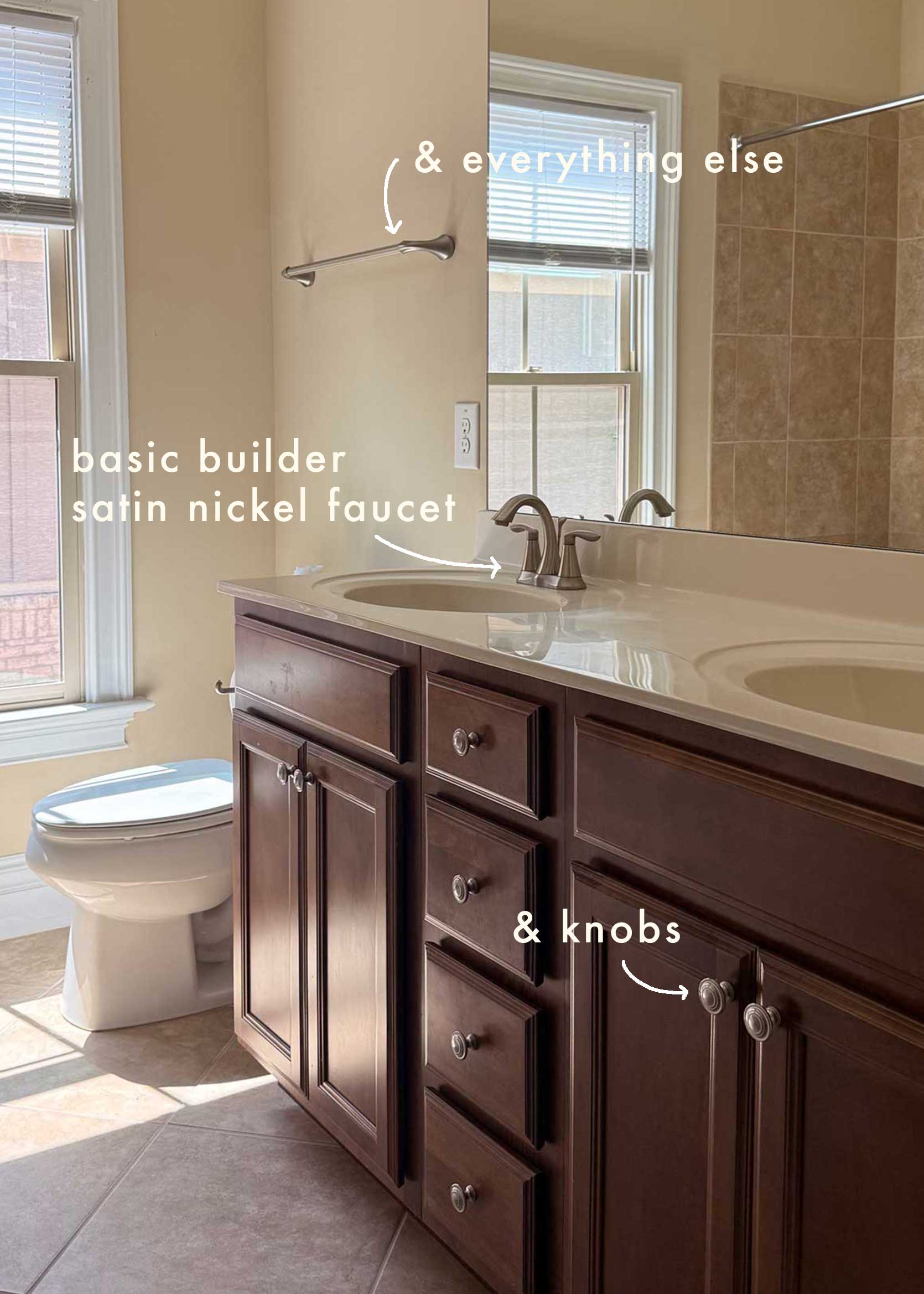
As with many homes built in the same era as this one (2010-ish), the cabinets are cherry, the tile is beige, the counters are beige, and the hardware and builder-grade fixtures are, of course, satin nickel. On paper, I understand the appeal of this metal finish: It’s not as cool-toned or harsh as chrome, so it’s more universally complementary, and the satin or brushed finish keeps things mostly finger-proof. But yes, it’s basic. I don’t have any problems with nickel, in fact. I love polished nickel; so warm and beautiful. But the “builder-special” usually comes in just the most boring faucet silhouettes.
Take one of my guest bathrooms above, for instance. That faucet screams “I bought this from an open-box special at Home Depot for about $43.97.” It’s transitional, i.e., it has no real style. It’s not modern; it’s not traditional. It’s like the plain Cheerios of the faucet world. Does the trick, but doesn’t really taste like anything.
However, I have absolutely zero interest or intention in changing the faucets or hardware in my bathrooms. Reasons include: A. We’re saving for a house, and this isn’t an important use of funds that could otherwise be put into our investments. B. If all goes according to plan in reason A, we don’t plan on staying here very long. C. Everything works just fine, everything is made pretty well, and it would be wasteful to buy interim faucets and hardware that end up where, exactly, when we move out? There’s no telling whether they’d work in our next place. Nah. I can’t be bothered.
SO, that brings me to today’s post. Jess had the idea of giving the “builder-grade bathroom fixture finish” concept the “cherry cabinets no-reno upgrade” treatment that I cooked up years ago and did gangbusters around here. What can you do with color and mostly soft goods and accessories to work with (or distract from) a dated, not-that-exciting faucet in a bathroom of yours? Could you spend the equivalent money on the rug/shower curtain/paint/etc., that I’m recommending on, say, a new faucet you like better? Sure you could! But where would the challenge be in that? I love a “Make It Work” obstacle more than most, so I put on my thinking cap and my color cape and got to work creating color combos and moodboards for satin nickel, chrome, polished brass, and matte black.
Could anyone use these color palettes regardless of their faucet situation? I’m glad you asked! Of course you can. Does someone’s bathroom vanity, countertop, and flooring material drastically affect how these would look IRL? Probably, but you’d be surprised what you can accomplish when you have a cohesive design story across all other elements. You can always pull from the colors and textures I recommend for some temporary solutions such as peel-and-stick floors (or even a vanity upgrade if that’s in the realm of your desires and budgets).
Now, let’s start with the most ubiquitous:
Builder-Grade Fixtures Color Combo #1: Satin Nickel
- Fixture Finish: Satin/Brushed Nickel
- Color Palette to Try: Olive Green, Black & White, Warm Wood, Ivory
- Metal Mix: Satin/Brushed Brass
As I mentioned before, satin nickel is actually fairly easy to work with because of its warm undertones. It pairs well with brass (especially if it’s also satin or brushed) if you’re brave enough to mix metals…and you should! This is easy to accomplish by changing out your cabinet hardware (fast and cheap!) or your switch and outlet plates (also fast and cheap!). The mistake I see a lot of people make is going the cool-toned route. They see silver and lean into black and white. You could do that, of course, and it would work well enough, but it would be just as basic as your faucet. Instead, pull the warmth out of the nickel and use olive greens and ivories! A little black-and-white marble moment through some bath accessories and even a cute striped towel set adds a touch of modernity, while a darker-toned wood table (or anything else wood, really) adds a realness and depth to everything else.
You’ll notice I pulled a tile for this and every other moodboard. Guilty! I couldn’t help myself, but if you’re not installing anything permanent, just pull that color for something else major, such as wall paint, trim, or even a peel-and-stick wallpaper. An even less intrusive approach is to use the tile color in a rug or shower curtain instead of what I picked. Just be sure the color from my selections appears somewhere else via an accessory or another moment.
And lastly, a seriously underrated technique to make dated or ugly elements in a room work: Bring in some weird and whimsy. In this case, a wool fish rug. Without it, the room looks like it’s trying too hard to be chic, even without being built around a chic faucet. But with it, it feels happy and pulled together. Go ahead, cover it up with your hand and see what I mean.
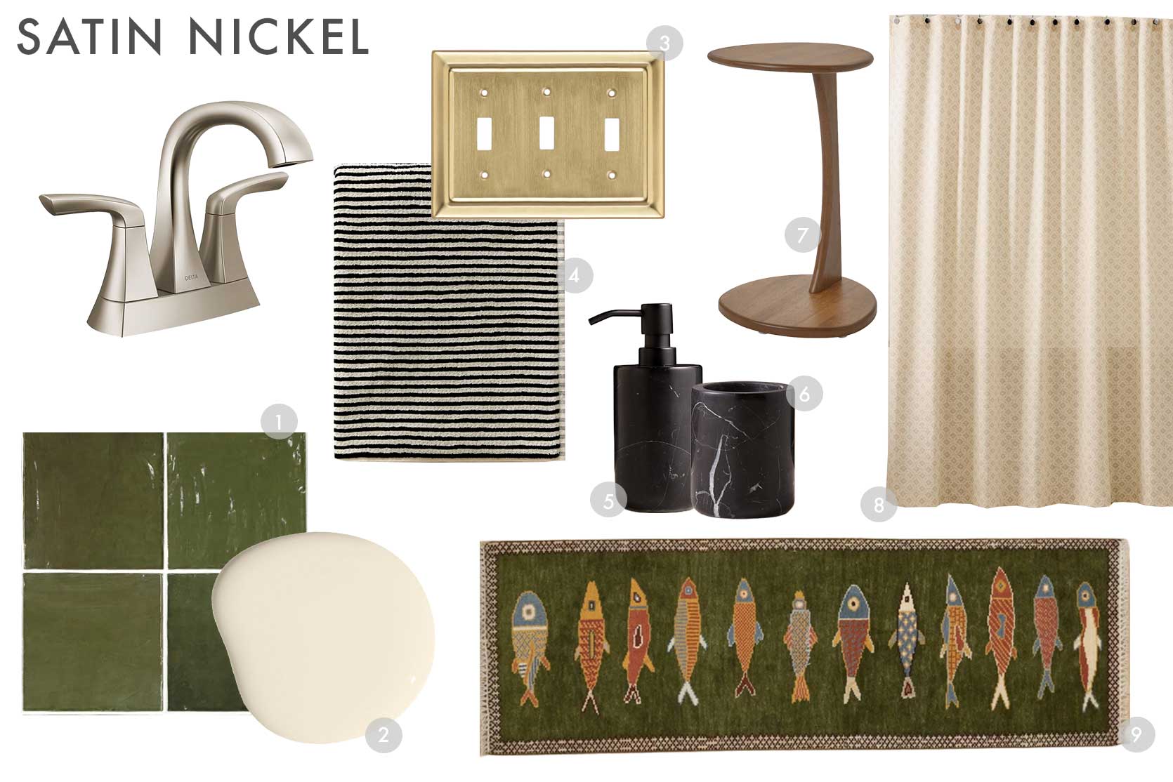
1. Artisanal 5X5 Ceramic Wall Tile | 2. Like Buttah by Clare | 3. Architectural 3 – Gang Toggle Light Switch Standard Wall Plate | 4. Dyed Thread Cotton Bath Towel | 5. Nexus Black Marble Soap Pump | 6. Nexus Black Marble Toothbrush Holder | 7. Ugglerum Side Table | 8. Trellis Shower Curtain | 9. Handmade Fish Runner Rug
Builder-Grade Fixtures Color Combo #2: Chrome
- Fixture Finish: Chrome
- Color Palette to Try: Ice Blue, Burgundy, Dark Oak, White
- Metal Mix: Chrome, Lacquered Color
Now, on the opposite side of the undertone spectrum is chrome for our popular choices for builder-grade fixtures. The faucet below is one we had in my childhood home until my parents did a big bathroom remodel, so it feels very nostalgic to me. I can still feel the memory of that plastic-y knob in the muscles and tendons of my hand. I can even hear what it sounds like when it opens and closes. Anyway, I digress.
Chrome is actually very popular again, so you may find yourself taking this color palette and applying it to a bathroom you’re working on with a super cool and very “now” chrome faucet. Either way! Here, just as I did with nickel, I’m leaning into the undertone with a cool, icy blue juxtaposed with a warm burgundy because I love those two hues together. Chrome doesn’t mix that well with other metal finishes, in my opinion, so I’m keeping any other metal here in the same family. You could probably get away with a polished brass or a matte black, but eh, not necessary. White is super classic with chrome and looks sharp and clean, so you’ll see that in the soap pump and toothbrush holder, as well as the shower curtain and towel. The towel’s red embroidered border and the sweet little florals are our moment of whimsy here without going too overboard. And technically, I guess so are those glossy blue knobs. I LOVE colored knobs; so unexpected and playful. I picked a fairly contemporary checked pattern for the rug to counterbalance a faucet that might feel very “yesterday”. Wood is always necessary to ground everything shiny (here, I went with a tray, but you could do this with a wastebasket, decorative storage box, bathroom furniture, etc.). Be sure to add in enough of that burgundy if you don’t do something like that tile; otherwise there won’t be enough depth, and it’ll just end up looking like a baby boy’s chrome-and-ice-blue bathroom.
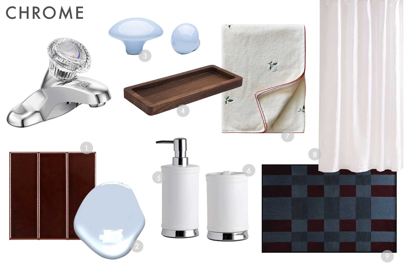
1. Bottega Glossy Porcelain Tile in Mahogany | 2. Ice Sculpture by Benjamin Moore | 3. Colored Gloss Pebble Knob | 4. Wooden Decorative Tray | 5. Classic White Chrome Bath Accessories, Soap/Lotion Pump | 6. Classic White Chrome Bath Accessories, Toothbrush Holder | 7. Floral Embroidered Bath Towel | 8. European Linen Shower Curtain | 9. Machine Washable Checkered Gray Area Rug
Builder-Grade Fixtures Color Combo #3: Lacquered Brass
- Fixture Finish: Lacquered Brass
- Color Palette to Try: Butter Yellow, Ochre, Blush, Rattan
- Metal Mix: Polished Nickel, Antique Brass
The lacquered brass of today’s builder-grade fixtures is very different from the lacquered brass of the ’80s. Mostly because that wasn’t even brass most of the time, but instead a tacky gold finish coated in a clear, shiny film. But even if you still have that, I promise we can make it look good…well…better. Here, I decided to lean alllll the way in. Got a yellow faucet? Let’s go full-force yellow, almost as if you meant to have a polished brass-like fixture. The key? Keep all those yellow shades varied. This is how you create depth and dimension. Dark ochre towels, beige and pin-striped shower curtain, sunflower-hued bath mat, buttery yellow wall tile (or paint), light natural rattan trash can, and even a yellow-adjacent burl wood-finished little wheeled cart. The bubble tray is a glossy dark brown, which plays off the shine of the brass, but continues the warmth of the other tones. In contrast, however, I picked polished nickel for some bath accessories because they cut through the richness some, but still echo both the warmth and shiny qualities of the polished brass. You could also go the route of opposites with a satin antiqued brass (like in the switch plate below). And finally, for a touch of whimsy and unexpectedness, mix in some hardly-there blush somewhere—here I picked a paint color by Clare, though you could add in some accent towels or art as well with this shade!
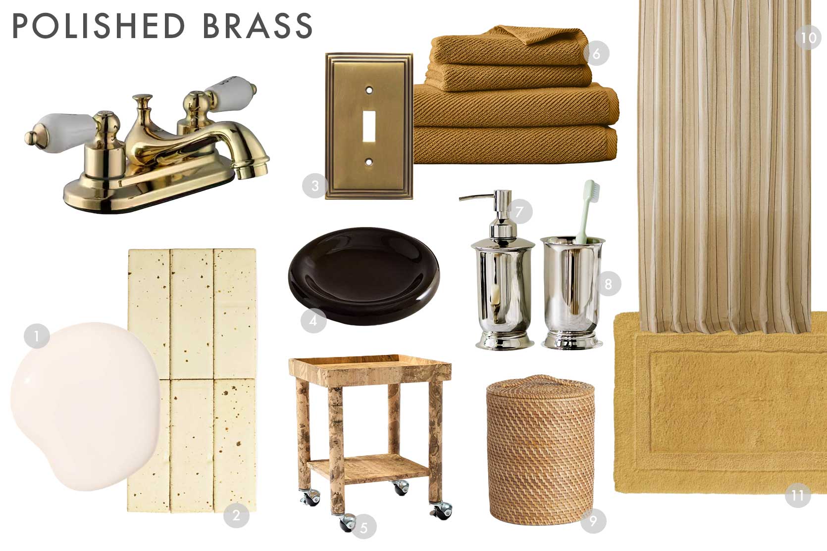
1. Wing It by Clare | 2. Clé Guild: New California in Cigar/MatteYarrow | 3. Art Deco Step Satin Antique Brass – Single Toggle Switch Plates | 4. Glossy Decorative Tray | 5. Pierce & Ward Burled Finish Cart (12″) | 6. Diagonal Ribbed Towel Sets | 7. Bedford Silver Soap Dispenser | 8. Bedford Silver Bath Tumbler | 9. Rinna Rattan Waste Bin | 10. Cotton Linen Striped Shower Curtain | 11. Frontgate Resort Collection™ Skid-Resistant Bath Rug
Builder-Grade Fixtures Color Combo #4: Matte Black
- Fixture Finish: Matte Black
- Color Palette to Try: Ivory, Beige, Amber, Antique Wood, Travertine
- Metal Mix: Satin Brass
The newest finish to the builder-grade fixtures scene is matte black. It was plastered everywhere around 2015-ish during the height of Modern Farmhouse. There’s nothing inherently wrong with matte black hardware or finishes, but it does tend to feel quite cold and industrial. If you have something similar and are ready to change the vibes, may I recommend just going hard on the warm neutrals? I always did a deep emerald green color story here (that’d be good, too), but I recognize that not everyone likes or needs color in every room of their home. Instead of white, go with ivory, linen, bone, and vintage wood. Some brushed soft gold is a great pair to bring in some different metals to break up a bank of black hardware. I also love some travertine in here, either via surface materials or in an accessory like a tray, for instance. A limewash finish adds additional texture and complexity. And finally, our touch of whimsy comes through the amber “confetti” canisters.
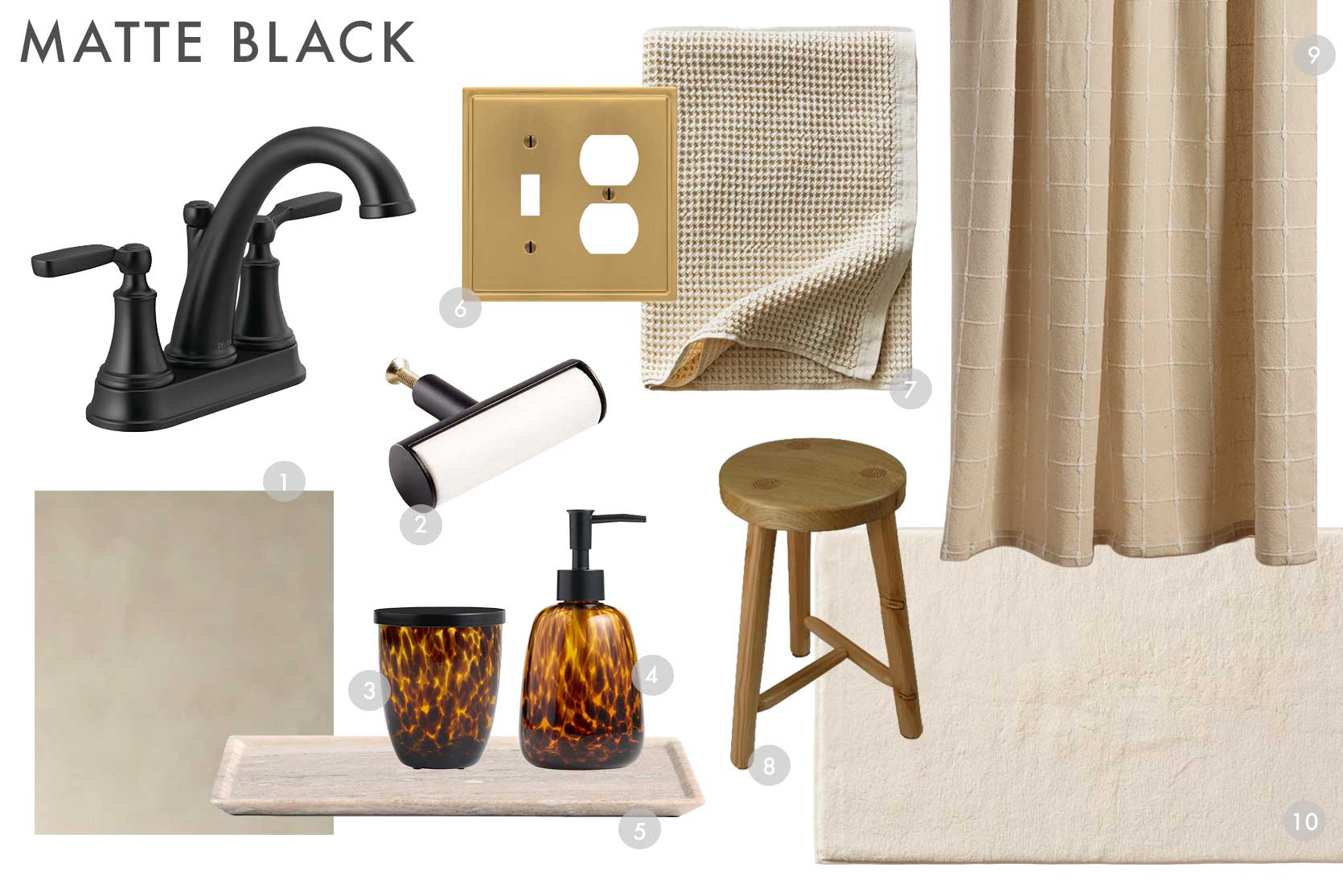
1. Bone Limewash | 2. Mason Marble Black Knob | 3. Amber Confetti Glass Canister with Lid | 4. Amber Confetti Glass Liquid Soap Dispenser | 5. Tuscan Large Beige Marble Rectangle Tray | 6. Moderne – Brushed Gold Decorative Metal Wallplate | 7. Waffle Cotton Bath Towel in Ivory | 8. Three-Legged Wooden Stool | 9. Organic Oasis Shower Curtain | 10. Frontgate Resort Collection™ Bath Mat in Ivory
—
And that’s all she wrote! Four moodboards with four color palettes to complement and elevate fairly basic bathroom builder-grade fixtures and their finishes. But again, these can be used even if you have a super awesome bathroom faucet finish. You can even pull these same combos into your kitchen, too! Get crazy, and let me know what you think.
Until next time, friends…
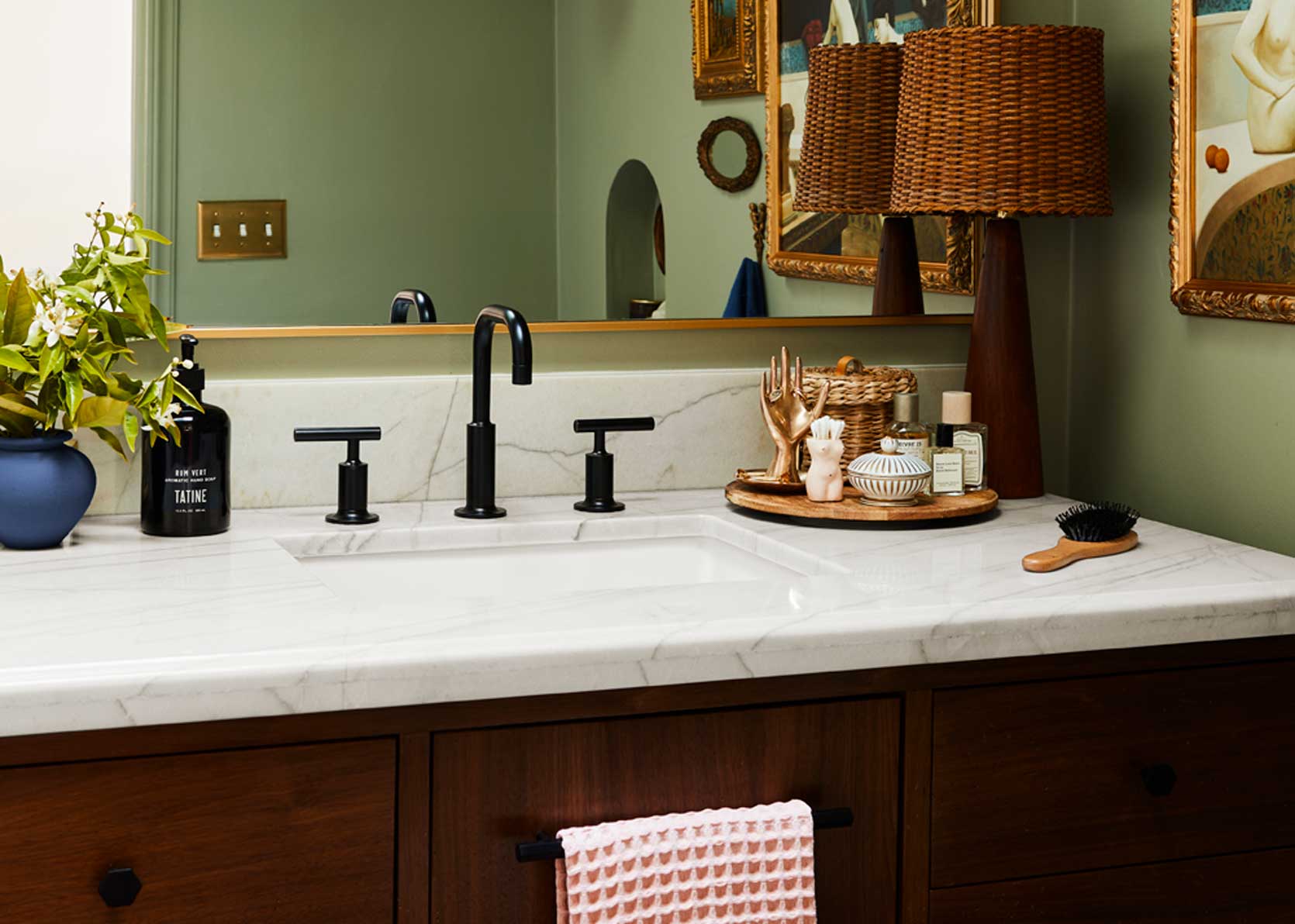
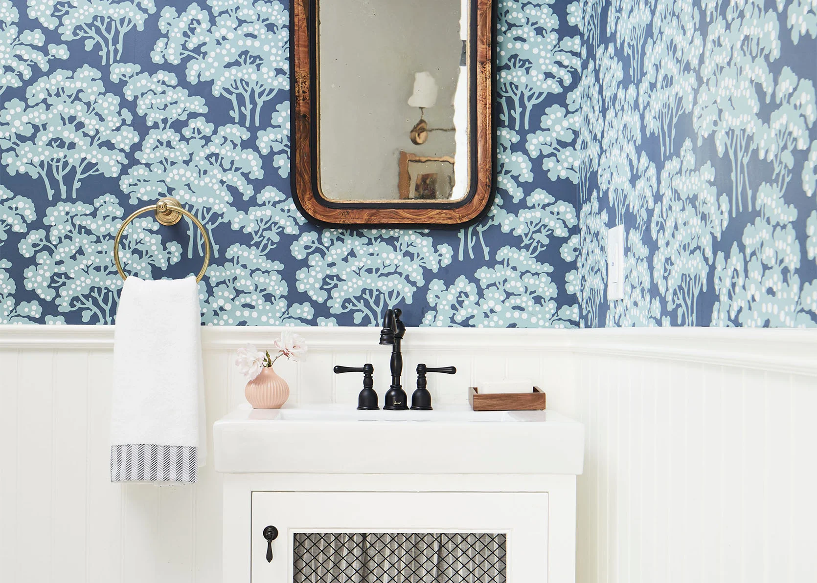
*Opening Image Credits: Design and Photos by Sara Ligorria-Tramp | From: How Sara Course Corrected Her Initial “Clean, Modern, And Very Neutral” Primary Bath Design Plan Into The Actual Design She Wanted – It’s A Surprise Reveal!

Love these posts!!!
Thanks, Kerri. Glad to hear!
That fish rug!!!!
Right?!? I’ve been seeing them a lot lately and I love them so much. I saw someone use it as a stair runner and I swooned.
Genius! Love your posts as always 💜
That might be my new kitchen rug!! Love it so much.
Such excellent work! Very helpful.
Thank you!
Thanks for reading!
I love, love, love the first one with the fish rug. I’m a green girl. Thank you for all the great options.
Yeah that might be one of my favorites, for sure.
As always, great article! I also love the bathroom that is pictured at the very beginning of your article and wondered if there might be a mood board somewhere for it.
That’s Sara’s amazing bathroom. It’s in this post:
stylebyemilyhenderson.com/small-primary-bathroom-ideas
And then later she repainted the bathroom in pink, color matched to the pink flowers in her bedroom’s new Sandberg Linnea Midnight Blue wallpaper. You can see a glimpse of the new bathroom color in her updated bedroom post –
That’s Sara’s bathroom (previous EHD photographer)! I can’t put a link here for some reason, but if you go to the bottom of my post, you’ll see something that says Opening Image Credits, and the link to that article is there. She details what everything is in that post.
Great post, more please!
Anything else in particular you need or would find helpful?
This is a fabulous post! We inherited a mix of brushed and shiny brass. My default has been brushed nickel (bc I don’t care for shiny anything). Haha, I recognize some of the fixtures you’ve shown here. I’m currently looking for a replacement faucet in my powder room, but can’t decide what a reasonable price point should be. I was looking at Rejuvenation, but $700-1000 seems high for my purposes.
I think you can find a great faucet for a powder bath for a few hundred. You can even find higher-end faucets on Facebook Marketplace, sometimes even still in the box! Ferguson Home also has a wide range of prices! Good luck.
Signature Hardware is another good source.
Arlyn!! We just moved to Winston-Salem, not too far from you. Im in the same boat. Im in fellowship, which is a 2 year job, unless we end up staying here. We did end up buying, but I am not ready to go all in on replacing all fixtures (though boob lights abound – had to fix that!) bc Im not sure how long we will be in this home.
Our house is circa 2013 – so same as u the cherry/dark wood, the satin nickel random faucets, beige tile. twinning! One is a kids bathroom – so I got a sage squiggle shower curtain from westelm and a fun rug – tried running it through AI and hated the result. Do you think I can make a theme based on what I have? (the curtain/bathmat and vanity and beige tile is all real – but that decor is not the vibe. What color should I make that wall? Would going lavender be too cool? You said go warm.
I wouldn’t go the lavender route. Maybe as a small accent if you really like it, but against the beige floors, it feels off. I like the green with the wood tone. Maybe opt for a warm green wall in a shade either lighter or darker than the shower curtain. Or a soft yellow perhaps, though I know that’s not for everyone. Keep the large uses of color warm to complement the floors, that way it’ll look more intentional!
Thank you so much! That is so helpful! The cool wall was throwing me off and I couldn’t figure out why.
Your cost efficient ideas are nice and would be lovely upgrades. I just wish ( as the designer in my husband’s renovation company)I wish you wouldn’t bash ” builder grade” selections. They usually follow interior designers’ ideas and creation of trends but in order to appeal to the varied tastes of the buying public, builders have to stay pretty neutral. They are not fools with no taste.
I totally respect builders and contractors. My husband works in building and construction as well. But the fixtures we typically find in tract homes, for instance, are of a certain style that is pretty synonymous with boring and basic. Totally makes sense they would have wider appeal when the style is straightforward. There isn’t anything “wrong” with that, just not a super personal design choice!
This is some of the best design content out there. I love that you’re helping people with sustainable and affordable design and the color combos are brilliant.
Why do you think there are so few extra long shower curtains? Is there a reason they are not widely used?
Thank you for this interesting post!
My bathroom is very dated and I have butter yellow colored tiles (which are somehow in again 😂 ) and chrome faucets. Should I lean into the chrome moodboard and the burgundy accent colour too? Or more into the the yellow moodboard, because there is already so much yellow? The floor has dark grey-blackish matte tiles and white walls above shoulder-height…
Oh that sounds fabulous. I’d go the yellow route, but just lean into some more chrome accents!
Did you see Allison Pierce’s “no reno” yellow tile bathroom in this post? It’s amazing.
stylebyemilyhenderson.com/a-colorful-vintage-home-tour-paint-ideas
This is perfect – our daughters’ bathroom has those brushed nickel fixtures and I am ready to give the room a refresh now that they are older but didn’t know where to start. Thanks for the great inspo!
Thanks for sharing this! I would love to see something similar with dated countertops — I’m struggling with paint colors to go with my off-white/beige builder-grade bathroom countertops. You could also expand into kitchens — thinking of the granite (both warm and cool-toned) that so many people work around!