Design
3 Readers Get Some “Design SOS” Help To Make Their Homes A Little Better (+ An Accent Wall Dilemma!)
When we first put out the call for our “Design SOS” (aka quick gut reactions to people’s styling problems), we got an avalanche of responses and couldn’t be more grateful! Unfortunately, we can’t get to everyone, but we can chip away. Emily did the first round in this post, and I thought I’d take a stab at it this time! I, of course, made mood boards and maybe enlisted Spoak for some magic renders because I simply can’t help myself, but I hope there are helpful tips for everyone and that you enjoy getting to peek into a few of our readers’ awesome homes! We’re talking fabric selection, small empty wall issues, and a BIG accent wall dilemma. Ready, set, style!
Ottoman Issues
Question #1:
Hi Jess and EHD team! Long-time fan of the site and the entire team’s approach to design. Happy to share my own mini design dilemmas with you all!
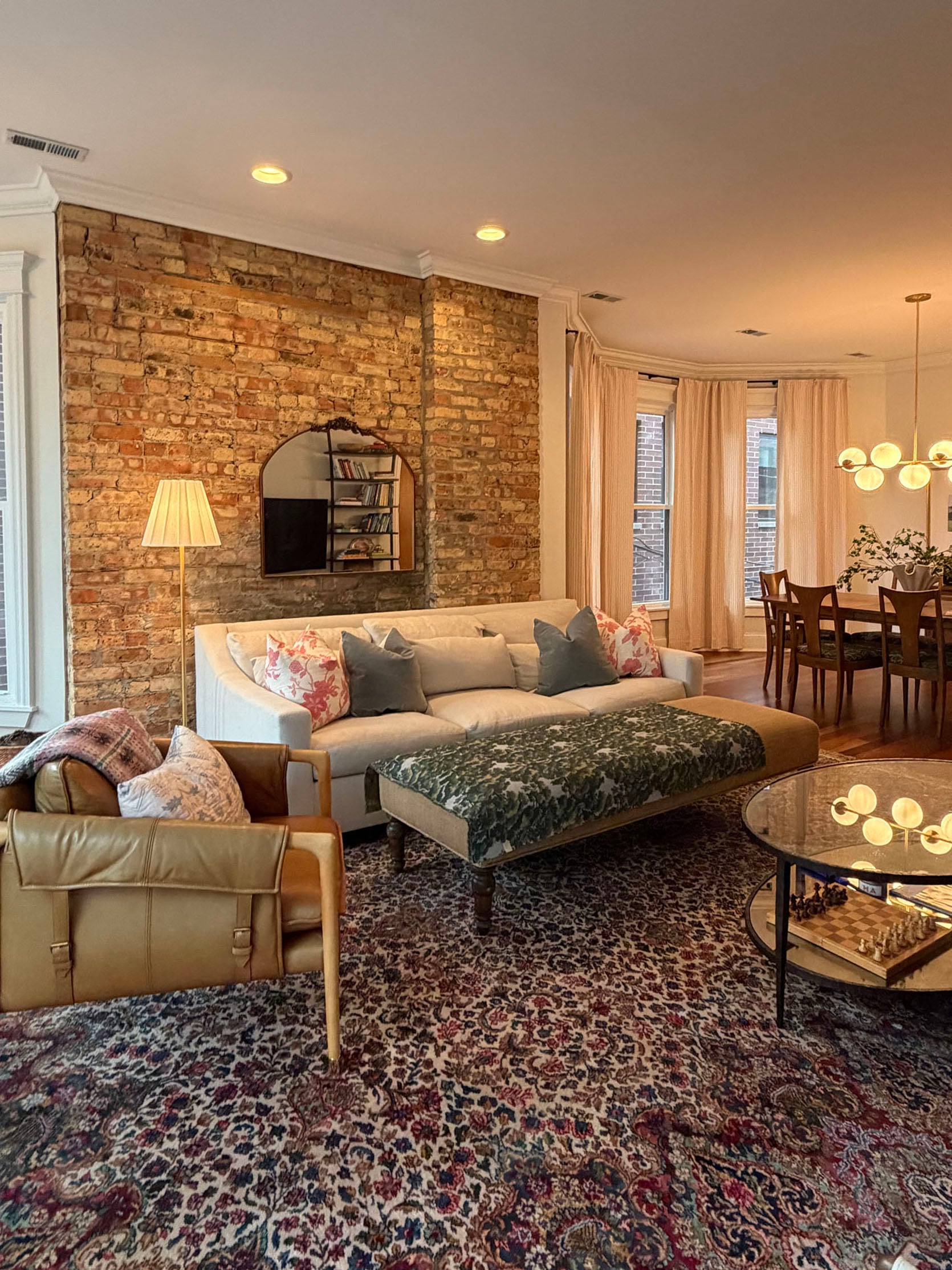
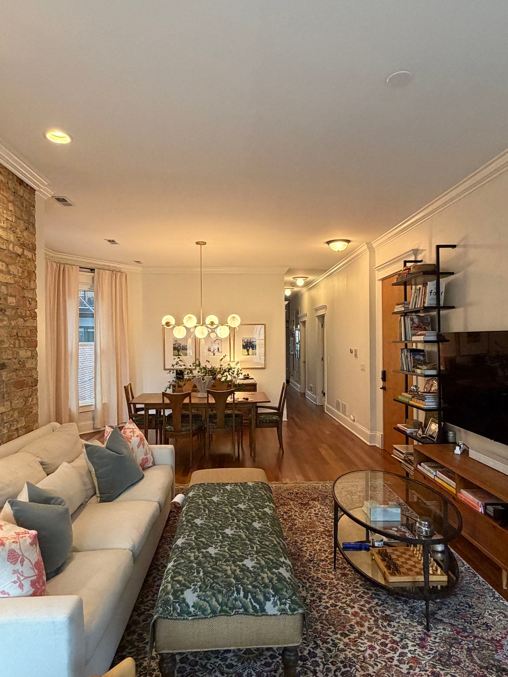
I had been eyeing Greenrow and Etsy ottomans with a Christopher Farr Lost and Found fabric to supplement our sofa (we were exploring sectionals but not ready to make the dollar or design commitment yet). We found a huge ottoman on FB Marketplace for $150! It’s 6 feet by 2 feet wide. The main question for you is based on the room (multi colored red Persian rug, cherry, brick wall) and the adjacent room: what direction would you take this fabric? Still like the Christopher Farr fabric but don’t love the price point! We previously had a Crate & Barrel glass coffee table in this room… excited for the ottoman to soften the room a bit and add comfort!
Answer #1:
First off, LOVE this space! The ottoman is going to be great, but I’m not sure this fabric pattern (which is beautiful) is the best option. For me, the fabric and rug are fighting too hard for the attention. The pattern scales are really similar, which is the biggest issue. The rug is great (and I’m sure not cheap), so potentially going with a different, solid fabric is the way to go instead of getting a more solid colored rug. Let me show what I mean…
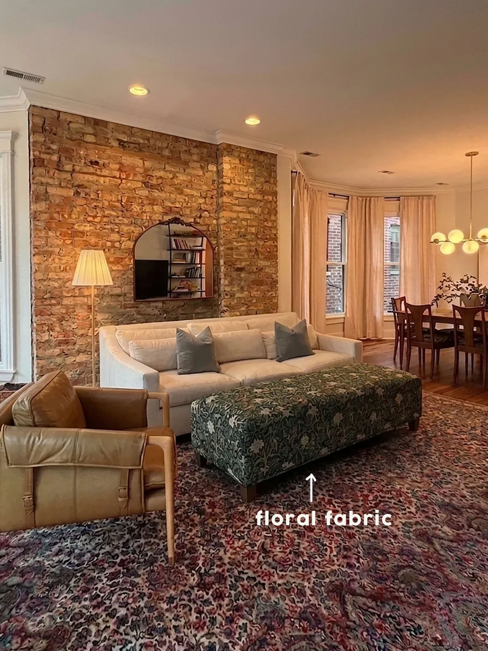
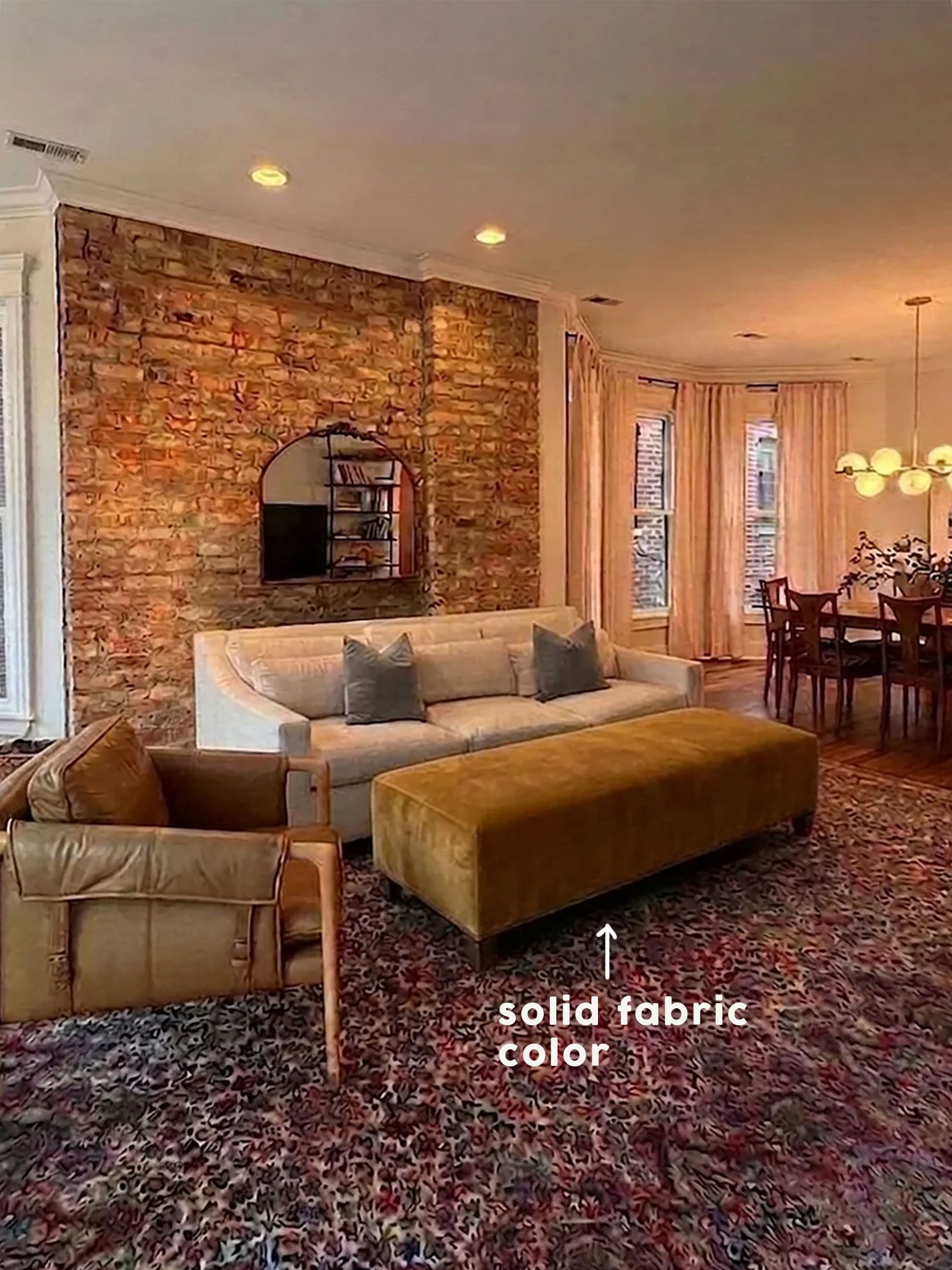
The render changed the shape of the ottoman, but the visual still shows my point. Your eye doesn’t have a chance to rest with the green patterned fabric. It’s also made even harder because of the brick wall. And look, few people love a brick wall more than me, so I am a HUGE fan. However, it’s another bold pattern/texture that is asking your eye for attention. The competition is too high! But with a solid velvet (I like the idea of adding another material for subtle interest), the room still looks eclectic yet lux, but in a way that’s more relaxing. I like the deep gold, but it’s just a suggestion:)
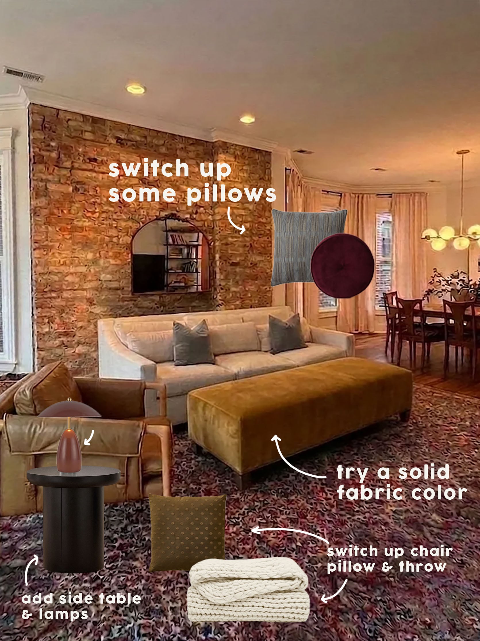
I couldn’t stop there and am giving some unsolicited styling and product advice. Oops! Since the rug is such a busy floral, contrasting with some soft geometric patterned pillows will look awesome and really intentional. The broken stripe blue-green pillow would look good with the velvet pillows that are already there, and that burgundy disc would perfectly tie in with the rug (Em has it in a different color and loves it so much). Then for the accent chair vignette, I love this green dot one, which talks to the green on the dining chair cushions (which you’ll see in a moment), and a cream hand-knit blanket, which ties in with the light colored sofa! And again, I know this is unsolicited, but the accent looks like it needs a side table friend. To contrast the legs on the chair, I love this black pedestal table, which I then paired with an LED cordless burgundy lamp! No need to worry about finding a workable outlet:) Below are all the products and links!
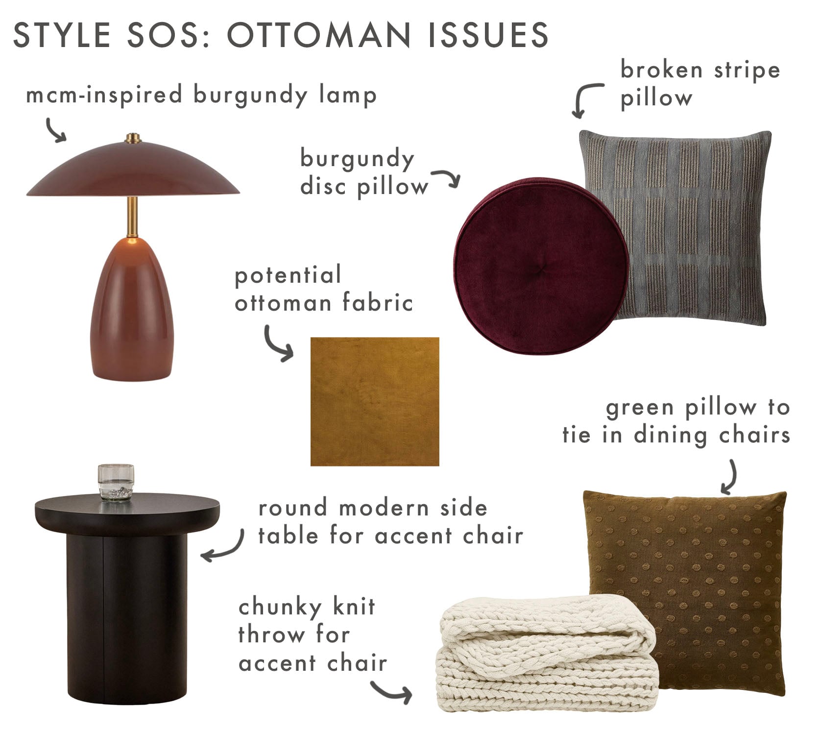
Table Lamp | Side Table | Fabric | Brick Grid Pillow Cover | Velvet Disc Pillow | Pierce & Ward Dot Pillow Cover | Handmade Chunky Knit Throw Blanket
Ok, onto the second question!
Question #2:
The easier one is what to do with this boob light… It’s the first light when you walk into the condo, and it’s parallel with our hallway lights. Should we replace it with something dainty/different or consider a wall sconce instead? The placement feels awkward; we’ve also thought about moving the light to be living room overhead lighting instead!
Answer #2:
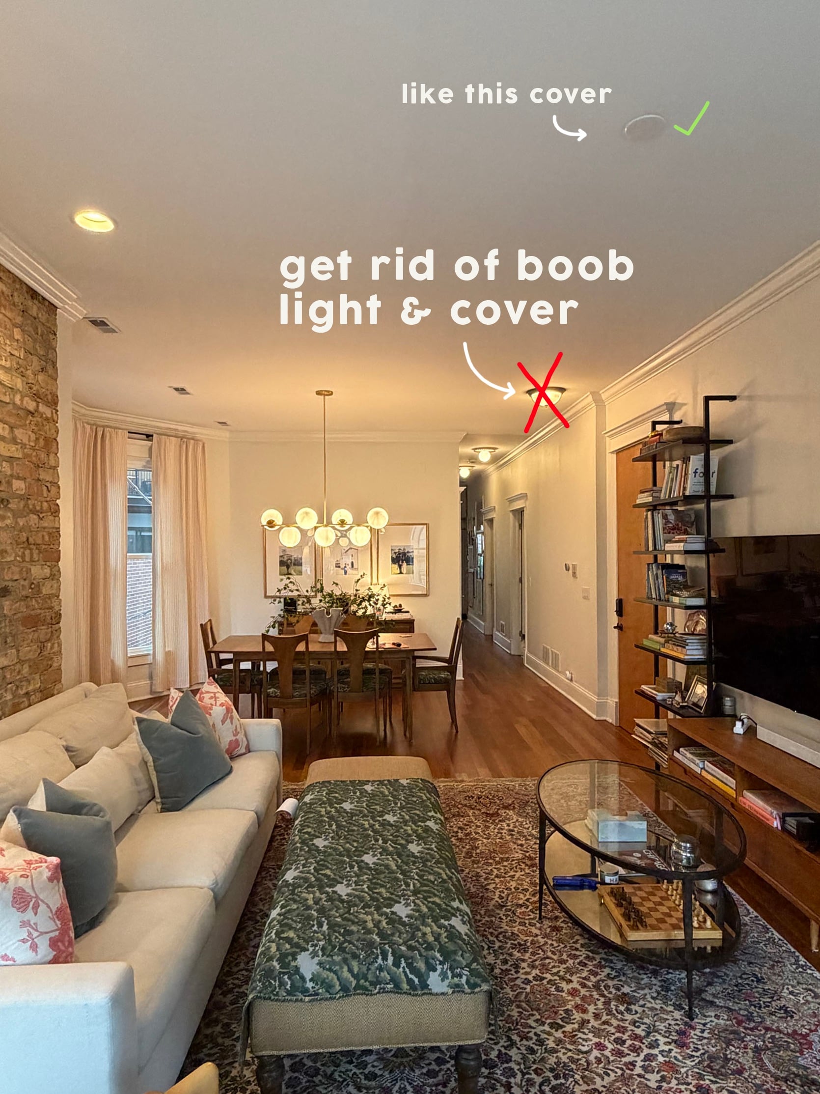
This is easy…get it outta here! It clearly bugs her, and there’s already plenty of light, so it’s not even necessary. They or an electrician can take it down, secure the wire, and then cover it with one of those circular plates they already have in another spot on the ceiling. Done and done:)
The Accent Wall Woes
The Question:
Hi! First, let me say how excited I was to see Emily’s IG story about this. I literally have been struggling with this room so much and kept thinking to myself, “I wish Emily Henderson could tell me how to make this room better!”
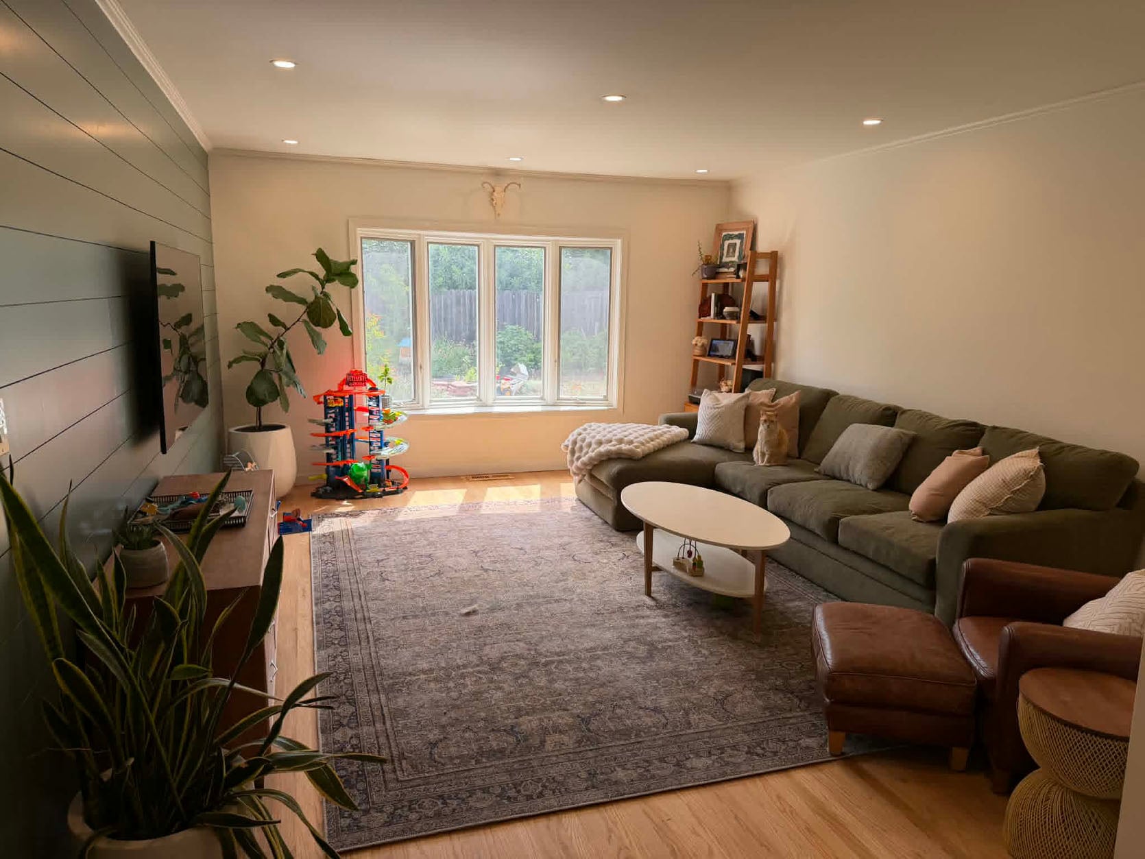
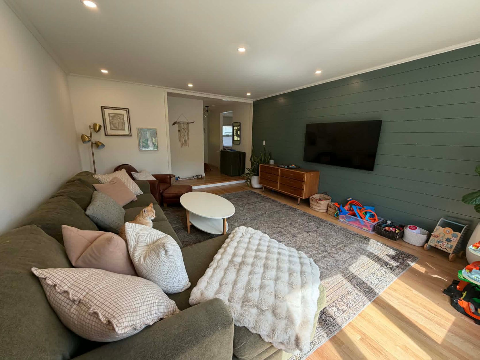
So here we go. This is my family’s living room. It’s the heart of our house where my boys (4 and 1) play, we watch movies, cozy up on weekend mornings, and just spend so much time in. It’s the first room you see when you enter our house, too.
Last month, my dad and sister graciously helped me build the shiplap wall, and while I thought it would pull the room together, it actually did the opposite and exposed how big and bare the room is! Would LOVE Emily’s advice on how to make this room work better. I know the green paint color I picked is so wrong. It’s so empty above the couch. Toys need a home.
Please, please, please would graciously appreciate any and all advice!
-Jaclyn (a boy mom who wants a beautiful home, all while knowing hot wheels and toys will be part of that)
The Answer:
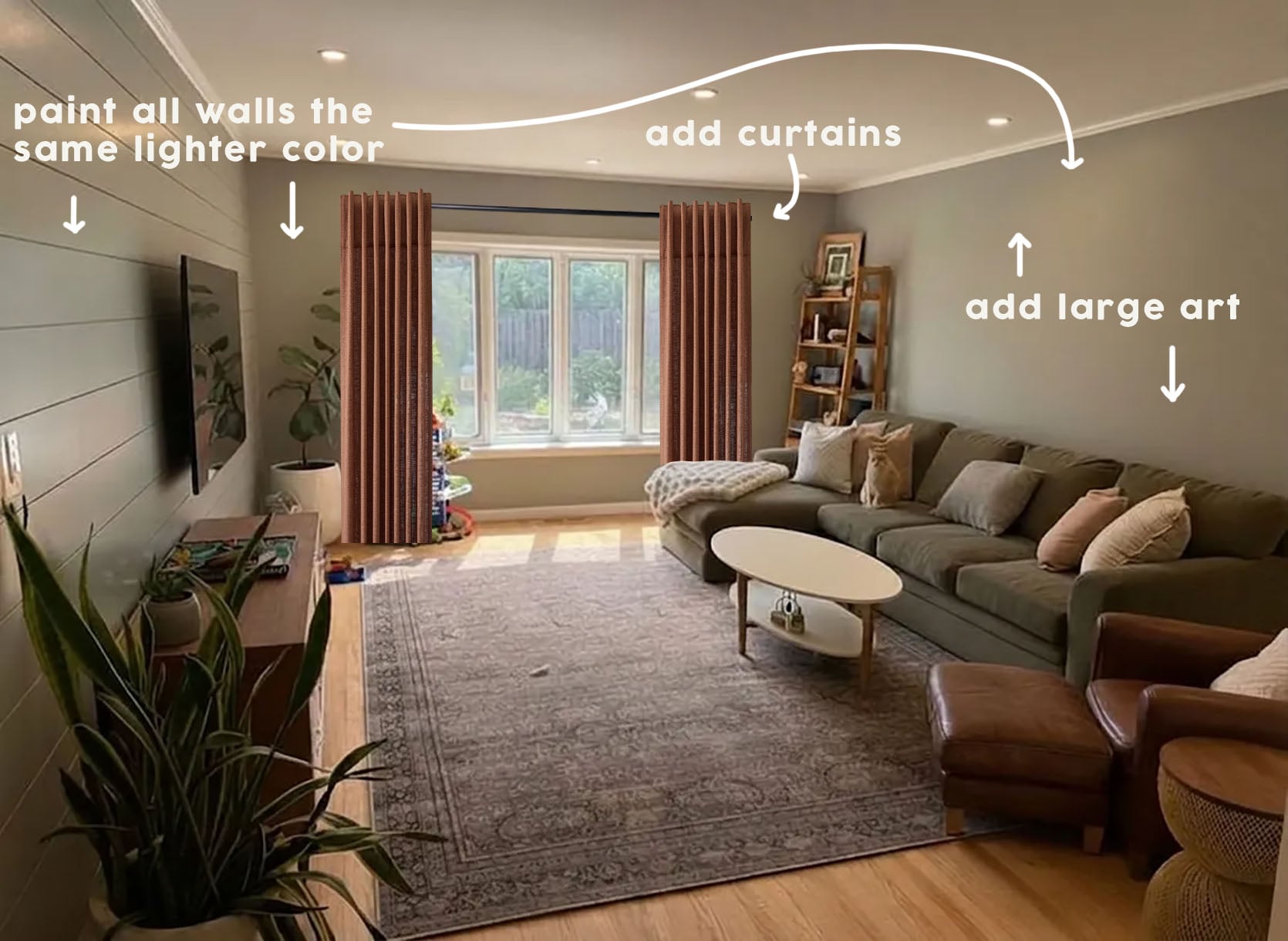
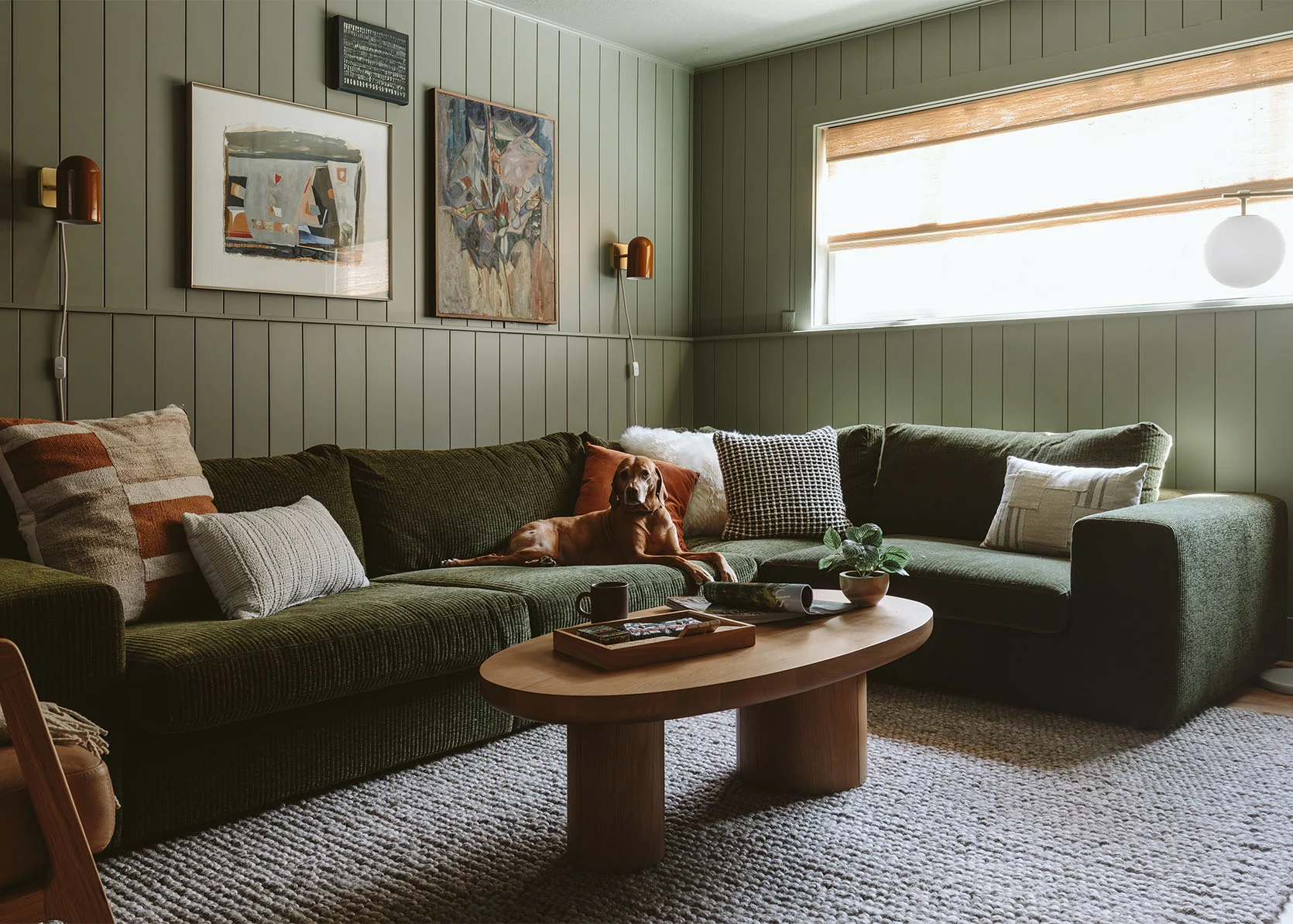
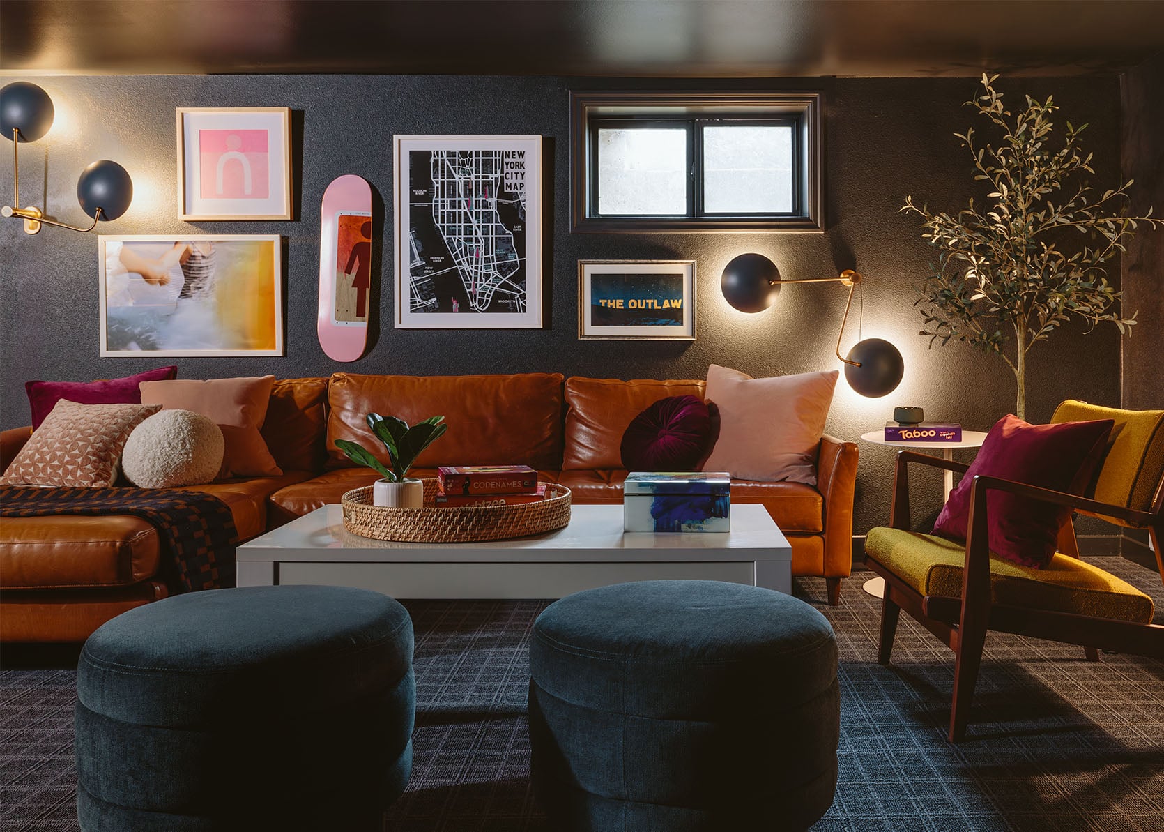
First off, this IS a beautiful home! But yes, accent walls tend to make a room feel unbalanced, unless it’s some kind of nook. My initial idea with the least amount of labor would be to pick a lighter version of the green on the shiplap wall and paint the other three walls in that. This will help to soften the transition from the darker wall to the lighter ones and also avoid creating a single dark-toned room that is open to this otherwise white-walled home. Another idea is to just choose a lighter green in general and paint all four walls for an overall tonal look in the same vein as Kaitlin’s beautiful basement, just the light version. The green sofa is already there:) This option is what I was able to render above! Oh, and since the pillows have a pinkish tone, these “Mulberry” colored textured curtains would add coziness and warmth. I’m sure this is also a future plan, but adding large-scale art to the wall above the sofa will help to balance the space. To make sure I was giving correct advice, ha, I checked in with Em, and she agreed, but here was her exact response:
“I think your instinct is totally right. The accent wall is cutting the room in 1/4 and making it feel smaller. I think since they probably don’t want to paint the ceiling, I’d repaint the whole room a lighter color so the ceiling doesn’t contrast as much and it still feels a little cozy, but doesn’t have that single wall that makes the room feel really unbalanced. A good second option is what you suggested – a lighter tone on the three walls to soften the transition and reduce the boldness of the single wall. All one color white is doable, but for a TV room, I get why they wanted the TV to be on a darker wall.”
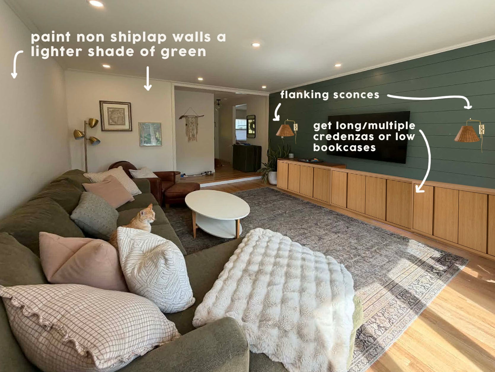
My rendering skills are lacking, so I couldn’t show the three lighter wall option, but here both Emily and I felt that either an extra-long credenza or multiple put together would also balance the room and give a lot of storage for “less beautiful” boy toys:) I do have to say the credenza that is there is SO pretty, but something bigger is just going to work better. Oh, and adding two pretty plug-in sconces that have texture will also make this room cozier and add to the balance.
From Emily: “A big credenza underneath with flanking lamps could balance out the sofa a lot, then add a bunch of art and maybe a white room with pops of color would also look good.”
Here are the three products I found:
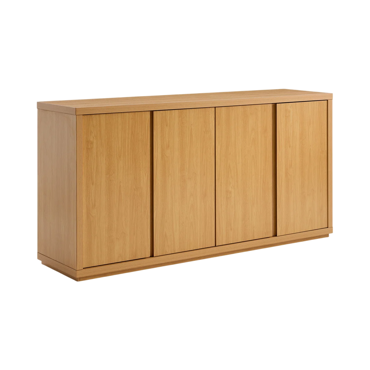
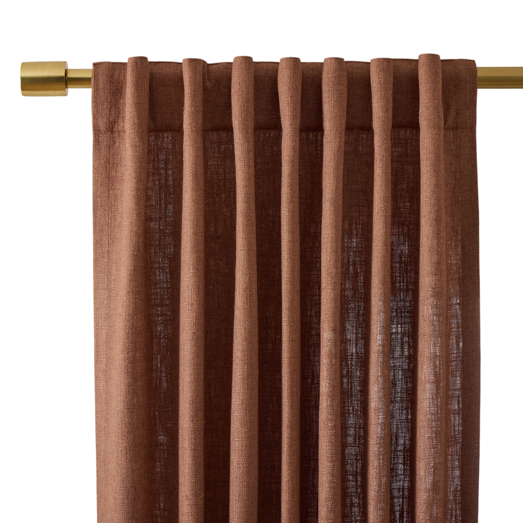
Tapered Rattan Swivel Plug-In Sconce | Fere Sideboard | Classic Slub Linen Curtain
On to the last reader…
What To Do With Small Empty Walls??
The Question:
Hi Jess!
Funny story….for the corner of my house I’m submitting, I’ve actually already asked ChatGPT to “decorate it in the style of Emily Henderson”!! As you can see, it’s still very much UNdecorated, so the timing of this is perfect since AI couldn’t come to the rescue!
We’ve lived in this house for just over a year. We love it, but we’re trying to be really intentional about how we decorate it (see: Target checkout counter in background, ha ). It’s larger than our previous home, so it feels like it is taking forever for it to develop that lived-in and layered charm.
We could use a lot of help! However, we have two smallish walls we can’t figure out what to do with! As you can see, we need to use at least one for 3 dog bowls (while yes, it’s unsightly, this unfortunately really does seem like the best/most convenient place to put the bowls). The wall with the light switches leads to our kitchen, and the other wall that leads to that long hallway will eventually bump into a small laundry room/mud room. We would love to squeeze the dog food and water bowls here, but it just doesn’t work.
We don’t think a coat rack seems like the right idea!? It seems odd to use a console table, especially at the wall where the dog bowls will be living?! It seems weird to hang artwork or sconces on the wall with all the light switches (the height/spacing)?! Then, I’m all out of ideas!
Would love to see anything your team can come up with! Please let me know if it would be helpful to send any additional angles or dimensions. I GREATLY appreciate your consideration!”
The Answer:
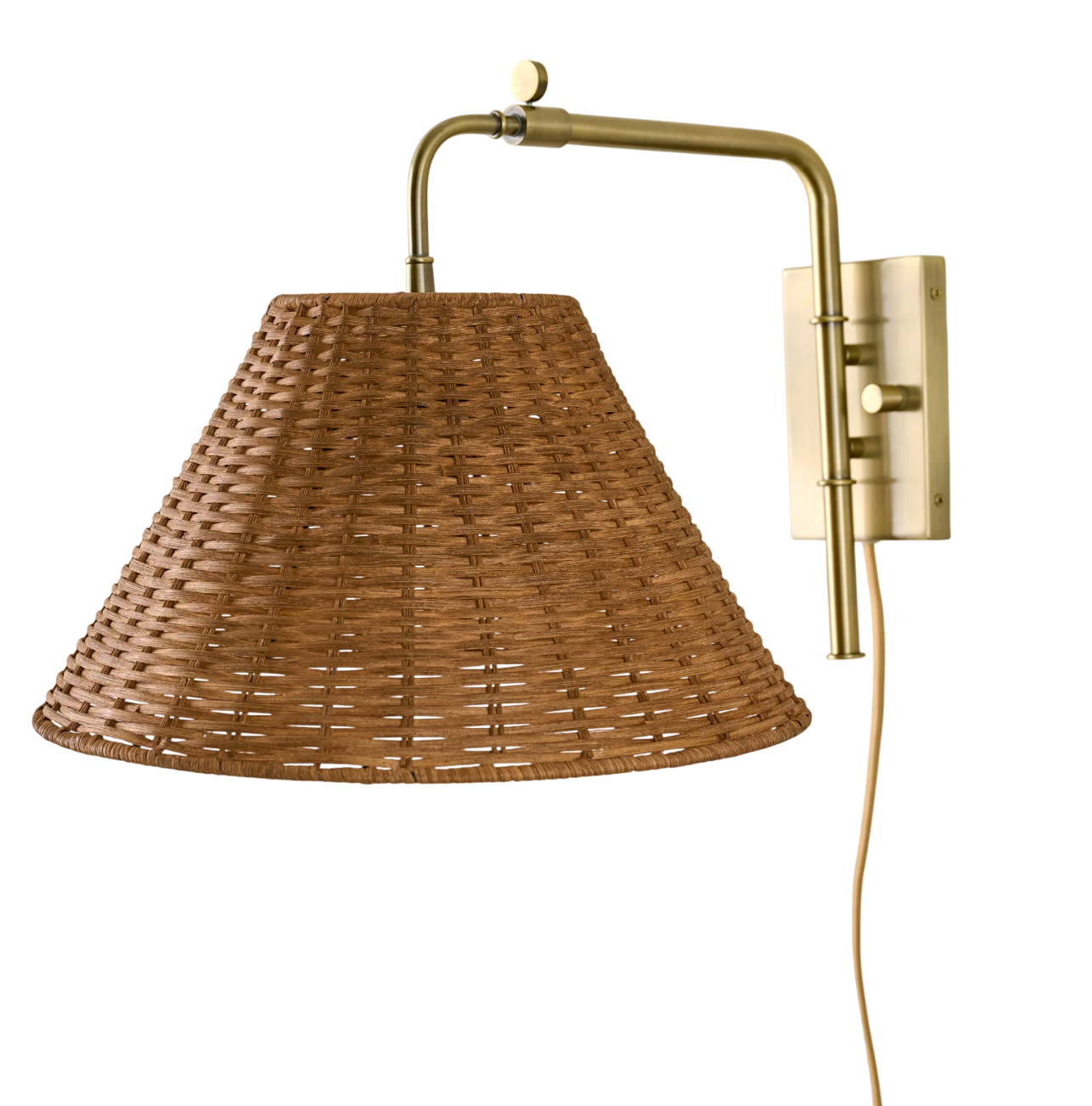
I think this reader is overthinking this a little, which I can *cough* more than relate to:) So let me be the design buddy and say that a console table to me would not be weird. It just needs to be one without storage or have a shelf to be able to have the dog bowls under it. Then, as you can see in the graphic, a fun lamp and a vintage woven cool tray are really all they’d need to make that wall feel pulled together (Hot Tip: Consider adding some earthquake clay under the lamp to secure it in case pups or kids knock into it. Then, for the other wall, I think a large piece of art would be awesome, and the same dog bowl tray to have everything look cohesive!
Table Lamp | Woven Diamond Tray | Console Table | Dog Bowl Stand | Large Art Print
I really love that console table, but I also do like this other console table that’s even more affordable. The art print is just a suggestion, but something neutral but fun could be great. Lastly, Etsy has so many customizable dog bowl stands (I think using a stand will make these setups look more intentional). They didn’t have a pic of these stands in black, but I like the idea of that color contrast to the table and also will talk to the dining chairs.
Like I said in the beginning, I truly hope this was helpful, fun, and relatable. It’s so easy to get stuck when you’ve looked at the same space for too long. But even if you can ask a friend in your life, it’s so helpful. Design is rarely a solo sport. Until next time!
Love you, mean it.
Opening Image Credits: Photo by Kaitlin Green | From: How I Convinced My Friend To Paint Her Room Really Dark: A Kid/Dog-Friendly Basement Makeover With Article Furniture
This was fun! Thanks!
Like these type of posts so much! Keep going and bring more of these, amazing EH Team!
Love these posts! For the last one, maybe a Demilune style console table? That would keep you and the kids from bumping into corners when coming through those doorways.
Love this post! Just came here to say – that tip about earthquake clay is the hottest of tips!! I have never heard of this before today but as a parent of 2 young kids, I’m immediately buying some!
Yes! And this has inspired me to do something with my dog’s food and water bowl.
Wanted to add that an interesting piece of wall art (With security command strips in a high-traffic area.) is so fun, and also potentially a conversation-starter. We’ve got a framed rug sample/Saudi knife case on a similar wall that leads to our powder room. (It looks was cooler than my description! The shop in Saudi who does the framing, Desert Designs, knocks it out of the park!). It always generates really interesting conversations for my husband when we host gatherings. It’s been so interesting to hear guys share about the pocket knives they got in their stockings as kids, the wood carving sets they’ve used, and their hunting knives (We live in Oklahoma, so this comes up!).
This was such a fun and helpful post.
Yes, more of these types of posts please!
The ottoman from the first room would look better under the window in the second person’s living room. It looks comfortable and good for extra company, kids etc. It’s just too heavy as an ottoman for the first room. Too big for the sofa. But it could work like like a second sofa (perpendicular to the first) with a table in the middle. They also have a chunkier sofa so they don’t need a chunkier ottoman in the middle. I just find it too heavy even though I get what they are going for. It’s a nice idea but wrong room
The ottoman from the first room would look nice under the window in the second person’s living room. It looks comfortable and good seating for extra company, kids that want to play a game etc. I love the idea of it in a room. It’s heavy but not too heavy. In the first room it seems that it could work like like a daybed/backless seating (perpendicular to the sofa) with a table/s in the middle. They also have a chunkier sofa so a lighter table/s seem to make sense. I have kids so I have multiple side tables (but not too small and not too many either) that can be moved where needed or moved aside when kids are playing.
I freaking love these posts! The homeowners typically have a good eye, they just need a little help (raises hand)!! Appreciate the EDH team offering their advice and have one teeny tiny request, I’m not on social media and would love another way to submit for consideration…thanks 🫣😀
I love these posts and wish you could do my house 🙂 Especially since you post more than one house, with different kinds of “problems” in each one, it helps me rethink some spaces in my home, how to utilize what I already have.
For the reader with the ottoman – I see where(Jess) you are coming from with the plain fabric but I don’t think the print fabric is a bad choice – just a different style. I personally lean more cottage so I like the eclectic English vibe of the print fabric, especially with the style of the house. I would pick the print over a solid, personally.
Agreed. First off I love that room as is. Well done to the author of the question! Second, I would love to see a pattern on the ottoman but at a different scale. Both the rug and the brick read as small scale pattern to me. What my eye is looking for in that space is a single pattern that sums up all the colors: the red of the rug, the white of the couch, the yellow/gold of the chair, the more orange color of the brick, the pinks of some of the cushions.
It errors when I try and post a link but the GreenRow “Flatweave Kilim Ottoman”in the “Pink, Green, & Red” color is kind of what I’m talking about.
Agreed! I think a patterned fabric that has a better color tie into the rug would help too. Still do a pattern but one that compliments the rug more and at contrasting scale.
A stripe could be nice… I wouldn’t go for the gold velvet personally.
For the dog owner…..I highly recommend looking for AI companies that do renderings using pictures of your dogs. You can choose whimsical ones or classic watercolor looking portraits. Those could be ordered by you after deciding which of your pictures looked best and then you can buy frames and hang them on the walls . I ordered both the water color headshots from one company and then whimsical scenes where my dogs were in a rowboat and motorboat and one was sitting on a dock. None of these cost more than $35 each.
They arrived within a couple of weeks and
I ordered frames from Amazon.
Instead of AI, it’s just as easy to find an actual artist who can work from a photo.
I like the lighter green in the mockup for the second one… what are some similar real life colors you might have recommended for her?
These posts are so sweet and heartwarming to me because I know the feeling so well of just not being able to get it right and then to have someone come up with some ideas and even links… It’s why I’ve been coming to this blog for almost 18 years. It just makes it all seem doable! This really is such a generous team of people. Thank you!
It’s always so interesting and useful to see you guys make suggestions for readers’ spaces. I get a little jolt of excitement when I see one of these posts! I seem to always miss the calls for entry but I certainly have some rooms to ask about!
Hi Jess, What a HUGE difference for the ottoman mustard/gold velvet fabric suggestion in the first home. It elevates the room immediately. The pillows with smaller prints is perfect as well!! Thank you, for helping us:)
Absolutely love this. I’m a long time follower (hey brass petal!) but life has changed and I’m not as often on here (or any sites). But this?!??? This would MAKE me check things out. Will this be weekly?
Yes! I love these posts too!! Would love to see a submission about how to tie together a builder grade, open floor plan home. Love your website!!
For the first dilemma, I would recommend doing a pinstriped fabric on the ottoman. It would provide a bit more interest than a solid fabric and also play well with your rug.