Uncategorized
Reader Design SOS – My Quick Gut Styling Advice On How To Fix These Rooms
Y’all. Pulling together your home to a level that you are proud of takes so much time and money. This isn’t meant to make you feel bad or throw your hands up and give up, but just know that even I have unfinished rooms or rooms that I’m not happy with, and I do this for a living, with a team and access to resources and partnerships. DO NOT BE EMBARRASSED. It’s neither easy nor cheap, and when you are living in it with a million other fires to put out or bigger fish to fry, it’s just so easy to put it off. Forever. Listen, with how much things are costing these days and how hard everyone is working to just get by and have fun on the weekends, I’m impressed if anyone has a room even slightly pulled together. So when these readers sent through their rooms that they want fixed, I was so happy to see if any of my styling advice could help. I did this quick and dirty, with ideas to try and no major purchases or changes (but enough suggestions if you wanted to take it much further). Thanks so much to the brave and willing readers for sending their rooms through to us. I feel honored to be able to help 🙂
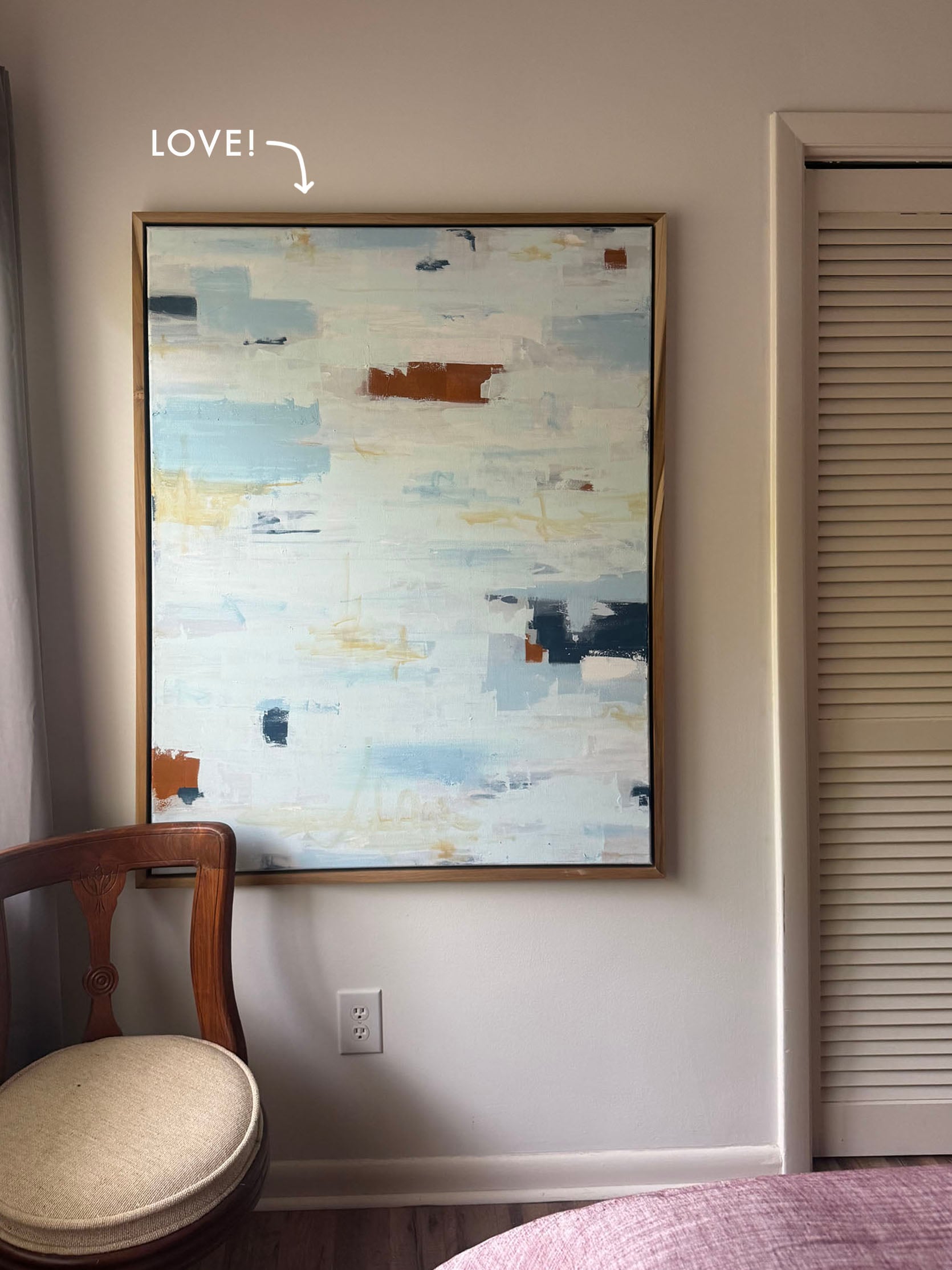
The Almost Done TV Room

From reader: I have two rooms in the house which I am stuck with. I would love your help and ideas! Keen to keep the budget to a minimum and not have to do a lot of work! One is the TV snug. I like the sofa and don’t think the room is bad, but something is missing/off, and it doesn’t feel exactly cohesive. I can’t work out why – wonder if it’s the shelving and that corner?”
My quick gut response: Paint color and sofa are great, warm, and happy (love that red sofa). And nothing you have here is “wrong”, but you could make the following changes to see if you like it better:
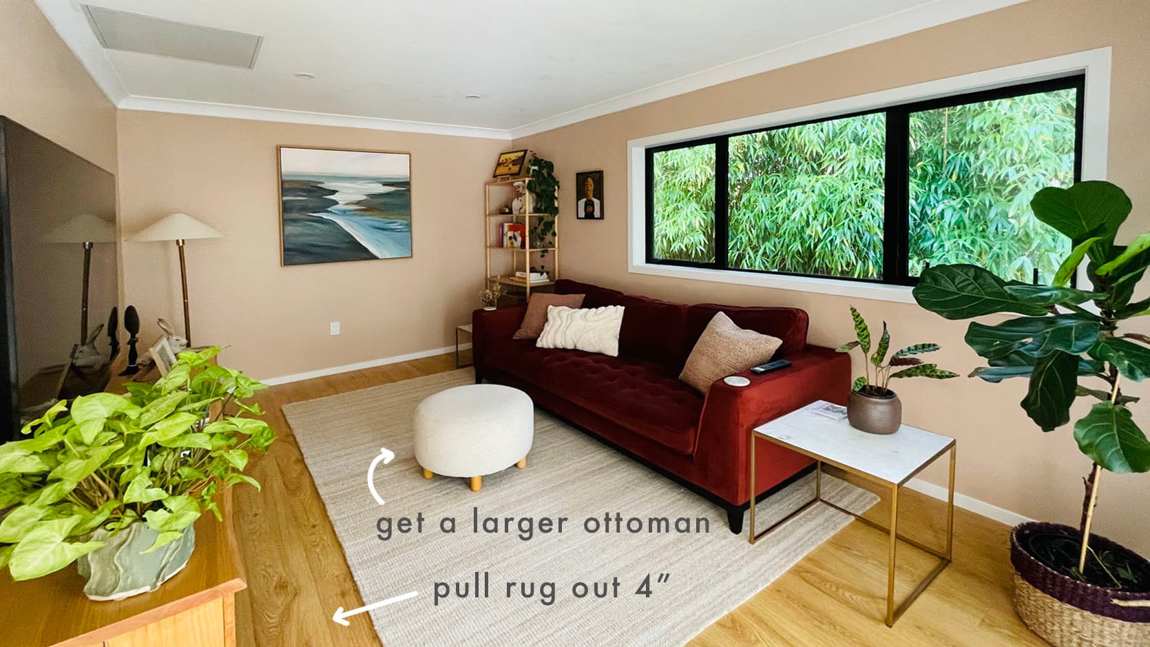
- Upgrade to a larger ottoman or coffee table. Not only will that be more comfortable and functional, but the room will feel less empty in the middle.
- Pull the rug out from under the sofa 4 more inches towards the TV (so that you have less of a gap between rug and credenza), which will make the room feel bigger and less chopped up.
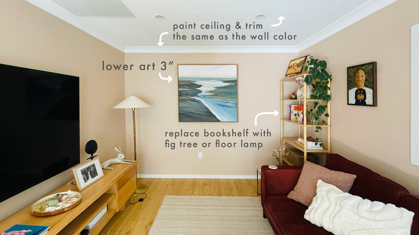
- Move the fig tree to the corner where the tall shelf is. The sculptural organic shape will take up more space, but be less busy (and will soften the window lines). If you can’t leave it there because it needs more light, then put the standing lamp there instead with that piece of art (which is very cool). The shelf is drawing my eye over there, but the little things on it are looking busy and messy in an otherwise pretty, calm room.
- Lower the large, pretty painting by 3 inches.
- If you want to go full snug, paint the ceiling (and maybe all the trim) the same peach.
A “Slightly Off” Living Room
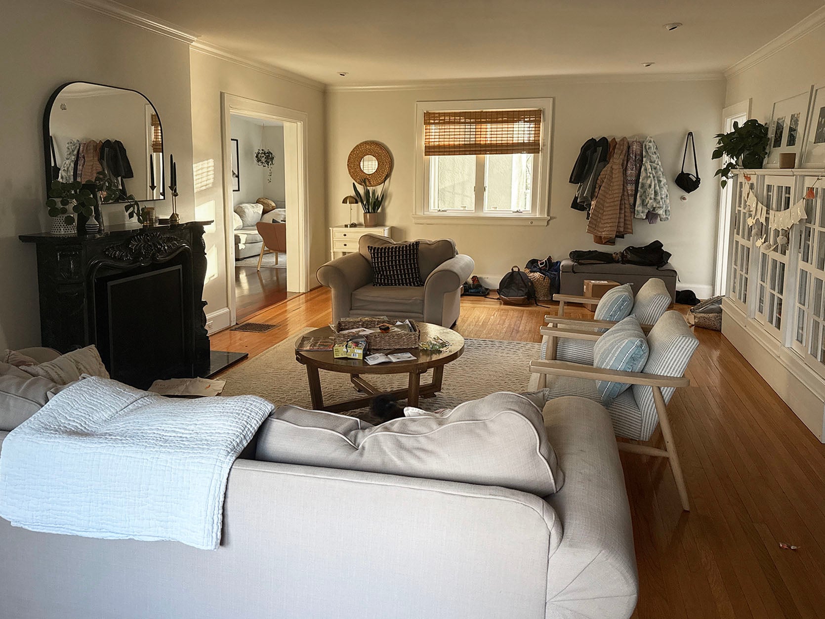
From reader: I really need help with this big center room in our house. It has lots of character, great light, tons of space – just feels blah and “off”. It’s high-traffic and high-chaos with three kiddos at home. Thanks for considering!
My quick gut response: You have a lot of great things happening! It looks comfortable and easy for people to hang out in. If you feel up to it, you could think about these ideas:
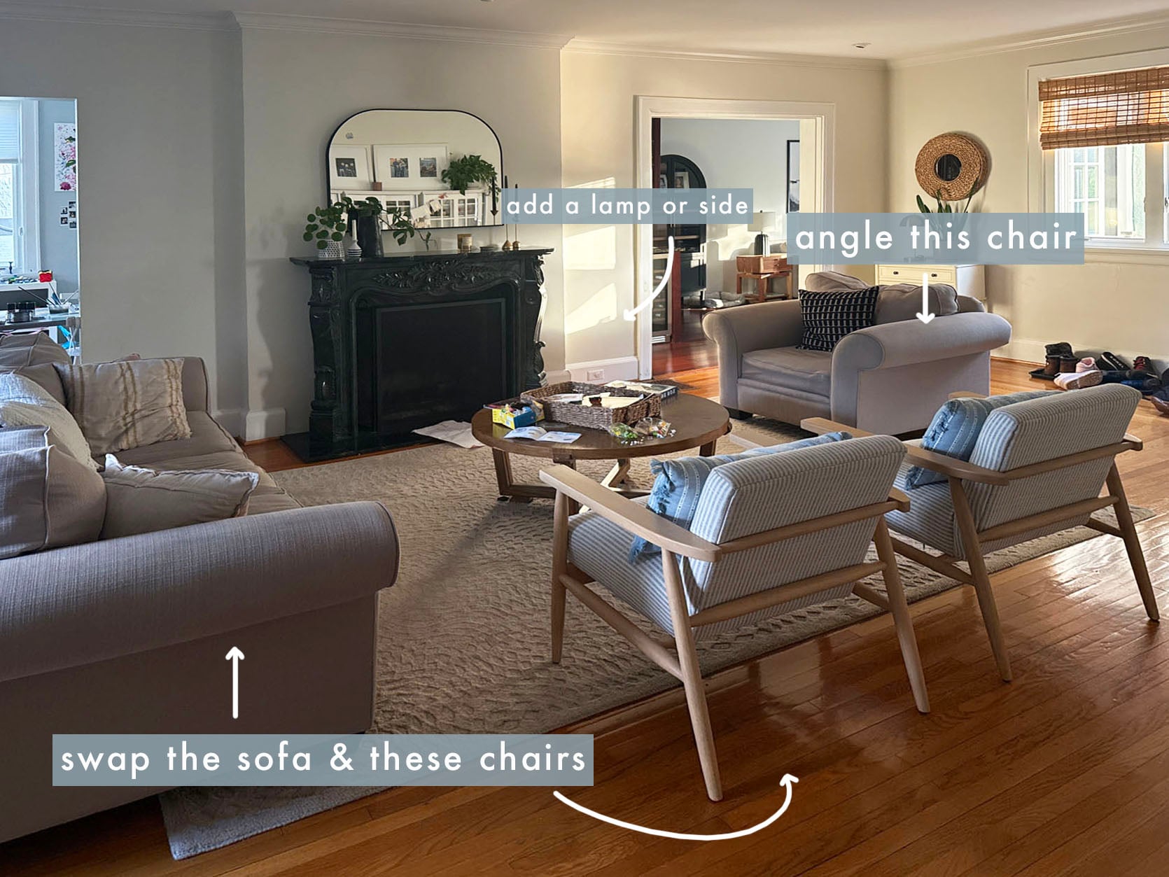
- Try the larger sofa opposite the fireplace, flanked by the two chairs and the large matching chair on an angle. There is probably a reason you didn’t do this (maybe it’s too big and there won’t be enough of a walkway?). But I’d try it again, even if it’s closer to the fireplace.
- This current iteration feels off balance since it’s so big and only on one side of the fireplace. Angle the big chair so its back is aiming at the doorway, allowing a pass through space in front of the sofa. This might create a more inviting (yet balanced) conversation area (think how we have our blue velvet Soho Home chair at an angle to our sofa). You might want to give that chair a friend – either a side table, a standing lamp, or an ottoman.
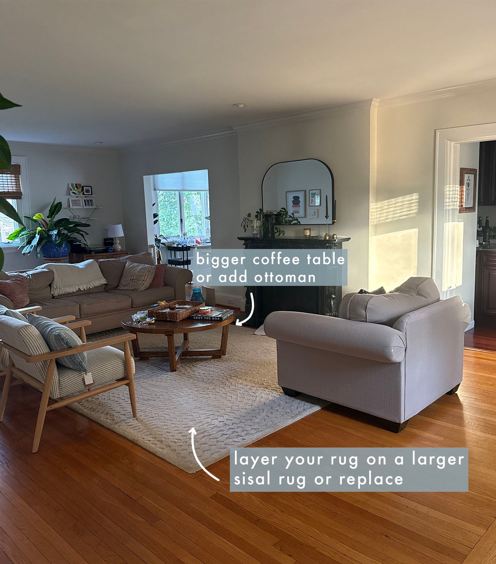
- Layer your rug on a larger sisal rug (or just get a larger rug). The scale of the sofa and chair really wants a larger rug to ground them. If you are going to replace the rug, get at least a 9×12 and ideally a soft color or pattern (solid, striped, or Persian-style, based on the style of your house). I love Chris Love Julias Loloi collection. Super classic and versatile.
- If the coffee table feels too small (round ones often do), then give it a smaller round ottoman as a friend (kind of like nesting buddies) to make it visually larger.
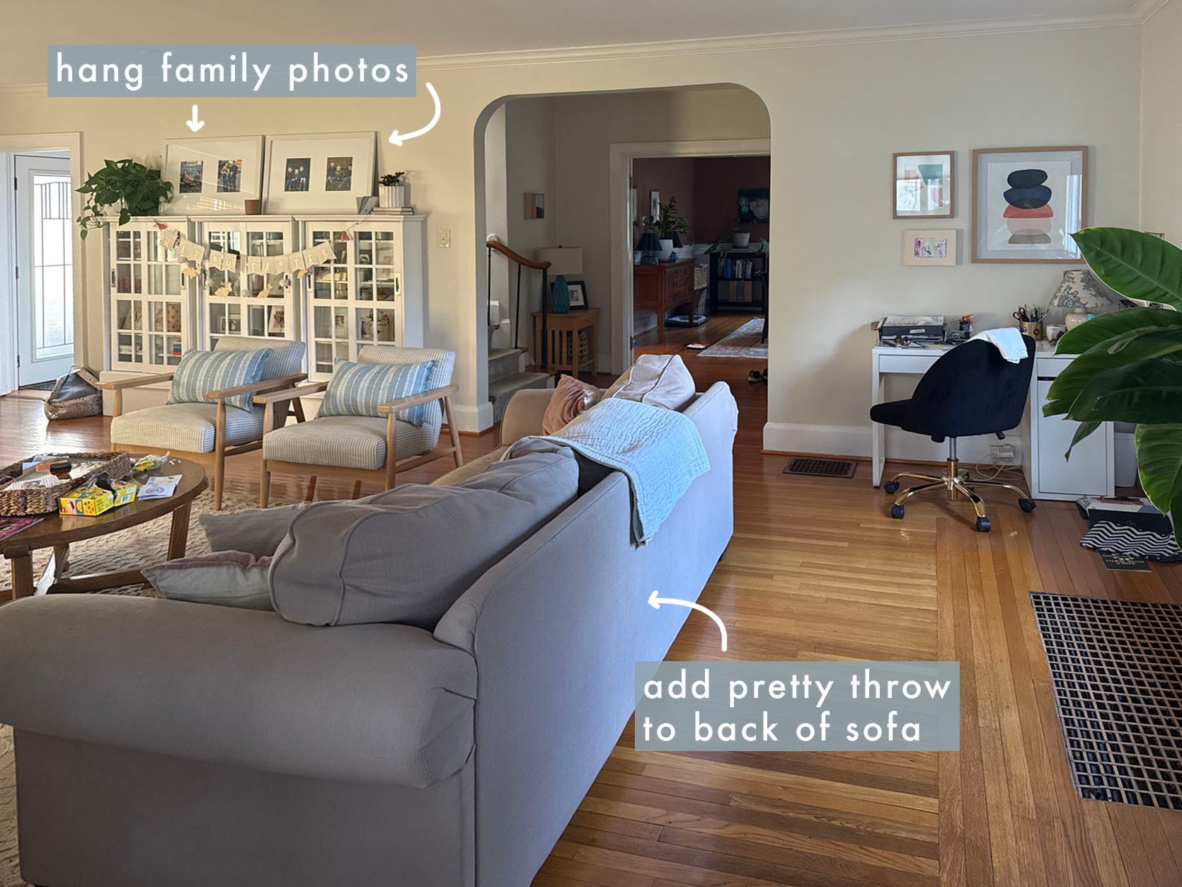
- Hang the photos above the shelf instead of leaning 🙂
- Add a pretty throw on the back of the sofa to break up the long gray mass that people will see as they walk into the room.
Love those built-ins and the fireplace (and mirror and chairs). So pretty!
The “Underdesigned” Guest Room
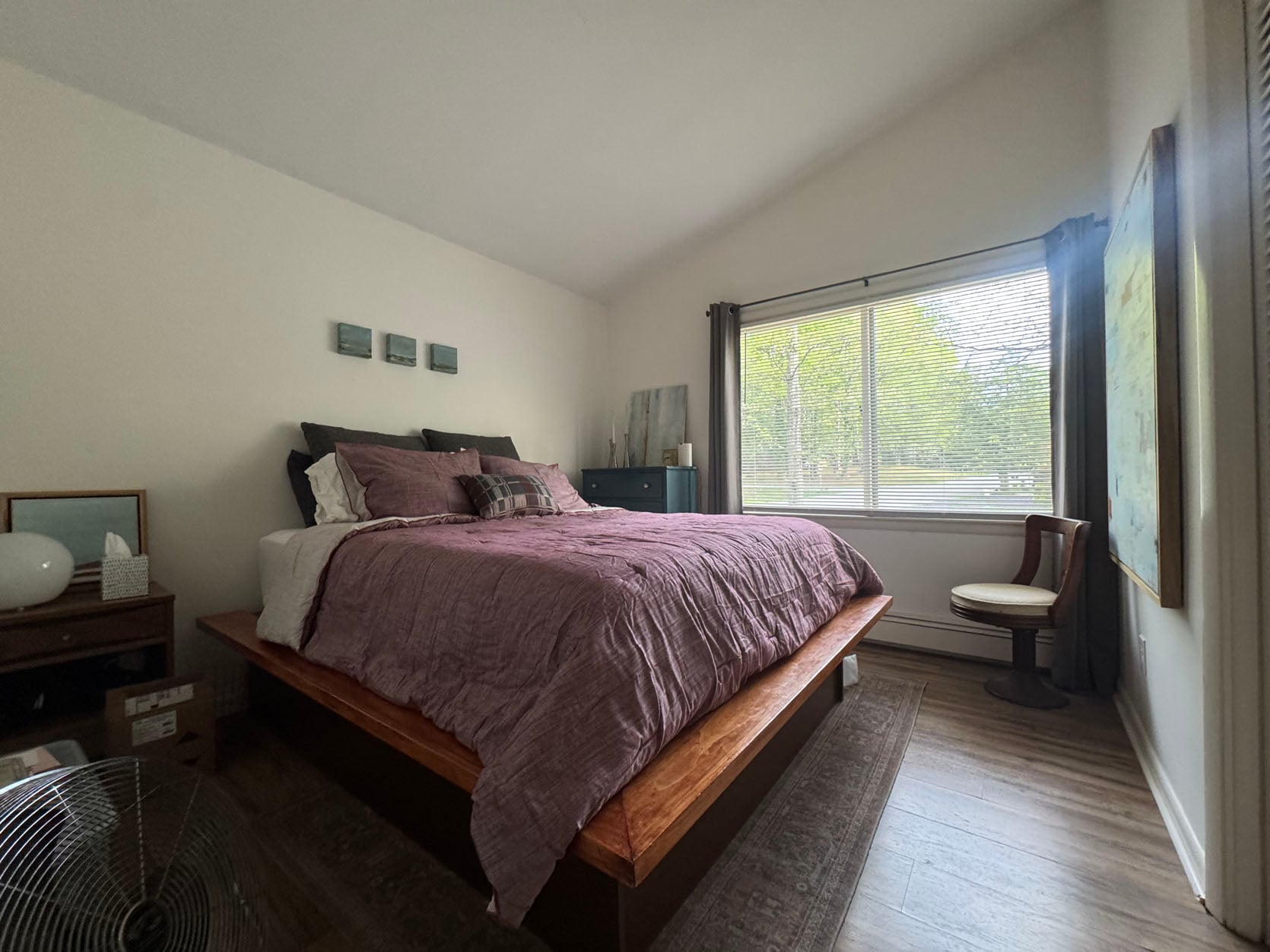
From reader: This is our tiny, under-designed guest room in our midcentury home. We love the house, but this room has just never been finished… due to my design fatigue. I love the newer bedding we added, and that my own paintings are scattered around. The blue dresser was a thrifted find I painted for my son’s nursery ten years ago. It gets pretty good light, but just feels unfinished. Do I paint the ceiling? Color drench the whole thing in a warm pink? Help!!!
My quick gut response: I’m the queen of “guest bedroom just gets leftover furniture,” so I get that this isn’t your first priority (it shouldn’t be!). That being said, I think this room has a lot of potential if you are open to putting in some sweat and tweaking a few things.
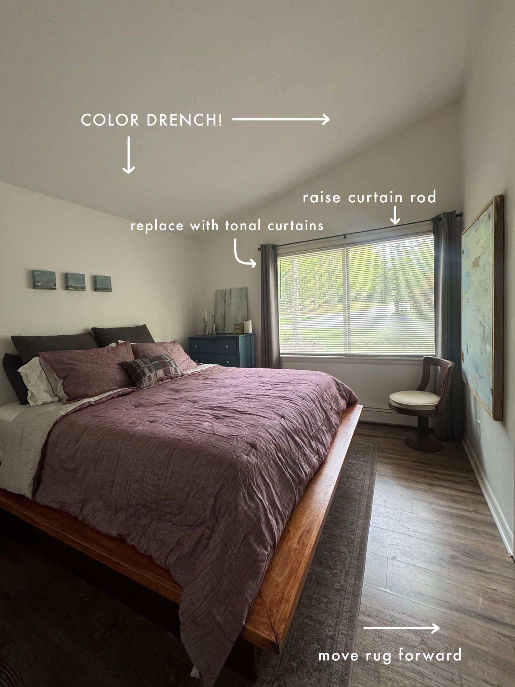
- Ok, you know I’m going to say it – Color drench!! If you do a dark color, then do the window trim and baseboard, but if it’s a light color, its ok to keep white. I really love that pink color in the bedding (and I love our pink guest room), so you could do something tonal, which I think looks great and keeps the room feeling big while also being cozy.
- Replace the gray curtains with a cream or tonal color that works with whatever you are painting the walls. I would get two panels per side since the window is so big (to help it feel full and proportioned). If you are up for it, raise the curtain rod and get taller curtains (to make the room feel taller). Check out this post for my rules🙂
- Pull the rug out from being so far underneath the bed, reducing the amount of wood flooring that is in front of it. I’d pull it out til its about 10″ from the closet wall.
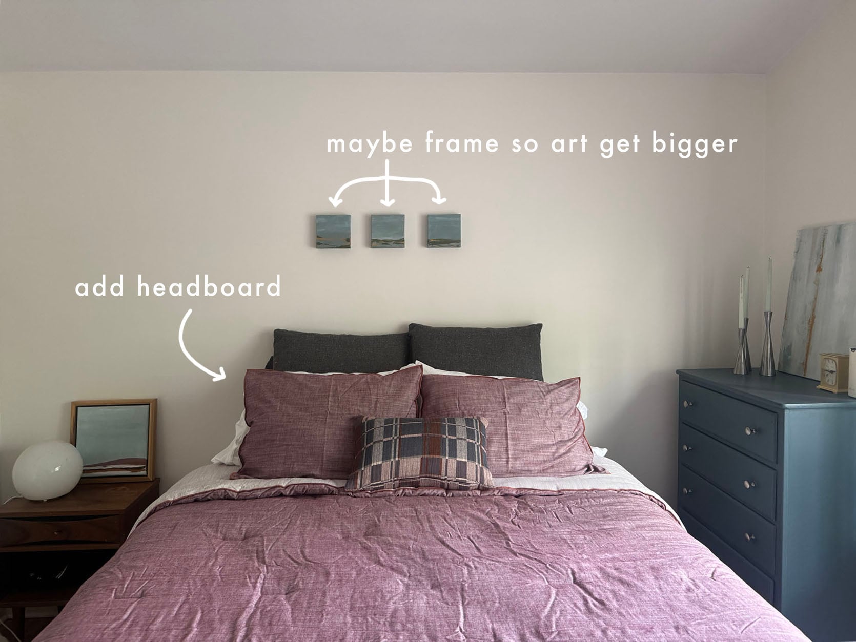
- Add a headboard to ground the main wall. You don’t have to replace the whole bed, but a simple fabric headboard will make it feel more finished (they often can be screwed into bed frames or just set on the floor).
- I think if you add a headboard, then three small pieces of art might not look so lost on the wall (but they are still pretty small). I wonder if you could frame them to have more presence? Otherwise, they might need to go into a smaller room or on a smaller wall to have more presence.
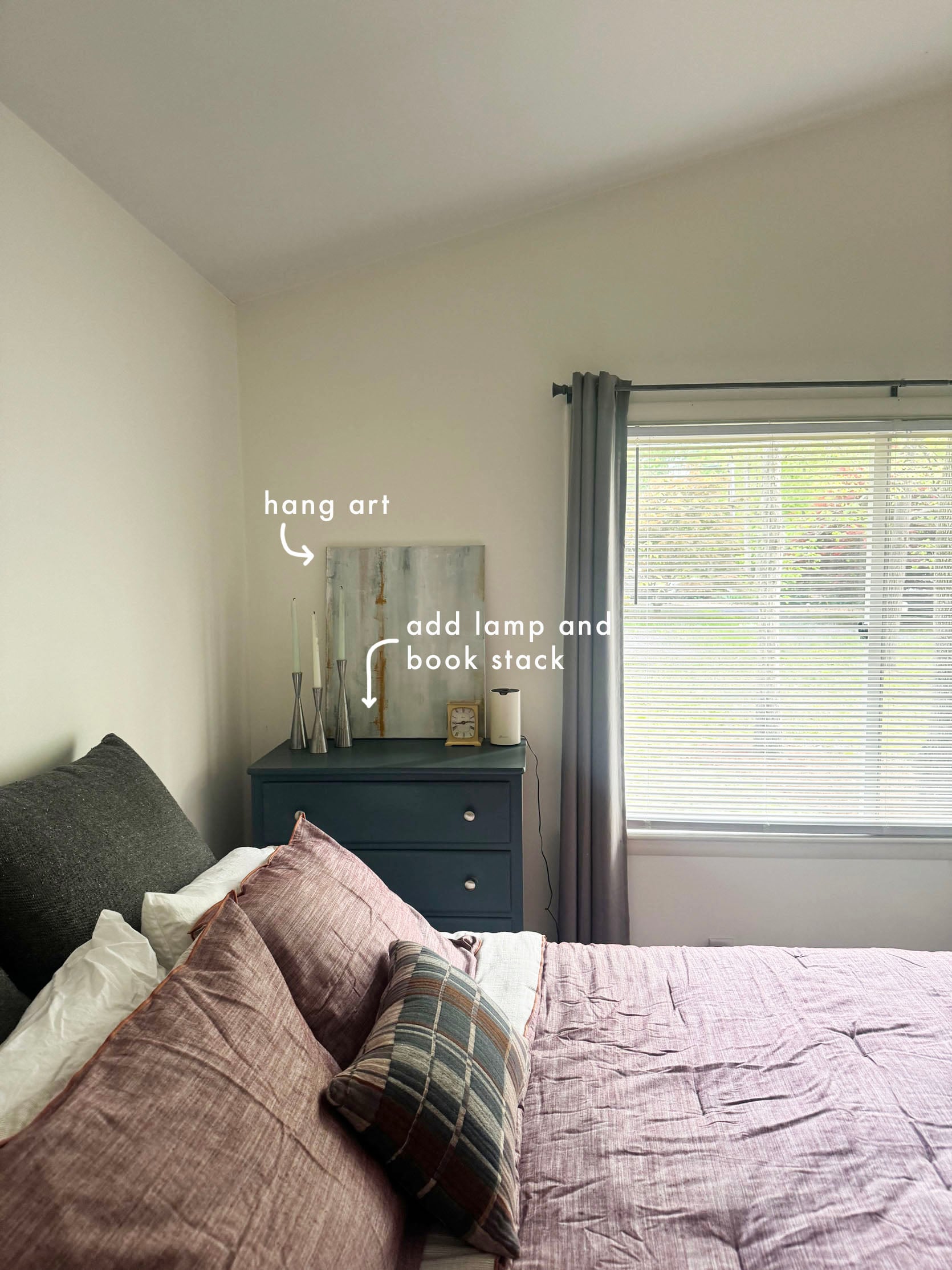
- I love that painting by the chair!! So beautiful!! Here’s her Instagram handle to check out more of her work! Kat currently just sells in some local NC galleries, but also takes commissions:)
- I think that the dresser works in the corner, just hang the art so it doesn’t sit on the dresser, and add a lamp and a low stack of books.
This was soooo fun. In a perfect world, I could teleport to each house and do this in person, just rearrange furniture and tweak, restyle, but until some billionaire tech person invents that booth, this will have to do. Thank you to all of you who submitted their rooms!
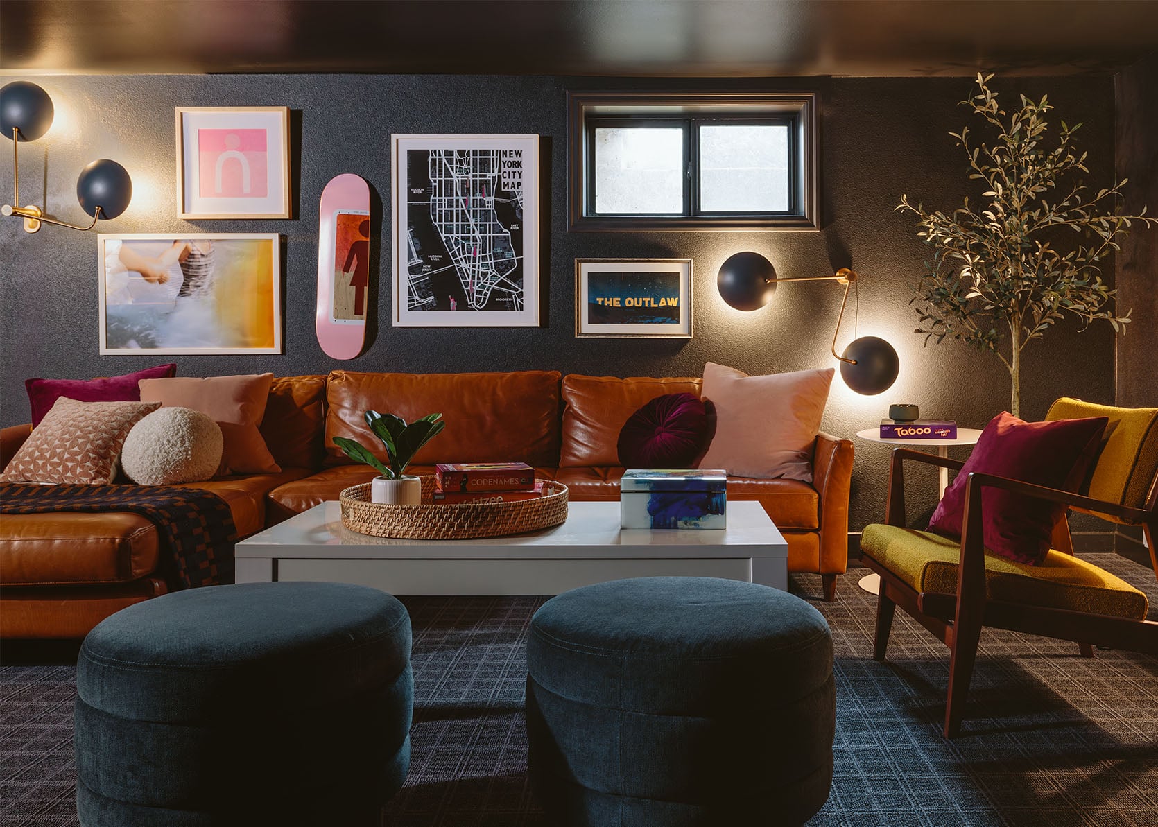
Opening Image Credits: Photo by Kailtin Green | From: A One Day Makeover For My Friend – A Teen Basement With Colorful Gallery Wall Using What They Already Had


I agree with all your advice. And, on the grounds that I feel we’re supposed to, I’d like to suggest some things too: Room 1 (the TV Room): I love the sofa but it is the only richly coloured thing in a room full of light neutrals. I think if you bring in something else of similar colour weight it will balance the room. Maybe an armchair or occasional chair or bench under the large artwork. Room 2 (the Living Room): All the throw-cushions on the seats in this room are different. I think if you get a new set of cushions that are all in the same colour scheme (I am a big fan of, say, a whole lot of burgundy-and-white cushions but each one is a different pattern or geometric or stripe) it will tie all the different seating together. That grid-pattern cushion on the armchair could be a great starting point, and the colours of it are great too. I think the neutral colours of the seating needs to balance out the strong colour of the fireplace more, and a good contrast with throw cushions could do that for you. Room 3 (the Guest Room). I think… Read more »
This is all great ideas on my guest room, thank you! And you’re exactly right, the leaning art has definitely been more stored than staged. Appreciate it!
Love this! How do we send in photos of rooms for consideration?
I think you have to be on Instagram and in her special Group thing.
Scratch that, I think it’s actually through her new Broadcast Channel on Insta .
Yes, I have this same question. 🙂 thank you for asking!
Oh, I love this sort of content – relatable and fun! And such great art in these! For the first room, I’d add a furry beanbag or wool ottoman under the beautiful painting on the back wall to give it some more seating and extra snuggly effect. Or a bar cart. For the second room, I’d try to fix that dumping ground near the door first. Could you replace the ottoman and hooks with a shallow but tall storage cupboard, so the bags, shoes and coats are all inside the cupboard? It would be much tidier if you could put them all away, and if people are inclined to throw down their bags then they can throw them on the floor of the cupboard and close the door. I’d go with a light wooden cabinet. If you need the storage, you could move the ottoman along to be under the window. Then get rid of the glass cabinets along the wall facing the fireplace so you’ve got more space for your sofa as Emily suggests and also so the doorway isn’t too closed off by the addition of the cupboard for coats – they seem to mainly have trinkets and… Read more »
Fun series!
I’d like to weigh in.
TV Snug, the sofa color is gorgeous. I’d love to see a slightly deeper wall color when the room gets color drenched. A picture light above the blue art. The credenza tchotchkes could be more colorful- richer hued in the red or blue so we see those colors repeated. Less is more, but high impact.
Living Room, the woven window shade is a nice color and texture in the otherwise single color room. I’d love to see more wood to warm up the space. For example the family art above the white bookcase could be reframed in a warm tone wood. The back of sofa blanket I envision something that incorporates nether raps: blue/cream/brown in a fun,graphic way.
Guest bedroom, that large art piece is amazing! The bed is too high and the frame add more bulk for the room and other furnishings. If it’s not an imposition, I’d get the headboard like what was suggested and new frame where the mattress just lays on top. Think Thuma, but less expensive even metal and add a bedskirt.
Love these suggestions, thank you!!!
in the first room I would play with the layout. seems like the TV could be on the far wall? those windows are so lovely, and you could try to move the sofa to get views to them sometimes.
Love this article! Much appreciated advice that benefits many is so valuable. Thanks Emily!
These are great, actionable ideas! I really, really enjoy this kind of post (and Aryln’s recent honey oak post). It’s been fun this week to have inspiration that feels relevant and relatable to readers’ homes.
LOVE the art in the guest room! KUDOS
I would also like to see more seating (padded bench or settee) in the TV snug – would be a great place to host watch parties!
Excuse me can we get a link to the reader/artist with the unfinished guest room? You made those paintings yourself?? Good job, ma’am! Literally do you sell your stuff on the internet???
Hi, artist here! Thank you, thank you so much for the kind words on my paintings!!! I think they linked my instagram and I take commissions from there. So grateful for Em’s advice and for all of the positive feedback! Best community on the internet.
Regarding the first room. I think the wall with the painting should be bolder, more of a focal point. I think if you turn etagere by 90 degrees, it will be more visibile, will be tall and more of an accent. And I’d put another etagere, ideally the same, but a different one in the same color/material/height would work too. I think that would fill the wall better, and provide another height. I’d leave the ficus where it is because it needs light.
I agree with everything else.
I looooove these kinds of posts! I always learn something I can apply to my own home. Thank you!
How can we find out who the artist is (last room)?? I lovelovelove those paintings SO much! Especially that big one by the chair. Wondering if it’s available for purchase?
Here!!! Thank you SO MUCH!!! Feeling the love! They linked my instagram – send me a message! @katjackson_studio
do more of these!! what (useful!) fun!
So fun!! I loved this!!
For the first room, I think adding a bit more of the darker red (or it could be a navy/brown/green) to other areas would balance the room. The red sofa visually weighs the room. Maybe a patterned rug (Loloi?) to repeat that color.
I love this post – more like this please!
Love this post
This post was so fun & helpful!!
I love this series!
I wonder how to participate in this.
I’m guessing it’s Instagram, but my DMs are never seen… is there an email or something where people could send entries? I know not everyone would be picked, of course, but having clearer instructions on how to try to get on these would be nice 🙂
Not sure, but this might be a way: “if you want to throw your room in the hat, you can submit here.” (links to a form; on the post How To EASILY Create A Nancy Meyers-Inspired Living Room)
Thank you!! I’ll look that up 🙂
I enjoyed these so much! Can completely relate to the ‘almost there’ state of these rooms. So helpful to follow along. Now I’m thinking if I take photos of my own spaces I can better analyze them. The suggestions are great because they are simply tweaks that bring out the best in each room already.
This is such a fantastic, helpful post! Love seeing real houses and real, easily applicable advice.
Such practical advice — especially the tip about pulling the rug out from under the bed and raising the curtain rod in the guest room. Small, zero-cost changes that make a huge visual difference. More posts like this, please!
Second room: I would change the layout by flipping the couch to the opposite side of the rug, so it creates more of a hallway effect and creates a barrier between the entrance zone and the living room. Put the chairs where the couch used to be, with a little table between them for drinks/your phone/a lamp, and then the comfy chair in front of the glass cabinets. There might even be room for a second comfy chair? Or another side table?
The drop-zone needs to be fixed so it’s more functional and less overwhelming. I would add low shelving that doubles as bench seating all along that wall and then add baskets to the shelves to store bags, shoes, and any other outdoor stuff. Keep the hooks by the door for jackets, although an old-school coat rack could also be an option if it fits better.
Finally, add some lighting! Some wall sconces by the fireplace, or a floor lamp in the corner beside it.
Good luck!
love these posts!
Love it when you do these type of real life redo’s and help outs. Even if my space is different I can usually glean a piece of advice or have arm chair quarterbacking. Thanks!