Design
This Quiet Design Trend Is Having A Moment For Good Reason
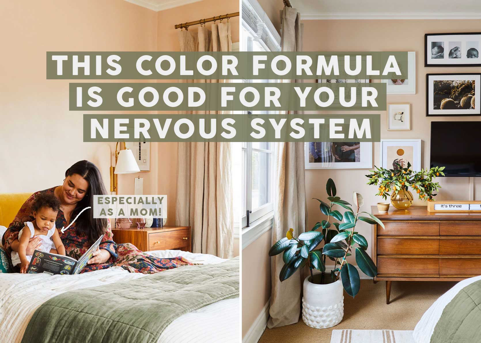
When you write about design and decorating as I do, you see a lot of rooms. And when you love interiors as much as I do, you fall for so many looks and styles along the way. It’s hard for me to peg my desired aesthetic due to this, but what I do know is that I’m very drawn to color. You should see the saved folder on my Instagram and Pinterest accounts. It’s all blue, yellow, burgundy, peach, mustard, olive, and sure, a little bit of creamy beige.
But while being able to proclaim my exact design style feels impossible, I have learned something about myself: My nervous system can’t handle a ton of contrast. This is a new development in my life, at least since I became a mother. Let me paint you a picture. As I write this post, I’m sitting on my couch, looking around my living room and I see the following in my direct line of sight: A play ice cream counter sitting atop my DVD player (yes, we still have one of those for library movies), a built marble run, a toddler shopping cart and baby stroller, a Little People’s farm, a wooden train…you get the point.
Sure, it would help to have a playroom where all of this could be tucked away, but this is just how we live in our home: Fully and in every room. All this added clutter and occasional disorder creates one thing for me—nervous system fraying. Add to that a bright blue sofa against a white wall and a dark reddish floor, and it’s an overload for my eyeballs. The seating and the walls are a high-contrast combo, and the same goes for the warm-hued laminate planks against the cool velvet of our sectional.
Enter: Low-contrast design, or what I’m drawn to for peace, calm, and its ability to carry a house full of high-contrast toys.
What Is Low-Contrast Design?
If you’re wondering exactly what I mean by “low-contrast,” it’s just what it sounds like: A room where the materials and colors are well, low in contrast. There’s no black-and-white or bold complementary hues from opposite sides of the color wheel. Tones repeat or coordinate, wood tones blend in more seamlessly with selected colors, and everything feels just more…quiet, even with heavy use of color.
You may be thinking what I’m talking about is color-drenching, and my response to that would be: No, not exactly. Sure, a color-drenched room could be classified as low-contrast, but it doesn’t necessarily always apply the other way around.
Here are some characteristics of a low-contrast room:
- Used colors are tonal or analogous (meaning, colors that sit next to each other on the color wheel, rather than across, which creates more tension and contrast)
- No sharp, bright whites or deep blacks. Think more mid-tones all together
- A tight color palette without too many added shades
- Surfaces such as your floors, ceilings, and walls should be just as considered within the subtle color palette
But First: A Study In High-Contrast Rooms
Before I walk you through some low-contrast rooms in action, I thought it would be helpful to see the opposite. Every single space you’ll see below is stunning; just to be clear, this isn’t an example of “what not to do.” Rooms with plenty of contrast are beautiful, interesting, and full of necessary tension. But they might not be for everyone at every phase of their lives, like me, while I have a young child and lots of stuff to tango with in our living spaces.
Light minty walls with a saturated rust sofa, a greige rug underfoot, a walnut wood desk, and a mahogany (I think) chair = high-contrast. So beautiful. I love to look at it, but I’m not sure I would feel at peace in my spirit while sitting on that couch.
Again, I’d be lucky to have a bathroom this pretty and sleek, but a dark navy tile juxtaposed with white porcelain fixtures and light neutral penny hex floors is energetic.
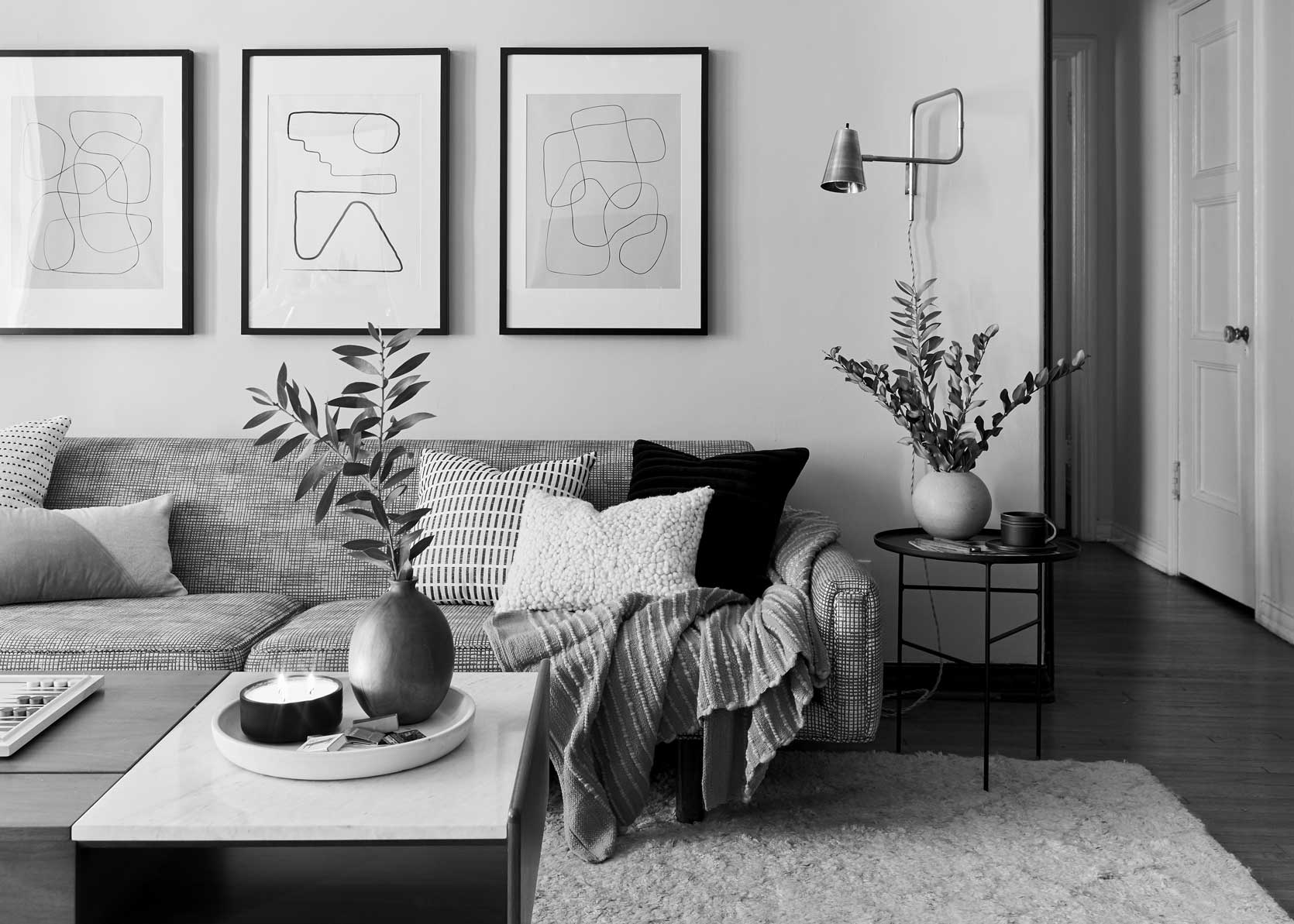
The combo of black and white is the very definition of contrast: Ying and yang, light and dark, bright and moody.
You can see *sort of* complementary colors in this room and how it creates a lot to look at (in a good way if you’re up for it). Red and green are opposites, of course, and while this is more of a plum and not a true representation of red, it still proves my point, I think.
There’s high-contrast, and then there is NO contrast, like this all-black monochrome room above. I just wanted to throw that in to see the full spectrum here.
Low Contrast: Color Edition
Good news! Low-contrast rooms can be done using color or all neutrals, and both are beautiful. Let’s start with color, because I am who I am.
Shout out to our buddies/EHD alums Velinda Hellen, Julie Rose, and Grace de Asis, who designed the above room that was just featured in House Beautiful. It was styled by Emily Bowser and shot by Sara Ligorria-Tramp, so basically, the dream freaking team. Here, they used varying shades of creams and browns alongside tones of soft greens. It’s easy on the eyes, beautiful, and interesting without having to scream at you.
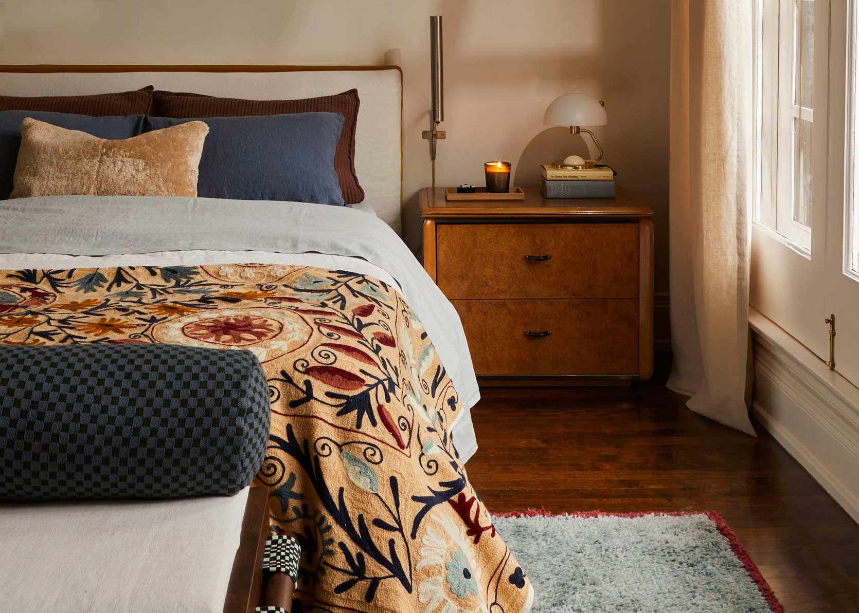
Want something with some more saturation? Do a deeper tonal look, like this blue story in a lovely room by Spec + Sage. The white tulip table does provide some contrast, but it’s such a small part of the space’s total design that it doesn’t overpower the rest of the lower contrast.
Here’s another angle of the same room (shot by our Sara Ligorria-Tramp). And again, yes, there is contrast between the nightstand and the lighter bedroom, and the deep amber nightstand, olive green rug, and blue walls, but 75% of what my eye takes in is in subtle harmony with each other. The intensity of each color is fairly equal, which does a good job of keeping it feeling moody and dreamy while still being even-keeled.
Another way to do low-contrast? Keep the tones of all the colors you use the same; for instance, in Kate Upton’s house featured in Architectural Digest, everything has a warm undertone. The chartreuse (remember when I said that was one of the new “it” colors??), the brick red, the clay pink. Even the wood tones lean orange/yellow.
Low Contrast: Neutral Edition
Large swaths of color aren’t for everyone or every home, so there’s how to do low-contrast in a neutral warm. Hint: It involves a lot of warm creams, taupes, and ochres.
“Arlyn, I’m seeing color!” you may say to yourself in disbelief as we start the neutrals section. I KNOW I KNOW. But listen, it’s important I show this, because even though the bedding is a punchy burgundy velvet, it still works so well with the super subtle peachy wall; and being that these are both warm colors, it plays totally in tune with the mushroomy doors, pine floors, and brown wicker chair in the foreground.
Some may say this is a colorful room, but it’s actually varying shades of wheat, brown and okay, okay, some red. But again, it’s the same approach. Everything except the short blue stool in the front is warm, so it reads very neutral all together. Nothing sticks out, nothing exclaims LOOK AT ME. It’s so easy on the eyes and spirit of this overstimulated mom. ::points to herslf::
Low contrast can still be done with tons of matter and interest. It doesn’t mean minimalism. It just means that the backdrop of your home or room is cohesive, so the primary red-blue-yellow Melissa & Doug train that will inevitably be left right in front of that dresser doesn’t have to contend with five other colors behind it. And for that, your busy brain will thank you.
I gotta tell you, I LOVE the way this room looks and makes my insides feel. I feel like if I curled up on that sofa, reached around to grab a book, and just sat in silence for 20 minutes (HA YEAH RIGHT), all the problems in my life would dissolve. It’s so peaceful, easy to digest, and, of course, low-contrast.
I’ve had this room bookmarked for months, and it makes me so happy. I love the enormous children’s art, which gets to have its moments because the rest of the space is basically all the same color: a shade of cream or brown.
Here’s an example of a low-contrast nook in a more high-contrast space. The background features deeply stained rafters with creamy white walls, which is the very definition of contrast, but the dining alcove balances that with an all-mid-tones arrangement.
And finally, another brown and greige living space that makes my heart skip a beat. Am I becoming a neutrals gal? When done like this, intentionally and well-balanced, then well…I could see that becoming more and more true. My eyes soften, my breath slows, and all feels right in the world (even when it’s so very not).
—
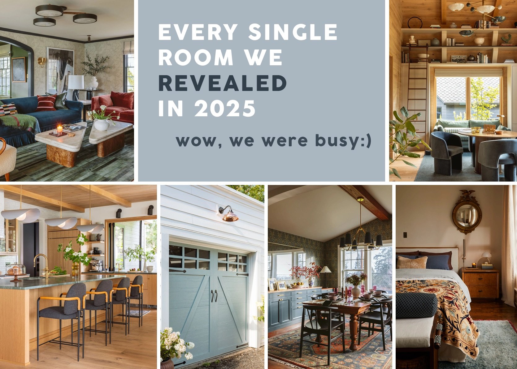
This is where I leave you. I spent weeks working through the low-contrast concept in my mind before pitching it to team EHD, and I’m glad I could go through the exercise of seeing it in action. I have a big life announcement coming in my next post (stay tuned!), and this post, as well as my last on yellow being a neutral, will get more play in the coming weeks and months from me. STAY TUNED!
Opening Image Credits: Photos by Design by Arlyn Hernandez (me!) | Styling by Emily Bowser | Photos by Sara Ligorria-Tramp | From: 3 Years In The Making Then An Unexpected Move: Arlyn’s Bedroom Reveal Is A Lesson In The Beauty Of “Unfinished” Design
Yes! This was very true for me as a mother. My children are now 7 and 10, and I’m starting to feel like I could explore adding some color to my bedroom, but since the toddler days of brightly colored chaos throughout the house, my bedroom has been a quiet, neutral haven. My bed frame is upholstered in natural linen, my curtains are linen, the walls are an almond color, the furniture is all warm wood, and the only color has been my MCM turquoise table lamps, and I’ve occasionally experimented with getting wild with my bedding, ha, ha. Not remotely design blog worthy, but a true reprieve for my overstimulated nervous system. Thanks for normalizing this, and for giving some really pretty examples!
Also, Arlyn, your bedroom is a dream!
Fun! But wanted to point out that the “children’s artworks” referenced in the one post are actually works by the artist whose instagram account the photo is posted to (you can see a lot more of her work on the page! Her name is Kathia Lagacé-Nadon!
This was very true for me with young kids as well – neutral color scheme of white & wood with muted greens and it was lovely. Now that my youngest is 9, color is back in a big way, baby. I appreciate both phases and heartily agree that you should create an environment that makes YOUR nervous system happy and works with your specific life.
Love your work, Arlyn!🥰 Rusty x
True how exhaustion and overstimulation in one area can make us lean so much harder into soothing experiences in other areas! Hey, even if you had a playroom, it absolutely would not matter – the kiddos always want to set up their play near Mom and/or Dad. Might work for end of the day toy storage but not much else IME.
I definitely experienced an extra craving for low stimulation environments during the early years, but even now when my girls are 10 and 13 I will never revisit high contrast, I think. My eyeballs simply don’t like it- it hits too hard. For example, those broken stripe textiles Emily likes so much just make me feel electrocuted!
Gosh, these are all so pretty. You find such good examples, Arlyn. I’d love a round up of accounts you follow and how you go about doing your research.
I, too, have white walls and a very blue sofa and the high contrast is a lot for my eyes. I invested a lot in the sofa, so maybe it’s time to re-think the paint…
This really resonated with me.Also never understood why baseboards were painted in the trim color rather than the wall color. Such high contrast makes the room seem smaller. Thank you for fleshing out my instinctive reaction to this color dilemma.
You nail it every time, Arlyn! Always enjoy your articles.
I definitely feel at this stage in my life (with 5 boys 11 and under) I lean into low contrast!
There is enough overstimulation for me from looking at my entry wall with piles of coats and many baskets of shoes.
But we still need the prints and patterns to help disguise the grime of children, which is what I’ve been working on lately.
Another great post, Arlyn! Love these low contrast spaces.
I finally feel seen. Low contrast isn’t making headlines because it’s not splashy and fresh, but low contrast is just what my eyeballs like and soul needs. I always described by perfect view as a long endless ocean, calm, serene, a low variety of colors in a subtle ombre effect. Like you said, but life is full of other stuff, I need my background soothing. I love a using the same color but layering with different textures, that’s enough to feel interesting to me.
I like higher contrast in my living room and lower contrast in my bedroom. Fifteen years ago I completed a bed quilt with lots of aqua, turquoise, orange, and coral, a plethora of patterns, and very little white. Now it’s just too much for me, so I hide it under my aqua dominant duvet.
Ooh. Thanks for this! I’ve also been drawn to low contrast tonal rooms but just realized reading this that I’ve been feeling guilty about it. Like it was a boring, safe option. But the tonality does calm my nervous system and high contrast just feeling jarring. So you’ve given me a bit of validation and maybe courage to lean into this some more.
Arlyn, I appreciate your thoughtfulness on topics that often speak directly to me. It’s not just that your posts reflect my sensibilities, I always come away with a deeper understanding of, and the ability to articulate why, I love what I love. Plus, I never leave here without at least one new instagram designer to follow.
Thank you!