Design
Turns Out This Bold Primary Color Acts *Basically* Like a Neutral (Let Me Explain)
Color in our homes is one of those things that you are either comfortable with or trepidatious about. Well, there is the third category of being someone willing to bring in “pops” of something other than gray, cream, black, or white, but what if I told you there’s a lucious hue that actually reads like a neutral but brings a room to life in a way no beige could? Can you guess what it is? Hint: No, it’s not blue.
Surprise! It’s yellow! Mustard, ochre, butter, primary yellow…it doesn’t really matter the variation, it’s the easiest color to work into basically any color palette because, if you think about it, it’s one of the closest colors to an actual neutral. Beige and cream? Just highly desaturated versions of yellow. Wood? Typically has golden yellow undertones. Yellow, even in small amounts, makes up all warm neutrals by default, so when you ramp it up, it makes sense that it could easily fit in with basically anything.
Quick anecdote: Once upon a time, I bought a pair of yellow leather and brass sandals only because they were on major sale, assuming they wouldn’t go with much, but I couldn’t walk away from the price for the quality. Long story (and many outfits and wears later—so many that they eventually fell apart) short, those little mustard T-straps coordinated with basically EVERYTHING. Plum blouses, red dresses, all-black chic, summer whites and creams…on went they went. Adding a subtle oomph and zero color conflict.
Let my sandals be a lesson for your home: Yellow goes with everything. Hence, it’s basically a neutral.
Below is a quick visual I put together to prove my point. The first collage is a top row of neutrals, a middle row of warm wood tones, and a bottom row of yellow. The image after that is the same thing, but with blue instead. Watch how the yellows perfectly blend in, and the blues stand out:
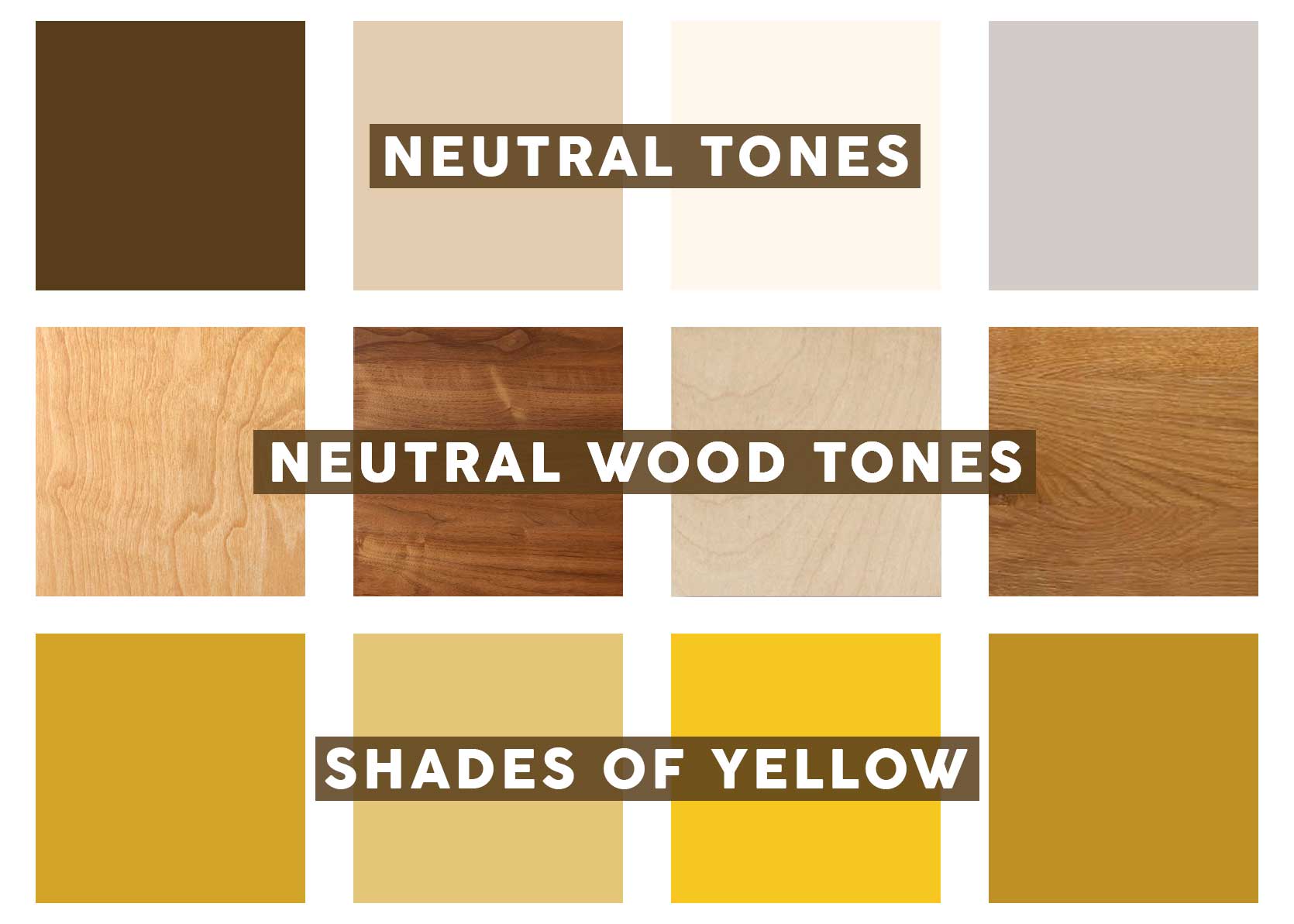
If you saw all of the above in the same space, your eye wouldn’t register any contrast. Just as it would with no vibrant color. But the blue below is a different story:
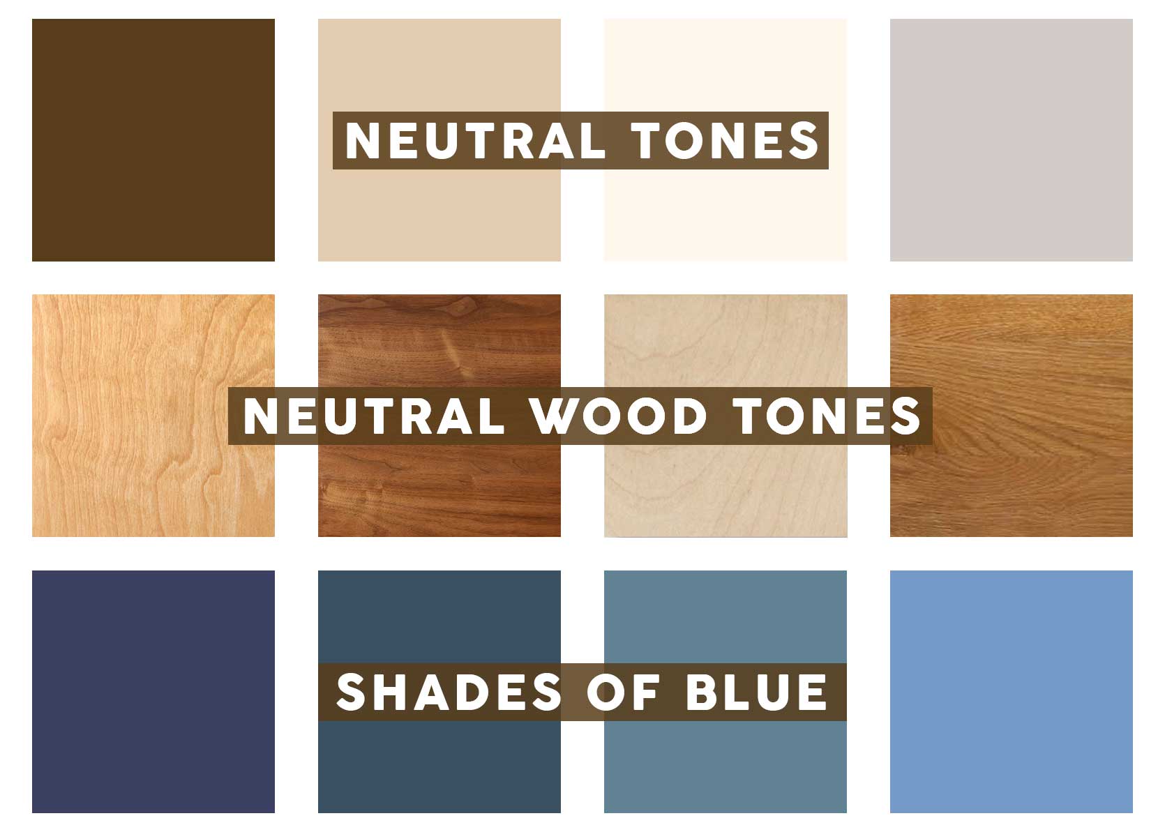
Does it look nice and calm? Sure! But do any of the shades of blue resemble the hues or materials shown above? No. Of course, someone here could argue that blue is an offshoot of certain grays (a neutral), but keep those thoughts to yourself, mkay? I’m not accepting feedback in this department. 😉
Yellow In Action
You know I need to keep proving my point, over and over again, for all you doubters out there (or to anyone already on board, you’re welcome in advance for all the inspo).
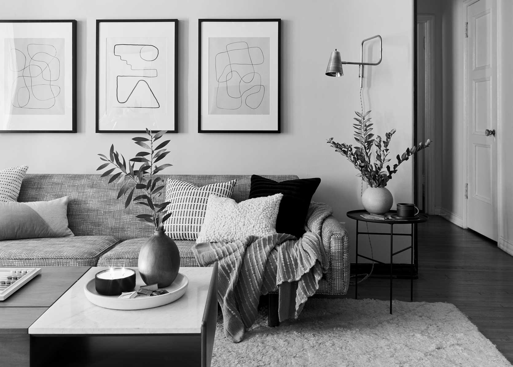
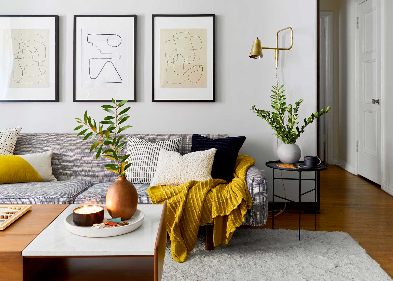
How lovely is this?!? Yellow has a way of looking complex and interesting, yet quiet when used in multiple applications in a room with white or cream walls. Be sure to bring in a corresponding pattern (like that bolster pillow) and plenty of warm brass to kick it up a notch.
Yellow isn’t often a color much associated with elegance and luxury design, but it should be, particularly when it’s in a golden velvet such as on this sofa. It perfectly melds with the warm whites on the wall and coffee table.
Another example of a very cool, very high-end living room where yellow and warm creams feel like butter and honey melting on artisan toast. Just delicious, calm, and luxe.
Two Togo chairs are just enough of a bridge between the high-contrast tight-back sofa and the red-toned plank ceiling and earthy stone wall. To me, that’s the beauty of this kind of yellow; paired with crisp, cool whites, it feels modern and sharp, but when sitting next to organic materials, it’s easy and seamless.
Love pattern, but not an overload of color and contrast? Try on something like this lovely bathroom by Studio Squire. The muddled yellow in the background of the wallpaper feels timeless and timeworn (in a good way) against the deep mahogany of the mirror frame, towel stand, and side chair. The brass legs of the sink console echo the hue.
Okay, here is something a bit different. This is not a neutral room, obviously, BUT, see how the yellow rug doesn’t really *add* to the color palette, more so that it grounds it amongst the warm neutrals throughout the architectural moments.
Another chic room, another yellow rug. Having the tone on the floor continues the visual line of the wood paneling while adding enough variance to keep it interesting.
Marco Zamora’s previous apartment, which he just moved out of, was a great example of how to incorporate a buttery yellow: Via draperies. They’re a step above white or flax panels without adding weight or distracting from a room with intricate architecture.
It doesn’t all have to be calm and hushed; yellow can be punchy and a perfect wingman to graphic wallpaper while still being very livable and non-trendy. Studio Wanda pulled the ochre from the florals of the wallcovering and repeated it on the bottom half of the wall. It’s hard to tell if the leafwork of the paper’s pattern is blue or black; either way, they play nice.
We’ve written about butter yellow being the darling of kitchen design over the last year, but we’ve never really approached it from the argument that it’s a neutral choice for cabinetry. I think it holds especially true in a home with great natural light, as well as a healthy mix of warm wood tones across floors and furniture. And so far, we’ve seen yellow mostly with brass, but it’s also great with nickel, chrome, and silver.
Another one from Studio Wanda. If you click through, you’ll notice the bed is a rich blue, but in the first image, it’s just a lovely, glowing, happy book with a mustard velvet armchair. Sure, a beige linen chair or bouclé would have been nice, albeit a bit boring. What’s not boring? A yellow armchair.
And finally, just a touch of ochre is all you need in a wood-wrapped space like this bathroom by Prospect Refuge. Do me a favor and cover the towel up with your finger, then pull it away. See the difference? It’s like the mustard on a hot dog (not a classy comparison, but effective).
—
So, after saying the word “yellow” and its synonyms nearly 30 times, I think I can rest my case. It’s just the hue your neutral room might need to add some oomph without adding anything that registers as a color that screams at you. It can also be just what you need to round out a color palette that feels flat or unfinished. It’s a panacea for most rooms that you may have overlooked all along because it doesn’t get all the flash and press of blue or green of being an unexpected red.
Thanks for being here today. Until next time, friends…
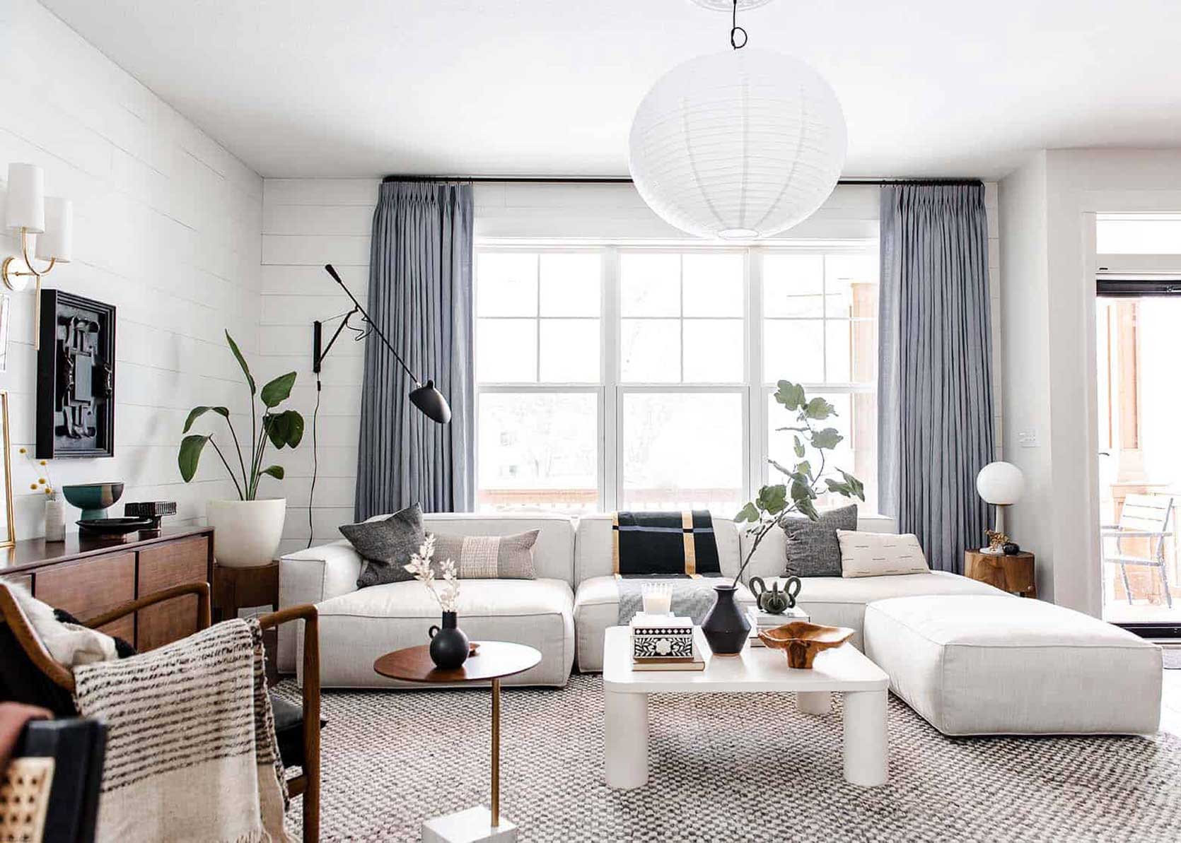
*Opening Image Credits: Design by Julie Rose | Photo by Sara Ligorria-Tramp | From: A Mid-Century Eclectic Living Room with Kilz Primer and Paint – The Dark Room Problem SOLVED
YES! I’m a big believer that every room needs a little yellow / gold / mustard. Especially now that I live in an area with long, gray, cold winters, a little yellow goes a long way. Thank you for this beautiful reminder.
I used to think every room needed some black or red, but now I’m team yellow for sure! (And well, black, too)
Yes!! I’m so happy that the previous owners of our summerhouse realised this as well and built a yellow kitchen to go with all the pine and brown tones. It’s just the perfect fit. And for me it’s so easy to just add some mustard fabrics and it just blend in perfectly.
Lisa that space is gorgeous! Is that mural in the background a map of some kind?
Thank you! Yes it’s amazing and I’m so thankful for the people that built it. The map is a laminated copy of a map from 1870s Stockholm. The woman who lived there used to work in a museum so there’s maps used as built in decorations in a couple of rooms. Great idea! I’ve attached a close up version.
Lisa, we need a house tour of this amazing space. Contact someone either here or at Cup of Jo as they still do house tours.
Lisa, email me! Hahaha 🙂
Someone get this place on the blog! 🙂
If they would be able to come to Sweden for that, it sure would be fun! 😅🥰
Lisa, your pics are great…you don’t need a special photographer. Send an email to Arlyn STAT and find out your next steps. Maybe try hello at arlynsays.com or arlyn at emilyhendersonstudio.com……
What a cozy space full of so much character! Amazing, and yes the yellow is perfect there.
You don’t have to convince me. I ordered a custom, gold fabric chair sight-unseen as a neutral for our new home, and it’s worked out beautifully. Also, have ochre print draperies that work as a neutral in our living room. The altforliving room is gorgeous!
Love it!
I’m with you! Flying my mustard flag. Love it.
Big lover of yellow in all hues, shades and tones, and particularly fond of a touch of acid yellow in a room.
I actually think most colours can be neutrals – rusty oranges, ochre reds, dusty pinks, sage greens, stormy blues etc etc – anything that appears in nature really.
I gotta say, I agree that a lot of other colors can act as neutrals. Let’s just say yes to ALL the colors!
We picked gold felt/fabric for our pool table surface, it was the prettiest color they offered. It may sound weird but it looks amazing!
OHHH I love the sound of that!
Arlyn, thanks for your ode to yellow! When we moved to the PNW, I knew I needed to get rid of the dreary off-white. Now there are 4 shades of buttery yellows on the walls in my house. My husband and daughter had to persuade me not to go yellow when we paint our new siding this spring. (We’re sticking with a warm earthy red like I chose 17 years ago.)
It’s kind of miraculous how happy yellow in any shade can make a room feel, right?
This was an eye opening post! Before the reveal I was SURE the color was going to be olive green. I was stunned and dubious when it was yellow! I thought there was no way. But, by the end of the post, I”m convinced! It really does bring a richness and warmth to every room shown.
Ohhh I do love olive green, though. 🙂
When I bought my house I knew I had to paint the white radiator cover chartreuse. Every room in my house has a pop of yellow – whether it’s a lamp, pillow, art ect. The same for red/orangish red.
LOVE that colour on your radiator! Beautiful room, beautiful cat 🙂
That’s a RADIATOR??? wow
Yes! When I bought my house I knew I had to paint the white radiator cover chartreuse. Every room in my house has a pop of yellow – whether it’s a lamp, pillow, art ect. The same for red/orangish red.
Lovely! (And so is the snoozing kitty.)
Love this post and love yellow!! It makes the world better!
You completely changed my perspective and now I’m reevaluating my entire home decor. Thank you!
It’s all I could ask for! 😉
You convinced me, Arlyn!
I am in love with mustard yellow! I am an artist and paint mostly abstracts. While I would never make a painting to match the sofa, lately I have been using a lot of Yellow tones as my neutral. I am happy to hear my instinctual choices resonated here.
I don’t love yellow, but I do LOVE your artwork!
Great article, Arlyn. You convinced me. Yellow doesn’t necessarily jump out, but it can still wake things up. I just unfortunately don’t care for it very much… I could get behind soft butter yellows, but gold/mustard/ochre is just not for me.
This was the perfect “neutral” pick me up needed right now! And I’m realizing I have missed a former yellow living room. Am highly considering adding some ochre/mustard accents and furnishings now. Beautiful examples brought your point home, Arlyn!
Love this. Just had these drapery installed in my client’s condo. Everything else was neutral and grays, so this pop of mustard on the wide bottom border of the drapery really added some nice color to the space!
Those drapes are so good!
Yet another great post from Arlyn. Love your color sense!
I really love yellow in interior! Can’t believe I see this post! Thought I was one of the few, as it is usually considered more specific and people rarely dare to use it when creating spaces 🙂 I am so happy!
I think all the same would apply to burgundy. I thought if it when you mentioned the shoes – I have some burgundy sandals that go with EVERYTHING and are just the right sophisticated color. I’m a color-lover and do agree with the person who said we should use all the colors 🙂 but burgundy is also a warm color that can be found in many woods and stones.