Design
Mixing “Leggy” & “Chunky” Furniture Is The Secret To A Balanced Space. Here’s How to Do It.
Have you ever looked around a room in your home and thought, “Hmm, something isn’t quite right?” but you couldn’t figure out why? Honestly, it could be a handful of reasons, such as the color palette isn’t well-rounded, the size or scale of your furniture is off, or maybe your curtains or art aren’t hung at the correct height. But if you feel like those boxes are all checked to your satisfaction, there could be something else going on: You don’t have the right combination of silhouette weights. Let me explain.
Most furniture and larger accessories can be categorized into two groups—leggy and chunky—and if the balance is off between these, things can feel either overly floaty or too heavy. While there are always exceptions to the rules (yup, I’m going through those, too), I took some time to study images in a variety of rooms to figure out what the right mix of chunky (solid, low-lying base) + leggy (thin-lined silhouette or tall legs) is to hit the bullseyes on balance in your spaces. But first, I want to give credit to Hans Lorei, who made this video on the topic a few weeks ago, which got my gears churning on the subject. Give it a watch as a primer; I’ll wait.
…..
……….
Okay, welcome back. Before we go into the examples of rooms with the right ratio, let’s hop in our home time machine and explore my previous living room. I loved that room at the time and, honestly, still do when I look back at it, but there was always something about it that felt a touch busy. Especially when life layered in baby things, hobby items, and just generally all that stuff that you collect and can’t find a spot for.
So I decided to scrutinize the furniture, keeping chunky + leggy proportions in mind, and I can see now why: It was all leggy, almost no chunk.
Coffee table: Leggy. Sofa? Leggy (with a bit of chunk, thankfully). Armchairs and side table: Leggy. Lamp: Leggy. There is a side table under the lamp that was chunky and you can’t see in this photo, but there’s also a console table to the right of this sofa that was also quite leggy. To my eye, it’s just lines, lines, lines, not to mention the inconvenience of all the balls and toys my kid played with rolling under something for the UMPTEENTH TIME a day.
Again, I think this room looked great in so many ways, and I loved living in it, but even a solid/chunky coffee table or more full-bodied chairs may have elevated it to the next level. And that’s what we’re trying to do here today. Posts like these aren’t meant to shame you into “fixing” your home, but rather help you feel a bit more pulled together, like your designer best friend came in and helped you tweak a few things for the better.
The Rules Of Leggy + Chunky (& When You Can Break Them)
We love a rule here at EHD, not to lock you into something, but to help set you free from analysis paralysis. Or perhaps the word “guideline” is best, because there are times when you can play around with said rules. But let’s stick with what to aim for first, before looking at a few defiant spaces.
In the world of leggy + chunky, I believe a few ratios work best:
- 1:1 (50/50 if you’re better with fractions, or just a fairly even split across both furniture weights)
- 2:3 (60/40, or 1 chunky piece for every 3 or so leggy pieces, and vice versa)
- 1:?? (Don’t be thrown by the question marks, this is not a typo. I write this because even one sizable piece that is either leggy or chunky in a room of all the opposite type is going to be much better than not.
Examples Of 1:1 Or 50/50
I dug through the EHD recent archive to study some of Em and the team’s work, and, not surprisingly, they all adhere to either a 1:1 or 2:3 silhouette ratio. Let’s look at them together.
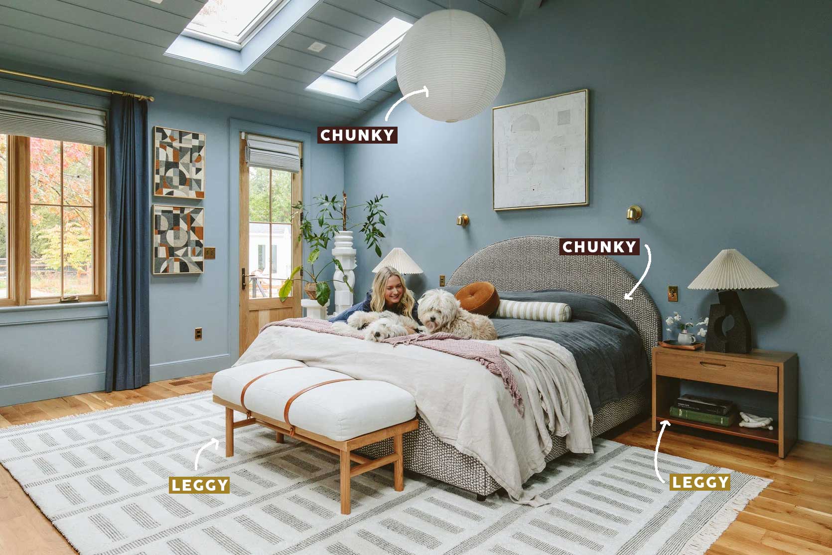
Here’s a shot from the primary bedroom in Emily’s farmhouse. As you can see, the bench and the nightstand can be labelled as leggy because they have some visible vertical lines (the nightstand, depending on the angle, could also look chunky, but from here, I’m calling it for the #teamleggy). The bed frame and pendant lamp—both solid pieces—round out the 50/50 distribution. Sure, you can take a look at the table lamp, the greenery, and a few other pieces to add to the equation, but the base fits squarely in the 1:1 ratio.
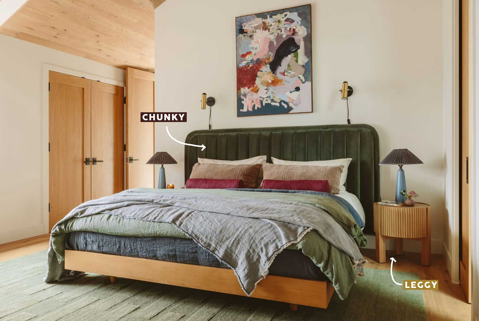
Another bedroom by Emily, this time from the River House. It’s a fairly simple one: Chunky bed, leggy nightstands. Boom, done. If you ever find yourself struggling to pick side tables for your bed, just remember the rule of opposites here.
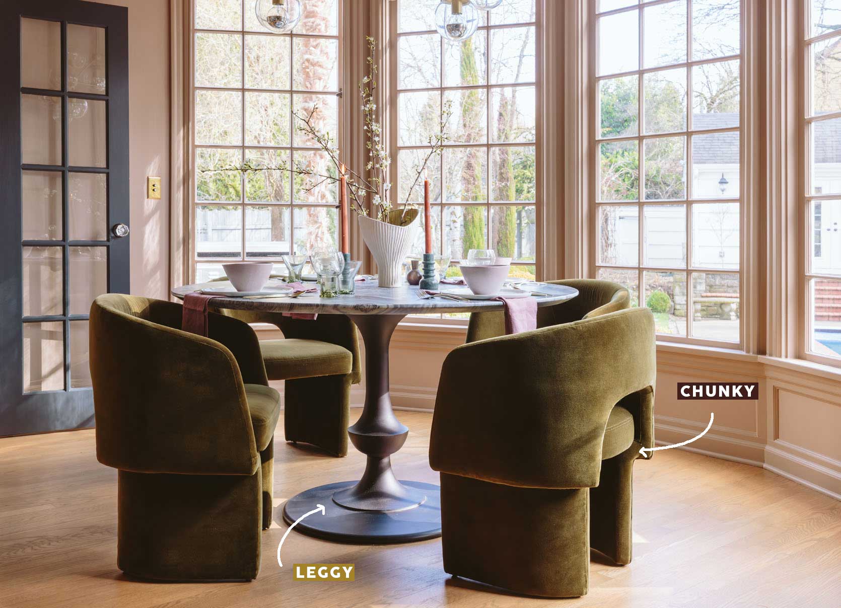
Here is the 50/50 split in action in a breakfast nook room. Chunky chairs, slender pedestal table. Many other light and airy aspects to this space also balance the club-like chairs, but it would still work without the bank of windows with the delicate grid.
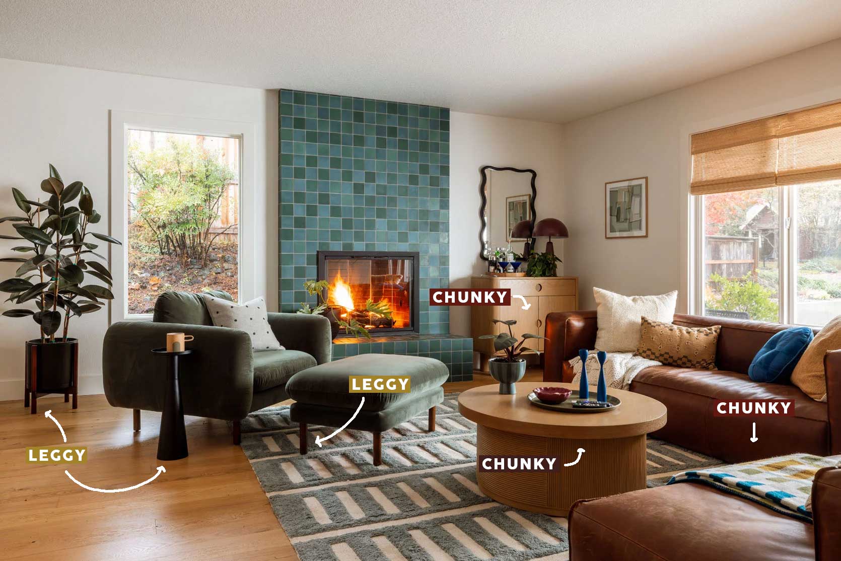
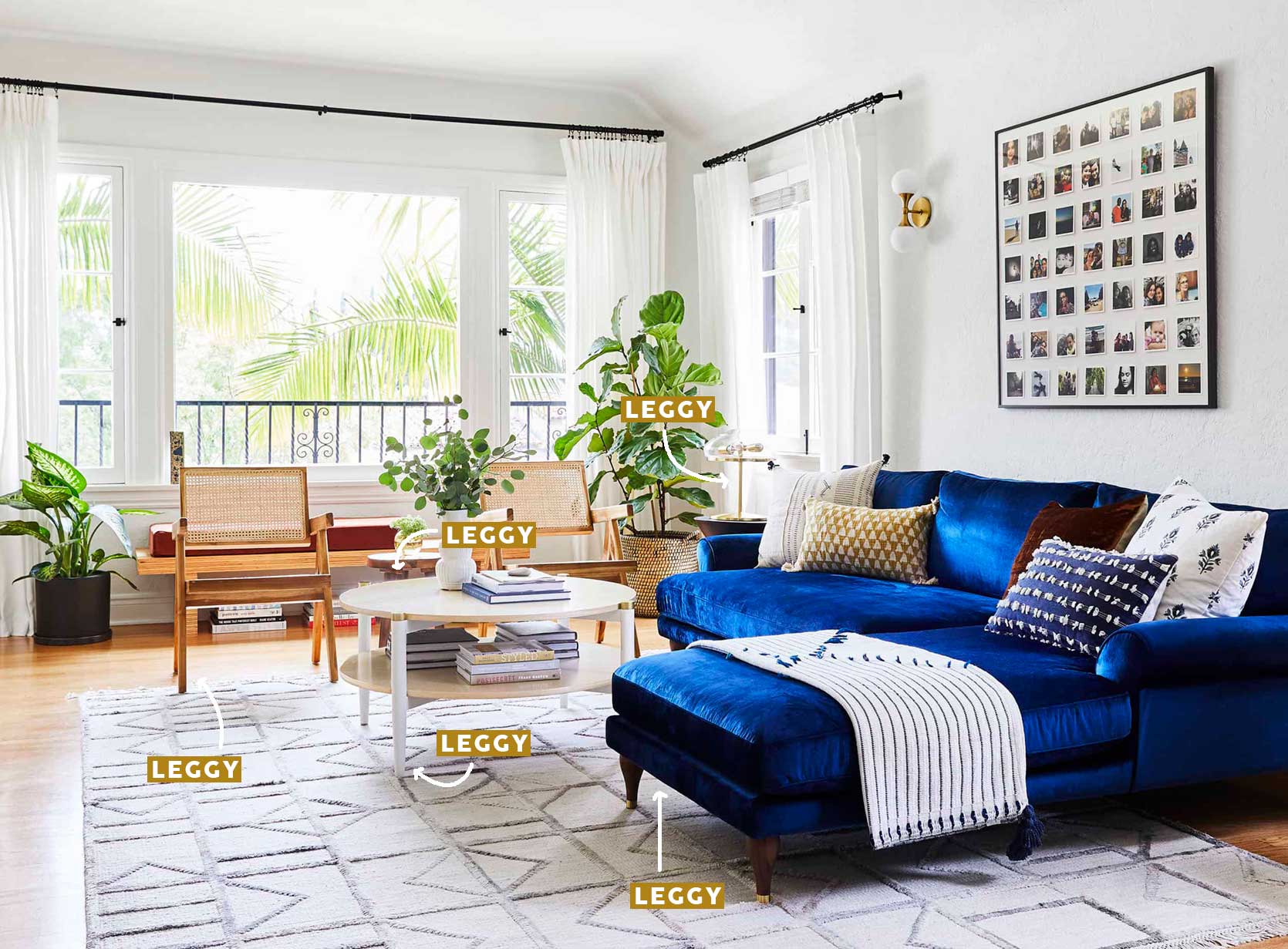
Kaitlin’s living room has one chunky piece for every leggy piece (chunky = sofa, coffee table, sideboard; leggy = ottoman/chair, drinks table, planter). It’s a really nice mix of both that feels intentional and balanced. I particularly appreciate how the solid pieces are anchored in the corners, and the leggy items are more in the center of the room, letting the flow feel more effortless.
Examples Of 2:3 (60/40)
Alright, let’s look at some spaces with a more varied distribution of silhouettes.
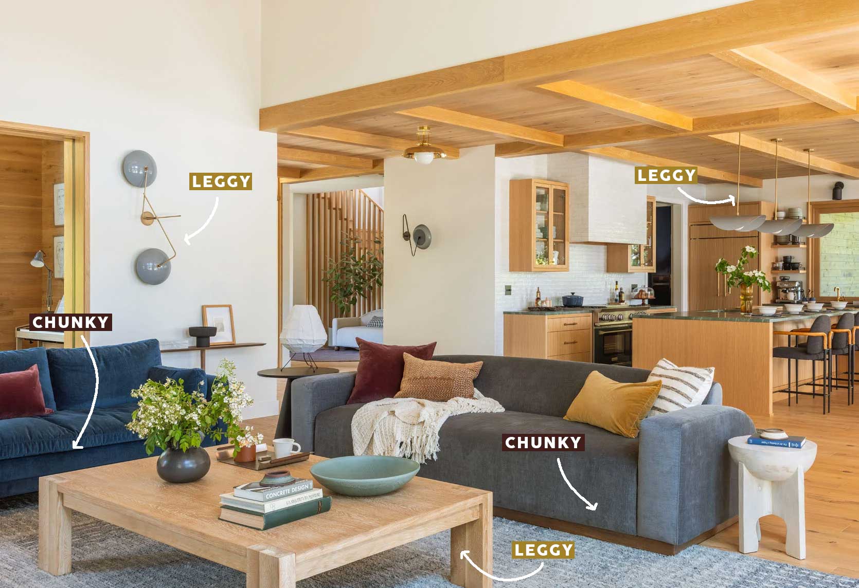
In the River House’s living room, we have a good mix of both chunky and leggy (even some I didn’t label, now that I’m looking at it again). The biggest takeaway with this one is to remember to consider things like lighting in this equation, because it’s not just furniture that ties into this balance. Here, you can see that the sofas and side tables are on the chunky side, but the sconce and pendant lights (and bar stools) introduce that thin, airiness. I labeled the coffee table as leggy, but honestly, it’s kind of a chunky piece, so that one could go either way.
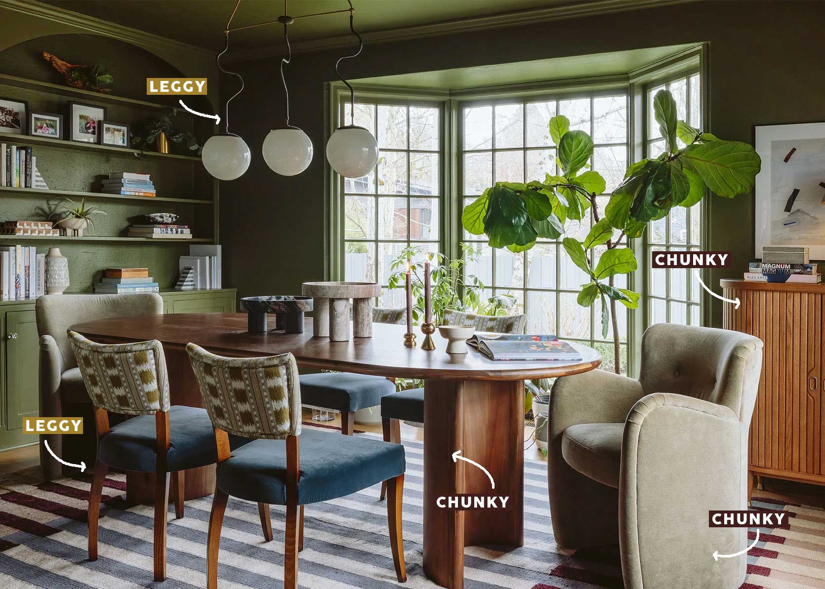
Dining rooms can be tricky, given that most tables and chairs are leggy by nature. Still, here, wispy side chairs and a slender and sinuous chandelier perfectly balance the solid head chairs, case good, and table.
The Rule Breakers
I’m just going to say it: Some of my favorite rooms break many rules of design. In fact, some of the best rooms full of character and interest hang their curtains too low, or have a too-small rug, or yup, even go against what I’m trying to convince you of in this post. But there are reasons they still look and feel good.
For instance, this space, by Sarah Sherman Samuel, has quite the chunky chair and chest. Yes, there is a petite little leggy step stool, but even without that, the room works on a few levels. First off, the furniture is very blocky but low slung, in a space with very high ceilings, so nothing feels overbearing. Also, the thin stripes of the wallpaper and rug serve to introduce an opposing visual.
On the opposite end of that previous room is this one, by VSP Interiors, that has more legs than a centipede yet is still such a beautiful classic English design. In a traditional home such as this, anything low and chunky would feel out of place. It’s okay to follow the whisper your home gives you in terms of what it wants style-wise. In this case, legs all the way.
Some More Examples To Bring It Home
Let’s look outside the world of EHD at some other homes in a variety of styles to see how this leggy/chunky equation plays out.
The home of Zilah Drahn, featured in Domino, is a great example of my 1:?? ratio I discussed above. Nearly everything shown in this photo is delicate and leggy, except for the vintage Cassina Soriana armchair. Here, it serves to inject the room with a touch of the unexpected (like the bunny, ha).
Yet another 1:?? room, that is lovely and still well balanced (ceilings like that could handle just about anything underneath it, TBH). Well-grounded furniture is paired with a slender, triple-arm floor lamp that goes a long way to add just enough tension.
I’m such a fan of Zoe Feldman, so anytime I can squeeze in a room by her, I take the opportunity. Here, chunky upholstery atop a solid window bench is beautifully paired with a leggy table and wall sconce.
Even a traditional design like this one by Emma Ainscough can mix in a chunky piece in a way that feels appropriate, though I think the modern piece of art and eclectic chandelier help to welcome it to the party.
Studio Valle de Valle struck a beautiful chord between the chunky desk, and leggy chair and lamp.
Another one from Zoe Feldman, but this time, a bedroom. I love the juxtaposition of the spindly desk and chair next to the more contemporary wavy corner headboard.
And finally, this pretty little pocket in the compact Ibiza, Spain, home of Vicente Hernández Zaragoza, by Romano Architects. The pencil-like table countervails the plinth banquette, as does the pendant light.
—
After 16 photos of mostly dos and even a few don’ts, I hope you feel better equipped to find some balance in your home if that is indeed what is missing. If you went too far with either leggy or chunky pieces, you now know what you need. And remember, even one item will check the box of the 1:?? ratio. Good luck, friends.
Until next time…
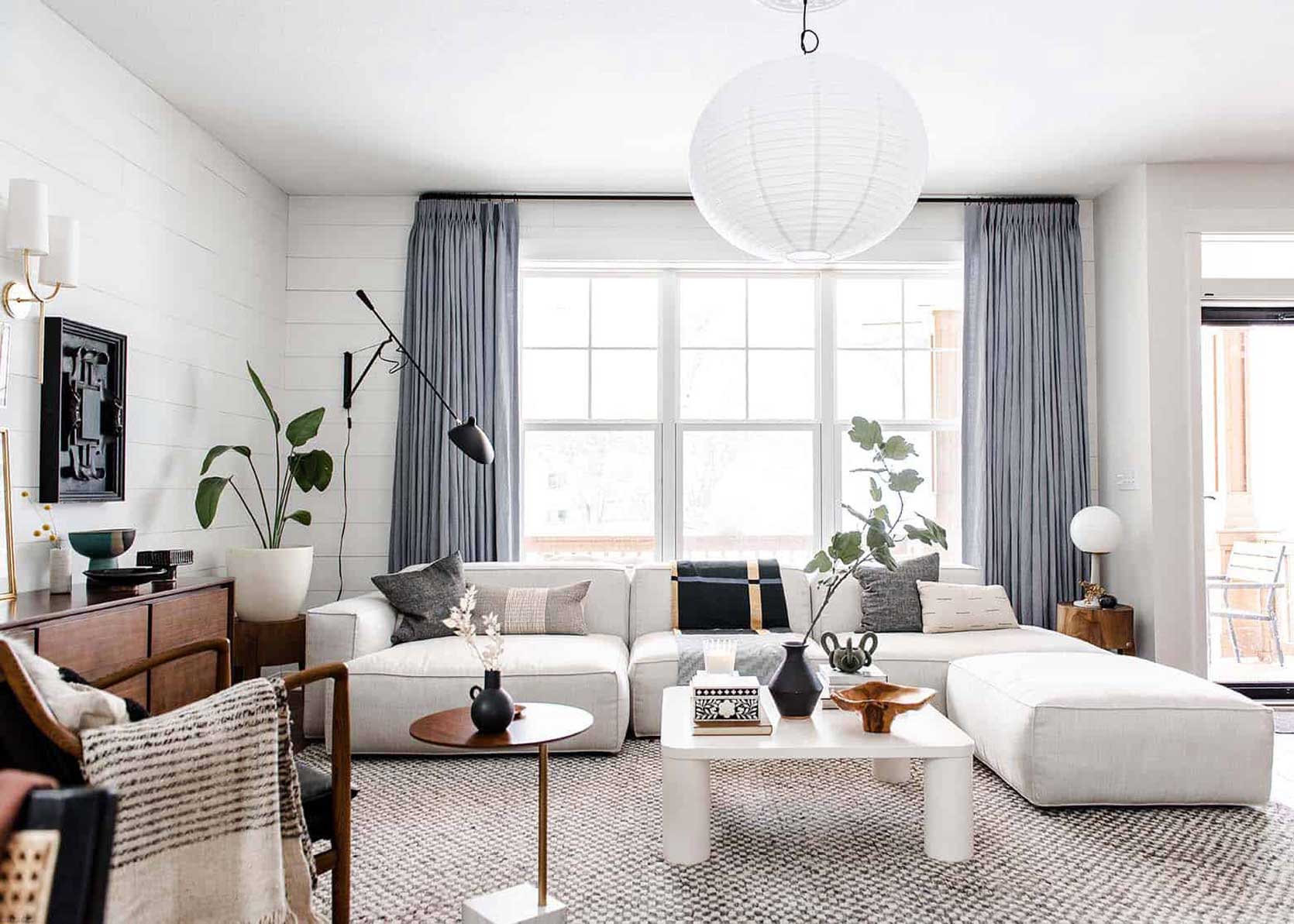
Opening Image Credits: Design by Lea Johnson of Creekwood Hill | Photo by Sage E Imagery | From: Lea’s Living Room Reveal: Her Pet And Family-Friendly Open Concept Design Agony SOLVED


Another very nice, informative post. I’ve always thought the space in my eat-in kitchen was too leggy and tried adding a settee to give it chunk. The settee looked great but when guests sat on it, the cushion sank, which caused the seated height to be much too low. I’m back to having a lot of legginess in this space. 😊
Oh sounds like the cushion probably needed more support. Was it a cushion that was removable or part of the body of the banquette? If it was removable, you can add a dense foam to the interior!
Can you just clarify the second ratio? 1:3 would mean that for every 1 piece of one silhouette there are 3 of the other, but 60/40 is not the same – that would mean that for every 2 of one silhouette there are 3 of the other (which actually seems to be the case in the example photos). 1:3 = 75/25, 2:3 = 60/40. Thank you!
1/3 does not equal 25%.
That’s true, but 1/3 also does not equal 1:3 because fractions and ratios are not the same thing. They are often confused which is why I wanted clarification 🙂
WHOOPS. Yes, it’s 2/3. Updated.
Thank you! Just wanted to make sure that I understood correctly, I appreciate you clarifying!
We need you math girlies. Thanks!
Ooh this was so good. Something I haven’t thought about. I’ve gone mostly leggy in our tiny house and now I know why our bedroom feels “off”. So many good examples to learn from. Thank you!
I’m glad I could help!
Great article,love that you make it so easy to understand,thank you Arlyn
A nice reminder that when a room is feeling “off” it is worth pausing and trying to figure out why. Love all the examples in this post.
Honestly, sometimes it’s as simple as adding (or taking away) one thing.
Hmm idk if I’m fully sold on leggy + leggy and chunky + chunky when they’re mixed in the same room (like the hero image). It works! And it’s honestly better than 90% of what’s out there. But I think it might balance better if you really commit to the mix across the whole space?
Right now it kinda feels like you could draw a line down the middle and one side is leggy and the other is chunky. I feel like it works better when those pieces are more interspersed vs. grouped.
I hear you but you also have to remember that a room you live in will feel very different to your eye. This is the specific angle the photographer captured so it looks that way, but you could be standing elsewhere in that space and it read differently!
I once read an article where a designer described a room full of legs as “nervous” and that always stuck with me. (Such cute phrasing!) Gotta throw a chunky piece in where you can! Fun post as always, Arlyn. Thank you!
Nervous!! HAHA yes I can see that for sure.
I’m wondering if the balance in the traditional room by VSP Interiors, with its many, many legs, benefits from the heft of the full bookshelves and built-in cabinets.
Good point!
Interesting way to look at it. I’ve def gone more leggy in my current home after becoming really grossed out by how gross my old place got having a bunch of chunky furniture that was unable to be cleaned under and extremely hard to move. So I would implore people to remember that. Of course that doesn’t apply to all the great chunky options here, just something to think about. Now when bringing something new in I always note whether I can get under it with a vacuum/mop or easily move it to clean. You may think it won’t matter that much but let me tell you from experience that over time the problem will compound.
Such a fun, helpful post. You’ve sent me wandering around my house, counting legs 🙂
Well this explains why my current arc lamp and slender scultural piece work so much better on either side of the couch than the vintage triangular-based end tables I had! Too chunky!
Very glad I read this as I have to find an overhead fixture for this room.
Whatever I find, I’ll have to balance it out.
Thanks for this post!
Appreciate the info, but have never been a fan of chunky. Perhaps it is because we have small rooms and like the visual airiness that leggy provides to make the space feel larger and lighter.