Design
Trying My New Favorite Piece Of Original Art In 4 Different Places
I have been a huge fan of Brooks Burns art for a few years (ever since I discovered it on IG – one of the BEST, most positive things about social media IMHO). I “liked” every painting he ever posted and have tried to figure out a way to put them into any and every project, but we are always on tight deadlines, and investing in something sight unseen from across the country can feel risky. But when I saw this painting, in those colors, I immediately did what I had done before and Dm’d. I think my exact message was “I want. OMG. So good. Those colors. I don’t know where it will go, but how big and how much?) Apparently he had seen my enthusiasm before, knew about my following, and proposed a deal. It arrived 10 days later, and it is obviously more incredible in person. Having contemporary art in my home is not something I take for granted, and I appreciate the hell out of it. I’ve always said that it’s what I would splurge on over anything else because it’s what makes your home interesting. There are so many great sofas out there that are more affordable. Save your money on furniture (unless it’s statement furniture) and buy art instead.
It arrived, and I loved it even more. It’s both powerful and whimsical, with such strong lines and in my colors. But there wasn’t an obvious spot for it in my house, so I figured I’d show you all the places that I was debating putting it and see what you think.
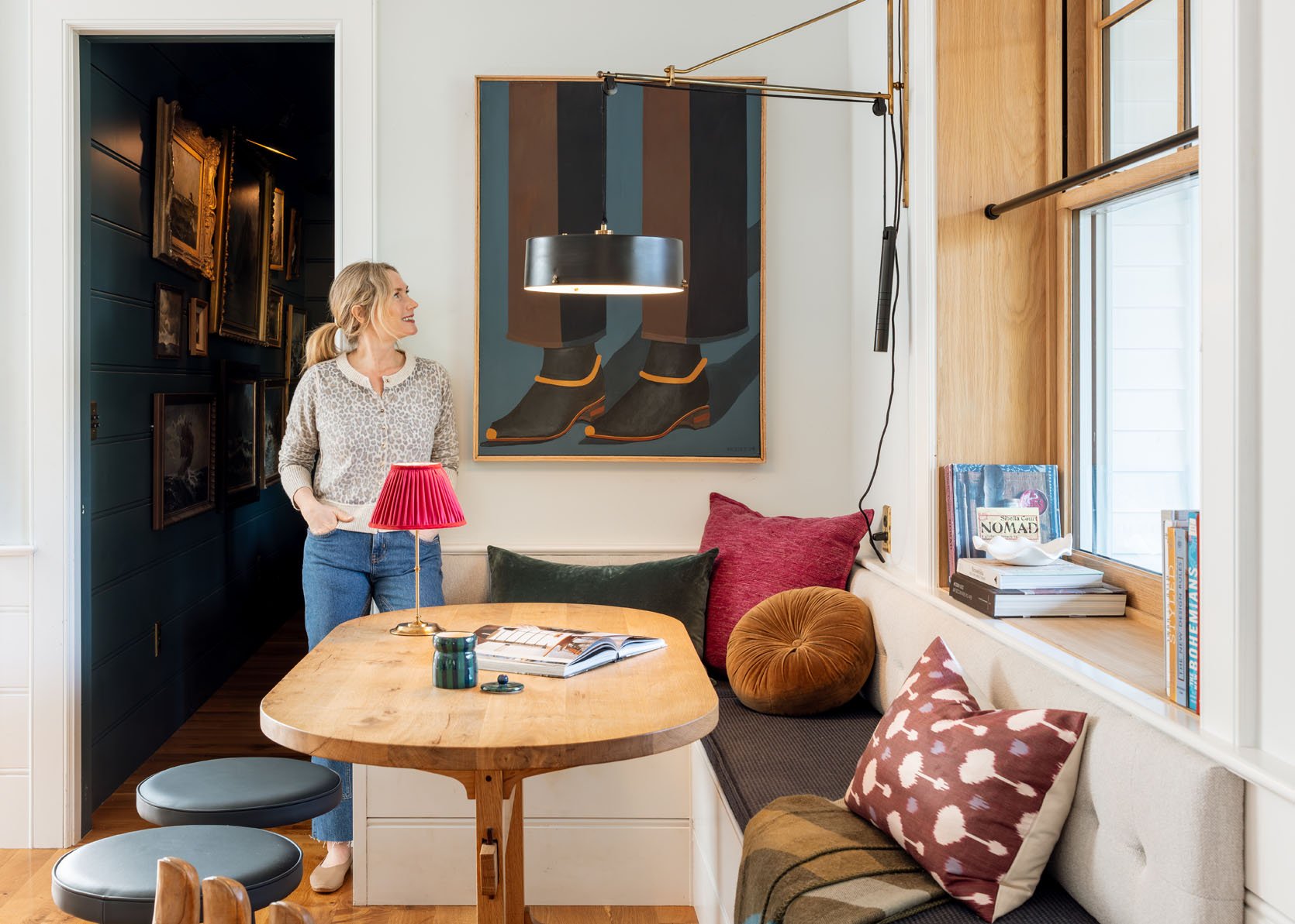
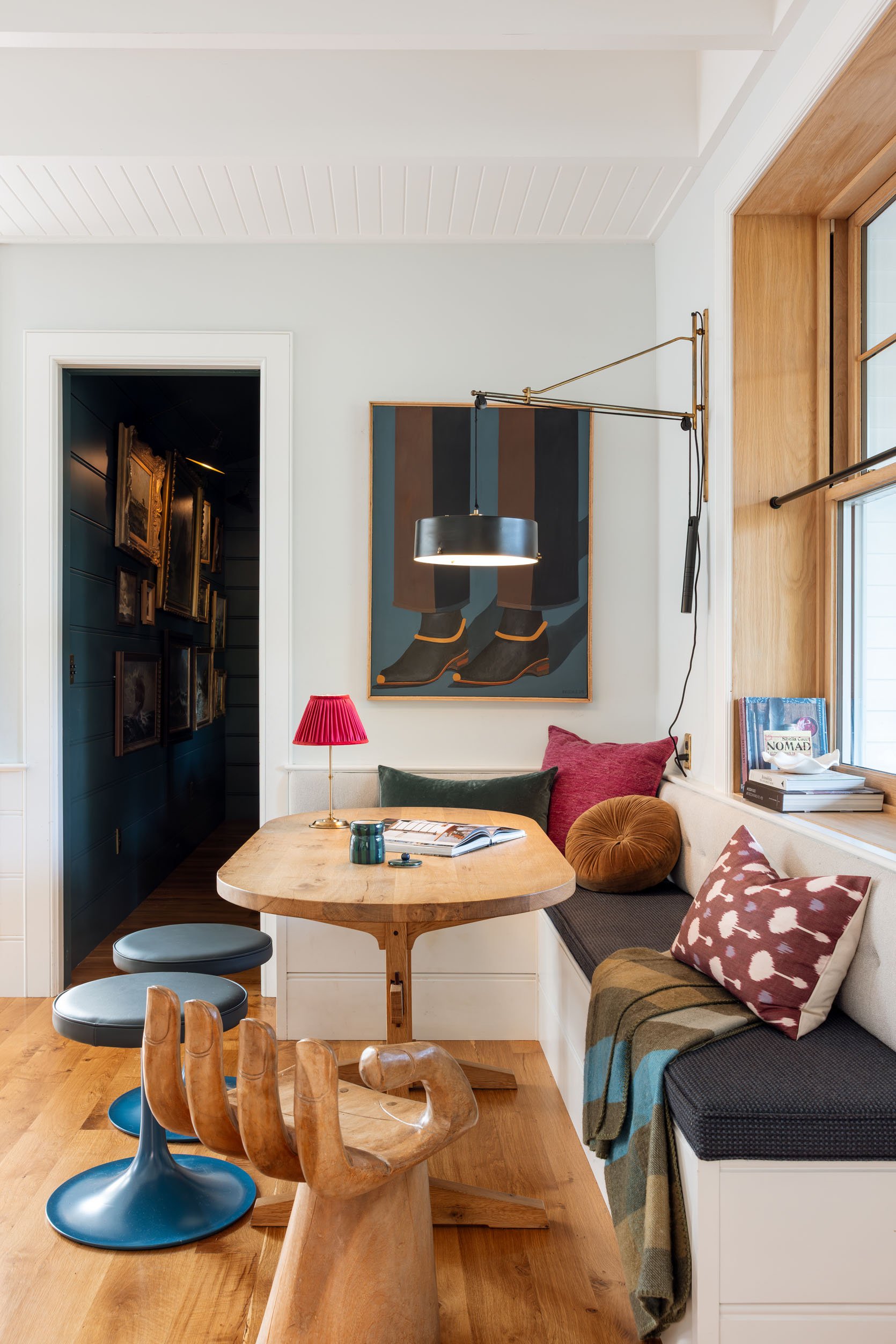
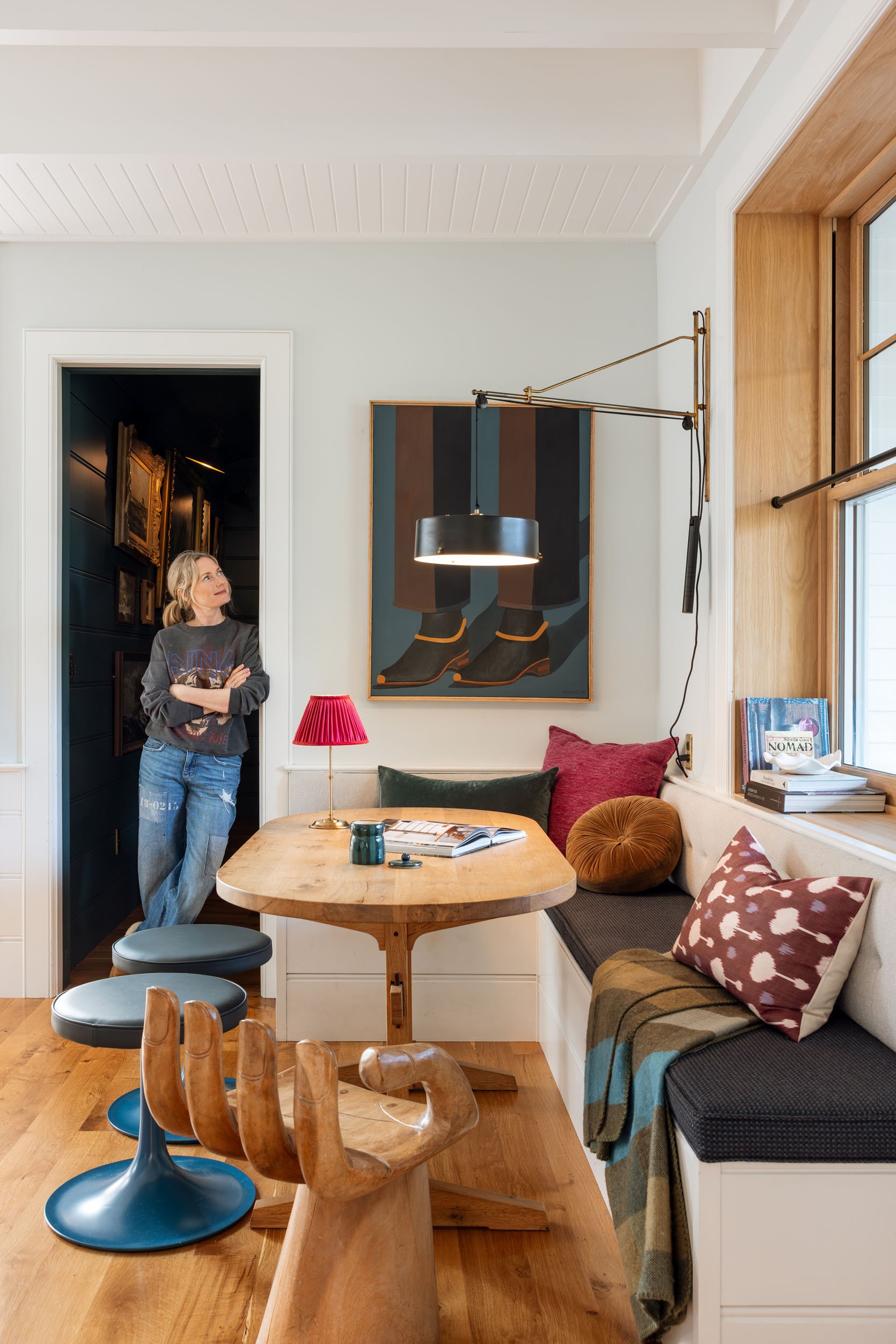
The Dining Nook
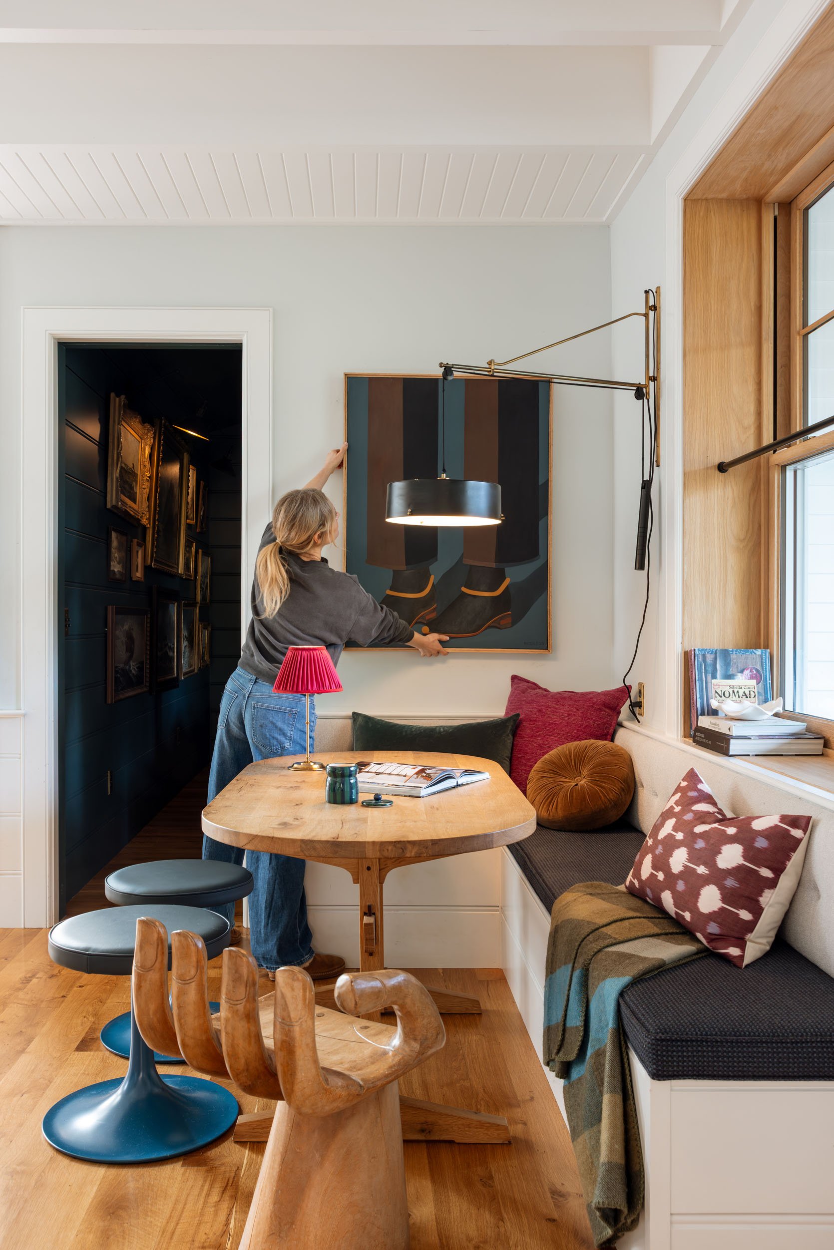
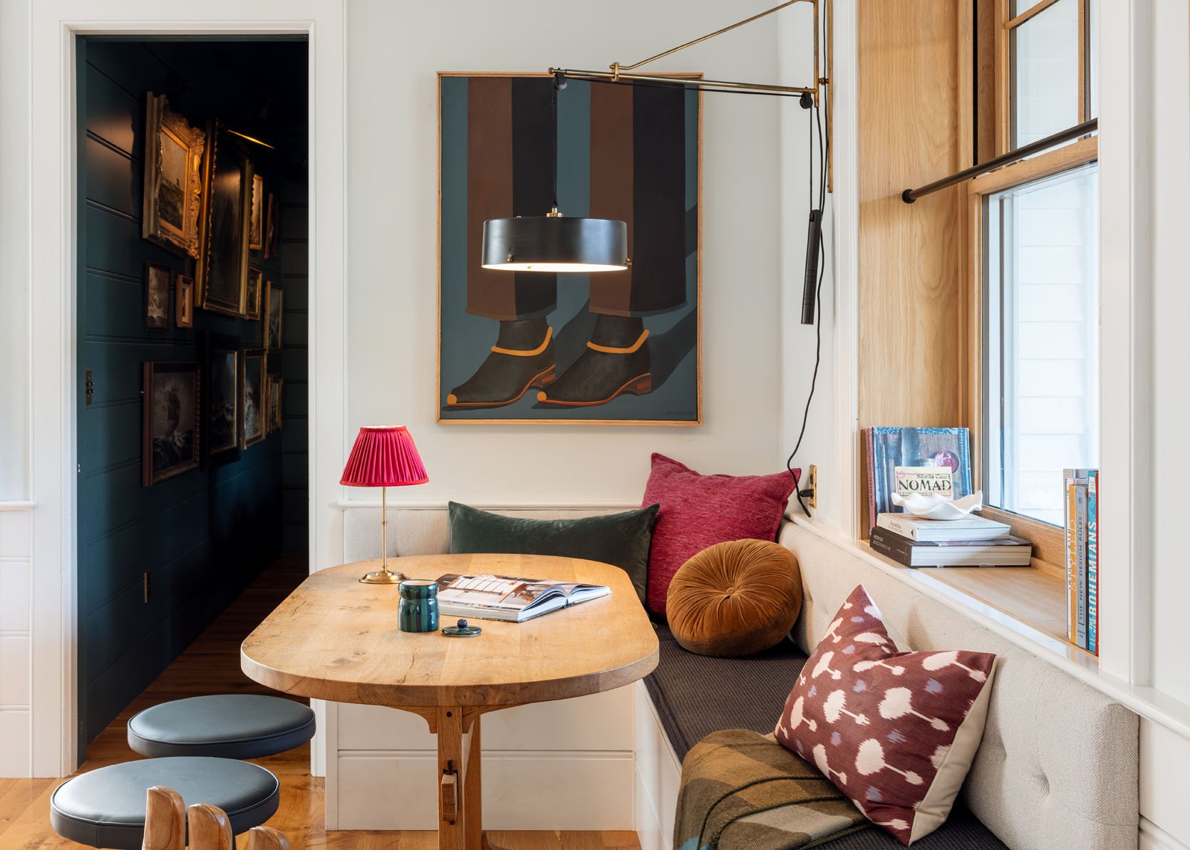
Everywhere I put it, I loved it, honestly, but in some places it made more sense, or it got more attention. Here it works in both scale and shape, perfectly. In the photos, it looks fantastic, but in real life, it doesn’t get a lot of natural light and feels a little dark – it oddly didn’t pop. Like it took a second for your eye to fully understand it because of the contrast, because of the low-light, bright white, and how deep and dark it is.
Over The Fireplace
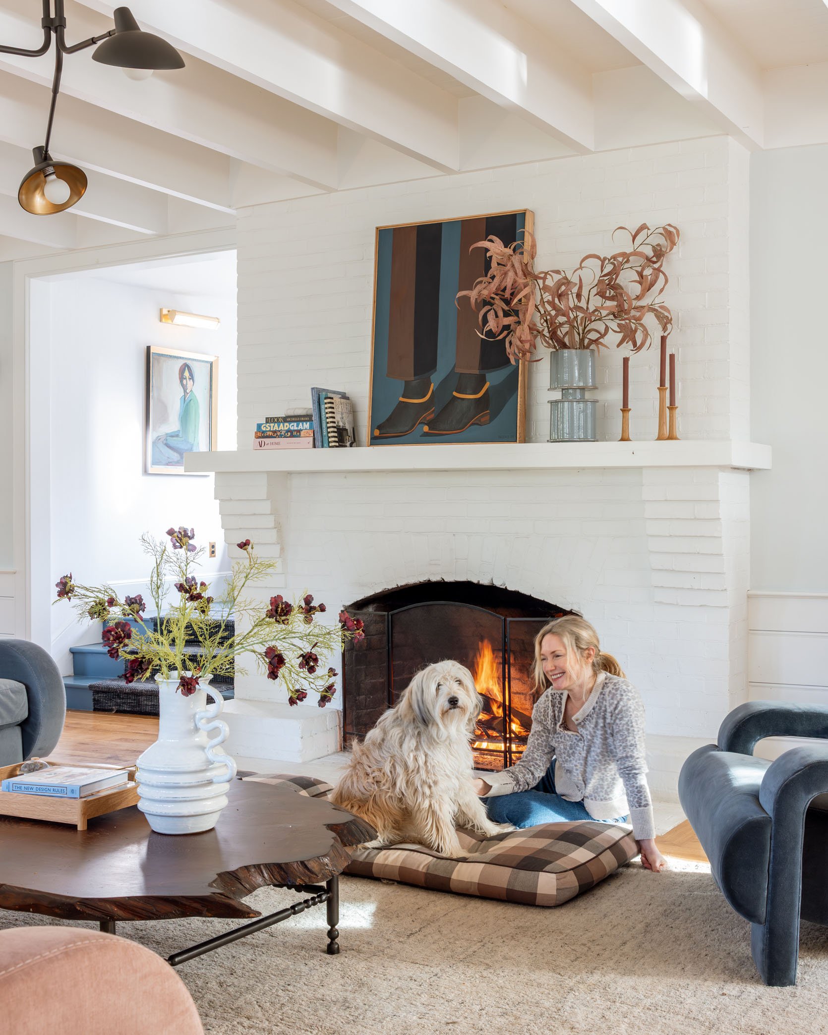
While this fireplace certainly wants a big horizontal piece, once I styled it out, I thought that it looked pretty darn great. It draws your eye, obviously pops off the white, and again, the color palette works perfectly. And a quick update – with all the lighter furniture (the double Barbs – blue and pink), I don’t want to paint the fireplace right now. The whole room (with the initial Scandinavian eclectic intent from years ago) really just flows so nicely and feels so light and airy and happy.
While it looks good here in the photos, in real life, it’s dark up here as well – not enough light on it. Now I could hang it properly and put a spot light or picture light on it, which I’m very tempted to do. It just needs to get real love.
First Landing
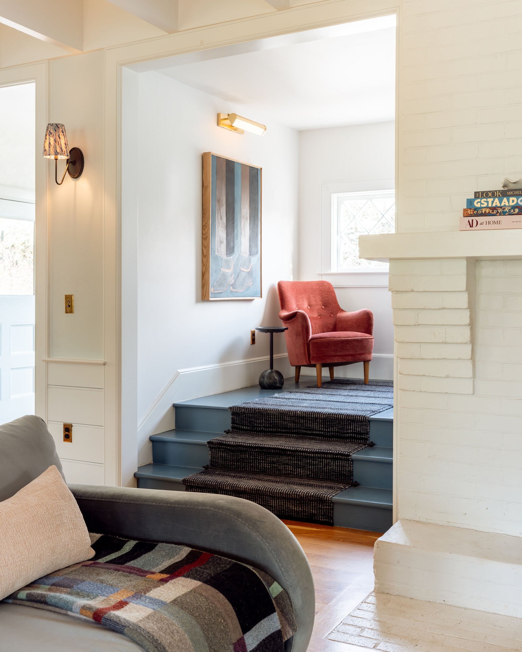
While this seems like an unimportant place, it actually gets a ton of attention every time we go up and down the stairs, which is frequent, obviously. But as you can see in the photos, the side light made it hard to see the painting. I think this might have to do with the type of paint it is (oil, maybe?) that reflects a lot, whereas the painting we had there before didn’t do that.
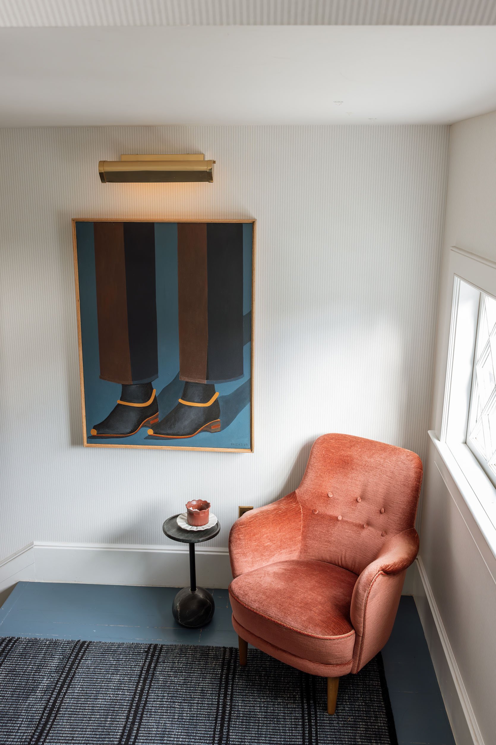
So while it fit nicely there, from the living room, I didn’t like how I experienced the painting. Also, yes, right now I have that chair there because it’s one of my favorite vintage pieces ever, and I like the soft lines and that color (I have two of them, and they are always trying to find a home).
The Top Of The Landing
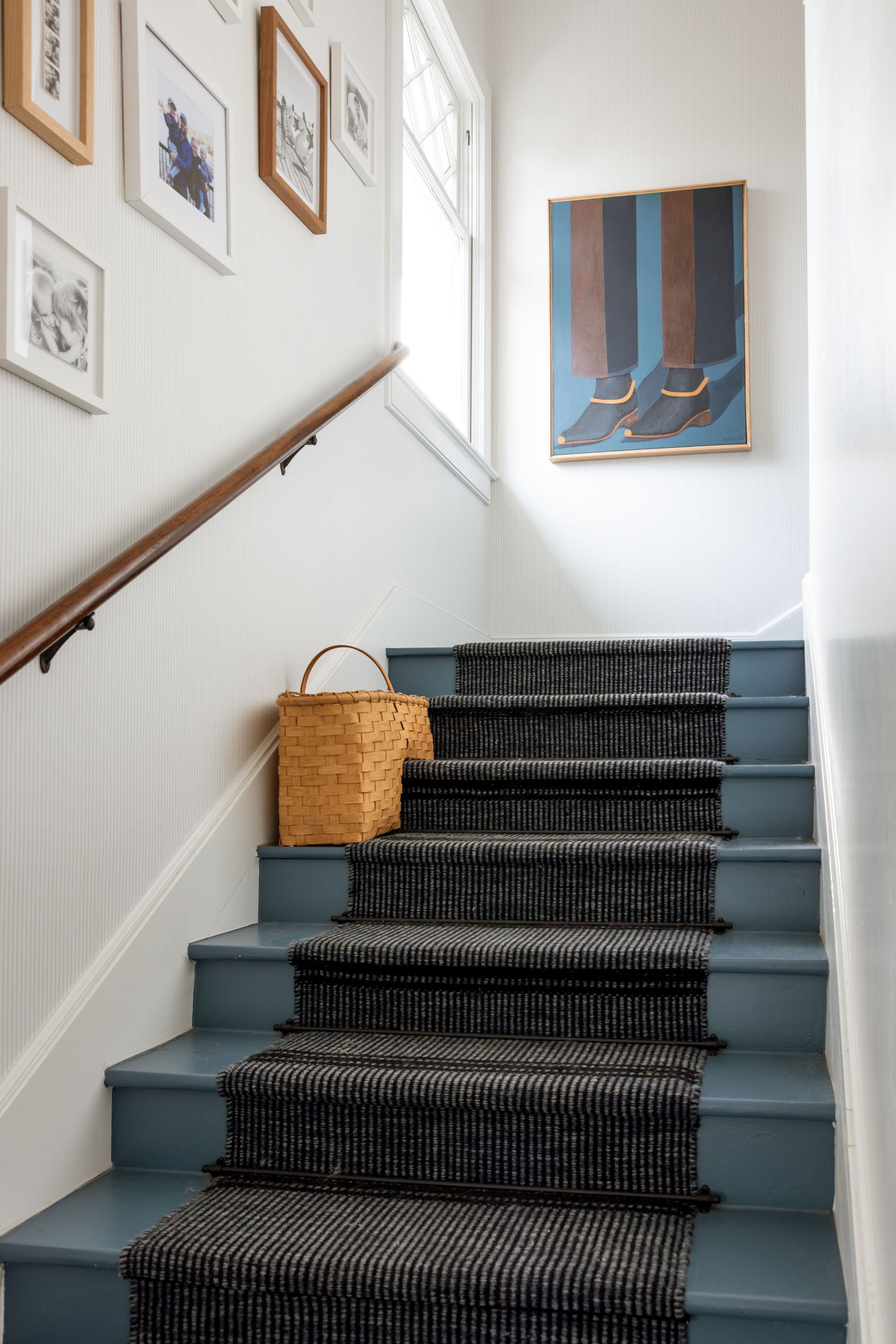
So then I tried it at the top of the landing, which again, is such a powerful place that gets a ton of attention. It also works here, but near all the family photos, it felt really intense.
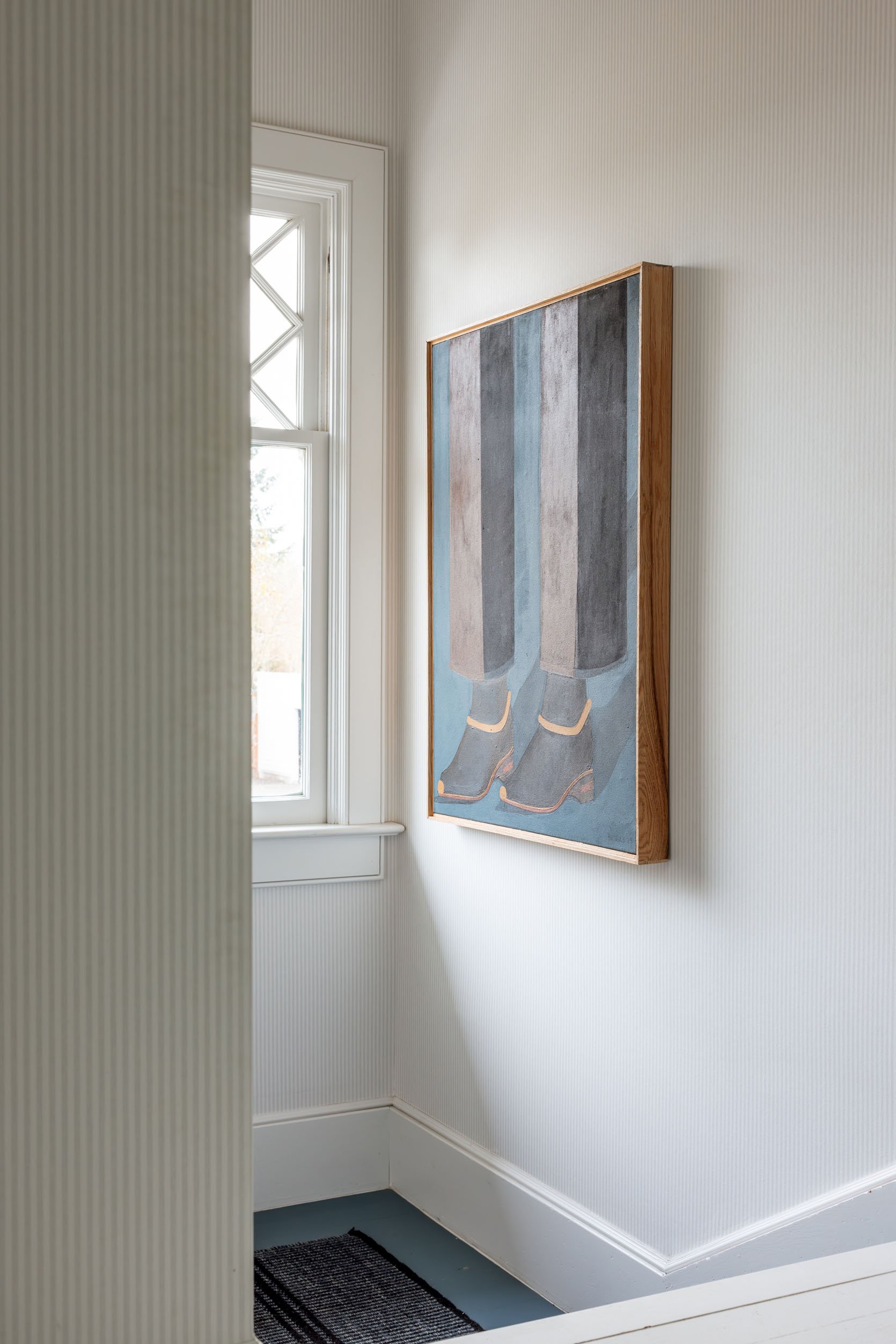
Up here, it also has that side light that hits it (and I’m also fearful of the light damaging the painting).
If you are wondering if the entry would be a good place, I can tell you absolutely yes, but no one ever goes in and out of our entry, so it’s a last resort. I would love to place it somewhere that gets more attention (at least from me). Right now I’m leaning towards mantel OR (get this) trying it over our bed in our bedroom (not shown, sorry). I finally ordered a new bed in there, and I think the colors could work so nicely; the darkness talks to the curtains, and it would be a lower contrast from a white wall. And perhaps this painting, which is a larger scale and the object that is on it is large, actually needs a larger room (like the bedroom) to give it space around it so you view it more from afar and not so up close (which it feels oddly intense).
But of course I’d love your thoughts 🙂 A huge thanks to Brooks Burns, the artist who painted this incredible piece. I feel so grateful and lucky to be able to put it in my home anywhere. Please, please, please go check out his work, and if you have the budget to support artists (and collect original art), think about him for a future piece. His Instagram is where he puts his paintings first (and how I snagged this one).
*Photos by Kaitlin Green


It’s best over the mantel. I really dislike it in the dining nook because that lamp blocks it. There is also a whole lot going on in that dining nook which distracts from this painting. It is also very large, so you want to be able to see it full on from further back, you can’t do that in the stairs. You love it, put it center stage on the mantel. Also I don’t think it needs a picture light, there is plenty of light in there to see it with.
Agree with all this! Could you have two leaning pieces of art? It would look amazing paired with something totally different style. And that would give the right width for over the mantel.
One of my all time favourites!
I love leaning and layered art. This combo is out of scale. The smaller piece is blocking too much of the larger piece.
I love this room so much
Over the mantel, 100% 😍 It brings some needed contrast to the white fireplace and is the perfect spot to showcase it from all angles. Thanks for introducing me to a new artist!
Also, shoes and feet where you are eating, I don’t know…
Love it over the mantel too!
Hi! Could you share the source for the current living room rug?
It’s from the Los Feliz Tudor living room. Purchased at HD Buttercup circa 2019. See this post:
stylebyemilyhenderson.com/quick-update-changes-ive-made-la-living-room
HD Buttercup. RIP (closed both stores 2025)
Could you get a rechargeable picture light for it so you don’t need to mess with electrical or cables, and try it again over the fireplace? I have a painting that’s very dark and every time I look at it I think it needs a proper light – this is my reminder to myself to buy the rechargeable light!
I say nook or mantel
Such a strong and exciting piece, which can make it hard to style. I feel like this painting could be great in the 1/2 bathroom or even the laundry room. You’ll spend some real time with it, you’ll get that graphic punch. but it won’t become too dark and overwhelming. Plus having this strong real art in an unexpected space will let it POP every time like the star it is. Just because it is a serious purchase doesn’t mean it has to live in serious place. It also might be good in the carriage house. It’s got those strong lines and whimsy that suits that space. .
Family room? The colors seem right. Swap out the framed boho fabric that could go in any of these locations.
What a cool piece! I vote: Over the fireplace. But really, my eye was immediately drawn to it in all 4 spots so, wherever it ends up, it’ll be an attention getter.
It looks good in all locations and the bedroom probably will also, but I think the dining nook is perfect to enjoy it. Viewing from the living area and walking to the kitchen, coming into room from upstairs, etc. will be fine as the lamp will not be blocking it. Enjoy it as you live with it and share with visitors!
I agree! It looks great in the dining nook, and the light is only in the way from certain angles. Such a cool piece!! Thanks for sharing with us.
How about the wall to the right of the fireplace? You may need to move or change out the furniture there, but at least it would be on a wall by itself, at an appropriate height for art, where it could be enjoyed from multiple vantage points.
Ooo, interesting idea!
It’s needs space! Let’s see how the bedroom will work….
I like the spot above the mantel: hung so close to the ceiling, it gives the impression that the body and head continue above the ceiling…in a kinda weird but fun and quirky way. It made me wonder about what the rest of the person might look like!
From a painter: the work seems to be acrylic (all of the works on his site are listed as such).
The reason it shines (or doesn’t) has to do with how he mixed his paints: for oils, layers with more oil and or a finishing varnish controls how “shiny” it is, for an acrylic painting, it’s the result of painting medium mixed into colors or an acrylic varnish applied at the end. Either type can be shiny or matte, depending on application.
And from a conservation/preservation perspective, if you don’t want the colors to fade immediately, don’t hang it right in front of direct light from a window. (True conservation means sticking it in a dark, controlled space, which means you can’t actually enjoy looking at it, so balance the value of the work with where you have to put it, but know all sunlight is damaging (causes yellowing, fading and makes the work brittle over time as it’s acrylic).
Enjoy your new painting!
Two more notes for hanging/placement:
1) scale – it’s a med/large painting (vs the scale of your house and other works). Unless there are subtleties to the brushwork/coloration that don’t read from these photos, this work is meant to be enjoyed from a distance where you can take the whole thing in at once – so place it where you tend to look at it from further away. Perhaps this rules the stairs or nook out, depending on how you move through these spaces.
2) fading – I don’t know if you have low emission, double pane etc glass in all your windows, but even if you do and plan to hang art in front of it, there are some great (either professionally installed or diy) window films that are clear but also block (or further reduce) the harmful UV rays while not blocking/tinting the light. If you are investing in heirloom fabrics, art, and furniture, it might be worth investigating getting some of your windows treated where there is the most exposure (this is what retail galleries and museums use on their windows to help prevent the same damage).
Both your comments are super helpful KW! Thanks for sharing.
I do get why it doesn’t work on the first landing, but I love it there! The feet pointing down the last few stairs makes me smile.
I agree! Nothing else detracts from it at the lower landing, and you see it from the living room. It deserves to stand (pun intended, given the subject) on its own instead of competing with other things to make it work above the fireplace. Acrylics and oils too will not suffer any fading in decades.
Fun article! can you please tell us about the basket on the stairs? it looks like a classic peterborough basket but is it cut-out to fit the stairs? Looks great and we certainly need something to keep our stairs tidy. Thank you!
As an artist I really appreciate that you make an effort to buy and showcase original art. Thank you <3
This is a great post! I particularly enjoy your posts that showcase different scenarios like this- locations, layouts, colors. It is so fun to analyze and weigh the options!
I think the mantel or dining just based on protecting the art from UV rays – the two landing spots look like they would get too much direct light, even for an oil painting.
I would vote for the dining nook. I love how it speaks to the trim on the window and the hand chair. I also like the landing.
It states on the artist’s website that yuh linked to thst the piece is acrylic
I like it in the dining nook best. Seems whimsical and fun there and a good topic of convo. Or at the top of the landing where it looks like the painting is walking down the stairs. Also fun. Doesn’t suit the mantel or living room, imo.
I agree, the dining nook will get a lot of time enjoying and looking at it, it is a fanatastic work
I like it best on the first landing!
It’s perfect with the floor color & runner, and looks great with that cute chair.
It looked too imposing on the mantel.
And it could look great in the kitchen nook area if that light fixture wasn’t there to distract it (it blocks alot of the art piece)
I’m with you! I like it on the landing next to the chair.
In the dining nook! Absolutely
I like either the dining nook, but add a picture light, or the bedroom, hung asymmetrically for the quirk factor. Love the lower landing, too, but it seems like that’s better in a pic than in real life.
I think it’s not the right piece for the mantle, it’s whimsical and fun and I think the colors tie in nicely in the nook or the first landing. It looks like the room behind the nook is dark and it starts that darkness out in the nook. In the first landing it makes it officially look like a cozy reading spot plus it gets attention from the living room too.
Wow i love every location – which to me says your home is SO COHESIVE that you can take one object and it looks amazing everywhere. Please, please, please make sure it’s away from sunlight. My husband buys art and it’s incredibly sad how many pieces he’s not been able to buy due to sun damage.
Ooh, I do love it next to the chair on the lower landing. I was thinking how much you would enjoy it at night with the picture light on it ( is it possible to put those lights on timers?). Added bonus would be a little added safety for someone descending the stairs at night if they didn’t want to turn on overhead lights.
But don’t know what to do about the sun issue, hmm. You could plant a Japanese maple in front of the window to filter the light in summer but that means less light in house?
Would love to see it in your bedroom!
First landin, super fun! Or even top of stairs. The subject matter ties in beautifully with walking up and down the stairs! Too casual a subject for your lovely, sophisticated living room, imho.
Oops typo… landing
I am fan of either of the landings.
Its a gorgeous piece of art! It will work in any of the places you’ve shown. I like it best on the mantel, but, yes, it will most likely be better with more light. I would try putting one or two small, round lights on the mantel that project the light upwards from the bottom of the painting. I’m not sure a picture light will work above the mantel and this particular painting might look even better with some uplighting. You could layer with additional artwork too if you wanted to. I also think it might be quite good in your bedroom with the darker walls. My personal third choice is on the landing with the chair.
I like it on the first landing of the stairs. You have natural light, the colors of the chair and the blue floors are “talking” with the original Art. You can see it from the living room and coming down the stairs and most likely from the dining area of your home.
I like it with the “hand”!
I might be in the minority , but I love it on the first landing next to the chair …its so compelling and intriguing there , and looks great with the co,or of he chair , and a little more unexpected
Over the mantle! Get a beautiful picture light for it and style the heck out of that fireplace. I move my art around all the time, and you probably do too, but definitely start it in the mantle because it’s new and you’re in love with it and you want to look at it everyday.
I vote for either of the landings!
I like the dining nook and first landing but it will get more exposure and be featured more prominently in the nook. Lovely work of art. We always try to buy original art when we travel so our home is filled with memories of wonderful people and places.
I love it in the dining nook because of the hand and feet combo, but it also looks great over the mantel. The stairwell locations seem like a recipe for sun damage. What a great piece!
Over the mantle. It speaks to the black firebox as well as repeating the linear lines of the ceiling beams. Love the way you styled the mantel to the right of the painting.
Love it on the landings , in my opinion contemporary art needs resting space to appreciate it, the light shouldn’t affect it , I’m assuming it is done with artist grade paints. I also like re reference to walking up with the feet theme and the way the blue floor compliments it! Kudos for supporting living artists.
Definitely the dining nook. Looks like it was made for that spot and pulls everything together.
It’s so pleasing to the eye there and I’m sure you’ll enjoy it very much.
You need something more horizontal and larger for over the fireplace. This piece is too narrow,
just the wrong proportions, and looks bitty there. And no, it can’t be saved by adding other items to the mantle to try to fill it out.
I love it on the first landing. The colors in the blanket on the couch mirror those in the painting. Perfect!
I love it by the stairs. Something about the feet by the stairs just gets me!
I love both of the stair options. The colours are perfect for those areas and the vertical wall areas perfectly framesthe painting. I wouldn’t be worried about the light obscuring the picture from side-on. You will be able to see the picture perfectly from the front and and the side on mystery will draw people to look at them and appreciate them properly.
I commented before, but it just struck me why I think it is so beautiful on the lower landing next to the chair–The light streaming across it from the window, when viewed from the living room, highlights the brush strokes–you can see the thought and care that went into the painting through the work of the artist’s hand. No way would you mistake it for a print or reproduction (not that those can’t be great too). As the light angles change during the day, and the picture light comes on at night, you’ll get different glimmers and reflections off the paint at the various angles of view. Plus of course, get the primary impact of straight-on viewing as you come down the stairs. As long as the sunlight doesn’t hit is too directly/just skims across it indirectly, maybe it is worth it to get the lovely variety of views and ways to experience the painting in that location. Love original art!!
It’s perfect on the first landing!
I creates a moment where there’s not much going on.
Scale is perfect for the space.
Location, location, location!
1) It looks great everywhere
2) It really packs a punch on the First Landing – MY VOTE
Great piece. My two favorite spots are by the banquette and the first landing. I like this piece on a smaller wall where it’s more prominent. It loses its impact on the larger walls ( over the mantel and the upper landing.) I can see how the banquette light might block it when you’re standing, but when seated, not an issue.
OK, I placed my vote and then read everyone else’s. My taste was losing out to the vast majority (Mantle/DR Club.) But then, I kept reading. And finally I found my First Landing Friends! Such a fun post.
As someone who works with art professionally, just wanted to say that oil paintings are pretty hardy, so I wouldn’t worry too much about light exposure.
LOL this feels like a comment from my mother. She probably just hasn’t taken down the curtain rod from a previous project because she’s a real person living in a real home 🙂