Design
Design Mistake: Your Media Cabinet Is Too Small. Here’s How to *Actually* Get It Right.
If you Google “what size should my media cabinet be?” or something of that nature, you’re likely going to keep seeing the same response echoed throughout other publishers or manufacturers: Your entertainment console should be 3 to 6 inches larger on each side than the TV in the center, though ideally, that televsion would be roughly 2/3 the size of the cabinet beneath it. The average flat panel sold today is 55 inches (though my research says 65 is quickly becoming more common), which means the smallest sized cabinet you should be pairing with your TV is about 82 inches.
Allow me to play the contrarian here and say that, no offense to anyone who wrote that (as it’s not technically wrong), but I think a media cabinet looks best when it’s wider than that. I understand that not all rooms can handle such a large piece of furniture (I’ll go into that below because I like to be thorough), but allow me to rewrite the rule: Your media console should be roughly the same width as your SOFA. Sure, your TV size matters, but if you want to achieve one of the most important aspects of a room’s design—balance—taking dimension cues from your seating, rather than your television, is the way to do that.
Think of it like you would the rug in your living room; it needs to be scaled appropriately to the size of your sofa or sectional. To me, the same rule should apply to your media console or entertainment center. Anything smaller, especially if you have a large TV set, and the furnishing will be dwarfed by it. Like wearing giant shoulder pads with a tapered ankle pant…totally top heavy.
If you’re here just skimming for the takeaways, here’s a quick summary of what I just said to avoid the “too small console” design mistake:
- Old rule: TV should be 2/3 the width of your cabinet
- New rule: TV cabinet should roughly match the size of your sofa or sectional (even wider if you have an expansive room in a modern style).
Where The Rule Doesn’t Work
As I mentioned, I’m realistic enough to know that “the bigger the better” doesn’t work for every room or even every home. Low, wide media cabinets often come off feeling more contemporary in style, though there are certainly plenty of traditional-leaning designs on the market now, as well.
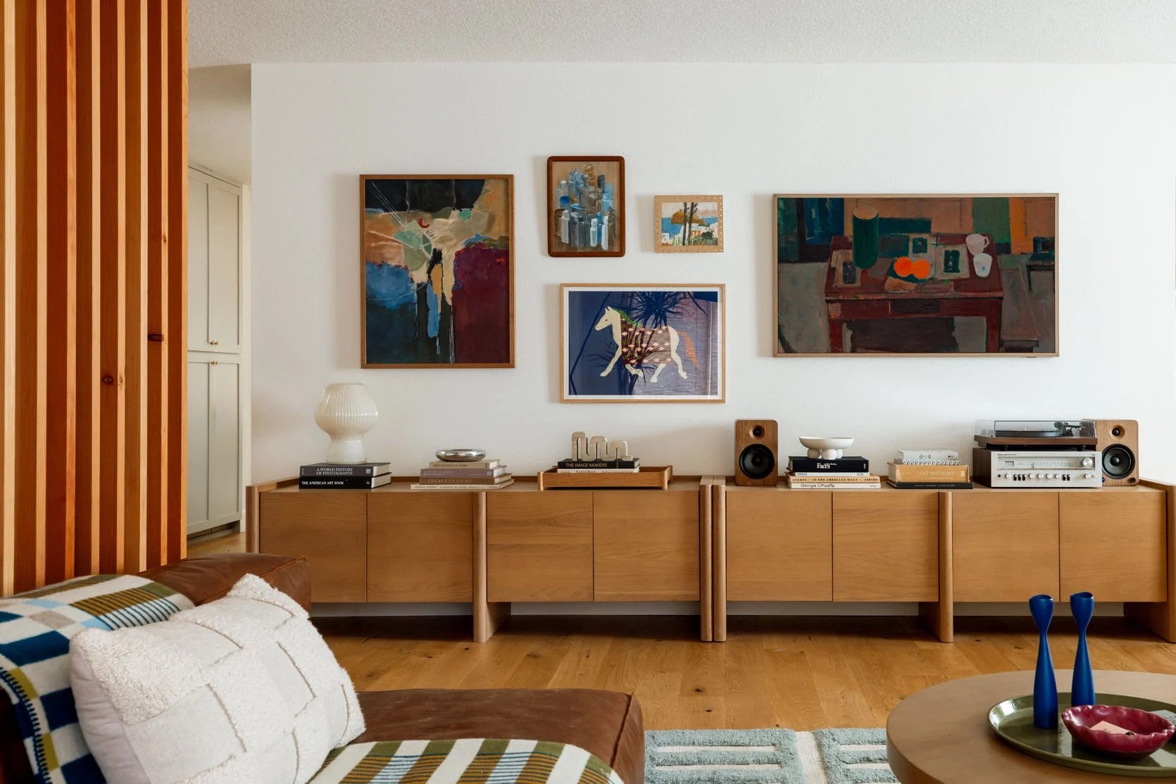
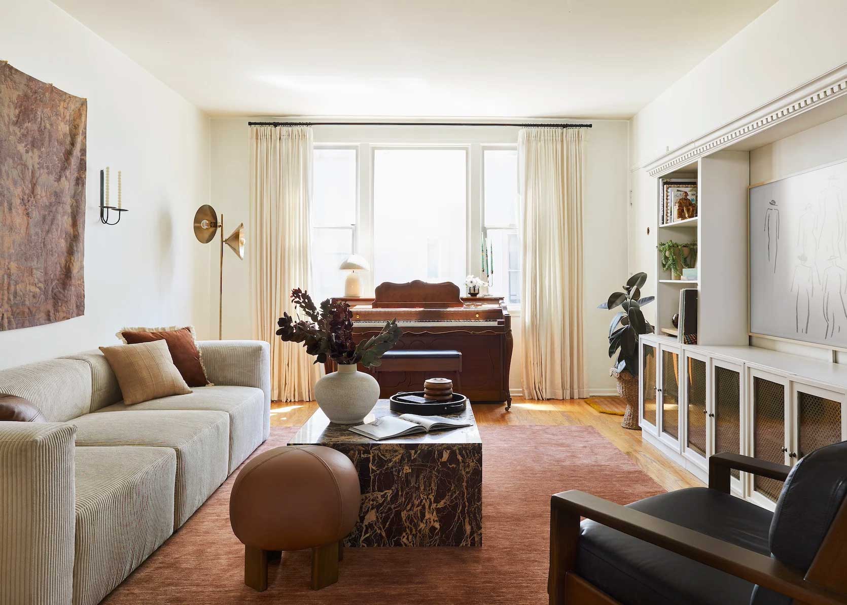
Let’s take my previous home (above), for instance. Our apartment’s building was built in the 1930s, so they didn’t design living spaces with “where does the TV go?!?” in mind. We didn’t want to put our LED panel above the fireplace, both because it wouldn’t have even fit properly, and because, as renters, we didn’t want to drill into a fireplace that wasn’t ours. Instead, we added a cabinet to a little alcove to the left of it. Our sofa is about 90 inches wide, and no cabinet of that size would fit in there. Nor would it match the old Mediterranean style of the architecture.
The Article Seno sideboard I used was 71 inches, which means it didn’t even fit the 2/3 rule for my 55-inch TV. I could have gone a little bit bigger in that space, though not much if I didn’t want the fireplace hearth to feel like it was sitting right on top of my Gilmore Girls binge rewatches. And guess what? It was totally fine. It looked great, but that’s because it suited the room size and layout.
Remember this oldie but goodie? The Design Milk family room reveal from over a decade ago is another great example of my new rule not necessarily working. As you can see, there are two windows that flank the wall space where the TV is being displayed, and while Emily and her team could have selected a lower cabinet to rest below the window sills and stretch all the way across, it would have butted up against the draperies on the left side, and gone too far across into what is actually the dining room on the right.
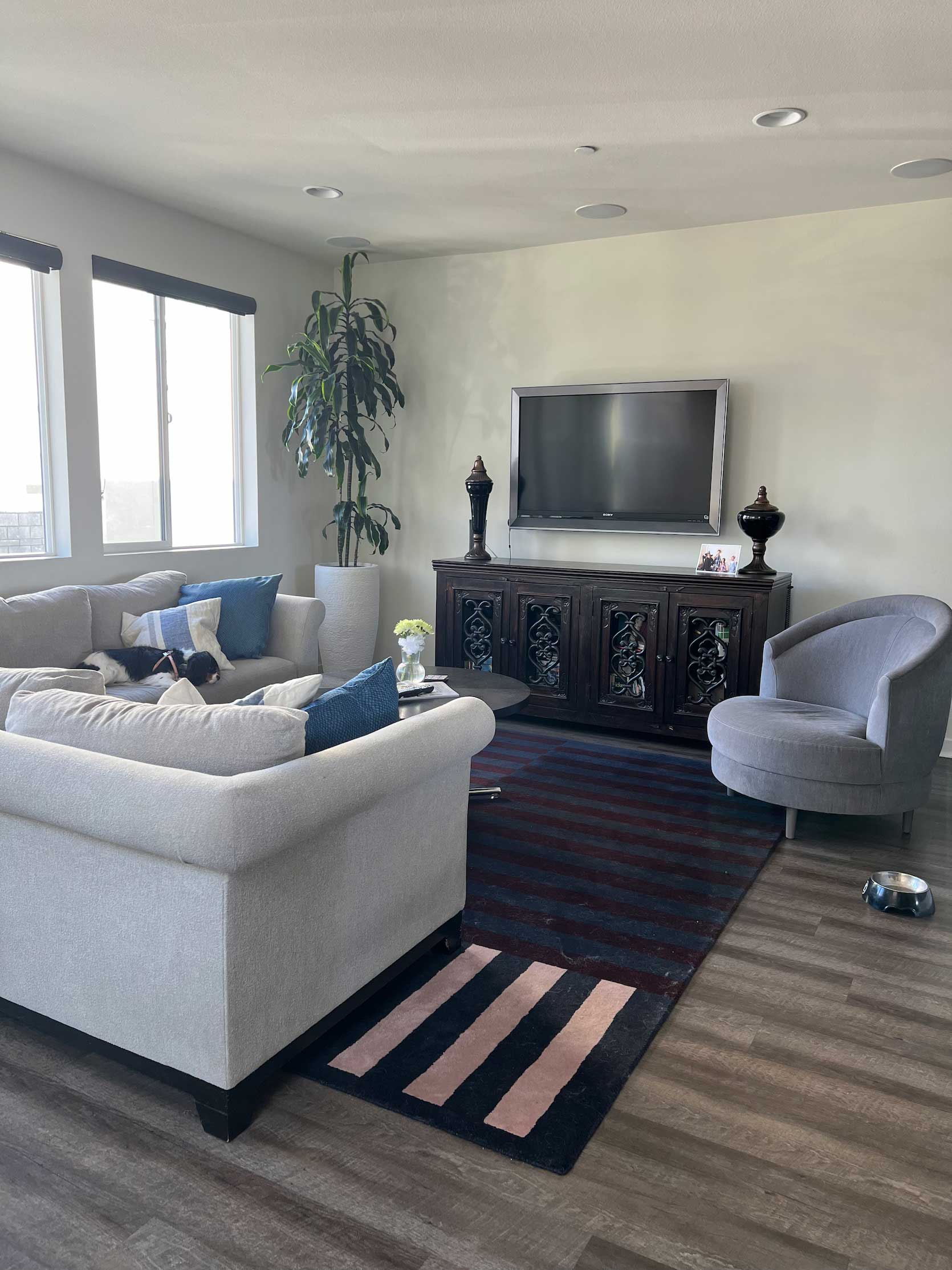
I wanted to include this beautiful room by our friends at Velinda Hellen Design because it tells a slightly different story. The sources for the cabinet aren’t listed, but I know an IKEA Besta unit anywhere (I have four of them in my home). Normally, I’d say something of this width is too small paired with a sizable sectional such as this one, but, because it’s wedged into a custom build-out with additional shelving on the size, it becomes part of a larger visual unit that better suits the room in terms of scale.
When The Rule Works Best
Before showing you the next example (which I think will make you instantly go, “OH YES I UNDERSTAND NOW”), I want to say that the extra-wide media console works best in a room that is large and open, or against a long stretch of empty wall. Often, I find people put a 60-inch cabinet beneath their 50-inch TV, and then stuff the rest of the wall with other things to fill the void. Plants, chairs, bookcases, large floor vases or baskets…when a singular furnishing takes up more space, you don’t need all that other fluff. This actually works in favor of bringing down the visual noise of a room, even if the piece itself is much larger.
Below is a “before” photo of the living room in Mallory’s parents’ home, which has a media cabinet of a very common size:
As you can see, they clearly tried to force some balance with the tree in the left, and the chair nooked into the corner of the rug on the right.
BUT THEN! Mallory redecorated and chose two walnut sideboards from AllModern that went nearly wall-to-wall, and the entire presence of this room changed. Here, the TV is half the width of the abutting cabinets, and with the addition of the floating wall shelves, it feels less about the TV and more about a well-filled-out room that doesn’t feel stuffy or crowded.
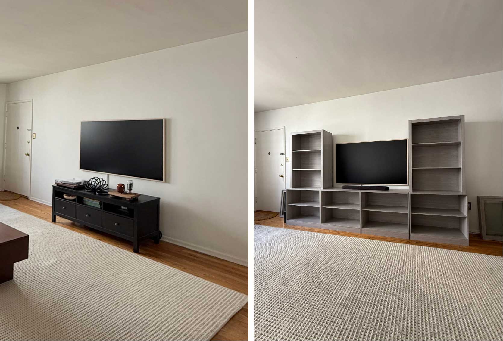
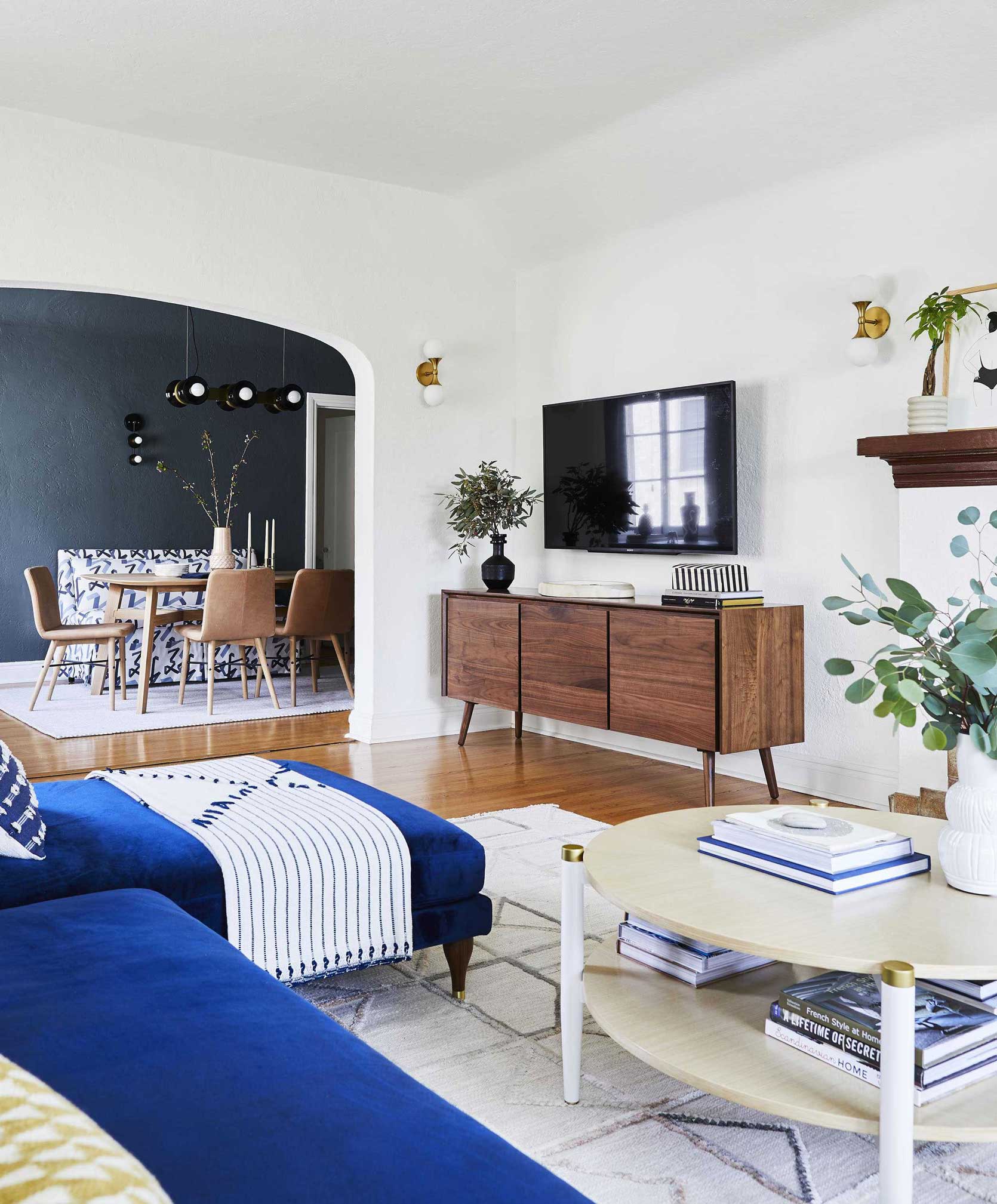
Mallory worked that same magic in her own apartment. You can see her before at left, where her Frame TV was nearly the same size as the little espresso wood cabinet underneath it.
After some creative crafting and DIYing, she turned the grey wall unit she found on clearance into what you see above.
Here’s an angle where you can get a good idea of its size compared to the size and area rug. That’s a chunky sofa she’s got there, and a smaller little unit would have looked dinky, especially on that long stretch of wall with nothing else on it. Now, the room is balanced and scaled appropriately.
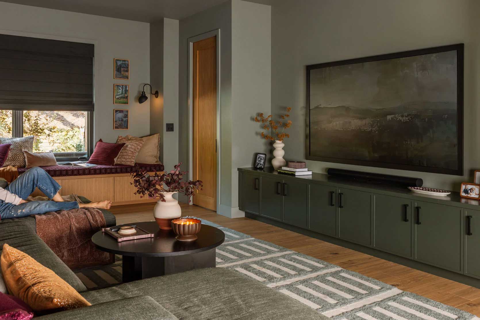
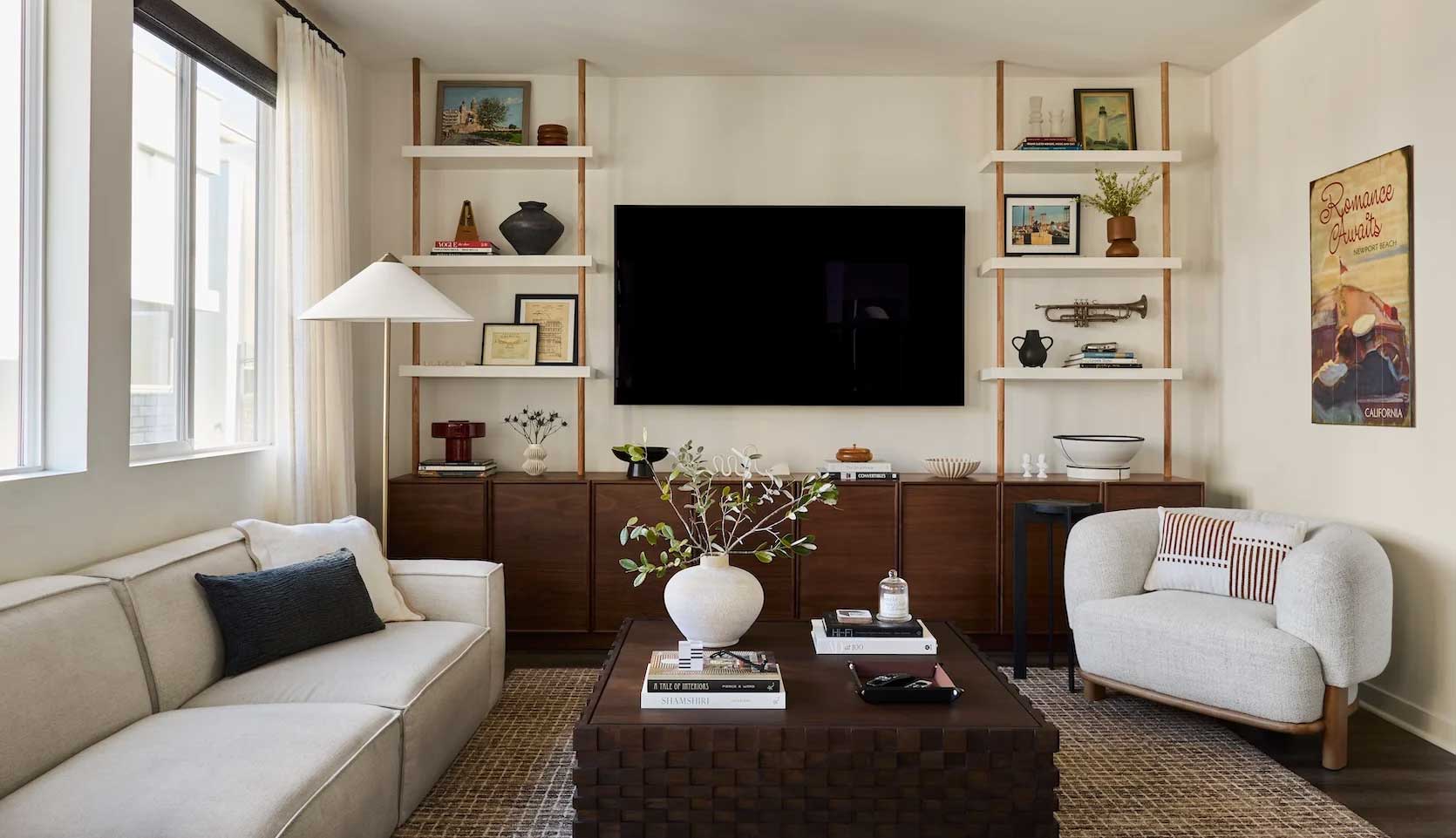
In the River House family room, a wall-to-wall unit sits low beneath a behemoth TV, rendering a clean, streamlined look that works well with the width of the two-chaise sectional.
Similar greens, different room. This is a project Em designed using a full color drench between the walls, ceilings, and furnishings. The giant Besta unit, once again, is well-scaled to both the wall it’s on, the size of the TV, and the width of the sectional. Anything smaller would feel out of place, yearning for something to fill the space at its sides.
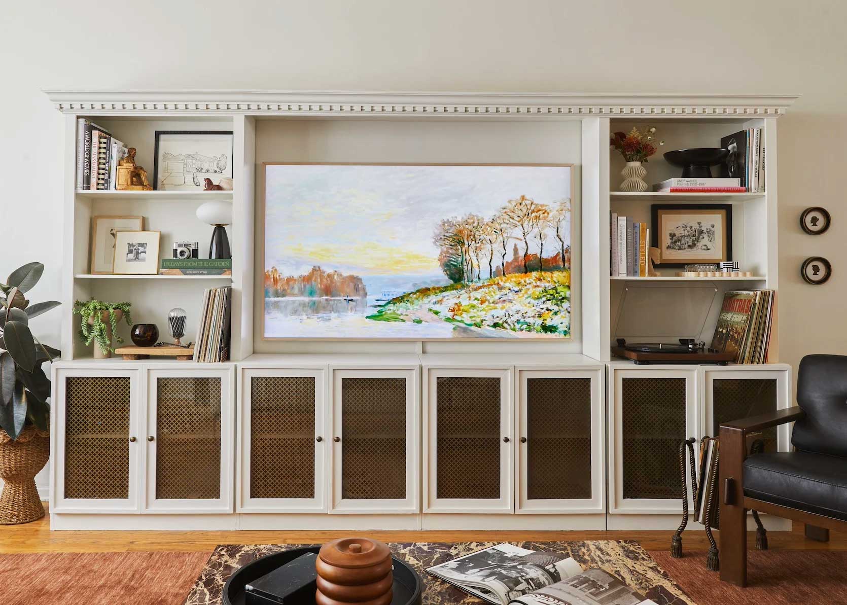
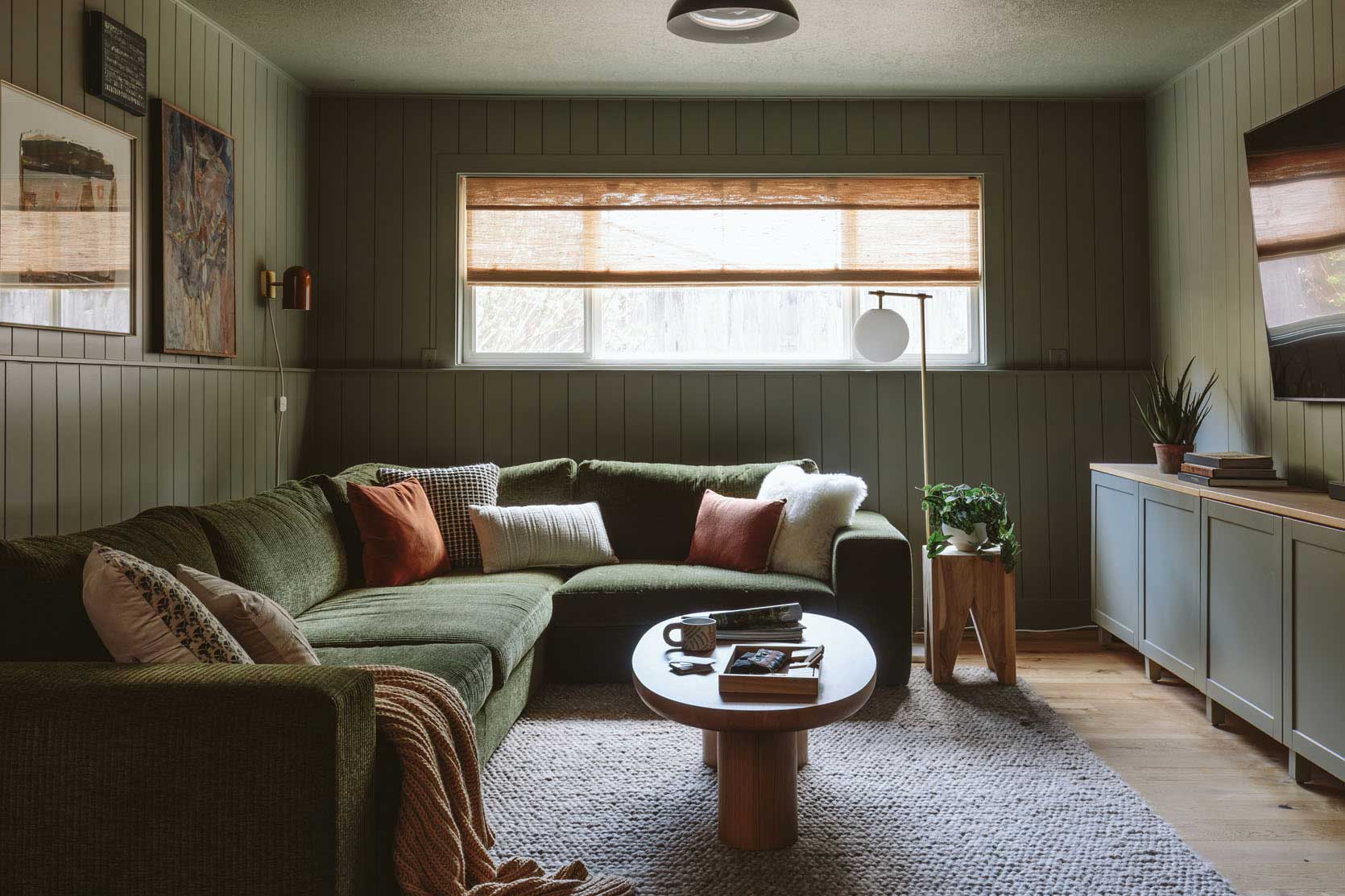
I keep talking about my Besta, and here it is. It’s a little wonky thanks to a toddler who loves to pull down on the doors often in search of toys and games, but it fills the 20-ish-foot wall of my living room well. Honestly, it could be wider, but I didn’t want to buy anything new for this place, as it was always meant to be temporary. This used to live in my previous dining room, but I swapped the Article sideboard for this because it worked better this way in our current floorplan. That Seno would have looked so dinky on this giant wall, especially given the ceilings are something like 15-feet tall in here.
Now, it’s time to see what’s out there on the market if you intend to redecorate or start fresh. Of course, secondhand is always a great option, so be sure to check around those marketplaces, as well, though vintage likely isn’t an option here due to the size. And of course, my final caveat is that if your media console is working fine for your home and your room, leave it alone. Sure, the title of this post is “Design Mistake,” but in my opinion, that really only applies to anyone on the market for a media console who is thinking of going too small. You don’t have to go and throw out your existing furniture just to fit in with my new sizing rule, but if new furniture is in your future, I hope this has been helpful to guide you toward how a design-minded person thinks it through.
Shopping Options: Extra-Wide Media Consoles Under $2,000
Here are some for under $2,000. Yes, I know that is A LOT of money, but it’s wild how much furniture, even from places such as IKEA, costs these days, that $2,000 is considered “budget.” Sigh.
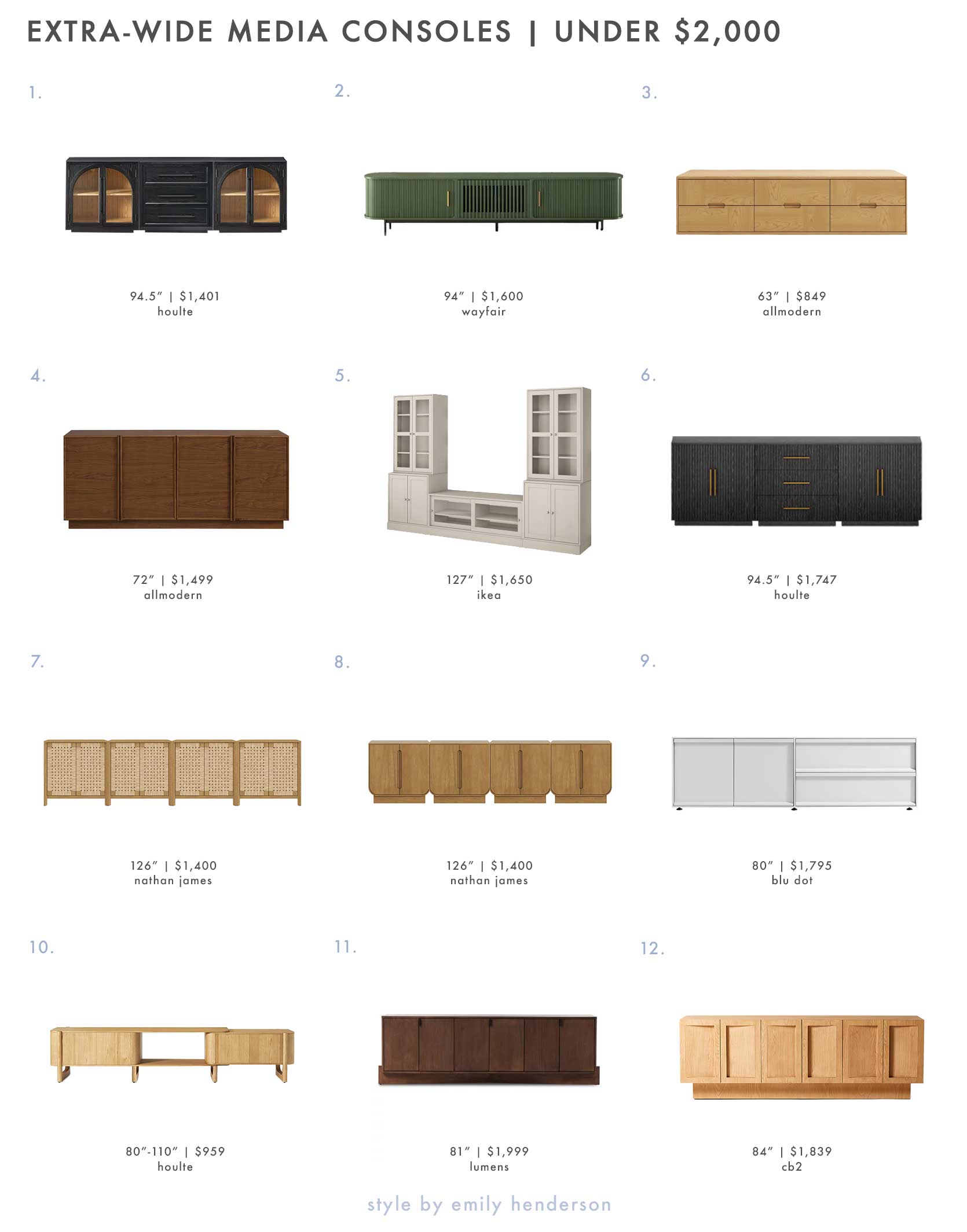
1. Alvar Arched 94.5″ Oak Modular Media Console (Set of 3) | 2. Mid-Century Modern 94″ TV Stand, Sliding Door, Fully Assembly | 3. Cabernet 63″ Media Console (x2) | 4. Collins 72″ Sideboard In Natural Walnut | 5. HAVSTA TV Storage Combination 126 3/4″ | 6. Holt Oak Modular Media Console (Set of 3) | 7. Woven Seagrass 126″ TV Console Cabinet Light Brown | 8. Wooden Arched TV Console Stand Light Brown for TVs 85″ | 9. Superchoice 2 Door / 2 Drawer Console | 10. Silas Extendable TV Stand 80″ to 110″ | 11. Castillo Media Console 81″ | 12. Shutter 84″ Ash Wood Media Console
I’ve never heard of the website Houtle; it’s a new discovery for me, and the prices seem super fair. Has anyone had experience with them? The piece at #1 is great for anyone with more of a classic or even transitional style. It’s three individual pieces put together, actually, so you can mix and match the configuration or even keep adding on to it. #10 is also from there, and I think it’s so neat because it extends from 80 inches all the way to 110 inches by sliding apart and revealing more (or less) of that shelf in the middle. You’ll notice both #3 and #4 are below our 80-something-inch threshold, and that is because those work best when you have two of them side by side. Pricey, yes.
Nathan James is another brand that sells fairly affordable case goods in more of a modular format. The ones at #7 and #8 are each four individual units, so you can do more or less depending on the size of your room, sofa, or TV. I’m quite smitten with the look of the Shutter console (#12) from CB2, even if it’s a touch smaller than I’d want it to be. In a more compact space, or in a room similar to the one I used to have with more of a TV alcove, this would be gorgeous. Same goes for #11.
Shopping Options: Extra-Wide Media Consoles Over $2,000
Have some more money to spend? Well, I’ve got some more options for you, too. While four of these barely meet the qualifications I went on and on about above, they’re just so pretty that I included them in case you don’t have a gargantuan TV, and your living room situation is better suited for something under 90 inches.
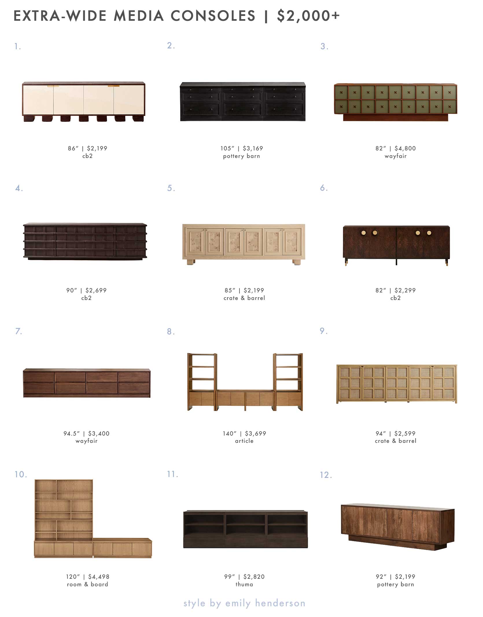
1. Moti 86″ Brown and White Wood Media Console | 2. Livingston Media Console with File Cabinets (105″) | 3. Retro Creative TV Stand | 4. Alpena 90″ Dark Acacia Wood Credenza | 5. Cotswold 85″ Natural Oak and Burl Storage Media Console | 6. Carbon 82″ Brown Burl Wood Media Console | 7. Esther 94.48″ Media Console | 8. Torme 140″ Media Storage Set – Smoked Oak | 9. Campagna 94″ Rattan and Natural Oak Wood Storage Media Console | 10. Keaton Wall Unit | 11. Nest Credenza 3×3 | 12. Decla Media Console (92″)
I could probably write a love letter to most of these here (especially the pretty little package of #1, the cool retro funky girl at #3, and the legging lady at #6). Though allow me to call out the larger “entertainment center” cabinets from Article (#8) and Room & Board (#10). These would be best suited for a living or family room where you’re trying to balance a massive sectional sofa.
As much as I love the decorative nature of the burlwood panels from #5 or the seagrass of #9, there is something so lovely about the simplicity and smoothness of the walnut piece from Wayfair (#7) and the modular units from Thuma (#11).
—
And that brings me to the end of this post today. As always, I hope you walked away with something helpful that will aid you in reaching your room design goals or in identifying and resolving issues you knew weren’t quite right, but didn’t know why. Of course, if you have anything else you struggle with nailing in your spaces, pipe up in the comments about it, and we’ll see if it feels universal enough to dive deeper into.
Until next time, friends…
Opening Image Credits: Design and Styling by Emily Henderson and Kaitlin Green | Photo by Kaitlin Green | From: Kaitlin’s ’70s Inspired, Colorful And Cool Living Room Revealed (Y’all, I’m So Jealous)
A Few Favorites

Amen! I have two West Elm Hollis consoles under my 70” TV. I put sconces and wall art on either side to fill out the rest of my long blank wall, large vases, and working on more big objects to place atop the consoles. Inspo: Alvin Wayne, Caitlin’s living room and so many EHD reveals.
55”? 65”? That surprises me. Our two TVs are 70” and 77” and I feel like our TVs are small. TVs are so cheap now. How many people have TVs that are 80” or larger?
Ha, I’m the opposite! My TV is 32″. It’s perfect.
I wonder if there is a lot of differentiation between social circles. We have a 40″ TV, and it feels like a typical size among our friends.
Our friends mock us mercilessly for our 42″ TV despite it being a very effective size for the space in which it is used.
Mallory’s TV is not a Samsung Frame TV but a TCL Smart Frame with Flush Wall Mount.
What good advice and wonderful options. I really like this look, much calmer than the giant entertainment centers of yore. I’m kinda sorry I don’t need one of these,since they can be styled so beautifully. (our tv is between two windows and above a linear fireplace.)
This is a great post! It made me realize that the difference between a “TV room” vs. a “nice room where we watch TV” has so much to do with the proportions of the media cabinet to the TV.
My dream post would be one that magically reveals how to style my wall to wall bookcase and/or my small set of open shelves in the kitchen. Unfortunately, that may be too individual to have broad appeal. I just can’t handle another “books turned backwards” or “spectral order” inspo photo (honorable mention to anything with a random random sphere or knot of some sort sitting in a decorative bowl).
EHD alum Brady Tolbert (@bradytolbert/) regularly shows images of his immaculately curated and styled wall-to-wall bookcases and I know the basics of doing so have been discussed here in previous posts and Emily’s books.
Such a helpful post! I am stuck with a TV-over-fireplace situation in my current home, but will take this advice with me to our next one!
Keep in mind, TV size is measured diagonally, so a 60″ tv is really only a 53″ by 30″ ish rectangle.
Great post! Wonder what you would recommend for people who use a projector. You need to leave a blank wall and it can fill unbalanced or have a screen but that’ can be annoying
One of the best blog posts since I’ve been in the market for over 5 years for an entertainment unit. Finally found one in the River House project! My hero Emily designed it. I also went with the same paint colors as the wall and will soon have the unit once it is made. Since I’m definitely not talented in the design industry I’ve had to look at Emily’s designs. I also have her green couch and blanket from The School House.
love this creative post by the way.
Thank you! I’m actually in the market for a credenza/server rather than a media unit for our great room. This “rule” seems to apply. I was about to buy something too small and balance it with other pieces. But it just didn’t feel right. Balancing with sofa does! I just eliminated a bunch of options and avoided a big mistake!
Hi Team, I just wanted to provide some feedback. Completely understand that the ads are your revenue stream, but were you aware that when viewing on an ipad in landscape, the ads cover up some of the text on the right of the screen? When I put the ipad into portrait the ads are fine and don’t cover anything up. It’s been like this a while and I wasn’t sure if you were aware or not. Its just a bit annoying as I do everything in landscape. Thanks!
Any recommendations for media unit to put in a corner? With current trend, the vast majority are very wide, and in our living room the only place that works is the corner, but the largest we can fit is ~48-50″. Most units specifically designed for corner tend to be old fashioned/country. Have looked at Jokuna by Article, but would like to have more options.
“The average flat panel sold today is 55 inches (though my research says 65 is quickly becoming more common), which means the smallest sized cabinet you should be pairing with your TV is about 82 inches.”
This alone is why we will likely have our 42″ TV until tat size can no longer be purchased.