Design
Your Gray Sofa Isn’t The Problem, Your Color Palette Is: 4 Ways To Make It Fresh Again
During my time as a marketing/creative director for a sofa company, there was one constant: Gray sofas were the top seller. It didn’t matter the style, what writers like me said the trends were, or where it was being sold to, neutral—especially gray—upholstery was a safe, dependable choice for many. (FYI, the other top-selling colors were varying shades of blue and beige.)
And while that may have been true during my ecommerce tenure, that was also three years ago, and since then, we’ve definitely taken a sharp turn into warm neutrals territory. You couldn’t tell me a decade ago that people would be willingly painting their walls shades of beige and brown now, but here we are (and I’m a fan).
So, what is one to do if you bought a gray sofa years ago when that was the hue du jour, but now you’re kind of over it and wishing you could warm up all those cool, sterile, and somewhat lifeless tones without having to start over? Well, that’s what I’m here for, friends, because Tim Gunn may have popularized the phrase “Make it work,” but boy, do I love to center design stories around the concept. Everything is too gosh dang expensive these days to be flipping through furniture like you would a well-worn magazine at the dentist’s office (not to mention the waste factor). Nope, not here. Let’s—say it with me—MAKE IT WORK!
Today’s topic tackles making that gray seating feel new, warm, and inviting, and the idea actually came from one of you in the comment section of this post I wrote earlier this month on non-boring rugs. I broke the color up into four different tonal categories and built an example palette and mood board around each: light gray, dark gray, cool-toned gray, and warm-toned gray. Keep in mind, of course, that the precise shades I picked for the wall paint and other soft goods may not work exactly with your sofa, depending on the shade of your fabric, but it should provide a good jumping-off point for you to build a new color palette around. Got it? Let’s explore.
How To Style A Light Gray Sofa
We’re starting with what I recall being one of the top grays: a light, neutral silver. If your sofa doesn’t lean necessarily warm or cool, you can go many different directions with it. Here, I liked the idea of using friendly and happy blush, rich taupe, warm vintage wood, and a touch of ochre.
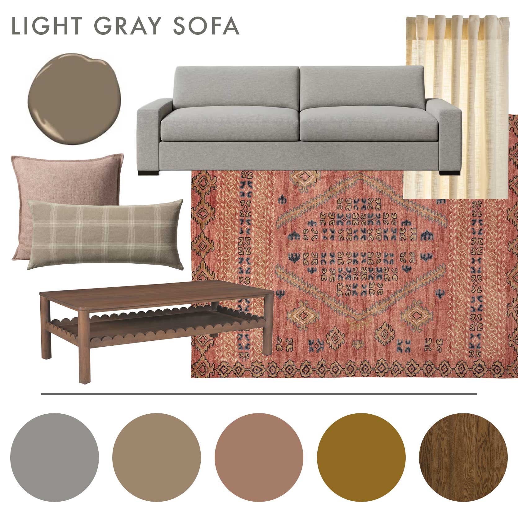
Sofa | Paint Color | Rug | Square Throw Pillow | Lumbar Pillow | Curtain Panel | Coffee Table
I’ll say this here, but it applies across the board: In order to make a gray sofa feel more current, limit the rest of the gray or cool tones in the room. You need *warmth*, and can achieve that through earth tones, bolder colors like burgundy and olive, and non-gray wood finishes. It’s easy to just say “oh, gray goes with gray” and then do gray wood floors and gray rugs and gray wall colors, etc., but I urge you to try something else. The result will be a space that feels complex yet inviting.
Back to this mood board. For my setup, I varied the intensity of the pinks, going richer on the floor to ground the lightness of the sofa color, and a bit smokier for throw pillows. I love a creamy, buttery semi-sheer curtain which introduces soft light (this alone could warm up the most sterile of rooms) without feeling like you’re bringing in another “color”, and neutral brown wood through storage and surface furniture. On the walls, Benjamin Moore Rustic Taupe is a saturated khaki that picks up the browns in the coffee table and rug details to envelop the living room setup.
Make A Dark Gray Sofa Feel Cool & Edgy
While I wouldn’t necessarily live in the below room, I actually am really into it. Like in fashion, a sure-fire way to get a chic look is to go monotone, then add in some black and/or cream.
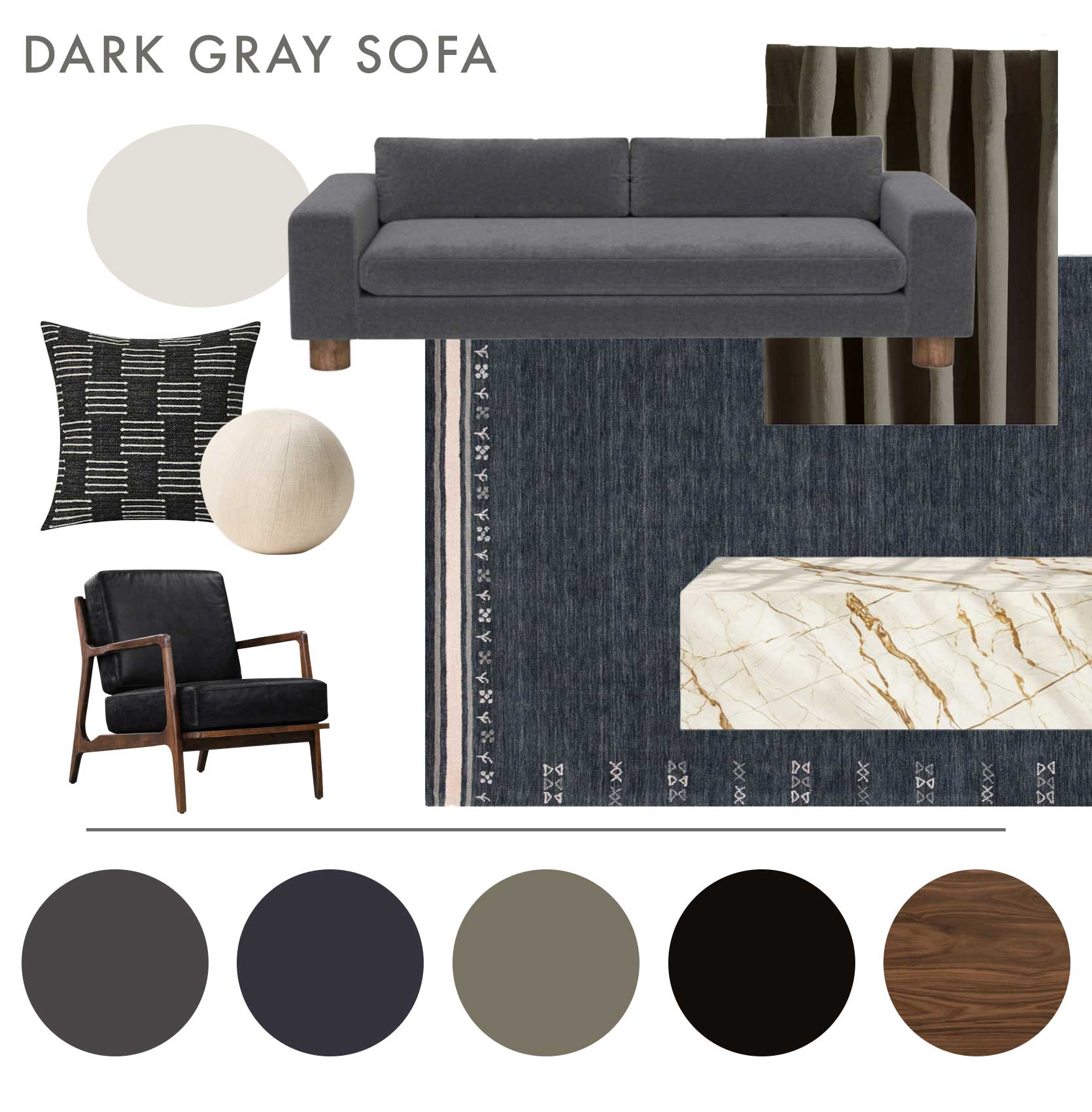
Sofa | Paint Color | Rug | Square Throw Pillow | Round Throw Pillow | Curtain Panel | Accent Chair | Coffee Table
I started with Emily’s Milo sofa in the deep charcoal colorway and worked from the cool tone here to introduce a dark navy rug, which is just different enough from the upholstery fabric to create a slight contrast. A graphic border keeps it interesting, as well as from turning into just a blob of the same-ish color, while a smart black leather armchair keeps it from getting overly contemporary with a handsome walnut wood frame. With a dark rug, sofa, and armchair, go opposite with other furniture like the coffee table and paint color. I actually opted for a gray wall paint in a stone hue that’s both warm but firmly gray enough to still work with the couch. Introduce pattern and geometric details with a combo of throw pillows (gotta love that sphere!!).
Warm Up A Cool-Toned Gray Sectional
Give me a room with a major burgundy moment anyday, so I couldn’t help myself but build one for today’s post. A cool-toned gray sofa and a deep red work together because they’re both extensions of a primary color (think of the gray as blue, an the burgundy as red).
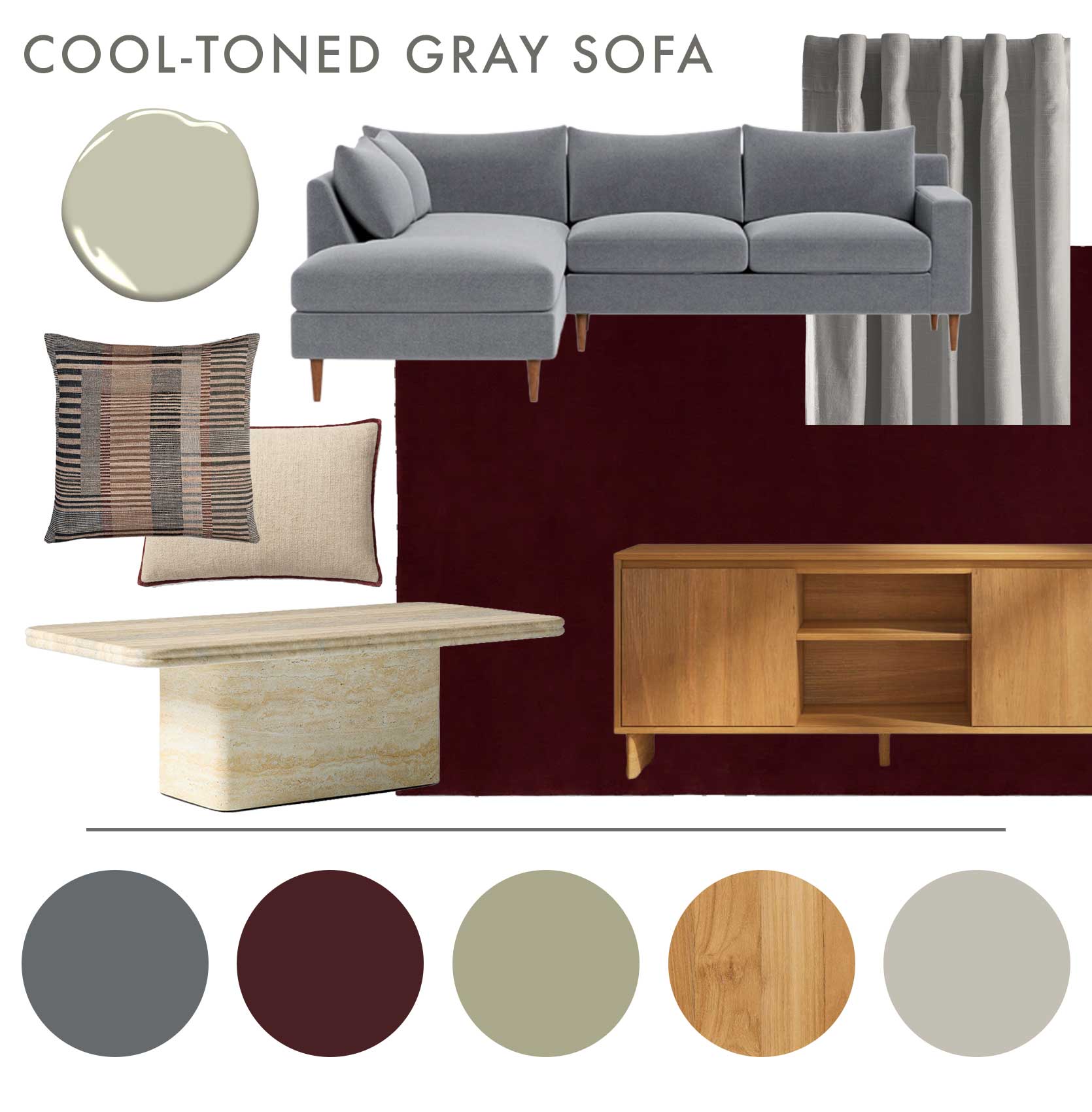
Sectional | Paint Color | Rug | Square Throw Pillow | Lumbar Pillow | Curtain Panel | Coffee Table | Media Console
A solid rug is very now, so it’s an easy way to bring a gray sofa squarely into today. To avoid things looking overly 1980s, I brought in an almost sagey gray wall counterbalanced with a yellow-toned oak. You can do this either with media furniture or a coffee table, but to add variety, I chose a travertine-esque table instead. Burgundy piping and detailing in the throw pillows echo the floor covering.
Make Warm Gray Seating Eclectic & Interesting
Like the first example with the light gray sofa, a warm-toned gray sofa gives you a lot of room to work with a modern color palette. In the right light, it’s basically beige (or greige, as they say).
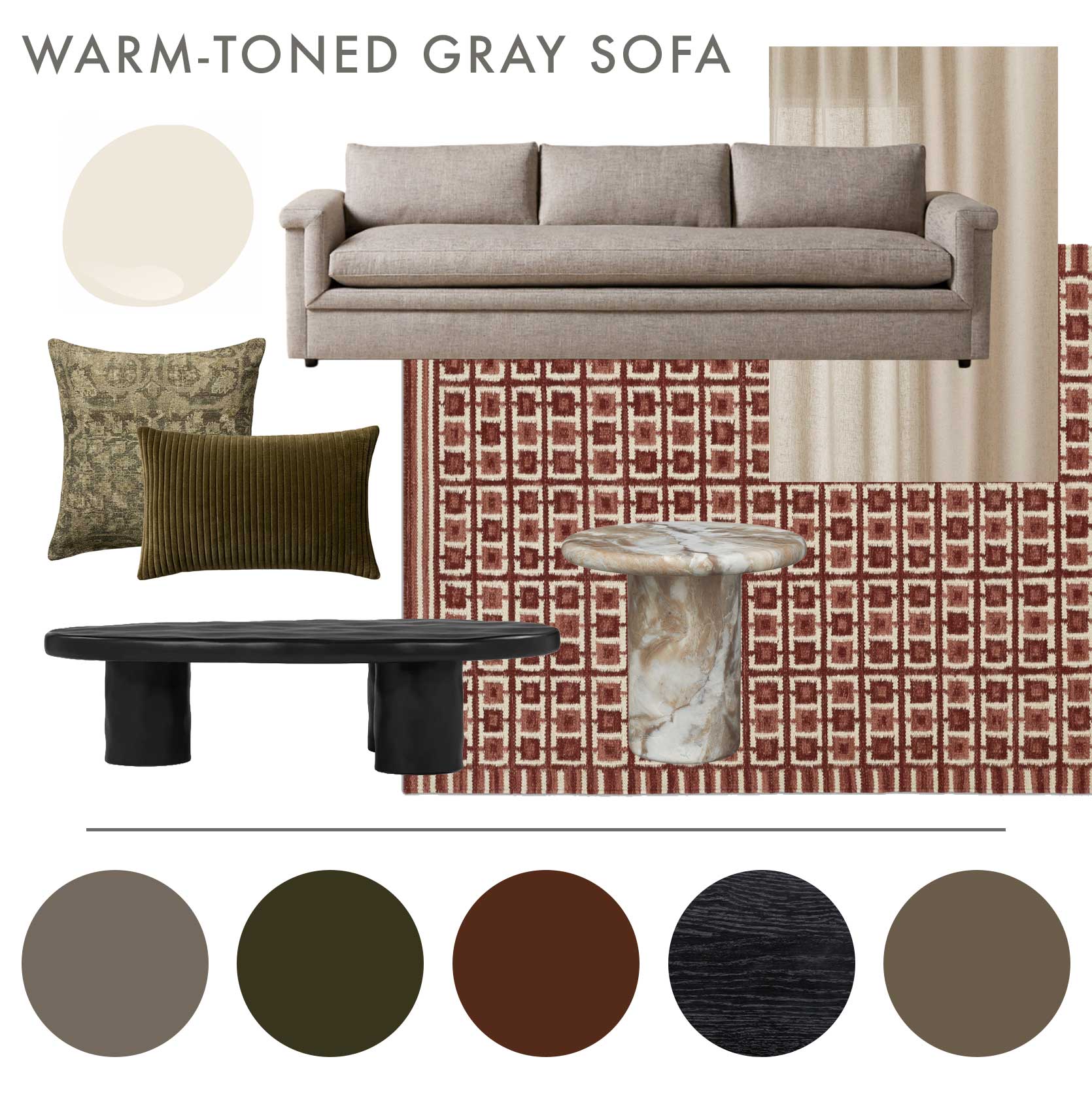
Sofa | Paint Color | Rug | Square Throw Pillow | Lumbar Pillow | Curtain Panel | Coffee Table | Accent Table
As I would a flax or oatmeal sofa, I’d pair a warm gray with rust or brick red (here, I picked the rug for the place to do that). I liked the variations in red tones in this rug from Lulu & Georgia, contrasted with a cream. I lightened the visual load with a coordinating ivory curtain panel and wall paint color, but then added gravitas with a black stained wood coffee table. For some extra credit, a warm, heavily veined marble piece melds together different gray and cream tones. And because I love playing with slightly shifted complementary colors, I went with olive greens in a textured solid and print via the throw pillows.
—
Alright, friends, I leave you here. That was fun, and as I tend to find myself after exercises like this, I kind of wish I had a gray sofa to use one of these palettes and moodboards! Hopefully, this was helpful to you if you do, though. If you have another pain point at home, please let me know in the comments. Always happy to jump in and, you know…MAKE IT WORK. Until next time…
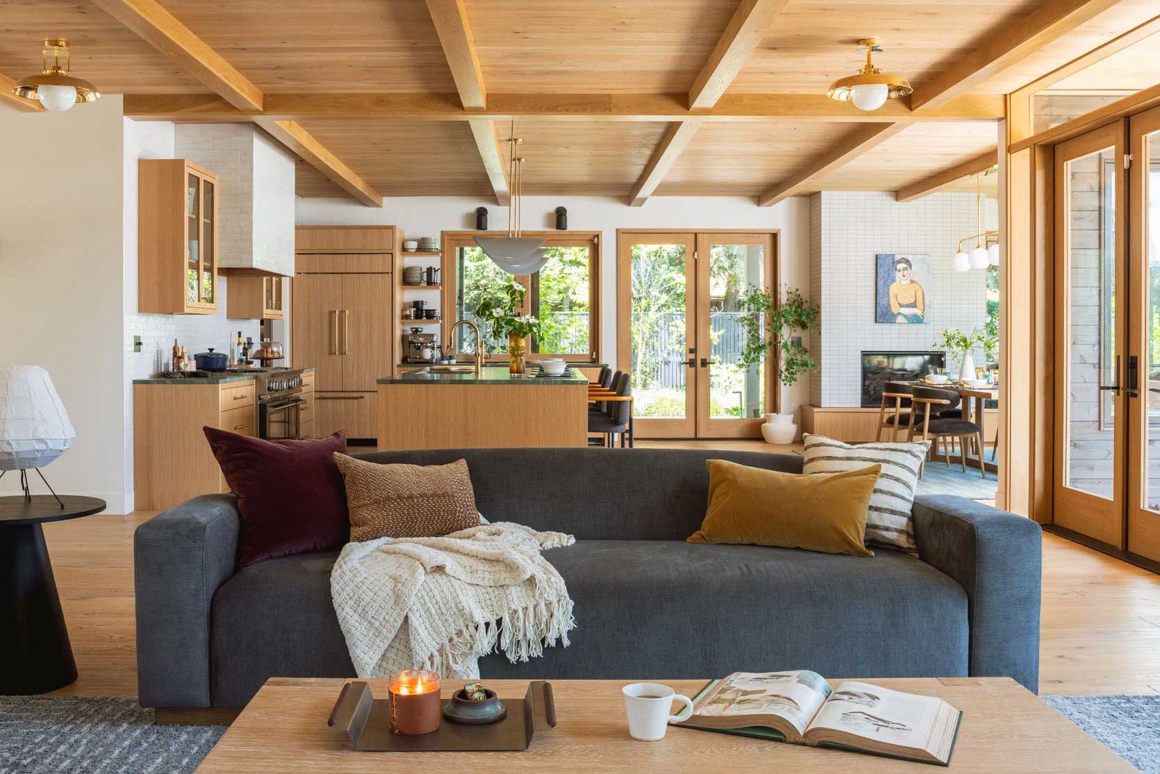
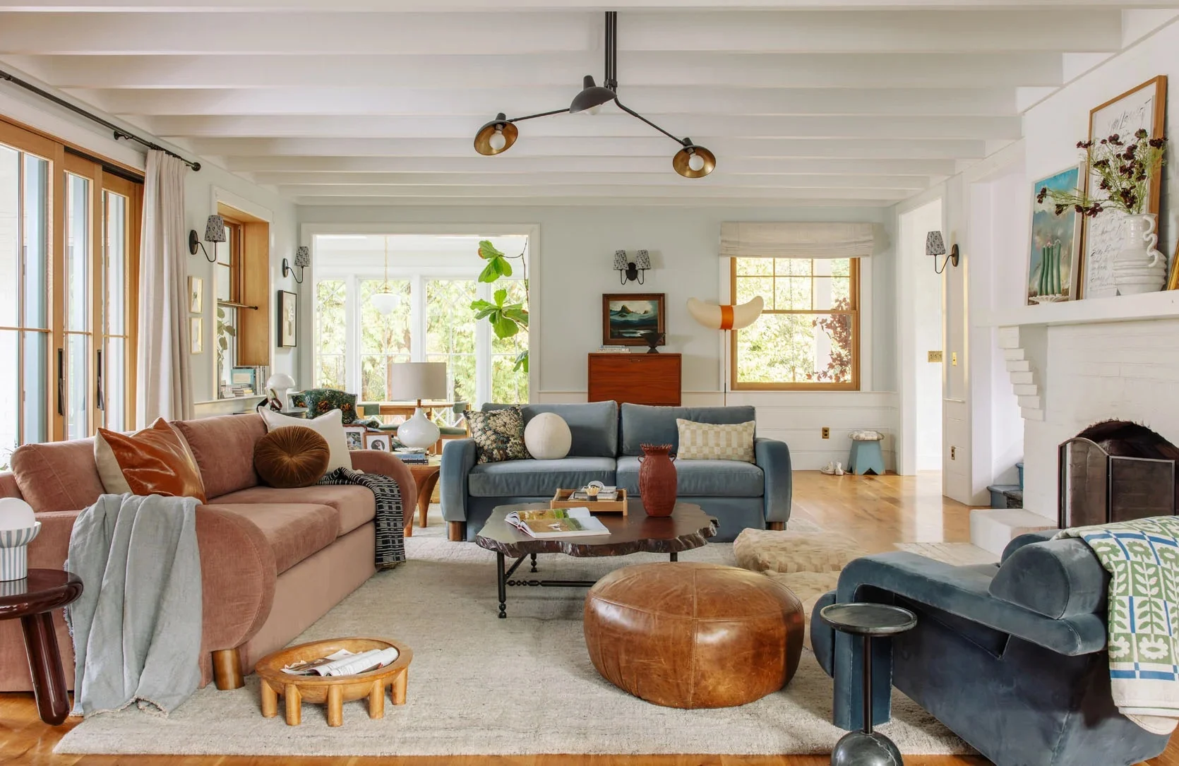
Opening Image Credits: Interior design by Emily Henderson and Max Humphrey | Photo by Kaitlin Green | From: My Brother’s River House Living Room Reveal – With A TV On A Tiled Fireplace

I like that deep red version the best! I have a dark grey mid-century sofa and my top tip is really to put a blanket over the back in your preferred palette so the dark grey is minimised. If you didn’t have a dog you could put one on the seat instead, but my dog burrows into anything fluffy and digs up the tucked-in blanket.
I have a medium blue (Farrow and Ball’s Ultramarine) room, and the sofa is the only grey thing in it (I bought it fifteen years ago in a different house) – the rest is shades of blue (turquoise, navy, cobalt), green (acid green, olive, racing green), warm pink, wood and occasional deep red. Nothing is the same colour as anything else, but all the colours look good together. I don’t think you really even notice the sofa is grey. Think of the living room Emily did for her friend Robyn with all the different colours.
Yes love the sound of that!
Love these kind of posts! Most people can’t afford to (or even want to) rip everything out and buy the current fad. I appreciate the thought that went into this and teaching us how to do it for ourselves.
I dream of having a home one day where the decor and design just grows with us over time, not having to be overhauled every few years or even every decade.
Arlyan, I would love your help. I have a grey loveseat that tends to have pink tones. yellow walls with small raspberry painted flowers. ( very suttle, dark green branches.) with lots of light. Wood work is light. Wood floors. Accent chairs oatmeal (pottery barn) rug ideas ?
find me on instagram and send me a picture! @arlynhernandez
I really like posts like this. Thank you for the inspiration!
Glad you liked it 🙂
This was awesome and super helpful
I have a dark grey sofa and it’s paired with blues and yellows (and a light grey wall color) plus lots of wood, like warm wood floors and furniture. I’ve had this color scheme for many years now, but I’m not tired of it yet. The sofa hasn’t held up as well as I’d hoped (and the fabric is a magnet for the cat) so it might need to be replaced sooner than later, but I will probably still go for a dark grey (or maybe a dark blue) when the time comes. I don’t particularly care what colors are trending or not, if I like them, I like them.
Yeah I tend to be the same. I have to *write* about a lot of trends, and because I’m living in the world of design news every day, it’s fun to imagine, but I like what I like.
I too have a medium gray sofa from 12 years ago (gray-green, not gray-blue, so it naturally leans warmer thank goodness). It is the only gray thing in my current home. Originally a sectional, we broke it up into the loveseat and sofa portions when we moved here. The sofa has a multicolored quilt permanetly tucked over the back cushions – a quilt with some structure works better than a floppier blanket – and they both do ok in a room that is otherwise all brown planked walls with doses of green, blue, and peach, plus textiles & rug with cream backgrounds and colorful patterns. There’s no other gray, my side chairs are medium blue, and *someday* I would love to replace with a colorful green sofa and a cream/greige loveseat.
while not the intention of this post… i’ll add SLIP COVERS. theyve come such a long way and we have navy blue velvet on our dark grey sofas and it’s given it new life
Where do you look for these? I haven’t had much luck but love this idea!
Our C&B Petrie sofa had faded unevenly from charcoal to varying shades of brown and gray. Comfort Works slipcover to the rescue! They make semi custom covers for many popular sofas. Not cheap but far less than a decent quality sofa or a custom slipcover. Other than the lack of button tufting, no one can tell it’s a slipcover.
Where do you look for these? I haven’t had much luck but love this idea!
Oh yes!!
I purchased a slipcover from Target in an oatmeal shade with a classic velour fabric. It came with separate seat cushion covers as well. It truly looks very good and doesn’t look like an average slip cover at all:) Total game changer for our room!
Wonderful, applicable advice! Something rare here. Love your input on this site.
Thanks Kate!
I LOVE a “make it work” post. These color palettes are beautiful. Love the last rug by Lulu and Georgia. Thanks for putting these together for us, Arlyn!
🙂
I love this post! I would like a similar post for how to make gray finishes work. What do you do with gray carpet, gray-toned wood floors, gray tiles, and gray painted walls? Do you paint the walls a different color? But then doesn’t that make the gray floors more noticeable? Help!
I did a gray floors one! I tried to paste a link but it wouldn’t work, but if you search for the following, it’s my piece –> Make It Work: 3 Color Palettes To Try If You Have Grey Wood Or Vinyl Flooring
A great companion blog to this one is Kylie M. Interiors (google it) – she focuses on making 90s and 2000s finishes “work”. I poured over her blog when I was trying to figure out what paint color to choose with some less than ideal finish choices that I made when I had a newborn and wasn’t at my peak form. (sigh, lol.)
I LOVE my dark charcoal sofa and feel very validated that the monochromatic color scheme you recommended is what I have going on! Okay Arlyn, you want a challenge to “make it work?” Remember over a dozen years ago when mint was popular? Well I was sold & had nightstands custom made for my master bedroom. They are still beautiful, solid, and in great shape but designing around them is HARD. Right now I have varying shades of blues and grays but I want to move on from the grays and update to something more fresh. What other color combos would look sophisticated with mint?!
As always, I love your posts because they’re practical and are written so well. I realize more and more that I have so much trouble establishing a color pallete. I’m familiar with the color wheel and how to use it but for the life of me, I have trouble knowing the right shade of a color to use without being too matchy. I hope you keep giving advice about using what we have. It’s so helpful.
Has anyone ever used upholstery paint? I realize how crazy that sounds, but I’ve seen a few influencers try it and I’m tempted. I have a decent pair of stained (b/c kids, sigh) light grey chairs that are a perfect size, but so tired. I feel like a punch of dark red or green would really make the room, and at a fraction of the cost. Bad idea???
Arlen, what did we do to deserve you?! Every post you put out is such a gift!
Thank you for the way you tap into creative inspiration while also balancing the tension of economic realities and responsible consumerism. I truly get excited whenever I see your name on a post because I know what I’m about to read is gonna be pure gold!
“Make it Work” is a wonderful alternative to “just living with it.” You made each pallet a stand out that would be a pleasure to live with!
Hi! I’m so curious if you’ve ordered from Interior Icons before and what your experience has been. Their prices seem too good to be true!
This is a fantastic post!! I need help! I’m not exactly sure what colour grey my sofas are because they also have black and beige flecks in them but I think they lean silver. Does that make sense? I was planning to repaint my living room Creamy already (like the last palette). I have brown shag carpet & I feel like everything just feels blah!. I also love light pink accents and I think I like the first sofa palette in this post better but I’m not sure I could get behind such dark walls even though the room is south facing. Any thoughts?
Such a smart way to style a gray sofa. Adding warm tones like olive, burgundy, and natural wood really makes the space feel more modern and inviting instead of cold. Loved the idea of buttery curtains and earthy textures too. Great inspiration for anyone refreshing their home setup while sharing decor ideas online through platforms like GetMyLikes.