Design
The 11 Things We Did To Add Charm To My Sister’s Builder-Grade Kitchen – HAPPY REVEAL DAY!!!
Oh boy, how I love a reveal day. Especially a kitchen makeover with charming vibes and budget-friendly ideas from mostly builder-grade materials (!!!). This is my sister’s kitchen that I introduced last week (for the full backstory and breakdown of the design process, go here), and I partnered with Lowes, using almost 100% of their product and services (all but styling), and it was by far the most streamlined project I’ve ever done thanks to their kitchen design services. You have my permission (and recommendation) to steal the entire design. I absolutely love how it turned out, and so do my sister and her husband, Garen.
The Before & After
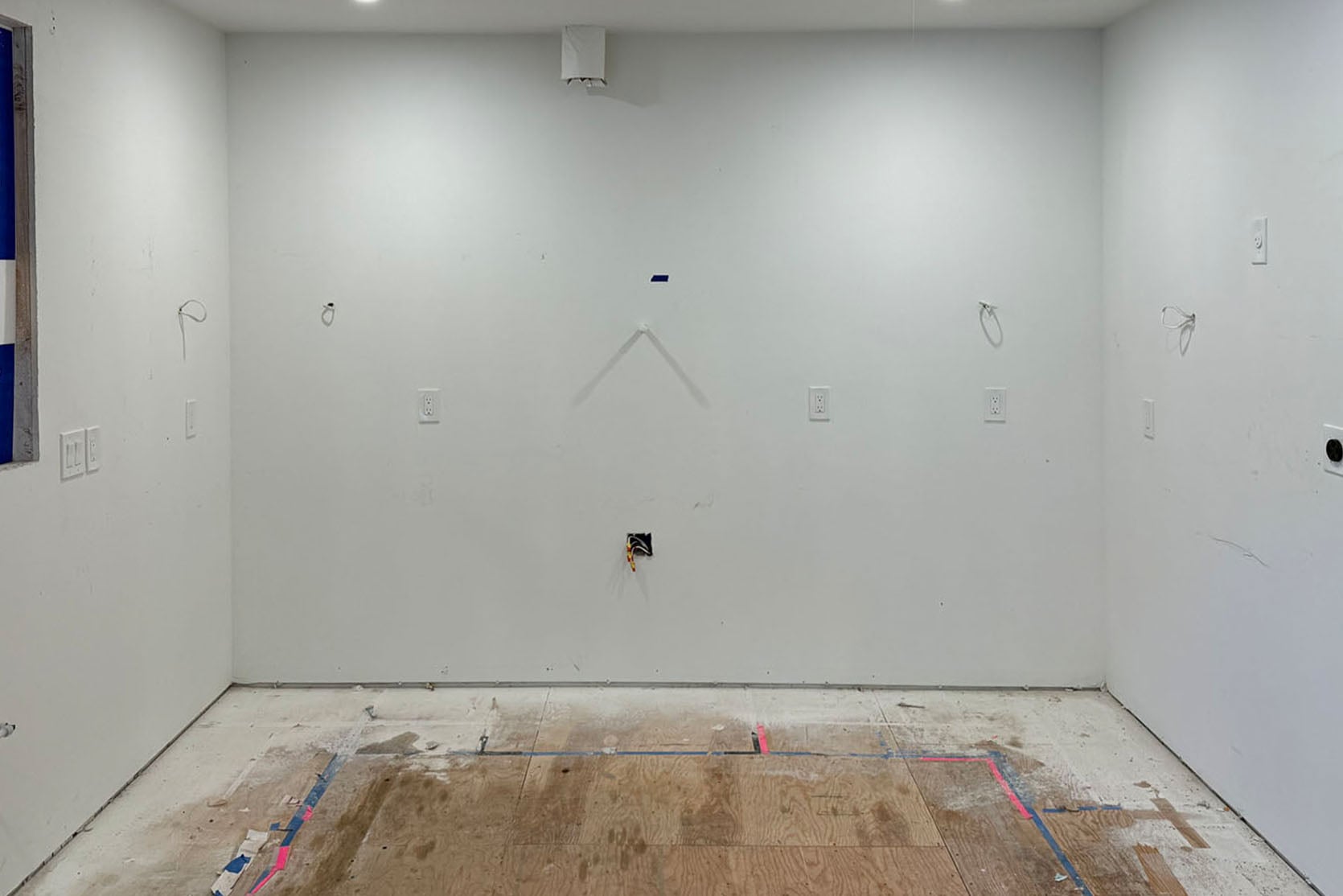
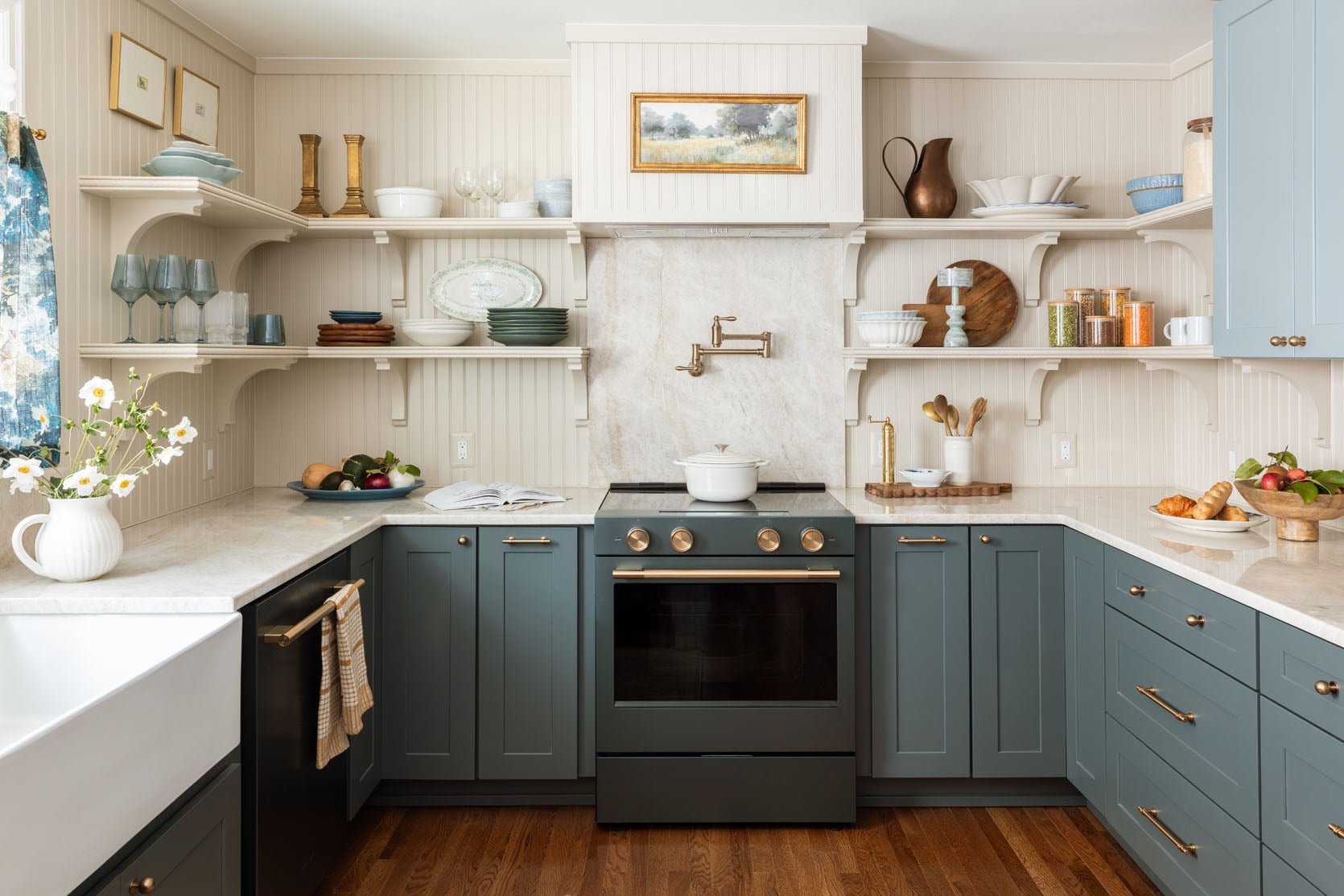
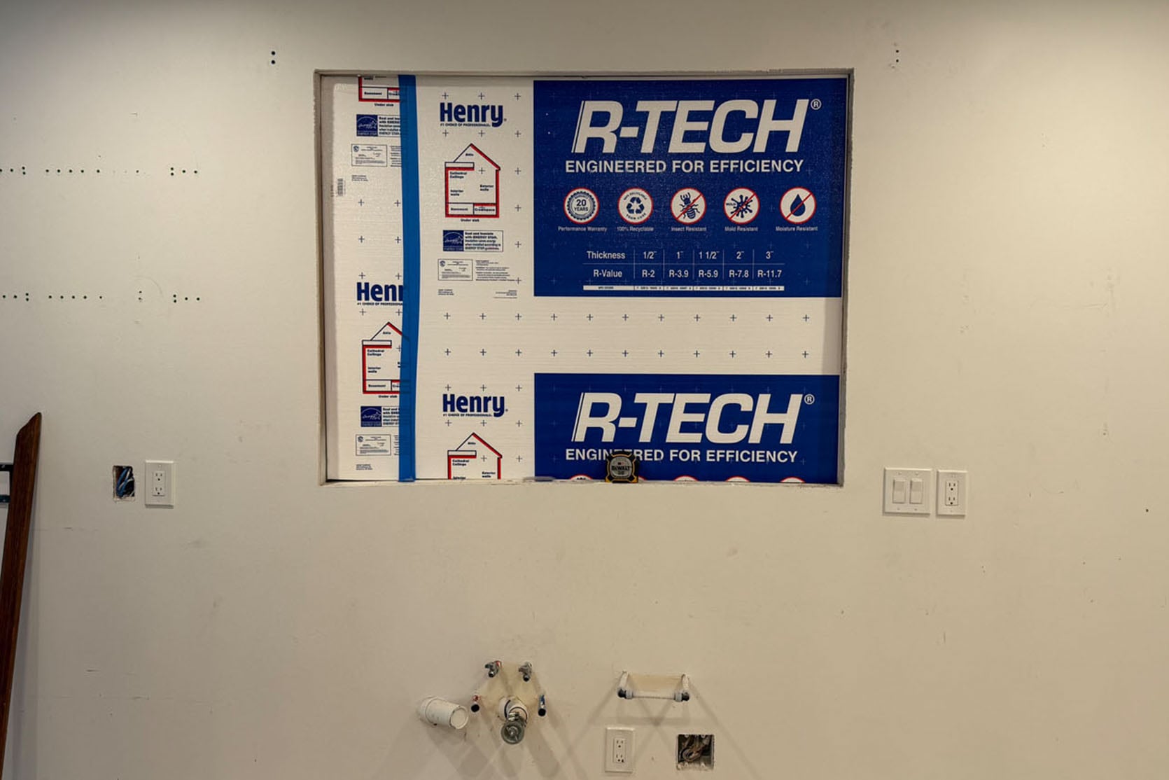
When I came into the project, the footprint, rough electrical, and plumbing were already done, so we were at the drywall phase, and we weren’t going to move a thing (to save money and time). It was a white box in a 1920s English Tudor home that needed to feel fresh and new, but timeless and classic (and they wanted color). Our goal was to reduce the labor costs as much as possible and lean on Lowe’s services to book all the installation of the flooring, cabinets, and stone countertops. It was a dream.
It was such a great exercise in simplifying and streamlining, in both the visual design and the process, and we had a blast combining all the materials to look colorful and fresh and with a lot of character and charm.
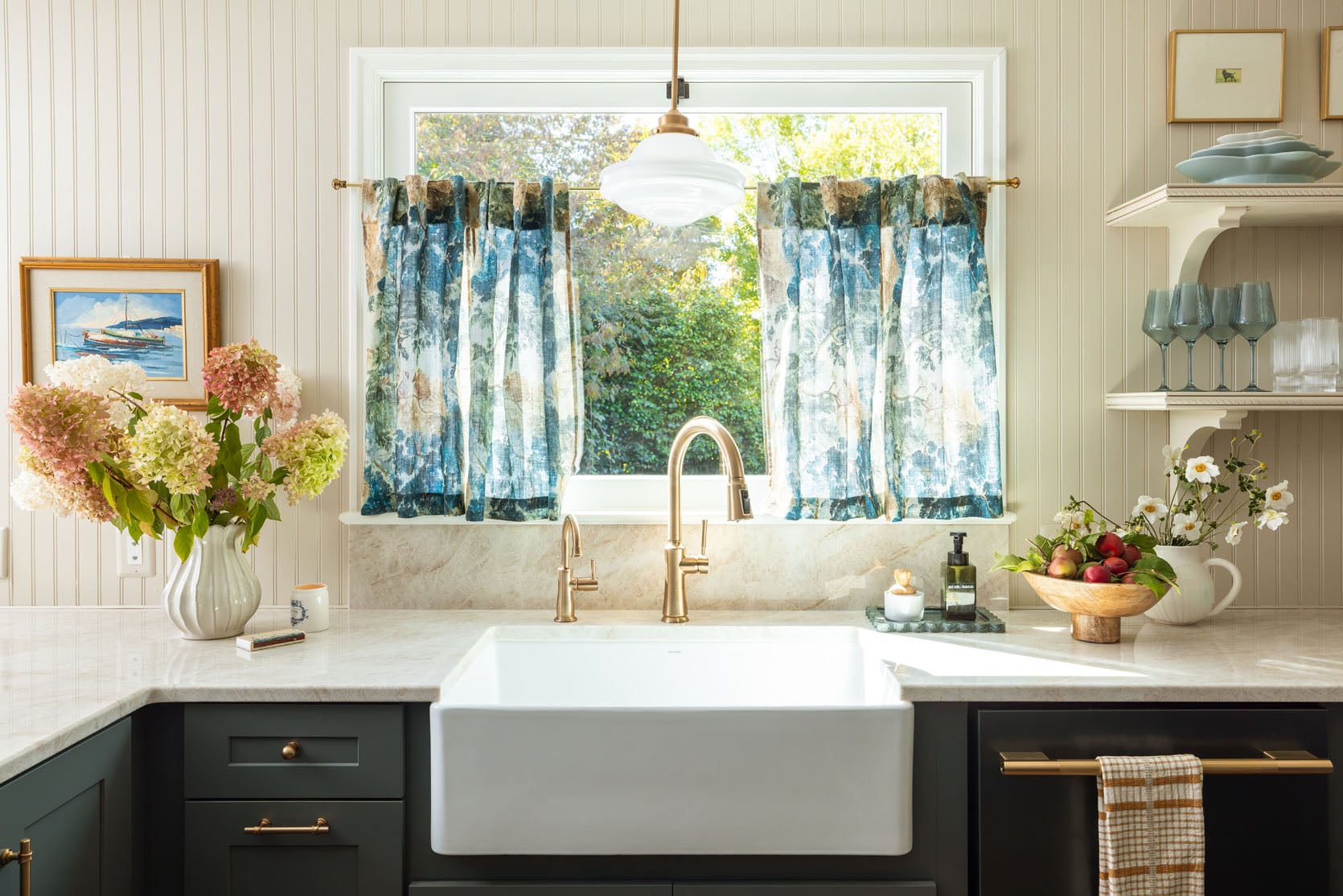
The Affordable Classic Farmhouse Sink And Pendant
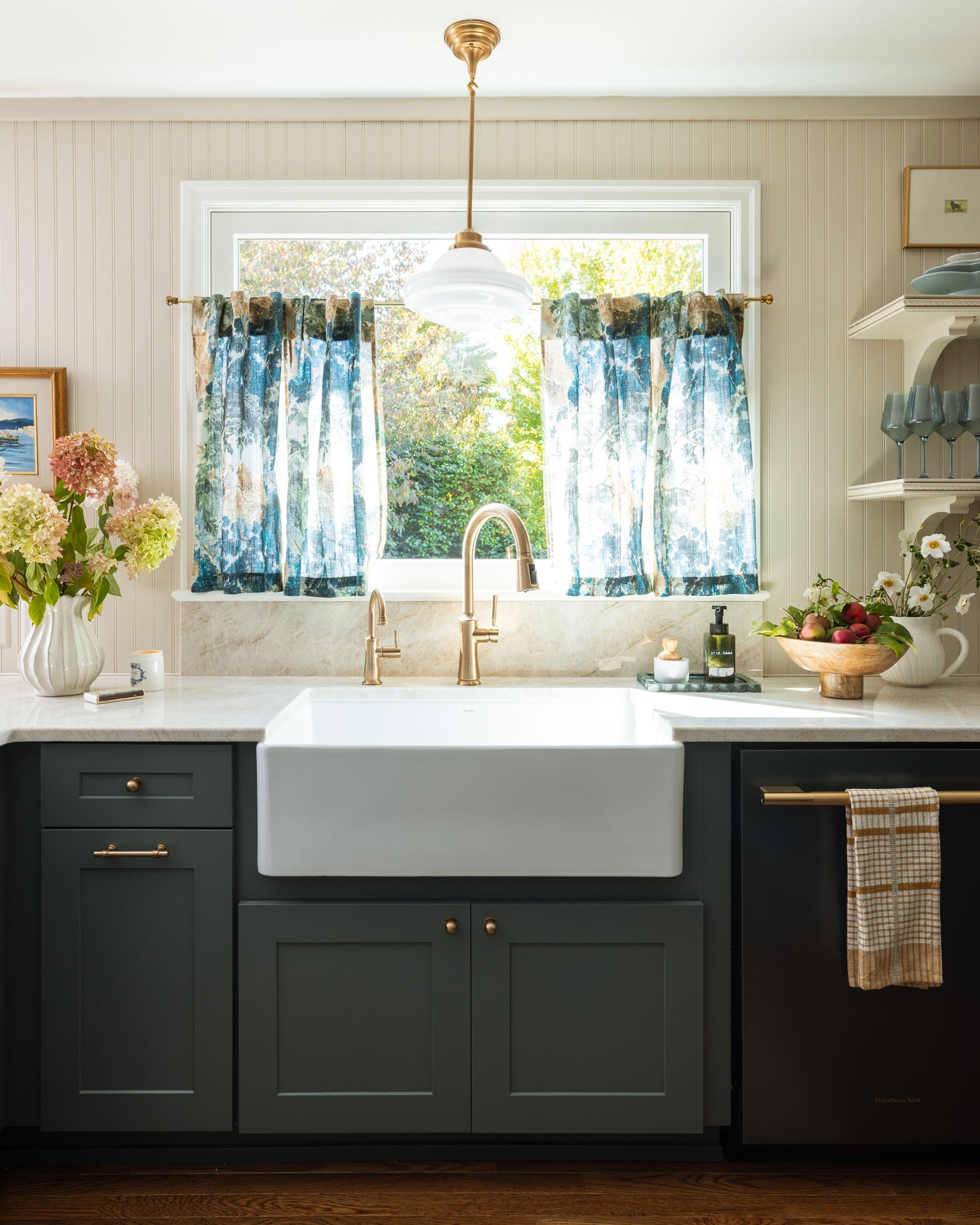
While I’m admittedly hyper picky (fine, yes, snobby) when it comes to most design elements, I also know that some things can give the same visual look for far less, and the impact is just the same. This sink is super simple and created the same vibe as a splurgy fireclay sink – it was $300. The schoolhouse-style milk glass pendant had some pretty details (and an adjustable drop) while being under $200.
Budget-Friendly Real Hardwood Floors – $5/Square Foot
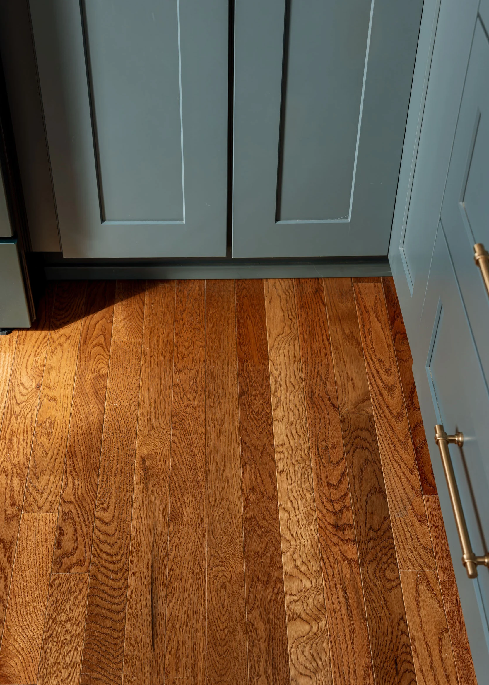
Bruce Hardwood Floors in ‘Fawn Oak’
This one really shocked me, and I want to shout it from all the rooftops. The fact that we replicated what they had throughout their vintage home (the 2 1/2″ red oak that is ubiquitous in older homes) for $5 a square foot – PRE-FINISHED (!!) really opened and then blew my mind. I learned such a lesson here. I think our obsession with wide plank, white oak, etc., is fine, but my goodness, this classic flooring for this affordable price, installed in ONE DAY by the Lowe’s installation team, was mind-blowing. It’s very, very, very pretty, y’all. (It actually made me want to do it in the guest cottage, but we had already ordered all our reclaimed wood). The Fawn Oak tone is so pretty. The sample was accurate, but I was worried it was going to be too shiny once installed, and it was the opposite – it actually looked way more expensive once it was all over the floor.
Semi-Customized Two-Toned Cabinetry: ‘Tropic’ + ‘Emma’
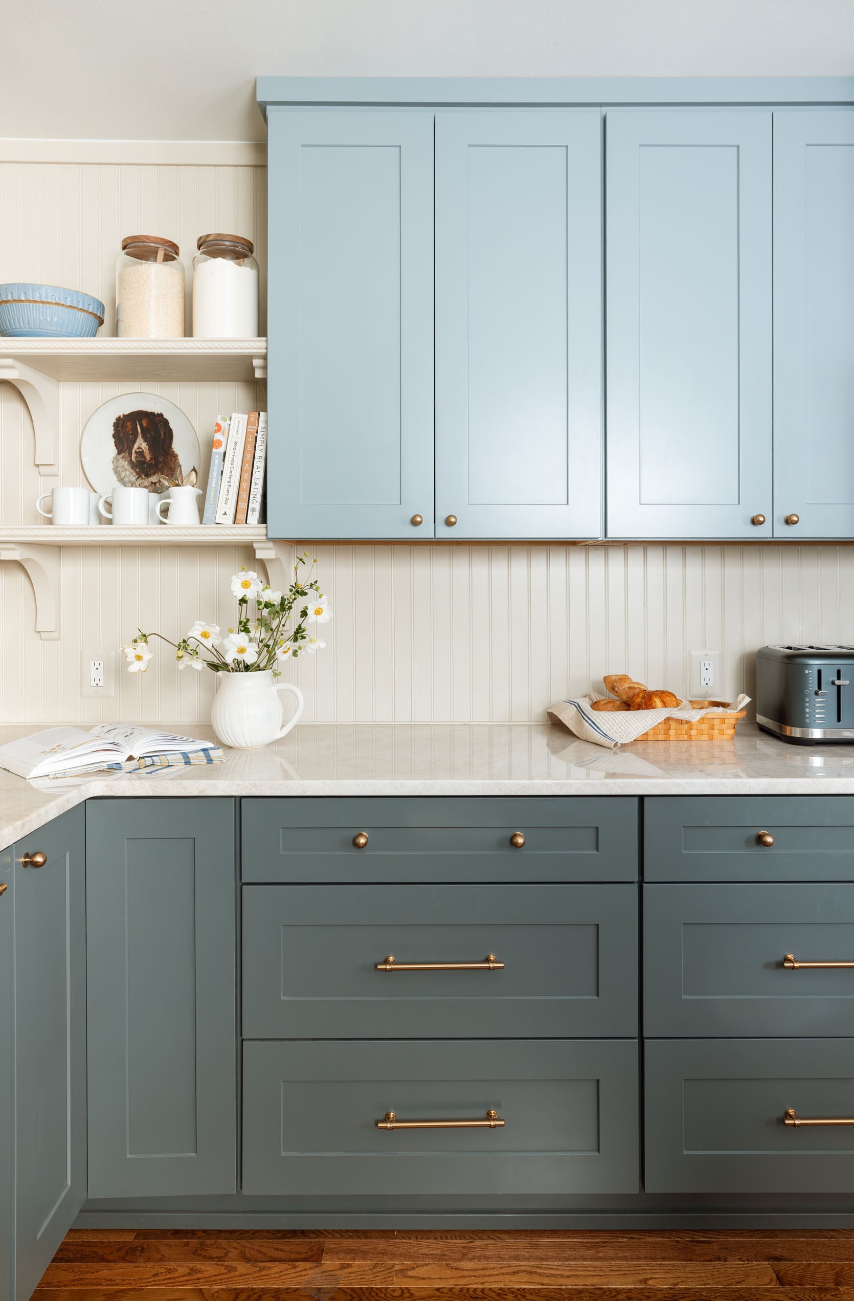
Upper Cabinets: ‘Tropic’ | Lower Cabinets: ‘Emma’
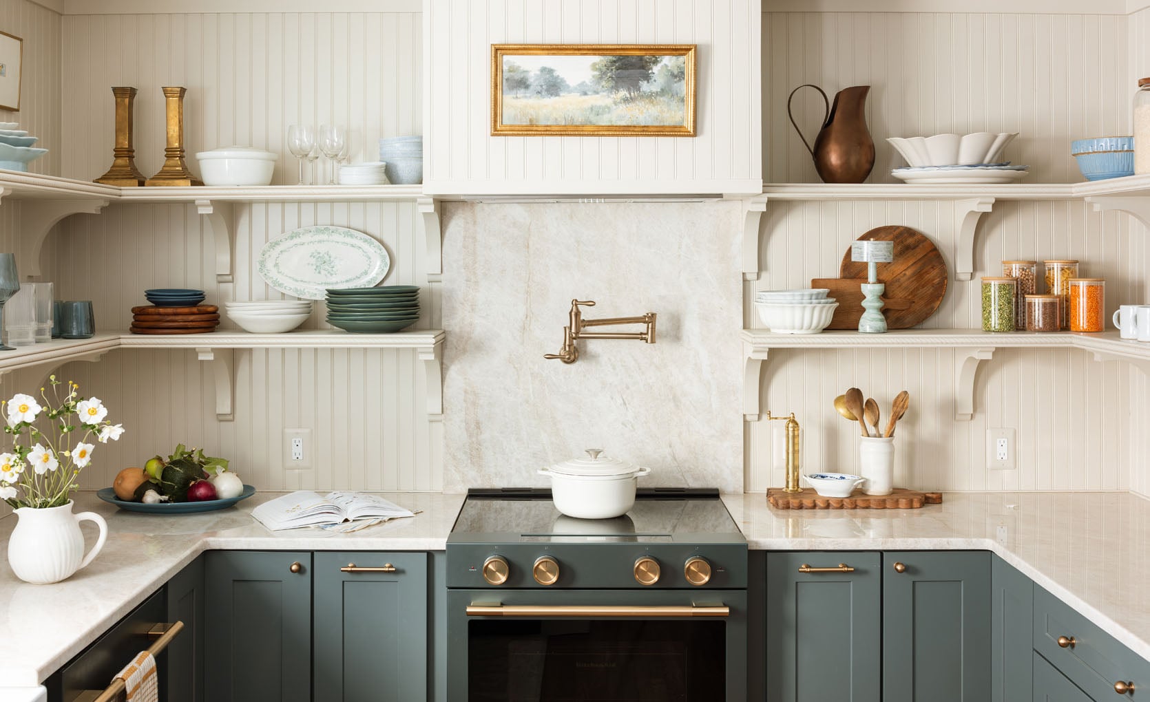
I knew that I needed to keep this kitchen pretty “safe” for any future resale (stylistically), but as a designer, I couldn’t just do white uppers and lowers, and doing even one color felt like I would be phoning it in. So this is one of the risks that I took that I am so stinking pleased with – powder blue on the top, and a deep green on the bottom (to integrate with the darker green appliances). Lowe’s has a few different cabinetry lines, from very affordable to pretty dang custom. We wanted to keep it affordable, but the pre-selected colorways really drove our selection, so we mixed two different lines (which was super easy – the kitchen designer will do it for you). I’ll be doing a full deep dive on what we chose and why, but we chose full overlay, shaker style in two different colors, and we were so pleased with the quality, the precision, the installation – all of it. Even the interiors are pretty and have all the bells and whistles of custom cabinetry. I love how the colors are different enough to create contrast and interest, but not so high contrast that it feels off balance. I would do this exact move again in a heartbeat. Note: I think that only having a couple uppers made this work best, and having the creamy taupe paint in between gave your eye the break it needed.
Affordable And Totally High Quality Hardware
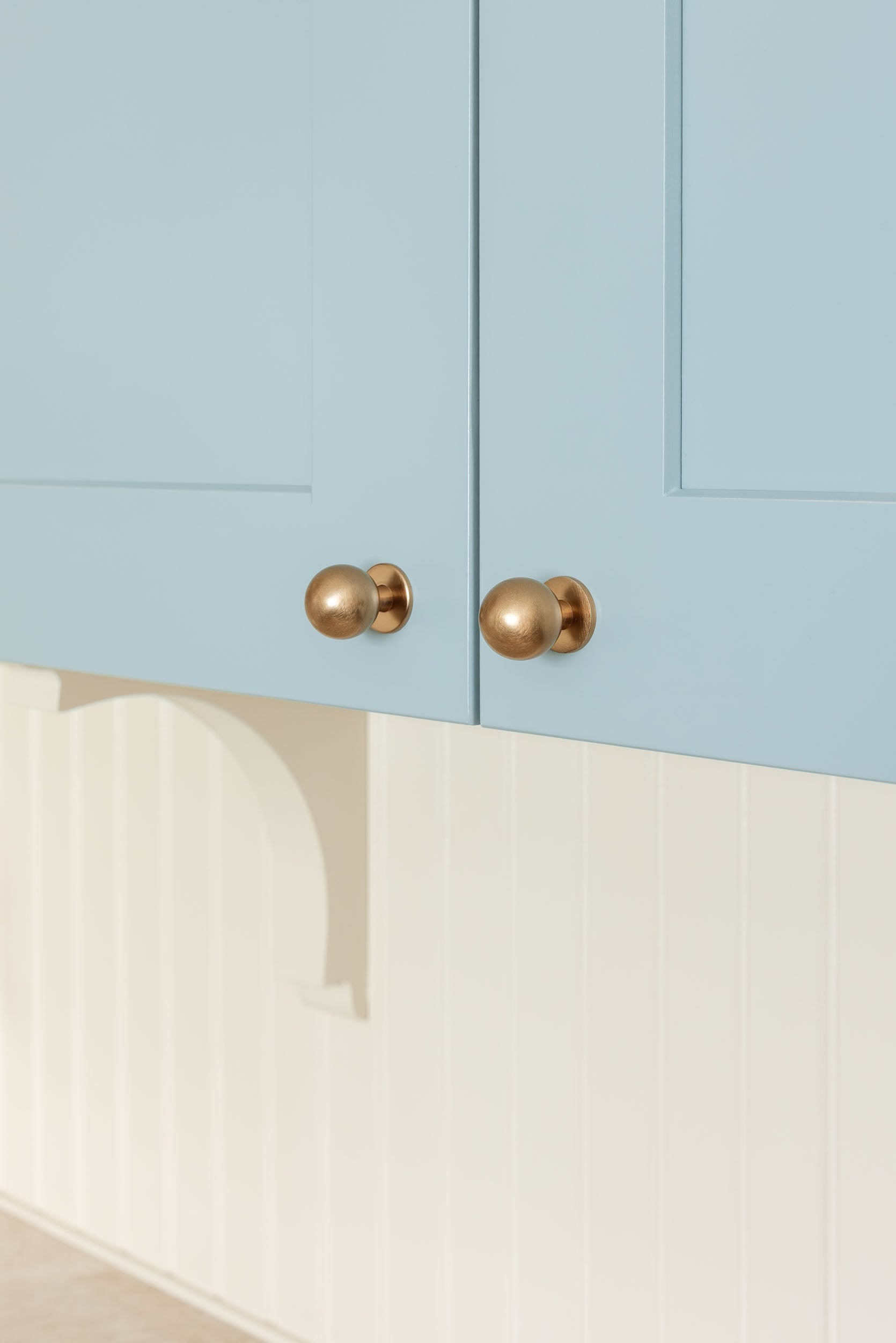
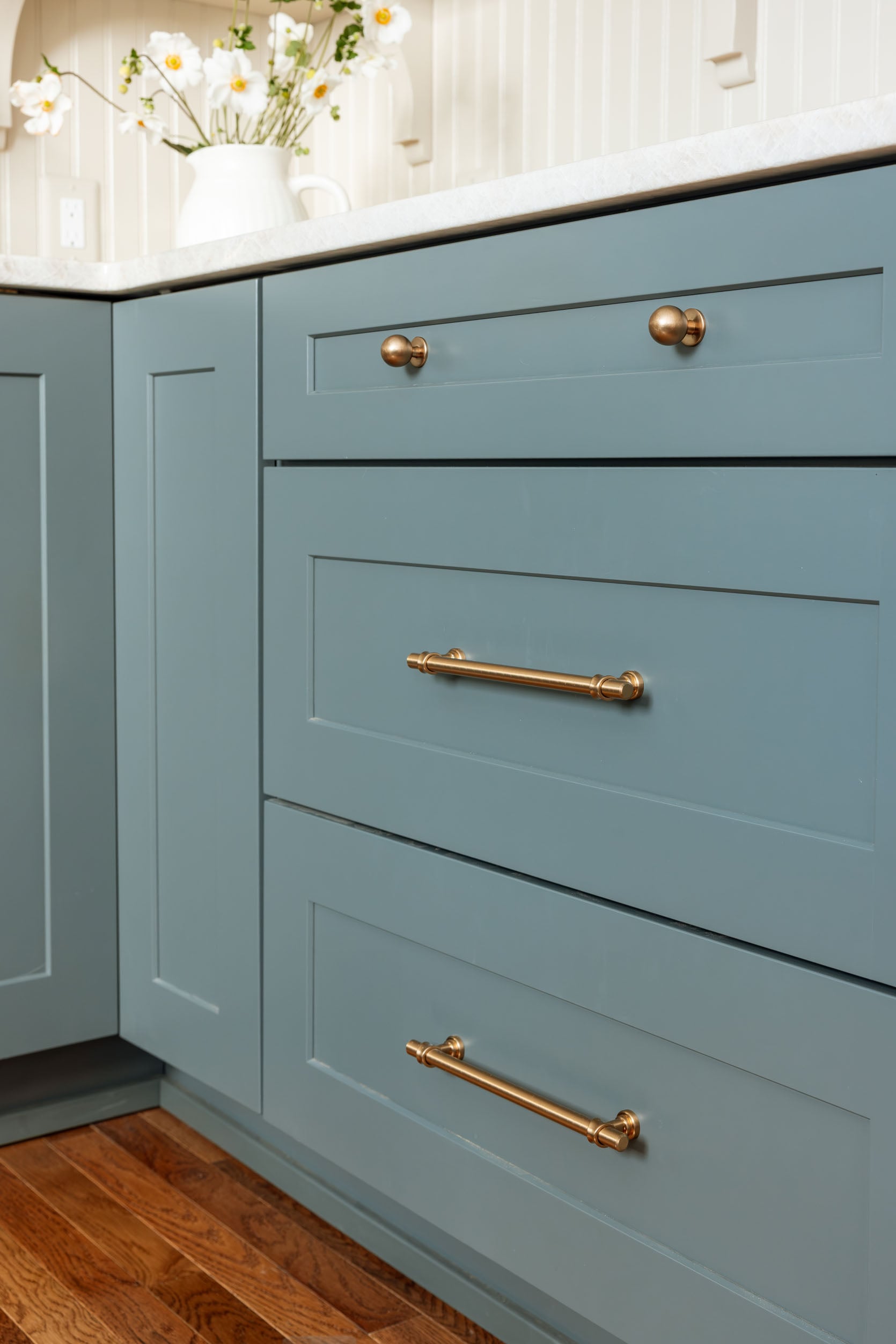
We ordered so many hardware samples, wanting to make sure that the gold tones worked well with the plumbing fixtures and the appliance pulls. But there were so many great ones to choose from that felt heavy and solid in our hand and added a bit of interest while, again, being classic. One of my favorite moves is doing knobs on upper cabinets, and then repeating the same knobs on lowers where appropriate. I obsess about the details of both, making sure they share some shape/profile or elements so that they look intentionally paired. These knobs and pulls are fantastic (and the pulls come in many sizes). How cute are those small, perfectly spherical knobs???
$28/Sheet Beadboard Paneling
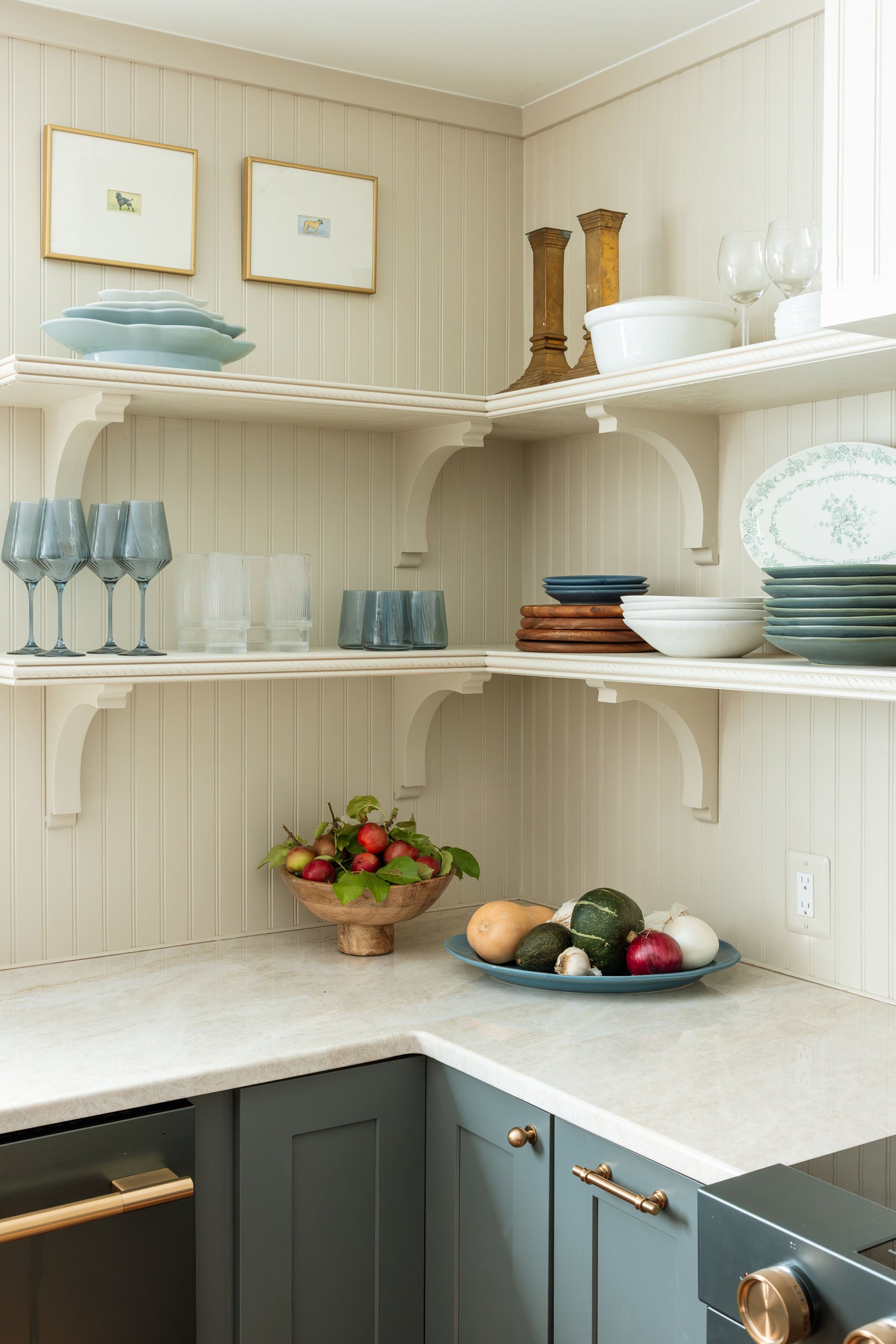
One of the VIPs of this kitchen is this “beadboard”. We were tight on our labor budget and knew that we couldn’t afford a fully tiled kitchen, so from the beginning I knew that this beadboard paneling would be a budget saver while adding so much classic charm and texture. While I could have mixed tile with beadboard, we wanted to keep things simple, so we flooded the panels from counter to ceiling and across the basic hood. While we hired a pro to do it because of our deadline and need to make sure it was done perfectly, this is totally something that can be DIY’d. The trickiest part is measuring for outlets, etc and keeping everything lined up, but since the beadboard “pattern” is small, it’s actually really easy to match the repeat with very little waste. These sheets come in 4×4 or 4×8. This is the fourth project I’ve used them in, and once up, they look like the real thing. Thank the design gods on this one.
$10 Wood Brackets And Decorative Trim
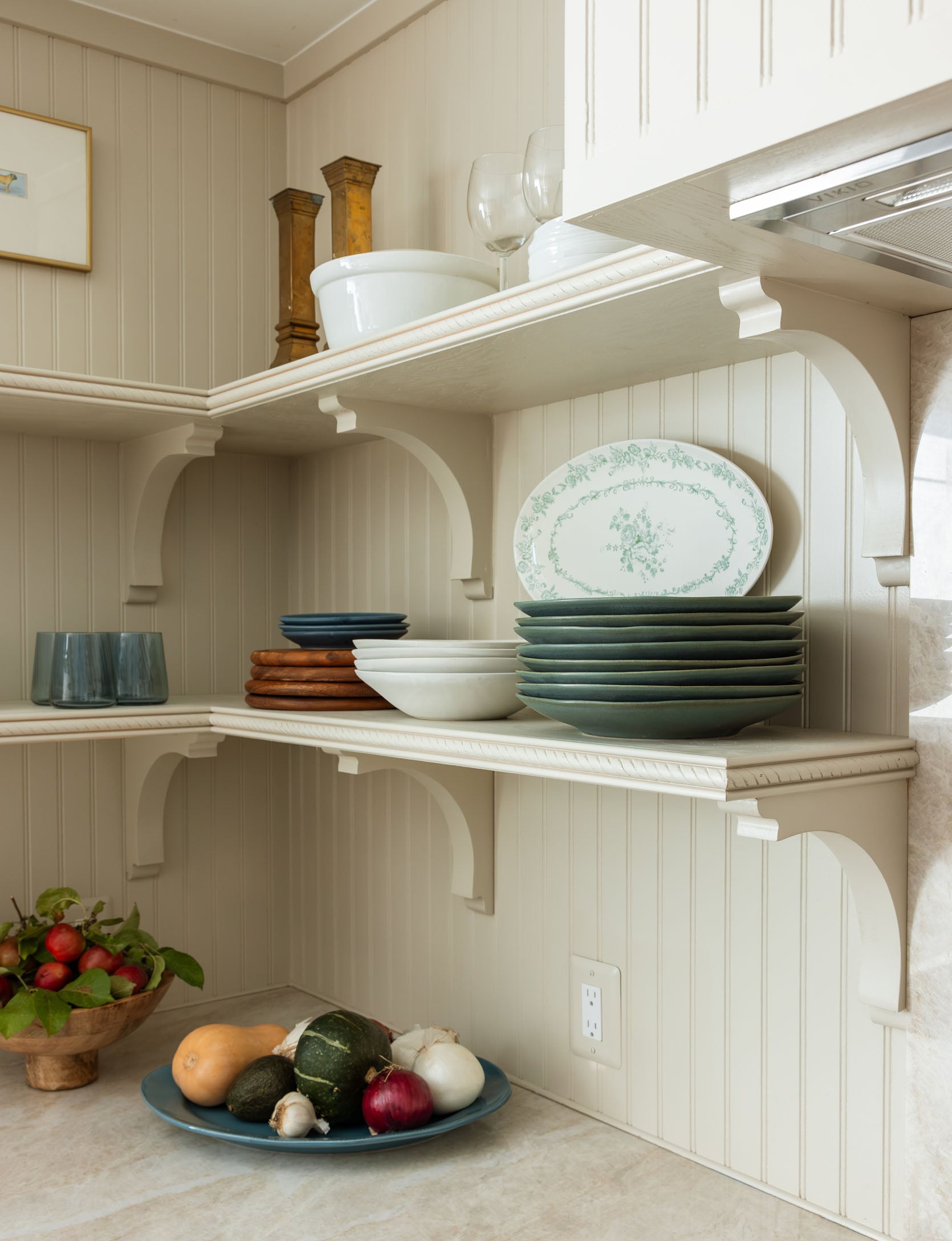
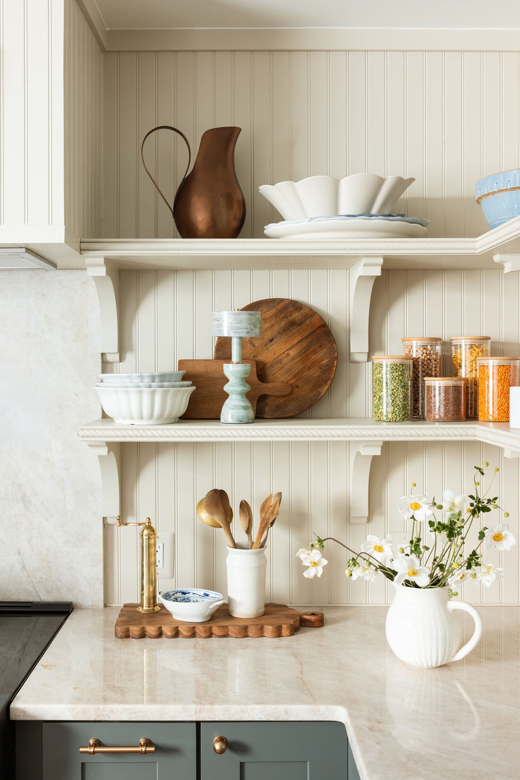
Since the kitchen is small, I didn’t want to cram it with all upper cabinets (there is a wall of closed storage pantry cupboards across from the stove), so this is where we could break it up with shelving and create some charming styling opportunities. But since it’s an older home, I didn’t want to do the look of “floating shelves,” which is fine, but more contemporary. The brackets are both decorative AND the functional support (we reinforced the wall behind it since we knew that stacks of heavy plates could be on it). We then applied this little trim piece along the front (with glue) to have it look even more charming, and painted it all our the same color as the wall so that it looked custom. I was reassured this look would be successful by staring at so many English kitchens, and it was so easy and affordable it almost felt like cheating.
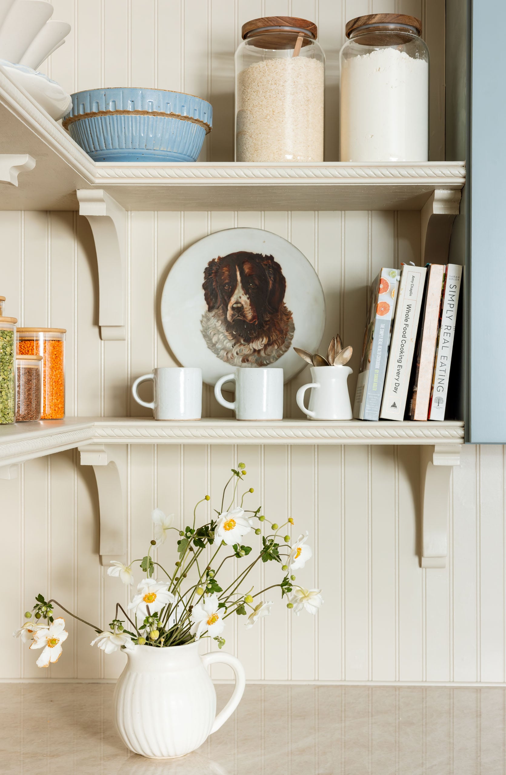
I’ll deep dive into all the dimensions and how we obsessed over where the brackets went (note that they hug the stone backsplash and are lined up perfectly with the bottom of the upper cabinets). This is super important to make something inexpensive look custom, so if you are interested, I’ll show you all the drawings in a follow-up post. Gretch really obsessed about all of this, and it was really time-consuming to make sure we nailed it, so I’m happy to share.
Our Splurgy Stone Countertops And Backsplash
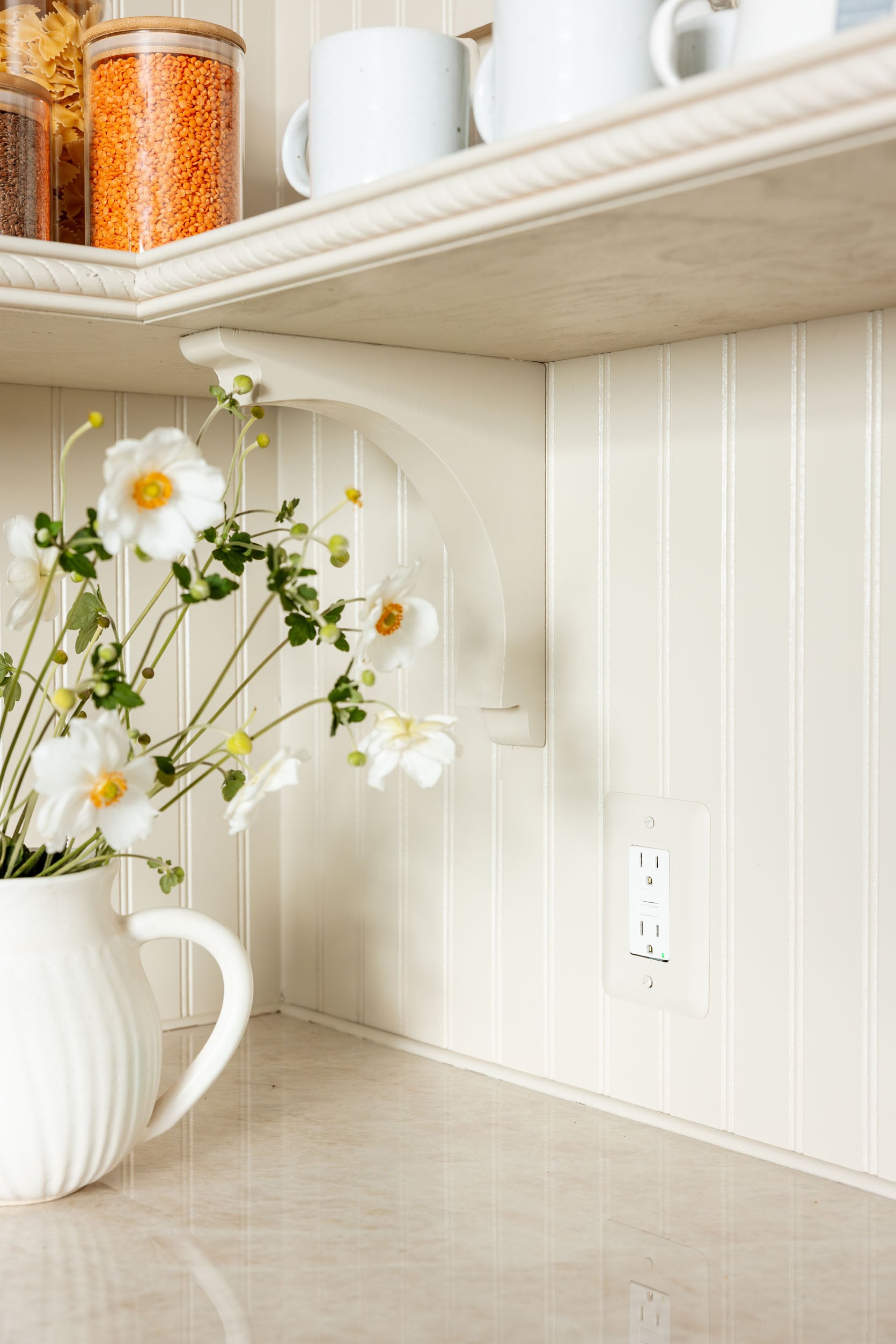
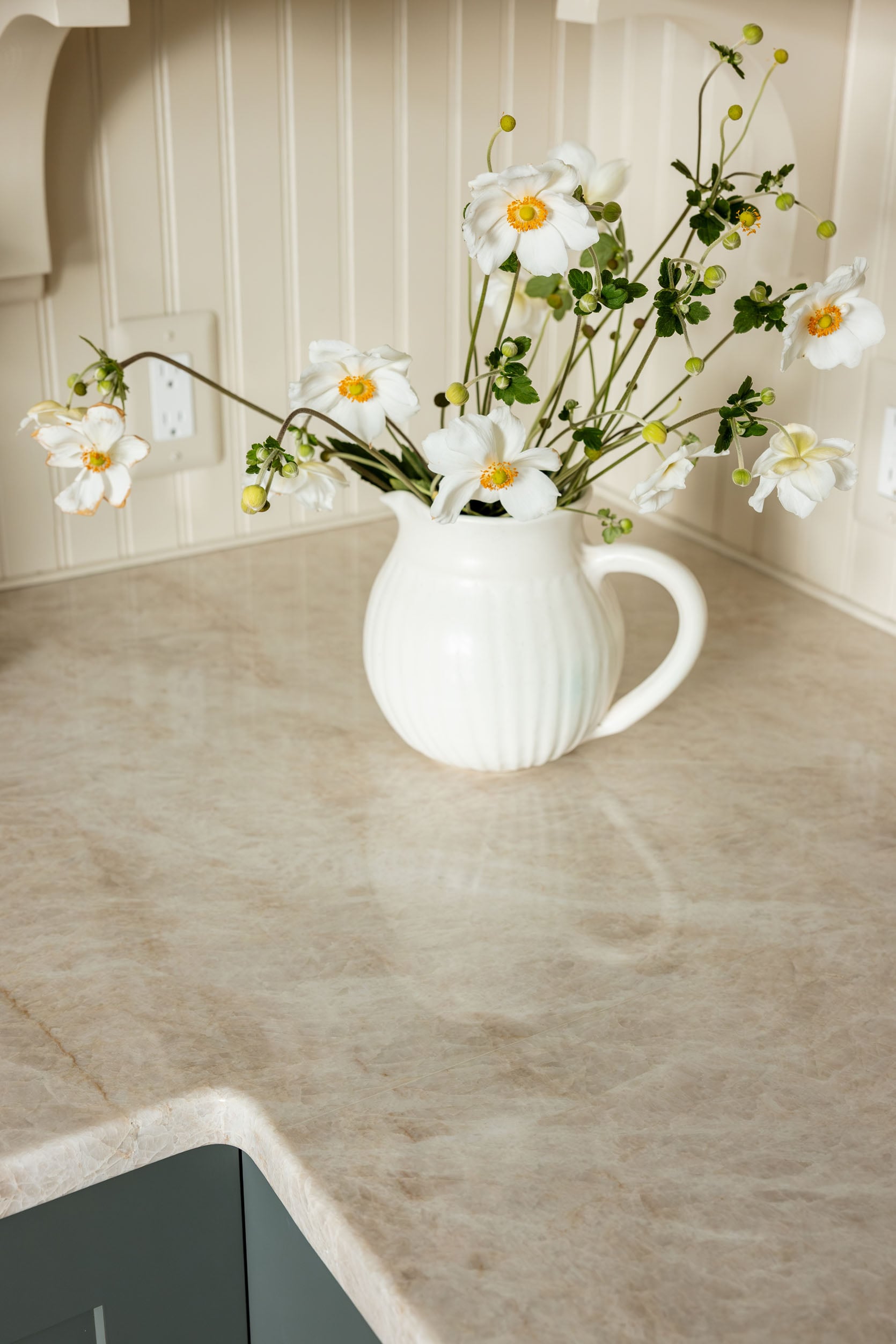
Of all the things my sister really asked for, it was real stone countertops. I honestly didn’t know what options we would have at Lowe’s, always having gone to stoneyards for real stone. But we found the perfect warm, gold-veined Taj Mahal in a lovely polished finish (that contrasted so well with the more matte walls). The warmth of it really paired well with the cooler tones of the cabinets and married all the gold and wood tones in the kitchen.
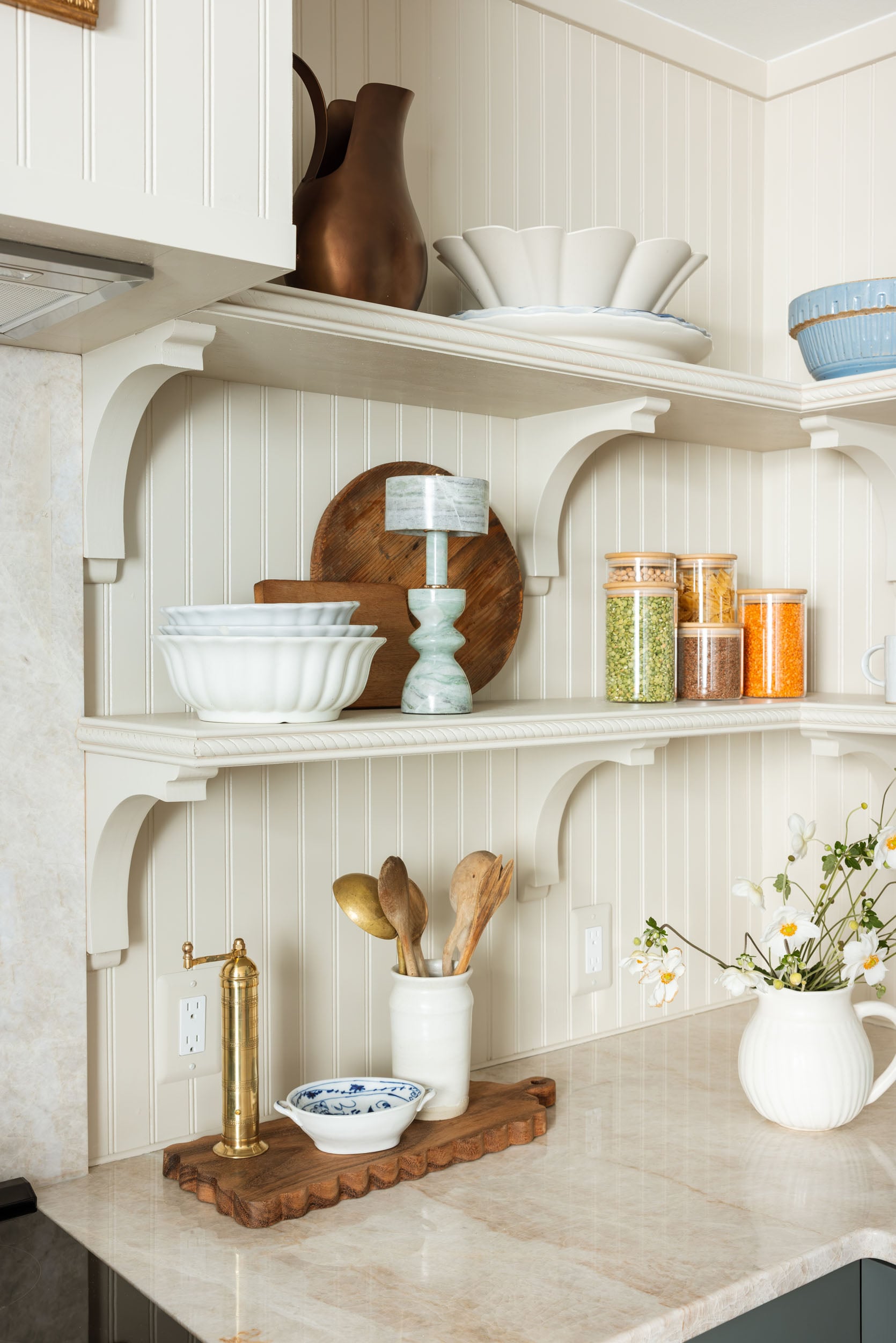
While our stone and installation added up to $12k, if you went with an engineered stone, you could save $5k. It was within our product budget, and by saving on upper cabinets, we made it work, and I’m so glad we did. My general preference is that older homes (pre-1950) are best with real stone, while anything post-1950 can go either way. I’m not dogmatic about it, though, and have used engineered stone on older kitchens for both budget and practical reasons. I will say since it was meant to be our backsplash and therefore more of a visual feature, having it be real stone was pretty crucial to me.
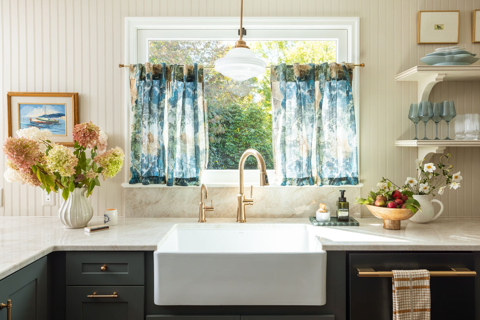
We had intended to do a 4″ stone backsplash across the entire kitchen, but after the flooring, cabinets, and 3cm stone counters were installed, there was only 2″ of space left under outlets (and there were 6 of them). We knew it would be tight, but it’s hard to predict these smaller measurements (we could have chosen 2cm stone, but with real stone 3cm is really recommended). We looked into getting the outlets raised, but it would have cost $1,800. So instead, we forewent having a backsplash except behind the range and the sink – where it’s most needed. We obviously could have pivoted and added tile (and they can if they want at some point), but it would have changed the look that we were going for. We added a tiny trim piece painted out the same durable cabinet paint. It looks great and was a way to save a lot of money (but full disclosure, tile or stone is recommended mostly to prevent water damage along the grout line to wood). I found so many kitchens in Europe that don’t have backsplashes, just beadboard, so I felt good about it.
Dark Green Juniper Appliances
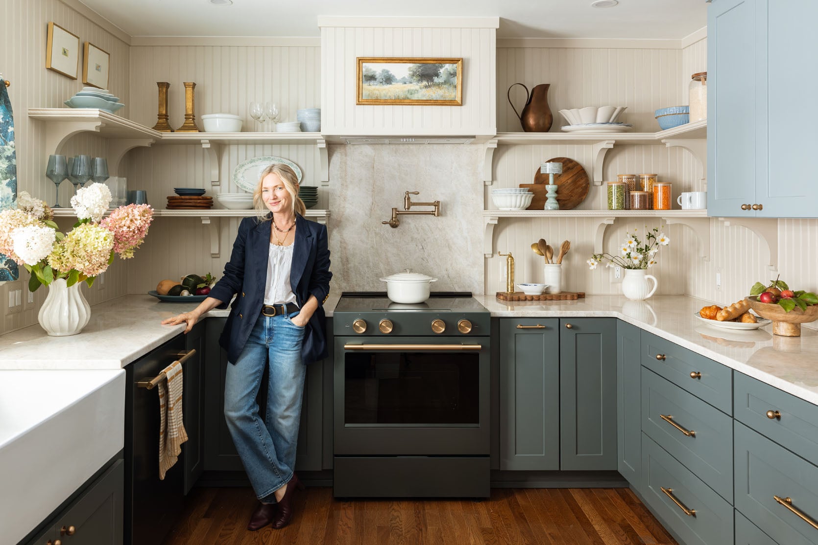
While I’m not super anti-stainless steel at all, when I saw these dark green appliances, we knew these would make this kitchen SING. KitchenAid did such a great job of keeping them simple (not adding too many details that could ruin the impact of this color). The color is an extremely rich dark teal, a deep blue-green that helped us choose our cabinet colors.
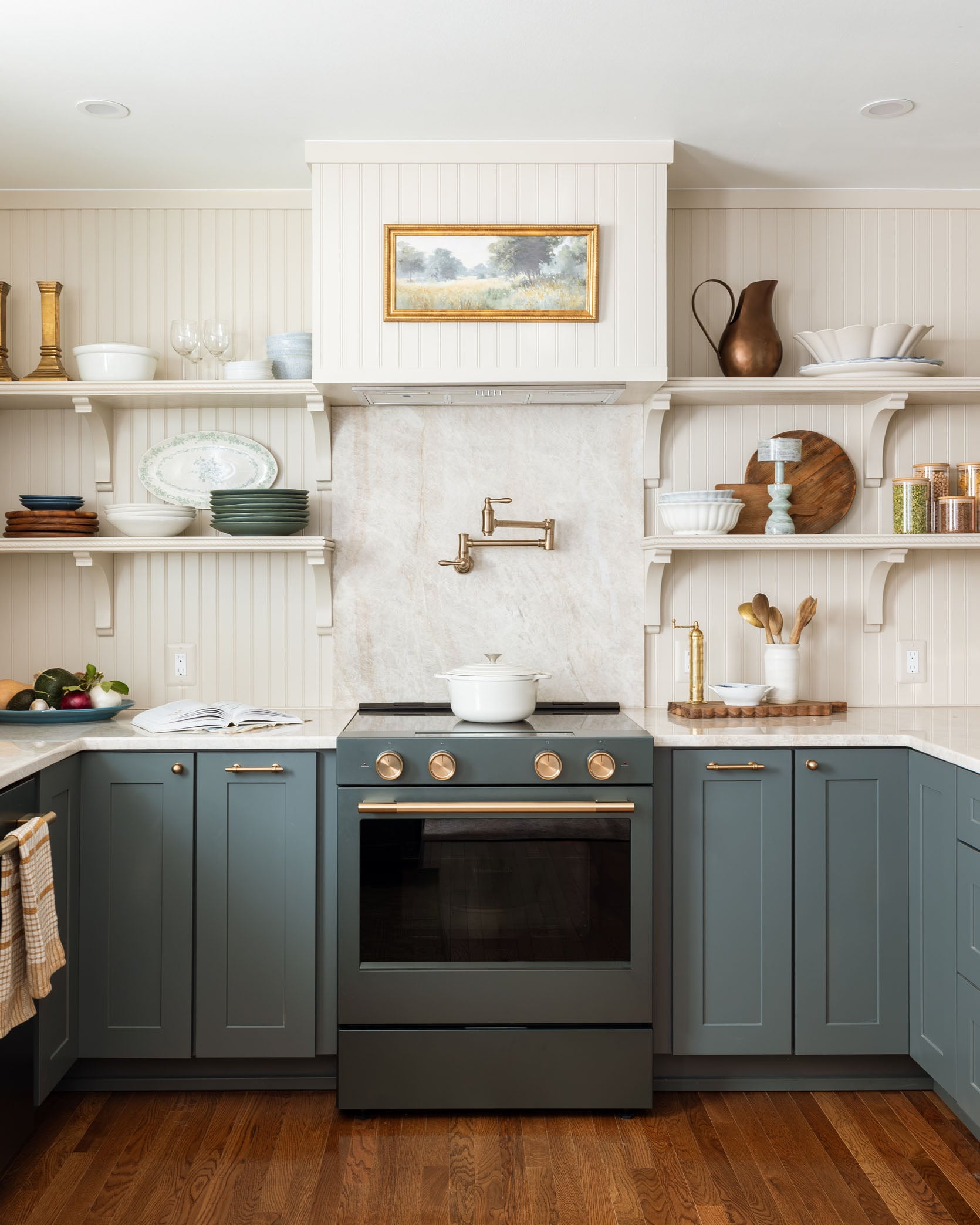
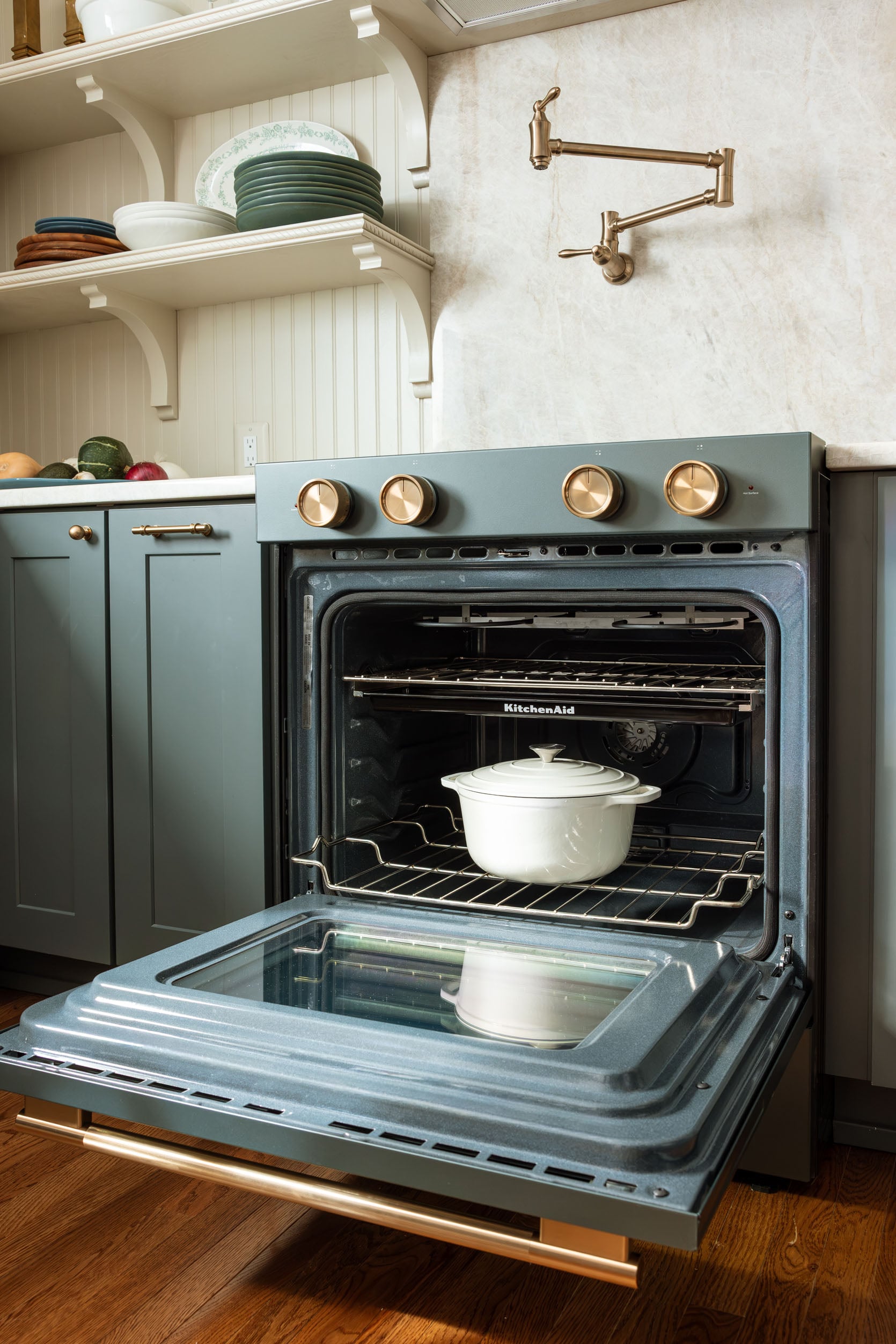
They had a 30″ electric range, which was exactly what we needed, as well as the fridge, dishwasher, and a built-in microwave (which we chose not to use, instead just hiding a microwave in a lower cabinet with an outlet). The hardware comes in brass, black, chrome, or bronze.
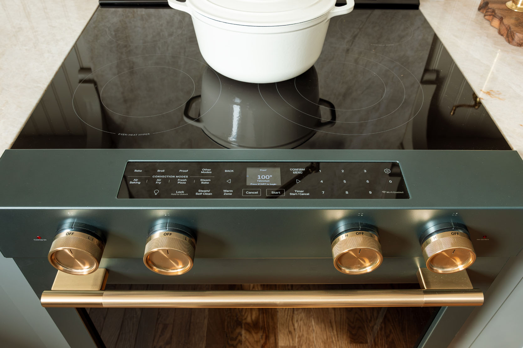
I personally think that the style is very transitional, working in so many different styles of homes (obviously it leans contemporary). The color sold us, and I love so much how the green integrates so well with the lower cabinets.
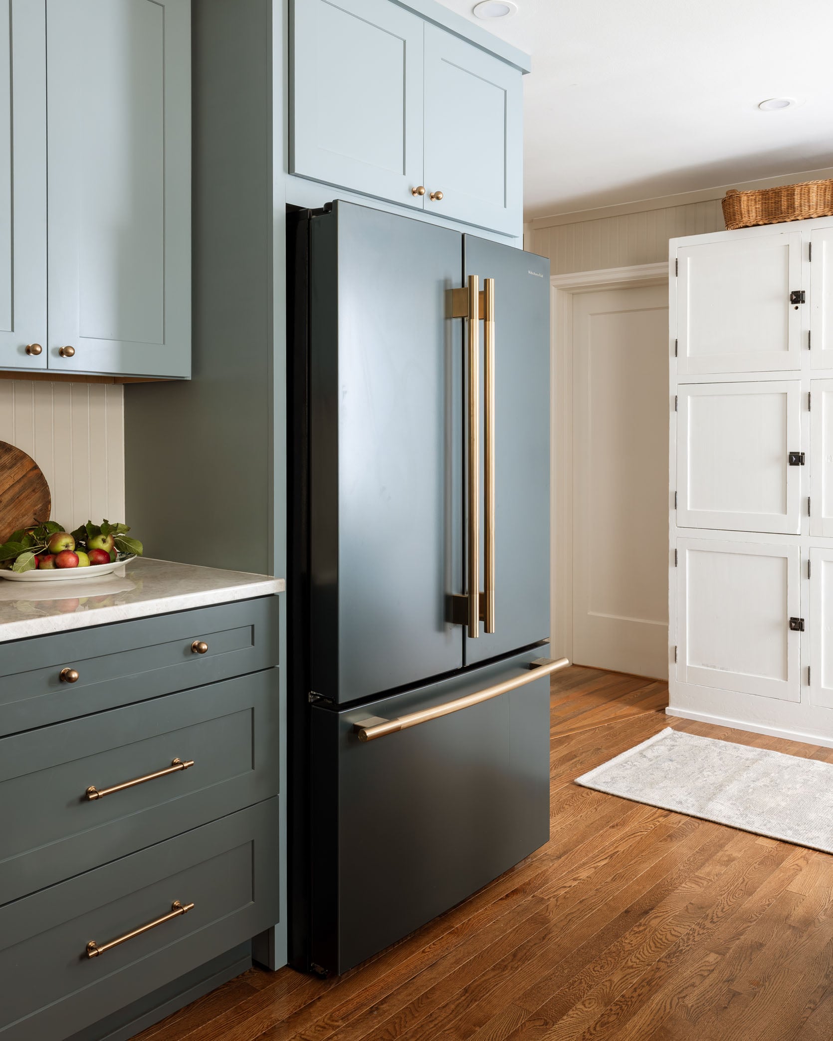
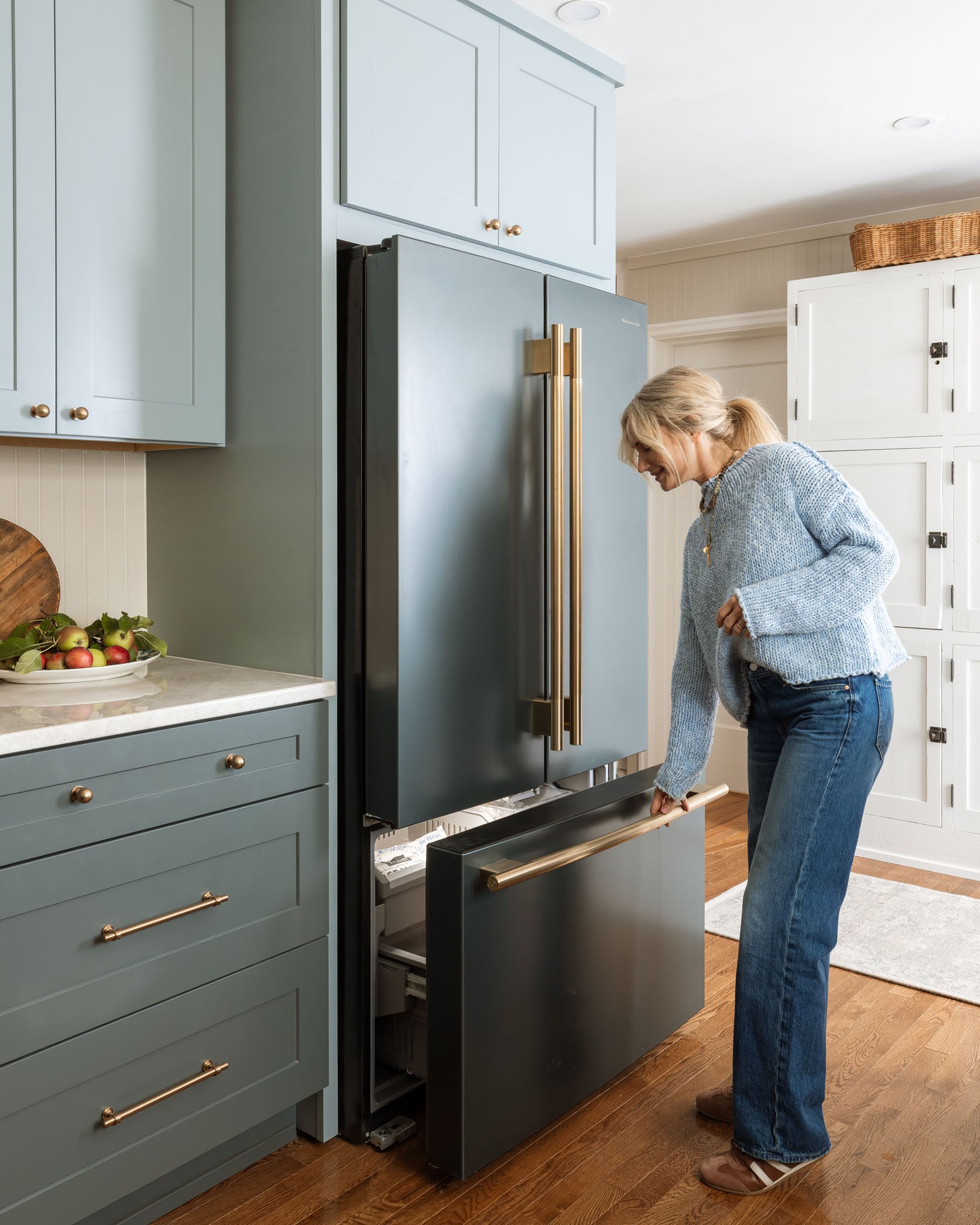
This is a fantastic alternative to panel-ready if that’s not in your budget (it wasn’t in ours), so these feel streamlined in color and tone and don’t break up the kitchen as much as stainless would in here.
Affordable Plumbing Fixtures That Look High End
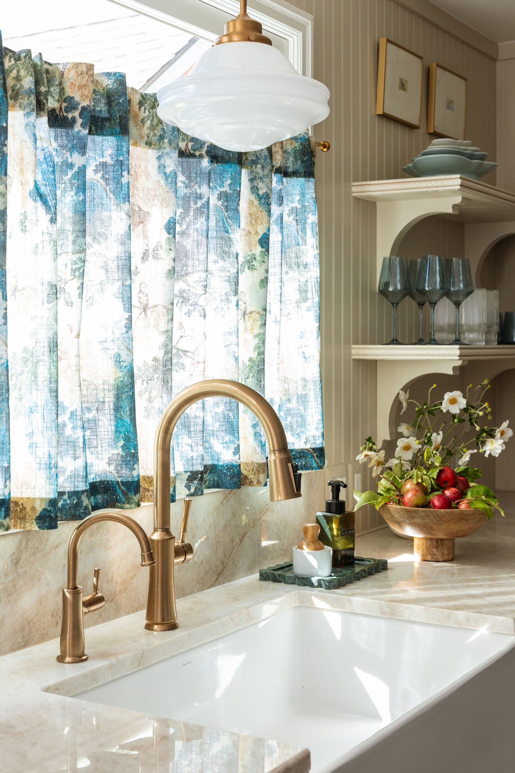
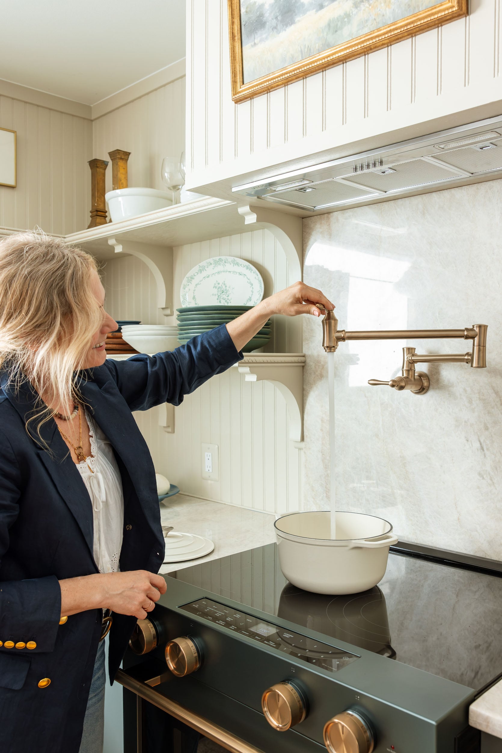
Hot Water Faucet | Faucet | Sink | Pot Filler
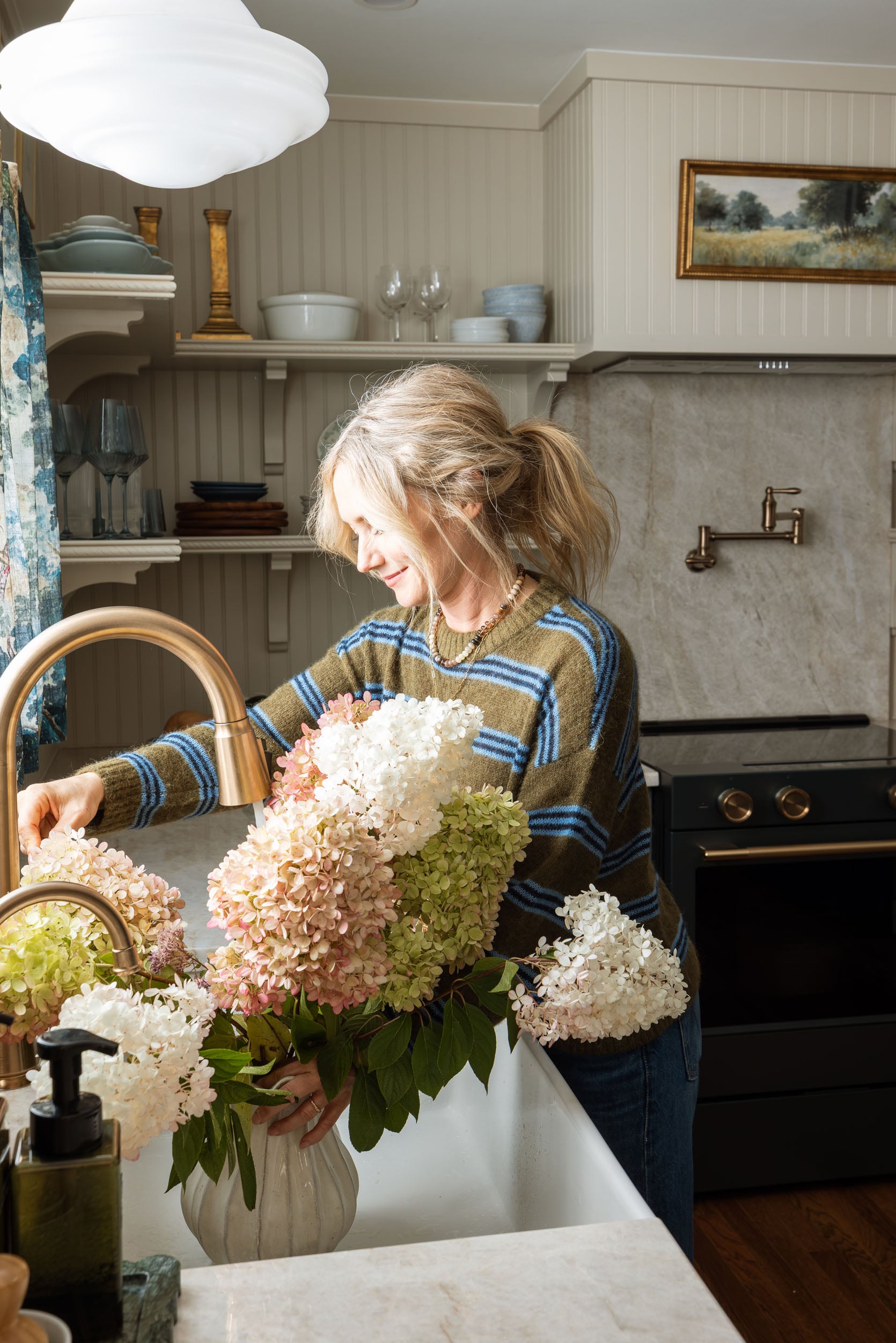
Michelle and Garen had planned and plumbed for a hot water tap and pot filler, so while typically on a budget you might skip these elements, since they were ready to go, we found a plumbing suite that met all our needs and felt really sturdy/high quality (and yes, a pot filler is so pretty, especially on a stone backsplash). The kitchen faucet pulls down into a sprayer, and the hot water faucet is strangely practical (I’m jealous; my sister says she uses it every day for tea, Cup of Noodles, etc.).
Maximizing Storage Solutions
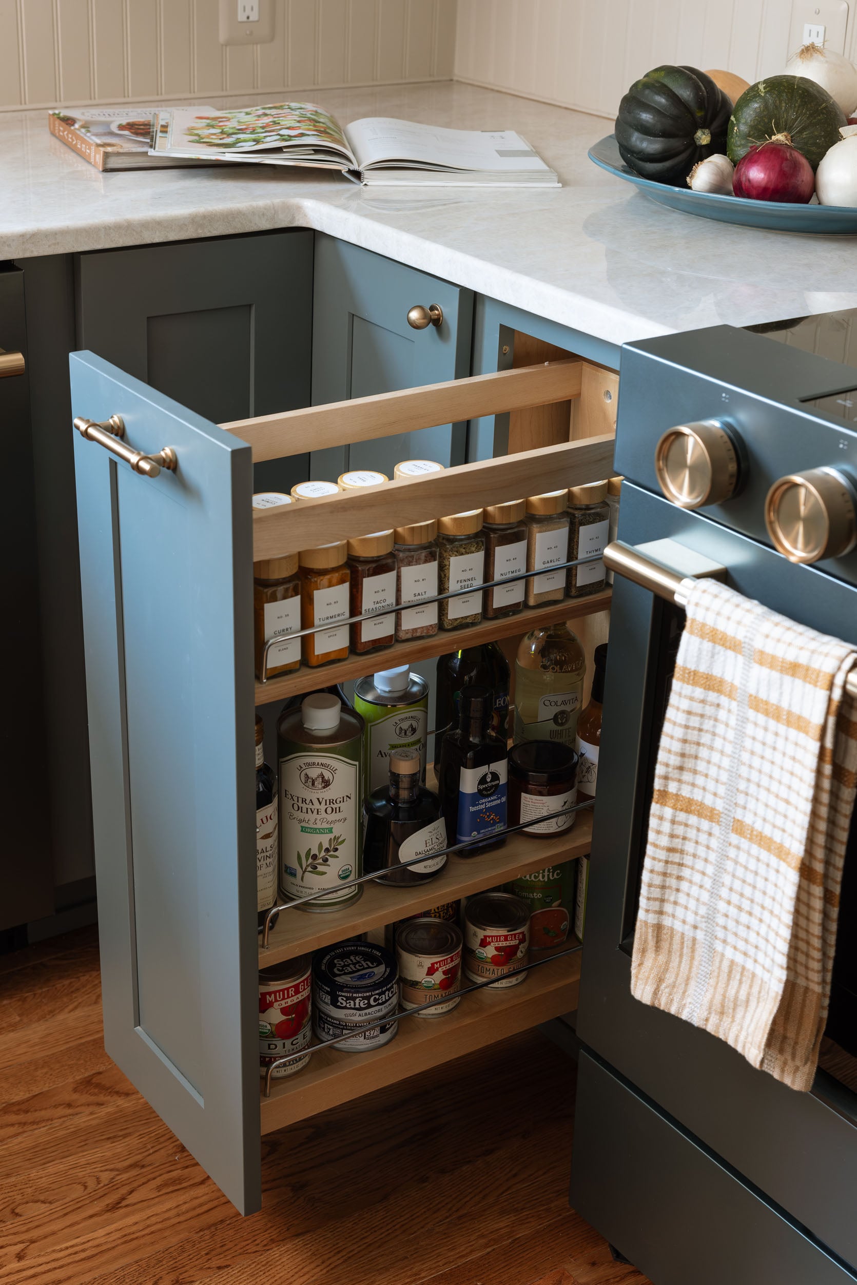
Lowe’s cabinetry has a lot of bells and whistles built-in that you would want for any kitchen in 2026. As you can see, the spice and oil pull-out can house so many of your everyday cooking needs (we removed one shelf so that we could put taller oils, which I’ve done in every kitchen that I’ve designed).
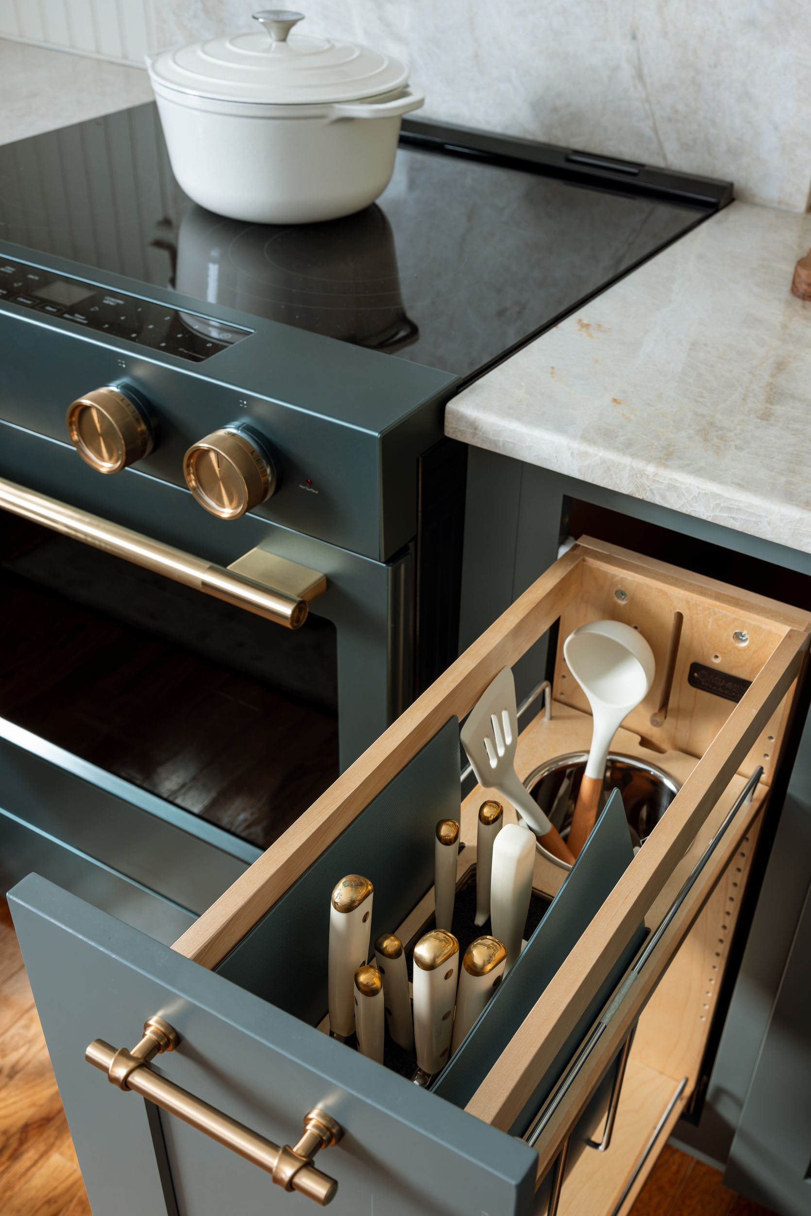
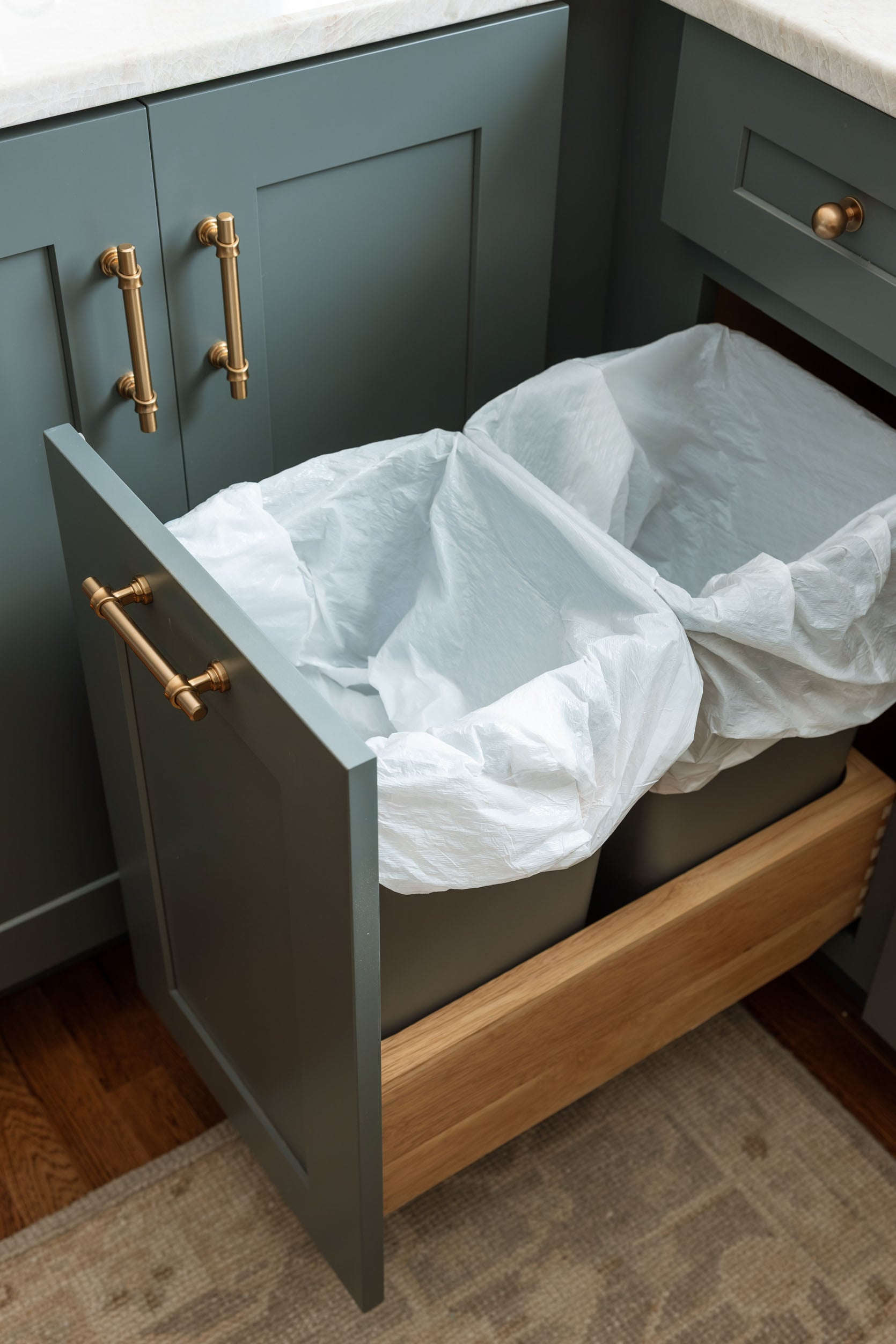
To match the symmetry, we did a knife drawer with a utensil container on the other side. We were even able to fit in a small trash and recycling drawer next to the sink, which is a must if you are able to customize your lowers to avoid the floating trash can.
Vintage School Lockers
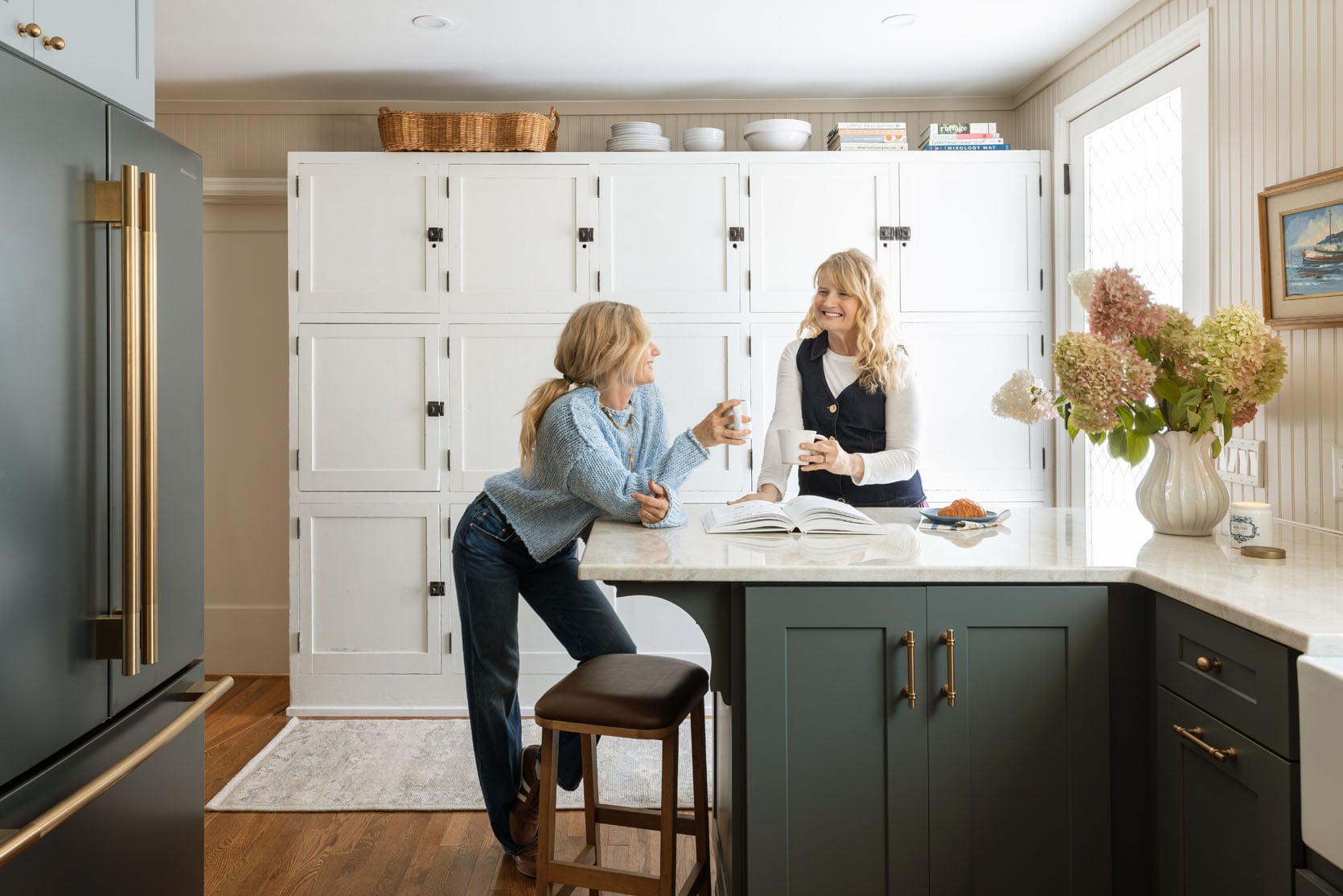
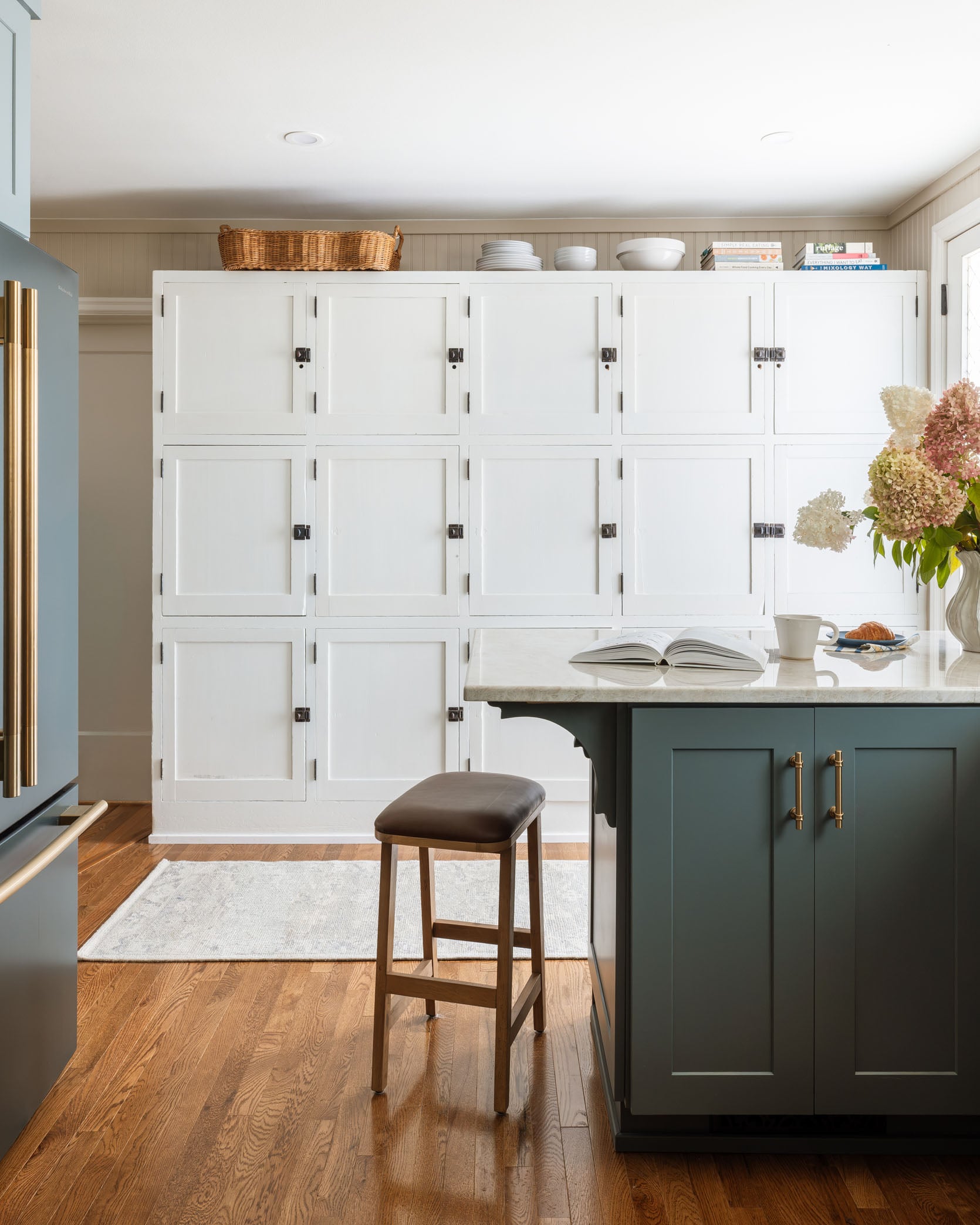
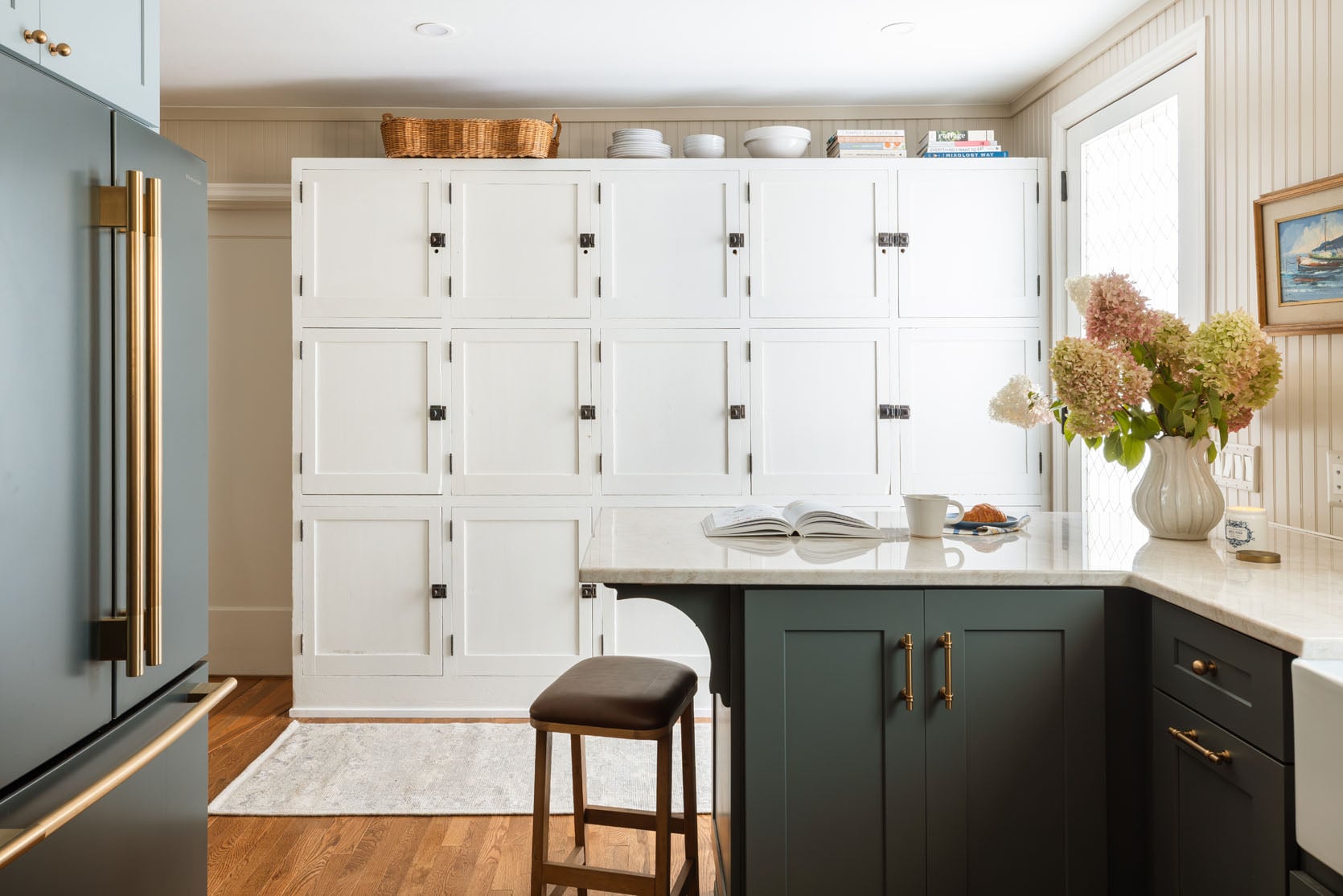
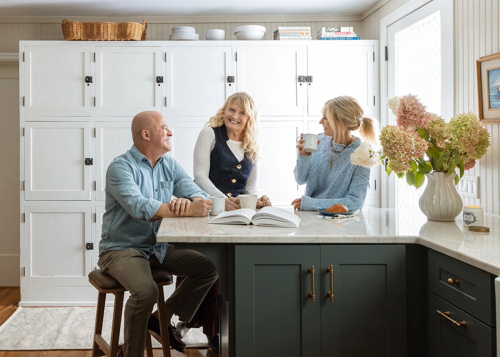
The back wall is dominated by these super sweet school lockers that Michelle had bought (for pennies) from the Rebuilding Center. We had them painted the same color as the window and door frame to hopefully look more architecturally original. They provide all the space for their food storage and more.
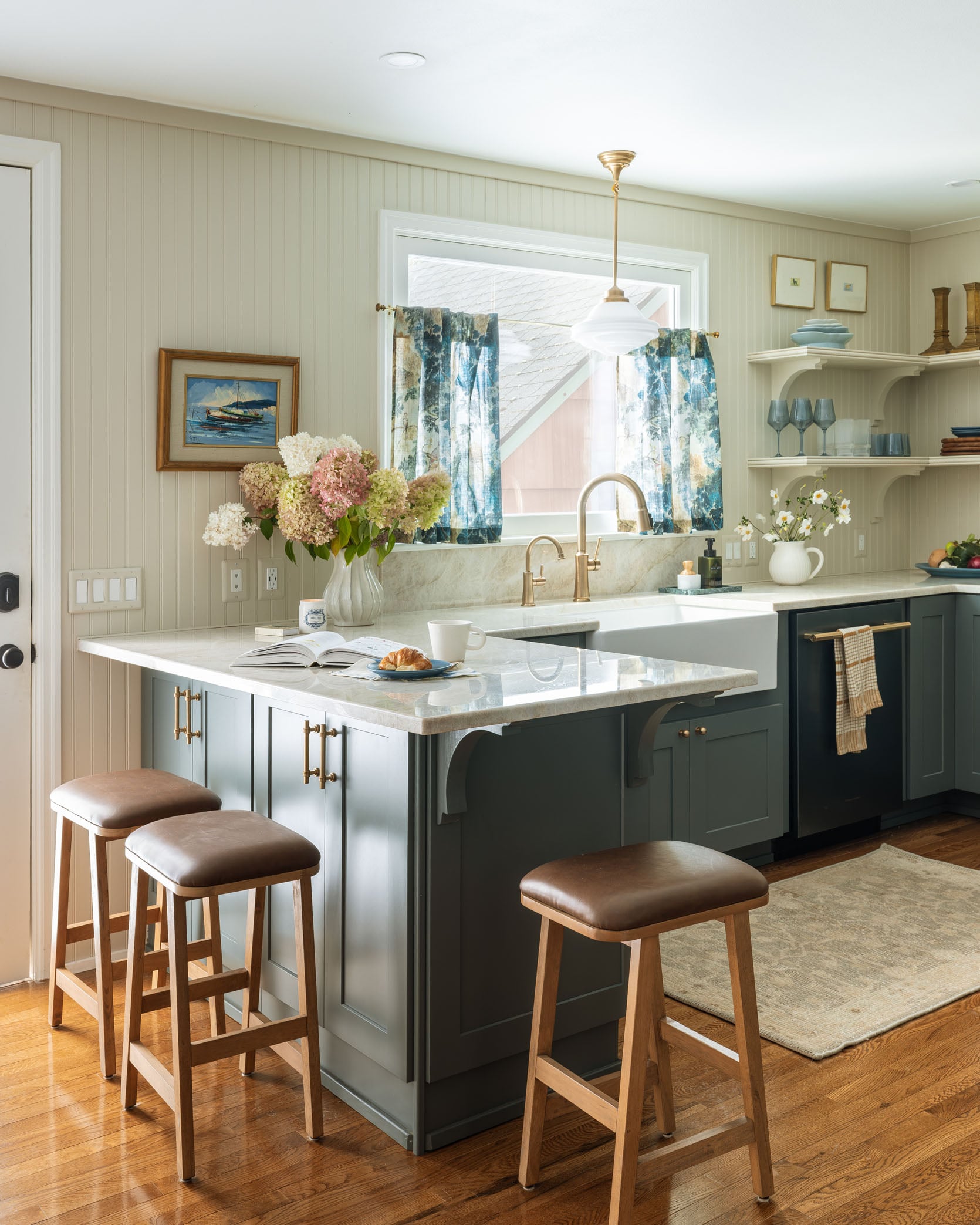
I also want to call out the overhang on the fridge side of this peninsula. This was my sister’s idea, and I was extremely nervous about it because the clearance between the fridge door and the peninsula was tight when the fridge door was open. But she loved the idea of sitting there and looking out the window while she wrote (she’s a musical theater writer). We added the same wooden brackets so it would be strong and hold the stone properly since it was a 12″ overhang, and also to tie in stylistically with the upper shelving. It’s actually such a charming feature that I wouldn’t have done, but I love it. Also note that the back of the peninsula has one functioning cabinet (near the wall) and one dummy cabinet (that opens from the other side and holds the microwave inside, outlet included), so we added handles on both to look finished.
It’s hard to see in these photos, but we added a decorative window film to the back glass door since the view out the back was to Garen’s workshop. It was such a nice way to solve a problem while adding some decorative elements. Bonus points for actually creating the softest, prettiest light.
A Real Family Affair
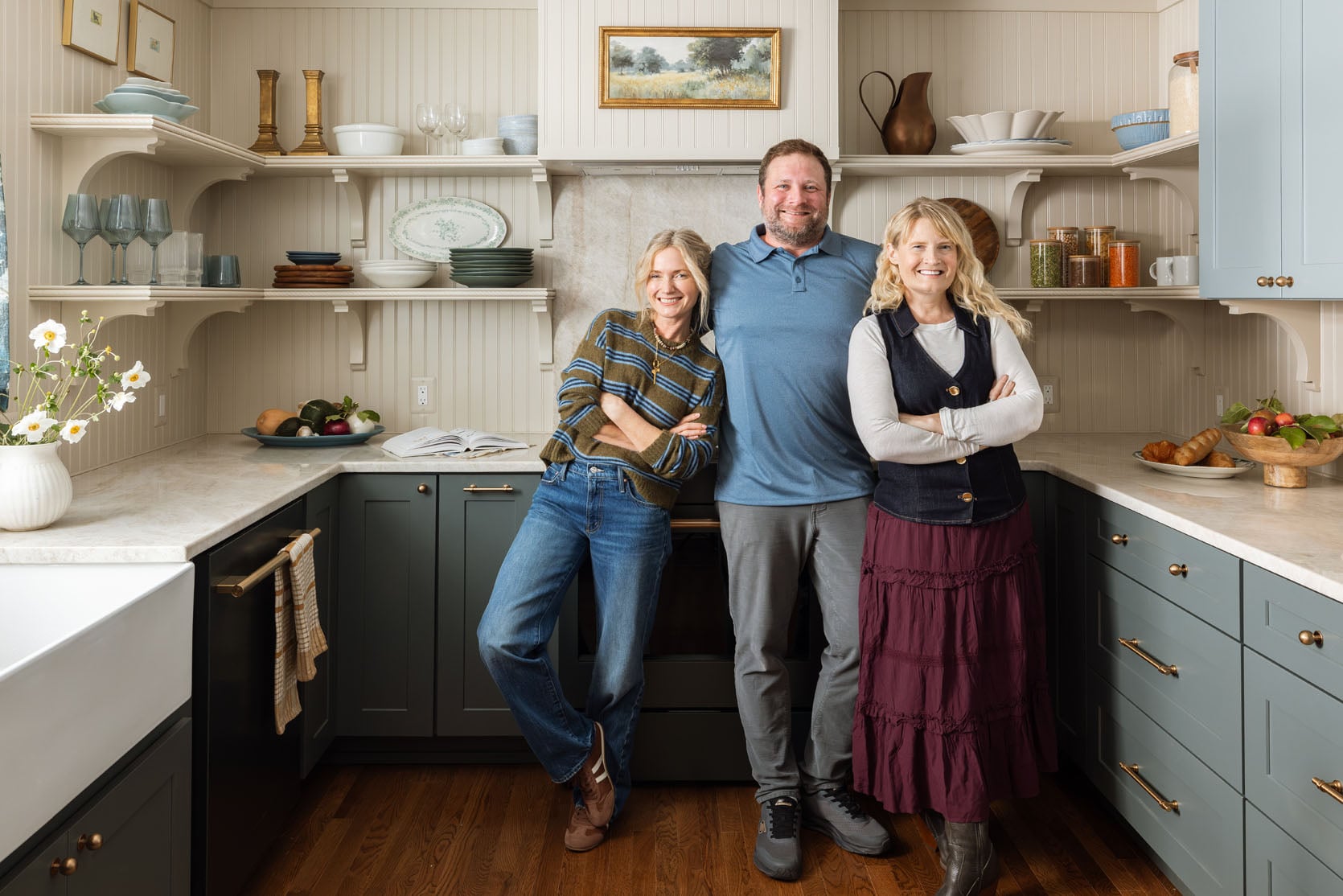
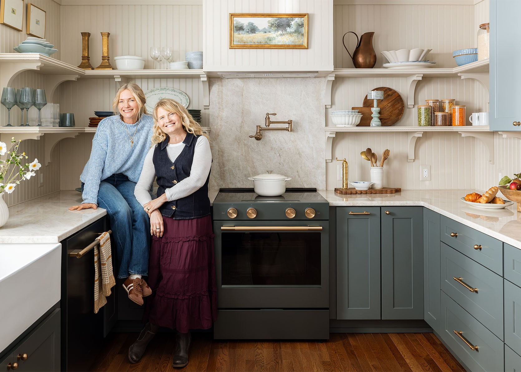
That’s me, my brother Ken, and my sister Michelle. You are of course missing three other siblings (shout out to John, Christal, and Katy). That’s right: 6 kids over 20 years (14 grandkids). And we all really like each other! Ken is a contractor and helped on the project where needed, which was so fun, but since Lowe’s was so full service, he didn’t have to be too involved; I still loved having his expertise and support.
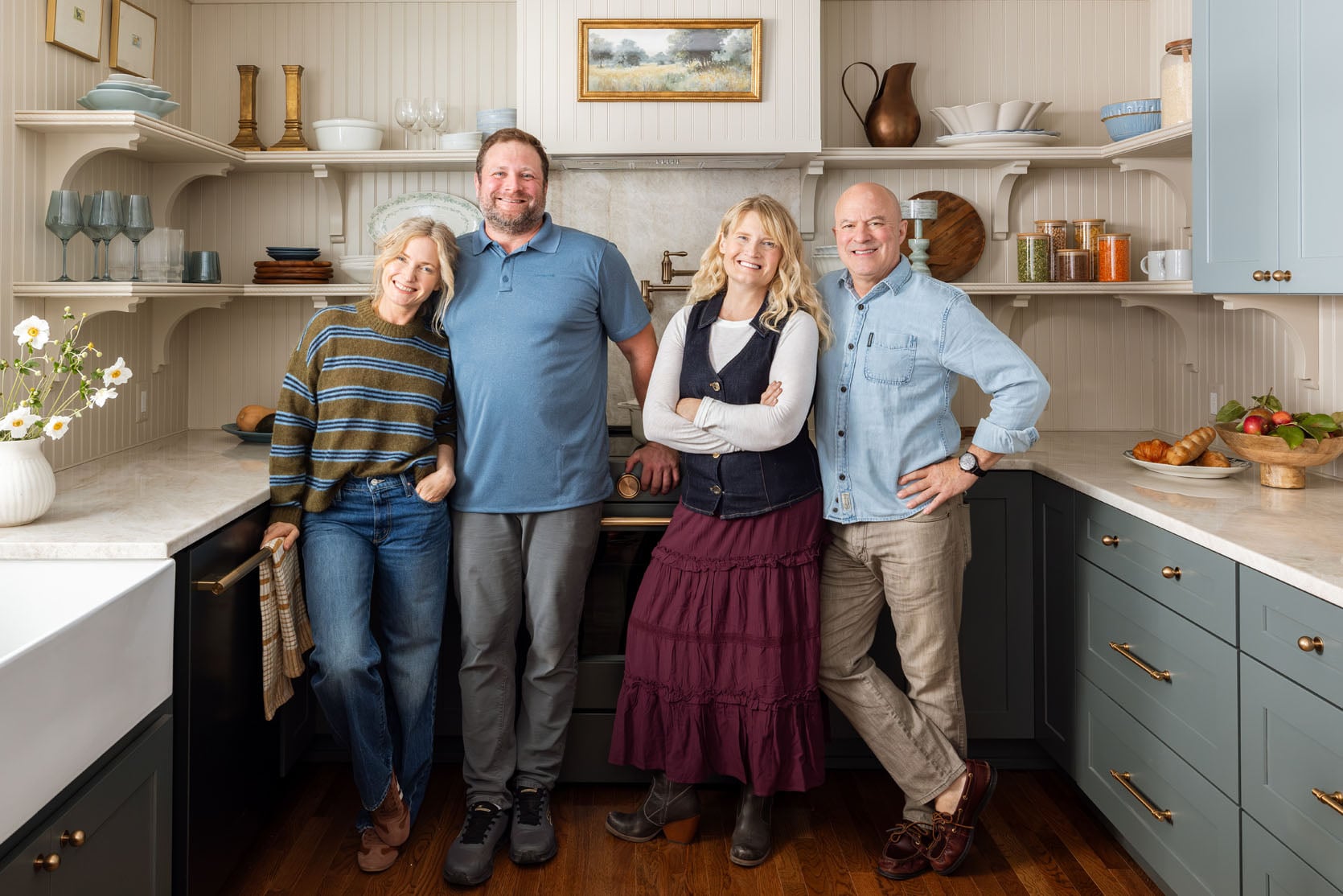
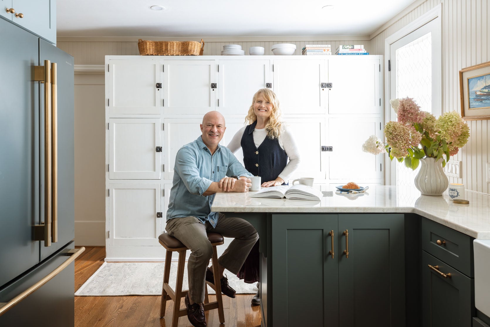
Michelle and Garen love the kitchen, and while a remodel can be disruptive, we started in April and shot in August, so by all accounts it was pretty dang streamlined. I wrote about the process in the intro post, but basically Lowe’s coordinated the flooring install (in one day), the cabinetry install (6-week lead time, 2-day install), and the countertop and backsplash install (1-week lead time after cabinets were done, two separate install days). So we hired a carpenter to do the beadboard and brackets (2 days), a painter (2 days), and Ken and Garen did the appliance install and finished electrical and plumbing. I know you are all dying for a budget breakdown, so let me see what I can pull together. Lowe’s provided the product budget and install that went through their kitchen design services. It’s hard to call anything in the tens of thousands “affordable,” but with the price of kitchen remodels these days, this absolutely fell into the most budget-friendly kitchen I’ve ever done and, in under 4 months, and by far the fastest.
I’m so proud of how it turned out and feel like we really met the balance of fresh and classic, timeless but still design-forward. The fact that these are all builder-grade materials I hope gives you hope for how to add charm and character to more affordable materials. Give me all your questions in the comments, and I’ll write a follow-up post diving into the most common ones.
Thanks to Lowe’s for being a fantastic partners, allowing for complete creative freedom (such a dream). I truly can’t recommend their kitchen design services and all these products more. Here’s the list of resources for fast referencing. xx
Lowe’s Kitchen Resources:
Hardwood Flooring
Lower Cabinetry: Door style is ‘Gresham’, color is ‘Emma’
Upper Cabinetry: Door style is ‘Gresham’, color is ‘Tropic’
Countertops: Taj Mahal Quartzite
Refrigerator and Brass Handles
Electric Range and Brass Knobs
Dishwasher and Brass Handle
Hood Insert
Pendant Light
Sink
Faucet
Hot Water Faucet
Pot Filler
Knobs
Short Drawer Pulls
Long Drawer Pulls
Shelf & Island Brackets
Decorative Shelf Trim
Beadboard Panels
Beadboard and Shelving painted Accessible Beige (SW 7036)
Counter Stools
*Design by Emily Henderson
*Photos by Kaitlin Green
Aw, this is lovely. I’m interested in what you class as builder grade: does that just mean big box store rather than bespoke, handmade or high end? I thought builder grade was the cheapest basic budget line, rather than the nicer ones you’ve used here (I’m in the UK and it’s not really a term we use here). Like, a new-build estate will have as their basic kitchens those cheap white shiny cabinets and grey composite worktops and too many spotlights? This looks more mid-range to me with the wood inserts in the cabinets. It’s come out beautifully, though! What is the brass thing beside the cooker on the right-hand side?
I believe that is a pepper grinder, as I have one just like it!
This is so lovely. Can you share what curtain rings (or ring tape/pins?) you used for the curtain above the sink?