Design 101
Emily’s 9 Favorite Green Paint Colors She Would Use Again And Again
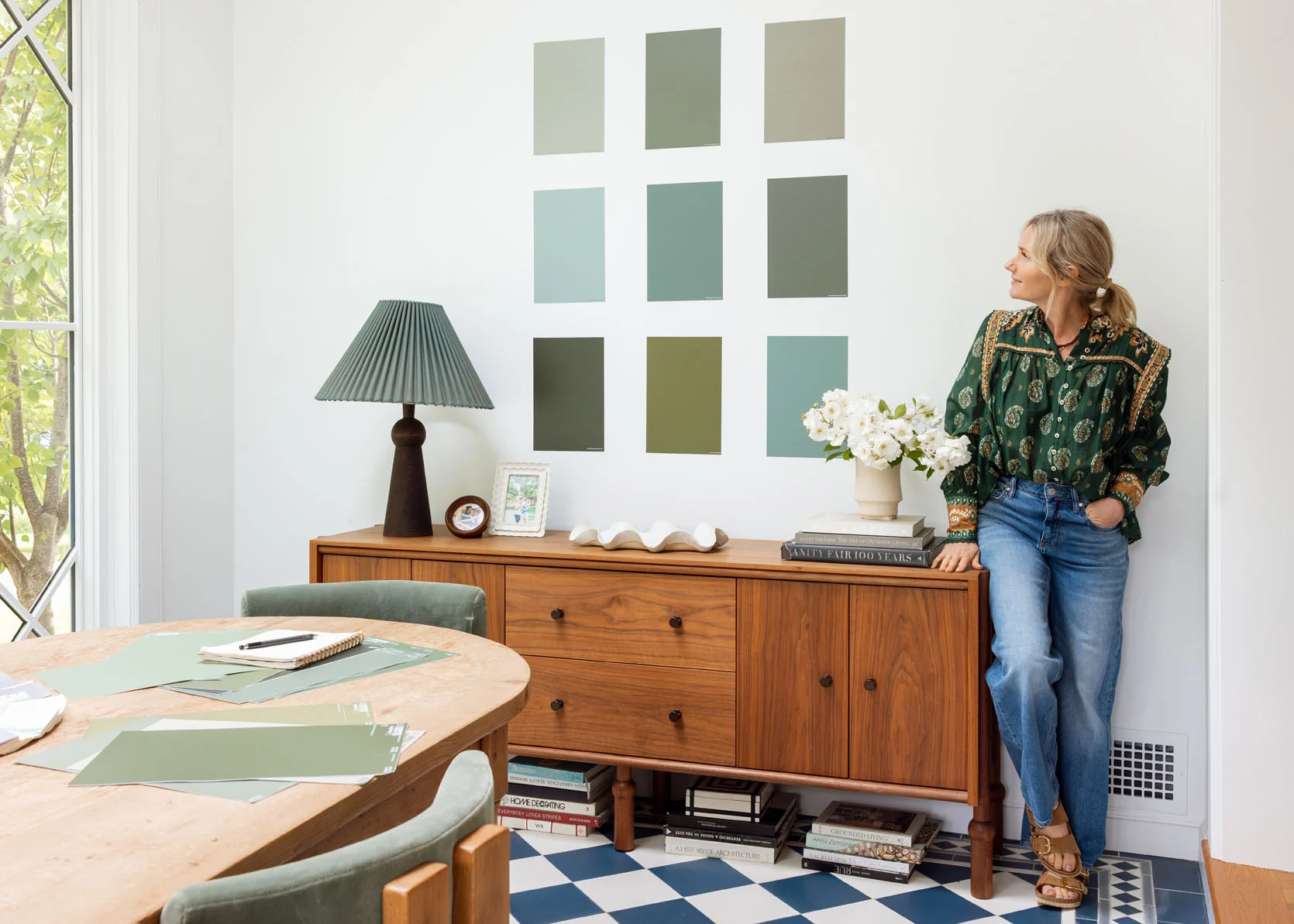
It felt like an appropriate day to show love for what feels like the world’s most popular color – green. While I’m more of an expert in “blue,” its sister color – green – is also a favorite and beloved by most people. We know that the design world is LOVING reds, burgundies, mauves – all these warm, deep tones, but I personally still think that the right green can be both on trend and more universally loved (long term). But I always like trying before I make a big decision, like painting with Samplize. It really gives you the confidence you want (and something I really need). So if you are wanting to paint something in your room green, these are ones I love, tested with Sampilze, and recommend wholeheartedly. Here we go:
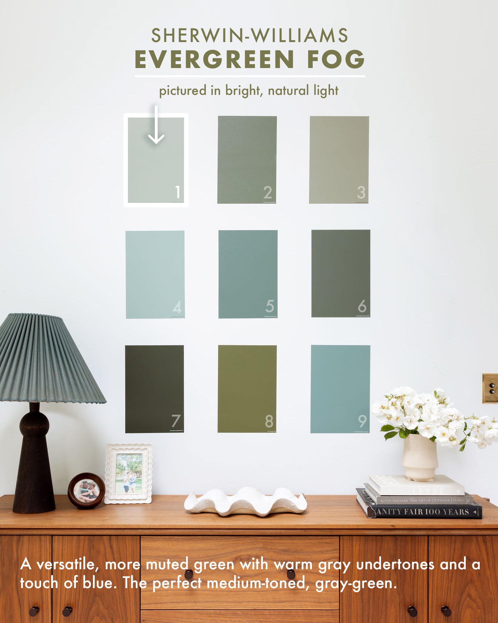
Green Paint: Evergreen Fog, Sherwin-Williams
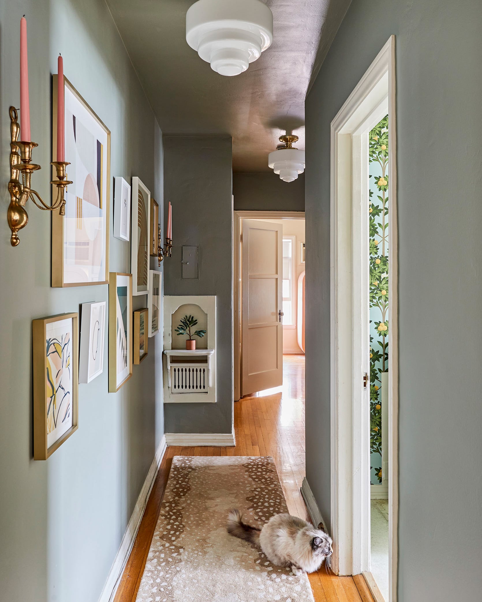
design by caitlin higgins, styled by emily bowser, photo by sara ligorria-tramp | from: caitlin’s long, dark hallway makeover
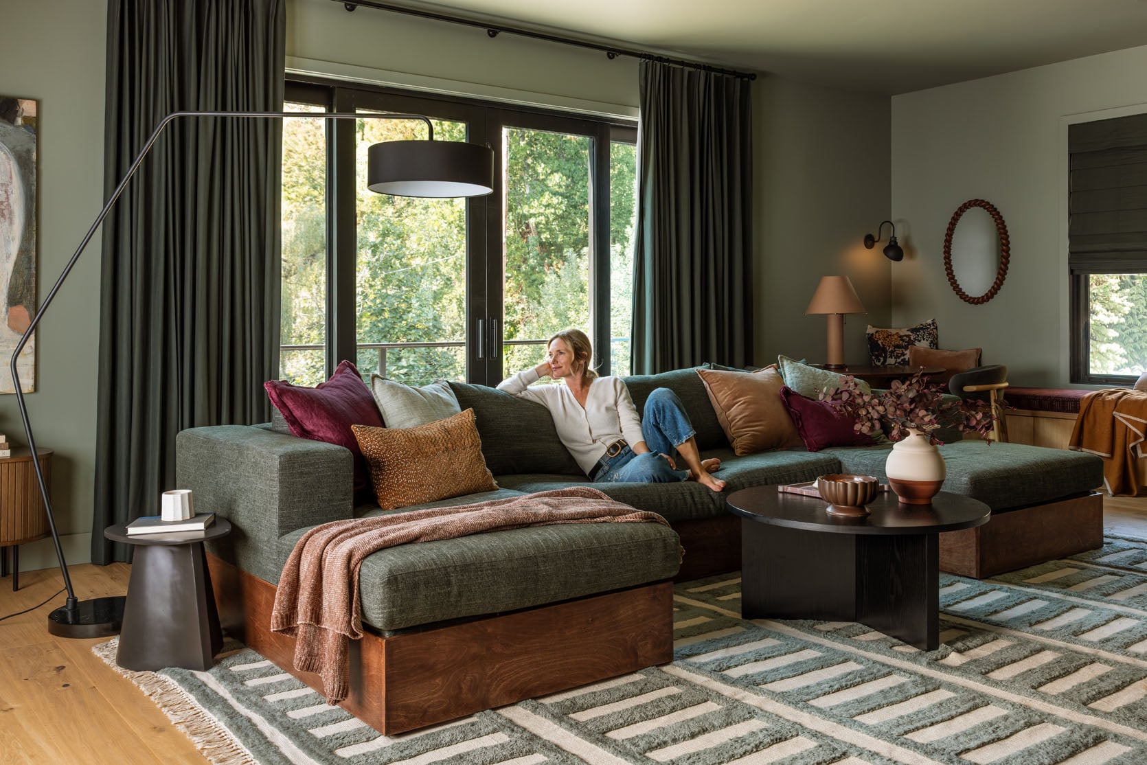
photo by kaitlin green | from: revealing my brother’s ultra cozy family room
Evergreen Fog SW 9130 was the Color of the Year four years ago, and sure, I liked it when I saw it, but it wasn’t until I painted my brother’s family room this color that I fell in LOVE. My goodness, it’s so pretty and rich, with so many different wonderful undertones that change. Sometimes it’s bluer and other times more gray, but always green for us. I will say that that room has north, south, and western light, so it gets a lot (non-direct), and I’m sure that has something to do with it. Additionally, we did sample this color in Brian’s new office, which only has one small window, and in there, it read mostly as gray, so it definitely changes depending on the light. You can see the difference above – Caitlin’s hallway is dark (no windows and only a few doorways), so it’s a bit cooler, whereas it’s much greener in Ken’s family room.
Green Paint: Rosemary, Sherwin-Williams
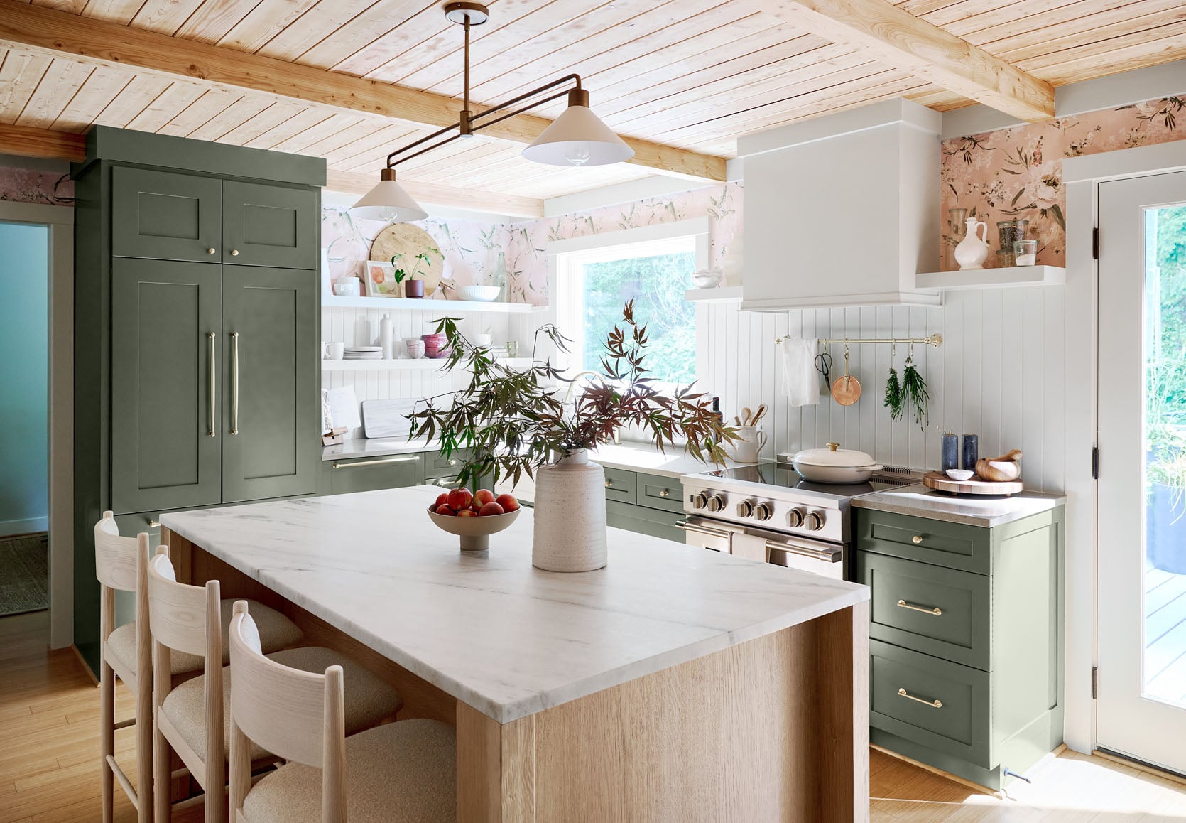
design by emily henderson and sarah weldon, styled by emily henderson and emily bowser, photo by steven mcdonald | from: the prettiest green and pink kitchen remodel that we completed in 7 weeks
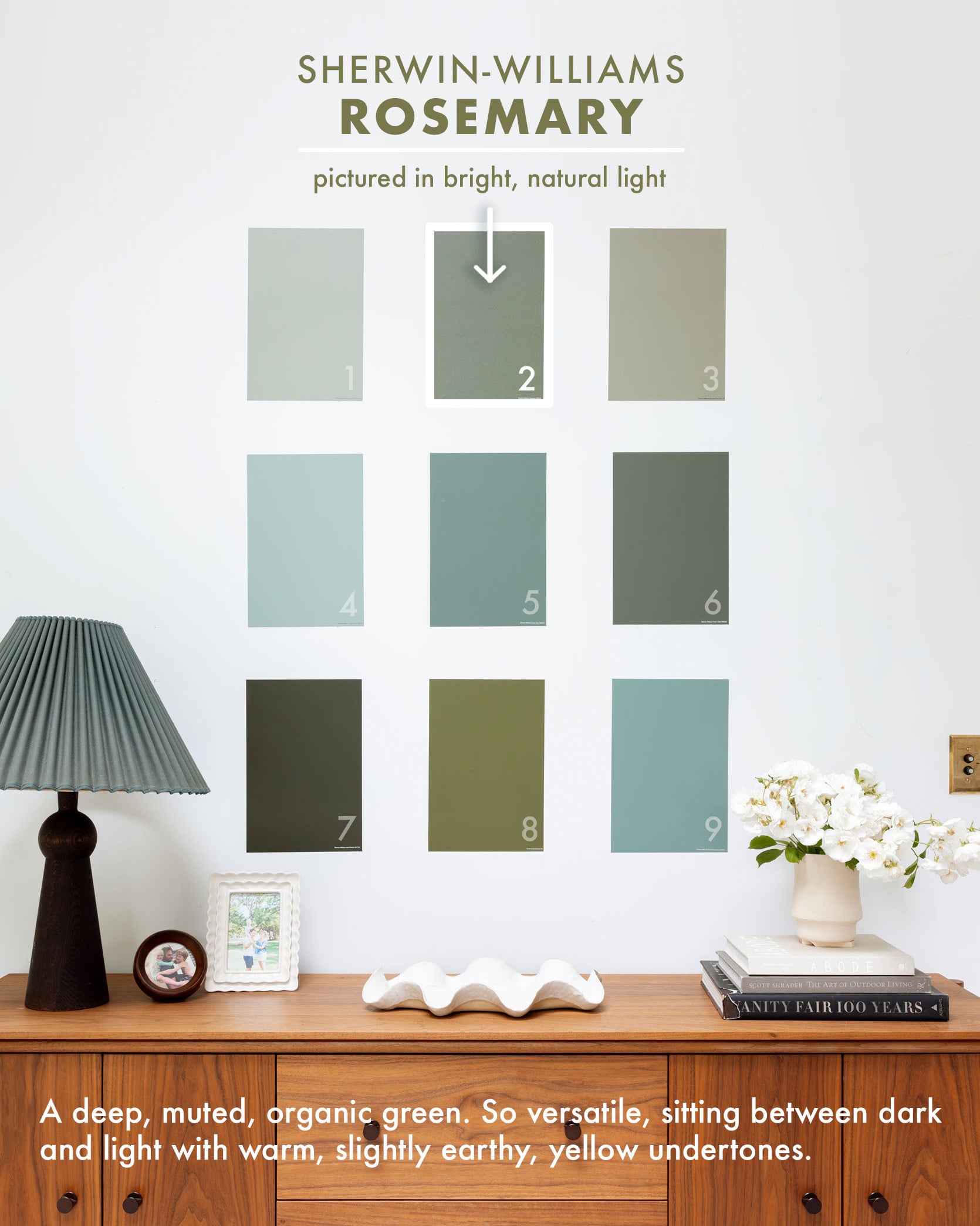
Rosemary SW 6187 was the winner for this kitchen’s cabinetry that we did two years ago, and while it feels similar to another on this list, Pewter Green SW 6208, it has a bit more warmth and “yellow” in it. We matched it to the green of the leaves in the wallpaper, which is a good hack if you are using wallpaper and want to find a paint color that will go perfectly with it.
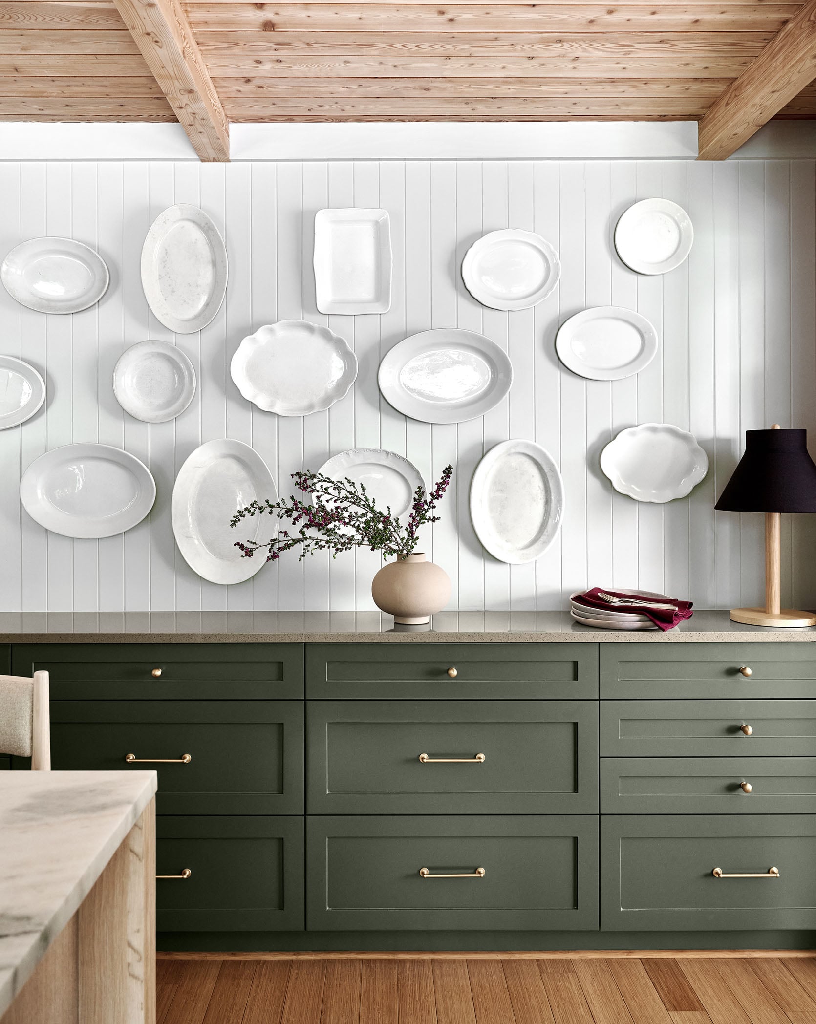
design by emily henderson and sarah weldon, styled by emily henderson and emily bowser, photos by steven mcdonald | from: the prettiest green and pink kitchen remodel that we completed in 7 weeks
My goodness, I love that project so much, and that green is one that I’ve almost used many times since, but have opted toward some with undertones that speak to the specific project we are working on. It really does have the tone of rosemary and pairs so beautifully with brass or silver.
Green Paint: Mountain Road, Sherwin-Williams
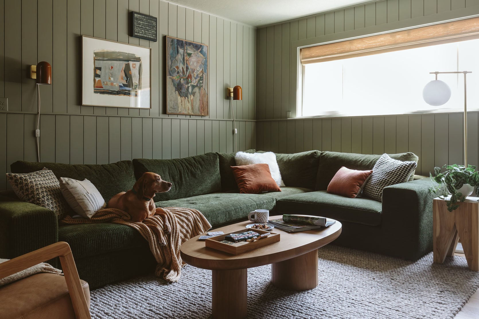
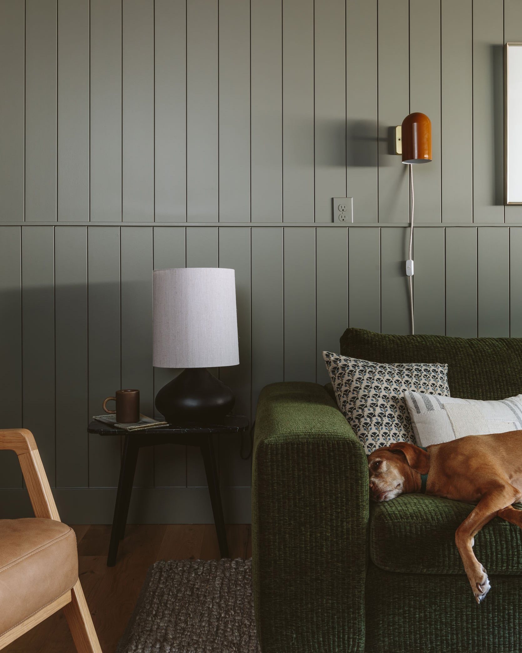
photo by kaitlin green | from: how i convinced my friend to paint her room really dark: a kid/dog-friendly basement makeover with article furniture
This color was SO hard to choose because that Article sectional has a lot of yellow (or olive) undertones. These more olive, yellow-undontoned greens are super popular right now, and in this dark room it just read as warm and green (whereas in a room with a lot more natural light, the yellow pigment came out more).
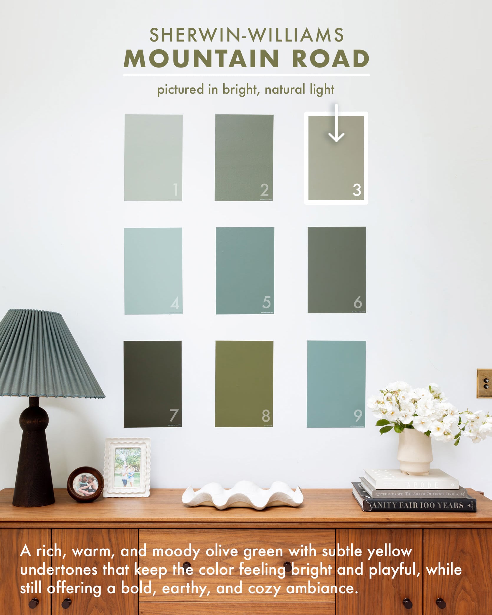
photos by kaitlin green | from: how i convinced my friend to paint her room really dark: a kid/dog-friendly basement makeover with article furniture
I LOVED this color (Mountain Road SW 7743) on these walls so much that I almost painted our front door in Mountain Road, but it pulled a lot more yellow outside, so always make sure to sample on YOUR walls with YOUR light.
Green Paint: Jasper Stone, Sherwin-Williams
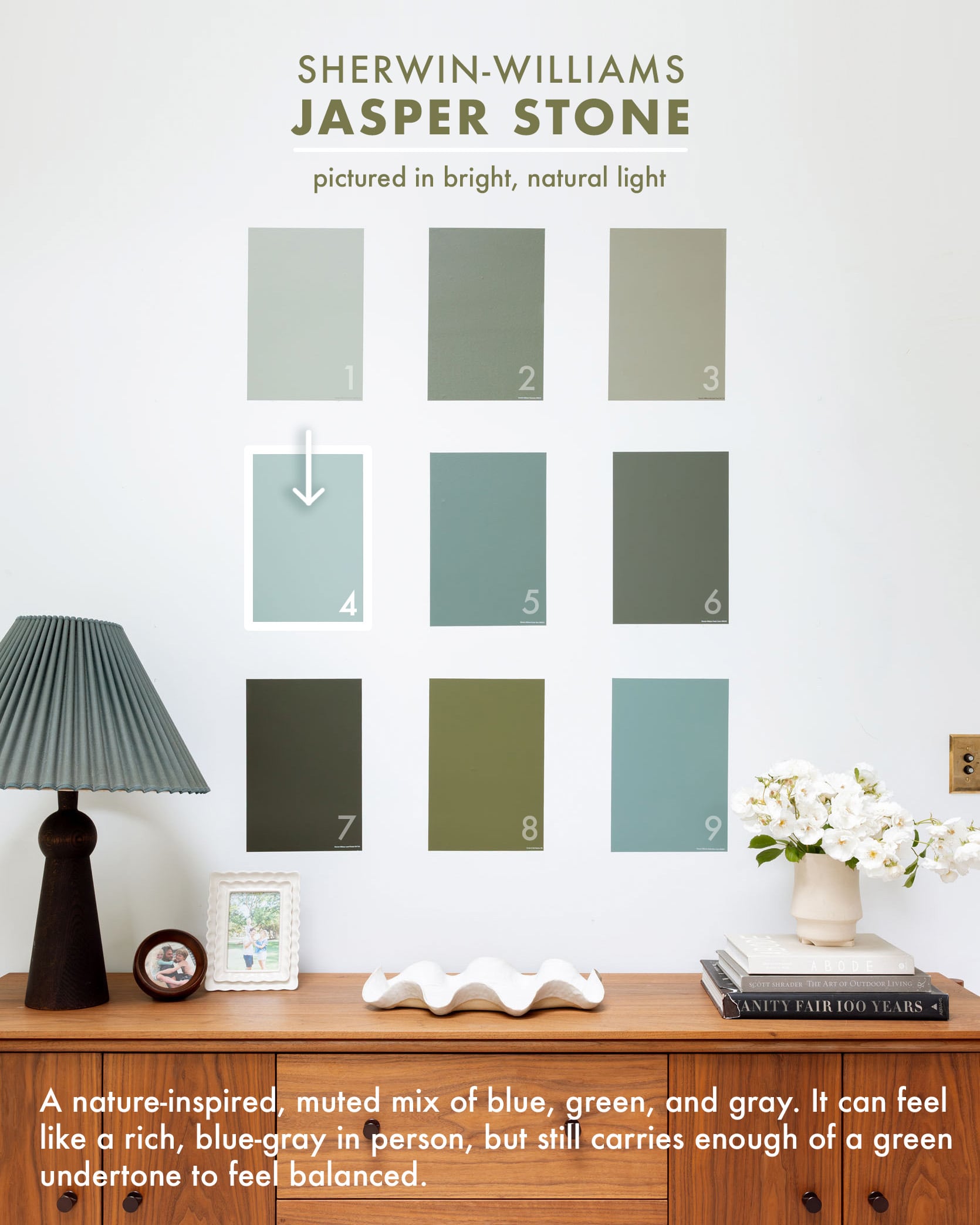
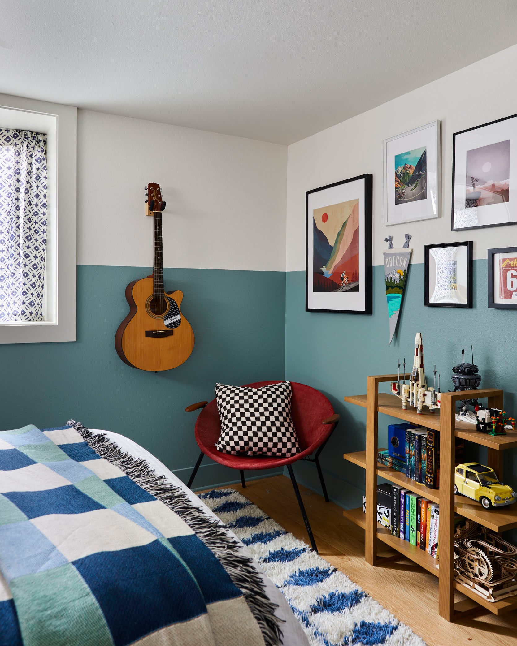
design by priscilla frost, styled by emily henderson, photo by sara ligorria-tramp | from: a teen bedroom reveal! + 7 budget-friendly ideas gen-z loves
My best friend’s teen son wanted his bedroom design to highlight his love of mountain biking and the Pacific Northwest, and Jasper Stone SW 9133 was the perfect jumping-off point. A perfect mix of the blues and greens of all the nature that surrounds us up here. It reads slightly more blue in person but has enough green to feel grounded, balanced, and calm.
Green Paint: Rocky River, Sherwin-Williams
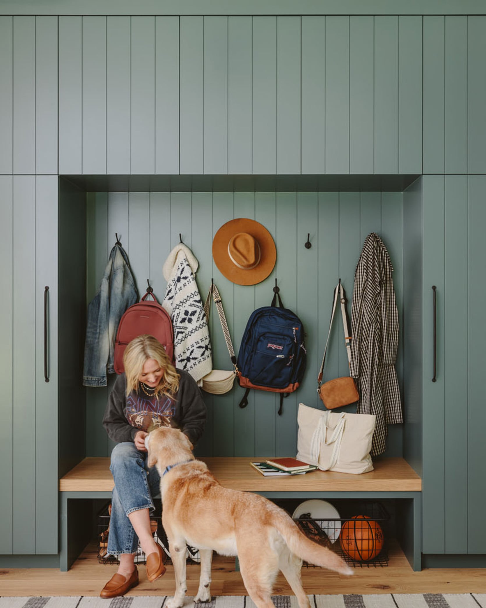
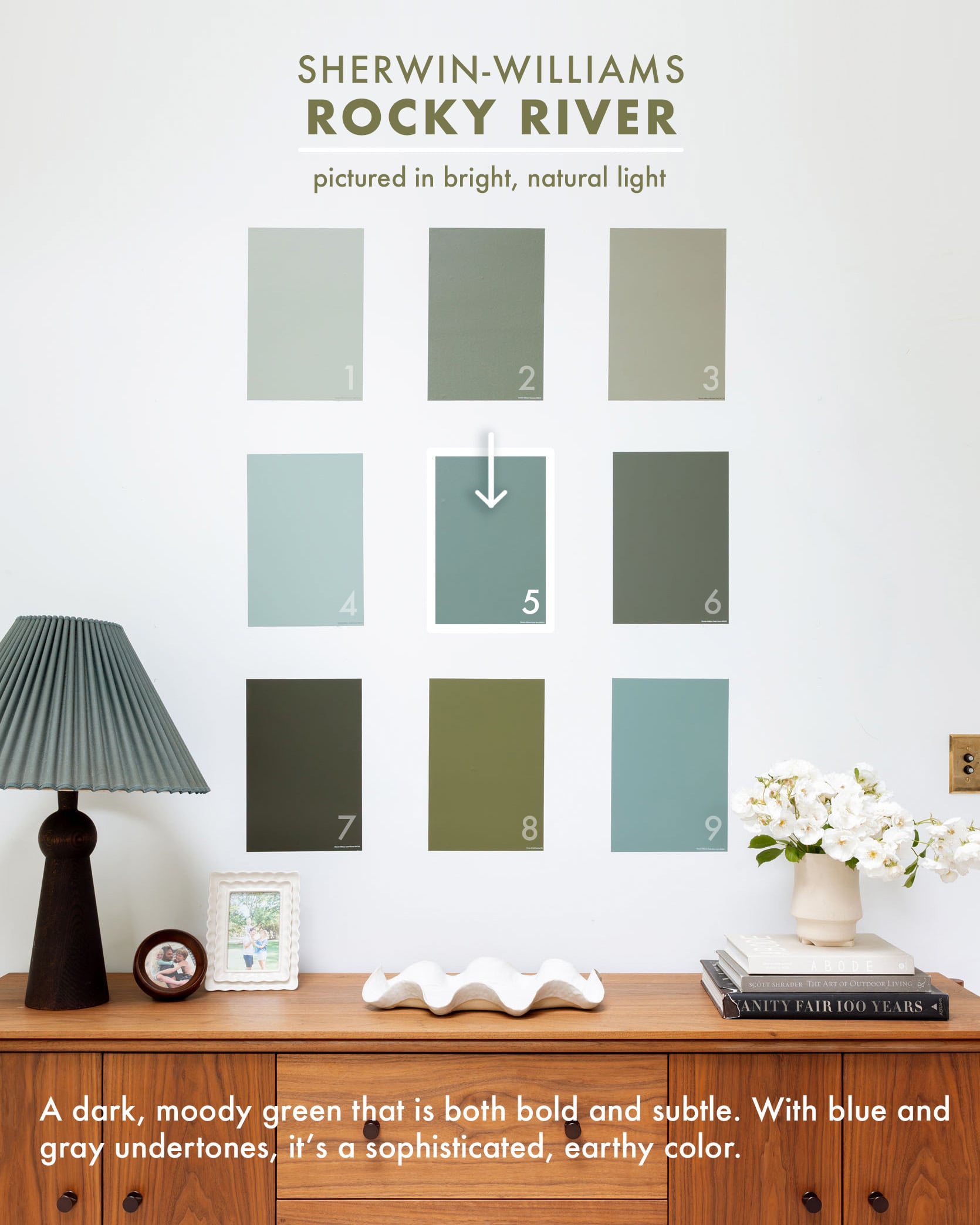
photo by kaitlin green | from: my brother’s river house mudroom reveal – a fantasy utility room for the whole family
Heading even bluer (and possibly more forest?), we chose Rocky River SW 6215 for my brother’s mudroom. We felt that being on the river, “Rocky River,” was clearly appropriate for the space.
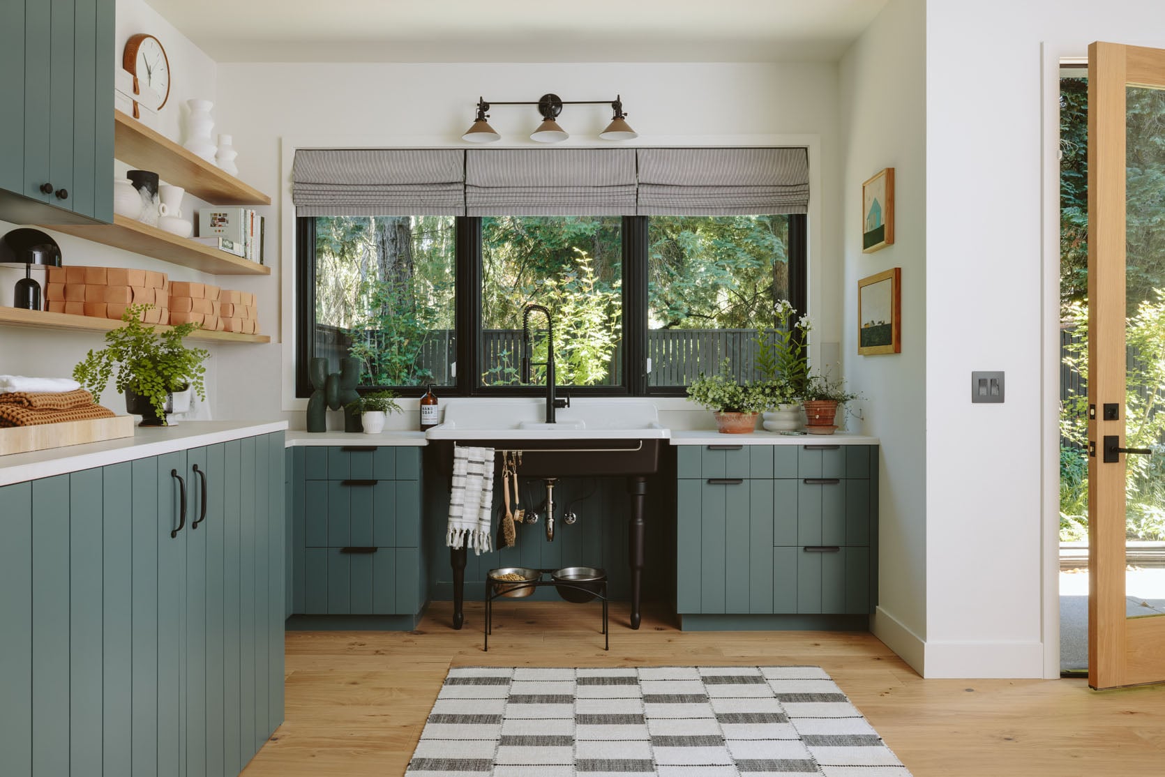
photo by kaitlin green | from: my brother’s river house mudroom reveal – a fantasy utility room for the whole family
A color like this will look very dark if it were color-drenched on all the walls or in a room with little natural light. However, in here it reads as a bold, moody color, but still bright and fun with all the white.
Green Paint: Pewter Green, Sherwin-Williams
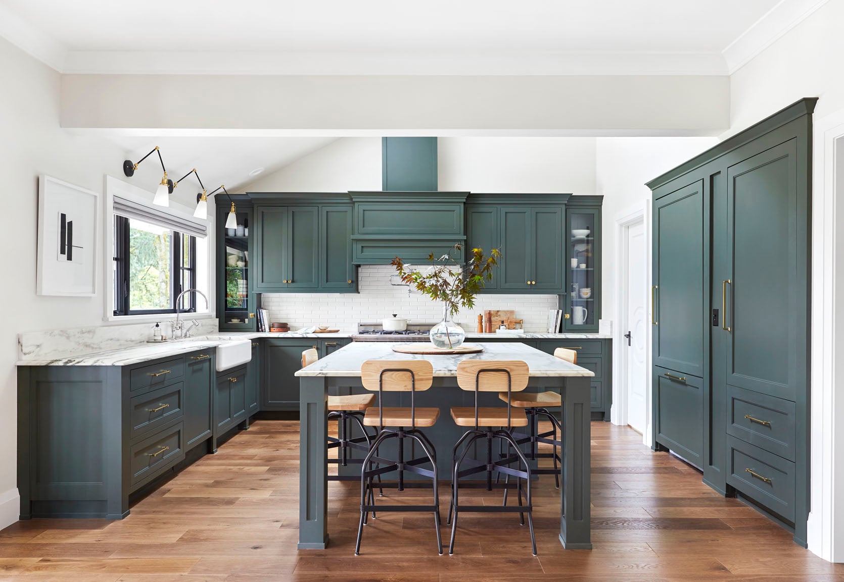
design and styling by emily henderson and brady tolbert (and team), photo by sara ligorria-tramp | from: the portland kitchen renovation reveal
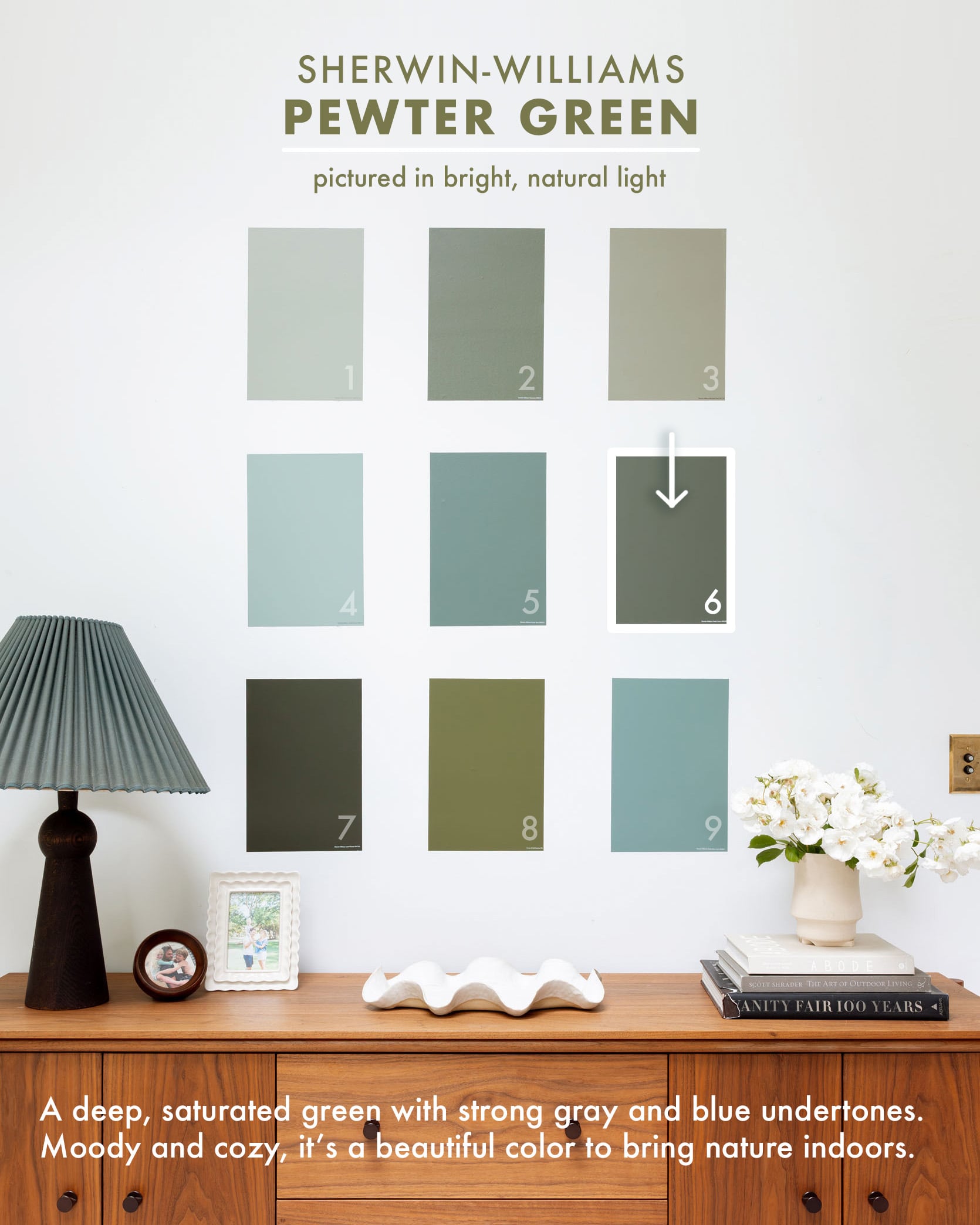
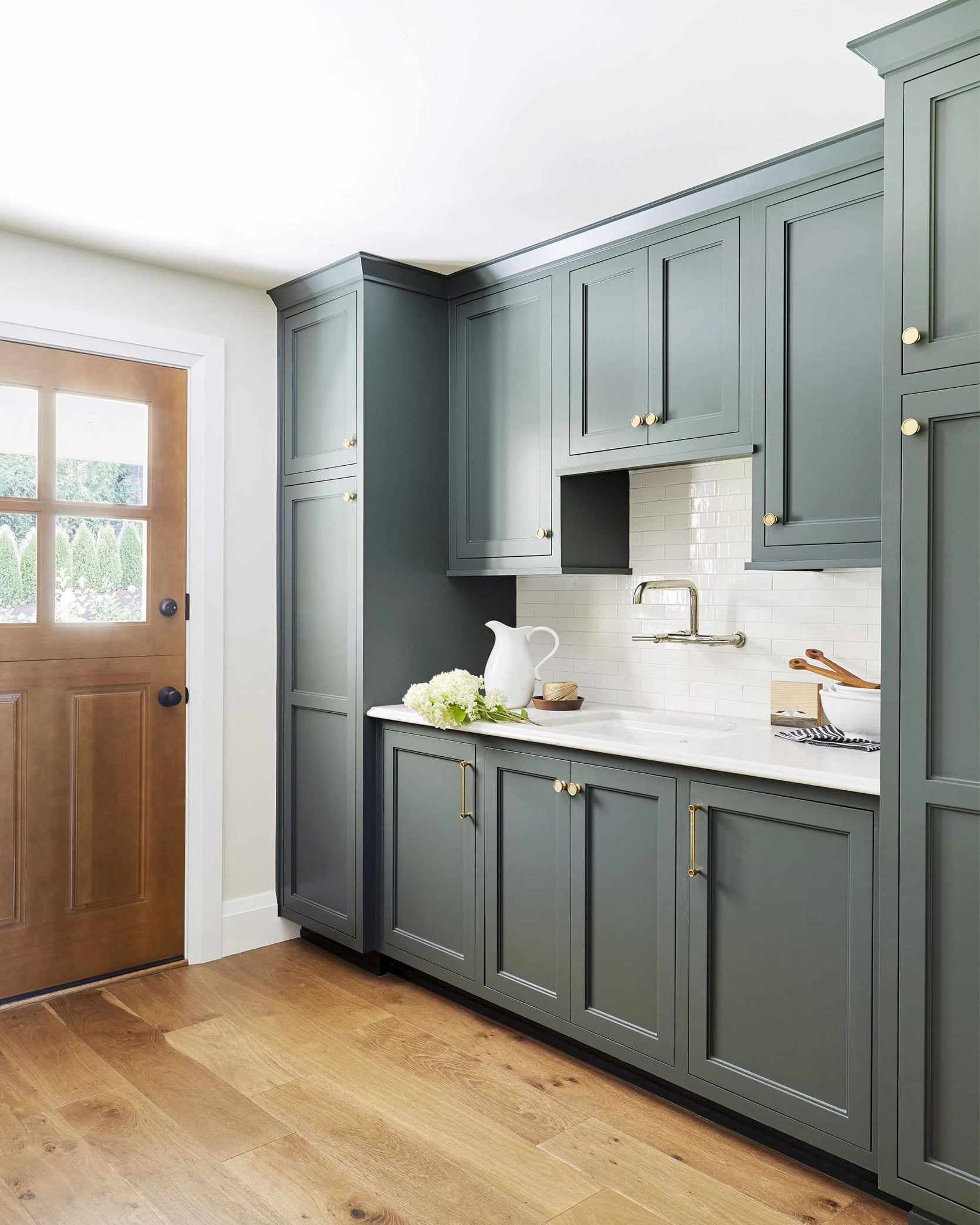
I still absolutely love this dark, deep, almost pine green of the OG Portland project kitchen (Pewter Green SW 6208). It does have a lot of blue undertones, but remains solidly green.
design and styling by emily henderson and brady tolbert (and team), photos by sara ligorria-tramp | from: the portland kitchen renovation reveal
I think paired with all the cooler tones of the stone and then contrasting with the wood flooring, this shade is pretty perfect. If you are scared of going too “yellow” or olive in your green, then I can solidly say this one is so beautiful and pretty hard to not love.
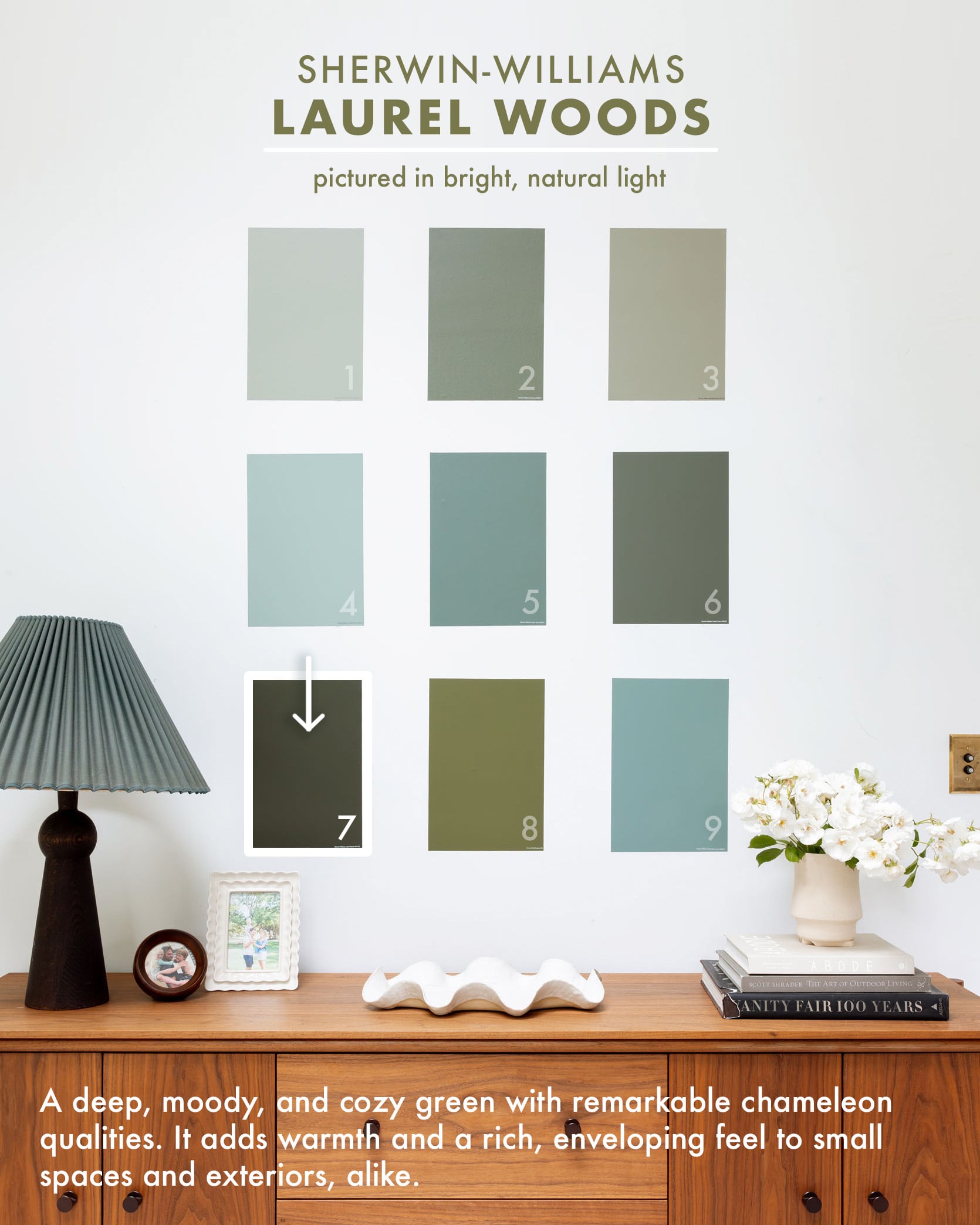
Green Paint: Laurel Woods, Sherwin-Williams
design and styled by emily bowser, photo by sara ligorria-tramp | from: emily bowser’s beautiful hardworking, multipurpose room reveal (+ get ready for her diys)
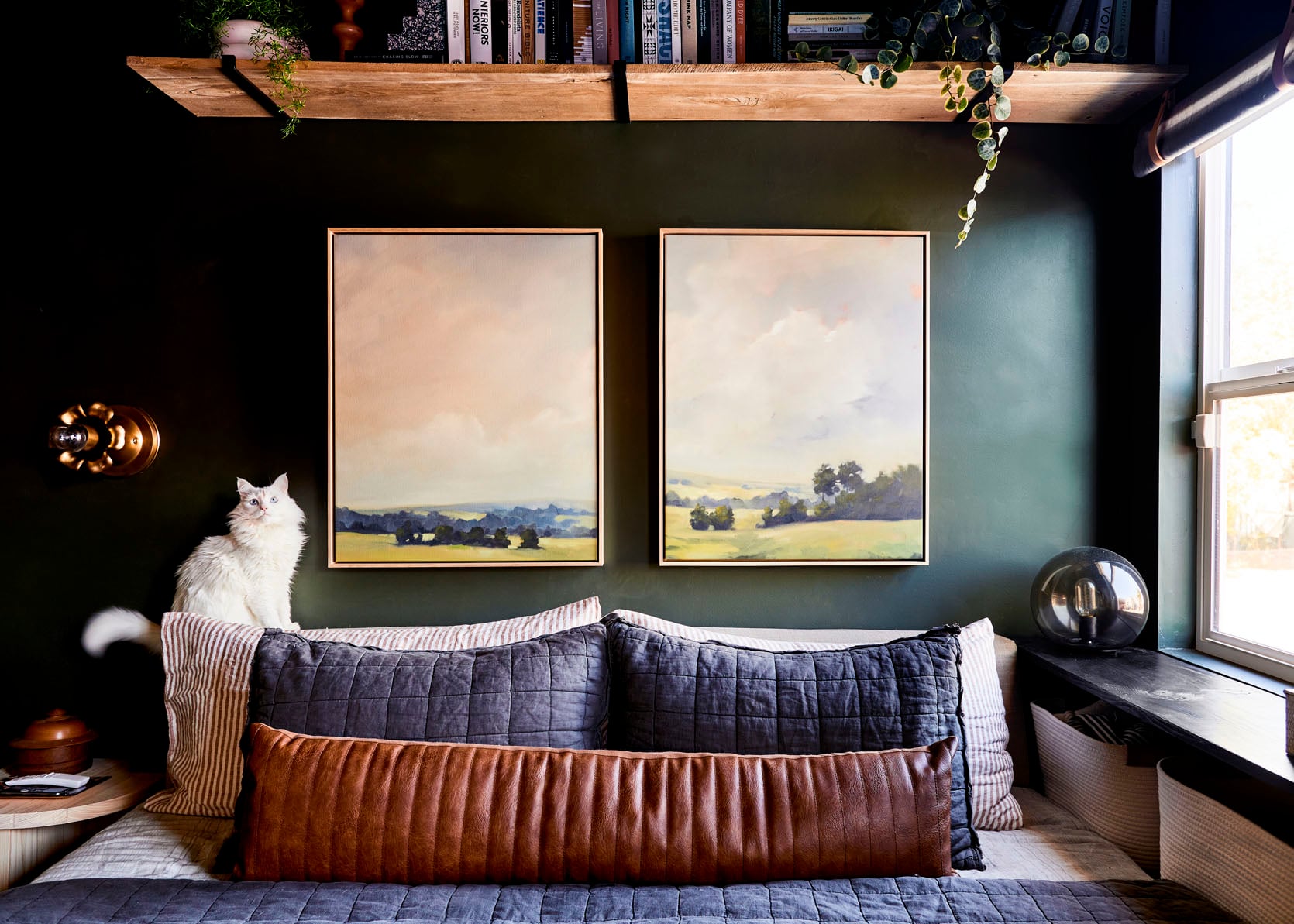
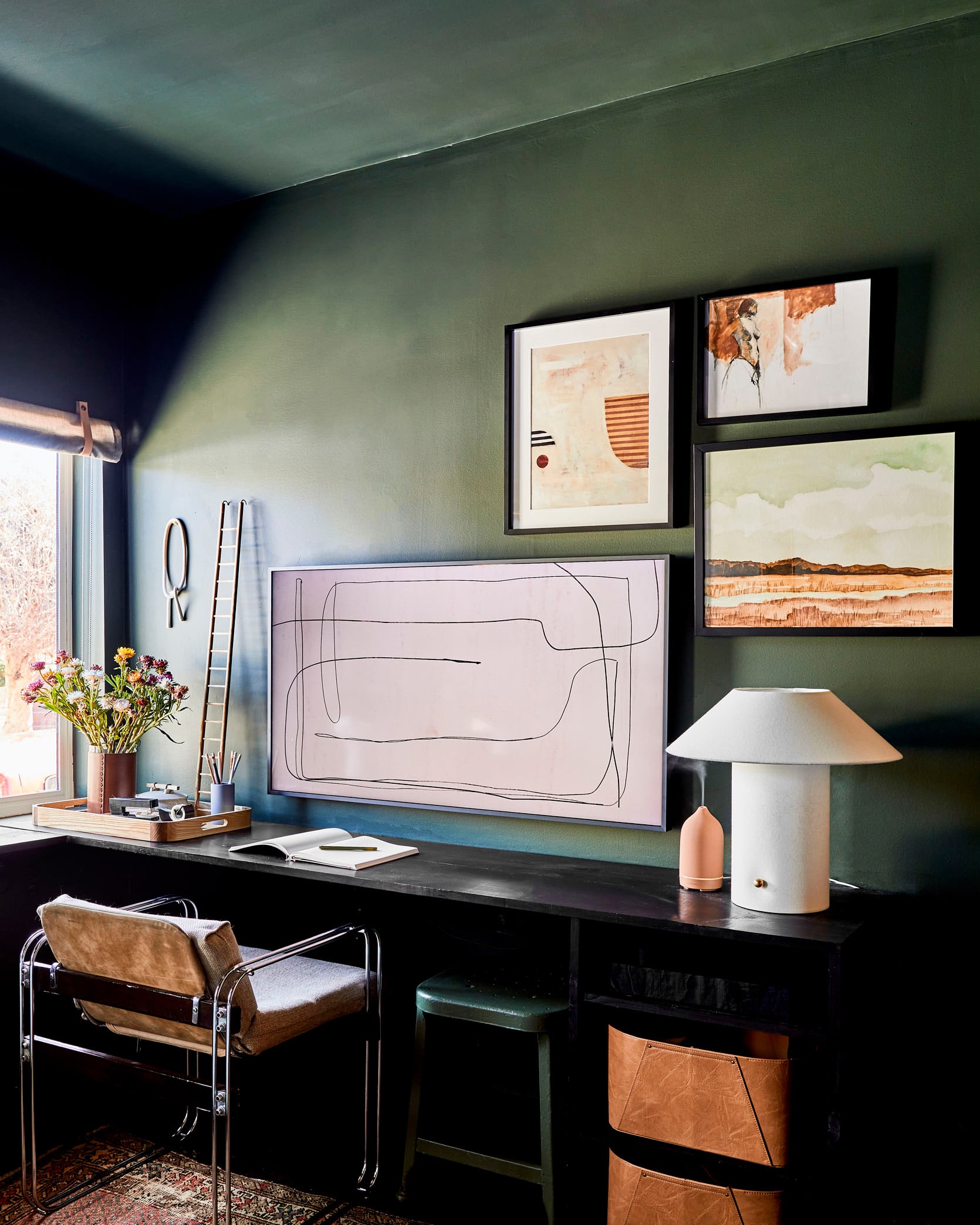
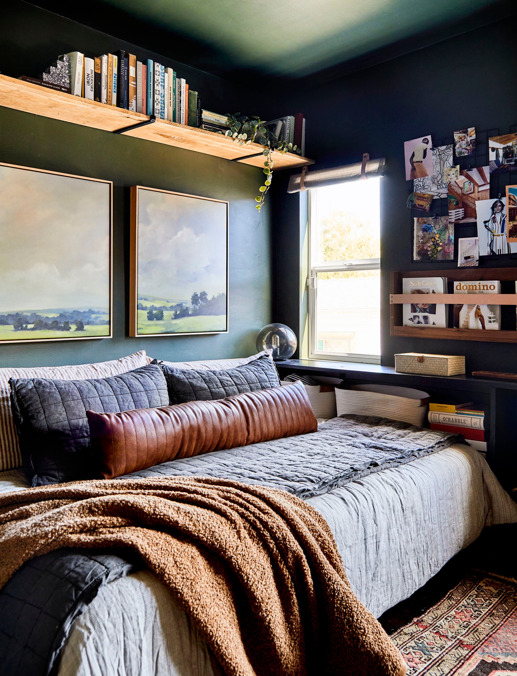
Emily Bowser chose Laurel Woods SW 7749 for her guestroom/office, which is also what I painted the exterior of our mountain house, and I LOVE it. It’s pretty dark, in a good way, so be prepared for it to soak up light and be moody.
design and styled by emily bowser, photos by sara ligorria-tramp | from: emily bowser’s beautiful hardworking, multipurpose room reveal (+ get ready for her diys)
I love how Bowser styled it with these deep hits of black and caramel – such a pretty color palette.
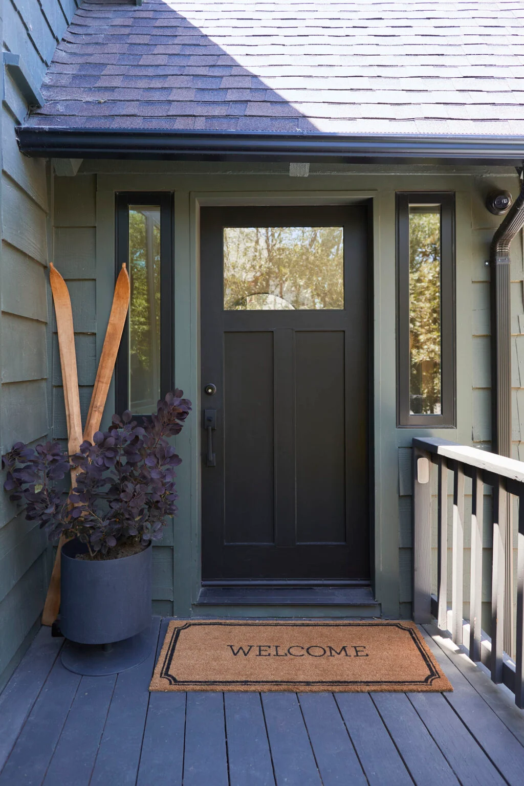
left: design and styled by emily bowser, photo by sara ligorria-tramp, from: emily bowser’s beautiful hardworking, multipurpose room reveal (+ get ready for her diys) | right: photo by sara ligorria-tramp, from: i’ve had my new invisible smart locks for 4 months – here’s an honest review
For the mountain house, I wanted something that read as “dark” but not so dark that you couldn’t tell it was green. A warning: when you are outside, the natural sunlight (even if indirect) will make the color look a lot lighter (our neighbors tried to go “dark” but didn’t choose dark enough, and it’s much lighter and brighter than they wanted. So you might think you are going dark, but then in the sun it might look bright green, so err on the side of much darker if you want a medium to dark exterior. This color, Laurel Woods SW 7749, will read super dark inside a room without a ton of natural light (which is what Bowser wanted) and more medium/dark outside.
Green Paint: Bancha, Farrow & Ball
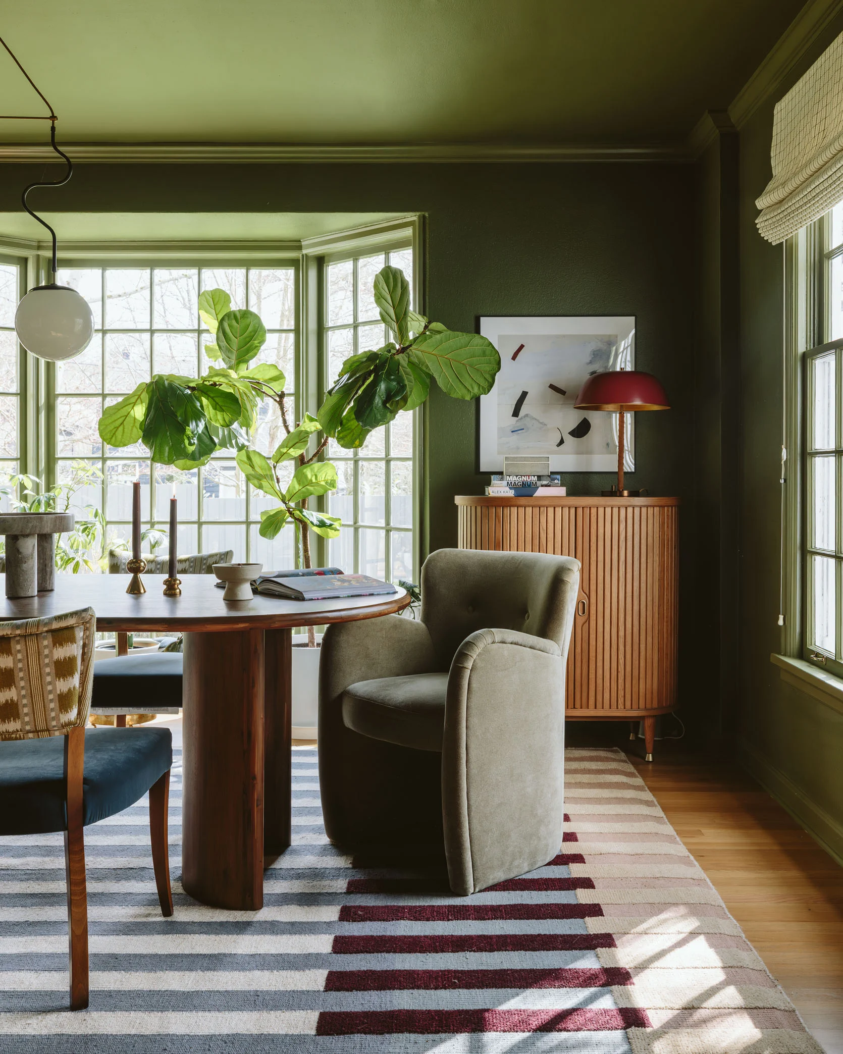
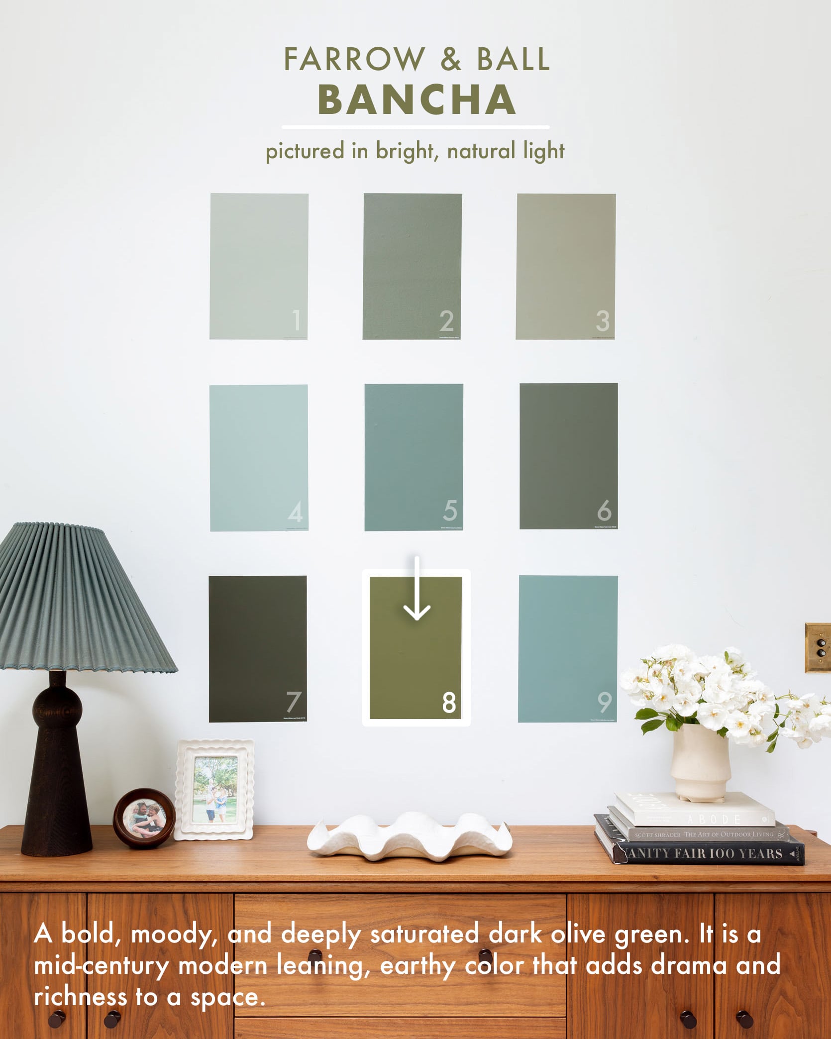
photo by kaitlin green | from: my friend’s moody dark green dining room
I helped my best friend, Nicole, design her dining room, and she and her husband chose this beautiful green called ‘Bancha’ by Farrow & Ball. It is bold, saturated, and has a real mid-century feel.
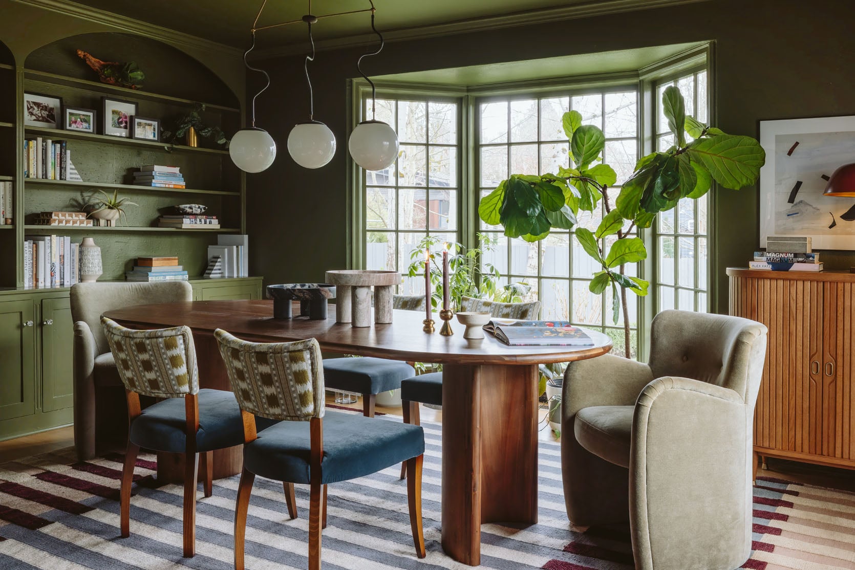
photo by kaitlin green | from: my friend’s moody dark green dining room
The colors in this space all work so beautifully together – the greens, blues, and warmer red tones create such a cozy and yet totally modern palette. It was such a refreshing room to design – so different than my light/bright Scandi vibe. This green paint has a lot of yellow, pulling way more olive than other greens I tend to gravitate to, but I really LOVE it in here. Just be careful in a really bright room where it might be really bold/jarring.
Green Paint: Studio Blue Green, Sherwin-Williams
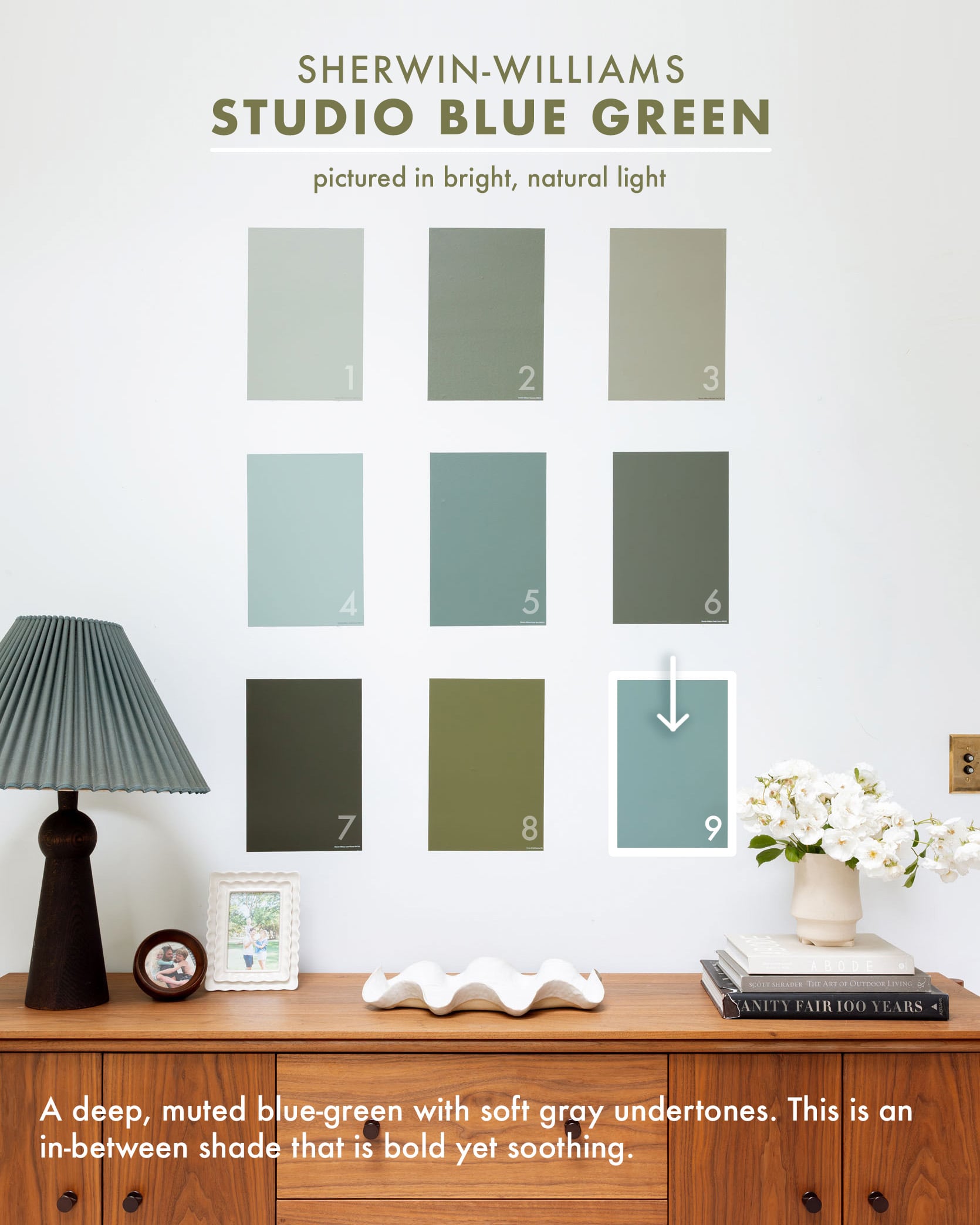
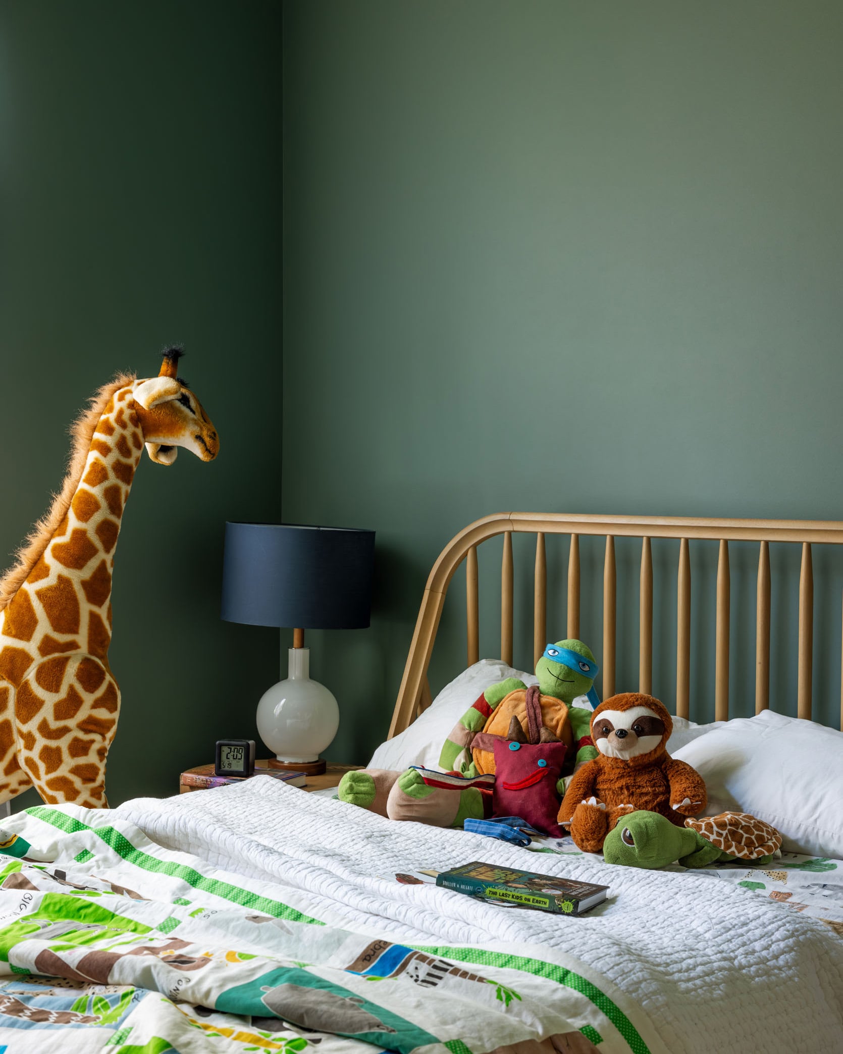
photo by kaitlin green | from: how to choose paint colors that are happy but not too bold – the full river house paint color palette
I have wanted to use Studio Blue Green SW 0047 for a long time – it’s so good. Frank’s room (my nephew) is on the south side of the River House and gets pretty low light despite having two windows. So we embraced the coziness and painted it (and the ceiling) this darker blue/green. It’s so high impact while strangely being soft on the eyes.
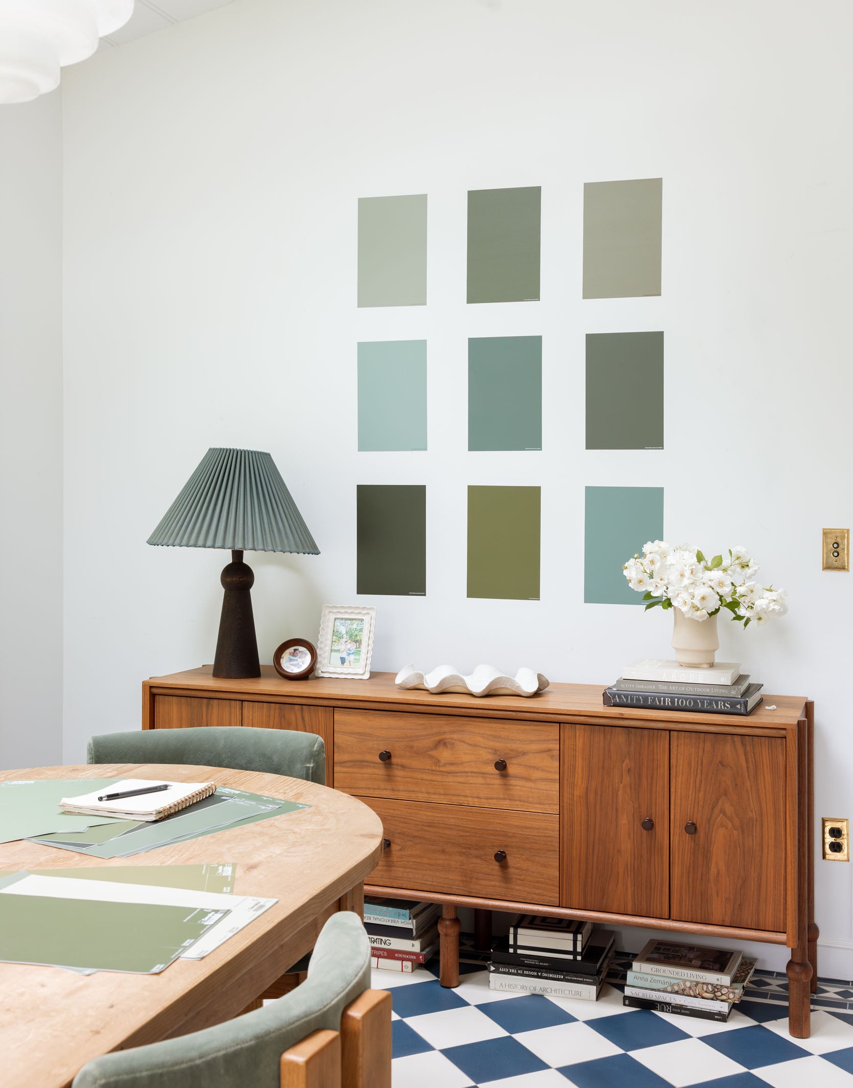
I truly hope that someday technology will solve all of our paint debate issues – I would love to walk into a room with some VR goggles so I could try different colors until my heart’s content. But until then, these oversized paint sample stickers from Samplize are the next best thing! Well, that and taking recommendations from people who have painted a lot (like me). Just make sure to sample all the colors on different walls at different times of day and then stare at them for so long that your husband might question your sanity 🙂 At least that’s my method!
Unless Otherwise Noted, Photos by Kaitlin Green


Love the Ulla Johnson Tillie Blouse in Raven you are wearing in the sneak peak.
Different header pic first time around 3/17/25
Yes! Love these greens! We painted our guest room SW Basil and it’s been a struggle to not use it in every room since! ?
My parents used this color in their house, and it’s so pretty!
My current favorite green is Edamame SW7729
Curious to know if you have a sheen you typically go with, or if it changes depending on what room it’s in?
Love each one!! Can’t believe the timing as I am looking for a green in our new “man cave.” Thank you!
this article is so helpful to me. the direct comparison of different types of greens made me realize that I prefer a more yellow green versus a blue green 🙂 The things i didn’t know. Caitlin’s hallway project lives in my head forever, i love that project.
These are all gorgeous! My fave might be Pewter Green. I need to bookmark that for future use!
What jeans are you wearing? Where is the lamp and blue shade from, and side board? I love alll your green picks!
The lamp with a blue shade is from Schoolhouse.
I think the lamp is the Bella Skirt Lamp from Lostine and the pleated shade was thrifted? The sideboard is the Mae Credenza from Crump & Kwash
We painted the exterior of our house Jasper Stone and I absolutely love it. We chose 3 shades darker for our shutters and the doors are a terra cotta color. Its beautiful.
These are nice.. I also have to shout out my beloved Timson Green from Ben Moore as a brighter, thrifter version of Bancha…
Hi Emily! Loved this green paint roundup! I’m trying to pick a green for my exterior doors and our siding is a brown/gray stain. One door is under a covered porch and one is exposed to full sun. Do you have a favorite from your list that will hold up in bright sun without looking washed out, while also looking right on the shady porch?
Emily, how has Laurel Woods held up as an exterior at the mountain house? I want to go dark and moody with my own exterior but wonder if it fades quickly compared to lighter colors.
Green is a timeless color that brings freshness, warmth, and a natural feel to any space. The right shade can instantly transform a room into a calm, inviting, and stylish environment.
Green paint colors continue to be a favorite choice for homeowners because of their versatility and timeless appeal. Whether you prefer soft sage, rich emerald, or earthy olive tones, green adds a sense of balance, comfort, and elegance to any room. It pairs beautifully with natural materials and a wide range of décor styles, making it suitable for living rooms, bedrooms, kitchens, and even home offices. These shades create a refreshing atmosphere that feels both modern and classic, making them colors you’ll happily use again and again
This is chat GPT text!
I did SW Secret Garden as the exterior of my house and I love it. I believe that Kyle (from @Kyledidit) is using this color in his living room.
Love that Bancha! But I always prefer less grayish greens. My whole home exterior is painted close to that very dark green and I love it! Feel so “one with nature.” Thanks for these!
Thanks for this post! I think the big takeaway is to use samples and look at them in different light. Our eyes perceive more shades of green than any other color (the green cones in our eyes are the most sensitive…yay, science!), so a small paint chip can fool you about the intensity of the color. I remember a mishap with a celadon green color some years back. It ended up so bright on the walls it was physically jarring. Haha! I had to repaint in a less saturated version.
gorgeous colors. Would love a post on green exterior colors.
Greens and blue-greens are my favorite colors. Emily, thank you for this collection!