Design
5 Under-The-Radar Trends To Try NOW Before They Become Oversaturated (Thanks Social Media)
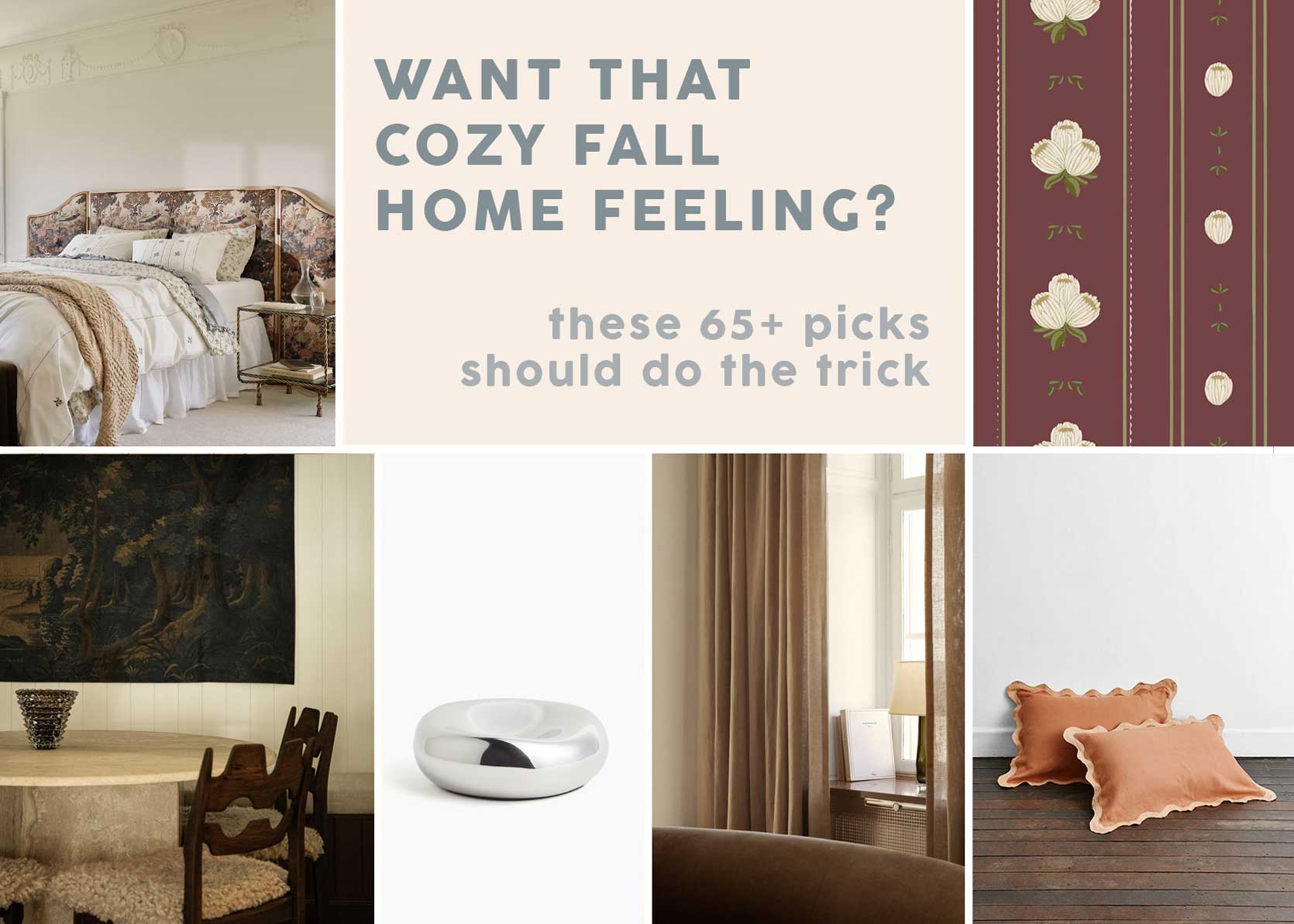
Fall is trend season. And while we’ve already chatted a bit about fall-specific trends (and followed that up with some supplemental shopping), I’m ready to look a bit more forward into next year and beyond. One of my favorite things to do as a design editor is to forecast, and, tooting my own horn, I happen to be pretty good at it. In my decade-plus of doing this work, I’ve pinpointed decor trends as far as a few years out, which frankly, feels very rewarding. I get that few have the bandwidth to hear about something that’s going to be huge—I swear!!—in 2029, so instead, I’ll tighten the slack a bit and just peer into 2026.
What’s bubbling up to the surface that’s interesting, inspiring, or comforting? What’s right in front of our eyes but under-the-radar enough that your house doesn’t look like a rip-off of every content creator online right now? Well…the following five things, I believe.
The tricky thing about writing an article on decor themes, items, and motifs that haven’t quite yet “hit” but I’m betting will become more mainstream is that there aren’t many pictures to support my cause. “Look, I can’t prove it or show you, but my gut is telling me…this is the next big thing!” Sure, Arlyn…
And while I do believe that what you’re about to read encompasses all things with legs, based on what I’m noticing at the high end of the market (where it all starts), what I’m seeing percolate in stores and design trade shows, it doesn’t really matter. If you love it, DO IT. The only thing I think trends give us is accessibility. Suddenly, that obscure material or color you love can be picked up at your next swing through IKEA, for example. And because fashions come and go so quickly these days, it’ll feel fresh again when everyone has moved on and you’re still into it. Live your truth, babies, whether on trend or not. Deal?
Okay, let’s dive in.
#1: Teal
I’m starting with the most obvious trend: the color teal. I’d say no one has come out and just outright said teal is in, but that would be a lie. WGNS, an international trend forecasting company, named “Transformative Teal” the color of the year for 2026. Now, every paint company around also comes out with their own color, and so far, only one other has picked a blue-green tone (Behr’s Hidden Gem). It makes sense; we’ve all loved and used blue and green, respectively, to the point that we probably don’t even know how to make it feel new anymore. Enter: An efficient combo of both colors! It’s been about 20 years since we last saw teal (or, as we referred to it then, peacock blue) rise to the top of the color pack, but I’ve gotta say, I’m ready for it. Just look how powerful and dreamy it looks in this seating nook by Nicola Harding & Co.
It can feel so refreshing, like a well-timed breath mint, like in this bedroom by one of my favorites, Reath Design. Note to self: Mix teal with buttery yellows, creams, and rust.
While I’ve seen teal being used more and more on walls and surface materials such as tile, never underestimate the power of upholstery. Sure, an armchair (especially these days when everything costs a fortune) is an investment, but it’s far less permanent than tile or stone and a great way to sprinkle in a daring color without it being overly in-your-face. Bonus points for some fringe, like this punchy little number by Lauren Doyle Grant.
The above photo, a design by Sarah Storms, actually showcases a whopping THREE trends I’m going to be discussing today, but I’ll save the non-teal talking points for later as not to give anything away. Anyhow, I’m a big fan of how well teal works with warm woodtones. As we move more into browns and darker wood hues, it’s easy for a jewel-tone like this one to really be a star if you’re after a design that feels friendly, yet elevated, yet saturated.
If you’re sitting here thinking teal has to be all moody, I hope this image from Rue Magazine designed by Jenny Keenan Design proves otherwise. In a room that gets great light, it can feel downright effervescent. Pair it with white and brass for a crisp aesthetic.
Another one by Lauren Grant Design, I do really love teal in a bathroom paired with rich woods and plenty of spa whites and grays.
You’ll have to scroll one photo over in the above carousel for the example I want to point out, but it’s a good one (again, with another trend I’m going to talk about if you keep reading). This kitchen in a home by Atelier LK via Architectural Digest is contemporary without feeling austere due in great part to the teal cabinetry.
Another great bathroom example, here by Owl Design London. It’s a cool monochrome look broken up by a variety of textures.
And finally, teal in a more organic, low-fi application. Try it on some bedding or even just a throw to punch up a neutral color palette, as seen here in a bedroom I found on The Materialist Co.
#2: Vintage Glass Chandeliers & Sconces
Moving on to one of my favorite home categories: Lighting. Metal, linen, and even paper have all been the rage for a few years, but more and more, I’ve been noticing vintage Italian glass chandeliers and sconces coming into the picture, and I LOVE IT. They’re so romantic and posh. Let’s look at a few.
One of the beautiful things about this type of lighting is the soft colors that can be incorporated, like the rainbow-like combination here in a space by Smac Studio. It’s quiet yet speaks volumes and is definitely eye-catching in a way only a few things in a room can be. Has it always been there? Is it new? It’s a lighting enigma.
Again, by Smac Studio, the same design of the chandelier in the previous kitchen shows up in hushed pink in a stately wall sconce.
Once you look past that INSANE jade green island, you start noticing some of the other details of this fancy kitchen by Constanze Ladner, like the beautiful glass sconce on the left wall. Something opaque or metal would have been expected (and still lovely), but the smoky glass is a delightful, surprising moment.
Wow, that sconce. Gorgeous. That vintage piece has the ability to cut through all the newness of this bathroom by the Australian firm Arent & Pyke. Stately and textural without screaming.
Arent & Pyke at it again (with some teal via the desk in the mix, too!). The caption for this image notes that this is a 1970s Mangiarotti chandelier, and it’s amazing to me how something that’s 50+ years old can still come off so modern.
Glass lighting fixtures aren’t just for fancy and elaborate rooms. They can add some serious tension (in a good way, like I wrote about here) to earthy rooms and design aesthetics as seen here in Arch Digest.
#3: Lacquer & High Gloss Finishes
And so we reach one of the trends I’ve hinted at twice already in the above photos, though it’s seen more than the two times I mentioned it. High-gloss is coming, people! After years and years of matte finish everything, lacquer is back. Honestly, this one kind of crept up on me, but it wasn’t until I was perusing East Fork looking for something that I noticed their new gloss finish. I thought, “Hmm…is this a thing?” The more I dove into it, the more and more I started to see it kind of everywhere, specifically in product. For example:
And….
I’ve even been noticing it a lot on finishes like tile, cabinetry, and wall paint:
While this isn’t a shopper post per se, I did want to drive my point home with this little round-up of high-gloss-finish product, from coffee tables to lamps to dressers and sideboards. It’s everywhere, all in candy colors. If it weren’t for the fact that lacquer scratches very easily, I’d be all over this. I’d say stick to one to two high-gloss pieces per spa for maximum impact.
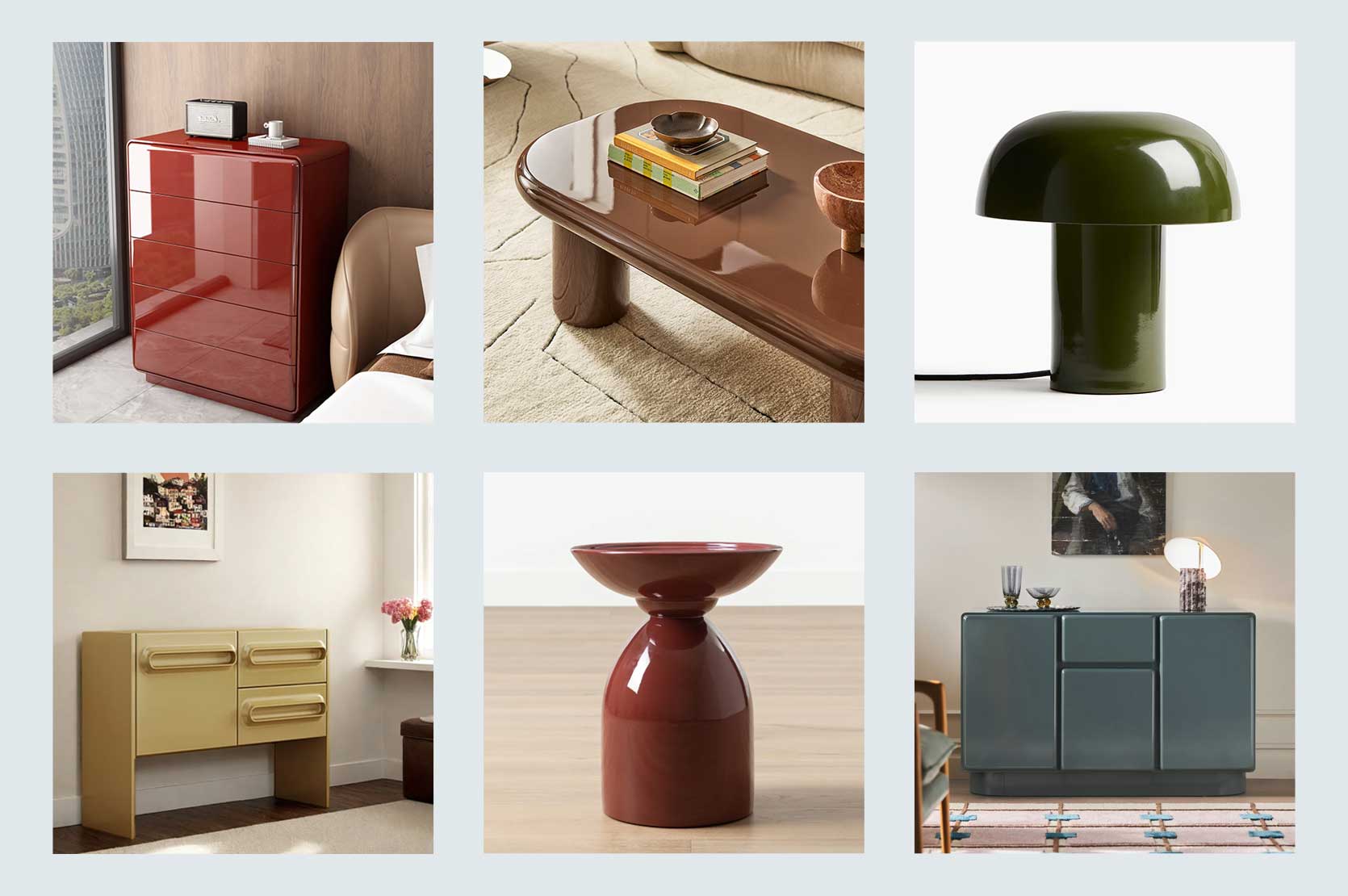
Top Row, From Left: No Handle Design Shiny Drawer Accent Chest | Bruno Coffee Table | Metal Table Lamp
Bottom Row, From Left: Simple Style Sideboard | Visby Side Table | Wright Rectangular 48″ Lacquer Sideboard
#4: Arts & Crafts Style
On the total opposite side of the spectrum from high-gloss modern lighting and furniture, we have Arts & Crafts style. This “trend” may or may not hit as widely as something like the color teal, but I’m telling you, it’s brewing. I think it’s an answer to all the curvy and glam looks we’ve been seeing the last few years, which is funny, because that’s loosely why Arts & Crafts came to be in the first place both in furniture and in architecture. After the Victorian era and the industrialization of furniture making, this style was an answer to mass production and ornateness (from around 1880 to 1920). It was seen as a return to quality craftsmanship and the beauty of wood in simple forms. Arts & Crafts celebrated joinery and wood itself.
I’m lucky enough to live in a part of California where both Arts & Crafts and Craftsman homes still stand and I have to tell you, they are a site to behold. For those new to this, Craftsman (and Mission) styles were the American offshoot of the British-born Arts & Crafts style. Mission is a leg of Craftsman, and Craftsman is a leg of Arts & Crafts (i.e, all Mission is Arts & Crafts, but not all Arts & Crafts is Mission). They all have similar spirits with streamlined works where wood reigned supreme.
This is an Arts & Crafts home that designer Nina Farmer (another favorite of mine) worked on for a client in Massachusetts. You can see more of it on her profile, but it’s so beautiful, particularly that staircase railing. The sleek, humble, and special warmth of A&C works well in modernday homes because it’s easy to mix in with flashier silhouettes. It’s very grounding.
A&C furniture often had special little details like the hearts in the chair highlighted above in a room by Antonia Stewart.
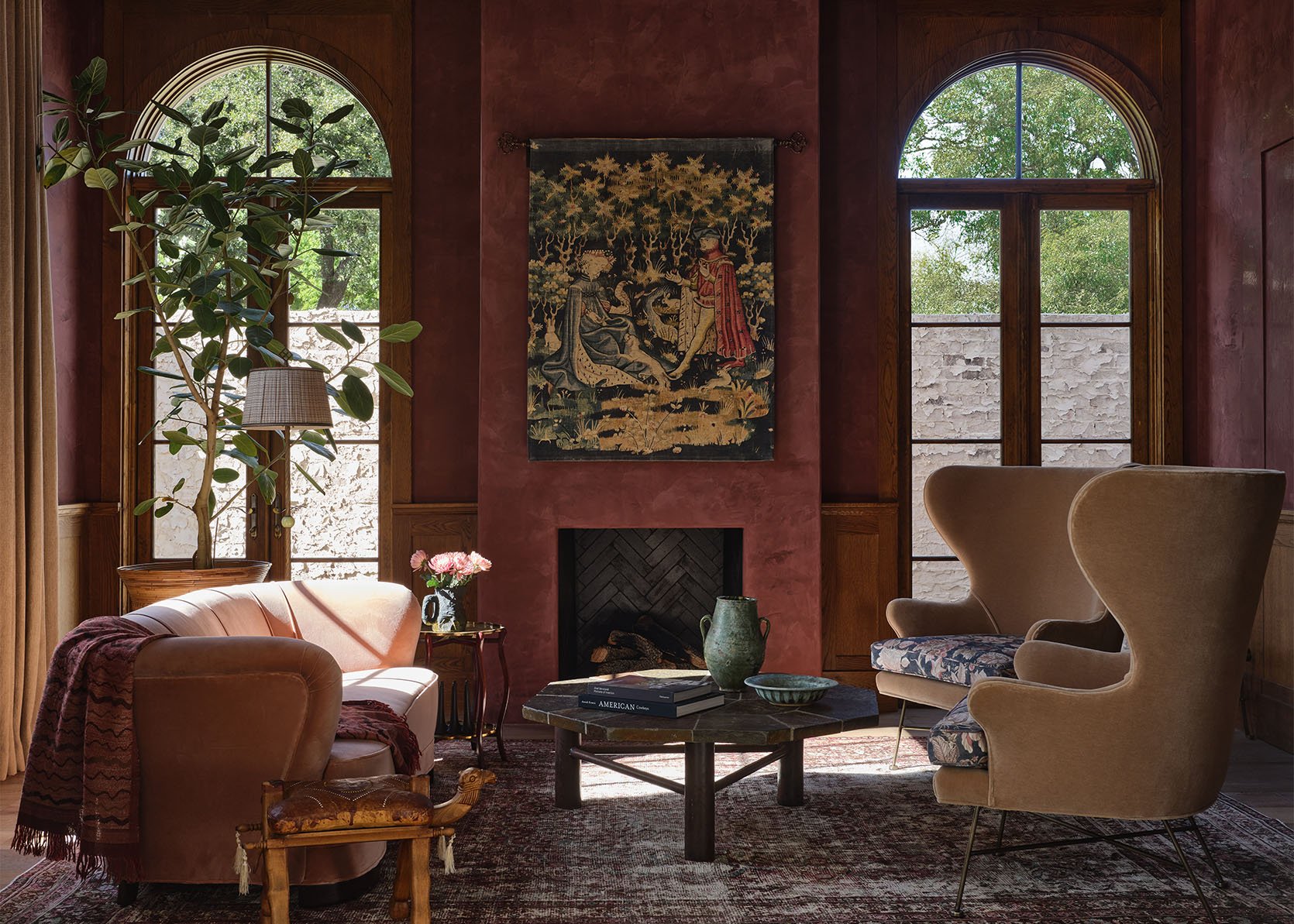
This room, by Madeline Stuart, just glows! It includes a mix of English, French, Chinese, and American Arts & Crafts pieces against the foundation of A&C architecture (look to the left to see the gorgeous joinery around the mantel of the fireplace). It’s so calming, has so much heart, and is built to last a lifetime.
How good would this chair be in a subtly designed room? You can see that Arts & Crafts lacked ornamentation, unlike what came before it, but it was still distinct and artful in its own way.
Stickley Furniture is the best-known example of American Craftsman-Mission furniture, and it has a long heritage of exquisite craftsmanship. I used to think Stickley pieces were boring, not a fan of the vertical slats common to this style of furniture, but I’ve grown to really appreciate them. The above is a gorgeous 125th anniversary bench by the company that features rare intricate inlays. It’s an heirloom piece (with a price to match).
#5: Wallpaper Borders
Somewhere, in some universe, my mother is still removing all the wallpaper borders in my childhood home. Wallpaper borders (and painted/stenciled borders) were such a staple of 1990s decorating, but well…they’re back. Gone are the blueberry bush branches, chickens and English rose gardens, though. Much of what we’re seeing is geometric, slender, and punchy. Think more “trim” than a six-inch ceiling belt like the days of yore. I gotta say, I love it in the right space.
You can find wallpaper borders in a handful of places like Etsy and Rebel Walls, but the best ones are from UK companies, like Ottoline de Vries (above).
I’m especially fond of these slender borders around windows and doors. It’s kind of like a fun ribbon detail that draws the eyes up and around a room. This one above is by Common Room, again, out of the UK.
I know the last few examples I’ve shown are fairly British, layered and graphic like this character-filled space from Studio Atkinson’s account, but today’s wallpaper borders could also be amazing in a simpler, stark modern space.
I do suspect scallops have reached a fever pitch, but a little wallpaper border in the shape is still very, very cute, especially if just in one small area like a reading nook, as above by Atelier Florentine.
And finally, these thin borders can certainly be used to create the illusion of molding. Take a look at the second photo of the carousel from Studio Atkinson above for some inspiration.
—
This is where I leave you. Five trends-in-the-making deep, feeling ready for fresh ideas (even if many—or most—are call backs to styles of eras past). As always, I’d love to hear what you’re thinking after getting down to this point. I know not everything is for everyone, but if it were that way, how boring would design and decorating be, am I right? Let’s have some fun. Until next time…
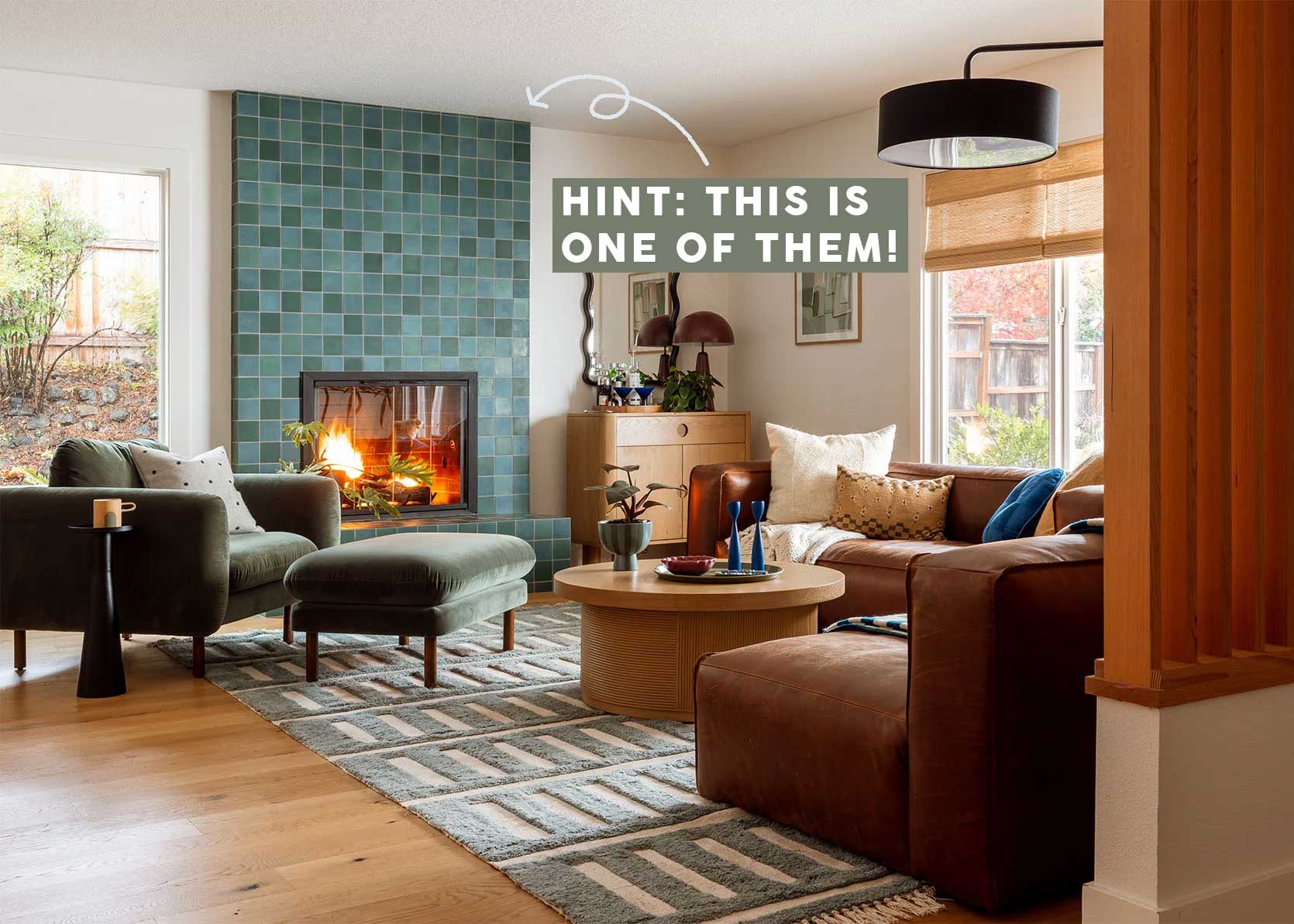
Opening Image Credits: Design by Emily Henderson | Photo by Kaitlin Green | From: Kaitlin’s 70s Inspired, Colorful And Cool Living Room Revealed (Y’all, I’m So Jealous)
Wow! I’m not sure I can lean into wallpaper borders again, but my son just bought a craftsman four square that has some lovely a and c original details! He’ll love to hear he’s right on trend!
I love a craftsman home SO MUCH. Congratulations to him and the family!
Ahh, I’m reading from the lovely confines of my teal/peacock blue reading nook, in a home where I’ve hand-painted some faux wallpaper-type details. I personally love spotting trends, even if I simultaneously find them silly, and I so appreciate this roundup. Also, I believe you’re right about these [except that I’m not sure lacquer ever went anywhere!].
I hear you on the lacquer but I do think for years, all-matte-everything, from paint to pottery to dinnerware, reigned supreme. If it wasn’t matte, it wasn’t chic, and I think we’re finally lifting the veil on that a bit.
Agreed. Remember how exciting it was when Farrow & Ball unveiled its dead matte finish? But lacquer, I think, has been an accepted classic throughout all that.
I agree – I mean lacquer is centuries old. But I think it’s gone through phases when it was harder to find in new things. I saw the East Fork update and, to be honest, am not sure about it. So gloss is different than lacquer and it really the trend called out here I think. When high gloss is in everyone suddenly remembers lacquer.
Loved this so much.
Fun to see teal coming back! A few years ago I had a 1980s beige / biscuit colored bathroom that I couldn’t afford to remodel, and I’m telling you every part of that bathroom was an almond-color that I particularly disliked: tub, tile surround, toilet, vanity top, floor. I finally painted the walls a dark teal and y’all, it was magic. The blue-green played off the warmth of the almond-colored fixtures and that, along with some carefully-chosen accessories, and made it look actually intentional. I’ve had a soft spot for teal ever since.
YES! I love to hear this.
Yeah same -I bought a house with that same combo – 90’s tuscan shower tiles, green teal walls- and it looks downright elegant, plays well with brown/blue/ black/white accents.
Do either of you remember the paint color you used? I have this same 90s kids bath I’d love to love.
Love this! My 20 YO stepson came home with a 1988 Corvette ($2,500 if you can believe it) to restore. This happens to be the year I graduated high school and when he opened it to reveal the bright teal interior I was transported in time. I keep joking that I am going to buy him a yellow Swatch and see if he suddenly appears in an Aha-style video but so far I am the only one that laughs at that. Anyway, teal is so lovely I am glad to see it back.
I like this post because, as a designer, I like design. I like seeing into other spaces. However, I can’t help but feel annoyed, too. Like, who cares if something you truly enjoy becomes “oversaturated”?! There have always been keeping-up-the-Joneses (coined in early 1900s)… but now with the whole world “living next door” it feels rampant and endorsed. The forever flux of ins/outs has many on a constant wheel of dissatisfaction and consumption. Yes, it’s fun to see what others are doing… I really appreciate people who make decisions based on what *they like… but this nonstop comparing, coveting and upgrading is exhausting to witness.
I hear you. I would counter gently that trend pieces can also help de-influence. For people who enjoy spending time looking at design images it can be hard to recognize why you feelings about something change. For example, seeing the rounded furniture trend or matte brass or <insert trend here> of the past few years can subtly influence a buying decision because it normalizes it. But once it is called out to your attention you can view it with a little more distance and decide if it is for you or not. Trends are inevitable and affect everyone because they affect what is available for sale. Cue Miranda Priestley you think this is about you scene from “The Devil Wears Prada.” It is the business of this blog to write articles like this and its our jobs as readers to know when to step away and get perspective.
Sorry, I don’t know the movie reference. But I think the discussion of fashion vs. style is relevant to this topic of trends. Fashion (what is “in” and currently available) vs. Style (unique combinations of choices based on personal history and emotional connections). The point of my comment was to offer an alternative perspective and encourage fellow readers to be unconcerned with the masses and instead seek contentment. Choices made a decade ago or last year don’t need to be reexamined and redone. You dig teal? You’re in luck – here’s inspiration on what to pair that with! Been on the hunt for shiny finishes? Consider this! You like chevron? Cool. I think it’s very fun and exciting to witness other’s choices. And it’s natural to want a little refresh from time to time… which can be done with simple rearranging, hunting used goods, a quart of paint, and, on the rare occasion, buying something brand new that you’re willing to keep, trendy or not. Instead, what I’m seeing is a consistent call to participate in shopping nearly every dang season. For the sake of people and planet, we must change this bad habit. And it starts with us, here…
These posts are so fun! I always learn so much from you!!
Thank you Susan!
Found the article for that first house with the brass dome pendant. Who would have thought to use vintage bowling balls as a design element!
houseandgarden.co.uk/gallery/nicola-harding-arts-crafts-house-oxfordshire
I just followed that link, looking forward to the bowling balls (I keep a three teal(!) ones as garden ornaments), scrolled on down, loving everything about that home until… oh my god! As a Californian who had just moved to SF before the big earthquake,I had a physical reaction to that photo. Still trying to pull my shoulders out of my ears.
I think teal is a risky one! I can just imagine too many people accidentally going with a too-saturated teal and making their house feel like the 2010s again (imagine paired with chevron print lol).
I definitely prefer dark teal over navy though.
Yes, I think the saturated teals in bright pop homes, paired with white and light gray, was something I admired at the time but didn’t really want. It does have a very different feel when it’s more muted and paired with browns and beiges per the examples.
Oh god NOT THE CHEVRON PRINT! I can instantly picture this 2010s room you speak out. Yes, teal needs to have some depth to it. Plenty of black in it to ground it or else it leans too aqua.
My friend’s kitchen is aqua and it’s perfect! For her! It’s her favorite color that taps back to a childhood memory. Good design has an emotional connection, and no trend can break that bond. And so, while I have never liked chevron (including herringbone), I say DO WHAT YOU WANT, PEOPLE!
Love this post! Arlyn, I just read last night that this administration is going to enact tariffs on all foreign made cabinets. I’m pretty bummed because I’ve been saving for a couple years for IKEA cabinets to redo my kitchen and I was just about to take the plunge. If you need an idea for a post sometime could you do a post sometime about kitchen cabinets? And also one about how the tariffs have affected building and renovation and design?
I would be happy to offer up some tips for finding salvaged kitchen cabinets and a contractor willing to work with them. This is what we did a couple of years ago and, with the way everything is going, I hope that this strategy will become more common. It wasn’t easy per se, but we ended up with essentially a custom kitchen on an Ikea budget, and that’s before tariffs were even a concern.
I always enjoy your insights!
Teal: Funny, while it’s definitely my favorite color to wear, I don’t love it in my home and prefer more straightforward greens and warm blues. However my new window seat is definitely peacock blue, shall I say teal blue?
Lacquer: last summer I spray painted a boring black side table with slick high glossy hunter green paint and immediately loved it! It’s great in my rustic lodge living room as a contrasting element. Too much matte/rustic is dull, it’s true.
Arts and crafts: I would love to see this become more mainstream and easy to source. Strong, plain, honest materials – I’ve always loved this. Though it can get too heavy and blocky in some iterations, overall I do gravitate toward the architecture and interior details!
Borders: not for me… I don’t like the outlining trend either. Having my eye follow a line up and around a room and doors etc is just not for me.
Thanks for another thoughtful post, Arlyn!
Love ❤️ teal. Have some fabric and rug accents with SW Sea Salt walls. I had wallpaper borders in the 80’s and loved them. Arts and Crafts furniture screams hard and uncomfortable to me.
I’ve been finalizing my wallpaper choice for my powder room. The background is teal. Cabinets, ceiling, and walls will all be teal. I’m retaining the beige-pearl tile (floor and counter), brass lighting, and round wood-framed mirror to keep costs in line.
That sounds really beautiful, Brenda!
I accidentally painted my bedroom a dark teal years ago. I had originally picked a much lighter shade but the paint store made a mistake. By the time, I saw the room the painter had painted half the room. I never would have been brave enough to pick the color but I still love it!
But can we also do a “2030” predictions article??
Yesssss!!!! Teal is my favorite color!! i just painted my cabinets a dark muted Teal. Newburg Green from Benjamin Moore to be exact. I’ve loved blue-green for as long as I can remember, soooooo glad its back!! Can’t wait to shop all the furniture and accessories in my color palette! Not sure about the wallpaper borders, hmmmmmm…
I expect to see a lighting roundup on where we can get our hands on vintage glass light fixtures that don’t cost $10,000 and up! 🙂
Please God, not teal again! We lived with it in the 80’s and it was hideous back then! Do blue or green but not a putrid mix of the two!
I’ve been on the teal and warm wood bandwagon for years and years. (Tho, I have yet to utilize the combo). It is masculine (to me) and sophisticated, and cozy, if those 3 things could ever go together.
All these images are so fun to see together – and you helped me solve a “problem” I didn’t realize I had! I’m an East Fork fan from way back and I was – for the first time! – super disappointed with their recent release. The colors and the gloss are, to my surprise, super not for me.
The way you’ve organized things here, I see my disappointment could be because I’m much more of an arts and crafts girl! I can happily leave the glossy trend to others and hunker in with my arts and craftsy self. Love that. 🙂
I really hope the Arts and Crafts prediction comes true and items of that style become more widely available. I love the wooden chairs with wide arms and cushions in that style, but Stickley is a higher quality than I can afford– if furniture that looked like that showed up in places like Pottery Barn I’d be thrilled!
Yay for teal! Along with dusty aqua (slated for my bathroom remodel), two of my favorite colors.
Trends just encourage mass consumption, environmental waste, and feed capitalism. People who feel they need to constantly redecorate because of something they saw on social media need to seriously reevaluate their lives. Social media is designed to make everyone feel insecure. The homes you see aren’t even real. They’re sets created for photoshoots or a multimillionaire’s palace.
This blog gave me both the idea and the confidence to paint the darkest room of my house a dark color a couple years ago. I worked with a painter to choose a color appropriate for the age of my house from the SW historical colors line-up, and landed on a very dark teal. I love it! The room is now a cool, shady sanctuary during the blazing summer heat, and a snug, cozy hug during the dreary winter months. I changed nothing else in the room, but the deep teal made it all sing. Maybe the teal will read as a trend for a while, but I can’t imagine changing it after the “trend” passes.
Thanks, Aryln! I love a good trend report. I instinctively used the teal, glass chandelier, and high gloss lacquer trends in my windowless basement earlier this year in an attempt to really embrace the dark and coziness of the space, but also bounce around a little bit of light. Here’s a progress pic.