Design
The Internet Has *Feelings* About Pantone’s Color Of The Year… Let’s Discuss
Did you hear about this Pantone color of the year thing?” my non-design-focused husband asked me the other night. His feeds are wildly different than mine, full of photography tutorials, comedy Reels, and nostalgic content; so for Pantone to have made its way into his algorithm tells me all I need to know this year: Everyone is talking about it, for better or for worse.
If you’re as clueless about this as my husband was last year without the viral chatter, Pantone—an international authority on all things color—chooses a “Color of the Year” every December. Since 1999, many other companies, from paint brands to home siding manufacturers, have followed suit, none more awaited than Pantone. Their selected hue for the upcoming calendar year speaks to the intersection of culture, current events, and design. So, while you may see a velvety peach as a choice (like we did in 2024 from them), it might not mean that soft oranges are trending in the traditional sense, but more so that the “mood” of our world, through their lens, matches their pick. Their language used around the shades often sounds like this (from 2024): “PANTONE 13-1023, or Peach Fuzz, fosters a sense of closeness and connection, acting as a balm in times of uncertainty.”
In a moment of upheaval, discord, and change, fraught with what feels like an epidemic of selfishness and a distancing from the greater good by authority figures (not to mention, though unrelated, a move toward maximalism and an explosion of color and patterns in our homes lately), Pantone decided to choose…
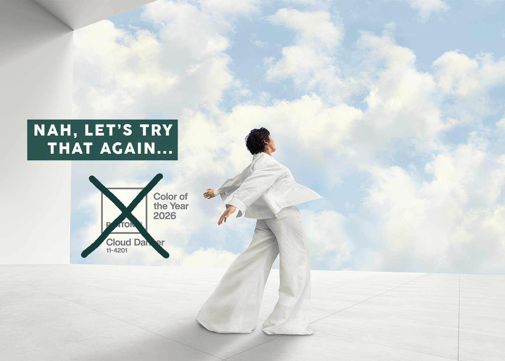
White.
PANTONE 11-4201 Cloud Dancer to be exact: “A lofty white that serves as a symbol of calming influence in a society rediscovering the value of quiet reflection.” Hmm…interesting choice of words.
I’m not the only one who took a moment and thought “uh…what?” Almost as if an Amber Alert went off on all of our phones and we collectively got to work sharing our not-so-quiet reflections on our social platforms, my feeds exploded with stunned and salty opinions. At best, Cloud Dancer feels lazy; at worst, at least according to some enflamed posters, tone deaf and even in support of an “all-whites” agenda.
The Reactions & Rejections
Let’s take a look at some of the strong feelings heard around the interwebs.
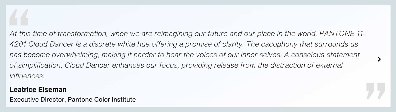
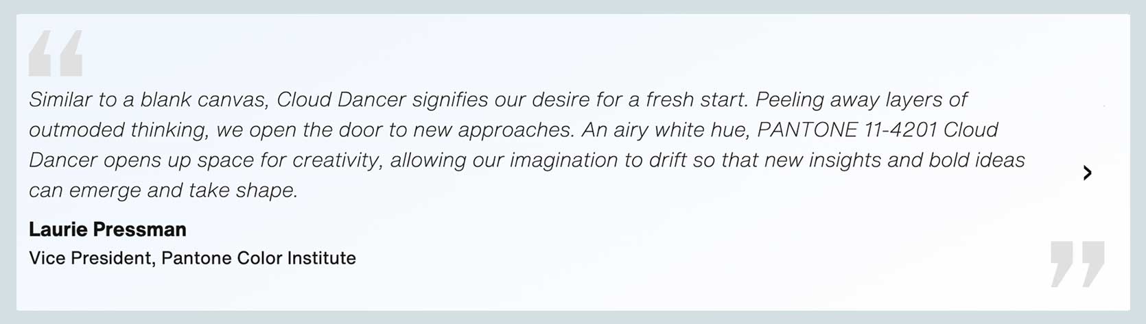
I admit, initially, I let the outrage fuel me. I saw someone write that the noise around the color is louder than the color itself, which was spot on. After sitting with it for a few days, I decided that, for me, it’s simply uninspiring. Those copywriters had to work overtime trying to find a way to make white—and mind you, a boring middle-of-the-road white with no leanings to warm or cool—sound interesting. Here are quotes from two figureheads over at Pantone, and boy, I’ve never seen so many creative words used to describe landlord white:
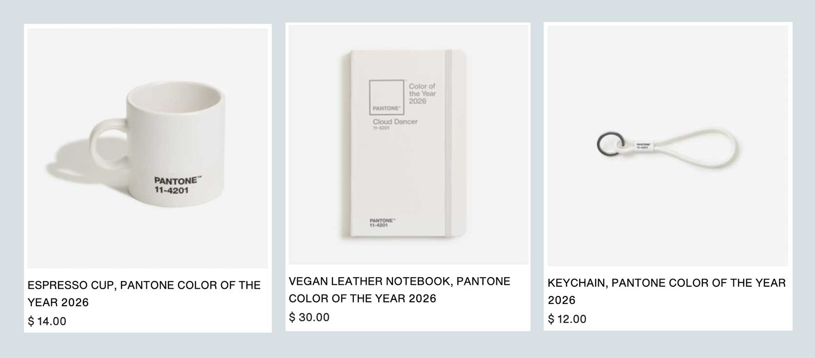
The product collaborations attached to this release are even more ironic-chuckle-inducing. There’s white Play-Doh. A white mug. A white keychain. A white notebook. Joybird, which has been releasing a special Pantone COTY collab line in recent years, launched…white furniture. You mean, what they already had lying around in the warehouse, perhaps that they just renamed to Joybird x Cloud Dancer? It’s just silly.
Is Pantone Just Rage Baiting Us?
I even saw an article by Allure (yes, the beauty/women’s lifestyle mag), questioning if the choice was just intended to be rage bait. To reignite people’s attention and feelings around the Color of the Year conversation that has felt a bit stale in the last few years. Frankly, the last time it felt interesting to me was in 2016 when they launched the first “we couldn’t decide” pairing of Rose Quartz and Serenity. And I can almost guarantee that everyone will be watching next year to see how far it swings away from Cloud Dancer. Genius marketing and PR move or just obnoxious? (I’m leaning toward the latter; don’t act like you’re trying to say something about stillness and calm if your actual intent was to poke at the embers of society, you know?)
But something I’m working on in myself recently is remaining curious rather than jumping to assumptions. What if, indeed, Pantone, was looking for a clean slate? Intentional restraint from all the noise *everywhere* and *everything.* Sure, “white” is kind of insulting in its simplicity for something of this nature, but last year was brown (Mocha Mousse). Personally, I know that my entire spirit is fatigued for many reasons, so perhaps the void that a color like Cloud Dancer creates is a quiet fortress of solitude that is very much needed right now for some of us to escape from constant distraction.
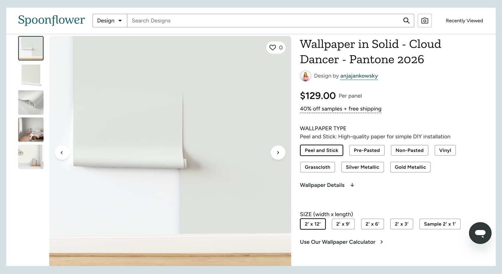
Does it make for exciting product releases? Absolutely not. Some of them are maddeningly mind-numbing, such as the Cloud Dancer white wallpaper—pictured being applied on top of a white wall—from an artist on Spoonflower. In previous years, the brand released very fun prints in partnership with the color authority (here is last year’s); this year? Nothing officially, just whatever the third-party artists have done themselves…and I don’t blame them. As a design editor, my inbox is always jammed with outreach by PR people sharing products from their clients in shades similar to the COTY, hoping I include them in a roundup about the announcement. This year, I got two messages. TWO. Talk about a blank slate….for my Gmail account. It quieted the noise in that sense, that’s for sure.
What Does Cloud Dancer Say For Interiors In 2026 & Beyond?
Because this is a design blog and not the Op Ed section of your chosen newspaper, I want to offer up some interiors-focused conversation, as well. For instance, when I brought up this topic to Emily, her initial quandary was: “Does this mean clean and bright interiors might make a comeback? And, even more controversial, are cooler whites going to prevail over the dominant warm white in 2026?” I don’t know, but it does match the natural progression of things. I think warm neutrals still have some juice left in their fruits to squeeze, likely for another three to four years. But then what happens? Well, people flip to the opposite spectrum. No more warm undertones, all in on cool whites and grays, just as it happened in the early 2000s. We went from cherry red woods and brown and beige everything to millennial gray and contemporary whites. Time will tell, I suppose.
Until we get there—LORD PLEASE LET’S NOT GO BACK THERE—I wanted to celebrate some selected colors of the year from other companies that feel like the people sitting in the room making the decisions were not trying to enrage us, but rather inspire us.
Let’s start with Coloro x WGSN, who released their 2026 COTY back in 2024, and have just announced their 2027 hue. Yup, they work that far ahead, unlike some of the other brands, given their nature. WGSN is a trend forecasting authority that heavily drives product manufacturing, while Coloro is a color expert, so the two come together to pick a singular Color of the Year.
For 2026, they went with Transformative Teal, which is absolutely luminous. The kind of color you can’t take your eyes off of; that you dream of being bold enough to use in some capacity. It’s rich, dramatic, and timeless in the right application. Take a look:
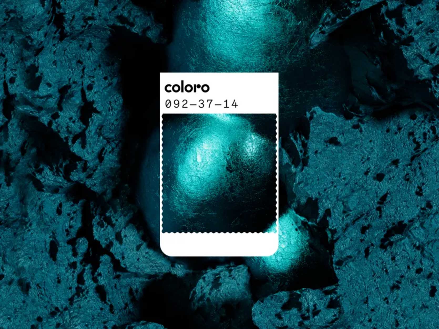
Can you imagine that on a hand-glazed tile in a bathroom?!? As a border accent on a fabulous rug? It says something, unlike ::cough cough:: basic white.
Now, onto 2027 for WGSN x Coloro. Get ready, because if Transformative Teal spoke volumes, the next one has a megaphone in hand.
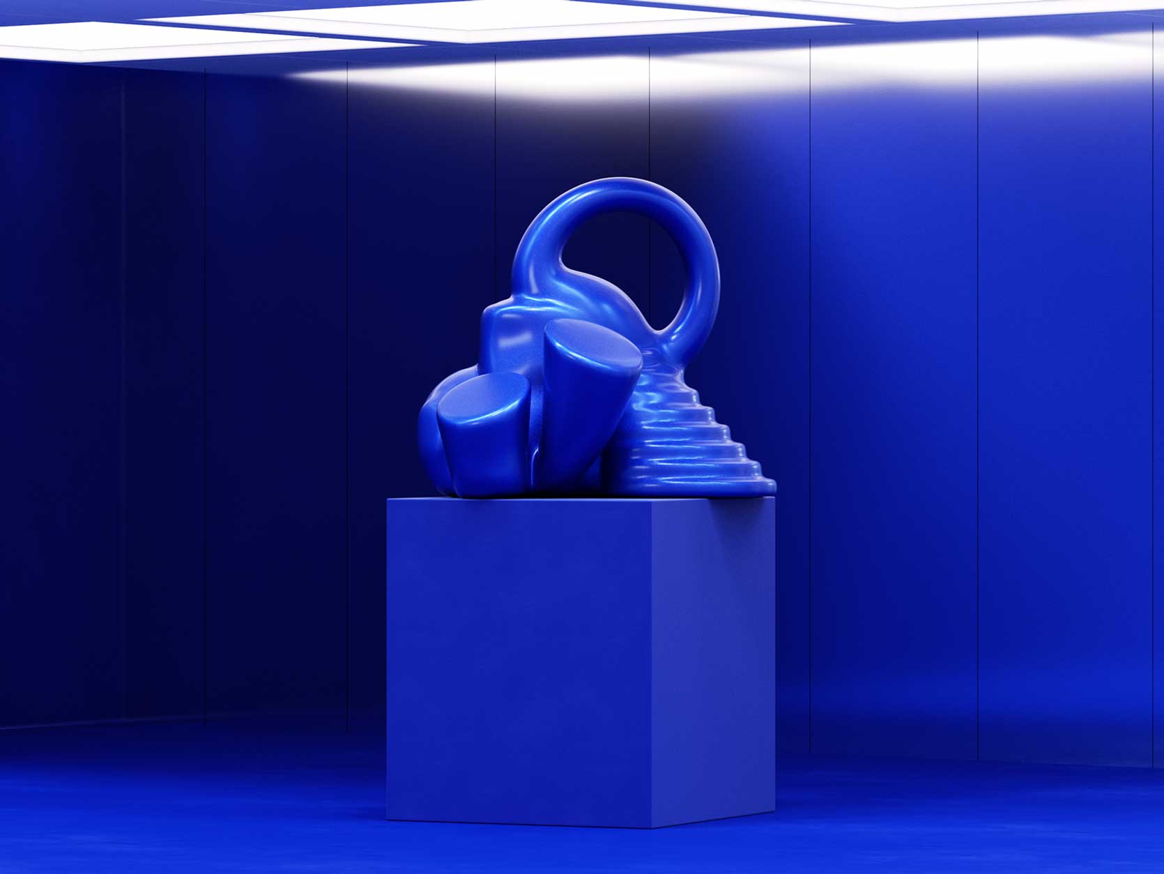
Feast your eyes on Luminous Blue. ::stands up; applauds; hoots and hollers:: Look, making a claim to a color of the year is far beyond what color we’re painting our walls, okay? You might see this International Klein Blue-esque shade and think “not for me or my home,” but it goes well beyond the walls you surround yourself with. It informs fashion, packaging, product design, branding, and marketing. Something like this is not quickly forgotten, and isn’t that worthy of celebration?
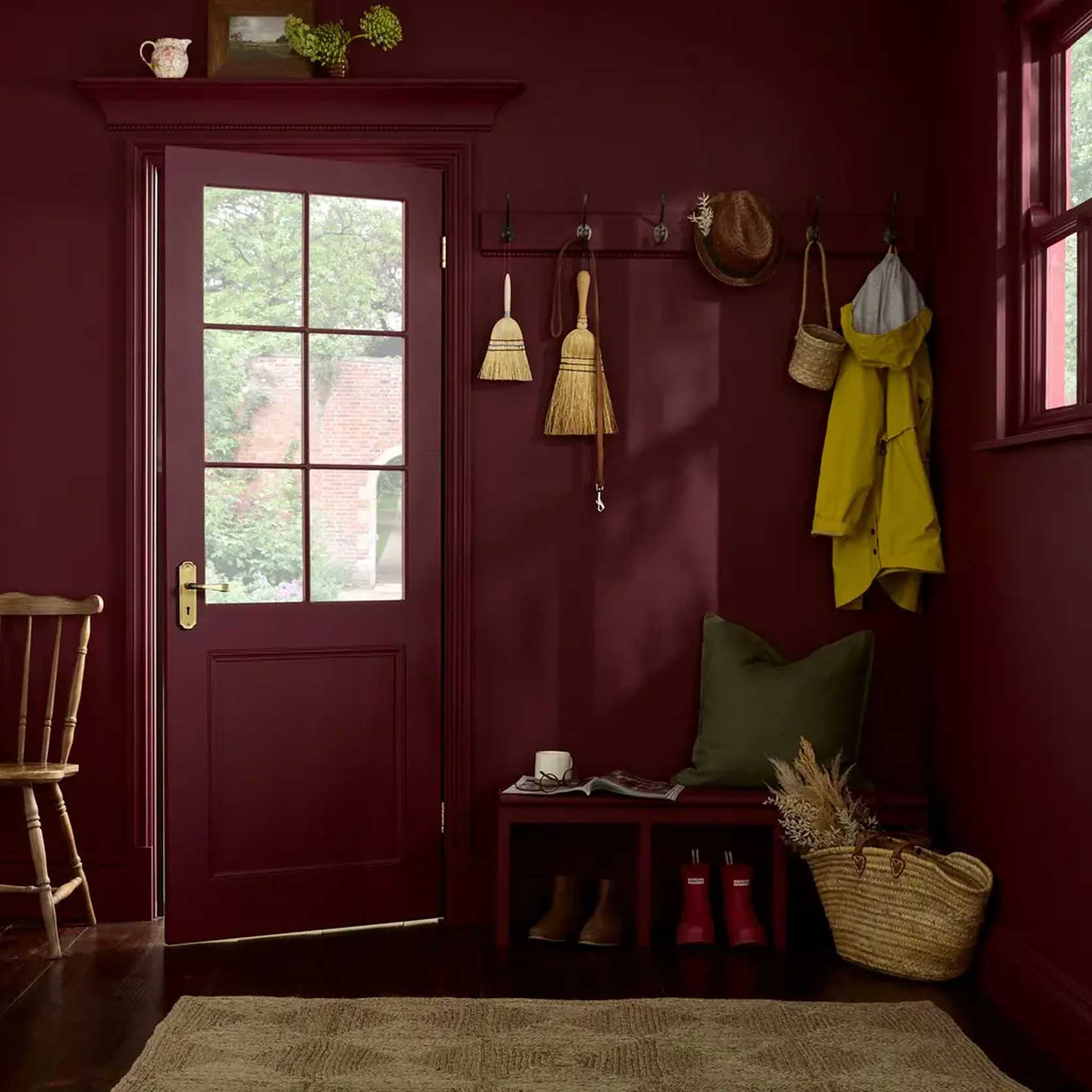
This third color, Divine Damson by Graham & Brown, is yet another intense jewel tone, and I’m making no apologies for it. Rather than quiet reflection and going inward like Cloud Dancer claims to want us to do, I think we should all be living our truest, most daring version of ourselves. No more fakery, no more shrinking. Be authentically you; sure, that might be a person who feels most stable in a bright and neutral room, but it could also be a person who wants to be hugged by mulberry-meets-garnet burgundies.
And finally, in an honorable mention position, is Behr’s Hidden Gem. This was the first COTY announced this year from the paint company heavy hitters, and I’ve gotta tell you, I wasn’t overwhelmed with emotion when I saw it. Mostly because I feel like I’ve been seeing it for a while now. It didn’t feel new or fresh or forward-thinking. Unlike Transformative Teal that has an incredible depth to it, this one is chalky and milky. It’s beautiful, sure (I had walls in a very similar color years ago by Farrow & Ball), but it’s expected.
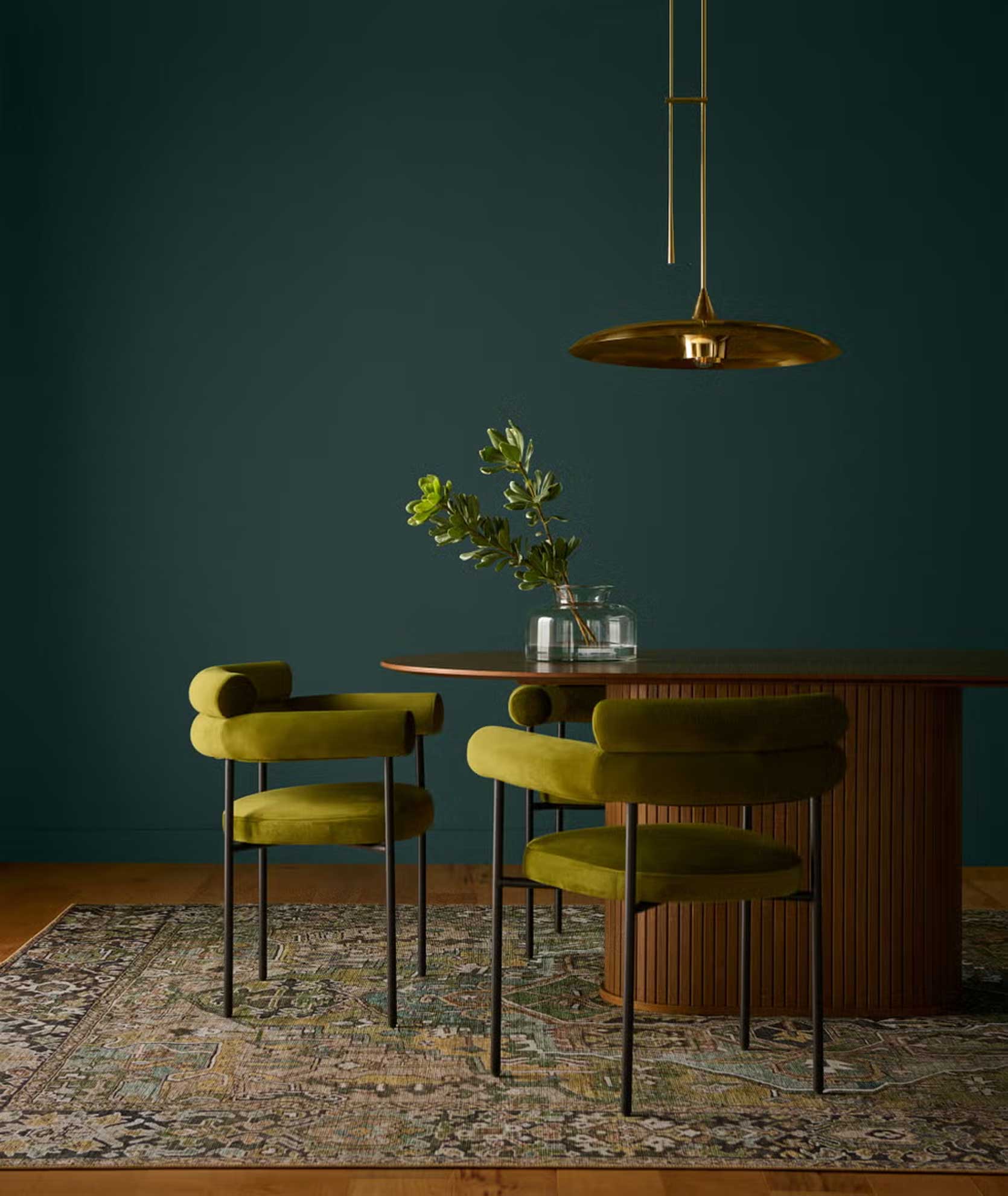
HOWEVER, I’ll still take it over Cloud Dancer, and for that, it made my list. It’s soothing and welcoming and pensive, and, from a design perspective, works beautifully with tons of other shades; I’m partial to warm-leaning colors like the olive in the chairs above.
—
So that my friends, brings me to the end of my rant about color. Based on how many articles and posts have come out on the same subject, some might say Pantone has won. The most genius Public Relations move; but I don’t like feeling as if I’ve been had, so for that, I’m a hard no on Cloud Dancer.
I’d love to hear your insights, thoughts, comments (angry or happy or otherwise), and especially anything I’ve missed or haven’t taken into consideration. What are you seeing that I’m not? Let’s keep talking about it.
Until next time, friends…
*Opening Image Credits: Photo courtesy of Pantone


Lol can you imagine going through the headache of wallpaper only to wind up with…white walls?
Personally, I LOVE the teal and damson, but that 2027 blue just feels like a rehash of the cobalt that was big in the 2010s.
Ehhhh. After a year of near-monthly layoffs in the advertising industry and the certainty of more to come after books are closed at the end of the year, I get where Pantone is coming from.
A Color with no noise. A color that gives many of us the mental break we need after a year of getting pummeled.
Color is emotional. Just like the green during Covid or Millennial Pink, Pantone releases colors to sum up a collective feeling.
It may not be where everyone is. I won’t fill my house with that color. But it does feel right to me in a year with very little right
Whether Pantone was trying to send a “we all need to chill” message or was just looking to create controversy, the bottom line for me is that the Pantone color of the year is supposed to spark design inspiration and Cloud Dancer doesn’t. It’s just boring. The debate is more interesting than the color, and I don’t pay attention to Pantone’s color of the year for debate.
People are collectively so upset about so many things in the state of our world, it feels like heaping rage on a COLOR CHOICE is a safe place to focus that rage energy that doesn’t hurt anyone. For myself, I cannot muster up the energy to be mad about a color, or to heap layers of meaning upon it that may or may not be there. When we get into a fight at our house, we always ask “what is this REALLY about?” It’s almost never the thing we think we are fighting about. None of the explosion of feelings happening over this choice is actually about a color. We are just heaping our feelings about whatever is bothering us into what feels like a safe “basket”. It has been interesting to observe but in the words of Shakespeare (maybe?) ” a lot of sound and fury signifying nothing”. And I love your discussion about it.
I totally agree and felt the exact same way (i.e what is this really about). Love this discussion, Arlyn.
It’s fun to ping pong around about!
I think it’s easy to take out our frustrations on something as meaningless as a color choice by Pantone. Like punching a pillow given the state of the country (and the world, in general). For anyone right now feeling slighted, especially speaking as a woman of color myself who has seen the very obvious writing on the wall that our country, which not long ago celebrated our cultural wealth of immigrants, is trying SO hard to white-wash as much as possible, it’s not far-fetched at all to see why THIS in particular would twist up some knickers.
I don’t have strong thoughts on the color itself but really enjoyed reading your thoughtful analysis.
Same here!
Thanks Emily!
As a gallerina (aka art gallery worker), I love this. I like white walls with the color and focus coming from the art on them and the furnishings in them. It allows focus on what you have chosen to put in the space rather than on the space itself.
Everyone is different though and I love the discussion! When I am asked What is your favorite color?, my response is For what?
I find that white walls work on average for most art work. Going to museums and art galleries, where the wall color is carefully chosen to go with the art work is so much better. The white wall and art work is rather an easy way out in most cases. And in homes with white walls and art work, it’s like the art kind of floats in a cluttered, not grounded way, compared to walls that have a color to them.
Museum worker here, which is a different setting than an art gallery. In an exhibition, wall color is part of creating the “story” of the show. Are we trying to evoke a specific era? A mood or a feeling? Compel people to look closely and make them linger? Or move ’em along? Disappear a janky ceiling grid? White is not always our friend in achieving these goals. I think applying a similar goals mentality to interiors can be useful!
I would have liked this article more if Arlyn had actually followed the curiosity and explored more of the (possible) return of cool-toned whites and interiors!
I’ll likely have more to say about this soon enough!
When Alabaster was the color of the year for Sherwin Williams in 2016 I don’t remember it getting this kind of backlash. In fact, many, many designers and internet people used it in their own homes, and it even influenced me to use it in my house in 2019. Now, Pantone isn’t a paint company, so it doesn’t have that applicability like a shade of white paint does, so it does feel pretty disappointing. I am not on social media any more, so although I did see the announcement I missed the backlash. Even for myself I found it blah. I do wonder, though if the other comment on here talking about having a safe place to put our general anger at the world coming out on the internet.
Sherwin Williams is a paint company. Pantone is not.
My first response was that the timing for home things in this color seems off. The all white kitchen trend was a bit ago, and that seemed like the time to have this be the color of the year.
I also think they could have gone with a more specific white that leans strongly towards some undertone. Don’t care which undertone, but do pick one.
I live in a 1962 mid century modern gem with white walls everywhere (except the basement where I veered into butter yellow). Previous owners chose SW Dover White and I stuck with it so I could repair and touch up without repainting the entire interior. I guess what I’m trying to say is that clean crisp white never went out of style for this house and never will. We add warmth through wood cabinetry, paneling and colorful decor. Not sure this adds much to the color of the year discussion but I felt compelled to weigh in on the beauty of spare interiors and clean white walls.
SW Dover White is not white or blue-white.
The color is perfectly appropriate for a time when everyone seems to be walking on eggshells. That being said I hate it.
My friend who has a MFA called to tell me that in art colour theory, white denotes economic hardship and poverty and I was like – that tracks
I’m not upset about it and it makes sense to me. Susan’s comment below is spot-on! I see a basic white as a canvas, a blank sheet of paper, an opportunity to reflect and choose my response without distraction or stimulus. That is what I hope to carry into 2026 and so this color selection is fine by me.
While I don’t disagree with that sentiment at all, I think I’m just underwhelmed by Pantone’s pick because well, they are PANTONE. They could have done anything under the sun in terms of color and they picked a neutral white and tried to sell it as an intentional pause of sorts. I don’t know…doesn’t work for me.
I’m going to let it rip and paint my newly resided house BM Copper Clay and Lafayette Green.
Transformative Teal—a big heck yeah!
Cloud Dancer—not so much.
I don’t think I can give that much credit to Pantone that this was a marketing gimmick. Marketing executives are just not usually that smart. I think it was picked sincerely and they are probably thinking they got lucky (or not) with the response. I’m a big thumbs down on the colour itself – so boring.
Which I hope means Arlyn will grace us with her colour of the year like she did in 2025 – I’m still loving that mulberry pick and want to see what she has next for us!
Omg – I just looked up the post I was thinking of and it turns out Mulberry was Arlyn’s pick in 2023 – not 2025! It feels like I just read that post yesterday – time is a wild thing.
Oh trust me, it feels like I wrote it just months ago, as well, but nope! And I’m still riding high on Mulberry, tbh! But I’ll think more on specific colors.
What marketing people have you worked with? Happy to have surrounded myself w smart, driven, insightful and creative marketers across a range of companies.
I think I’d rather know where you work, so we can find those smart, driven, insightful and creative marketers. My spouse works for a multinational home good manufacturer with an internal marketing department and as Lia says, most of those people are not any of those things.
Thank you for sharing Luminous Blue, I am in LOVE with it! (Not for my walls though.)
Isn’t it absolutely spectacular???
I like white as a color in smaller amounts, but as someone has already mentioned, a lot of it can highlight clutter and other imperfections. I don’t think it’s universally practical for everyone. Actually, it’s not practical, unless one has a log of closet space where they can hide everything. I think most people are done with the landlord’s white or interiors that are waiting to appeal to the potential buyers. If one doesn’t live in a white rental or doesn’t want the expense of repainting their entire house white before listing it, then maybe they can’t relate to the people who are taken aback by the choice.
As for calmness and a wider perspective, I don’t think that people want to feel calm about the status of the outside world. I think they are looking to change things in their favor. Lots of people struggle in their daily lives. People seem to want to live a little more without worries. They seem to desire to do and have things that please them a bit more. Wouldn’t white be like a void in that scenario?
I appreciate that you raised this issue. While I agree with folks that the color of the year is not where I am going to put my energy, at a minimum, this choice when there is a white nationalist agenda causing havoc in our society and damage to non-white folks every day, is just completely tone deaf or whatever you want to call it. I have a lot of warm whites in my house, and like neutrals, but that’s different than picking WHITE in 2025. For folks talking about their walls – think bigger, pay attention to what’s happening in society. Poor choice, Pantone, and thank you for saying something Emily. If it’s supposed to capture the mood how about cloudy day or the blues or something capturing the discontent and overwhelm or even the opposite, something like a yellow called ‘brighter days’.
It’s not that serious
I am a designer for a wallpaper and fabric company. In my ten years in this role, I have never, ever had a client (interior designers, architects, and the like) ask me to recolour a designs in the Pantone Color of the Year. Make of that what you will..
Well.
I feel ignorant. I had no idea this debate was raging. I don’t take notice of COTY (as I will now call it). I absolutely love bright ppl colour and pattern, in my home and in my clothing, but I will always and forever love white too, because it makes my colours pop. I also love black for accent and depth and contrast.
I kind of can’t believe that this whole thing has blown up like this. Do we honestly think that Pantone are white supremacist or that they want to ‘rage bait’, another expression I am not familiar with? Those are pretty hefty accusations. I’m guessing they were trying to differentiate themselves in a crowded market and did not predict the fallout.
Either way – bloody hell!
With you on this.
I’m blown away by the amount of blowback I got from covering the debate in my newsletter. I didn’t even share my own take, just described the different perspectives and shared some historical context. The reader emails have been… illuminating. One woman told me the newsletter was “difficult to read.” (Cue tiny violin.) I honestly still haven’t made up my mind about the color choice itself, but I do think that we need to learn to disagree about things without being awful to each other and disagreeing about color seems like a good place to start.
(Omg, I love your book! I have it out from the library right now for the second time!)
A screen fading to white, someone *literally* dancing in clouds…all I could think of was death. A very dangerous message for people as desperate and helpless as many are now, or soon will be. At the least, it’s stark and cold for people who struggle everyday put one foot in front of the other because of the horrors. This is not a time for quiet introspection. This is a time for action. The Insta posts won’t show for me, so apologies if this has been said.
Love the discussion, Arlynn. Pantone seems to have lost their way, which is not surprising in the turmoil of the world and the gutting of the advertising industry of which Pantone used to be an inextricable part. It seems in the last few years, the chosen colors are akin to hiding places (from the stress of the world). This “lofty” rationale approach (putting aside for a second any potential click bait or not-so-tacit-racial-ignoring [at best]) forgets to ask who or what will this color choice serve — both socially and practically. Is white the blinding light that you see at death’s door because we can’t take it anymore? Is this what we are all doing now, giving up? Not inspiring. At all. Now that teal… there’s some life. There’s some inspiration! Thanks for all your do, Arlynn!
As much as I appreciate your insightful and creative blog daily, I am sitting here with my jaw dropped. I never ever correlated cloud dancer, which also happens to be in two of my rooms, as a racist agenda push. Please! White is blank canvas, a starting point, absence of all other influences, free of obligation, unintentionally intentional. How beautiful if we could find beauty in ALL of our creation’s colors instead of imposing an agenda, forcing racism into everything, and assuming that we as individuals must associate ONE of a billion colors with skin color.
There’s beauty in *everything* God created and we also have the God-
given freedom to choose colors on our own accord. We have our own opinions on what suits our needs, and our own uses for color, texture, art, nature, materials, style…and every design element you can list here.
All of this is a blessing indeed.
Thank you for an intelligent, measured and realistic response to the ridiculous madness of equating a paint color to racism. I noticed no one attributing the same to last year’s choice. As someone said above, “it’s just not that deep” and if you go there with it, you might want to re-think how you spend your time.
I am surprised nobody has said this yet, so maybe I’m an outlier, but I feel like the rationale on this (from Pantone, not Arlyn) is all wrong. We’ve been furious and unhappy about the state of the world for a while, so maybe a blank slate would’ve seemed appropriate a few years ago. But choosing zen didn’t work. And there’s a bit of a lonely, solitary vibe to the white and the imagery Pantone chose. What I think people want now, and what is reflected in that teal and blue, is joy. I think that’s why people are embracing maximalism now. They miss vibrancy.
Yes this is exactly right! Perhaps the approach of “here is a reflection of what people are feeling” rather than “here is something to hope for” is all wrong. I like this, Amber!
White is trending hard in Australian interiors and has been for a couple of years. Google “Three Birds Renovations” for examples. I guess it works well in our warm climate because in most parts of Australia we don’t have to worry about our interiors feeling “cold” in winter. White on white can be a stunning design choice when it’s deliberate and executed well, with textural elements and sculptural shapes for contrast. It’s also a classic fashion move. Reading racist motivations into a design colour choice is quite strange in my opinion. Being offended by a paint colour must be an exhausting way to live. Interesting discussion though.
I don’t care for this color and I don’t care for the political outrage. I find both silly.
Is it their way to yell “RESET”. The world right now is truly in need of one. Maybe they look at it as a blank slate. A way to start fresh. Honestly, I think I may have chosen a Red color for love as I think the world needs more of that than anything else.
I think it’s a reflection of the dearth of creativity in 2025 and the dullness of 2026’s AI landscape. Cloud Dancer does not make me mellow out. It just turns my brain off. Like endless scrolling on the internet.
I’m happy with exactly how you have dealth with this subject matter in such a exact method. I discovered your web-site although searching by means of Google and I’ll need to admit that I’ve subscribed to it already.
I’m surprised there wasn’t a mention of color regarding physics vs color regarding art/pigmentation. In physics- white is ALL COLOR, the spectrum (red, green and blue when it comes to light) are all visible/reflected to create white. Black is the absence of all color when it comes to physics. Paint/art is where this reversed. White is the absence of color and black is the presence of all colors. If one chose the context of physics and another of pigmentation, each come to a very different conclusion. And THAT feels like the state of our world IMHO.