Design
Kaitlin’s 90s Builder-Grade Primary Bathroom Makeover
And we’re back! It’s been a little over three months since we ripped out our small, builder-grade primary bathroom and our daughter’s bathrooms for a much-needed update. I’m so happy to finally share that the bathrooms are complete!
Last time you heard from me, we had just demo’d, and I shared our rough design plans for both spaces. Something I failed to mention in my previous post–I’m an interior design school dropout. I was so close to going to Savannah College of Art and Design. Loved the city, loved the school, but as a small-town girl from Oregon, it was much too far from home for me. I settled on Oregon State University. However, by my second term and starting the Kitchen and Bathroom Planning course, I hated it. Seriously–way too many numbers for me! AutoCAD–woof! After barely making my way through that, I got into the photography department, and the rest is history. It’s quite comical and full circle that I now photograph interiors after an 11-year run as a wedding photographer. All of this to say, I mostly just enjoy design–being a designer is not a goal of mine. But, it sure was fun to play one in my own home for a couple of months! (I still hate numbers. Thank you, Emily & Gretchen, for all your mathing during this process, especially with the tile order!)
Back to it.. As a refresher, here is where we started.
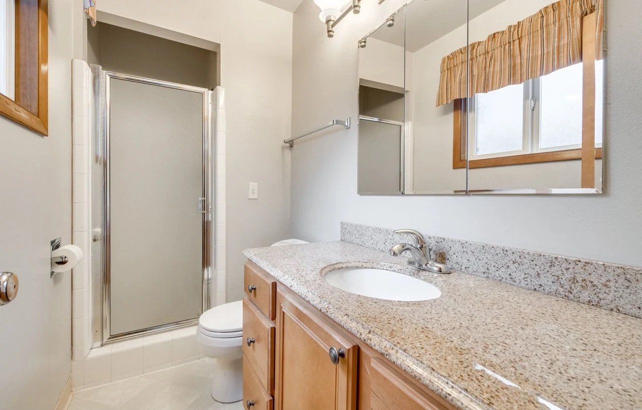


The bathroom was boring, dark, bland, and just so, so sad.

Medicine Cabinet | Vanity | Tile | Checkered Towels | Striped Towels
And here is the mood board we created for the space.
I photographed The Carly back in the spring and had the pleasure of joining the EHD team on their retreat there. I’m so inspired by all the design choices that Max Humphrey and Curtis, the owner, made throughout the property—especially in the bathrooms. Each one had its own personality with paneling and pretty tile.


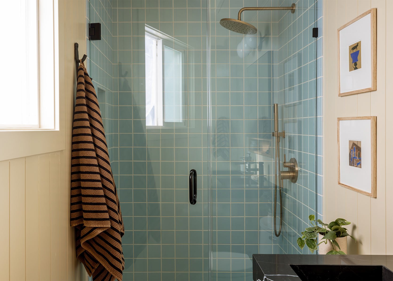
While our home’s style (and budget!) is definitely different from The Carly, it was fun to pull a bit of that inspiration into our own bathroom with paneling and a bolder tile choice. Also, ever since we paneled our basement, I’m pretty hooked on the look—I now want to either panel or wallpaper every room in the house. It just adds so much warmth and texture compared to painted drywall.

For our basement, we used Metrie’s individual planks, but this time around, since space was tight and every inch mattered, we went with panel sheets instead. It was a pretty affordable way to get the look we wanted. All in, we were able to panel both our bathroom and the girls’ for about $750 in materials.
The Demo
As I mentioned in my last post, we didn’t have the budget—or the space, honestly—to expand the overall footprint of the bathroom. But we were able to enlarge the shower area, which felt like a huge win. There were a lot of exciting moments throughout the remodel, but seeing that header come down and the wall open up was easily one of my favorites. The shower is now nearly twice the size, and it completely transforms how open and spacious the whole room feels.


Tile & Grout
Once the demo and rough plumbing were complete and paneling was up, it was time for tile. Fireclay was so incredibly kind to gift us the most beautiful blue square tile. It’s exactly what I’d been searching for. We went with 2×2 tile on the floor and 4×4 tile on the shower walls. I was leaning toward a warm, neutral gray grout that would complement the paint color we’d chosen, but after bringing the grout deck over to the River House one afternoon and getting Emily and Gretchen’s input, we ended up choosing Alabaster. I had a lot of creative freedom on this project, but I’m so grateful for Em’s perspective on this one—once the white grout went in, the tiles totally popped in a way I hadn’t expected. Yes, it’s white grout, and yes, as a bit of a clean freak, I’m nervous about keeping it pristine. But honestly, that doesn’t outweigh how much I love the look. I’ll just have to be diligent about scrubbing the grout and never wearing shoes in the bathroom, like, ever.


Ok, ok, enough chatter. I think it’s time for the final reveal!
The Reveal!

Wall Color | Tile | Shower Fixtures | Shower Doors | Striped Towel | Toliet | Vanity | Baskets | White Towels


Art (vintage) | Frames | Planter | Shower Fixtures

Tile | Bath Mat | Baskets | White Towels
The Medicine Cabinet & Vanity

I absolutely love this vanity. I was very impressed right when it arrived, and we opened it up—the quality is incredible and honestly feels custom. I don’t usually gravitate toward black countertops, but when I saw this one on AllModern, I knew it would be perfect for our space. The veining adds just the right amount of personality and gives it that luxe, designer feel. I hadn’t been specifically looking for a double-sink vanity—especially since our space is small and I didn’t want to lose valuable counter space—but I’ve been pleasantly surprised by how roomy it still feels, and how much I enjoy having our own little zones.


Faucet | Striped Hand Towel | Toothbrush Holder (unavailable)
One of the few things I actually liked about our bathroom before the renovation was the medicine cabinet storage—I knew I didn’t want to lose that. When we found this cabinet, it felt like the perfect match for the new vanity. They’re not from the same line at AllModern, but the white oak finish is an identical match, which makes them look completely cohesive.

Vanity Light | Medicine Cabinet | Vanity | Faucets
Technically, the cabinet is designed to be wall-mounted, but because of our layout and the overhead lighting we chose, our contractor recessed it slightly into the wall. I love the subtle black trim around the edge and the little wooden shelf below.


The Skylight

As you know, Em is a big skylight girly—and so are we. We already have a large one in our kitchen and another at the top of our stairs, and we’re so grateful the previous owners installed them. When we started the remodel, skylights weren’t at the top of the list, but we were definitely hoping to add them to the bathrooms, knowing they’d make a huge impact—especially in the girls’ bathroom, which we’ll be revealing next week. The installation ended up being a bit out of order because of installer availability—summer in Oregon is a busy time for skylights, as you can imagine. By the time they went in, the bathrooms were nearly complete. Since we didn’t want to make any major structural changes, we opted for a smaller skylight over the vanity area. Even with just a small skylight and our existing window, the difference was dramatic. Huge thanks to Velux!
The Light Fixture

If you remember from my moodboard, I originally planned to put two lights flanking the medicine cabinet. However, once all the final measurements were done (again, I’m not really a numbers person—oops!), it became clear that side-mounted lights just weren’t going to fit. So, we opted for a fixture above the mirror, and I couldn’t be happier with both the look and the light it produces. On that note, I’m a big believer that every single light switch should be on a dimmer—even in bathrooms. So yes, this one is dimmable, and I absolutely love it. Especially during these dark winter-like mornings when waking up feels so difficult.
Worth noting because I know it was a hot topic in the River House Game Room comments last week, I did Photoshop out the outlets behind our vanity. I promise, I have zero intentions of trying to deceive anyone! We didn’t really put much thought into ordering pretty outlets until it was too late. The plates we had installed are pretty darn big and white and don’t really go with the overall vibe of the space. Something we didn’t realize until things were finishing up— again, it’s my first time designing a bathroom, so some misses were definitely made. Lastly, in photos, they were in the way of some of the vanity styling that pulled your eye a bit too much. Ideally, we would have put an outlet on the wall to the right of the sinks, but due to the new pocket door placement, it wasn’t possible. All of this to say, sorry if it’s a bummer to not see them, they just weren’t very pretty!

Here’s the view from our bedroom looking into the bathroom. We definitely wanted the bathroom to feel cohesive with the Kelly Ventura wallpaper we chose for our bedroom.

Here are some pretty exciting before and afters:


And that’s a wrap on our no longer builder-grade primary bathroom! A huge thank-you to AllModern for the beautiful bathroom fixtures that truly brought everything together. And a big thank-you to Emily as well—for your guidance, and for letting me take the reins on this one. And thank you for all the hard work to Ken (Em’s brother), Nick, and Ben at Afore!
Come on back next week for a fun little reveal of my daughter’s bathroom!
*Design and Photos by Kaitlin Green


So beautiful, Kaitlin! All of the elements work together so well. IMO, the blue tile makes the space sing. You worked miracles with that small footprint.
Thank you, Kim!
Love it!! I’m looking at similar blue tiles for my own bathroom so enjoyed seeing those. Lovely, liveable, inviting bathroom. It’s a vibe!!!
Look forward to seeing next week’s now. I’m really enjoying your whole house.
PS please keep us informed how the grout turns out. Very interested in the specifics as I’ll need to make my own call for the blue tiles I’m considering.
Thanks, Sally! I just KNOW the tile isn’t going to stay white white forever. But, maybe it’ll change so subtly we’ll never really notice? Ha!
I work in hospitality design and we often consider high performance grout or epoxy grout. High performance grout has some stain resistance, but epoxy grout is definitely the preferred choice to resist staining. Of course these options are more expensive than a traditional sanded grout and are more labor intensive to install, but if you have a small bathroom and a very experienced installer, it might just be worth it.
I swear by high performance grout in bathrooms. (And I’ve even used industrial grout for exterior applications.) What you spend up front in material cost you make back in lower maintenance and lower stress.
These days do most tile installers use the high performance grout or do you have to request it? I feel like its almost common? But maybe just depends on the installer.
Probably my fav view is the pop of pretty blue from the bedroom. So lovely
The shot of the floor tile, grout, rug, and white oak sings! The colors are working! I hope fireclay uses that shot.
Also I just know, are you going to switch out the cover plate? What would you have done differently?
Thanks, Sarah 🙂 And yes! Planning to swap out the switch plate. Was actually just on Anthropologie this morning looking at some cute ones they have. Could also go the Etsy route. Rejuvenation has some as well for a bit of a higher price point.
Amazing! Love seeing the medicine cabinet open. What are the dimensions of this bathroom (WxDxH)?
Looks great! Can’t believe you had so much shower space just boxed behind that wall. I commend your commitment to the white grout – would love a follow up in a year or two for how it holds up to real life!
We couldn’t believe it either! Especially since it was SO TINY before.
Wow, it’s like walking from the restful meadow of your bedroom into a Spring time blue sky in your bathroom. What a difference it must make on gloomy PNW mornings. Lovely!
Dang, this is SO PRETTY!! If I were looking at paint chips in Sherwin Williams, I likely wouldn’t have gravitated toward Natural Wood, but on the paneling in your space it’s absolutely delicious. (Paint colors are so odd that way.) Now I want to paint my bathroom this color. 😆 I also love that the contractor recessed the vanity slightly. It looks so custom. And the pocket door is darling. Thanks for sharing with us! What a home run!
Thanks, Stephanie! We’re so thrilled we added the pocket door. For such a small space, it make a really big difference — my husband and I can both actually be in there at the same time without the door being in the way!
what is the paint color in the bathroom, on the paneling? it is dreamy and id love to sample it in my dining room!
Paint is Natural Wool by Sherwin Williams!
perfect!! very excited to try this out!
I love it sooooo much. Already plotting where I can use this paint color in my future
A beautiful, timeless but special design for a relatable primary bathroom. The blue Fireclay tile is gorgeous and all the colors and finishes flow from the bedroom to give a calm relaxed vibe. I’d enjoy getting ready for the day in this space.
SO pretty!!! you have the best eye!!!
This is so gorgeous. Not my specific taste, but I still really like and appreciate it, which hopefully you take as a compliment! Crowd pleaser, so to speak.
I’m also considering paneling in our bathroom, but am not certain how to make it work as there’s a dormer in part of the bathroom – is it weird to only have paneling on some of the walls? Hoping to crowd source opinions, haha.
Have you seen Chris Loves Julia’s bonus room in their current home? They added paneling and have dormers. You can see how it turned out.
chrislovesjulia.com/diy-how-to-add-a-planking-to-any-wall-or-room/
chrislovesjulia.com/shop-our-house/bonus-room/
Such an incredible transformation!! And a great post too 🙂 This bathroom is just soooo good. Well done, Kaitlin!
Oh my goodness, I want to live in your house! Every choose you make is just beautiful! Congrats and enjoy!
Wonderful update! Could you share how much the skylight cost? I’m considering one in our tiny, dark ensuite but not sure if it’s in the budget.
@Kaitlin Green – well done, looks soooo good! Would you mind sharing the paneling you used? In the planning stages of two bathrooms myself and was thinking paneling for at least one of them. Thanks in advance!
In the post about her other bathroom, Kaitlin said “I believe we went with the 7/32 in. x 48 in. x 96 in. White Nickel Gap Shiplap Panel from Home Depot.”
Love!
It’s lovely, and I’m so envious! But a question: how do you turn on the shower without screaming at the initial cold water spray? We did a similar remodel, and no one wants to use the beautiful new shower because it requires huddling in the corner and enduring the little bit of cold overspray you can’t escape. Is there a strategy we haven’t thought of yet?
You use the handshower and point it to the floor till the water is hot, then switch to the one overhead? That’s how we (and our visitors) do it anyway and no one has complained yet 🙂
Point the shower head at the wall opposite the door. Turn on.
It’s not a perfect solution, but I always run the water in the bathroom sink until it’s hot before I turn on the shower. Takes less time for the hot water to then travel to the shower (especially if your hot water heater is a ways away from the bathroom like it was in my last apartment).
So lovely. Shockingly, I just finished a bathroom remodel using identical light blue square fireclay tile!
would love to see!
SO PRETTY KAITLIN!!!!! I mean, i said so in person but I want to make it public. What a transformation. Very proud of you, friend. xx
Absolutely adore those striped towels and fun bath mat! The whole space looks amazing. And loved the backstory – funny how the universe leads you where you need to go and when 😉
The color story and vibe throughout your home is so cohesive. Can’t wait to see the next space too.
Looks great. Where is the toilet paper holder?
Question about the sheet paneling in the basement. Is it ready to paint or did you need to sand the V grooves?
In the post about her other bathroom, Kaitlin said “I believe we went with the 7/32 in. x 48 in. x 96 in. White Nickel Gap Shiplap Panel from Home Depot.”
All spaces designed by you are effortless and stylish. This bathroom is beautiful
Beautiful!! Please share info re: paneling!
In the post about her other bathroom, Kaitlin said “I believe we went with the 7/32 in. x 48 in. x 96 in. White Nickel Gap Shiplap Panel from Home Depot.”
I know not everyone uses Insta but here’s a link to a video snippet of both of Kaitlin’s bathrooms (if it works for you):
instagram.com/p/DQ4inTUj_OQ/