
Bedrooms
Orlando’s Master Bedroom Reveal
You guys, it’s me, Orlando (again)! Since we last gabbed, there have been some MAJOR updates in the Haus of Orlando. My master bedroom is done and ready to chat with you guys about what I chose and why. It’s only been a few days since I blabbed about my plans, but if you need to refresh your memory check out my intro post AND check out my even blabbier post on Hommemaker which has before pics and my plan for the space.
The name of the game with this makeover was ME ME ME. As you know, I just went through a slew of bad luck/life happenstance and it’s been strangely empowering. When you lose things you care about (for me, a boyfriend I loved very much and my dream job), sometimes it forces you to look inward and find your innate value. When other people make you feel unvalued, you look inside yourself to ask if they’re right. And often what you’ll find is that they’re not.
For me, the past six months have made me a bit fearless. It’s kinda like “I already lost my companion and my job, what do I have left to lose?” (I mean, a lot I’m sure… SHHHHH!!!!). What does this have to do with anything? Well I’m bringing it up because this sentiment had a lot to do with how I approached decorating my new place. While I was sad to be moving into a new place on my own, I tried to see it as an opportunity to do exactly what I wanted and not worry about anyone else’s wants/needs/desires. This new place was all about ME.
This was the rationale behind this full-size grown up human man painting his bedroom pretty pale pink. I wavered about it a bit, and was like “Is this going to cause me to be single forever?” But ultimately I decided I don’t wanna date the kind of guy who wouldn’t date someone because he has a ballerina pink bedroom. I love pink, always have. And I’m super stoked on this color. The color is Yours Truly by Benjamin Moore and it’s just ravishing. Many people have reached out to me to ask how this color reads in person so I’m gonna say right now it’s a little more saturated than it looks in these pictures. In order to color balance for details in artwork and to show off bedding, etc, it’s often necessary to brighten the room a bit in photos, so in real life this is a bit darker than it seems here. It is by no means deep Barbie pink, but as with all paint colors it’s a good idea to test it out on the walls before you paint the whole room. If I were going to do this again and only cared about what it looks like in real life (versus how it reads in a photograph), I’d likely go a shade lighter. I wanted SUPER pale pink. But this color is the perfect blogger pale pink, because once you’ve brightened everything enough to show the details in the room the color of the wall is exactly the color I wanted it to be in real life (keep in mind I was also shooting this for my upcoming book, so the way it looks in photos was obviously very important). Wow that was a really boring/long color explanation.

The master bedroom was the first room I designed, so I actually started it before I got laid off (i.e. before I got totally freaked about money). My first splurge was this GORGEOUS bed from West Elm (full disclosure, I paid for everything in this space, aside from the rug, dresser, and bedding, which I totally would have bought anyway and am obsessed with).

Roar & Rabbit Bed from West Elm

I recently became obsessed with an artist named Ben Lenovitz who has a company called Art On Block. He adheres his drawings onto blocks of wood, creating really great sculptures like this guy, who is the embodiment of my self-esteem. For the bedding, I went all out with pretty linen from Cultiver. Their linens aren’t cheap, but they’re a worthy investment that will last for a long long time. The great thing about linen is that it ages well and just gets softer over time. I chose to combine a blush pink duvet cover with sandy-colored sheets, white pillowcases, and a white throw. Previously, my bed had been a collection of a lot of different types of textiles (percale sheets, woolen throw, linen duvet) so I wasn’t sure I was going to like the all-linen look. But once all the bedding was linen, the overall look felt very 1990 Calvin Klein chic (in a good way). So minimalist, so sexy.

Linen Duvet in Blush from Cultiver

I’m obsessed with the design of the bed, with its amazing pleats and supple velvet upholstery. And this is coming from someone who used to be vehemently opposed to beige. I used to hate beige SOOOO much. But now I love soft neutrals and this color was just the warm kick that my bedroom needed to go from Pretty in Pink to FULL ON COCOON.

I’m in love with my cozy rug. The key to using a vibrant wall color is going neutral everywhere else. You have to choose where to have color and where to be soft and subtle, so this rug was the perfect balance of graphic, old-world style and minimal color.

One of the chapters in my upcoming book is about mixing vintage and new so needless to say, mixing old and new is one of my favorite pastimes. I love this cute contemporary Stem and Sphere lamp juxtaposed against this vintage gold Japanese screen. Fun fact, I chased Emily around for about two hours at Rose Bowl asking her if I should buy this stupid gold screen before actually doing so (she was like “YES SHUT UP ALREADY!”). THIS IS WHY NO ONE SHOULD GO TO THE FLEA MARKET ALONE TBH (and also why you should bring a disguise with you so you can hide from your friends when they get annoying).

I’ve already professed my love for my dresser. It’s truly a work of art. The top is made from a marble slab and the hardware is subtle and lovely. The wood adds warmth and another texture to the room. Fun fact: combining multiple textures and materials in a room makes it feel more eclectic and welcoming. Another gorgeous added material: the glamorous linen roman shades from Loom Decor.
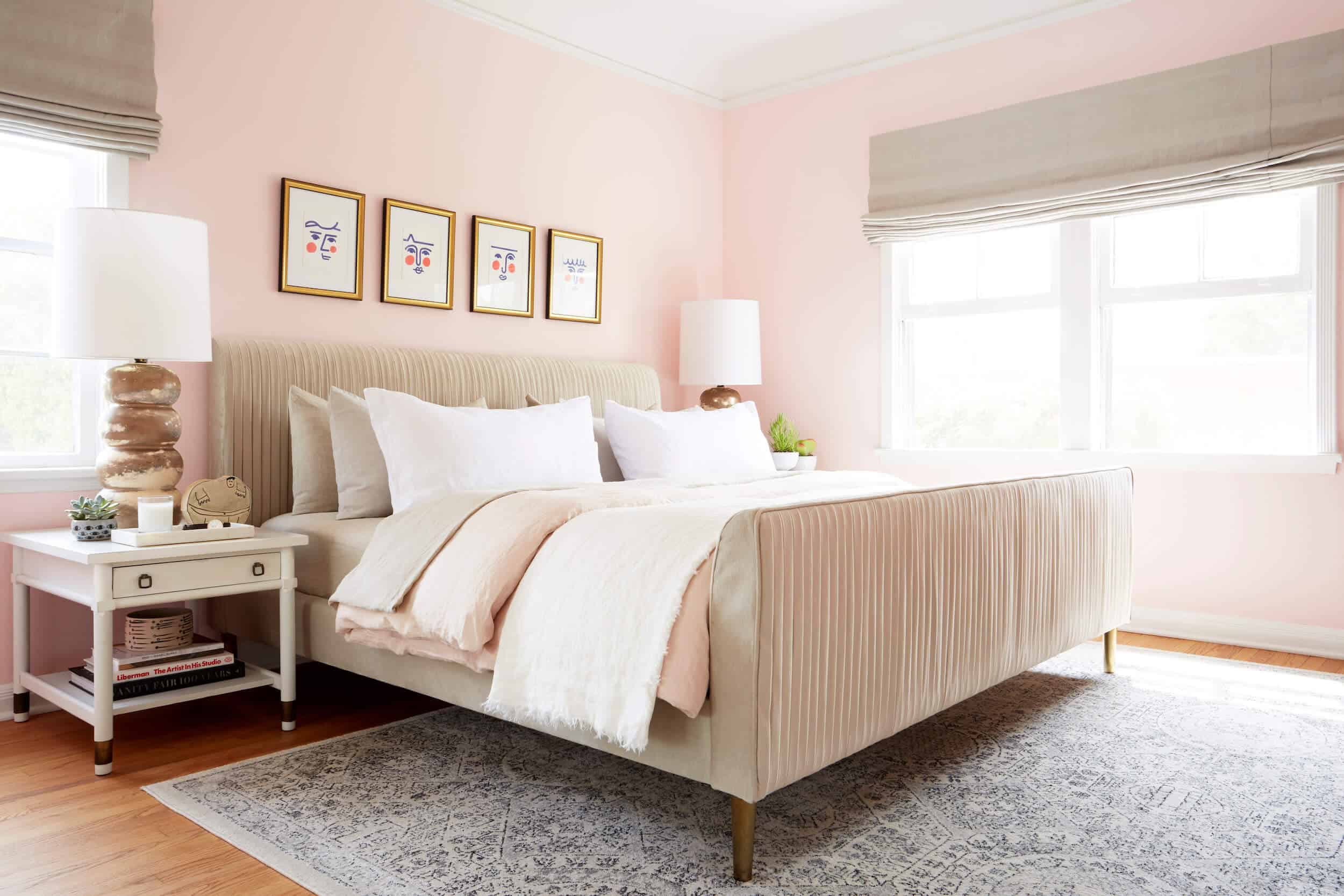
The prints above the bed are from Hey Sosi, which is the brand of an incredible Barcelona-based artist named Sofia Schizas. I love her work and it makes me feel constantly like my life is terrible because I don’t live in Barcelona and hang out with cute Barcelona hipsters who all look like Penelope Cruz and wear dark-rimmed glasses and make art and talk about their emotions all the time. But I love looking at them every morning.
I am super pleased with my new bedroom, and feel glad every day that I chose to go so warm, feminine, and soft in here. The vibe goes well with my new I DON’T CARE WHAT YOU THINK GET AWAY FROM ME vibe, which is also a phrase I yell at strangers in the street and/or whist placing my order at Starbucks. Here’s the most important design advice I can give any of you: YOU DO YOU HUNNY. Because there’s literally no one else like you and who else should your house look like???
…Also plz paint your bedroom pink. You will NOT regret it. I promise.
Okay bye.
Resources: Bed from West Elm, Bedding from Cultiver, Window Treatments from Loom Decor, Rug from Rugs USA, Side Tables from Wertz Brothers, Lamps are Vintage, Dresser from Design Within Reach, Lamps from West Elm, Japanese Screen Vintage, Bamboo Pendant from Ikea, Marble Accent Trays from Crate & Barrel, All Other Accessories Vintage.
***Photography by Zeke Ruelas
For more of Orlando’s Makeover Takeovers: Guest Bedroom Reveal | Kitchen Reveal | Bedrooms | Kitchen & Bathrooms | Living & Dining Room | Bedroom Makeover


Orlando your room is gorgeous! Everything, oh my. Also I love that you chose the Ikea light fixture, it looks fabulous and right at home with all the higher end things.
It’s beautiful and fresh. I don’t want you to date the kind of guy who doesn’t love your ballerina pink bedroom either.
That bed is a dream! I am obsessed with all of the pink and personally love that you choose what you liked. We need more of that in the world. You do you is absolutely the best design advise ever! What a great makeover for a Monday morning.
congratulations on moving forward and embracing change. some of the best of my friends and colleagues have found themselves in this very same situation and find it as you describe, weirdly exhilarating in a way. Loss is never fun but starting anew with all its challenges can bring good things. I happen to love pink and think it’s a great neutral. You mentioned the color is a bit more saturated than in your photos. No matter, go with intuition. Sparkly pink is my power color.
You are awesome and so is your pink bedroom.
Orlando! Beautiful. But can you please say how much of this was sponsored versus out of your pocket? That dwr dresser is $4k plus. I remember you were on a budget a while ago for the kitchen (which made many of us totally relate to you) and now you have a $4k dresser. I’m confused. Transparency with sponsors helps … thanks so much.
He said in the post he paid for everything except the rug, dresser, and bedding. That seems pretty transparent to me!
If you read the post he addresses all of this.
He explained this in the post.
He has been transparent: ” I paid for everything in this space, aside from the rug, dresser, and bedding, which I totally would have bought anyway and am obsessed with).”
He mentioned this: “full disclosure, I paid for everything in this space, aside from the rug, dresser, and bedding, which I totally would have bought anyway and am obsessed with.”
In case he doesn’t responde: He did answer this with “The master bedroom was the first room I designed, so I actually started it before I got laid off (i.e. before I got totally freaked about money). -full disclosure, I paid for everything in this space, aside from the rug, dresser, and bedding, which I totally would have bought anyway and am obsessed with.
On a side note, DWR does provide designer pricing which is 30%-60% off the retail price you see on the web, depending on the manufacturer of the product.
So glad you bought the screen – it’s hands down my favorite part of the room : )
I liked your pink paint explanation! I painted my bathroom pale shell pink and I don’t even like pink normally, but it is sucha warm happy color. Your bed. man. so nice. the whole thing is so nice. Hope you have a very happy life in this new place.
I agree! While I loved and appreciated getting my looky-loo fix, what to me was the most important takeaway was how and why he approached paint color. As someone who doesn’t photograph much beyond my kids and my murals I had no idea about wall color being washed out, so this was fascinating stuff.
Plus, you know, pink is my all-time favorite color, especially fuchsia. Our powder room is — walls, trim, mouldings, ceiling — fuchsia (black + white mini hex marble flooring, and I did silver leaf the ceiling over the fuchsia), and our master bath is almost a ballet slipper pink, with the water closet a more saturated version (making it a very pink coral). It is pretty and subtle and makes me happy.
I’m so glad Orlando is happy in his bedroom — it’s where we start and end our days, so how important it is to feel like ourselves in there and make us feel our best.
I need to see this powder room!
Love that light fixture! How did you convert the ikea pendant into hardwire with black fittings?
I have this in my bedroom as well. That’s how it is sold — hardwired with that mount.
I struggle with beige too! I think it’s out on walls and in on everything else except we don’t call it beige. We call it “Taupe” “Nude” and “Oatmeal”. The sexy second cousins of Beige. And as a side note, I will forever love you for introducing me to Hey Sosi! So cute.
This room is a warm embrace, so relaxing: I see this blush, sand, gold, and white palette becoming more popular after seeing it come together with an abundance of soft textures and unfussy elegance. The graphic, fun art and sculpture are my favorite personal touches.
“Unfussy elegance”= perfect description =best compliment
Gotta say, I would sleep like a baby in this room. Love it!
I love the well chosen art above the headboard. I always thought it would be too “busy”, but I may have to try that myself now!! AND That pink paint is to-die-for. LOVE it.
This is gorgeous. Questions on the screens: Did you have them remounted on wood or a frame? Were they joined together at one time? Just wondering if you transformed them in any way from what you bought at the flea market. Thanks!
I love that rug and bought it for my own living room about 2 months back. I really like seeing other uses of it since it is such a neutral piece. It helps me to envision how else I might use it in my house if I ever feel like doing the rug shuffle again. The room came out gorgeous!
Can you tell me what the color of the rug is? It looks blue in his room but more gray/black on the rugs USA page.
I’ve been following Emily since Design Star so knew you too. Your “voice” used to annoy me (full disclosure :)) because i thought you were trying to copy Emily’s voice. Sorry. You are great! Your designing is absolutely gorgeous, fun, sharp and you for sure are my new read every day designer! I can’t imagine why you lost your job, you were amazing and did great things for them. On to new and more amazing work. Someone will snap you up soon or you will figure out your own next move. The pink is glorious and the room is beautiful!
I almost bought that dresser to use as a buffet a couple years ago. It’s beautiful and feels so solid and high quality!
LOVE! I painted my bedroom a super pale pink (himalayan salt by Martha Stewart) a few years ago and my husband loves it too! It’s so warm and welcoming.
I AM painting a pedroom pink this summer and I am inspired by you.
All hear eyes!
also, as a soon to be therapist (just in practicum now), painting a room pink as a male, msy help bring you balance. We each have fem and masc components to ourselves. When you bring it out of the shadow, you don’t look for it in others, and create more inner balance. IMO (and dr. Jung)
OMG! Orlando, you are so hilarious! Love your bedroom… I LOVE IT! Wish my husband would let me paint our room pink, but that is not going to happen lol!
I love this room. I do think the room was really lifted by the addition of the black in the graphic cushions in the intro post. I can see how maybe it was a bit too ‘facey’ with the art above the bed and also that in real life with the stronger wall color it might read better to keep the bed neutral, but my eyes liked the subtle addition of black to the room. Still, even without it, it is a great room.
I think this lovely! You love what you ❤️! I know the pain of life changes that surprise and change you! Leave you a bit vulnerable and in doubt. I just had open heart surgery from a childhood illness I never knew about and shocked me into life is too short to not surround yourself around the people, places and even pink you adore:) thank you for sharing this post!
I love it! I painted my master bedroom pale pink, too, and it’s amazing. Also, my husband totally likes it, so I obviously agree that you should only date/marry someone who is down with a pink room. We painted our room Bridal Pink by Benji Moore. It’s super super pale. We have a vaulted ceiling, and previously I had painted the room a dark salmon pink, which emphasized the weird architecture (and made any other color impossible), so we changed it to the super pale pink that reads as white in bright light but is sweet and subtle pink at night. I’m really happy because now I can have actual other colors in the room, and it feels light and bright. Yay for pink! And yay for you!
Another pale pink master bedroom over here! Went with BM Soft Pink (after much agonizing between that and Pink Cadillac) because I was also looking for the palest pale pink that wasn’t actually white. The room is pretty dark but when it does get sunlight the walls are soft and glowy, and then they turn more peachy at night with yellow-toned lamp light. Yay for pink!
Love, love, love! That’s all I have to say!?
THIS IS DREAM BEDROOM. IT’S EVERYTHING. IT’S ME.
orlando = the cutest. love him.
Beautiful! I would also like to hear about the steps to wire the Ikea pendant light…..love it and considering it for my dining space, but not very familiar with electrical/ DIY.
Looks so good, love it! Currently buying one, or five, of these Art On Block sculptures.
Gorgeous! I went through a terrible breakup last year as well, and am finding that “YOU DO YOU HUNNY” rings truer than ever. This bedroom is a testament to your genius, Orlando! I have two questions though:
1) Living in California, are you not nervous about hanging things above your bed? I’m terrified of getting knocked out/killed by a falling picture frame in the event of an earthquake.
2) What is the upkeep on an upholstered bed like? I already have a new bed (bought it post-breakup, by the way. Out with the old!), but when I was in the market for one, I was always curious how you clean them if you accidently spill, say, chocolate or wine or pizza WHICH I NEVER EAT OR DRINK IN BED WHAT ARE YOU EVEN TALKING ABOUT on it?
Are you in California Tammy? If you are, there are inexpensive earthquake hooks for heavy items and things over the bed. I happen to like the ones made by Ook.
This is my dream bedroom–and it will remain just a dream as my husband has said “no way no how” to a pink room. The colors and textures are beautiful and, as usual, your art choices blow me away. You have such an incredible eye for art!
Orlando – LOVE IT – gorg, sexy, and sassy! I’m painting something pink, no matter what my husband says!
You’ve got to check out BOHO LINEN { Cool alternative linens, made by a California mom and her daughter. Great quality and totally unique : )
Orlando, I’m curious . . . What pink would you have used if you didn’t have to go darker so you could brighten photographs?
beautiful! question on the rug…. did the ends/corners roll at all? or do you have a trick for this? thanks!
Omg stunning. And so spot on – you do you!!
Absolutely gorgeous. I really want a pink bedroom now! Thank you for explaining how you chose the shade and changes you’d make. Mucho helpful because that’s how my mind works. Super rooting for you!!!
I’ve been looking for that exact summery white throw for my bed for ages, just didn’t know where to find it! Clicked through and purchased – a successful sponsored post for both reader & sponsor 🙂 thanks!!
You’re awesome. So’s your room.
Love it- all of it! In the design and the post. So fresh, inviting and the pink is original-looking and gorgeous. Two things I hate seeing in the world of internet interiors: 1) Everything morphing into the same trendy, internet-driven style, and 2) “Eclecticism”, which ends up being a bunch of styles thrown together that really don’t work. No, make that 3 things: 3) Expensive crap that no one would truly wants to live with for more than 2 months! Orlando, you keep doing your pink bedroom, because you don’t fall into these traps! Love your work- you are really one of the best out there, IMHO. It’s so good to see you keeping your spirits up, despite, you know… Keep at it and keep sending us your fabulous sh**!
Am I being dumb or am I just naturally stupid?
The bedding… is it purposely smaller than the bed? I pulled out all duvet and comforters I have but they don’t perch the way it does on yours. Mine drapes over my bed and pass the side of the bed (I have similar West Elm sleigh bed). I have to tuck all of the sides every freaking day so I like the what you guys did. Slip in and out, amirite?!
I wish it were the 1800s and you were forced to marry me in order to inherit the family farm. Not because I love you in a sexy time way, but I want to repel human rights so you’d be forced to be my bff.
I love this decoration
xo
The Pink Pineapple
New post:
I understand that the lamps are vintage, but a link to similar-looking lamps would be appreciated.
This room is beautiful! Before the company I work for moved to a new building, each office was painted the color of our own choosing. I chose pink. It was almost the same color pink as Orlando’s room. It was so cozy and inviting, and everyone who took a tour of the office would say, “I love this room!” when they would peek in. Love it!! I bet it’s extra cozy at night with the lamps on.
Beautiful–so peaceful and cozy, and the art gives it a lot of personality and fun. I read ” I DON’T CARE WHAT YOU THINK GET AWAY FROM ME” in Billy Eichner’s voice.
a. I love the room. Our bedroom is also a pale pink and I have never regretted it (nor has my husband).
b. The lighting fixture looks terrific, but does it produce enough light? I’ve considered that one for a different room in the past, but am worried that for a larger room, just one socket may not be enough. Can you give me the skinny on the actual light production??
Beautiful and fresh. Makes sleep more comfortable ..
You have impeccable taste, Orlando. Congrats on your new and beautiful space. Let this be a fresh start for you 🙂
Wow, the Master Bedroom is beautiful. The Pink colored wall accent the room with the added shades of beige and white. The rug sets the theme of the room. A room to be proud of that provides a comfortable and calming effect. Thank you for sharing yourself – your thoughts and design.
I love this room! But I love everything Orlando! EVERYTHING!!! Podcast please. TV show please. With Emily. With Ormomdo. Or not. You do you! Love that your positivity is coming out more and more!