
All Things Renovation
The “Mosaic Tile” Journey And How It Took Me 11 Months Of “Designing” To Land On Something Totally Classic
If I were charging myself my hourly rate I would have billed/spent around $12,500 in design time for sunroom mosaic floor, followed quickly by firing myself. That’s 50 hours at $250/hour, and that is easily how many hours I put into this endeavor. You see, copying or applying something you’ve seen before, even if it’s just classic, is just too easy at times especially when, say, you are in lockdown in early 2021 dreaming of your future home. Even if I were in a hurry, I like to use my own home as an experimental lab, and doing something too classic feels like a missed opportunity to challenge myself (and show my creativity to the world). And I’m not alone, many designers obsess about how to reinvent a classic in all art forms. Sometimes it’s worth it (that stained glass from Fig House is a great example) but sometimes it’s not. Maybe sometimes “the classic” was actually the best route anyway and maybe you don’t need to customize everything just to prove that you can do something more special. And while what I landed on won’t have been seen before (because they’re custom colors) I think we can all agree that I spent far more time on this mosaic floor than was probably needed. And that’s ok because it was honestly so much fun and I got to deep dive and learn something new. Remember “the obstacles are part of the journey” and the creative process is super messy if you are doing it right. So today’s post is “the case of the mosaic tile – the one where I spent so much time to actually design something you’ve kinda seen before”.
The Inspiration – My Old Patio
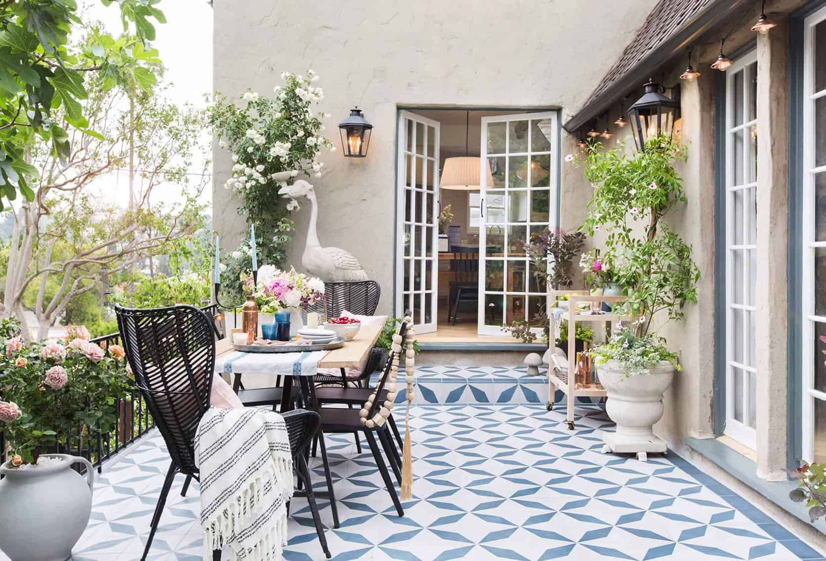
Before we get started – I’m not sure if this is healthy or not but there are certain past rooms of mine that I have loved so much that I find myself wanting to recreate a new version in this home (think Elliot’s first two rooms – this one and this one). Maybe it’s “homage”, maybe nostalgia for that period of time, or maybe they were so “successful” that I want to bring that success into my new home. The tile of our patio in LA is one of them. I LOVE THAT TILE, I love that courtyard. I loved being out there every single second we lived there. So when we bought this farm I was like, “Where is my patio here?? Where is that magical space that feels old-world and eccentric? Most importantly where do I put my 7′ bird????”

Thus the “sunroom/writing studio” was born and at times I fear that we added this room onto the house for the sole purpose of me getting that tile moment that my heart and eyes wanted so badly. Sure, I could have put it in a bathroom but it wouldn’t have gotten the public attention it deserved. I knew that I didn’t want the kitchen to have this busyness and the dogs didn’t deserve this splurge in the mudroom. This room, since it’s an addition, can be its own style/moment, like a conservatory/sunroom styled with plants, for summertime dinners, meetings, photoshoots, and it’s where I’ll write/design/blog during the day. There is nothing about this room that is “shaker” but it honestly feels separate from the house (different window pattern, different exterior material and it even steps down). I CAN’T WAIT.

So with that patio inspiration in mind, I wanted to come up with this house’s version of my favorite outdoor space. I knew I wanted a larger pattern and I know this is shocking but I was leaning towards the oft-overlooked color combination of, are you sitting down? Blue and white. It’s my “Anna Wintour black dress and big sunglasses” uniform and I’m comfortable with it.
So I obviously asked myself “what is the farmhouse/Victorian version of that tile pattern?’ And knowing that I was working with Pratt and Larsen the challenge became what new pattern could I make with all of their classic tile shapes? Like an evil mad designer from a marvel movie I thought, hands wringing, I will create a new pattern the world has never seen before!! (said every designer, ever before realizing that, spoiler, most things have been done).
So I did what all internet famous designers do, I googled “Victorian patterned tile floor” and my screen was once again flooded with intricate old-world patterns. Most of them are on the busier side which I love but don’t want. I wanted a fresh take on it, and something that (at the time) felt more appropriate for a farm.
Wanted: A “Farm-Inspired” Mosaic Tile Floor
…But, like, one that isn’t dorky. And that, my friends, can be very tricky and risky. Of course, there are farm motifs that make sense – plaids, stripes, and florals, but I didn’t want it to be lame! Then I had another aha moment… Quilts!!! I love quilts!
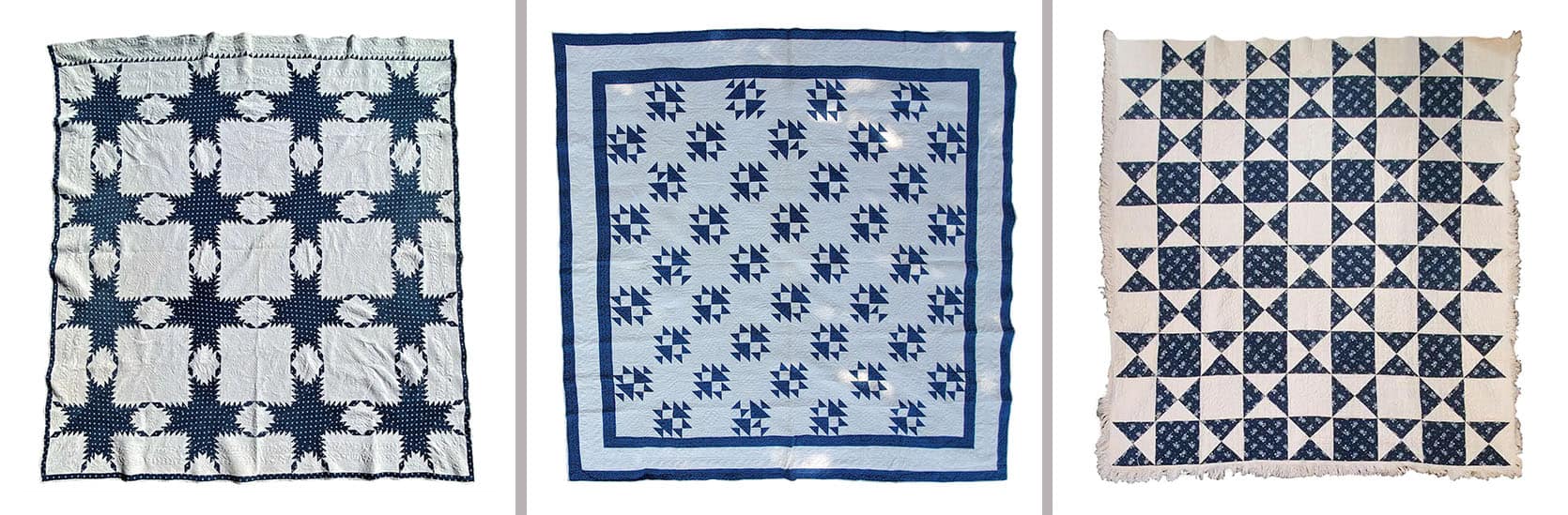
19thc Fine Blue & White Feathered Star Quilt | 19Thc Teal Calico & White Shoe Fly Quilt | Antique Quilt, Mid-19th Century Blue Resist Eight Point Stars
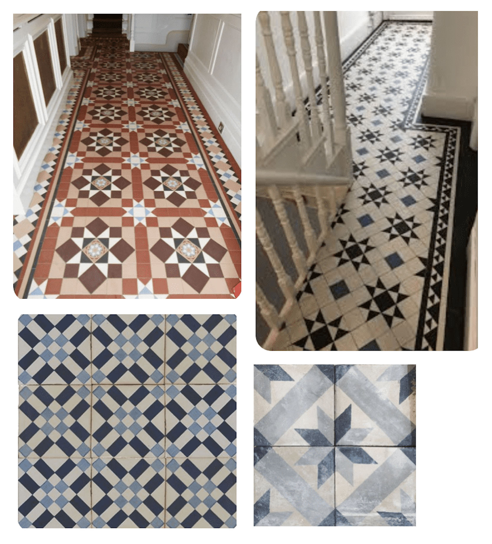
Instantly I was like ooh, that’s so appropriate and could it be done? Of course! The below are “star quilt-inspired Victorian floor patterns” and they are indeed awesome.
Wait… How Expensive Could This Risk/Mistake Be?
Glad you asked because we aren’t shopping for scrunchies if you know what I mean. Installing a mosaic tile will be extremely expensive. We don’t have a quote yet but we are talking between $5-10k just for this room. It was always a tile install I had planned to splurge on (and since it’s my writing/design studio I can write off a large percentage of it) but even so, it’s expensive and it makes a normal pattern decision even weightier. FURTHERMORE, how much is it to potentially replace the tile if it looks bad? Answer: EXTREMELY expensive. Like a year of gut punches. I’d have to change my profile pic on every platform to the hand-to-face emoji. Tile is the most expensive “hard finish” to replace if you get it wrong. It’s not “switching out a faucet” or a sconce. It requires a very messy demo process that is full of waste. I applaud all of you who take tile risks, but in an older home, I’m just VERY nervous to do something risky. I’m not proud of this cowardice, and I do think there are other places I’m willing to take tile risks… but not in a 12’x17′ room that I’ll be spending 6 hours a day in.
Meanwhile, I had gotten all the tile shapes from Pratt and Larson and it was time to “play puzzle” on the floor of my office/loft at the mountain house. This first photo documentation of this is dated April 7th, 2021. Almost 1 year ago.


I experimented with a “plaid”, a broken stripe, and a mixed checkered pattern. None felt right. Ultimately I gravitated to most was the picket shape and forming flowers with it, with a contrasting color as the spacers between.


I tried it in white with blue squares and blue with white squares, both with a Victorian border. This became VERY exciting to me and I thought I had absolutely nailed it. I love flowers so much so that I named the blog originally “The Brass Petal” (and fun fact, I actually wish I never had changed it to my name – word of warning). So a flower-shaped mosaic tile? YES!!!! EUREKA!!!!!!

So I did what any professional designer does in 2021, I had my kids paint different blue tones on paper and cut out the “tile” so that I could play with the repeat on a larger scale. If only there were a way via technology that I could have gotten a visual …
TBH it was still lockdown and it’s not that I was bored per se, but with the kids not in school it was a super fun way to get them involved in the design and do “arts and crafts with mama”. And it was super helpful to see it repeated over and over. Until …..
So, confident as a cucumber (?) in my never been seen before mosaic floor pattern, I sent the specs of the tile to a magical person (Stephyn) who knows “computer programs” (chief architect) to render it out in the space, mostly to calculate tile take-offs (square footage per tile) because we were that sure.

HUH. Our first reaction was not a “hell yes”.

HMM…. still nervous.

We all had the exact same reaction. Uh, no. And listen, Stephyn didn’t finish rendering it out because I think they had a sense that this wasn’t going to be a “yes”. Looking back, I think that renderings are very very hard to get a sense of how it will be in IRL, especially when it comes to texture. How could I love something so much in person, feel so confident in person but then have an immediate negative reaction once rendered out? IDK. It’s frustrating. Sometimes I feel like I should have just gone with it and it would have been beautiful. But this render made it look like polka dots, not flowers and too much white. But this render doesn’t show grout or texture of the tile. That’s all to say that maybe it would have still been awesome, but none of us felt confident to take the risk. I do want to take more risks going forward, but for our permanent residence, I would hate to be confronted daily by a mistake (thinking I’ll take more risks in the Victorian house on our property once we tackle that).
So we went back to the drawing board, wanting a larger scale pattern because we think that that was what we loved so much about the patio. But most companies, Pratt and Larson, included don’t make ceramic tiles larger than 8″ because of waste and fragility. So we created a “square” pattern that is bigger with 2×6 + 2×4 + 2×2 (all separate tiles). This is a classic tile that I did not invent.

We saw it rendered out to mixed reactions. I really liked it but thought it was too, like, regal or something for this house. Too much, too fancy, too formal, not the right vibe. Brian and Anne totally disagreed with me. And needing the actually pull the trigger soon (it’s a 4 month lead time and we were past our deadline) I said OK, thinking that I was wrong.

Then Brian and I went into Pratt and Larson to finalize our kitchen tile and show Suzanne (the wonderful head of marketing who I’ve worked with for years). After going through the rest of the tile choices that were already chosen, we showed her this mosaic flooring and all three of us at the same time had the same reaction – this is a different house. Now we always knew that this room was going to feel different than the rest, but I still wanted an element of simplicity in here – and the ornamental/intricate pattern really made it feel fancy, not classic.
So that day at Pratt and Larson, Brian and I pulled the trigger on the classic diamond shape pattern, in our custom blue that is so happy without being too bold, with a Victorian-style border.

How do I feel about it? GOOD. What you can’t see here is that the border is about 8″ wide so it’s thicker than the renderings, and it includes a light blue/gray accent in it. So it’s more substantial than seen here and it has another tone which we love. Do I wish that I had created something that no one has ever seen? YAH. But I KNOW that this will not date, that this is classic and by keeping the pattern pulled back into just a diamond it still feels restrained and easy for your eye to understand (which is always important to me these days). I find that things that are busy make me mentally slightly more exhausted I think because my brain is trying to understand what is going on. I’m not sure if this is an age thing, a personality type, or a design philosophy that is rooted in truth, but I feel better, more settled in spaces that are less busy. Don’t get me wrong – this floor pattern is BUSY but the experience we want to have in this room is more fun – for dinner parties, creative business meetings, or where I write/design so that added dose of energy is welcomed. I’m just glad we didn’t go overboard. Plus, this install will be probably 30% less than the previous design since it’s just 2 tiles back and forth versus a more intricate pattern.
So that’s the mosaic tile journey. I’m finding myself doing this more and more – going further just to pull it back. And I’m fine with it. It’s like exercising my creativity but being secure in the fact that it may not be what I actually want in life right now for this house anyway. It also aligns with my ethos of designing something once, and for the long term. I just want to make sure that I’m not always being too safe or boring. So my goal (as it has been) is to keep the permanent hard finishes (flooring, tile, lighting, and plumbing) on the safer side, with furniture/decor, art, and textiles with more risks – but only if they make sense for comfort and function. IT’S HARD Y’ALL. 🙂 Thanks for indulging me in my tile journey. I’m having a SERIOUS blast and thanks to Anne and Stephyn for trying out all these different renders to land where we did.
Opening Image Credits: Design by Alessandro Agrati | Photo by Elena Rosignoli | via Vogue Italia


Argh! I love the old patio and I love classic but this is a massive miss for me. I was excited to see this be a moment…and instead it looks like every tile floor basically anywhere (the border helps a little but not enough). I’m pretty sure every cafe/diner in my town has floors that look like this. Of course I might be biased because my first apartment had a crappy linoleum floor that looked basically like this (blue and white squares arranged in a diamond)…but then again, that’s probably not much of an argument in favor…it’s scary to take design risks and I get that you live in the house but we are also watching to learn how to make those exciting choices. It’s just a bummer that after 50 hours of work you land on something that looks like you walked into Lowes and left it to their tile installer to come up with. But hey- maybe the order will make a bigger difference than I realize!
Oh, my heart belongs to those gorgeous Victorian quilt pattern tiles–or to the beautiful encaustic Victorian repro tiles that are out there. Even if you used them sparingly, they would bring so much more warmth and joy to the space. Right now, I’m sorry to say that it feels both busy and without any real personality. But maybe when you pull everything together, I’ll feel differently? It’s hard seeing just a bit of the plan at a time.
Hmmmm….. I was pretty surprised where this landed too. But if you love it and are happy with it who cares? This might be a dumb question but if you love the patio tile why not use it again? I’m personally not a fan of the big diner check pattern at all, but as you said when it’s all laid I’m sure it will look great. Personally, I would have chosen the first pattern but reversed the blue and white.
Snap! That’s what I thought when I saw the pattern!
Yes! I thought the exact same thing about the first floral design.
Agreed. I would have kept the first pattern but just used a grout color that would have brought out the design. This design looks too diner-y to me.
I really liked the first pattern the best too and am not super jazzed about the checkerboard.
Yes! A darker grout color would have brought back the flower shape that was lost in the render. Personally though I think using the blue as the petals and white grout with the white spacer tiles would have been gorgeous.
oh boy Emily now has a big dilemma! That is the perfect tile and pattern but it not from her sponsor.
Hey! One thing I notice about your inspiration that is totally different in your renderings: you only used two colors of tile! It seems to me like you could get the floral right if you introduced a tan or lighter blue as the tertiary color—it would make it more quilt-like and less fancy bathroom, which is how the majority white rendering reads to me. It’s your house, so you should do what’s comfortable, but I do think the quilt concept is SO close to being AWESOME—wish I could see it play out!
I love the original flower design. Would using a different grout color have made the flower patterns a bit more evident?
Love this post! Thank you for the peek inside your process and for validating those of us who regularly exercise our “woman’s prerogative” to change our mind! I LOVE where you landed. The floor works so well with the window pattern you created, perfect harmony. I think there’s so much value in exploring your options before making a final choice, it gives you the confidence and peace of mind that you’ve ultimately made the right choice.
I love where this landed! After several years of encaustic everywhere, it’s nice to see something plainer and bolder. Thank you!
I agree encaustic is everywhere. I was hoping for a plaid pattern made from variety of square tile laid in a square pattern rather than on the angle.
It might be called buffalo check in the states ??
I’m excited to see this room completed. I don’t think you can go wrong with a classic diamond pattern. When Chris Loves Julia shared the plans for their checker dining room floor in their Idaho home there were a lot of doubters, but it turned out beautiful and classic. I’m sure this will be beautiful and classic.
And I think you were right to ditch the first idea. I think that the rendering correctly showed how the eye would focus on the triangles and not the flower shapes. With or without grout. I had a friend who had a similar issue with patio tile. I loved the original mock-up that she showed me, but when it was repeated in a large space it looked completely different and not good. It was a big disappointment for her.
I love the contrast and have always wanted a floor similar
I really love the dark and light blue tile on the bottom right corner of the set of four Victorian floor tiles you posted. I don’t see a source linked. Perhaps that’s because it’s just an image and you aren’t aware of a source. But if you have one, I’d love it! Thank you, and can’t wait to see this all come together! I read every detail of every farmhouse post….
or search “carreaux-de-ciment-anciens-motif-etoile-tons-gris”
The blue and white star quilt inspired patterns were by far my favorite. If you stick with the classic checkered pattern, will you pick tiles with interesting marbling or subtle variations? Looking forward to seeing the sunroom’s development!
I’ve painted three houses THE exact, same colour! (The colour doesn’t even exist any morr, so I have to take tge recipe to have it made up). A post-war hp8use, a snazzy “executive residence” snd my current nearly 100 year old gurl (maybe sge should be a Dame?).
Anyway, my point is, that WYKYK … when y8pu ABSOLUTELY love something, like your LA patio tile, there is NOTHING wrong with repeating it, like a signature dish for dinner parties.
Yes???
What you chose is nice. It’s safe and I get that and the motivation for a ‘safe’ choice. But those LA patio tiles SCREEEEEAM YOOOOOOOU!!!
When I saw the photo of the painted, cut out bits of paper, I just knew that Birdie was involved, because of that telltale little blue heart in the shot…melt my heart! ?
You said “I’m finding myself doing this more and more – going further just to pull it back.” Isn’t that Coco Chanel’s quotable thing along the lines of ‘once you’re dressed, step back and remove one thing’ or something like that?
I think it’s a good theory in most cases.
This. I suspect that you are changing it up from the LA patio tile just to have a different tile to post here. I don’t think you have to do that. The LA tile is you, and it’s ok to have a signature look. In fact, I would love to see how you use that signature tile in the new house.
I’m curious about the shade of blue – you said “our custom blue” – is that the color blue in the LA tiles? If so, how would one of us get it?
I too was excited about one of the quilt designs and loved the flower one. I’m sure you’ll make this room look stunning but the check doesn’t feel EHD if that makes sense- seems like another designer. I know you’ll wow us in the end and excited to see it all finished and if you still love it.
I do like the last one best..mostly because of the feeling state it gives me. The others made me feel awash in a sea of cool tones. Not that inviting. The bold black gives it more nuance, movement for me. Like from background music to something worth tuning into. Actually I think I could have loved a terra cotta brick floor here or even wood for its warmth.
But … it’s blue?! ?
Man, I never want to be negative but this is a miss for me as well. That being said, I love literally almost everything you’ve ever produced, so I’m sure the final product will be no different. I personally was drawn so much more to both the floral and quilt examples you showed. When you describe where you landed, it almost felt like you were trying to talk yourself into it.
Thank you so much for this post and all posts you create, I can’t wait to see how it turns out.
Same! I thought the quilt designs looked so perfect – classic vibe but not necessarily seen a million times on a floor. The checkerboard will be cute but it’s a bit of a yawn design-wise while still being kind of busy on your eyeballs with such contrasting colors.
“It almost felt like you were trying to talk yourself into it” Yes, I think that’s why so many of us are sad to not see the original inspiration play out… reading this and being a loyal blog follower, you can just FEEL that Emily is bummed to not get her creative, original tile moment. Emily, we want that for you!!
I personally feel the diamond pattern you landed on looks much more regal and formal than the previous pattern you swapped it for. But diamonds are classic and safe, so I am sure you can style the room more relaxed and comfortable. What a journey!
I’m so glad to hear you kept the 7′ bird! As a fellow 9/1 Virgo, I identify with all of this, and understand the need to explore all the options exhaustively. It’s going to look great!
Yes, I have been wondering too. I LOVE it and so glad she plans on having it in the sunroom!
This was absolutely the right call. The other versions would make the room look so “tacked on” in real life.
I agree that this is classic, but I have to say this feels like a miss for me as well. I am personally more drawn towards the floral or mosaic patterns. I normally wouldn’t say anything either, but it sounds like you aren’t all that happy with the selection either…
Hm. I love your style Emily, but I am also am a little unsure of the winning pattern. More than anything, the scale seems off to me – in the sense that the diamonds in the floor are now competing with the diamond grids in the windows. Too many similarly-scaled diamonds going on visually for me – starting to feel a little harlequin. Maybe if they were either significantly bigger or smaller than the window diamonds, they might work better?
agree! If the tiles were 12 or 15 inch tiles to make a visual difference from the windows. As is it looks like a diner.
This is going to be incredible! Love the classic diamond pattern but with the blue/white and border as an unexpected twist. You’ll never tire of it and it’ll be a perfect backdrop for everything else in that room plus the views outside!! Can’t wait to see it all done.
I absolutely love the classic checkerboard here! The diamond pattern plays *perfectly* with those gorgeous diamond window panes. And I can’t wait to see this classic floor paired with your vintage, eclectic design and decor!
I agree. I think it really works so well with the windows.
what if there were a few flowers replacing some of the white checkers, would break it up some but wouldn’t make so many shapes out of the negative space.
The diamonds mirror the pretty windows and don’t compete with them. I’m curious: if the room is only warm enough for dinners in summer, will it be warm enough for you to work in there? I’m in Portland and still today, March 14, I’m avoiding sitting right by the windows! Summer might also be very hot in there. Will you have shades covering the beautiful windows?
I’d LOVE to see a tile version of the Eight Point Star quilt you linked in the post. That, to me, is simple and stunning.
What about scaling up the tile so it’s maybe 18×18 or even 24×24? That would be more of a moment.
Or make it monochrome, with dark blue and medium blue diamonds? I feel like blue and white may end up looking too “country” rather than farmhouse.
I’d love to see a tone-on-tone color scheme here too — maybe two shades of blue or a blue and a grey.
For me you hit the nail on the head when you said “I fear that we added this room onto the house for the sole purpose of me getting that tile moment.” It feels that way. None of the tile choices seem “just right”, because the room itself doesn’t. I’m still wondering why you decided to tack the sunroom onto the front corner when you could’ve expanded the living room where the deck currently sits. Interior French doors could’ve closed it off from the main living area when necessary, creating a more natural transition between wood and tile…it would’ve put the dining room closer to the kitchen…not to mention it would’ve felt like a natural extension of the existing house rather than an oddly placed add-on.
This hits the nail on the head. Also, given what Emily has shown of the front of the house so far (obviously not anywhere near done, so maybe that will improve things), it makes the whole front facade look odd to me.
This one is a miss for me I’m sorry to say. Makes the room look way more modern than a farmhouse. I loved the tile on your old patio…why not use it again, even in a different color or tone to make it fresh?
My grandma quilted a lot, and this post totally reminds me of what her house would look like when she was designing and piecing quilts. I definitely like the larger scale of the design you chose, some of the others seemed a bit busy to me. I also really love your LA patio tile, and would not be disappointed to see that again!
Curious if you played around with any of the Pratt & Larsen Arc tiles ( You can make some seriously FUN designs out of those curves without dealing with a bunch of tile shapes, and it reminds me of a modern twist on the classic checkerboard.
If anyone else loves classic mosaic tile, but can’t afford it (me) or are terrified of expensive, irreversible decisions (also me), Spicher and Co. make beautiful vinyl mats in all sorts of patterns. I’ve seen them at Maker and Moss in SF and they look great in person. They’re in the $100-$1200 range depending on size.
This one is a diamond pattern similar to the one above:
And this one is like Emily’s patio:
I am usually a positive poster myself, but I am going to agree with the number of likes on the posts with dissent. Yes, it is diner and grandma’s kitchen floor that we have all pulled up now…I think my comment is just how closely it repeats the window diamonds. The windows look refined with the diamond shapes because there is space to breathe (and remember angles can be a bit disruptive to the eye) but the heavy contrast and repetition on the floor look a bit too clunky and weighty. Having said all that…I am about to build a house and am certain I would not even attempt to be this brave with tile. So good for you being a dog with a bone on this one. I do agree with the comments of repeating your LA patio (which I simply ADORE as well, softer rounded shapes, something with a curve is so lovely. (you know…like women:)
Major props on your financial and process transparency Emily! And the border sounds like it will be beautiful and special. The simple diamond pattern is nice with the windows I think. Thanks for sharing!
Major props on your financial and process transparency Emily!
And the border sounds like it will be beautiful and special. The simple diamond pattern is nice with the windows I think. Thanks for sharing!
Emily, what makes you so wonderful is that you show your work and your thoughts, warts and all. You make the process of putting a home together less intimidating since you allow us to see you in all your work and worry. Thank you so much! I really love how the house is turning out!
Decision fatigue is real, and I’m sure it will look just FINE.
But I agree with the other comments. What a missed opportunity. And it feels like you’ve lost your imagination because you’re relying on renderings that take out all of the nuance in design. Yeah a rendering can look not right- because it’s NOT REAL
this feels like a Victorian conservatory and not a shaker farm house. A Victorian conservatory turned into a bed n breakfast where they serve a bad continental breakfast.
Nothing shaker or farmhouse here. I feel as disappointed as I did when you put identical Kohler vanities in every bathroom of the mountain house.
Why is it that 100% of the time doing our own homes is so much harder than clients. Is it because we love everything? Or want to do something no one has ever seen like you stated? It’s so weird and there should be a show of designers only doing our own homes to show how crazy it gets! BTW looks amazing.
I cannot see how your ‘brass petal’ design relates at all to the renderings that Stephyn developed. There is no shape of the flower petals in the renderings at all, I am very confused. And even more than that, very disappointed as this flower like mosaic design is beautiful.
The blue and white checkerboard design you have decided on is functional and inoffensive but it is far from being any sort of design statement and I think you will get very bored with it very quickly.
And just a quick question, does everything outside of a kids bedroom need to be blue white and/or beige these days?
I love diamond patterned floors (Beata Heuman frequently uses them as well). Classic and pretty. I can’t wait to see your sunroom tiled out with the custom happy blue color! I bet it’s more interesting and beautiful than the rendering. I also found the other earlier options to be too busy and not the right fit for your vibe and the house.
After thinking about it all day, I agree with your choice- it is lovely, calming and classic and, as you said will withstand the test of time. it will be a gorgeous room.
Wait, what? This took a turn I was not expecting! I think we’re all sad to not see the floral/quilt mosaic come to fruition. Honestly, who cares what we all think because it’s your house, but what I loved is that YOU loved it so much and were so excited about it. You had so much fun designing those tiles! Renderings are kind of a buzz kill.
The renderings are bad – no offense to Stephyn. The flower pattern came out as a bunch of squares, which isn’t your actual pattern at all. Did you ever think to actually lay the tile (mortar, grout and all) on half sheet of plywood? That way you can actually see it with the color variation and texture (that you’ll never get in a rendering) and move it around the room? Technology feels like it’s getting in the way on this one.
Hi, I love the Diamond pattern with that blue, plus who hasn’t taken a longer route to get somewhere? Thanks for being aware of the process and sharing it with us.
I also so get that room sun room with those proportions and in that position with the multiple exposures, I bet you live in that room, and it gives you so much happiness. Just a tough crowd tonight, I think expectations might have been a bit out with how it started, rather then based on the actual result.
Thanks
Emily, go with your first design. When it’s actually installed it will not be a stark black and white that it appears in the rendering. It will be textured and layered, the flowers will catch the light as the sun moves through the space during the day. Believe in yourself, your original vision was inspired and exceptional. See it through!
Couldn’t you get enough sample tiles to mock it up with grout on a piece of board? I also love the flower pattern and feel like the diamonds seem too heavy and bold.
I actually like your original design. It’s actually a safer choice, because it’s not high contrast. So it will always work, with or without a rug . The smaller pattern without high contrast will engage, but not be overwhelming. It will continue to be timeless like those quilts. I’m not too much into checkered or diamond patterns, especially in this size. If it was smaller with slightly lighter blue and a third color, I might be a bit more into it. Your original was pretty. It might look almost all white on the rendering, but those tiles wouldn’t be uniform. Even a tiny variation in level would cause light to bounce off in a different way. Also those patterns would be visible. Think how penny tile or hexagon marble tile is visible. And if you choose grout slightly darker than white, it would enhance the design. Also if you used a third color in that design, you could add a bit more dimension by, for example, alternating flower colors.
I know that whatever you choose will look great. Can’t wait to see it
Yes!!! That is what I was invisioning! Love it!
What a fun adventure to plan out tile! I enjoyed that you showed how many directions one can go with styles and inspiration — but I also think that where you landed will give you so much more flexibility with the other elements that you include in the space. While I love the LA patio tile, there’s a certain timelessness to a older farm house that may just make your pick very fitting. I’m excited to see more!
Give yourself the gift of time with this one, as you don’t seem thrilled with your decision. You are correct that demo-ing tile is expensive and messy. Just move in with a concrete floor and a rug. Enjoy your new home and see bring in real tile samples to play with. No need to rush!
She sounds committed already.
Coming back to comment the next day – I’m sad that it worked out this way. The checkerboard is what Sara pulled up in her house. It looks so heavy, and I loved the LA tile. This looks so weighty. I can’t imagine doing a photoshoot in here without having to think about how to subdue the tile so you can see the other stuff. Any of the others would be so much lighter and more you.
Emily, I love so much of what you’re planning in this house, but I have to agree with others (and it seems deep down you kinda do too?) that this isn’t quite nailed. What about if you swapped the white for a midtone blue, so the contrast isn’t so high? A tone-on-tone blue combo is a little more unexpected and fresh to see paired with such a classic pattern, and the softer colors I think will maybe suit the farmhouse more, and your general vibe towards calmer interiors? It seems to me that the dramatic contrast of this is what’s fighting with both the farmhouse architecture and your own sensibility. Hope all these comments haven’t been too much of a bummer!
nice