
Design Trends
All The Trends We Predicted and Loved This Year (& Where We Stand on Them Now)
One of the most thrilling parts of being a design editor and writer is excavating ideas, sniffing out that they might be a “thing,” sharing them with the rest of the design-loving world and then seeing them spread like honey on a warm biscuit. Granted, that’s also one of the curses of working in design—constantly being on the hunt for that new new, not wanting to jump on the “basic” bandwagon of widely-executed home decor trends and instead finding your own voice and vision. BUT, that’s a conversation for another time, another year. Today, we’re looking back, reminiscing, reevaluating what we uncovered as great, new and exciting ideas in 2018 AND THEN we’re seeing where we still stand on said trends. We’re starting in January and making our way to December with everything we reported on. It’s like going through Pinterest boards you’ve had for years, scrolling all the way down to the bottom/beginning of a certain board and being like “HAHAHA remember when I thought that was my style/looked good?” A stroll down digital memory lane where all the houses are blog posts that we may or may not still agree with.
This is going to be fun.
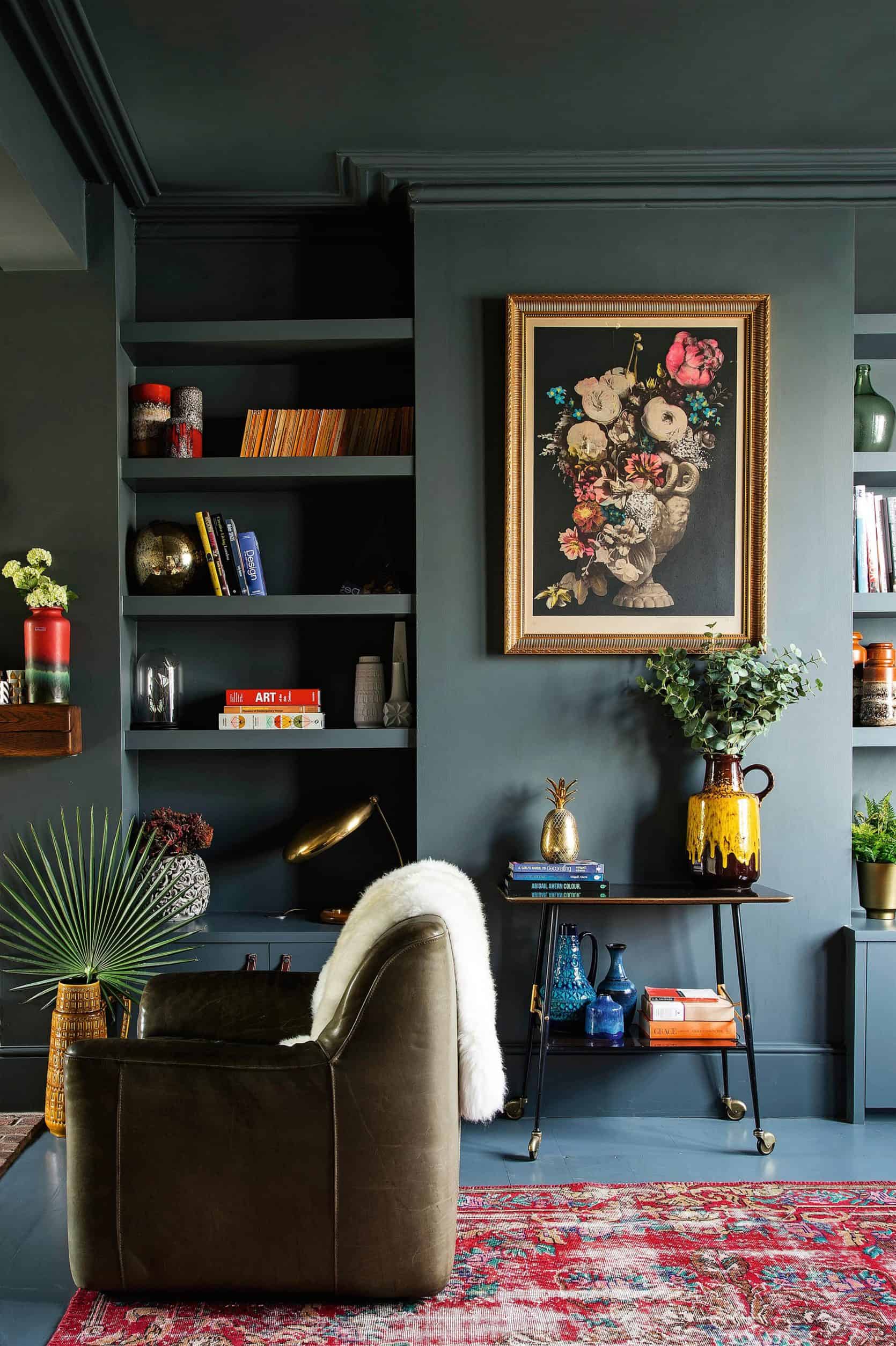
Trend: Modern Victorian Style

What We Thought Then: We called this one early on in the year (January 23 to be exact) and you guys LOVED THIS. We expanded on the series over the weeks that followed (bringing you all the shopping needs to create the look), and halfway through the year, after we did some digging into our top Pinned images, several from this initial introduction post made the Top 10. Hot off the heels of 2017, a year all about Scandi minimal EVERYTHING, this aesthetic felt right. It’s just modern enough while being lush, luxe, nearly seductive. Hallmarks of the look include lots and lots of velvet, fringe, deep, saturated colors, modern lighting, ornate pieces in sleek spaces…head to the post to see more, but it was all about a marriage of extremes.
What We Think Now: There are still serious heart eyes happening for this vibe, and we’re definitely not tired of it yet. To keep it from getting old fast, we think maybe skip the bold floral wallpaper and stick to color blocking like in the image above. All the Modern Victorian, none of the age-prone prints.
Lasting Power for 2019: Strong – 4/5
Related Posts: Modern Victorian Furniture | Modern Victorian Wall Treatments & Art | Modern Victorian Lighting
Trend: Modern Traditional Style

What We Thought Then: On the COMPLETE opposite spectrum of Modern Victorian was Modern Traditional. This post spawned a lot of conversation surrounding a more “appropriate” name (pretty sure “modern monastery” won out) but ultimately, this look is one part farmhouse, one part Shaker, a little traditional, a little rustic with a hint of modern, and all about the heirloom and handmade. Design firm Jersey Ice Cream Co. has this look ON LOCK and do it so, so well because they aren’t too heavy handed with it. The key is to keep colors light and chalky, and furnishings humble.
What We Think Now: There’s still a lot to love about this one. We’ll never not love a well-worn farmhouse table, oil paintings and delicate lighting, but keeping things more on the “modern” side of “modern traditional” might feel less…aged. Plus, “decor” (a.k.a. random stuff you always have around your home if you’re a normal human) doesn’t really work that well with this modest style, and we love layering and “things” too much to be able to actually live in such a pared down universe. With whiffs of maximalism coming through now, it’s not super likely this will be a mainstream contender for long (saying this with that caveat that “mainstream” being the operative word because any look can have legs for decades if it’s YOUR look and you love it for as long as you want to).
Lasting Power for 2019: So-So – 3/5
Related Posts: Modern Traditional Furniture | Modern Traditional Lighting | Modern Traditional Decor & Accessories
Trend: Kitchens With No Uppers

What We Thought Then: We know this one was pretty controversial. So many of you were like HOW DO YOU STORE THINGS/LIVE and while we totally get that concern, we kept seeing kitchens without upper cabinets again and again and again…and again and we had to talk about it. Pros: keeps things feeling light, airy and minimal. Plus, if you have a stellar backsplash, no cabinets up top lets that tile have its starring moment. Cons: half the storage (in theory), having to bend down for everything. This style of kitchen seems to be most popular in Europe (I’d say a good handful of the examples we found were in Nordic countries), but American kitchens still made a strong showering.
What We Think Now: Kitchen trends usually turn over every decade or so (dropping $50k on something to just be “over it” in two years isn’t exactly wise or sustainable) so we think this one is just creeping into our collective kitchen consciousness and likely has decent lasting power. This absolutely will not be for everyone (or even half of you), but open floor plans still reign supreme, and we see nothing more conducive to a home with minimal walls then a kitchen that doesn’t even need them (wait, are we now predicting freestanding kitchens as the next big thing? You’ll have to wait and see…).
Lasting Power for 2019: Moderate – 4/5
Trend: Alternative Vanity Mirrors

What We Thought Then: So many of the trends that we uncovered/birthed this year came out of pure design necessity (i.e. wanting fresh, interesting ideas for the Portland project and mountain house). This is one of those trends. We were up at the mountain house this past summer, sitting IN the master bathroom that was basically just framed out in studs, talking about what kind of mirrors could work for the space and the conversation of what cool new things we’ve all seen came up, so of course we created a post about it all. Some of the update profiles we found and loved: large and round, tall and skinny, suspended, pill-shaped, built-in shelves and a handful more.
What We Think Now: We’re definitely not done talking about vanity mirrors around here (literally, we were all convened around the design team’s computers the other day talking mirror shape for the mountain house powder room). Anything that adds a little punch and pow to a utilitarian space like a bathroom will forever get our seal of approval.
Lasting Power for 2019: Strong – 5/5
Trend: What’s New in Tile

What We Thought Then: In an effort to not create “basic B” bathrooms in the mountain house, Emily and the design team peeled back the layers of Pinterest to find exciting ideas for how to shake up really simple tile shapes in a way that felt fresh without being over the top. Two of the concepts that came forward as a possibility were colorblock tile (when one solid color transitions into another solid color, create, well…blocks of color) and changing the direction and scale of tiles in the same color. The image above (from a bathroom by Joanna Gaines) represents BOTH of these concepts, and the use of a handmade, artisan tile makes something that might feel “trendy” (i.e. easily dated) a bit more timeless.
What We Think Now: Ultimately (something you may know now if you’ve been following along with the #ehdmountainfixer), neither of these concepts were implemented, but that doesn’t mean we don’t think it has lasting power. Some of the shots we showcased definitely felt “contemporary” and like something that will feel very “2018” in a few years, but there’s absolutely a way to do either of these in a way that will look great for decades (all about the tile and tones used).
Lasting Power for 2019: Moderate – 3.5/5
Trend: Why We Think Purple Is Back in a Big Way

What We Thought Then: This past spring and summer, soft, whispery shades of purple like lilac and lavender were everywhere. All over Instagram, Pinterest, even in retail offerings (a rarity in the decor realm). It was a welcomed visitor, breaking through all the blues, blushes and blacks we see all the time and really staked its claim. Purple was really the star of the “desert sunset” palette that was in the zeitgeist, converting some skeptics on the staff that never thought they’d ever admit this color underdog could be chic and polished.
What We Think Now: To be honest, we’ve kind of seen this one fizzle out a bit, though it might just be because refreshing, light hues in the pastel family usually hibernate during the winter and emerge again in the spring. It’s hard to tell right now if lilac and lavender will last on a mainstream level, but with Living Coral having been recently announced as the 2019 Pantone Color of the Year, we’re thinking brighter, more saturated shades might be the next wave. Sorry purple, as much as we’d love to see you stick around longer, your time in the limelight might be running out. Back to being a “niche” color for you.
Lasting Power for 2019: Ehhh… – 2.5/5
Trend: The Micro Bubble Sconce

What We Thought Then: Here’s another trend birthed from researching ideas for the mountain fixer. We were all super into these little lights mostly because they were so cute, but then saw the greater appeal because they were all the function of a pendant or larger wall light but without the bulk or the blocking of sight lines. OH and we find a ton of options that were really reasonably priced (smaller light = less $$$ we are guessing). Sarah Sherman Samuel used them all over Mandy Moore’s renovated Pasadena mid-century modern home and the crush was fast and hard.
What We Think Now: So many of you thought these looked like “fried egg” lights, and okay, we admit we didn’t really consider that prior and now we absolutely see it. HOWEVER, we still like them very much. Even though they’re super simple (basically a decorative bulb and wall plate), they can really make an unexpected impact in a space because they’re no-frills. And for the record, the fact that they’re kind of “undecorated” means you can put a few together to create something really unique, editorial and interesting. Also, stay tuned for the kitchen reveal of the mountain house later in 2019, because what the team did in the kitchen might change the mind of any “micro bubble sconce” nay-sayers.
Lasting Power for 2019: Strong – 4/5
Trend: “No Hardware” Hardware

What We Thought Then: Hardware in a kitchen is like jewelry to an outfit…what’s an LBD without statement earrings or a necklace? But when done properly, it can actually be insanely chic (we’re still talking about clothes…but it translates to the kitchen, as well). The look is super clean, minimal (even in a more rustic or traditional setting—not just for modern spaces, folks) and custom feeling. We explored different ways to do it in this post (hand ledge, finger hole pull, inset notches, etc.) and talked ourselves into loving the idea.
What We Think Now: Loved it then, love it now. This is definitely not a “direct from the hardware store” feature, and likely most of the options we showed in the post were custom and high-end, but if you’re investing in a kitchen renovation and looking for something that is a little out of the box, we’re signing off on this idea.
Lasting Power for 2019: Strong – 5/5
Trend: Stacked Versus Staggered Tile

What We Thought Then: Clearly, we had a lot to talk about in terms of what’s happening in the world of tile this year. This time, instead of color- and pattern-blocking, we explored a new way to use subway tile. In designing the guest bath in the mountain house, Emily wanted to do something different with a simple/basic tile, and dived into the horizontal and vertical stack as options.
What We Think Now: While a lot of you readers said you think this already looks dated, we firmly and lovingly disagree. A traditional running bond (brick) pattern on a subway tile is, of course, a forever classic, but that doesn’t mean that something other than that should be avoided forever. Yes, classics are a classic for a reason, but there are so many “right” answers in design, even if they don’t initially feel like something that we’ll all collectively love in another 100 years. As long as the tile itself isn’t super modern, we think this installation (either vertical or horizontal) is a keeper.
Lasting Power for 2019: Strong 4.25/5
Trend: Rethinking the Shower Niche

What We Thought Then: The shower niche can be incredibly limiting but whoa is it prolific. Sure, it’s a good way to use free space between studs in a shower reno, but you’re locked into a pretty small height and narrow width FOREVER. What happens when you decide to hit up Costco for bulk-sized shampoo and body wash? You have to dispense it into smaller bottles just to keep it in your shower? NOPE, enter the shower ledge.
What We Think Now: We think this one is just getting started. It was implemented into the design of one of the guest bathrooms at the mountain house (we seriously can’t wait to start rolling out those reveals next year), and frankly, if you can spare the space (it will take up square footage and eat into your shower, which means you need to push your shower out to be to code, FYI), we say you can confidently explore this as an option. Sure, a lot of the examples we see are in really modern spaces, but we’ve also seen it done in VERY traditional rooms and look solid. This one is more a matter of preference/space and less “trendy”.
Lasting Power for 2019: Strong – 5/5
Trend: Modern Maximalism

What We Thought Then: White walls have been the most popular kid in home decor school for a few years now (mostly due to looking extra good and bright and aspirational on Instagram—no, really, there was a story about it in The Wall Street Journal last year) and Arlyn had had it. She waxed poetic about how she was ready for something new, and her discovery of what she’s calling “modern maximalism” led to a hoard of people sounding off in agreement. GIVE US SOMETHING NEW, GIVE US COLOR she (and the people) demanded. The key to this new “look” wasn’t just color, but a balance of it with new, modern silhouettes and textures.
What We Think Now: Yup, still not done with this. The tides are only now starting to turn over, and color is fighting its way back into our hearts and homes. While white walls and neutrals are absolutely still pretty refreshing and not the enemy (and anyone who lives their white walls is not wrong for that), we’re excited to see more ways in which people bust through the same-same cycle and put a truly original stamp on their homes.
Lasting Power Prediction: Strong – 5/5
Trend: Chinoiserie’s Comeback

What We Thought Then: Jess campaigned strong for this one after a huge change of heart. Never did she think she’d dive into such a decorative look (our Senior Market Editor typically leans cool/minimalist(ish) with a proclivity for handmade ceramics and blonde woods), but after seeing the CB2 x GOOP collab from earlier this year, she was singing a slightly different tune.
What We Think Now: Chinoiserie is one of those things that in certain circles/markets is not a trend, but rather a way of life. Handpainted wallpapers from companies like Gracie, Fromental and de Gournay cost, oh…a small (large?) fortune, so an investment in this look is not something you opt for on a whim or on just a “sniff” of a “trend.” In small doses, the whimsical motifs can be transformative to a space (like we said in the piece, even just the addition of a vintage Chinoiserie-style porcelain lamp can shake up a streamlined and modern room in the best way), but a fully decked out Chinoiserie living room, for instance, is not our look now (or ever).
Lasting Power for 2019: Moderate – 3.5/5
Trend: Dark Green Walls – the New White Walls?
What We Thought Then: “Then” was just a few weeks ago, but Arlyn made the case for this moody hue being the new “it” color for wall paint. And by “dark green,” it was a specific almost-blue, deep hunter-type green. You guys seemed pretty into it, with the exception of the few commenters who thought it was too 1970s (or worse yet, ’90s).
What We Think Now: This is a newer trend in the grand scheme of things, and frankly, a color like this, when furnished the right way, could be considered less trendy and more timeless. Some of you might not agree with that comment, but we’re standing firm on this. A modern twist is painting all moldings, woodwork, ceiling (and even floor) in the same hue, but for something more classic, stick with white (or wood-toned) baseboards and crown molding.
Lasting Power for 2019: Strong – 5/5
Whew…12 months, 13 trends…so much still to love here! We’d love to hear from you guys what you thought initially when you saw these on the blog (or even if you’re just catching up now), and what you think now. Are we totally off base or right on? As we ramp up for 2019, we’ve already been on the hunt for fresh ideas to share, so if you’ve seen any new ideas you feel super excited about, spill the beans. We want to know!


What a lovely post – you’re such a great inspiration.
lots of love, Miri
Great recap! Thank you. So glad to see the shower ledge in the post- I love it. And I’ll take those little fried egg sconces any day of the week. Looking forward to 2019 inspiration!
Loved lilac 20 years ago, will love it in another 20.
The “no hardware” look already feels dated to me. But I’m old…
No kitchen uppers…you can always add them later.
Love tile of alll sorts, in all ways, so I’m useless there…
No upper cabinets feels rather European, and some Europeans do have modular, carry-away kitchens, for when they move from place to place, so maybe that’s why?
Also, I’m a no-hardware girl, except that hardware is jewelry and I love just the right piece of jewelry, so. Plus, I’m no longer the person who chooses form over function every.single.time, because kids and husbands and fingerprints on my glossy cabinets. I did what I’ve always called ledge pulls, which I now hear called edge pulls, so maybe I need to get my hearing checked?
…there is so much to love in that chinoiserie room (chairs!! table! I yearn for a banquette…), but I all I really need is the lighting fixture. It makes my heart jump.
Hm, let’s see – I did a hunter green accent wall in my two daughters’ room which I’m also pushing toward Modern Victorian, I put tiny white bulbs in a pair of gold lined semi-flush mounts that looks an awful lot like the bubble sconces. I ADORE the modern monastery look but need more color, I LOATHE the busyness of maximalism but like the happy colors you find there, and clearly although you guys are not the only design media I follow, you have influenced me!
Enjoyed reading the trends I have been seeing lately. Totally agree with the all white walls; I need to go brighter with my wall color, I just hate white walls. Glad to see that dark green is trending, one of my favorite colors. Great post!
Loved seeing these ideas in review! Still hate the no uppers in the kitchen but I’m super onboard with the dark green walls!
Excited to read more EHD new 2019 predictions
Great post! Love the green walls, stacked tile, shower niches, and no hardware cabinets. These are all absolutely going to stay for 2019. Brass is still here to stay as well as it has yet to make it fully into all homes yet. It’s like brushed stainless in 1998 that lasted nearly 20 years before being replaced by bronze and brass.
Your comment about freestanding kitchens blew my mind, then got my wheels turning… Do tell more!
Hello, Would you be able to let me know where the tile comes from in the “What’s new in tile?” trend…the bathroom pictured was done by Joanna Gaines. I tried to find which episode from Fixer Upper and was unsuccessful. I would really appreciate your help. Is it Cle Tile?
I loved all of the recap. So much fun to see what was/is popular and what coming next.
Thanks so much!!
Karen Murray
I love love love the all dark walls, ceilings, baseboards. Your picture is one I come back to OFTEN. But in my open floor plan, I can only picture it in a room with a door that closes (a bedroom or office). And since a home office is really for being able to SEE AND READ things, I think I could only pull this off in a bedroom. And then I hesitate: one crazy awesome room in the house while everything else has some continuity? Maybe. I think I’d have to sit on that idea for a long time before I bit.
I am consoled with my all white walls, ceilings, doors, baseboards. Since painting it all white, I see the architecture more and certain views (within the house) from certain seats are really enchanting. A tract house wins!
Hello, thanks for an interesting article. I really like Modern Victorian Style. I made redesign in my house few month ago. I used – Modern Victorian Style. I bought all necessary material and furniture. But was one problem. I bought furniture in Europe. They give the size of furniture in cm, but I need the size in inches. For convertation I used the website – If you have similar problem, you can use this website.
Love your recap. I’m on team un-kitchen, skip the uppers if you can but recognize it’s all wrong for many households. I love love dark moody walls, agree with you there. I quite like modern monastery but also recognize this is a specific lifestyle that doesn’t work for everyone. Thanks again for circling back to emerging trends, what we thought then, how we feel now. Great concept.
About 3 months after moving into my current house, I painted my bedroom blush. This was a lot tamer than I usually go on the walls and I liked it, but the room just never felt right to me. After Arlyn’s “Modern Maximalist” post I decided to lean in a little harder to my color preferences. I left the walls blush, but traded in my white curtains for dark green velvet. I moved the bed in front of one of the windows and went as wide as the bed with the curtains instead of just the third outside the window width and the space finally feels like me! I’d still like a new bed (the current one blocks too much of the window), but I no longer feel the need to grab a pillow here and there or art because “something is missing”. So 2 trends there – Modern Maximalism and the Dark Green.