
Emily's House Glendale
How To Add Style To A Neutral Living Room (+ Get the Look)
When we staged the house to sell last year I styled it to be more pulled back, reserved, have more mass appeal and be more neutral, and as I’ve said before I secretly liked it the best this way. For someone who previously loved STUFF and COLOR why exactly did I like it so much? What made it feel so good to me? Here’s the answer…. because it’s neutral and calm, but with a lot of warmth, comfort, style, pattern and color. Isn’t that kinda what we all want in life??
Eight months ago we created this post/gif, with tips to getting this look/feel, and I realized I never finished or published it (probably because I felt you had all seen it so much). So here is today’s ‘Drafts we never published’:

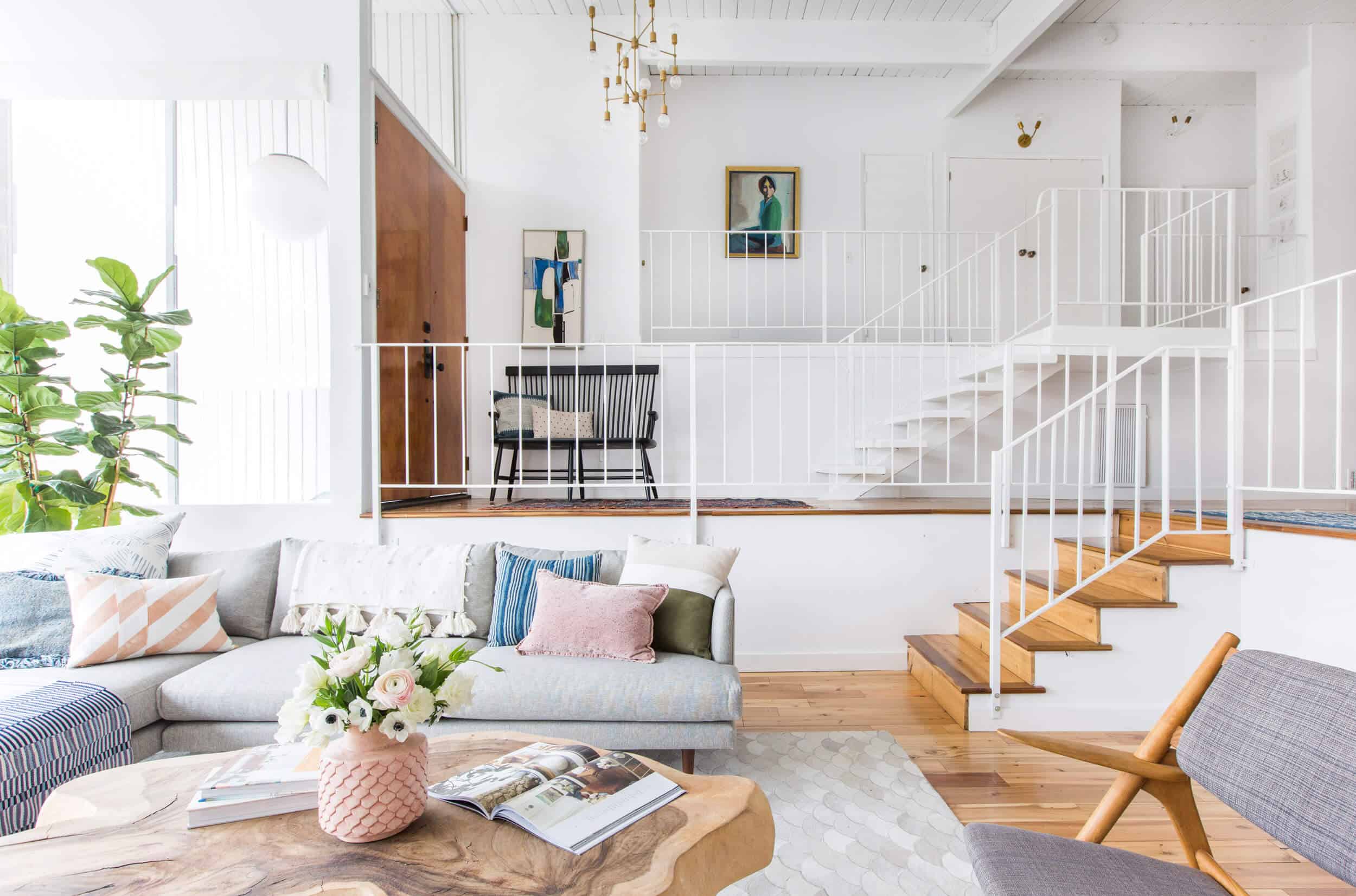
Start with neutral furniture. Now, I will admit that some of these pieces of furniture or rug aren’t EXACTLY basic :). Sure they are neutral in tone and gender, but all of them are pretty special (see resources below). But the tips apply to any room that just has neutral pieces of furniture and you can’t go wrong with gray, wood and leather. If you are someone who never wants to change out furniture, then go simple and neutral (like the above) but know that you can definitely layer on style and color and change it out often.

Next choose a couple ‘accent colors’. An all white/neutral living room can be stunning, but one with layered on tones is what I feel is more inviting. In this case that blue and blush (note: that blue was indigo before it was faded by the sun). I like choosing colors on the opposite side of the color wheel to keep it balanced. My go-to combo used to be teal and hot pink and now it’s indigo and blush (SO DIFFERENT YOU GUYS… but seriously I guess it is). Update: I’m pretty into swedish/french gray/blues right now … and yet navy never leaves my life, and nude and blush are still in my house, but far less.

Now comes the part that looks easy but I’ll be honest with you, it can be pretty time consuming – combining the pillows and throws. I knew that for staging to sell a ton of ‘accessories’ wouldn’t be a great idea, but that a lot of pillows and throws makes any space feel inviting. But the right combination can be hard to master – Just remember to mix different sizes, shapes, textures, patterns and styles in the same color palette. A good formula is big (24×24), medium (20×20), and smaller rectangle (16×20) in the same corner (you can do 22×22, 16×16, and 12×16, too if your sofa is smaller). Put smaller patterns near larger ones, and break them up with solids or just a texture to keep it from getting too busy (see below to see details of the pillows).
Lastly as aforementioned, keep table surfaces simple – books, and flowers.

If you want to look super cool you can leave the magazine open to the feature of your own living room. (It was for staging and you bet I left all those magazines open around the house:)) Here’s the same shot without the copy if you want to pin that sucker.

In case you haven’t properly feasted your eyes on that room and miss it like I do, here are some more photos with some additional tips.

What you can’t tell above is that some of the pillows were splurges and some Target. The pillow on that chair was Rebecca Atwood which is high end and while Brian would be like ‘what’s so special?’ even in this shot you can get a sense of the hand stamping through the color and inconsistencies of the pattern. On the bench is a vintage (fringe), two Target pillows and a simple linen pillow that wasn’t particularly expensive.

You’ll notice that the two pinks don’t match at all. It’s totally fine. They all feel very tonal and calm. Had one of them been hot pink it would have been jarring, but they are both calm and the fact that they aren’t an exact solid pantone color is a good thing. You don’t want to look like you tried THAT hard.


I really, really tried to channel what I loved about this last living room and bring it into our new one, but I already failed….. well, not really a fail. I don’t think that our kids can handle anything but a medium to dark sofa right now, so this gray one probably wouldn’t have withstood the flubber, play-doh, banana and well even more disgusting stains that this one didn’t have to endure (since in our current house the living room gets full use where this one was definitely more of ‘the living room’). And I have tried for 8 months now to find a 12×15 vintage Persian style rug in the blue/gray that isn’t $14k, is also beautiful (and can beat out our heriz, which I love) and hides mess. My friends/family/team are all so sick of me saying I want a neutral rug (do you like how I consider blue neutral?) and it’s because I want the feeling of this room, in our new house. It just feels so fresh, big, airy and yet has style.
Anyway, I’m not saying I don’t love my living room, because I do (stay tuned for the reveal!) but someday when I find that 12×15 blue/gray rug that is still kid friendly and under $5k everyone will see what I mean….
If you want to watch a fun gif (set to music) about this living room here you go:
Of course we reposted the get the look with all the items in the room if you are into it. Happy Friday, folks. xx
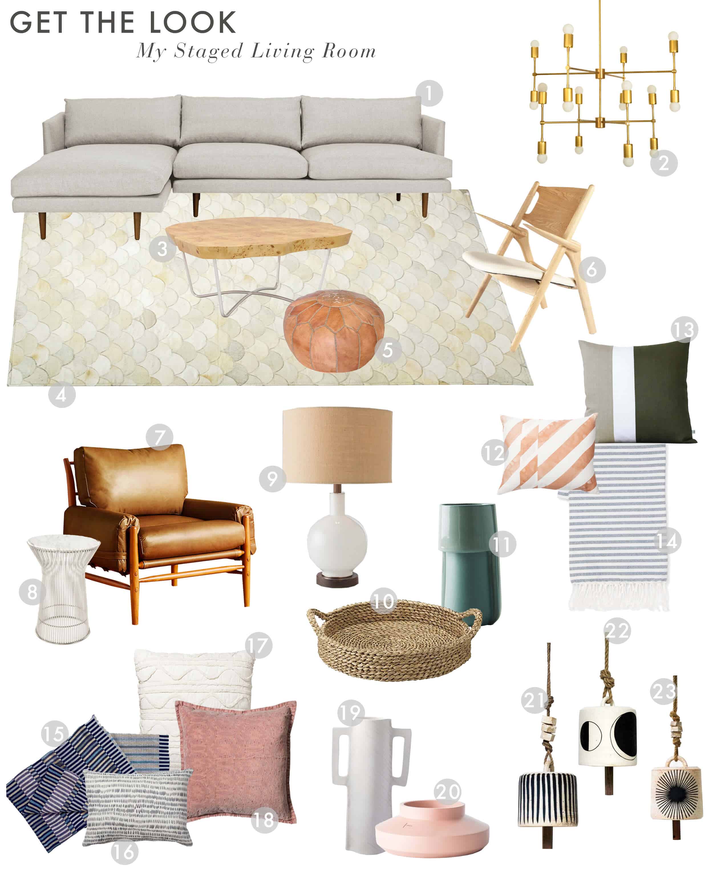
1. Couch | 2. Brass Chandelier | 3. Coffee Table | 4. Rug | 5. Leather Pouf | 6. Wood Accent Chair | 7. Leather Accent Chair | 8. Side Table | 9. White Lamp | 10. Woven Tray | 11. Turquoise Vase | 12. Coral Stripe Pillow | 13. Green and Gray Pillow | 14. Striped Fringe Throw | 15. Blue Strip Throw | 16. Dash Pillow | 17. Cream Euro Pillow | 18. Blush Pillow | 19. White Handled Vase | 20. Pink Ceramic Vase | 21. Striped Bell with Beads | 22. Moon Phase Bell | 23. Painted Eye Bell
For more reveals from Emily’s Glendale Home: Full House Tour | Family Room & Kitchen Styled to Sell | Elliot’s Room Styled to Sell | Charlie’s Room Styled to Sell | Living Room Styled to Sell | New Master Bedroom Styled to Sell | Office | Guest Bathroom | Master Bedroom | Elliot’s Blush & Green Nursery | Master Bathroom | Charlie’s Circus Themed Nursery | New Guest Bedroom Bed | Good Housekeeping House Tour | Guest Bedroom | Closet


Here’s hoping you do a “one room three ways” for a kid-friendly neutral living room. People with young kids (like Emily) already know this, but this living room above is not very kid-friendly. The carpet and sofa would be dirty and stained in two days. The side table would flip over. The coffee table would tumble over the minute a kid tries to climb on it (and they will). The arms on the armchair could poke an eye out or gouge someone. I LOVE this look (the room above looks awesome!!), but I’d also love to see another version of it that is accessible to those residing with toddler-aged children.
ha. We will put that on the list! But actually some of them were super kid friendly. The coffee table was so heavy that it was impossible to move, let alone tip over, the rug was a quilted hyde and you could wipe up wine, coffee, paint, anything without it leaving even a mark (so amazing), the leather chair can’t be stained and was really chunky and had soft corners (the kids loved climbing all over it). But the side table and lamp were for sure not going to last with toddlers and the light sofa might have been a problem in a light color (but these days there are so many synthetic fabrics or stain repellent fabrics, so who knows). Anyway, I think that I did a whole post on kid-friendly … let me see if I can find it … here it is: https://stylebyemilyhenderson.com/blog/how-to-make-your-home-kid-friendly. But I need to do more kid-friendly content because I sure do have those kids and our new house is crazy kid friendly. xx
Im totally here for more kid friendly posts!
I had been concerned that these posts hadn’t originally been published for a reason, but this one is good and helpful. I often struggle in design with wanting/loving too many different colors/patterns/styles all at once. This is probably a little more neutral than I would go but I really like the basic concept of keeping it simple and timeless. thanks 🙂
Thank you! We just moved to a new house where we have, a new gray sofa + loveseat, leather chair and a neutral (sea grass) rug. But only about one throw pillow because our old sofa was a totally different color. Been trying to figure out an approach to build in some pillow and throws, so this timing is perfect. I’ve also reached out to a friend trying to launch her own textiles business and said we’d be guinea pigs — we like blues and greens, beyond that we said we’d give ourselves over to her creativity. Wish us luck!
Your pillow game is really on point with this room! I love how diverse and cohesive it all is. It looks so warm in there! (of course, I’m sitting in my freezing office right now so literally anywhere sounds warmer). This post made me nostalgic for your old house! Those windows, that light! ARG!
Emily–did that actual coffee table sell out and that’s why a different one is linked? I loved that table…
In regards to a rug, have you considered purchasing custom? There are a lot of great hand-knotted or hand-tufted traditional rug companies out there (just cruise through the Pacific Design Center) and you can get something beautiful. Yeah, you’ll have to wait, but it’ll be YOURS. And vintage wasn’t always vintage, it was new once, too 🙂
I love that you put flowers in the special vessel – so often these sit empty on the shelf (beautiful) but they look a GORGEOUS with flowers in them:) what a great idea….
CHEERS to a weekend of styling and re-styling and arrange and re-arranging :p
Great post. One quibble — if you could think of a word other than “nude” to describe a certain color, that would be great. Nude people come in a huge range of colors, and the more we reinforce that fact in public discourse the better!
What a smart, interesting comment. I had never even thought about it, besides the fact that “nude” band-aids don’t work for a lot of people… Thanks for bringing it up in a respectful but thought-provoking way. What about “tan”? Or is there another word for “beige” that’s not as ugly-sounding as “beige”?
YES, Thank you Amy!
Wow, I think of myself as being sensitive to language, and I hadn’t thought of that before. Thank you, Amy!
What did you guys end up doing with your big tree that was in Here?
Did it die? I have a feeling it didn’t make it
Love your blog! Thanks for all you do. This might not be the kind of topic you are interested in writing about as it’s not glamorous, but I’d love to know how you keep your house clean. All the vases, lamps, etc. are beautiful but I see them and think “dust magnet.” With young kids and a demanding job (same here!), how do you keep your house clean? Or do you hire someone?
Agree!
Great post and super timely for me as I am finally decorating my living room.
Also super interested in how you keep it all clean!
And I’m so glad you talk a lot about “kid-friendly”! You’re the best. 🙂
I consider blue neutral too! Especially dark varieties. Blue, much like the greys blacks and whites of the world, plays so well with every color hence why it’s a neutral in my book!
I could never be sick looking at this room. It’s gorgeous and so bright and inviting. I totally agree that this version is a favorite but I love a comfy sectional.
Great post, as much as I have enjoyed your last house which was stunning as well how you styled it here. I look forward to see how your new house is revealed.
I’m curious about what you did with your blimp drawing? Did it make the cut to move to your new house? Did you sell it with the old house?
I believe it’s in her new dining room on the wall opposite the window
Oh good!!! That blimp is my favourite of all her art.
This past month your posts have been totally on point for my season of life, thank you! We just moved into a new house and your paint color round ups, California casual posts, and this one absolutely hit the nail on the head. My husband and I are often saying “how does she write exactly what we need right now?!” Thank you!
I really like how you design and style a room, and then point out how different it might be in real life, with real people living in it.
Would you consider designing rooms for seniors and for people with various disabilities? For example, rooms that accommodate a wheelchair but don’t look institutional, or rooms for visually challenged people who might not do well with lots of accessories scattered about, or less than clear walkways. Or bedside storage for people who use CPAPs or other medical equipment.
And where/how to charge our rapidly growing numbers of devices in convenient places.
I love to have a houst like this.
Is the sofa comfortable? I’ve never bought a sofa on-line before!
I miss this house. I get why moving was right for your family, but I looooooooooooooooooooooooved this house. (I mean, don’t get me wrong, I love reading about the new house; this one was just more my style.)
Vintage Persians — yes, they are really, really hard to find in a blue-grey colorway. Nearly all of them lean red or purple or salmon or something instead. If you don’t mind bidding without touching first, you might try Link Auction Galleries, they are listed online through this company called “Invaluable” (google can find them for you). They often have a *ton* of rugs, and if it’s a slow auction, you can get huuuuuuuuge rugs for, no joke, less than $200. I don’t work for them, promise — I just have way too much stuff in my house from them 🙂
I always thought that the first couple versions of this room looked more rock-star, designer (esp with the huge tree) and this one looks more doable, real life…and I love seeing both! I think its fun to see one room styled in different ways/different price points, etc.
This was so fun! I love posts like these where you break rooms down and explain why they work. So glad you posted this one, it’s especially relatable!
Hi Emily, thanks for this post.
It’s a complete visual guide to styling. If I put up this design, I’m sure I’ll rearrange it in a week or two. I don’t know but I think my problem I tend to like multiple design, style, pattern, color at a time. And also because I am quick to get bored on things like this.
I love this house! When you first showed us the the modern artwork near your front door, I fell in love. I love green and it’s so underutilized. Hope you found a place to hang it in your new home. Looking forward to the reveal.
Great post Emily! Love the breakdown of the pillow sizes, so helpful. One thing that I always loved about your style was your incredible taste in vintage art and textiles. I can’t get over how beautiful the greens in the two paintings in your front hallway look paired together. Just amazing! I look forward to seeing more of that in your new house as you continue to layer things. I adore that blue and white large textile, can you share what that was? Is it a sail? So amazing. Thanks Em!
Hey Emily- Thanks for the tutorial. Any other suggestions or resources you can make for staging your home for sale, but still keeping it “cool”? 🙂 Thanks- Love your blog!
Emily…first let me say that I am delighted to know you no longer allow mean comments. Can’t we all have the freedom to do what we do and share it with others and NOT be mean to someone’s share? Yes! Yes we can! So bravo for saying NO to mean! And I am sorry you had to read junk like that for as long as you did.
So…to the living room…I LOOOOOOOOOOOOOOVE it! I am a neutral gal…grays, whites, mixed in with natural things like woods, glass, leather, metals AND yes pops of color. Also….a Fiddle Leaf Fig Tree anywhere and the one in this living room is amazing! I would move into this home in a nano second…and love simple and few accessories. You did an incredible job! Thanks for sharing your talent and decor tips with all of us.
xo Elizabeth
@elizabethbeardesigns
LOVE this post. Thank you.
Favorite room ever on this site-love.
This idea is amazing! Coincidently meet this post when watching TV. Keep posting very interesting post like that!
OK am I the only one that *just* realized that you can have an assortment of pillows (none of which match!) on your couch? Apparently I’ve been buying them wrong my whole adult life. I always had two or three matching sets?? I’ve never loved the look and thought it was the patterns/colors etc. Ha ok mind. blown. And I’m off to mix up my pillows!!
I, too, am always trying to find a big, not-bright-red vintage Persian rug for my living room. Several years ago I bought a 40-year old bright-red Bahktiar and I’ve hated it since the moment I unrolled it– it’s too new-looking and too bright– but I can’t find anything to replace it with. Here in the PNW vintage Persians are nearly impossible to find at auctions or antique shops. Do you have any favorite online sources for them?
Hi Emily! And thank you for such a great blog and IG. I have a question which is not related to this specific post. Your kitchen tile…. Would you mind telling me what it’s called? Been trying to find something similar in Sweden but I can’t. All my best, Cathy
Hi Emily! I am struggling to find beautiful blankets that aren’t boring! Can you add a best blankets round-up to your blog soon? There are so many ways to use blankets and they add such layer. Couhes, benches, chairs, beds, picnics etc. All the best things need blankets!
Hi Emily! I am struggling to find beautiful blankets that aren’t boring! Can you please add a best blankets round-up to your blog soon? There are so many ways to use blankets and they add such layer to a room (plus they are an easy way to add character to neutrals, as you have done here). Couches, benches, chairs, beds, picnics etc. All the best things need blankets!
~like a breath of fresh air!!
Okay, maybe more than just one breath. More like 5 and counting.
One word : perfection. This room is just perfection! Could just stare at it but really enjoy and appreciate the visual breakdown. Such great stuff! Those finishing details really seem to be what make or finish a room. When done right it looks so effortless, but it’s tough to accomplish! Feel a little better knowing even an expert admits its tricky!
Absolutely love this blog! I love how small details can make such a significant difference, will apply this to my apartment for sure <3
Love this post. Adding style to any room is very important to make a room look beautiful. Thanks for sharing these lovely ideas for adding style to a neutral living room. These all pictures are very pretty.
The place looks amazing! You really made the place look great with such simple decor accents, I love it!
But the tips apply to any room that just has neutral pieces of furniture and you can’t go wrong with gray, wood and leather. If you are someone who never wants to change out furniture, then go simple and neutral (like the above) but know that you can definitely layer on style and color and change it out often.
SO in love with this styling and colour palette! Really want to try recreating this feel for a bedroom when I move, even though the space will be way smaller.
Rabeyah | @rabeyahn
There are so many ways to use blankets and they add such layer.
I love this look, and the step by step guide to layering. My problem is that I’m allergic to dust mites, and managing those allergies requires minimizing fabrics, pillows, throws, fluffy rugs, throws, etc. I would love some ideas on how to make a room feel appealing, without using so many dust-holding fabrics and pillows.