Uncategorized
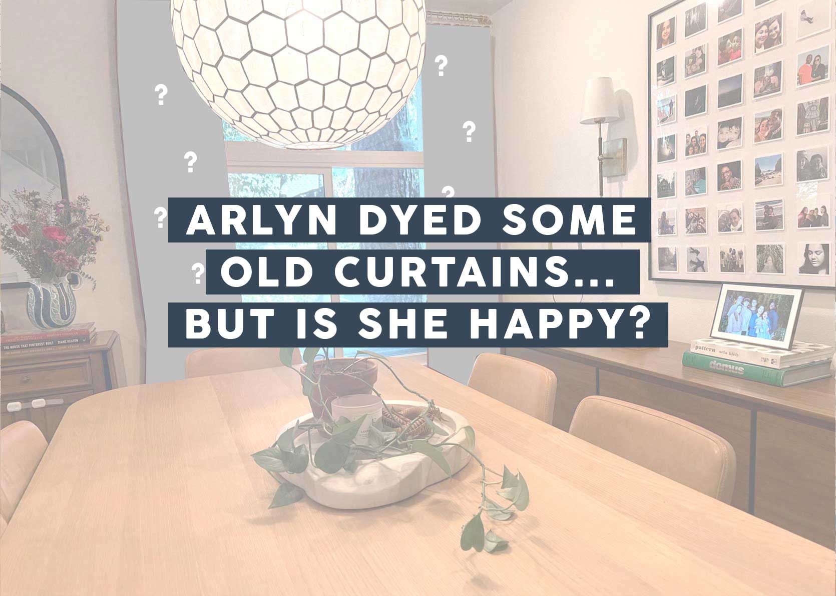
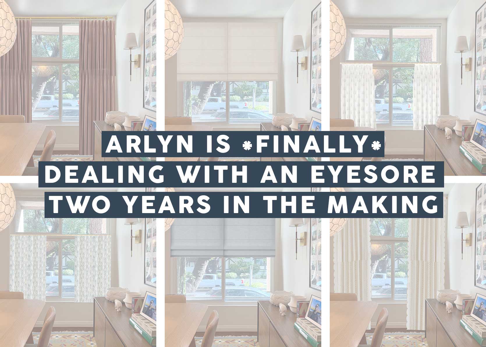
Arlyn’s Dining Room Curtain Update: Here’s What She Ended Up Doing (Spoiler: It Involves Another DIY)
It happened. I (basically) met my deadline to address the curtain issue in my dining room by the end of January. To say I’m proud of myself is an understatement—yes, even if I actually, technically, did this entire project start to finish, starting on February 2 and taking a not that great photo (more on that down below) on February 3, all the while knowing a post about it was due to go live on February 4. And while I don’t recommend that kind of pressure for anyone, especially when it’s your birthday, your kid is sick, and your family is juggling some unforeseen stressful situations, what this proved to me is that a project I’ve been toiling over for months, heck, even years, only took a few hours to finish. Typical.
But first, let me rewind for those of you joining us on this topic late.
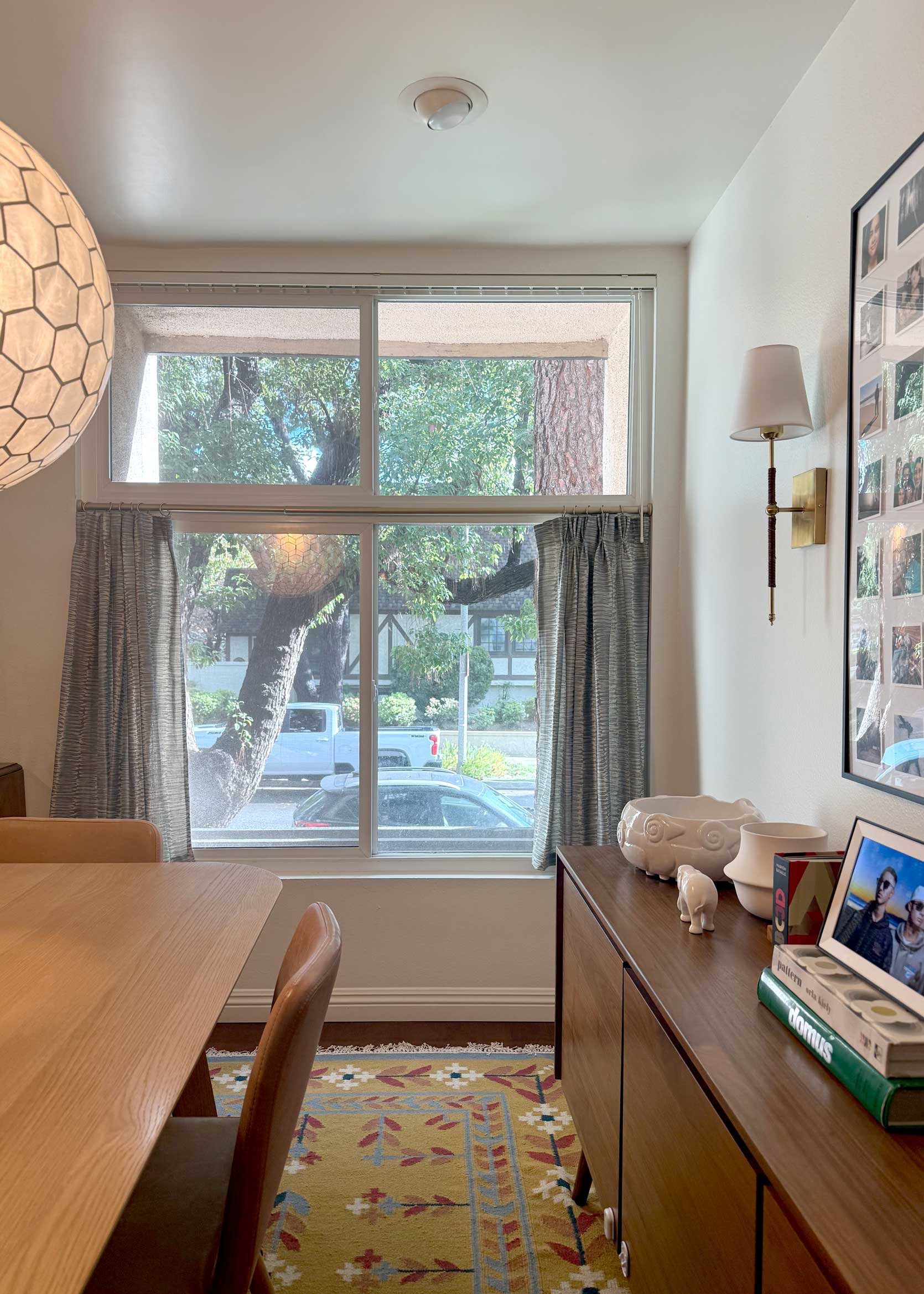
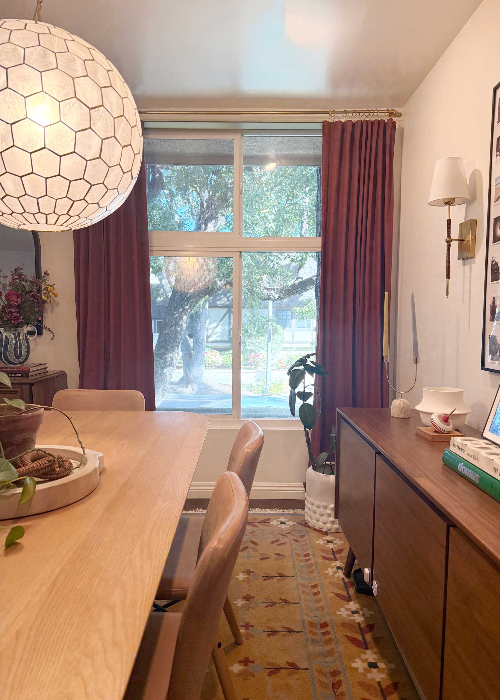
This was my dining room until yesterday morning. It’s perfectly fine, but the cafe curtains I made after moving in weren’t working for me for a multitude of reasons. In short, they were, well, too short, rigid due to the wrong fabric choice on my part, and didn’t suit a window of this size.
I went on a journey in this post exploring possible solutions, and in the process, I unexpectedly stumbled upon a look I ended up loving. Of course, it was just a Photoshop mock-up, and I knew the real-life version was going to be a little different, but it was exciting to have a plan after two years of being in style limbo.
Here was what I mocked up, using these curtain panels from West Elm in the color Mulberry:
The soft, mauvey-clay pink looked like a nice bridge from the warm wood tones in the furniture and floor to the color palette of the rug. They matched the light blush petals nicely. As I mentioned in the post, we are likely not staying here for much longer, so I didn’t want to invest in expensive curtains, and a new DIY presented itself.
Here was the plan: Take white cotton curtains I had stashed away in a cabinet, dye them a similar color, and hang them with a curtain rod I also had lying around in the garage. Spending $30 on dye and a few hours of my time seemed like a well-worth it experiment to save $300 on ready-made panels.
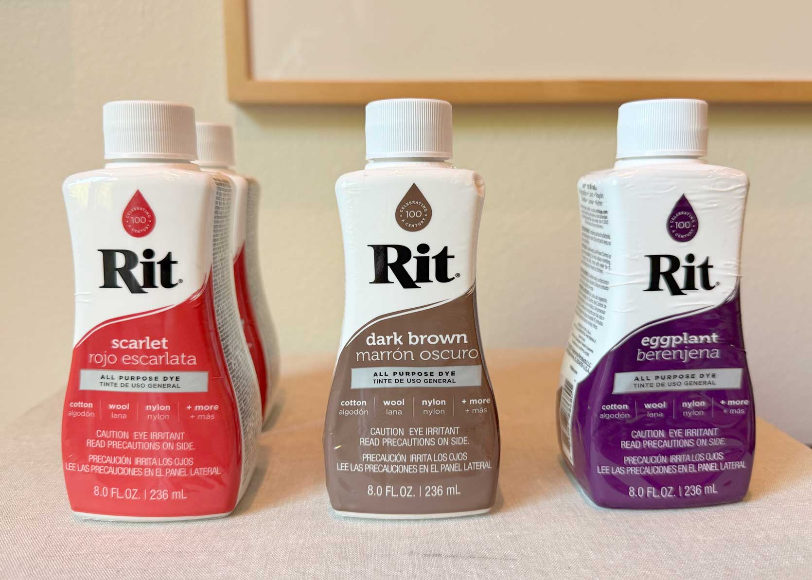
The Dye Color Options
Rit dye’s website has a great section where you can pick a very specific color, and it gives you the exact coloration formula to get there. I dug through the pinks, reds, and browns to find something to match the West Elm curtains. I should note that I took a zoomed-in photo of the fabric from the brand website and used that, which was actually much more terracotta than the pinkish hue seen above.
These were the four colors I considered. I liked the balance of Ruddy Red, the subtleness of Sangria, and the depth of Mahogany. End of Road felt a bit too brown to me, but SPOILER, in retrospect, I think it was the better color. Let’s keep going, and you’ll see why.


So off I went to Michael’s to grab some bottles, and while I was there, I decided to go a bit rogue and also get a bottle of the color eggplant. I trusted Rit’s color combo instructions, but thought that a bit of eggplant could add a touch of plum to the finished result, and that seemed enticing to me.
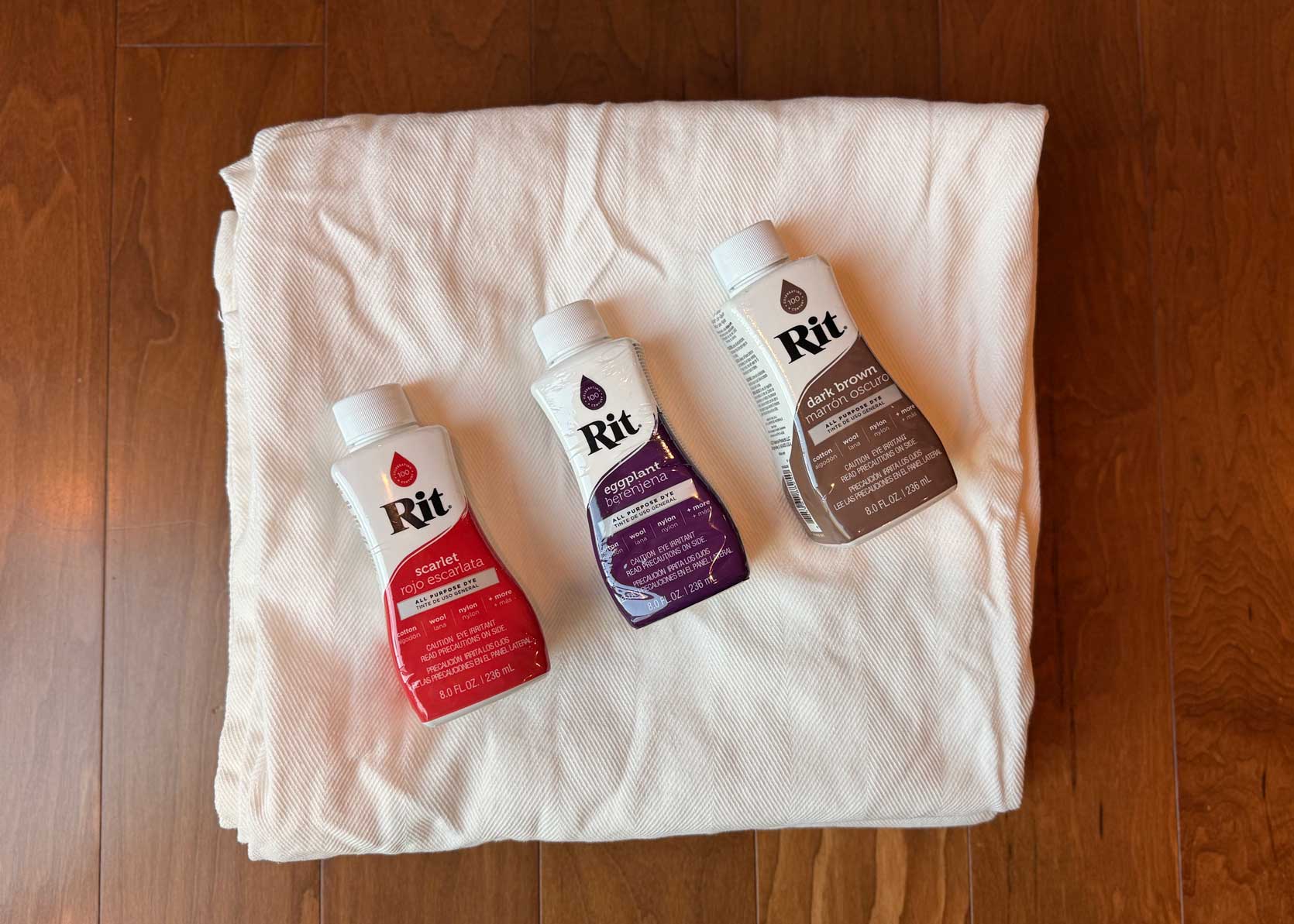
My curtains were cotton, so I was able to use the All-Purpose product, though take note that if you’re dying anything synthetic, they have a different dye for that. I also planned on using my top-loader washing machine because I didn’t know another way to maneuver the size of draperies. I would also like to add that I HAVE NEVER DONE THIS BEFORE AND WAS KIND OF TERRIFIED.
This terror kept me from starting the project for two weeks. Every time I thought of getting my supplies together, I would freeze and then find something else to do. Avoidance is my coping mechanism, for better or for worse (mostly for worse). Every time I saw these bottles where I set them on my dining table in waiting made my heart skip a beat in a not-so-fun way. Look, I’m quite capable. I can sew, paint, cook, do crafts, build furniture, put up wallpaper, etc., but dyeing fabric is incredibly permanent, and it had me shook for some reason.
But then February 2 came around, and I knew it was do or die (die = miss my deadline and disappoint my beloved Jess, who needed this post for today). I took a deep breath, grabbed the curtains from the upstairs linen closet, and just got to work.
Finally, Dyeing the Curtains
I’m not going to go into every detail of the dying process because the step-by-step is unbeatable on the Rit website (see that here), but I’ll touch on the broad strokes.
I started by washing the curtains to remove dust or grime from hanging in my previous home for years. Also, putting damp or wet fabric into the dye is best for getting an even application.
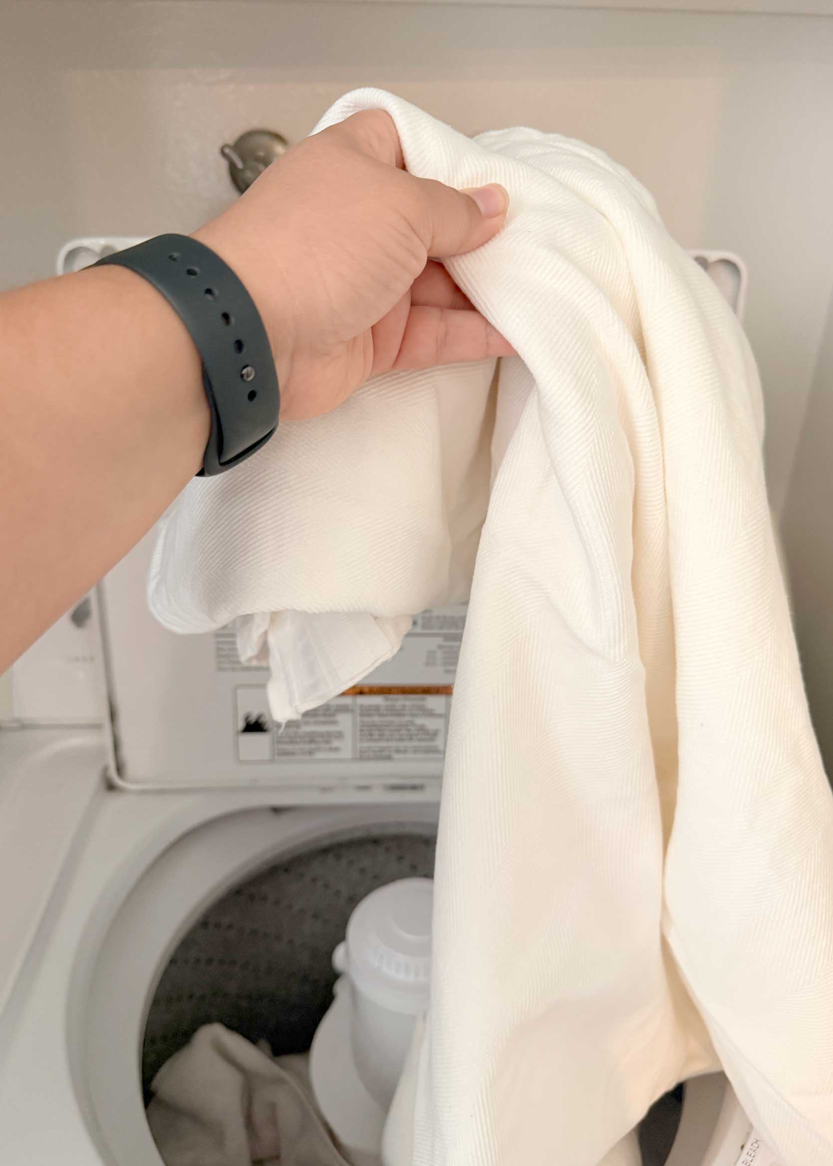
In they went. Once the cycle was done, I removed them, started a new cycle with hot water, and waited for the drum to fill all the way. I followed the instructions for diluting the dye with boiling water in a stainless steel bowl prior to adding it to the drum. You also have to dissolve a cup of salt in another bowl of boiling water to add to the laundry. I missed this fact in my prep and had to cobble together some pink Himalayan sea salt with some coarse grey salt I had in my pantry. Not ideal, but it’s what I had, and I didn’t want to have to run to the store in the middle of the project.
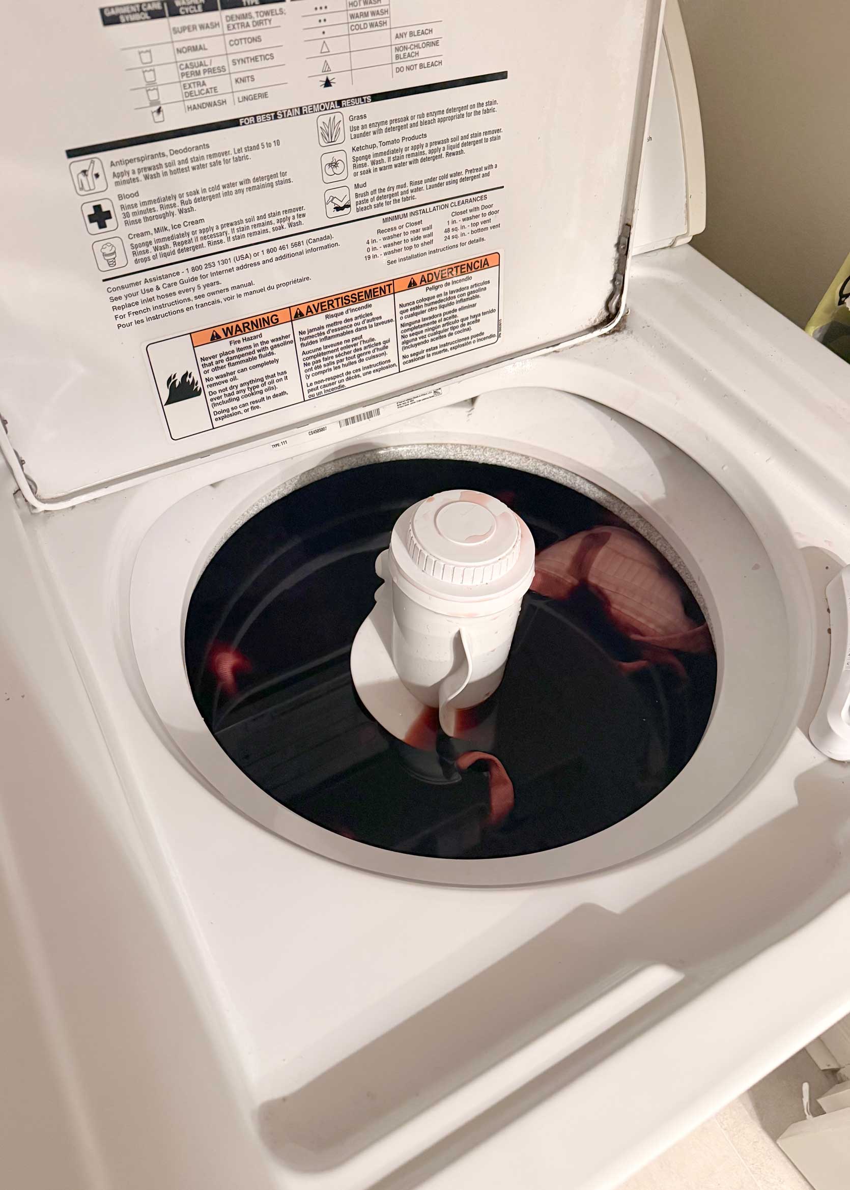
Pouring such concentrated dye into my washing machine was nerve-wracking, but the website swore up and down it wouldn’t stain. I let the curtains sit in the dye water for about 15 minutes before closing the lid to start the cycle. They have to be in the solution for 30 minutes minimum, an hour max. Right before the rinse cycle, I stopped the machine and gave them another 5 to 10 minutes to really give the color time to set. The longer they sit, the darker they get. For me, it was like how it feels to be in the chair at the hair salon with the intention of only getting a trim, and suddenly you hear yourself saying “take it all off” to the stylist. Like…why do I do this kind of thing? More is not always more.
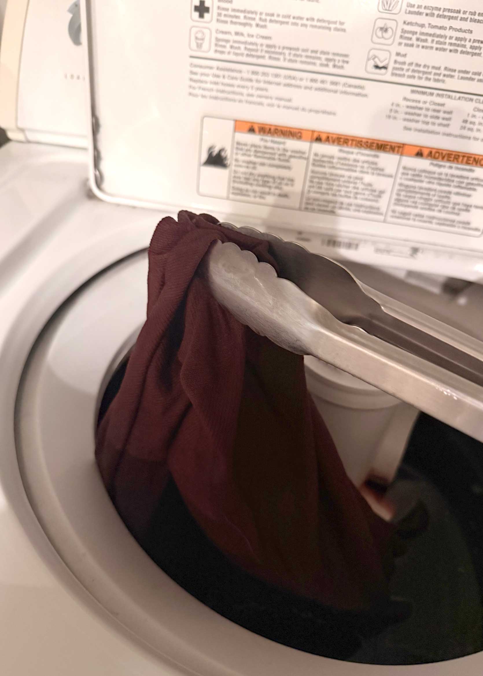
The photo on the right is what they looked like wet after the first rinse. You’re supposed to do another wash with some mild detergent, which I did. I wasn’t sure how much dye would wash out, so I was nervous. At this point, I kept saying “trust the process, trust the process” to myself frequently. When mixing the colors together, I ended up adding three capfuls of the eggplant, and wondered if I should have done more as they looked quite red.
The Big Reveal
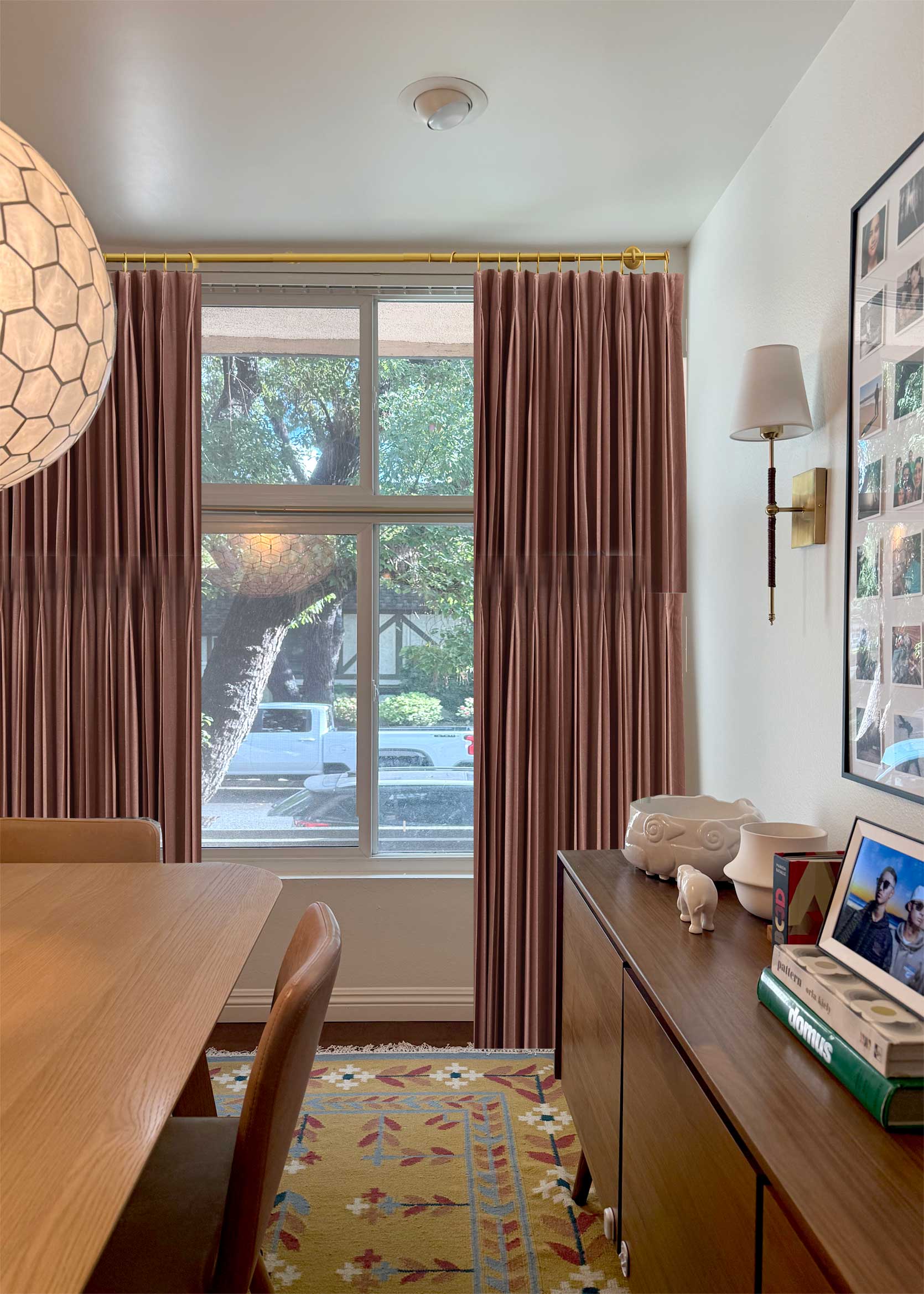
After drying, ironing, and hemming, here is the final result:
Please excuse the poorly lit photo. I really wanted to snap this with the beautiful morning light that streams into this room, but I didn’t manage to get everything up until close to 2 pm, when we lose light thanks to the shade the trees cast.
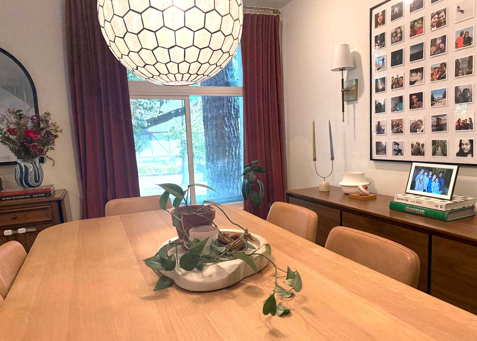
I did tidy up but didn’t do much in terms of styling or fussing, so this is definitely not so much a “reveal” as it is a “hey, look what I did” photo snapped with my iPhone. You may notice that the bracket for the French curtain rod is horizontal. Folks, it should be vertical; however, as I was putting it up, I realized that, FOR THE LOVE OF GOD, I didn’t have enough clearance between the top of the window and the ceiling. With no time left for mistakes, I just turned them to the side and moved forward. This meant that I couldn’t use the center support, however, and I was crossing my fingers that the rod would be strong enough at this width to not sag without it. So far, it’s holding and feels super sturdy, thank goodness.
So…Do I Like It?
Here’s the big question: What do I think about the finished result? Well…I’m honestly not sure. A few things I like: The length of the curtains feels far better suited to the size of the window, and the room feels much better balanced. I can see now that I needed full-length draperies here the whole time, and the cafe curtain was a miss that I tried hard to make work unsuccessfully.
What I don’t love? Well, the color itself. Maybe it was the eggplant I went rogue with and added in that threw it all off, maybe I let them sit too long, or maybe I picked the wrong color to begin with, but they are super saturated and a bit more red than I wanted them to be. Yes, I can acknowledge that the color does closely match the swatch from the Rit website, but at this large scale, it’s a bit overwhelming. In a quieter room, with fewer red-hued wood tones, I think I’d really like them. But to my eye, it all feels too red and warm. The room needs some cool-toned balance.
Ultimately, even though my end result isn’t exactly what I wanted, I am incredibly impressed with the dye and the process. The panels are evenly dyed, saturated, and look like they were always this color. I would never look at them and think they were white before, which is pretty cool, tbh. I’ll definitely be far less scared to do this process again for another home project in the future.
The plan is to leave them up and let them be. They are very pretty, just overwhelming to my eye in this particular space. If we were staying for another year or two, I’d take my two remaining white panels I have stored away and go for a lighter pinky brown color, rather than this deep rusty red. But for now, it’s at least better than what I had (to me, and if you disagree, feel free to keep that to yourself).
So that’s it. I’m happy to answer any questions you might have about the dye or the process, and welcome any general insights, as well. Thanks for following along on this curtain journey with me.
Until next time, friends…

I think they look fabulous! They pull out the darker red tone in the carpet. A massive upgrade from the cafe curtains that were there before.
Thank you Joanne! I’m still getting used to them, that’s for sure.
Perhaps the iPhone photos aren’t an accurate reflection of how it looks in real life but I think the colour looks fantastic, especially as it looks to perfectly match the pink tone in the carpet.
Well done from another To-Do List Procrastinator!
TDLPs unite! 🙂
I think the color looks great for this space! I love the end result.
Thanks Maeve!
I love your combination of furniture! And the bunch of flowers seen in the corner of the picture. The colour of the curtains is wonderful. And at the same time heavy yes, I van see. Add one more DYI: Paint the walls a light version of End of the Road and I believe all will balance out beautifully! Good luck & courage with family business (second job if not first ;)).
Jess actually brought those flowers over for my mom when she was visiting! 🙂
Yes, I would love the curtains more if the walls weren’t white. It’s too high contrast for me. But my space is totally open to the rest of the house (and I’m renting, and leaving soon) so alas, that paint job will only happen in my heart.
I felt your whole process.
lol at – “and if you disagree, feel free to keep that to yourself”
Right? And such suspense! I was on the edge of my seat. And they’re better than west elm pinks ones, imho.
HA thank you!
I love them! Nice job 😊
love them! They look great I think 🙂
They look fantastic! They looks so good with the rug, and the bracket is less noticable in the horizontal position.
From what I’ve learned about design from here and life experience, the only thing that matters is if YOU like it. But I’ll tell you what, they look fantastic to me based on these photos. Well done.
I don’t dislike them, I’m just…getting used to them. They’ve already grown on me so far today.
I’ve been dyeing a bunch of stuff with Rit lately: too-light jeans, stained hand towels, pillowcases, etc. And they all look sort of mottled and tie dyed. I don’t hate it, but wanted to say bravo for getting a consistent color like that. That’s expert level crafting right there!
In my experience dye works best on totally natural fibers.
i think the washing machine method (and starting with wet fabric) had a lot to do with the final results!
I think they look great, Arlyn! I used Rit to dye a white Ikea couch (turned it dark green) and it’s imperfect, but I’m still so glad I did it. Now that I’ve done one project, I feel so much more ready to tackle another!
Can you share the details on what curtains you used? (Sorry if you already have and I missed it.)
In the previous post (linked in blue at the beginning of this post) she mentioned they were from Ikea but I don’t see a link to the specific panels.
These are old panels from IKEA. I believe they are the TIBAST (which, btw, were half this price when I bought them. Wild how much costs have gone up).
Oh, yes, they look very nice! Great job.. I’m glad you tackled dying.
I like them! And I support just living with them…but FYI, I’ve gone a little too dark with Rit in the past and just washed my item with a generous dose of bleach. Worked great!
They don’t turn out splotchy with the bleach??
Thanks for the update Arlyn! They look beautiful, and also – I so appreciate relatable posts like this – particularly the “not a total fail but also not exactly what I dreamed of” result. This happens to me often and it’s really nice to be in good company 🙂
I love it! The curtains work with the rug so well.
I keep thinking a natural woven roman shade would be really beautiful on this window. It would hide the roof line of the porch and that upper portion of the window, while still allowing light to filter through. And you could lower it down fully in the evening for privacy. The texture would be really nice too!
Oh I’ve definitely looked into it. They’d be great, I agree, but just not looking to spend money on this at the moment.
I love the length and th color looks great in the photo. It looks like such a high impact difference for a relatively small change. I’ve been paralyzed about the curtains my living/dining room, that looks very similar to your layout (dining room is half floor above and open to living room), but I know anything would be better than the nothing that’s been there for 2 years.
Put something up and then just see how you feel. It might help you better understand what you actually want. If you put up something neutral, maybe you’ll be bored of them. If you put up something bold, maybe you’ll realize you want neutral. Just make a move!
This looks great! I wonder if your disconnect is that you were envisioning the color closer to the lighter tone in the rug and instead it’s close to the darker tone from the floral design. From here it looks like a strong color but not overwhelming in the space.
Side note – your home is so warm and interesting and inviting! This room feels layered and there are details to look at but it’s not fussy or precious-feeling, and everything feels like you selected it with care and love over time.
Yes I think that’s exactly it. I was preparing for something more subtle and they are DEEEEEP colored. But thank you for your kind words.
Kudos to you for doing this yourself. I wouldn’t attempt dying curtains but I’m the first to admit I’m not exactly the world’s greatest DIYer. I think it looks pretty good although to be honest, I thought the inspo curtains were striped! Only now do I realise they are a pale pink.
Did you have run the washing machine on empty afterwards to make sure no dye has remained?
When I did this, I decided to run a cleaning cycle afterward. A product like Affresh might work well.
The site has instructions for running a bleach cycle with some old towels. TBH, my machine still has dye on it. However, what I think the dye is clinging to is the grime or hard water inside my machine, not the machine itself. When I get some time, I just have to go in there with a brush and give it a good scrub.
I always run a load of whites with hot water and lots of bleach after I’ve done machine dying, and I’ve never had a problem with dye transfer to my clothes.
The curtains look great. Much better than what you had before, and good enough to get you to your next move.
i love em!
Wonderful job, Arlyn! It’s a big upgrade from what you had before. That’s always a win, even if they’re not exactly what you wanted. A learning lesson to take with you into your future! Thank you for bravely trying out dyeing fabric and sharing your experience with us 🙂
🙂
They look beautiful! I really appreciate this post on many levels, from finally getting that to-do ticked off to trying RIT dye, which I’ve been reluctant to do. And nice to know that even a veteran design person feels hesitant on some things!
Yes it is the same grid (though it’s actually 50×50). I think it looks bigger because it’s on a smaller wall space and more tightly surrounded by lights and furniture.
And the frame was a gift from someone and I’m not actually sure where it came from (probably just some random brand from Amazon, TBH).
You can strip these back down with Rit Dye. But I cannot recall the exact name of the product off-hand. Then just re-dye them the color you are thinking you want more. I’ve done it before, and it worked great!
Interesting…
Well I love them. They’re darker than what you envisioned but still work with your beautiful rug! And yes, the height makes such a difference. I know I don’t have to tell YOU given your color skills, but I think a few choice accessories in that lovely blue from the rug will provide that cool-toned balance you want. I’m impressed with the dye job and your last minute timeline 🙂
They look great! As a veteran dyer of fiber arts, I’m impressed with your even color- not the easiest thing, even on new fabric. Agitating/stirring and moving the fabric around in plenty of liquid is key, but you also need extremely clean/stripped fabric for an even result.
Agree with others that if you still feel they need a tweak after having them up a while, try dye remover to strip the dye and re-dye, or wash with plenty of bleach to lighten them a bit.
I’m very much in the camp of “done is better than perfect” and think of home decorating and renovating as a long road where nothing is ever finished, it’s just a series of steps where hopefully each step builds or improves on the other. This is all to say- I think this is a huge win you should celebrate! They look great and are a big improvement from the cafe curtains (which were a big improvement from nothing on the windows). Maybe they are a bit too saturated from what you envisioned but so what? I know we all seem to expect absolute perfection from design content but I think a post like this is so inspiring and relatable!
I like the “but so what” idea. Haha yes!
I think they look great! In the 70’s I bought a white nurses uniform from a thrift store (most likely from the 50’s) died it red and have been dyeing stuff ever since. Your post has inspired me to take a second look at some curtains I have in storage.
Do it!
This is a big win! These curtains have a bigger presence that does a much better job of hiding that the window is asymmetrical. The whole area looks so much more elegant. And an impressive DIY, as well!
Wow! I am super impressed. I think they look great! It never occurred to me that you could mix dyes to get your desired color. I’ve only ever used the denim blue because that’s the color I like as is. And I’ve never gotten such great results. I’m going to try again.
Yes! The website has a tooooooon of color combos and then just follow the formulation for the size item you are dying. It was effortless.
omg. they look like a million bucks, lady!!!!
Thank you ma’am!
Oooh, I love this color, especially with your rug! Great work, Arlyn! I haven’t dyed drapes in years…
I think this looks great!! It speaks to the rug so well. You’ve inspired me to not be scared of dye, Arlyn! Also, great save on turning the curtain brackets. I would have lost my mind, especially after hemming them to a particular length. Aaaaargh!!!
Haha I almost lost my mind, but didn’t have another option so to the side they went. Whatever!
Wow,came out great!
I think they look fantastic! Really pretty color and great with the rug. I bet you will like them more over the next few days as your eye adjusts. Even if they’d come out to the perfect slightly lighter shade you envisioned, it might still be a shock to see so much color in that quantity after being accustomed to the grey. But truly I think it looks great and really pulls together the room.
The curtains look great! The way they bring out the flowers in the rug I’m fairly certain you sold some rugs today! Lol
They look great and pull from the similar tones in the rug. Bravo!
Like so many, I love them too. They really pull the room together. Great job.
As a fellow renter who is trying to be conscious about how & where I spend my money, thank you for this post.
I was going to say it is both inspiring and very relevant but that positions those two as opposite end of the spectrum. While I love a beautiful big budget project from time to time, a project that I see myself in is even more inspiring ❤️
Hi there- lots of rug fans in the comments section, including ME! I may have missed the link to it- could you reshare here please?
Cheers on your beautiful space.
Find the blue text “curtain issue in my dining room” in the second sentence of this post. Blue text means there is a link embedded in the text. Click the blue text and you’ll find another post with a link to the rug. It was from Garnet Hill.
I think they look great! I’ve had hit-and-miss results with dying items but it’s so satisfying when it works. I find Rit dye runs quite a lot in the wash unless you use a fixative (which I assume you haven’t for curtains). If you run them through another wash cycle, the intensity of the colour might come down a bit.
Or you could lean in and paint the walls a pale purply pink to match.
I think they look wonderful! They finish off the room beautifully and make a nice focal point. I’m just so impressed that after your discouraging experiences with DIY projects, you dove back in and made something out of nothing in such an effective way. Well done!!! I’m definitely side eyeing my bland, dingy white Ikea curtains right now…