Design
Ask The Audience: Which Wallpaper (& Renter-Friendly Tile) Should Arlyn Use In Her Dining & Living Room To Add Serious Drama?
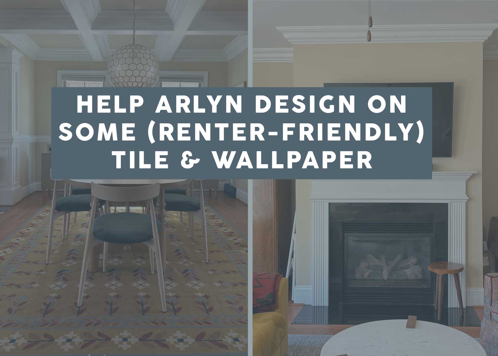
Hello friends and welcome to another update from my North Carolina home! Last I left you, I was contemplating what style I wanted and plotting out loose design plans for some of my spaces. You may remember that my sofa was locked in and acquired (in a gorgeous golden mustard velvet). From there, I picked up a few pieces here and there on Facebook Marketplace, found homes for furniture and decor I had previously, got a chair reupholstered, settled on a rug, and then took a look around. For the record, I know it’s not very nice to mention everything above but then show you almost none of it, but if I did, it would feel too much like a “sneak peak/rough draft reveal” post rather than what it is: Help me decide on a totally random set of ideas that popped into my head one day while sitting and looking around. In particular, some wallpaper on the partial walls and coffered ceilings of my dining room to make it feel more like its own room, and peel-and-stick tile to create more of a focal point on my fireplace wall. More on that in a second…
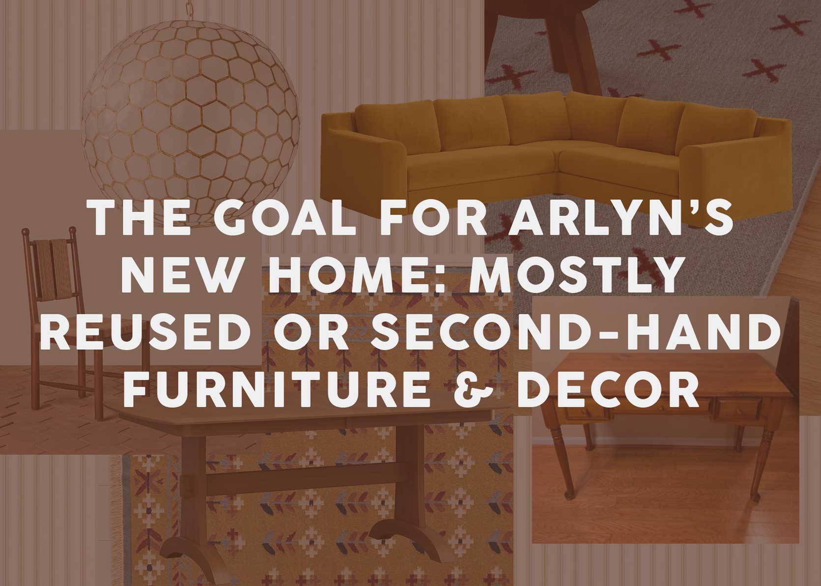
It is important to understand my color palette a little before we dive deeper into this subject. So far, here’s what I’m working in, though I’m still searching for another accent color I haven’t quite landed on yet:
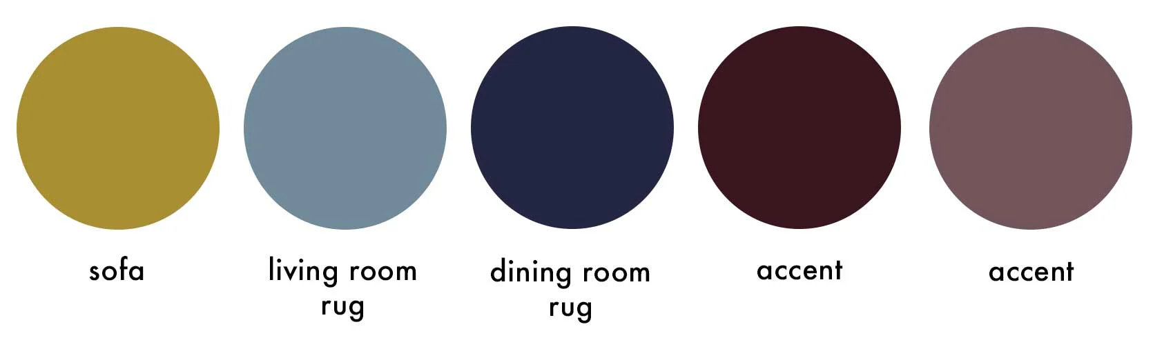
The mustard, light blue, and burgundy are materializing in a few places; the navy and the mauve are accents in my dining room rug and (sort of) in my chair upholstery, but for some reason it doesn’t feel totally complete. I know I’m still missing curtains, some decor and styling, and some small furniture pieces (mostly side tables), but something is calling me to a touch of olive or khaki.
Because I think it would be helpful, here’s a quick look at the rug and chair just to give you a sense of how some of these colors are playing out:
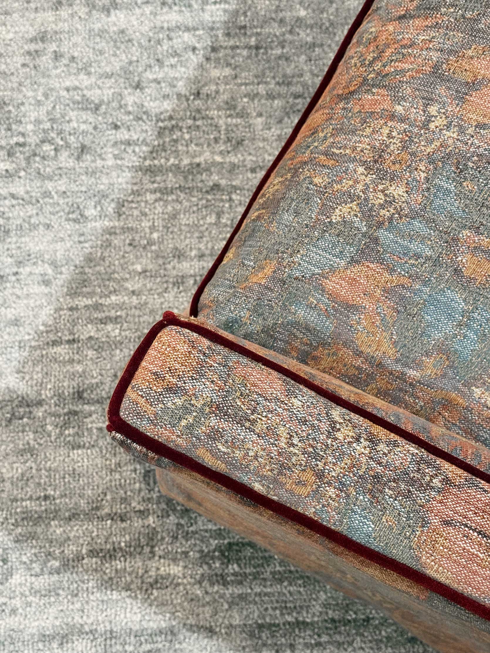
I took this photo at night, so the exact hues are just a bit off (for some reason, they look kind of green even though I tried to desaturate them in Photoshop to better match the real color), but it does the job in terms of giving you a better idea of what’s happening in my rooms.
So, here’s the current state of my dining room, now that I rolled out my rug (it was in my previous home’s dining room, and I think it’s so friendly and just the right hit of color), strong-armed Jess into hanging up my pendant light while she was visiting, found amazing second-hand chairs, and settled on a table. The chairs, by the way, need to get their seat reupholstered, but deciding on what will live on the walls of this space is going to better guide me into making that fabric choice, as I haven’t picked anything for those yet.
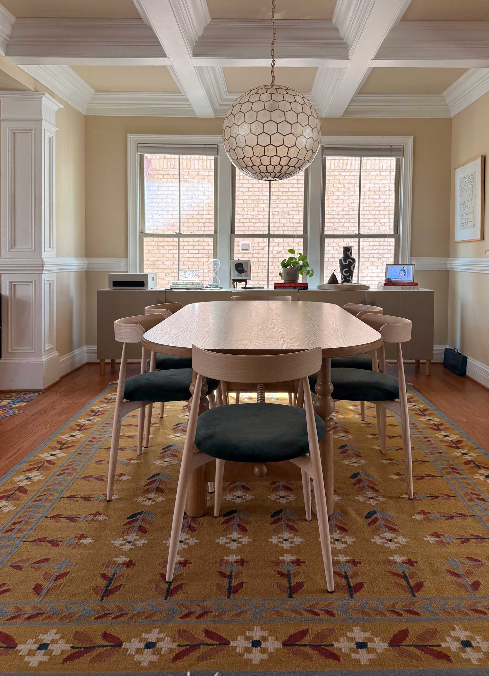
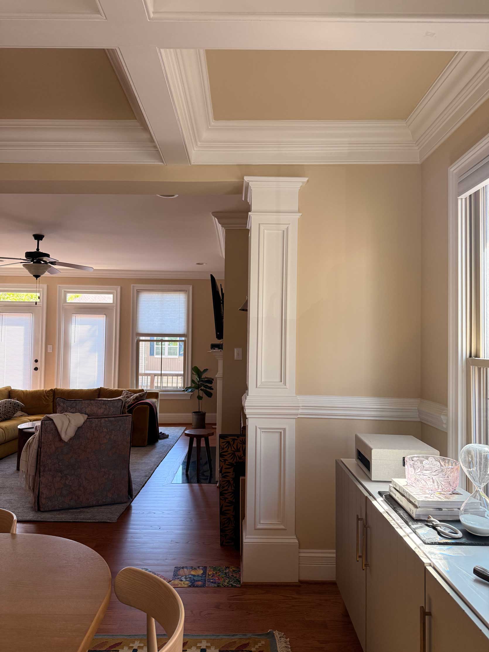
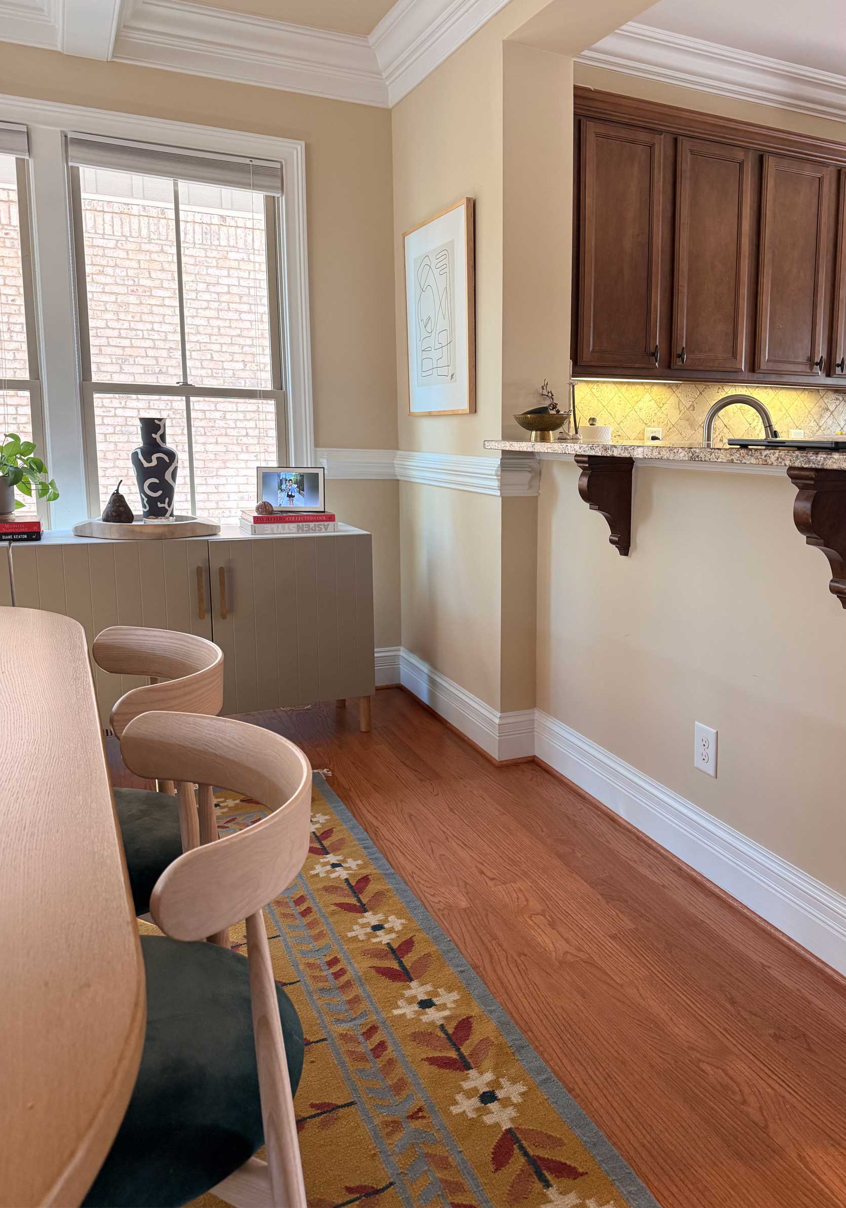
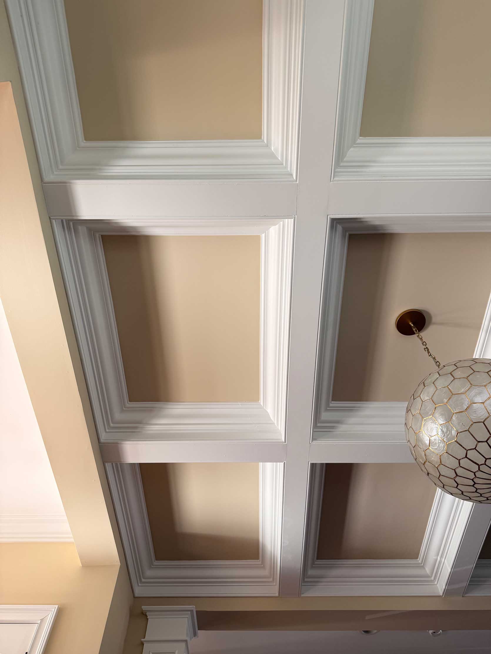
The thing about my dining room is that it’s basically an open space slightly set apart from the living room and kitchen by columns, a lowered coffered ceiling, and a chair rail. There really aren’t that many walls to satisfy the “wall” in “wallpaper,” but there are enough, in addition to the ceiling, to bring some fun design into a kind of nothing room. Here’s another angle to get a better sense of its placement (empty, before we moved in):
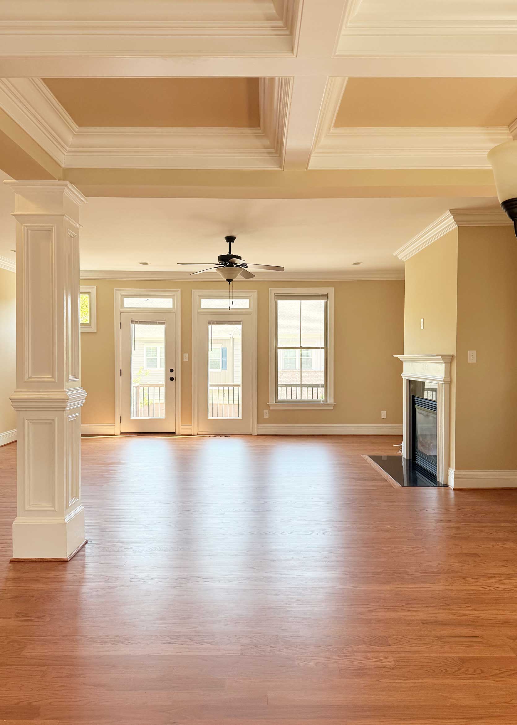
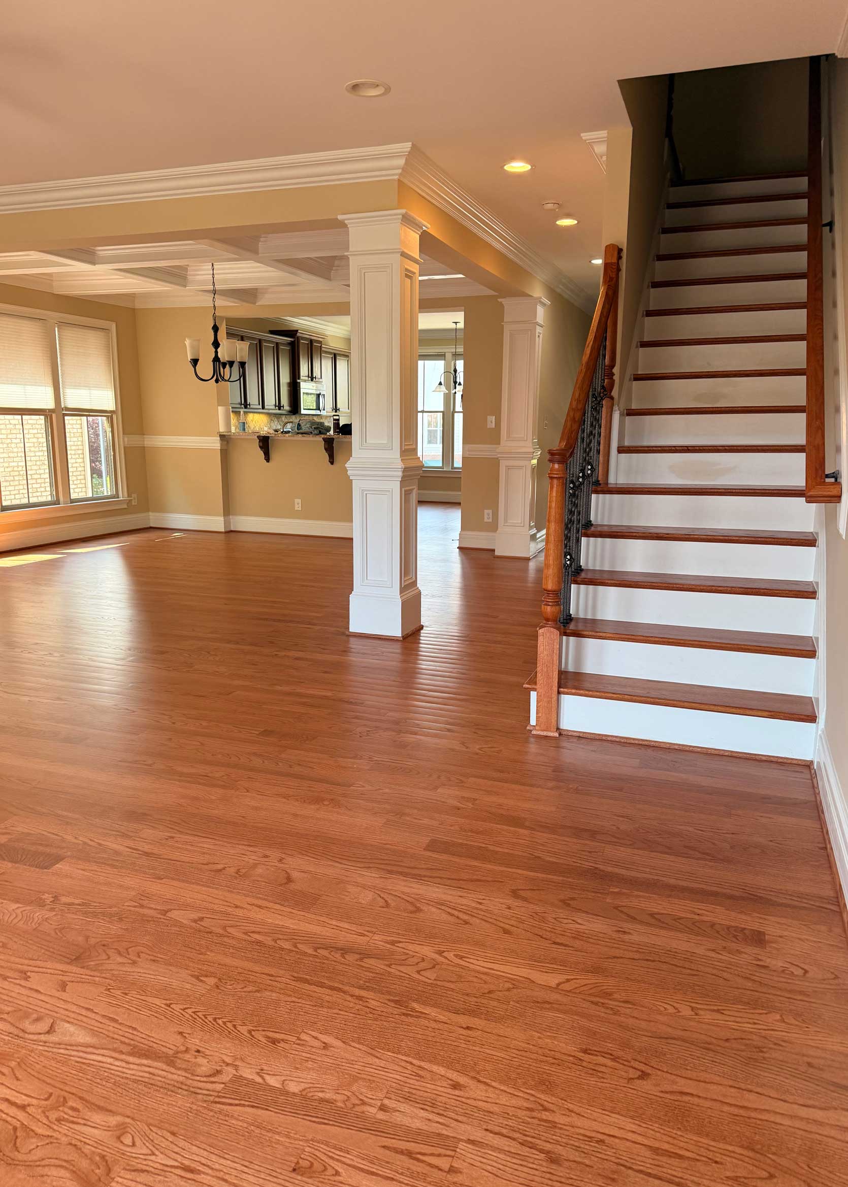
Could I leave it alone and happily exist here for another year or two? Sure! It’s finally coming together, and even without this extra layer, I like where it’s headed. But I’m not well known for leaving well enough alone. I’m waffling between not disrupting the visual line *that* much by keeping the paper more in the neutral zone, and going all in with something punchy and dramatic. To help me envision it, I popped some options into Spoak to see what they could look like.
After going through this exercise, I think I know what I’m liking, but you all always see something I don’t right away (especially in my own home), so I’d love to know…what’s your pick and why? Let’s explore:
Neutral Wallpaper Option #1:
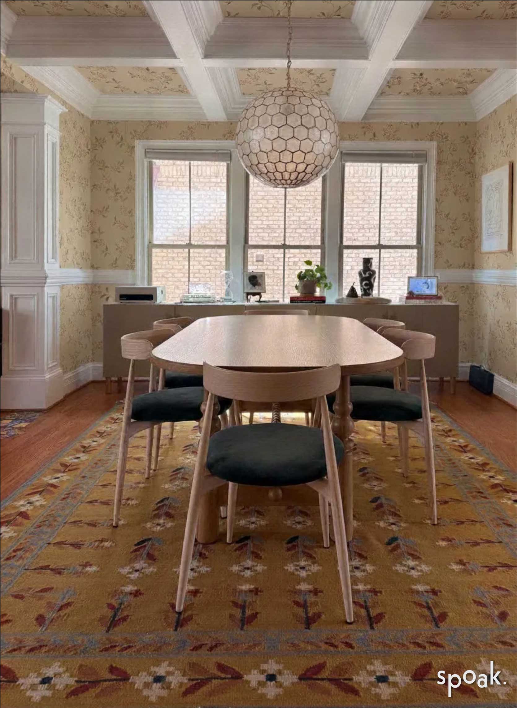
Here’s a dainty, pretty trailing floral. The actual scale is a bit smaller than what we’re seeing here, but I do like that the background color of the paper is pretty similar to the wall color throughout the rest of the walls in my living room and kitchen. I’m not sure I like the type of floral with the folk flower on my rug, but it has potential.
Neutral(ish) Wallpaper Option #2:
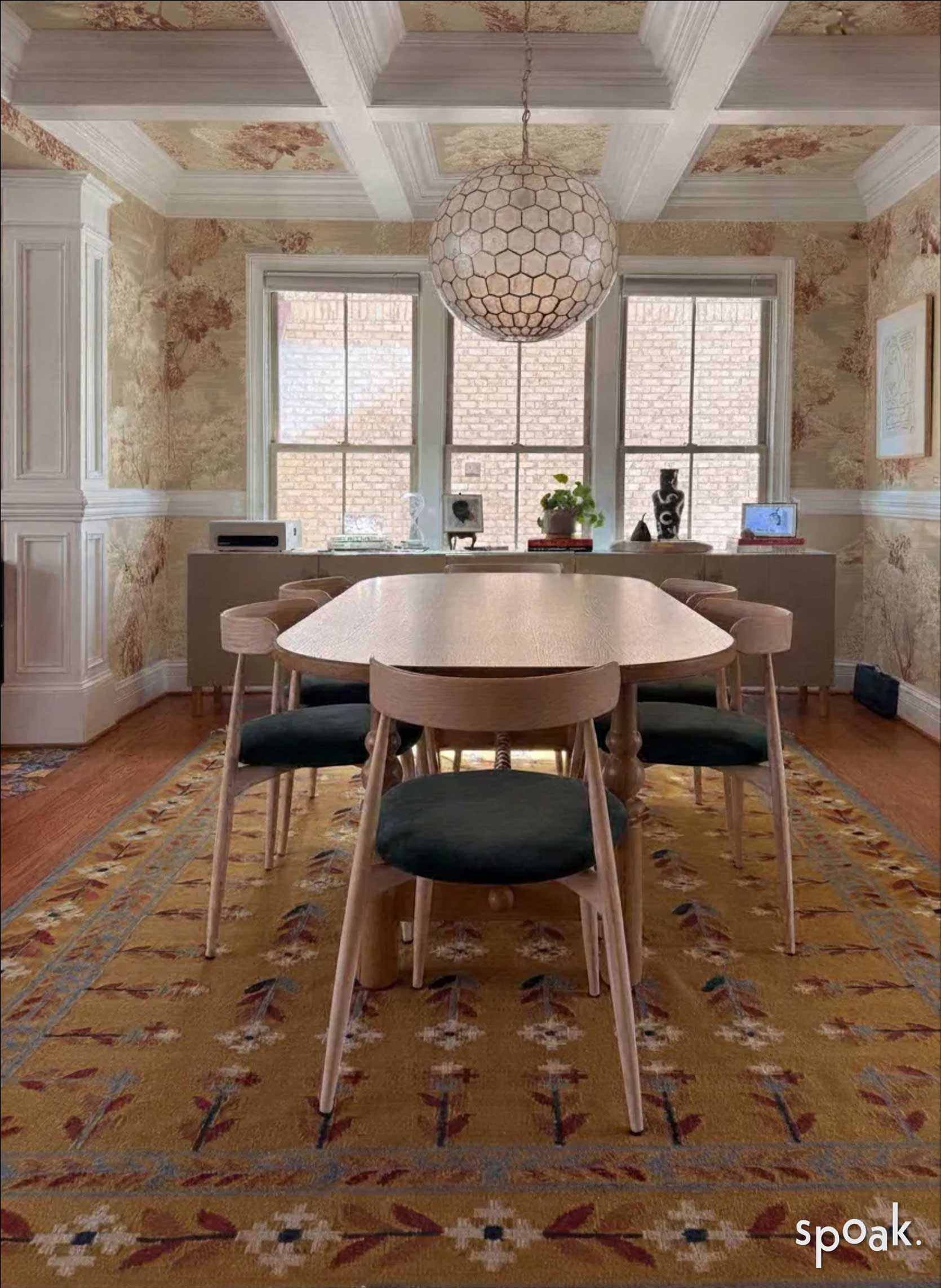
This is more of an abstract botanical that comes in both a beige neutral and this one above that also has a rosy sepia flourish. It picks up the mauve of the rug nicely, I think, but still feels quiet in a way.
Bold Wallpaper Option #1:
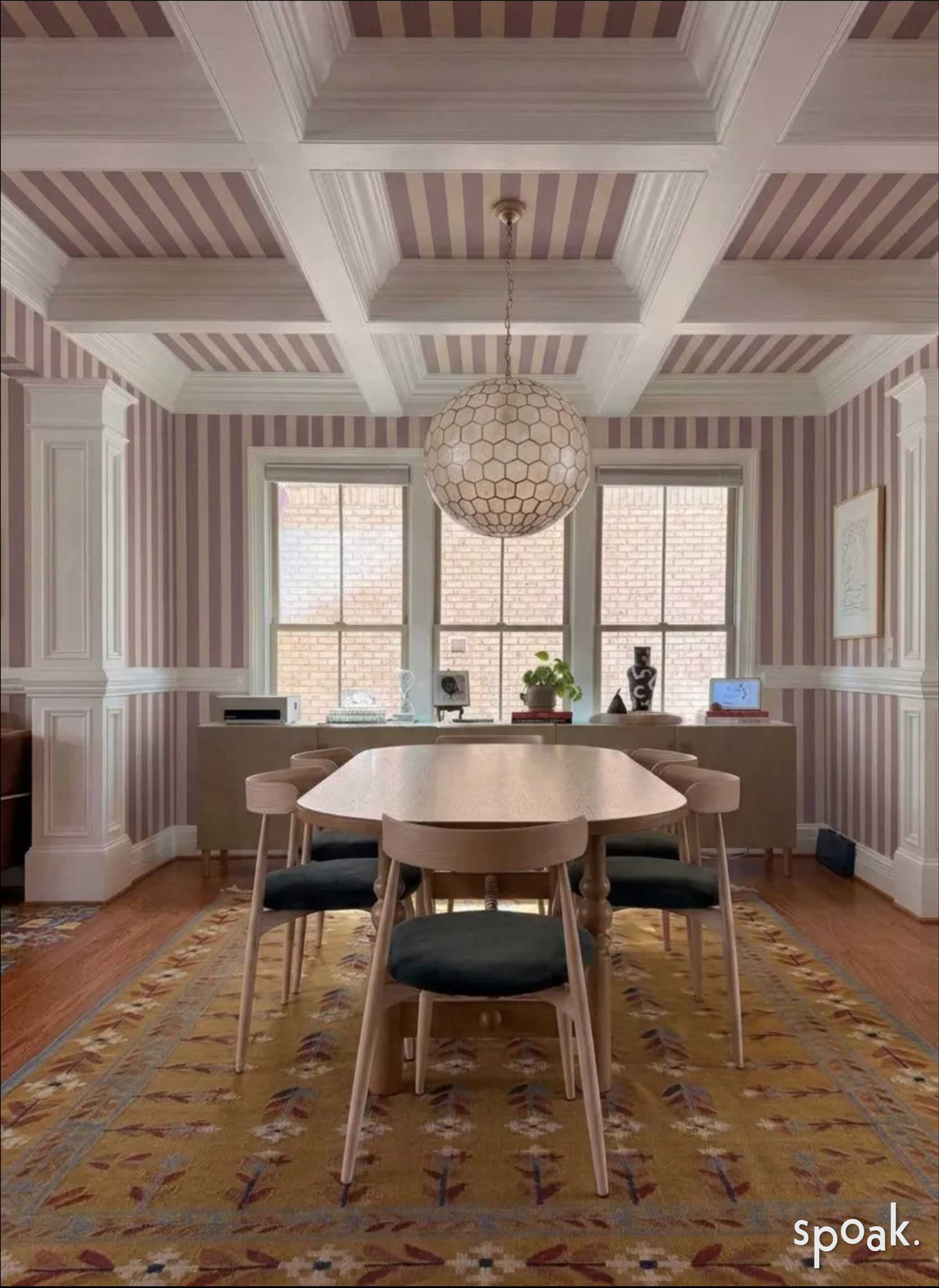
I just had to try a bold stripe because that and a floral are a classic pattern mix that’s always a home run in my book. Again, the scale here is not right (it’s smaller IRL), which I think would actually make quite the difference in the visuals, but I do like seeing the color story here. It’s cute, for sure, but it may be too much with the icy blue rug and mustard sofa in the adjoining room. Another option is to just put the stripe above the chair rail and paint the wall below in a corresponding color.
Bold Wallpaper Option #2:
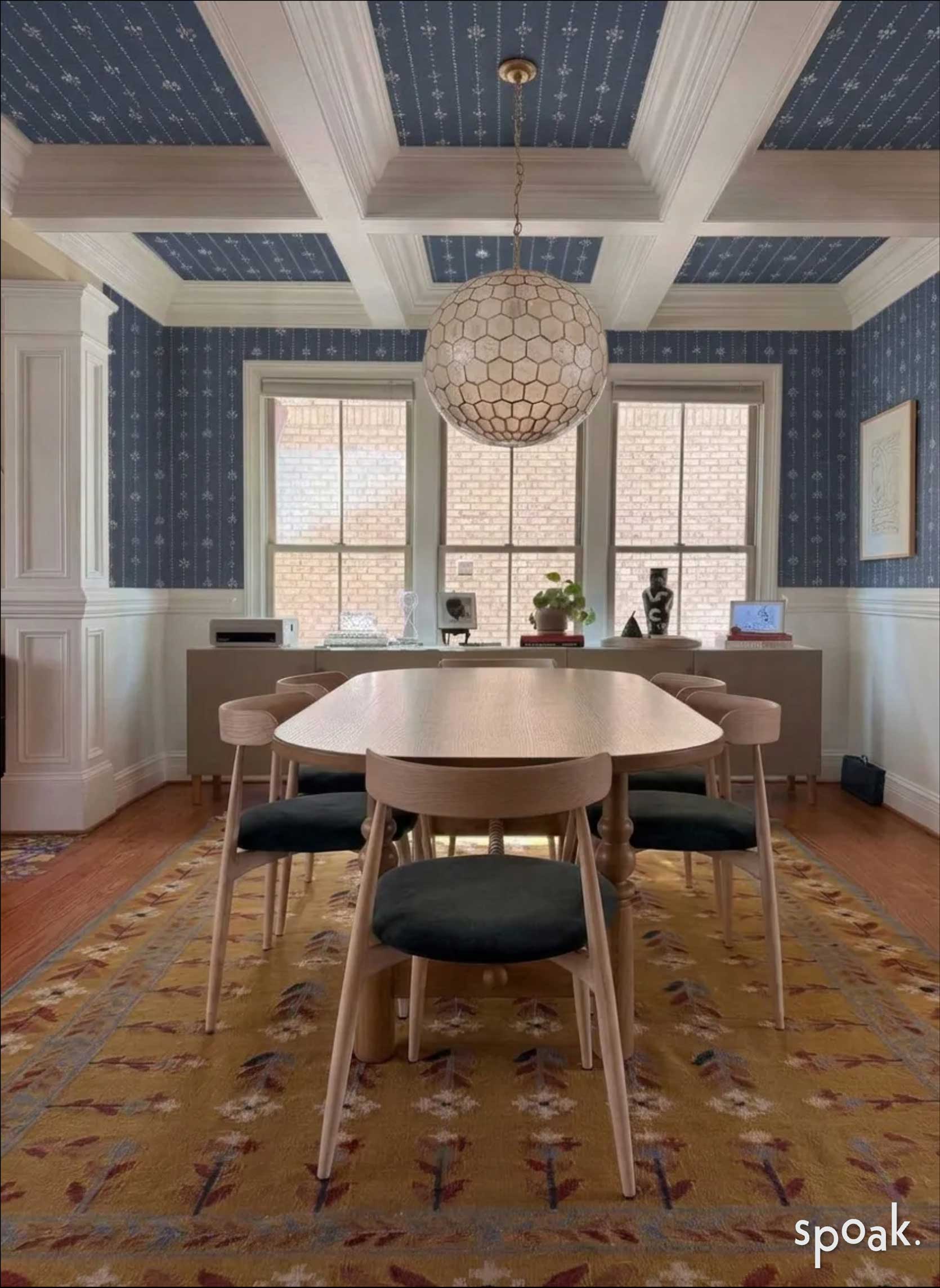
Let’s try some blue. To create contrast from the lighter blues in both the living and dining room rugs, I went with something closer to a dark denim, and tbh, it works! The rendering from Spoak turned the bottom part of the wall white, rather than the beige that it really is, but I’d either just continue the paper if it isn’t too heavy-handed or pick a blue that works with the paper’s tones.
Now, let’s see the two neutral picks and the two colorful options all side by side:
Individually, I love each of these, but in the grand scheme of the open living spaces, I don’t think they all make sense. But that’s why you’re here today: Pop your opinions down in the comments on this.
Here’s a better look at the papers, plus two additional selections I’m crushing on (I love a toile!).
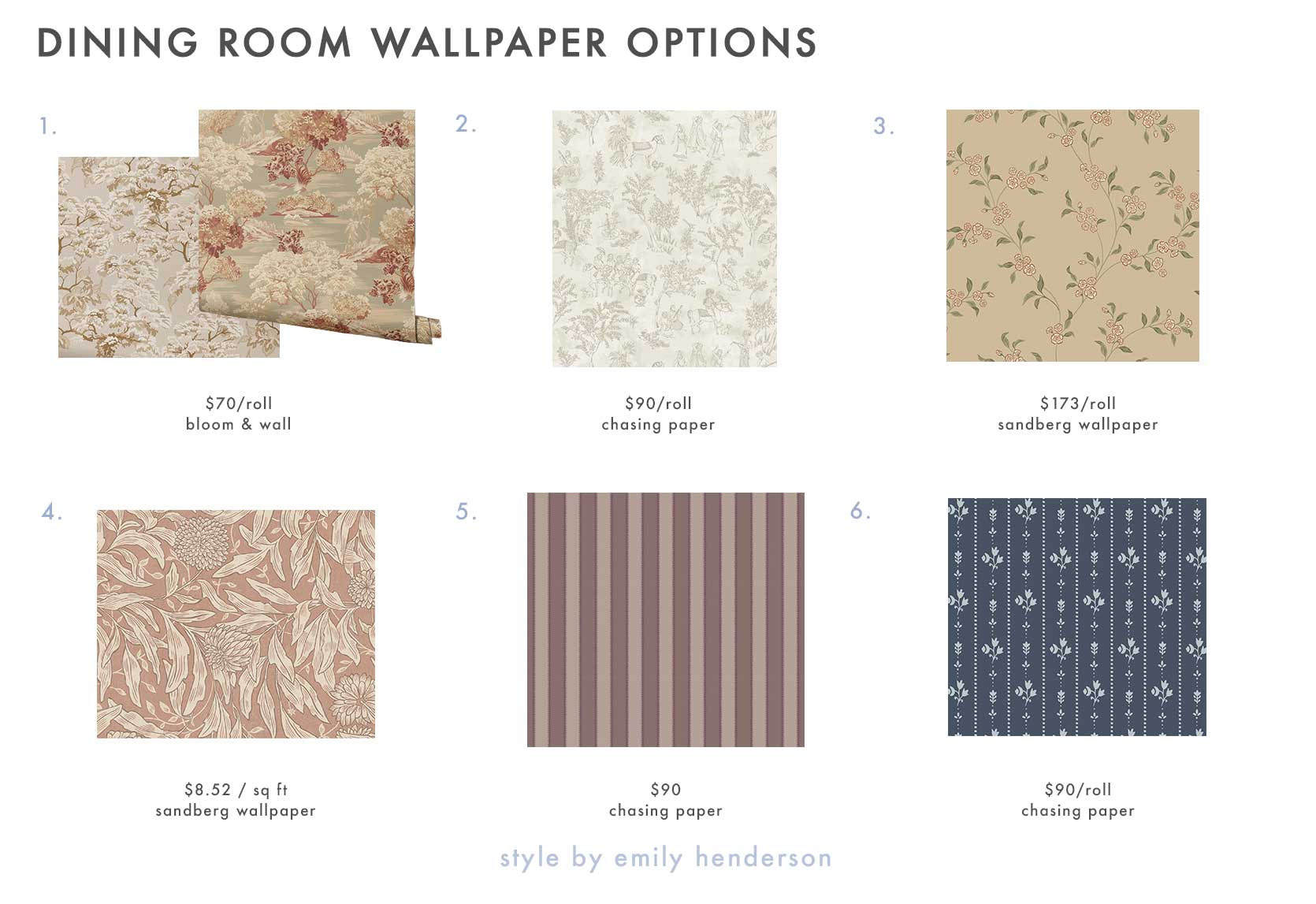
1. Lennon Vintage Tapestry Forest Beige Wallpaper and Lennon Vintage Tapestry Forest Sepia Wallpaper | 2. Toile de Joon in Bone | 3. Smilli, Clay | 4. Olof Mural, Terracotta | 5. Wilder Stripe in Mauve Mist | 6. Floral Stripe in Blue
Time for the fireplace!! While I’ve been gnawing on the wallpaper-in-the-dining-room concept for a few weeks, the fireplace addition is new. I’ve always been a fan of floor-to-ceiling tile on a fireplace wall, especially square tile. Because I’m a renter, my only real option is a peel-and-stick tile. I did consider doing wallpaper over here as well, but I just don’t love an accent wall, honestly. And the way my walls go up and down the stairs, there’s no natural stop for the paper if I decided to put it on every wall.
An accent tile is more acceptable to me in this application, so it’s something I’m contemplating if I can find the right product. My options are limited, though.
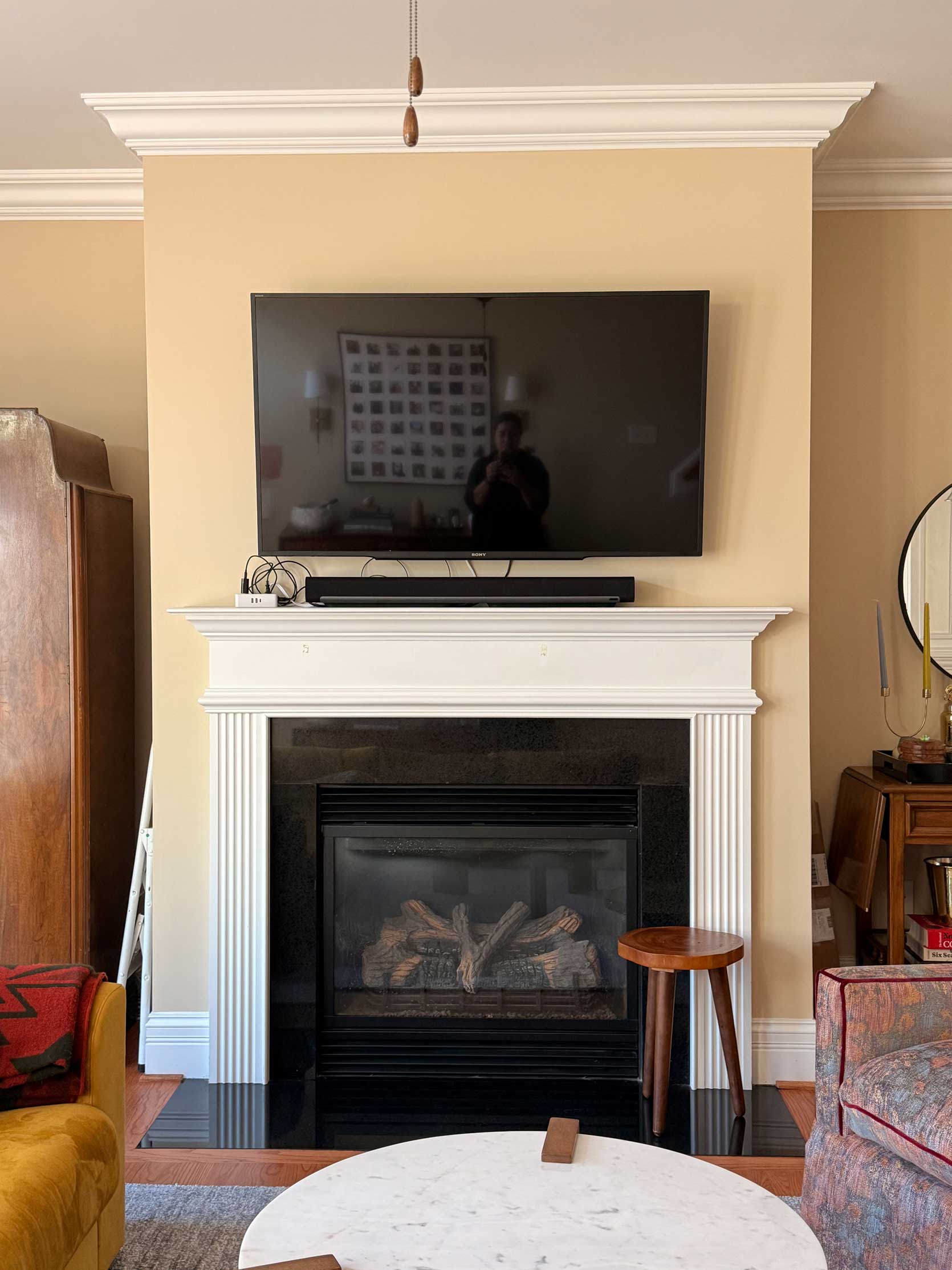
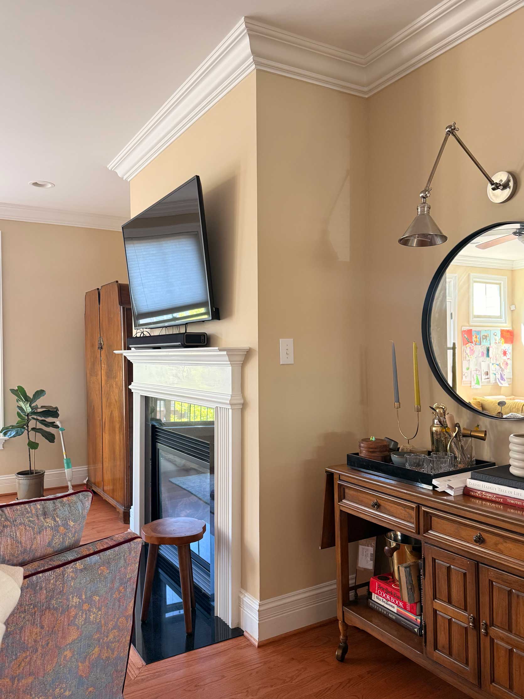
Fireplace Wall Tile Option #1:
Given that all I really want is some texture, I think a beige or cream tile would hit that mark without stealing too much focus. The tile below looks warmer online than in what I rendered, but you can get an idea of the impact it could make.
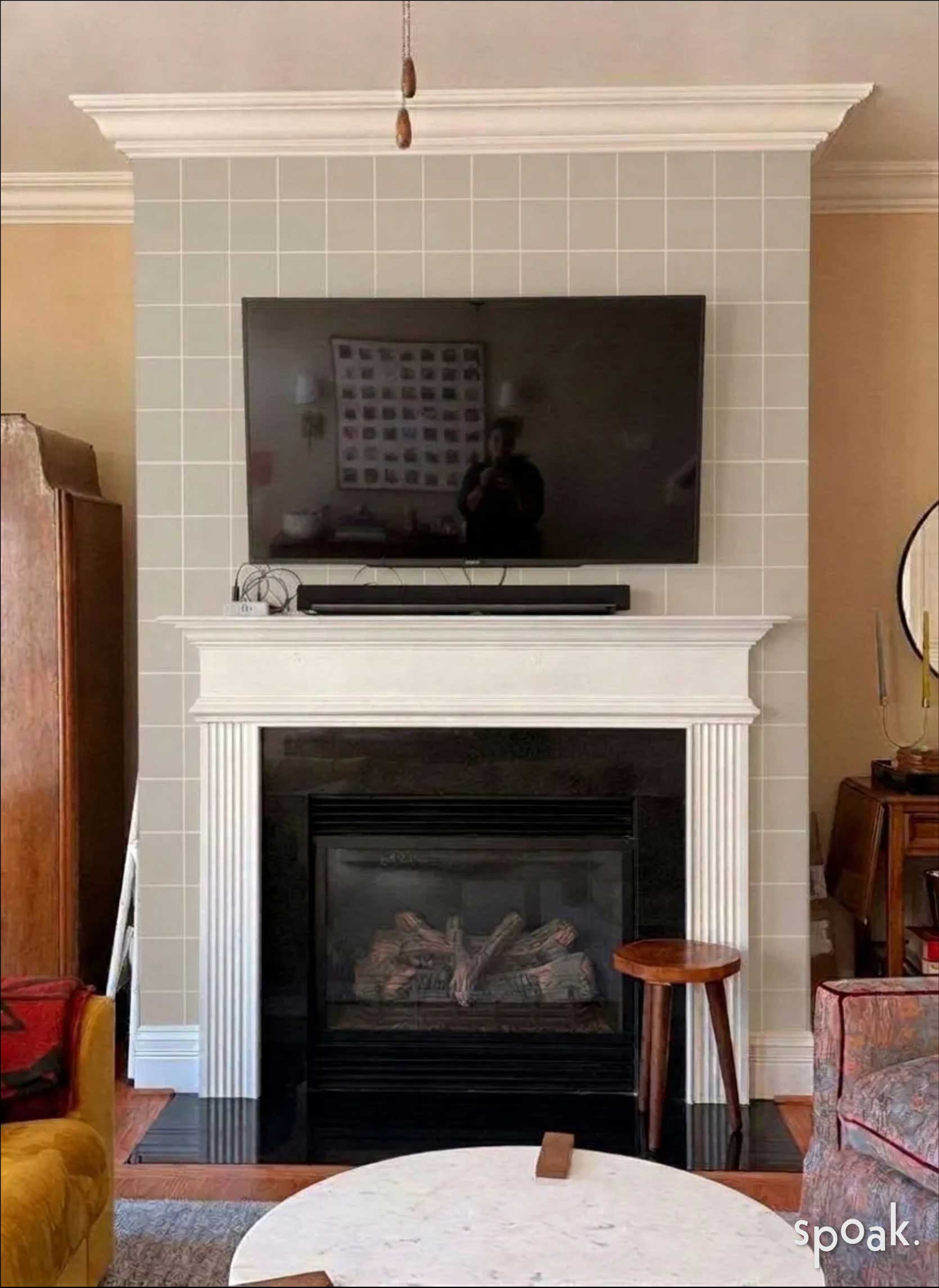
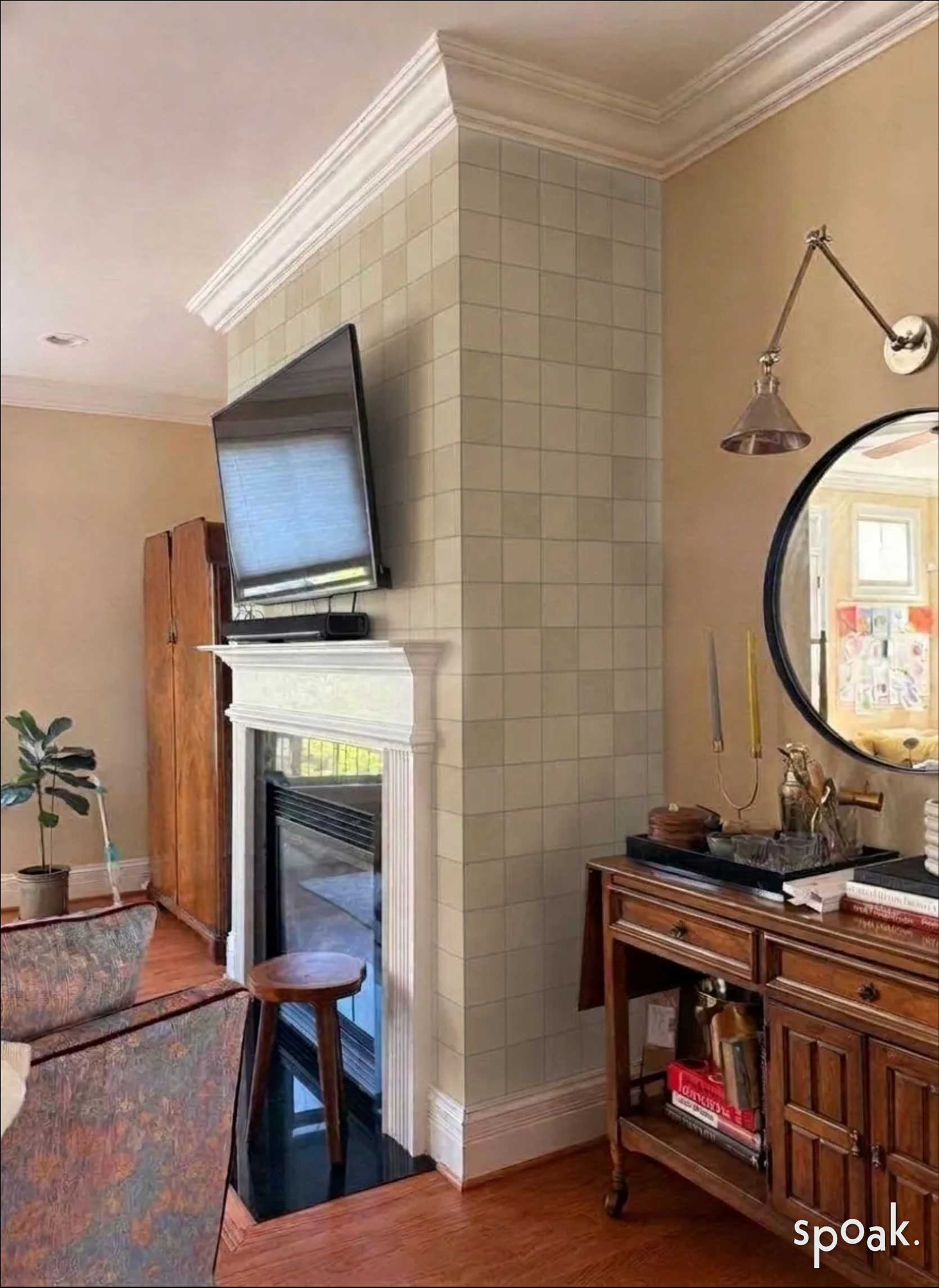
Fireplace Wall Tile Option #2:
Alright, let’s try some color, just for giggles. I found a dusty blue option by Easy Tiles that could be cool. I need to hunt down something with more gray in it to better suit my rug, as this is too turquoise, but interesting to see what happens over here with a punch of something other than cream.
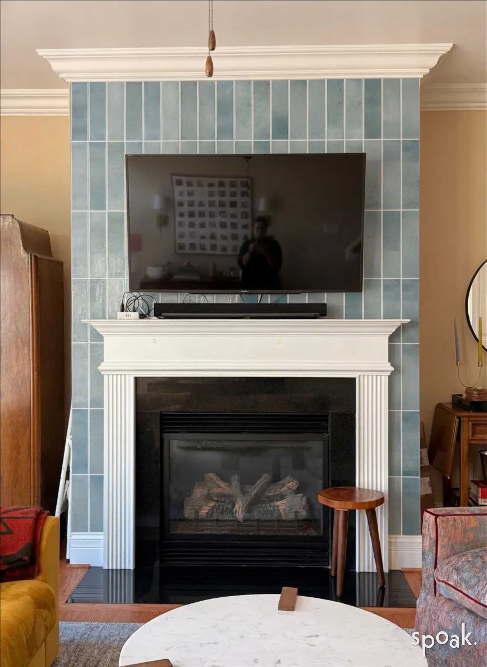
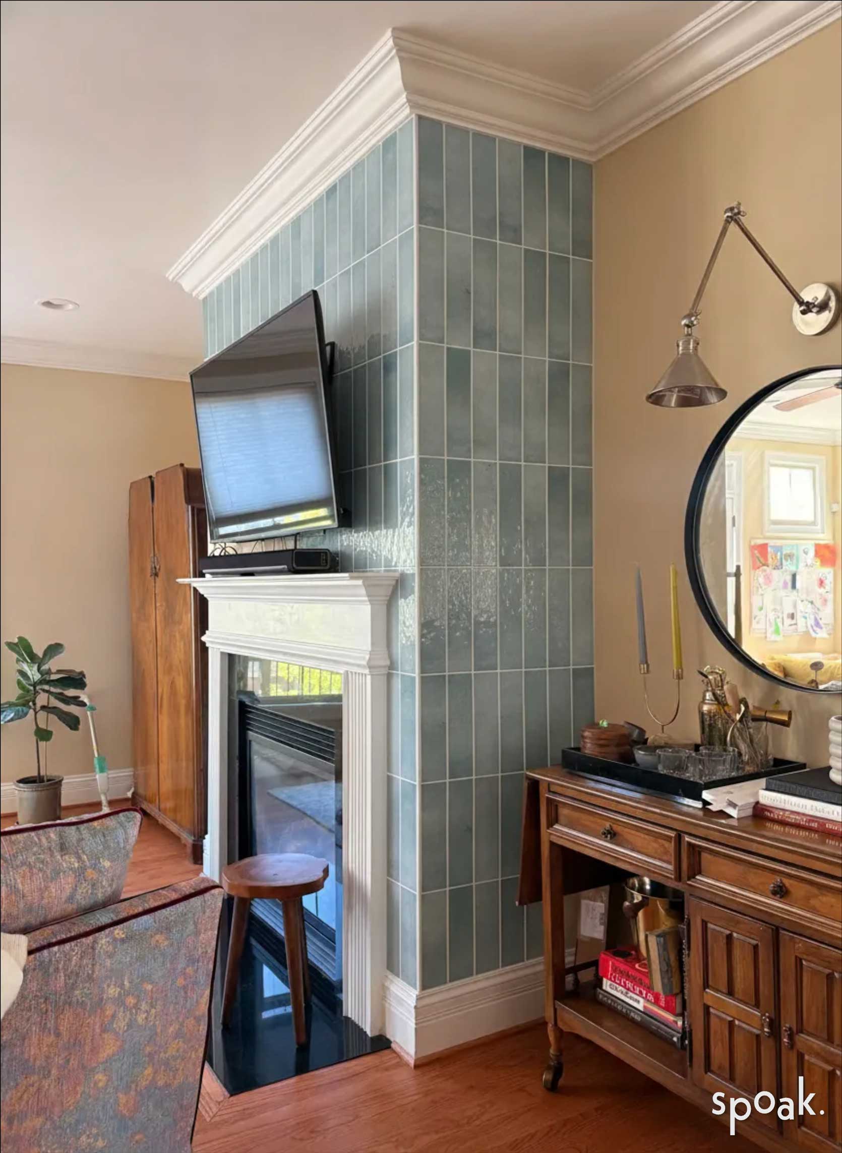
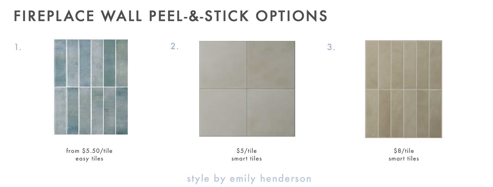
1. Mundano – Porto | 2. Zellige Zagora | 3. Morocco Tangier
—
Now, it’s time to sound off in the comments. The more I look at the dining room options, the more I’m leaning toward absolutely doing wallpaper (and maybe paint) in there. I’m still on the fence about the fireplace. I may need to order some samples and keep digging around to get the color correct, because it can go bad really fast.
I can’t wait to hear what everyone is thinking, and if you have any additional ideas, please let me know!
Until next time, friends. See you in the comments…
Hmm. I love the idea of boxing in the dining area to showcase its beautiful architecture, but I’m not particularly keen on any of the wallpapers. They’re all a bit too granny in contrast to the folky Scandi rug, somehow. I am also worried that peel and stick tile is going to look cheap – what are they made of? Surely not actual ceramic? I suggest painting the box for the dining room, walls and ceiling, and then also painting the chimney breast to match. Are you keeping the cream colour on the rest of the walls? I’d do a dusty rose or olive for the box, and then a less yellow neutral on the other walls, myself. Lovely room, though!
I had the same reaction to the first two wallpapers. Love the rug, but the wallpapers have a different vibe that to me, is jarring. The striped paper, esp. on the ceiling, feels a little overwhelming. I vastly prefer the blue paper over the first three options. Thanks for sharing your process, Arlyn!
Am I the lazy one? I loved NOT having to worry about anything like this while I was renting for a couple years. ha! You all do such a wonderful job of making even your temporary homes look incredible.
Wonderful progress! On DR wallpaper, #2 is a lovely contribution to create unique feeling for the open space without creating too much impact on adjoining spaces. However I would be a hard ‘no’ on wallpaper tile for fireplace. While loving all tile on fireplace like Kaitlin’s recent LR, it doesn’t seem to work with more traditional mantle and crown trim. It is a beautiful rental, love the views with furniture so far. I hope your family is enjoying North Carolina.
That dining room rug is beautiful! Where was it from? I am partial to the two Sandburg options, and in awe of the energy and patience it will take to wallpaper each of those coffered ceiling squares as well as above and below the chair rail.
For the fireplace, I like how the first picture looks more like a wallpaper grid than a faux tile. In any case, I think a square option works better than the longer rectangles for this style of home.
Thank you for showing us your process.
love the first neutral paper! with the tile on the fireplace, it’s such a lovely Swedish folk feeling! love it. love that console you have beside the fireplace.
My vote is a ceiling only wall paper for the dining area. I like #1 for the print but I’d go with whichever neutral one looks best with your wall color if you are not painting. I know you said you don’t love an accent wall like this would be, but I lean towards not fighting against your layout with abrupt starts and stops on finishes. I agree with others about not doing peel and stick tiles floor to ceiling at the fireplace as I think you will be disappointed with the look of the material. However you could do them just to cover the black quartz/granite?