Design
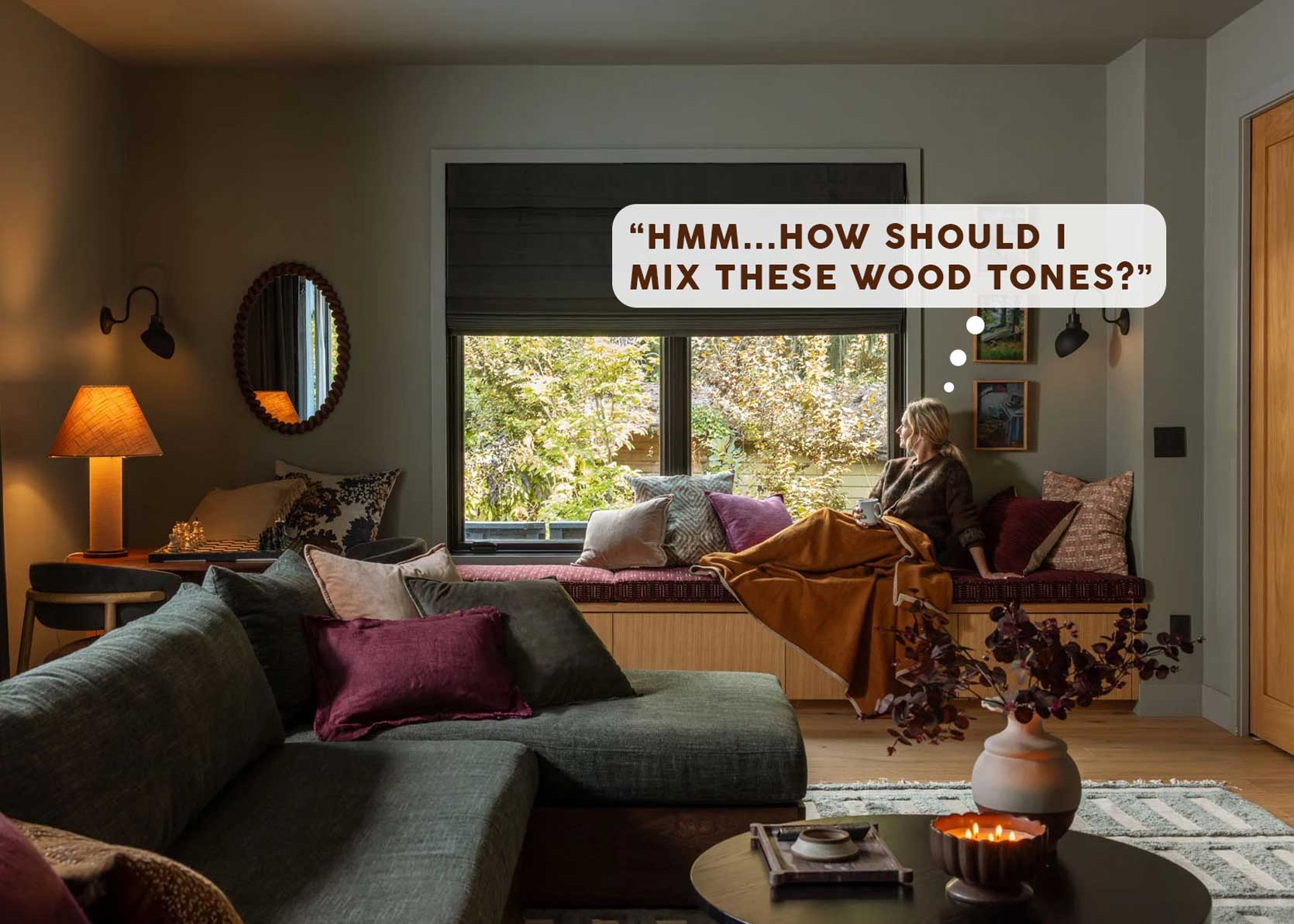
The 5 Things You Need To Know About Mixing Wood Tones In Your Home
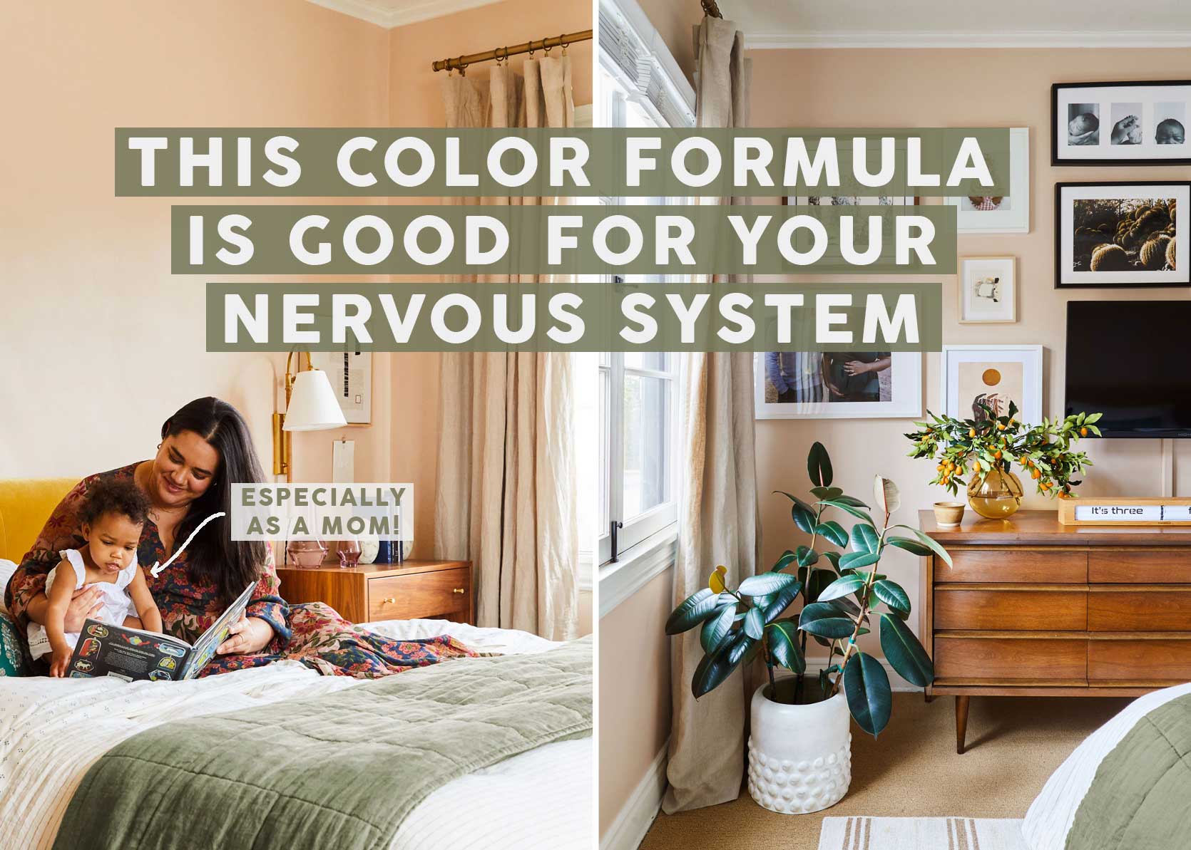
As someone in the design field that’s a writer and occasional decorator, I get a lot of the same questions again and again. “Where do I buy rugs?” “What are your favorite paint colors?” “Can I mix metal finishes?” and, for the purpose of today’s post, “How do I go about mixing wood tones properly?” All of these queries are second nature to someone who lives and breathes this art form, but I get that there can be a lot of doubt and unknowns when you’re doing things yourself without much guidance.
But I’m here for you today to help you through, as always!
First and foremost, let’s establish one of the most important points in this conversation: YES, YOU CAN HAVE MULTIPLE WOOD TONES IN ONE ROOM. And while it’s not an exact science, there are some solid guidelines you can use to nail the mix in a way that feels intentional, not like your house is full of hand-me-down pieces that never belonged together.
5 Must-Dos When Mixing Wood Tones in Design
Let’s establish some rules first, and then I’ll walk you through some real-life examples to show you what this all looks like.
Mixing Wood Tones Rule #1: Establish A “Dominant” Wood Tone
Think about a wood palette as you would a color palette, where a 60/30/10 percentage is a great place to start. So, 60 percent of your wood tones should be the main attraction in your space. This is often your floors, or any other significant woodwork you may have in your home. From there, 30 percent would be your furniture, and 10 percent is smaller accessories such as frames, ladders, that kind of thing (both of these can be a mix of tones).
Mixing Wood Tones Rule #2: Match Wood Temperature
Okay, now we get into more of the nitty-gritty. Wood *temperature* is a huge part of this conversation, because this is where things can go wrong, fast. Wood is either a cool-toned wood (think anything with blue or gray tones), warm-toned (cherry, oak, walnut, mahogany), or neutral (white oak, blonde woods, etc.). What you want to do is make sure that, even if you have a handful of different wood colors in the same room, that they are all mostly the same temperature. A gray wood floor running underfoot a warm walnut sideboard, for instance, is always going to feel visually not-quite-right. For variety, it’s okay to mix in neutral wood temperatures with either warm or cool.
Mixing Wood Tones Rule #3: Bring In Contrast
There are plenty of beautiful rooms that use the same wood tone and temperature across all of its furniture and finishes. But I like things to be a bit more eclectic and collected. If you’re the same way, I urge you to employ some contrast in your pieces, meaning, wood tones that are close in color tone or temperature, but some are dark, and some are light. Walnut with white oak. Cherry or mahogany with red oak.
Mixing Wood Tones Rule #4: Bridge The Gap With Black-Stained Or White-Painted Wood
Sometimes, we don’t have a ton of control over all the tones and temperatures of the wood in our home. Your floors are your floors, unless you picked them out yourself. Perhaps you have heirloom family pieces you’re not planning on ridding yourself of. Or something you love the function of and hanging on to for the long haul. How do you make all the things work together? I’ll tell you: Introduce some wood that’s stained black, or painted white, or frankly, any other color (Em loves using black wood to bring in that balance).
Mixing Wood Tones Rule #5: Use Rugs As Dividers
Most of our homes are not these perfectly put together designer spaces where everything was picked out at the same time and goes together exactly right. Maybe your floors are orangy oak or maple, and your TV cabinet is a modern grayish weathered situation. Or your grandma’s antique is mahogany, but your LVP leans to the cooler side of things. This is where rugs are your friend. Use them to create a buffer between furniture and floors that don’t go that well together. It makes a huge difference, trust me.
Mixing Wood Tones in Action: Real-Room Examples
I took the liberty of sourcing some images from the world of EHD (plus one other designer at the end to show you something different), to show you how mixing tones actually looks IRL, because spouting out rules is one thing, but seeing and feeling how it all comes together is another. Let’s start with the Portland Project.
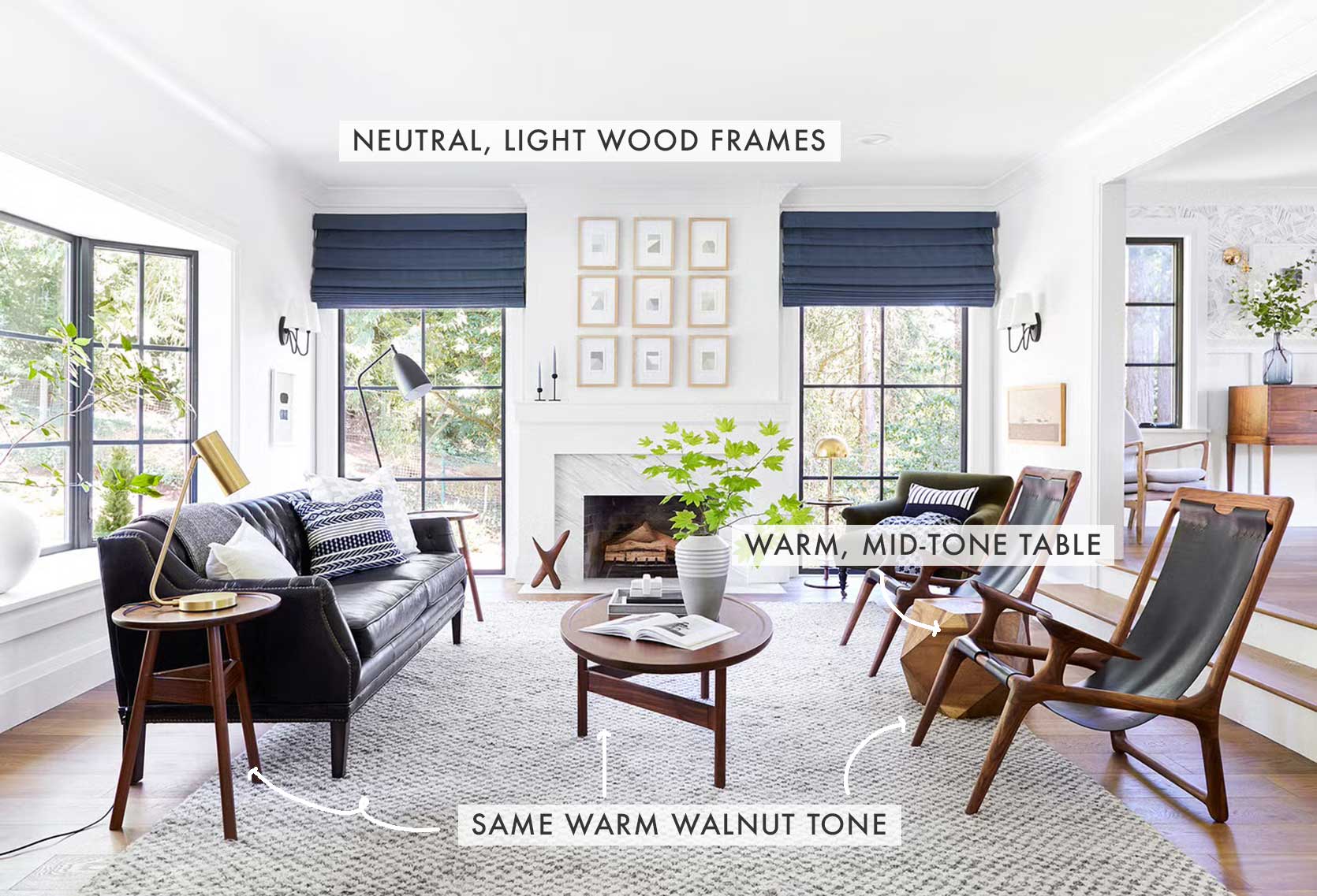
As you can see above and below, Emily and team leaned into all the warm wood tones (as is her style and you’ll see a lot of in the photos that follow). The coffee table and side table appear to be from the same line and are a warm walnut tone. Those lean the most red in the room, but they still work in tandem with the wood of the armchairs and even the floors. The geometric side table between the chairs adds in more of a mid-level tone of wood, but is still warm with a yellow spirit. A light, neutral wood for contrast comes in through the frames.
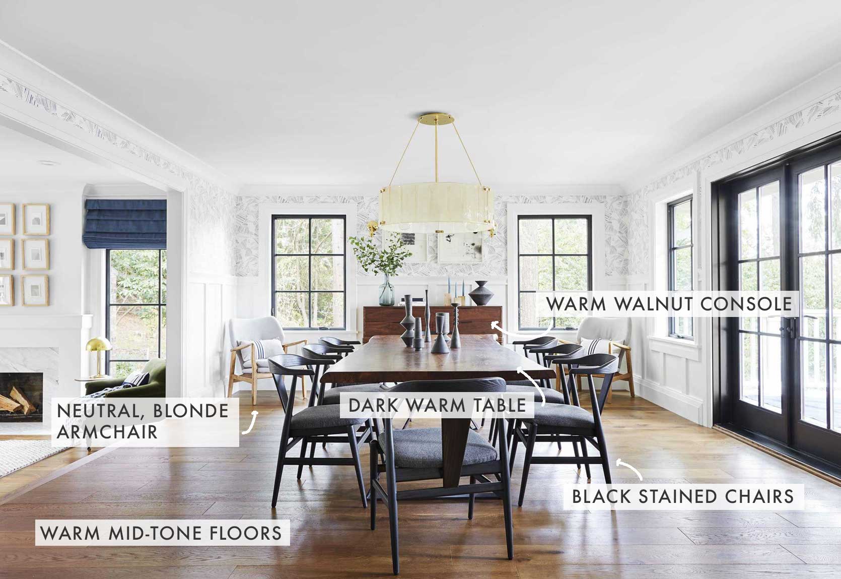
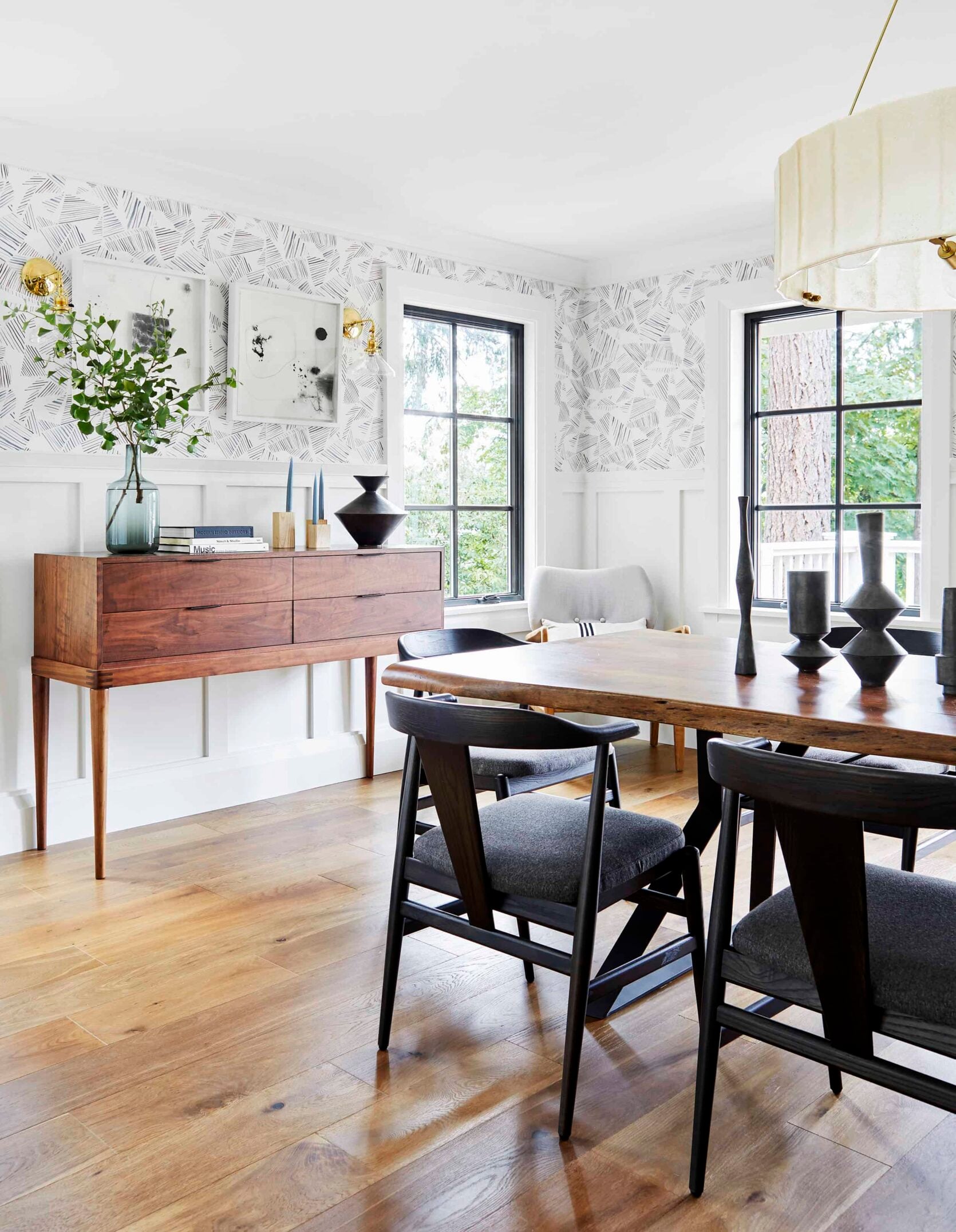
Here, Emily followed rule #5 and used black-stained wood chairs both to break up all the brown tones but also to keep things interesting. Here in the Portland Project dining room, there’s a range of dark, light, warm, and neutral woods throughout.
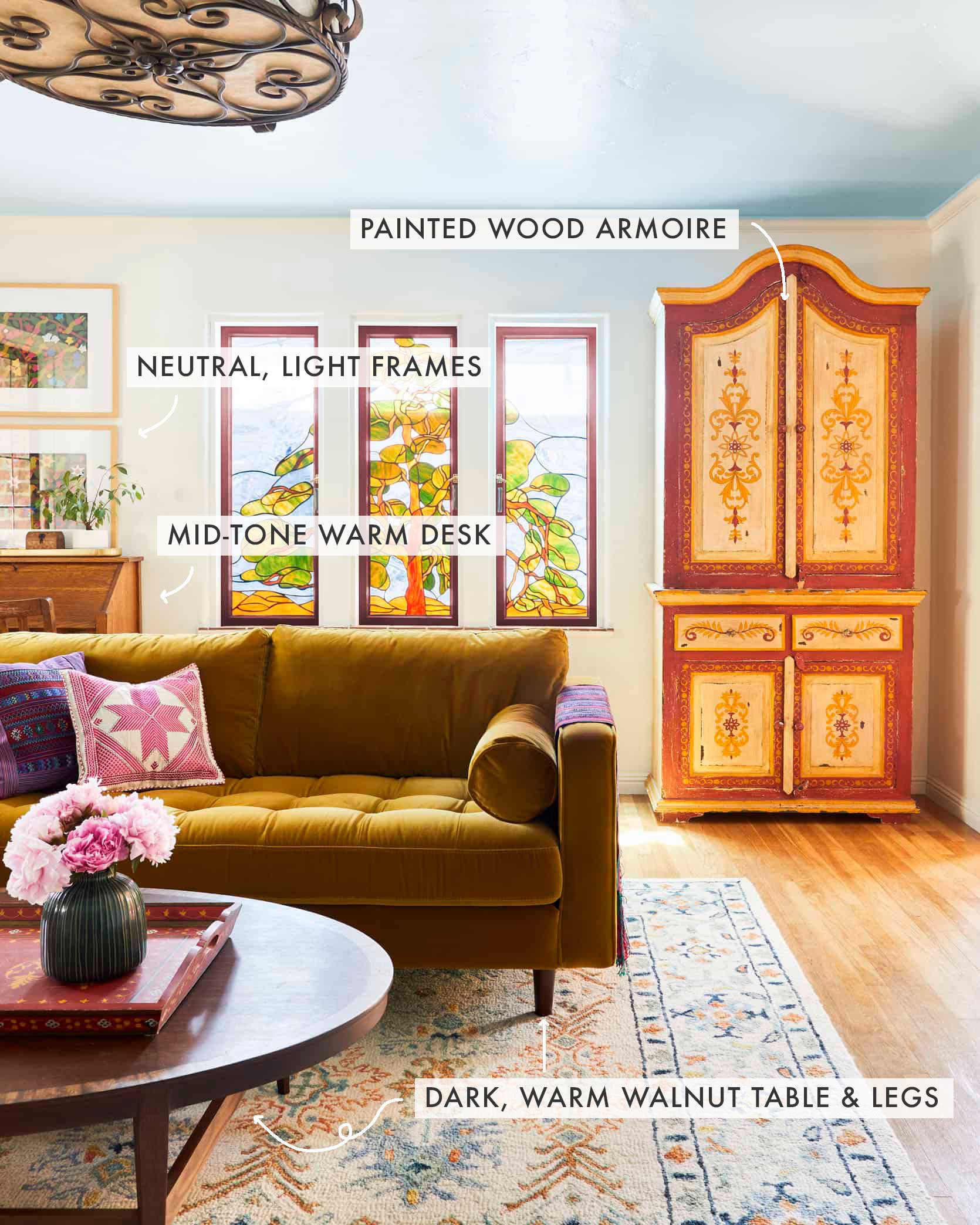
Now let’s look at a different vibe. This is the living room in Sara’s parents’ house that she designed for them. It’s alllll warmth, and so happy. You can see that she pulled the same walnut-y vibes between the sofa legs and coffee table, but the floors, secretary desk in the corner, and painted armoire all fall in more of a mid-range tone of wood (and paint).
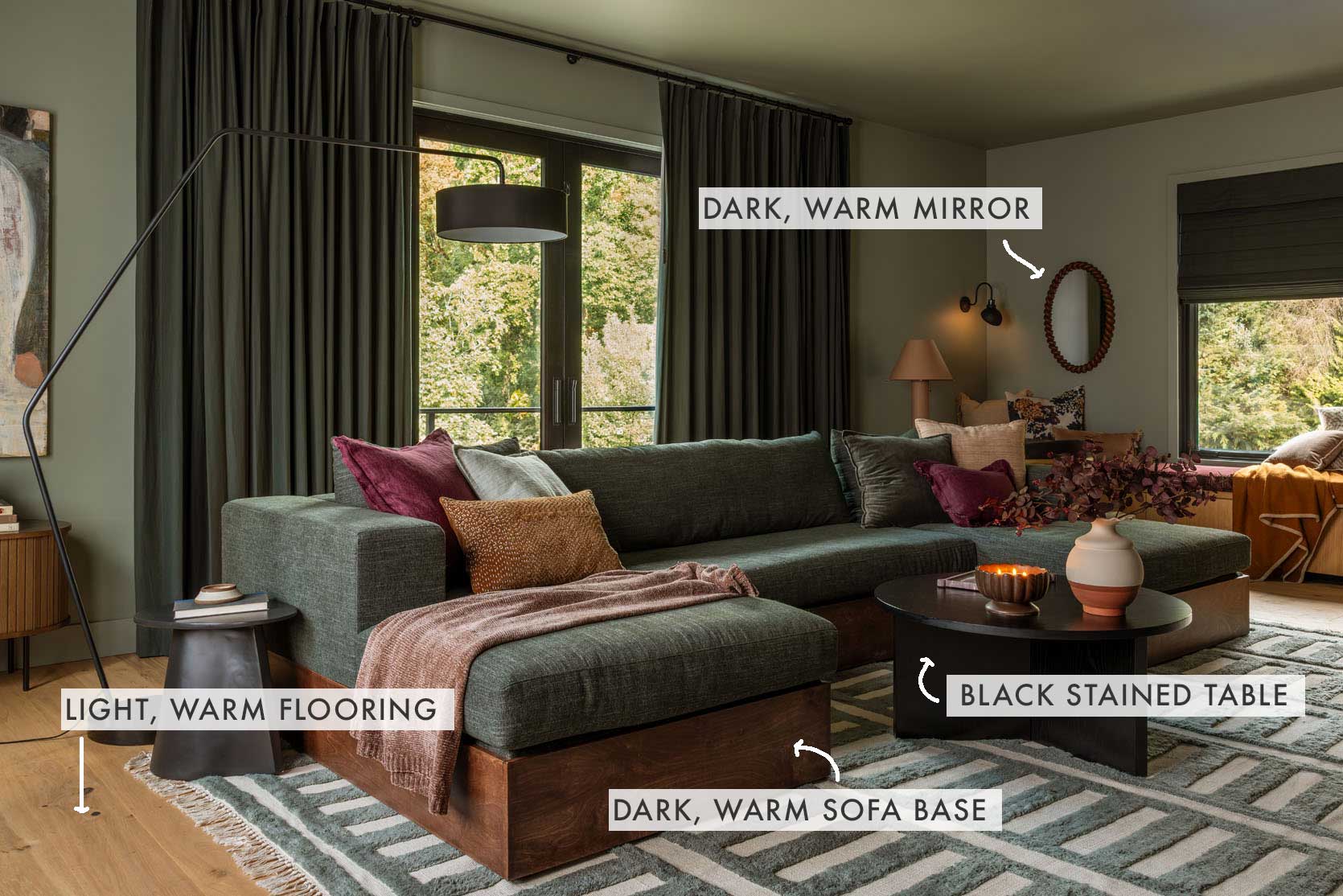
design by emily henderson and max humphrey | styling by emily henderson | photo by kaitlin green | from: revealing my brother’s ultra cozy family room (and the most comfortable green sectional)
Let’s get moody now. The River House family room has a few things going on with it in terms of woods. The base of the sofa is a deep, rich reddish wood tone, the floors are really neutral and light, the mirror in the background picks up the tones of the sectional frame, and, in true EHD style, the black-stained coffee table bridges the gap.
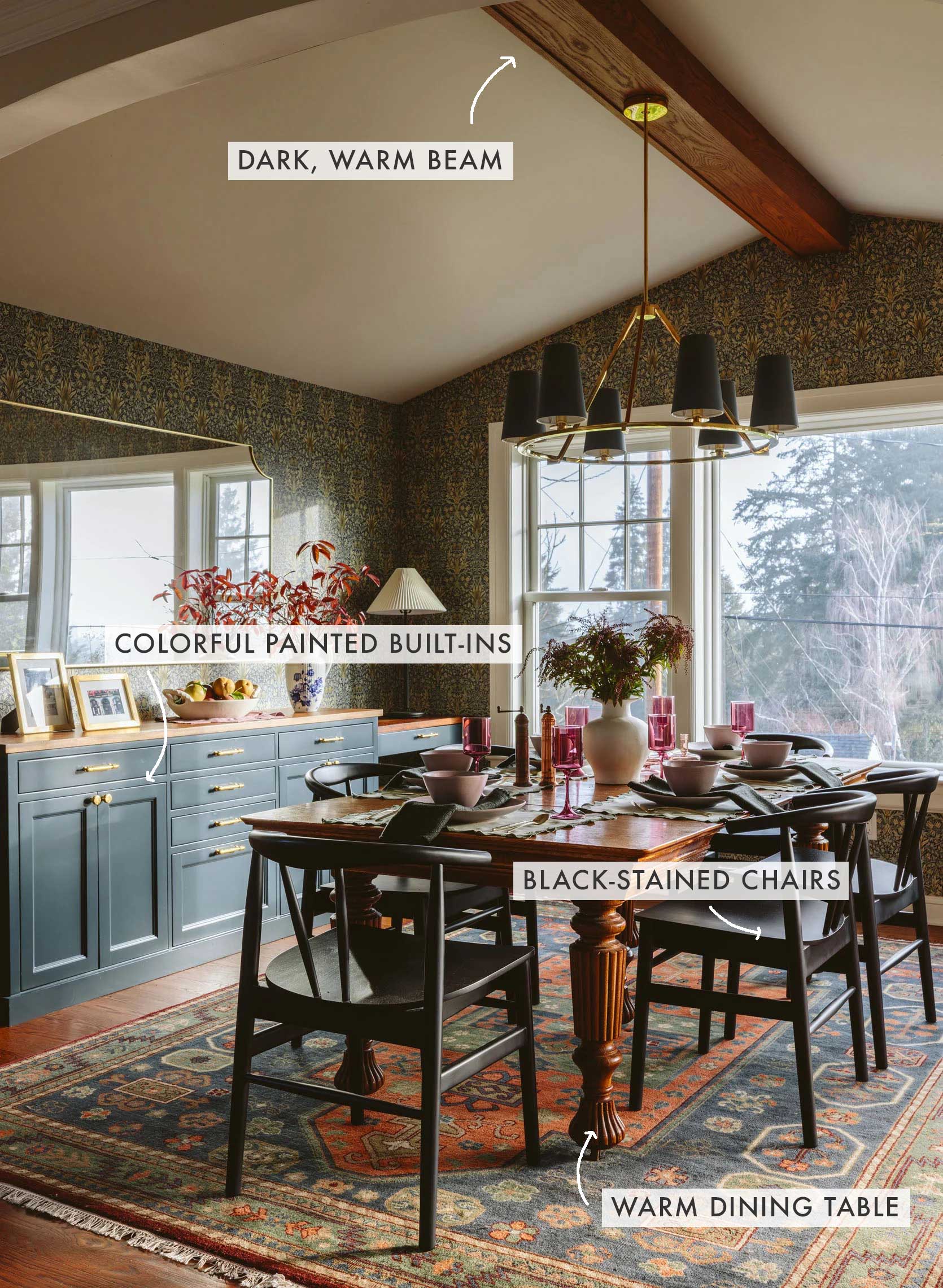
Red-toned woods get such a bad rap, mostly due to all of our collective trauma from the cherry craze of the early 2000s. But here, in Emily’s friend Robyn’s dining room, the decadent red-toned floors, table, and beam marry expertly with the black-stained wood chairs and the painted built-ins.
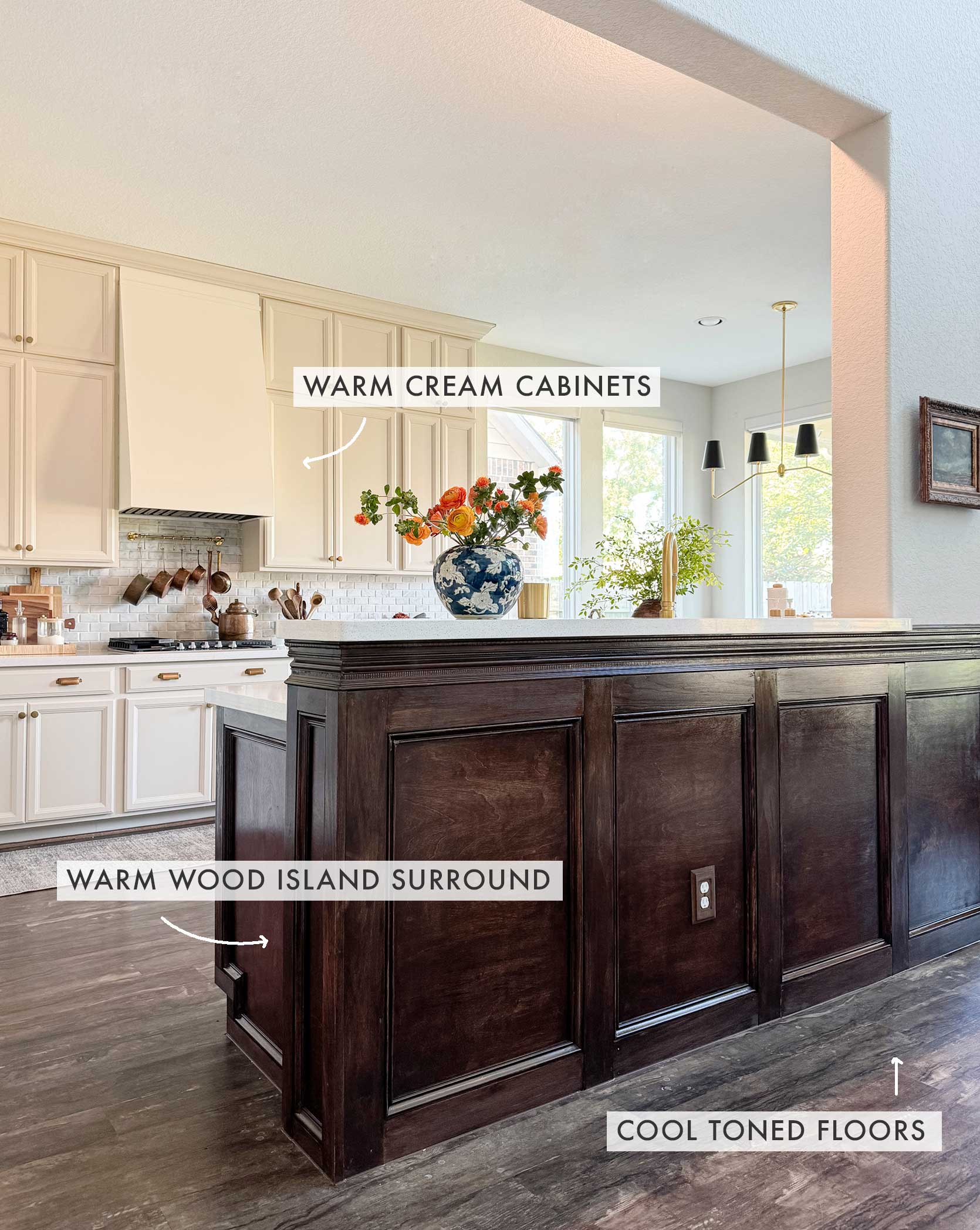
I really wanted to show you some cool-toned wood, because I know plenty of people have similar floors to designer Fariha Nasir’s in their own home. Her floors came with her home, so she had to work around a color she didn’t love. Though I noted in the rules that a rug is the ideal buffer for a situation like the above, obviously, you can’t put a rug between a built-in island and the floor. But it still works, mostly due to the liaison work being carried out by the creamy white cabinets.
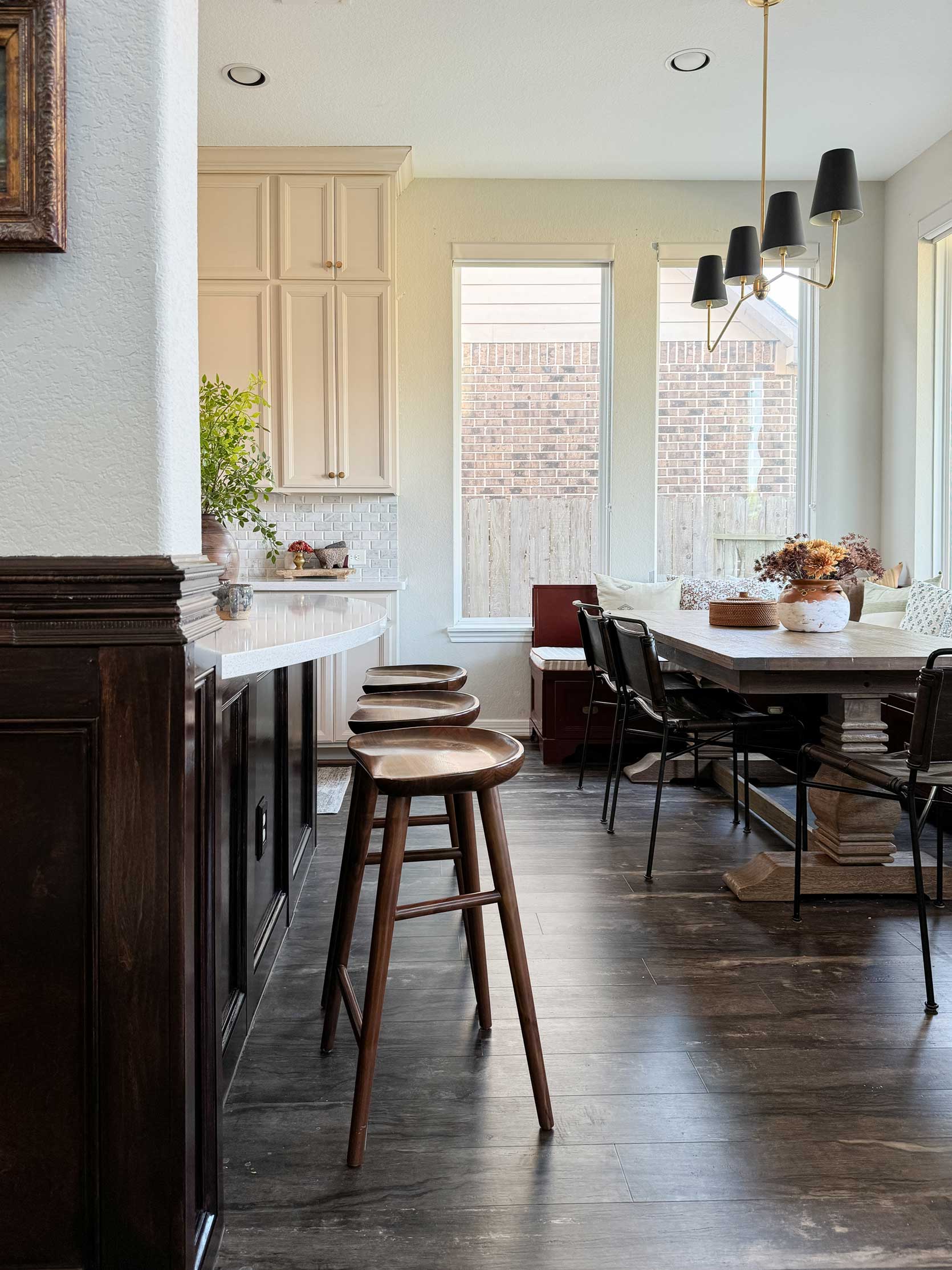
Rug or no rug, please remember that even if some of your materials or surfaces aren’t your ideal, you can still have a beautiful room that works well, and even breaks a few rules along the way.
—
Let me know if you have any other questions on this wood mixing topic, and I’d be happy to hop into the comments with you all to discuss. The next time you hear from me, I’ll be a North Carolina resident (AHH), so until then, good luck out there, design friends.
Opening Image Credits: Design by Emily Henderson and Max Humphrey | Styling by Emily Henderson | Photo by Kaitlin Green | From: Revealing My Brother’s Ultra Cozy Family Room (and the Most Comfortable Green Sectional)
Moving to NC at the same time as you (welll, a couple of months behind you!) Our new house has very cool toned wood cabinets and backsplash, so this definitely gives me ideas on how to warm things up. I’m also drawing inspiration from your old kitchen. Can’t wait to see what you do in your new place! I think mixing woods really created a curated, collected over time feel – more organic to how we actually live.
Thank you! Your article reminded me: hey, I’m pretty good at this.. vs. mixing/matching patterns/textiles for bedding-that’s a struggle.
I think it helps I live in a historic home and like warm woods and vintage pieces. I have gotten a run for my money though as we try to add a wood floor with our existing patina pine floors. Haven’t purchased but am going with a ‘clean’ medium brown like a provincial stain running the opposite direction where they meet as the pine in the same width.
This has been graduate level mixing wood tones for me! 🙂
For our kitchen. I just couldn’t do pine there.
This sounds risky, Kristi. Are you confident you won’t end up with the dreaded “new next to old” syndrome that makes both floors look bad? Have you looked at Vermont Plank Flooring or Southern Wood Floors? They have engineered pine appropriate for a kitchen that might be a closer match.
What are your suggestions for a house in FL where large format tile floors are common throughout a home? They are frequently very light in color, or all dark in color, but there’s no real “tone” unless it has flecks of gray/marbling. If any readers live in FL and have an all-tile floor house, I’d love to hear from you! We are considering a move to FL east coast in the next 5 years so I am interested to hear how you utilize tile floors in your decor. Thanks in advance!
Same challenge in the California desert or in southwest homes where tile floors are common. I’d love some design advice on this.
Best wishes for your move. Always love your articles. Looking around my living room and understanding, first time really, what is going on with the impact of my floors.
Hope your move goes well! We moved cross country 6 years ago – not easy but 100% worth it in the end.
A wood species chart, arranged by warm/neutral/cool would have been great to include here to give people visual tool
IMHO if there is space enough to separate pieces of furniture or other wood details you can mix almost any wood color, cool or warm.
The real challenge is when room is small, then the black wood advice is very good.
Also, landscape or marina paintings that add depth to walls and make the room look bigger help to move the eye far from the wood pieces that are oo close.