
All Things Renovation
The Full Farmhouse Entryway Recap + What’s Happening Next
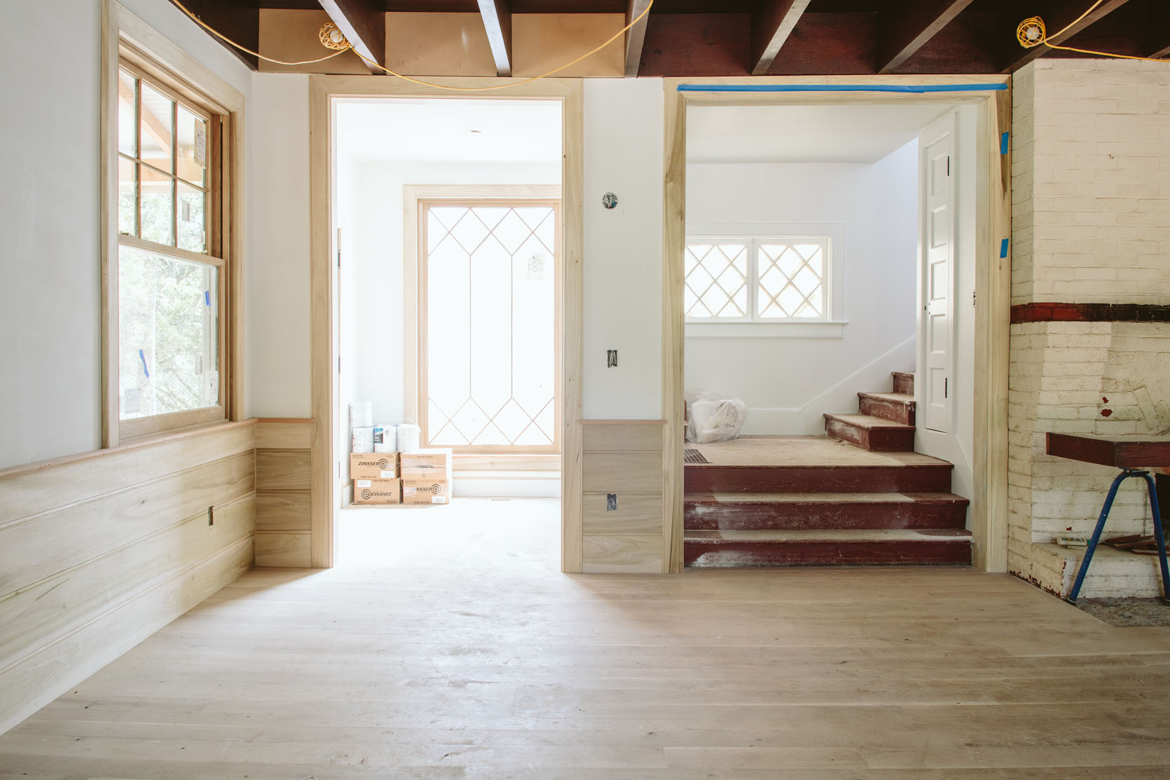
This coming Monday we are revealing the entryway to you (first round reveal, at least), a sweet little room that sets the tone for the house. Before we show you the reveal we wanted to give you a recap of where we started, why we did what we did, and where we landed on things before the final layer. We don’t come in and out of this door as much, but it was a great opportunity to be a welcoming little vestibule. However, it wasn’t always so bright and airy, no siree. Here’s where we started:

It was a great space, pretty big for an entry (8’x7′ or so), and had a really pretty door and window. We wanted to bring more natural light into the living room so we ended up repurposing that window into the upstairs guest bathroom so we could install a much bigger one.


As you can see the living room was dark, and this entryway leads right into it. The paint color would need to change. The trim ended up being replaced because we renovated the whole house and the style of the trim changed. And the flooring, which was not original (a ’90s update), was not what we wanted and not in great shape.

We worked with Sierra Pacific to design this window that married the original diamond pattern design that remains upstairs and throughout some other areas (pantry) with the more traditional and simple grid pattern of the double hungs in the living room and kitchen. It’s unbelievably gorgeous and brought so much light into the living room like we had hoped it would.
Originally, we were going to put a wall of closets in here but that was before I realized that we likely weren’t going to go in and out of here too much so we need as much storage. We still need to add a coat rack for guests, but we just don’t need it on a daily basis.

We go in and out of the kitchen door and the mudroom door far more, so this room just needed to function as a welcome for guests. I think my FedEx dude sees this door more than anyone else 🙂


As you might remember, we stared for hours and hours and HOURS at wallpaper samples for this room, over the course of six months. I really wanted to stick to this calming Scandinavian farmhouse vibe, despite loving color and pattern so much. I love so many of these, a lot, but living long-term with one is a different story.

I ultimately decided to go more neutral (which I know that many of you were confused/disappointed by) but I continue to be so happy about it in person. I suppose I’ve reached the point in my career and with this blog where I’m choosing what I want to live with over what I know will look good on camera – because admittedly this paper pattern barely reads in photos.


It’s just really pretty and calm in person and has allowed me to layer on a lot of art (in a fun way which you’ll see in the reveal!). Will I someday wish I had gone bolder with the wallpaper? Maybe! But here we are now and I’m super into it. Oh, and I’m not convinced that the door will stay white but it is for now, FYI.
The Bench

The only furniture that this space needed was either a console table or a bench. I was open to both but mostly wanted the piece to be super special. I had this outdoor Rejuvenation bench for a long time which looked pretty darn good, but when Thos. Moser said they would partner on this wood spindle bench I screamed, “YES”. It’s the world’s most beautiful bench, with two tones of wood, the most beautiful joinery, and a better scale for the entry (a foot longer than the black one).


Black Bench | Two-Toned Wood Bench
I’ve had that vintage rug forever and want to blow it up to a 12’x15′ and put it in the living room – it’s perfection. And the light fixture is an antique that I got from Rejuvenation’s Vintage Department. It’s a simple milk glass disc with a triple bulb brass fitter on an unlacquered brass stem. It’s made for this space because of how it interacts (or doesn’t interact) with the window. I wanted it pared back and simple, letting the pattern of the window shine.
How To Hang A Gallery Wall Of Art On Wallpaper??
The reason I went quiet on the wallpaper was because this is one of the few walls in the house that I felt could handle a gallery wall (and no there are no rules on an entry just having a mirror). I have a lot of fun art that was feeling odd in other places or was competing too much with the art that I already had there. It’s my opinion, however, that busy art on busy/bold paper would be too much for me in this home. So I chose to keep the backdrop quiet and let the art be more eclectic and colorful.
But I know myself enough to know that I love to switch up art, especially a gallery wall A LOT. Another one of my talents is putting holes in the wall. So this wallpaper created quite a challenge for me – you can’t just willy-nilly throw holes inside wallpaper, y’all.

So I found this art rail from Pepe & Carols and decided that I’d hang that, which would allow me to switch up the art on the chains. This allowed for ultimate flexibility and I thought would be such a pretty architectural detail. I chose the 72″ length which came with 17 feet of chain and then ordered 5 of the large S hooks and 14 of the small S hooks.
So here’s a sneak peek into the art that we hung – via a really bad iPhone shot by me.

Since this room is so small I can’t give you a better sneak peek without giving the whole space away, so you’ll have to come back Monday to see how it all turned out and how I feel about it. 🙂
Resources:
Floors: Oregon White Oak by Zena Flooring
Wall and Interior Door Color: Extra White by Sherwin-Williams
Wallpaper: Scalamandre Raphael Sandberg Wallpaper in White
Windows: White Oak Sierra Pacific Windows
Black Bench: Rejuvenation
Wood Bench: Thos. Moser
Light: Rejuvenation
Art Rail: Pepe & Carols
Opening Image Credit: Photo by Kaitlin Green | From: The Case For The Quiet Neutral Wallpapers


Such a tease!!!
I’m very into seeing this space revealed, not least because I’m kinda regretting-ish the very busy wallpaper I put up in my own little entryway! I love the wallpaper you chose (I can see the pattern); on my mac it reads as a texture with movement but also seems calm and quiet. Wonderful.
Looks very pretty! But I would not want an entry that looks into my house anymore. Too much exposure.
Funny how you can only really see the wallpaper pattern in the black-and-white photo. I actually think the subtle paper is exactly the right choice for this entry — I can already see it balances so well with the art. I love to change up the art in my home, too, and kind of wish I’d used a picture rail (as opposed to all those holes in my wall. Gulp.) This space looks beautiful!
I love the wallpaper ! So lively, pretty, and flexible for many styling choices. It is joyous without being trendy or obnoxious and it feels like you can live with it for a long time. The picture rail is very cool. I’m imagining budget version for myself using a curtain rod. This is all very inspiring. I’m currently in design dilemma with my entry / downstairs living room and no budget… I’m thinking of hand stamping linocut patterns or starch pasting fabric on the walls. Currently its a shiny tan yikes.
That art rail is amazing and I can’t wait to see the full space tomorrow. Anticipation…!
“I’ve had that vintage rug forever and want to blow it up to a 12’x15′ and put it in the living room – it’s perfection.”
Emily, you can have rugs woven to your spec! They can even copy the look of vintage wear. You must know this??? Surely!?!
What a great partnership that’d be!!
When I was studying teaching, the man next door had me design a pattern for a rug for his business foyer and he took me to a place that made rugs to spec design (kinda like printing a photo on a mug or t-shirt, but woven!).
It was amazinggggg!!!? That was yearrrrrrrs ago, so the process must be slick by now!
YOU COULD TOTALLY CREATE A HUGE VERSION FOR YOUR LIVING ROOM!!! ?
LOVE the art rail!!!
looking forward to the reveal!
Emily, that bench by Thos. Moser is a beautiful work of art…and if I came to visit, I would have to try it out. Sooo pretty with that rug!
I mean, out of all of the pretty rooms in this house, it would be premature (foolish?) to declare the entry one of the prettiest by OH. That bench is perfection, the window is perfection, the rug is perfection, the art rail, yes, perfection. And the quiet, neutral wallpaper is such perfection that I chose a similar wallpaper (actually, it might be the same, just named differently on L&G) for our hallway and going up the stairs in our 1872 farmhouse. Well done!
Hello! I would love to see a tutorial on using the art rail. I’m not very handy it love the idea of them (because I also like to change out my art work periodically). ?
Same here!
Google pictures hung from molding, because that’s a great option that is more subtle as it doesn’t require bolting a rail into your wall.
Great tip, sadly I am not blessed with ceiling molding in my current home and the pic rail would add interest in my situation.
Yes to picture rails! A lot of old houses (including mine) have wood picture rails that just look like decorative trim but are meant for hanging pictures. I use brass picture rail hooks and brass chains with mine. I have a Pinterest board on the topic, if anyone’s interested!
Looove picture rails in an older home 🙂
Here’s another way to do it
This is a perfect way to do it!
A little off topic, but did you consider taking down the wall between the entry and the stairs and just running the stairs straight down? And then you could close up the wall that is currently open from the living room to the stairs, which feels like it would solve the lopsided feeling of having the wall end right where the fireplace starts. I’m sure you considered it and would find it interesting to know what decided you to keep the staircase as is.
I love a good picture hanging rod! Looking forward to the rest of the reveal!
I wondered the same – it looks like that little internal wall may be loadbearing?
Just lovely! It’s going to be a visual delight to all who enter.
Ok hot take but I actually kind of like the black Rejuvenation bench a little more for this space!!! The wood bench is 100% a work of art, but I kind of like the contrast of the black bench against the light wood floors/light wallpaper. Anyway, the art rail looks amazing and it’s all very lovely.
I loved the black bench in this space. My first thought was okay, just drain all the color from the area… but I am warming up to the beautiful wood tones in the new one. And I understand Emily’s point that that the proportions of a longer bench make more sense here. Let’s see if you your view changes at all after the reveal tomorrow.,,
Love the simple, clean elegance of this room. Actually love it with NO ARTWORK.
Agree. The no art in that space looked better. It’s a lot going on visually with the gallery, rail, chains, papers. A fancy big mirror would look great.
How about a fun ceiling wallpaper! You can use temp and see how temporary temp wallpaper is and review!
The space is Gorgeous (esp the bench) except that hand kind of creeps me out.
How much weight can the bench take?
The rug and window are gorgeous also!
what a stunning bench!!!! Obsessed.
Would you mind sharing the width and length of your front door?
So glad you selected the neutral paper. As much as I loved several of the colorful samples, the neutrals were more entryway appropriate.