Design
The River House Entry And Staircase Reveal (+ Why We Designed The Stairs This Way)
This entry is not the infamous family drop zone, which makes me just so happy. I really love how the architect, Anne Usher, designed the layout of this house. There are two exterior entrances that lead to the mudroom (up the garage stairs and up the side of the house), allowing the front door entry to be pretty, spacious, and clutter-free. It’s such a dream.
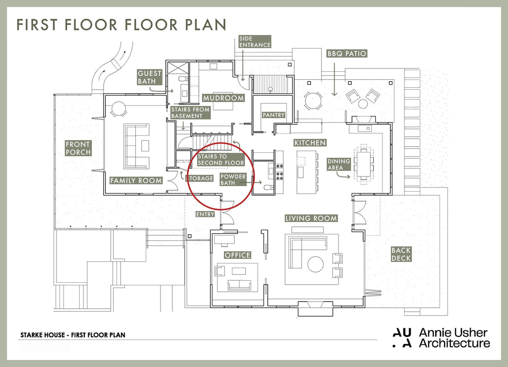
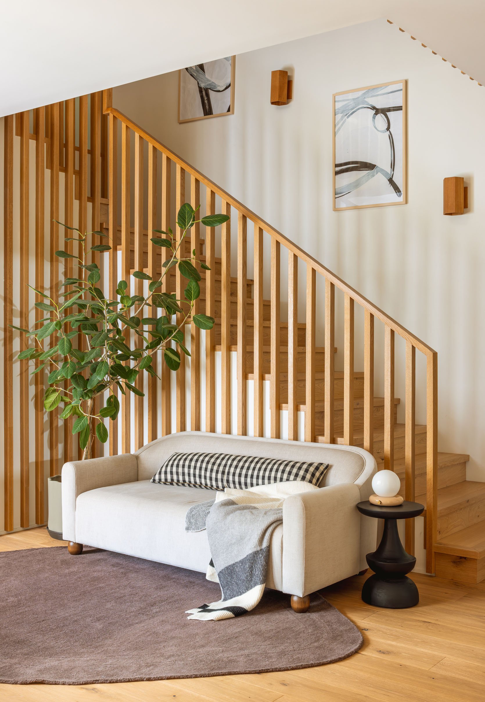
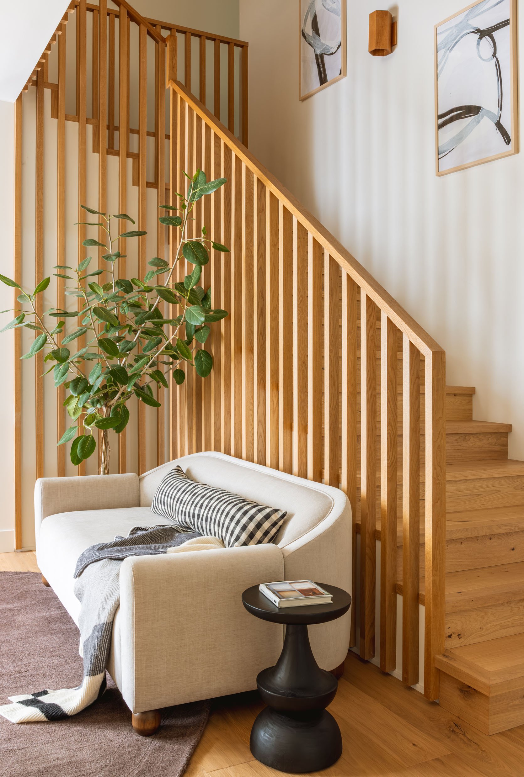
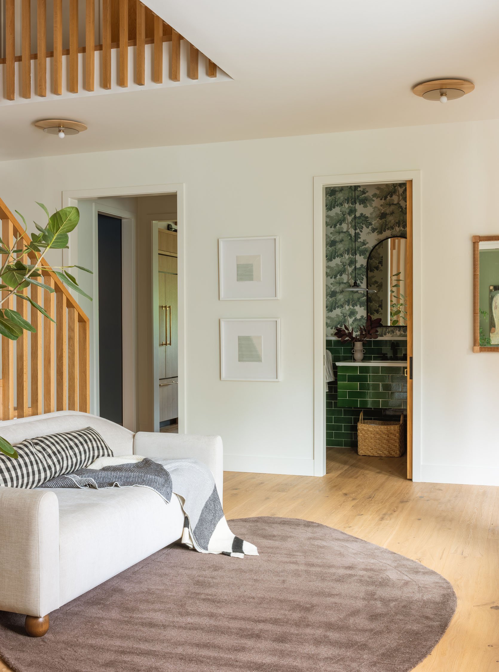
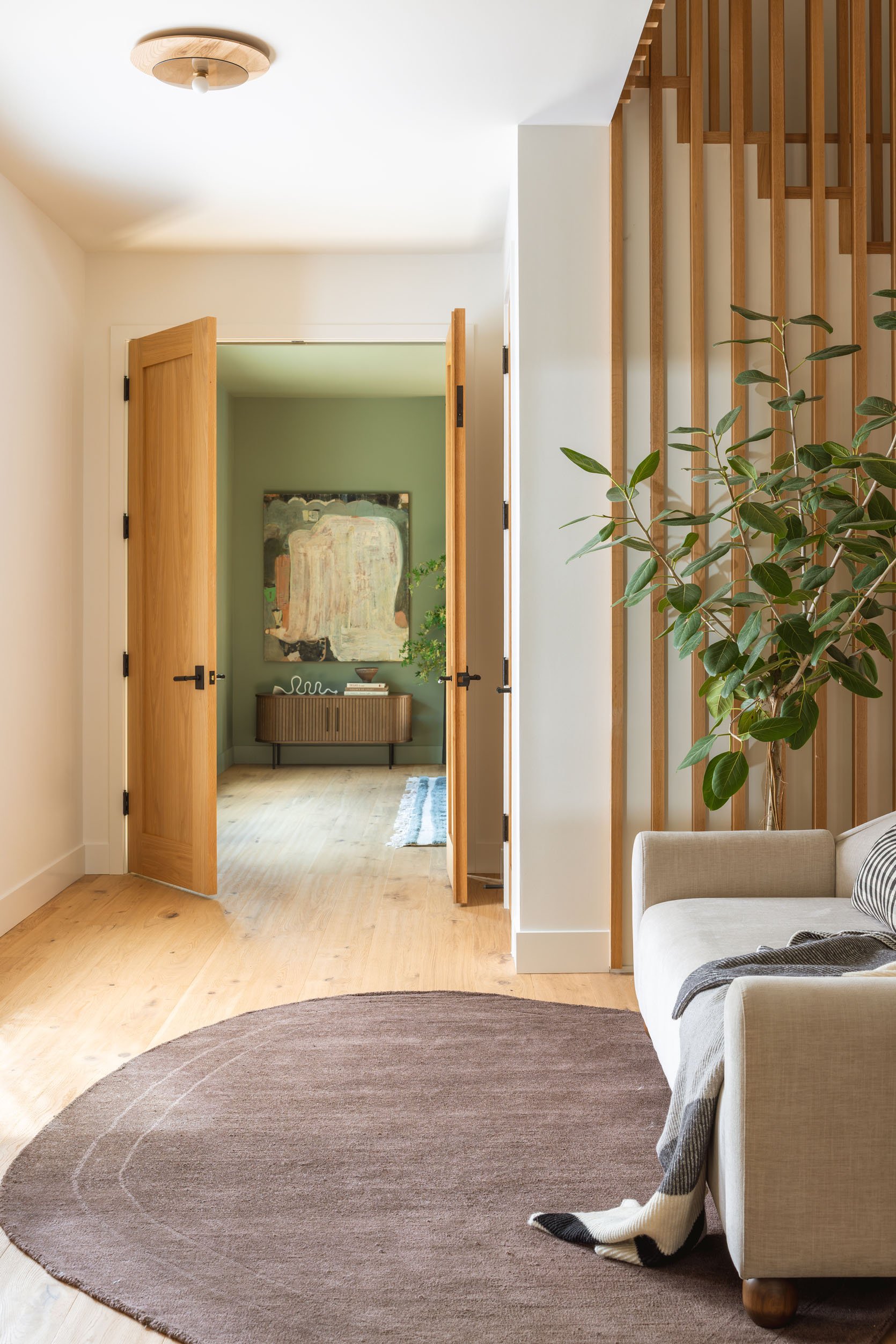
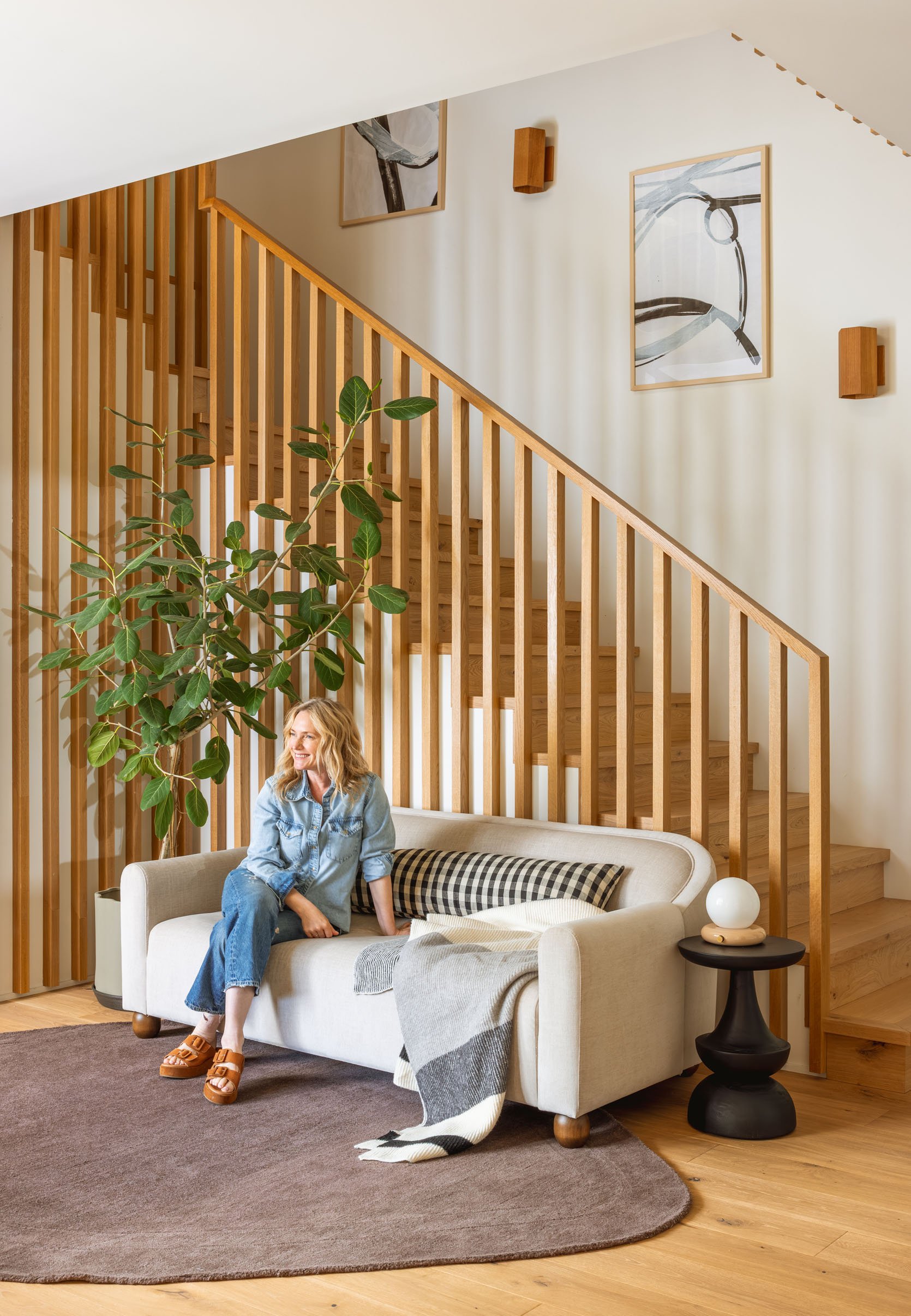
As a reminder, this entrance is up a cascade of wide concrete landings and exterior stairs, and once inside you can move forwad into the living/dining/kitchen area, cut to the right into the game room/library or cut left and see this sweet little sitting area under the railway. But a lot of designing had to happen along the way.

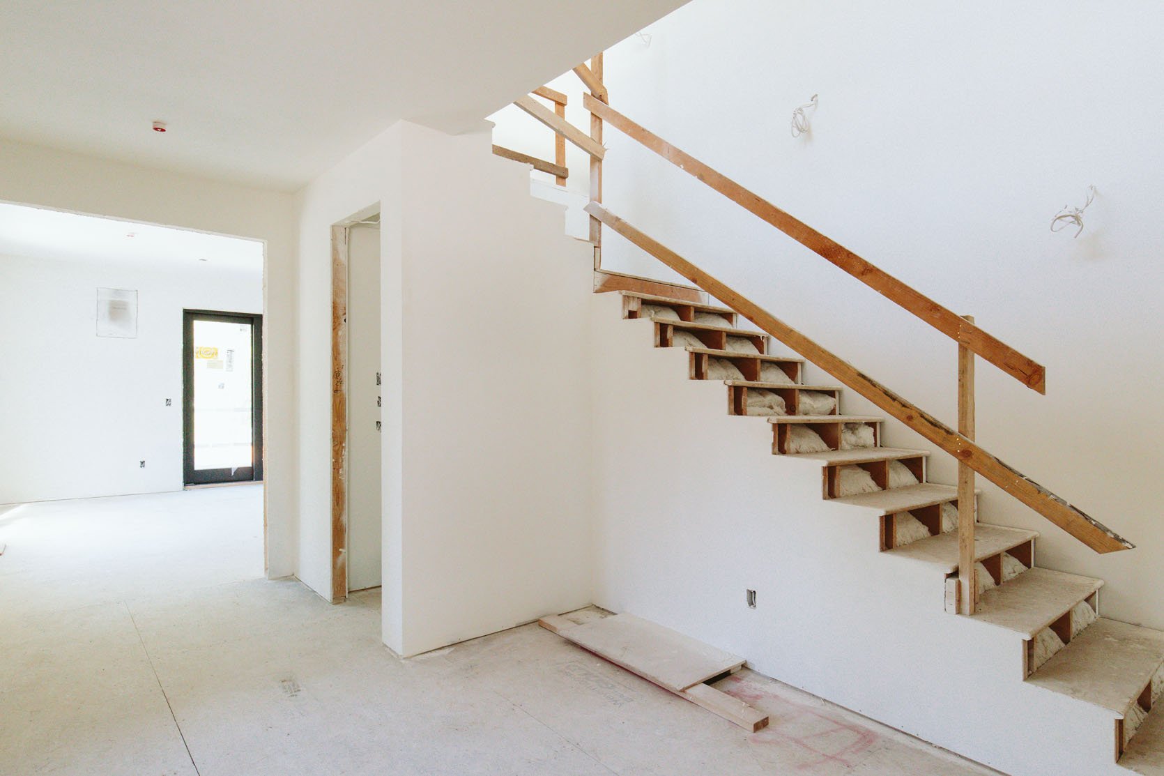
This was the stairway a couple of years ago, before I had even thought about what it should look like. Katie knew she wanted wood (as opposed to metal or glass), but where should it start and stop? And how does it integrate with the railing along the landing above?
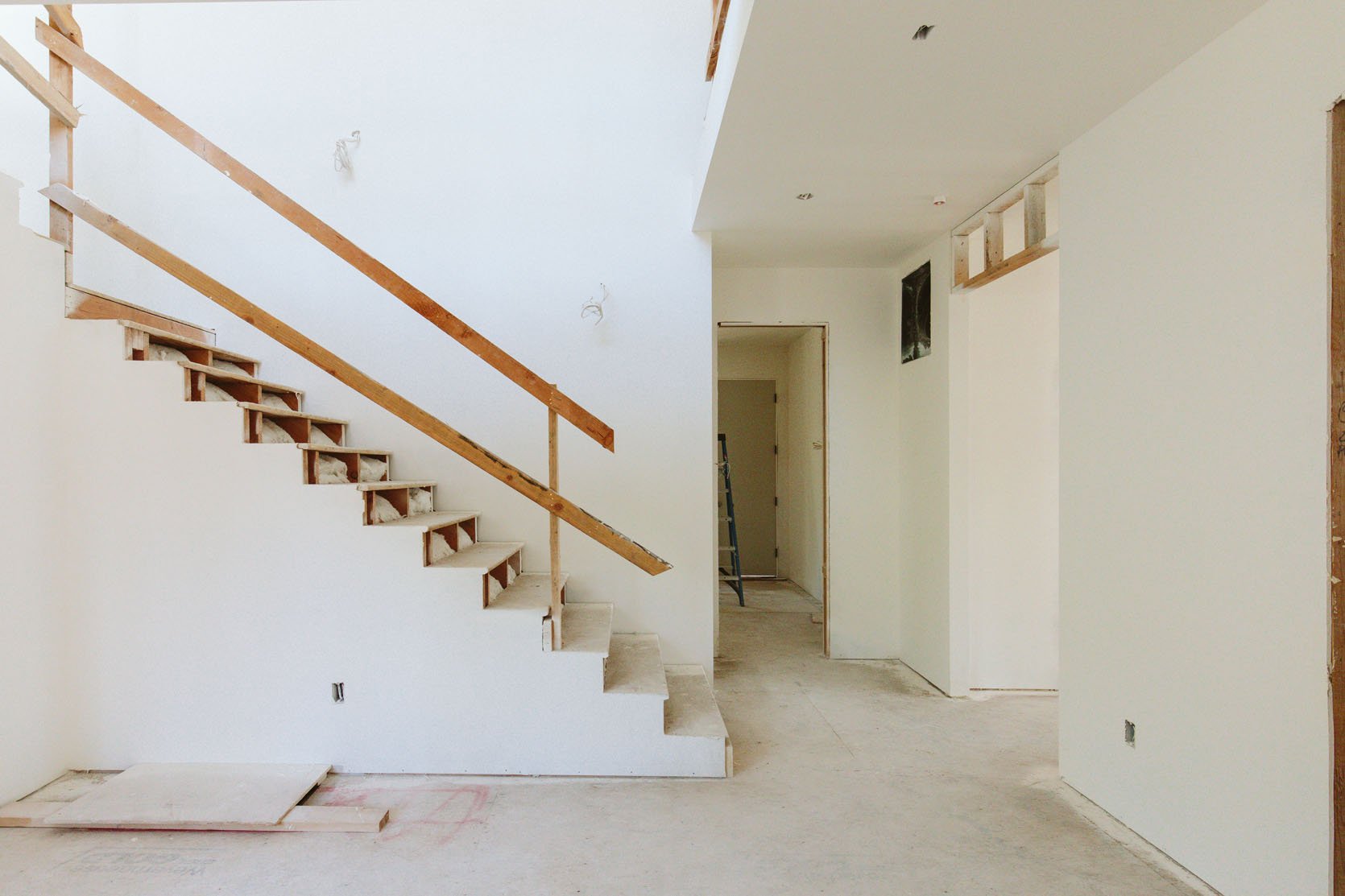
At this point, they were so far over budget that doing something super bespoke was not on the table – no intricate carvings or welding this time, which was fine because this house is meant to be simple in its finishes, more eclectic in its styling.
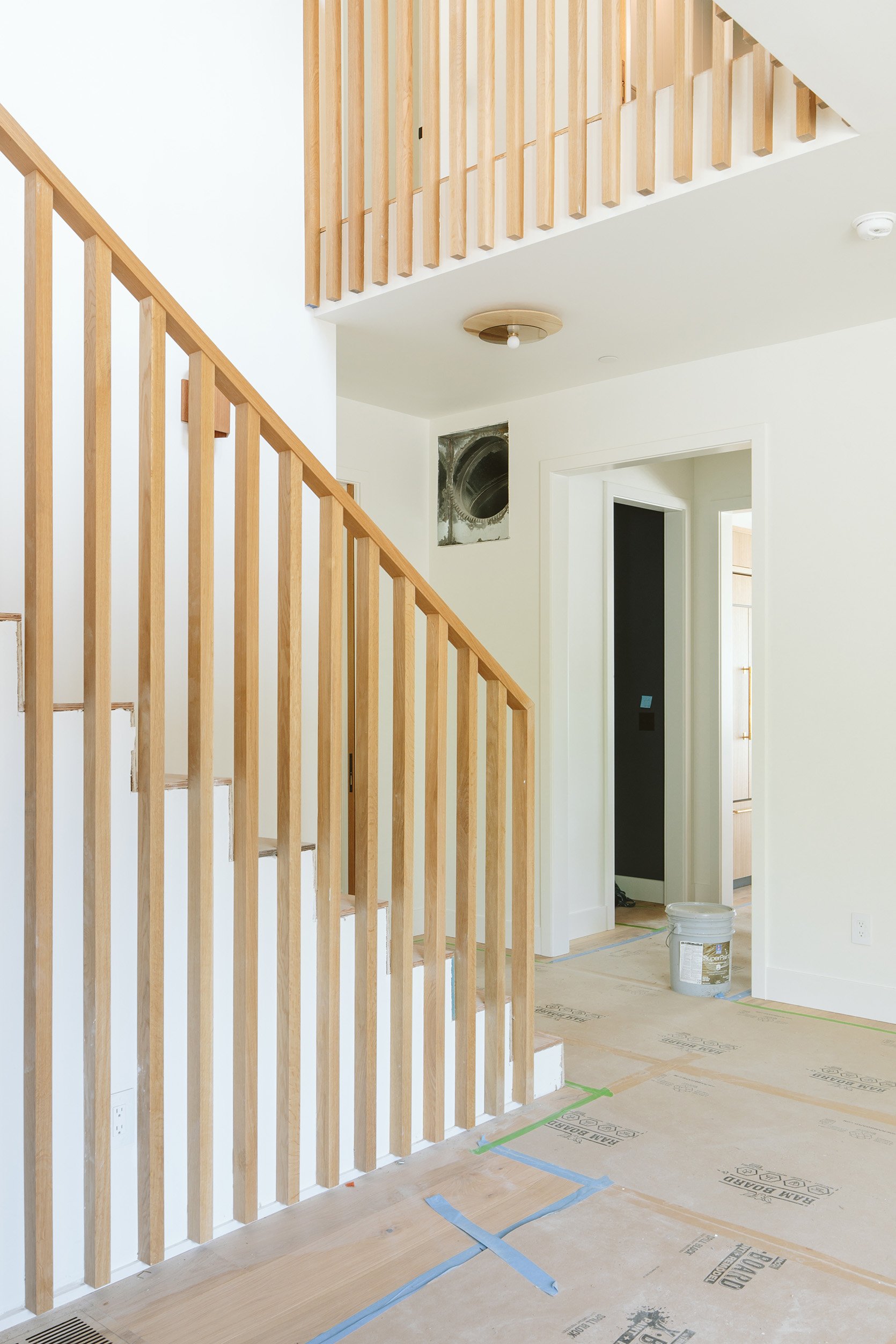
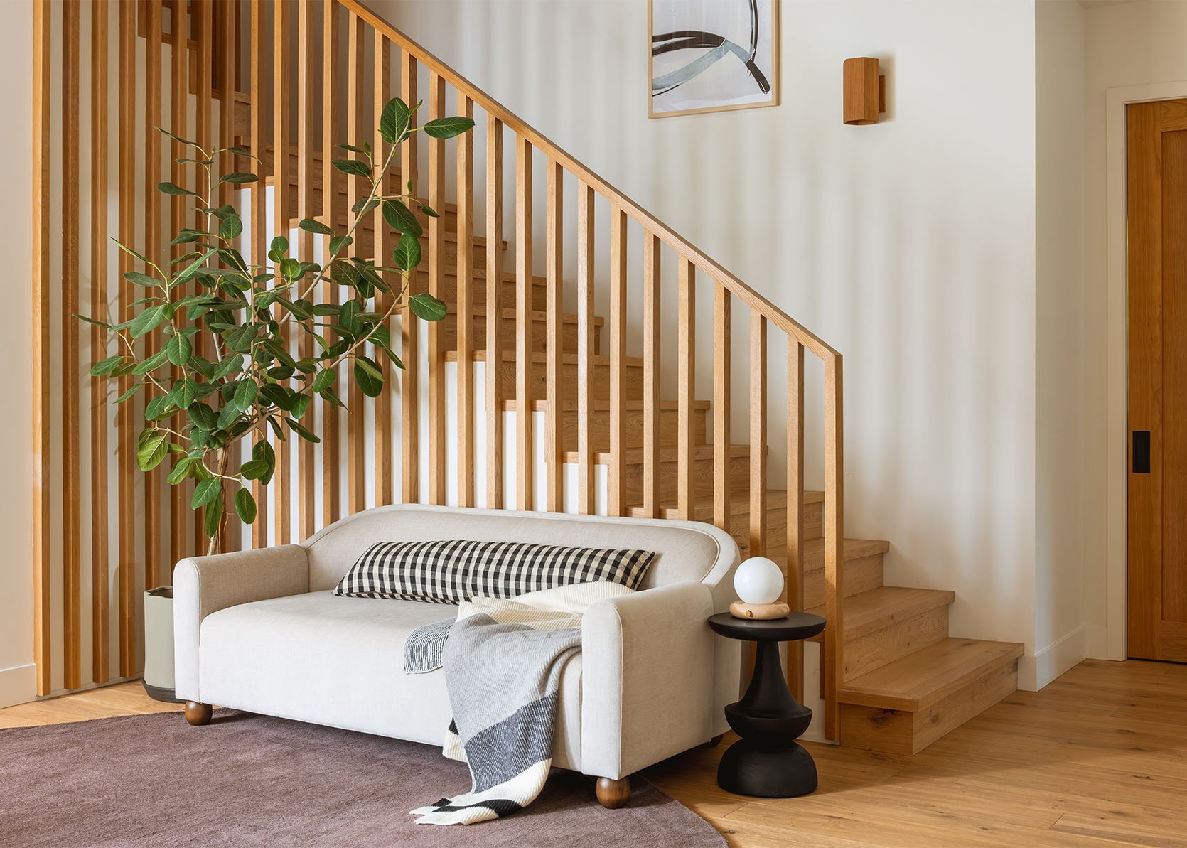
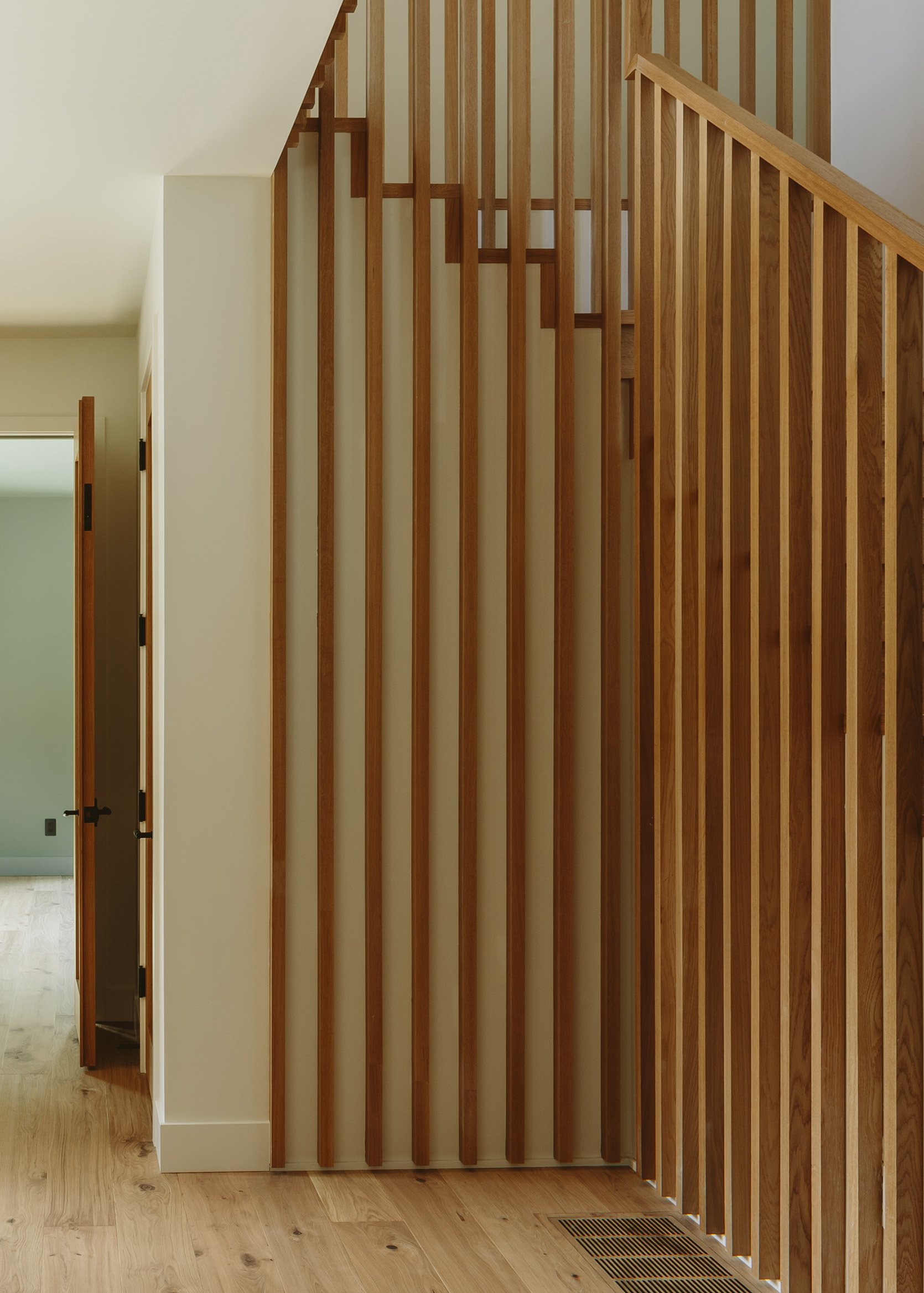
We chose 2×2 squared off white oak lumber, installed vertically with a simple railing along the top. We thought this would create architectural interest, dimensions, and shadow lines, while not breaking the budget nor being too builder-grade.
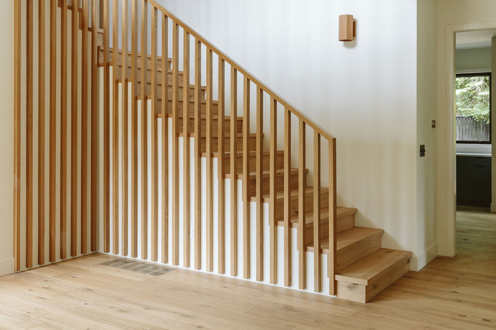
I remember that we had to stop the vertical wood to float an inch (or less) above the floor, mostly because of timing – it had to go in before the flooring and so stairs could be installed. But the exact measurements (height) were a bit unknown and god forbid if they weren’t exactly flat/uniform that would be a huge pain in the A. So they wanted to give some space as a buffer for a trim piece. I knew that for the most part, your eye wouldn’t clock this and that there would be furniture here, so I was ok with it. I also didn’t want this decision to hold up the rest of the construction, which needed to happen in a specific order. Designers can famously hold things up, especially when we are so myopic and obsessed about the details that honestly later barely matter (I’ve learned this lesson every single project and will likely for the rest of my life, but it’s easier for me to be less perfectionist at my brother’s house, lol).
I’m obsessed with those wood wall washers going up the stairs (from Cedar and Moss), and while I love the Schoolhouse flushmounts on the ceiling, we always meant to switch the bulbs out to be bigger. They are so tiny!
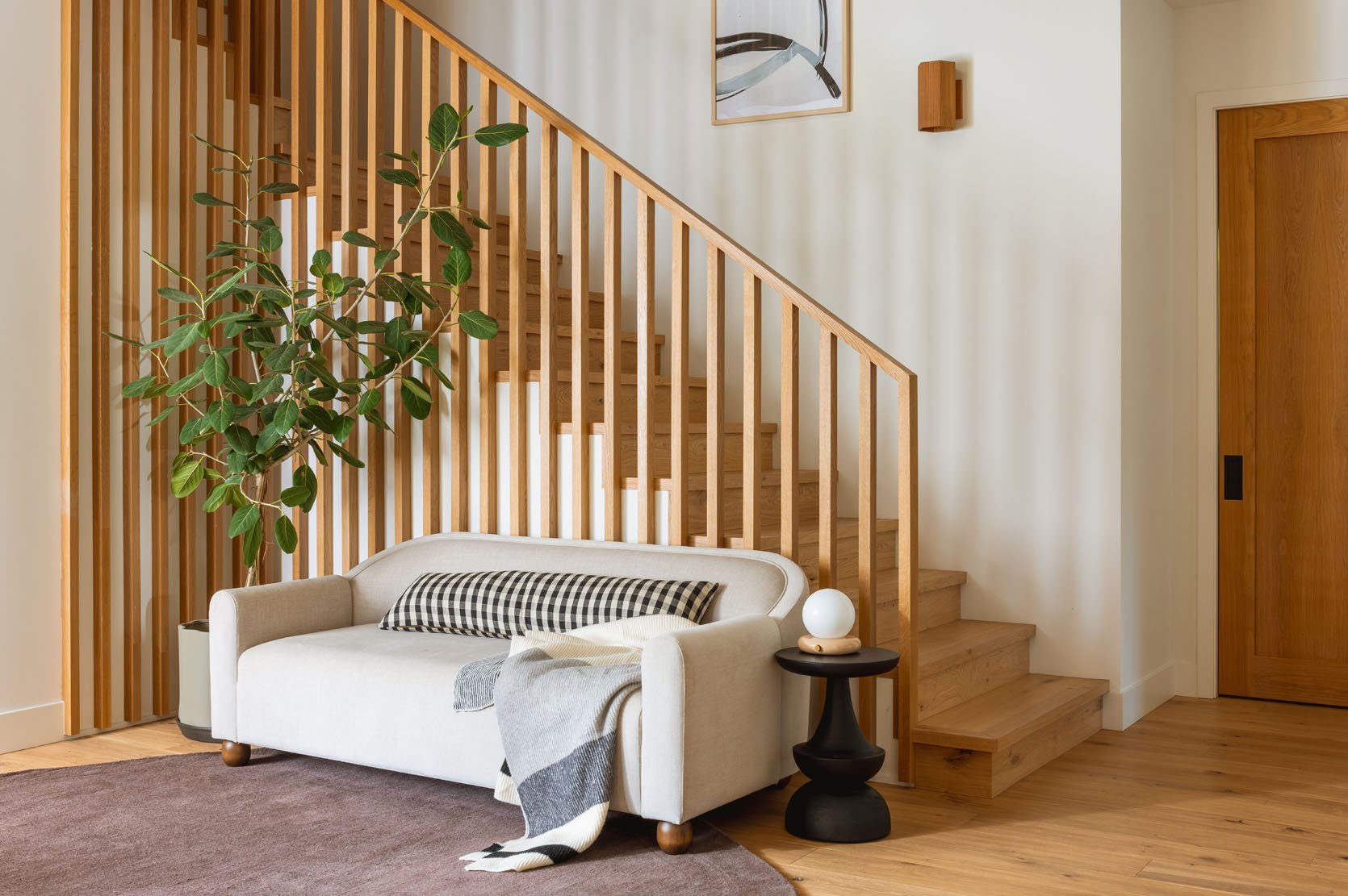
The railing continues up the stairs onto the second-floor landing that opens up to all the bedrooms. I love how it adds a lot, just with one material.
Chandelier (no longer available)
The large chandelier up here is from Schoolhouse Electric. We needed something with a lot of bulbs and a really big scale without being insanely expensive or too ornate. The amber glass is quiet and pretty.
I honestly don’t remember where I ended and Max started on some of these design decisions (or vice versa), but I know that he helped troubleshoot some of the measurements – he’s excellent at making decisions when I got super stuck in indecision mode.
The Finished Staircase
The Alice Sofa | Rug | Pillow | Throw (similar) | Side Table | Lamp | Planter | Wood Sconces | Artwork
I truly love how it turned out. It’s just so striking and simple. Sierra Custom Construction executed it really well, and honestly, it’s just so perfect for the house as a whole. It’s really strong and sturdy (Ken’s biggest concerns) while being visually really powerful.
The paintings up the stairs are by a local artist named Anna VonRosenstiel, which I found at Urbanite (a Portland mall that has both vintage and makers). I can’t believe how perfect they are in size, color, style, movement, scale, price, and the fact that we could get a diptych going up the stairs really nailed the whole look.
The light and shadows give it so much movement and texture, not to mention the “striped” pattern that packed a big design punch.
Stacked Artwork | Wooden Mirror
I hadn’t planned for a sofa to go here, but we had this one from our new collection, the Alice, that found its home. Ken and Katie are, like me, typically scared of a light colored sofa, but this is really just a pass-through space and is visually really important (you can see it from so many rooms), but gets very little functional use, so it was the perfect place to put something really pretty. Originally, I thought I’d put a round entry table with a dope lamp or maybe just a huge tree with a sculptural chair underneath, but once we put this here, we realized it was perfect. Again, they have a mudroom as their drop-zone entrance, but for guests, they can absolutely throw their coats here for gatherings, so it does actually serve a purpose.
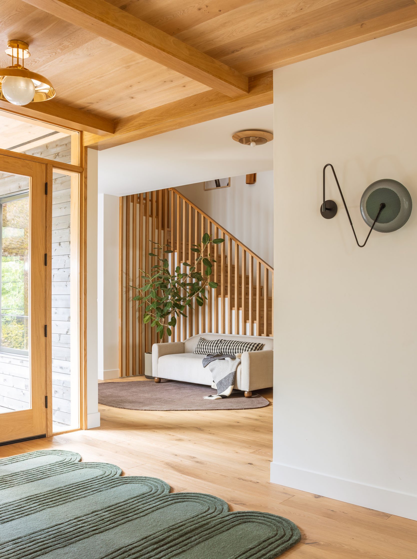
The brown amorphous rug was really the best move (it’s not the highest quality, but it’s so affordable and perfect in color, size, and shape, so they kept it here). The plant breaks up the stripes with something organic and asymmetrical. And Katie has kept it alive since January with only mild to mid-level daily fear that she’ll kill it. (Ahem, more to come on the excellent faux house plants/trees that I bought for her after realizing how much stress this real plant created – I found pretty dang great ones, I promise).
This color of the rug is really forgiving (being brown), and a rectangular rug would have cut off the space in a really odd way (and no rug felt sad). Once we put this down, it immediately created the sense of a “room,” even though it’s just a pass-through space. It warmed it up a ton.
The Front Door
Ceiling Lights | Flooring | Wall Color
They chose all glass and white oak front doors and side lights (which they have come to regret, actually, for privacy reasons), but they sure are pretty 🙂 Turns out you don’t want your Amazon delivery friends to have total visibility into your morning (so they might add a film onto it). There wasn’t really room for much of an entry table (we might still add a very narrow one on the right white wall), but we needed something to make it feel special.
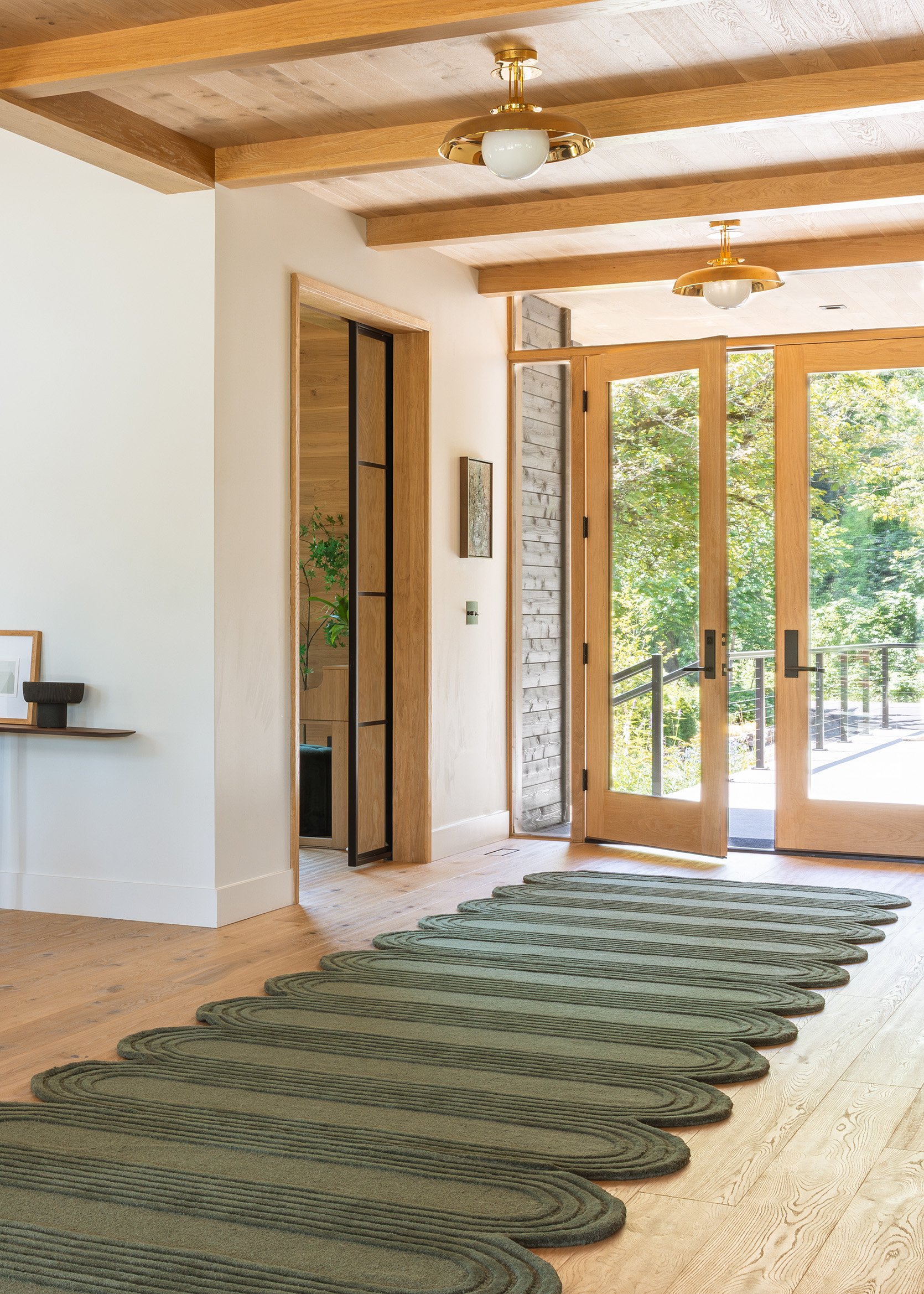
Finding this rug was clutch. We put a big mat outside where you wipe your shoes, but I really felt like this should be a special rug since it’s the first thing you see walking up to the house, and really invites you in. But what size? And do you place it horizontally with the door or more vertically perpendicular to the door? I bought two of these green scallop rugs from West Elm in hopes of creating a longer rug, and it looked great in the shots. But that day I realized that if we had 3 of them, sewn together, it would actually act as a long corridor rug leading people into the living/kitchen area towards the view of the river. Like so:
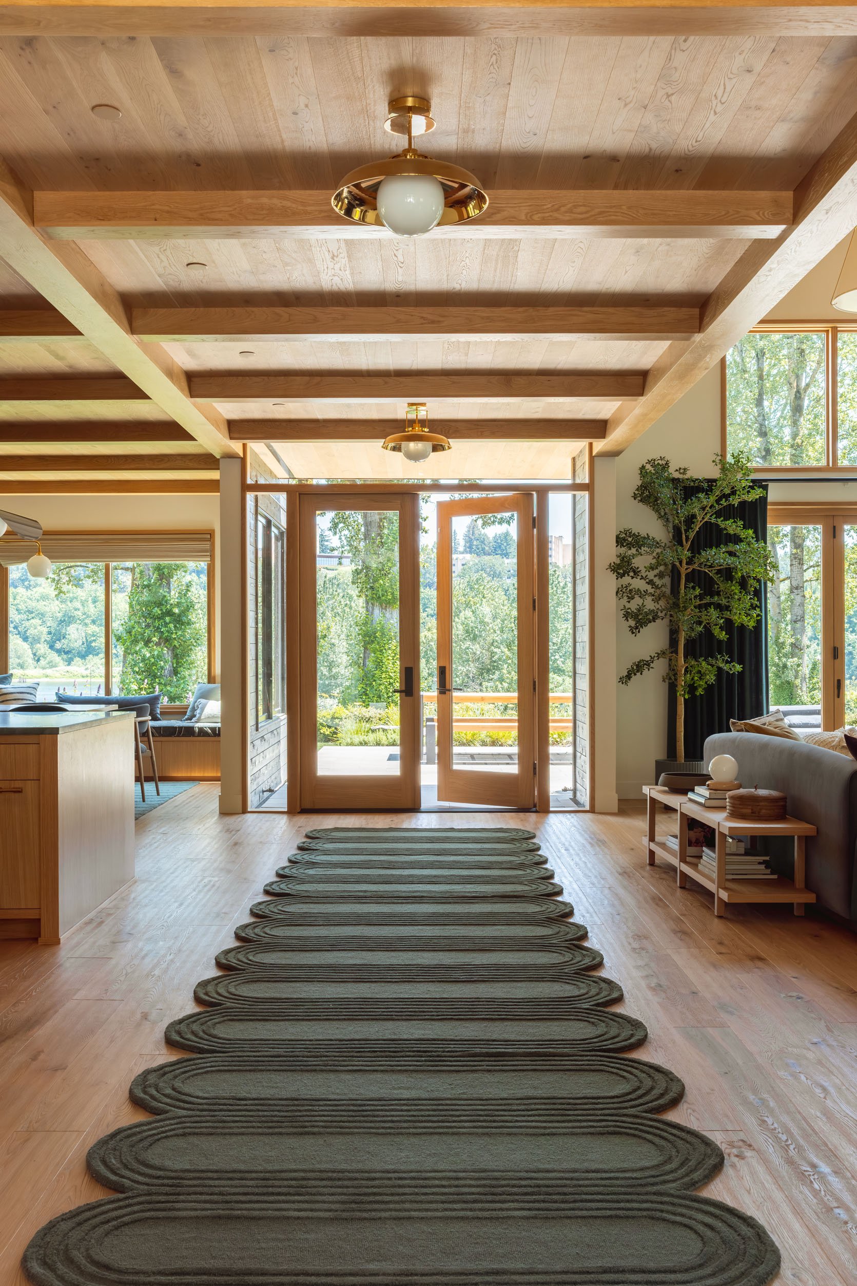
I’m pretty dang obsessed with it. Katie ended up just getting a really sticky rug pad instead of dealing with sewing them together (which would have cost hundreds and taken a couple of weeks), and she swears it’s fine:) You can get a sneak peek of the living room and dining room up there, and I cannot wait to show you the rest of the house in a couple of weeks.
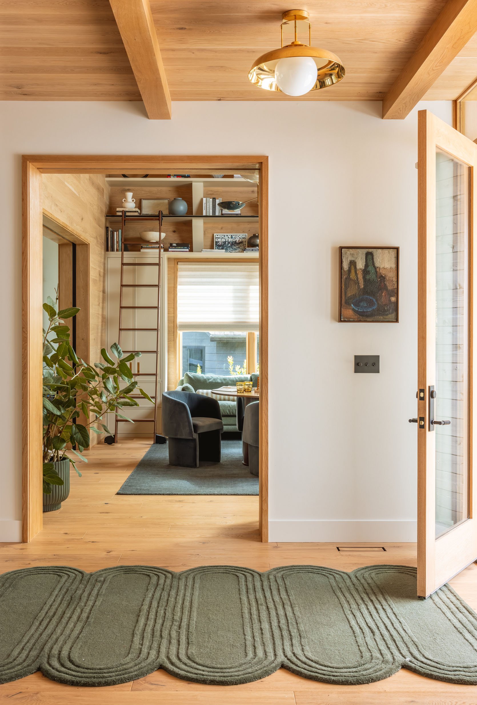
The first impression is pretty dang perfect. And being that mid-tone green, it’s really forgiving (versus a lighter rug). I can’t believe I sold them that vintage Swedish oil still-life painting. Sure, technically it didn’t have a home in my house currently, but I love it so much (don’t worry, I’m charging them a lot for it, lol). The colors look so beautiful here, and it gets a lot of attention and appreciation, which is important to this hoarder:)
The whole vibe when you walk in is honestly so warm, welcoming, and exciting. The green rug takes you straight into the main living space, and you pass by what I think is my favorite room in the house – the game room. A big thanks to Anne Usher, the architect, Max Humphrey, who helped make a lot of design decisions, and Sierra Custom Construction for building the house. More to come soon:)
*Architect: Anne Usher
**General Contractor: JP Macy of Sierra Custom Construction
***Interior Designers: Emily Henderson (me!) and Max Humphrey
****Styling: Emily Henderson (me!)
*****Photos by Kaitlin Green
Could you tell me about covering up the floor vent with the sofa? Do you worry about air flow?
If it’s an issue, the sofa can be pulled out from the wall about 6-9 inches. That would be plenty of room for the return duct.
good question. I don’t think its a problem but i can ask! they have a lot of vents so I don’t think its a huge deal.
The house looks amazing. Really beautiful scenes. The 3 rugs together – genius!
The link for my friend Anna VonRosenstiel doesn’t work- but you can find her at carterandrose.com. She is an amazing human!
oh no! i’ll fix now!
I’ll fix!! So sorry 🙂 thank you!
Could you share info on those brass flush mounts that line the hallway ceiling? Thanks!
Search “Ceiling Lights” on the post (Ctrl + F) and you’ll find the link under one of the last images. They’re the Ormandy semi-flush from Rejuvenation. So good, right?! One of my dream ceiling fixtures.
It’s so nice seeing how it all flows together, as we’ve been seeing pieces of the house for so long. It’s simply gorgeous. I’m glad there are light entry walls, as the little glimpses have been on the dark side. Chef’s kiss to the sofa in the entry spot.
After we built a house and chose a large glass front door, I knew we couldn’t leave it bare for too long as the privacy invasion was real. We hung up a linen curtain panel close to the ceiling so it covered the whole section of wall where the door is. I got one in a non-white colour from Restoration Hardware (so it was a murky brown-ish colour!) and it softened it up in all the right ways. It let plenty of light in and Wwe could still see if someone was there, but they couldn’t see in without pressing their faces to the glass. Usually it was only halfway closed, and since we used the other entrance through garage (via mudroom!) it wasn’t an issue to deal with tbh. I much preferred it fully pulled over in the winter when it’s dark so much earlier, as I hate the black emptiness of non-covered windows when you just feel like someone is standing outside looking in un-seen.
Am sure film would deal with the privacy, but I would worry that it’ll not be cosy enough for the house, especially since you see it from the main living area so much.
Yes, here’s an example. The River House would need a brass rod and maybe simple off-white panels?
Such a good idea (and very helpful to see a photo Cleo)! Though I wonder if both a film and drapes would be nice together. The film would still give privacy even during daytime or at night if curtains are open, but curtains could be closed at dusk for more privacy, coziness and also to keep the space warmer in winter.
Just keep in mind that applying any film or coating to new windows or doors will typically void your warranty.
It’s called a portiere! I live in a shabby little Victorian where the previous owner used a full-lite interior door (with about a gap of about 1″ at the bottom!) as the front door. We use a velvet curtain there for privacy and insulation. I’m just about done restoring an actual exterior door, but I like the curtain so much I think I’ll keep it. In the River House, it’d really help soften the space.
Yes – I do a portiere with dark green IKEA Sanela velvet curtains on my drafty doors in and they really warmed the space up literally and visually – they would look great in this house.
I’m thinking coach would be too big for the space? Maybe a chair or bench?
Couch🤣
Wow. Those front doors are beautiful. Love the earthy feel to everything. That said, imo, the brown rug looks sad there, and brings down the vibe. The bones in the entry are beautiful but a tiny bit of vavoom in the rug would be really nice. Love the green rug!
I hear you, but respectfully don’t agree because i love it. its earthy and warm and not to mention family friendly. I think if more rugs came in that shape in different colors we might have chosen a different color but onlly came in cream, rose and this darker brown. the green rugs are rad though!!
Agree. Maybe it is the photo but the brown rug is throwing things off. The couch also seems off as it needs a chair or two. The single couch up against the wall reminds me of college days and all the roommates brought a couch and one would be thrown in the foyer. It would be used mostly at parties.😂
One can get carpet and/or remnants cut and bounded into many shapes. Finding a remnant and having it cut and bounded is usually less expensive than purchasing a ready made rug.
Love the green rugs!
I agree – I would catty corner the sofa and put a vintage oriental down. I think that’s really the strength of this house it is such a clean and well built backdrop for all kinds of styling and moods.
Wow, it’s surprising how different people’s tastes and preferences are! I found the brown asymm rug jaw-droppingly brilliant and beautiful a move for this space, and the entire styling with the sofa feels so thoughtful, inviting, and organic. Adding more chairs, to me, would feel like a force fit to a pass through space. This styling creates such a special introvert friendly nook ❤️
I think a rug with “vavoom” could command too much immediate attention and detract from the cohesiveness of all the other lovely elements in and surrounding the space.
Comment #2:
This house is STUNNING. I hope once everything has been revealed that you all might do a video tour so we can really experience the flow and how it all comes together. The floor plan is really helpful, but I want to see it like I’m in person. So so beautiful.
I have GOT to get this on the books!!! And before they decorate for halloween or christmas!! thank you so much for the reminder. yes this has been a goal of ours since the beginning but its at least a full day shoot (and has to work for their family and every room has to be clean). STAY TUNED!!! but thanks for the reminder (and the love)
Love the Hanna Brundin painting in the entry (tell your brother her work is in various museums). I remember that from your Los Feliz dining room update. Blog post was: My Updated LA Dining Room + My Dream Dining Chairs (Kinda)
Forgot the photo
OMG!! how do you know the artist??? I didn’t even know who it was?? THANK YOU! I love that piece so much. Might steal it back 😉
The home is so beautiful! Curious if they are using any of their previous home furniture? If they are how are you weaving it into the new look?
A couple pieces, but what they had was either starter furniture or stuff that they didn’t love anymore (or super wornout from dogs/kids) or make sense that they sold when they moved.
This is a masterpiece.
I’ll take it!!!!! omg. thank you 🙂
It looks amazing!! I actually think that 1 inch float at the bottom of the railing looks really modern and intentional. Love the sweet white sofa, and looooove that green rug. Can’t WAIT to see the game room! Thanks for sharing!
The Jane Denton textile art is perfect next to the powder room. Part of a set of 4 originally, I believe. BELOW Clockwise from top left are Still i – White, Still i – Celadon, Still i – Grey + White and Still iv – Celadon. Her website is janedenton.co.nz
The view to the game room with the styling and that painting is SO FREAKING GOOD
I made the same mistake with front door and side lights in a previous house, and I used window film for privacy. You can get them in all kinds of clear textures, like reeded, frost, pattern, bubble, etc It worked like a dream.
This is my dream house!! I love every house you’ve designed (in fact, my own house was heavily inspired by your Glendale house), but this one is my fave. Dreaming of building a cozy house in the woods in Michigan someday, and this would be the assignment…
Such impeccable taste, love it all!
Huge request… could you all do some posts on accessible furniture… specifically taller furniture for those of us with mobility issues? I can’t find seating options anywhere with a higher seat height. There are many of us who want our homes to look fab but who have a hard time getting up from lower sofas/chairs. I need dining-chair-height or taller. (Also, I know about adding taller legs but not sure those are stable, and many sofas don’t allow swapping legs.)
Thank you so much!!
I like the couch, but am not crazy about it here, as it blocks the cool lines of the staircase. Maybe a chair would be better, as it would not completely block the bottom of all those vertical lines.
Love the staircase, and I’m obsessed with the green West Elm Kids rugs run along the entry! I had hoped they had a runner size for normal sized entries, but no luck. And the sofa as a guest entry spot is so nice. It really looks great there. The only thing I’d switch out is the brown amorphous rug. The color just seems off for the space. I hope Katie manages to keep the tree alive (no pressure). It’s so good!
Okay, normally I am really not a brown fan. With ALL of the colors out there, WHY brown!? But I actually kind of like it in the rug here. It ties in the warm wood without being the same color, seems to have a mauve undertone, and the shape keeps it from being boring (if it was squared off, it would not only be awkward, it’d be sad). I would probably prefer a different color for myself, but considering where it is (So. Much. Foot. Traffic.) and the neutral palette of the house, I think it’s great.
I love the Alice and plant and rug to break up the very cool but strong lines. I think leaving more uncovered would be too much like HIIII LIIIIIIIIINES! when you turn the corner. And a couch means you can throw a purse and a coat on it or there’s room for multiple people to put their shoes on at once.
TLDR: I love it all.
A ficus, Emily? AFTER ALL YOU’VE BEEN THROUGH??😂 (It looks so good though!)
I’m always here for the fashion. I think on the staircase you are wearing your Anny Cardigan in Blue by Caron Callahan and a striped Charli Shirt from Rails? And in the last photo the Denim Shirt in Light Denim Blue from H&M, your R13 jeans and maybe the Cordani Karson Slide Sandals in Brown?
Could you please tell me the of the space between the vertical 2 x 2 squared off white oak lumber on the wall/stairway? I love the spacing. Thank you 🙂
I left some words out: please tell me the width/length- measurement 🙂 of the space between the vertical lumber 🙂 Thank you
If you are thinking of copying this look, it will be driven by the dimensions of YOUR staircase. What is the depth of your stair treads and the rise? Basic construction is one on the front of the tread, one in the center and one at the back.
Thank you for sharing these beautiful stairs – they are just like the stairs that have been living in my head for the past 5 years of my renovation and I that I have been struggling to describe to the stair builders… today I could link him to your post and ask him to come up with something with the same energy for my space! If he comes up with a proposal that is just a tiny bit close to this perfect I will be overjoyed!
Love the entry rug(s)! Do you have a source for the really long and sticky rug pad keeping them together?
Love the staircase, the wood and the design simplicity of it. The couch at the entry is awkward to me, it seems as though it just “landed” there because there was no where else to put it. Without a coffee table or some sort of “piece” to put a drink or a book on, etc., in front of the couch, it really does not feel like a sitting area. I don’t feel like a couch is a good “catch all” for people’s purses or coats; however, I think a cool bench would be wonderfully suited to the space. I do really like the green carpet, perfect for the space and function.