Design
BIG REVEAL DAY: My Brother’s “River House” Textured, Modern Kitchen Is Done!!!
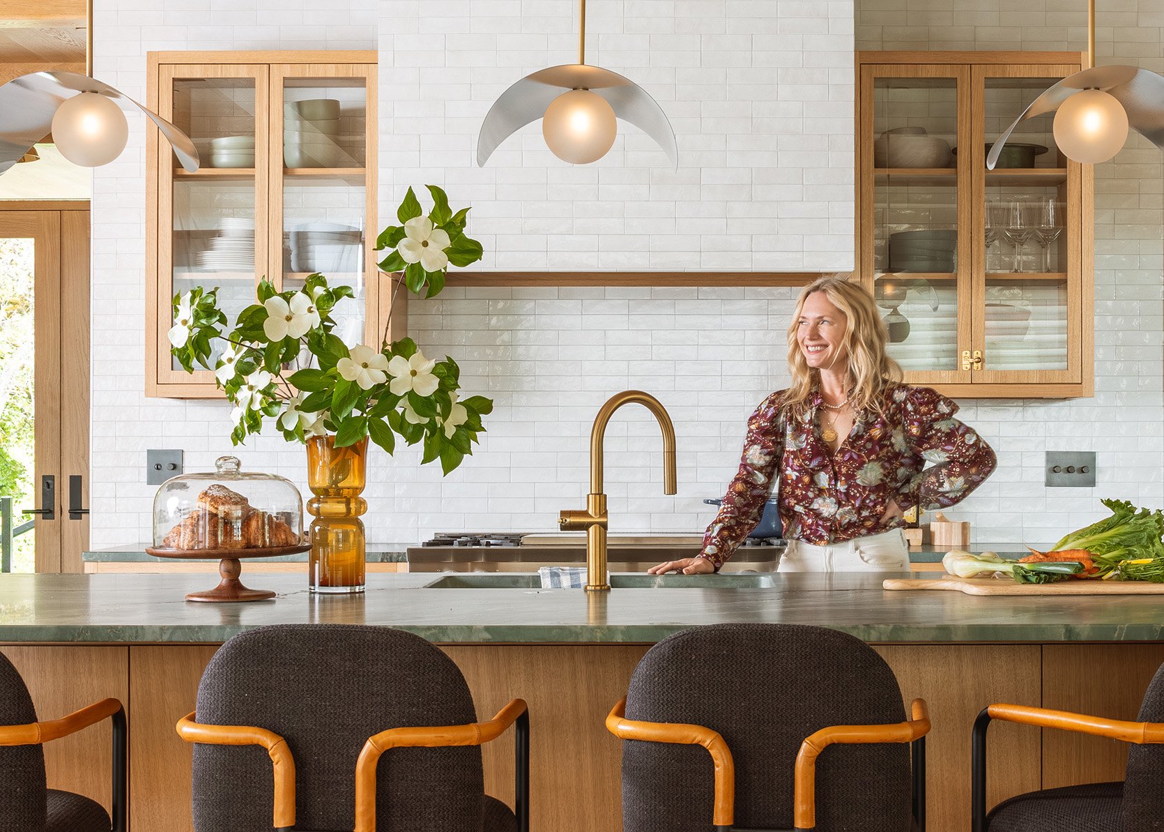
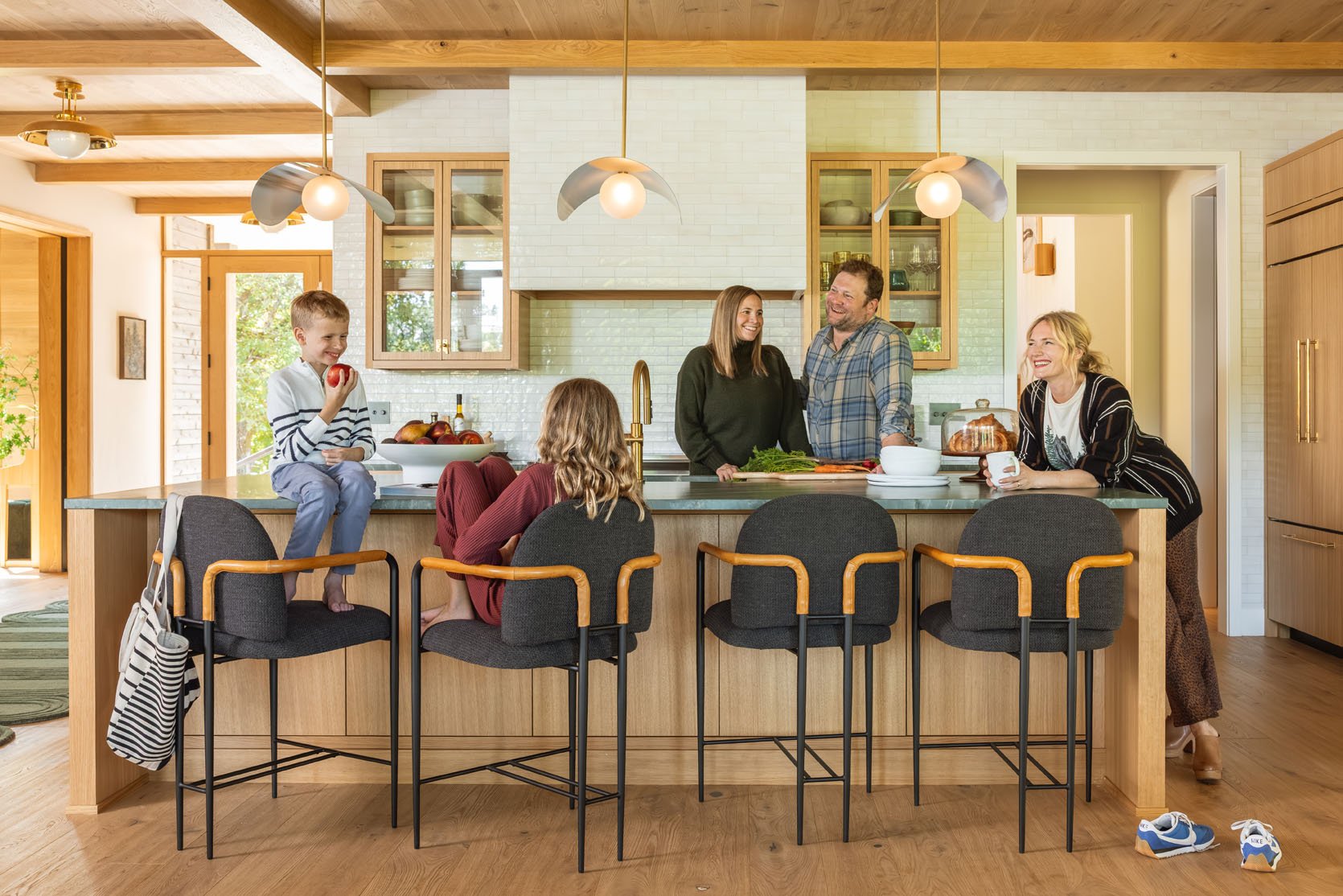
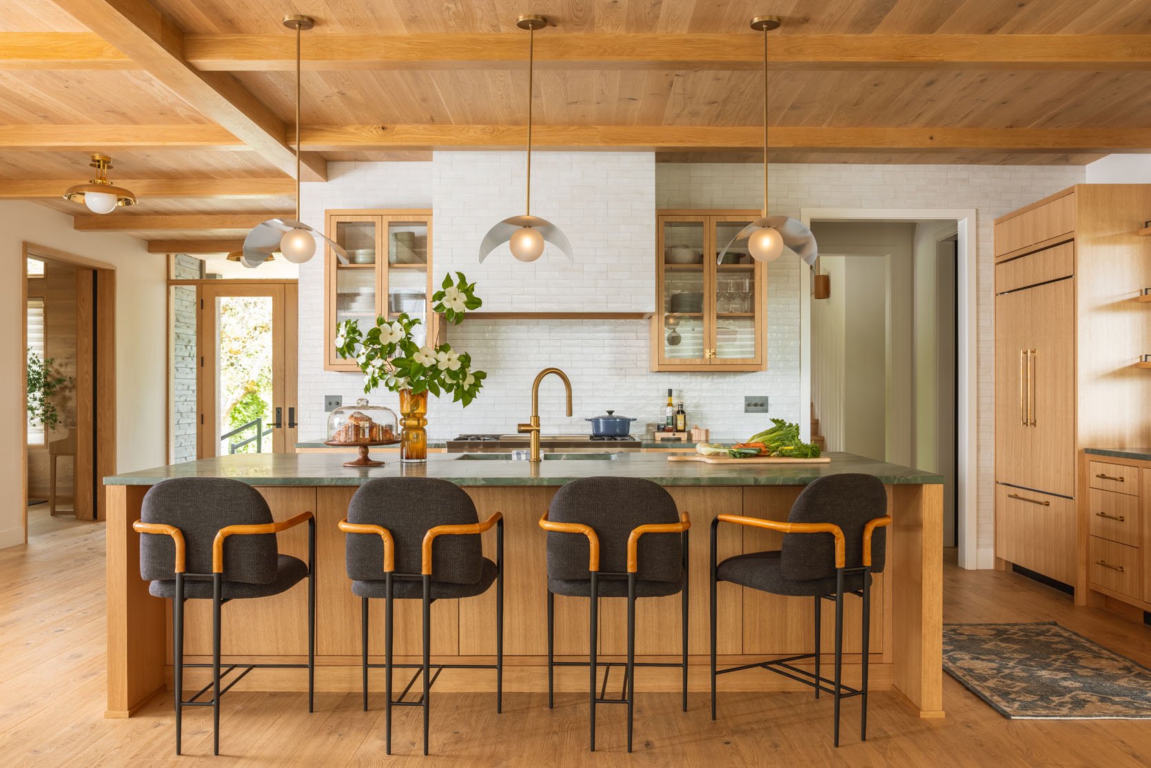
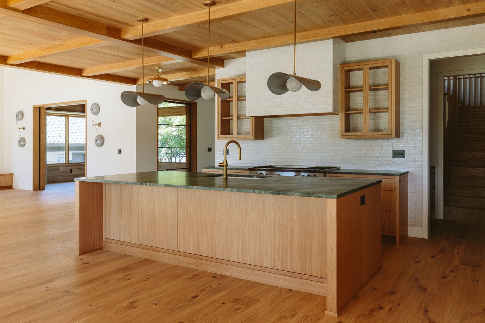
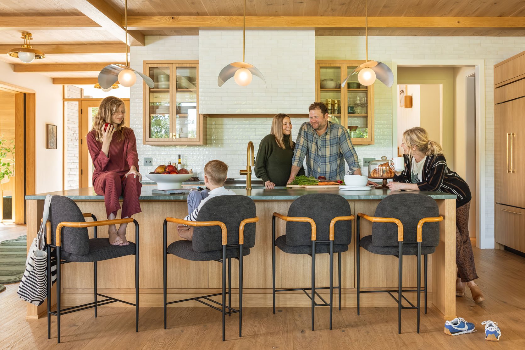
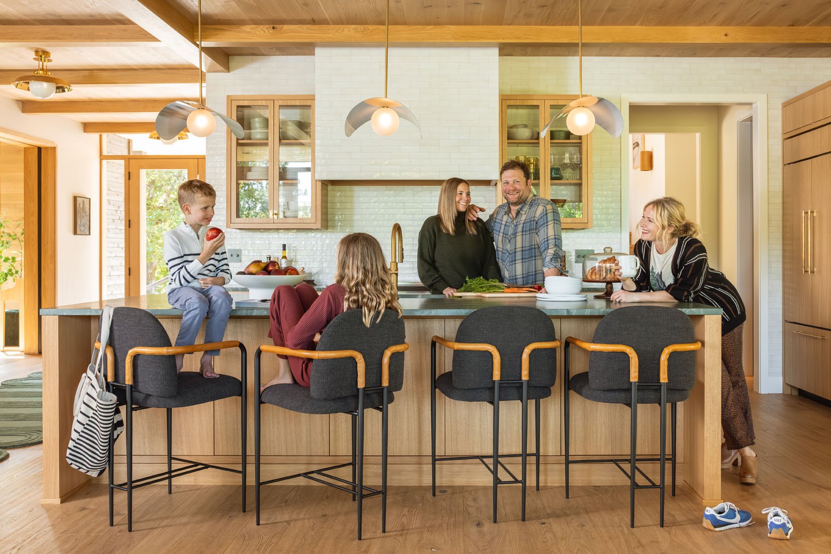
Welcome to my brother’s new River House modern kitchen reveal. She is open, minimal, textural, and hyper-functional for their family of four. We LOVE how it turned out, and when you walk through the house, it flows so well with the design as a whole. The colors, textures, and minimalism keep everything calm while the styling and furniture pop. Let’s give you a tour (and see the family in action).
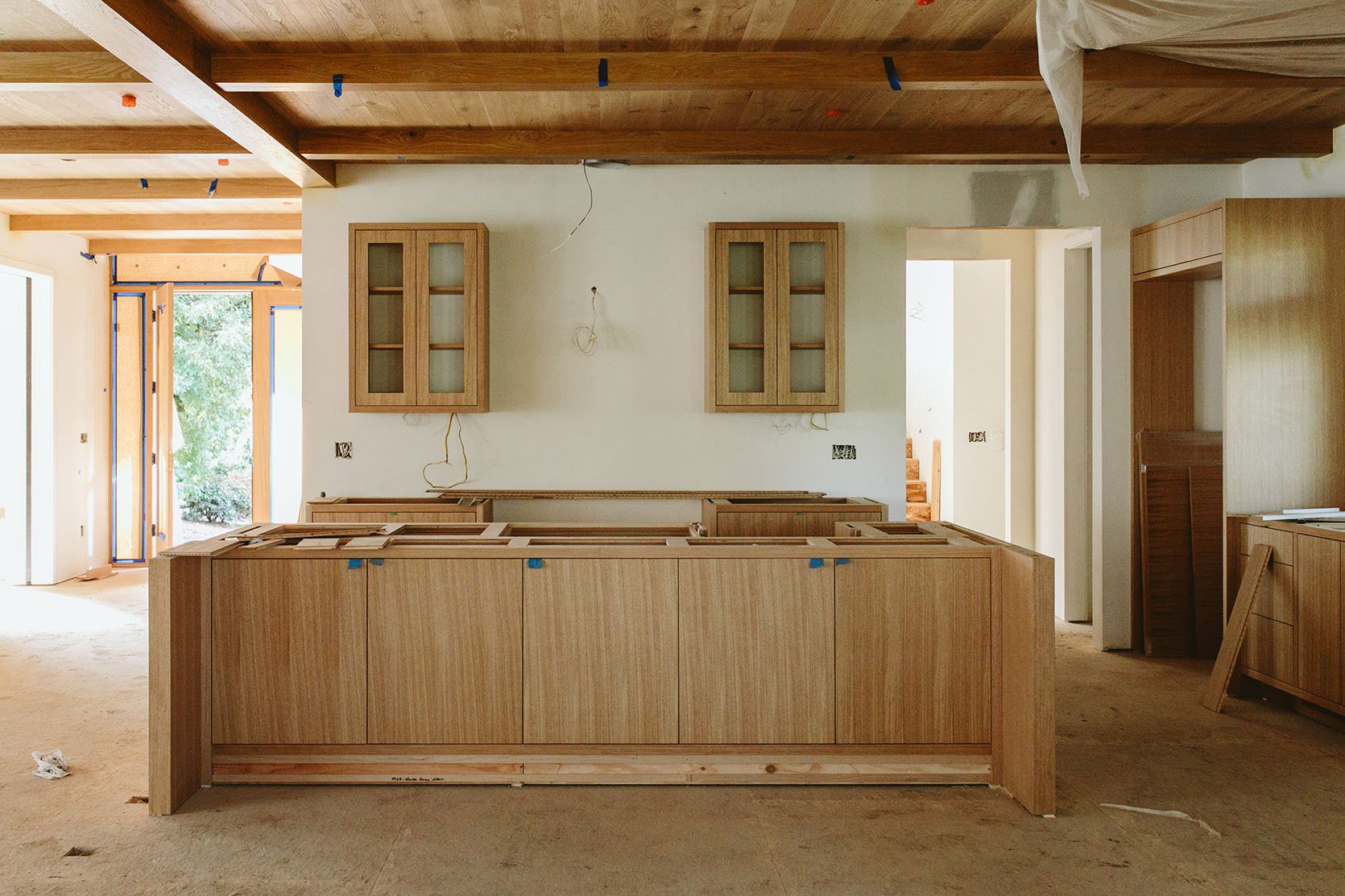
Now this kitchen was a design collaboration (like the rest of the house) between myself (I’m the sister), Max Humphrey (local designer), and Anne Usher (architect). My job was to be involved where there were partners – the tile, plumbing, and lighting, which meant that I was pretty hands-off with appliances and cabinetry. But this was a clunky way to do it because everything affects everything, design-wise, and you can’t have different chefs making different entrees for the same meal. That’s all to say that Max and Anne deserve a lot of credit for the layout, overall flow (Annie killed it), and some of the hard finishes. I took over with some of the other elements (and all the styling, stone, hardware, and lighting). Heck, maybe this collaboration worked because it turned out pretty darn great. At a certain point, I became so emotionally invested that, despite not being a “hired designer,” I wanted to see every room through to the end since it was such a huge part of my life for so many years.
Bar Stools | Stacked Bowls | Vase (unavailable) | Cake Stand | Cutting Board
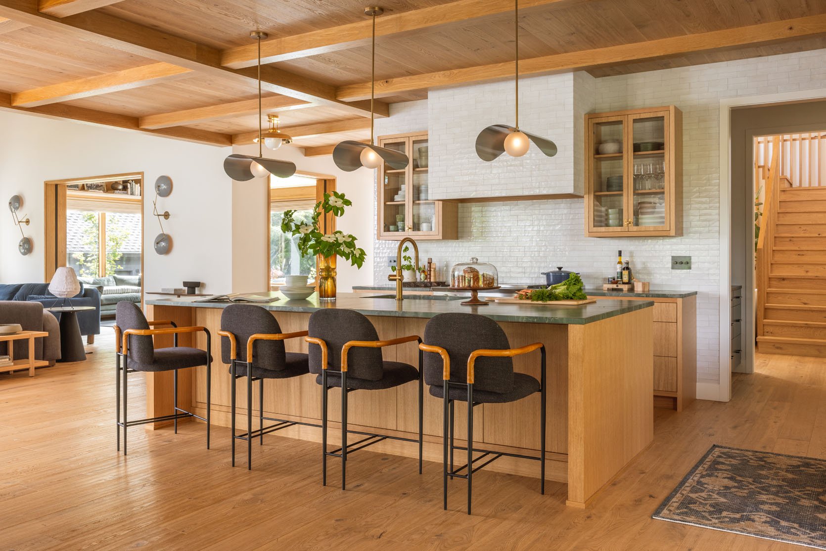
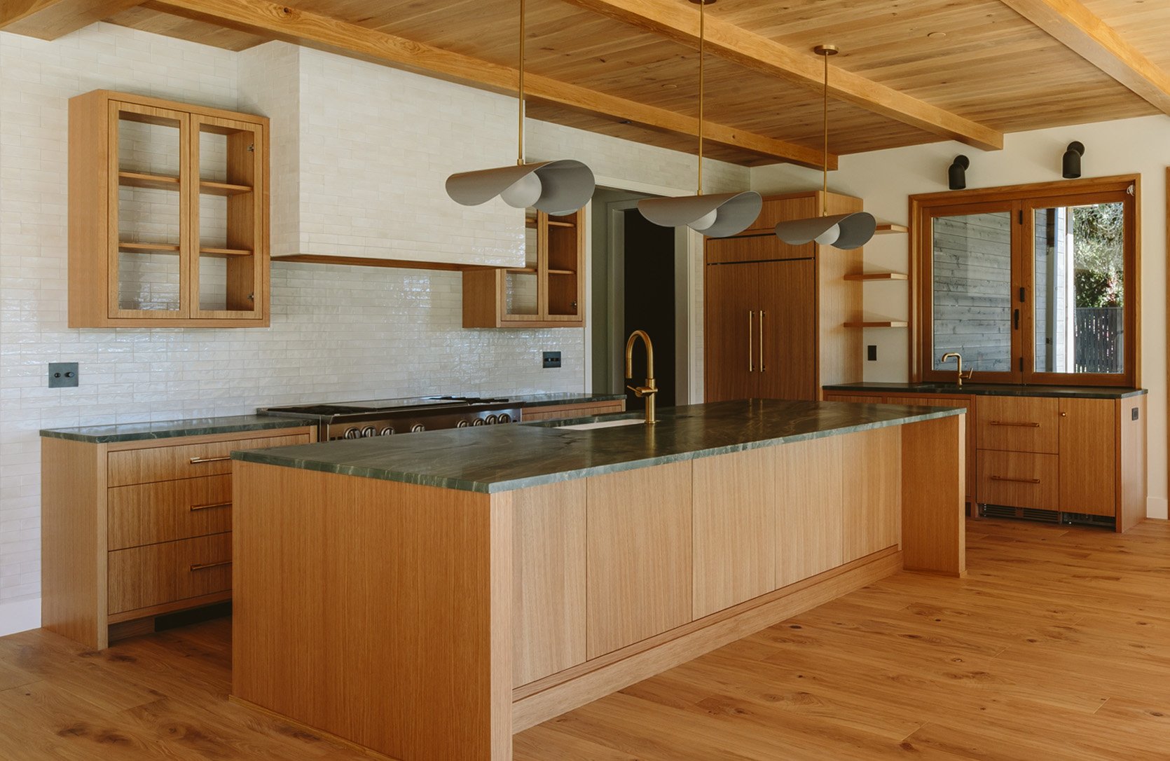
The kitchen lives in the middle of the first floor, open to the living/family room, dining room, and game room. So choosing the hard finishes required us to see the design as a whole to make sure that we weren’t designing a fun house.
On Choosing Tile…
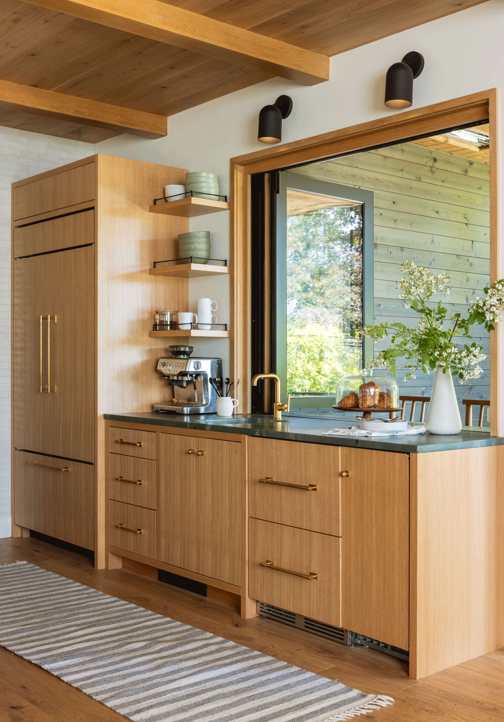
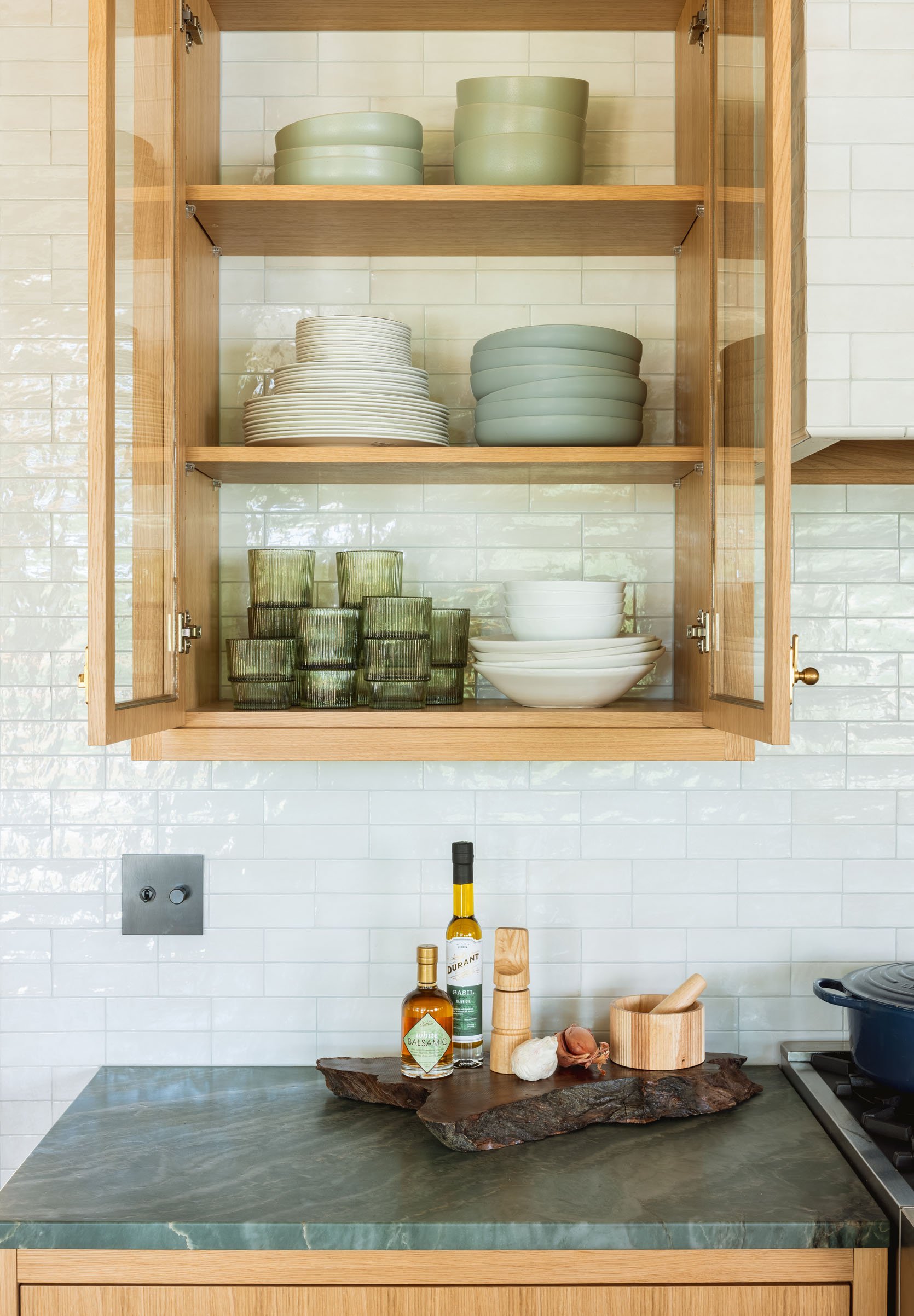
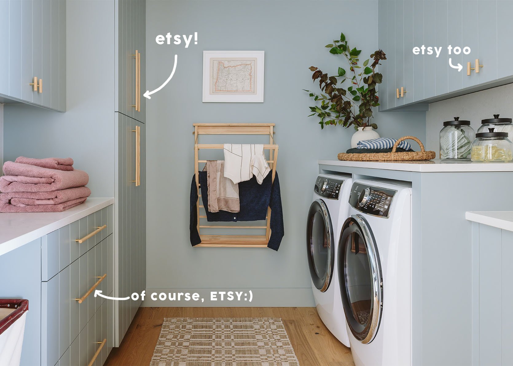
Runner | Drawer Pulls | Cabinet Latch | Tile | Range
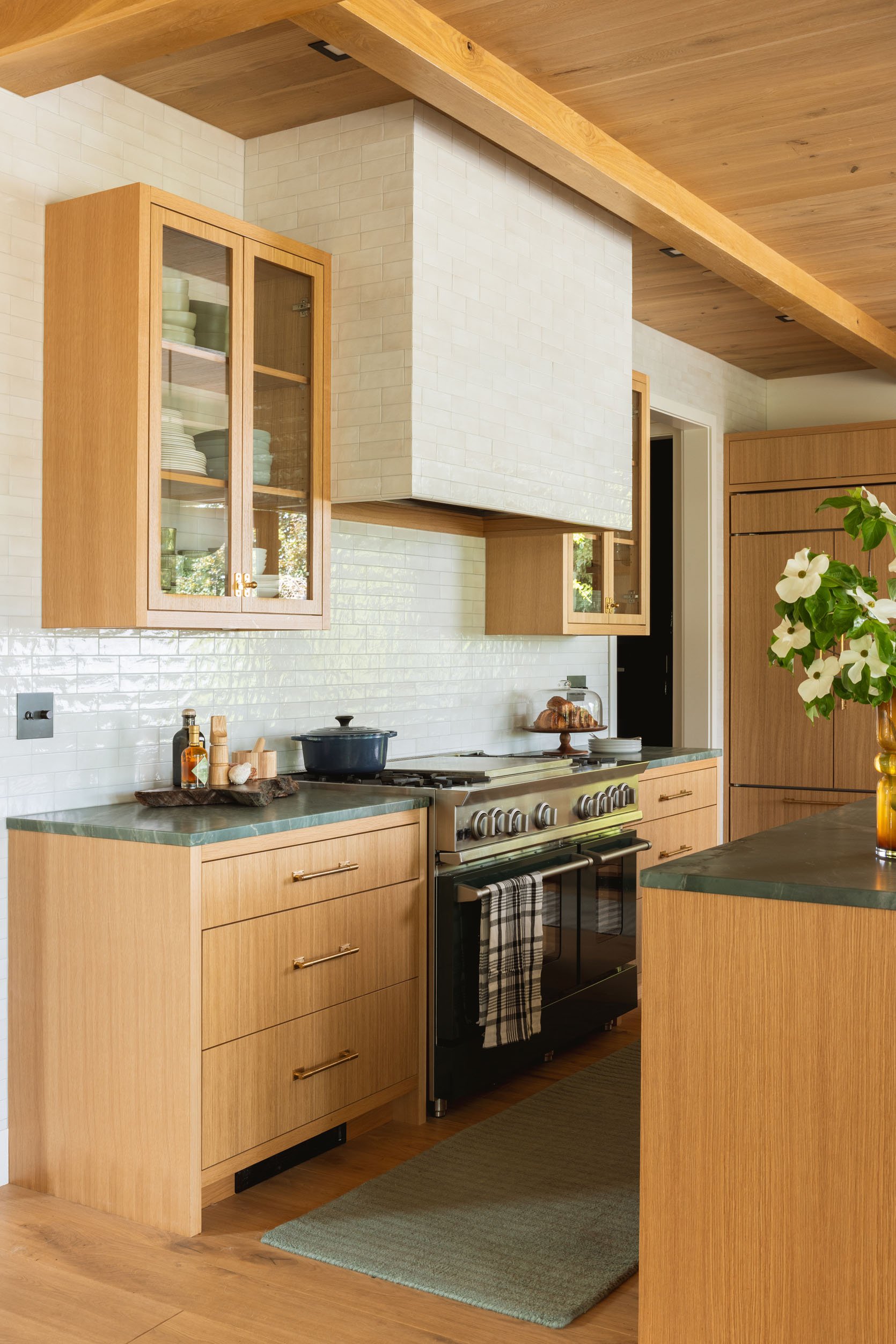
We chose this super beautiful, creamy Ann Sacks tile from the new Studio McGee line. We didn’t have the furniture locked down when we were choosing tile or stone, and Katie and Ken are pretty risk-averse when it comes to tile colors/patterns, so as you can see, the main finishes are pretty safe (if not still so beautiful). We knew from day one that they wanted a whole wall of tile to create that beautiful texture and reflection, so the overall impact is soft, quiet, and really pretty. You don’t turn the corner and scream at the boldness from color, which is good (they aren’t bold tile folk, TBH).
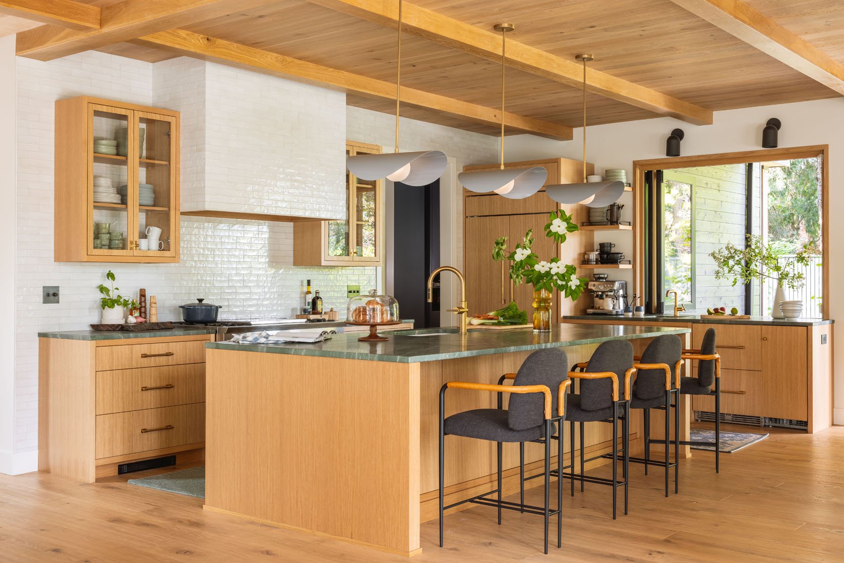
Also, within view, you have two huge tiled fireplaces (living and dining), so the tile really needed to work with the other choices. Now that it’s all done, I love the calm simplicity of it (especially with the green stone countertops). The ultimate vision and intent of the house remains clear – warm minimalism, with a Pacific Northwest bent.
A Non-Boring, But Still “Safe” Tile Layout
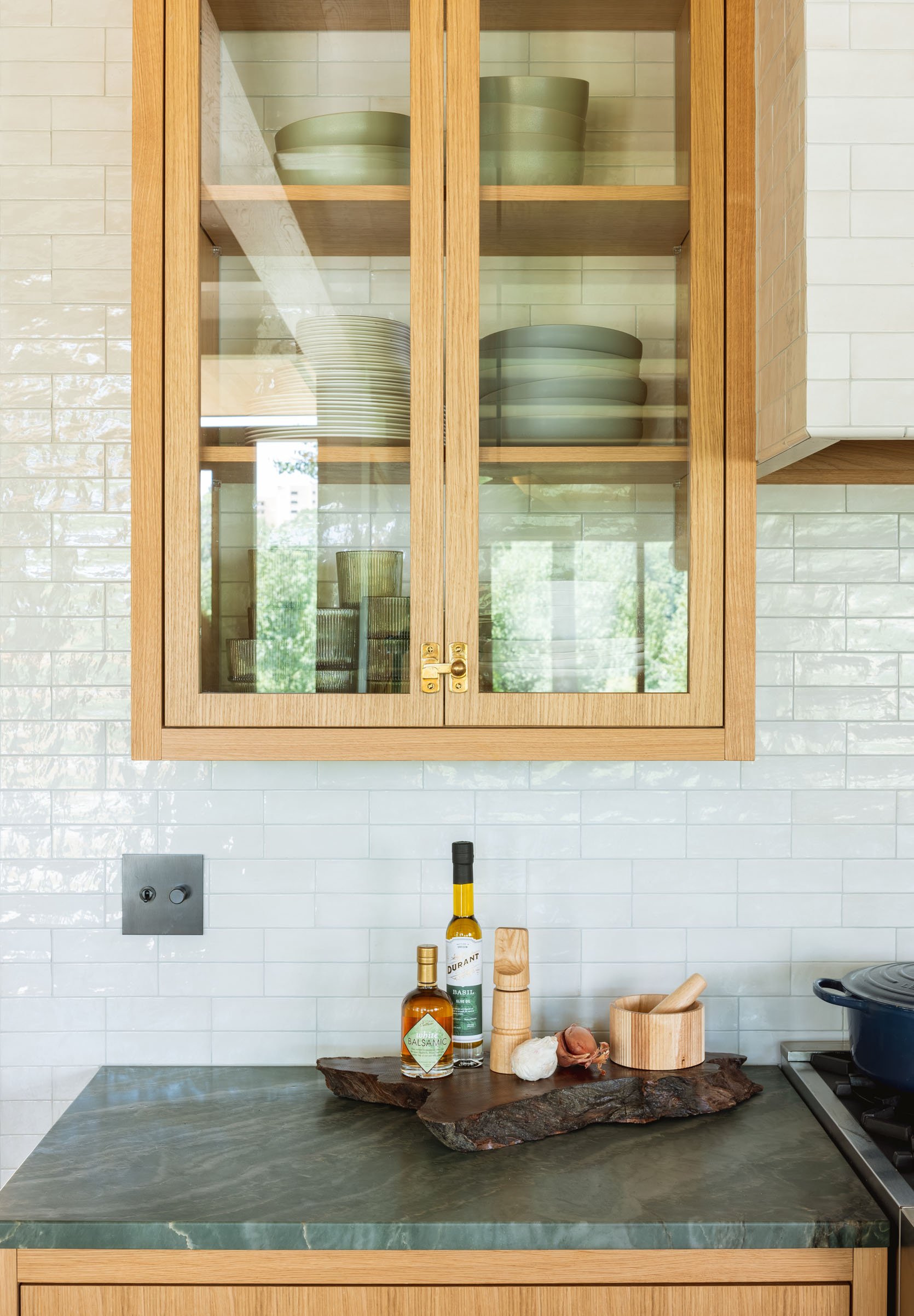
We laid out the tile in what I dubbed a “double stack stagger”, where two tiles are horizontally stacked on top of each other, but then staggered 1/2 way over two more stacked tiles (hard to explain, just see above). It was slightly more midcentury and a bit unexpected. We went through all the options (the horizontal or vertical stack or the traditional stagger/running bond), and this felt like a really great complement to the other tiled fireplaces in the room. Katie and Ken were nervous, but I felt that it was such a safe risk, so I pushed, and they agreed. We chose a really neutral grout, Platinum by Prism, that added some dimension without too much busyness (but not a bright white). I LOVE how we put it behind the hanging cabinets (which Max designed) so you can see the tile through the glass. It’s subtle but so pretty.
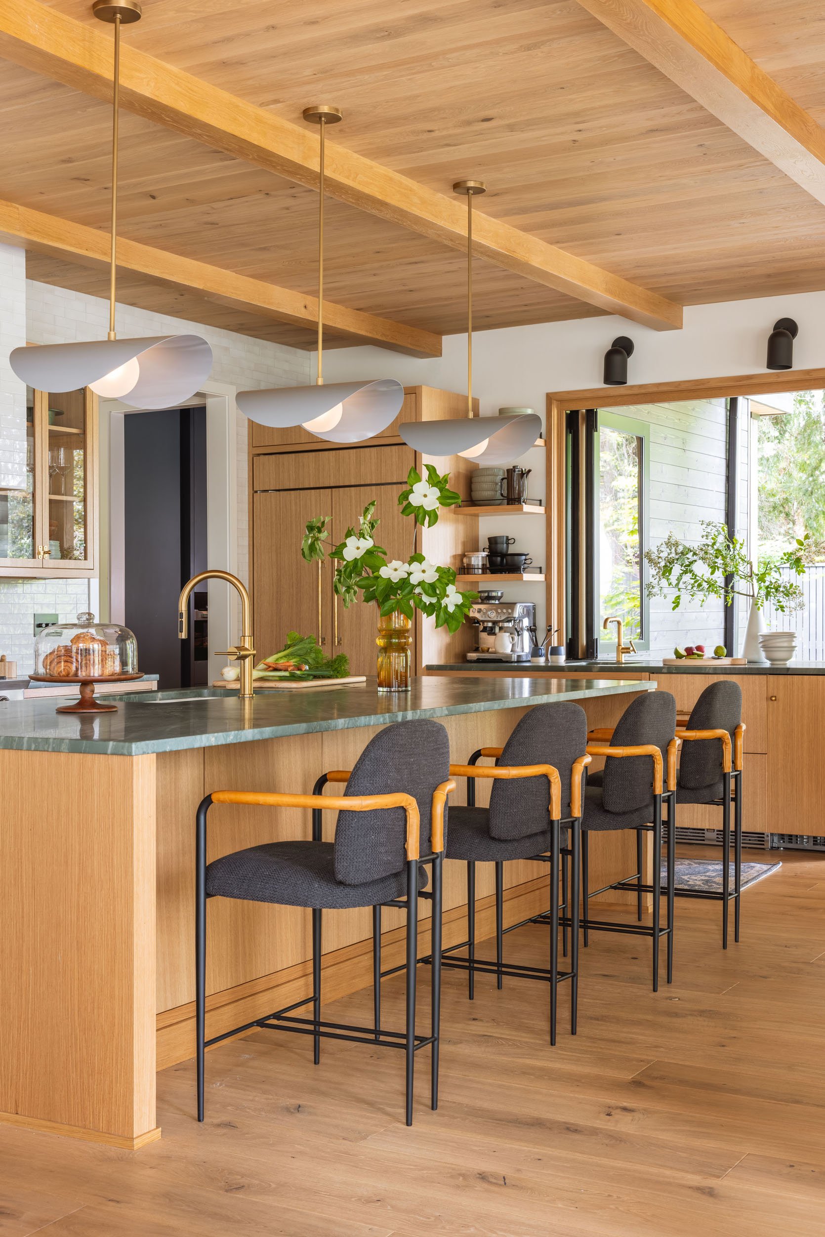
The Pendant Lights

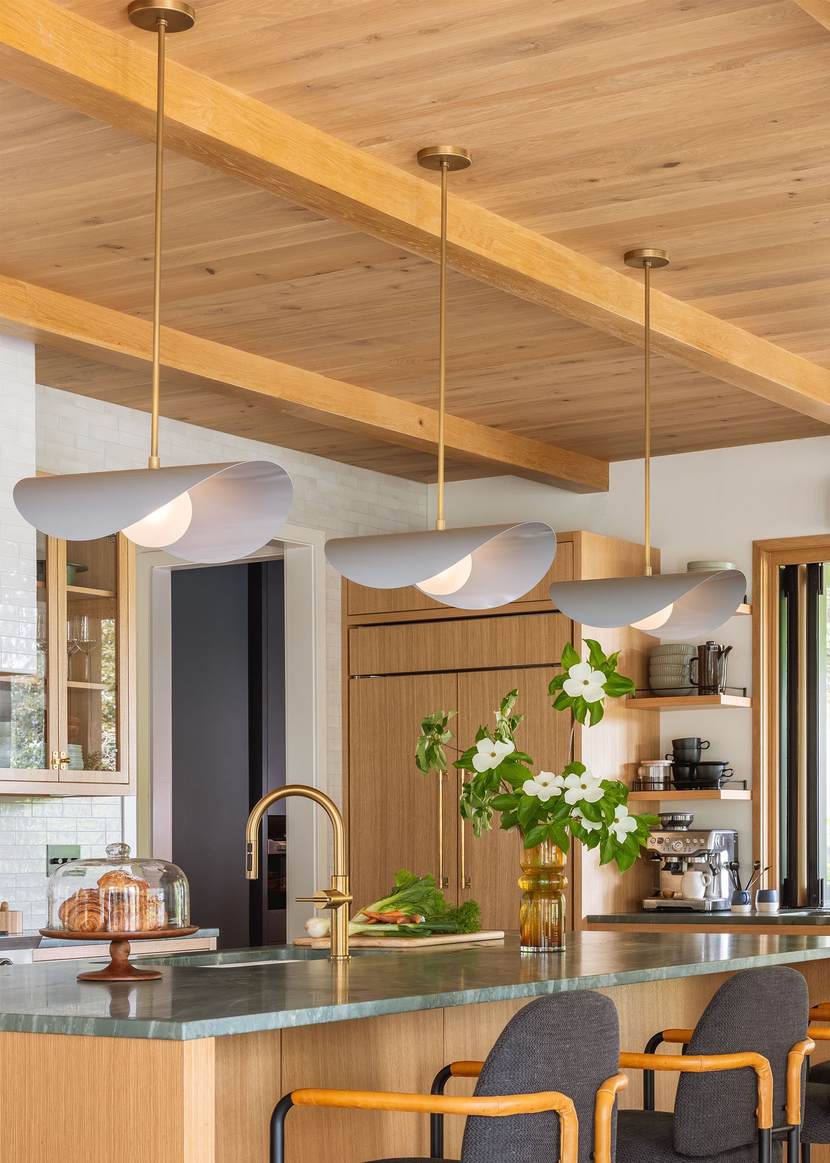
I was so excited to finally use Blueprint lighting. I’ve been a fan for a while, but since my house is so vintage, it didn’t feel as right there. But this kitchen felt simple enough that adding some more sculptural pendants, almost like art, over the island was the right move. These are called the Montera pendants, which have a lot of different metal and enamel color options from both the shades and the stems. We chose Slate, which at times reads way more blue, which was the intent (other times, like in these photos, they are more gray). The black sconces over the bar are from Rejuvenation and complement the Blueprint pendants really nicely, while pulling in the hits of black we have around the kitchen.
I love how the more delicate shape of the shade contrasts against all the hard lines of the wood, and the reflection of the shiny metal pops so well off the wood. Once they were up, I actually decided that black stems and canopies would be better and ordered them to replace the gold. It felt like they were just disappearing too much. But as the room came together (and as we kept putting off calling the electrician back), we decided that these look great.
The Bar + Coffee Bar
Upper Bowls | Middle Bowls | Mugs | Espresso Machine | Drawer Pulls | Cabinet Knobs | Appliance Pulls | Plates | Vase (unavailable) | Runner
They have a separate cabinet run for the bar (that opens to the kitchen patio) and houses their coffee situation. It also has drawer fridges and a pebble ice machine (like brother, like sister). The window is from LaCantina Doors, and I had nothing to do with it, but it’s pretty dang awesome.
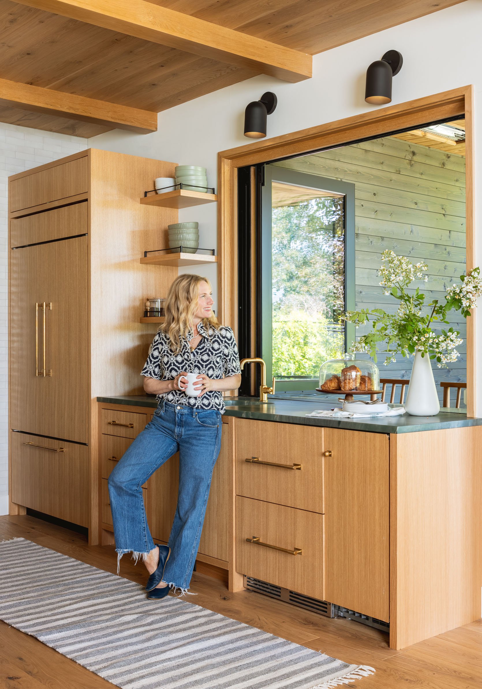
As you can see, we chose unlacquered brass hardware from Rejuvenation, in handles, knobs, latches, and appliance pulls. Once again, their selection and custom options can really make your project look special. We were hoping to reduce contrast here by choosing the brass, but I think black could have looked hot, too. I just love how the brass patinas, even in a contemporary house like this.
The Brass Faucets + Purified Water
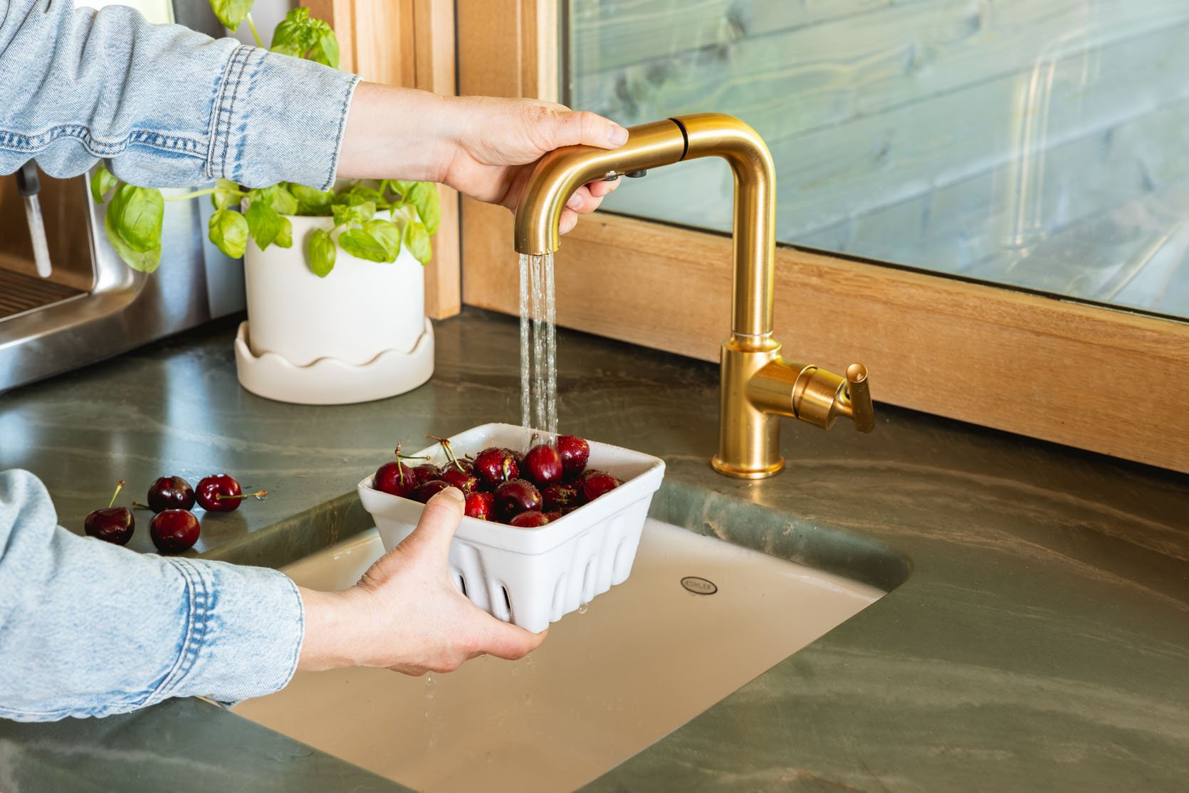
Planter | Faucet | Sink | Berry Basket
The faucet is a Purist Kohler pull-out bar faucet (in Vibrant Brushed Moderne Brass) for washing veggies and for drinking water. Over here, they have the Culligan water filtration system, inside the cabinet below, that gives them extremely purified water (all the things are filtered out, including microplastics). Listen, Portland doesn’t have the best water, so I’m jealous of this and might get it for myself now (especially after all the very recent microplastic reporting). It was a super easy install for them (harder for me, as we have less clearance in our cabinets, so stay tuned on that). The faucet comes in a lot of finishes, and Kohler has so many different styles, but we thought that this one was contemporary and transitional – not hyper-modern but fit stylistically really well.
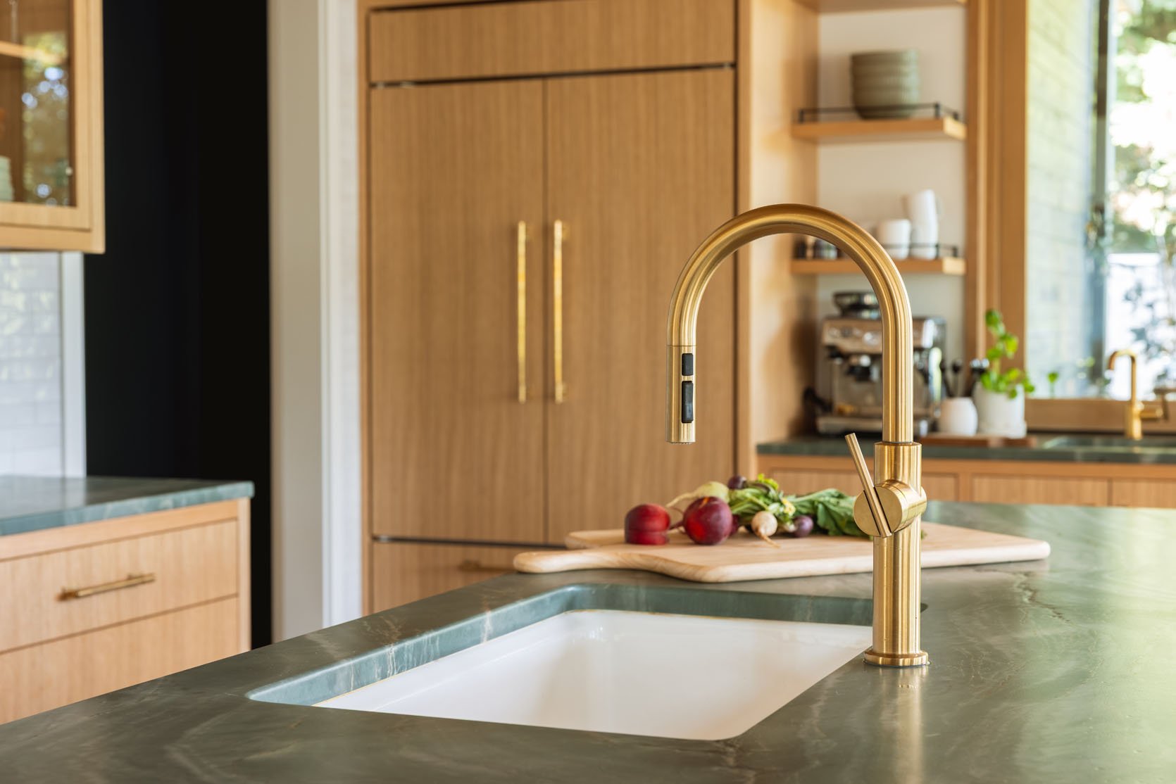
The kitchen faucet is so gorgeous. It’s Kohler, in the same Vibrant Brushed Moderne Brass finish, single-hole pull-down. It can have a regular water flow or a more shower-like spray. It’s a one-and-done faucet for those who want a lot of function in a really simple shape.
The Green Leathered Stone Countertops
Pasta Bowls | Ramen Bowls | Plates | Pasta Bowls (similar) | Glasses | Small Bowls | Wide Bowls
I wrote about the process of choosing the stone here, but with the tile being a creamy white and the cabinets being wood, I was desperate to bring in some color and something punchy. We had Caesarstone on board to trade the countertops (which is a super durable choice that Ken and Katie were excited about), but I was just so worried that without color in here, this kitchen would simply put, look boring (and I told them that). So I found this green stone from Elmar, and thankfully, they were on board (nervous, but they trusted me). It felt so perfect since the green of all the trees outside was a huge part of the interior color palette.
We had the stone leathered, which enhanced a lot of the veining and gave it more of a matte textural finish. Be warned that it needs to be sealed IMMEDIATELY afterwards because theirs wasn’t, and there was an immediate ring from a sub that no one took responsibility for, but was very expensive to remove. Not sure why it wasn’t sealed when they leathered it before it was on site, but it was one of those dumb blame game situations that is unfortunate during a remodel. And I felt so responsible because I was the one who forced natural stone on them, but you can barely see it now, thank goodness.
The counter stools are from CB2 and are pretty much perfect in here (which is why I forced them to buy them). Since you mostly stare at these stools from the back, they needed to be interesting, and that mixed leather/metal finish is just so architecturally striking (not to mention being comfortable, and family-friendly since it’s a dark fabric).
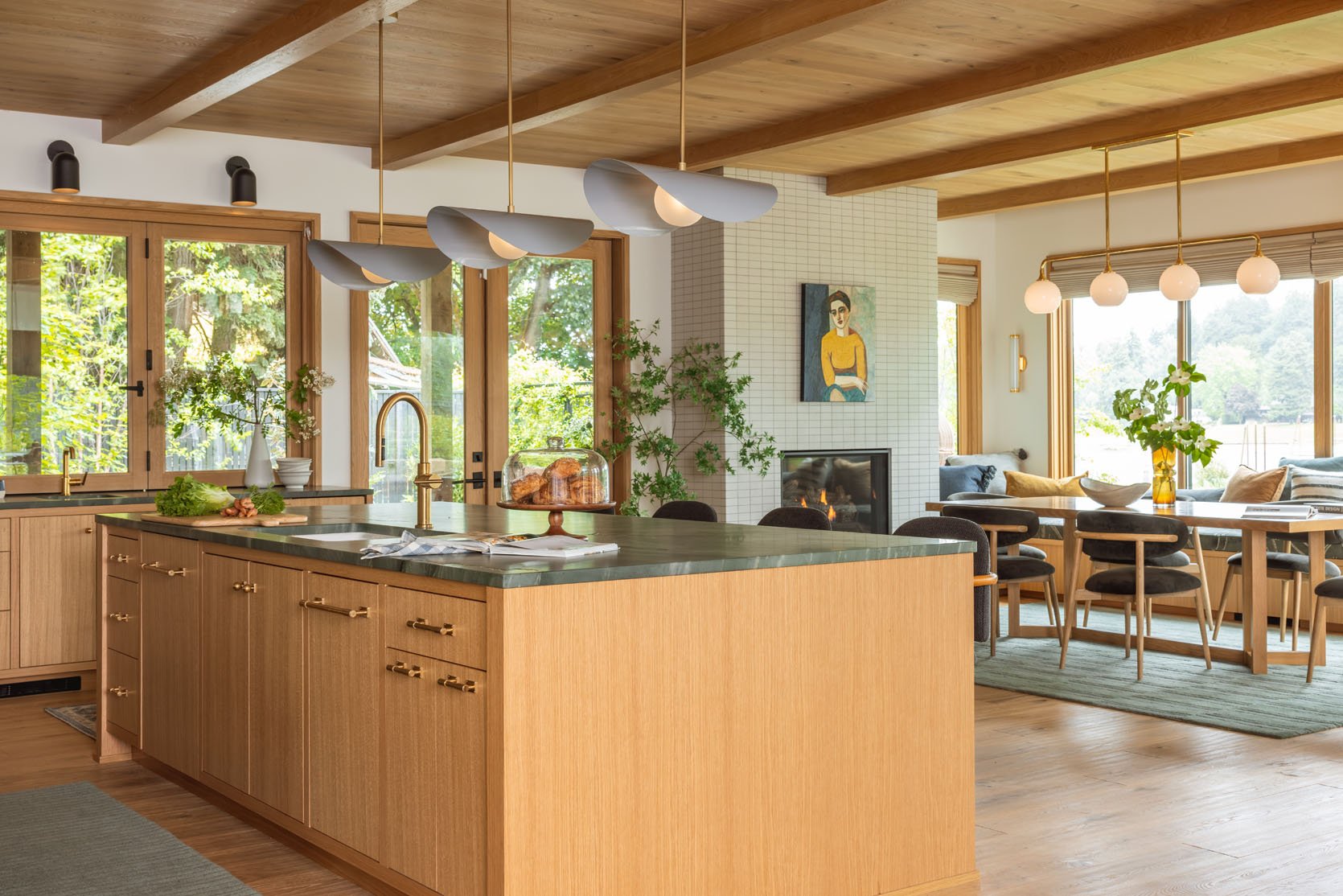
The biggest debate that we had at the beginning of the design was whether you want to face the river/view while washing dishes or eating at the island. It’s really just a personal preference. At one point, Anne even tried the sink cabinet run at the window with the kitchen island behind it, where the range wall is. Lots of opinions on this one! I LOVE how Anne ultimately designed the layout, and having spent a lot of time in the house, sitting at that dining table is just so special, and the kitchen is so close and so inviting.
Wait, Where Do You Keep The Food???
I totally forgot to mention that there is a big walk-in pantry in that hallway where they have a second small fridge, their built-in microwave and steam oven, and tons of cabinets and drawers for food. We’ll shoot it eventually, I promise 🙂 You’ll see the dining room soon. But for now, let’s get to those before and after sliders 🙂

It’s a real case for keeping hard finishes simple, and the power of styling and decorating. I can’t stress this enough – you don’t want to redo the hard finishes, but it’s so easy to switch out almost everything else based on your style shifting.
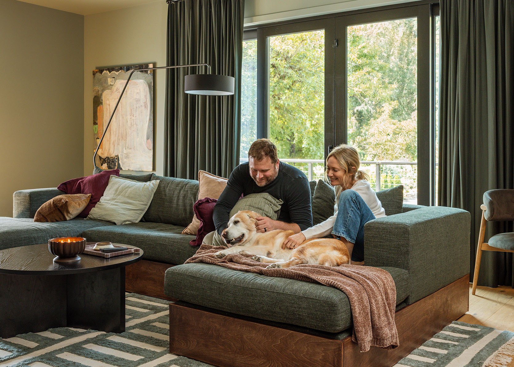
I’ll show you the living room soon, but know that you can see the TV from the kitchen, should there be a big game on – you can even cook while watching the new season of The Bachelorette that we are all VERY excited by.
It’s a super easy to live in, easy to keep clean, dreamy kitchen for this family, and I feel so lucky and grateful to be part of it (and hang out here).
Kitchen Resources:
Plumbing: Kohler
Water Filtration System: Culligan
Windows: LaCantina Doors
Tile/Stone: Ann Sacks
Cabinetry: Custom
Main Wall Color: Alabaster by Sherwin-Williams
Pendants: Blueprint Lighting
Sconces and Hardware: Rejuvenation
Stools: CB2
Flooring: Stuga
*Architect: Anne Usher
**General Contractor: JP Macy of Sierra Custom Construction
***Interior Designers: Emily Henderson (me!) and Max Humphrey
****Styling: Emily Henderson (me!)
*****Photos by Kaitlin Green
Gorgeous!
The pendants *make* this space!!!! Amazing choice.
For 5K, they’d better!
One of my favorite kitchens ever! Stunning!
1) Love it all
2) What stone is the island?
3) What would be a matching paint color- looks almost like a jade..stunning.
4)Those pendants are not typically my style, but I am sold. They remind me of the “Flying Nun”-old-fashioned veils the nuns used to wear, and that adds a delightful whimsy for me that I am sure you didn’t plan on. 🙂
Me too! I was just going to call the pendants “Flying Nuns”! I love them.
Also curious about the type of stone.
It’s linked in the referenced blog post. Did you click the blue text which is a link to that post “the process of choosing the stone here”. Any blue text you see is a link, click any for more info. Or search for the blog post by title:
This is quite beautiful! Congratulations to the family for getting their dream house. And thanks for following up on the countertop stain 🙂
i would love to hear more about how the countertops are holding up since sealing—and if they are easy care now, what sealant you used.
I’d love to see a before and after of the stains on the island along with the process to fix it. There was a little bit of info on that one post but no final resolution. The post was:
Lessons To Learn: The Three River House Renovation Hiccups (A PSA On Avoidable Issues)
These before/after swipes make painfully obvious where my house is lacking. We completed a comprehensive refresh/remodel in January and I LOVE everything I chose. We are fortunate to have a great “library” of family art and “items” but I have compostela taken on my face even it comes to pulling all that together. Perhaps I need to save up to how a stylist!
All of this is to say… the styling really takes this house over the top! Lovely.
Apologies for the terrible typos. Upshot: Styling good.
Your outfit with jeans with the black and white blouse & flats is casual-lovely! Where did you get the blouse?
Emily’s tops are, in order:
Just spectacular! I love the layout with the sink area overlooking the dining area and the windows beyond. A window is lovely but turns into a black hole after dark so I’d much rather face a lovely room and people keeping me company at the bar.
Those open-back, glass-front hanging cabinets are pure genius! Not every kitchen can devote that prime space to display but it really makes this open design shine and there’s obviously plenty of storage elsewhere.
Kudos all around!
So fun finally seeing this home. Thank your brother and his family for allowing us to tag along for the entire project. I’m sure it’s exhausting putting everything out there for the John Q Public’s entertainment.
So beautiful and so much inspiration in terms of where to take thoughtful risks while staying in a more timeless style. I didn’t clock the unique layout of the tile until the close-up photo, so I thought that detail was really special in terms of a quiet declaration of custom work. Thank you for sharing the space with us.
So beautiful!! You all did an incredible job and it really is such a treat to see these reveals after seeing the process from the beginning! I couldn’t stop thinking though how fun a bold, patterned fabric with maybe some green on it would look on the bar stools and make the room pop! 🙂
I absolutely love the finishes and functionality. The light fixtures are perfect! I can understand how it’s nice to have the kitchen accessible from all sides/multiple rooms for their family, but I’d prefer a little more structural separation of the kitchen between the spaces.
Agree. It is way too open to the other spaces for me. That works great for my family when we’re on vacation or something, but for everyday, I like to keep the kitchen and its’ mess contained.
Wow everything is just beautiful. The most incredible to me though are those insane green stone counters! So glad you were able to convince them to go with them. Congrats to everyone on coming together to design and execute such a truly beautiful house.
Very curious about the pantry situation. Is basically all their food in there? So whenever they cook, they need to get all the ingredients out and then put them back again? That would drive me crazy. I’ve always stored spices, oils, and baking ingredients within arm’s reach of my main food prep area.
Things I love: the green rugs/countertops look so good together.
The pendants speak to the dining room lights but are more fun – stylish ladies with big hats.
That bar area looks like it has all it needs and would be a lovely coffee stop.
I’m curious how they feel about moving food from pantry to kitchen and back now that they live there.
Also (please don’t yell at me) – the very first thing that my brain clocked on the intro picture is that I can’t see any color in your eyes. It must be the style, but you are looking to the side or up or to the side and up in all pictures (and most posts). The first one actually looked a bit creepy without eye color – I wouldn’t read the book if it was the cover. Maybe some pictures looking a little more towards the camera (doesn’t have to be fully facing).
Beautiful kitchen! That stone is a showstopper! Really looking forward to the pantry reveal.
Magnificent result with everyone’s combined effort. Now I have a serious case of kitchen envy! Love those Blueprint pendants over the island.
Is that orange??? Love everything!
This is so beautiful and special. Congratulations to all and enjoy!
I’ve been so excited about this reveal! I want to do emerald haze quartzite for my planned kitchen as well. It turned out beautifully.
Love it all.
I am curious – did your brother / SIL not already have any art of any kind or collections or even beloved furniture pieces of their own that would be incorporated in their new home? Or did they really just not want to show that stuff publicly?
Love the house, but Portland has bad water?!! They literally win awards for how great their water is!!!! Tap water is super safe to drink (and WAY better than bottled water). It is fine if you want to add extra filtration, but it really is more of a preference than a need! Hopefully you can clarify this in the future!
Just a heads up that when reading on an ipad the right side ads actually obscure a small portion of text and make reading difficult, not sure why thats happening!
Love the tile layout, I remember it from one of the Mountain House bathrooms that Julie designed. Such a warm and inviting space that feels timeless.
Oh yes, I remember that bathroom. That looks completely different because they used a 1×8 tile and installed it both horizontally and vertically.
Mountain House Reveal: The Upstairs Guest Bath That Used to Be a Closet (and a Peek Into the Bedroom)
stylebyemilyhenderson.com/mountain-house-reveal-the-upstairs-guest-bath
The countertops really make this! Love the green with the wood and brass, and the subtle but unique tile layout. Perfect PNW vibe and totally a great hangout spot. I was wondering why they settled on the sink in the island (vs. on the side by the window), interesting to hear the thought process.
Wow, you have done some great kitchens but this one is my favourite!
Looks absolutely gorgeous! Just want to make sure the link is taking me to the exact tile you used (love): is it antique white gloss Canyon Lake by Studio McGee 2″ x 6″ Field Tile? Thank you!!